Interior Design Logo Maker
Design an interior design logo that looks good on your website and business cards.
Need a different logo maker? Try our AI logo generator.
Logos created using LOGO.com
670,000,000
Modern and minimal interior design logos
Coastal and relaxed interior design logos
Heritage and luxury interior design logos
Interior Design Logos, Ranked From Real Founder Prompts
According to LOGO.com data, the symbols interior designers reach for most are the armchair, in about 26 percent of the icon descriptions we read, a simple house outline in about 25 percent, and antique furniture in about 13 percent, with leafy branches and framed wall art close behind.
Because an interior design logo has to look just as composed on a studio website as it does on a business card, a mood board, and a client proposal, the nine styles below are built to stay elegant at any size. Start from the symbol that fits your work, then make it your own with your color and name.
On this page
- What do interior designers actually put in their logo?
- Fifteen interior design logo ideas from real founder prompts
- A symbol, a monogram, or just your name?
- Make it look luxury without making it look busy
- Residential, commercial, or home staging: match the mark to your work
- Colors and fonts that read calm, warm, and elevated
- What an interior design logo costs, and where you can use it
- Make your interior design logo with LOGO.com
Interior designers spend their days making other people's rooms feel intentional, then reach for the first script font they find when it is time to brand their own studio. You can do better, and you do not have to start from a blank canvas. When we read the icon descriptions real interior design and furniture founders typed into LOGO.com, one piece of furniture led everything else, the humble armchair, named in about a quarter of them. This page walks through the nine symbols interior designers actually reach for, fifteen real prompts you can borrow, and the small choices that make an interior design logo look calm, considered, and genuinely high end.
What do interior designers actually put in their logo?
Interior design covers a lot of ground, from a solo decorator to a full studio to a furniture line, and these nine symbols come from across all of it. Seating leads, then the shape of a home, then furniture and greenery, and after that the set opens up into framed art, arches, and windows. Pick the symbol closest to the work you do, keep it to one clean shape, and it will still read when it is shrunk onto a business card or a social avatar.
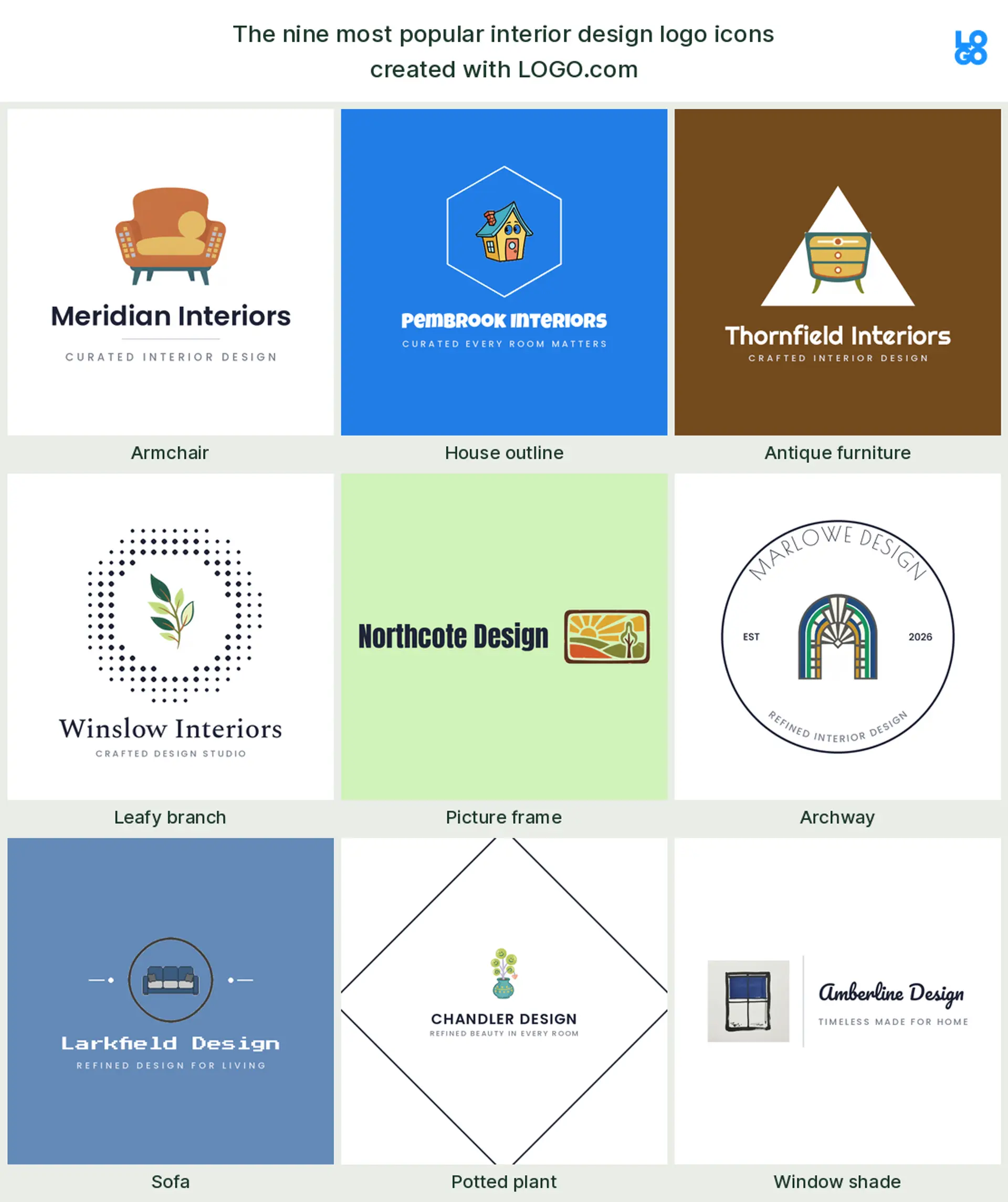
Armchair
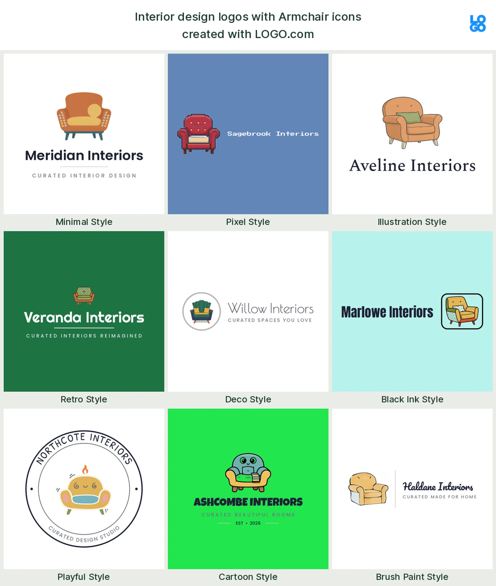
Nothing says interior design faster than a single, well drawn chair, and the founders agree. A cozy armchair shows up in about 26 percent of the icon descriptions we read, which makes it the quiet default for an interior design logo or an interior designer logo. Keep it simple and a little bit soft and it reads as comfort and good taste from across a room.
House outline
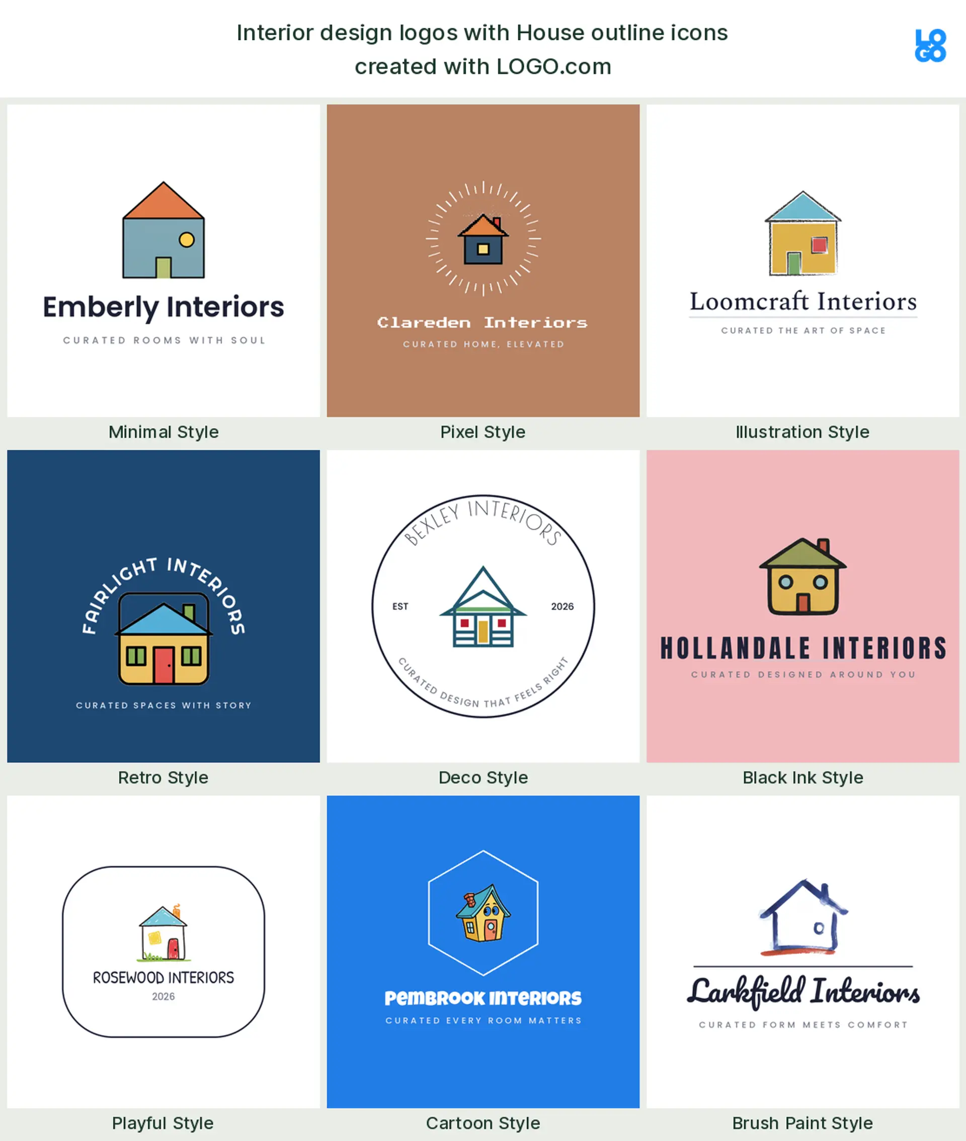
Close behind the chair sits the outline of a home, described in around 25 percent of the prompts. A clean roofline or a simple house shape says this is about spaces people live in, which makes it a natural mark for a residential design or home interior logo. Pared back to a few strokes, it never feels literal.
Antique furniture
About 13 percent of founders describe a piece of furniture in silhouette, a dresser, a console, a sideboard. It leans heritage and craft, so it makes a lovely furniture logo or a mark for a studio that mixes vintage finds with new pieces.
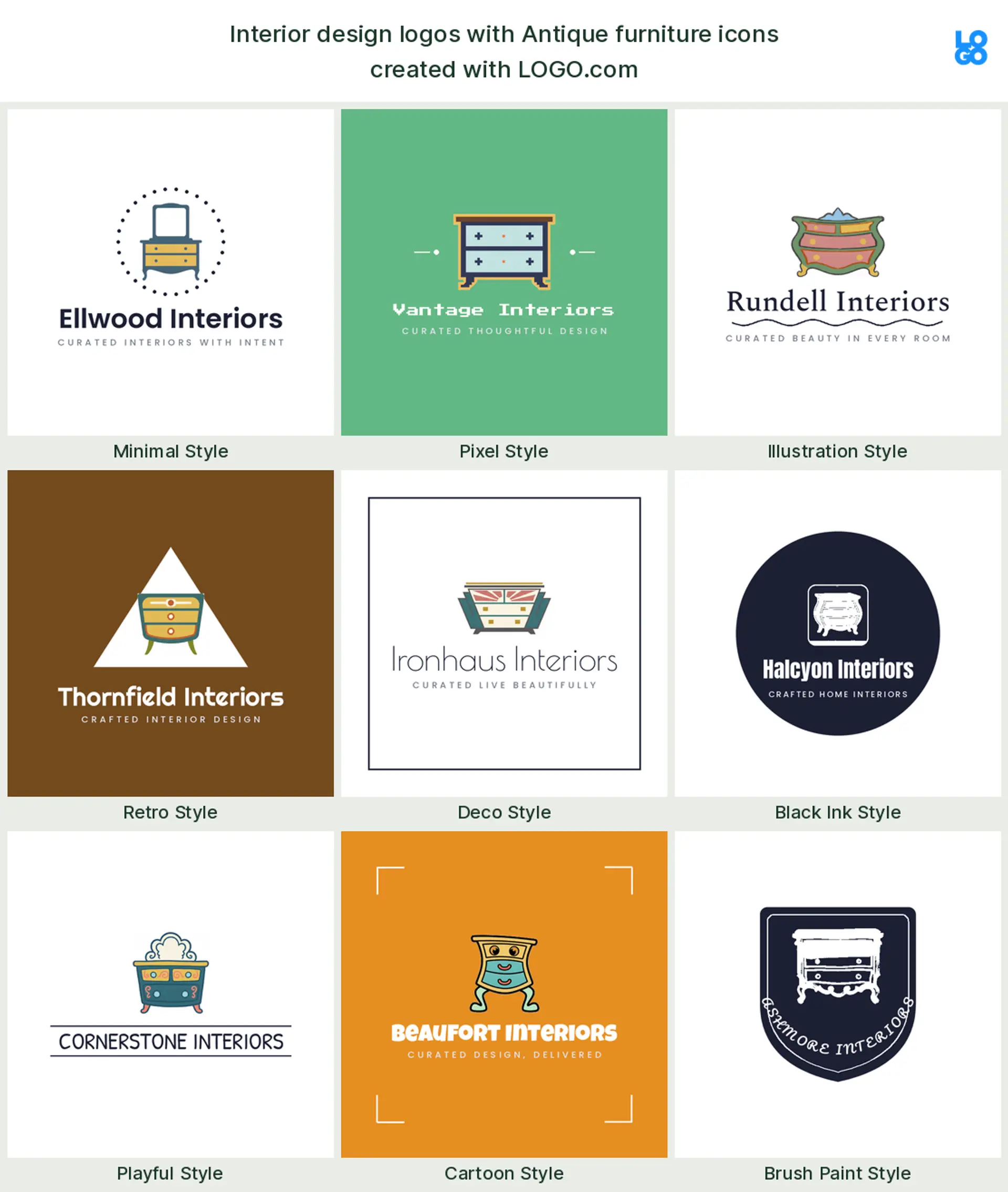
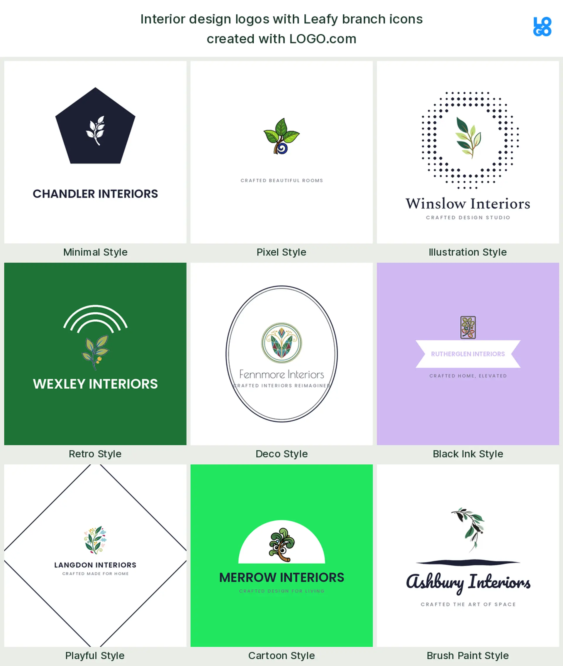
Leafy branch
Just outside the top three, founders reach for a leaf or a slender branch. Greenery signals warmth and a biophilic, natural touch, which is why it suits a calm, organic interior design logo or a plant led studio that leans into texture and light.
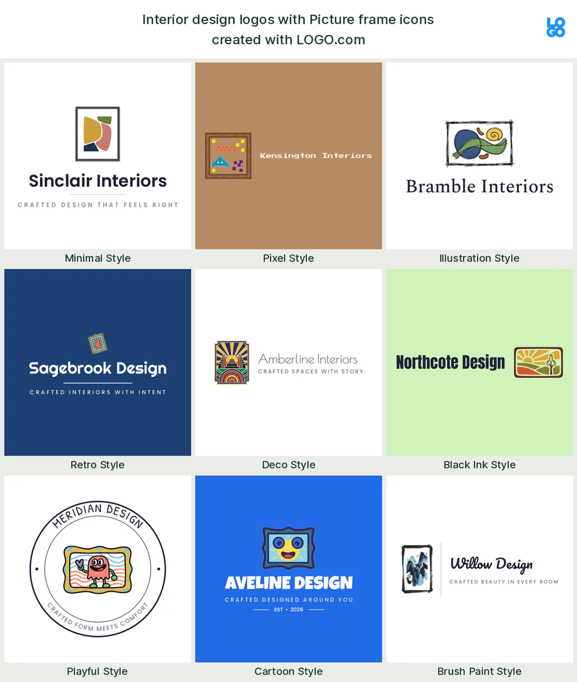
Picture frame
Next comes framed wall art, a picture frame or an abstract canvas. It points to the styling and finishing side of the work, the part clients see last, so it fits a decor, art advisory, or gallery leaning interior design logo.
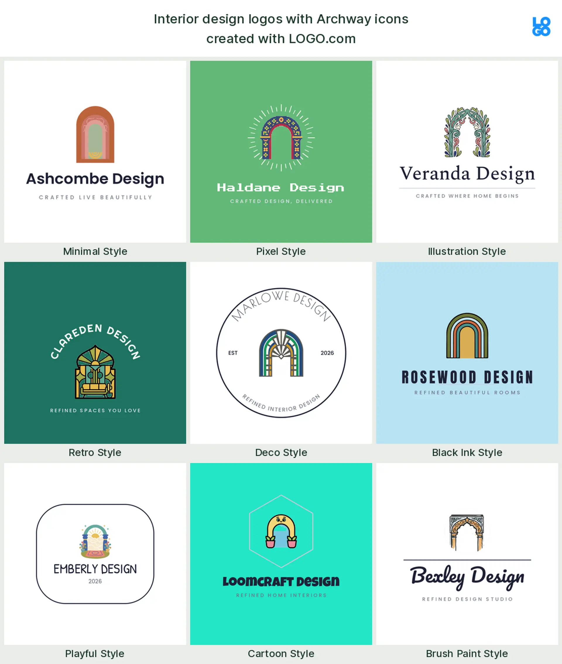
Archway
A little further down, designers describe an arch or a doorway. An archway borrows a sense of architecture and permanence, which gives an established, editorial feel that works well for a high end or luxury interior design logo.
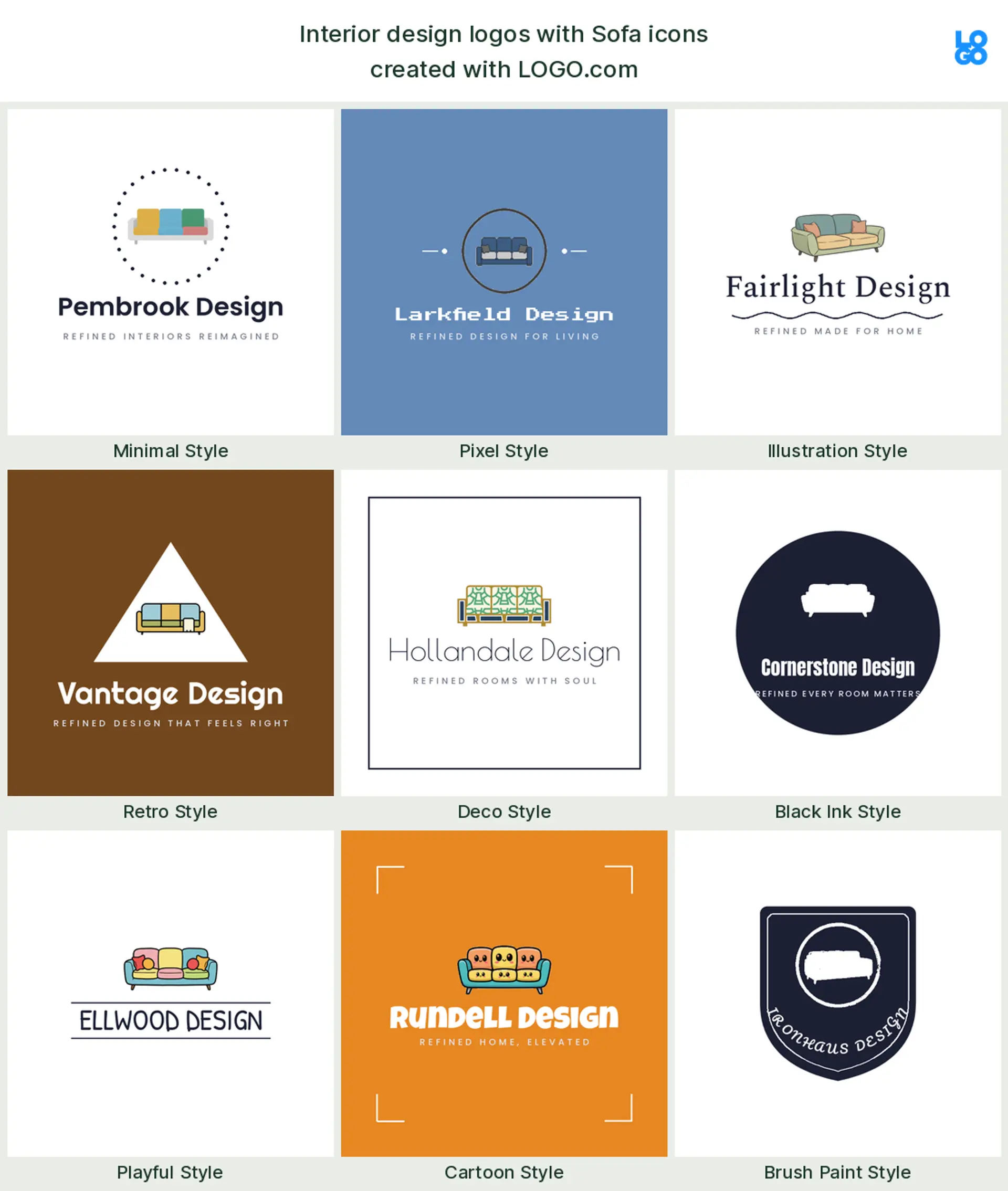
Sofa
The sofa turns up next, the bigger cousin of the armchair. A low, modern couch reads relaxed and contemporary, a friendly choice for a furniture logo or a studio that specializes in living rooms and lounges.
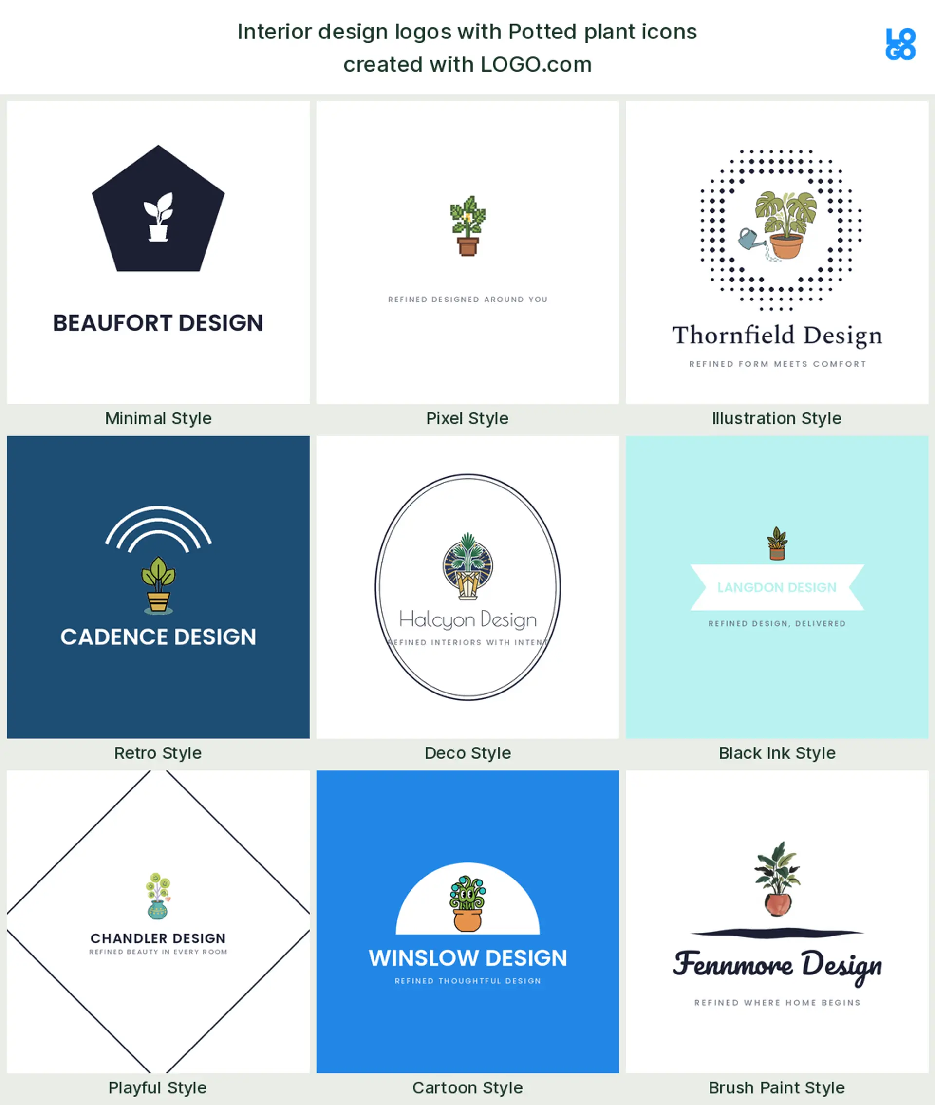
Potted plant
The potted plant is the everyday symbol of a lived in, cared for space. Founders reach for it when they want to look approachable rather than austere, so it makes a warm styling or home decor logo.
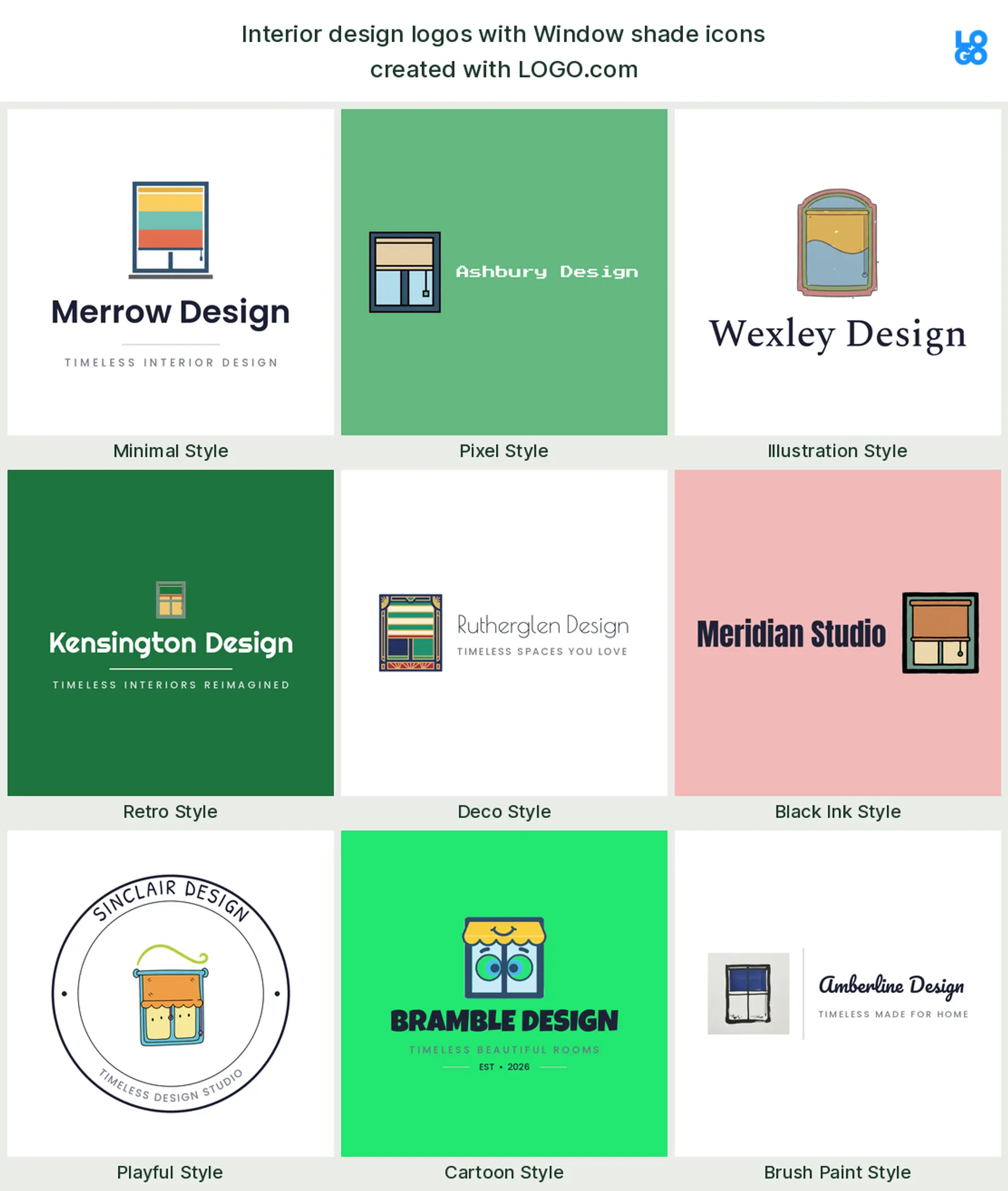
Window shade
Last in the set is the window, often paired with a shade or blind. It is the shorthand for light and how a room feels through the day, a tidy mark for a window treatment, drapery, or soft furnishings interior design logo.
Fifteen interior design logo ideas from real founder prompts
These fifteen are the exact icon descriptions designers, decorators, and furniture makers typed into LOGO.com, shown across the nine styles so you can watch each one shift from clean and minimal to bold and modern. They build on the plain top nine but carry a little more character, and any of them can hold your name. Treat them as interior design logo ideas to start from, then change the color, font, and wordmark until the mark fits your studio.
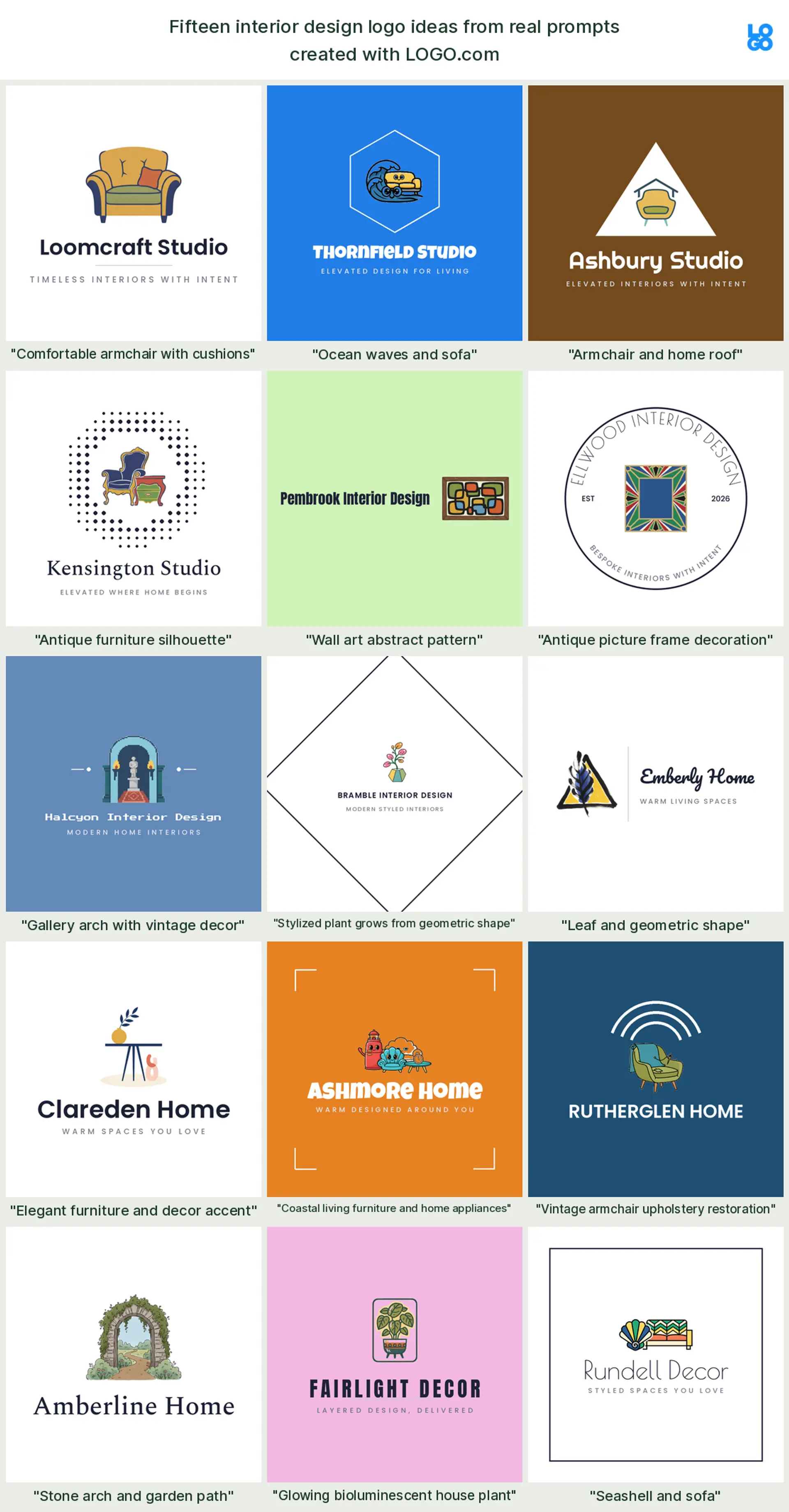
"Comfortable armchair with cushions"
A founder favourite, one soft armchair piled with cushions, reads as comfort and considered styling in a single mark. It makes a warm, inviting interior design logo for a studio that leads with living spaces.
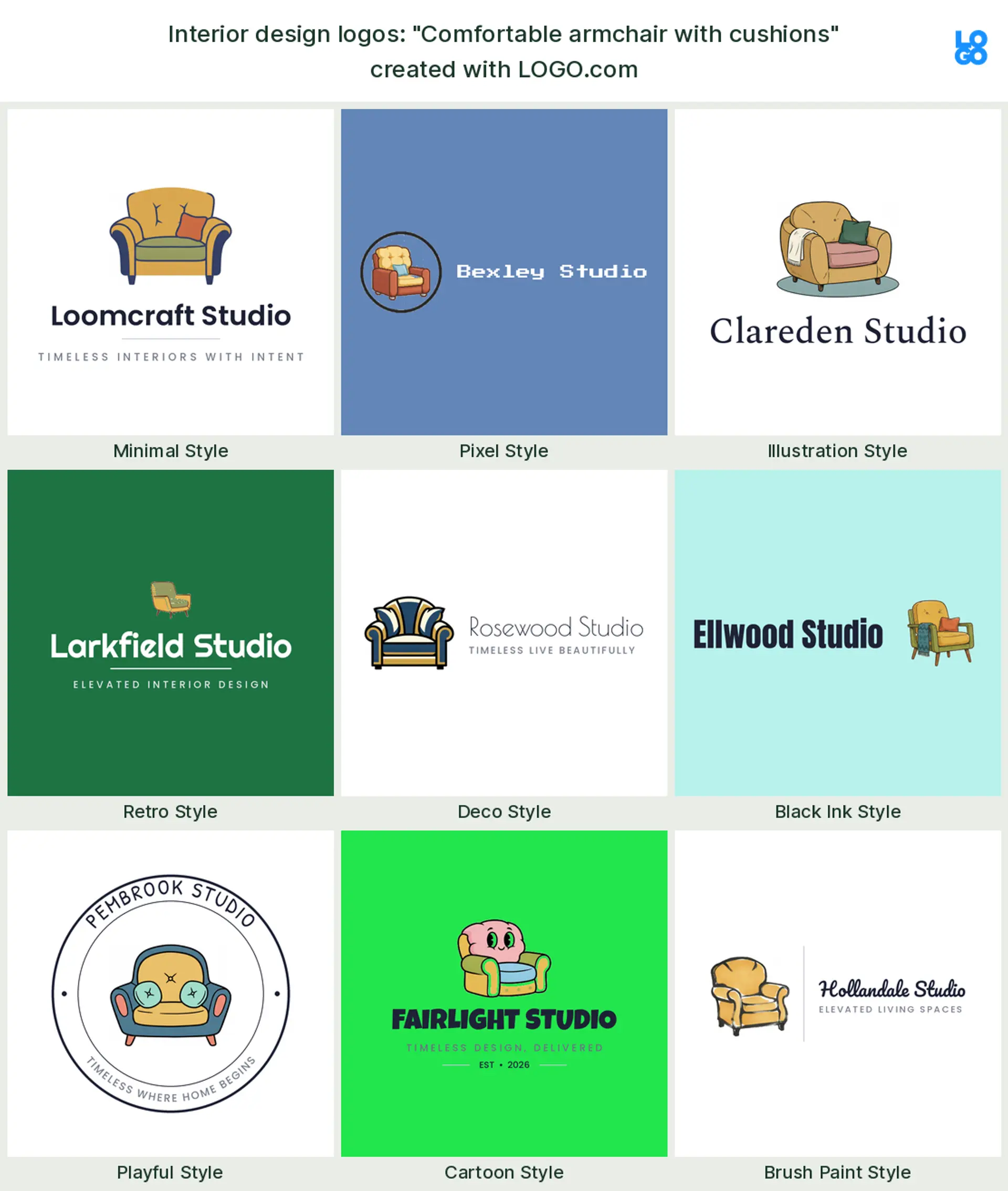
"Ocean waves and sofa"
Set a low sofa against a cresting wave and you get relaxed, coastal ease, exactly as one founder pictured it. It suits a beach house or coastal interior design logo.
"Armchair and home roof"
Tuck an armchair under a simple roofline and the logo says comfort at home in one glance, a real founder prompt. It reads as a friendly residential interior design logo.

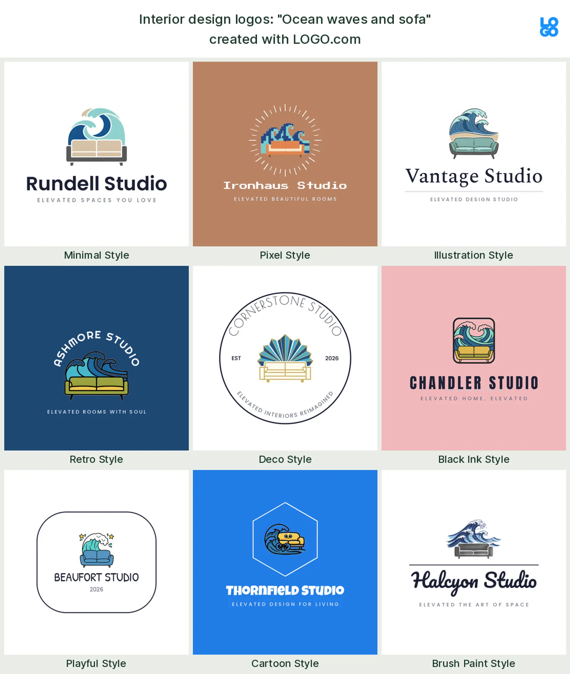
"Antique furniture silhouette"
A single furniture silhouette, a dresser or console in profile, carries craft and heritage without a word. It is an elegant furniture logo for a studio that loves vintage pieces.
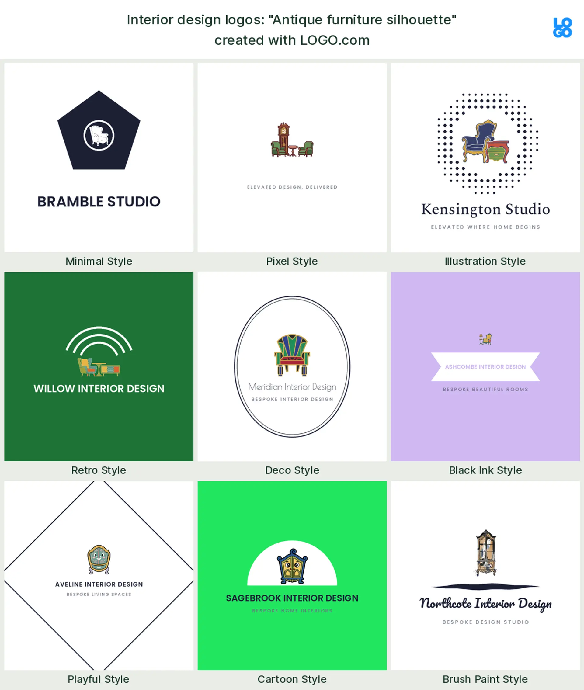
"Wall art abstract pattern"
A framed abstract pattern points straight at styling and finishing, the part clients remember. It makes a creative, gallery leaning interior design logo or decor logo.
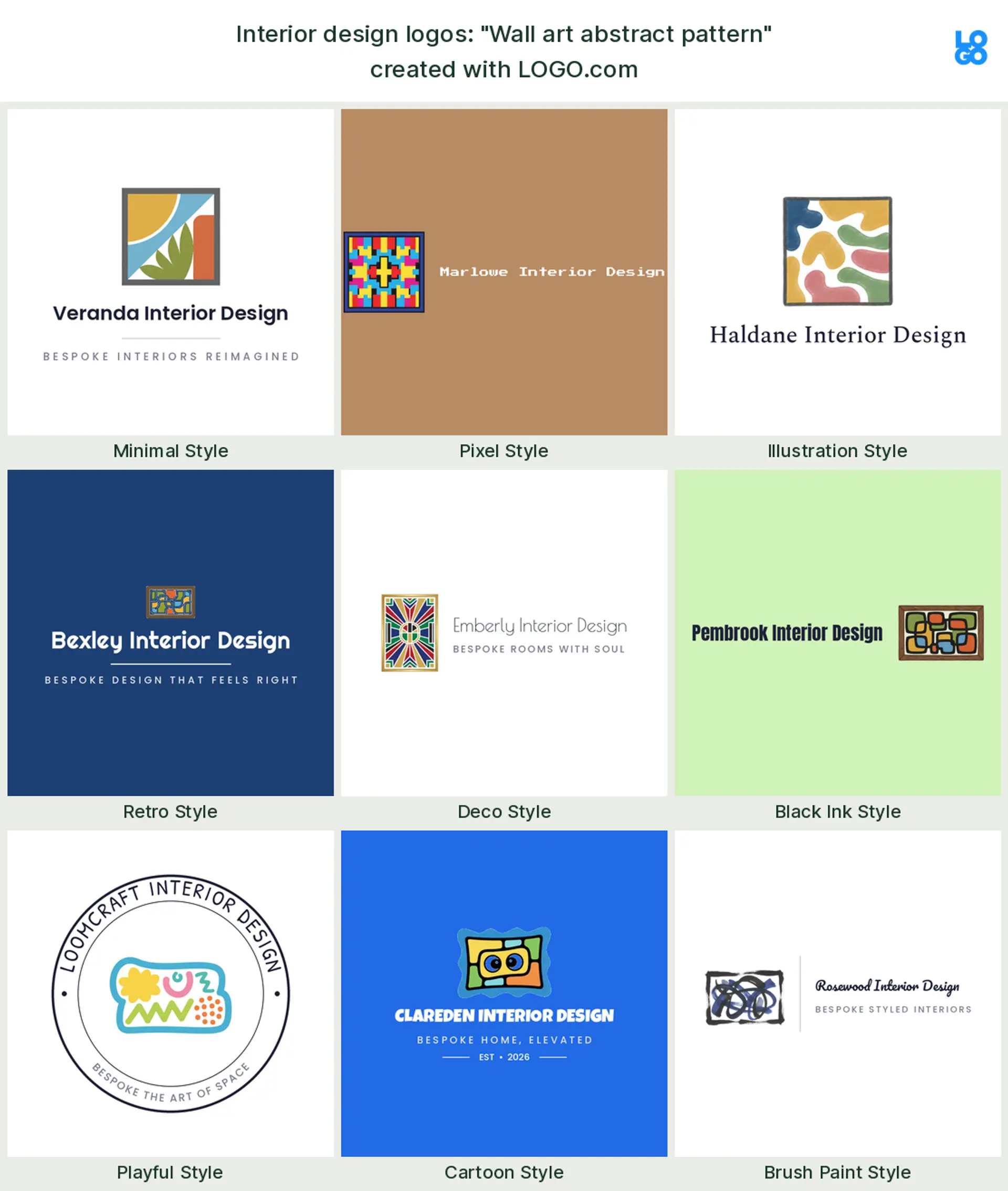
"Antique picture frame decoration"
An ornate frame around your initials feels curated and collected, just as a founder described it. It suits a high end decor or art advisory interior design logo.
"Gallery arch with vintage decor"
Frame the mark in a gallery arch and you borrow the calm of a well hung room. A founder typed this, and it makes an editorial, luxury interior design logo.
"Stylized plant grows from geometric shape"
A leaf rising out of a clean geometric shape balances nature and structure, a modern founder prompt. It reads as a fresh, biophilic interior design logo.
"Leaf and geometric shape"
One leaf paired with a simple geometric form is about as minimal as an organic mark gets. It works as a calm, contemporary interior design logo for a pared back studio.

"Elegant furniture and decor accent"
Pair a refined piece of furniture with a small decor accent and the logo says full service styling. It suits a studio that handles both the big pieces and the finishing touches, a rounded interior design logo.
"Coastal living furniture and home appliances"
A founder prompt for a breezy, coastal home look, furniture and easy living combined. It makes a relaxed vacation home or coastal interior design logo.
"Vintage armchair upholstery restoration"
A classic armchair mid restoration names a specialty plainly, exactly as a founder wrote it. It is a characterful upholstery or furniture restoration logo.
"Stone arch and garden path"
A stone arch opening onto a garden path stretches the work from indoors to out, a founder prompt made for it. It fits an interior and outdoor living, or landscape leaning, design logo.
"Glowing bioluminescent house plant"
A softly glowing potted plant gives an ordinary symbol a modern, memorable twist, just as a founder imagined. It makes a distinctive plant led interior design logo.
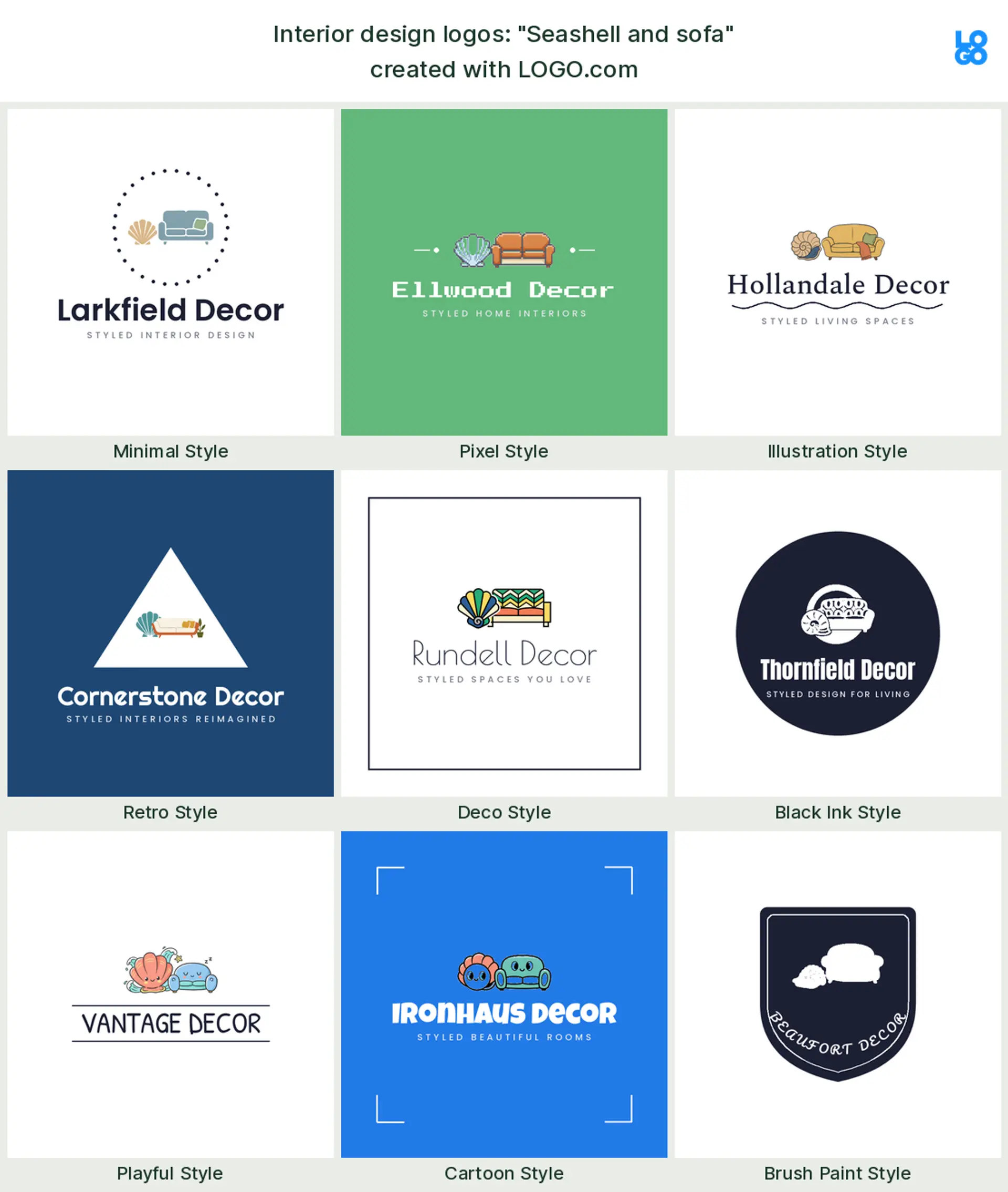
"Seashell and sofa"
A seashell resting beside a sofa keeps things soft, natural, and coastal, a gentle founder prompt. It reads as a warm, textured interior design logo.
A symbol, a monogram, or just your name?
This is the fork most designers hit first, and interior design leans a particular way. Plenty of the field's most admired studios use no picture at all, just a refined set of initials or a clean wordmark, because in a taste driven business your name is the brand. A small symbol, a chair, a leaf, an arch, adds warmth and tells a first time visitor what you do, which helps a newer studio. A monogram of your initials feels boutique and grown up, and it scales down beautifully to a website favicon or a stamped invoice. If you want to look established and let the work speak, reach for a monogram or a wordmark. If you want a little instant warmth, add one quiet symbol and stop there, because an interior design logo looks most expensive when it is doing the least.
Make it look luxury without making it look busy
A luxury interior design logo is almost always the restrained one in the room. If you want the mark to read high end, give it room to breathe, use one confident color plus a neutral, and pick type with a bit of quiet elegance, a fine serif or a light, well spaced sans. Thin, even letter spacing reads expensive, while a crowded badge with a symbol, your full name, and a tagline all fighting for space reads cheap. Skip drop shadows and gradients. A single elegant initial in a calm color, framed by white space, will always feel more premium than a detailed icon, which is why so many top studios keep their interior designer logo down to a monogram and a whisper of a line.
Residential, commercial, or home staging: match the mark to your work
Let the logo say what kind of spaces you shape. Design homes for people to live in? A soft armchair, a sofa, or a simple house outline makes a warm residential interior design logo. Fit out offices, restaurants, and hotels? Lean structural with an arch or a clean geometric mark for a confident commercial interior design logo. Stage homes for sale? A crisp house outline and a tidy wordmark read fast and photograph well for a home staging logo. Sell or restore furniture? A single piece in silhouette makes a clear furniture logo. And if you run a full studio, a monogram keeps you flexible as the work spans all of it, so you are not boxed into one room. Pick the corner you are known for and build the mark around that one idea.
Colors and fonts that read calm, warm, and elevated
Color sets the mood before a client reads a word, so choose it on purpose. When we looked at the palettes interior design and furniture founders actually picked on LOGO.com, green led, with a calm blue close behind and warm browns and a soft terracotta not far off. That tracks with how the best rooms feel: a sage or olive green reads natural and grounded, a muted blue feels serene, and a warm wood brown or clay adds the handmade, lived in touch buyers love. For type, a light serif feels timeless and gallery ready, while a clean, airy sans reads as a modern interior design logo. Keep it to one color plus a neutral, add generous white space, and let the restraint do the signalling.
What an interior design logo costs, and where you can use it
Getting started costs nothing. Designing and previewing your logo on LOGO.com is free, and you can download a high resolution PNG with full commercial use without paying, so a new studio can brand its website, proposals, and social profiles right away. When you want the logo printed large and crisp, on a shopfront, a fabric label, or a signage panel for a showroom, the Brand Plan adds the vector files, unlimited edits, and a full brand kit that keeps every mood board and invoice on brand. Commercial use comes with both the free and paid downloads, so you never pay simply to use your own interior design logo on client work.
Make your interior design logo with LOGO.com
Pick the symbol that fits your work, choose one of nine styles, and our free interior design logo maker builds the rest around your studio name. Preview it free, download a high resolution PNG with full commercial use, and walk out with one calm, considered mark ready for your website, your mood boards, and your business cards in minutes.
Methodology. These figures come from logos created on LOGO.com during the 12 months ending July 2026. Because interior design is a smaller field in our data than, say, restaurants, we widened the lens to the roughly 251 founders who selected an interior design industry, along with the furniture and home decor founders alongside them, and grouped the 53 interior focused icon descriptions they wrote by concept. The armchair was most common, in about 26 percent of the descriptions, followed by a house outline in about 25 percent and antique furniture in about 13 percent. Because many logos combine two symbols, these shares overlap and do not add up to 100. Figures are rounded to the nearest percentage point. Source: LOGO.com first party product data, July 2026.
THE #1 LOGO GENERATOR
Why LOGO.com is the best interior design logo maker
1.Ranked from what real interior designers choose
The symbols and styles come from the icons real interior design and furniture founders described on LOGO.com, so you start from what works, not generic clip art.
2.A polished mark ready in minutes
Enter your studio name, pick a symbol and a style, and you have a finished interior design logo in minutes, not weeks of back and forth with a designer.
3.Sharp on a mood board and a business card
Your mark stays elegant on a large studio sign and on a small business card, where thin lines and fine detail usually vanish.
4.Transparent PNG for decks and proposals
Download a transparent logo that drops cleanly onto a mood board, a client proposal, or an invoice with no white box around it.
5.One mark for your site, cards, and socials
Design it once and it carries across your website, business cards, project decks, and your Instagram grid.
6.Full color or a single, understated version
Choose a full color icon or a quiet single color version that reads as a luxury interior design logo on a stamped invoice or a fabric label.
7.Nine styles, minimal and timeless to bold
Match your taste, from a fine serif monogram for a luxury studio to a clean modern mark, all built to read small.
8.A monogram and a full wordmark to match
Keep a compact monogram of your initials and the full studio name, so you have the right version for a favicon and a signage panel.
9.Free to design, yours to sell with
Preview free and download a high resolution PNG with full commercial use, then upgrade to the Brand Plan for vector files to print signage and labels.
Interior Design Logo Maker FAQs
Need Inspiration? See example brands in your industry...
3D3D DesignAbstractAcademic EducationAcademic WritingAccessoriesAccommodationAccountantAdventure TourismAdvertising AgencyAerospace EngineeringAestheticsAffordableAgricultural ConsultingAgricultureAgriculture BlogAgriculture CompanyAirplaneAlternative MedicineAmazonAnimalAnimal BlogAnimal ProtectionAnimal and PetsAnimalsAnimationAnime Logo MakerApartmentApp DevelopmentApplicationAppraisal ServicesAquacultureArchitectureAriesAromatherapyArrowArtArt and DesignArtificial IntelligenceArtistArtsArts & CraftsArts EducationAsian RestaurantAssociationAstrologyAthleticsAttorney FirmAudio ServicesAudio Technician