Technology Logo Maker
Design a technology logo that works on your website and your products.
Need a different logo maker? Try our AI logo generator.
Logos created using LOGO.com
670,000,000
Circuit, chip, and engineering technology logos
Network, support, and innovation technology logos


Device, optics, and data technology logos

Technology Logos, Ranked From Real Brand Data
According to LOGO.com data, the most common technology logo icons are the circuit board (about 22% of icon descriptions), connected network nodes (about 9%), and the gear (about 5%). One clean symbol and a confident company name carry most of a technology logo.
The nine styles below come from those real logos, so whether you build hardware, run IT services, or ship software, you start from what people already read as technology rather than a blank canvas. Recolor any direction, drop in your name, and you have a technology logo design ready in minutes.
On this page
- What do hardware and IT founders put on a technology logo?
- Mix the symbols: fifteen technology logo directions from real prompts
- Hardware, IT services, or an engineering firm: match the mark to your kind of tech
- Make it read on a device, a spec sheet, and a trade show booth
- Show the circuit, the connection, or the machine?
- Make your technology logo with LOGO.com
Technology is a huge tent. It covers the hardware startup soldering its first board, the IT company keeping a town's servers online, the electronics brand shipping gadgets, and the engineering firm drawing up the next bridge. We read 350 real icon descriptions that technology founders typed into LOGO.com, and one thing jumped out: the same short list of symbols keeps coming back. This page ranks those symbols and turns the most popular into fifteen technology logo ideas you can recolor and make your own.
What do hardware and IT founders put on a technology logo?
Nine symbols carry almost all of it. About 22% of the 350 icon descriptions we read asked for a circuit board, connected network nodes came in around 9%, and the gear around 5%. Behind those sit the shield, the smartphone, the cloud, the lightbulb, the computer chip, and the globe. That is a short list for a very wide industry, so the difference usually comes from how you draw the symbol rather than which one you pick.

1. The circuit board
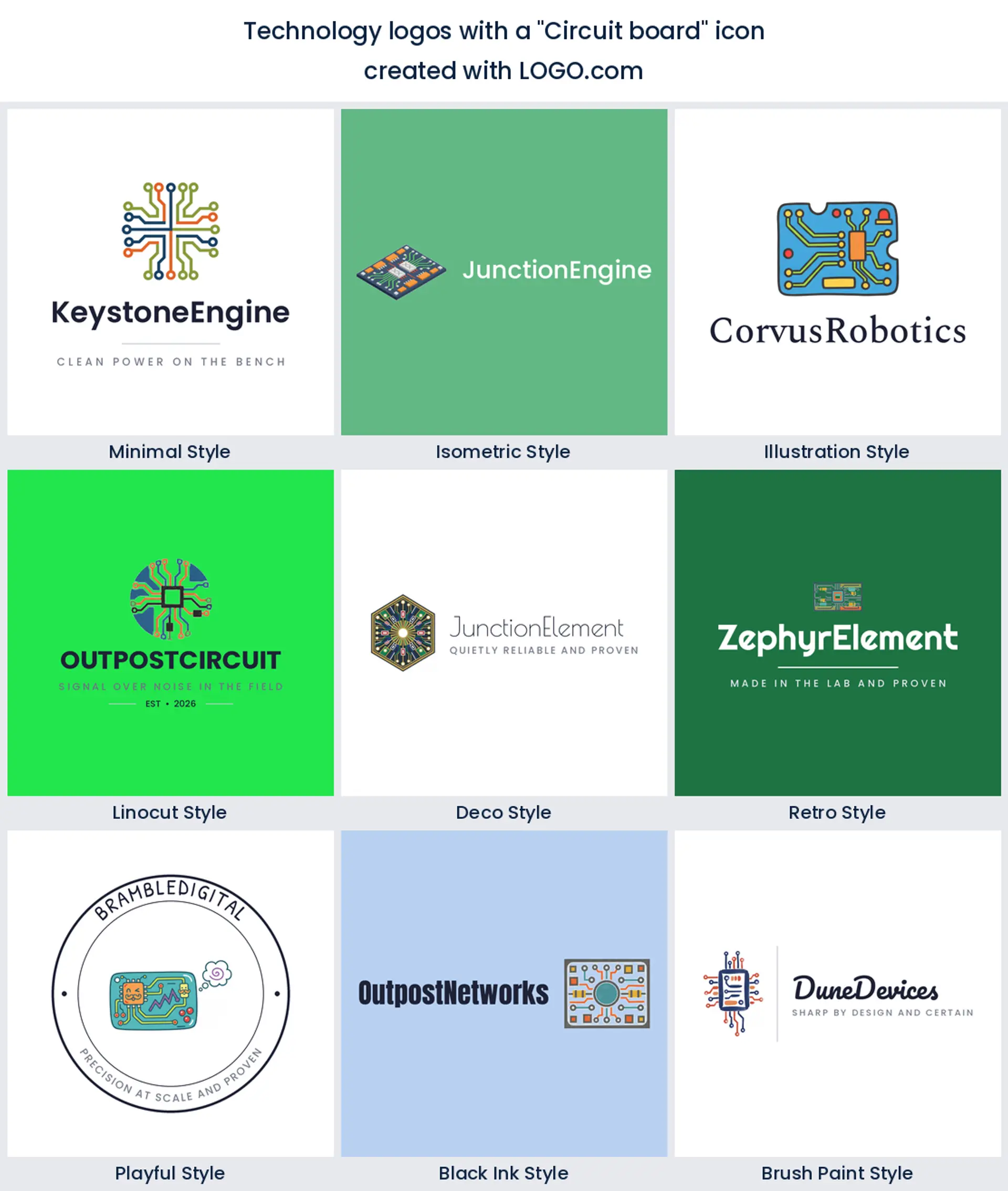
Almost a quarter of the technology logos we read, about 22%, were built around a circuit board, which makes it the symbol founders grab first. Those clean traces and pads read as hardware and engineering in a heartbeat, so a circuit board is the safe, obvious pick for a hardware, electronics, or IT company logo.
2. Connected network nodes
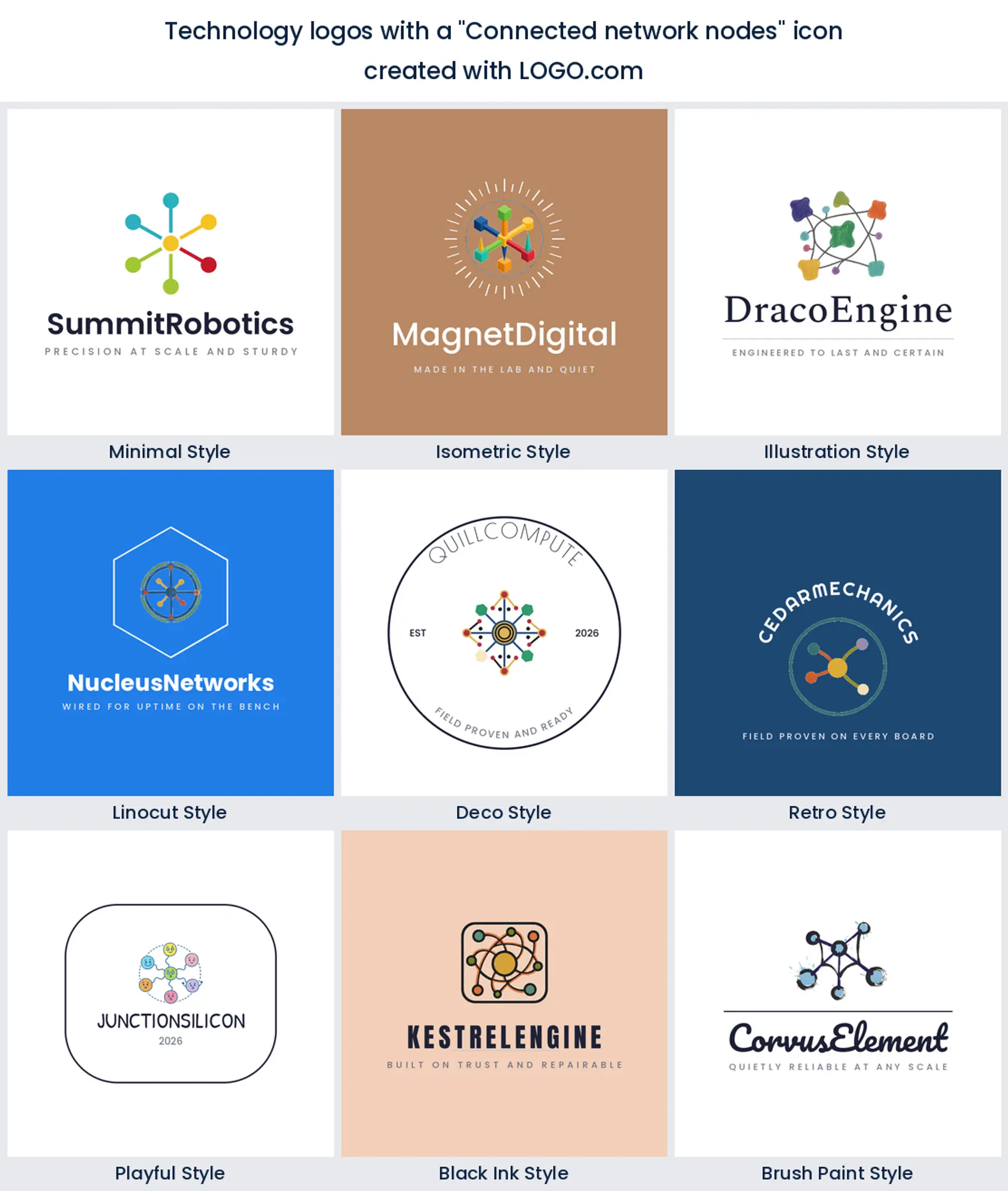
About 9% of what founders wrote described connected nodes, which puts them second. Dots joined by thin lines say infrastructure, uptime, and machines talking to each other, so they suit an IT services, networking, or information technology logo.
3. The gear
The gear takes third at roughly 5%. It leans mechanical and dependable, the natural fit for an engineering firm, a systems integrator, or a general technology logo that wants to feel built rather than branded.

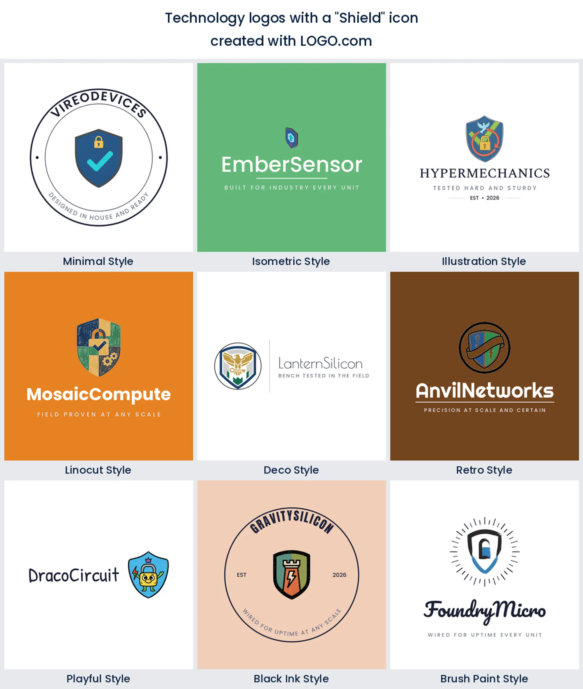
4. The shield
Once security is the story, founders draw a shield, and it sits fourth here. Fuse it with a circuit or a checkmark and you have a cybersecurity, data protection, or IT security logo that signals safe hands.
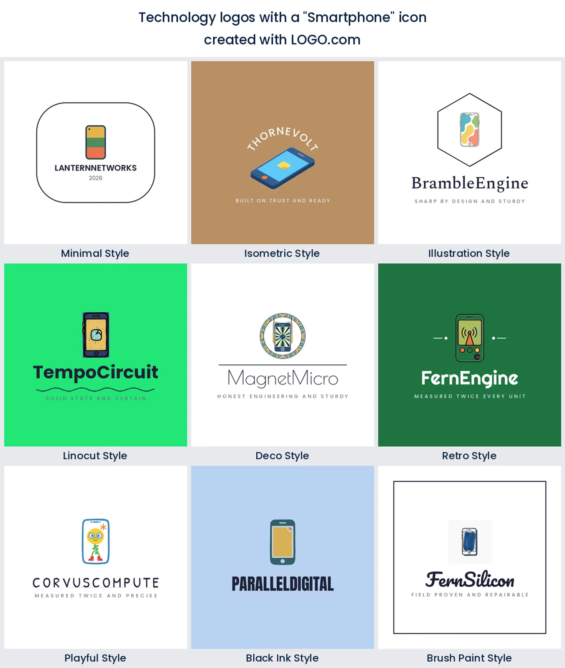
5. The smartphone
Fifth place goes to devices: phones, tablets, and smartwatches, usually mid charge or mid tap. Reach for one when what you make lives in someone's hand, like a consumer electronics, gadget, or mobile app company logo.
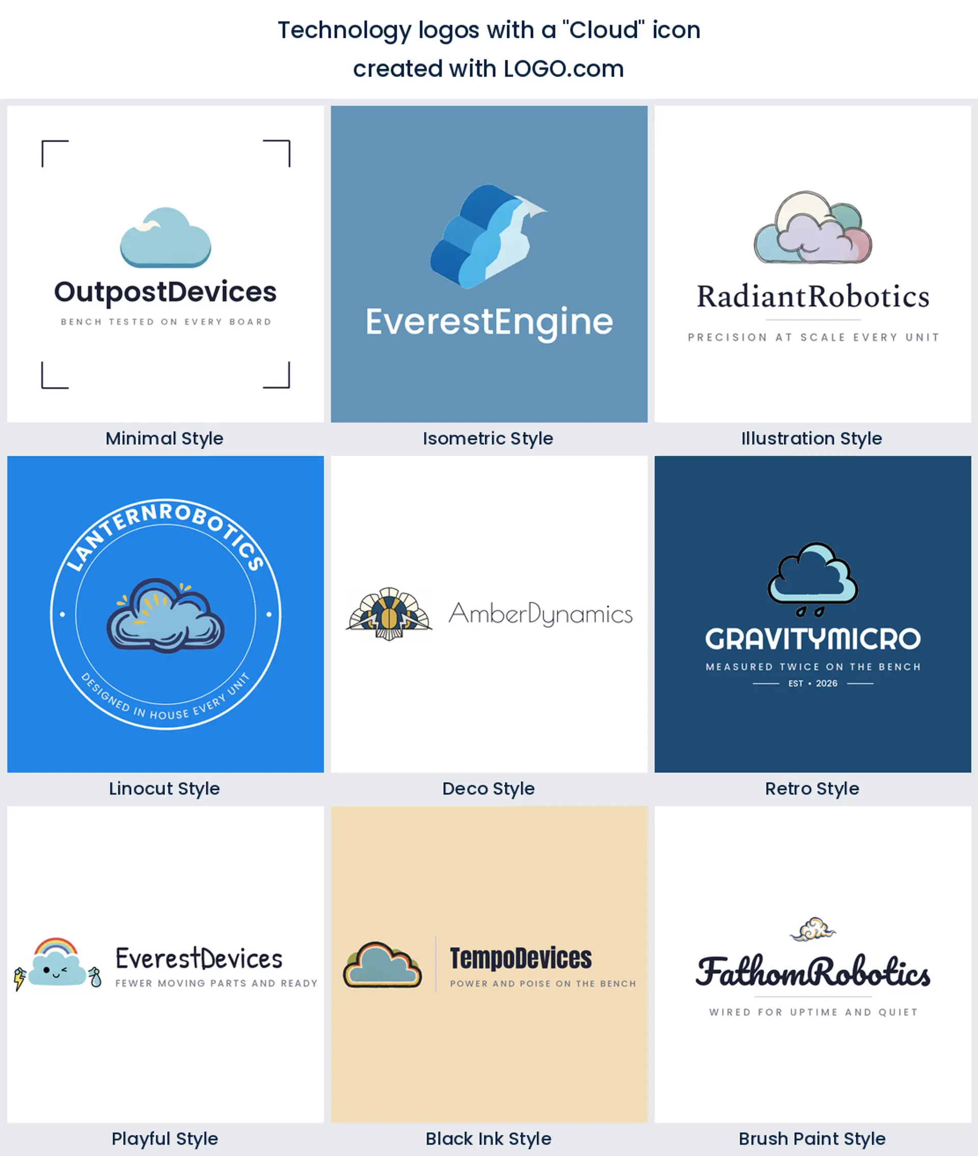
6. The cloud
In sixth, the cloud does a lot of explaining for very little ink. Drawn with a bolt, a lock, or a stream of data, it is made for a cloud computing, hosting, or software logo, and plenty of broad technology brands use it too.
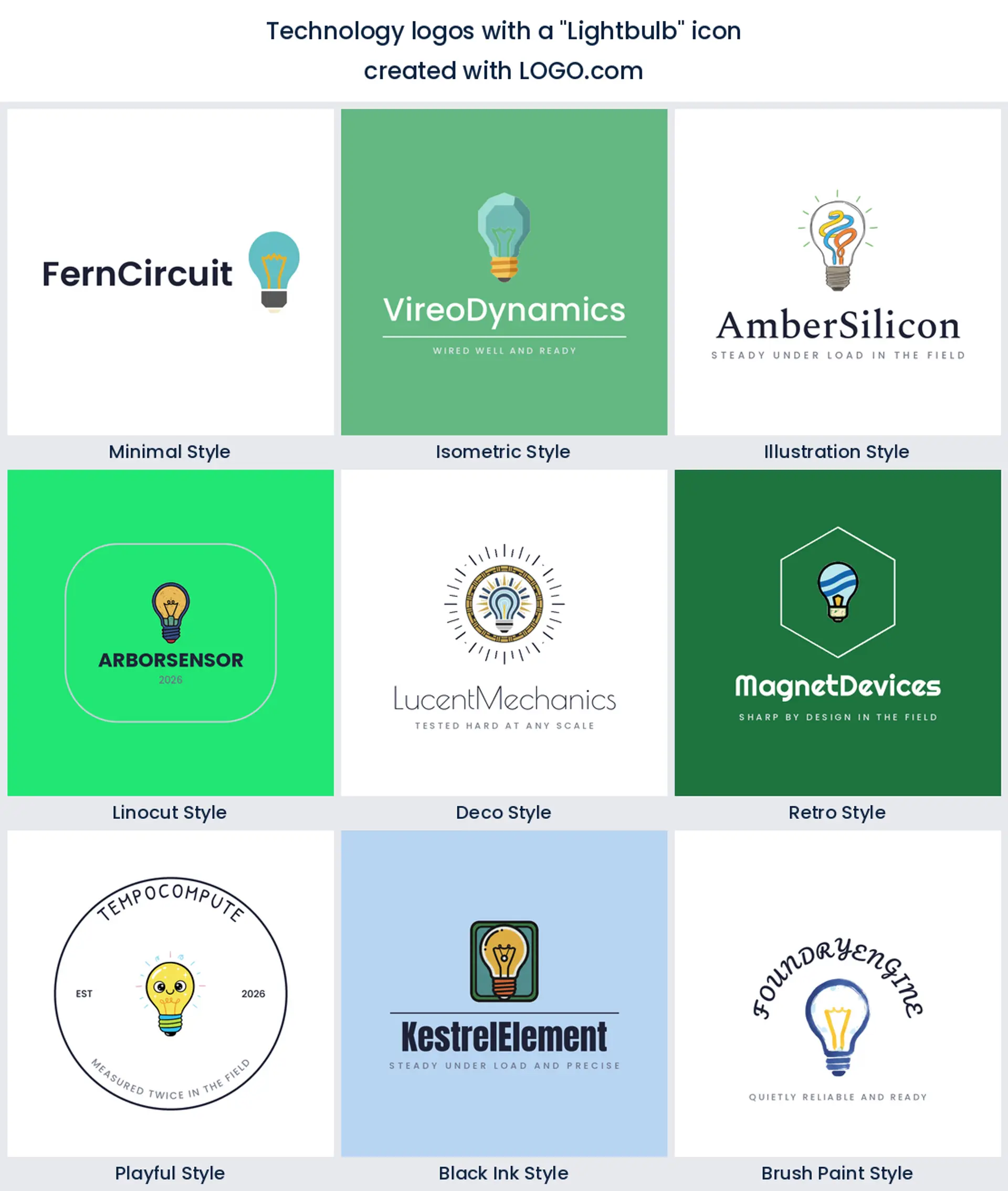
7. The lightbulb
The lightbulb edges ahead of the chip this year, and it turns up whenever a brand wants to lead with ideas rather than kit. Merge it with a circuit or a gear and it becomes an innovation, research, or tech studio logo without looking like a lighting company.
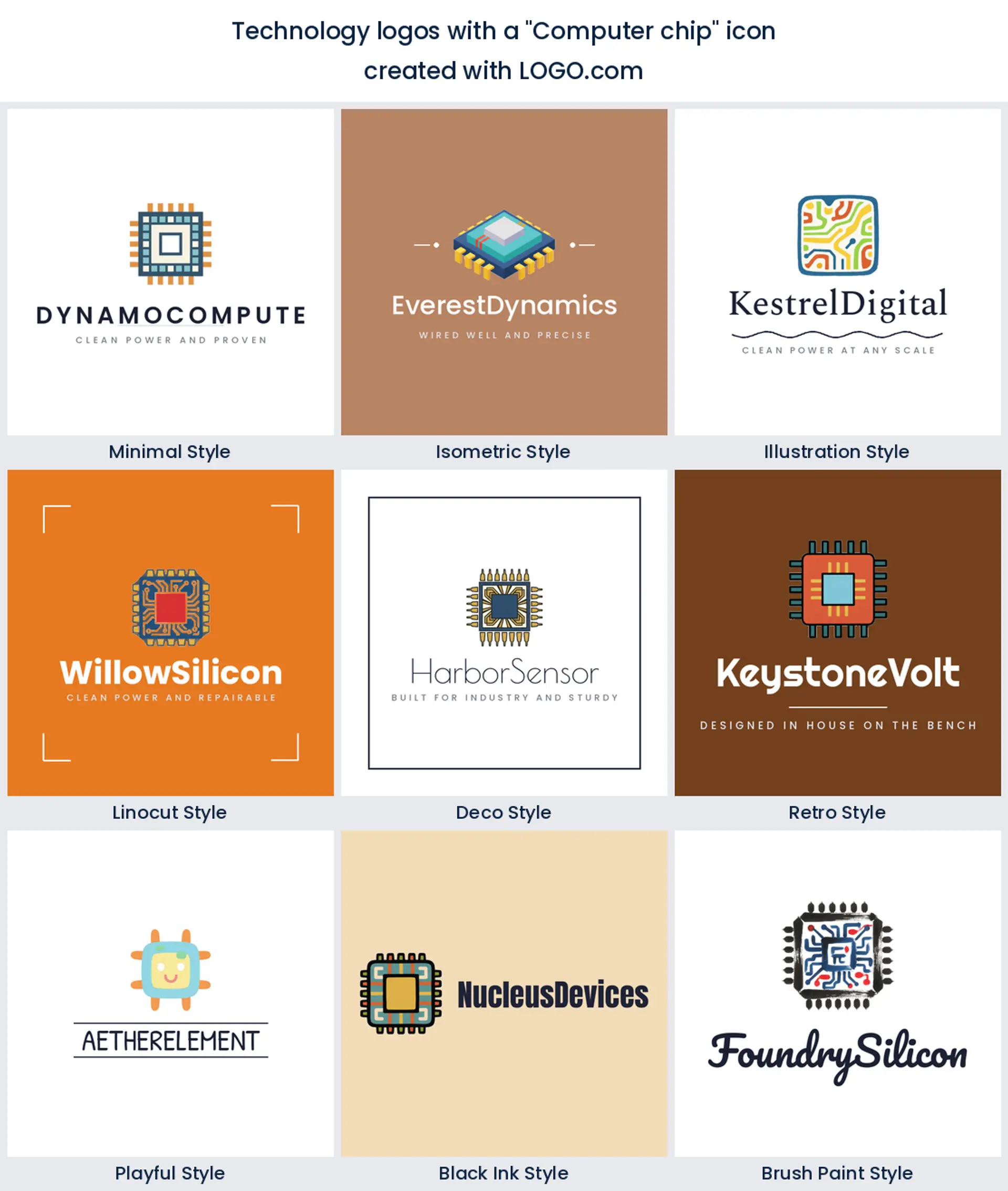
8. The computer chip
The single chip sits one place lower. Where a full board can get busy, one processor square with a few pins stays crisp at any size, which makes it a strong microchip, semiconductor, or computer hardware logo.
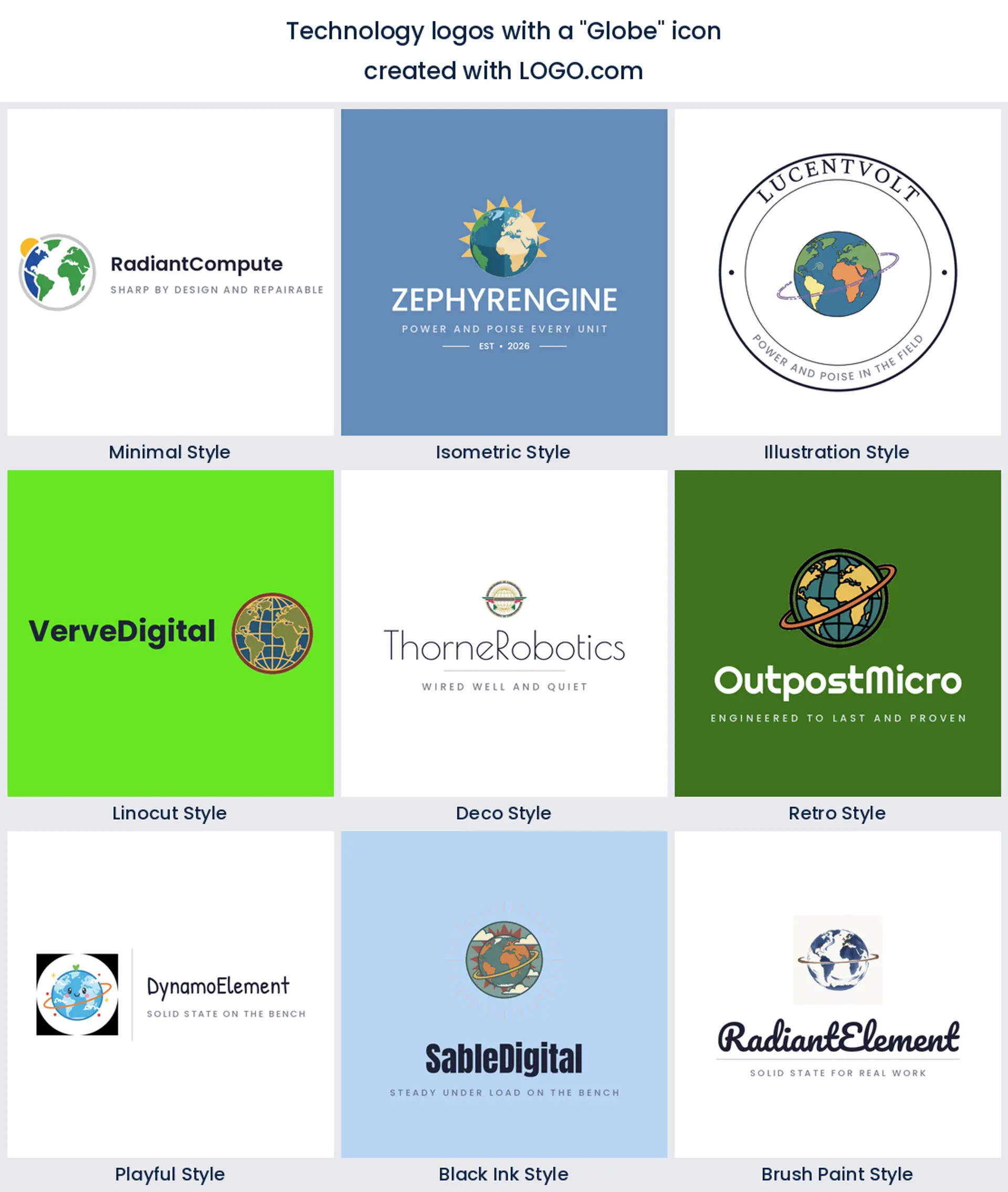
9. The globe
The globe closes the nine, often ringed with nodes or an arrow. It says reach and scale, so it works for a global technology, internet, or telecom company logo.
Mix the symbols: fifteen technology logo directions from real prompts
Everything under this heading was typed by somebody. These are real icon descriptions technology founders wrote in the LOGO.com prompt box, rebuilt across the nine styles so you can see one idea as a clean minimal mark, a carved linocut, and an isometric build. Pick the one closest to what your company actually does, then push the color, the type, and the name until it stops looking like research and starts looking like yours. Free technology logo inspiration, with the guesswork already done.
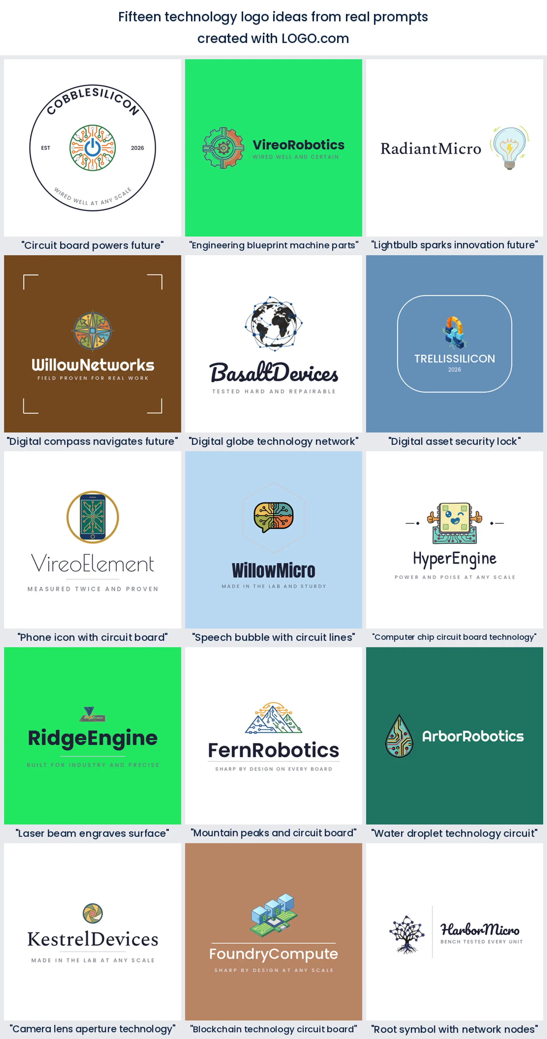
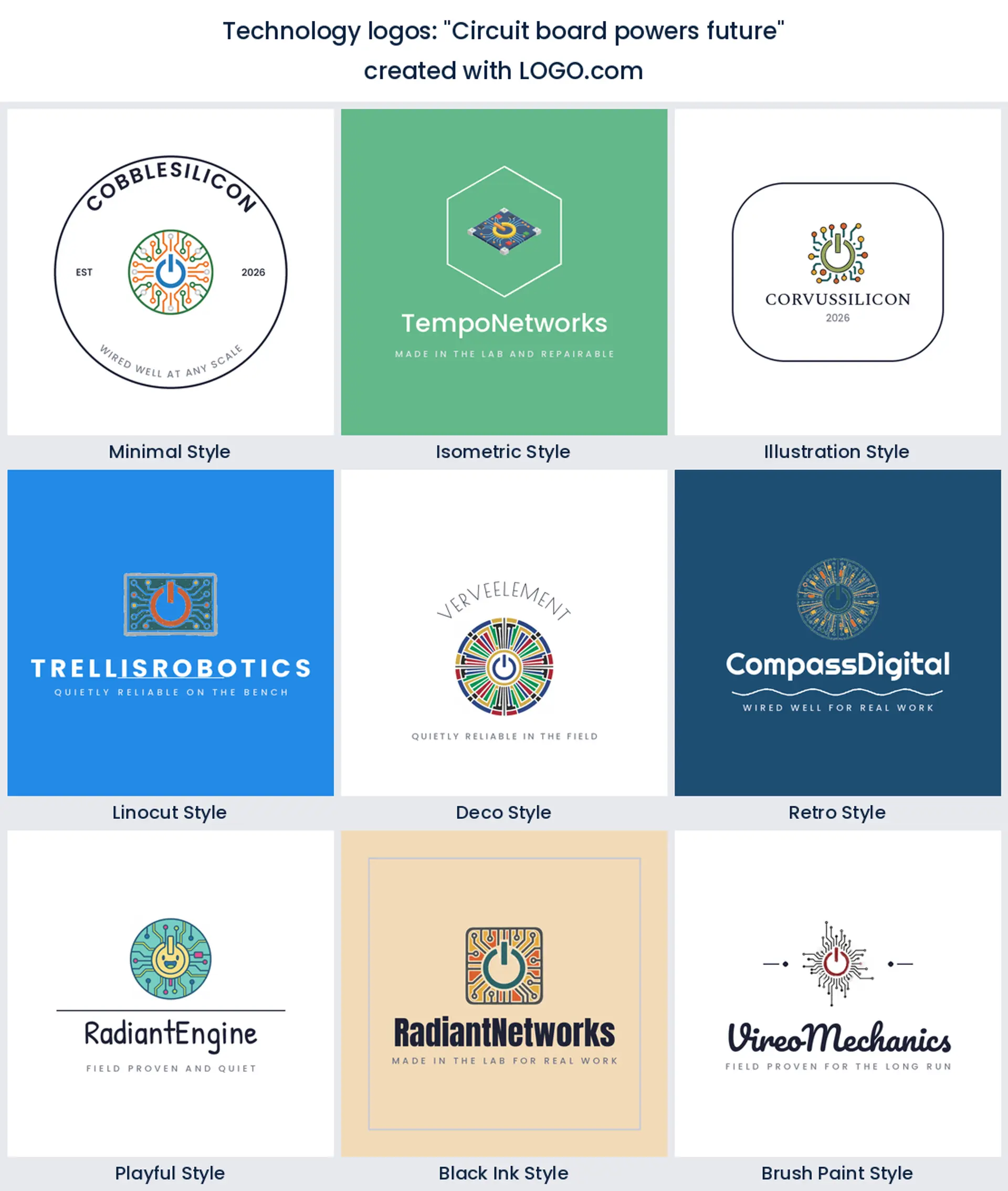
1. "Circuit board powers future"
A circuit board with a power symbol at its heart is about as on the nose as technology gets, in the best way. It reads energy and hardware at once, a clean fit for a power electronics or semiconductor logo.
2. "Engineering blueprint machine parts"
Founders on the engineering side of technology keep reaching for drafting language. Blueprint lines wrapped around a machine part read as measurement and tolerance rather than apps, so this one makes a confident mechanical engineering logo, and it works just as well as a civil engineering logo for a firm that builds real things.
3. "Lightbulb sparks innovation future"
A lightbulb wired like a circuit puts the idea first and the tech second. Use it for an R and D lab, a tech incubator, or an innovation studio logo that wants to feel bright rather than technical.

4. "Digital compass navigates future"
A compass rebuilt from circuit lines is a warm way to say you steer people through complexity. Founders typed this one when the product is advice as much as code, which makes it a natural IT consulting or information technology logo for a company clients lean on.
5. "Digital globe technology network"
A globe wrapped in a network grid signals reach without shouting. Reach for it if you run a telecom, a global IT company, or an internet service logo that spans more than one country.
6. "Digital asset security lock"
A padlock built from data blocks puts safety up front without reaching for another shield. If you protect files, payments, or accounts, this makes a clear cybersecurity or software logo, and it still reads when it shrinks to a browser tab.
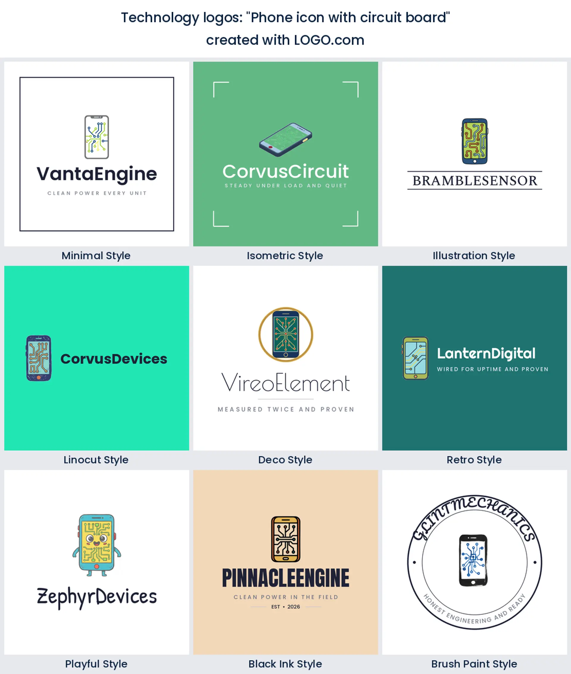
7. "Phone icon with circuit board"
A phone with circuitry showing through works for anyone whose product lives on a screen. It is a natural mobile technology or app development logo, friendly enough for consumers and precise enough for engineers.
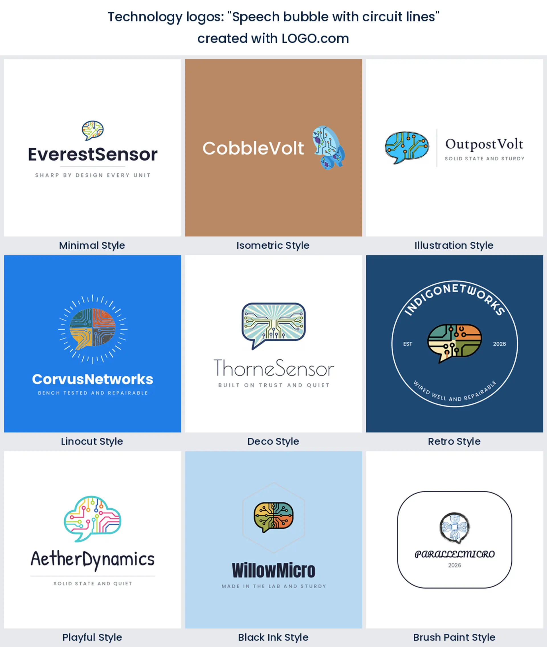
8. "Speech bubble with circuit lines"
Circuit traces running through a speech bubble turn support into a symbol. Use it if people talk to you before they use you, which makes it a friendly helpdesk, telecom, or IT services logo and a much warmer option than another cluster of nodes.
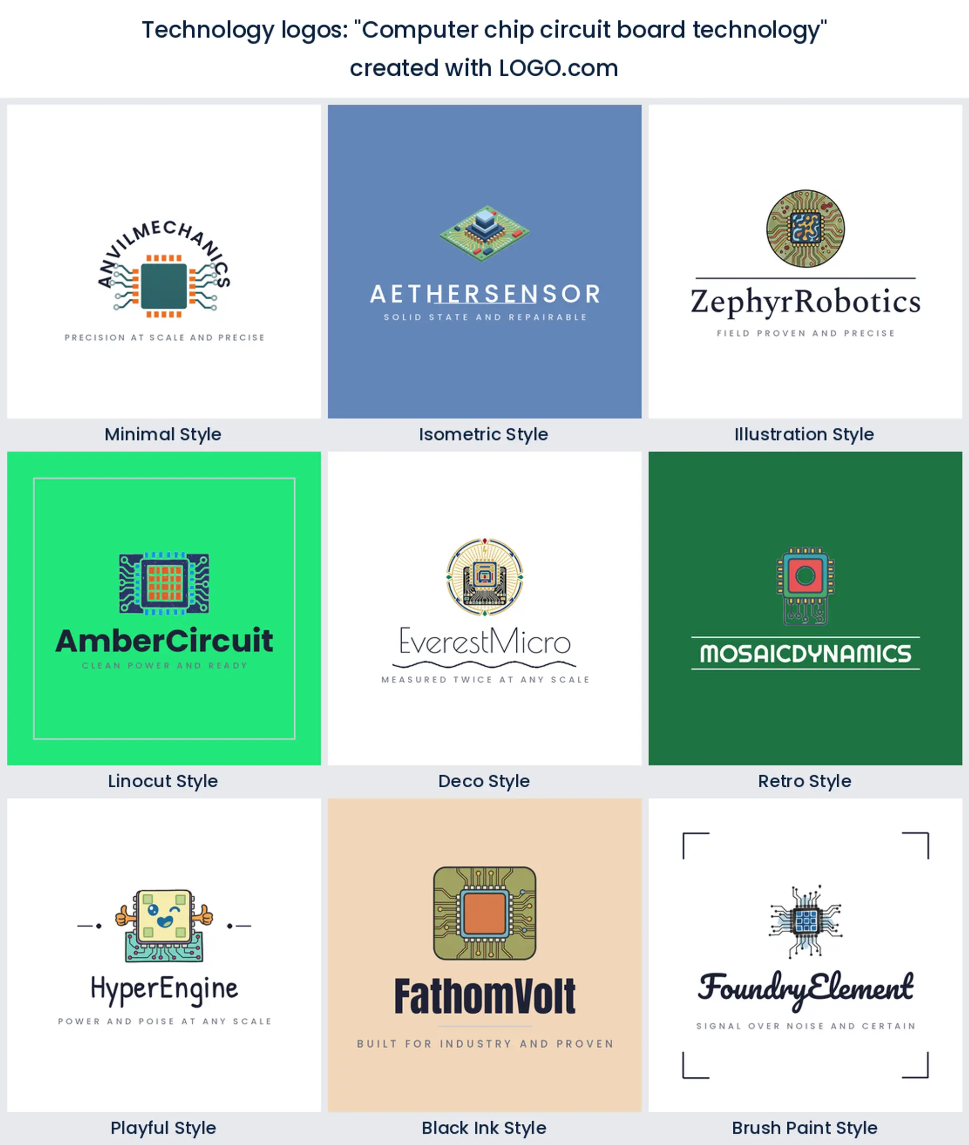
9. "Computer chip circuit board technology"
A chip sitting on a board is the heart of every device, so it brands hardware honestly. Use it for a semiconductor, computer hardware, or electronics logo where you want to look precise and modern.
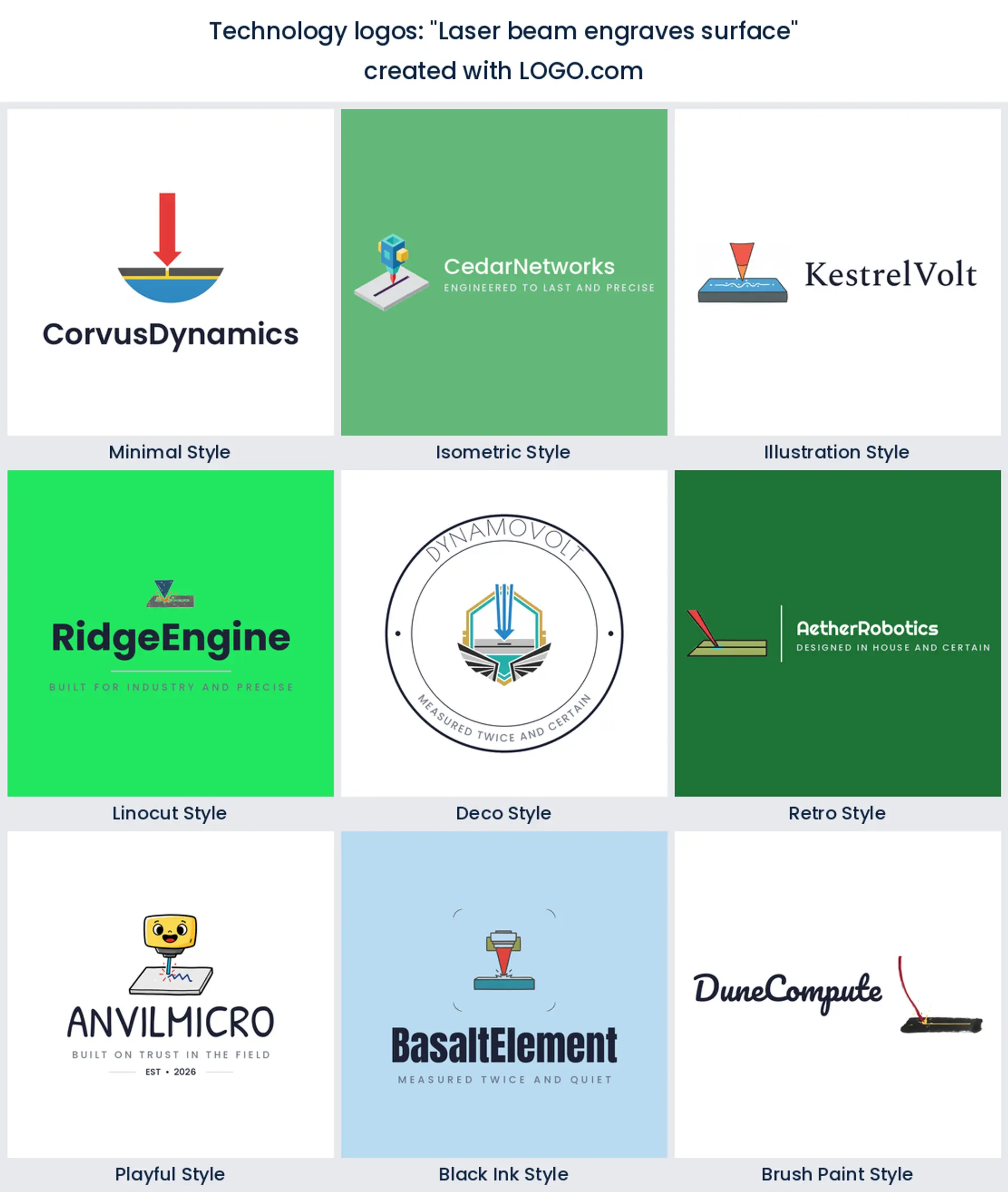
10. "Laser beam engraves surface"
This one came from founders who make things rather than apps. A beam cutting a clean line into a surface says precision out loud, so it suits an industrial technology or electronics logo for a shop that machines, engraves, or fabricates.
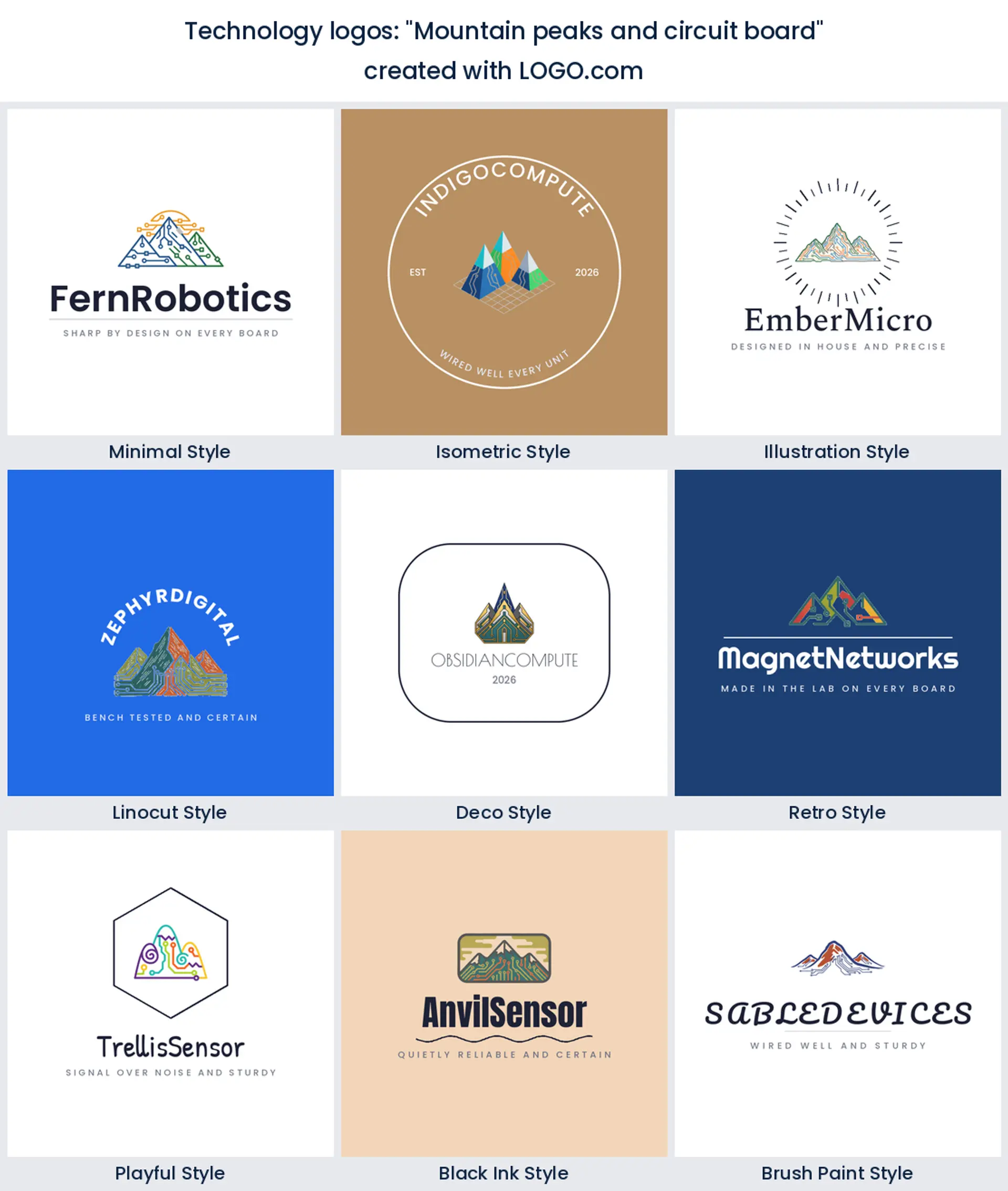
11. "Mountain peaks and circuit board"
Mountain peaks made of circuit lines mix ambition with hardware, a quietly different look. It suits a technology company logo that wants to feel like a climb, from a scrappy hardware startup to an established firm.
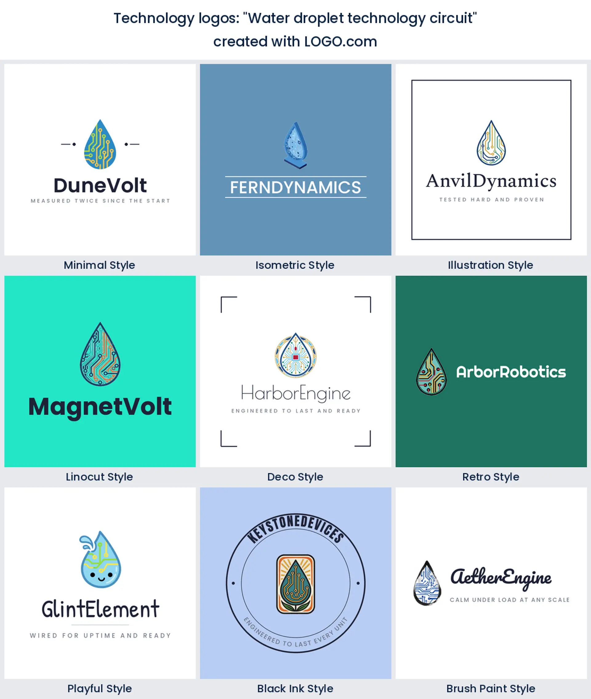
12. "Water droplet technology circuit"
A droplet threaded with circuitry is unexpected and calm, good when you want tech to feel clean and human. Think a water tech, clean energy, or environmental technology logo.
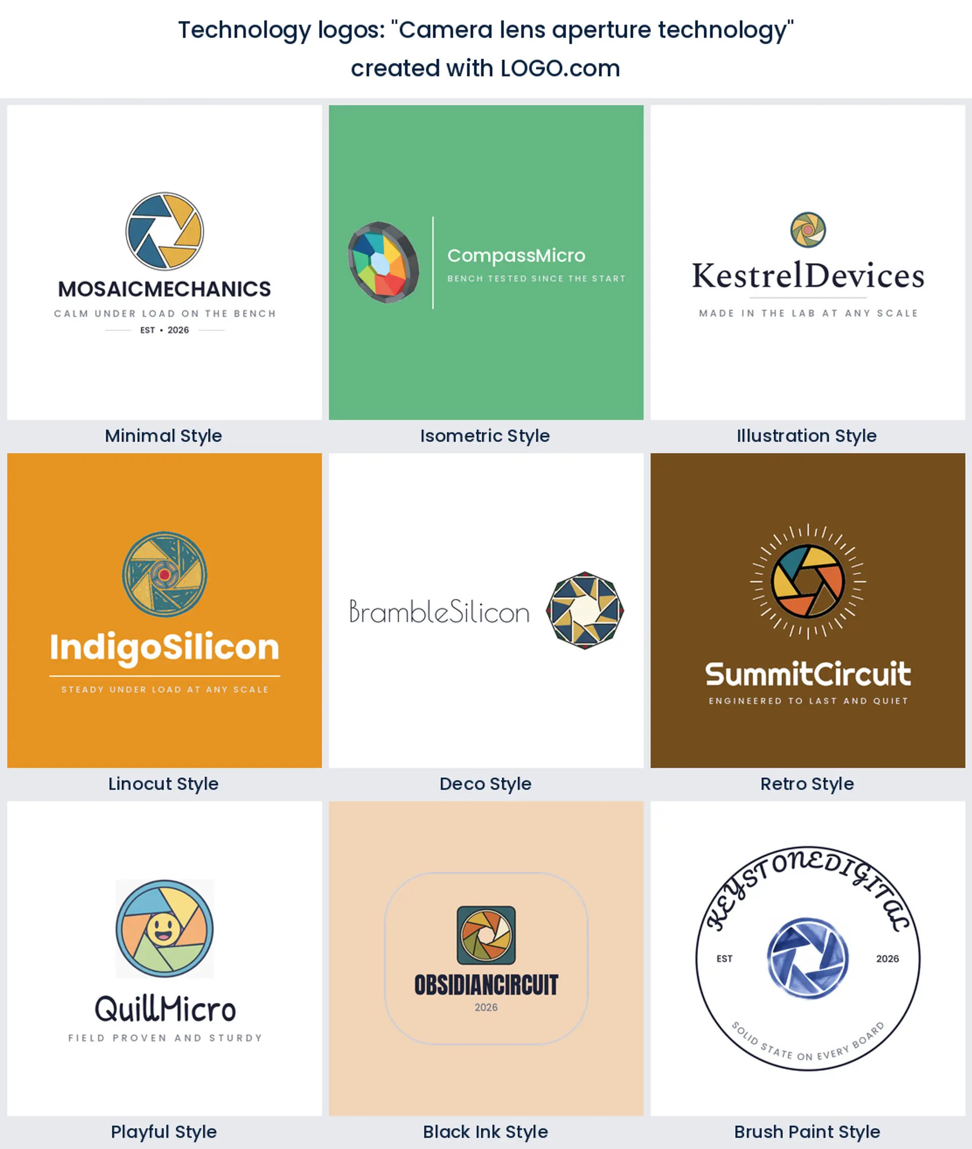
13. "Camera lens aperture technology"
An aperture built from precise blades reads optical and exact. It is a strong pick for a camera, imaging, or hardware technology logo where lenses and sensors are the product.
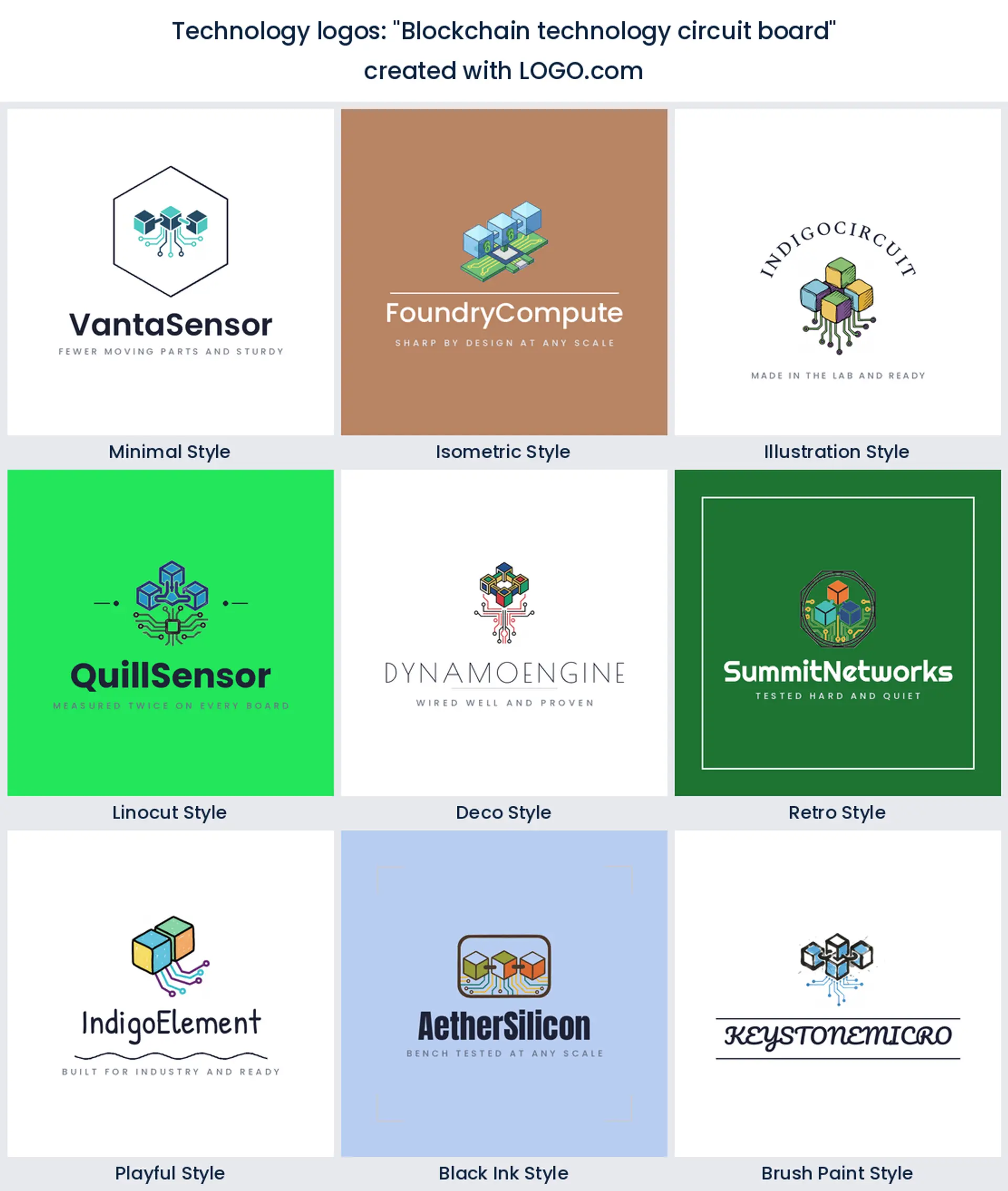
14. "Blockchain technology circuit board"
Linked blocks laid over a circuit spell out a ledger without a word. Use it for a blockchain, fintech, or digital logo that needs to look secure and current.
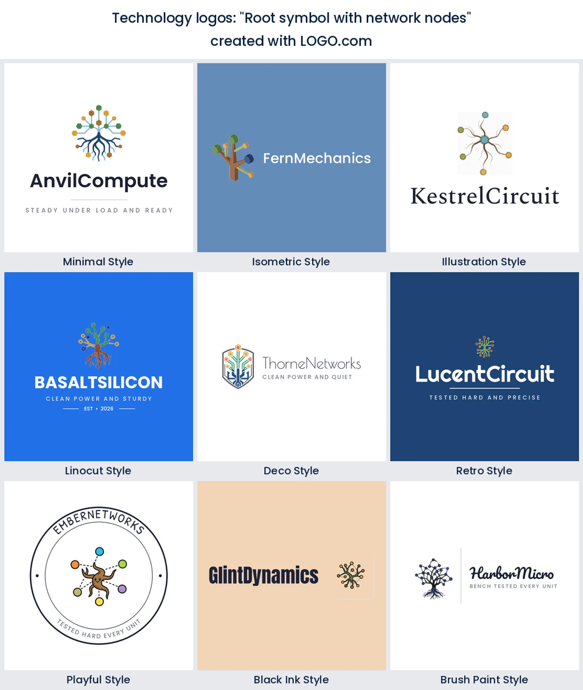
15. "Root symbol with network nodes"
A root splitting into network nodes is a clever way to say your platform is the foundation. It works for a developer tool, a database, or a computer science logo aimed at technical buyers.
Hardware, IT services, or an engineering firm: match the mark to your kind of tech
Technology is not one thing, so your logo should point at what you actually do. If you build hardware or electronics, a circuit board, a chip, or a device makes the product obvious the moment someone sees the mark. Run an IT services or managed network company? Connected nodes, a cloud, or a shield say uptime and safe hands better than a generic swoosh. Doing engineering, robotics, or systems integration? Gears and precise geometry read as built to spec. And if you sit across several of these, a clean abstract mark plus a strong company name keeps a technology logo flexible as you grow into new lines.
Make it read on a device, a spec sheet, and a trade show booth
A technology logo has to survive some unglamorous places. It gets molded into a plastic casing, silkscreened onto a board, printed tiny on a spec sheet, blown up huge on a trade show banner, and squeezed into a website favicon. Keep it bold and simple so none of that breaks it. Drop hairline strokes and fussy detail, since they disappear when a mark is etched into metal or printed at a couple of centimeters wide.
Test the logo in one solid color before you commit to the full color version. A single color knockout is what actually laser etches onto a device, embosses on packaging, and prints on a circuit board, so a technology logo that still reads in plain black or white will work almost anywhere you put it, on screen or on the product itself.
Show the circuit, the connection, or the machine?
You have three honest directions, and the data points at all three. Show the hardware, a circuit board or a chip, when the physical product is the story and you want instant recognition as a technology brand. Show the connection, nodes, a cloud, or a globe, when your value is the network, the platform, or the service tying things together. Or show the machine, a gear or interlocking gears, when engineering and precision are the pitch. On color, our own numbers back the classic instinct: blue and green lead the technology logos founders build on LOGO.com, so a confident blue with a green or teal accent reads modern and trustworthy, while a sharp neutral keeps it clean. Whichever you pick, hold it to one clear idea so the mark still works small.
Make your technology logo with LOGO.com
Pick the symbol that fits what you build, choose one of nine styles, and our technology logo maker builds the rest around your company name. Preview it free, download high resolution PNG files with full commercial use, and upgrade to a Brand Plan when you want vector files for signage, product badges, and print. Design a technology logo that looks right on your website, your product, and everywhere your brand shows up.
Methodology. These figures come from logos created on LOGO.com during the 12 months ending August 2026. We isolated the roughly 4338 brands whose founders selected a technology industry, meaning Technology, Information Technology, or Technology Consulting, along with the 350 custom icon descriptions those founders wrote. We grouped the descriptions by concept, for example circuit board, network node, or gear, and ranked each concept by how often it appeared. The circuit board was most common, in about 22% of technology logo descriptions, followed by connected network nodes at about 9% and the gear at about 5%. All figures are rounded to the nearest percentage point. Source: LOGO.com first party product data, August 2026.
THE #1 LOGO GENERATOR
Why LOGO.com is the best technology logo maker
1.Built from real technology brand data
Icons, palettes, and layouts pulled from technology logos founders actually made on LOGO.com, not generic clip art.
2.Reads on a screen and etched on a device
Your mark stays sharp as a website favicon and still works laser etched onto a product or a circuit board.
3.Transparent files for spec sheets and product shots
Download a transparent PNG that drops cleanly onto packaging, a dashboard, or a product photo with no white box.
4.Nine directions, from sleek IT to rugged hardware
Match the look to your company, whether you sell software, run a network, or build electronics and machines.
5.One color for etching, embossing, and PCB silkscreen
A solid knockout that engraves into metal, presses into a case, and prints in a single ink on a board.
6.One brand kit across product, packaging, and site
Keep a single logo, palette, and font consistent from your website to your hardware and your invoices.
7.Update it as you launch new hardware
Swap the icon, color, or wordmark whenever you add a product line, a service, or a fresh direction.
8.Free to design, yours to sell with
Preview free, download high resolution PNGs with full commercial use, then add vector files on a Brand Plan.
Technology Logo Maker FAQs
Explore more logo ideas by industry
AbstractAccessoriesAdventure TourismAestheticsAgricultureAirplaneAnimalAnimal and PetsAnime Logo MakerApplicationArchitectureArrowArtificial IntelligenceArts & CraftsAssociationAttorney FirmAuthorAuto Parts SupplyAviationBaked Goods StoresBandsBarsBeautyBeauty and Cosmetics BlogBeerBicycleBiotechnology ResearchBlack+WhiteBlueBonfireBook StoreBoutiqueBranchBuilding Materials ManufacturerBusiness LogoButcher ShopCalligraphyCampingCandyCar ClubCartoonCatering and Buffet ServicesCharitable FoundationChibiChiropractorChurchCircusClassicClothing ManufacturingCoffee Shops