
Financial Consulting Logo Maker
Design a financial consulting logo that works on proposals and your LinkedIn page.
Need a different logo maker? Try our AI logo generator.
Logos created using LOGO.com
670,000,000
Growth and partnership marks for a financial consulting logo
Method and judgement marks for a management consulting logo

Analysis marks for a business consultant logo

Financial Consulting Logos, Ranked From Real Founder Prompts
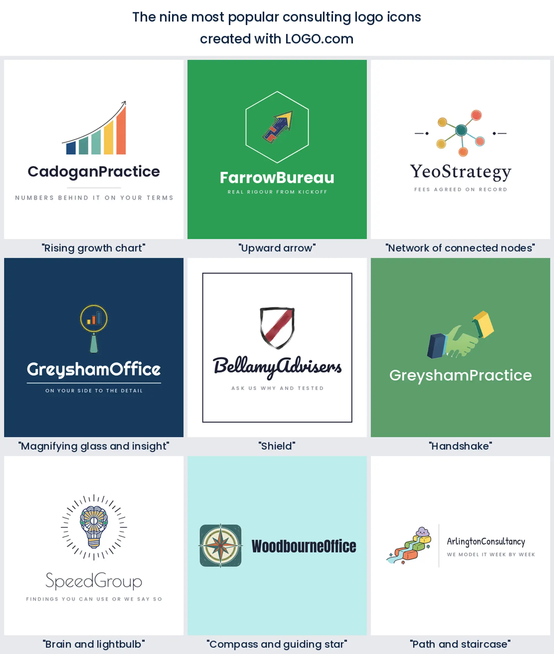
According to LOGO.com data, a rising growth chart is named in about 11 percent of the consulting and advisory icon descriptions written on LOGO.com, an upward arrow in about 6 percent and a network of connected nodes in about 6 percent, across 463 descriptions and 3,257 consulting and advisory practices.
That spread is friendlier than it looks. No single symbol owns a consulting logo the way a cup owns a cafe, which means you can pick the mark that matches the work you actually sell and still look like you belong. Below are the nine ranked symbols and fifteen real founder prompts, each one drawn across all nine LOGO.com styles, so you can watch a financial consultant logo move from carved and formal to plain and current before you settle on anything.
On this page
- Where does a consulting logo actually get seen?
- Nine symbols behind 463 consulting icon descriptions
- Fifteen founder prompts, rendered in all nine styles
- Will the mark still fit when you have associates?
- Colour choices that survive a black and white printer
- What it costs, and what files you actually need
- Make your financial consulting logo with LOGO.com
Your consulting logo spends most of its life on paper nobody frames. The cover of a proposal, the footer of an engagement letter, the top right corner of an invoice, a slide somebody screenshots and forwards to a finance director you have never met. That is a very different job from a shopfront sign, and it changes what a good mark looks like. It has to hold up small, in one colour, next to a client's own logo, on a document being read by someone deciding whether to spend real money on advice. Everything below comes from what consulting and advisory founders have actually built on LOGO.com, so you can start from evidence instead of a mood board.
Where does a consulting logo actually get seen?
Make the list before you design anything, because the list decides the shape. For most advisory practices it runs roughly like this. The proposal cover, where the mark sits large and gets the only real look it ever receives. The document header on every deliverable after that, where it is tiny and often greyscale because somebody printed the pack in the office. An invoice, which is the one page your client's accounts team will definitely open. Your LinkedIn company page, cropped to a circle at about 60 pixels. A pitch deck that gets resized without your permission. Maybe a name badge at a conference.
Notice what is not on that list. No window, no van, no packaging, no signage above a door. So the flourishes that sell a retail brand do you no favours here. What you want is a mark that survives being shrunk into a document header and flattened to one colour, and a wordmark you can read at a glance when it is set beside a client logo that is louder than yours. If you are torn between two directions, print both at the size they will appear on a proposal footer and the argument usually settles itself.
Nine symbols behind 463 consulting icon descriptions
A word on where this comes from, because scope matters. Only 33 accounts have ever picked the label financial consulting in our product, far too few to rank anything from, so the corpus here is consulting and advisory work as a whole. We took every icon description written on LOGO.com by an account in a consulting industry, merged it with every description whose own wording names consulting or advisory work, and grouped the result into nine concepts. That gives 463 symbol mentions from 445 written descriptions, with the full scoping set out in the methodology at the foot of the page. Read the shares as mentions rather than exclusive picks, because founders cheerfully name two symbols in one line.
1. Rising growth chart
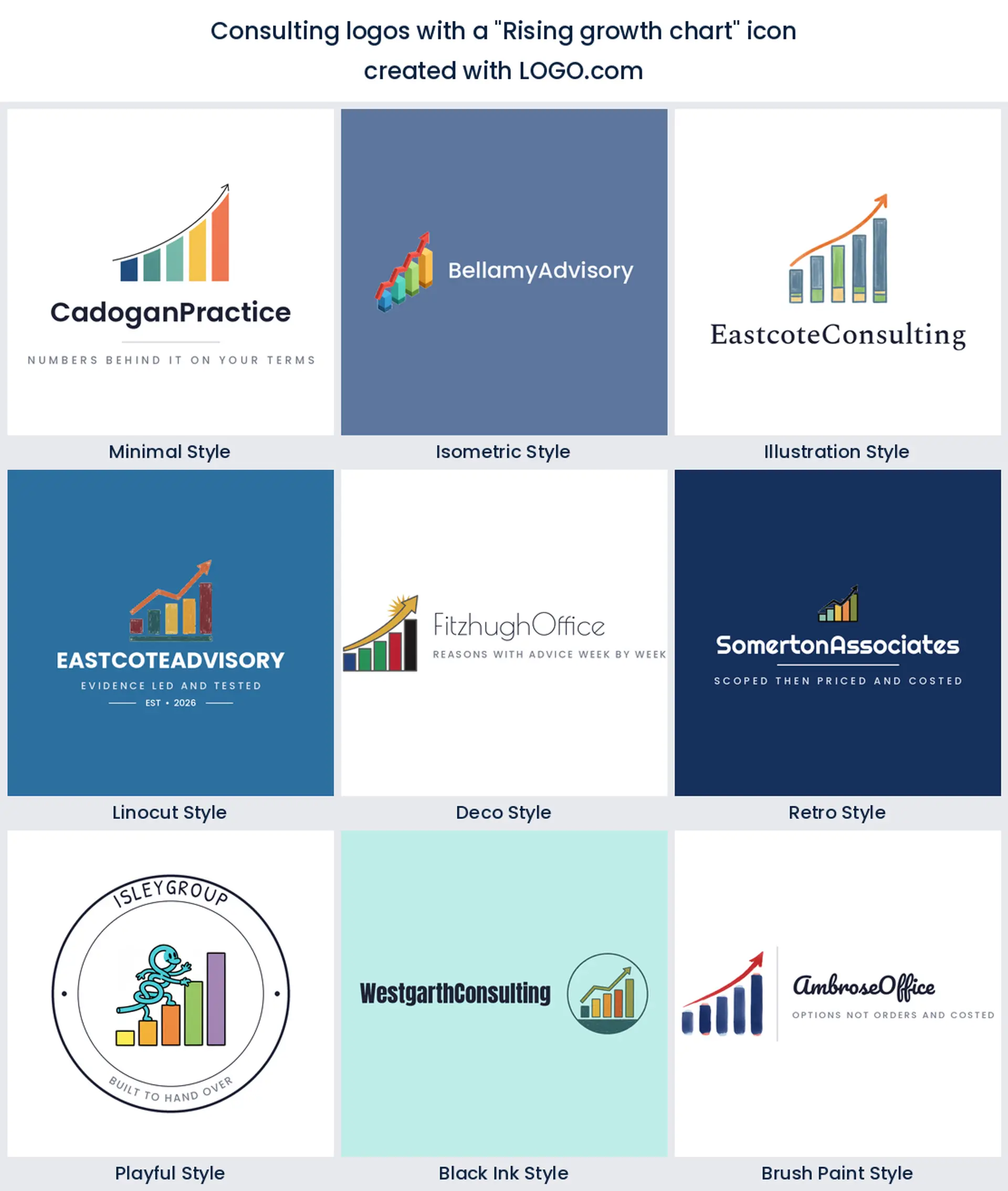
About 11 percent of these descriptions ask for a chart, a graph or a climbing line, which makes it the single most requested idea and also the most crowded. There is a reason it keeps winning. A client hires you to move a number, and a chart says that in the smallest possible space, in any language, at any size. If you use it, earn it by being specific. Three bars instead of five, one line breaking the frame, an axis you can drop entirely. Kept simple it makes the clearest business consulting logo on this page.
2. Upward arrow
Strip the chart away and you are left with the arrow, which around 6 percent of founders ask for on its own. It is the most compact promise in the set and the easiest thing to draw badly, because a plain arrow is a clip art shape. What saves it is construction. Build it from two clean angles, or let it double as the first letter of your practice name, and it stops looking generic. Good for growth advisory and turnaround work, and a solid base for a consulting firm logo that has to sit in a document header.
3. Network of connected nodes
Level with the arrow at roughly 6 percent, and by far the most modern feeling symbol in the nine. Dots joined by lines say systems, stakeholders and moving parts, which is what most advisory work is really about. Keep the node count low, three or four, or it turns into a molecule. This is the natural choice for a management consulting logo, an operations practice, or anyone whose pitch is that they can see how the pieces fit together.
4. Magnifying glass and insight
Fourth on the list, and the most honest symbol a consultant can use, because it describes the first half of every engagement. Founders write it as a lens, an eye or the word insight, often with something small inside the glass. Put a two bar chart in the lens and you have said diagnosis and numbers in one shape. Ideal for due diligence, audit adjacent work and any financial consultant logo where the offer starts with finding out what is actually going on.
5. Shield
The protective mark holds fifth place, and it changes the tone of a practice more than any other symbol here. A shield reads as risk, compliance and keeping you out of trouble rather than growth, so it suits regulatory advisory, tax and governance work far better than a strategy shop. Keep it flat topped and plain, resist quartering it like a coat of arms, and it makes a calm consulting services logo that never looks like it is trying too hard.
6. Handshake
Two clasped hands turn up right through the middle of the ranking, usually paired with a chart or a bridge. The risk is obvious, since a badly drawn handshake is the oldest cliche in professional services. The fix is abstraction, so try two shapes interlocking, or a single continuous line that reads as a grip without drawing knuckles. Worth the effort if your practice sells partnership and long engagements, and a warm option for a business consultant logo aimed at owner managed firms.
7. Brain and lightbulb
Seventh place goes to the thinking symbols, where founders write brain, lightbulb or acumen, frequently combined into one shape. It is the most explicitly clever mark in the set, which cuts both ways. On a training, innovation or research practice it lands well. On a tax advisory it can read as a bit pleased with itself. Draw the bulb as an outline and let the filament do the work, and you get a friendly consulting agency logo without the smugness.
8. Compass and guiding star
Navigation sits eighth, written as a compass, a north star, a guiding light or a lighthouse. These are the symbols of the practice that arrives when a client has no idea which way to go, which is a real and sellable position. A compass rose also happens to be beautifully symmetrical, so it holds its shape as a favicon and as a circular avatar. A strong pick for strategy, planning and any financial planner logo built around long horizons.
9. Path and staircase
Last of the nine, and quietly the most useful if you want to avoid the crowd. Paths, steps and staircases show up whenever a founder is selling a process rather than an outcome, which describes most implementation and change work. Three steps is plenty, and steps have a practical advantage over a chart line because they stay legible when the mark is only a few millimetres tall on an invoice. A quietly confident base for a consulting company logo.
Fifteen founder prompts, rendered in all nine styles
These fifteen lines were typed by people building real consulting and advisory practices, reproduced exactly as they wrote them. They are more useful than the plain nine because a founder describing their own firm instinctively puts two ideas together, and the join is where the character sits. Each one is drawn in every LOGO.com style below. Take a phrase, paste it in, change one noun to match your practice and you have your own starting point. If you came here looking for consulting logo ideas rather than a ranking, start in this section.
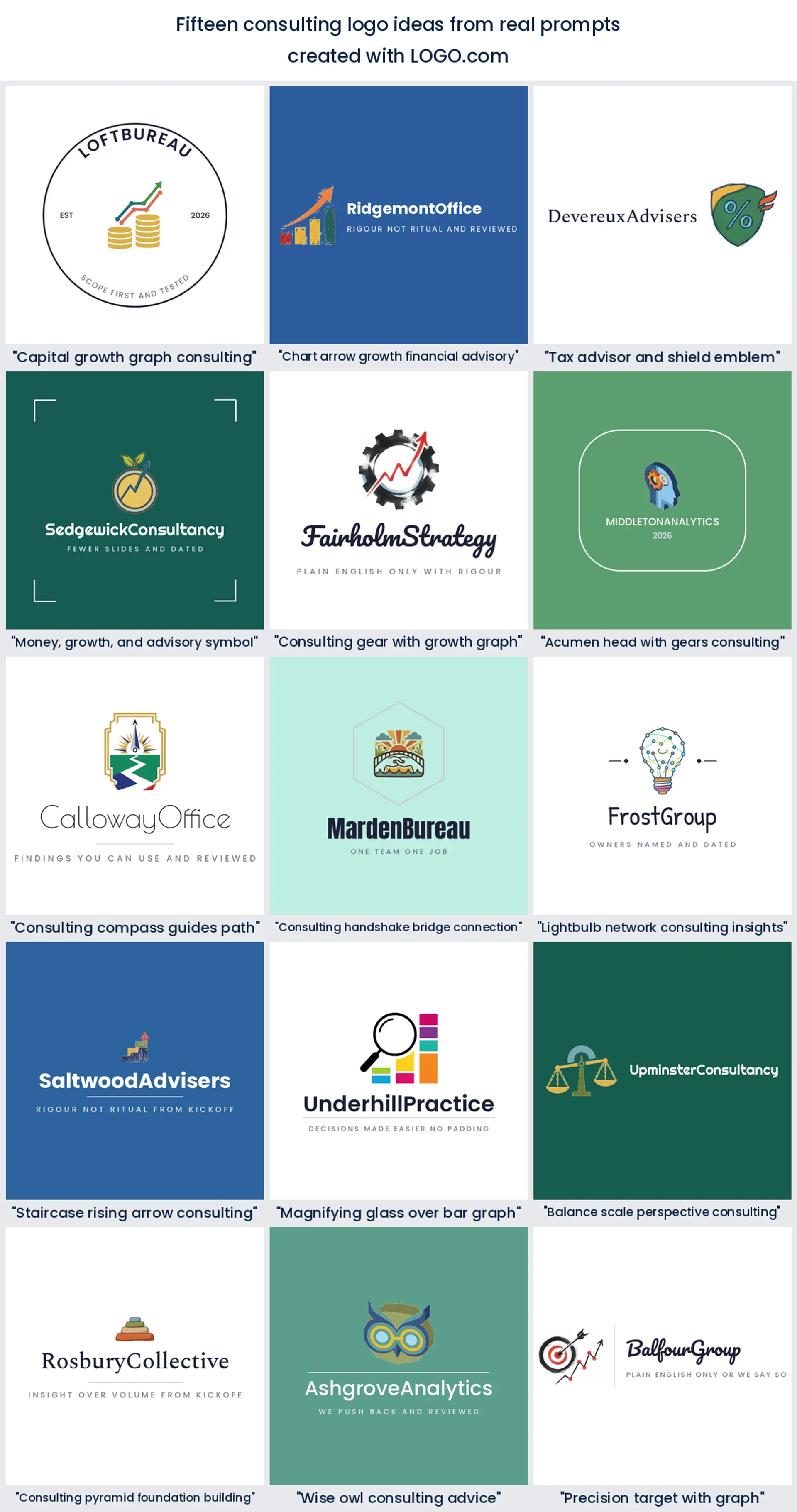
1. "Capital growth graph consulting"
Money and momentum in one shape, and the closest thing on this page to a default for finance work. The coins give the graph a subject, so the line is not abstract growth but growth of something countable. Works well for fundraising, valuation and capital advisory, and it makes a direct financial consulting logo when the pitch is simply that clients end up with more.
2. "Chart arrow growth financial advisory"
The two most requested symbols in the data welded together, which is exactly why it needs restraint. Let the arrow break out of the top bar and leave everything else plain, and the mark gets one clear moment instead of two competing ones. This is the safest choice on the list for a financial advisor logo, and safe is often the right answer when the reader is deciding whether to trust you with a number.
3. "Tax advisor and shield emblem"
A percent sign inside a shield is unusually literal, and for tax work that is a feature. It says the subject is rates and the promise is protection, which is the whole offer in two marks. Keep the percent small and centred so the shield still reads at document header size. Excellent for tax and compliance practices that want a financial consultant logo nobody has to interpret.
4. "Money, growth, and advisory symbol"
Three ideas in one prompt, and the leaf is what rescues it from being another coin logo. A sprout beside a coin reads as patience rather than profit, which is a genuinely different pitch and a softer one. Good for financial coaching, sustainable investment advice and any practice selling steady progress rather than a quick win.
5. "Consulting gear with growth graph"
Mechanism plus result, which is a smart pairing because most clients care about both. The gear says there is a method behind the number, so the graph stops being a promise and starts being an output. Use a low tooth count, six or eight, or the wheel fills with noise at small sizes. A strong operations and process choice, and a credible management consulting logo.
6. "Acumen head with gears consulting"
A profile head with gears inside it is the most human shape in the fifteen, and heads are memorable in a way geometry is not. The catch is that it can drift toward a psychology practice, so keep the gears crisp and the silhouette simple. Suits training, leadership advisory and expert networks, and reads well as a consulting business logo for a named individual.
7. "Consulting compass guides path"
Direction and journey in the same frame. The compass gives the path a purpose, and the path gives the compass something to point at, so neither element is decorative. Because the shape is tall rather than wide it sits nicely to the left of a stacked wordmark. A natural fit for strategy, succession planning and any consulting firm logo built on knowing the route.
8. "Consulting handshake bridge connection"
The cleverest way to use a handshake, because turning the clasp into a bridge span gives it a second meaning and an excuse to be abstract. You get partnership and crossing a gap without drawing a single finger. Ideal for practices that broker between two sides, integration work after a merger, or a consulting agency logo built on joining things up.
9. "Lightbulb network consulting insights"
Draw the bulb out of nodes and lines and the idea becomes collective rather than one clever person's brainwave. That is a better story for a firm than for a founder, and it neatly combines the third and seventh most requested symbols in the data. Great for innovation advisory, research practices and any consulting services logo where the value is the thinking.
10. "Staircase rising arrow consulting"
Growth with the working shown. Steps make an arrow honest, because they admit progress happens in stages rather than in one smooth line, and clients recognise their own experience in that. Four steps is the sweet spot. A good choice for phased programmes, maturity models and a consulting logo design that has to explain a method in one glance.
11. "Magnifying glass over bar graph"
Diagnosis before advice, stated plainly. Overlapping the lens with the bars matters more than either shape on its own, since the overlap is what says examine rather than illustrate. Let one bar sit outside the glass so the composition has an edge to it. Perfect for analytics, performance review and any business consulting logo that leads with evidence.
12. "Balance scale perspective consulting"
Level pans mean judgement rather than justice, and the distinction is worth protecting, so keep the beam thin and the pans shallow or the mark starts looking like a law firm. What it buys you is neutrality, which is exactly what an independent adviser sells. Well suited to valuation, dispute support and an advisory logo built on being genuinely impartial.
13. "Consulting pyramid foundation building"
Blocks stacked into a pyramid say built to last and built in order, which is a quieter claim than a rising chart and often a more believable one. It also survives being tiny better than almost anything else here, because it is all solid shapes and no thin lines. A sturdy option for corporate finance, structuring work and a consulting company logo that wants to look established on day one.
14. "Wise owl consulting advice"
The one prompt in the fifteen with real personality, and personality is scarce in advisory branding. An owl carries experience without a chart in sight, and the round spectacles give you a shape that works as a standalone avatar. It will not suit a firm chasing enterprise procurement, but for a solo consultant or a small practice it makes a consultant logo people actually remember.
15. "Precision target with graph"
An arrow in the middle of a target is about accuracy rather than growth, so it reads as we hit the number you gave us. Adding a small chart line stops it looking like a marketing agency. Keep the rings to two. Strong for performance improvement, cost reduction and a consulting logo aimed at clients who already know exactly what they want fixed.
Will the mark still fit when you have associates?
People search for quite different things here, and the difference is not cosmetic. If you are a solo consultant, your name is the brand and the symbol is support, so set the wordmark first and keep the mark small enough to work as a LinkedIn avatar on its own. Building a firm with associates? Lead with the symbol, because it has to carry a business that will outlast any one adviser, and give it a shape that still reads when a partner name gets added underneath. Running an agency that pitches alongside creative shops? You have more room for character than either of the others, and a plain chart will make you look like the safe boring option.
One practical note whichever you are. Ask for a symbol only version alongside the full lockup on day one. That is the file you will use for the favicon, the app tile, the circular avatar and the corner of a slide template, and building it later usually means redrawing. A consulting firm logo that only exists as one wide horizontal lockup will let you down the first time somebody needs a square.
Colour choices that survive a black and white printer
Our own numbers are closer than the received wisdom suggests. Across the consulting and advisory brands built on LOGO.com, green is the most chosen non neutral hue at 629 palette picks and blue is close behind at 522, with orange third at 319 and brown after that. The two leaders are not saying the same thing. Green talks about growth and it feels current, which is why newer strategy and coaching practices reach for it. Blue talks about not making a mistake, and it is still the steadier choice if your work touches money somebody could lose.
Pick one to lead and use the other in small doses, because a fifty fifty split reads as indecision, which is an unfortunate look for an adviser. Then check two things a retail brand never has to. First, greyscale, because your proposal will get printed in black and white by somebody in a hurry, so the mark needs to survive with no colour at all. Second, contrast against your clients, since a mid blue that looks confident on its own can vanish when your logo is set next to a bank's navy on a joint slide. A deep ink neutral for type solves most of it.
What it costs, and what files you actually need
Designing and previewing costs nothing, and the high resolution PNG download is free and carries full commercial use, so you can put it on your website, your proposal template and your invoices straight away. The Brand Plan is the paid step and it adds the vector files you need for print, exhibition panels and anything large format, plus unlimited edits, brand guidelines and the brand kit. For a practice that mostly ships documents and slides, the free files genuinely cover the first year.
What is worth attention is the file set rather than the price. Get the full colour version, the single colour version and the symbol on its own, then keep all three in the same folder as your proposal template. The single colour file is the one that saves you when a client's document standard says one ink, or when a print shop quotes extra for a second plate on a report cover.
Make your financial consulting logo with LOGO.com
Type your practice name, pick one of the nine ranked symbols or paste in one of the fifteen founder prompts word for word, then choose a style and set the colour and the type. Previewing is free, the high resolution PNG comes with full commercial use, and the Brand Plan is there when you need vector files for print plus the brand kit and unlimited edits. Most practices land on something they agree on inside an afternoon.
Methodology. Figures come from LOGO.com first party product data for the 24 months to August 2026. Only 33 accounts have ever chosen the industry label financial consulting, too few to rank icons from, so this ranking is scoped to consulting and advisory work as a whole. We merged three pulls of the icon_prompt_generated event, being every icon description from an account whose industry names consulting, every description whose own wording names consulting, and every description whose wording names advisory work. Rows whose subject plainly belongs to another trade sitting inside the consulting bucket were removed, leaving 445 distinct founder descriptions and 463 symbol mentions grouped into nine concepts. A single description often names two symbols, so these are mention shares rather than exclusive shares. A rising growth chart appears in about 11 percent, an upward arrow in about 6 percent and a network of connected nodes in about 6 percent. The brand count of 3257 is the number of accounts that chose a consulting or advisory industry in the same window, 69 of which name finance, tax, accounting, valuation, investment or economic work explicitly. Palette figures are palette_selected events over the same window and scope. Source: LOGO.com first party product data, August 2026.
THE #1 LOGO GENERATOR
Why LOGO.com is the best financial consulting logo maker
1.No mood boards, just 463 real descriptions
The marks on this page come from 463 symbol mentions in consulting and advisory icon descriptions written on LOGO.com. Nothing here was chosen because it looked good on a mood board.
2.A symbol only file for footers and avatars
Take the symbol only file next to the full lockup, so the same mark holds up in a proposal footer, as a favicon, and as a circular avatar on your LinkedIn company page.
3.For the client whose template says one ink
Download the flattened single colour version for packs printed in one ink and for client document standards, alongside the full colour files for screen and slides.
4.Growth green or steadier blue, decided by data
The palettes follow the hues consulting and advisory founders actually pick on LOGO.com, so you are not guessing whether growth green or steadier blue suits your practice.
5.Room for an associate you have not hired yet
Set the practice name as a wordmark or shorten it to a monogram, then add an associate, a partner name or a new service line without redrawing the symbol.
6.Ends the internal debate in one meeting
See the same symbol as a carved emblem, a plain sans wordmark and seven more, so the internal debate finishes in one meeting rather than four.
7.Incorporate, merge or rebrand without starting again
Incorporate, merge, drop a service line or bring in a co founder and you can go back in and adjust the mark, the name and the palette instead of starting again.
8.Free to design, yours to invoice under
Designing and previewing is free and the high resolution PNG download comes with full commercial use. The Brand Plan adds vector files for print plus brand guidelines and the brand kit.
Financial Consulting Logo Maker FAQs
Need Inspiration? See example brands in your industry...
3DAcademic EducationAccommodationAdvertising AgencyAffordableAgriculture BlogAlternative MedicineAnimal BlogAnimalsApartmentAppraisal ServicesAriesArtArtistArts EducationAstrologyAudio ServicesAuto DealershipAuto Rental AgencyBBQBakeryBanking ServicesBaseball TeamBeauty SalonBed & BreakfastBettingBioinformaticsBirdBlock Letter Logo MakerBlurbBookBooks and LiteratureBoxBuilderBurgerBusiness Services and ConsultingCBDCameraCancerCannabisCardsCatCattleCharityChild CareChocolateCinemaCityClevverCloud