Car Logo Maker
Design a car logo that works on a van door, a decal and your booking page.
Don't have a business name yet? Try our Business Name Generator.
Need a different logo maker? Try our AI logo generator.
Logos created using LOGO.com
670,000,000
Sparkle and suds marks for car detailing
Emblem and engine logos for auto repair
Tire, glass and steering wheel badges
Car Logos, Ranked From Real Brand Data
According to LOGO.com data, the icons car businesses describe most are the car itself (about 63%), a polish sparkle (about 23%) and a shield style car emblem (about 15%).
Read those three together and you have the whole brief. The car says what you work on, the sparkle says what you leave behind, and the emblem says you are a business rather than a hobby. Almost nobody asks for all three at once, which is why the good marks pair two of them and stop. Below are the nine symbols car and automotive founders describe most often, fifteen combinations lifted word for word out of the prompt box, and a free car logo maker so you can build yours now.
A car logo has an unusual problem. Every other industry gets to invent its own imagery, but yours is already taken, roughly a hundred times over, by the badges bolted to the front of the vehicles in your own bay. So before you draw anything, it is worth knowing what people building car brands actually reach for and where the crowd already sits. We counted the icons founders described on LOGO.com, kept fifteen of their descriptions exactly as typed, and drew every one of them out in nine styles so you can see which shapes still look like a service business and which ones read as a manufacturer.
Six in ten car logos begin with the car itself
Founders can pick a stock icon or describe their own in words, and the descriptions are the honest bit, because nobody types a shape they do not want. We took 165 of those descriptions from people building car, detailing, wash, repair and dealership brands, grouped them into concepts and counted them. Nine concepts came out on top. Every one below has a nine style grid under it, because the same object drawn as cut ink and drawn as a clean outline gives you two completely different businesses. Read this as a shortlist of automotive logo design directions rather than a ranking to obey.
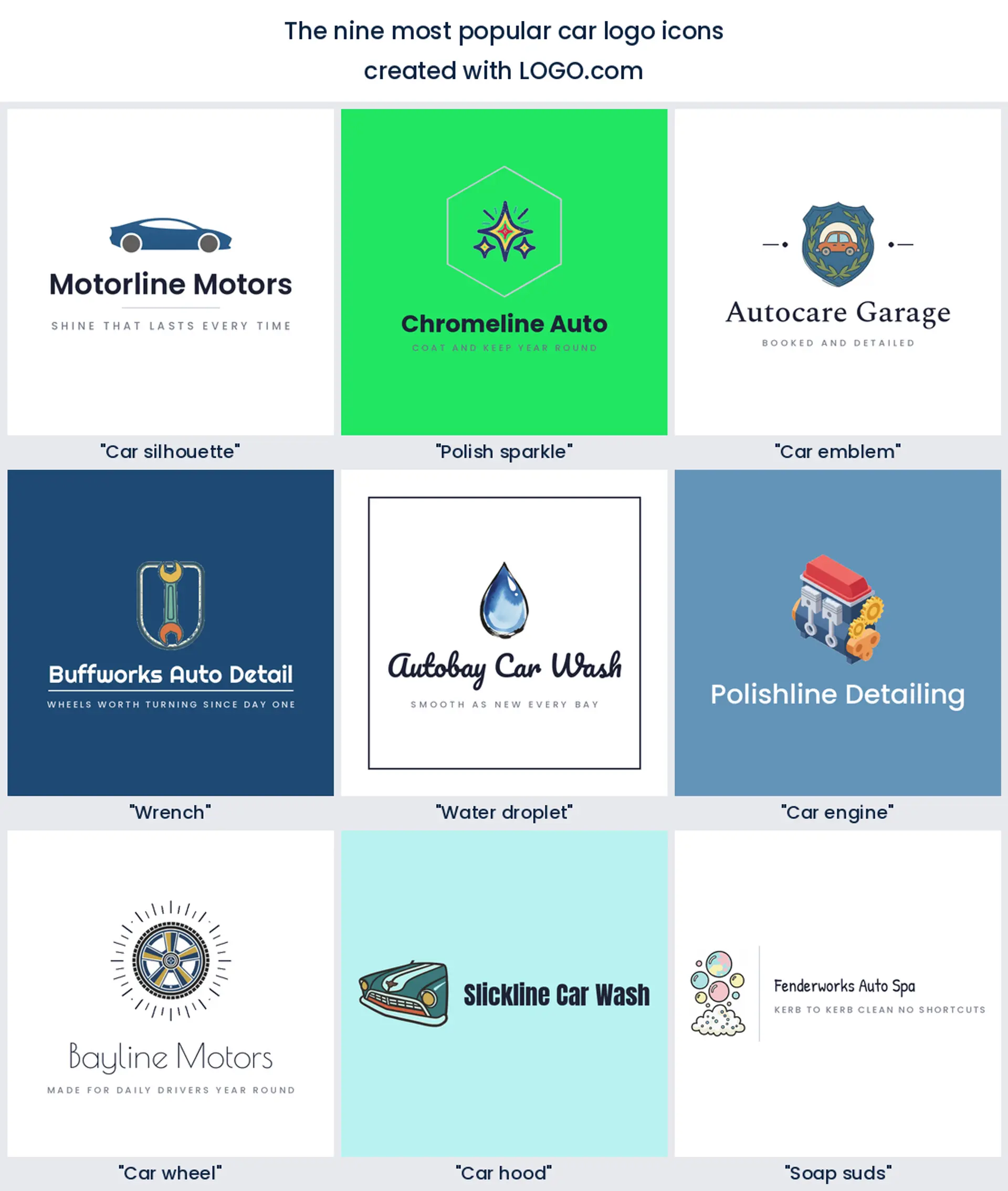
1. Car silhouette
About 63% of the descriptions we counted put a car in the mark, which is the widest lead any single symbol has taken on one of these pages. That is not a failure of imagination, it is clarity: a car shape tells a stranger what you do before they read a word. The angle is where you get to choose. A flat side profile reads calm and premium, a front three quarter view reads energetic, and a nose on view reads like a dealership. Pick the angle first and the style after.
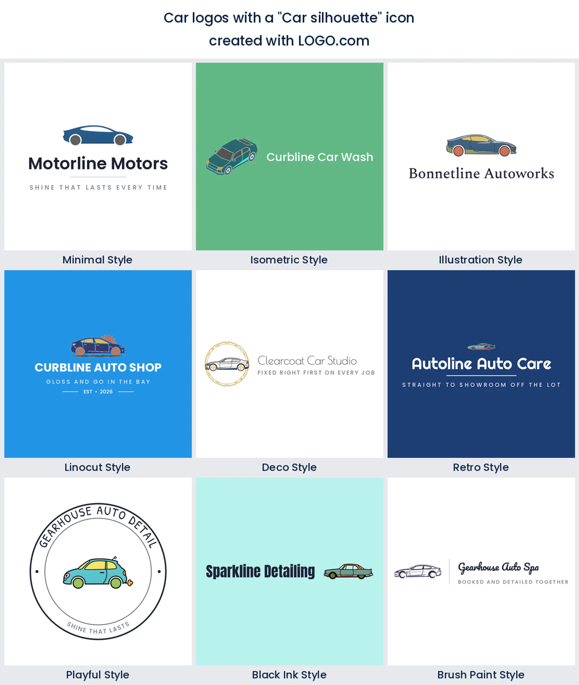
2. Polish sparkle
The second most described element is not an object at all, it is a result. About 23% of descriptions ask for sparkle, shine, gloss or wax in some form, usually as a small four point star sitting above a panel. It is the single most useful thing on this list for a car detailing logo, because it separates you from a repair shop in one shape. Keep it to one large sparkle and one small one, since three or more start to read as magic rather than paintwork.
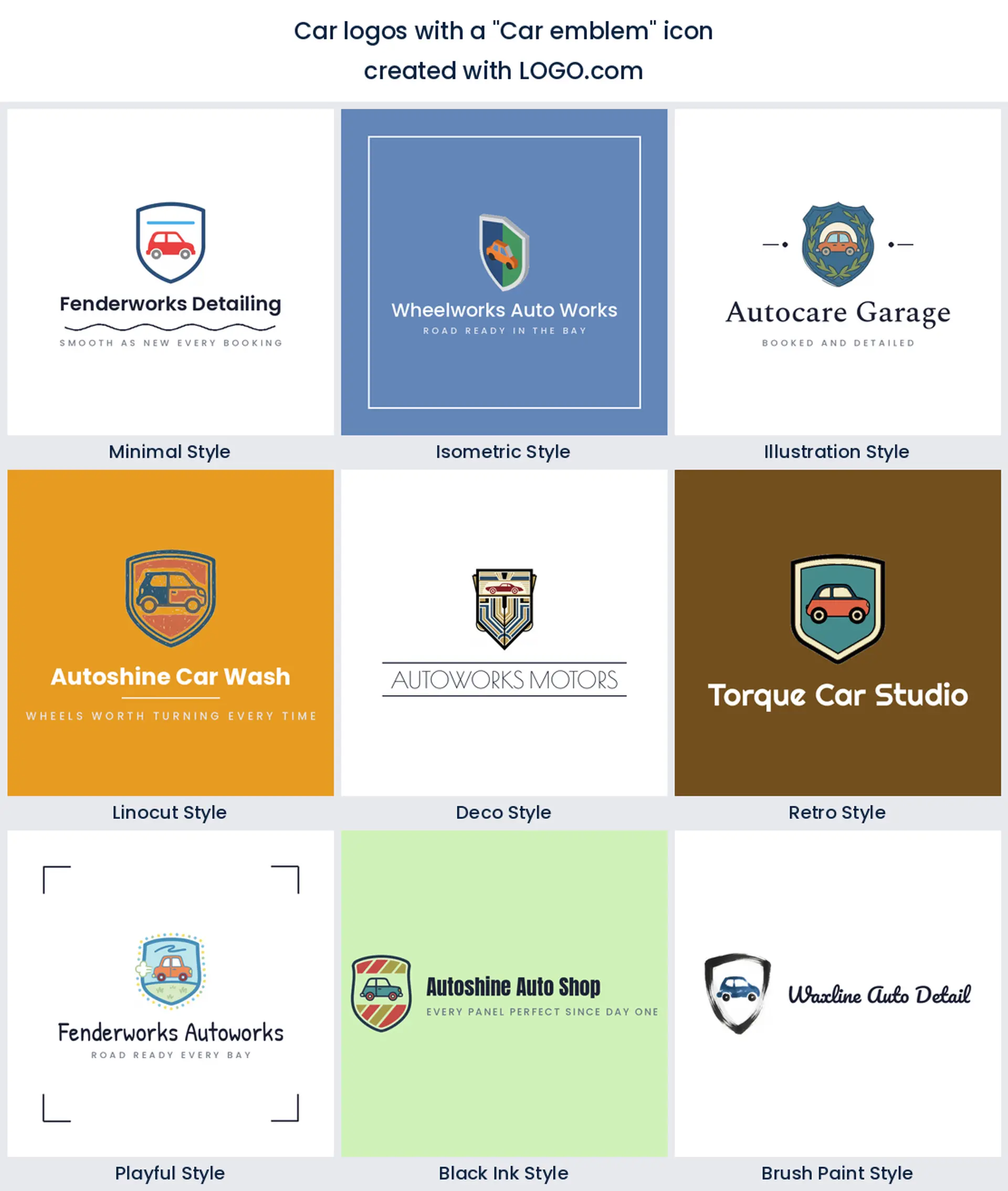
3. Car emblem
Roughly 15% of founders describe a shield, a badge or a crest holding the car rather than the car on its own. The instinct is sound, because a frame turns a generic silhouette into something that looks owned. It is also the riskiest choice on the page, which is why there is a whole section further down on staying clear of manufacturer territory. Use a soft shield or a rounded container and you get the authority without the imitation.
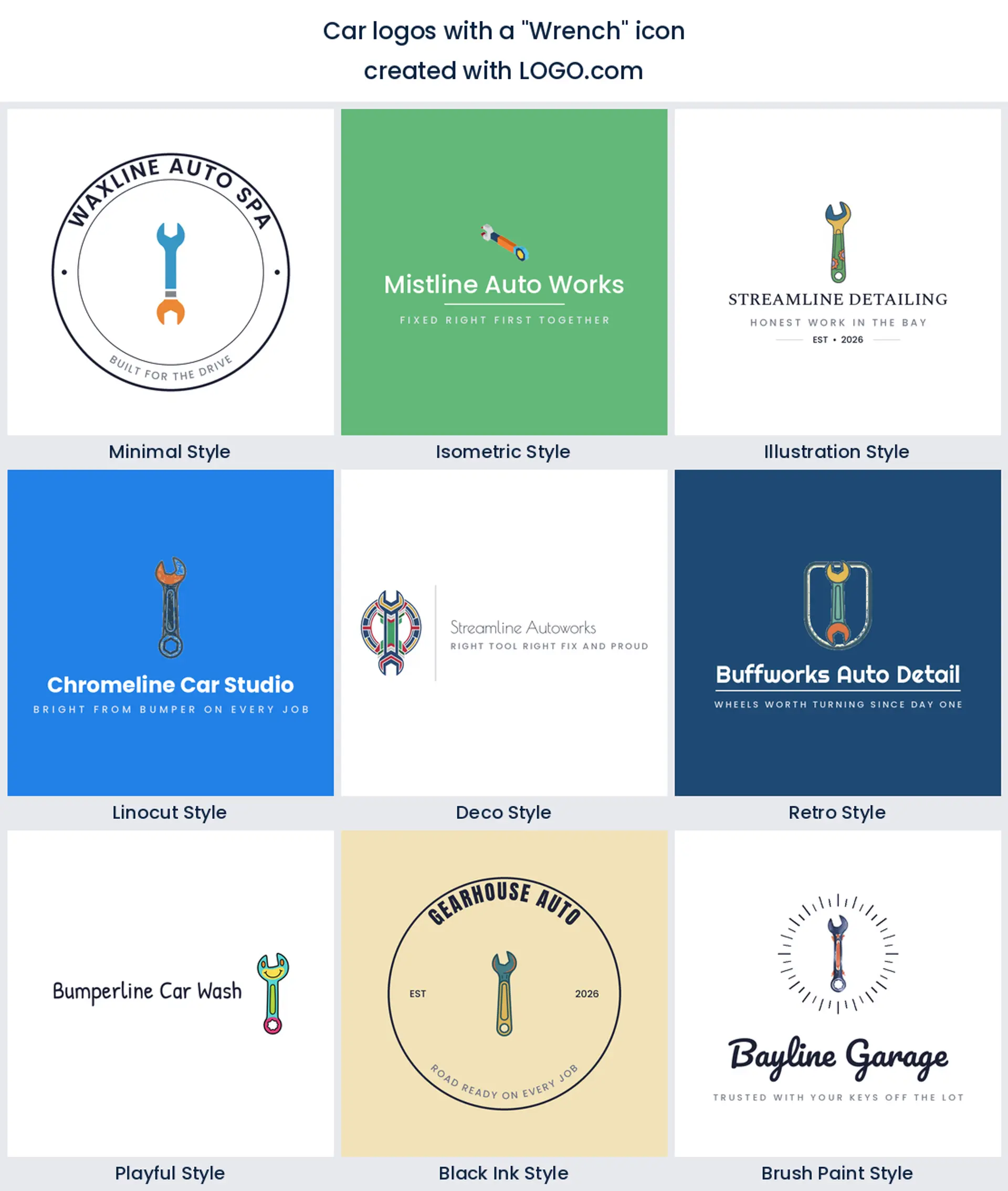
4. Wrench
The wrench is the workhorse of every mechanic logo and it earns its place by being unmistakable at any size. Two things to watch. A single wrench sitting upright is close to what every other auto repair logo does, so cross it with something, and keep the jaw opening chunky because a thin one closes up the moment it is embroidered on a work shirt.
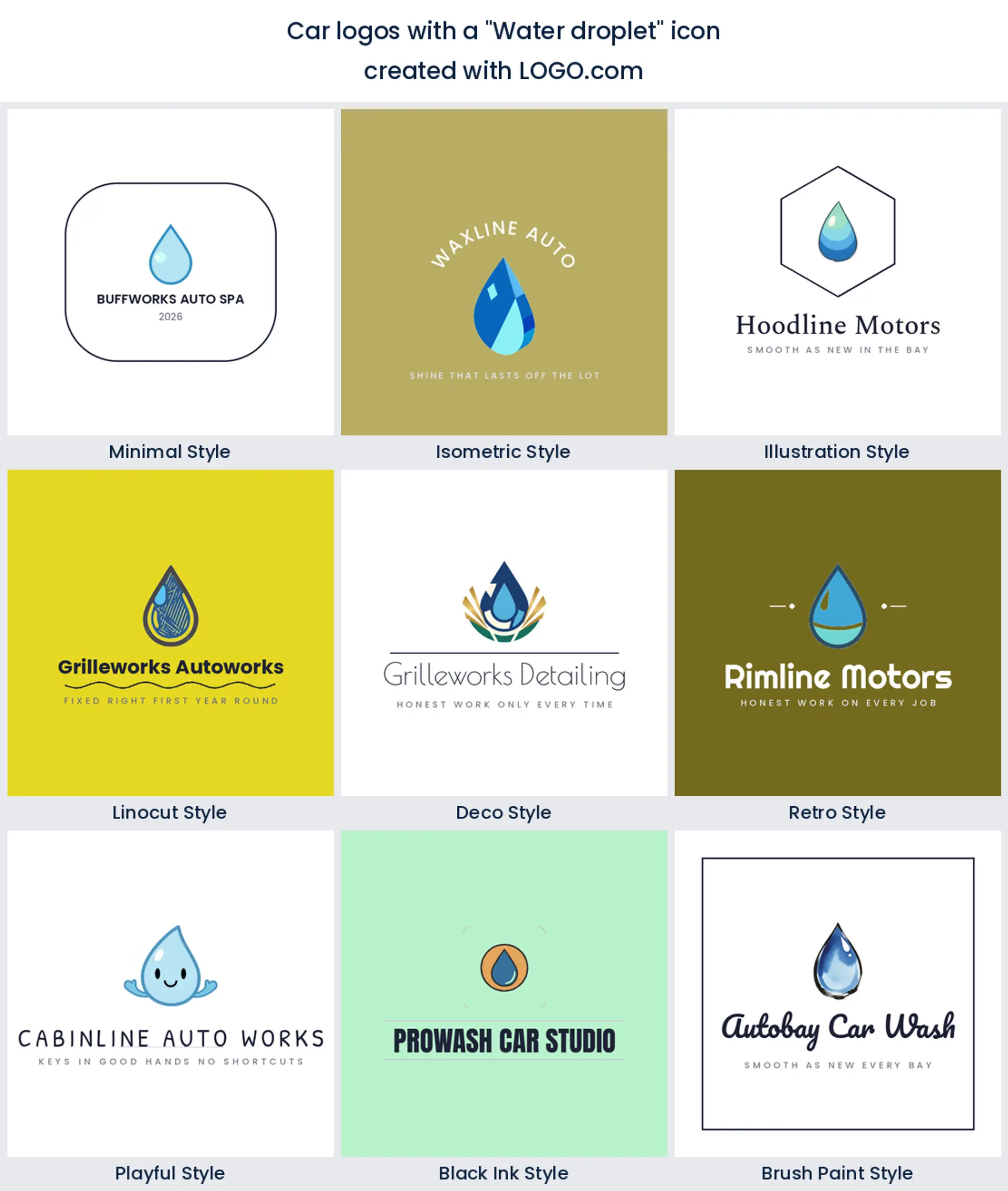
5. Water droplet
A droplet is the cleanest way to say water without drawing a hose, and it turns up constantly in car wash and valeting descriptions. It is also the friendliest shape here, which matters if you want a car wash logo that appeals to families rather than enthusiasts. Give it a single highlight and no gradient, because gradients are the first thing to die on a printed decal.
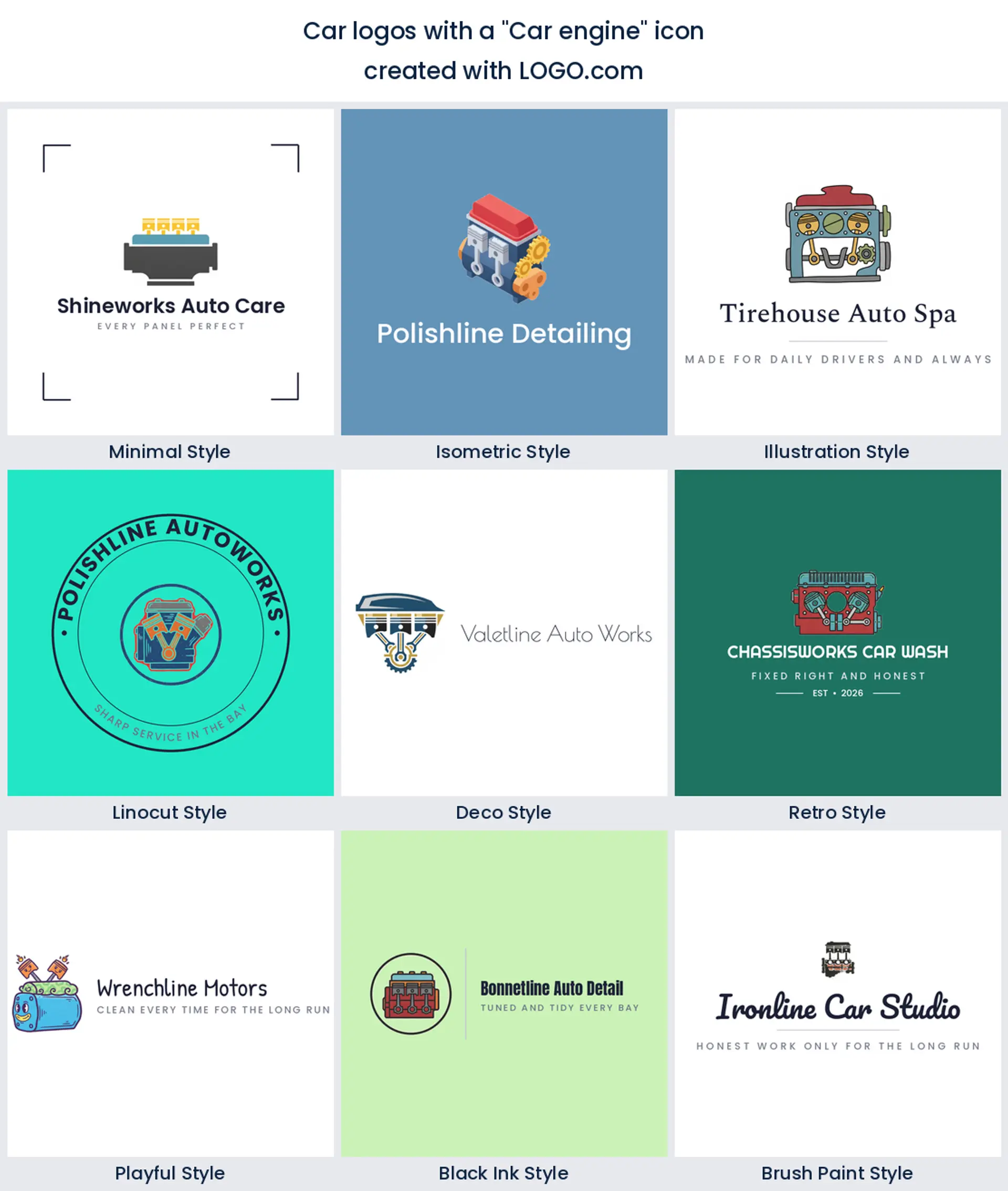
6. Car engine
An engine block is the least glamorous idea in the nine and the most credible. Nobody puts pistons on a shirt unless they actually open bonnets, which is exactly why it suits a garage, an engine builder or a parts business rather than a wash. Draw it blocky and symmetrical. A faithfully detailed engine turns into grey mush at the size of a business card.
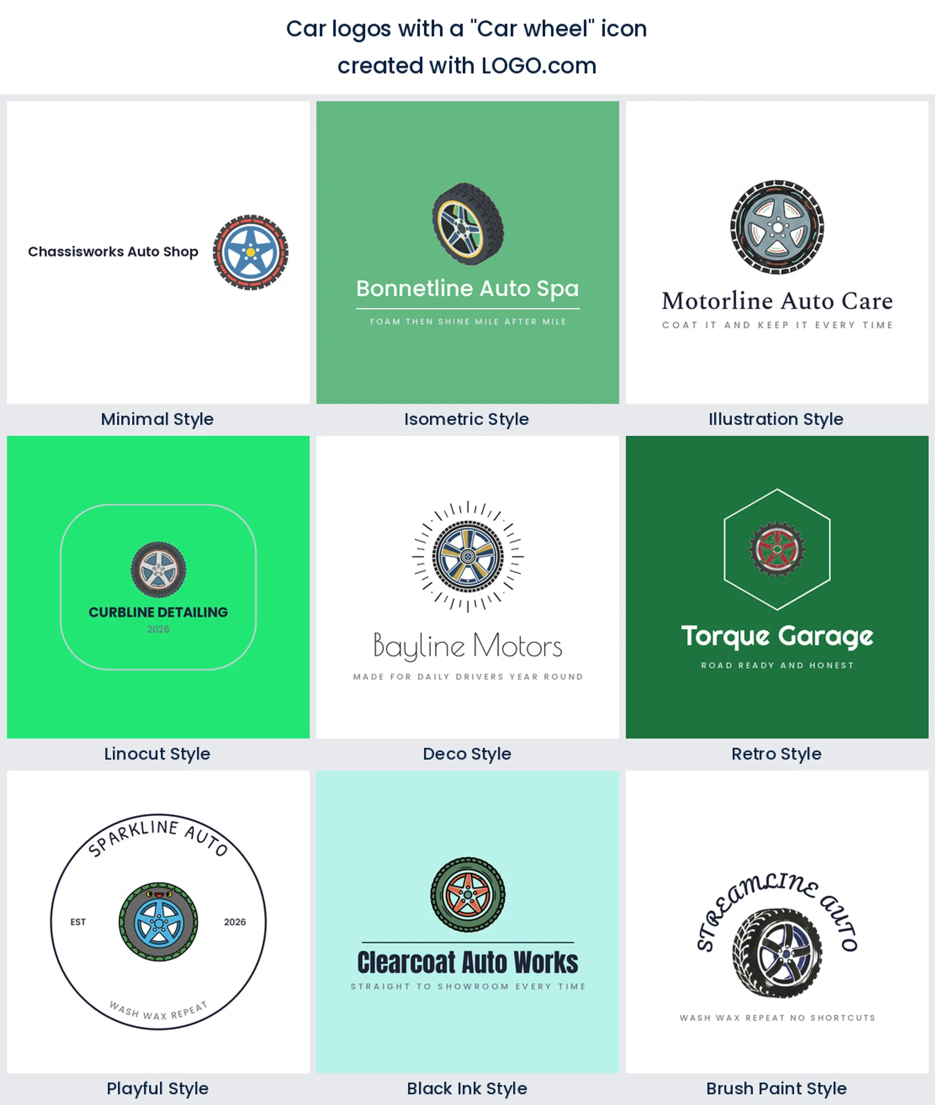
7. Car wheel
A wheel gives you a circle for free, and a circle is the shape that survives everywhere: an avatar, a sticker, a stamped hub cap. Founders describe it two ways, as an alloy rim for performance work and as a treaded tyre for fitting and mobile work. Choose the one that matches what you charge for, because customers read the difference immediately.
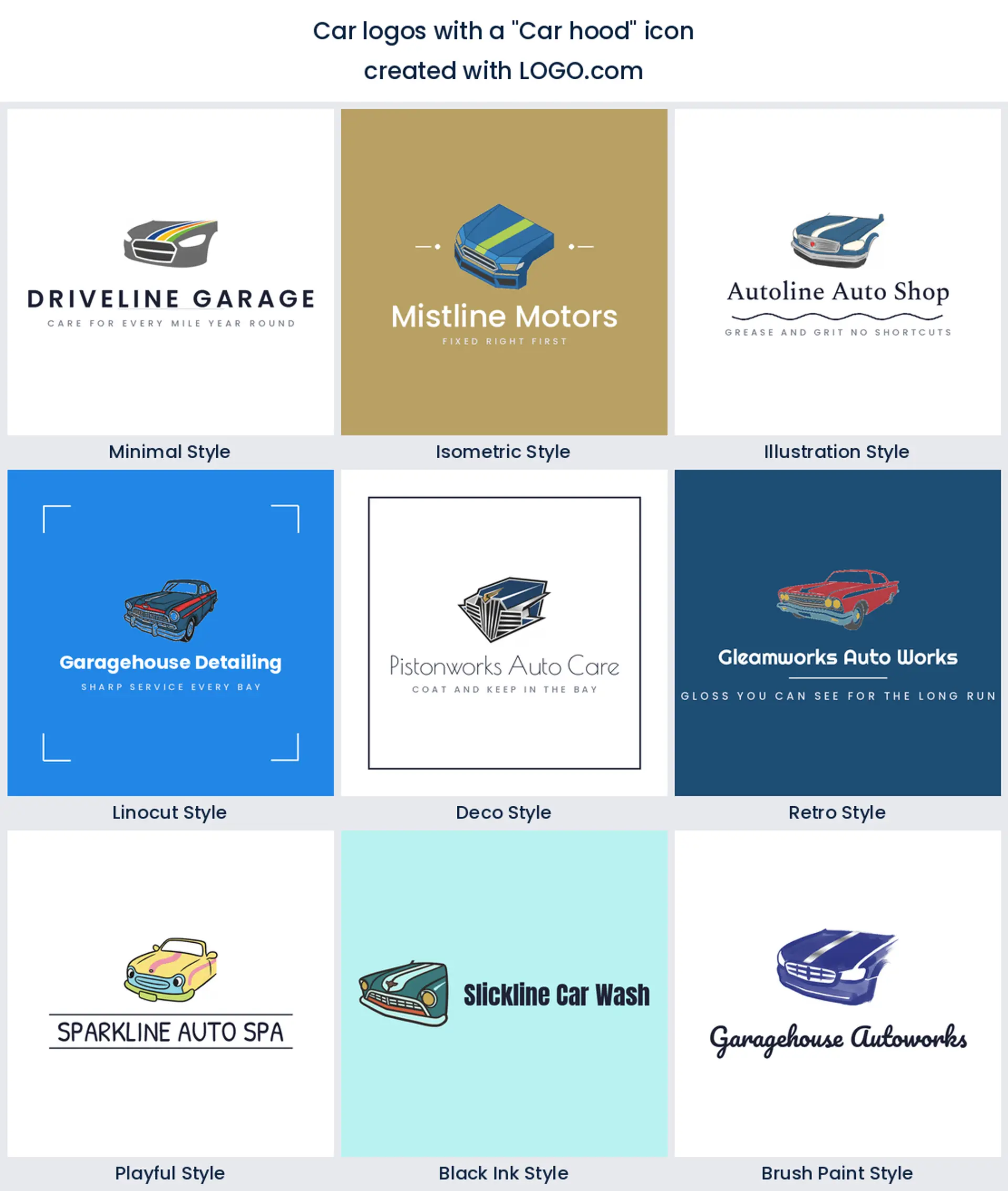
8. Car hood
The bonnet and grille seen close up is a surprisingly common ask, and it is really a request for reflection. Founders describe a polished hood with a shine streak across it, because that streak is the proof of work. It is a strong pick for paint correction and ceramic coating, and a weak one for anything mechanical, since a closed panel says nothing about what is underneath.
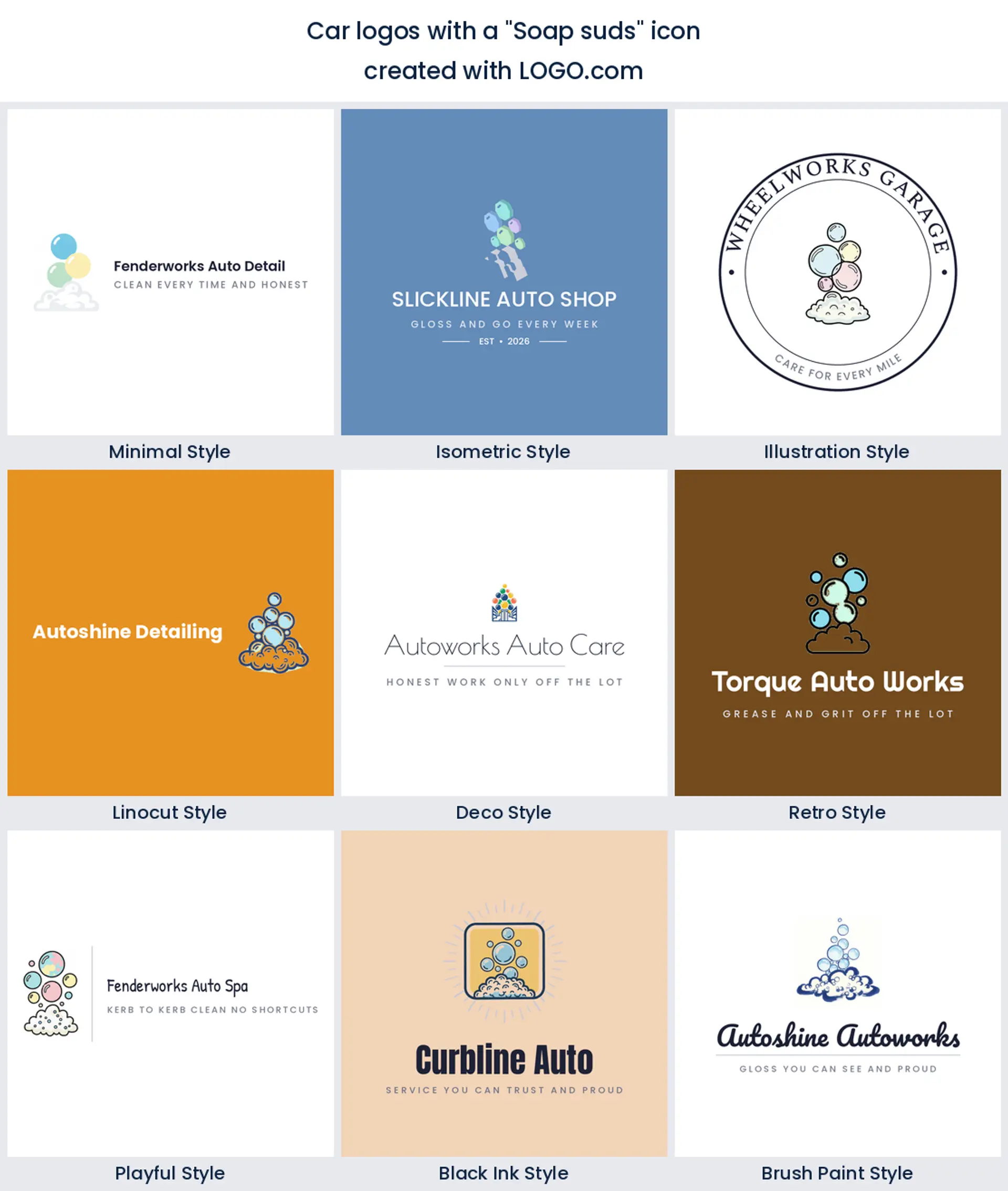
9. Soap suds
Bubbles and foam close out the nine, and they do a job no other symbol here can: they make the brand look cheerful. That is worth something for a hand wash, a subscription wash or anything aimed at a driveway rather than a workshop. Keep the cluster small and the bubbles unequal in size, because a neat row of identical circles stops reading as foam.
The fifteen pairings we found in the prompt box
Every line below is a real description somebody typed while building a car or automotive brand on LOGO.com. We kept them exactly as written, lower case starts and all, because the pairings founders invent are consistently better than the ones a template offers. Each is drawn in all nine styles, so pick the combination first and the finish second. Treat them as car logo ideas to bend, not answers to copy.
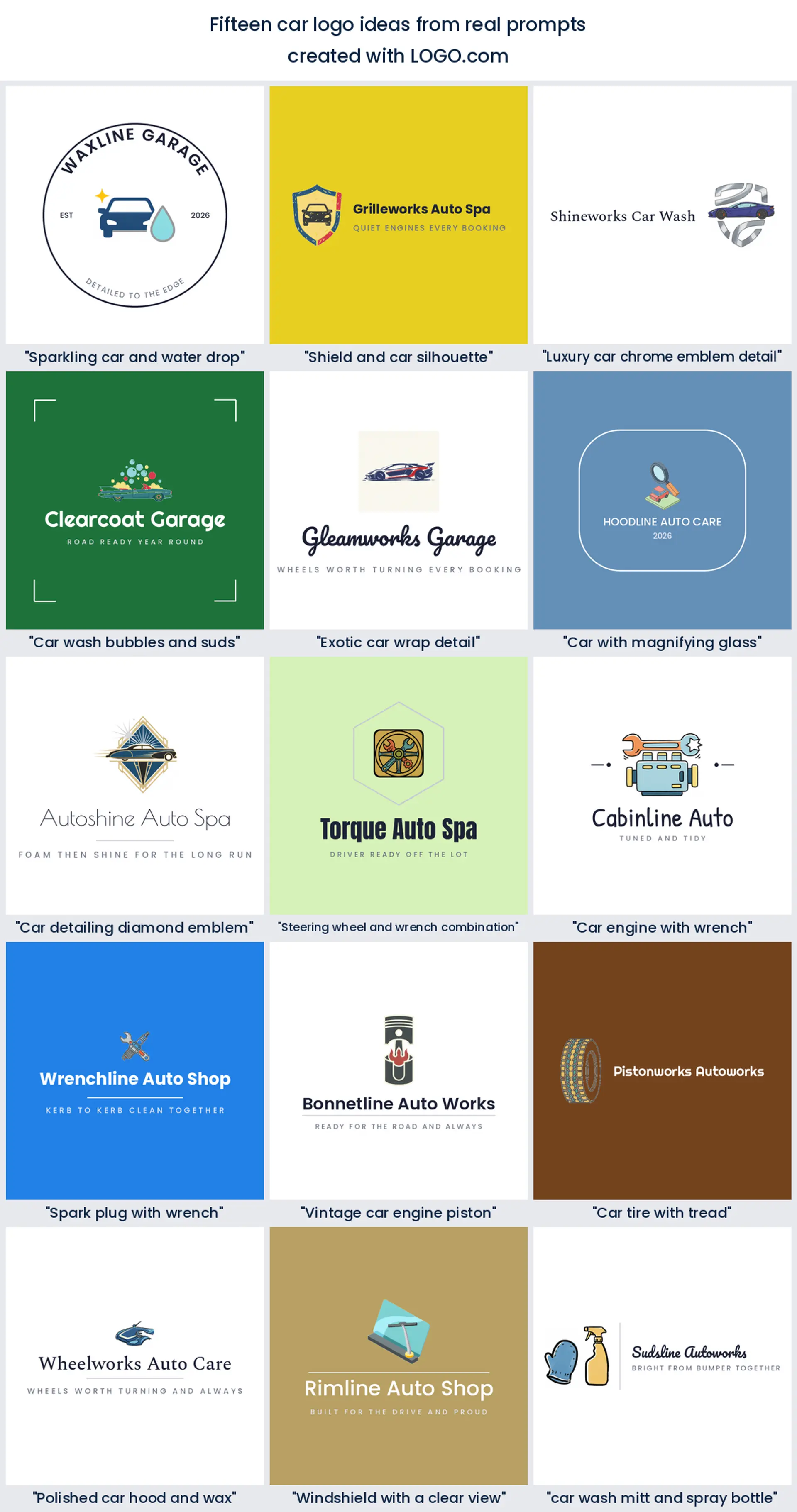
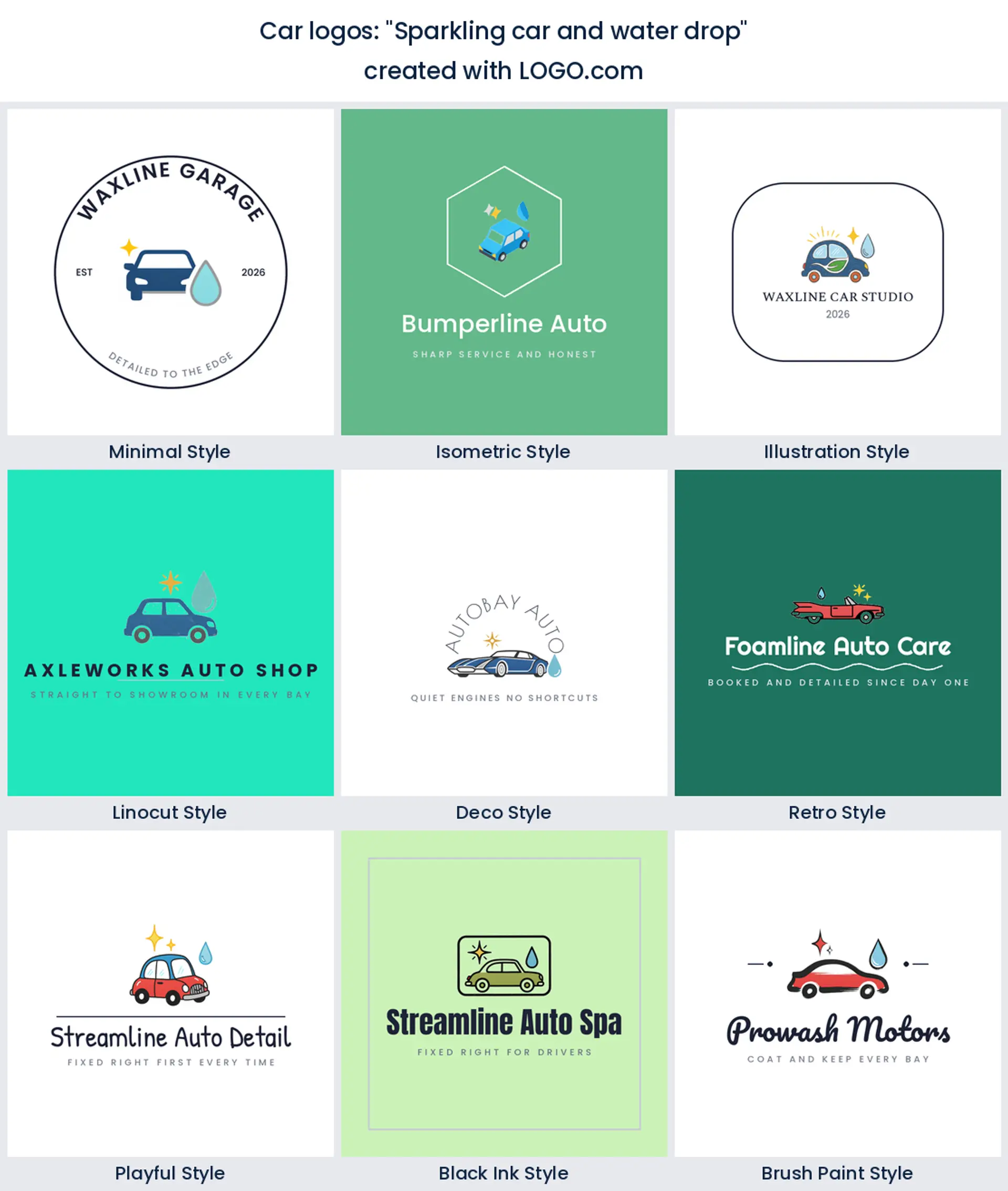
1. "Sparkling car and water drop"
The most complete detailing mark in the set, because three shapes cover three promises: the car, the water, the shine. Keep the droplet small and tucked beside the roofline or the lockup grows too tall for a van door. This is the shape most car detailing logo ideas end up circling back to.
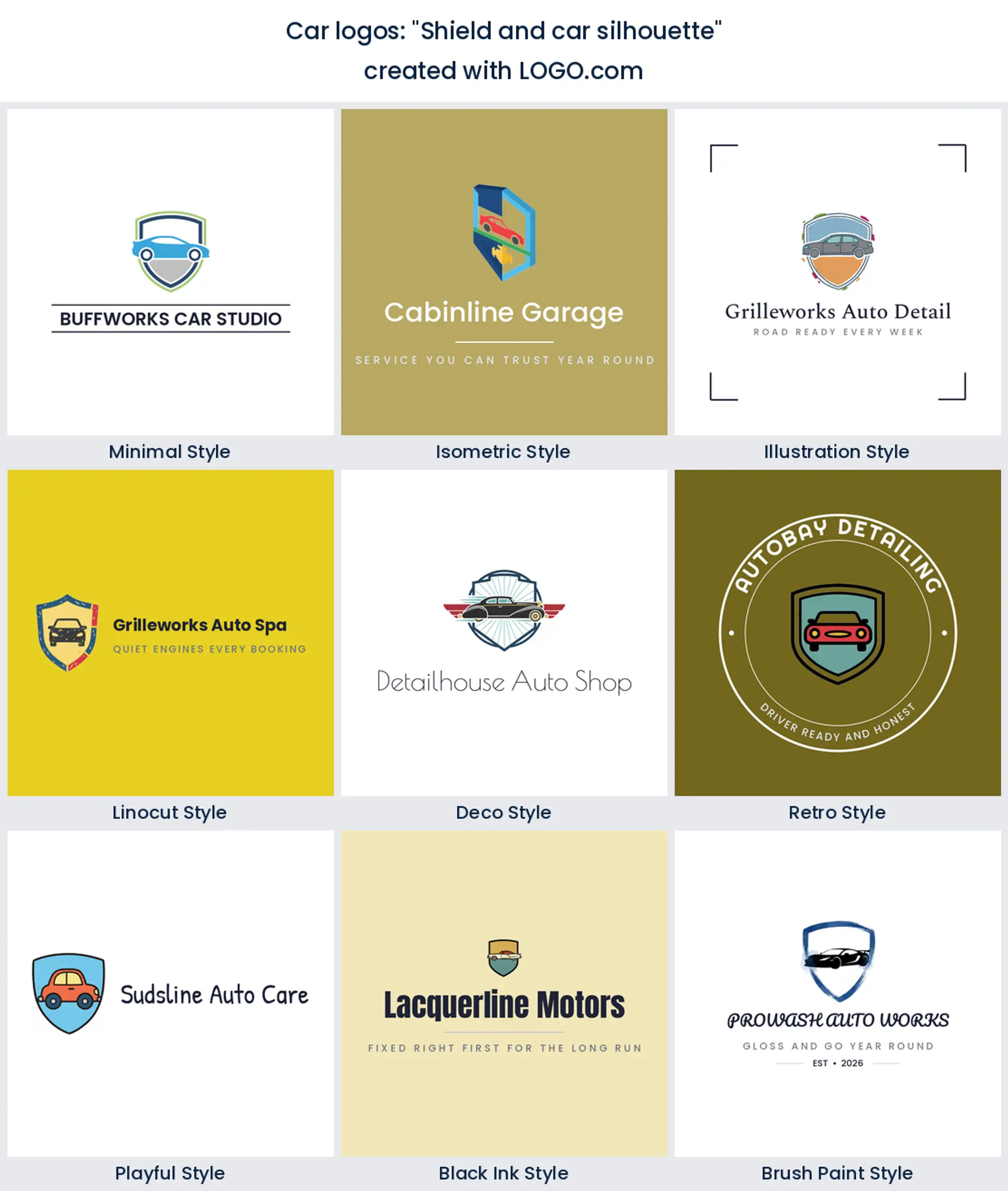
2. "Shield and car silhouette"
A shield around a car is the oldest move in automotive branding and it still works, provided the shield is soft rather than heraldic. Founders reach for it when they want a car dealership logo or a club badge to feel established. Two colours maximum, or the frame starts to fight the car.
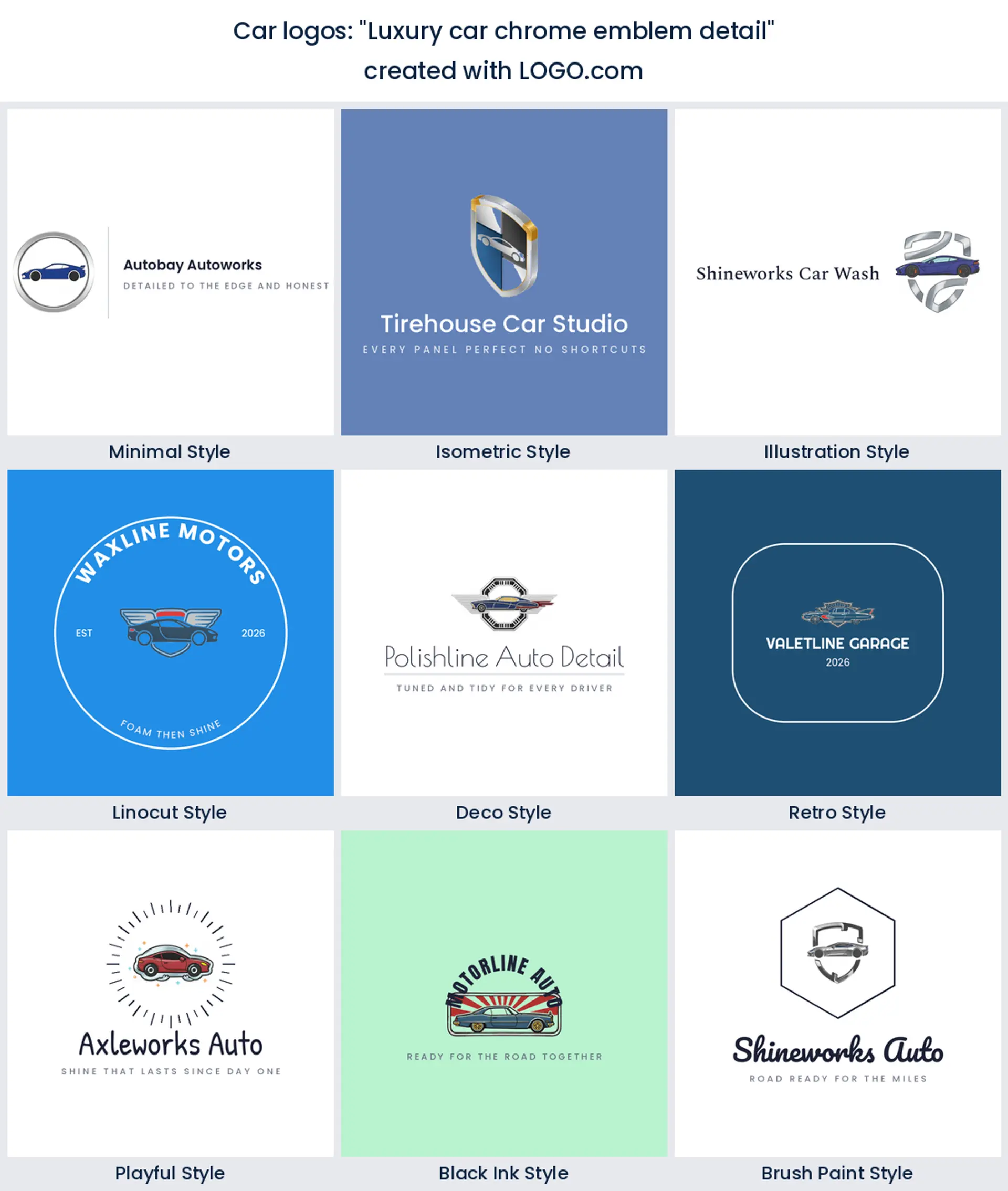
3. "Luxury car chrome emblem detail"
Chrome is a texture, not a colour, and that is the trap. Ask for a chrome emblem and you get something that looks expensive on a screen and disappears in one colour print. Draw the emblem shape you want first, then decide whether the metal effect survives the places it has to sit.
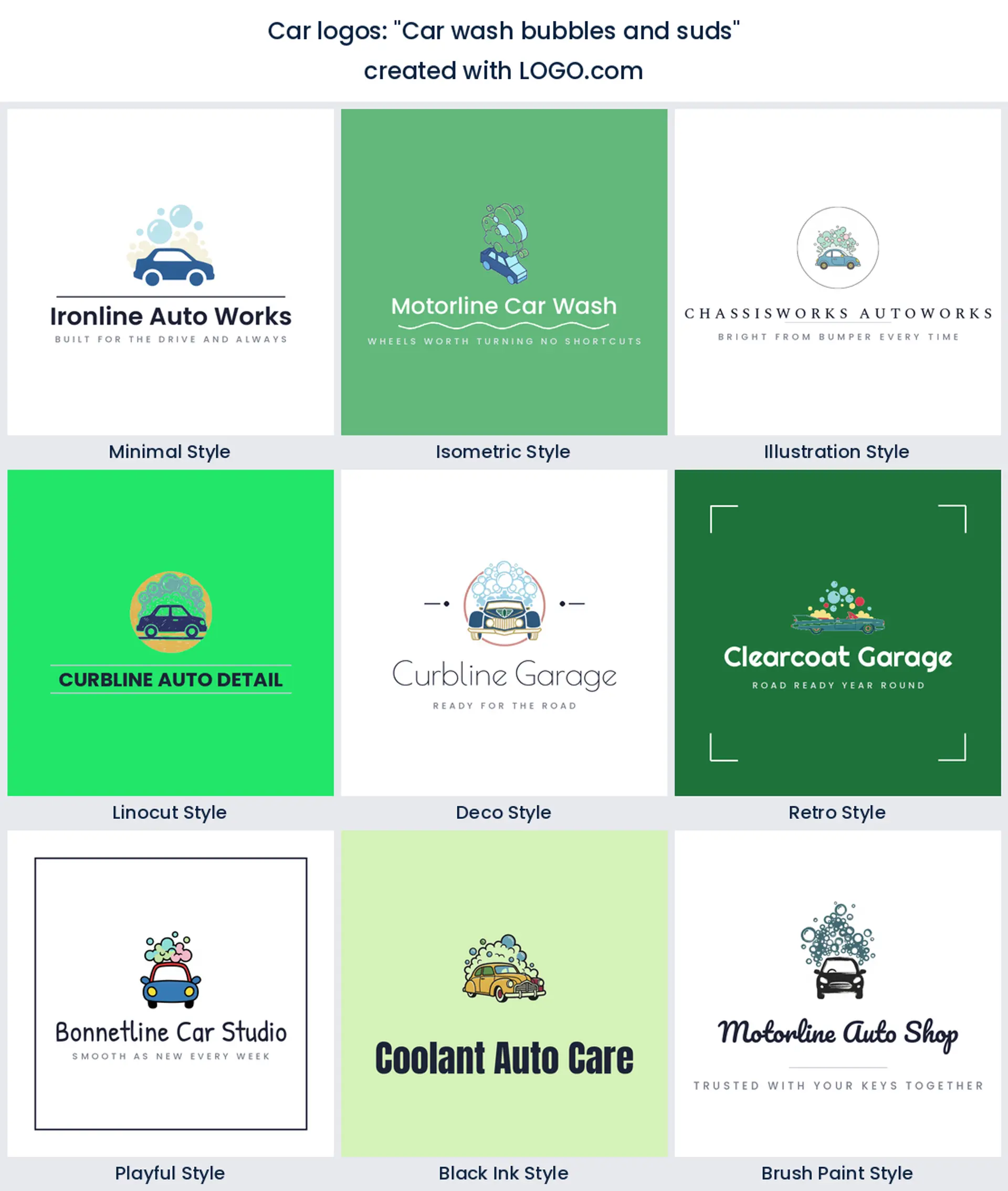
4. "Car wash bubbles and suds"
Bubbles above a car is the clearest car wash logo you can build, and it reads from across a forecourt. Contain the foam inside a circle and the whole thing becomes an avatar as well as a sign. Left loose, the suds spread sideways and the mark stops fitting anywhere square.
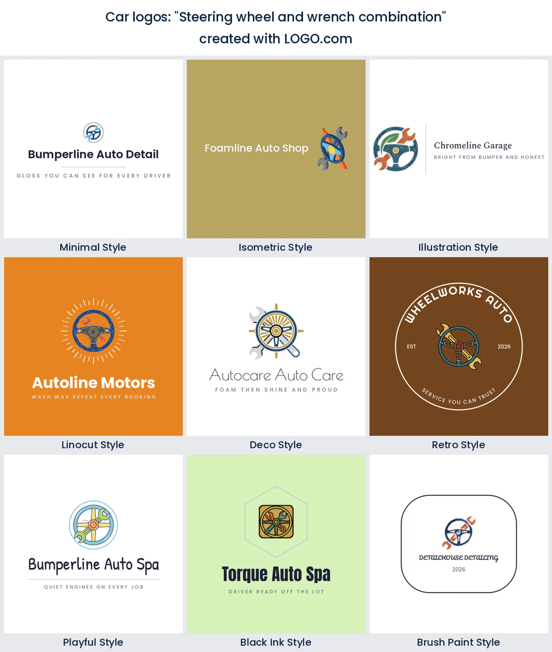
5. "Exotic car wrap detail"
A low supercar with a stripe running down the flank, which is what wrap and vinyl shops keep describing. It is the most specific idea here and that is its strength: nobody mistakes it for a family hatchback service. Just be sure the stripe is part of the drawing, not a gradient over it.
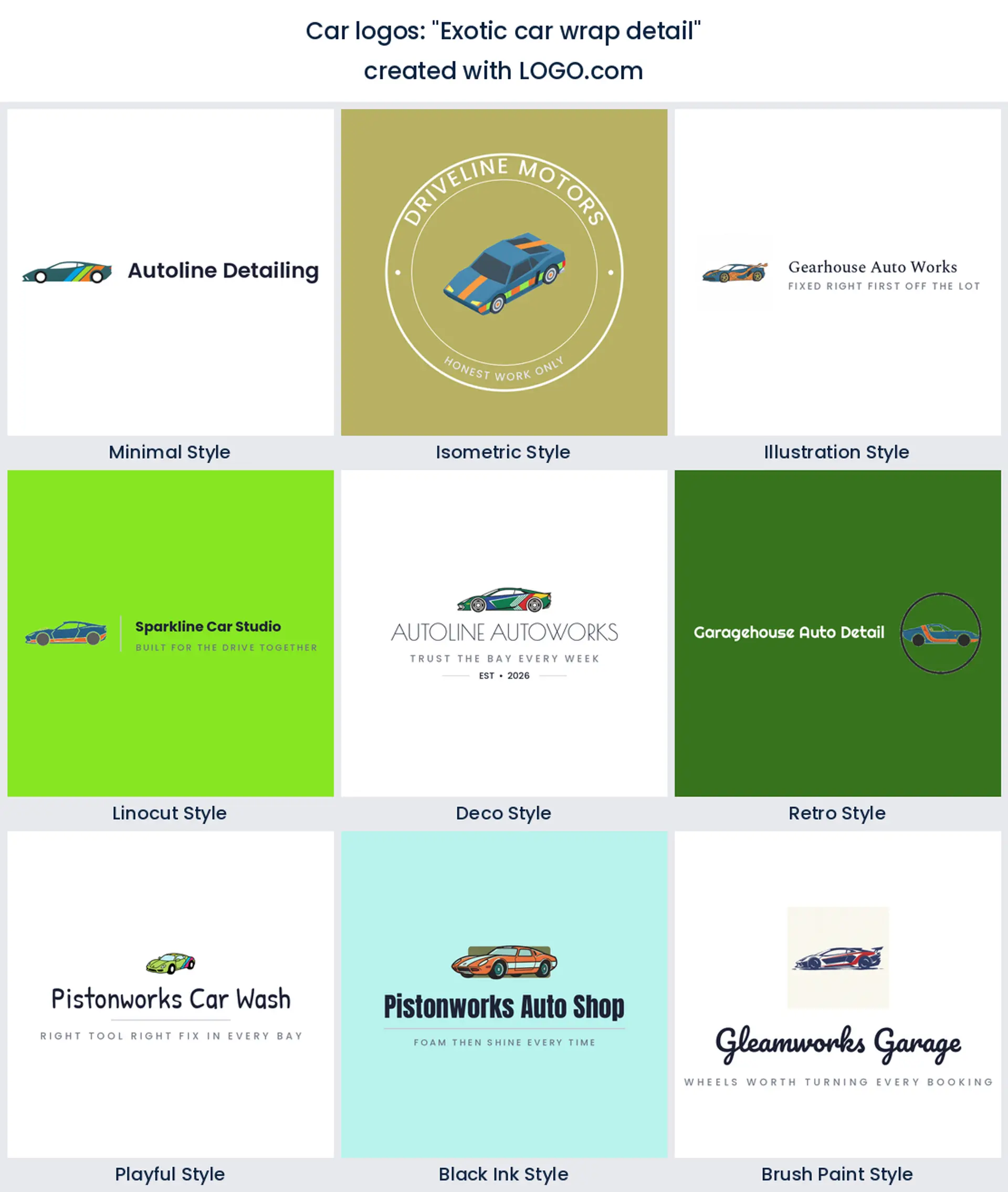
6. "Car with magnifying glass"
Inspection, diagnostics and pre purchase checks have almost no visual language of their own, so founders borrow the lens. It works because it changes the story from fixing to finding. Keep the car small inside the glass, since a car peeking out from behind it reads as a search bar.
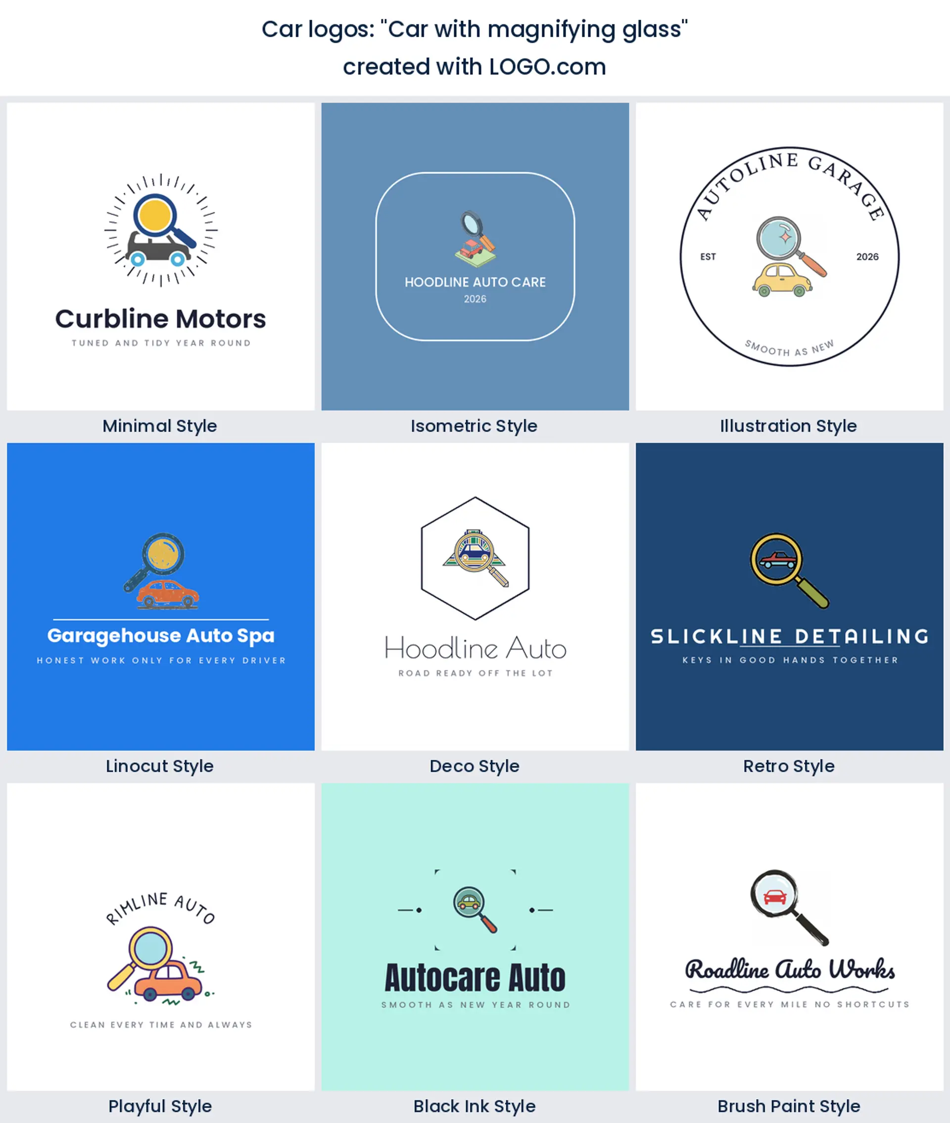
7. "Car detailing diamond emblem"
A diamond does the same job as a shield with none of the manufacturer baggage, which makes it one of the smartest car detailing logo design moves in this list. The angled sides also give the car somewhere to sit diagonally, so the mark feels like it has motion without any speed lines.
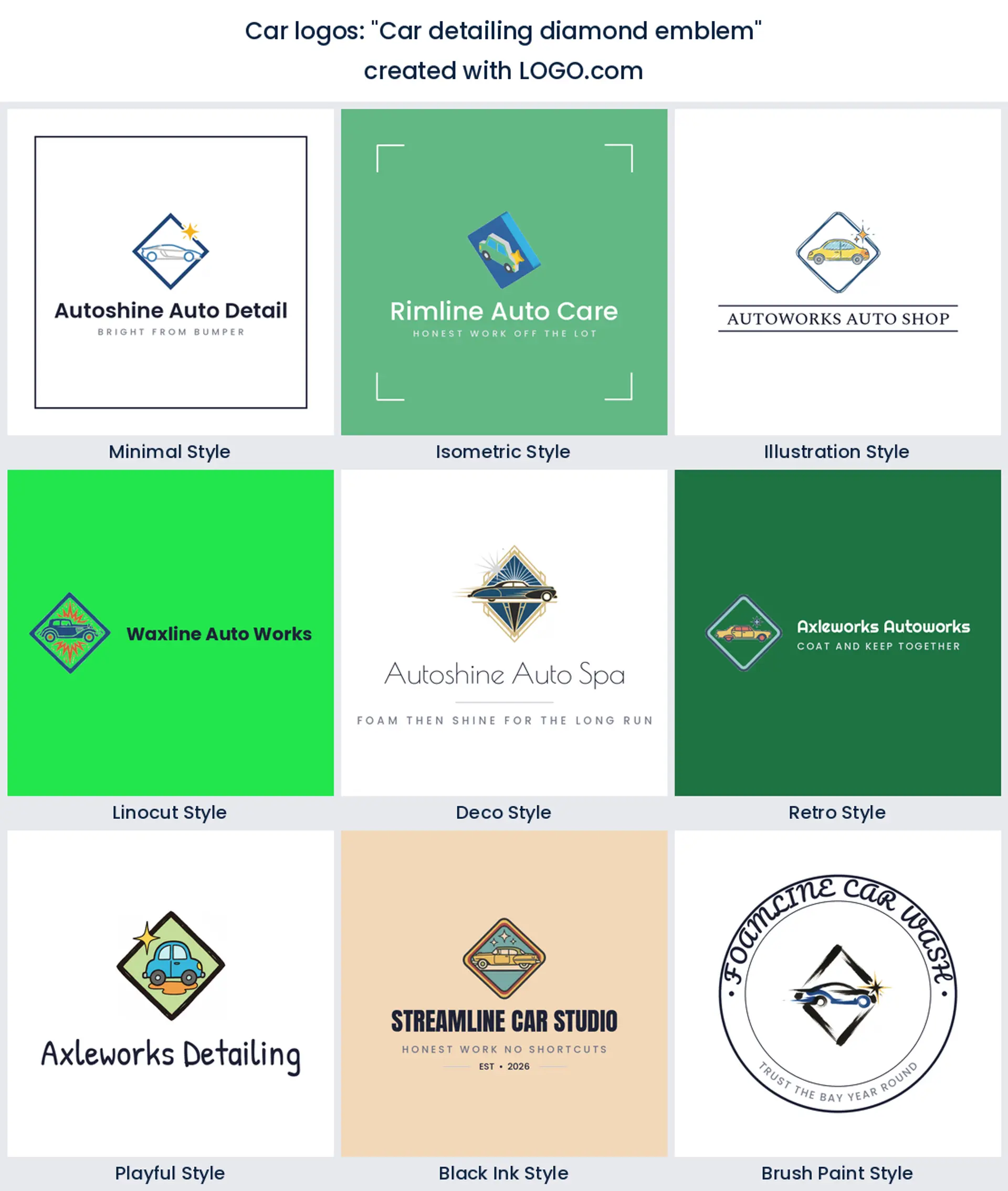
8. "Steering wheel and wrench combination"
The most described repair pairing we found, and the reason is geometry. The wheel supplies a circle, the wrench supplies a diagonal, and together they make a badge with a built in centre. Ideal for a mobile mechanic logo that has to live on a phone screen and a rear window alike.
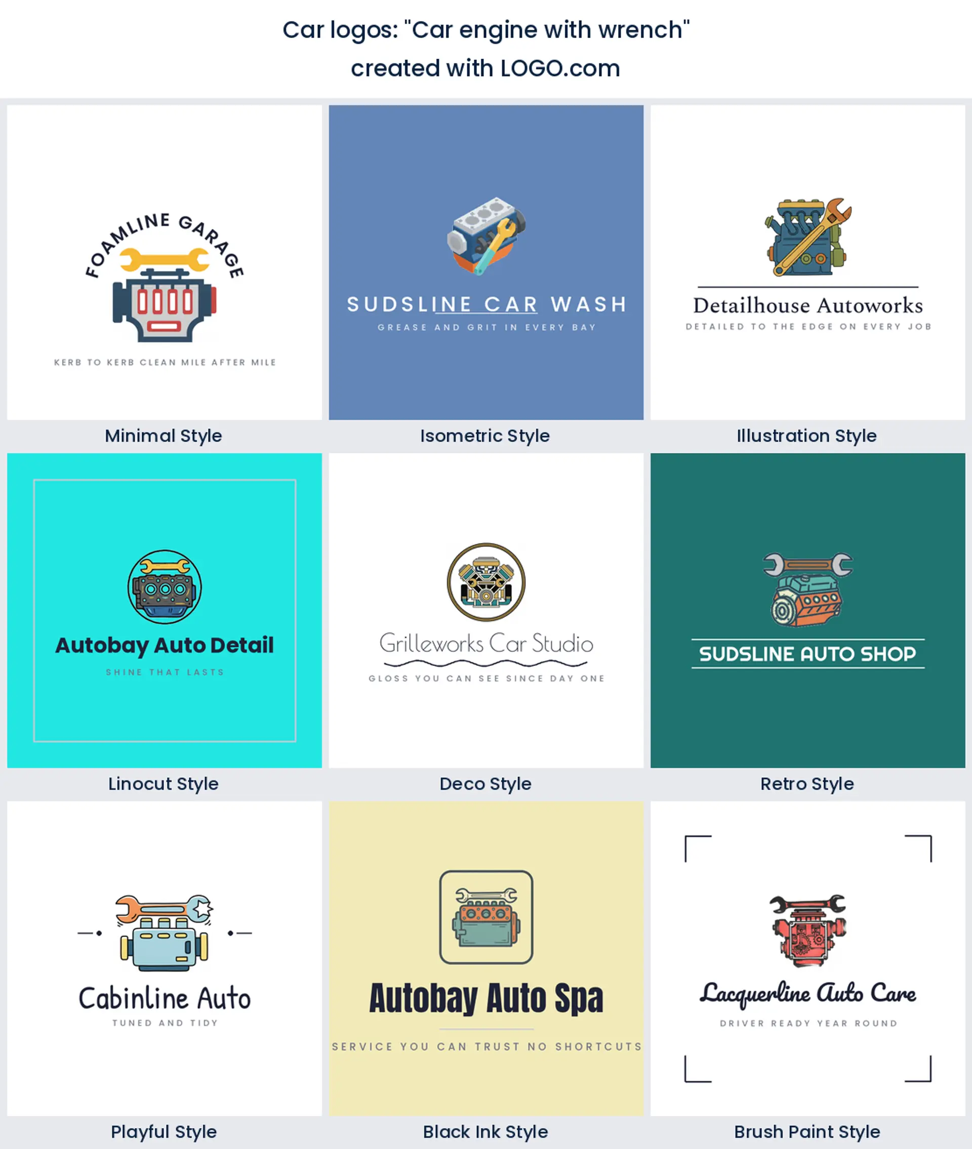
9. "Car engine with wrench"
Tools plus machinery is the service side of the trade in one mark. It tells a customer you open the car rather than sell it, which is exactly what an auto shop logo needs to say in the second before someone scrolls on. Lay the wrench across the block on a diagonal so the shapes separate.
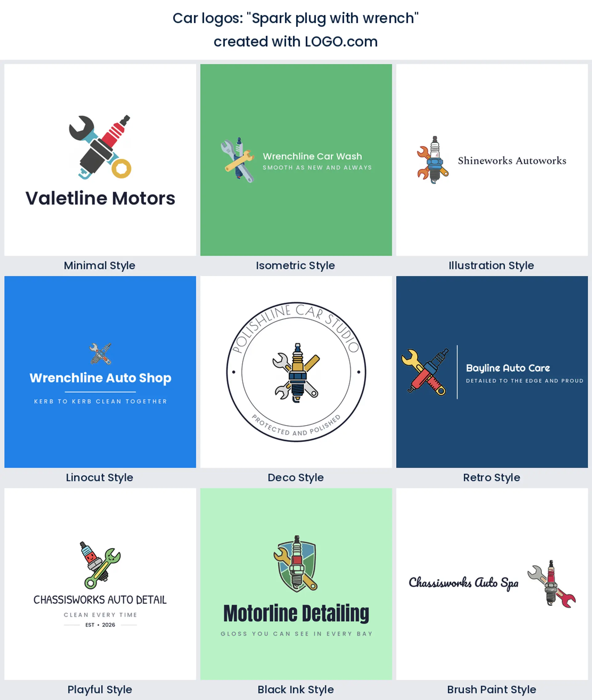
10. "Spark plug with wrench"
A plug is a lovely silhouette, tall and narrow with a threaded waist, and almost nobody uses it. Crossed with a wrench it becomes a tune up rather than a repair, which is a useful distinction if servicing is your bread and butter. Vertical lockups suit it better than horizontal ones.
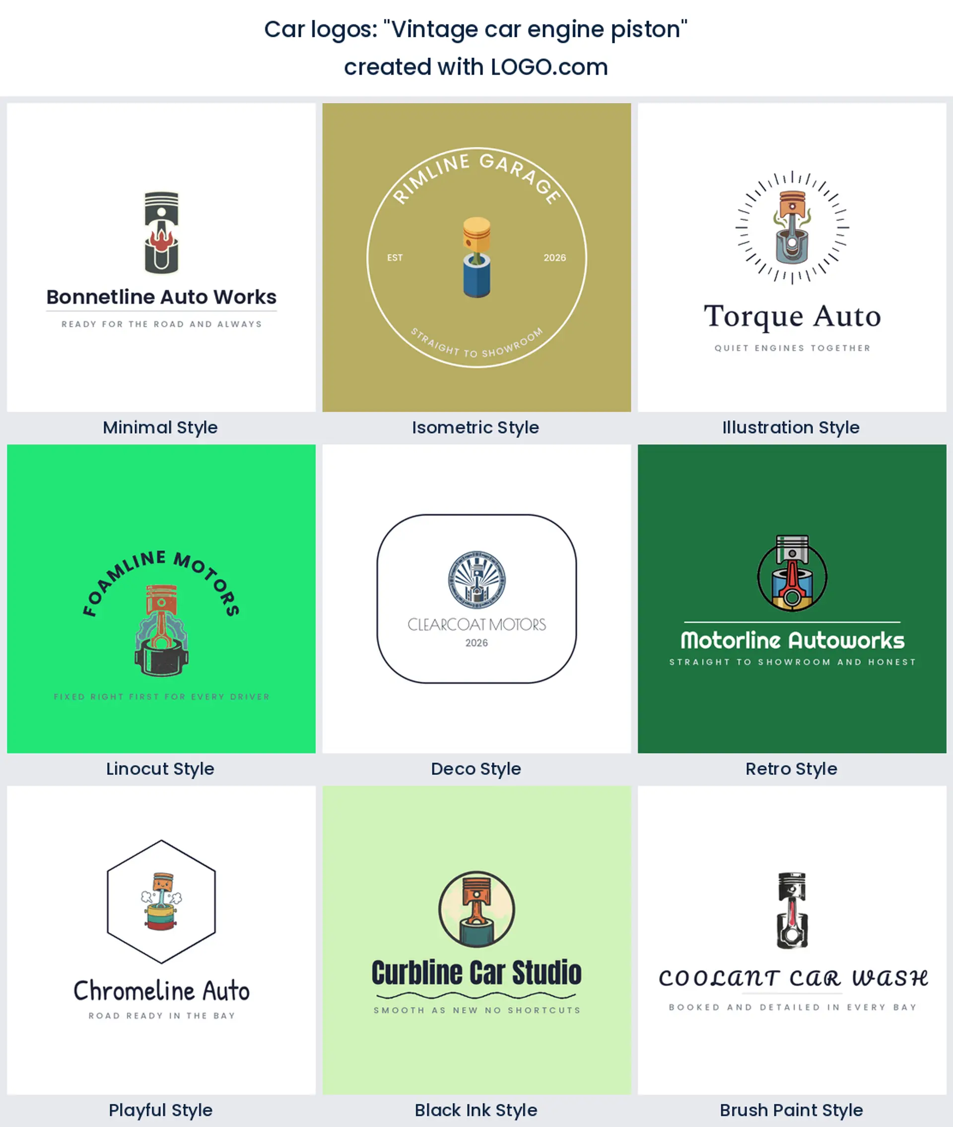
11. "Vintage car engine piston"
One piston rising out of a cylinder, drawn like an old parts catalogue plate. Restoration and classic work is where this belongs, because the vintage treatment is doing as much talking as the part. Keep it to a single piston. A row of four turns into a fence at small sizes.
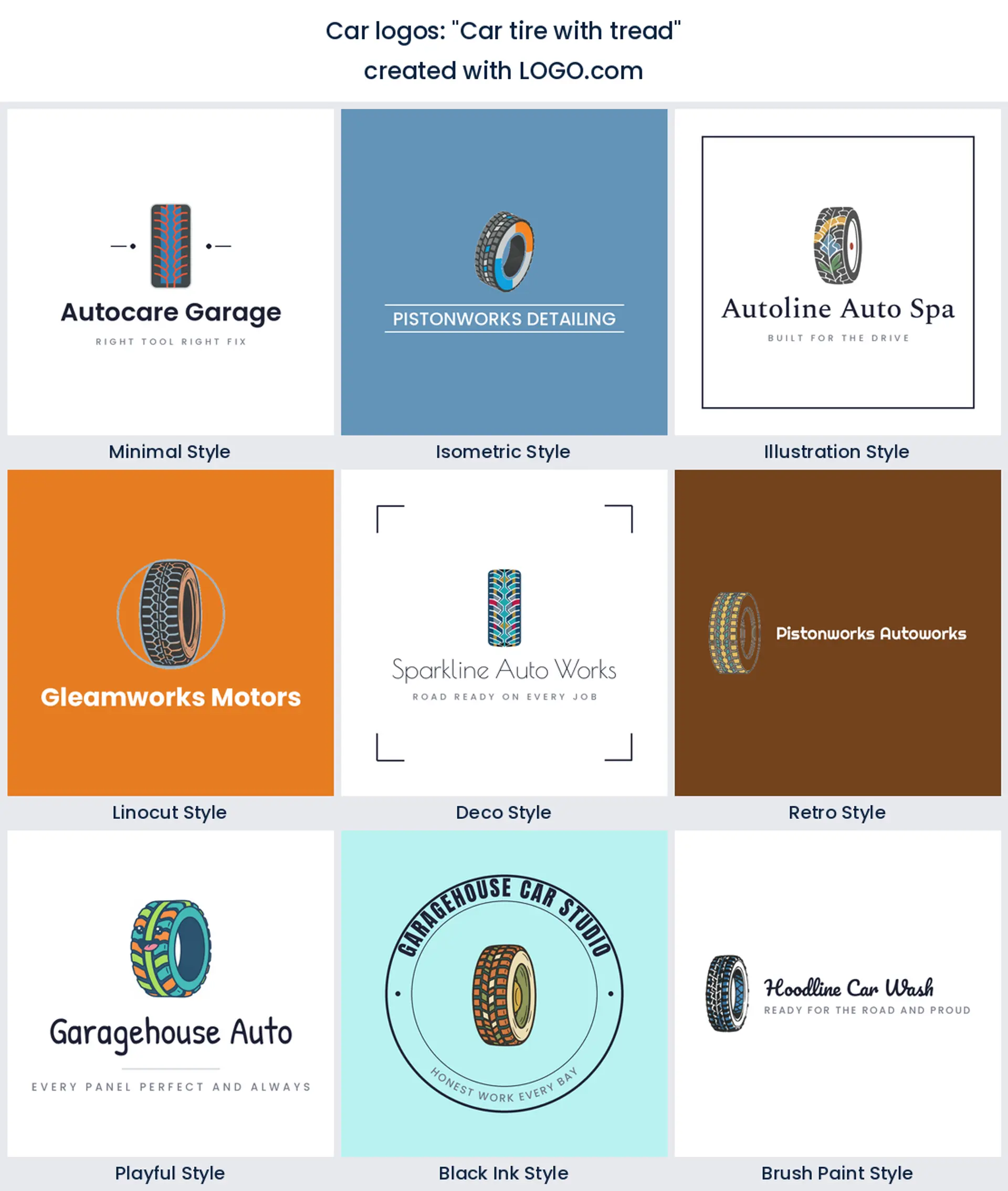
12. "Car tire with tread"
An upright tyre with visible tread blocks is the most legible circle on this page, and it prints beautifully in one colour. That makes it the sensible pick for fitting, alignment and mobile tyre work, where the logo ends up on a roller banner and a kerbside board rather than a screen.
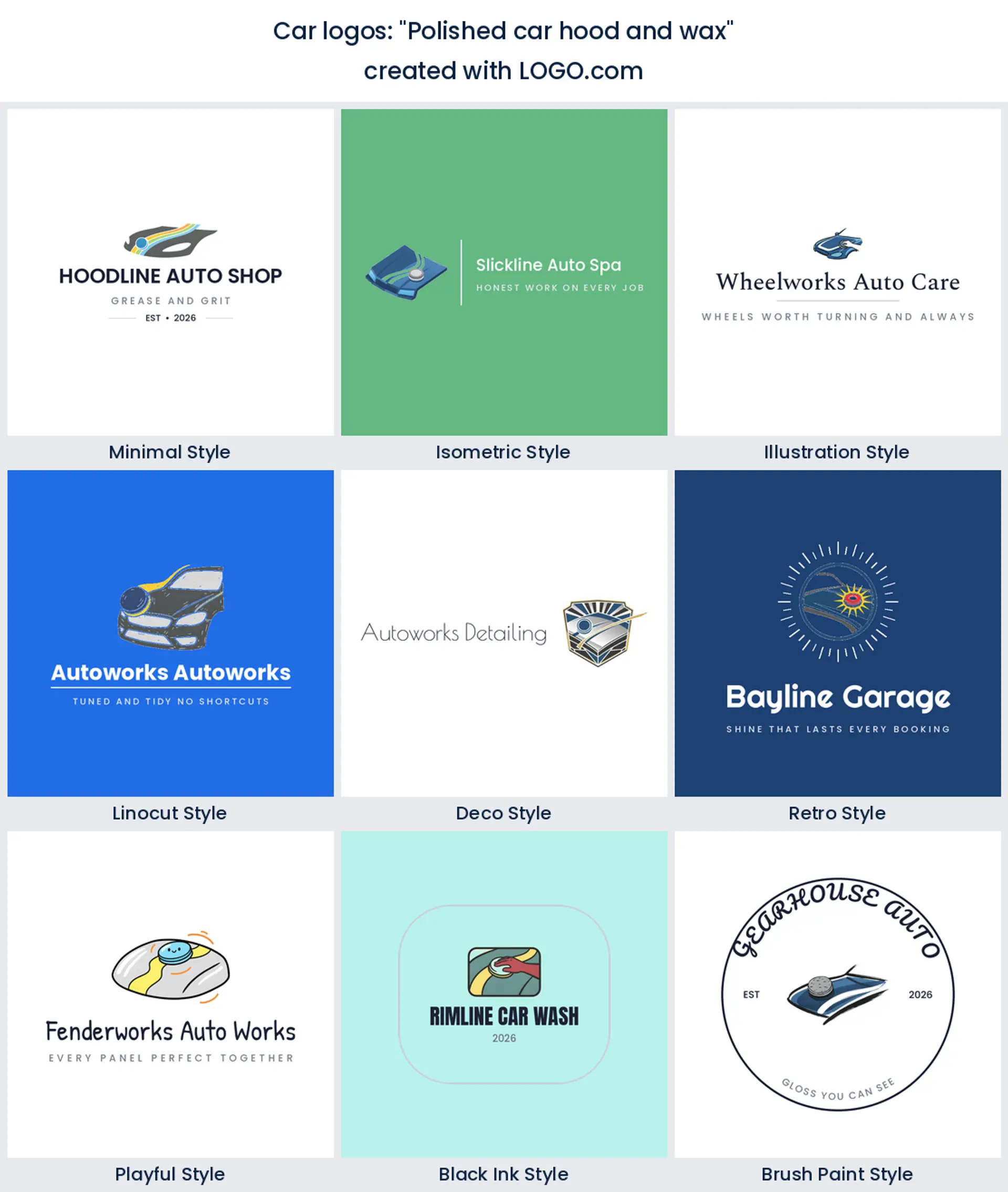
13. "Polished car hood and wax"
A hood with a wax pad and a streak of shine is a before and after in a single shape, which is hard to beat for paint correction and ceramic coating. Draw the streak as a solid shape rather than a soft glow, or it will vanish the moment somebody prints it on a dark shirt.
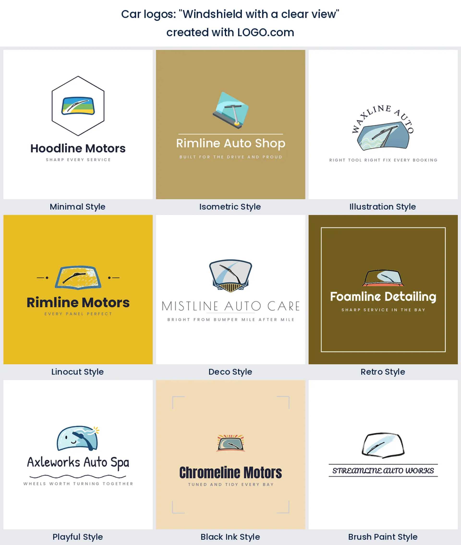
14. "Windshield with a clear view"
Auto glass is its own trade and it deserves its own mark instead of borrowing a wrench. A windshield with a wiper sweeping a clean arc says repair and replacement at once. It also gives you a wide shape, which suits the side of a mobile fitting van better than a circle does.
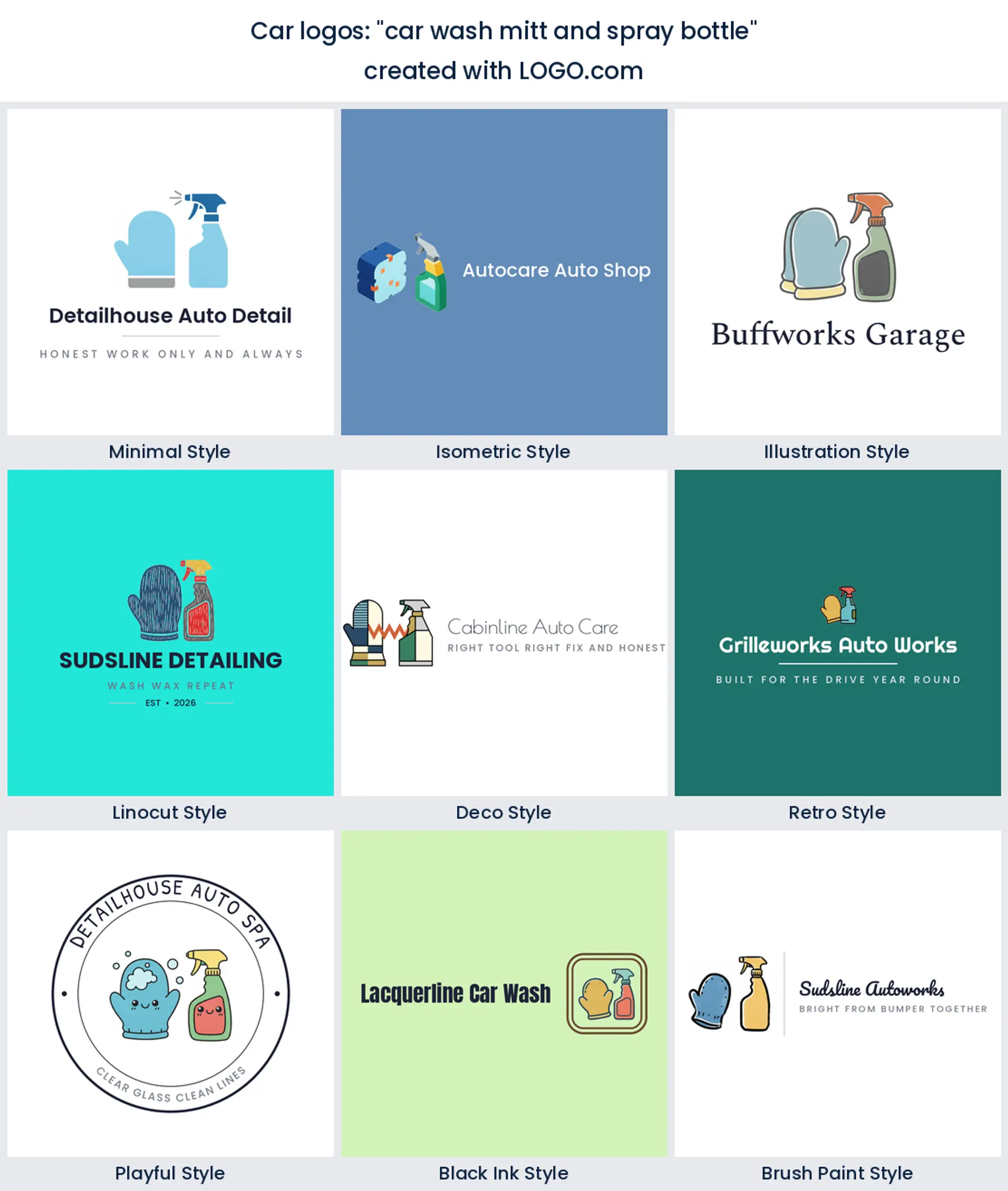
15. "car wash mitt and spray bottle"
Two tools and no car at all, which is braver than it looks. Showing what you hold rather than what you clean makes the brand feel handmade, and it is a neat answer for a driveway operation that does not want to look like a franchise. Give the pair one shared colour so they read as a set.
The four car businesses in our data want four different logos
Car is a wide word and the four biggest groups in our data want four different logos. Detailing sells a finish, so a sparkle or a droplet does the work and the car can be a silhouette. A wash sells speed and volume, so suds and a friendly shape beat precision every time. Repair sells competence, so a wrench, an engine or a plug is more persuasive than anything shiny. And a dealership sells confidence, which is why a car dealership logo almost always ends up inside a frame of some kind.
The smaller groups matter too if one of them is you. A car rental logo leans on the car plus a sense of place or a road, because the product is going somewhere. A car club logo wants a badge you would put on a rear window, so the icon has to work with no wordmark at all. A car sales logo for an independent trader works better with a name led lockup than a symbol, since trust sits in the name. Decide which of these you are before you pick a mark, and half the choices below make themselves.
Should the name say car, auto, or automotive?
This looks like a wording question and it is really a positioning one, which is why it is worth settling before the mark. Searches split three ways and so do customers. Car is the plain everyday word, so a car logo reads friendly and local and suits anyone whose customers are drivers rather than trade. Auto is shorter and harder working, which is why an auto logo tends to sit above a workshop door. Automotive is the trade register, so it lands better on invoices, supplier accounts and fleet quotes than it does on a driveway flyer.
The practical part is fitting, not meaning. Car gives you three letters and huge type. Automotive gives you ten and forces a two line lockup or a much smaller wordmark, which changes the mark you should draw. If you are undecided, sketch the long version first, because an automotive logo maker lockup that works will always shrink down to a short name, and the reverse is rarely true.
How not to look like a car manufacturer
This is the trap that no other industry has. Shields, ovals, wings, laurels, rings, stars and three pointed anything are all spoken for, and a customer who half recognises your badge will assume you are an official dealer or, worse, that you copied. Our own numbers show 15% of founders asking for an emblem, so this is a live risk rather than a theoretical one. There are three reliable ways out.
First, keep the frame soft. A rounded square or a diamond carries authority without quoting heraldry. Second, put a service object in the frame instead of just the car, so a wrench, a droplet or a sparkle tells the viewer you work on cars rather than build them. Third, let the wordmark carry more weight than the badge. Manufacturers can afford a symbol on its own because everyone already knows the name. A new custom car logo cannot, so give the name room and treat the mark as support.
From a van door to a booking confirmation
Most trades only have to worry about a shirt and a sign. A car business has a longer list, and the awkward placements are the ones that decide the design. Your mark will end up cut as vinyl for a van door, which means it needs to survive with no background panel behind it. It will be printed on a rear window sticker, so a version with no wordmark has to exist. It will sit at the top of a booking confirmation and a review request, where it is about forty pixels tall. And it will be embroidered on a polo shirt, which closes up every gap thinner than a stitch.
Test all four before you settle rather than after. Shrink the icon on its own until it is the size of an app tile and see whether you can still name the object. Set it against a dark panel as well as a light one, because half of your work sits on paintwork. A car logo png with a transparent background covers the digital side of that list, and it is part of the free download, so there is no reason to guess.
Red is the obvious choice and almost nobody picks it
Red is what most people expect from anything automotive, and it is not what founders here actually choose. In the palettes car and automotive brands save with us, white and black lead as the base pair, and after the neutrals blue is comfortably the most picked colour, with green second. Yellow and orange show up as accents. Red sits well down the list. That gap is useful rather than surprising, because blue reads as trustworthy and clean, which is precisely what somebody handing over their keys wants to feel.
So set a deep neutral first, charcoal or near black, then choose one hue and commit to it. Blue for trust, green if your angle is careful hand work or eco friendly chemistry, and a warm accent only if you need heat somewhere. Keep the pair readable on silver, white and black paint, since those are the three cars parked outside every unit in the country. And remember you can take a full colour icon or switch to a one colour version, which is the file a sign maker will ask for.
The files a wrap shop and an embroiderer will ask for
Designing is free and four high resolution PNG files download free with full commercial use, which already covers your booking page, your socials, your invoices and the sticker file you email to a printer. That is the honest baseline, and for a lot of small operators it is the whole job. Where it stops is scale. A wrap shop cutting vinyl for a van flank and an embroiderer digitising a chest logo both want vector artwork, because only vector holds its edge at that size.
Vector files come with the Brand Plan at $72 a year, together with unlimited edits, your brand kit and a branded website. The practical advice is to get the vector before the van goes in for signwriting rather than while it is on the ramp. Sign shops charge for redrawing a logo they cannot scale, and that fee usually costs more than the plan.
Make your car logo with LOGO.com
Put your business name in the box at the top, pick one of the nine marks above, and try it in three or four styles before you decide. A free car logo generator is most useful as a way to rule things out, so kill the ones that fail on a dark panel or at sticker size early. Most people land on something they are happy with in a few minutes, and you can come back and change it whenever the business does.
Methodology. We looked at the car and automotive logos created on LOGO.com in the twelve months to August 2026. The cohort is two industry groups combined, one covering car labels such as car detailing, car wash, car rental, car sales and car dealer, the other covering auto labels such as automotive, auto repair, auto detailing, auto parts and auto body, with false matches like healthcare, lawn care, trading cards and carpentry excluded. That is 1219 brands and 165 custom icon descriptions across 146 distinct descriptions. We grouped the descriptions into concepts and ranked them by count, which is where the car itself (about 63%), a polish sparkle (about 23%) and a car emblem (about 15%) come from. Colour shares come from the palettes those same brands saved over the same window. Source: LOGO.com first party product data, August 2026.
THE #1 LOGO GENERATOR
Why LOGO.com is the best car logo maker
1.Checked against paintwork, not just paper
Build your car logo against black, white and silver inside the editor, so you know now that it still reads on the three colours of car parked outside every unit rather than finding out at the sign shop.
2.A door decal size test built in
Shrink your mark to the width of a van door decal in the editor and check the thin parts have not filled in, because that is the size most people will actually see it at.
3.Booking page and socials sorted the same day
Four high resolution PNG files download free and carry full commercial use, so your car logo png can go on the booking confirmation, the review request and the shop front photo this afternoon.
4.The wordmark free icon for a rear window
Every build gives you the icon on its own as well as the full lockup, which is the version that ends up on a rear window sticker, a polo shirt chest and a square profile picture.
5.Vector files for wraps, signage and stitching
The Brand Plan adds the vector artwork a wrap shop, a sign maker or an embroiderer needs for a van flank, a forecourt board and a workwear chest logo.
6.Change it when you add a second bay
Car businesses grow by adding services, so the Brand Plan keeps your edits unlimited and your brand kit in one place when a wash turns into a detailing studio.
Car Logo Maker FAQs
Explore more logo ideas
3D DesignAcademic WritingAccountantAerospace EngineeringAgricultural ConsultingAgriculture CompanyAmazonAnimal ProtectionAnimationApp DevelopmentAquacultureAromatherapyArt and DesignArtsAsian RestaurantAthleticsAudio TechnicianAuto ManufacturingAuto Repair ServicesBadgeBandBarber ShopBearBeauty and CosmeticsBeeBibleBiotechBitcoinBlogBoatBook PublisherBooks and Literature BlogBrainBuildingBusiness Consulting Logo MakerBusiness StorageCakesCampaignCandlesCarpentryCateringCelebrationsChemicalChildrenChoirCircleCivil EngineeringClothingCoffee ShopColors