
Finance Logo Maker
Design a finance or financial services logo for your website and client reports.
Need a different logo maker? Try our AI logo generator.
Logos created using LOGO.com
670,000,000
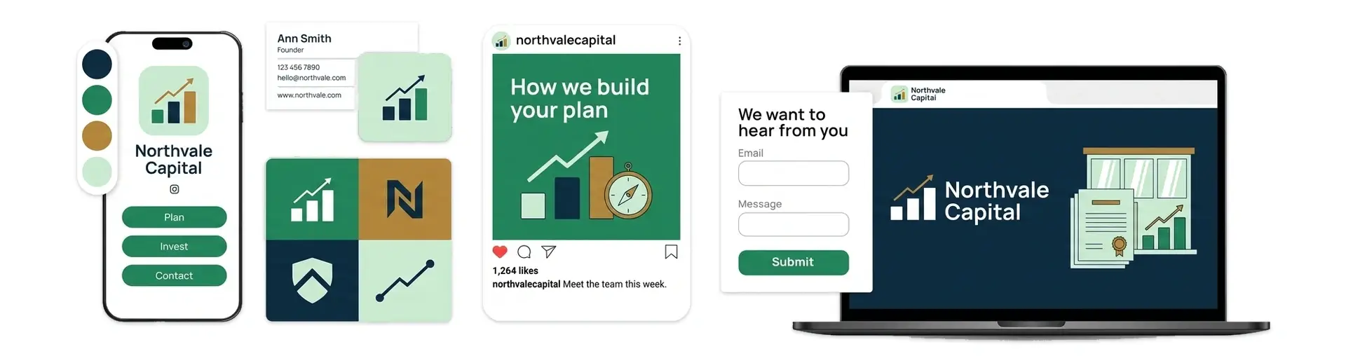
Growth marks for a finance or investment logo
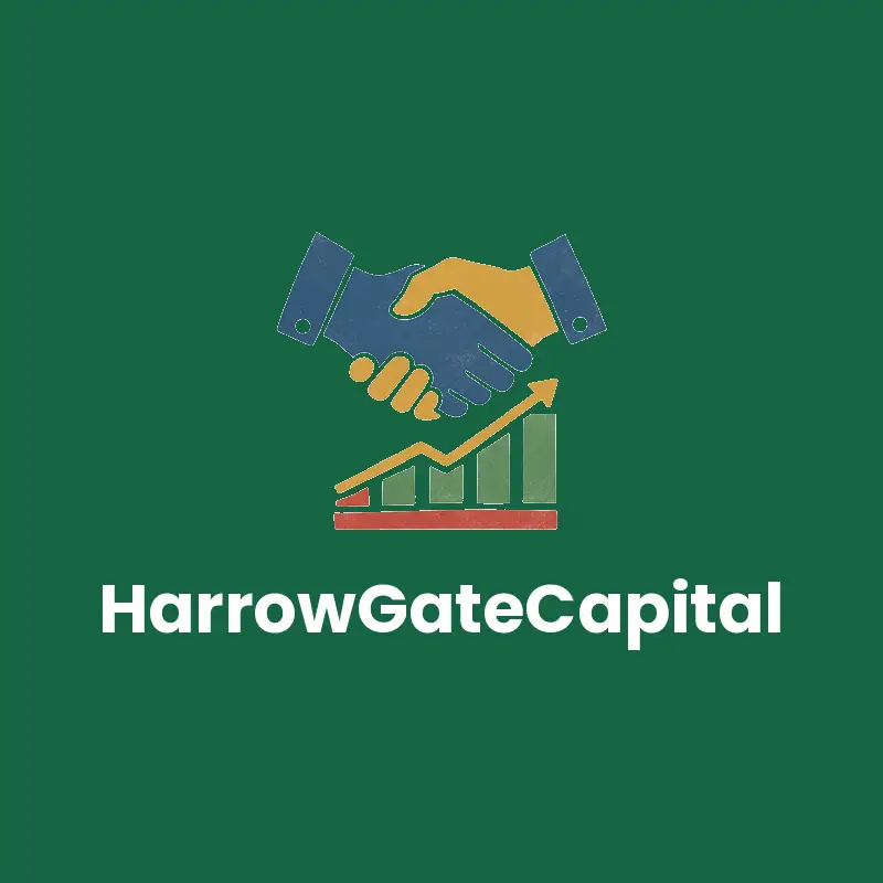
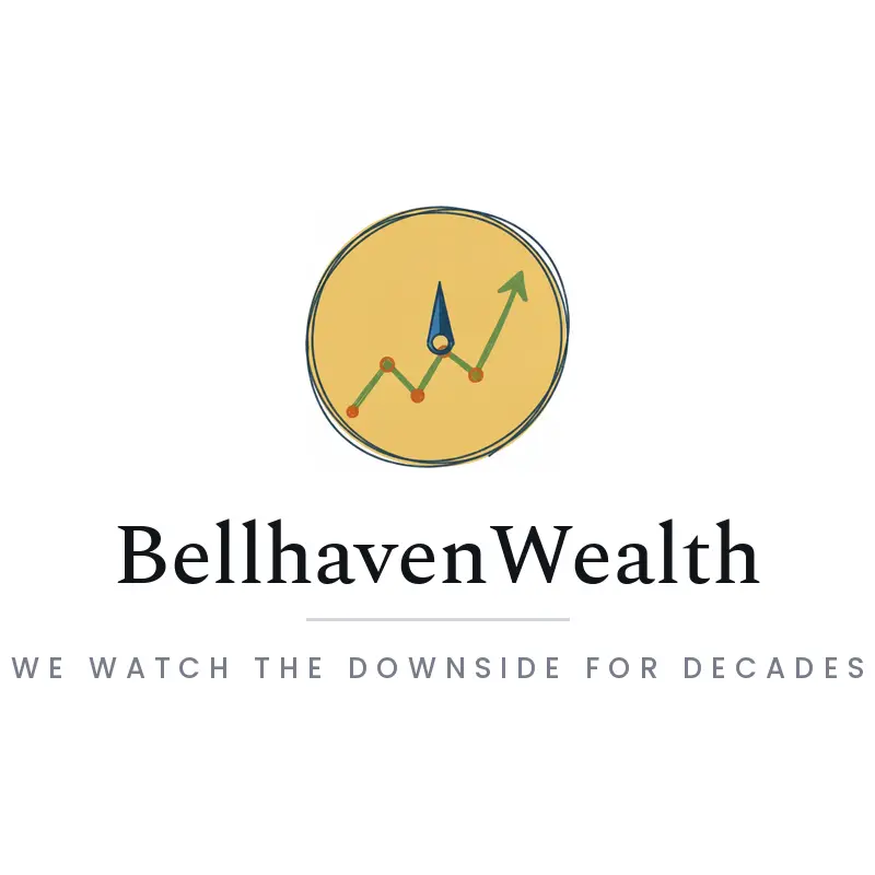
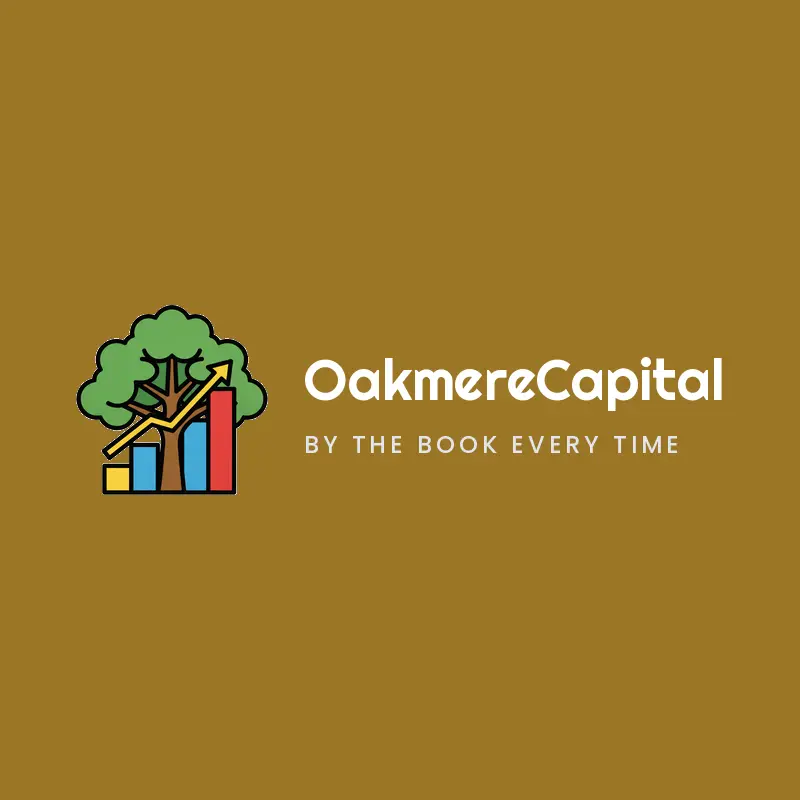
Ledgers globes and tools for a financial advisor logo


Steady marks for a wealth management or banking logo

Finance Logos, Ranked From Real Founder Prompts
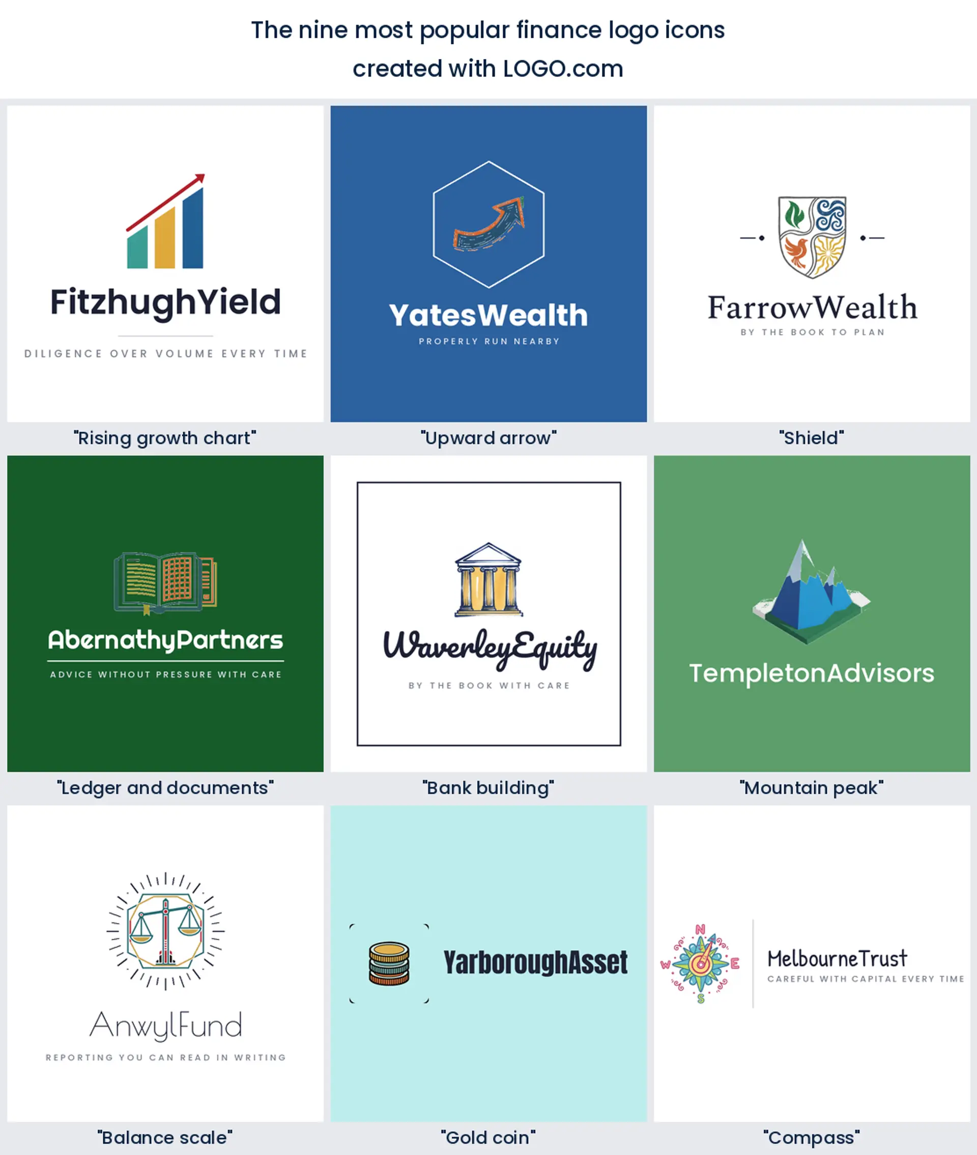
According to LOGO.com data, a rising chart or graph is named in about 29 percent of the finance icon descriptions written on LOGO.com, an upward arrow in about 6 percent, and a shield in about 6 percent, across 628 descriptions from 2,631 finance, banking and investment brands.
So growth is the story almost everyone tells, which is precisely why the six symbols further down the ranking are worth a look. Below are those nine ranked marks and fifteen real founder prompts, each one drawn across all nine LOGO.com styles, so you can see a financial services logo shift from carved and institutional to plain and current before you commit to anything.
On this page
- Should your mark look like an institution or like a person?
- The nine symbols behind 628 finance icon descriptions
- Fifteen founder prompts worth stealing, word for word
- Green or blue, and what each of them quietly promises
- Advisor, planner, or investment firm, match the mark to the work
- Will it survive a client portal and a quarterly report?
- What compliance asks for, and what you can trade under
- Make your finance logo with LOGO.com
Somebody is sitting with your website open, working out whether to move a pension they have spent thirty years filling. Nothing on that page gets read as carefully as the mark in the top corner, because before you have said a word it is already making a claim about who you are. That is a lot of weight for one small graphic, and it is why founders labour over a finance logo far longer than a coffee shop ever does. Play it too safe and you look like a bank that is not one. Play it too confident and you look like a trading app. Everything below is about finding the middle, using what finance founders have actually built on LOGO.com rather than what a mood board suggests.
Should your mark look like an institution or like a person?
Settle this before you pick a symbol, because everything downstream follows from it. Institutional marks lean on shields, columns and deep navy, and they work by borrowing the look of somewhere that has been standing a while. That is the right call if you hold other people's retirement money, if your compliance record is part of the pitch, or if the firm you lose deals to is a regional bank. Take that road and keep the drawing spare, keep the type conservative, and let the restraint do the persuading.
The friendlier road is winning more of the market than it used to. If you talk people through debt, if you are one adviser with forty families on the books, or if you publish about personal finance, a soft green sprout or a plain climbing line will read as approachable in a way a crest never manages. A personal finance logo can afford warmth that a custodian bank cannot. You are not picking between clever and safe here, you are picking who feels welcome, so choose the one your real clients would see themselves in and stop hedging.
The nine symbols behind 628 finance icon descriptions
Where the corpus comes from matters, so here it is. Finance labels in our product carry plenty of brands but surprisingly few written icon descriptions, so we widened the net to every description on LOGO.com whose wording names finance and merged it with the descriptions from finance, banking, investment, accounting and insurance accounts. That gives 628 descriptions, grouped into nine concepts, with the full scoping set out in the methodology at the foot of the page. Read the shares as mentions rather than exclusive picks, since founders happily name two symbols in a single line.
1. Rising growth chart
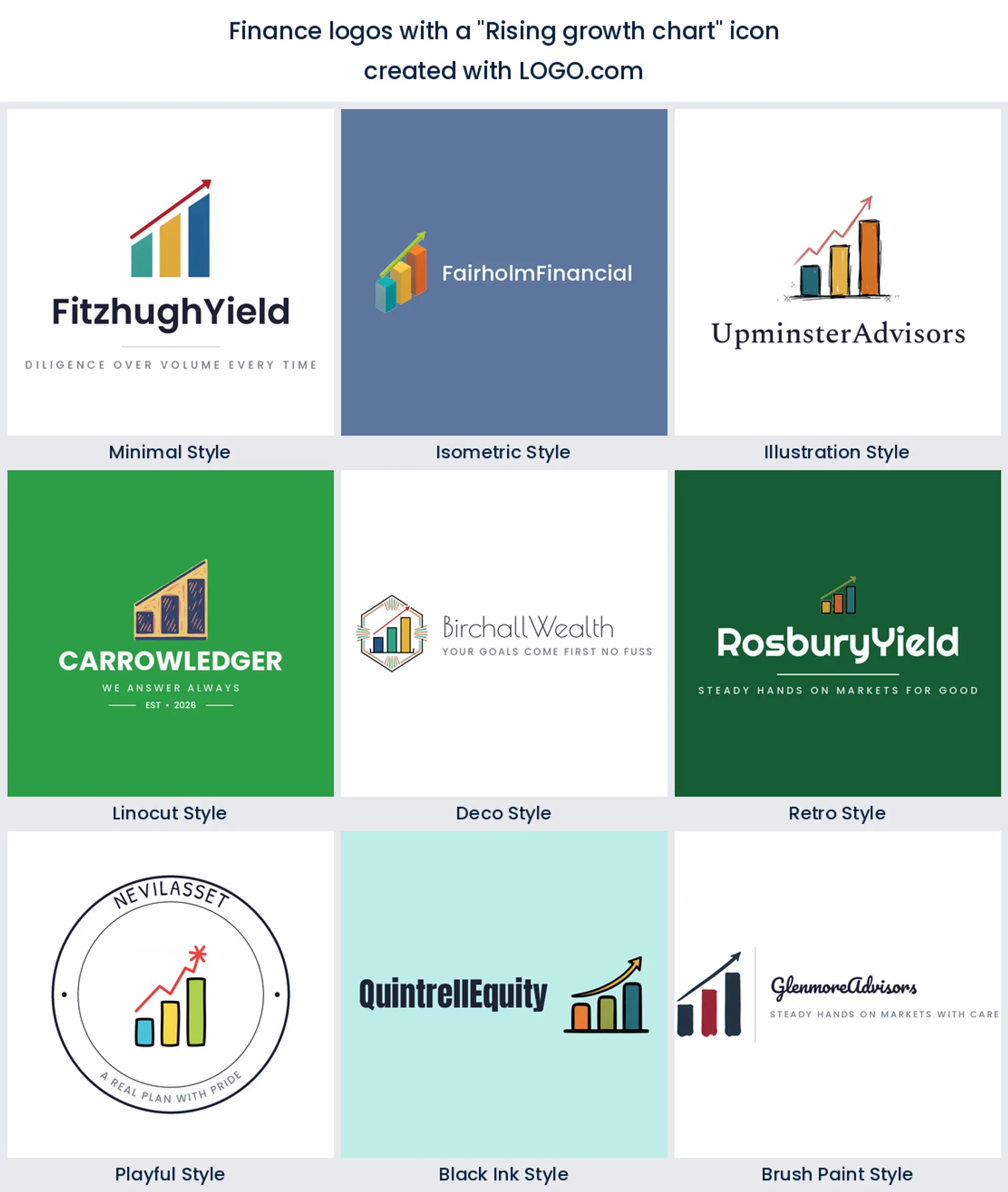
Roughly 29 percent of these descriptions ask for a chart, a graph or a climbing line, and that number is the one to reckon with before you draw anything. It is the most legible thing you can put in front of a client, and it is also why half your competitors are hard to tell apart. Take it if you want it, then earn it back with a particular bar rhythm or an unusual line weight. It fits almost any finance logo and it is strongest where growth genuinely is the product, portfolio management and business advisory.
2. Upward arrow
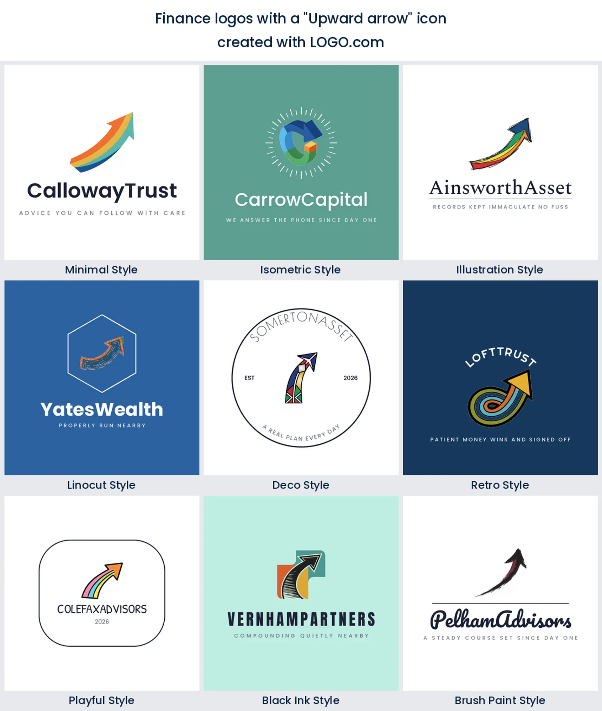
Strip the chart down to one stroke and you have the arrow, named in about 6 percent of descriptions. No axis, no bars, nothing to misread, and almost no detail to lose. That last part earns its keep, because an arrow is still an arrow at sixteen pixels. Reach for it when your product is an interface, which makes it the obvious fintech or investment logo.
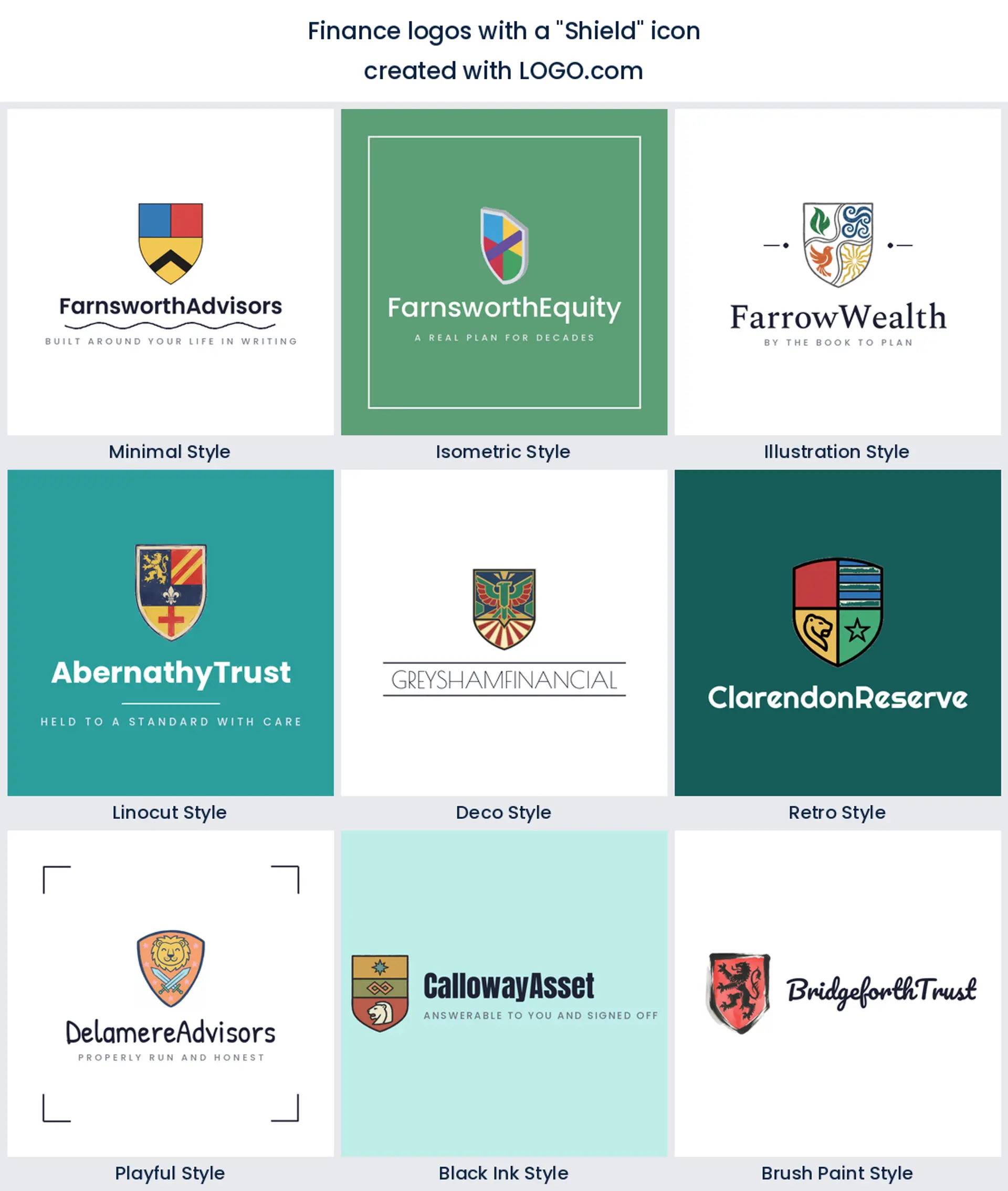
3. Shield
Then the mood changes. About 6 percent of founders reach for a shield, and they are selling safety rather than upside, which is a different conversation entirely. Insurance, custody, estate planning and anyone whose clients arrive worried all get real mileage from it. A shield also takes a monogram better than any other shape here, so it makes a tidy financial services logo for a firm with a long name.
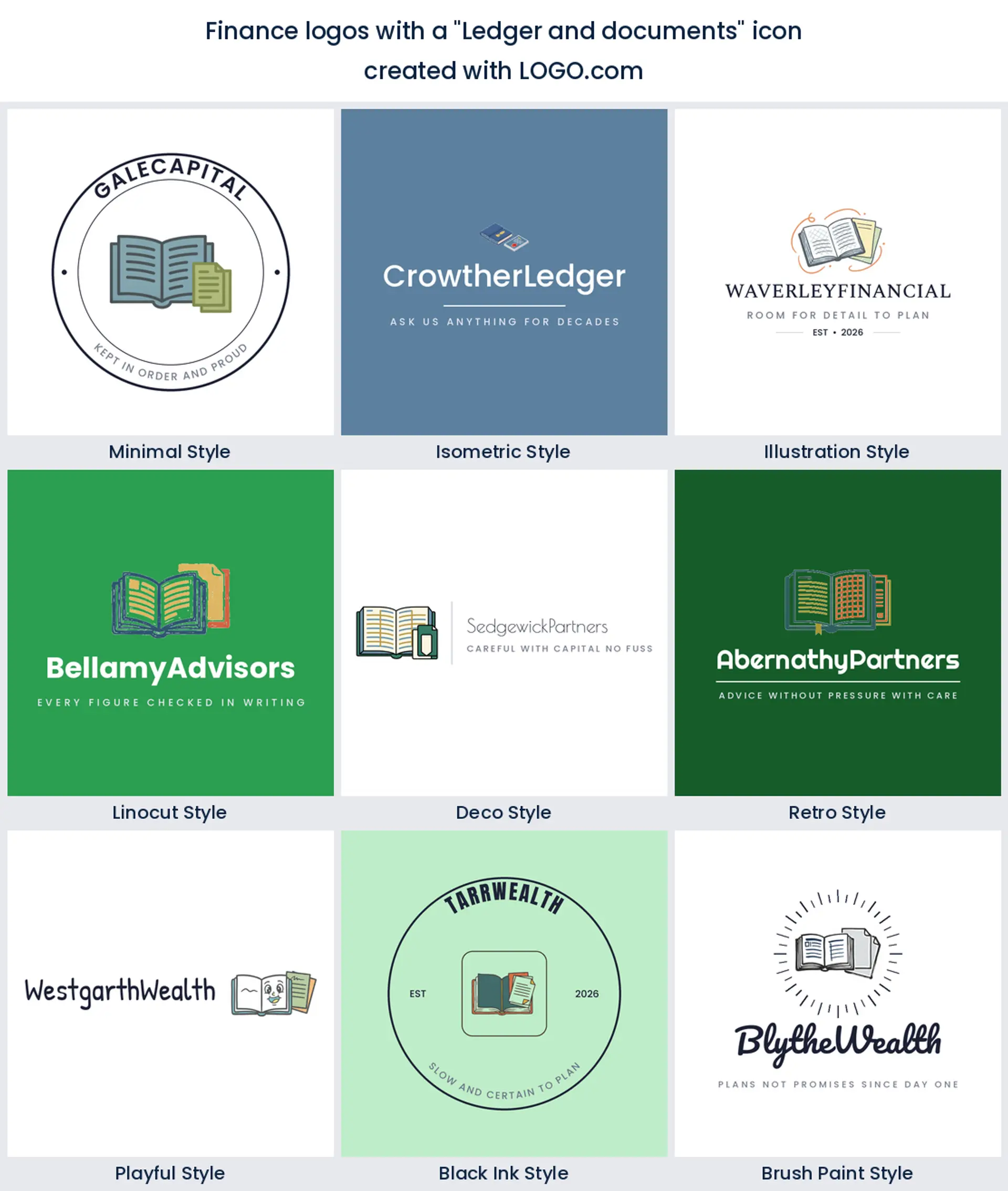
4. Ledger and documents
Ask a bookkeeper what they sell and you will hear about reconciliations, filings and a set of accounts that balances. About 5 percent of descriptions name that work directly, an open ledger or a stack of statements, and it is refreshing how little it promises. Nobody looking at a ledger expects a windfall, they expect the numbers to be right. Where that is the pitch, and for tax practices and outsourced finance teams it usually is, you get a financial logo that will never embarrass you in a bad quarter.
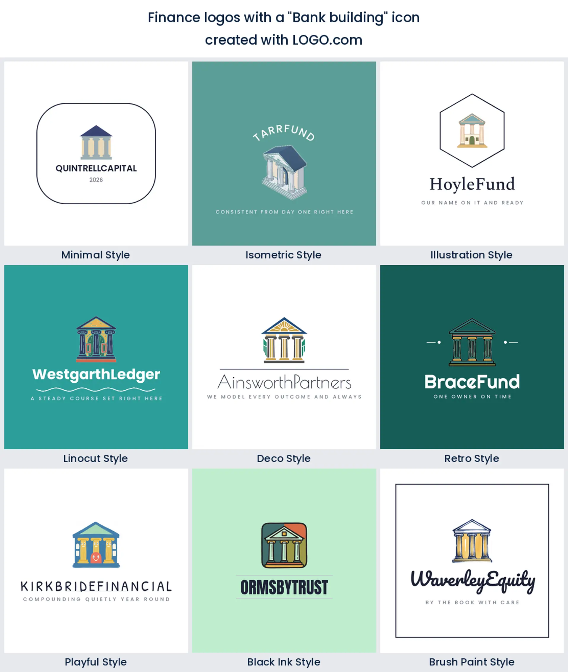
5. Bank building
Roughly 5 percent of founders describe a building rather than an object, columns or a tower or a vault door. What they are reaching for is age, and age is the one thing a mark cannot manufacture for you. With a real address, a licence and a decade behind you, put the facade on the letterhead and let it do the work. Newer than that and you are better off borrowing the geometry than the grandeur, because a young firm in a marble frame invites the question you least want asked. It is the natural banking logo when the permanence is true.
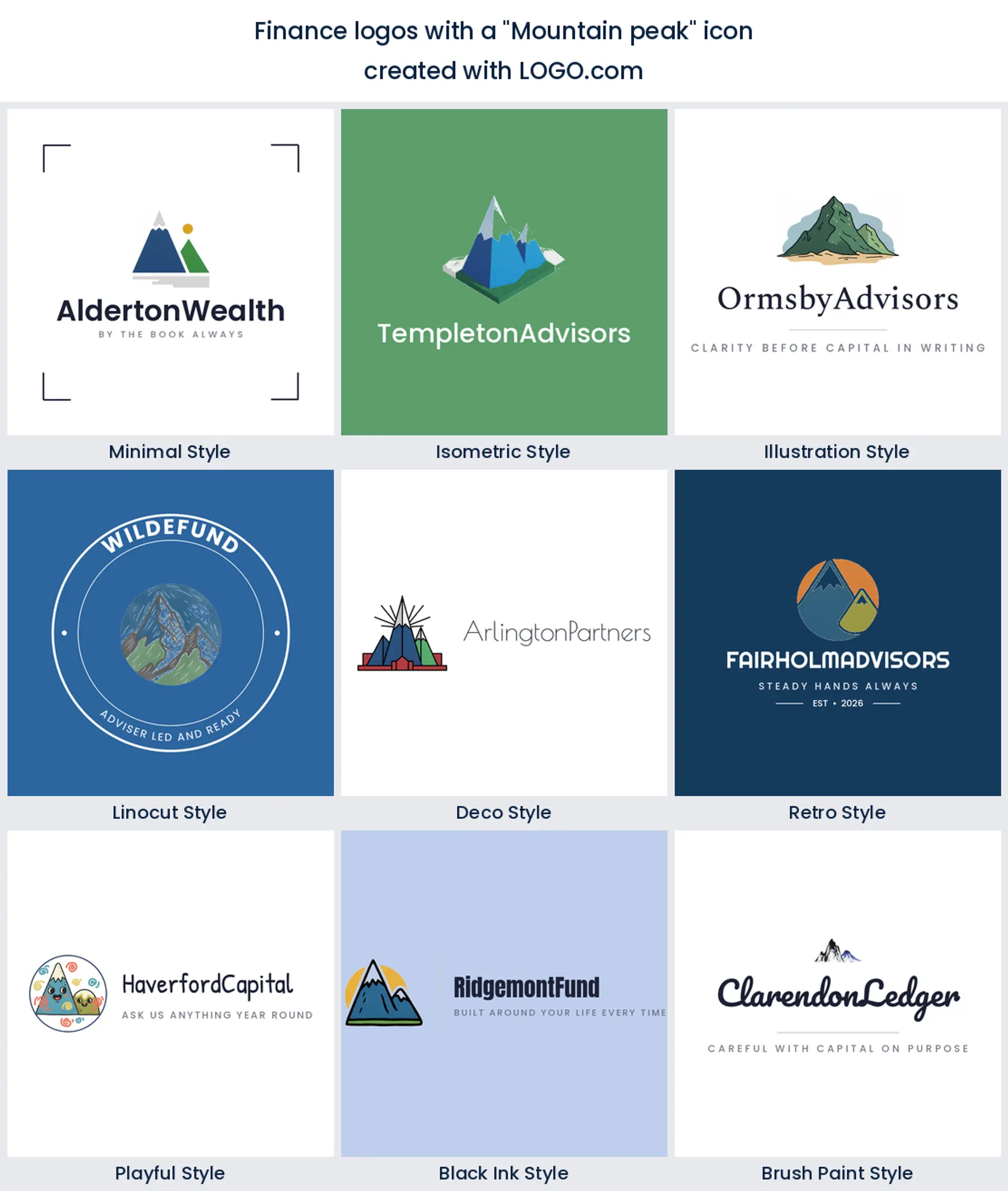
6. Mountain peak
Every other growth symbol implies the line only ever goes up. A summit does not, and roughly 4 percent of finance founders clearly like that honesty, since you get there but you climb. It suits anything with a thirty year horizon, so retirement planning and generational wealth management logo work land beautifully on it, and drawing the ridge as a rising line hands you a chart for free.
7. Balance scale
Around 4 percent of descriptions ask for scales, and the scales offer something none of the growth symbols will touch. They offer judgment. Risk assessment, audit, valuation and fiduciary advice all read instantly from them. Keep the beam level and the pans shallow, because a tilted scale quietly says you favour one side, and that is the last thing a financial advisor logo should imply.
8. Gold coin
Coins split opinion more than anything else in the nine, and about 3 percent of founders want one anyway. One coin reads as savings, a stack reads as accumulation, and a pile reads as a lottery advert. Used with restraint it is the warmest and most tangible finance company logo available, which is why savings apps and lending brands aimed at people rather than institutions keep coming back to it.
9. Compass
The navigation family, compass roses and north stars and the occasional lighthouse, appears in roughly 3 percent of descriptions, and it is the only group here that talks about direction instead of return. That is a quieter promise and a far easier one to keep. It makes a graceful financial planning logo for coaches, planners and anyone whose value is the plan itself rather than last year's performance.
Fifteen founder prompts worth stealing, word for word
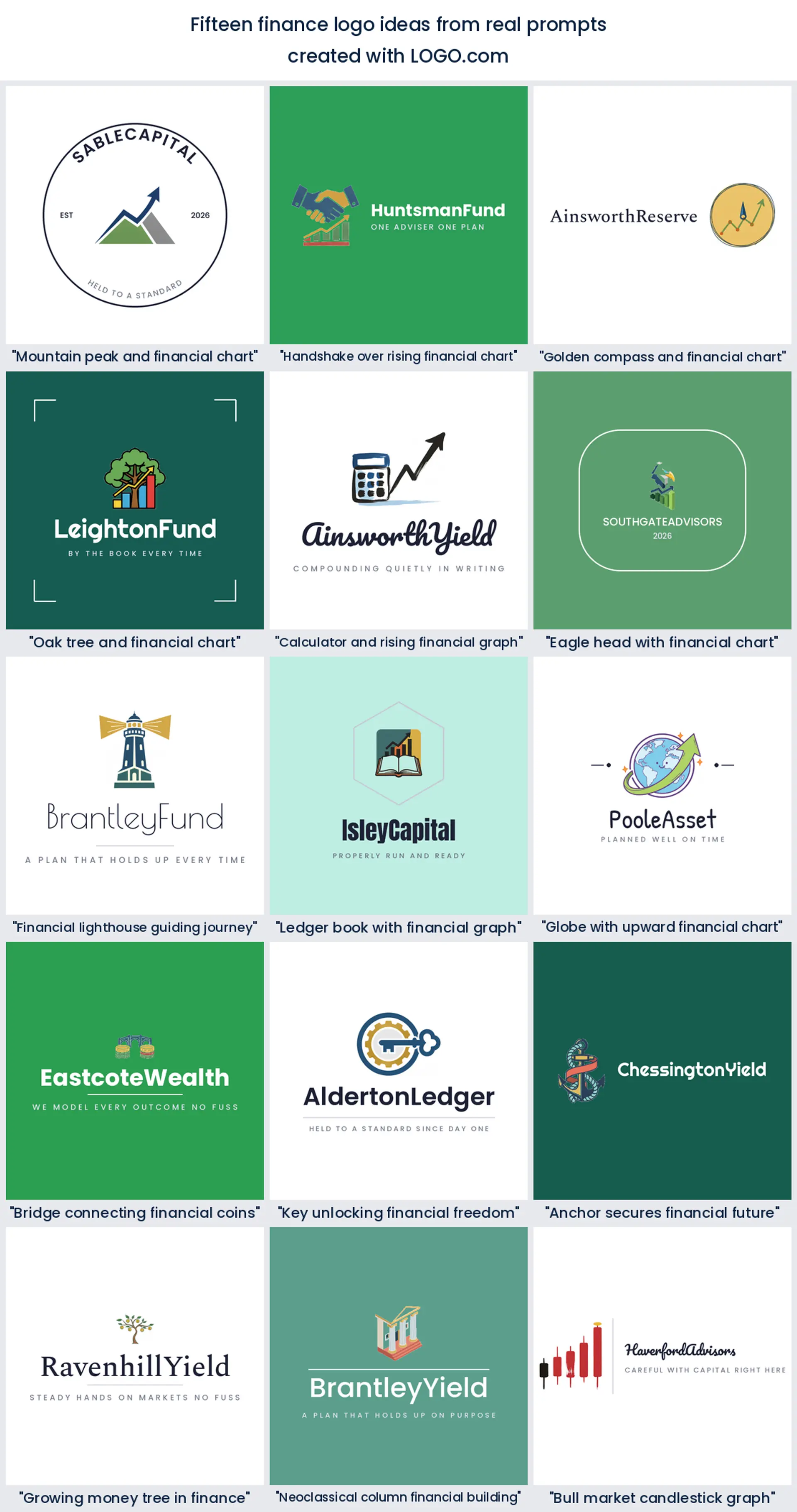
Fifteen prompts, every one typed by somebody building a real finance brand, reproduced exactly as they wrote them. They are more interesting than the plain nine for a simple reason: a founder describing their own company instinctively pairs two ideas, and the pairing is where the character lives. Each is rendered in all nine styles below, so take a phrase, paste it in and swap one noun until it is yours. Search demand says finance logo ideas is what people are after, and this is the honest version of that list.
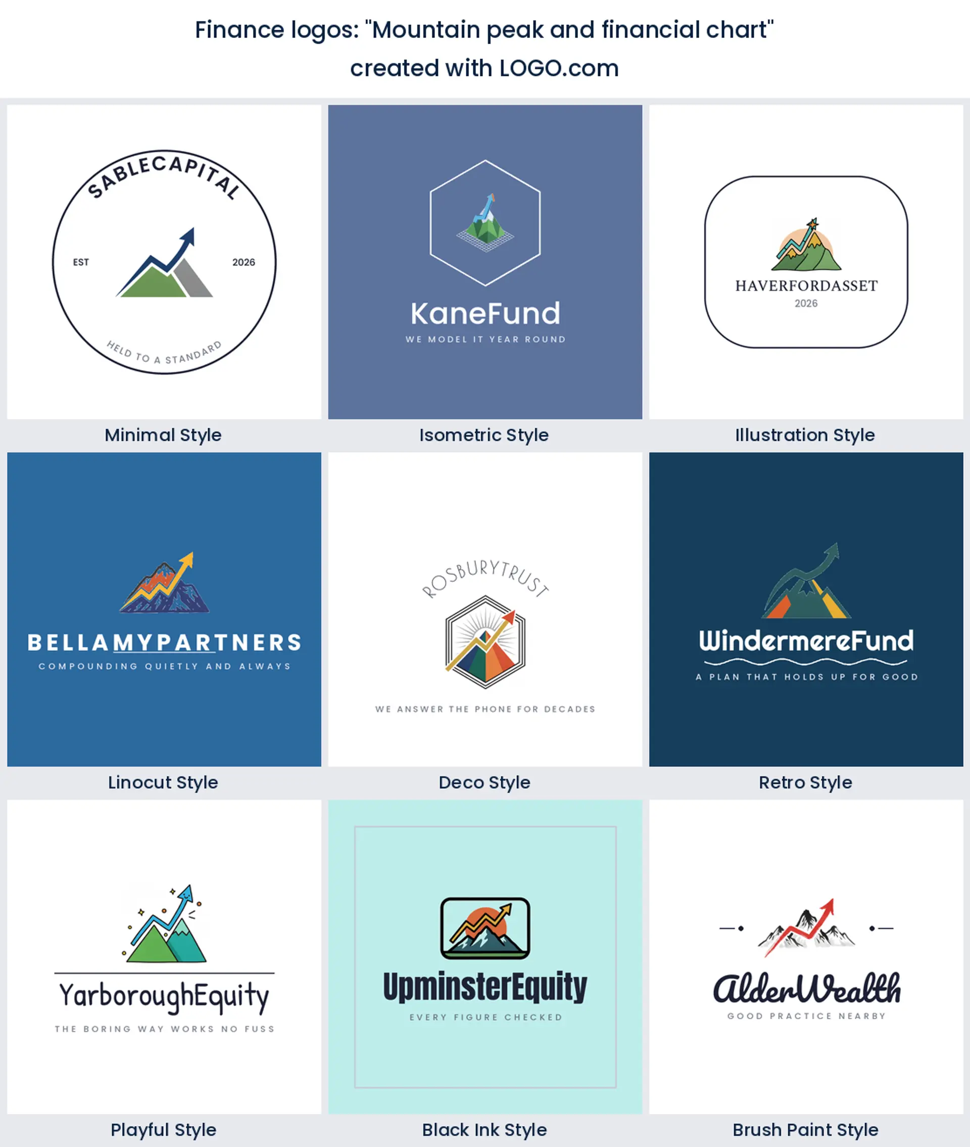
1. "Mountain peak and financial chart"
The two most optimistic symbols in the data, stacked. Draw the ridge as the chart line and you get one shape doing both jobs, which is a rare piece of luck in logo work. Retirement and long horizon investment logo work suits it, because it promises altitude without promising a date.
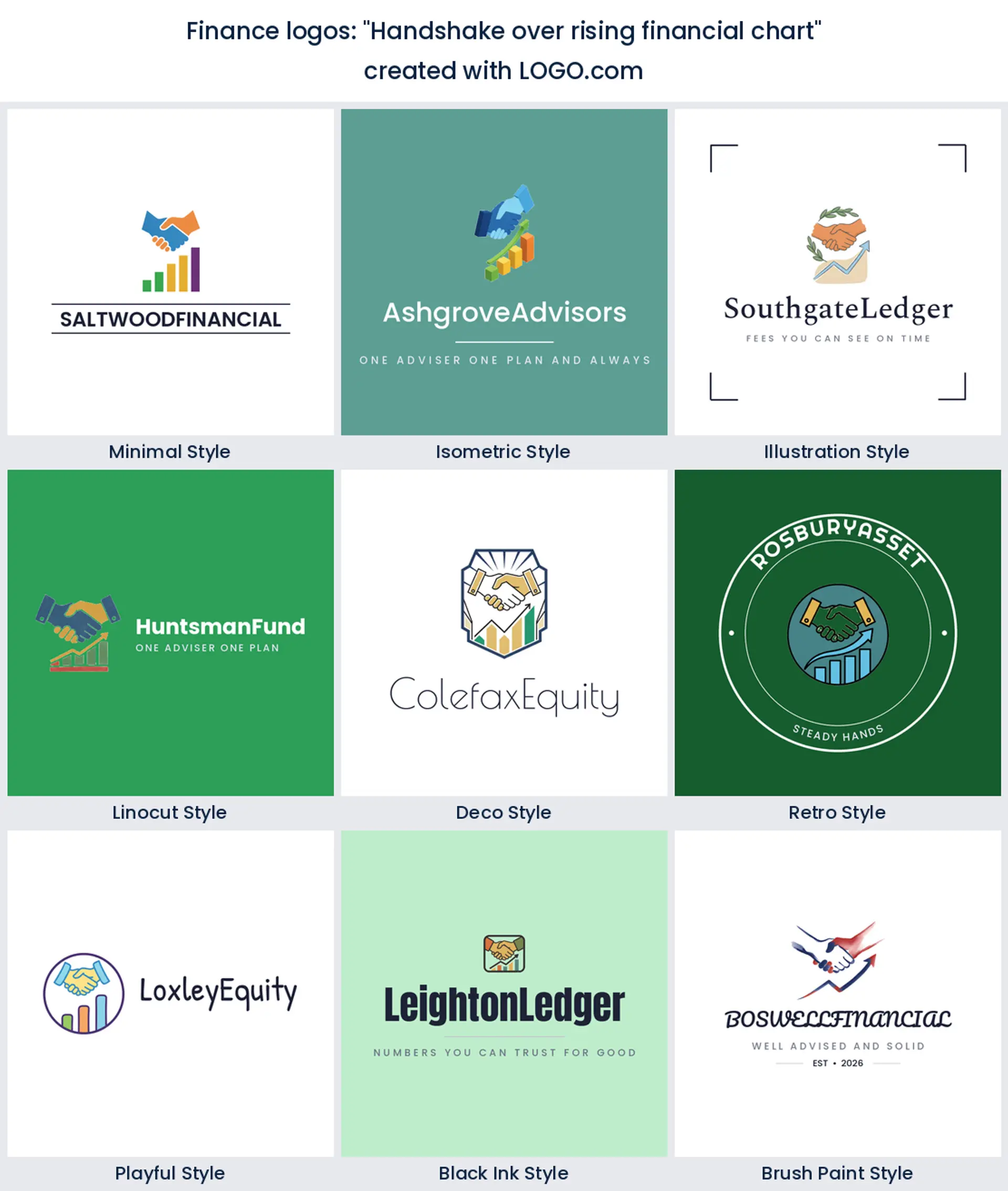
2. "Handshake over rising financial chart"
Somebody building an advisory practice wrote this, and you can tell. Two hands above the line put the relationship in front of the return, which is exactly the pitch when a client is choosing between you and a robo platform. Brokers, introducers and any partnership led financial services logo will wear it well.
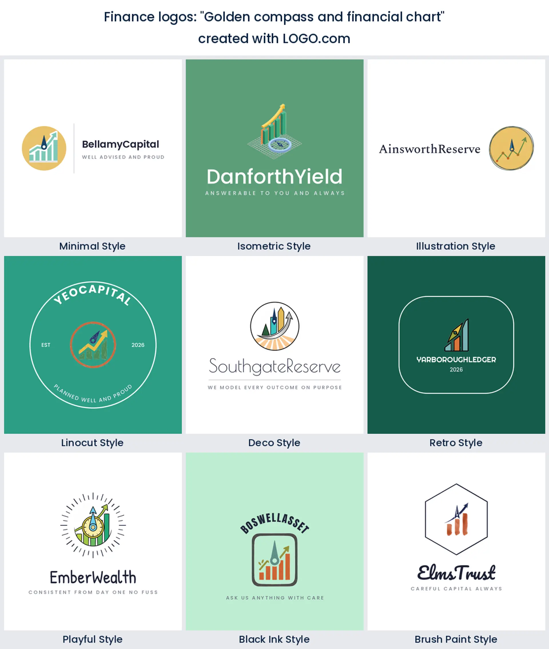
3. "Golden compass and financial chart"
Direction plus evidence. The compass says we know where this is going and the chart shows the working, which together answer the two questions every prospect actually has. It is a natural financial advisor logo for someone who sells a plan rather than a product, and the needle gives you a strong diagonal to build type around.
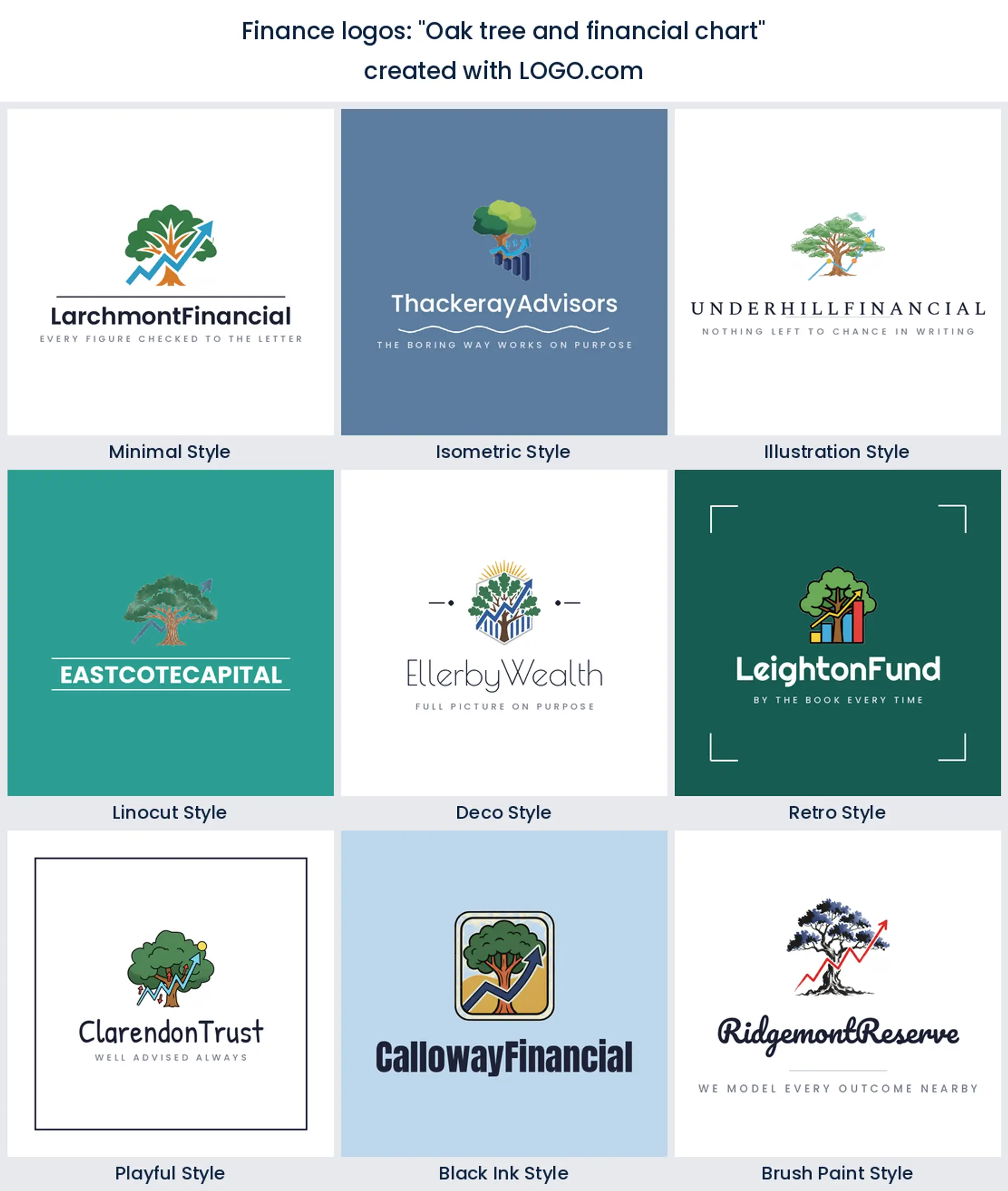
4. "Oak tree and financial chart"
Slow money, drawn properly. An oak is decades of compounding in one silhouette, and setting a chart against it keeps the mark from drifting into garden centre territory. Family offices, trusts and endowment work all read well here, and green suits it, which our own hue data says is where finance brands already lean.
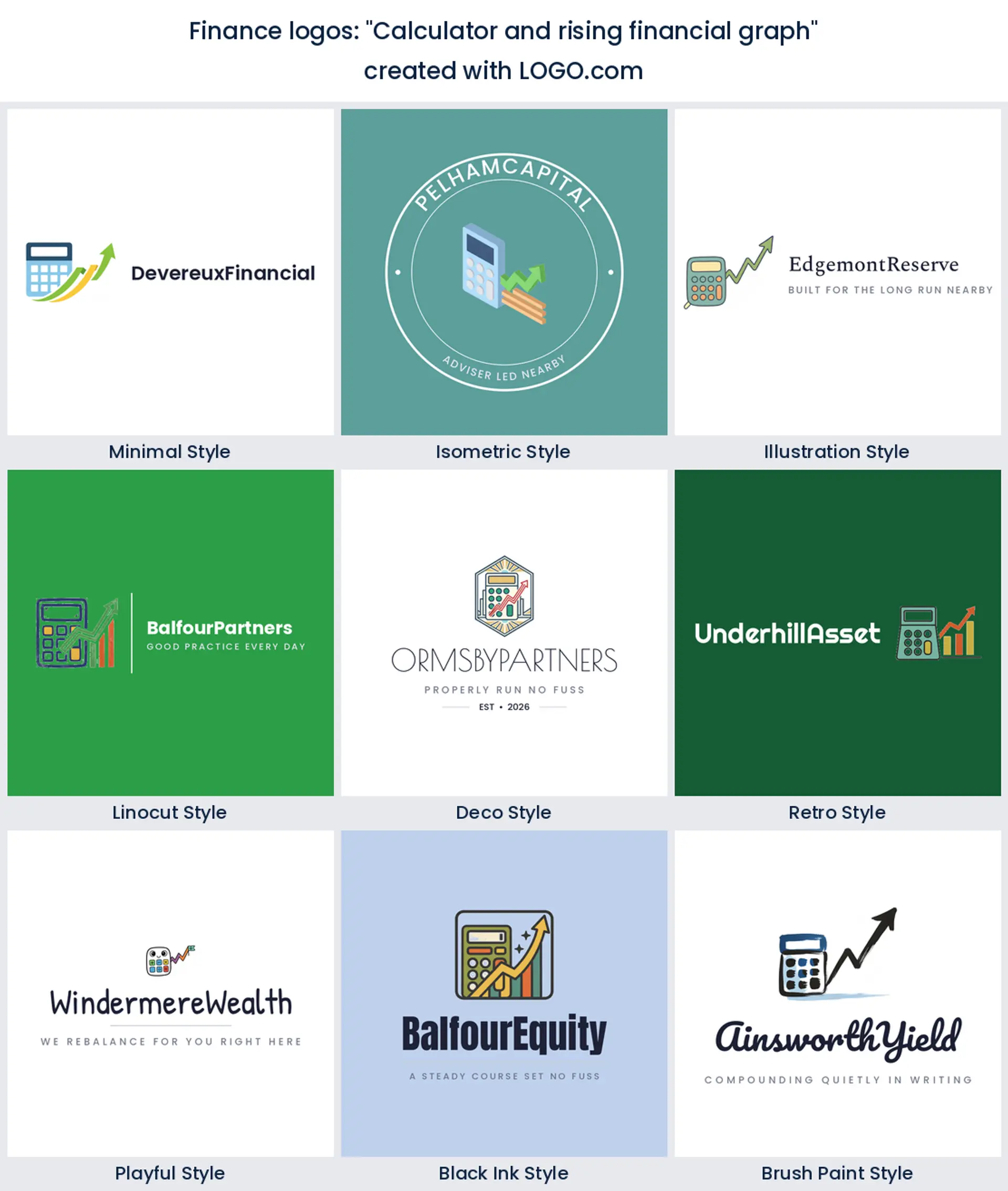
5. "Calculator and rising financial graph"
This is the least romantic idea on the list and one of the most useful. A calculator is unmistakable, it dates slowly, and nobody has to guess what you do with it. Bookkeeping, tax and fractional finance teams should try it first, and it makes a plain spoken financial planner logo for anyone whose value is accuracy.
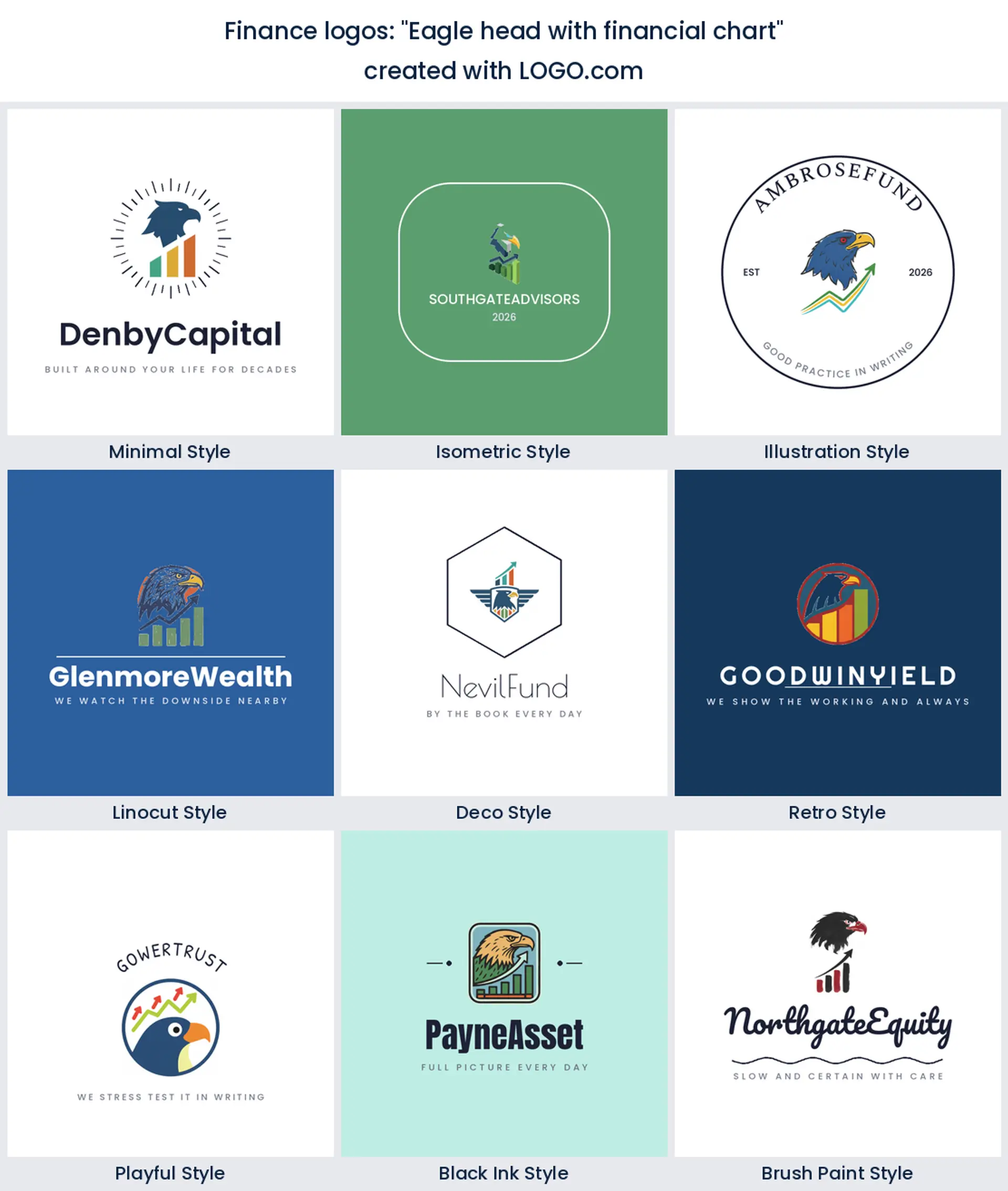
6. "Eagle head with financial chart"
Sharp eyes and altitude. The eagle turns up more than you would expect in this corpus, usually from founders who want to look watchful rather than merely clever. It carries authority fast, so it flatters an asset management or commodities finance logo, but keep the feathers simple or it turns into a crest from a coin.
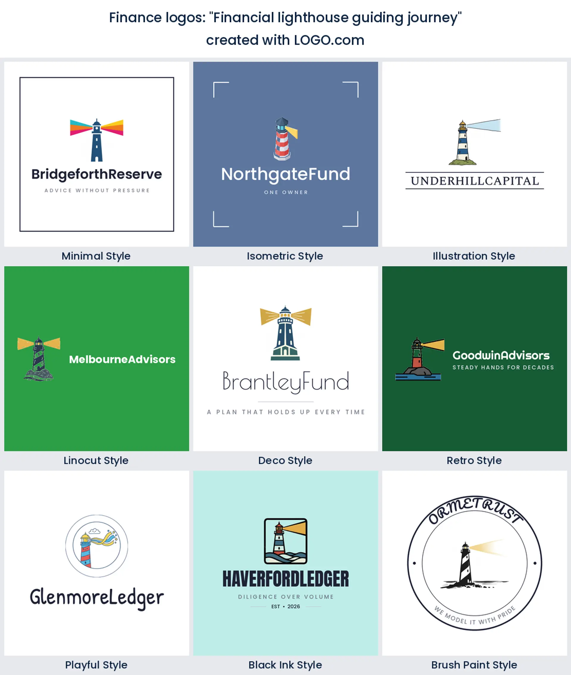
7. "Financial lighthouse guiding journey"
A lighthouse does not chase the market, it stays put while everything else moves, and that is a genuinely different promise. It suits a financial planning logo for someone whose job is stopping clients panicking in March. Tall and narrow, so ask for the horizontal lockup early or it will fight every website header you put it in.
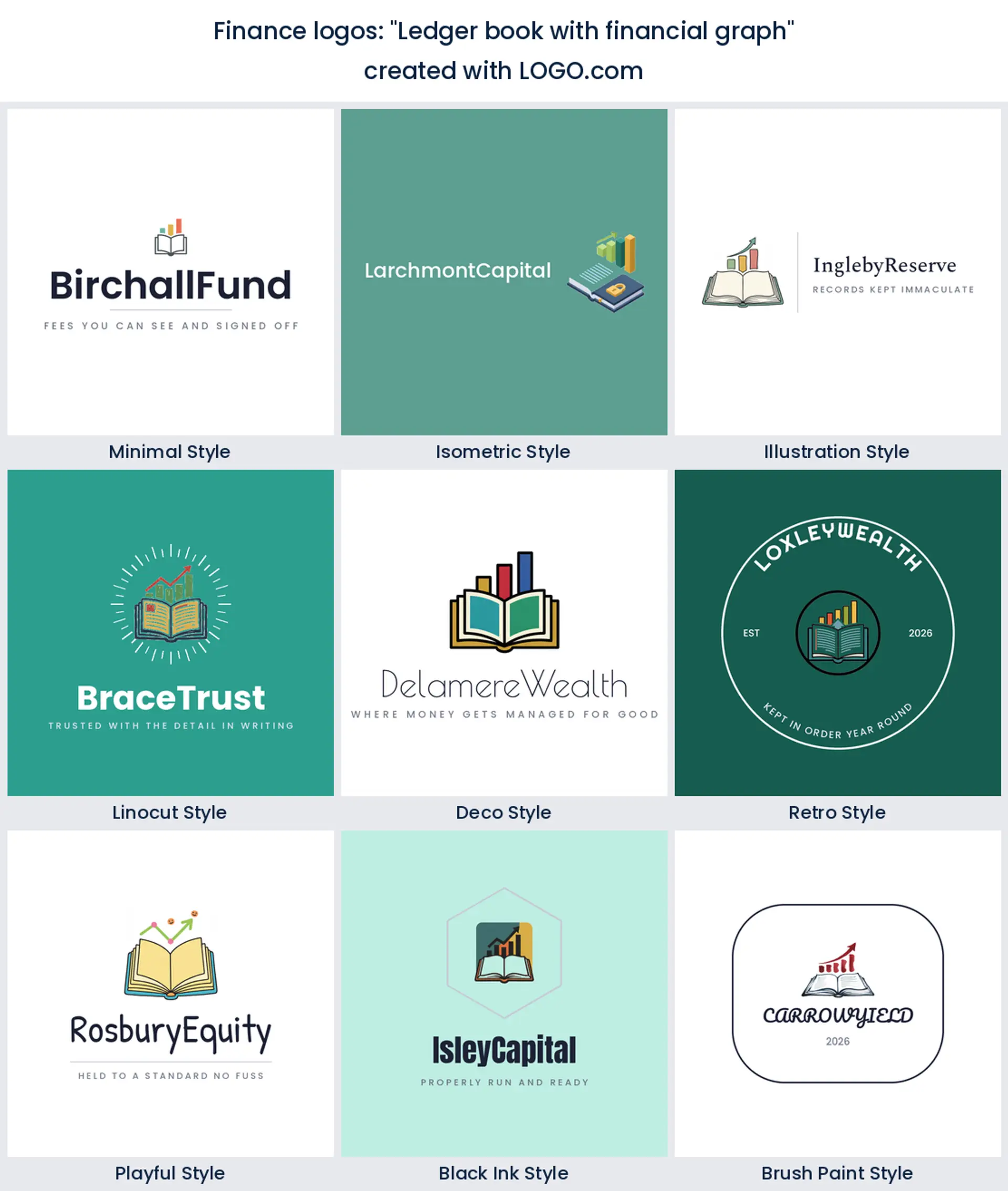
8. "Ledger book with financial graph"
Record keeping and results in one frame. The open book gives you a wide, stable base and the graph stops it reading as a library, which is the usual risk with book marks. Outsourced finance functions, audit support and a small banking logo all sit comfortably in it.
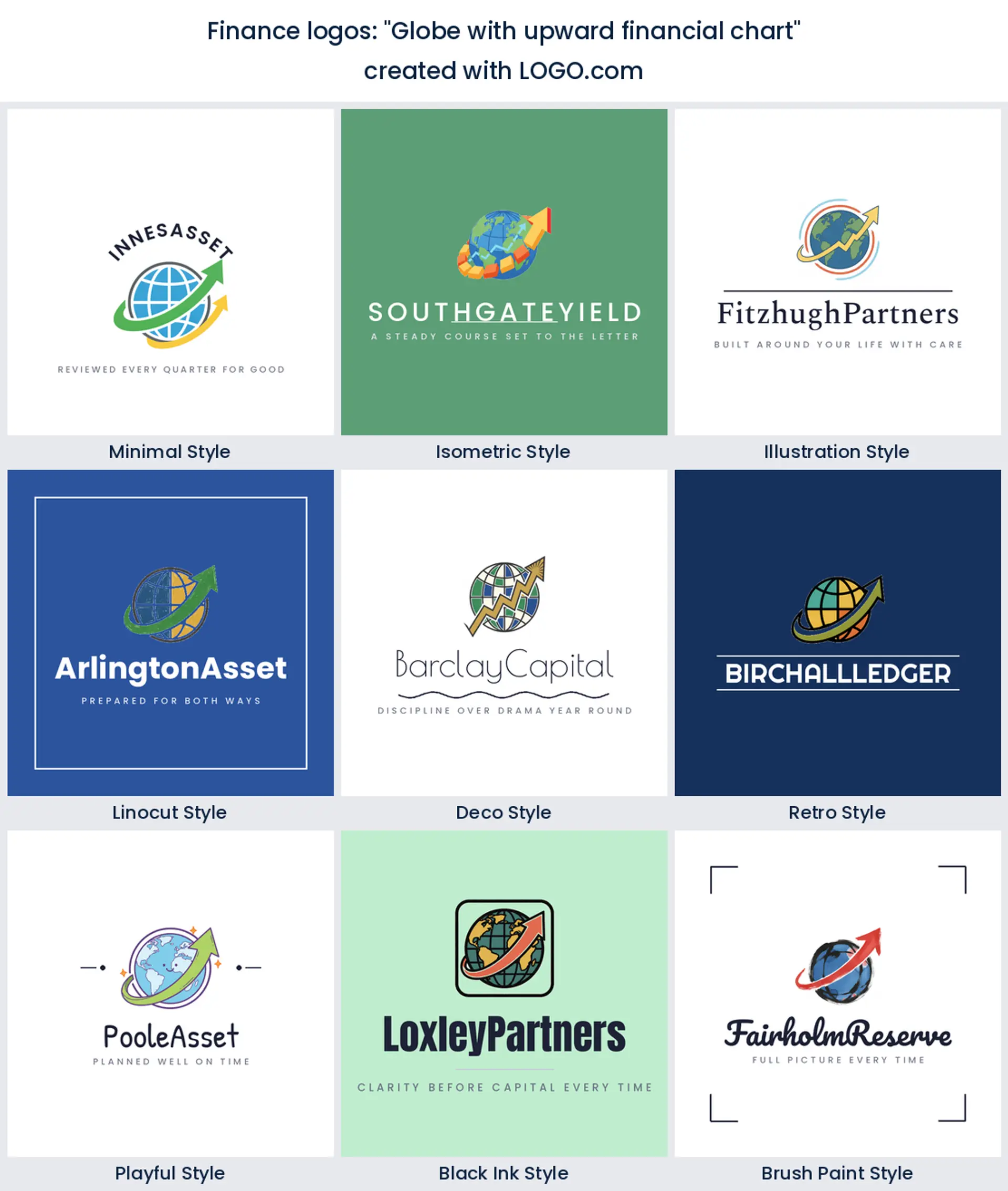
9. "Globe with upward financial chart"
Reach, stated plainly. If you handle cross border payments, foreign exchange or overseas clients, the globe does a job no abstract shape can. It also fills a circle perfectly, which makes it one of the easier ideas here to reuse as a profile picture for a wealth management logo.
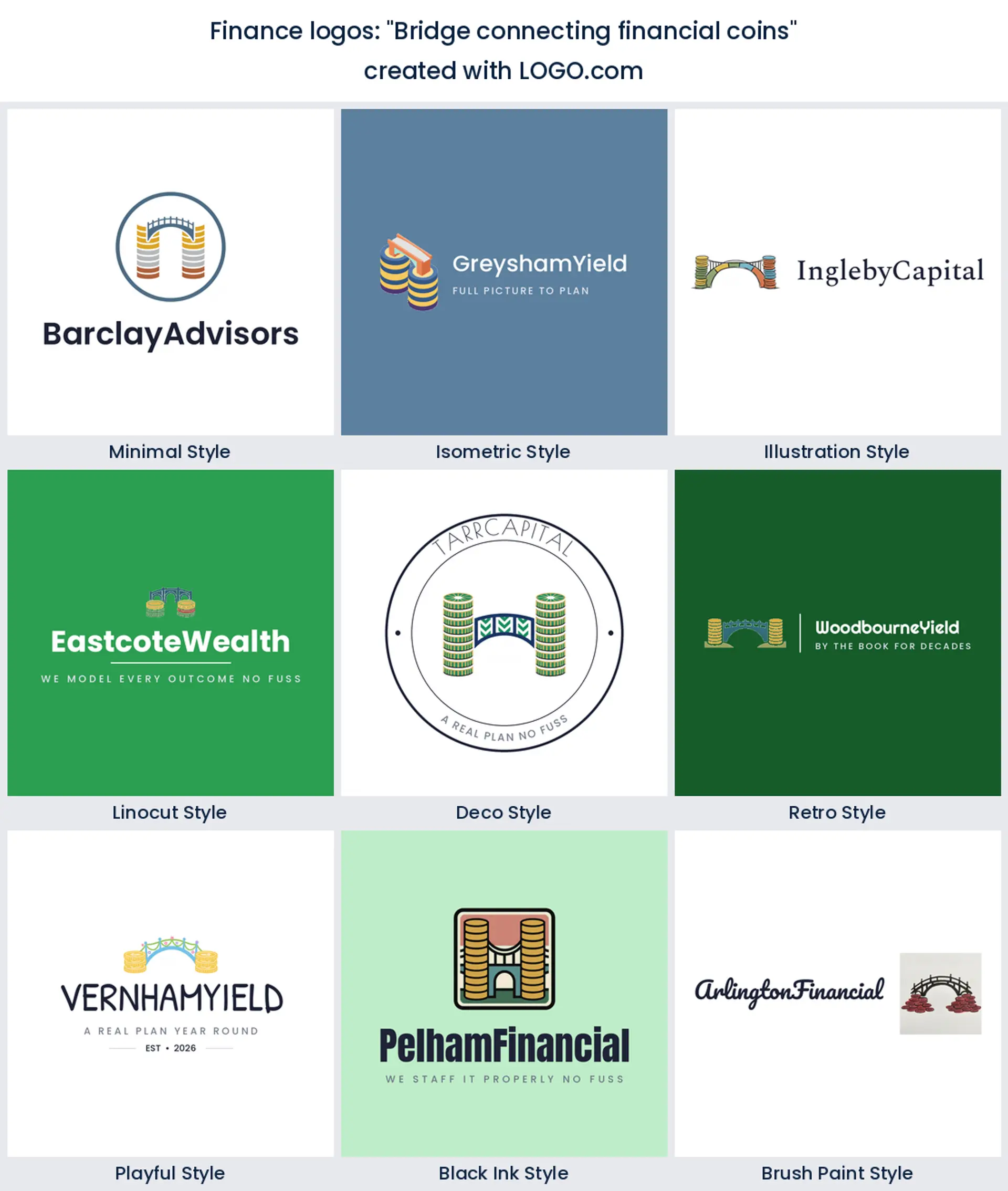
10. "Bridge connecting financial coins"
Movement rather than growth, which almost nobody else is drawing. A span between two coin stacks is a picture of transfer, so remittance, settlement and lending brands get a distinctive finance company logo out of it. Keep the arch geometric and it stays modern instead of civic.
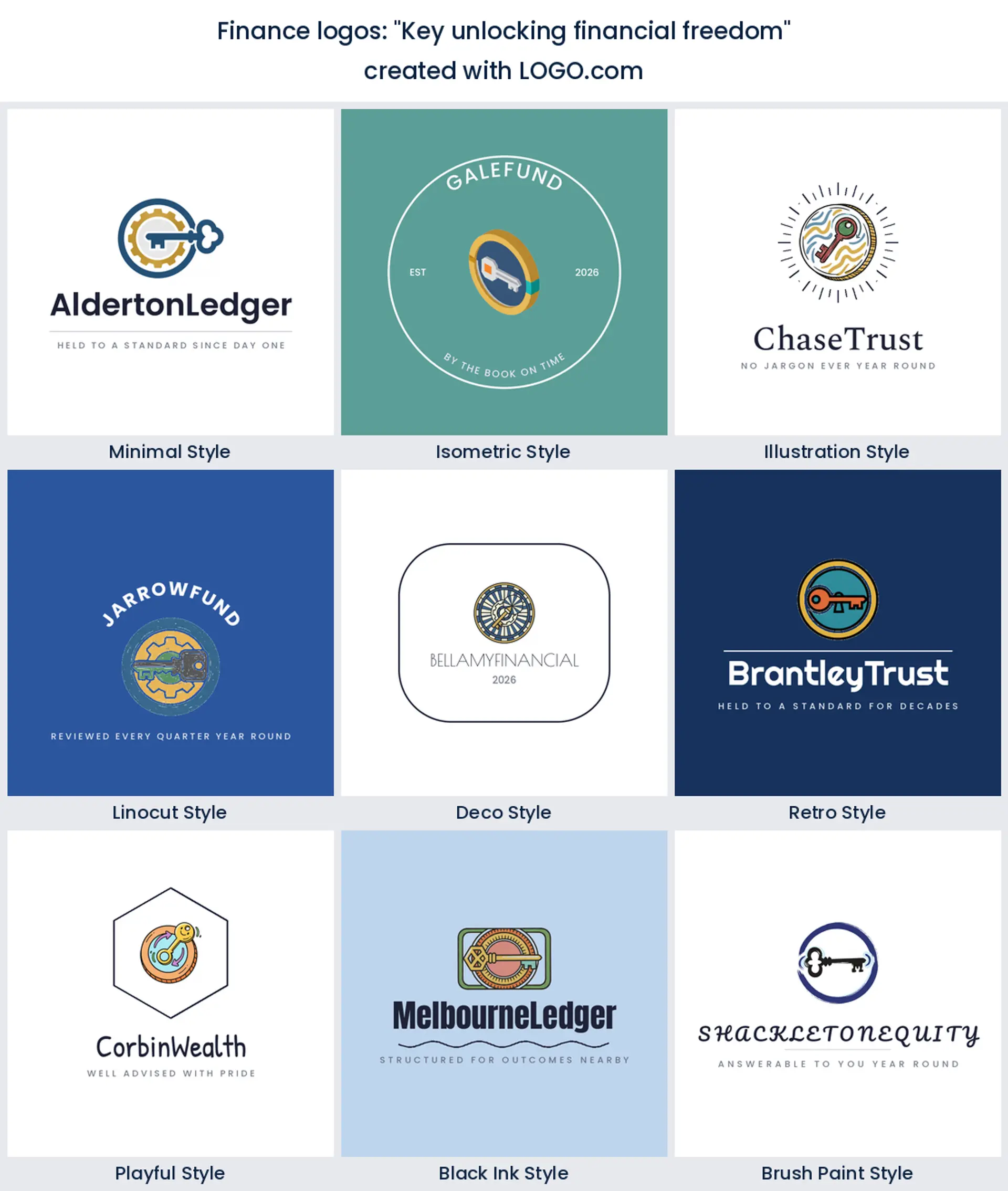
11. "Key unlocking financial freedom"
The most emotional idea in the fifteen, and it is aimed squarely at people rather than institutions. A key is access, and access is what debt coaching, first home saving and financial literacy work actually sell. It makes a warm personal finance logo, and it looks right in a brighter color than most marks on this page.
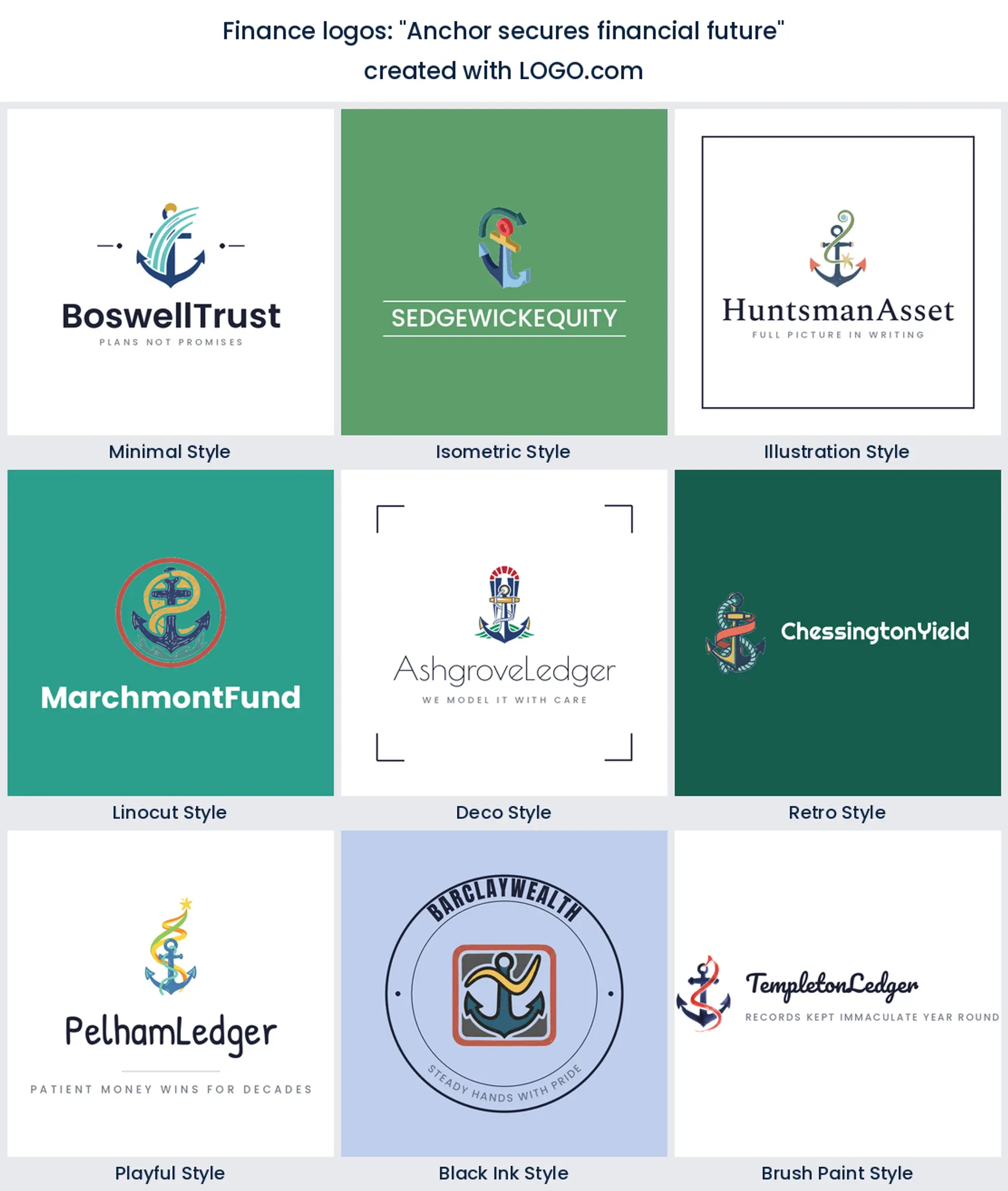
12. "Anchor secures financial future"
Stability without a shield. An anchor holds without looking defensive, which is a useful trick if you want to signal safety and still feel human. Pension advice, insurance broking and reserve heavy funds suit it, and it gives you a strong vertical for a stacked financial logo.
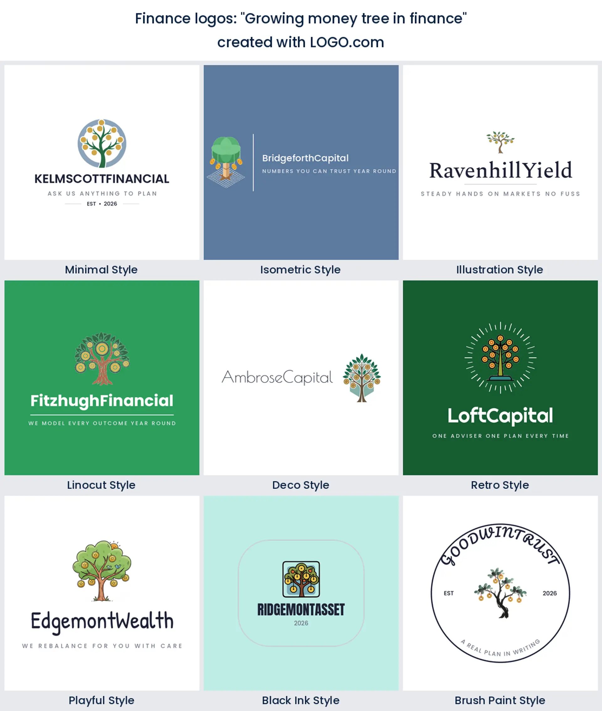
13. "Growing money tree in finance"
Compounding for beginners, and there is nothing wrong with that. A sapling carrying coins explains what you do to someone who has never opened a brokerage account, which is most of the market. Savings apps, junior accounts and green investment logo work all fit, so long as you keep the coins few and the leaves simple.
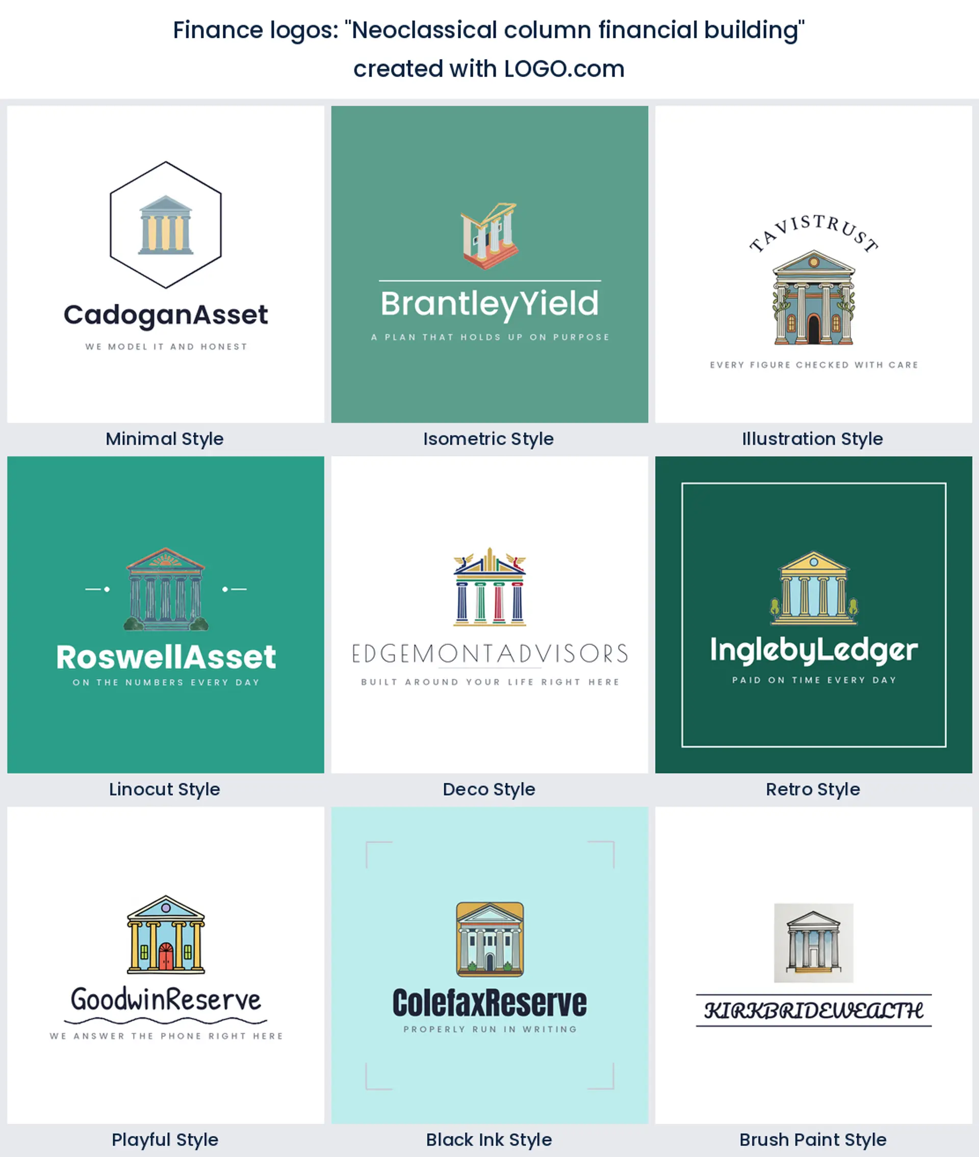
14. "Neoclassical column financial building"
The most conservative idea here, deliberately. Columns are shorthand for having survived something, which is why a regional banking logo or a private bank still reaches for them. Draw two or three columns rather than six, because a facade collects detail and detail is the first casualty at door plate size.
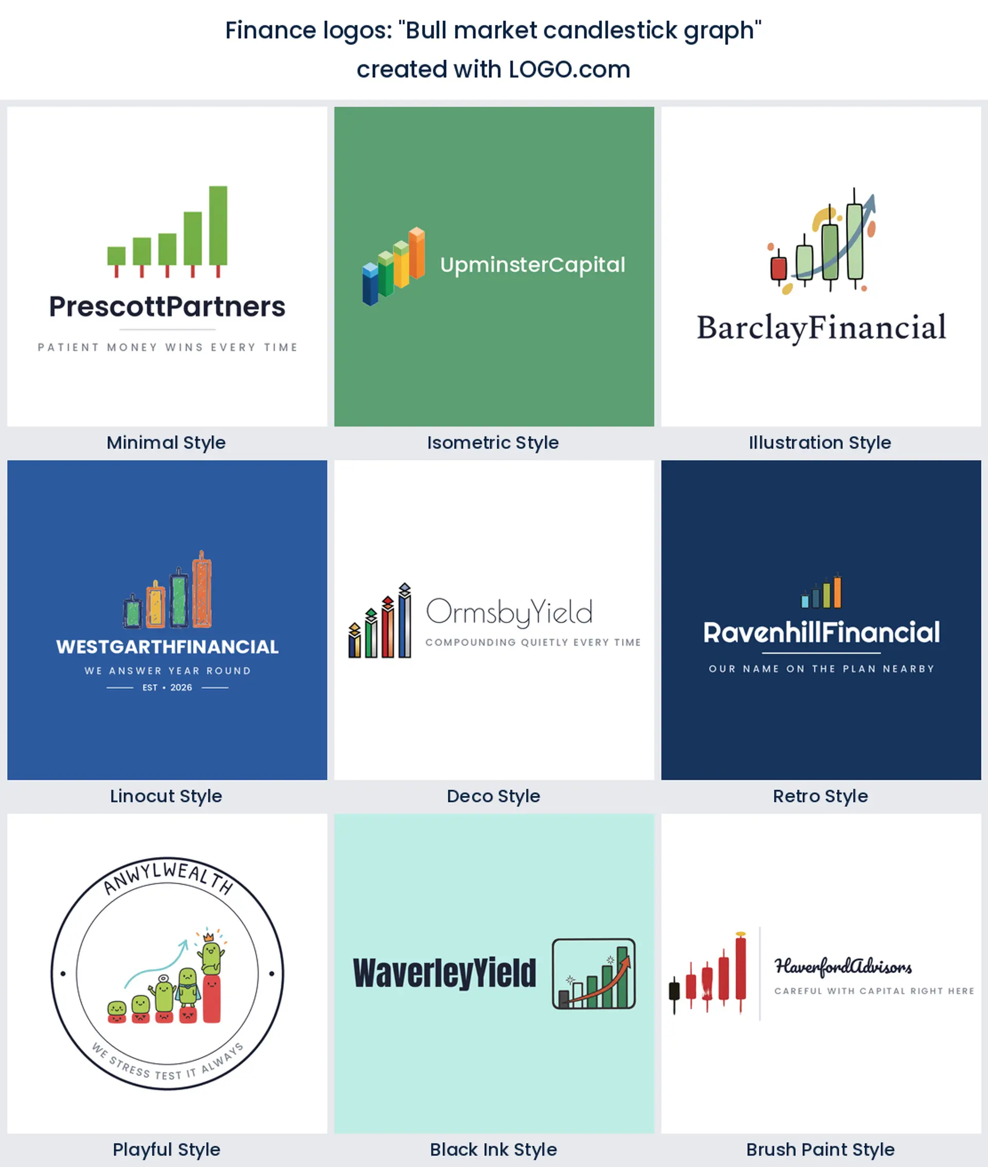
15. "Bull market candlestick graph"
The only idea in the fifteen that names an actual instrument. Candlesticks tell traders you speak their language, and they tell everyone else nothing at all, so use it only if your audience is already in the market. For a brokerage or a trading education finance logo it is a strong, specific choice.
Green or blue, and what each of them quietly promises
Our own numbers point one way here, and it is not the way most people guess. Across the finance brands built on LOGO.com, green is the most chosen non neutral hue and blue is a close second, with a small amount of bronze and gold behind them. The two leaders are not interchangeable. Green talks about growth and it feels current, which is why so many newer advisory and savings brands sit there. Blue talks about not losing your money, and it is still the safer bet if you are asking somebody to move a pension.
Pick one to lead and use the other sparingly, because a green and blue split down the middle reads as indecision. Add a deep neutral, ink or charcoal rather than pure black, so your type has somewhere quiet to sit, and keep gold for a single accent if you use it at all. LOGO.com icons come in full color, and you can choose a multi color mark or a one color version. Take the one color file too, because embossing, engraved plaques and a stamped compliment slip all need it, and so does anything printed on a single plate.
Advisor, planner, or investment firm, match the mark to the work
The searches split cleanly by role, and your logo should too. If you are an independent adviser, lead with the compass or the handshake and keep the palette warm, because you are the product and people are hiring a person. Running a planning practice? The scales or the lighthouse suit you better, since your value is the plan holding up when the market wobbles. A financial planning logo that promises returns is writing a cheque the plan cannot always cash.
Investment and asset management firms can carry the harder symbols. Mountains, eagles and candlesticks all belong to you and they will look overdressed on a bookkeeper. If you are a bank or a credit union, take the columns and the vault and accept that conservative is the point. And if you sell software into any of the above, strip everything back to the arrow, because a fintech mark lives at sixteen pixels inside somebody else's dashboard long before it lives on a wall. Whatever the role, name it in your own words on the site, so the finance logo design and the copy underneath are telling the same story.
Will it survive a client portal and a quarterly report?
Finance brands live on two surfaces most logo projects never test. The first is the portal, where your mark sits in a header bar maybe twenty pixels tall, next to a login field, on a screen somebody opens on a phone at midnight. Ask for the horizontal lockup and a symbol only version at that height and look at them properly. Any hairline in a chart, any thin serif, any gradient will turn to mush. If the symbol alone still reads, you are fine, and you now have your favicon and your app icon for free.
The second is the quarterly report, which is the opposite job. Here the mark is printed small in the corner of a page full of tables, often in black and white, often after somebody has scanned it. Test it flattened to one color at about fifteen millimetres wide, leave the strapline off, and give it real clear space so it does not collide with a column heading. Get both of those right and everything in between, the website header, the pitch deck cover, the office signage and the email footer, stops being a decision.
What compliance asks for, and what you can trade under
Regulated firms run marketing through a review, and the logo is usually the easiest thing in the pack because it makes no claim. Trouble only starts when it does. An arrow drawn through a percentage, a line labelled with a figure, a coin stack sized to suggest a number, all of that invites a question you do not need to answer. Keep the mark quiet and leave the claims to copy where they can be qualified. Then hand your reviewer the whole file set in one go, so the version they sign off is the version that turns up everywhere.
On what you can actually do with the files, designing and previewing on LOGO.com is free, and the high resolution PNG download is free as well and carries full commercial use, so it goes on the website, the portal, your LinkedIn and your client reports without you paying anything. The Brand Plan is the paid tier and print is the reason for it, since it adds the vector files a sign maker or a printer asks for, so reception signage, an embossed folder and a stamped plaque all come out crisp. It also brings unlimited edits and the brand kit, which earns its keep the first time you register a second trading name and need the whole set updated in an afternoon.
Make your finance logo with LOGO.com
Type the company name, pick one of the nine symbols above or paste in one of the fifteen prompts word for word, then choose a style and set the color and the type. Previewing costs nothing, the high resolution PNG comes free with full commercial use, and the Brand Plan is waiting when you need vector files for signage and print plus the brand kit and unlimited edits.
Methodology. Figures come from LOGO.com first party product data for the 24 months to August 2026. The finance industry labels in our product are too thin to rank from on their own, about 61 icon descriptions over two years, so this ranking is scoped by prompt text as well. We took every icon description written on LOGO.com whose wording names finance, merged it with every description from accounts that chose a finance, banking, investment, accounting or insurance industry, and grouped the result into nine concepts. That gives 628 icon descriptions across 582 distinct prompts. A single description often names two symbols, so these are mention shares rather than exclusive shares. A rising chart or graph appears in about 29 percent, an upward arrow in about 6 percent and a shield in about 6 percent. The brand count of 2631 is the number of accounts that chose a finance, banking or investment industry in the same window, with food banks, blood banks, bankruptcy attorneys and private investigators excluded. Source: LOGO.com first party product data, August 2026.
THE #1 LOGO GENERATOR
Why LOGO.com is the best financial services logo maker
1.Ranked from 628 real icon descriptions
Nine ranked marks and fifteen ideas, all pulled from 628 finance icon descriptions written on LOGO.com. Nothing on this page came off a mood board.
2.Legible in a portal header at twenty pixels
Take a symbol only version alongside the full lockup, so the same mark works as a favicon, an app icon and the logo in your client login bar.
3.One color files for plaques and stamped paper
Download the flattened single color version for an engraved office plaque, an embosser and a compliment slip, next to the full color files for screen.
4.Green, blue and bronze straight from the data
The palettes here follow the hues finance founders actually choose on LOGO.com, so you are not guessing whether growth green or trust blue suits your firm.
5.Add a fund or a trading name later
Set the firm name as a wordmark or reduce it to a monogram, then add a partner or an office later without redrawing the symbol.
6.Nine styles to settle in one review
See the same symbol as a carved crest, a clean sans wordmark and seven more, then settle the argument in one meeting instead of four.
7.Rework it when you add a licence or an office
Merge, rebrand, add a trading name or open a second office and you can go back in and adjust the mark, the name and the palette rather than starting over.
8.Free to design, yours to trade under
Designing and previewing is free, and the high resolution PNG download comes with full commercial use. The Brand Plan adds vector files for signage and print plus the brand kit.
Finance Logo Maker FAQs
Need Inspiration? See example brands in your industry...
AbstractAccessoriesAdventure TourismAestheticsAgricultureAirplaneAnimalAnimal and PetsAnime Logo MakerApplicationArchitectureArrowArtificial IntelligenceArts & CraftsAssociationAttorney FirmAuthorAuto Parts SupplyAviationBaked Goods StoresBandsBarsBeautyBeauty and Cosmetics BlogBeerBicycleBiotechnology ResearchBlack+WhiteBlueBonfireBook StoreBoutiqueBranchBuilding Materials ManufacturerBusiness LogoButcher ShopCalligraphyCampingCandyCar ClubCartoonCatering and Buffet ServicesCharitable FoundationChibiChiropractorChurchCircusClassicClothing ManufacturingCoffee Shops