Personal Trainer Logo Maker
Design a personal trainer logo that works on your coaching app and training top.
Need a different logo maker? Try our AI logo generator.
Logos created using LOGO.com
670,000,000
Ambition and unlocking potential logos
Progress, balance and movement logos

Strength training and barbell logos
Personal Trainer Logos, Ranked From Real Founder Prompts
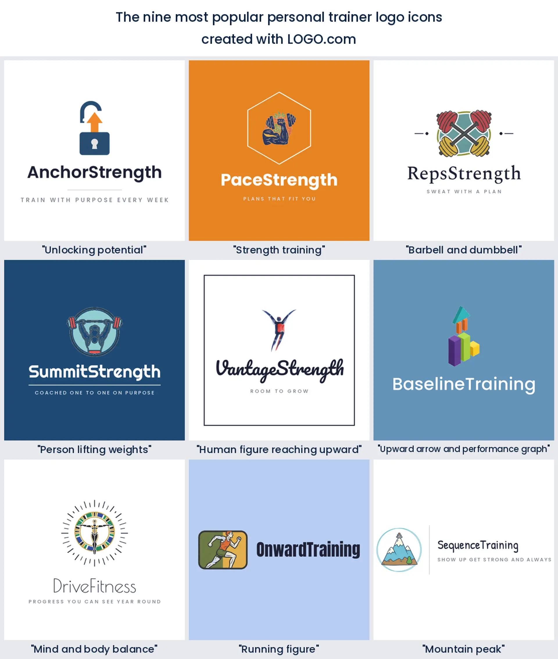
According to LOGO.com data, the idea personal training founders describe most is unlocking potential, a lock, a key, or a chain coming open, in about 25% of the 57 icon descriptions we read, ahead of strength training at about 23% and a barbell or dumbbell at about 14%.
All nine of those symbols, plus fifteen briefs founders typed themselves, are drawn below in every LOGO.com style. Line up a key led mark beside a barbell and a reaching figure and the one that matches the clients you want usually picks itself.
On this page
- Why personal trainers ask for a key more often than a kettlebell
- Fifteen personal trainer logo ideas, one for each founder brief
- Your name or a symbol? The personal trainer branding question
- Where a personal trainer logo actually shows up
- A female personal trainer logo does not have to look softer
- Coaching online changes what the mark has to do
- The colors personal trainers actually save, and the one you expected
- What it costs, and what you can use it for
- Make your personal trainer logo with LOGO.com
Most personal trainers assume the logo has to show a weight. The founders who actually build one on LOGO.com keep surprising us. Read the icon briefs they typed and the single most common request is not a barbell at all, it is a lock coming open, an arrow climbing, a figure stretching toward something. About 25% of the 57 icon descriptions we read describe unlocking potential in one form or another, slightly ahead of anything explicitly about strength. That says a lot about what you are really selling. Below you get the nine symbols that came up most, fifteen prompts founders wrote word for word rendered in all nine styles, and the decisions that only matter once your mark is on a client app and a training top.
Why personal trainers ask for a key more often than a kettlebell
The personal training sample on LOGO.com is small and honest, so here is exactly what sits behind these numbers. Our first party data covers 57 custom icon descriptions, written by founders who picked a personal training industry plus founders anywhere on the platform who described a strength or fitness training subject, alongside roughly 75 brands that chose personal training or personal trainer as their industry. Every description was sorted by the objects and ideas inside it, then those groups were tallied. One thing to hold in mind as you read the percentages. A single brief usually names two things at once, a person and a weight, or a lock and an arrow, so one share can belong to two symbols and the nine never add up to 100. The ranking runs top to bottom, with a nine style grid under each entry.
1. Unlocking potential
The symbol at the top of the list is an idea rather than an object. About 25% of the briefs describe unlocking potential somehow, as an open padlock, a key, a door swinging open, or a chain snapping. Trainers write it because it is what a client is buying, and it gives you something no equipment icon can, a mark that still works when your client is 68 and rehabbing a knee. If you coach transformation more than performance, this is the most interesting personal trainer logo route on the page.
2. Strength training
Second place goes to strength itself, named in roughly 23% of the descriptions, usually as a flexed arm or the words strength training attached to a piece of kit. It is the plainest promise you can put in a mark and clients read it instantly. Pick it if you run barbell led coaching, small group strength sessions, or a return to lifting programme, and you want a fitness trainer logo that argues for itself before anyone reads your name.
3. Barbell and dumbbell
The equipment does show up, in about 14% of the briefs, but lower than almost anyone predicts. A barbell, a dumbbell, or a kettlebell drawn on its own is the shorthand every gym in town already uses, which is exactly its strength and its problem. Take it if you want to be understood in half a second at the door of a facility, and plan to make the shape or the color do the differentiating work.
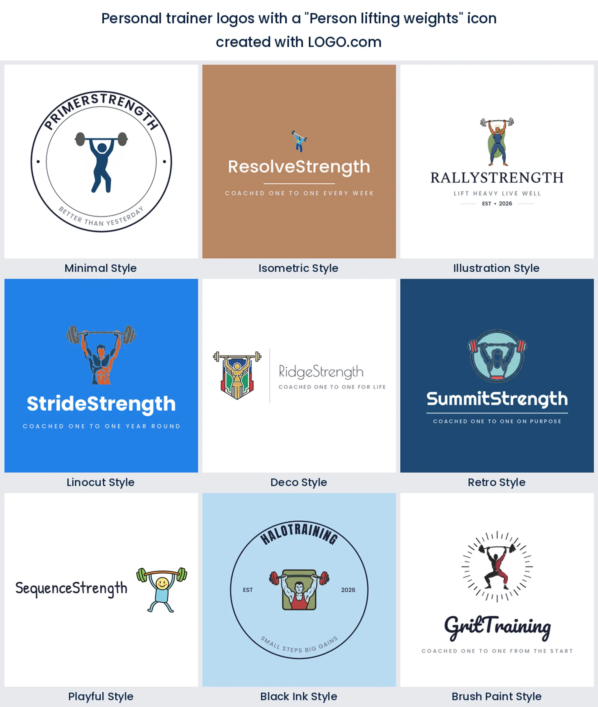
4. Person lifting weights
Put a human being under the bar and the ranking shifts again. Fourth on the list is a person mid lift, which reads warmer than bare equipment because there is somebody in it, and that somebody is easy for a client to imagine being. It suits one to one coaching, and it is the sort of logo personal trainers who work in a client's garage or a park pick over a facility badge.
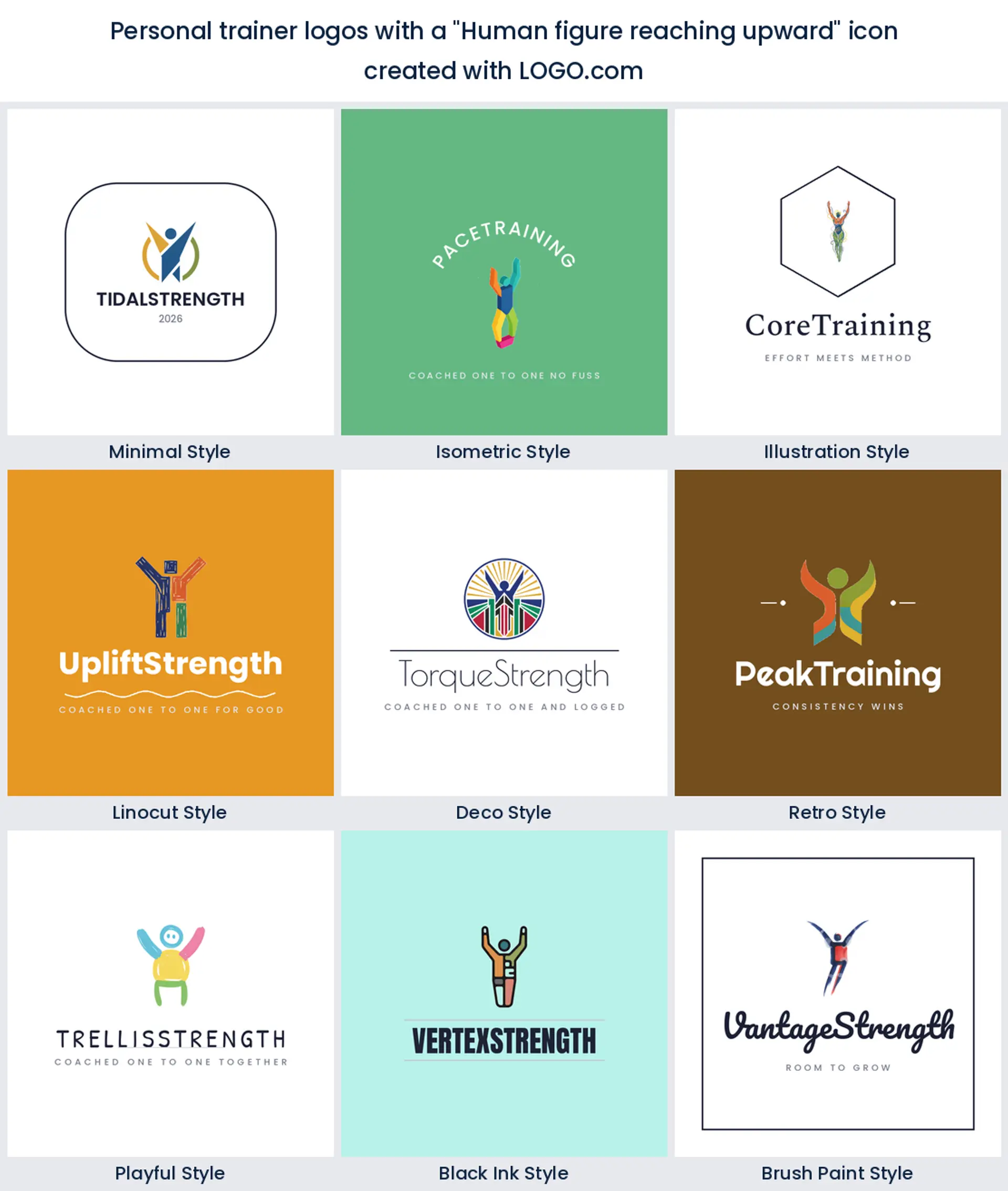
5. Human figure reaching upward
Halfway down comes the abstract figure with both arms up, stretched toward something out of frame. It carries no equipment at all, which is precisely why trainers reach for it, and it stays clean at very small sizes because it is basically four strokes. This one flatters an online coaching brand or a wellness leaning fitness coach logo more than a powerlifting one.
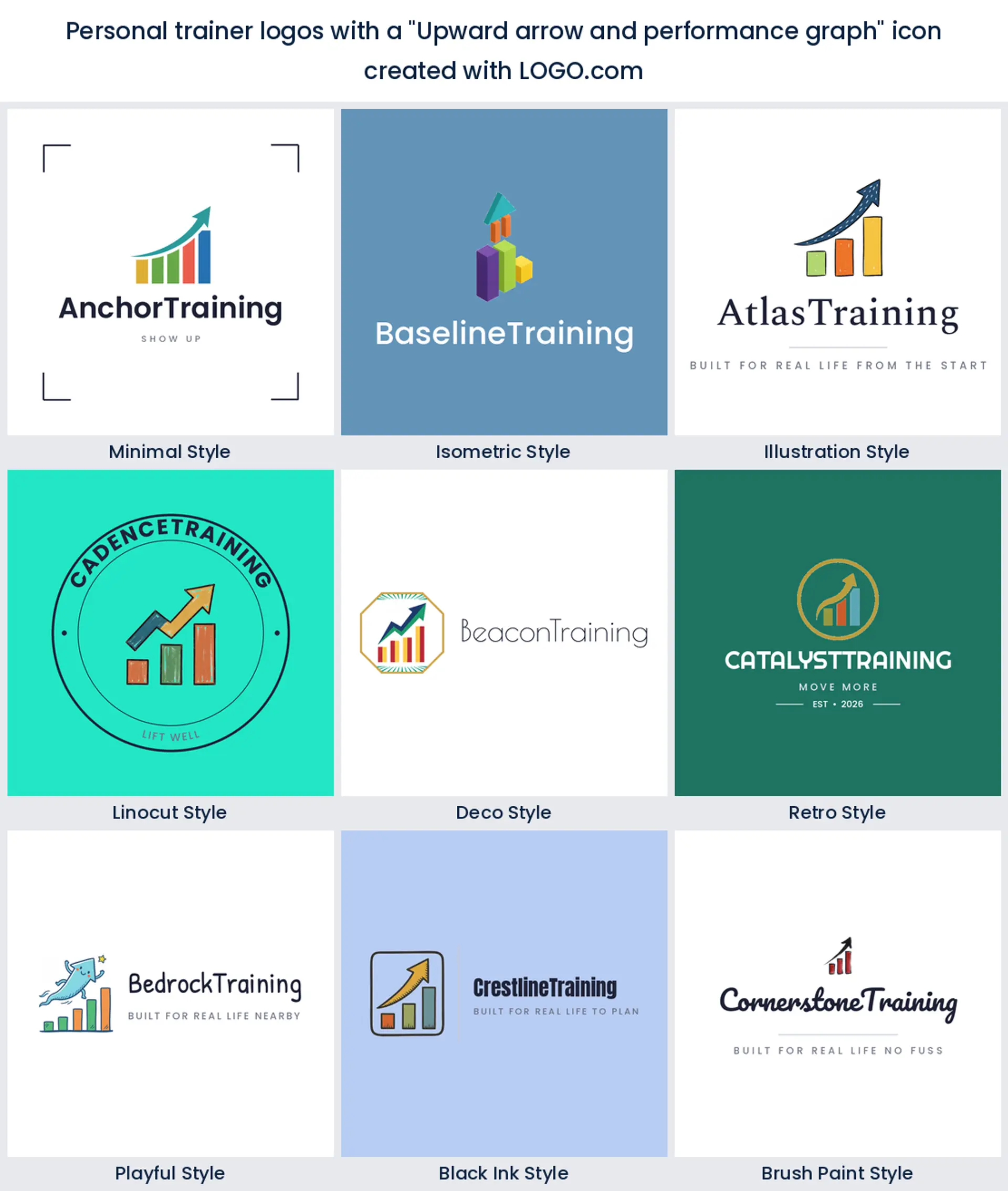
6. Upward arrow and performance graph
Sixth is the one that comes from the results conversation: an arrow climbing, sometimes over a small bar graph. It is the language of progress, of numbers moving in the right direction, and it is a smart pick if you sell measurable programming, testing, or performance blocks rather than vibes. It also happens to look right beside data on a client dashboard.
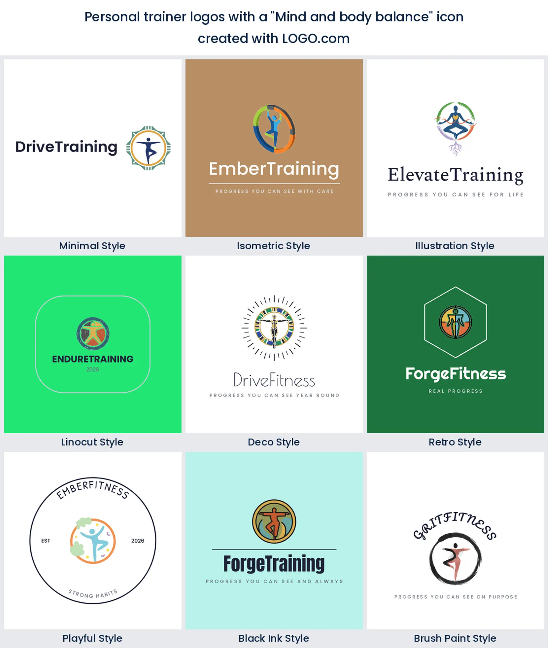
7. Mind and body balance
In seventh place trainers stop talking about output and start talking about balance, with briefs asking for a mind and body connection or a figure held in a calm, even pose. This is the mark for coaches whose sessions include mobility, breathing, or habit work, and it is a lovely fit for a personal training logo aimed at people coming back from burnout rather than chasing a total.
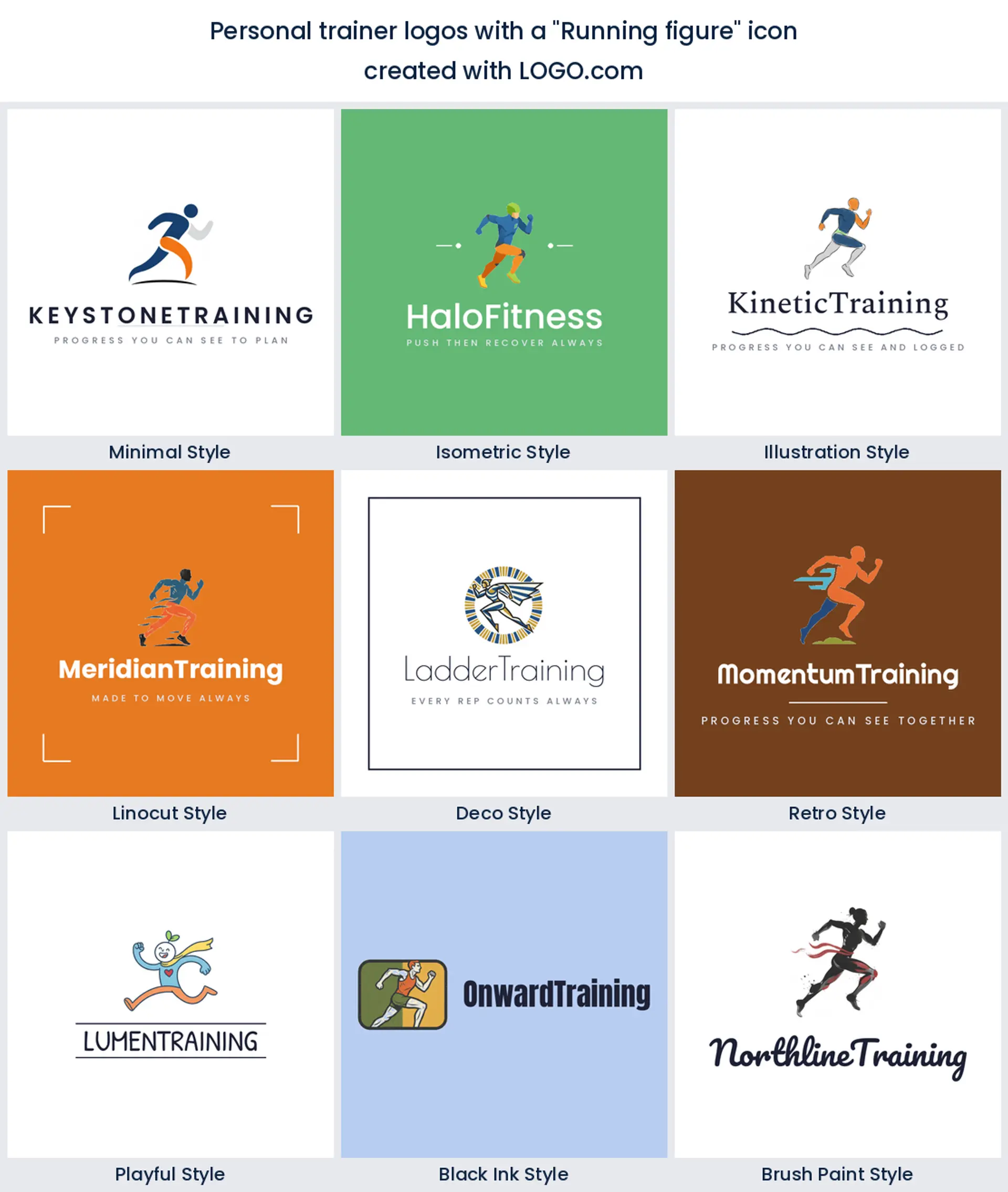
8. Running figure
Running turns up eighth, as a figure mid stride or a single shoe. It is the only symbol here that moves, which makes it useful when your work is conditioning, run coaching, or bootcamp style sessions outdoors. Worth remembering that a runner reads as endurance to most people, so it will quietly position you away from heavy lifting whether you meant that or not.
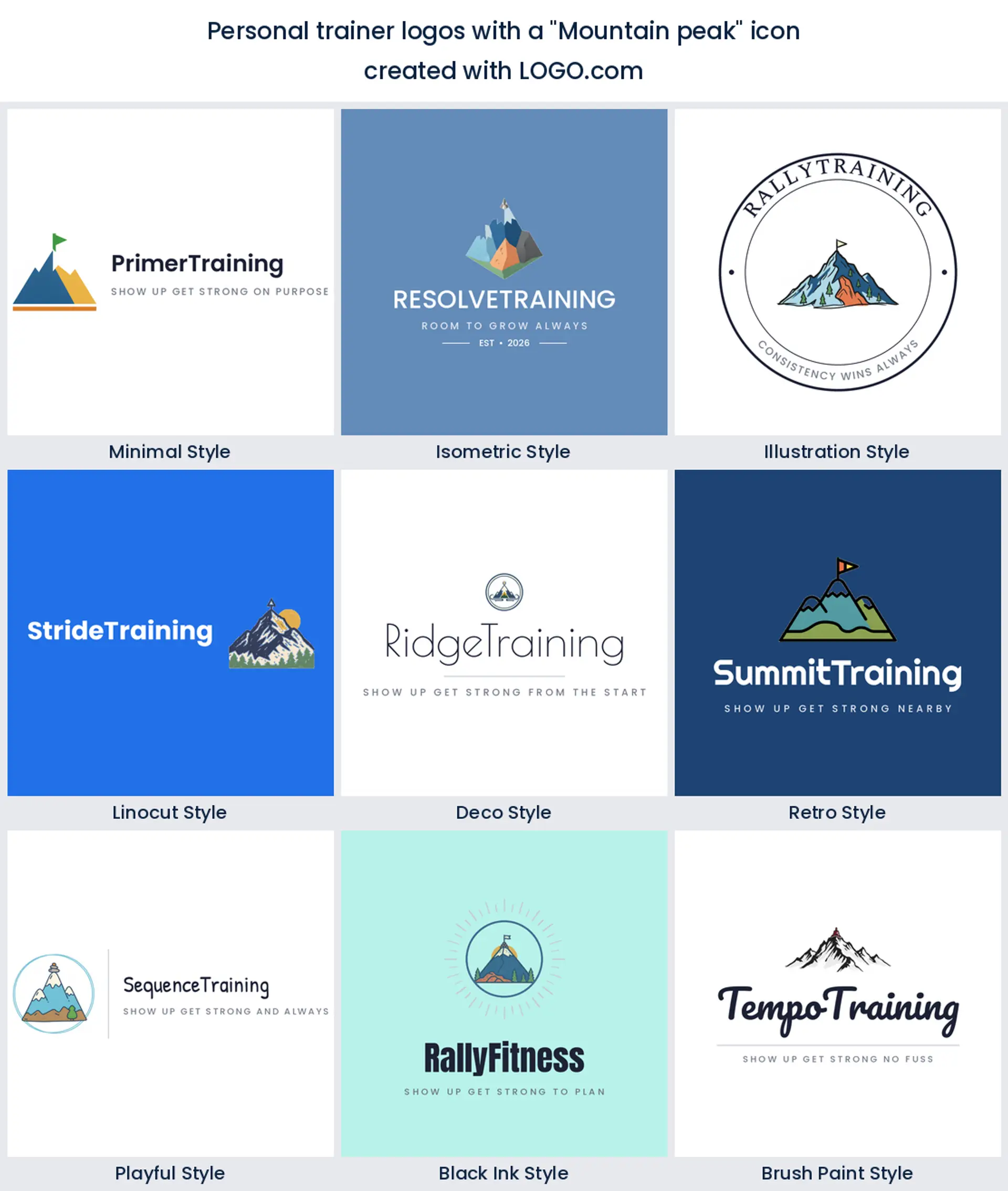
9. Mountain peak
Last of the nine is the mountain, and it almost never appears alone. Founders draw a peak with a bar above it or a summit marker on top, which is the unlocking potential idea again, just in landscape form. Choose it for a challenge, a transformation package, or an outdoor training brand where the climb is the whole story.
Fifteen personal trainer logo ideas, one for each founder brief
Nothing below was dreamed up in a meeting. These are fifteen icon descriptions founders typed into LOGO.com themselves, kept word for word, then drawn in all nine styles so you can see how far one sentence stretches. Read them as personal trainer logo inspiration rather than a menu. Copy the sentence you like into the generator, change one noun to suit your work, and you have a starting point that already reads like this industry.
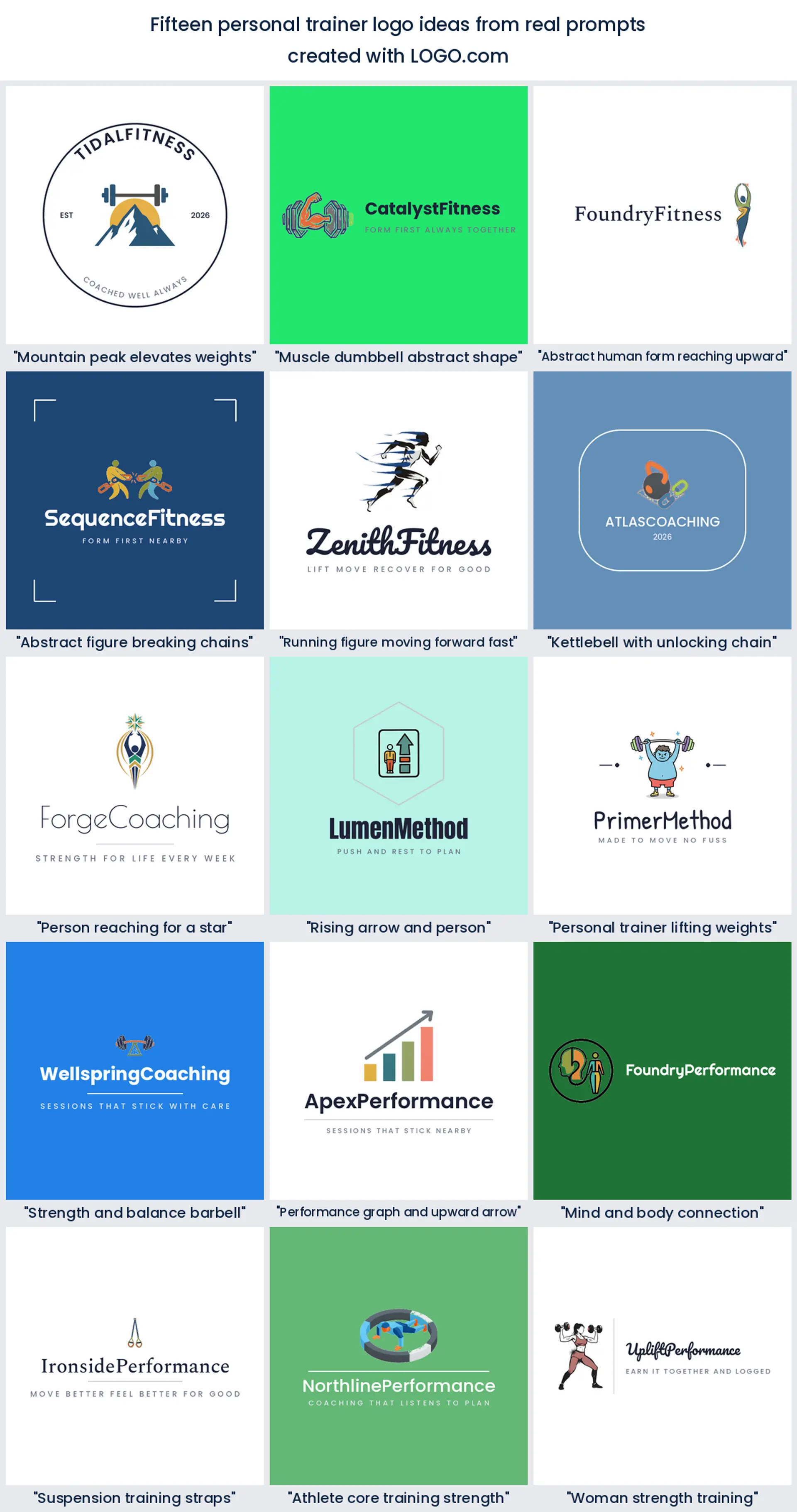
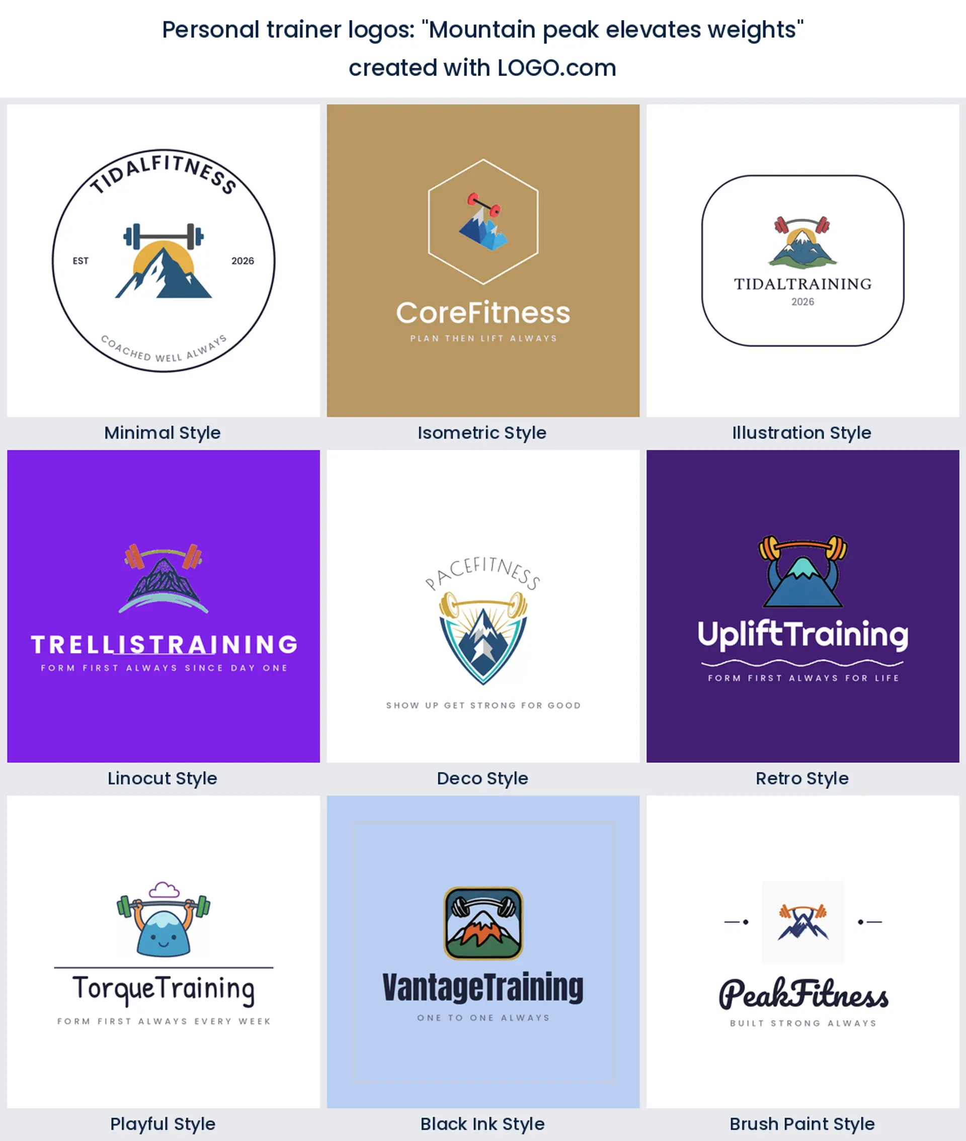
1. "Mountain peak elevates weights"
Two symbols doing one job. The peak carries the ambition and the bar carries the method, and stacked together they say hard climb, real coaching. It draws beautifully as an emblem, so it is a strong choice if you want a badge you can stitch onto a jacket for a transformation challenge logo.
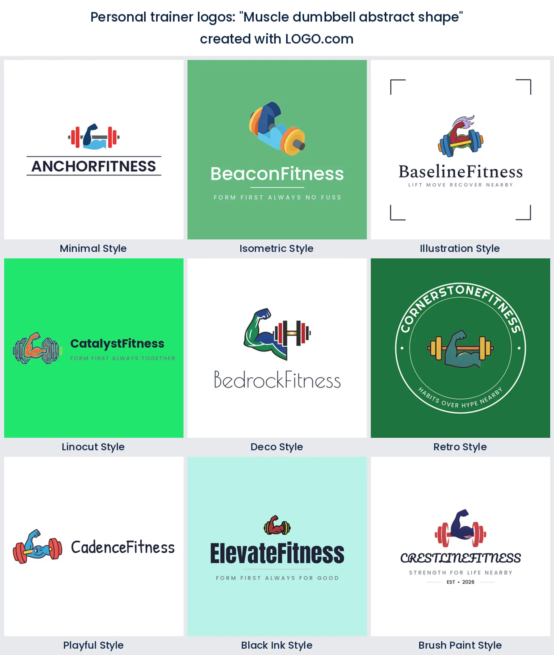
2. "Muscle dumbbell abstract shape"
This one asks the drawing to be a shape first and an object second, so the bicep curve and the dumbbell melt into a single form. Abstract marks like this age slowly and scale down happily, which makes it a sensible personal trainer logo design if you expect to be small on a phone more often than big on a wall.
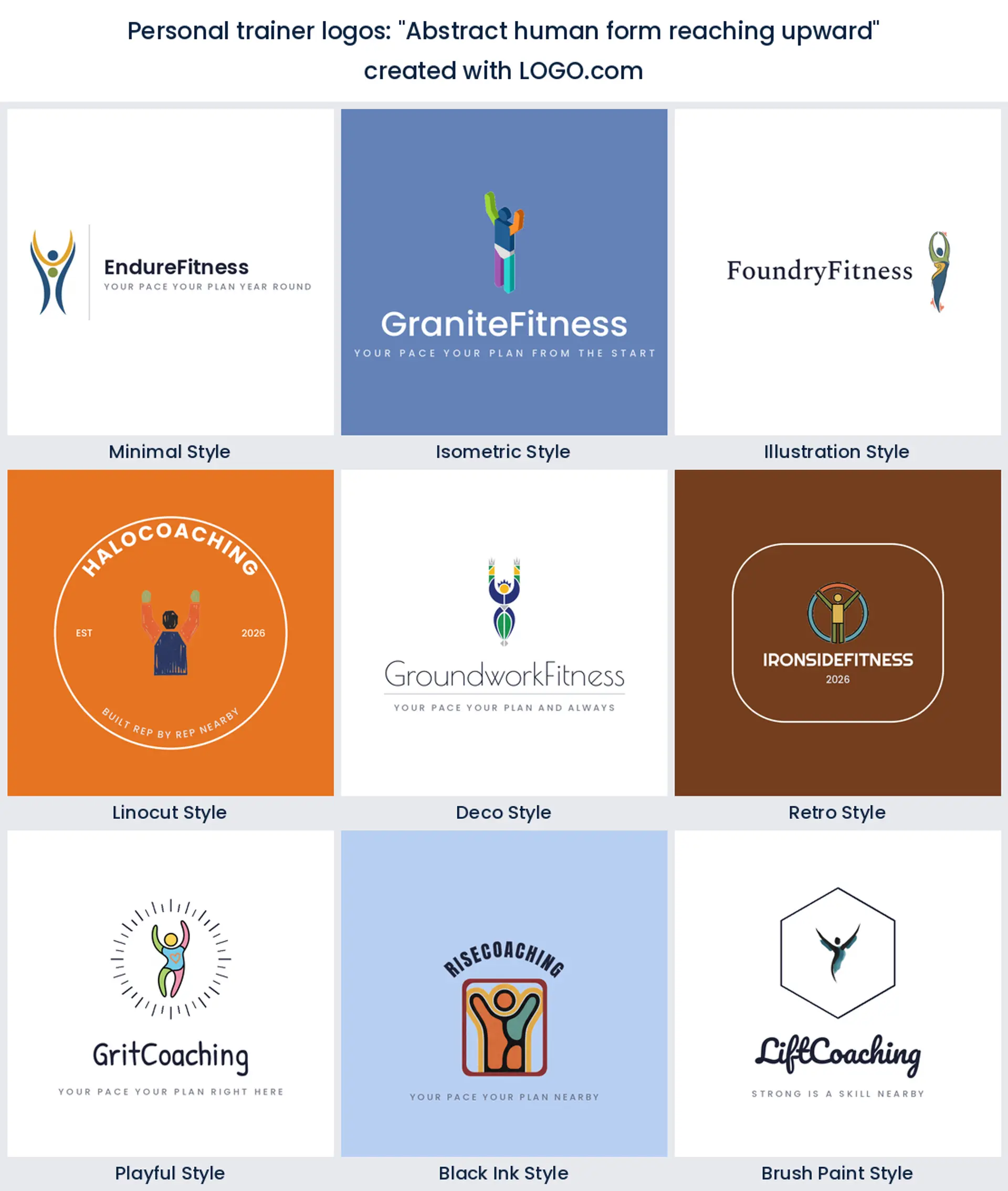
3. "Abstract human form reaching upward"
Strip out the equipment and you are left with a person and an intention. That is the whole appeal here. Trainers who coach beginners, older clients, or post injury work often want nothing in the mark that looks intimidating, and a reaching figure manages to feel ambitious without shouting.
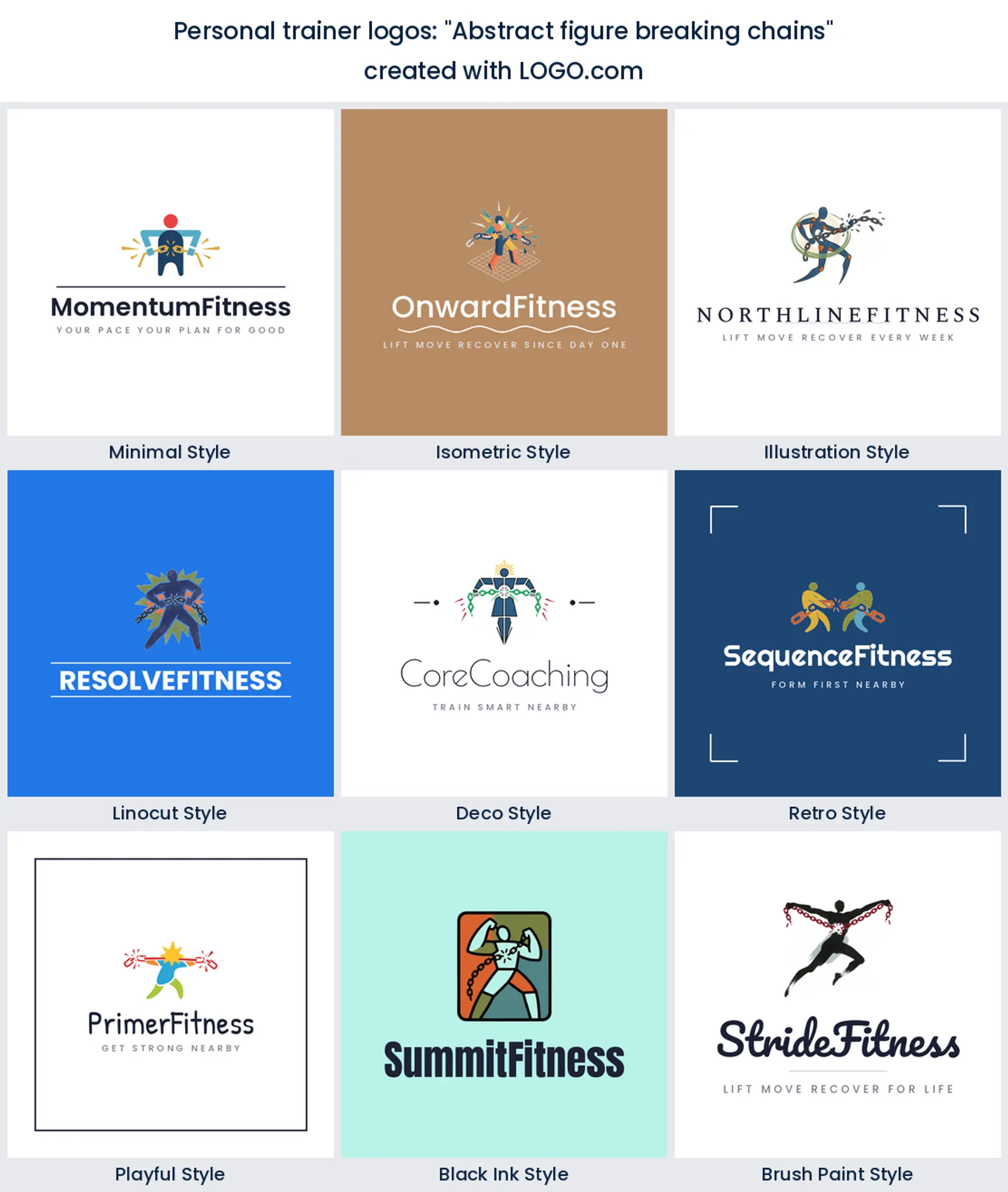
4. "Abstract figure breaking chains"
The most dramatic brief in the set, and the most specific about who it is for. Chains snapping means something changed, so it lands with clients who arrive after years of stopping and starting. Use it when your marketing is about breaking a pattern, and keep the linework simple or the chain turns to mush at small sizes.
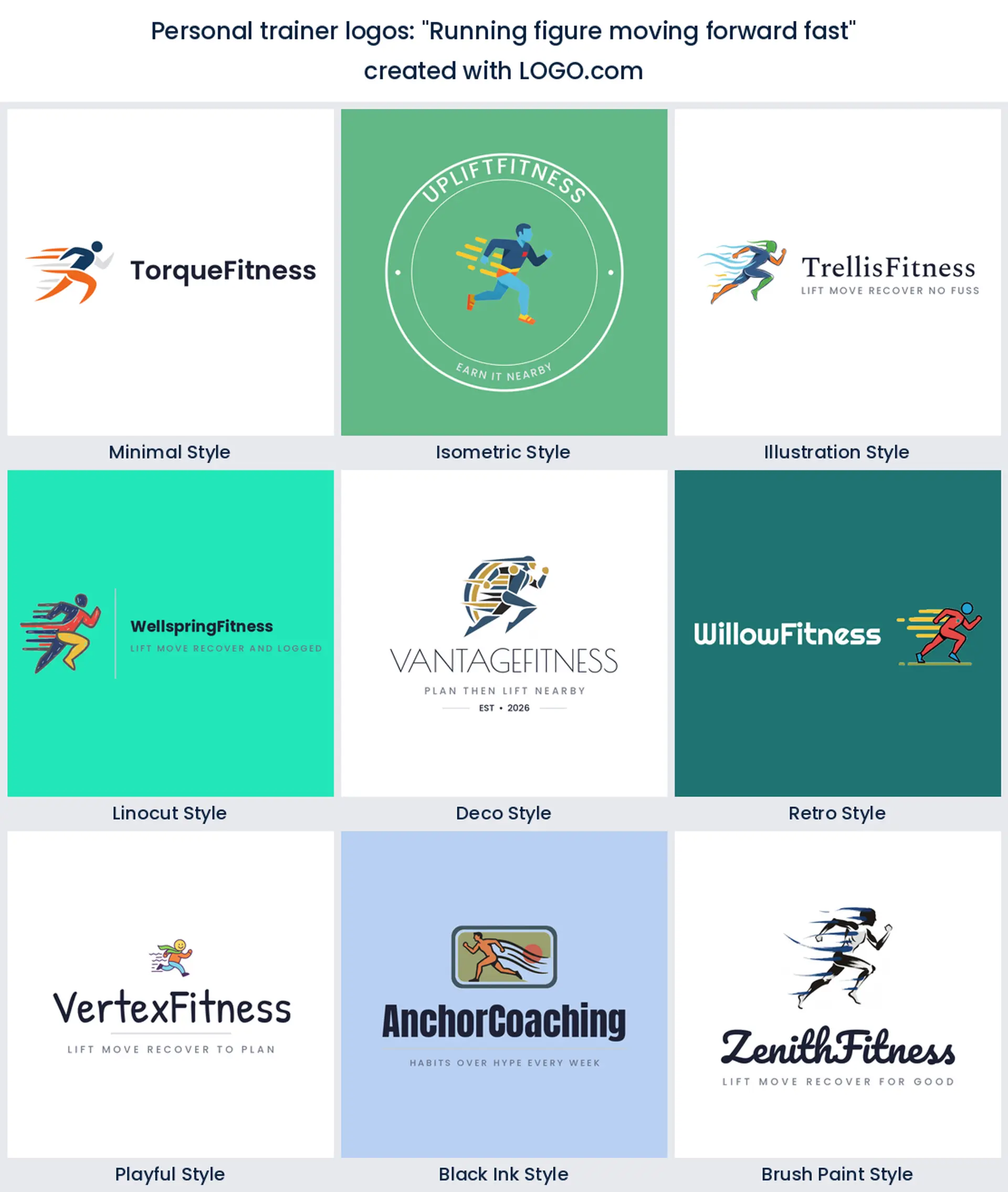
5. "Running figure moving forward fast"
Speed lines behind a runner is the oldest trick in sports design and it still works, because motion reads even when the icon is tiny. Good for conditioning coaches, run clubs, and outdoor bootcamps, and a natural fit if your sessions are about pace rather than plates.
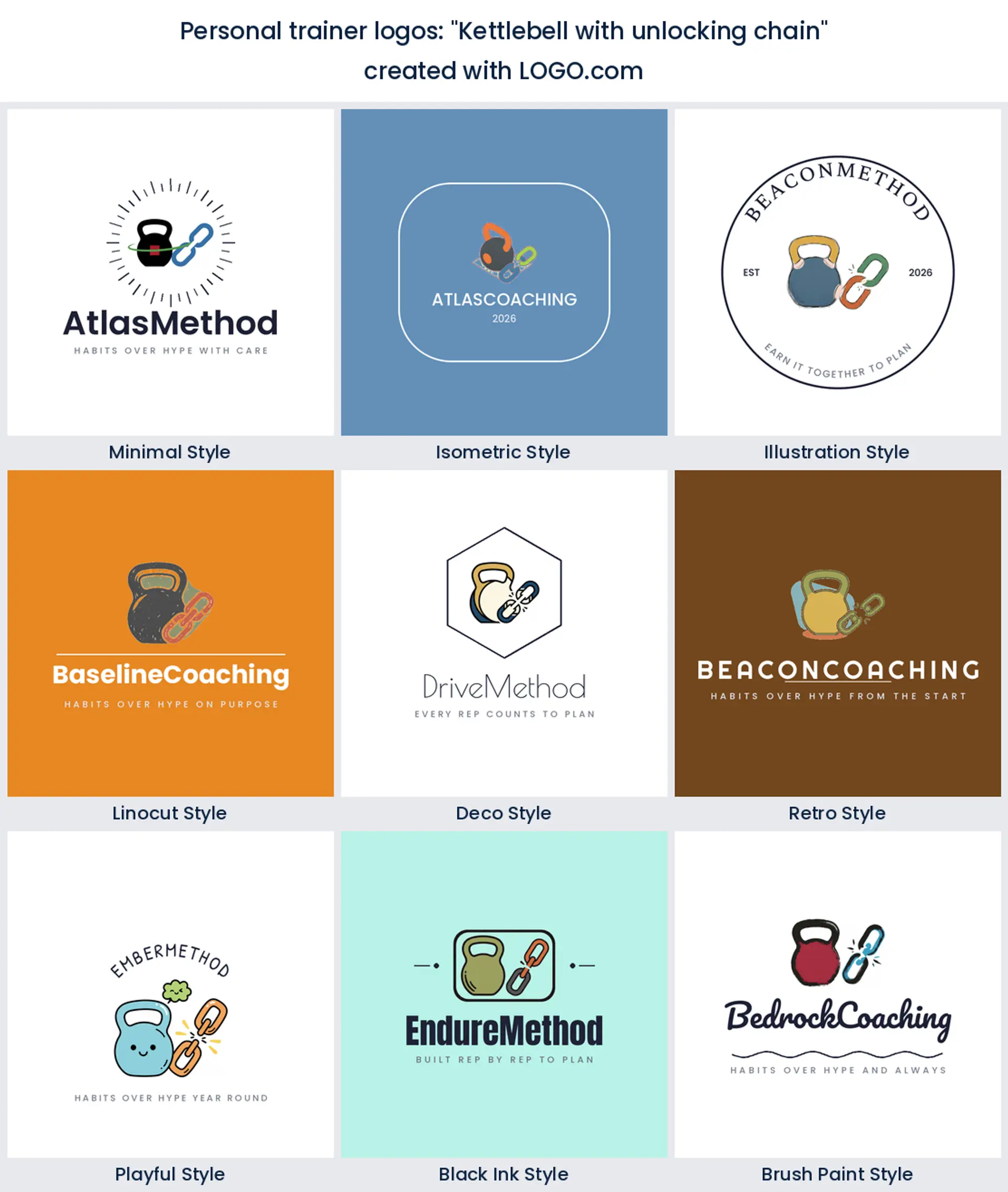
6. "Kettlebell with unlocking chain"
Here the two top themes on the whole page collide in one icon: the kit and the release. A kettlebell with a chain opening beside it gives you equipment credibility plus the promise underneath it, which is a rare combination in one mark. Strong pick for a small group strength studio.
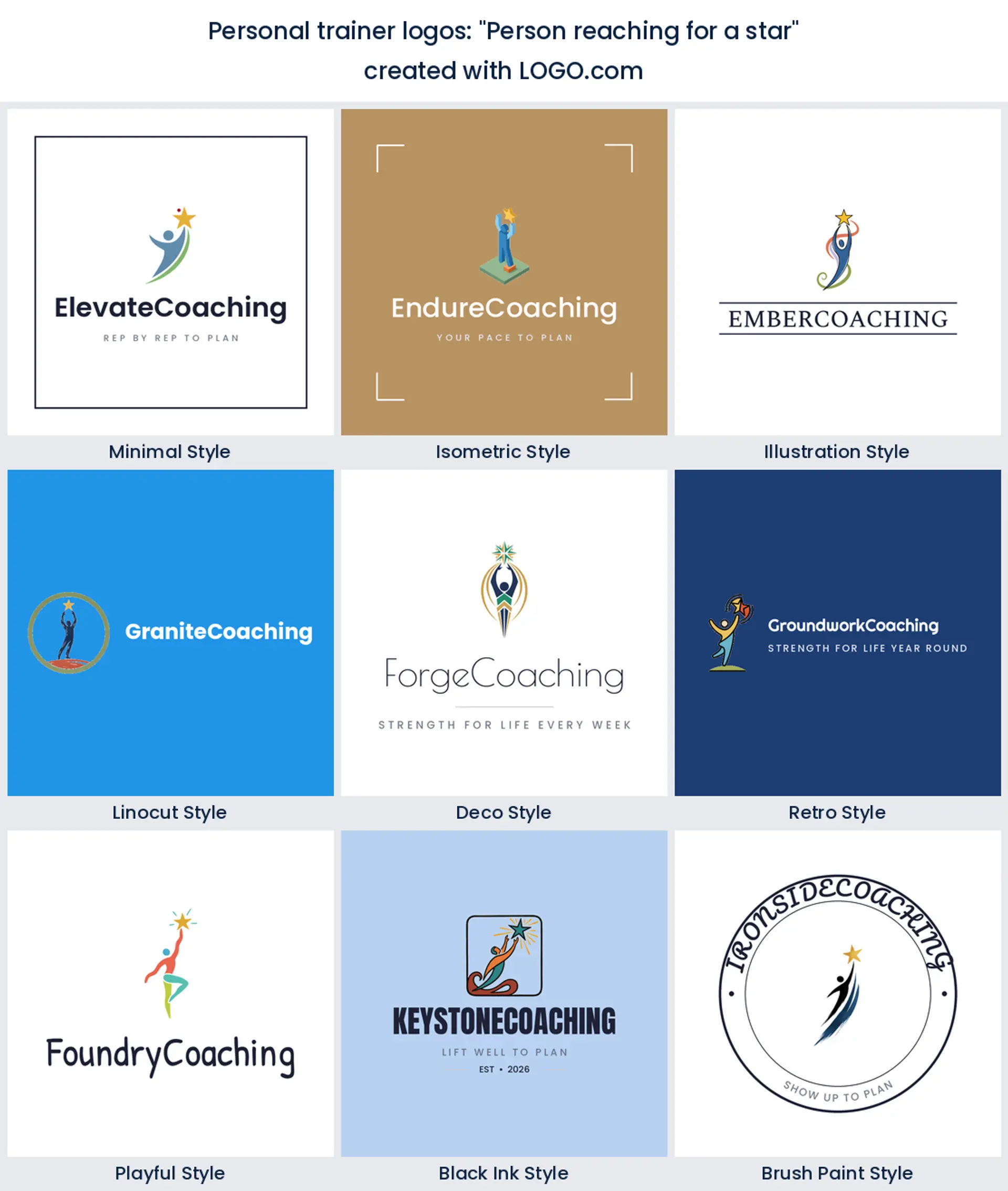
7. "Person reaching for a star"
Softer than the chains, warmer than the graph. A figure stretching toward a star is goal setting drawn plainly, and it photographs well on a pastel palette, which suits coaches whose feed leans encouraging rather than intense. It also makes a friendly avatar.
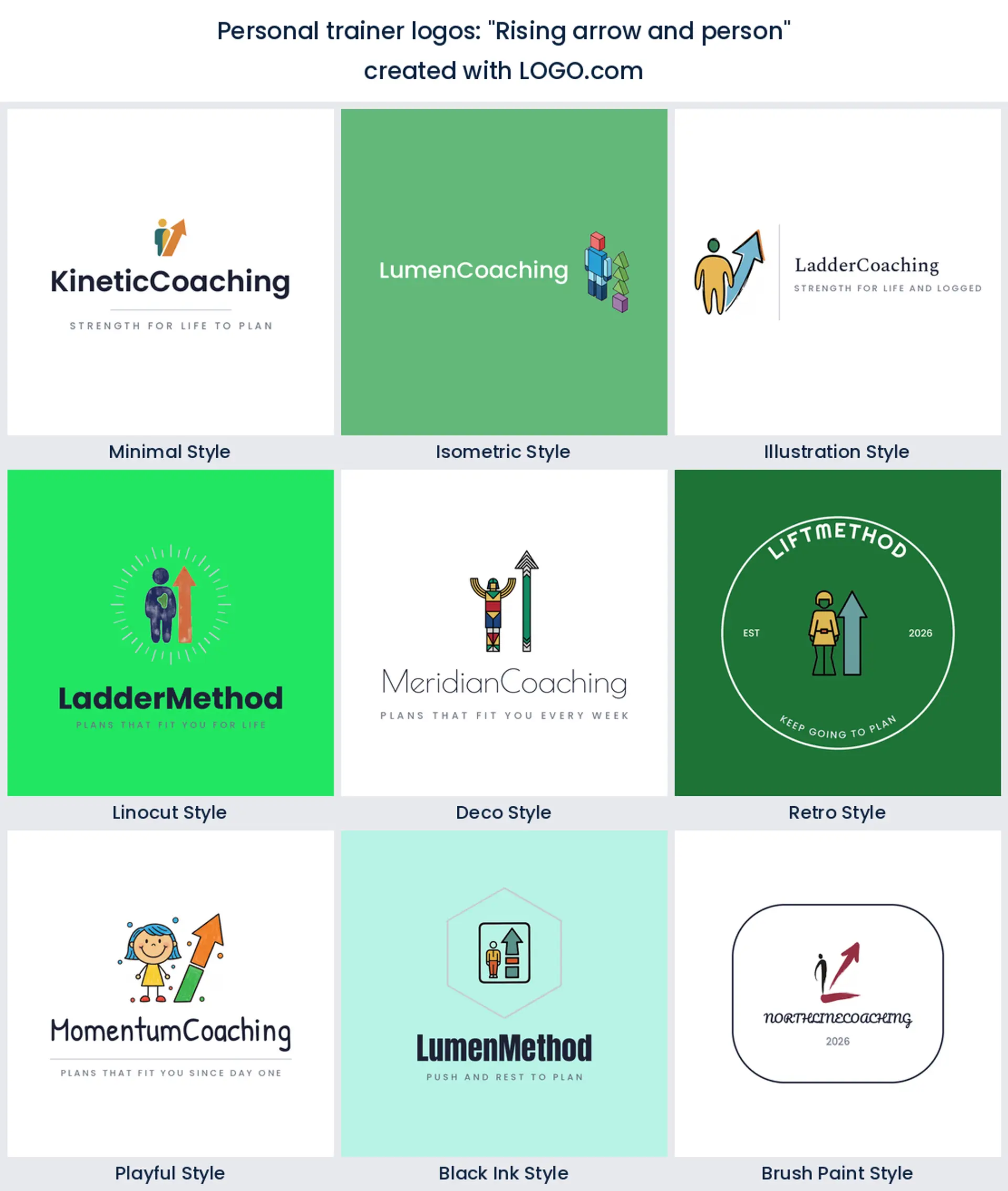
8. "Rising arrow and person"
The client and the trajectory, side by side. Because the arrow is a separate element you can drop it and keep the figure when the mark has to go really small, which is handy on an app tile. A tidy option for anyone selling structured programmes with a beginning and an end.
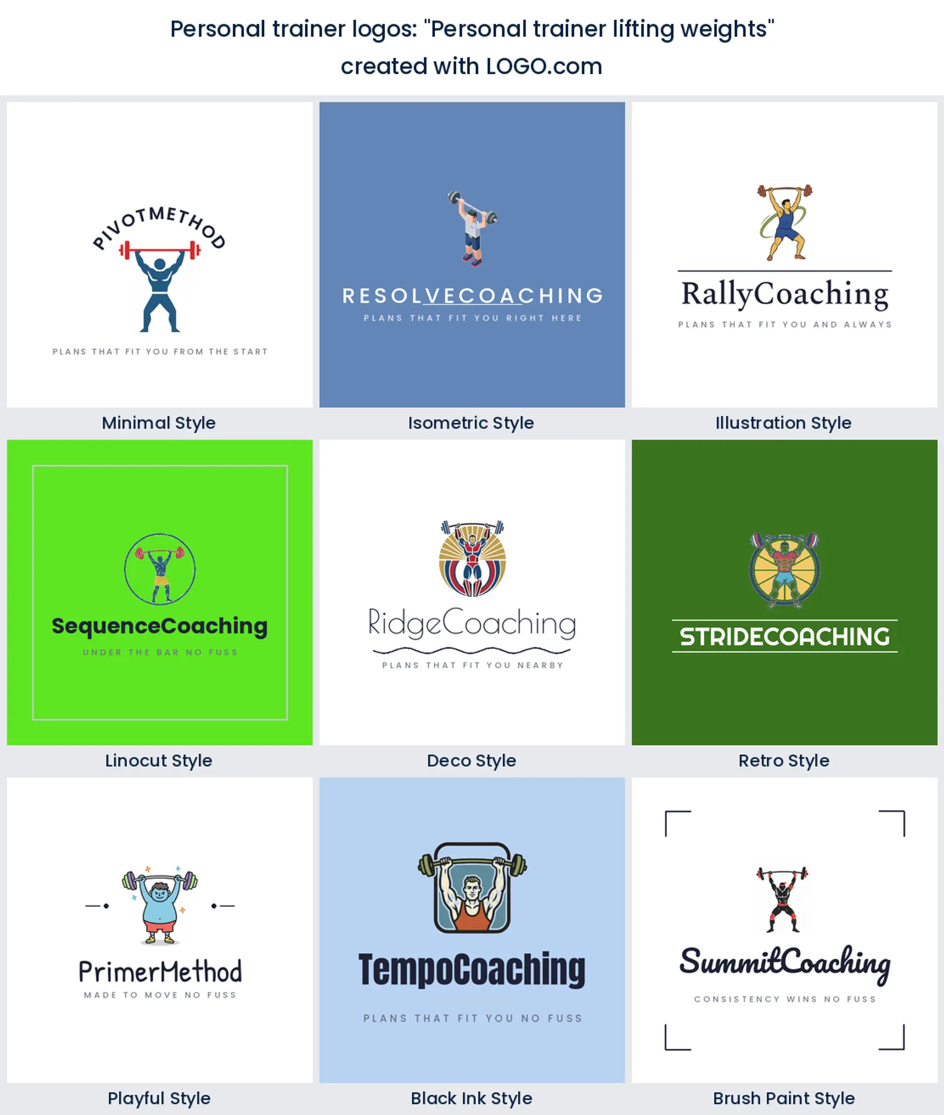
9. "Personal trainer lifting weights"
The literal version, and there is nothing wrong with literal. A coach under the bar tells a stranger what you do in one glance, which matters when your mark is a thumbnail beside nine other coaches in a directory. Keep the pose clean and the bar level so it does not read as a scribble.
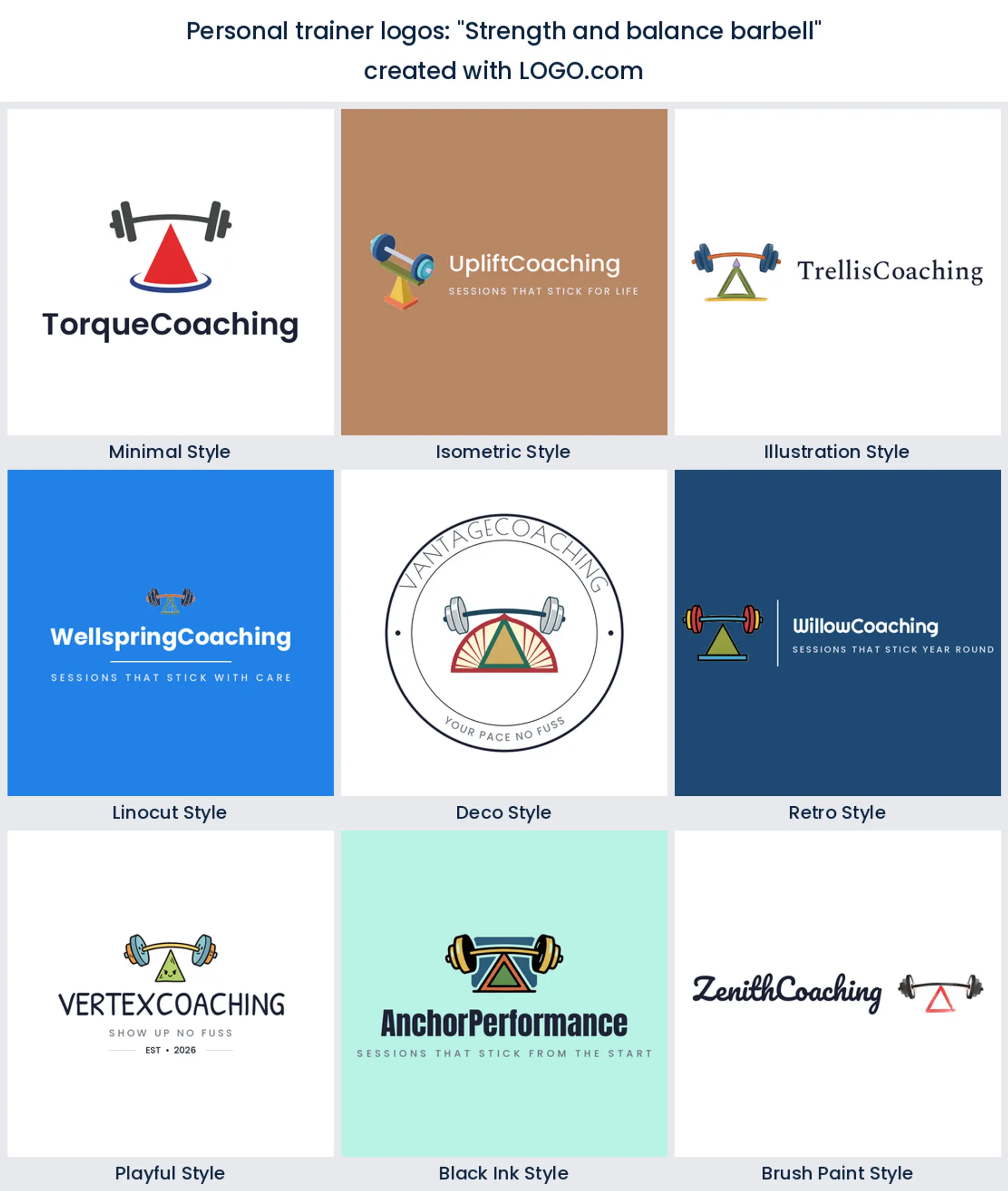
10. "Strength and balance barbell"
A bar resting on a fulcrum, which is a neat visual pun and an honest description of good programming. It hints that you are not only about load, you are about doing it well. Coaches who talk a lot about technique tend to like this one, and it gives you a very stable horizontal lockup.
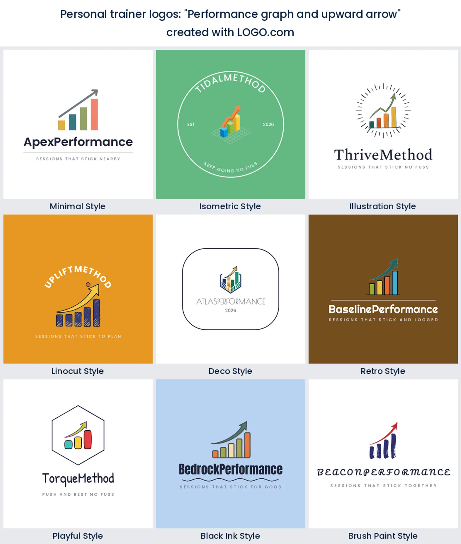
11. "Performance graph and upward arrow"
If your selling point is measurement, put measurement in the mark. Bars climbing under an arrow look at home next to a testing report or a body composition scan, and they signal a coach who tracks things. Not the warmest icon here, so pair it with a friendly font.
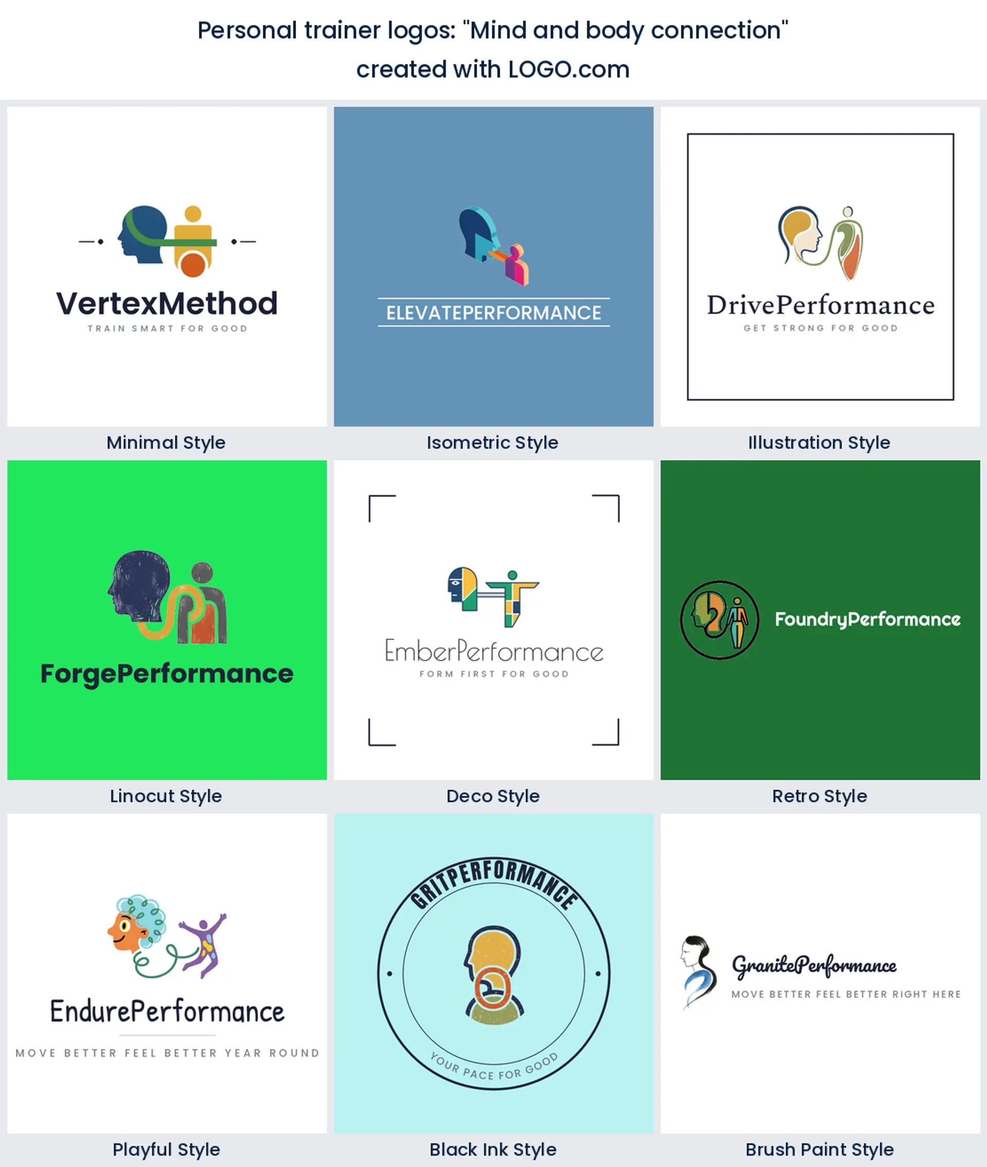
12. "Mind and body connection"
A head profile joined to a body by a single line. It is the quietest brief in the fifteen and the one that travels furthest outside the gym, into habit coaching, nutrition, and sleep. Try it if half your conversations with clients happen away from the weights.
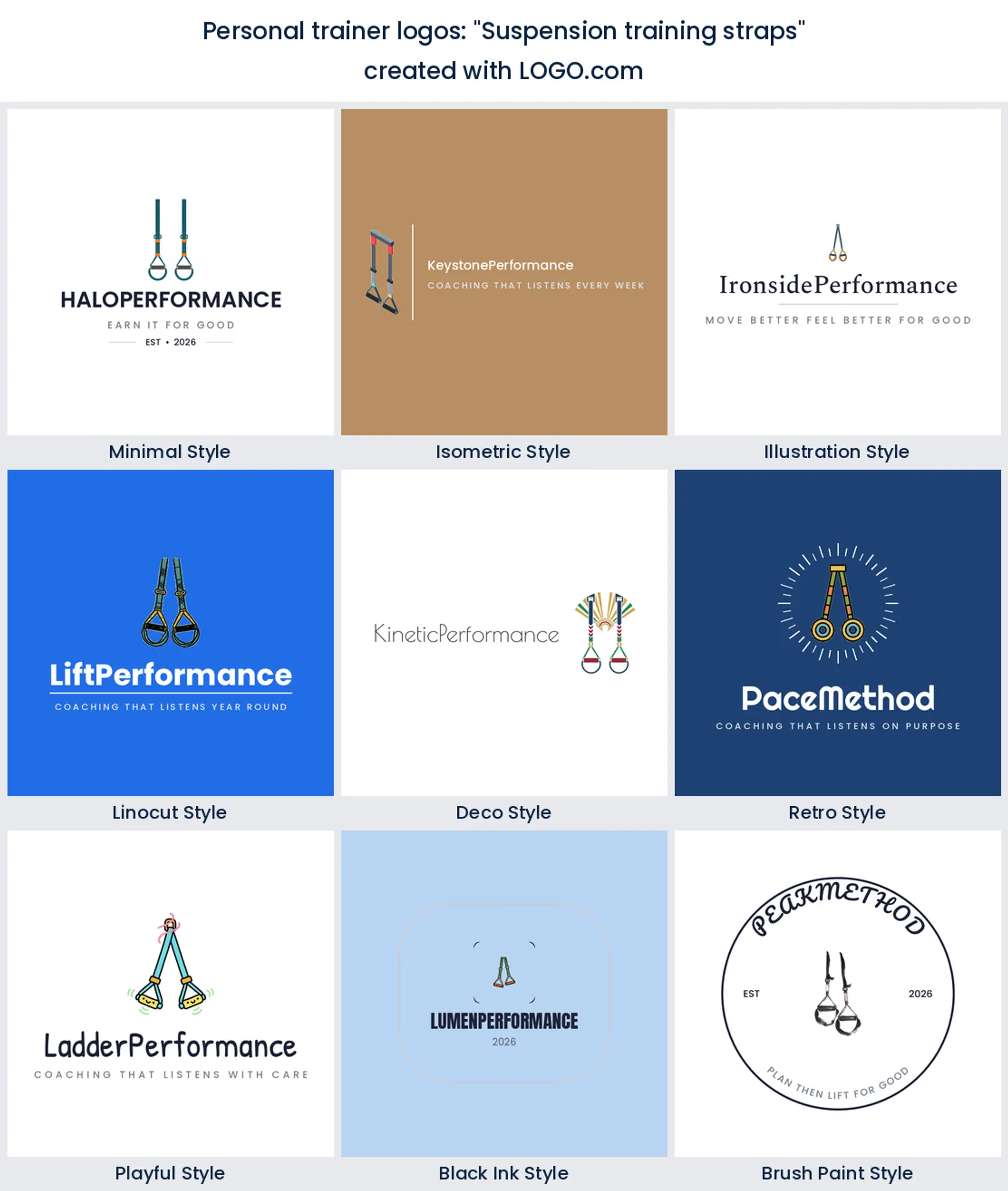
13. "Suspension training straps"
Nobody expects the straps, which is the point. A piece of kit this recognisable but this rarely drawn gives you instant separation from every barbell mark on the street, and it says bodyweight, mobile, train anywhere. Ideal for a mobile trainer or a hotel and home coaching brand.
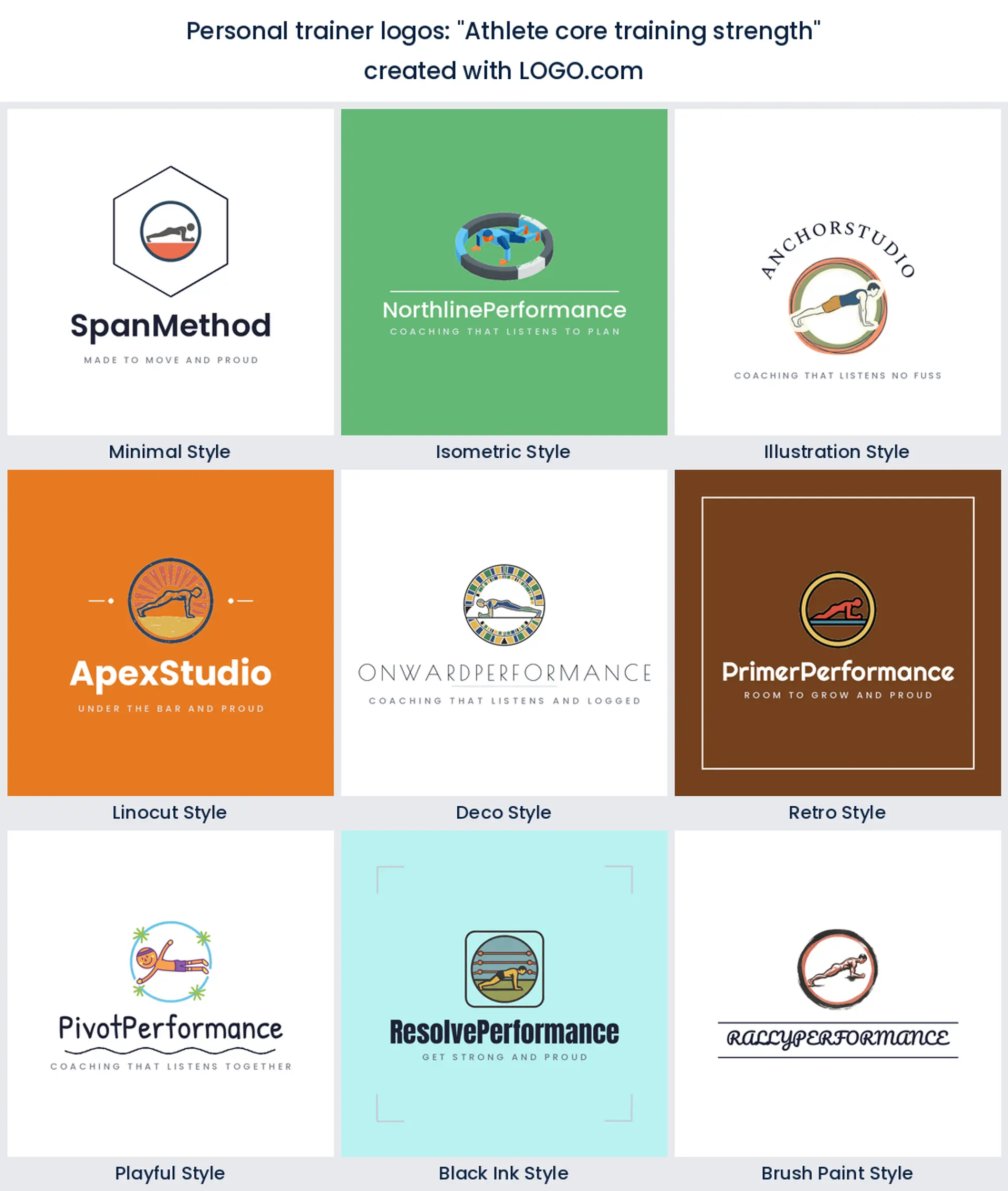
14. "Athlete core training strength"
A held position rather than a lift, drawn inside a ring. It suggests control, and control is what sells rehab, pilates adjacent, and athletic development work. The ring also gives you a ready made circular crop for a profile picture without redrawing anything.
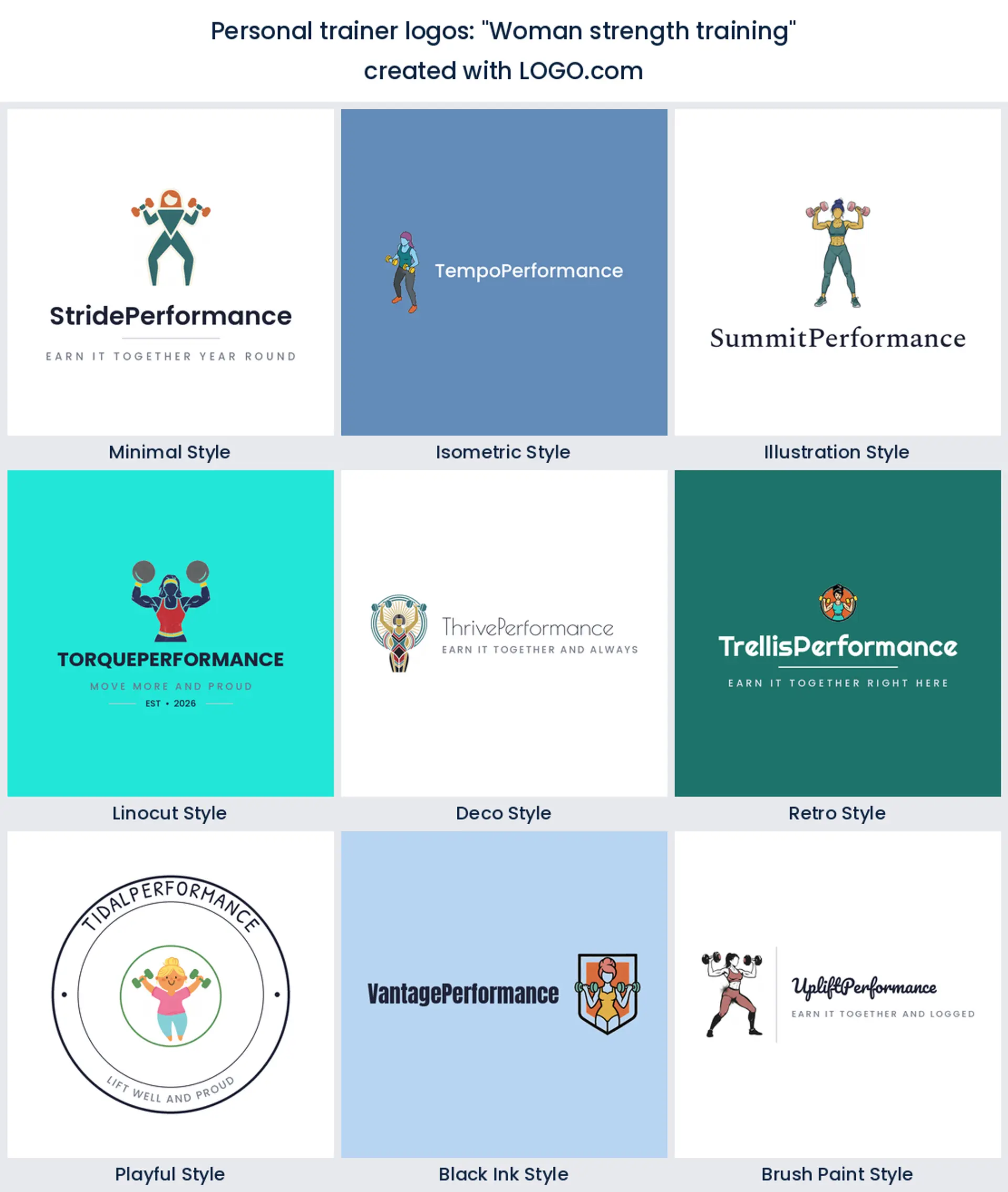
15. "Woman strength training"
A founder asked for this specifically, and it is worth its own slot. A woman with a dumbbell in each hand states who the room is for, which is the whole job of a female personal trainer logo. Drawn in the bolder styles it looks nothing like the soft pink shorthand this niche keeps getting handed.
Your name or a symbol? The personal trainer branding question
You are not branding a building, you are branding a person, and that changes the maths. A gym can hide behind an emblem because the emblem is on the door. Your clients booked you, they message you, they see your face before they see anything else. So decide early which one is doing the heavy lifting. If you trade under your own name and everything comes through referrals, a wordmark with a small mark beside it is usually the honest answer, and it keeps working when you rename your programmes. If you plan to hire other coaches, build a group, or eventually sell the thing, put the weight in the symbol instead, because a symbol can outlast you and a surname cannot. Either way keep a compact version, just the icon, no words. That is the piece you will use most.
Where a personal trainer logo actually shows up
Think about the last week of your business and you will notice your mark almost never appears large. It is a round avatar on a coaching app where the client checks off a session. It is the header of a programme PDF nobody prints. It is a small embroidered patch on your training top, a sticker on a water bottle, a corner bug on a form check video, and a profile picture on Instagram that renders at about the size of a thumbnail. Build for that. Test the icon on its own at roughly 32 pixels before you fall in love with it, check that the shape still reads when the wordmark is gone, and keep one single color cut ready, because embroidery drops thin lines and gradients every time. If you can recognise your logo on a stitched polo across a gym floor, the rest is easy.
A female personal trainer logo does not have to look softer
This is one of the most searched variations in the whole niche, and most of the personal trainer logo examples that come back look identical: script font, dusty pink, a small leaf. If that is genuinely your brand, wonderful, use it. If it is not, you are being handed someone else's shorthand. The founder brief in our own data reads simply "Woman strength training", not "soft feminine fitness", and that distinction is worth defending. Try a bold figure in a strong color, or a monogram with real weight to it, or the exact same barbell every other coach uses drawn in a palette nobody in your area is using. Let the copy on your page say who you train, and let the mark just be good.
Coaching online changes what the mark has to do
In person, your logo is background. The room, the kit, and you are doing the persuading, and the mark is mostly a signature on the invoice. Online, it is often the first and only thing a prospect sees before they decide, sitting as a tiny circle beside a caption. That flips the priorities. If most of your delivery is remote, choose the simplest icon in your shortlist rather than the cleverest, make sure it survives a circular crop with room to spare, and get a transparent version so it can sit on your own footage instead of in a white box. If most of your work is face to face at a facility, you can afford more detail, because your mark will spend its life on a banner, a door decal, and the logo personal training studios stick on the window.
The colors personal trainers actually save, and the one you expected
Ask anyone to picture a training brand and they will describe black and red. Our own numbers point somewhere else. Setting the neutral bases aside, blue is the most saved hue among personal training founders on LOGO.com, orange comes second, green is third, and purple appears more often than red does. That is a genuinely useful gap. Blue reads capable and calm, which is why it suits rehab, strength coaching, and anyone selling consistency over intensity. Orange is the energy hue without the aggression of red, and it pops hard on a dark gym photo. Green leans into recovery, nutrition, and outdoor sessions. If you want a creative personal trainer logo that still looks like it belongs in the industry, pick one of those as your lead, keep a near black for text, and skip the red unless your whole brand is built on intensity. Every icon on this page can be a multi color mark or a one color version, so you can carry a full color logo online and a single ink cut for stitching.
What it costs, and what you can use it for
Designing and previewing costs nothing, and neither does the download you probably need. The free plan hands you four high resolution PNG files with full commercial use, which covers your coaching app, your socials, invoices, programme PDFs, and a printed flyer. You would pay for the Brand Plan when you need vector files, and the moment that happens is usually physical: a pull up banner for a gym open day, a vinyl cut for a window, a batch of embroidered polos for your small group, or a van. The Brand Plan also brings unlimited edits and a brand kit, which is the practical bit when your colors and fonts have to be handed to a printer. Nothing about commercial use is locked behind the upgrade. The free files are already yours to earn under.
Make your personal trainer logo with LOGO.com
Type your name or your business name, describe the icon in your own words, and pick from the nine styles above. Every mark is drawn for you rather than pulled off a shelf, so the same stock dumbbell does not end up on three coaches in the same postcode. Preview it free, download it, and come back to change the mark when you add a second coach or move your programmes online.
Methodology. These figures come from logos created on LOGO.com in the 48 months ending July 2026. The personal training industry sample is small, so the corpus is scoped openly: 57 custom icon descriptions, made up of every description written by founders whose industry contains personal training or personal trainer, plus descriptions from anywhere on the platform that named a strength or fitness training subject, sitting alongside the roughly 75 personal training brands built on LOGO.com in the same window. Railway, animal training, team sport and cycling matches on the word training were excluded by hand. We grouped the descriptions by concept and ranked each concept by how often it appeared. Unlocking potential featured in about 25% of them, strength training in about 23%, and a barbell or dumbbell in about 14%. Founders usually name more than one element in a single description, so the shares overlap rather than summing to 100. Figures are rounded to the nearest percentage point. Source: LOGO.com first party product data, July 2026.
THE #1 LOGO GENERATOR
Why LOGO.com is the best personal trainer logo maker
1.57 founder briefs set this ranking
Every symbol here earned its slot by how often personal training founders asked for it on LOGO.com, so you are choosing from real personal training logo ideas rather than stock clip art.
2.Holds up as a round app avatar
Your client sees the mark as a small circle in a coaching app more than anywhere else, so check the icon alone at thumbnail size before you commit.
3.Survives the stitch on a training top
Stitching eats hairlines and gradients, so keep a single color version of the mark for training tops, caps, and gym bags.
4.Brands a form check clip with no white box
Use the transparent file to drop a small bug into the corner of client footage and progress photos with nothing white behind it.
5.Tops a programme PDF and an invoice
The same mark heads your twelve week plan, your intake form, and the invoice that follows, so your paperwork looks like one business.
6.Nine styles, from rehab calm to bootcamp bold
Minimal, illustration, isometric, deco, playful, linocut, retro, brush and black ink, each properly drawn instead of recolored.
7.Ready for the day you stop coaching alone
Swap the wordmark or add a second line when you bring on another coach, and keep every polo and sticker you already printed.
8.A fresh palette for every six week block
Six week blocks, summer bootcamps, and referral pushes all get their own palette without you starting the personal trainer logo design again.
9.Free to design, yours to coach under
Download four high resolution PNG files free with full commercial use, then add the Brand Plan for the vector files banners and embroidery need.
Personal Trainer Logo Maker FAQs
Need Inspiration? See example brands in your industry...
AbstractAccessoriesAdventure TourismAestheticsAgricultureAirplaneAnimalAnimal and PetsAnime Logo MakerApplicationArchitectureArrowArtificial IntelligenceArts & CraftsAssociationAttorney FirmAuthorAuto Parts SupplyAviationBaked Goods StoresBandsBarsBeautyBeauty and Cosmetics BlogBeerBicycleBiotechnology ResearchBlack+WhiteBlueBonfireBook StoreBoutiqueBranchBuilding Materials ManufacturerBusiness LogoButcher ShopCalligraphyCampingCandyCar ClubCartoonCatering and Buffet ServicesCharitable FoundationChibiChiropractorChurchCircusClassicClothing ManufacturingCoffee Shops