Car Dealership Logo Maker
Design a car dealership logo that works on your lot sign and vehicle listings.
Need a different logo maker? Try our AI logo generator.
Logos created using LOGO.com
670,000,000
Emblem and badge marks for car dealerships
Luxury and vintage marks for premium lots
Vehicle and road marks for used car sales
Car Dealership Logos, Ranked From Real Founder Prompts
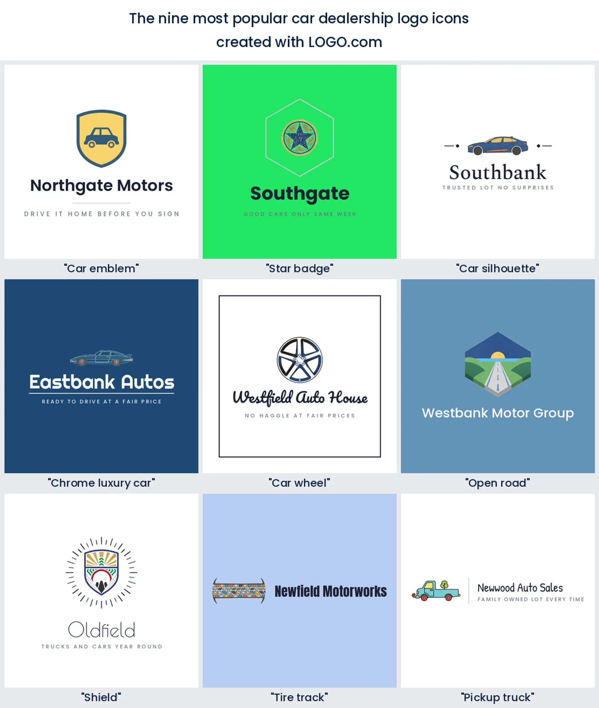
According to LOGO.com data, the shape dealership founders describe most often is an emblem. A car emblem or crest appears in about 24 percent of the vehicle sales icon descriptions in this group, ahead of the star badge and the car silhouette, which tie at about 14 percent each.
The nine icons and fifteen ideas below come straight out of those descriptions, so you are starting from what people selling cars actually asked for rather than a blank canvas. Take the shape you like, then push the color, the type, and the name until the mark belongs to your lot and nobody else's.
On this page
- One in four dealership logos starts with an emblem
- Fifteen dealership logo ideas, drawn nine ways each
- Your logo sits beside the manufacturer badge, not instead of it
- Used lot, franchise store, or online only, pick the mark to match
- Listings, plate frames, and the window sticker do the real work
- Not one founder asked for wings, and that is worth knowing
- Blue leads the lot, and red is further down than you would guess
- Make your car dealership logo with LOGO.com
Two of the founders who described a dealership logo on LOGO.com typed a carmaker's name straight into the prompt box, and one of them asked for a three pointed star. It is an honest place to start, because you spend all day surrounded by other people's badges until they become your shorthand for what a car logo looks like. The rest of the automotive logo descriptions in our data show where people went instead, and those choices are far more useful. This page ranks the nine symbols they reached for most, quotes fifteen of their own prompts drawn nine ways each, and works through the calls you will make about color, files, and where the mark actually ends up.
One in four dealership logos starts with an emblem
Sort the 50 icon descriptions we scoped to vehicle sales by subject and the badge wins outright. A car emblem or crest turns up in about 24 percent of them. The star badge and the plain car silhouette then tie at about 14 percent each, and behind those come chrome and luxury cues, wheels, open roads, shields, tire tracks, and pickup trucks. Nearly every one is a single object held inside a frame, which is exactly how car brands have signalled quality for a hundred years. You do not need more than that.
1. Car emblem or badge
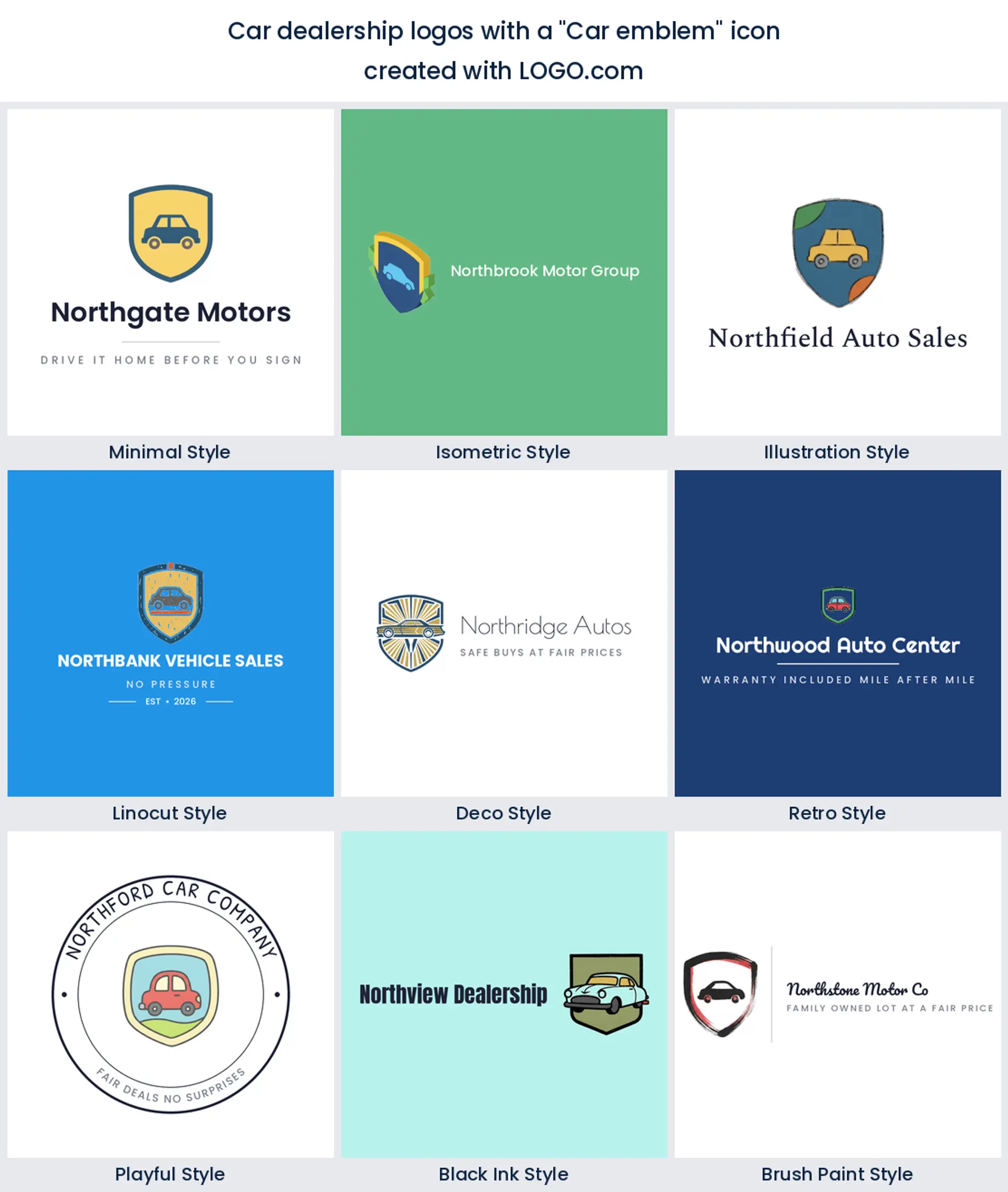
This is the shape a quarter of dealership founders asked for, and it is the closest thing the trade has to a default. An emblem does two jobs at once. The frame says heritage and the thing inside it says what you sell, so a rounded crest with a small car in the middle reads as a marque rather than a service. Keep the outline heavy and the contents to one object, and you have a car dealership logo that looks at home on a forecourt sign and on a plate frame.
2. Star badge
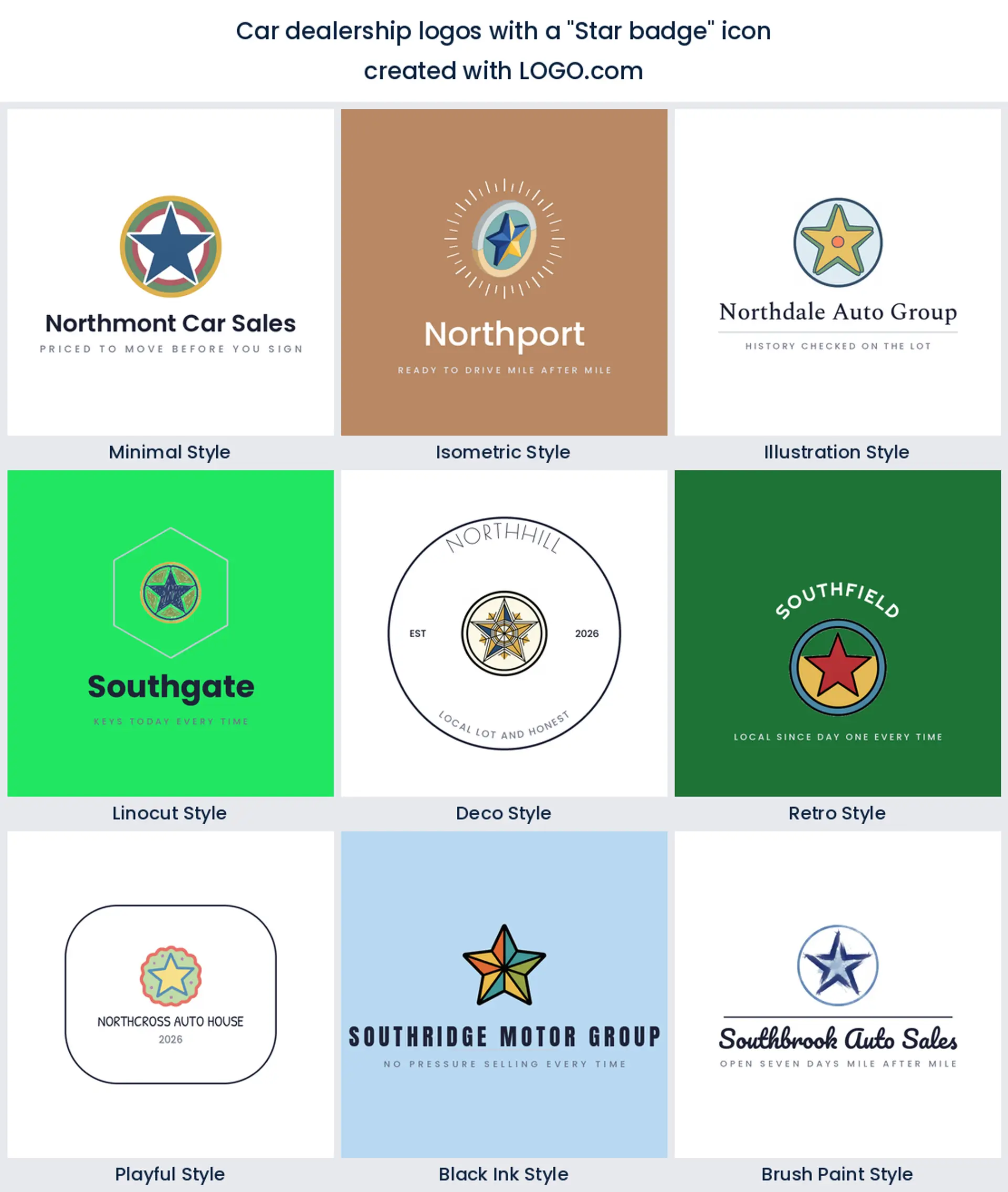
About 14 percent of these descriptions put a star in the middle, which is more than any other abstract shape managed. A star carries rating and reputation, and that is the whole pitch on a used lot where trust is the product. Draw it with five clean points and a fat weight, then give it room inside the badge. It makes a confident auto sales logo, and it stays legible when it shrinks onto a listing thumbnail.
3. Car silhouette
Level with the star, and the most literal option in the nine. One profile of a sedan or coupe tells a passing driver what you do before they have read a word, which matters on a road sign at 40 miles an hour. The trick is the angle. A flat side profile with one strong roofline beats a three quarter view every time at small sizes, and it gives you a wide car sales logo that fits neatly above a phone number.
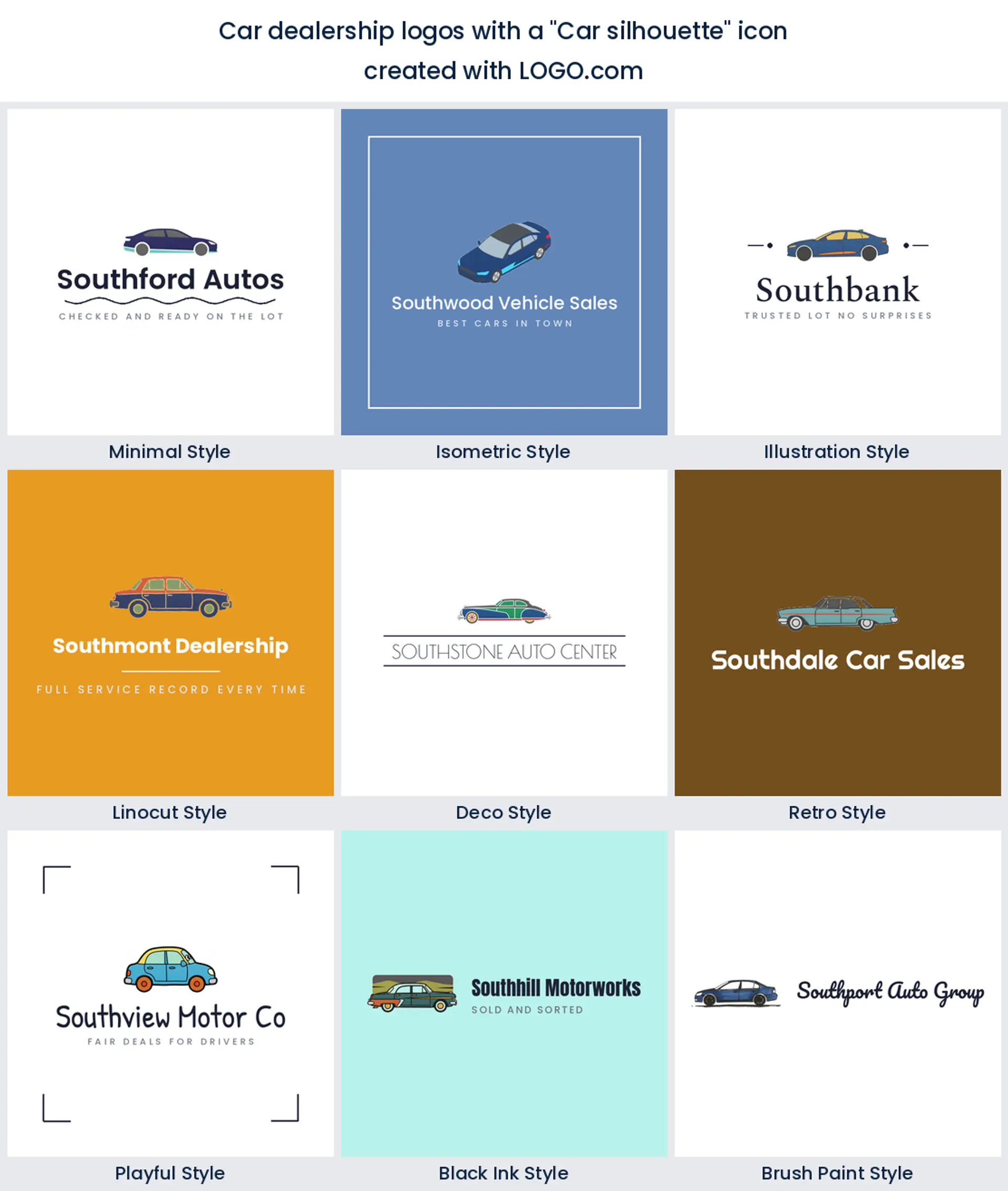
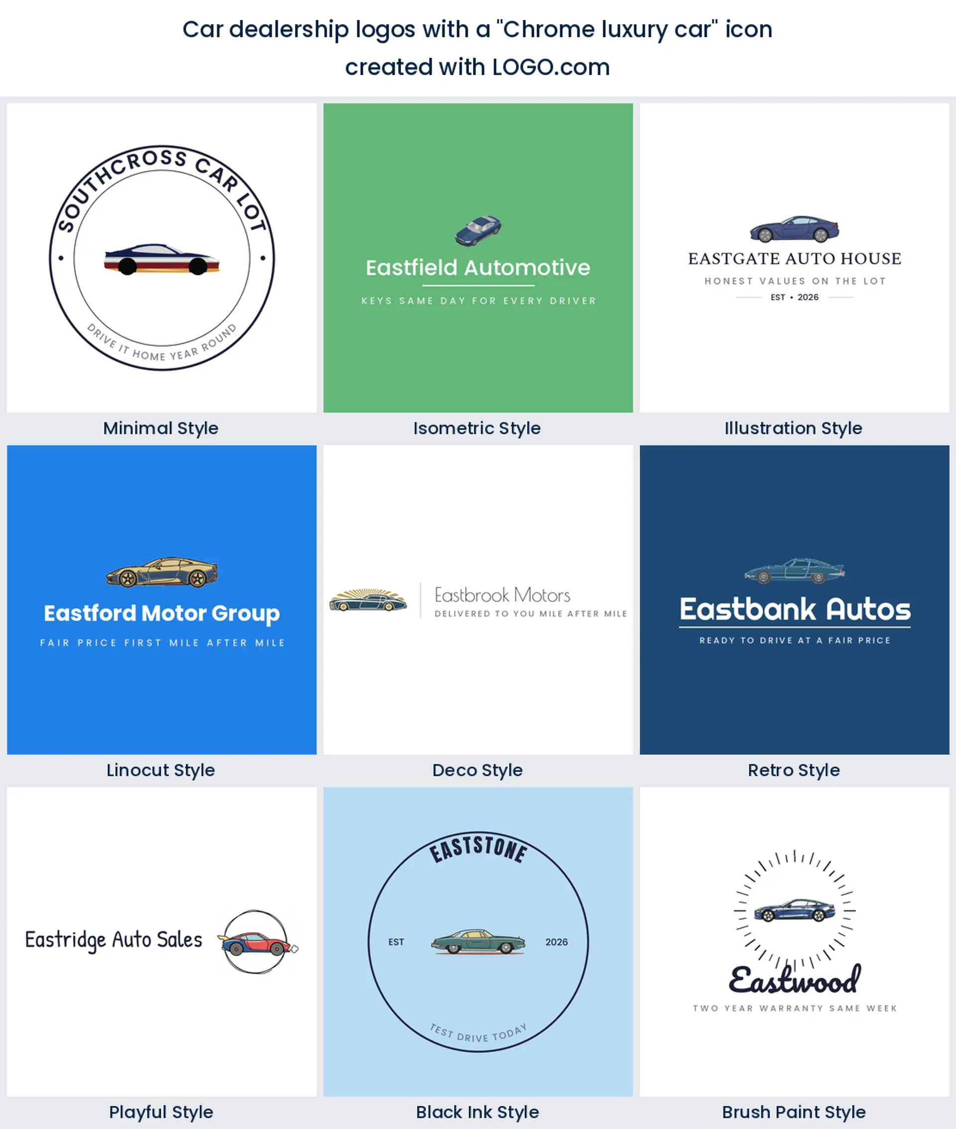
4. Chrome and luxury cues
Fourth on the list is not a shape at all but a finish. Founders kept describing polished surfaces, gleaming hoods, and exotic profiles, which tells you how many independents are chasing the premium end of the lot. You can get most of that feeling without a chrome gradient. A slim italic wordmark, a deep base color, and generous space around the mark will carry a luxury car dealer logo further than any shine effect.
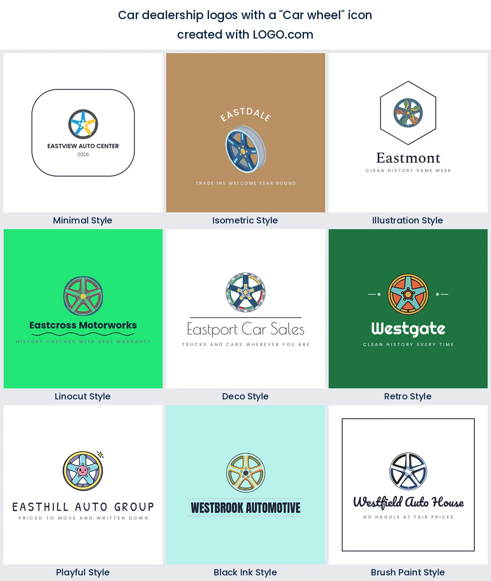
5. Car wheel
The wheel is the part of a car people can identify from any angle, which is why it sits fifth here. An alloy seen straight on is a circle full of repeating spokes, so it works as an avatar and it tiles beautifully across a lot banner. Watch the spoke gaps though. Anything thinner than the spoke beside it will close up in print, and a solid disc is not much of a wheel.
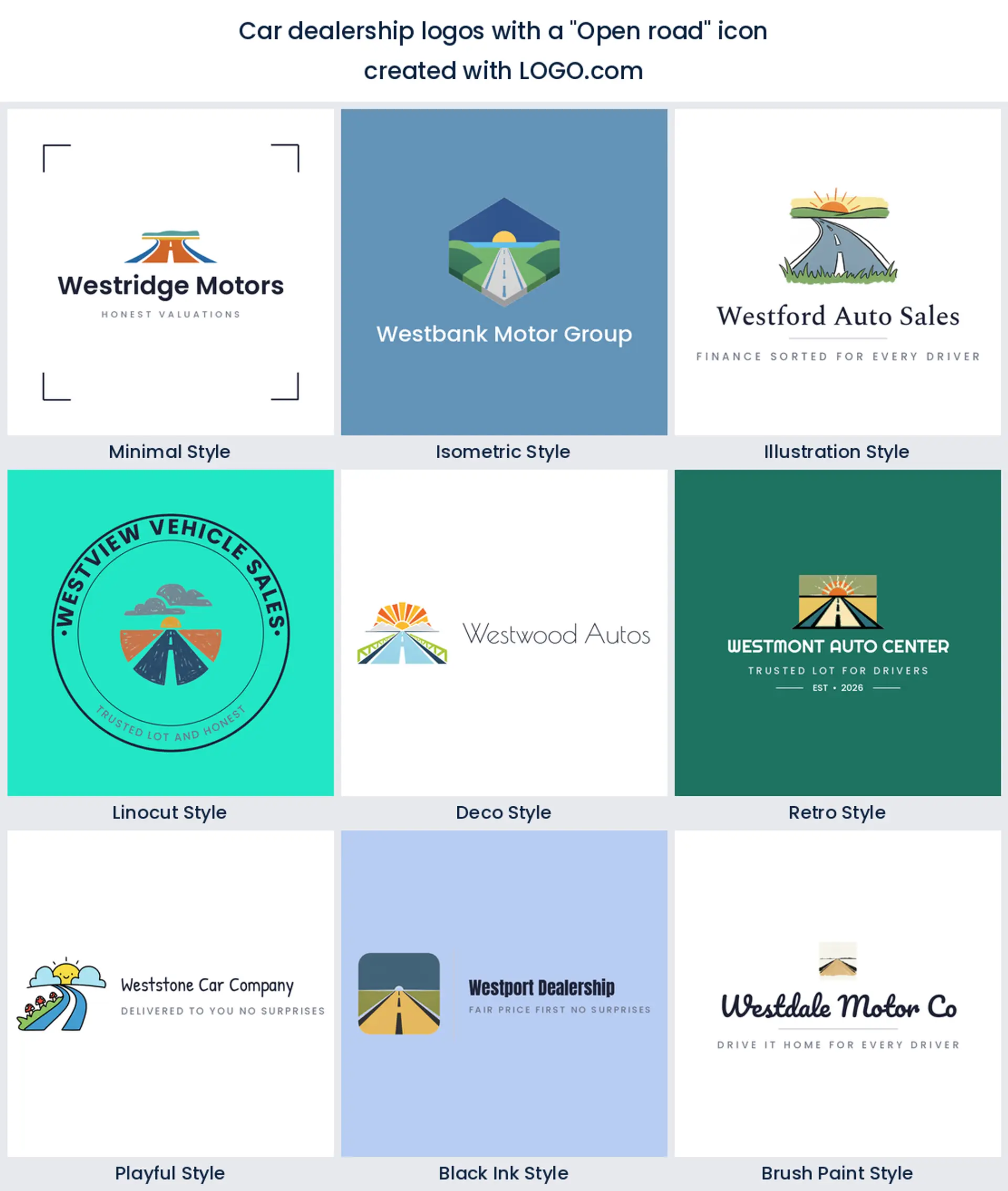
6. Open road
Roads, journeys, and map pins show up sixth, and they are the only symbol in the set that points at the buyer instead of the vehicle. That makes the open road a warm pick if you sell family cars, campers, or first cars, because it talks about what happens after the sale. Two converging lines and a horizon is all it needs. Add a small star above it and you have a dealership logo with somewhere for the eye to land.
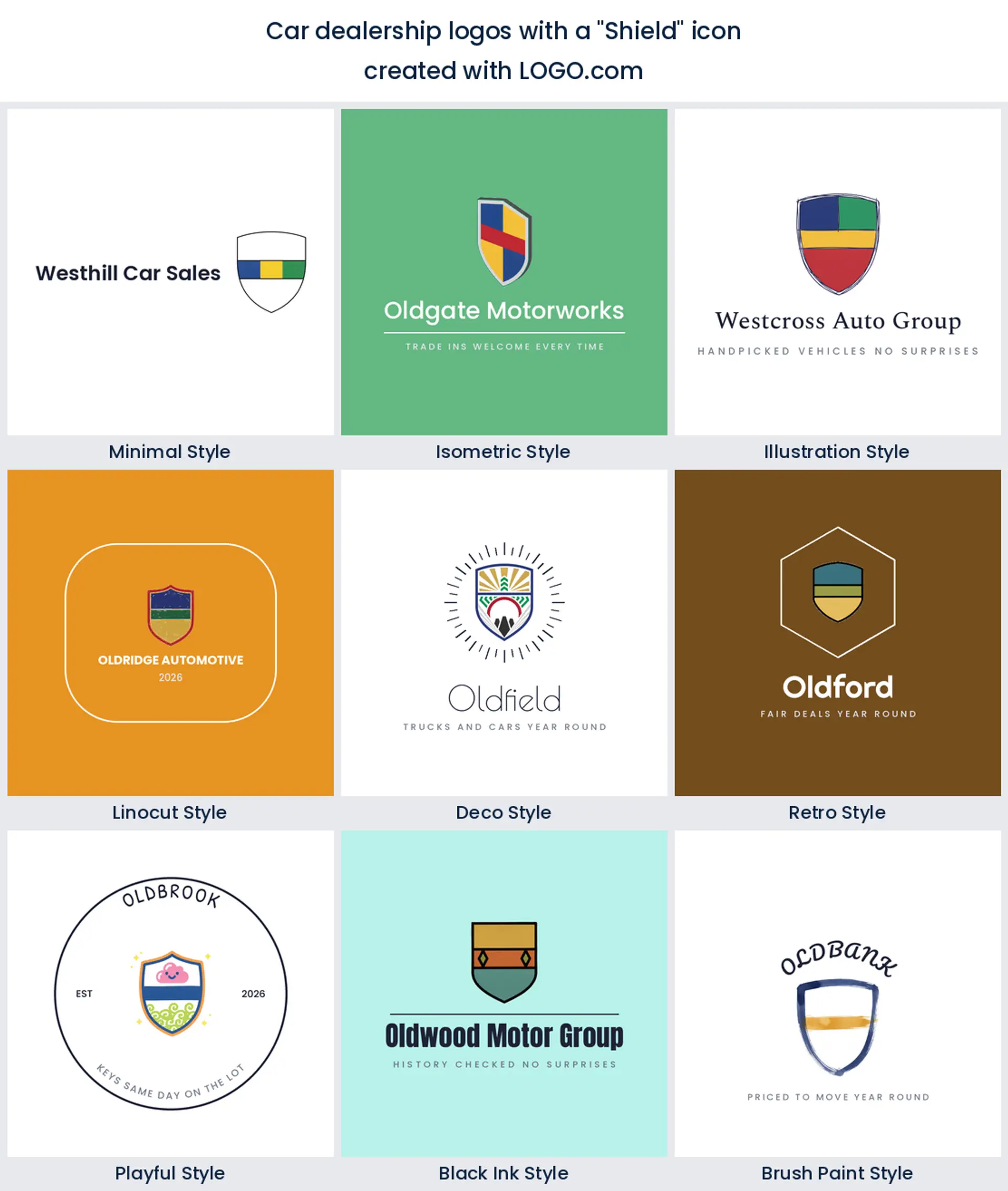
7. Shield
Seventh, and the shape people reach for when they want to promise something. A shield reads as warranty, protection, and a car that has been checked over, so it suits any lot selling certified stock or offering its own cover. Keep it simple and symmetrical, put one object or one initial inside, and resist the urge to wrap a banner around it, because banner text is the first thing to turn to mush when it is printed small.
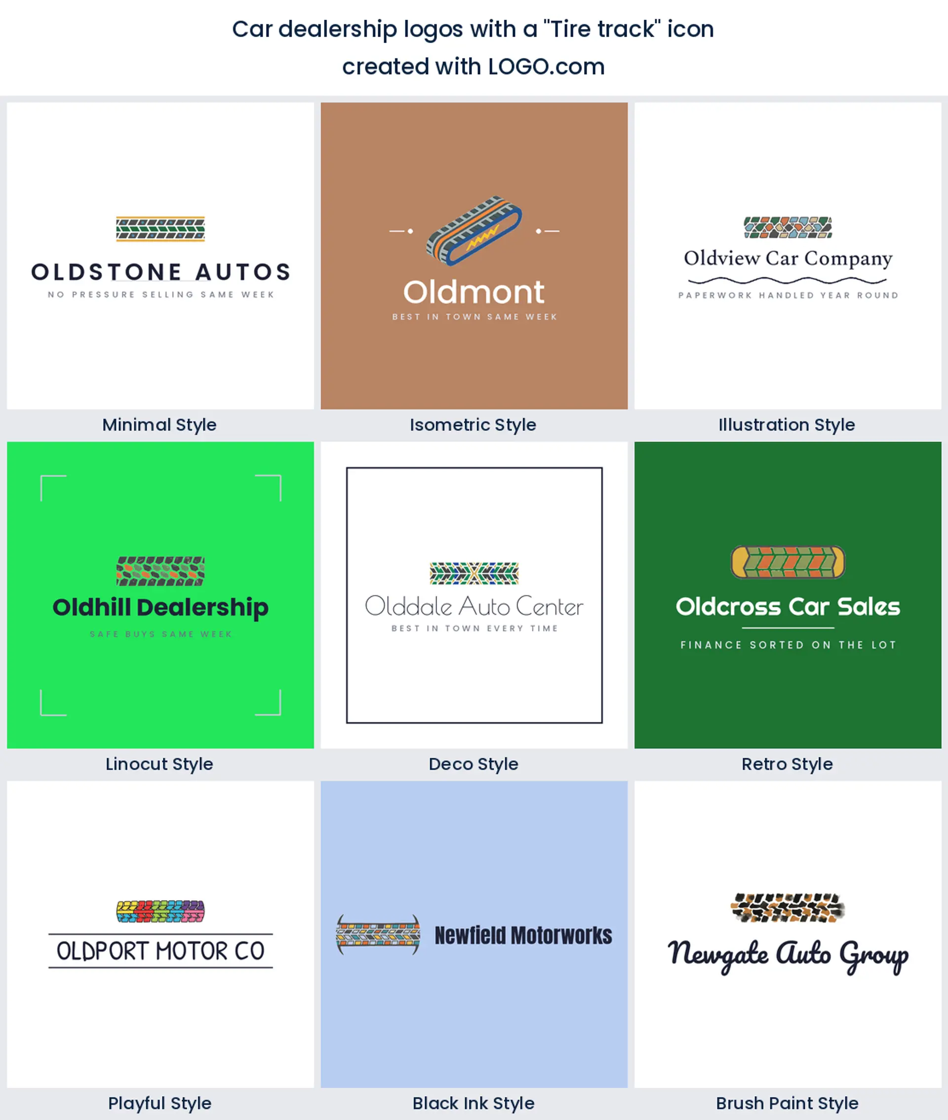
8. Tire track
A tread mark comes in eighth and it behaves differently from everything above it. It is a texture rather than an object, so it works best as a band under your name or as a stripe running through the mark. That makes it a useful used car logo when your business name is already long, since the track can carry the width without stealing attention from the words.
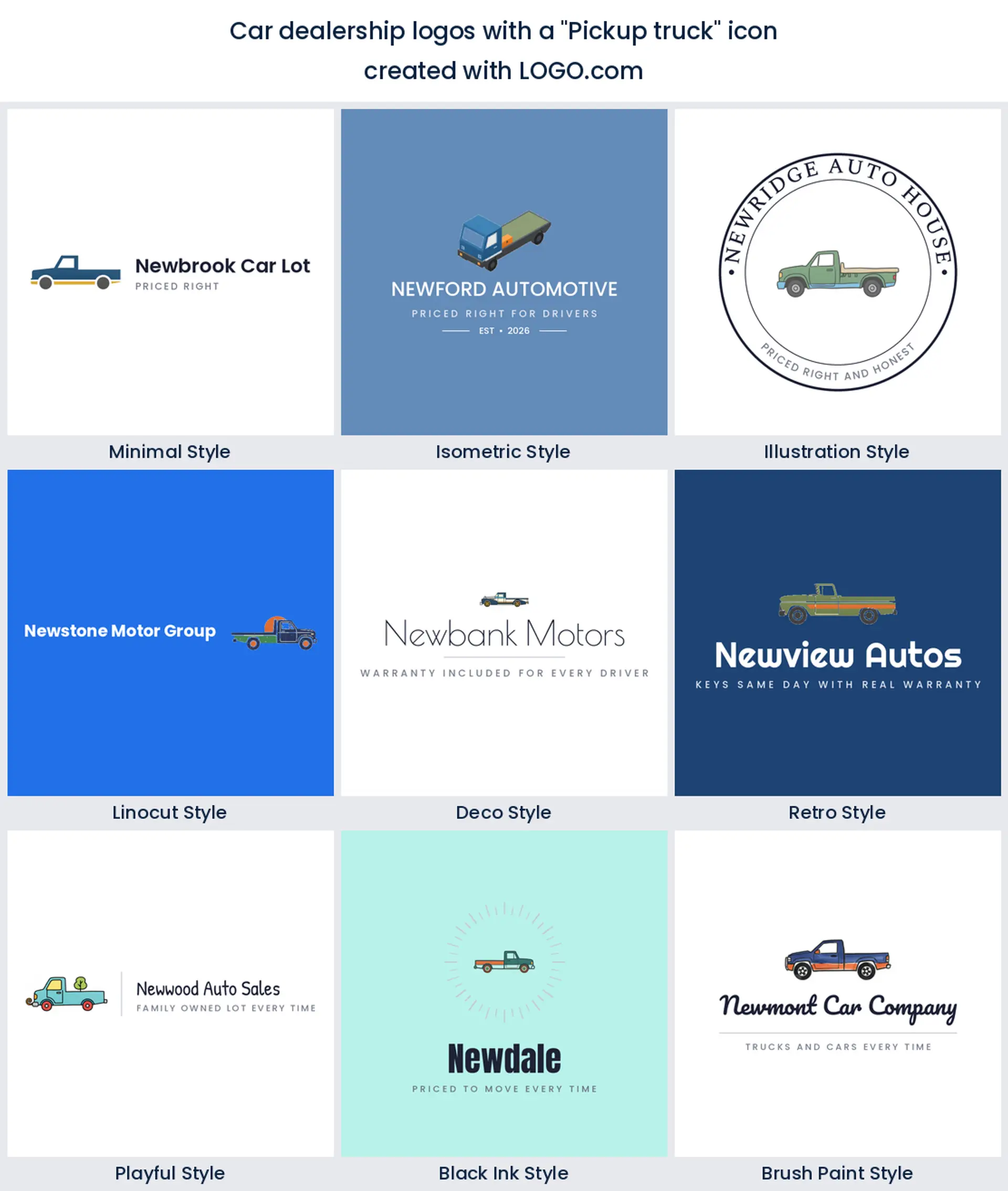
9. Pickup truck
Last of the nine, and the one that tells you most about who wrote it. Truck and trailer dealers make up a real slice of this group, and a boxy pickup in profile speaks to them in a way a sedan never will. Square the body off, keep the bed flat and long, and it becomes an honest truck dealership logo that a farm or trade buyer recognises as theirs.
Fifteen dealership logo ideas, drawn nine ways each
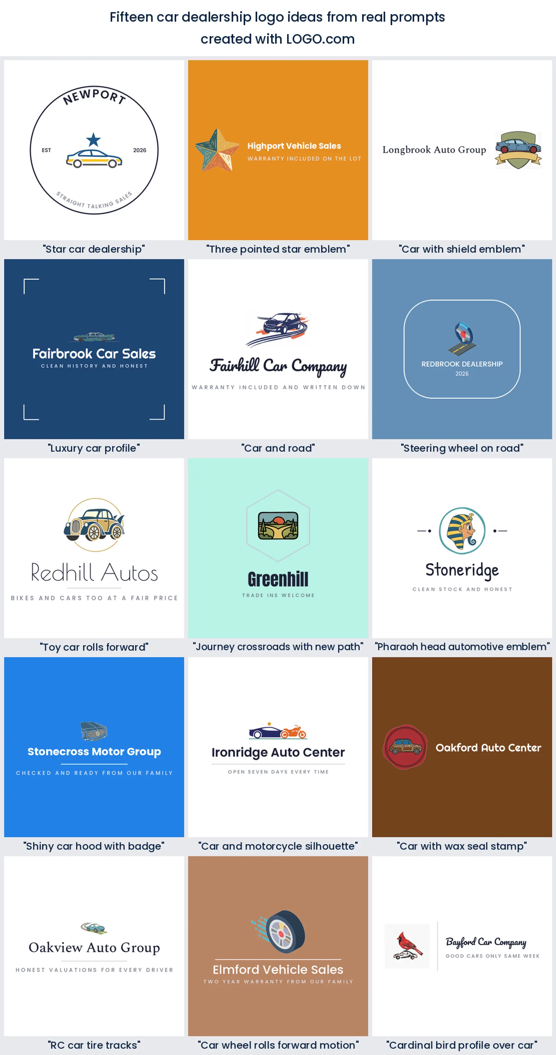
Every heading below is a description a real founder typed into the prompt box, quoted word for word, and each one is rendered across all nine LOGO.com styles so you can watch a single thought travel from a clean minimal mark to a carved linocut badge. They are combinations rather than lone objects, which is where character comes from. Treat them as car dealership logo ideas to push around, then change the object, the color, or the wording until nobody else could use it.
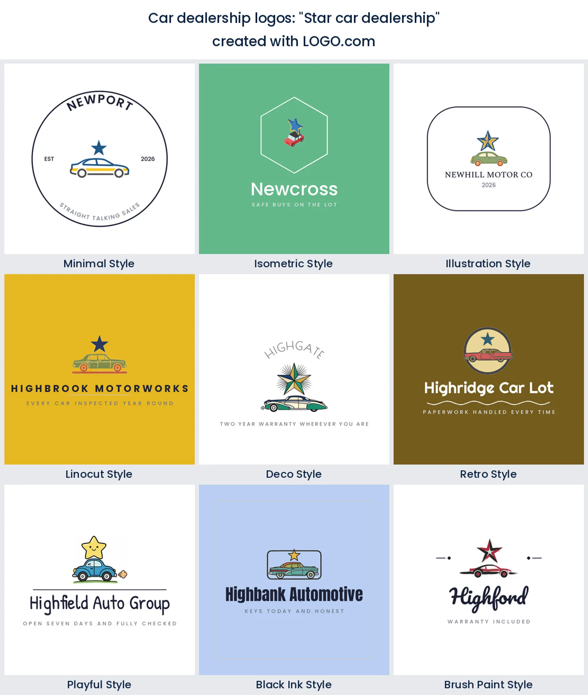
1. "Star car dealership"
The most common instinct in the whole set, written out plainly. A star above or beside a car is shorthand for a lot people rate, and the two shapes sit together without fighting because one is angular and one is long. Put the star at the top left of the car and you get a mark that reads in one beat, which is what you want on a roadside board.
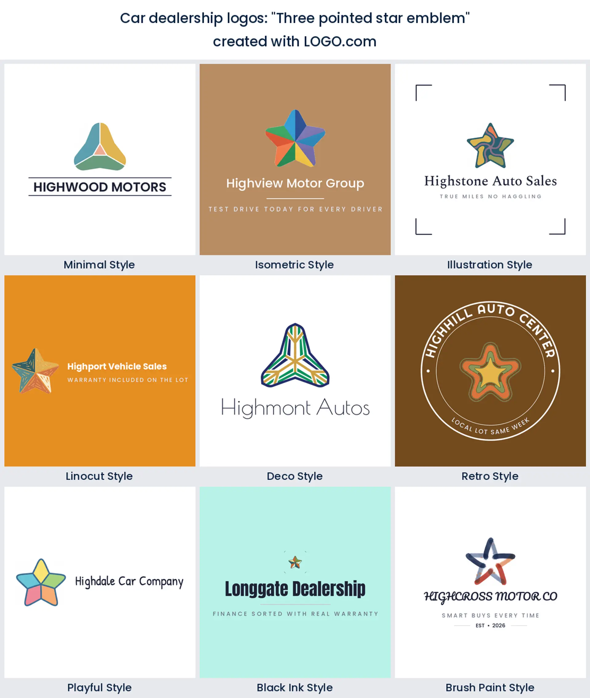
2. "Three pointed star emblem"
Worth reading closely, because this founder was clearly thinking of a German marque. Copy that badge and you will be asked to take it down. Draw your own three pointed star instead, with soft rounded tips and no ring around it, and you keep the balance and the precision without borrowing anyone's trademark. It makes a sharp, modern automotive logo design for a specialist importer.
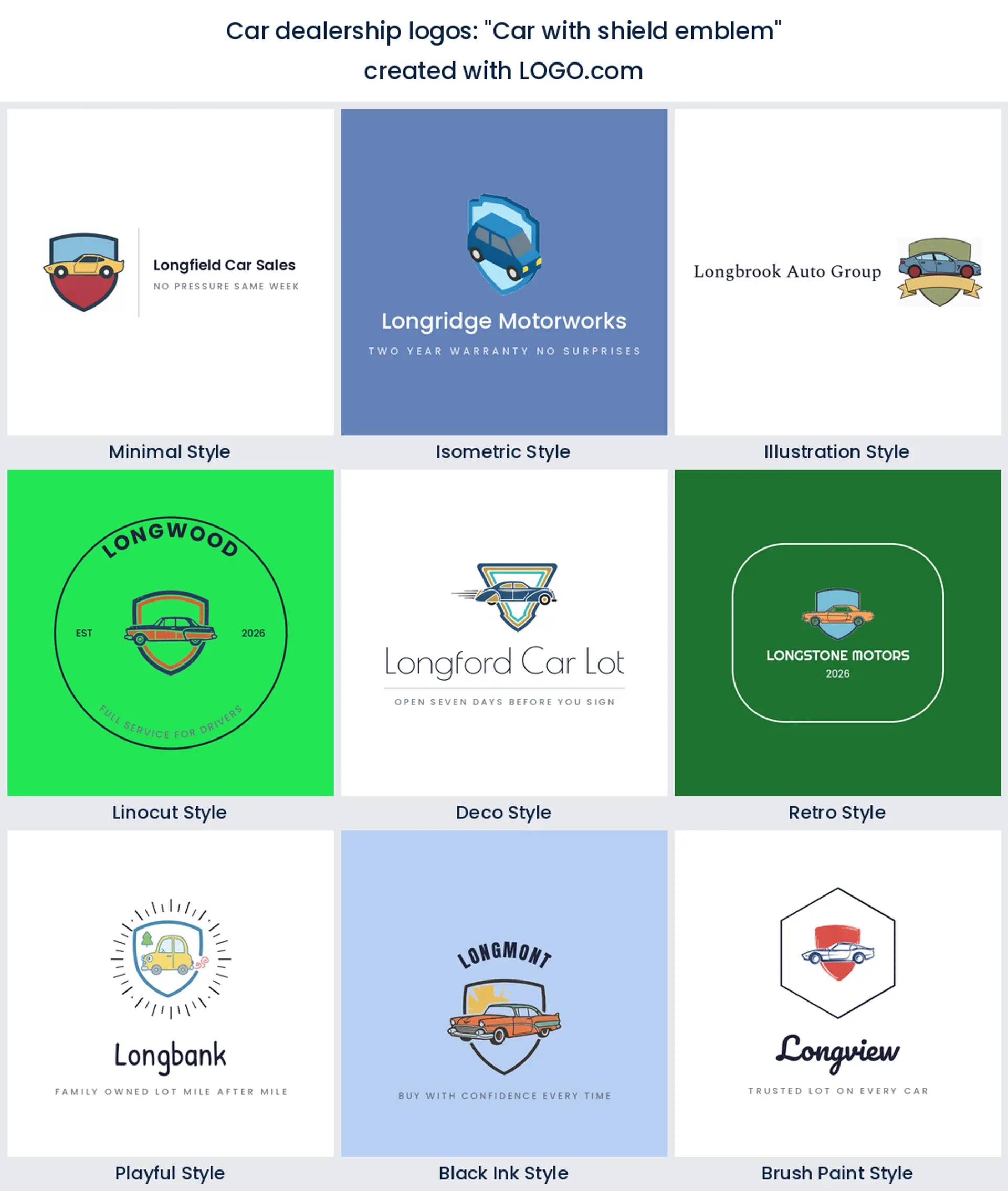
3. "Car with shield emblem"
The promise and the product in one shape. A car tucked inside a shield says checked, covered, and worth your deposit, which is the exact argument a used lot is making. Let the car break the shield outline slightly so the two do not read as a sticker on a sticker, and it holds up as a car dealer logo on everything from a banner to a key fob.
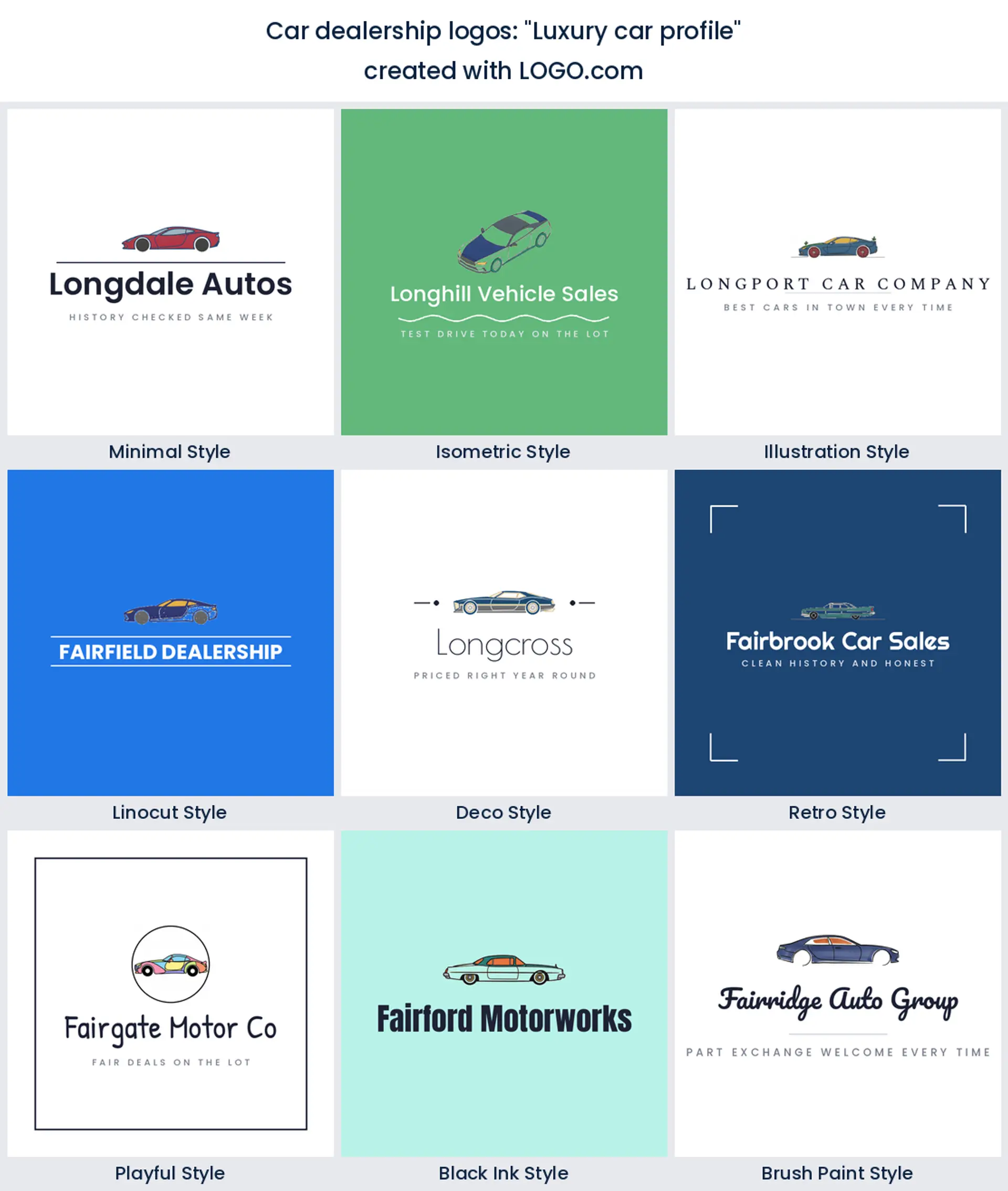
4. "Luxury car profile"
Low, long, and drawn with one continuous line. This is the prompt for anyone whose stock sits at the top of the market, and the whole effect lives in the roofline. Stretch the car wider than feels comfortable, drop the ride height, and pair it with a thin letterspaced wordmark. Restraint is what reads expensive here, not detail.
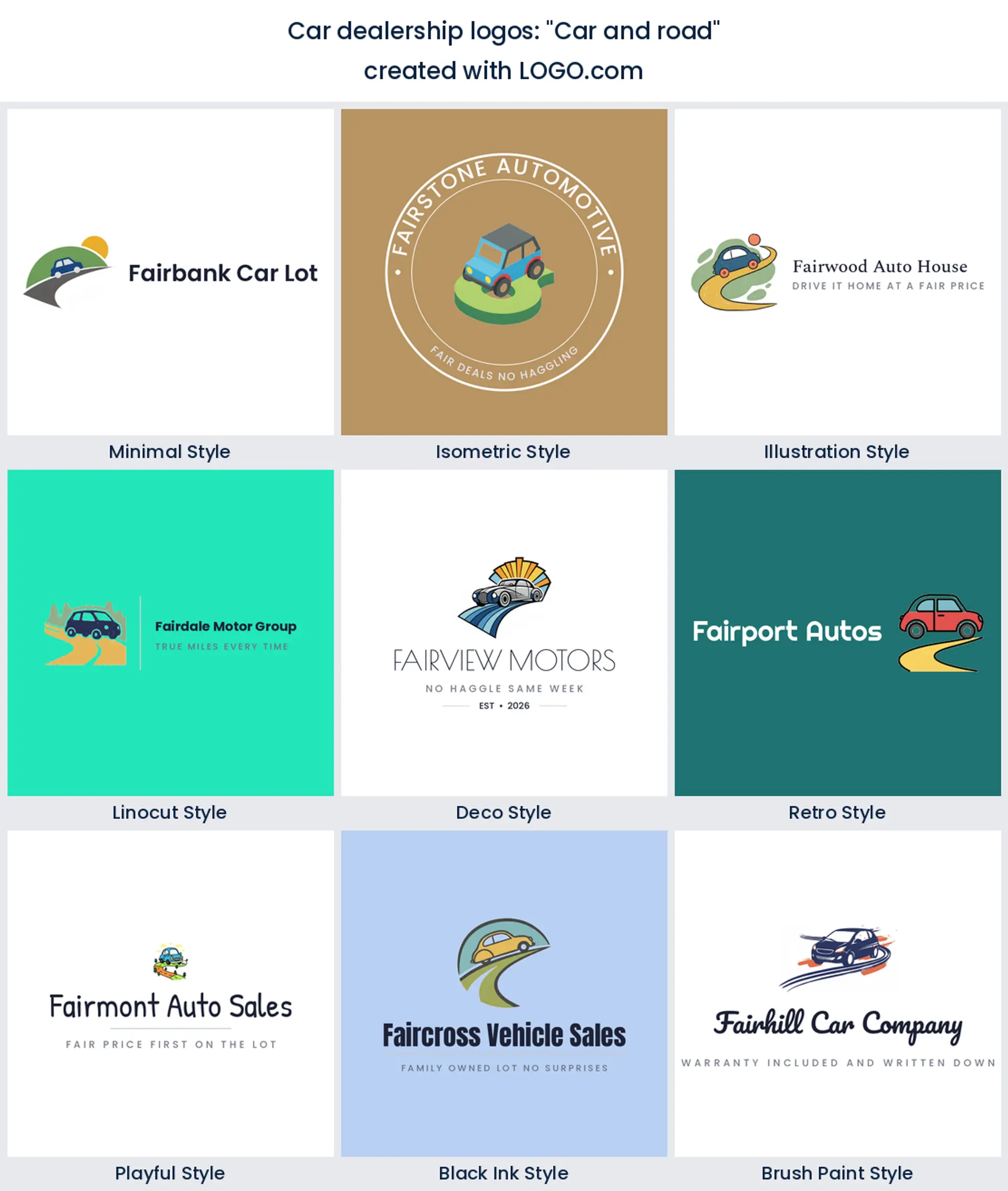
5. "Car and road"
Two founders wrote a version of this, which makes it one of the few repeated ideas in the group. A car sitting on a curving road gives you movement and context in one mark, and the road doubles as a base line for your name. Keep the road as a simple sweep rather than a full landscape and the whole thing survives being shrunk to a map pin.
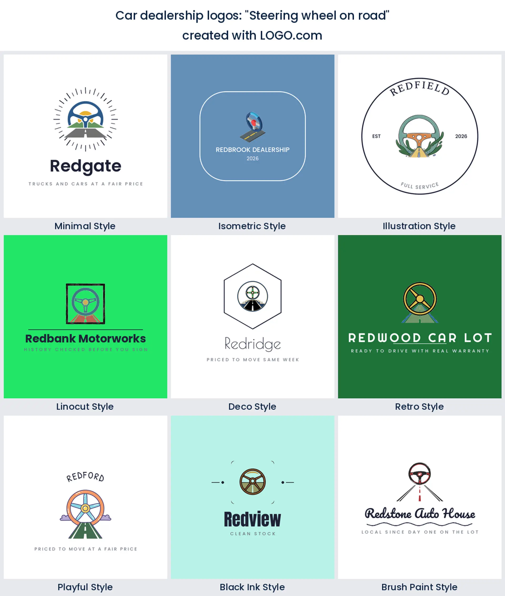
6. "Steering wheel on road"
This one points at the driver, not the metal, which quietly changes who it appeals to. A steering wheel above a road reads as the moment you take the keys, so it suits a first car specialist or a family lot. Draw the wheel as an open ring with three spokes and let the road run behind it, and the middle stays clear enough to sit on a dark background.
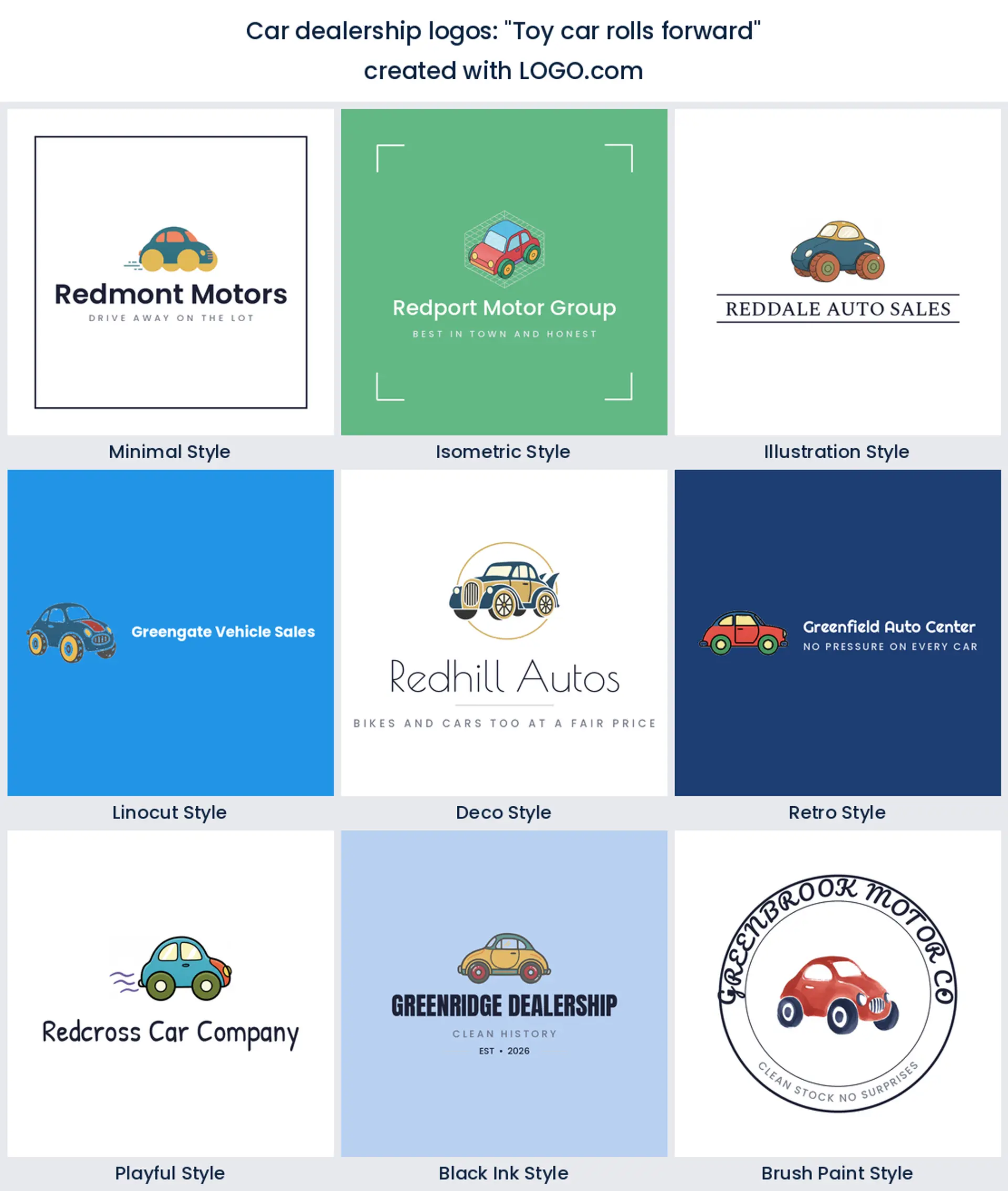
7. "Toy car rolls forward"
A friendlier direction than anything else here, and it lands better than it sounds. A chunky toy car with oversized wheels reads as approachable and cheerful, which is a real position on a street full of serious badges. It is a lovely fit for a budget lot or a rental style business, and it gives you an automotive business logo that children point at from the back seat.
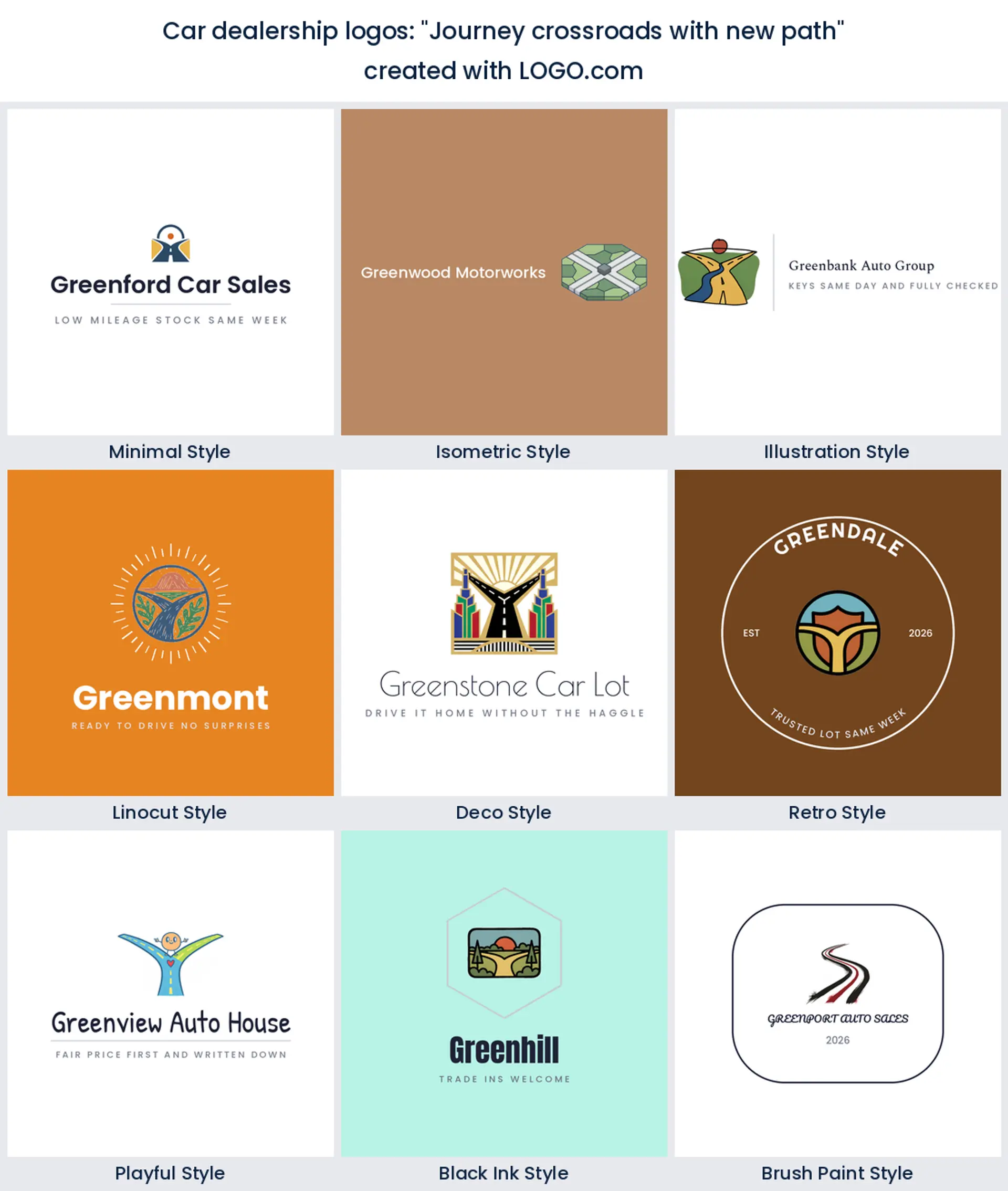
8. "Journey crossroads with new path"
The most abstract prompt in the set and the most interesting one. There is no car at all, just a road splitting into two, which turns your logo into a story about the buyer changing something. That suits a dealership built on trade ins and upgrades, and it will stand out hard on a search page where every competitor drew a sedan.
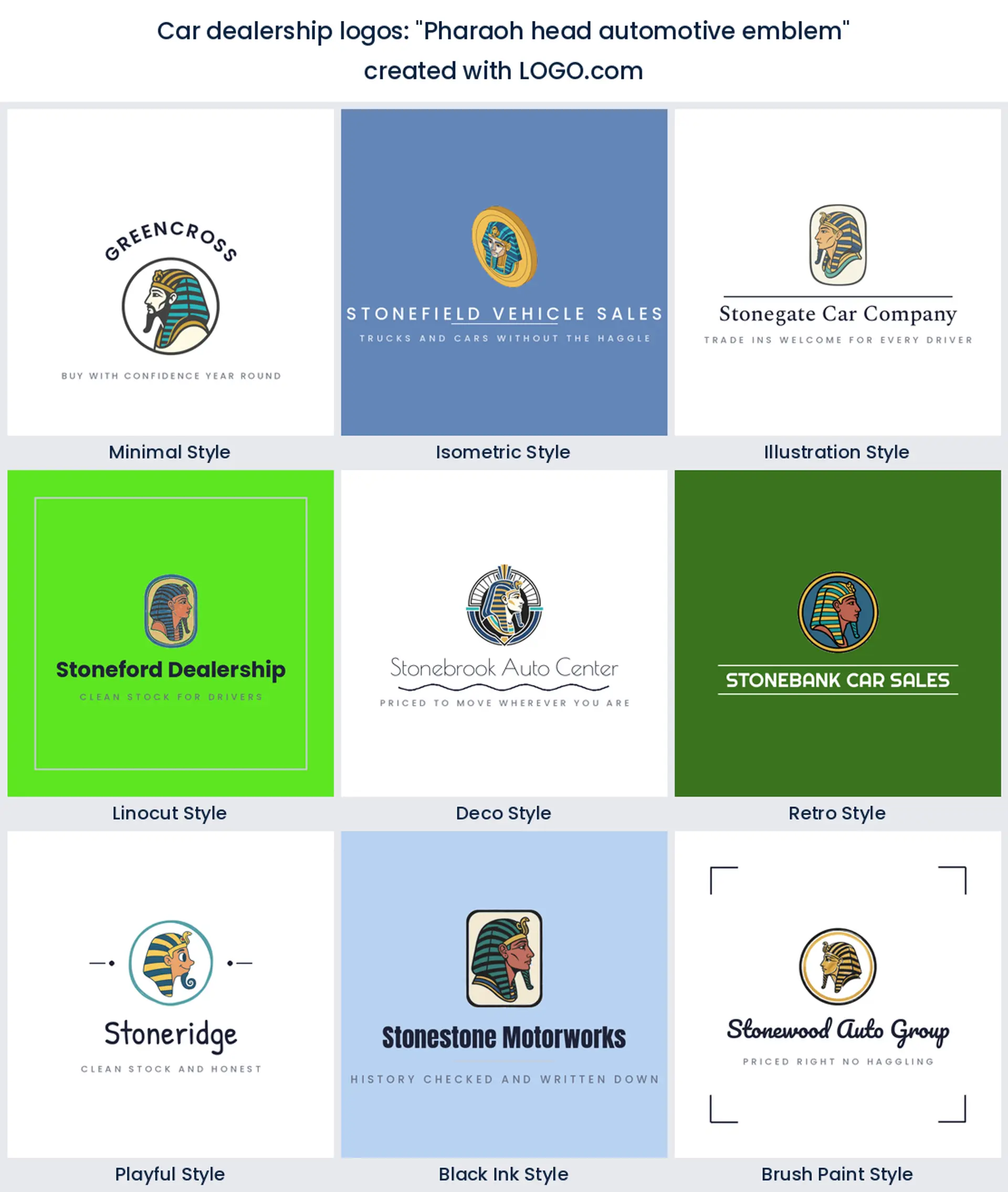
9. "Pharaoh head automotive emblem"
Proof that a badge will hold almost anything. A pharaoh profile inside an emblem has nothing to do with cars, and that is the point, because it makes the mark memorable and personal to the founder who wrote it. If you have a family name, a nickname, or a local landmark, this is the pattern that turns it into a marque.
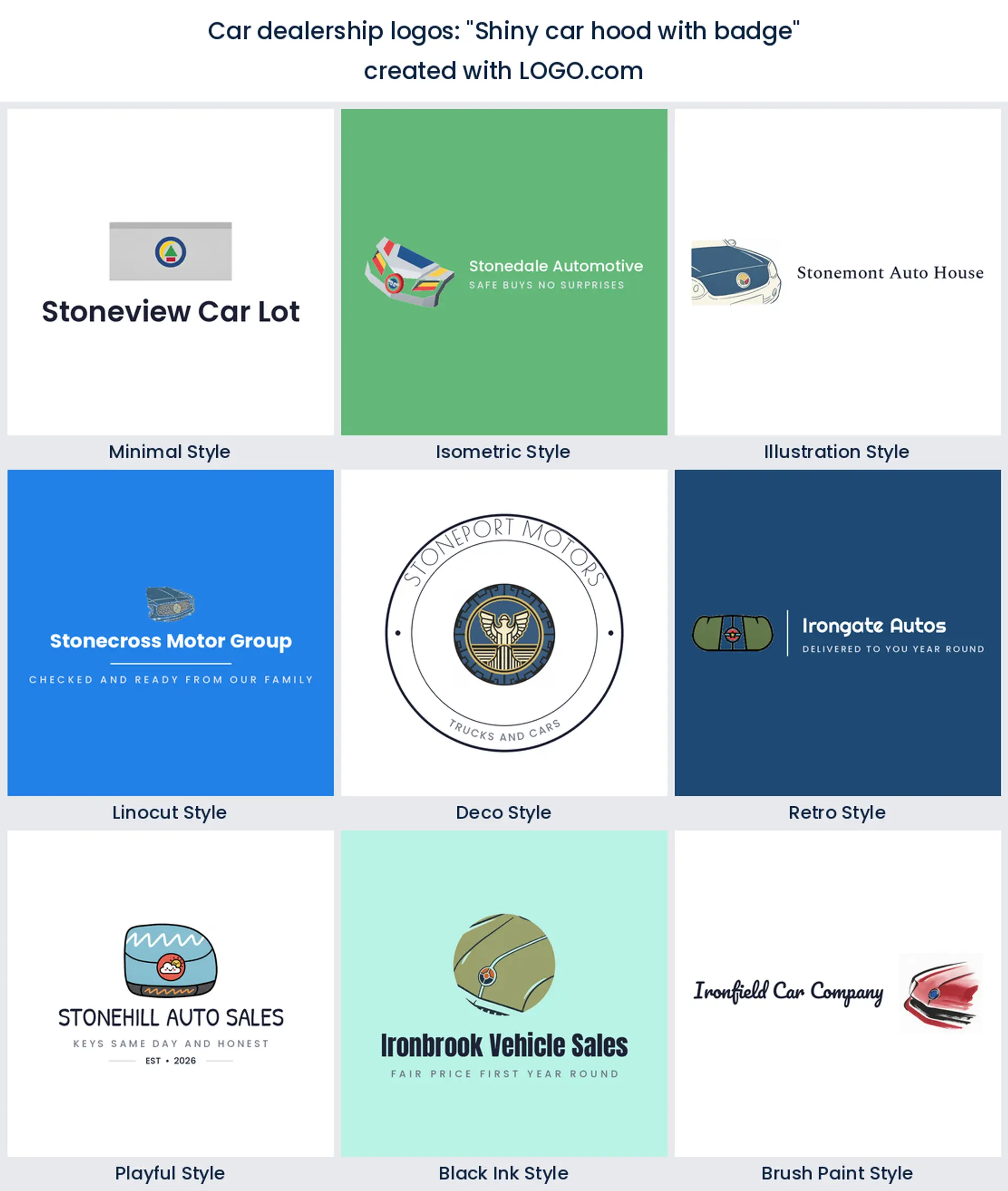
10. "Shiny car hood with badge"
A close crop rather than a whole vehicle, which is unusual and worth stealing. Cropping into the hood and the badge suggests a car you would want to touch, and it fills the frame far better than a small car floating in space. Keep the shine to two flat highlights instead of a gradient so it still prints cleanly on a single color decal.
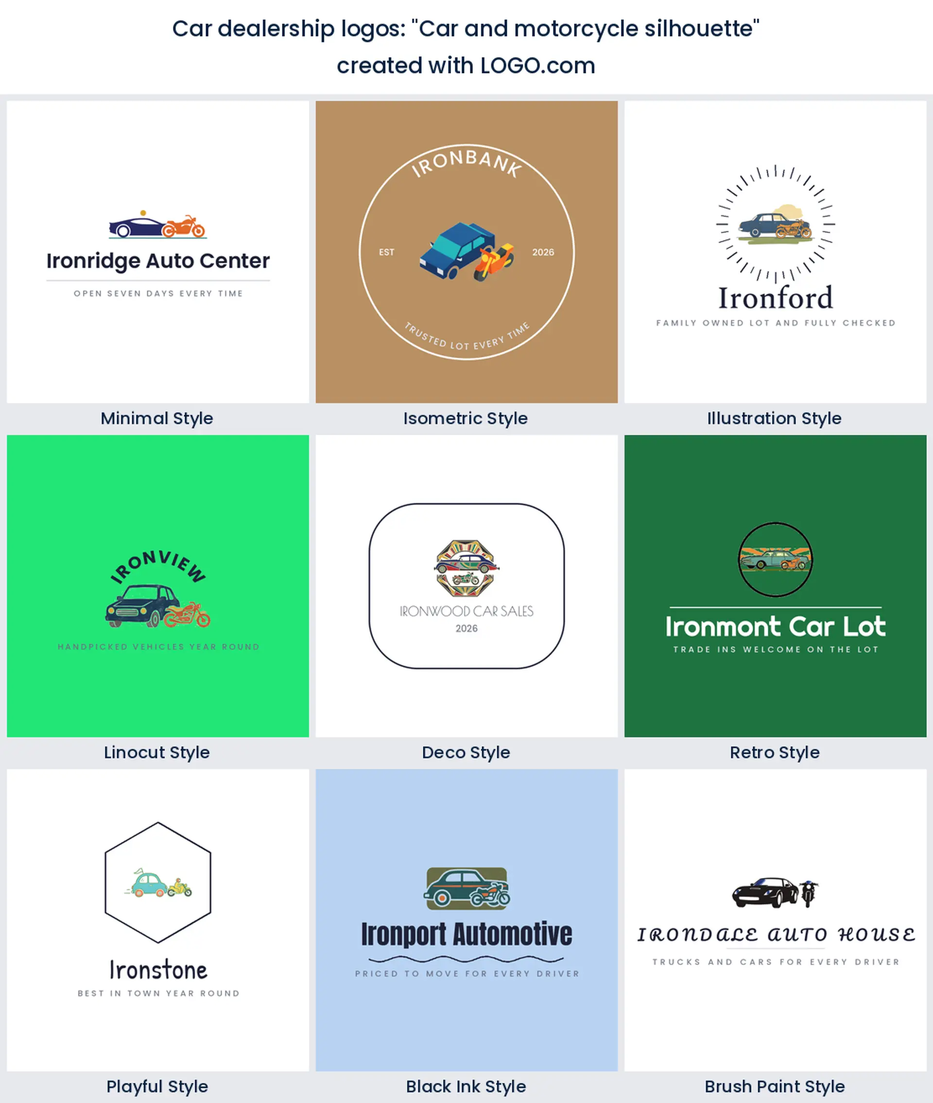
11. "Car and motorcycle silhouette"
The answer to a real problem, which is what to show when your lot sells both. Two profiles at different sizes, stacked or overlapping, cover cars and bikes without a word of explanation. It is an honest mark for a mixed dealership, and it saves you redrawing everything the first time a trade in arrives on two wheels.
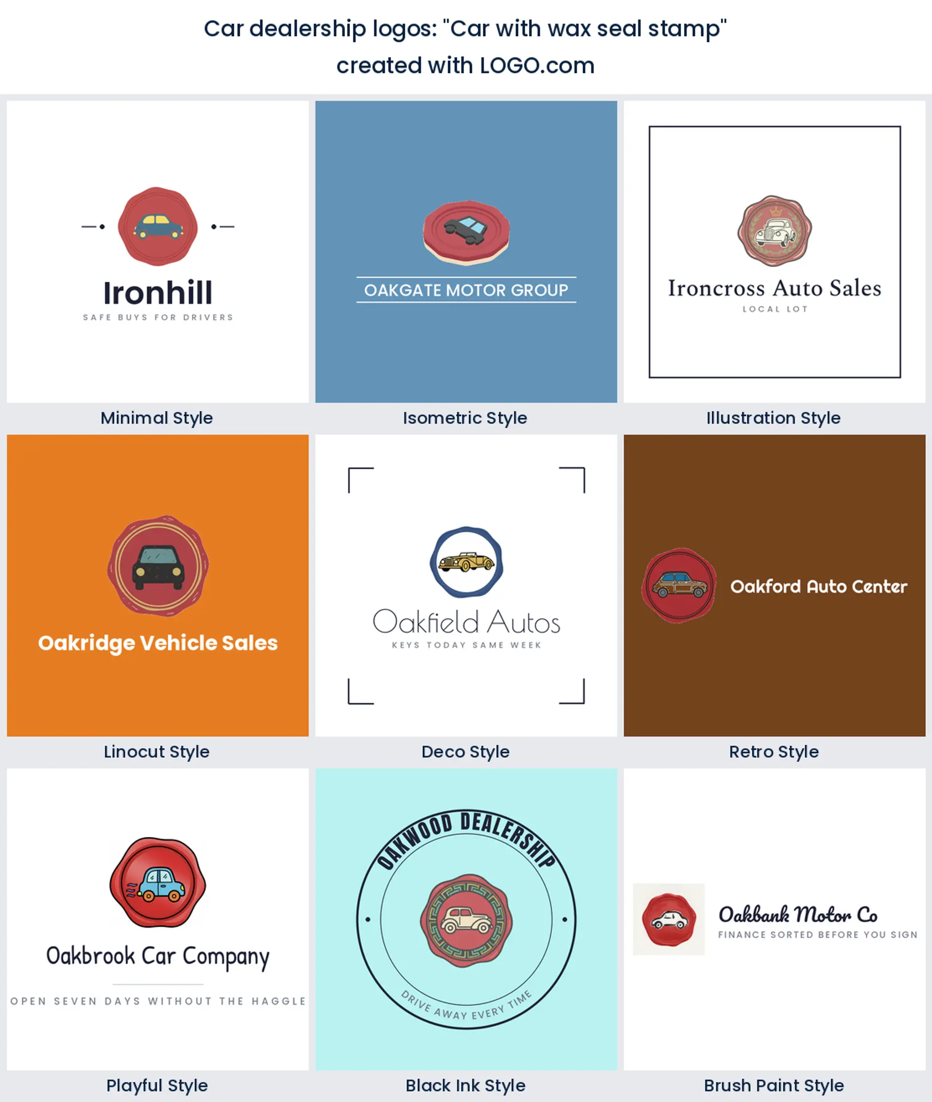
12. "Car with wax seal stamp"
Old fashioned in the best way. A wax seal says approved, signed off, and documented, which is a clever thing to attach to a used car. Draw the seal as a solid rounded blob with a car pressed into it, keep it to one color, and it will stamp neatly onto paperwork, a window sticker, and the corner of every listing photo.
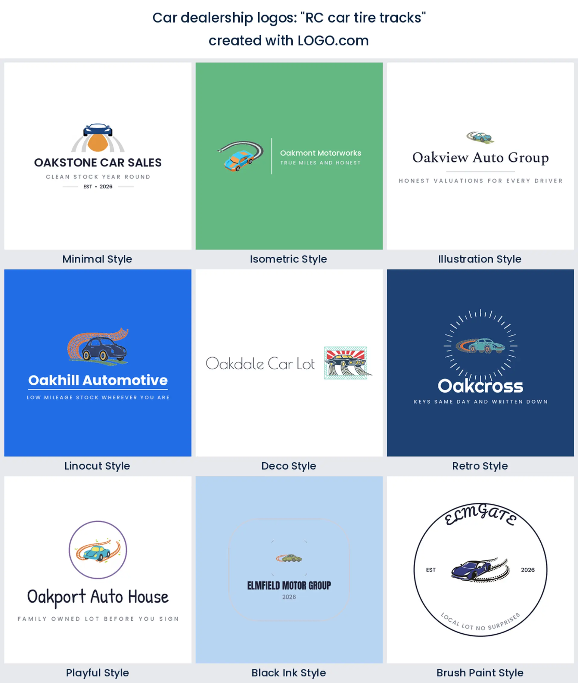
13. "RC car tire tracks"
Written by someone selling something small and fast, and the tracks are what make it work. Tread marks curving away behind a low car give you motion without a single speed line, and the track becomes a natural underline for the business name. Good for performance stock and for anyone whose buyers care about how a car drives.
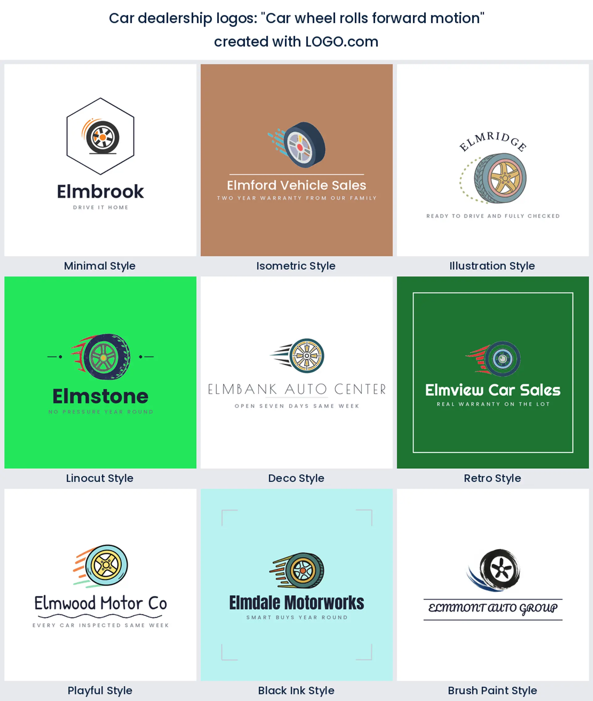
14. "Car wheel rolls forward motion"
Three founders described a wheel in motion, which makes the idea the most repeated in this group after the emblem. A wheel leaning forward with a short arc behind it is the simplest way to say your stock moves, and the circle keeps everything friendly for an avatar. Tilt it slightly rather than a lot, or it starts to look like it has come loose.
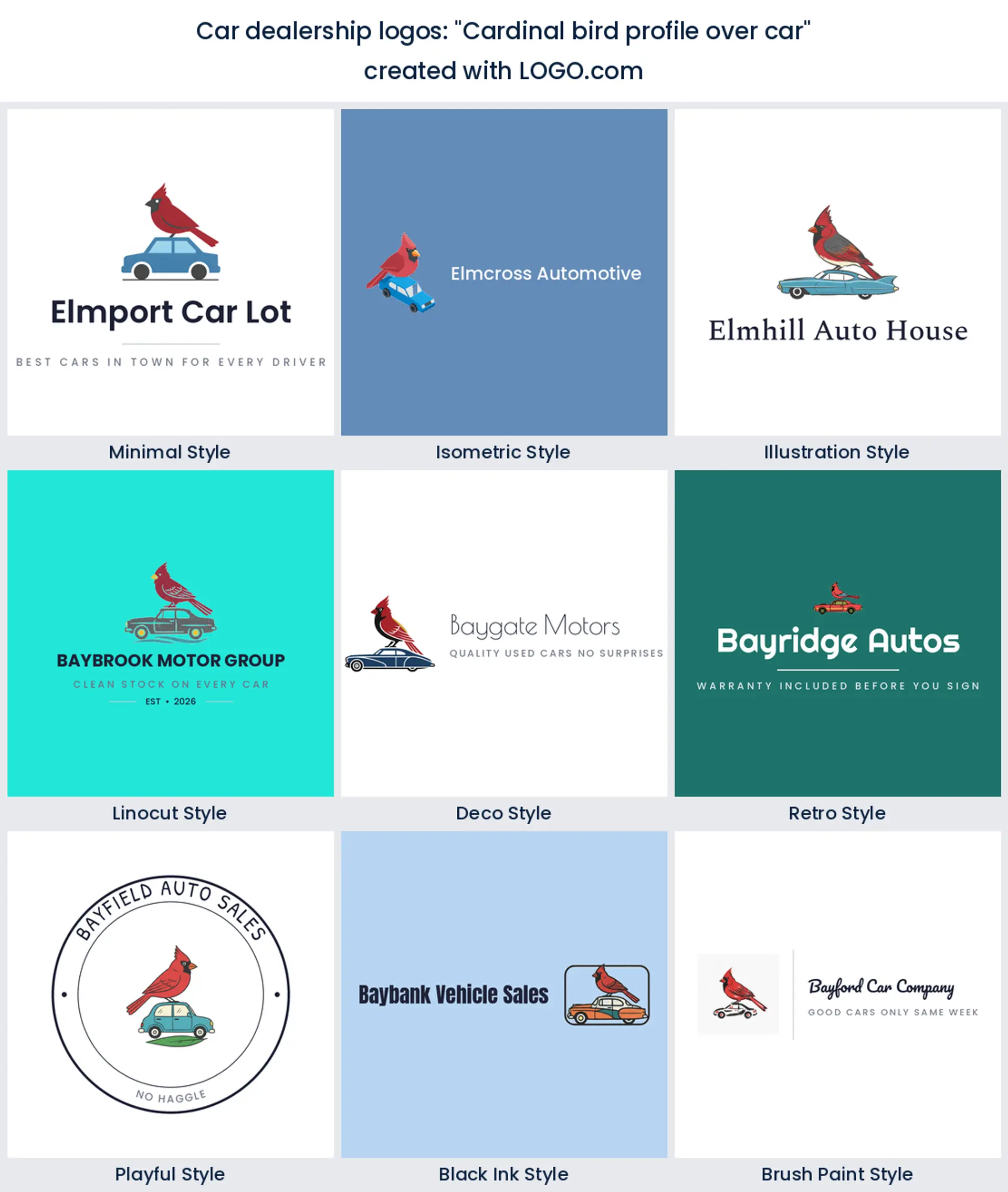
15. "Cardinal bird profile over car"
A bird above a car sounds like a mismatch until you see it done. The bird carries the personality and the color while the car does the explaining, and together they make a lot feel like a local name rather than a franchise. This is the pattern to follow if you want a dealership logo with wildlife, a state bird, or a hometown emblem in it.
Your logo sits beside the manufacturer badge, not instead of it
Two of the prompts founders wrote name a real carmaker outright, and one of them describes a famous three pointed star. It is an easy trap. You spend your day surrounded by other people's badges, so they become the shorthand in your head for what a car logo looks like. Borrow one and you have a problem, because manufacturer marks are trademarks and dealer agreements are specific about how they are shown. Your own mark has to survive sitting right next to them on the window, the wall, and the listing.
That is actually an argument for making yours simpler, not louder. If the manufacturer badge is a detailed chrome crest, a flat two color emblem beside it looks modern and separate rather than competing. Independent lots have it easier, but the same rule applies to shapes everyone recognises. A ring with wings, a prancing animal, or a shield split down the middle will invite comparisons you do not need. Take the structure and change the contents, so the logo reads as a marque without borrowing anyone else's.
Used lot, franchise store, or online only, pick the mark to match
If you run an independent used lot, your logo is the whole brand. There is no factory name on the sign doing the reassuring, so lean into the emblem and the star, use your own family or street name, and keep the shapes heavy enough to hold up on a wind ruffled banner. A used car logo works hardest when it looks like it has been there a while, which is why a founding year inside the badge is worth more than any effect.
Running a franchise store? Your mark spends its life in a corner, small and secondary, so give it a compact square lockup and a single strong color that does not clash with the manufacturer palette. And if you sell online only, through Marketplace, Autotrader, or your own site, then the mark is the storefront. Design it as a circle first, check it at the size of a profile picture, and make sure the wordmark is readable when it is stacked underneath. Those are three genuinely different automotive logo designs, so decide which one you are before you fall for a shape.
Listings, plate frames, and the window sticker do the real work
Ask a dealer where their logo earns its keep and the sign is rarely the honest answer. It is the corner of every listing photo, the plate frame that drives around town for the next five years, the window sticker, the deal jacket, and the little watermark on a walkaround video. Every one of those is small, and most of them are printed in one or two colors. So test your mark at about two inches wide, in solid black on white, before you decide you like it.
Two things break at that size. Fine chrome effects and gradients turn into grey soup, and a business name set inside a ring becomes unreadable. Fix both by keeping the icon flat and lifting your name out of the badge onto its own line underneath. It is worth building a square version and a wide version of the same mark while you are there, because the square one goes on the plate frame and the avatar, and the wide one fits the banner and the video watermark.
Not one founder asked for wings, and that is worth knowing
People search for an automotive logo with wings more than almost any other style variation, and yet across every description in this group not a single founder asked for a pair. The wing belongs to a specific era of badge, the heritage marque and the classic restoration shop, and buyers read it that way. On a modern used lot it can make you look older than you are, or worse, like a tribute to a brand you do not sell.
If you do want that feeling, take the geometry rather than the feathers. A pair of angled bars sweeping out from a central shape gives you the same width and lift with none of the borrowed history, and it holds together at small sizes where real wings blur. Save the full winged crest for a classic car business where the reference is the point, and browse a few dealership logo ideas in the styles above before you commit to it.
Blue leads the lot, and red is further down than you would guess
Set aside the white and black bases nearly every logo uses and our first party numbers put blue well ahead among auto and car founders, with green second, then orange and yellow. Red, the color everybody assumes belongs to a car lot, sits a long way down. Blue does the trustworthy, financed, above board job that selling a used car needs, green has quietly become the electric and hybrid signal, and orange and yellow are what you use when your lot sits on a busy road and you need to be seen from it.
Pick one lead color and one accent rather than three equals, and choose against your street. If every lot near you is red and white, blue or green will make your banners pop from a hundred yards. Your logo does not have to be full color everywhere either. On LOGO.com you can take a multi color icon or a one color version, and the one color file is what your sign maker, your window tinter, and your plate frame supplier will ask for. Free downloads give you four high resolution PNG files with full commercial use, and the paid Brand Plan adds the vector files for large format print, unlimited edits, and a brand kit.
Make your car dealership logo with LOGO.com
Type your business name, choose the emblem, star, or vehicle that matches the stock on your lot, and pick one of nine styles. Our automotive logo maker builds real options around your name in under a minute, and you can keep pushing the color, the icon, and the type until it looks like your forecourt. Preview it free, download the high resolution files, and get it onto the banner, the listings, and the plate frames.
Methodology. These figures come from logos created on LOGO.com during the 12 months ending August 2026. We took two industry cohorts, founders whose selected industry contains auto and founders whose industry contains car, guarded against false matches such as automation, cardiology, and carpentry, which gave 1218 founders in total. Of those, 82 named a dealership or a vehicle sales business outright, including auto dealership, car sales, car dealer, used car dealer, motorcycle dealer, truck dealer, and motorhome sales. We then read the custom icon descriptions those founders wrote and scoped them to sales and showroom subjects, meaning emblems and badges, stars, vehicle profiles, chrome and luxury cues, wheels, shields, roads, tires, and trucks, and set aside wash, polish, and detailing descriptions along with wrench, engine, and piston descriptions because those belong to our car detailing and auto repair pages. That left 50 descriptions. Grouped by concept, the car emblem was most common at about 24 percent, followed by the star badge at about 14 percent and the car silhouette at about 14 percent. Figures are a share of scoped vehicle sales icon descriptions, rounded to the nearest percentage point. Source: LOGO.com first party product data, August 2026.
THE #1 LOGO GENERATOR
Why LOGO.com is the best car dealership logo maker
1.Built on what car sellers actually asked for
Every symbol on this page comes from icon descriptions real dealership and vehicle sales founders typed on LOGO.com, so you start from evidence instead of stock badges.
2.Still readable on a plate frame
Heavy shapes and open gaps keep your name legible at two inches wide, which is all a plate frame and a window sticker will ever give you.
3.A square mark for listings and profiles
Start from a square lockup and the same logo drops into Marketplace, your Google Business profile, and the corner of every listing photo without a redraw.
4.Nine styles, from a bare emblem to a carved badge
Compare a stripped back emblem and a bold retro badge side by side before you commit, without briefing a designer or redrawing anything.
5.One color files for decals and stitching
Take a multi color icon or a single color version, which is the file your window tinter, your banner printer, and your workwear embroiderer will ask for.
6.Free PNG downloads with full commercial use
Four high resolution PNG files cost nothing and carry full commercial use, so your listings, socials, and paperwork are covered from your first sale.
7.Vector files for lot signs and banners
The Brand Plan adds the vector files a sign maker needs to print your mark across a forecourt banner or a building sign with clean edges.
8.Change it when the lot changes
Add trucks, bikes, or a second location later and swap the icon, color, or wording yourself rather than paying for another round of design.
Car Dealership Logo Maker FAQs
Explore more logo ideas
3DAcademic EducationAccommodationAdvertising AgencyAffordableAgriculture BlogAlternative MedicineAnimal BlogAnimalsApartmentAppraisal ServicesAriesArtArtistArts EducationAstrologyAudio ServicesAuto Rental AgencyBBQBakeryBanking ServicesBaseball TeamBeauty SalonBed & BreakfastBettingBioinformaticsBirdBlock Letter Logo MakerBlurbBookBooks and LiteratureBoxBuilderBurgerBusiness Services and ConsultingCBDCameraCancerCannabisCardsCatCattleCharityChild CareChocolateCinemaCityClevverCloudCollege