Coffee Shop Logo Maker
Design a coffee shop or cafe logo that looks good on your cups and storefront sign.
Need a different logo maker? Try our AI logo generator.
Logos created using LOGO.com
670,000,000
Classic coffee cup and bean logos
Craft and specialty cafe logos
Cozy and artisanal coffee shop logos
Coffee Logos, Ranked From Real Brand Data
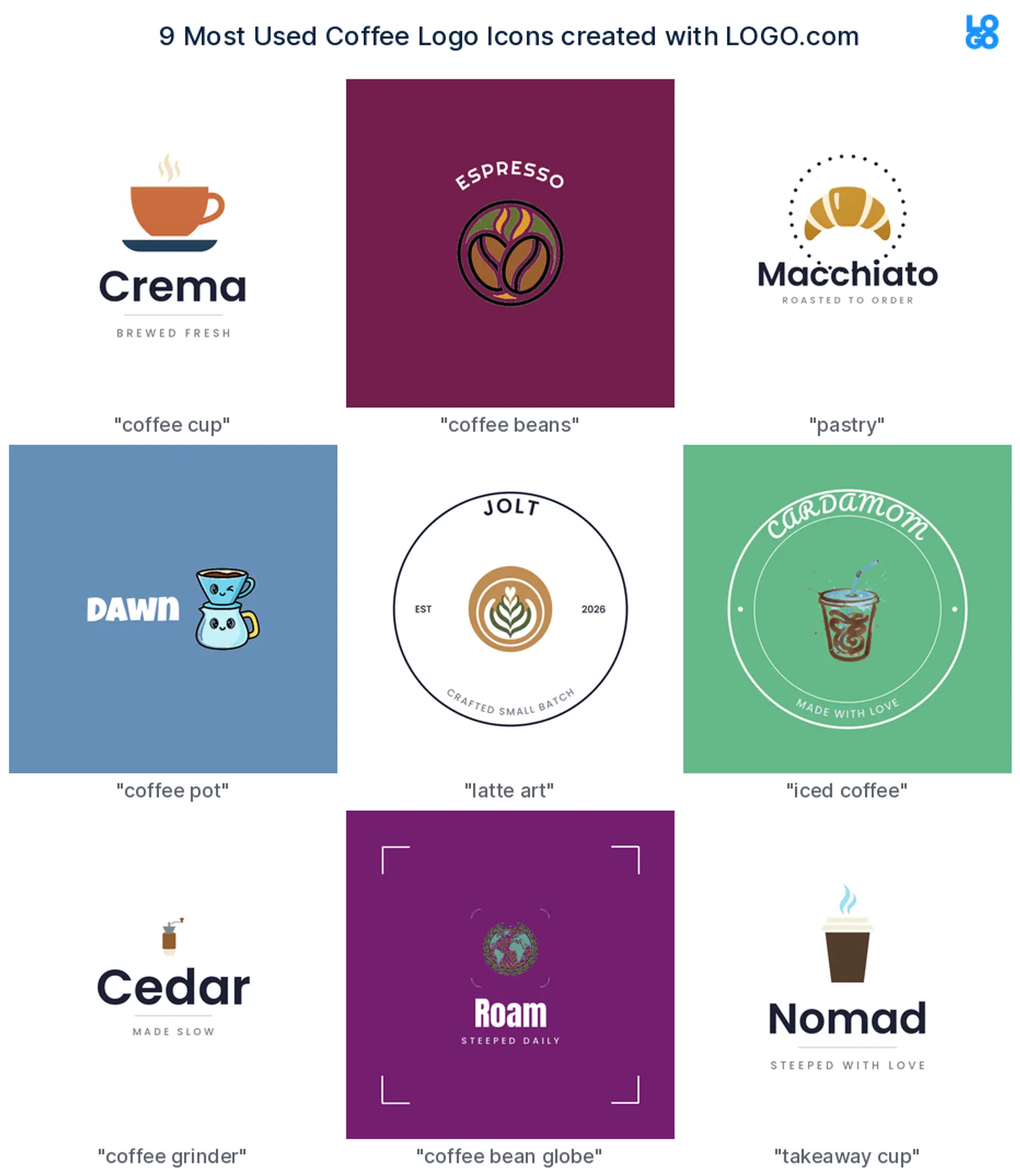
According to LOGO.com data, the most common coffee shop logo icons are the coffee cup (about 28%) and coffee beans (about 16%), followed by a pastry such as a croissant. Coffee pots and pour overs, latte art, iced coffee, the grinder, a bean globe, and the takeaway cup round out the nine icons coffee founders choose most.
The icons, fonts, and colors below all come from real coffee logos made on LOGO.com. So whether you are after a cafe logo, an espresso bar mark, a roastery badge, or a simple coffee cup logo, you are starting from what customers already recognize.
On this page
- The nine icons real coffee shops reach for
- Fifteen coffee logos to make your own
- Cafe, roastery, or drive through: match the logo to your format
- Show the drink, the bean, or the mood?
- Make it read on a cup, a window, and a tiny app icon
- What the big coffee brands get right, and what to borrow
- Make your coffee shop logo with LOGO.com
Walk down any street and the coffee logos start to blur, a cup here, a bean there. The ones you actually remember do one thing well, they pick a single symbol and own it. So instead of guessing, we looked at what real coffee founders chose on LOGO.com, ranked the icons that show up most, and turned them into fifteen coffee logo ideas you can make your own.
The nine icons real coffee shops reach for
Across the coffee logos founders create on LOGO.com, nine symbols do most of the heavy lifting: the coffee cup leads at about 28%, then coffee beans at about 16%, followed by a pastry such as a croissant. Coffee pots and pour overs, latte art, iced coffee, the grinder, a bean globe, and the takeaway cup fill out the rest. One clear symbol plus a readable name does almost all the work.
1. Coffee cup
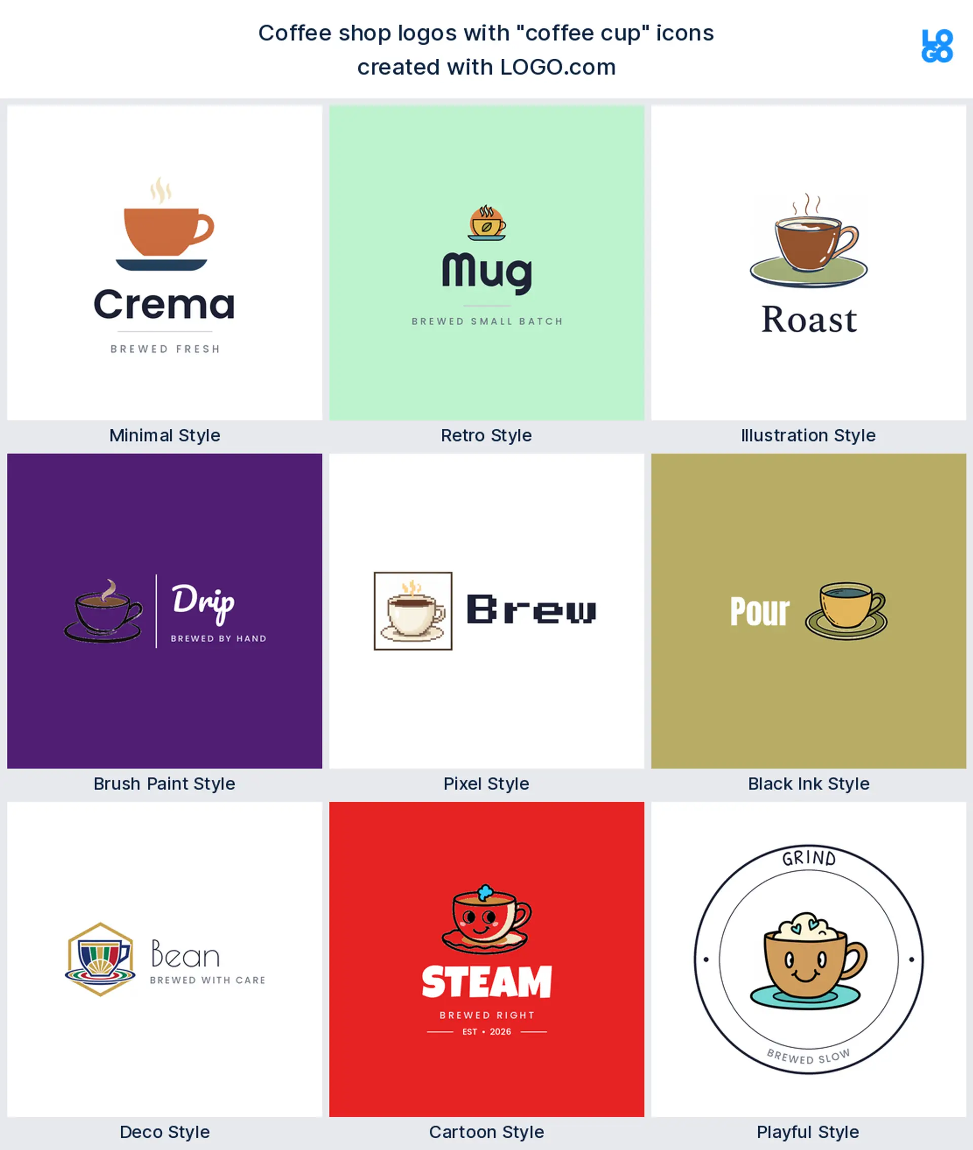
The coffee cup is the one nearly everyone reaches for first, and the data backs it up: about 28% of coffee logos on LOGO.com are built around a cup, mug, or saucer. It reads as cafe before a single word does, and it stays clear shrunk down to an app icon or a loyalty stamp. For most shops it is the safest, most recognizable coffee shop or cafe logo to start with.
2. Coffee beans
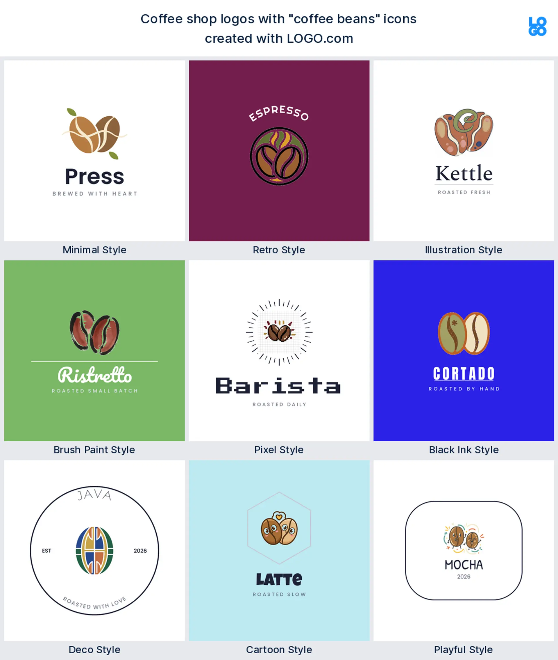
Right behind the cup come coffee beans, in about 16% of coffee logos. A single bean or a roasted pair quietly promises fresh, properly roasted coffee, which makes a natural coffee roaster or specialty coffee logo. The shape is small and bold, so it survives being stamped on a bag of beans or printed tiny along a cup sleeve.
3. Pastry
After the cup and the bean, the symbol founders pick most is a pastry, usually a croissant. It makes a friendly cafe or coffee and bakery logo, since a croissant next to a cup says we do breakfast too without a word. Keep the shape simple and it still reads on a menu board from across the room.
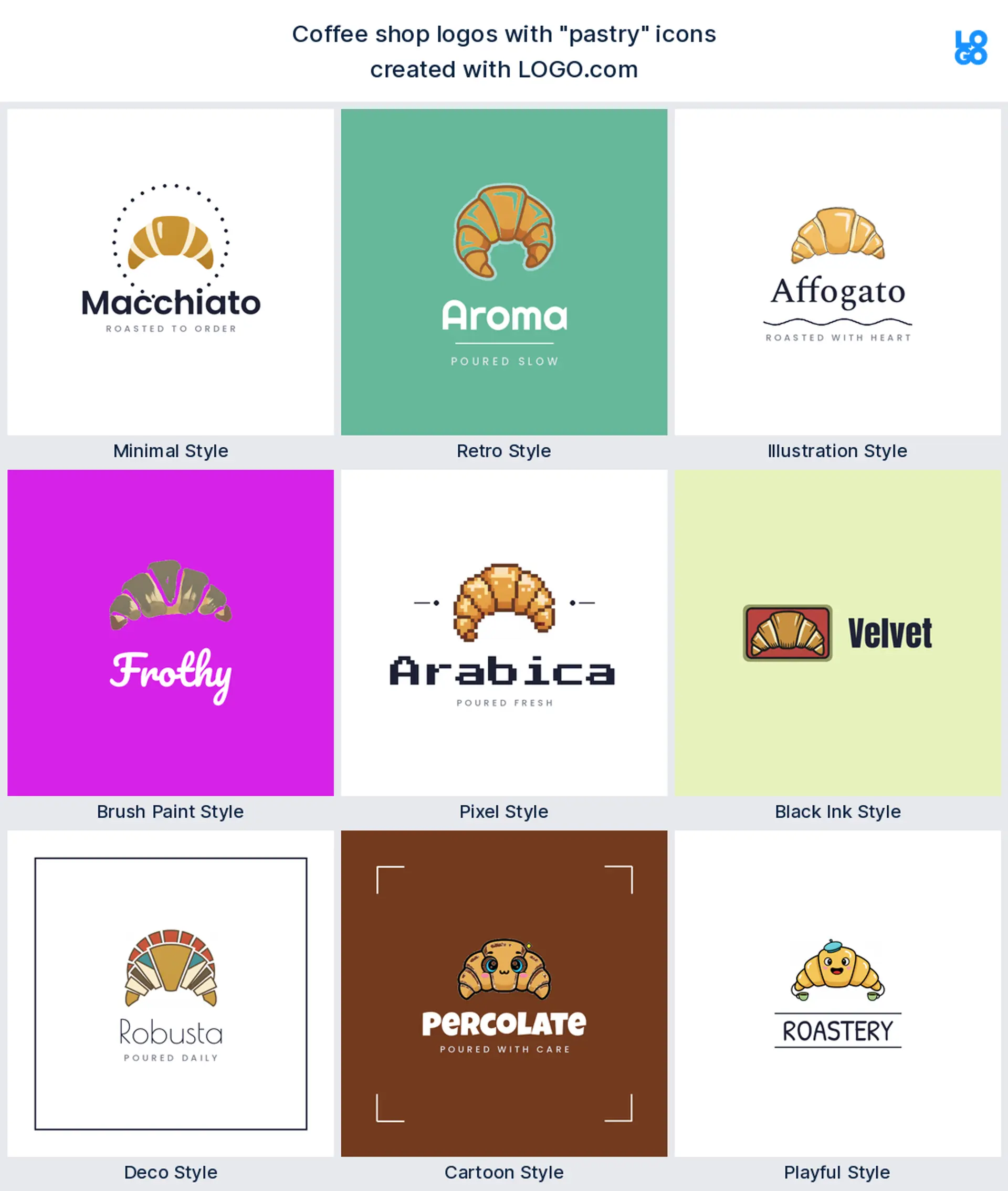
4. Coffee pot and pour over
Brewing gear is next: pots, kettles, and pour over drippers. This is the mark of a shop that takes the brew seriously, which makes a considered specialty coffee or roastery logo. Drawn as one clean silhouette, a pour over or a French press holds up on a cup and a small sign alike.
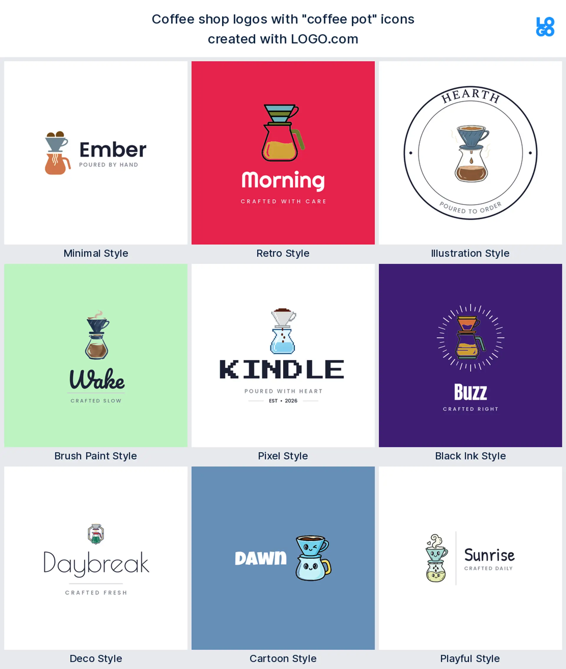
5. Latte art
Then there is latte art, a leaf or heart poured into the foam. Few symbols feel as warm or as welcoming, which makes an inviting cafe or coffee house logo, lovely across a storefront window or a printed cup. Just keep the foam shape bold so it survives a tiny app icon.

6. Iced coffee
Iced coffee is climbing fast, one summer menu at a time. A tall cup with a straw says cold brew, iced lattes, and grab and go in an instant, which makes a fresh, modern iced coffee or cold brew logo. Bold outlines keep the ice and the straw legible once the logo shrinks, and it pops on social and a delivery app.
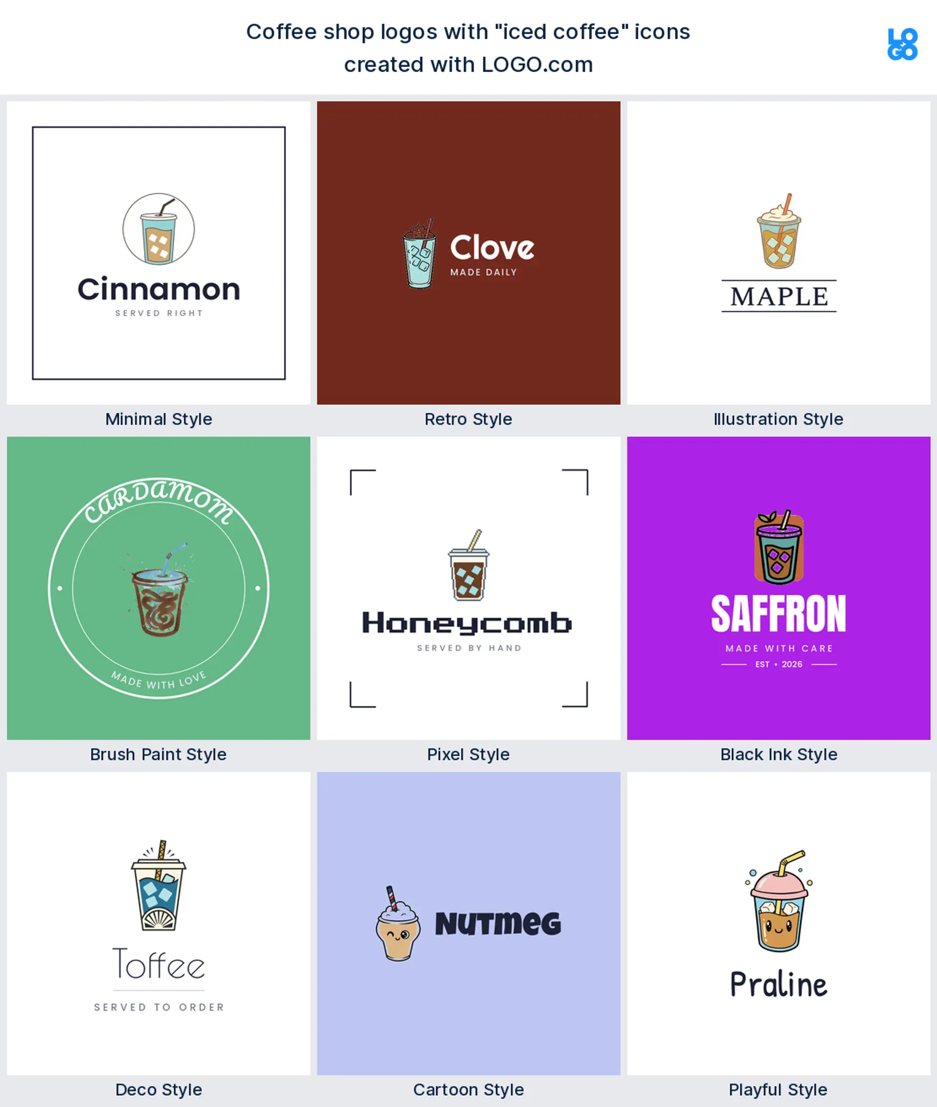
7. Coffee grinder
For heritage and craft, founders reach for the coffee grinder. A hand grinder is the kind of detail a roastery loves, which makes a heritage roastery or third wave coffee logo. It pairs beautifully with warm wood and kraft tones, and a simple one color version stamps cleanly onto a bag of beans.
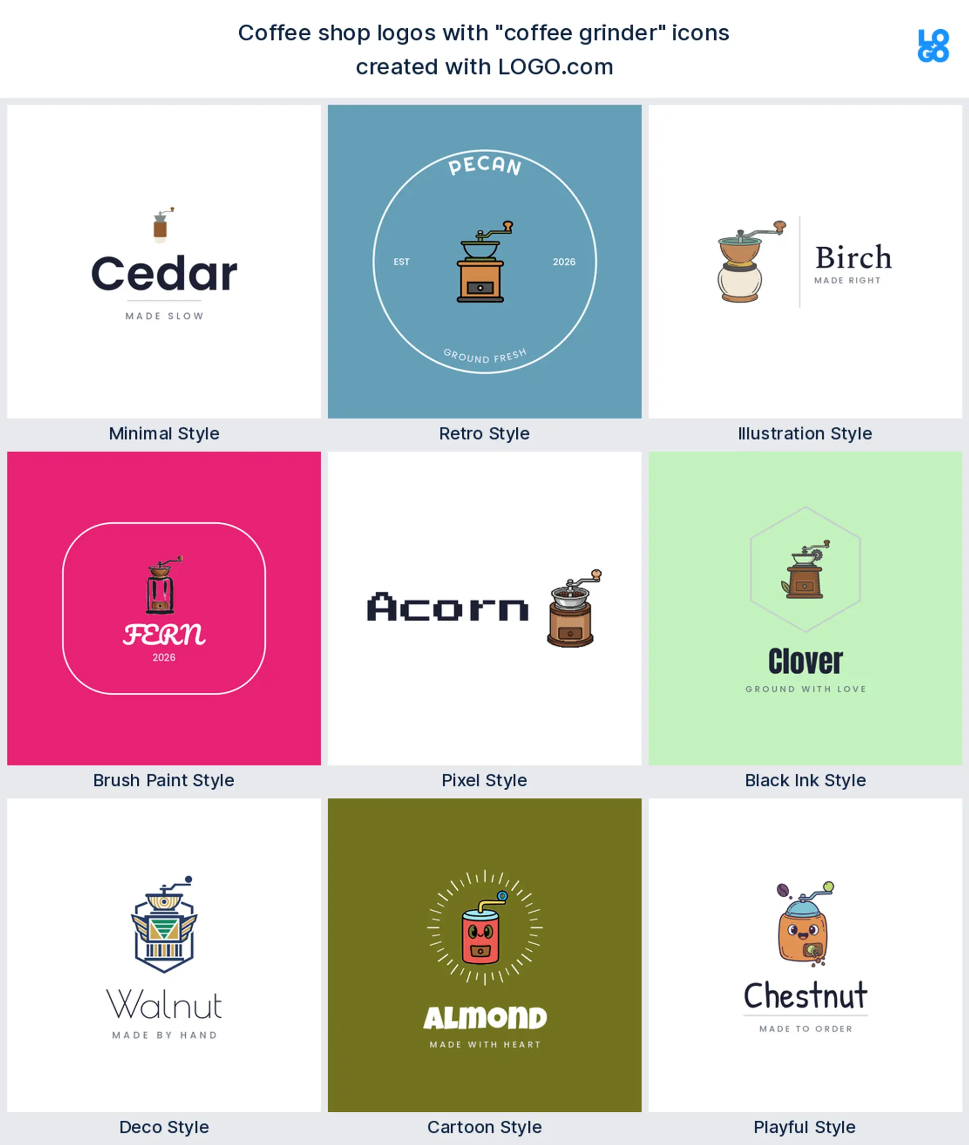
8. Coffee bean globe
A quieter favorite is the bean shaped into a globe, a soft way to say we care where our coffee comes from. It makes a thoughtful coffee roaster or single origin logo, and gives an otherwise plain coffee bean logo a little more story to tell.

9. Takeaway cup
Last in the nine is the takeaway cup, the lid and curl of steam everyone knows on sight, which makes a bold grab and go or drive through coffee logo. It is shorthand for a kiosk or a busy counter, and one clean to go cup stays sharp at any size and never needs explaining.
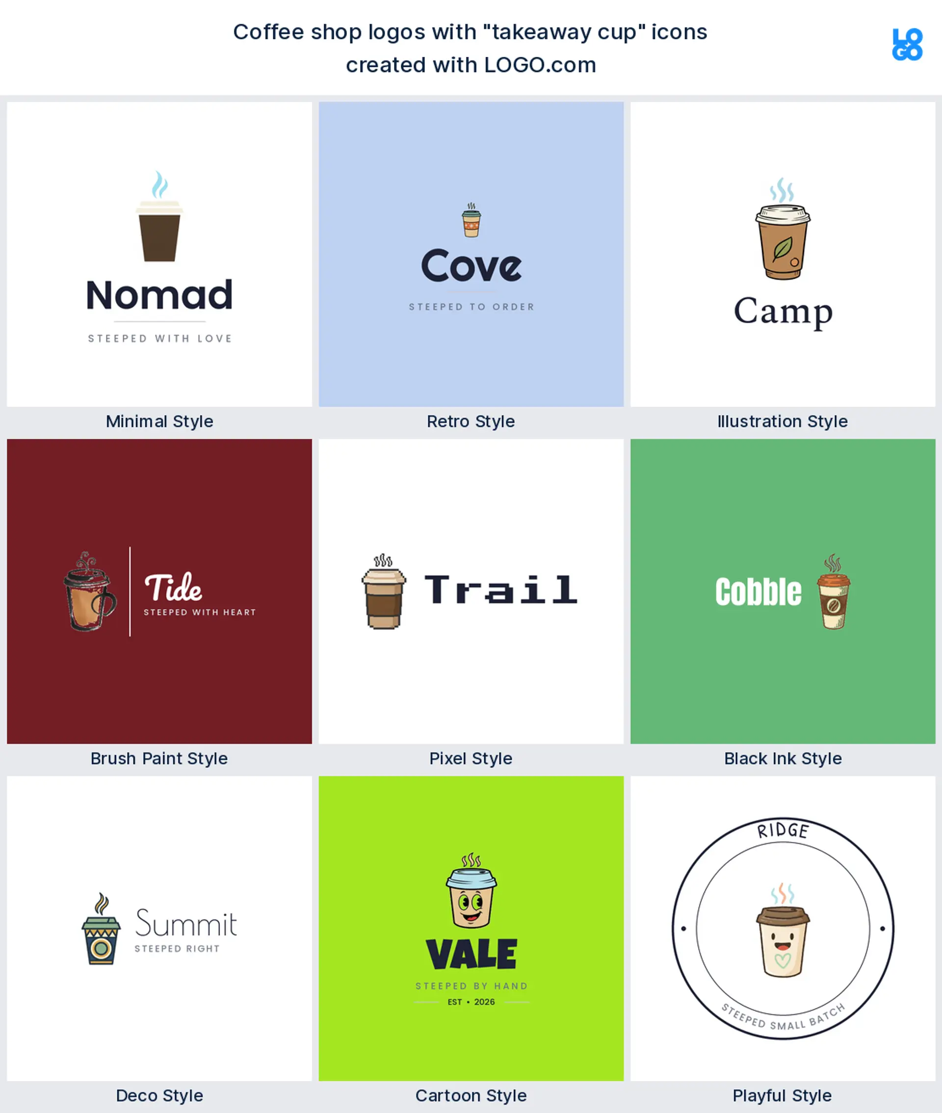
Fifteen coffee logos to make your own
No two of these look alike. Each takes one of the popular coffee symbols in a different style, so you can watch a steaming cup go minimal, a bean go retro, or a cup turn into a full cartoon mascot. Find the closest match to your shop, then make it yours from there.
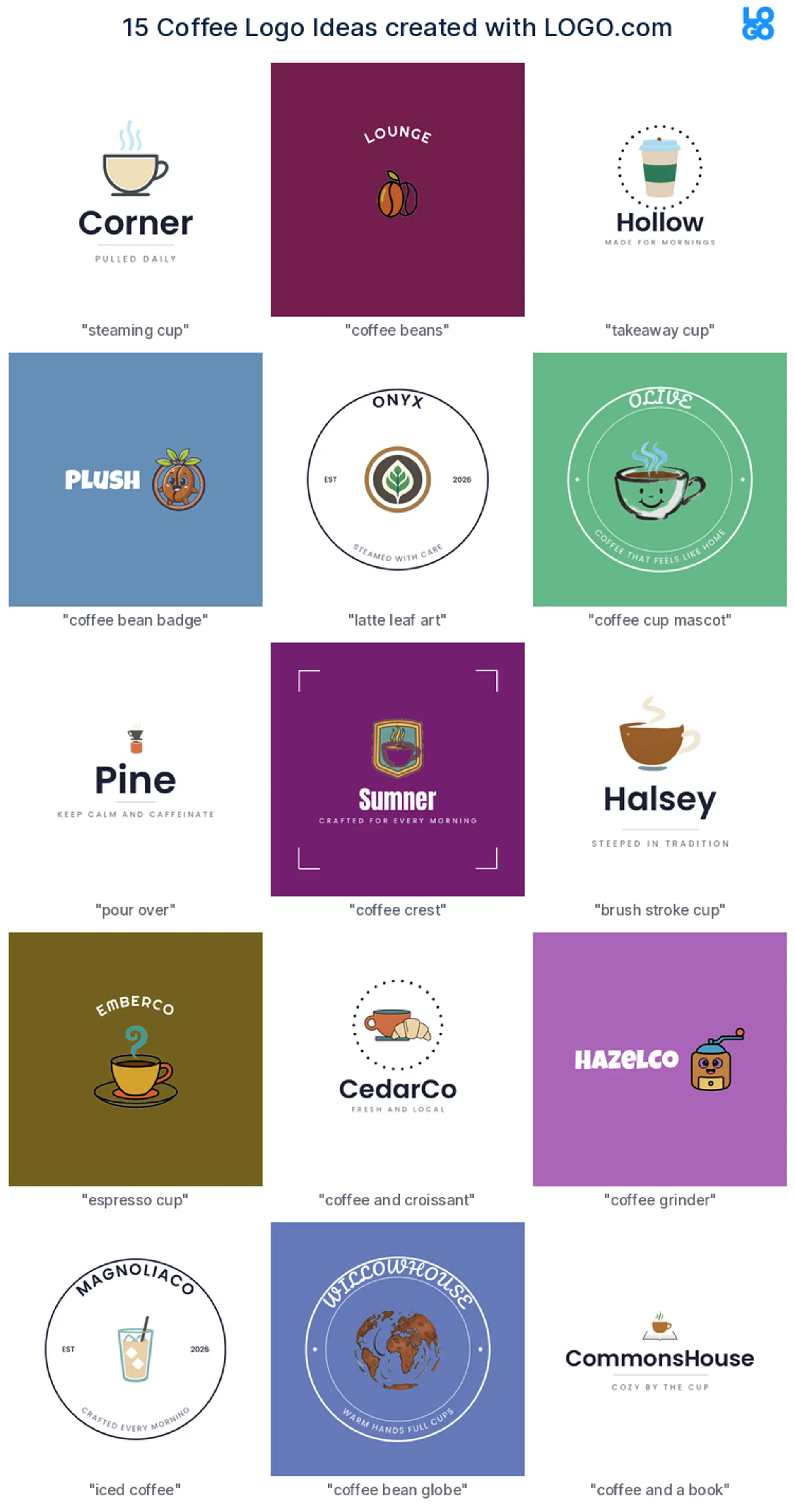
1. Steaming cup, minimal
For a calm, modern cafe, a single steaming cup over a quiet wordmark feels clean and confident. It is simple enough to paint on a window and gentle enough to sit on a tucked in loyalty card.
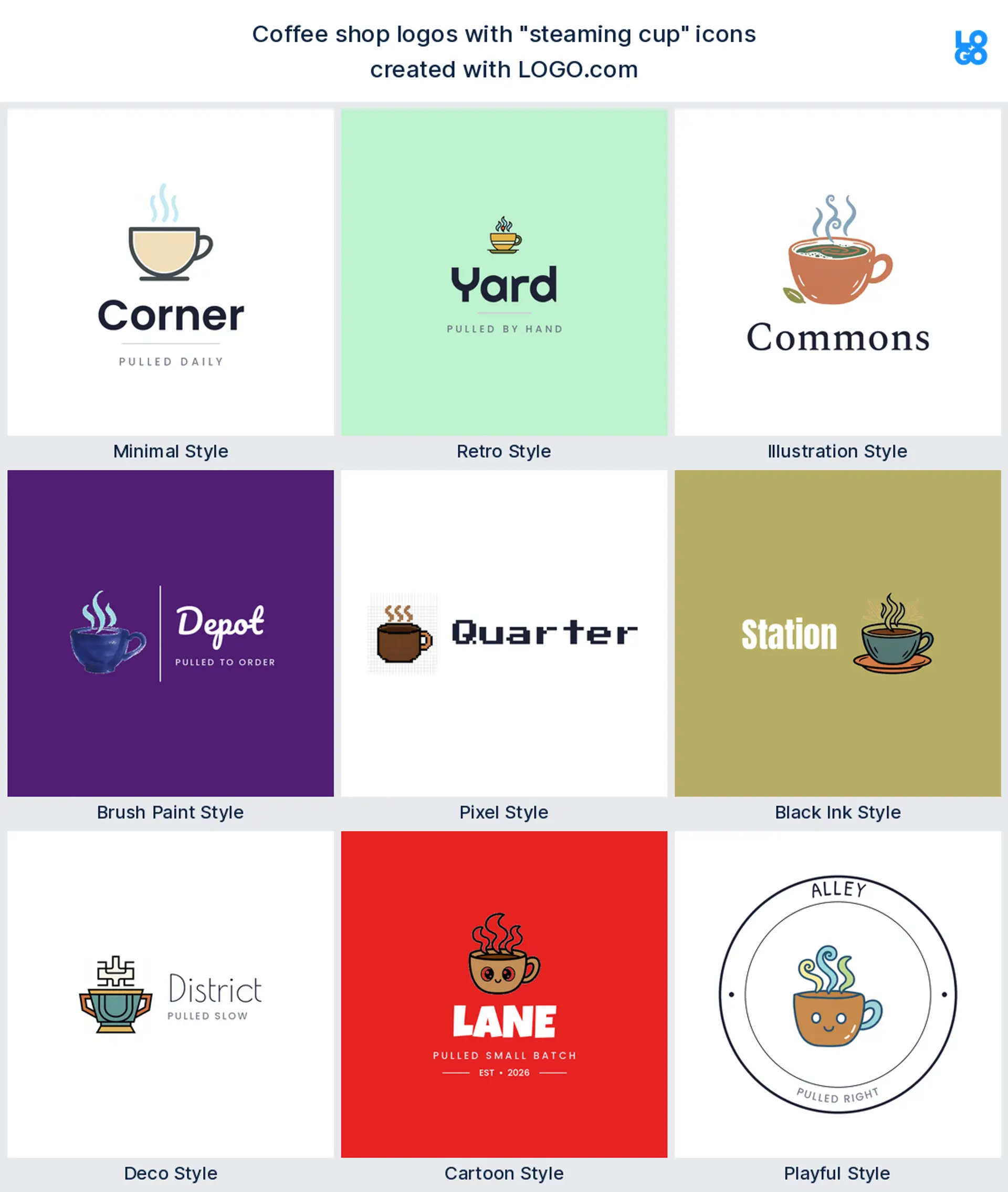
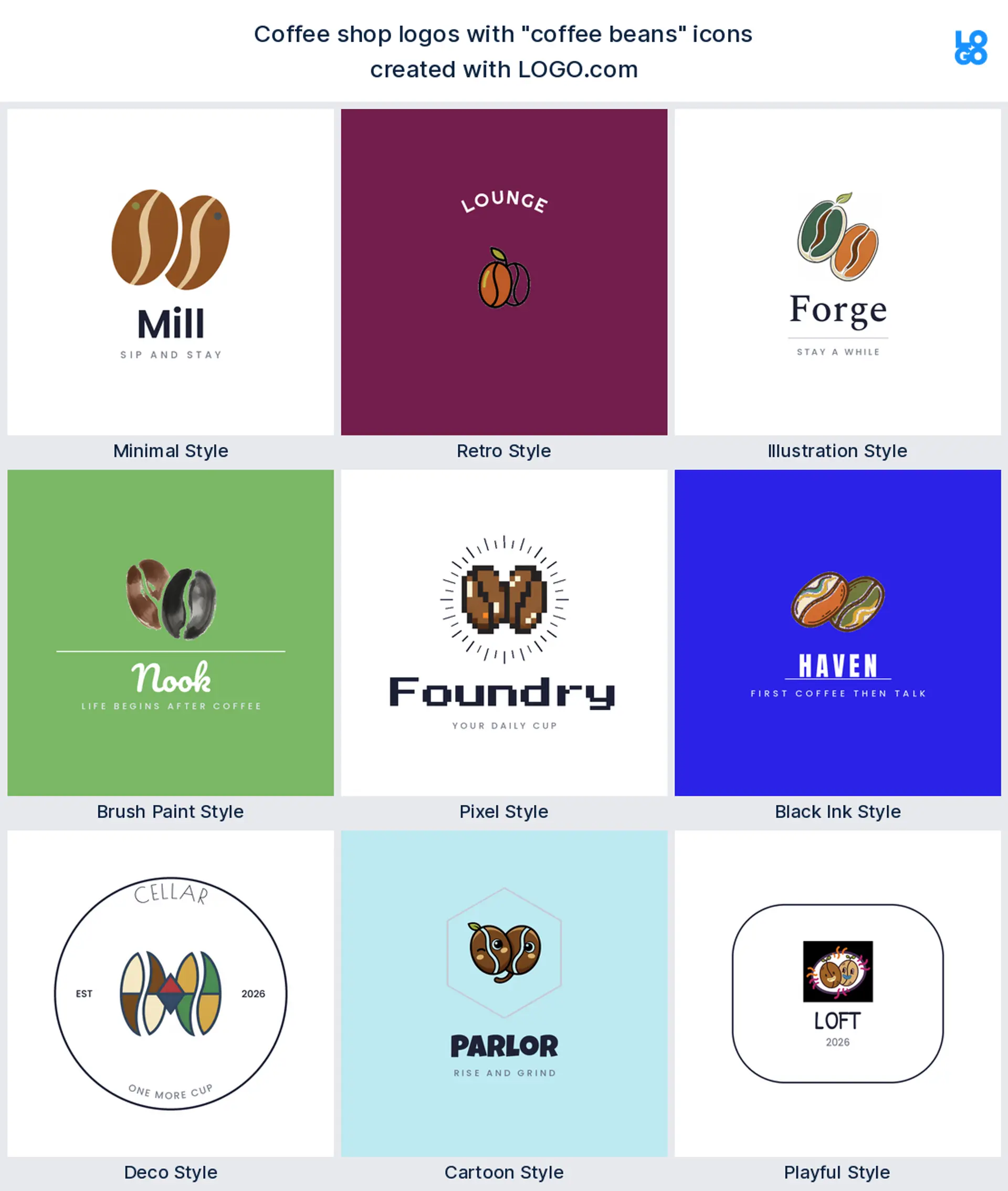
2. Coffee beans, cartoon
A pair of rounded beans with a bit of personality feels warm and approachable, the kind of cafe logo a friendly neighborhood spot wins regulars with.
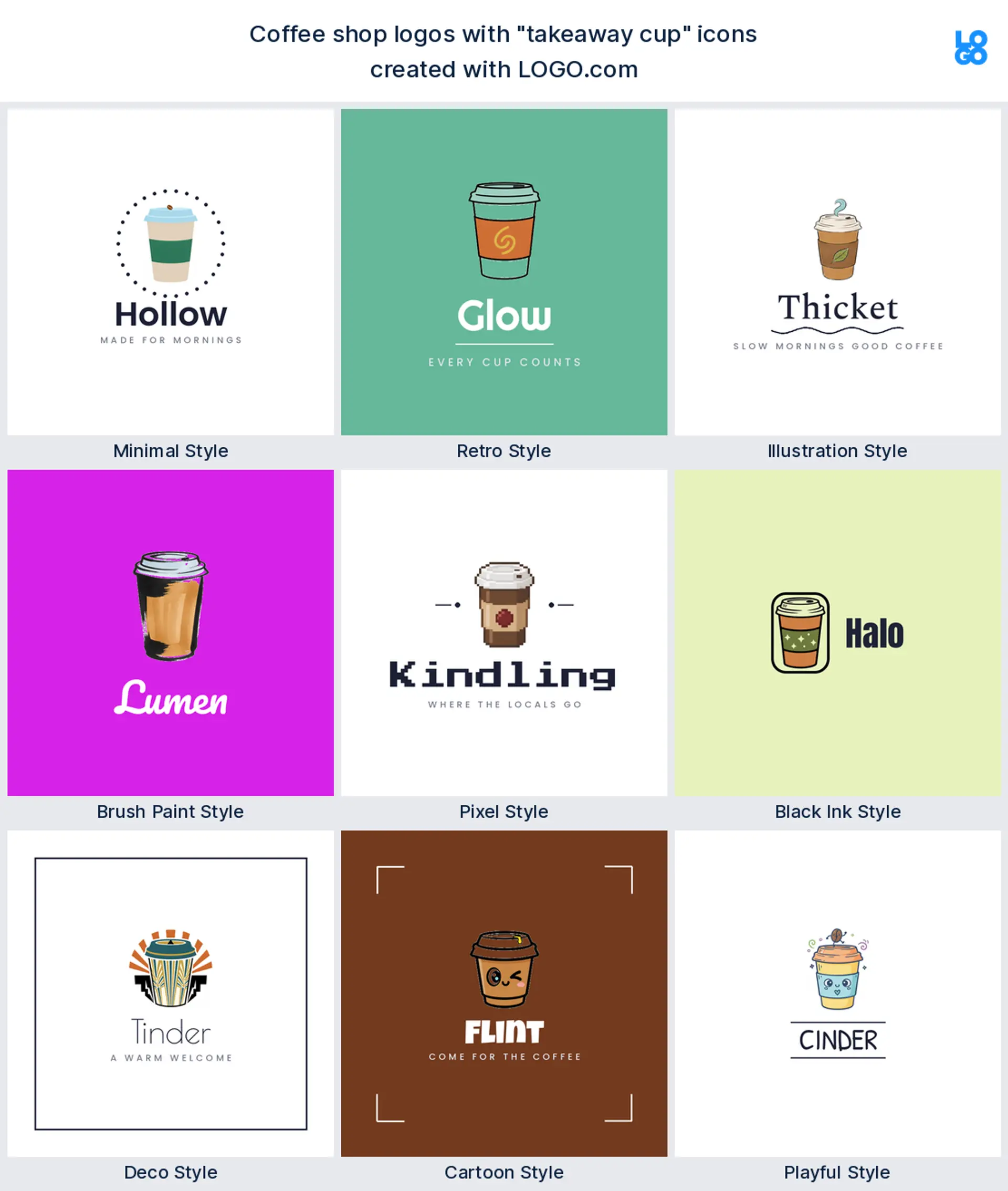
3. Takeaway cup, illustrated
Running a kiosk or a drive through? A hand drawn to go cup with a curl of steam says grab and go in a glance, and it looks great printed straight onto the cup.
4. Coffee bean badge, retro
To look like you have been roasting for years, set a bean inside a round badge with a chunky font. It feels established and it is perfect on a bag of beans.

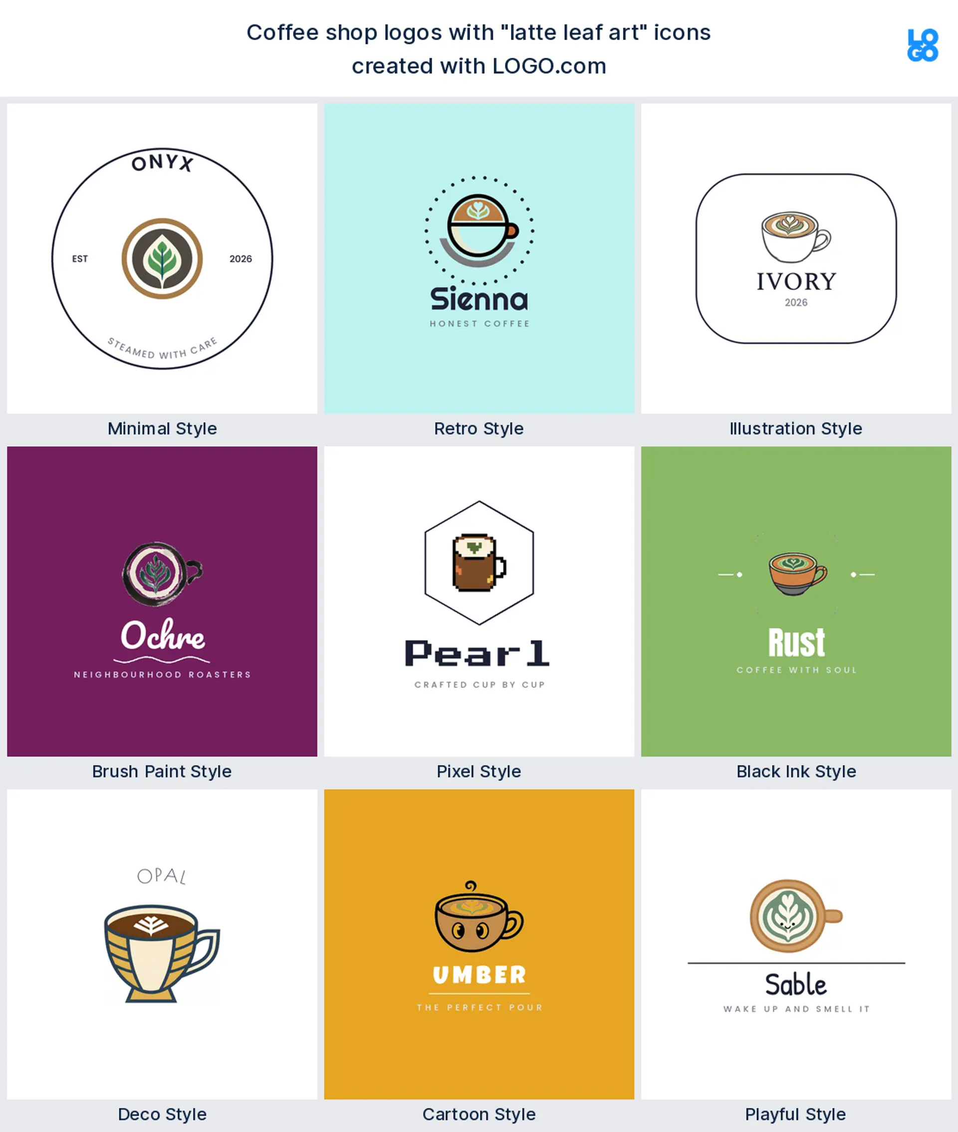
5. Latte leaf art, pixel
If your brand leans playful and modern, a leaf of latte art built from crisp pixels brings a fun, digital feel that pops on social and stands apart from softer cafe brands.
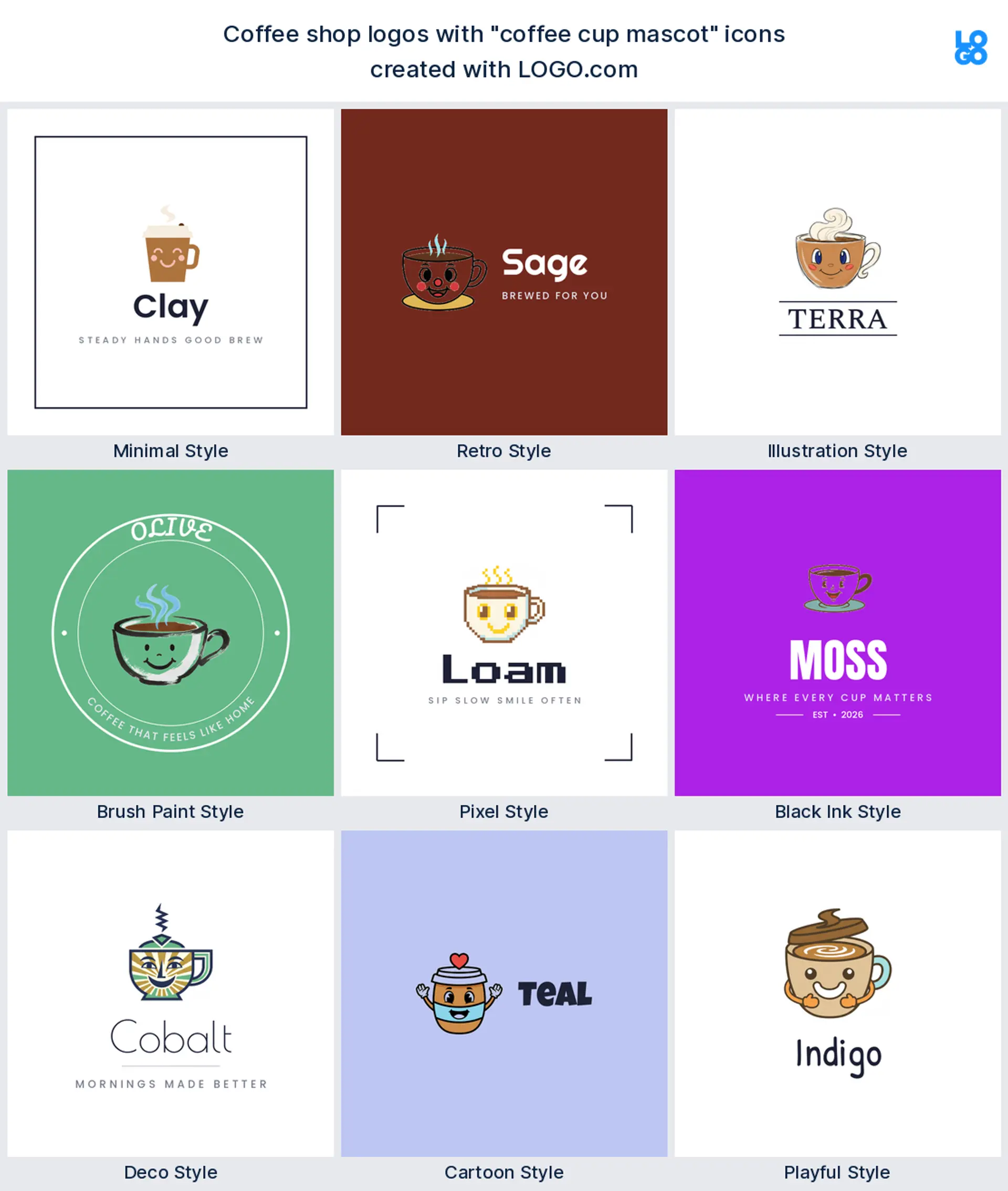
6. Coffee cup mascot, brush paint
For a shop with real character, a smiling cup mascot painted with a loose brush feels handmade and full of life, the sort of face people remember and tag.
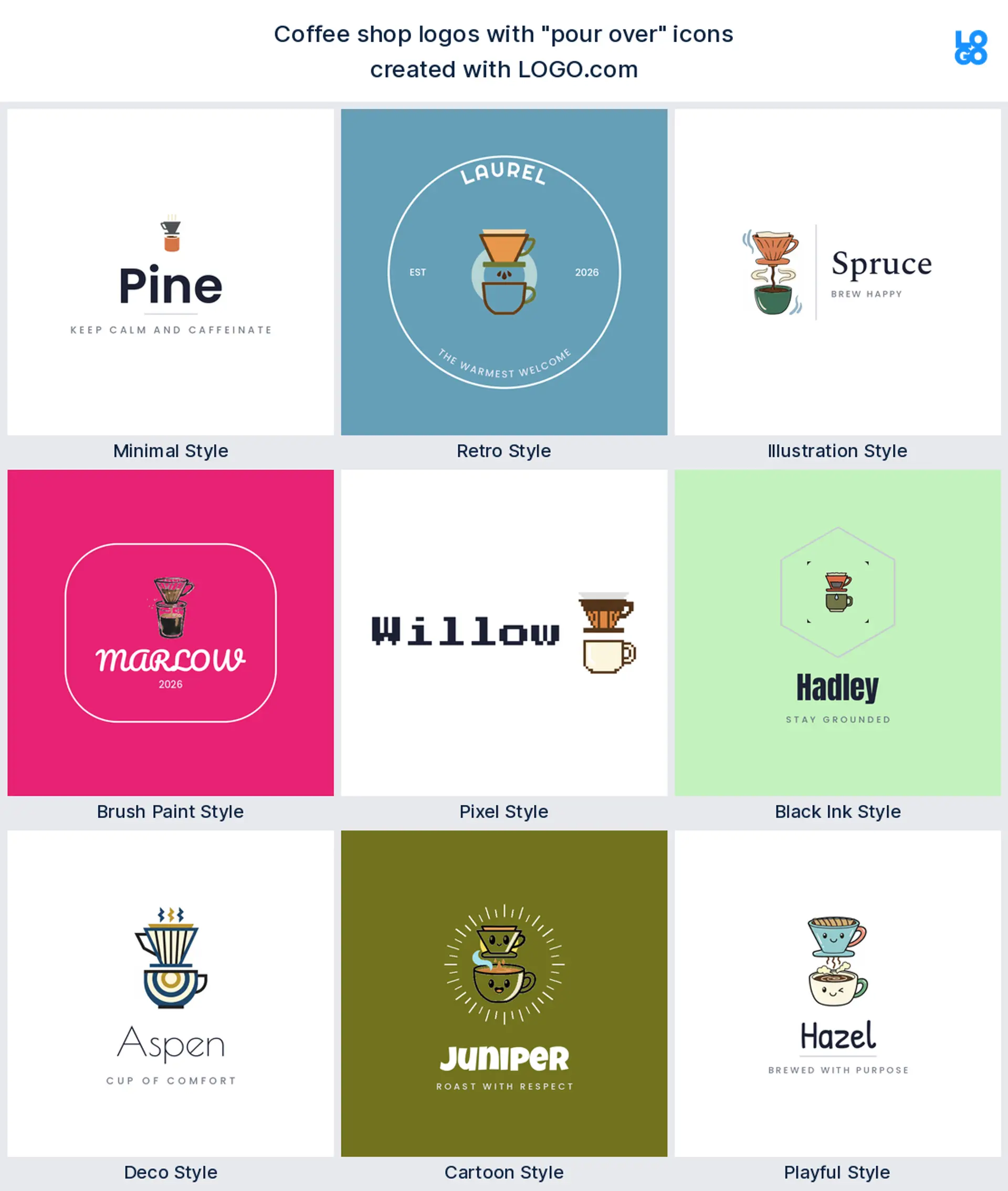
7. Pour over, deco
A pour over framed with neat deco lines looks considered and a little upscale, exactly right for a specialty cafe with a tasting menu.
8. Coffee crest, black ink
For a heritage feel, a cup inside a bordered crest in one ink color reads classic and trustworthy, and because it is a single color it stamps cleanly onto cups and bags.
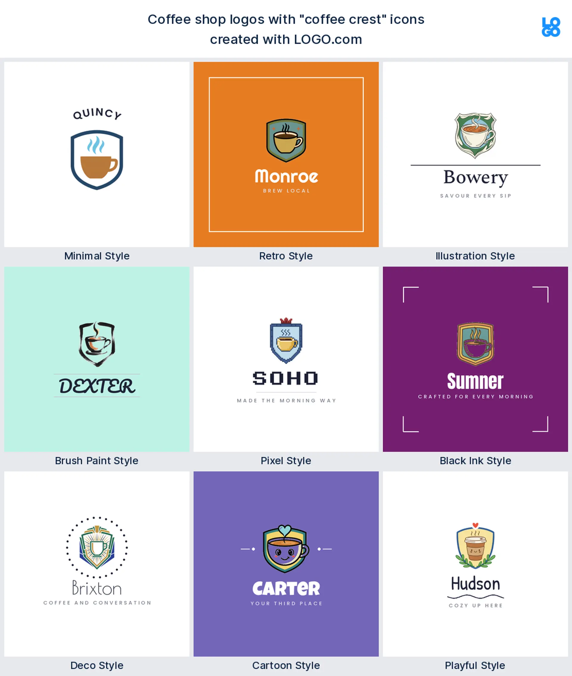
9. Brush stroke cup, playful
For a relaxed, arty cafe, a cup drawn in one loose brush stroke feels casual and human, like a sign a local artist painted just for you.
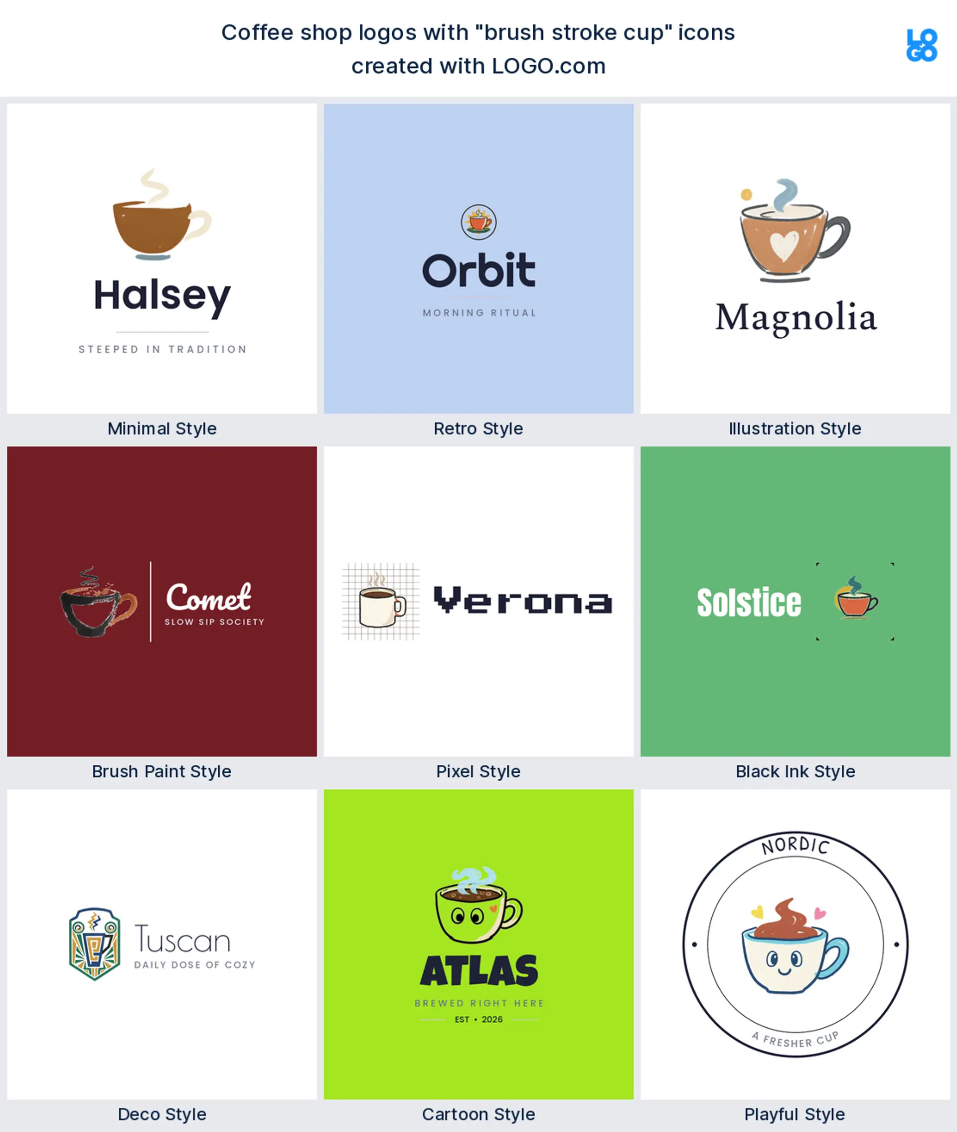
10. Espresso cup, cartoon
A small espresso cup on a saucer with a friendly bounce keeps things light and quick, the mood of a fast morning counter.
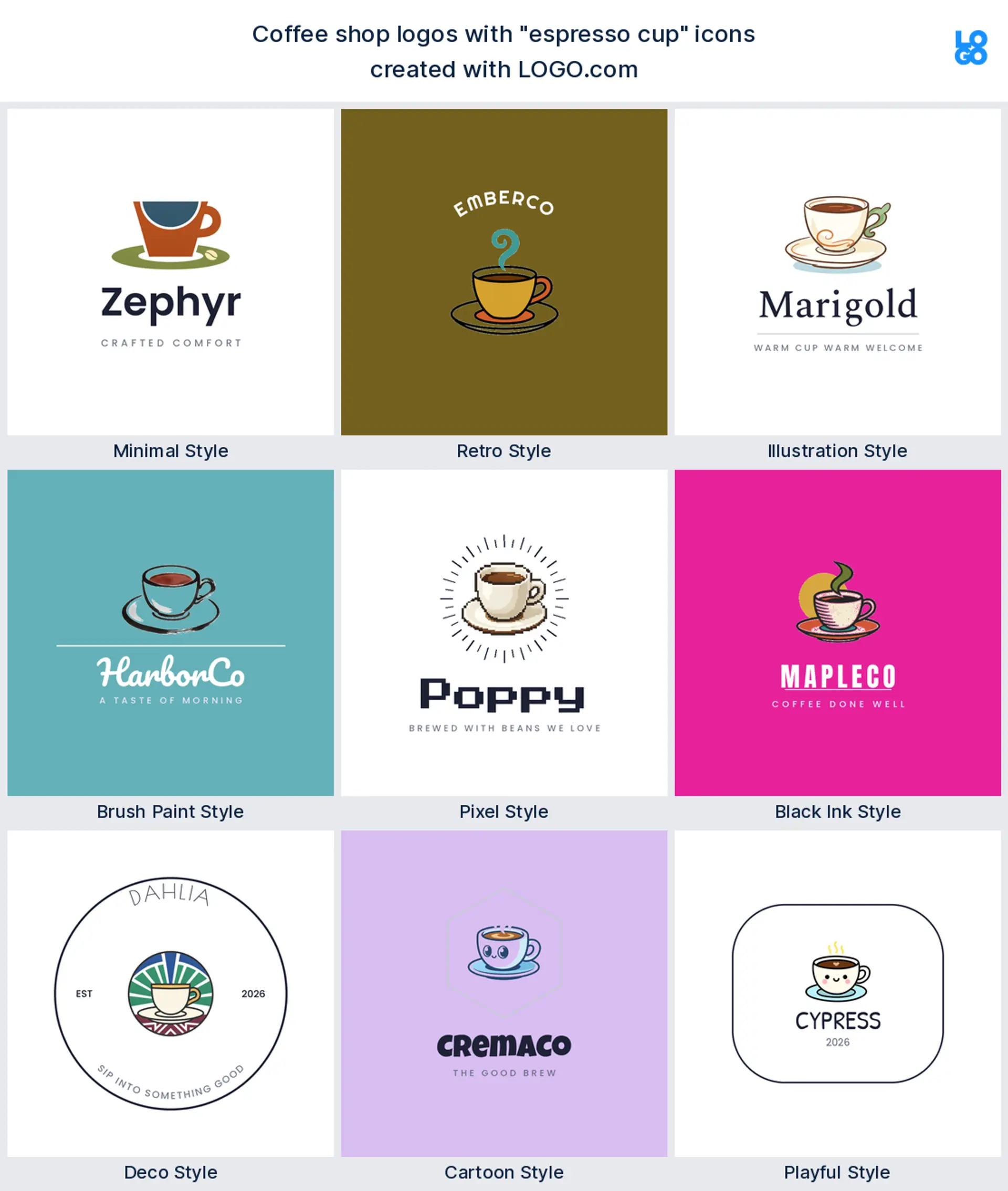
11. Coffee and croissant, minimal
For a cafe that is as much about breakfast as the brew, a cup beside a croissant says it in one tidy mark, calm enough to sit at the top of a menu.
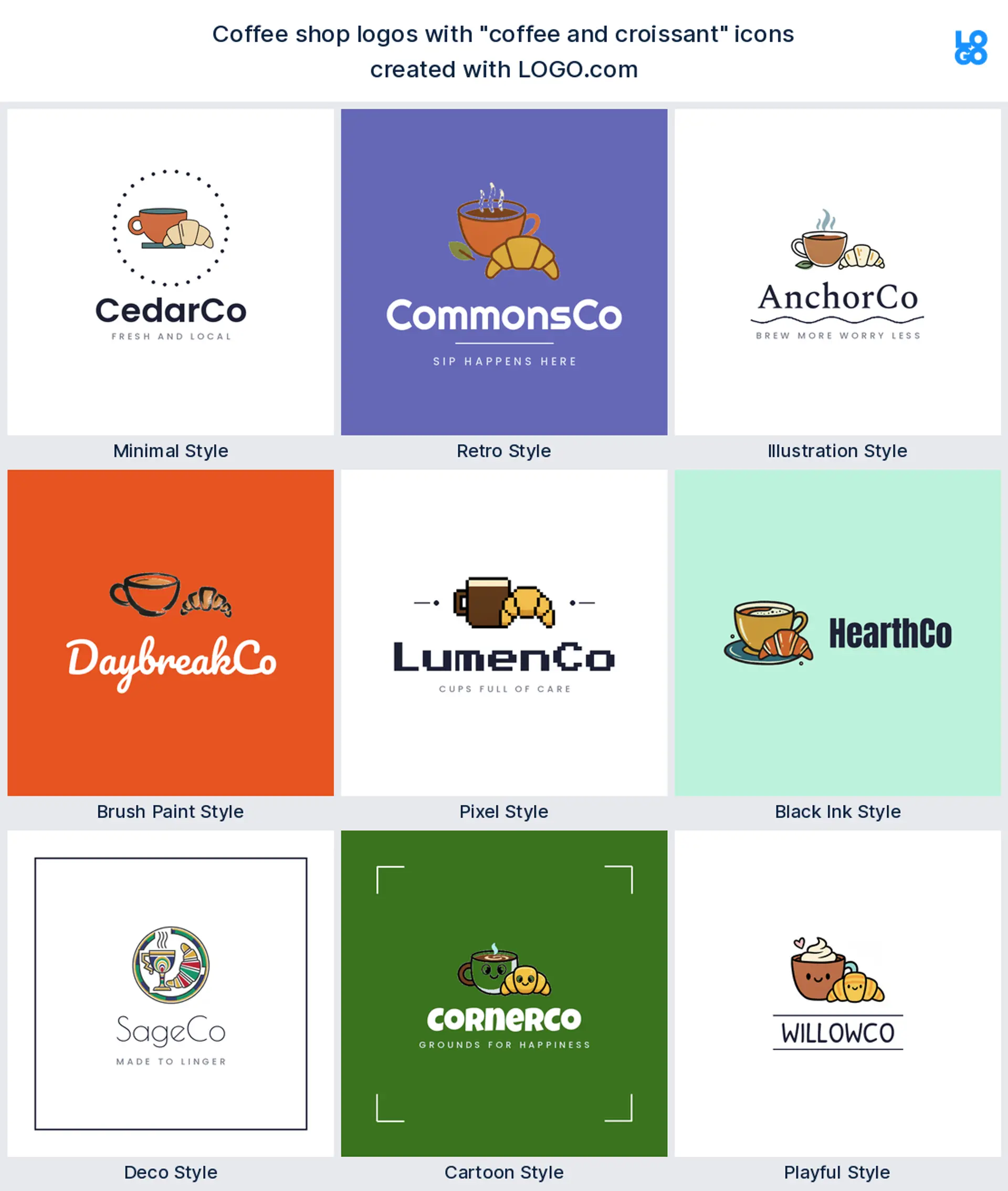
12. Coffee grinder, retro
A classic hand grinder and a vintage font feel warm and crafted, the opposite of a faceless chain, ideal for a roastery with a story.
13. Iced coffee, illustrated
For a shop built on cold brew and iced lattes, a tall glass with a straw drawn in soft detail feels fresh and current, made for a summer menu and a social feed.

14. Coffee bean globe, deco
A bean shaped into a globe inside clean deco rays hints at origins and quality without a word, perfect for a roaster that sources with care.
15. Coffee and a book, retro
For a cozy cafe and reading nook, a cup resting on an open book and a nostalgic font feels like a quiet afternoon, just right for a bookshop cafe.
Cafe, roastery, or drive through: match the logo to your format
Start with what you are opening, because it should steer the whole logo. If you run a sit down cafe, you can lean warm and detailed, since people read it up close over a table. Got a roastery? Show off the craft with a bean, a grinder, or a pour over, because your customers care where the coffee comes from. And if you are a drive through or a kiosk, go with the boldest, simplest mark you have, since it gets about half a second on a sign as cars roll past.
If you are still deciding, design for the most demanding format you will use. A logo that survives a tiny app tile and a roadside sign will also look great on a ceramic cup and a chalkboard menu, but it does not work the other way around. Start bold, then add the warmth.
Show the drink, the bean, or the mood?
Coffee logos tend to fall into three camps. Some show the drink, a cup, a takeaway cup, or latte art, which reads as coffee in an instant. Some show the bean or the gear, a bean, a grinder, a pour over, which signals fresh, properly roasted quality. And some skip the object and sell the mood with type and color alone, the route a lot of modern specialty brands take. Pick the camp that matches how you want to be known, then hold it to one idea so the mark stays clean.
Make it read on a cup, a window, and a tiny app icon
Whatever you land on, keep it bold and simple, because a coffee logo lives at wild extremes on the same day, a printed cup, a painted window, a delivery app tile, a stamped loyalty card. Drop hairline strokes and fussy detail, since they vanish when the mark shrinks. Grab the transparent version in your download too, so the logo sits straight on a kraft cup or a bag of beans with no white box around it. If it still reads in one solid color, it will work just about anywhere you put it.
What the big coffee brands get right, and what to borrow
Look at the coffee names that stuck and you spot the same habit, one simple, ownable symbol and a shape that survives being tiny. A round badge that doubles as an app icon, a creature or a cup you would know in silhouette, a wordmark in one confident color. You should not copy them, but you can borrow the discipline, one idea, strong contrast, and a logo that reads at a glance. That is exactly what the icons and styles on this page are built to give you.
Make your coffee shop logo with LOGO.com
Ready to make yours? Drop in your shop name, pick the symbol that fits, and our coffee shop logo maker builds a cafe logo around it in one of nine styles. Preview it free, then download a logo set up for your cups, your signage, and your app.
Methodology. According to LOGO.com first party data, these figures come from logos created on LOGO.com during the 12 months ending June 2026. We isolated the roughly 700 brands whose founders selected a coffee shop or cafe industry, such as Coffee Shop, Coffee, Cafe, and Coffee Roaster, and the more than 700 custom icon descriptions those founders wrote. We grouped the descriptions by concept, for example coffee cup, coffee beans, or croissant, and ranked each by how often it appeared. The coffee cup was most common at about 28%, followed by coffee beans at about 16%. Figures are a share of coffee logo descriptions, rounded to the nearest percentage point. Source: LOGO.com first party product data, June 2026.
THE #1 LOGO GENERATOR
Why LOGO.com is the best coffee shop logo maker
1.Built from real coffee logo ideas
Every icon, font, and color is pulled from real coffee logos made on LOGO.com, from cafe logos to roastery marks, so you start from what customers already recognize instead of generic clip art.
2.Sharp from a printed cup to an app icon
Your mark stays sharp on a delivery app tile and a social avatar, so a tiny coffee cup logo or coffee bean logo still reads the moment someone scrolls past.
3.Transparent files for cups and packaging
Download a transparent PNG that sits cleanly on kraft cups, bags of beans, and glass jars, with no white box, exactly what a coffee logo needs when it lives on the product.
4.One mark for cups, stamps, and loyalty cards
Start square so one coffee shop logo works as a cup stamp, a loyalty card, and your app icon all at once.
5.Multi color or one color, your choice
Choose a bright multi color icon for your coffee logo, or a clean one color version that stamps onto a cup sleeve, prints on a bag, and embroiders onto an apron. Both are ready to download.
6.Nine styles, cosy cafe to bold roastery
Nine styles cover the whole coffee aisle, a clean minimal cup, a warm illustrated roastery mark, a bold retro badge, whatever fits your shop.
7.One brand kit for cups, menu, and signage
Keep one coffee logo, palette, and font across your menu, cups, signage, and socials, so everything looks like the same cafe.
8.Grows when you add a second location
Swap the icon, color, or wordmark any time, so your cafe logo can grow from a single counter into a second location or a roastery.
9.Free to design, yours to sell with
Try our coffee shop logo maker free, download high resolution PNG files at no cost with a full commercial license to sell branded beans, mugs, and merch, then upgrade to the Brand Plan for vector files when you print larger.
Coffee Shop Logo Maker FAQs
Need Inspiration? See example brands in your industry...
3D DesignAcademic WritingAccountantAerospace EngineeringAgricultural ConsultingAgriculture CompanyAmazonAnimal ProtectionAnimationApp DevelopmentAquacultureAromatherapyArt and DesignArtsAsian RestaurantAthleticsAudio TechnicianAuto ManufacturingAuto Repair ServicesBadgeBandBarber ShopBearBeauty and CosmeticsBeeBibleBiotechBitcoinBlogBoatBook PublisherBooks and Literature BlogBrainBuildingBusiness Consulting Logo MakerBusiness StorageCakesCampaignCandlesCarCarpentryCateringCelebrationsChemicalChildrenChoirCircleCivil EngineeringClothingColors