Photo Studio Logo Maker
Design a photo studio logo that works on your studio door and booking page.
Need a different logo maker? Try our AI logo generator.
Logos created using LOGO.com
670,000,000
Clean and technical photo studio logos
Warm portrait and family studio logos
Studio hire and event photography logos
Photo Studio Logos, Ranked From Real Brand Data
According to LOGO.com data, the most common photo studio logo icons are the camera lens (in about 74% of the descriptions founders wrote), the camera aperture (about 23%), and the film roll (about 11%), ahead of the shutter, the vintage film camera and the photo frame.
The nine symbols and fifteen prompts below were counted out of real photo studio logos created on LOGO.com rather than picked by a designer. They cover a portrait studio logo for family sittings, a wedding photography studio logo, a photo booth logo for events and a quiet geometric mark for product shoots. Start from whichever matches the work that pays your rent, then change the colors and the type until it looks like your room.
There is a moment about a week before you open when a sign maker asks for your logo as a vector file and you realize you do not have one. A photo studio logo gets tested physically in a way a photographer's never does: cut into window vinyl, printed on a price list, shrunk onto a booking avatar, all inside the same fortnight. So rather than guess at what works, we counted. In 936 photo studio icon descriptions written on LOGO.com the camera lens appears in about 74% of them, and the ranking below runs from there down to the marks almost nobody thinks to use.
On this page
- 936 studio prompts, counted and ranked
- Fifteen photo studio logo ideas from real founder prompts
- Three studio businesses, three different marks
- Your logo gets cut into vinyl before anyone sees it on screen
- How to name a photo studio so your logo has something to hold
- Why the studio light is the most underused mark in the category
- Where your color goes when every wall is neutral
- From a free PNG to a two meter backdrop banner
- Make your photo studio logo with LOGO.com
936 studio prompts, counted and ranked
We grouped 936 icon descriptions written on LOGO.com by the founders who described a photo studio subject, then counted the concepts. The result is not a list of trends, it is a record of what people reach for when they are trying to look like a studio. Nine symbols carry almost all of it, and they split neatly into gear, room and finished product.
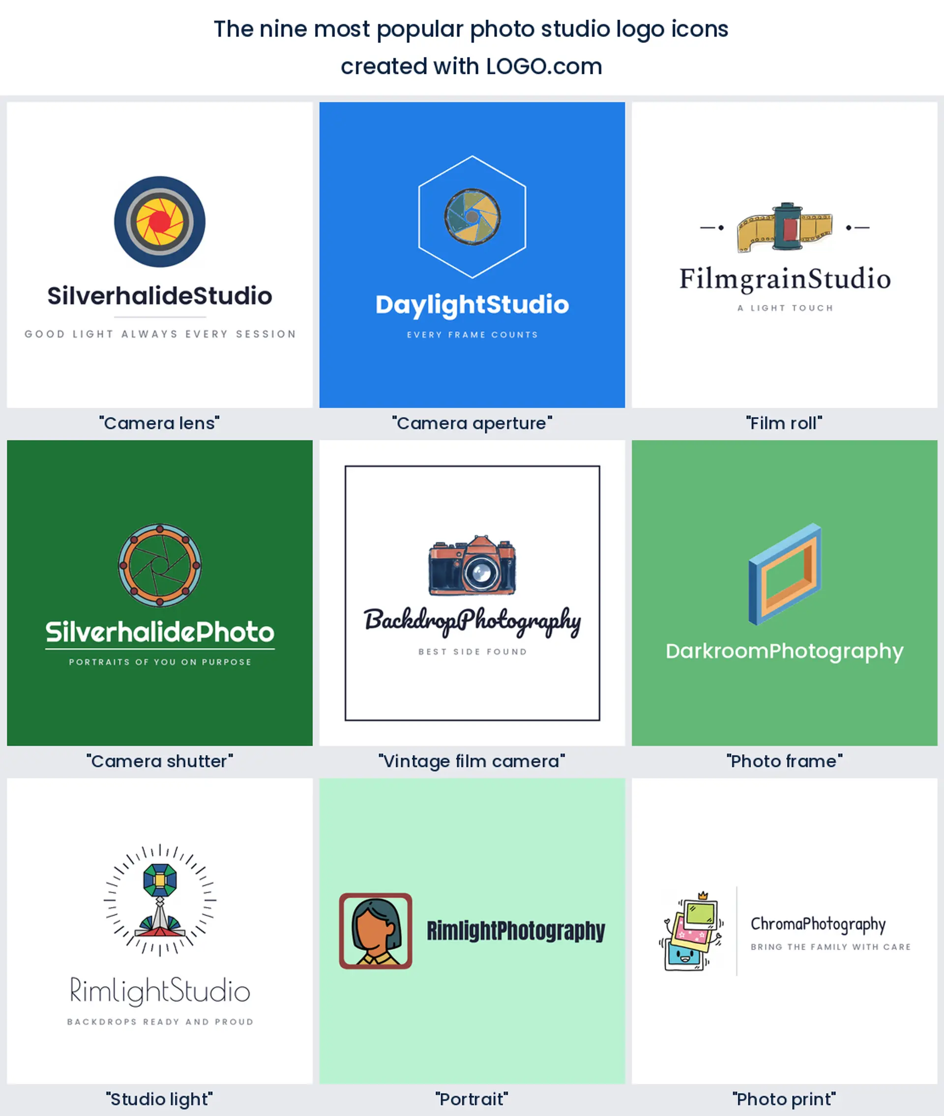
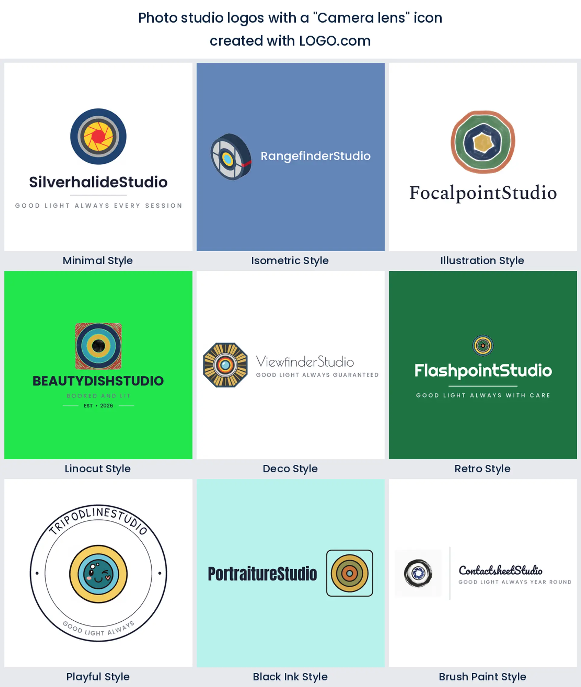
1. Camera lens
Nearly three quarters of the photo studio descriptions founders typed name a camera lens, about 74% of them, which makes it the most instantly readable mark in the category. It works because a lens says stills rather than video, and it reads at any size. If you want a photo studio logo that nobody has to decode, a clean lens ring is the safest place to start.
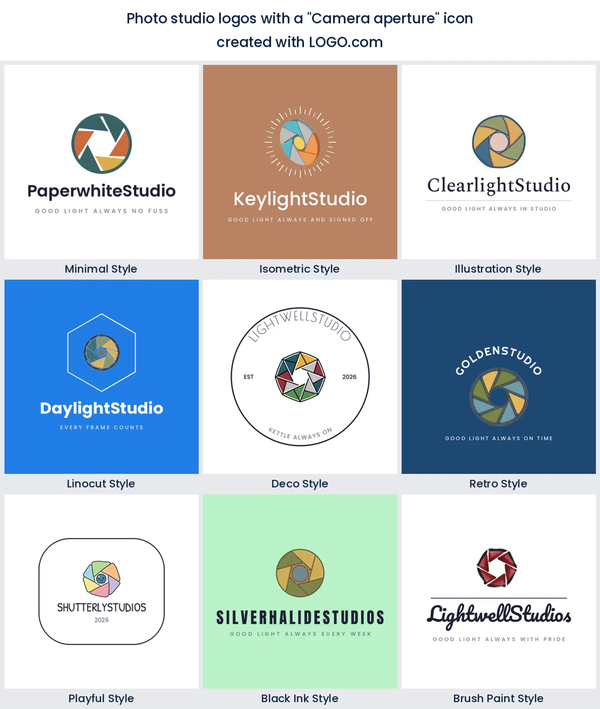
2. Camera aperture
The aperture shows up in about 23% of those descriptions, usually as a ring of interlocking blades. Founders reach for it when a plain lens feels too literal, because the blades give you a geometric shape that still belongs to a camera. That makes it a strong pick for a modern photo studio logo design that needs to sit next to clean type.
3. Film roll
About 11% of the descriptions bring in a film roll or a strip of frames, and it is the mark that instantly reads as craft rather than phone camera. A canister with a tongue of film pulling out gives you a horizontal shape, which is handy when your name is long. Reach for it if you want a vintage photo studio logo without leaning on a whole antique camera.
4. Camera shutter
Fourth in the count, and the closest this category gets to a purely abstract mark, is the shutter. Founders like it because a shutter reads as the moment itself, not the equipment, so it ages well and never looks like a specific camera body. It suits a studio that shoots a bit of everything and does not want to be pinned to one genre.
5. Vintage film camera
Studios with some character in the room, an old shopfront or a shelf of props, keep choosing the full vintage film camera, the boxy body with a dial and a chunky lens. It sits just behind the shutter in our own numbers. It carries real warmth, though it needs more space than a lens, so keep the wordmark short beside it.
6. Photo frame
The photo frame is the outlier of the nine, because it draws what the client ends up hanging rather than what you shoot it with. That quiet promise of prints on a wall is exactly what a portrait studio is selling. Pair it with a lens or a face and you have a wedding photography studio logo that reads before anyone has read your name.
7. Studio light
The most studio specific mark in the whole set is the studio light, the softbox or umbrella on a stand. Nothing else in the nine says physical room quite so plainly, so it is the one to use if you hire the space out or shoot to order. A softbox silhouette also happens to make a lovely one color stamp.
8. Portrait
A plain head and shoulders silhouette turns up next, the portrait itself. In the logos founders build on LOGO.com this one turns up on family and newborn studios, where the subject matters more than the kit. It is warm, it is human, and it is the obvious anchor for a portrait studio logo aimed at parents rather than art directors.
9. Photo print
Least used of the nine, and all the more useful for it, is the photo print, a small stack of finished photographs with visible white borders. It stands out on a street full of lens icons and it says you deliver something you can hold. A print stack makes a friendly photo studio logo for a shop that also sells albums and framing.
Fifteen photo studio logo ideas from real founder prompts
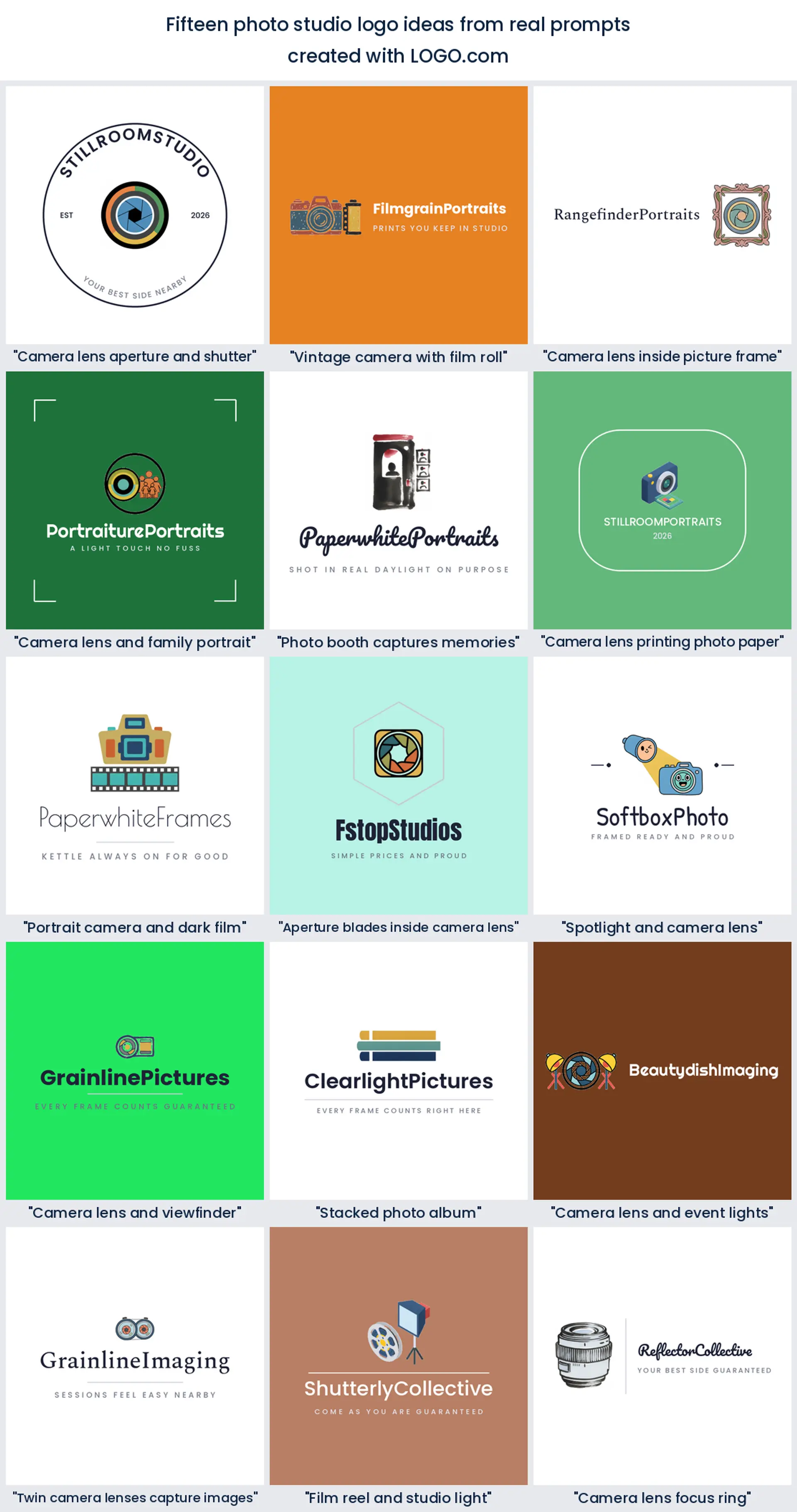
Every heading below is a real description a founder typed into our icon generator while building a photo studio brand, shown here in quotation marks exactly as it was written. You can type any of them straight into LOGO.com and see it drawn nine ways, which is a much faster start than a blank screen. Read them as photography studio logo ideas you are allowed to steal.
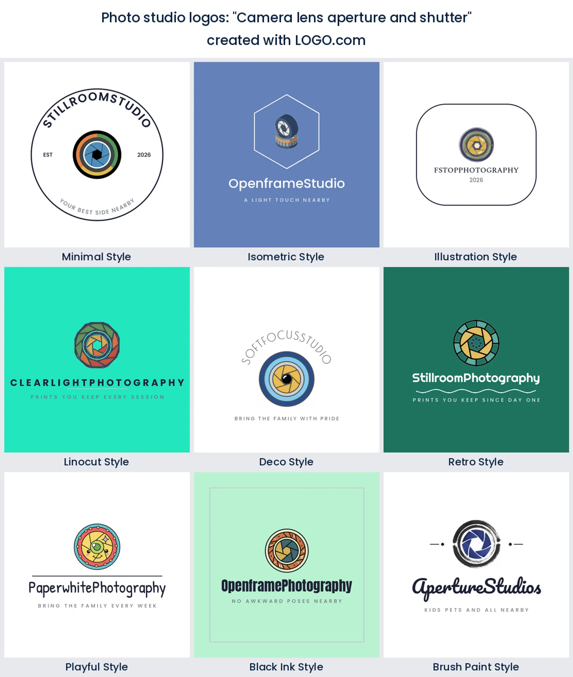
1. "Camera lens aperture and shutter"
This is the busiest of the founder prompts and it stacks all three of the top marks into one lockup, a lens ring holding aperture blades with a shutter arc around the outside. Because every layer belongs to the same object it still reads as one shape at small sizes. Type it as written if you want a technical, gear forward studio mark.
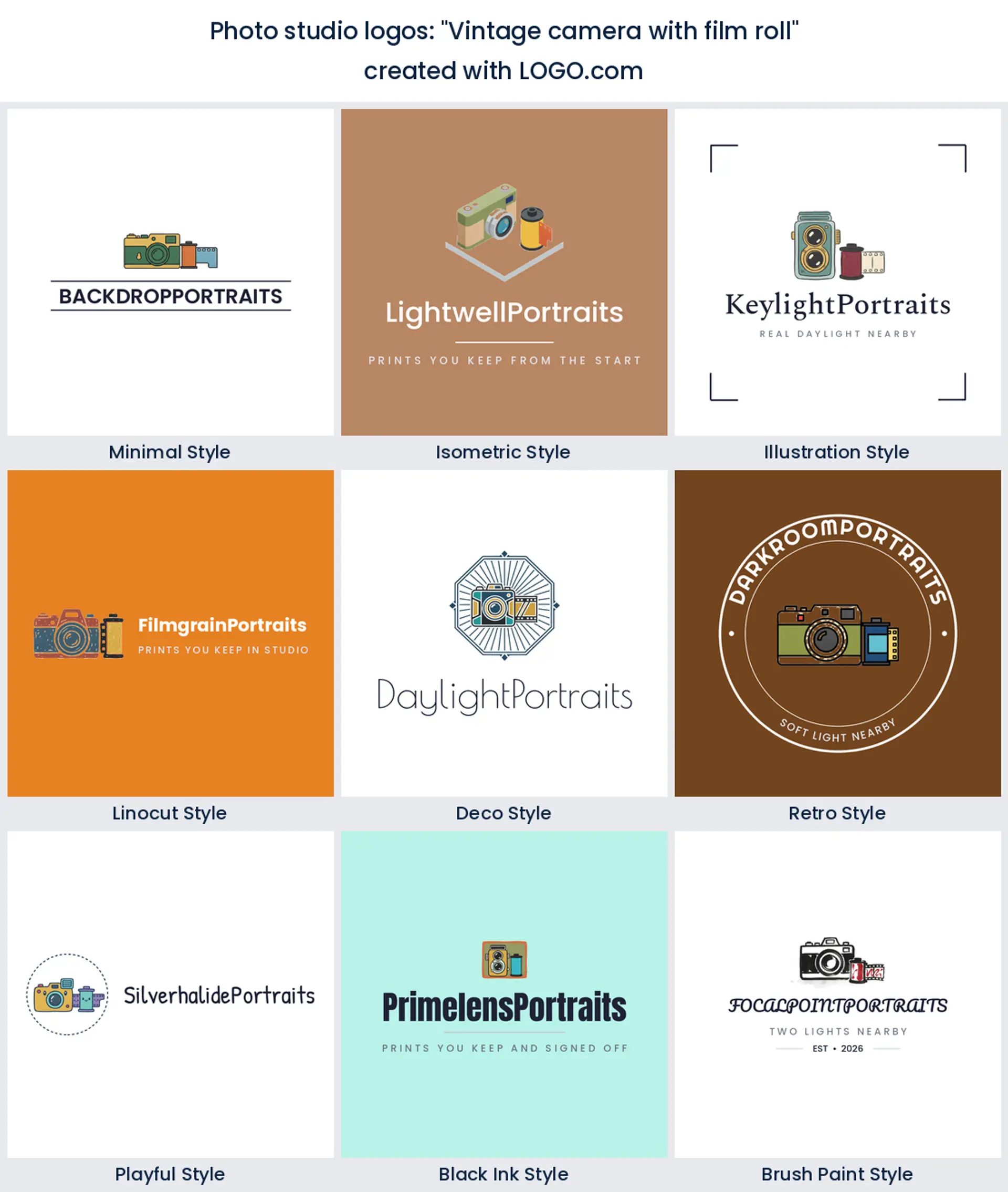
2. "Vintage camera with film roll"
Two objects, one story. The camera body gives you the silhouette and the roll of film beside it gives you the texture, which is why this prompt keeps coming back from founders with a bit of history in the room. It is the shortest route to a photo studio logo that feels analog without looking dusty.
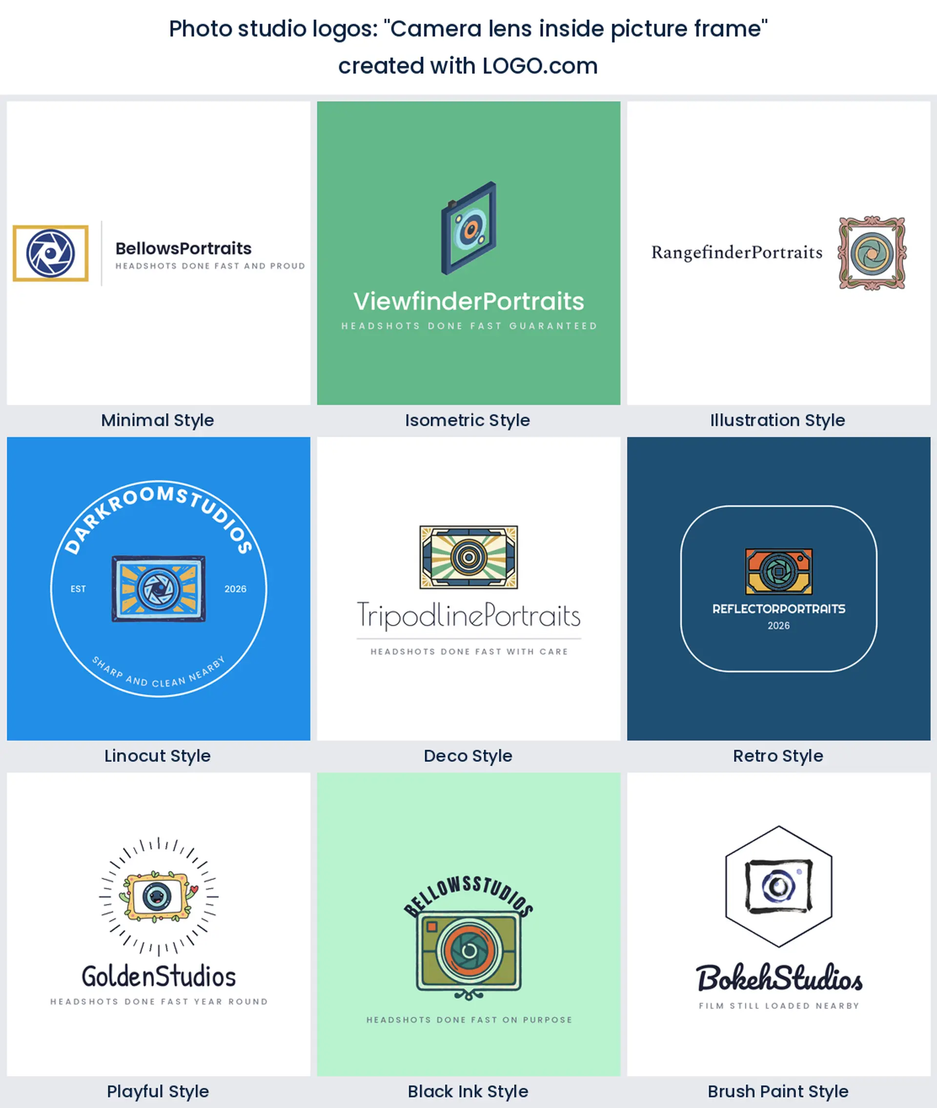
3. "Camera lens inside picture frame"
Founders wrote this one when the studio sells prints and framing alongside the sittings, and it shifts the emphasis from the equipment to the thing that gets carried out of the building. It also gives you a naturally square outline, which is useful for a booking avatar.
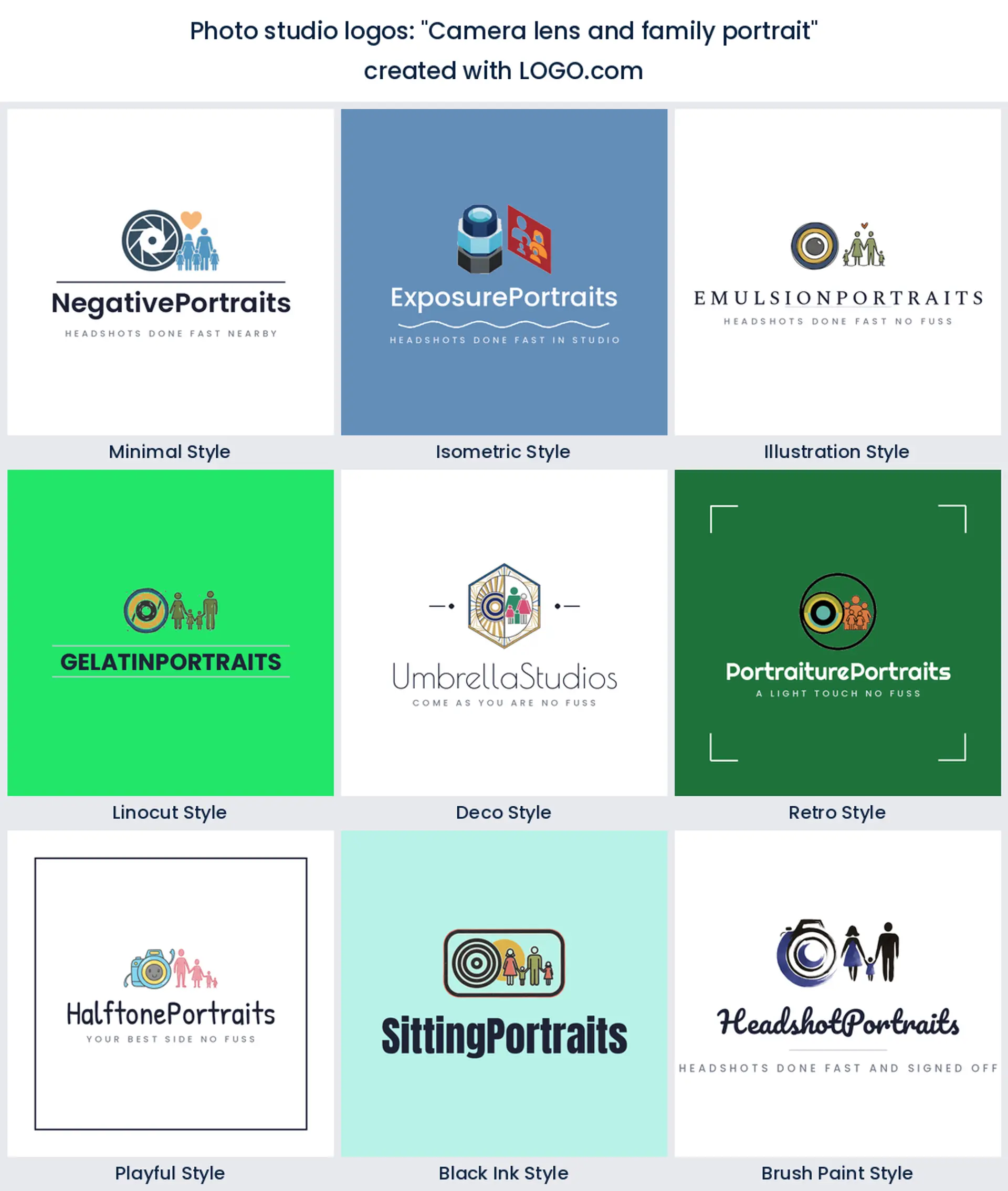
4. "Camera lens and family portrait"
A lens beside a group of figures says family studio in one glance, no words needed. This real founder prompt suits the studios that live on school photos, newborn sittings and grandparents ordering four copies. Keep the figures simple so they do not turn to mush on a small sign.
5. "Photo booth captures memories"
Founders running booths alongside the studio typed this one, and it draws the cabinet with a strip of photos hanging out of the slot. If events are part of your income it is worth knowing a photo booth logo and a studio mark can share the same icon family, so you are not maintaining two brands.
6. "Camera lens printing photo paper"
This prompt joins the shoot to the print, a lens with a sheet of photo paper feeding out below it. It is a good pick if you want people to understand that you finish the job in house. The horizontal paper edge also gives the wordmark a natural baseline to sit on.
7. "Portrait camera and dark film"
A camera above a dark strip of film reads serious and editorial, which is the mood a headshot studio usually wants. Founders used it where the work is business portraits and actor headshots rather than birthdays. It is a strong base for a creative photo studio logo that still looks like it charges properly.
8. "Aperture blades inside camera lens"
Tighter and more abstract than the full lens, this one crops in until the blades fill the ring. Founders reach for it when they want something that could pass for a monogram, and it holds together beautifully at favicon size. Try it if your studio name is long and needs a compact mark.
9. "Spotlight and camera lens"
The beam is doing the work here. A light throwing a cone across a lens says lit indoors, which is the one thing a studio has that a photographer with a bag does not. It is the first place we would start for photo studio branding built around hiring the room out.
10. "Camera lens and viewfinder"
Lens plus viewfinder window gives you two circles and a rectangle, which is a surprisingly flexible set of shapes to build a lockup from. Founders wrote it when they wanted the logo to feel like looking through the camera rather than at it. Good for a studio that teaches or runs workshops.
11. "Stacked photo album"
No camera at all. A stack of albums points straight at the shelf in the client's living room, and it is the warmest mark in the fifteen. Use it if you sell albums as the main product and want a photo studio logo png you can drop onto an order form without it looking technical.
12. "Camera lens and event lights"
Two lights flanking a lens gives the mark symmetry, which is why it works so well inside a badge or a circle. Founders typed this one for studios that shoot on location as well as in house. It is a neat answer if you want photography studio logo ideas that also work on a van or a kit case.
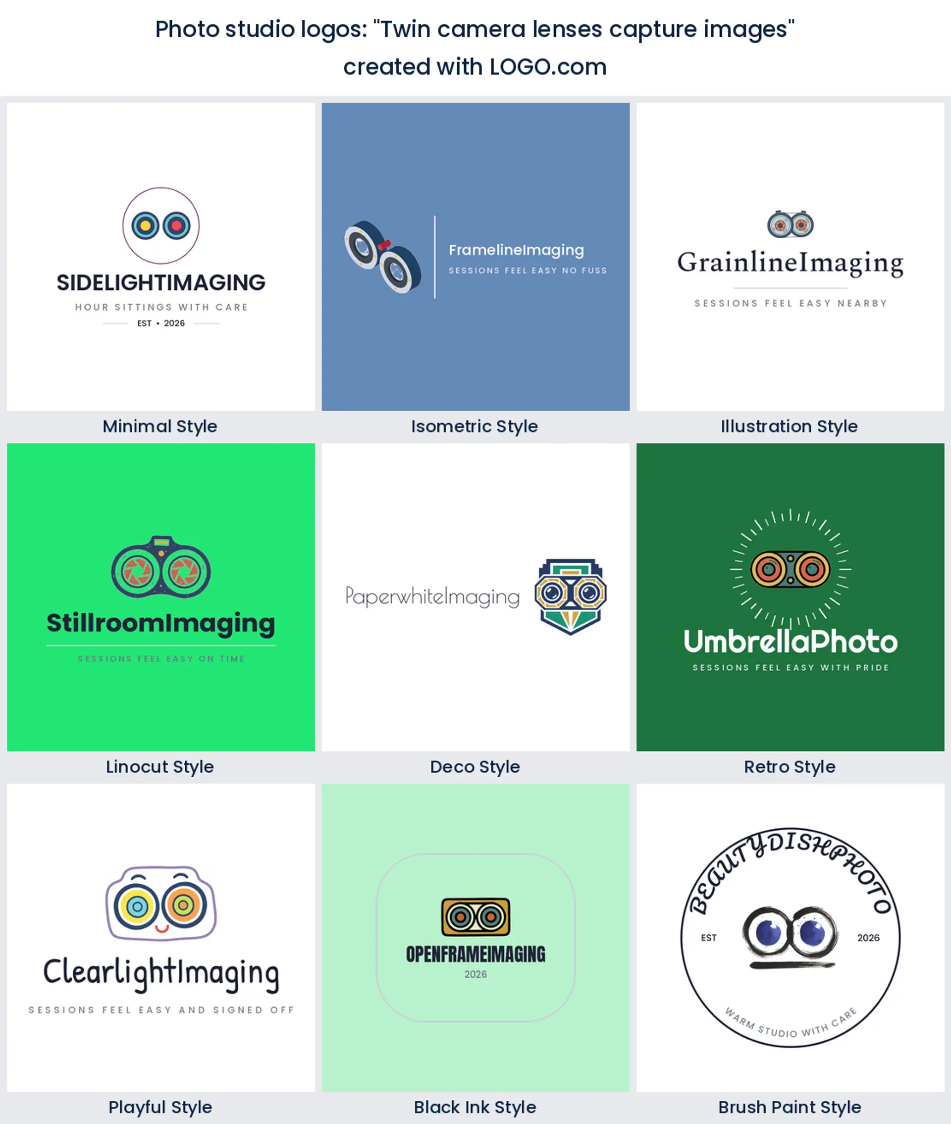
13. "Twin camera lenses capture images"
Two lenses side by side, like a twin reflex camera or a pair of eyes. It is playful, it is memorable, and it is the sort of shape people can draw from memory after seeing it once. Worth trying when you want a photo studio logo that does not look like every other lens ring on the street.
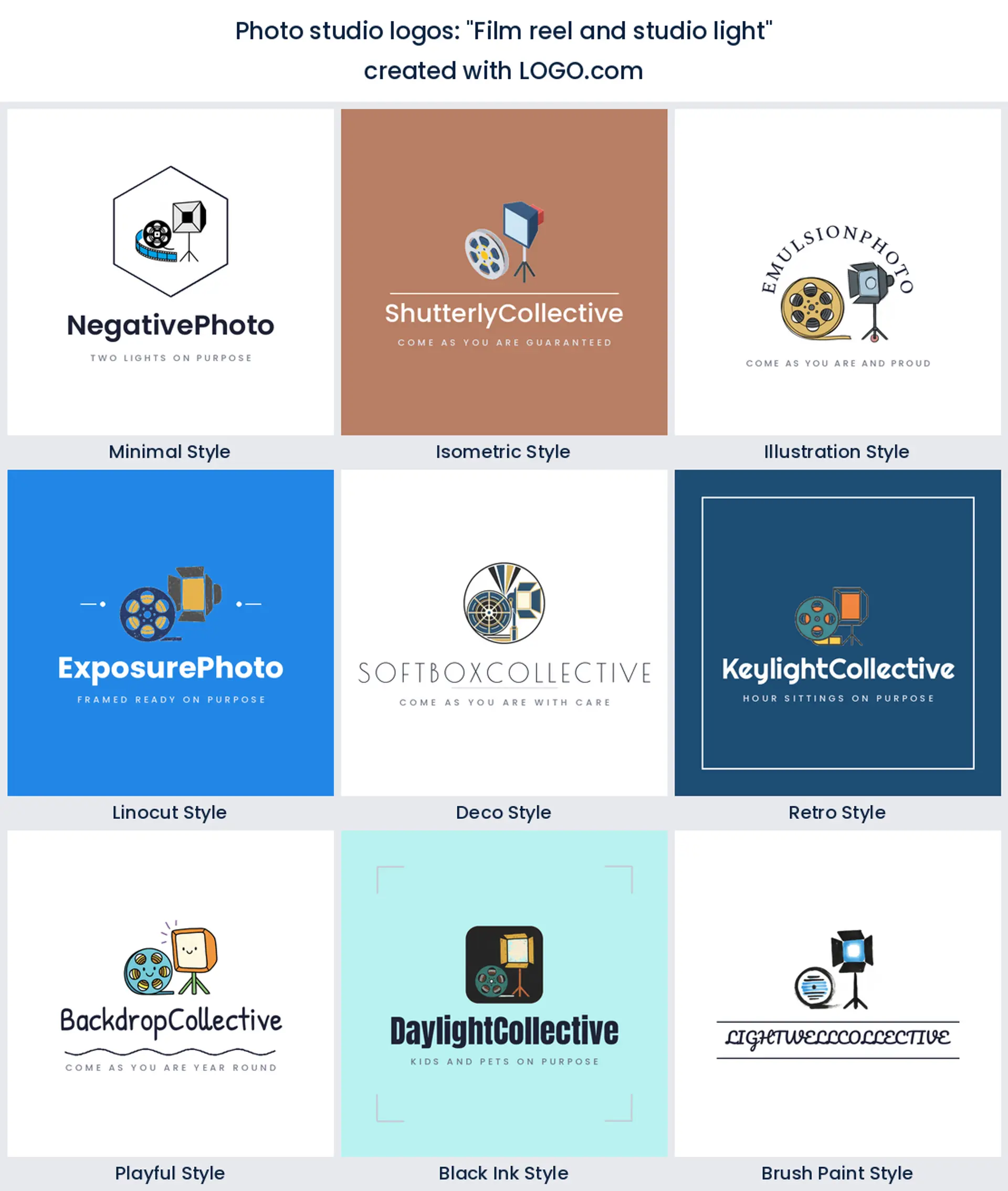
14. "Film reel and studio light"
A reel next to a softbox covers both halves of a studio that shoots stills and motion. Founders wrote it where video is a real part of the business, and it keeps the two services in one mark instead of two logos. Handy for a digital photo studio logo that has to sit on a showreel thumbnail.
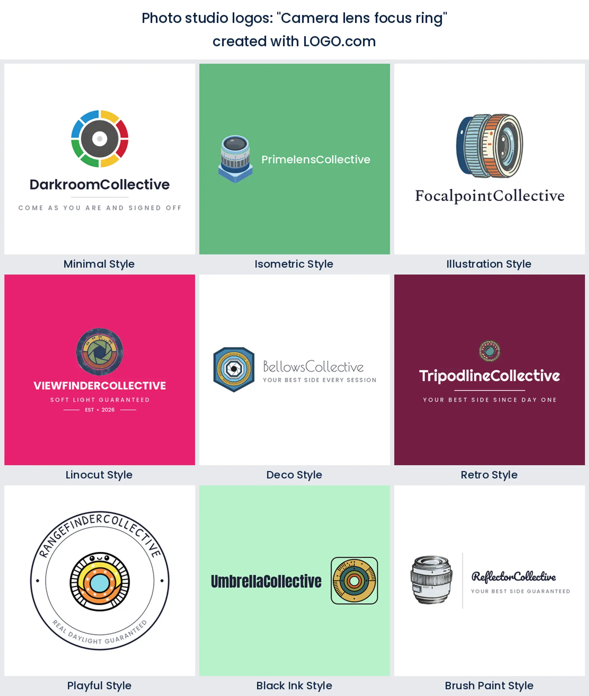
15. "Camera lens focus ring"
The last of the fifteen zooms right out to the barrel, with the ridged focus ring and its distance marks. It is the most tactile prompt in the set and it gives you a nice grippy texture to play with. A good pick if you want the logo to feel like a real piece of glass someone has handled.
Three studio businesses, three different marks
Three quite different businesses hide behind the words photo studio, and your customer decides which mark makes sense. If you hire the room out by the hour, lean on the space itself, a softbox or a light stand, because your customers are photographers buying kit and daylight. If you sell portrait sittings, put a face or a frame in the mark, because your customers are families and they are buying the picture on the wall. If you shoot products for shops and brands, keep it geometric and quiet, an aperture or a lens ring with confident type, so it sits happily in a supplier deck.
Plenty of studios do two of the three. When that happens, pick the one that pays the rent and let the other live in your copy rather than your logo. A mark that tries to say hire, portraits and product at once ends up saying nothing, and it is the fastest way to end up with a photo studio logo you quietly stop using.
Your logo gets cut into vinyl before anyone sees it on screen
Most logos start life on a screen. Yours starts on a roll of vinyl, and that reorders every decision. Begin with the door, because that is the version people meet from across the road: at that distance thin outlines vanish and only the silhouette survives, so check your mark as a solid black shape before you fall in love with the detail. Then the window, where the logo is usually cut from vinyl, which means no gradients and no hairlines. Then the price list and the folder your prints go home in, where you suddenly need it small and sharp.
A quick test that costs nothing. Print the logo at 20mm wide, walk six paces away and look at it. If you can still tell what the icon is, it will hold on a door sign, a stamp and a booking avatar. If it turns to a smudge, simplify the icon rather than enlarging the type. A transparent photo studio logo helps here too, because it lets you drop the same mark onto frosted glass, a dark mount board or a colored backdrop without a white box appearing around it.
How to name a photo studio so your logo has something to hold
Search demand for photo studio name ideas runs alongside the logo searches, which tells you people are usually solving both problems in the same evening. Two things make a name easy to draw. Keep it to one or two words, because a ring or a badge layout gives you about fifteen characters before the letters start colliding with each other. And pick a word with a picture in it: light, north, frame, room, print and glass all give a designer somewhere to go, while initials give them nothing.
Avoid your own full name unless you are the product, since a personal name locks the studio to you and makes it hard to sell or hand over. Say the shortlist out loud on the phone once, then check the domain and the handle before you commit. Once the name is settled the logo takes minutes, and you can test three or four names against the same icon to see which one actually sits well.
Why the studio light is the most underused mark in the category
Look again at the ranking and something odd stands out. Seven of the nine most used symbols are equipment or finished output, and only one, the studio light, actually describes the room you are paying rent on. Founders default to the work, which is fair enough when the work is what people buy.
That leaves the softbox as the most underused shape in the category, and it is the one we would test first if the space is the reason people book you, a big cyc wall, a north facing window, a shelf of period props. A light on a stand tells a visiting photographer exactly what they are renting, and it happens to make a cleaner one ink stamp than any lens. The best photo studio logo is the one that names the thing you actually sell, so settle that before you pick an icon.
Where your color goes when every wall is neutral
You are the only business whose branding sits directly next to your best images, so the palette has one job: stay quiet. In the palettes founders saved for photography and studio brands on LOGO.com, green and blue lead, with brown and a soft blush behind them, almost always over a white or black base. A deep green or a confident blue holds its own on a price list without pulling attention off the print hanging beside it, and the warm tones give family work somewhere friendlier to go.
For type, one strong face is enough. A clean geometric sans suits product and headshot studios, a light serif suits portrait and wedding work, and a script belongs only in the wordmark, never in the small print on a price list. Our logos come with full color icons, and you can keep the multi color version for screen and switch to a one color version for a foil stamp on a print folder, a window cut or an embroidered polo. Whatever you pick, look at it once on a white backdrop and once on a black one, because a studio uses both.
From a free PNG to a two meter backdrop banner
Start at the cheap end. Designing is free and so is the download: the free plan gives you four high resolution PNG files with full commercial use, which is enough for your booking page, your socials, a price list and a photo studio logo png for anyone who asks for one. Nothing is watermarked and nothing is locked behind a payment before you can use it commercially.
You start paying at the other end of the scale, where the sign maker lives. The Brand Plan, about $72 a year, is what adds the vector files, and those are what a fabricator asks for to cut window vinyl or print a two meter backdrop banner, because vectors scale to any size without going soft. It also adds unlimited edits, the auto generated brand guidelines and brand kit, and a branded website with a domain, which covers most of what photo studio branding actually needs in year one.
Make your photo studio logo with LOGO.com
Type your studio name, pick a lens, an aperture, a softbox or a frame, and you will have a photo studio logo design to look at in under a minute. Try a couple of the founder prompts above if you want to see something you would not have thought of, then adjust the colors and the type until it feels like your room. Download the high resolution files free and put it on the door.
Methodology. Ranking taken from 936 custom icon descriptions written on LOGO.com over the 24 months to July 2026 by more than 585 founders whose description named a photo studio subject, meaning a stills camera, a lens or aperture, a shutter, a photo frame or print, a studio light, a film roll or a portrait. Descriptions were grouped into concepts and counted, giving camera lens about 74%, camera aperture about 23% and film roll about 11%. The Photo Studio and Photo Booth industry labels are too small to rank on their own, at 26 and 16 founders, so the set is scoped to the descriptions rather than the label. Colour figures come from saved palettes across the photography and photo studio industry group. Source: LOGO.com first party product data, July 2026.
THE #1 LOGO GENERATOR
Why LOGO.com is the best photo studio logo maker
1.Your first nine icons come from real studio prompts
Your starting icons are not a designer's guess. They are the marks founders described most often when they built a photo studio brand on LOGO.com, so the lens, aperture and softbox you see first are the ones clients already read.
2.Big enough for the studio door
Every logo is drawn to hold its shape as a silhouette, so it still reads from across the road on a door sign or an A board rather than turning into a smudge.
3.Survives the sign maker's vinyl cutter
No hairlines and no gradients you cannot cut. The same mark works when a sign maker takes it to vinyl and when you drop it at 15mm onto a printed price list.
4.A single ink version for foil stamped folders
Keep the full color icon for screen and switch to a single color version for a foil stamp, an embroidered polo or an etched glass door. Both come out of the same logo.
5.Fits the circle on your booking listing
A tight square lockup means your booking page, your maps listing and your socials all get a version that fills the circle instead of floating in it.
6.Nine drawing styles, not nine color swaps
See your name as a linocut, a clean minimal ring, an isometric softbox or a brushed script, then pick the one that matches the room rather than settling for the first draft.
7.Hand the same files to your retoucher and print lab
Colors, fonts and logo files land in one place, so an associate shooter, a retoucher and a print lab all send work back looking like the same studio.
8.Rebrand the day you move rooms
Moved to a bigger room or added video? Edit the logo, keep the name, and download the new files without starting again.
9.Free files you can sell prints under
Designing and previewing costs nothing, and the free plan includes four high resolution PNG files with full commercial use. The Brand Plan adds the vector files for signage and merchandise.
Photo Studio Logo Maker FAQs
Need Inspiration? See example brands in your industry...
3D DesignAcademic WritingAccountantAerospace EngineeringAgricultural ConsultingAgriculture CompanyAmazonAnimal ProtectionAnimationApp DevelopmentAquacultureAromatherapyArt and DesignArtsAsian RestaurantAthleticsAudio TechnicianAuto ManufacturingAuto Repair ServicesBadgeBandBarber ShopBearBeauty and CosmeticsBeeBibleBiotechBitcoinBlogBoatBook PublisherBooks and Literature BlogBrainBuildingBusiness Consulting Logo MakerBusiness StorageCakesCampaignCandlesCarCarpentryCateringCelebrationsChemicalChildrenChoirCircleCivil EngineeringClothingCoffee Shop