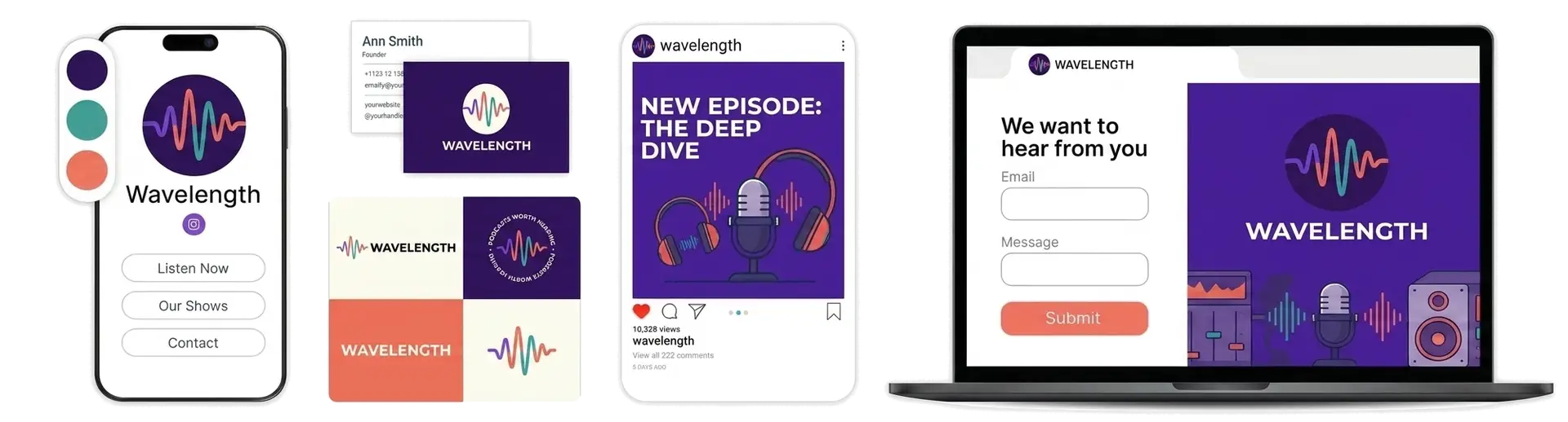
According to LOGO.com data, the most popular podcast logo icons are the microphone (37%), sound waves (15%), and the open book (9%), and the strongest shows pair one simple audio symbol with a bold, legible wordmark that still reads at the size of a phone icon. The icons, colors, and fonts below come from real podcast logos created on LOGO.com, so you can build on what listeners already recognize.
Podcast Logo Maker
Design a podcast logo that works as your cover art and on every podcast app.
Need a different logo maker? Try our AI logo generator.
Logos created using LOGO.com
670,000,000
Podcast logo ideas
Create your own with custom icons, fonts and colors.
Podcast Logos, Ranked From Real Brand Data
Now for the detail behind those choices. The sections below rank the icons podcasters use most on LOGO.com, explain what each one signals and the kind of show it suits, then give you 15 ready ideas to customize. Every figure here comes from real podcast logos created on the platform, so you are building on what listeners already recognize rather than guesswork.
The Most Popular Podcast Logos
The most popular podcast logo icons on LOGO.com are the microphone (37% of podcast logo ideas), sound waves (15%), and the open book (9%), followed by speech bubbles, coffee cups, radio mics, headphones, bells, and play buttons.
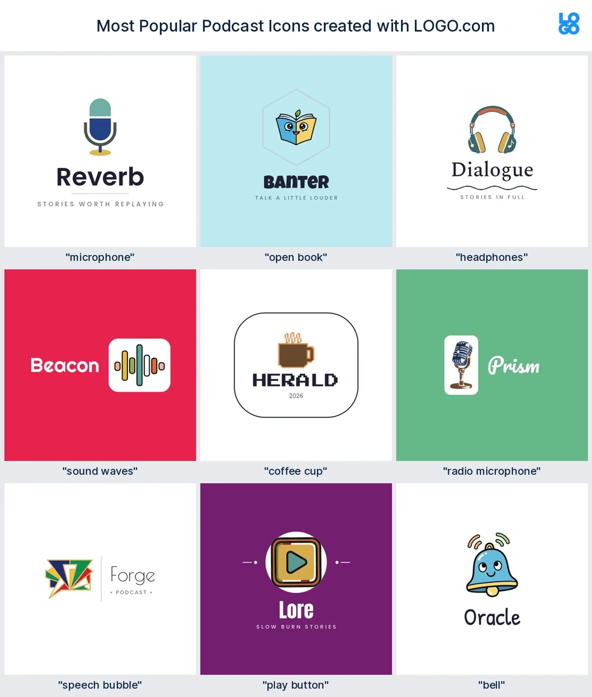
A handful of icons do most of the heavy lifting in podcasting, and the best podcast logos usually lean on one of them. Here are the nine that come up most on LOGO.com, what each one says, and the kind of show it fits.
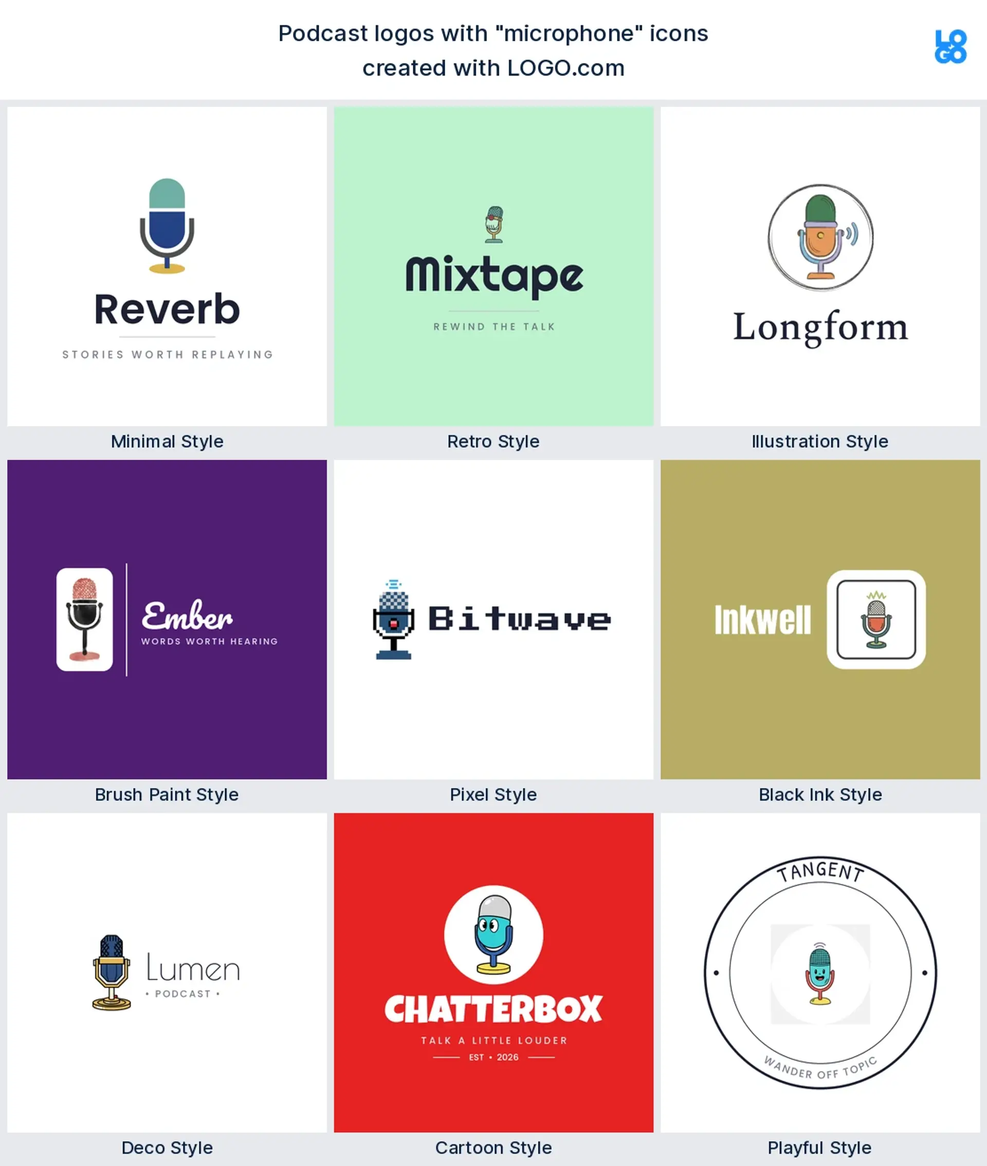
1. Microphone (37%)
The clearest signal there is, and the runaway favorite. A clean mic instantly says press play, which is why it beats every other icon by a mile. It fits almost any genre and pairs perfectly with a bold wordmark.
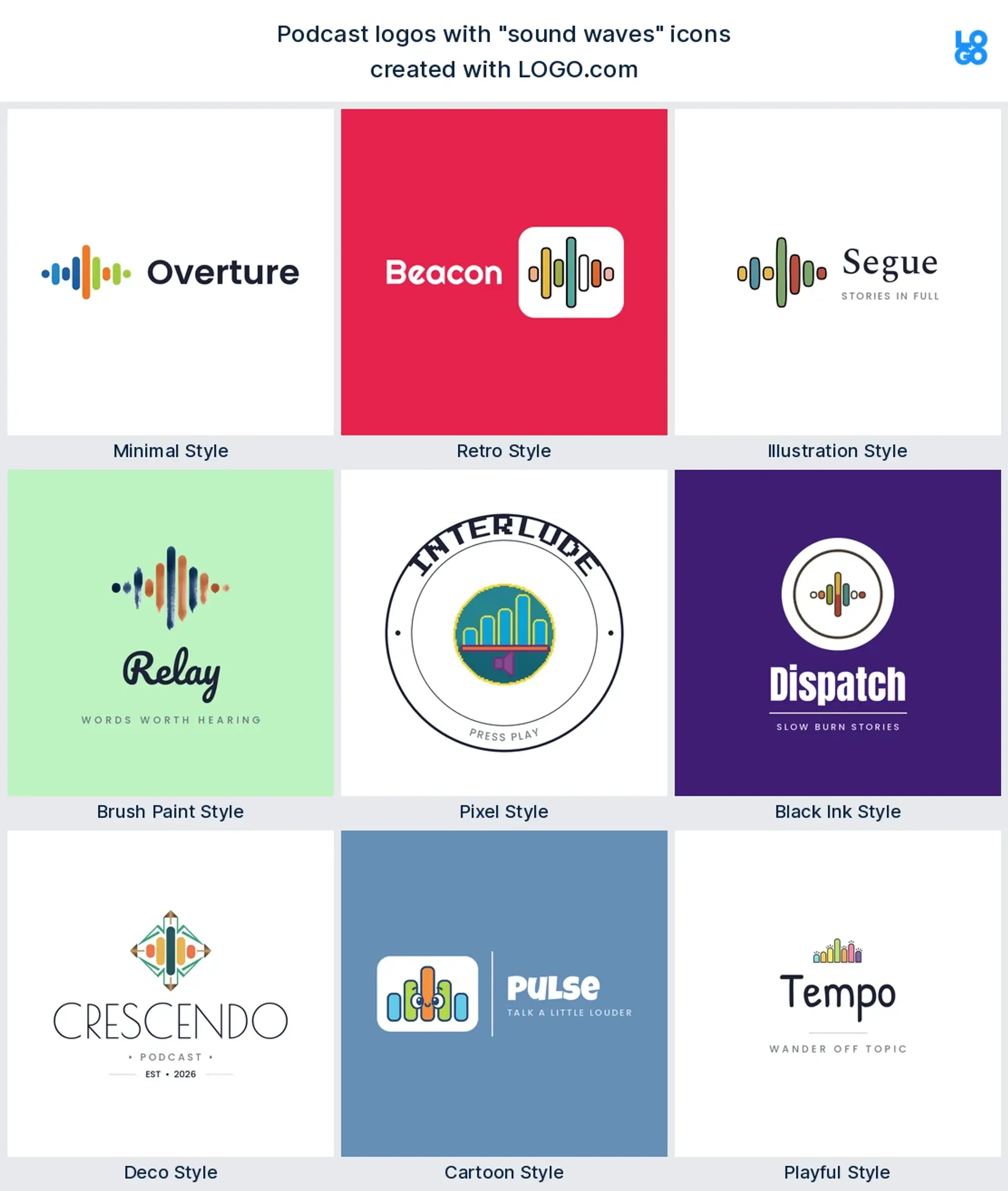
2. Sound waves (15%)
Waves and volume bars say voice and motion without a word. They read well when tiny and look great wrapped around a mic or tucked under your title. A safe bet for talk, music, and interview shows.
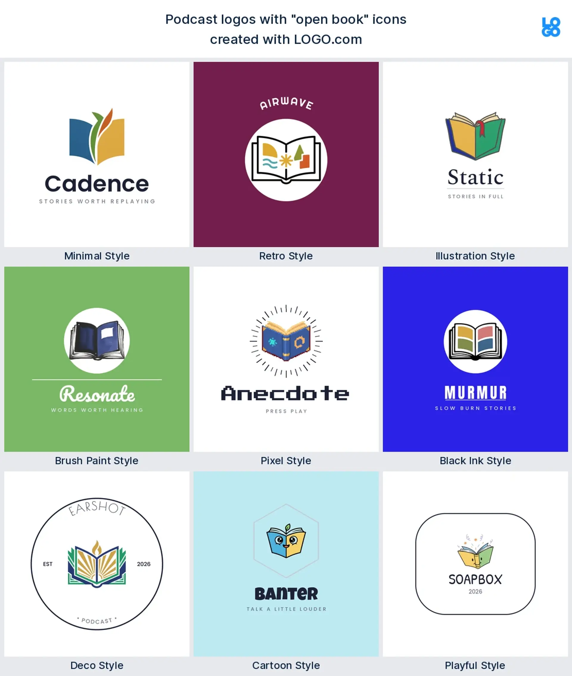
3. Open book (9%)
A favorite for storytelling, education, history, and faith shows. The open book frames your podcast as a place to learn something, and it shines when you add a small audio cue like pages turning into sound waves.
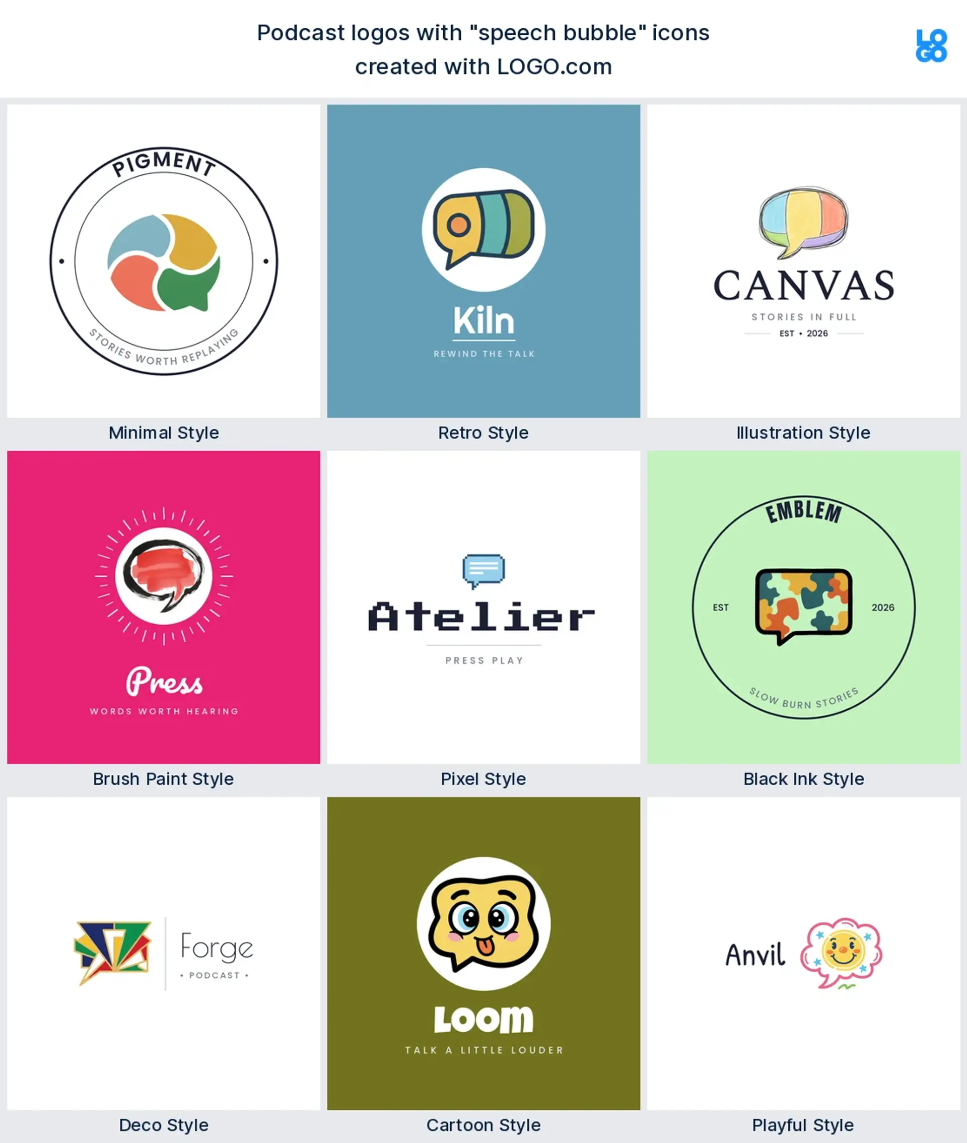
4. Speech bubble (7%)
Conversation, comedy, and interview shows love the speech bubble because it promises real back and forth. Pop a tiny mic or three dots inside and the podcast meaning is unmistakable.
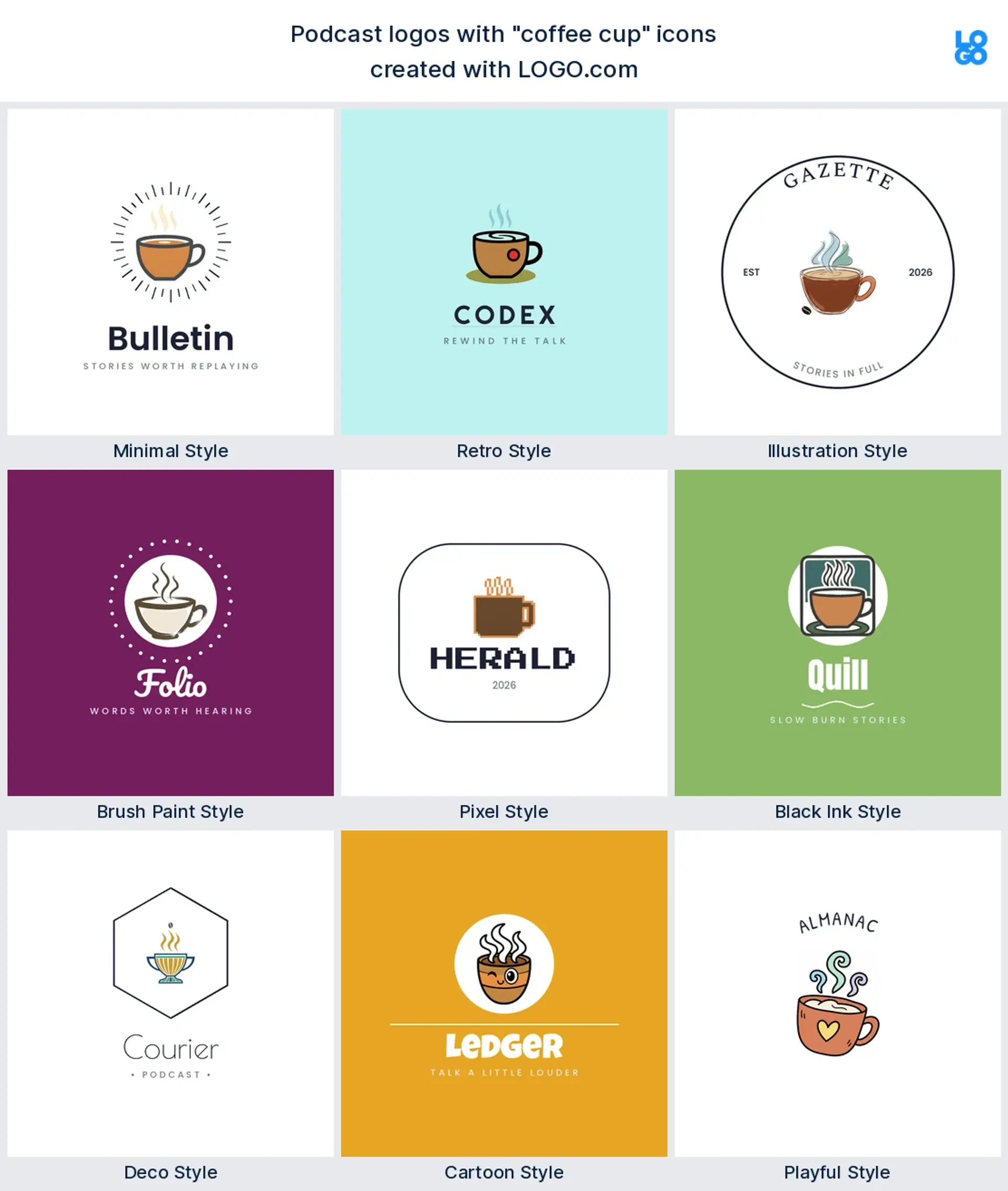
5. Coffee cup (5%)
Coffee, tea, and kettle motifs together show up in about 1 in 20 ideas. They suit the casual chat over a drink format perfectly, and the warmth of a cup signals an easy, friendly listen.
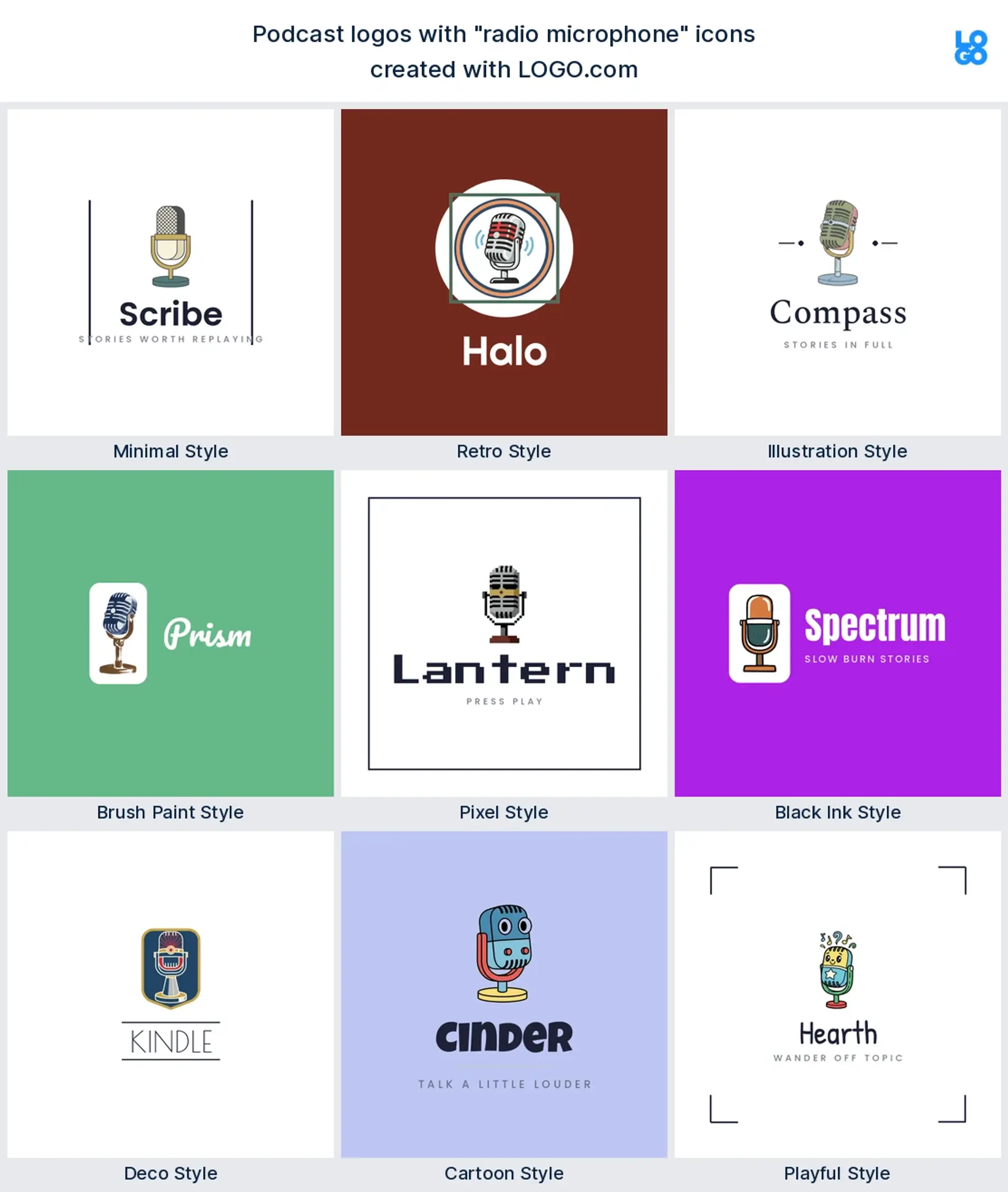
6. Radio microphone (3%)
A vintage broadcast mic leans into heritage and a classic on air feel. Reach for it when you want your show to feel established rather than brand new.
7. Headphones (2%)
A nod to the listener and to studio life. Headphones work best stacked with a mic so you show both sides of the conversation, and they give tech, gaming, and music shows a modern edge.
8. Bell (under 2%)
Small in usage but big in character. The bell plays on hit subscribe and notification culture, and it stands out precisely because so few shows use it.
9. Play button
The timeless shorthand for play. The triangle reads at any size and suits clean, minimal brands. It is also a natural fit if your podcast lives on YouTube as well as audio apps.
15 Podcast Logo Ideas To Inspire Your Show
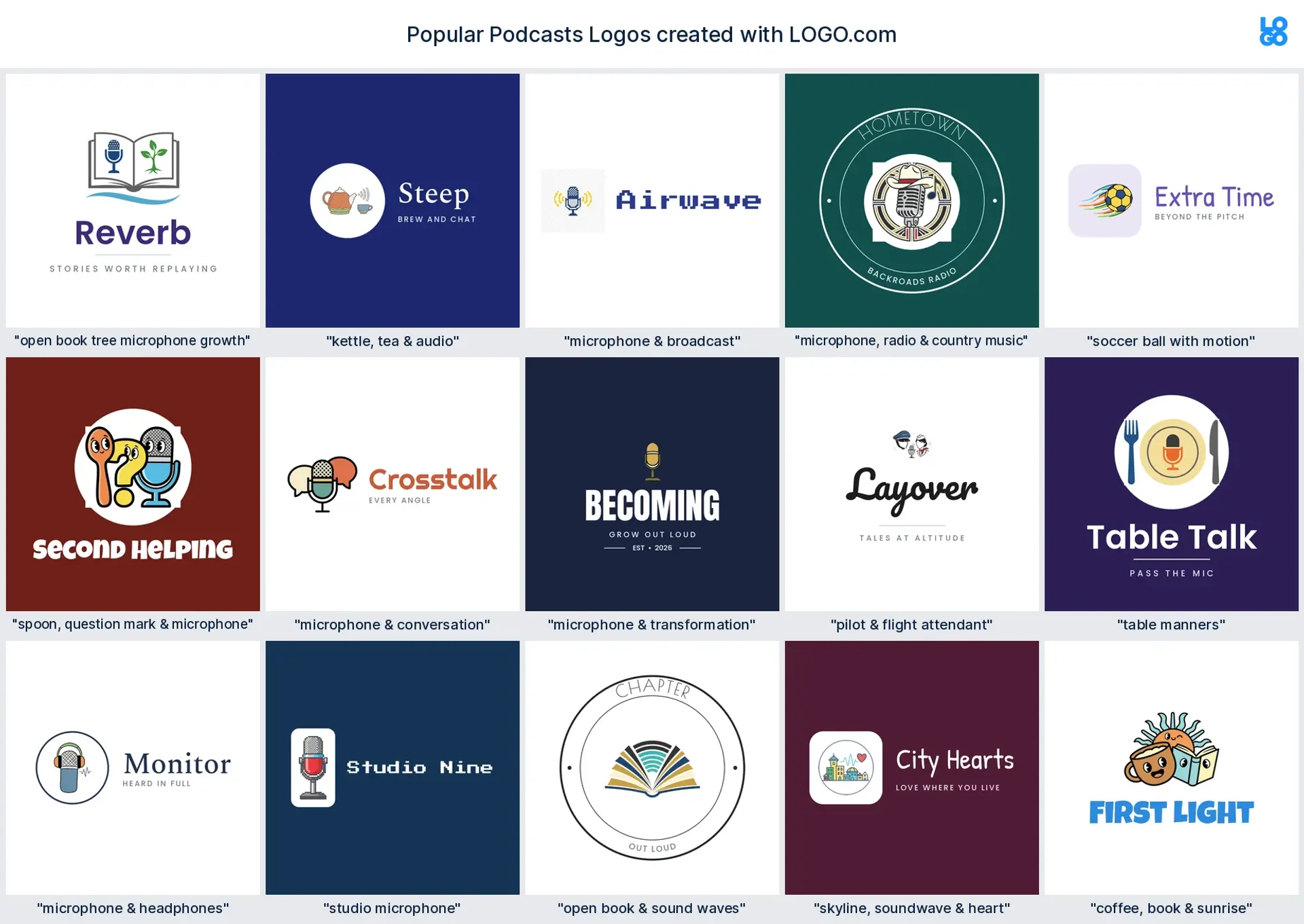
Need a starting point? These 15 podcast logo ideas come straight from real concepts described on LOGO.com, ranked by how often the theme came up. Treat them as podcast logo examples to riff on or remix into your own, and each one is shown across our nine styles so you can picture more creative podcast logo ideas for your show.
1. Studio microphone
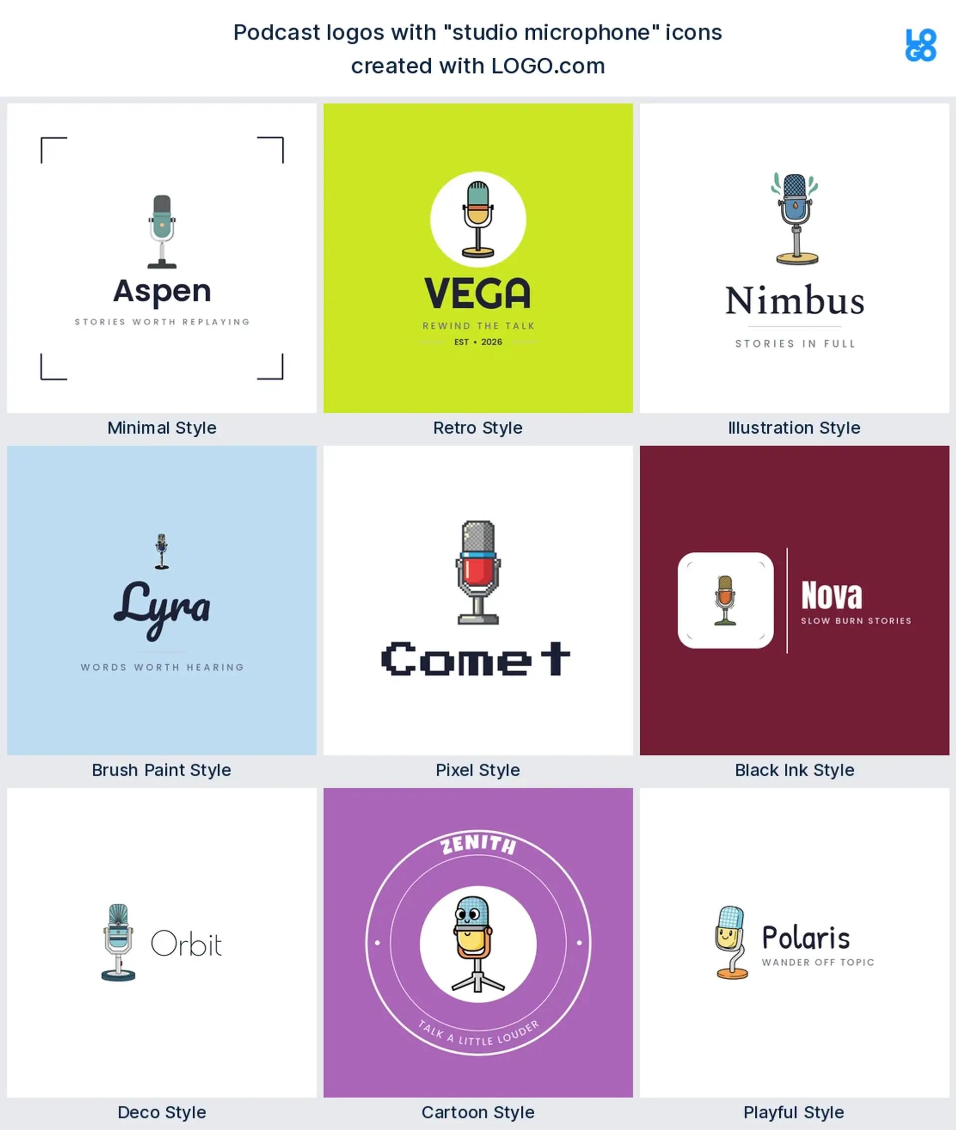
Picture a daily interview or talk show built around great conversation. The logo puts a studio microphone front and center, maybe ringed by a soft circle so it reads like a record button. Keep it to one bold color on white and it stays sharp the moment someone scrolls past. It is the most recognizable podcast logo you can make, and it suits almost any genre that wants to look professional from episode one.
2. Microphone and broadcast
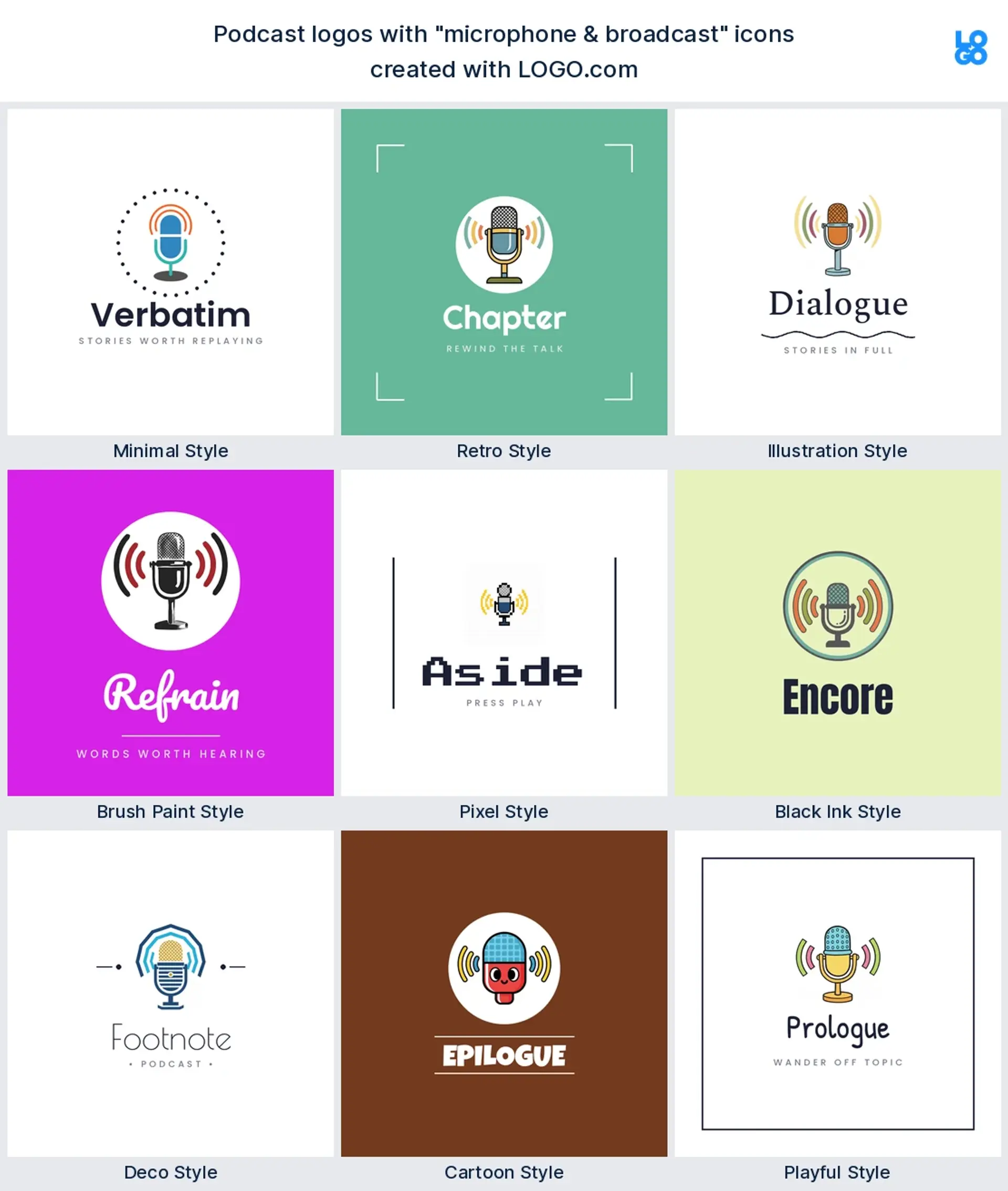
Think a news, sports, or daily briefing show with energy to spare. A mic sits at the center while broadcast lines radiate outward like a signal going live. Pair a deep navy with one bright accent so the on air feeling jumps off the cover art. The branding says timely, current, and worth tuning in to today.
3. Microphone and conversation
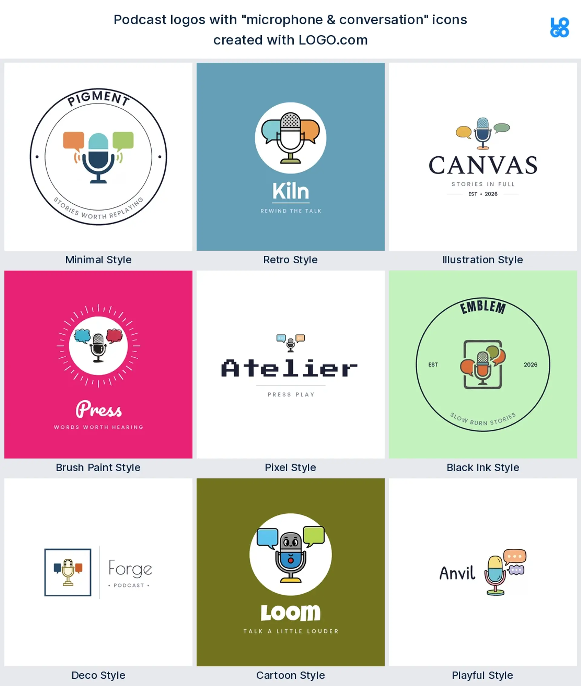
Imagine two hosts, real talk, and a few laughs. A microphone tucked inside a speech bubble instantly signals an interview or chat format. Rounded shapes and a warm, friendly color make it feel welcoming rather than corporate. It is the ideal mark for a podcast built on dialogue.
4. Microphone, radio and country music
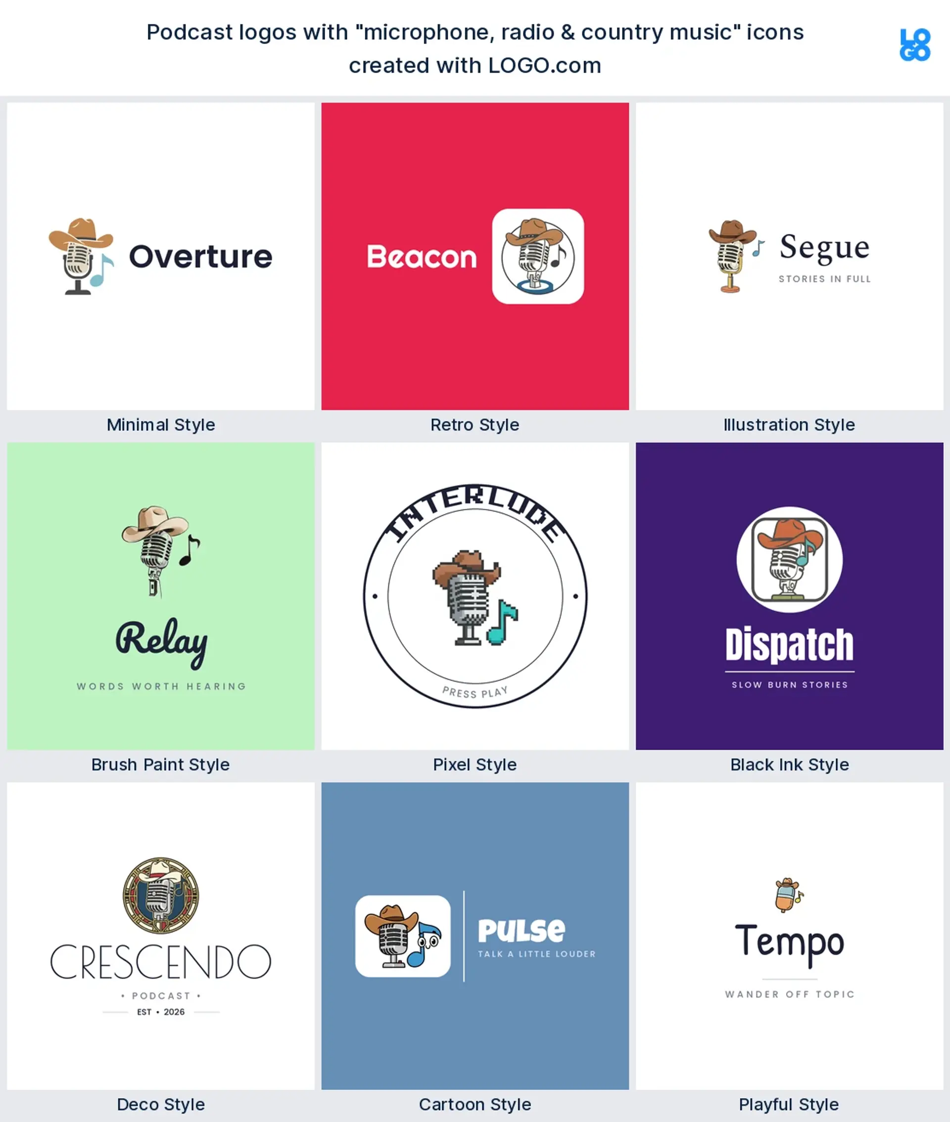
Picture a music, Americana, or storytelling show with roots. A mic paired with a cowboy hat, guitar, or radio wave gives instant genre cues. Earthy tones, a vintage typeface, and a badge style frame lean into the heritage. This logo tells listeners exactly what they are in for before they hit play.
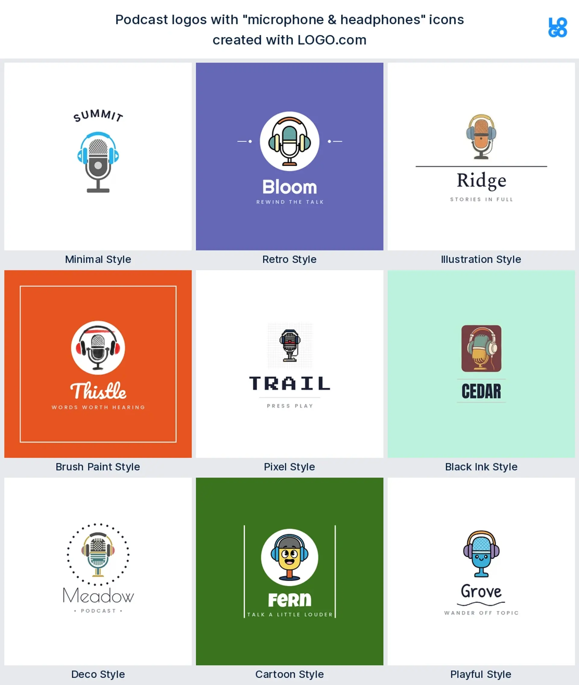
5. Microphone and headphones
Think a tech, gaming, or music production podcast. Combining a mic with headphones shows both sides of the studio, the speaking and the listening. A sleek, minimal style in one confident color feels modern and capable. This is branding for a show that takes its craft seriously.
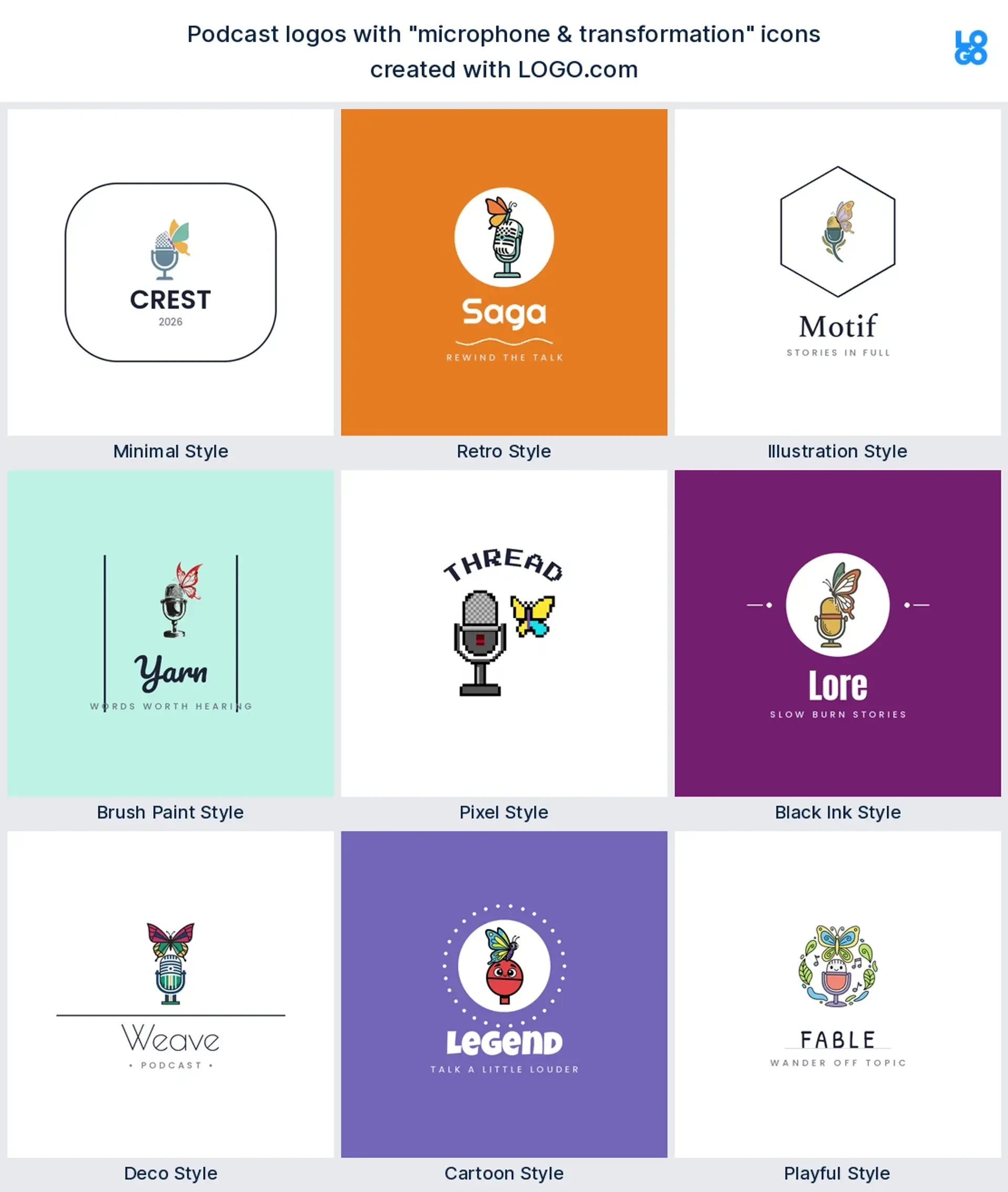
6. Microphone and transformation
Imagine a wellness, mindset, or personal growth show. A microphone paired with a butterfly, arrow, or sprout turns the icon into a story of change. A calm palette or soft gradient makes it feel hopeful and human. This is the logo for a podcast that promises listeners they will leave a little better than they arrived.
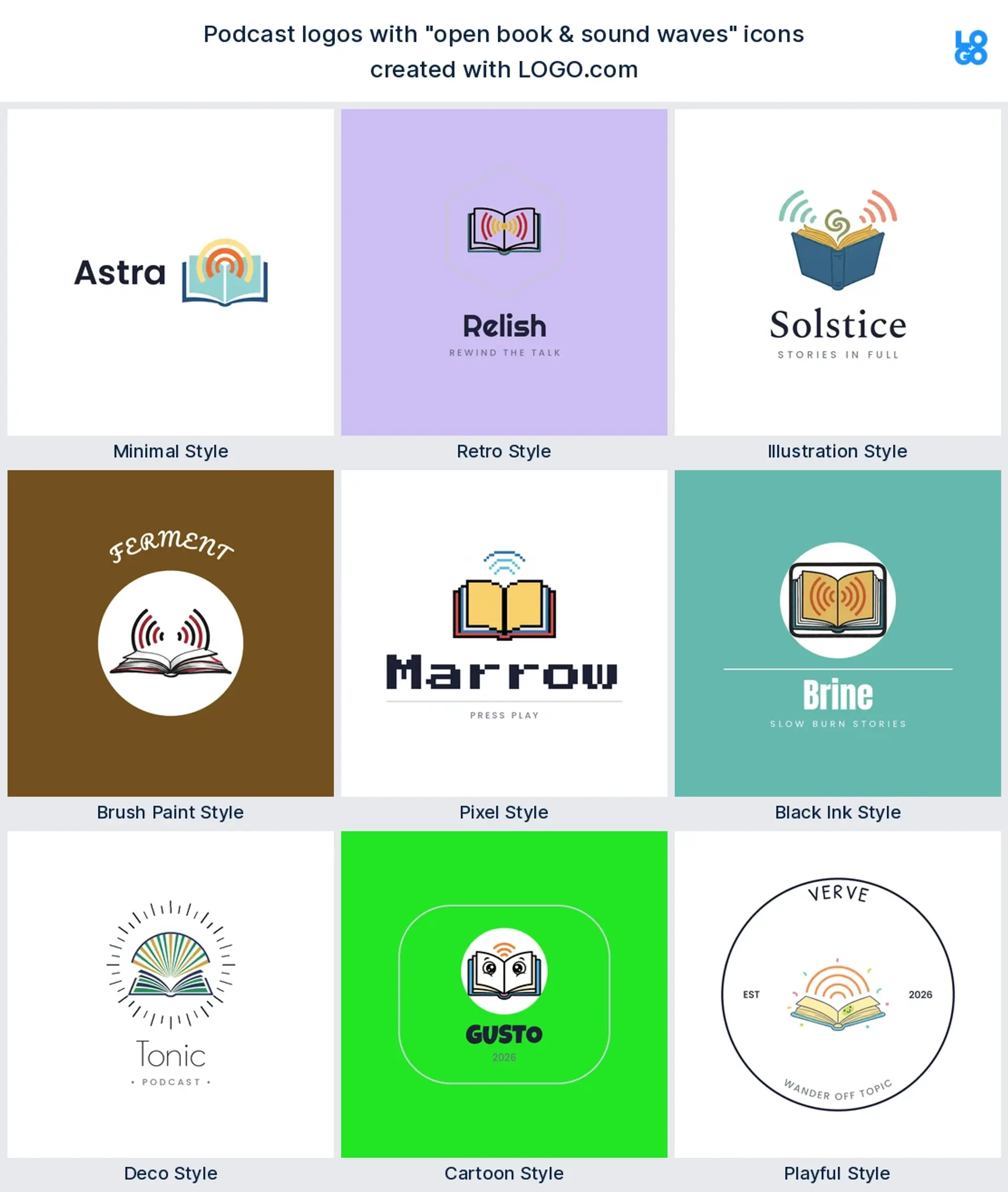
7. Open book and sound waves
Picture a storytelling, history, or book club show. Pages flowing into sound waves marry the written word with the spoken one. A classic serif next to a clean icon feels literary but still modern. The brand says this is a place for stories worth hearing.
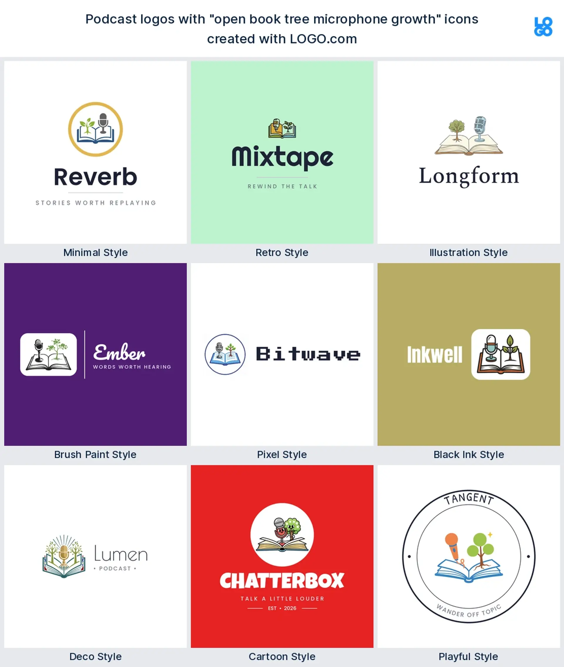
8. Open book, tree and growth
Think an education, faith, or self development podcast. A book that sprouts into a tree turns learning into something living and growing. Greens and warm neutrals reinforce the theme. It is ideal branding for a show that wants to feel nurturing and wise.
9. Skyline, soundwave and heart
Imagine a city culture, relationships, or local community podcast. A skyline stitched together with a sound wave and a heart captures place and emotion in a single mark. Bold duotone colors give it a contemporary, urban edge. This logo says your show is about people, and where they live and love.
10. Soccer ball with motion
Picture a sports talk or fan reaction show. A soccer ball trailing motion lines brings instant energy and movement. Black and white with one punchy accent keeps it sporty and clean. It is branding made for banter, hot takes, and matchday passion.
11. Kettle, tea and audio
Imagine a cozy, slow chat podcast you put on with a warm drink. A kettle or teacup paired with a gentle sound wave sets a relaxed, homely tone. Muted pastels and a handwritten feel make it inviting. This is the logo for a show that feels like catching up with a friend.
12. Coffee, book and sunrise
Think a morning routine, faith, or lifestyle podcast. A coffee cup, an open book, and a rising sun blend ritual, reflection, and a fresh start. Warm oranges and creams give it that early morning glow. The brand promises a calm, grounding way to begin the day.
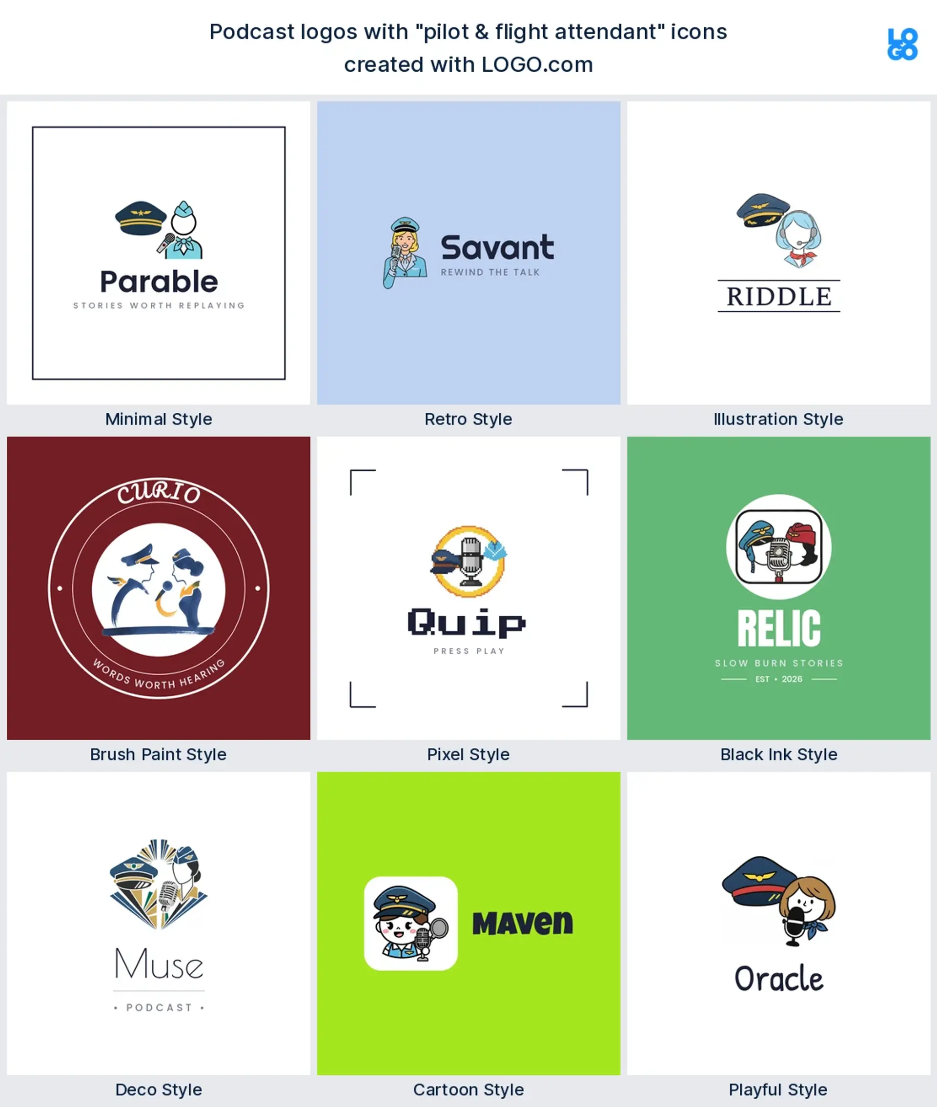
13. Pilot and flight attendant
Picture a travel, aviation, or crew life podcast with personality. Character illustrations of a pilot and flight attendant make the show memorable and human. A retro travel palette and a rounded badge feel like a passport stamp. This logo turns your hosts into a brand listeners recognize at a glance.
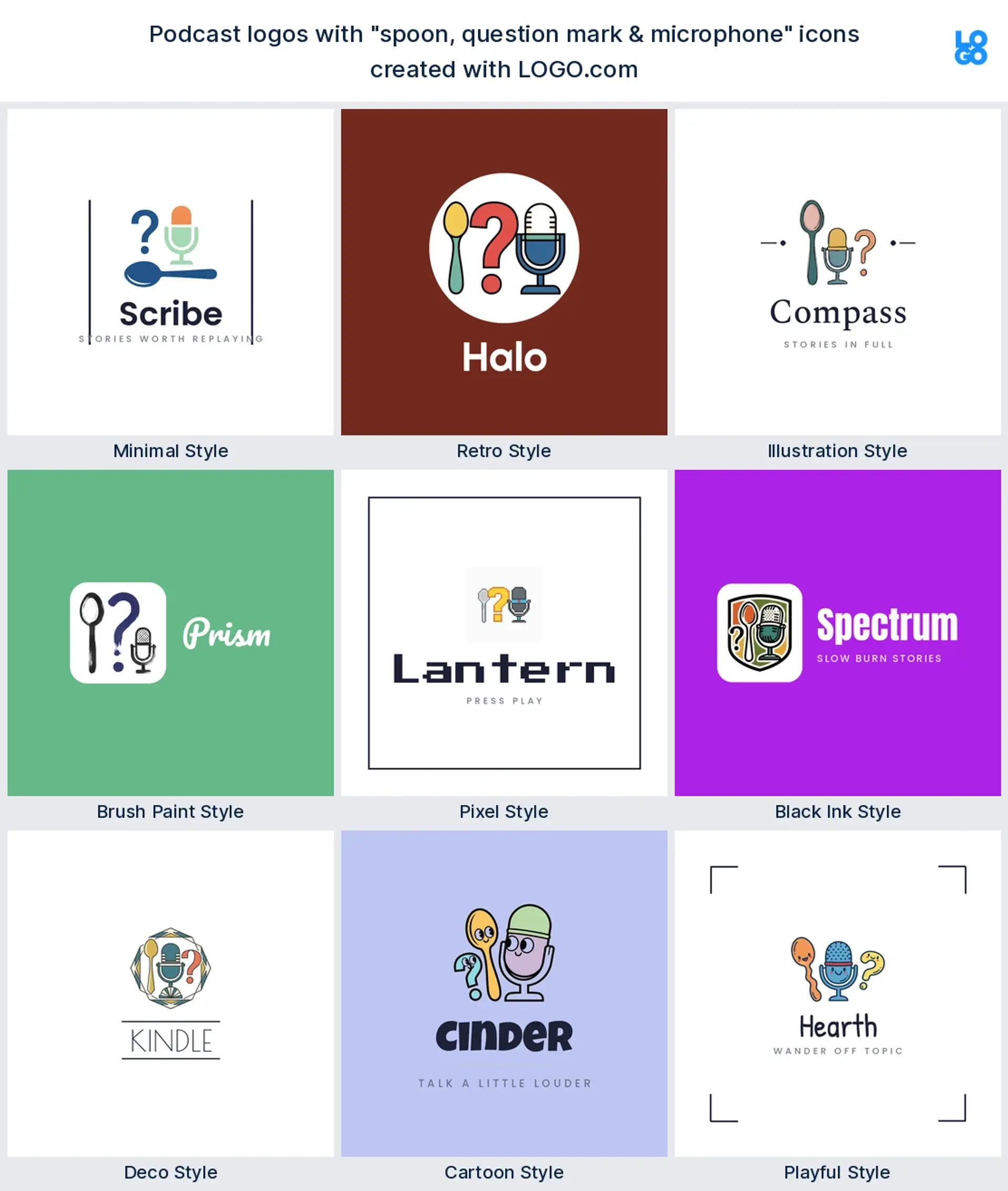
14. Spoon, question mark and microphone
Imagine a food, trivia, or curiosity podcast that loves a twist. A playful mash up of a spoon, a question mark, and a mic signals fun and the unexpected. Bright, contrasting colors and a quirky typeface lean into the humor. It is branding for a show that does not take itself too seriously.
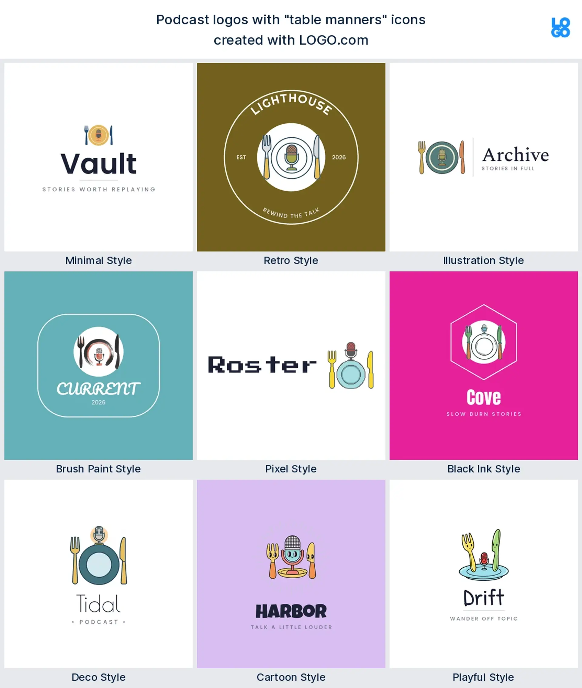
15. Table manners
Think an etiquette, dinner party, or lifestyle podcast with charm. A simple, witty table setting motif pairs beautifully with a clever wordmark. Elegant type and a refined two color palette keep it tasteful. This is the logo for a show that is equal parts polished and playful.
Tips for designing your podcast logo
To design a podcast logo, build it as a 3000 by 3000 pixel square, use bold high contrast color, choose one clear icon, and a legible font. Export it with a solid background, since Apple Podcasts does not allow transparency.
Good podcast logo design comes down to a few small choices once you have a direction. Go bold with color so your logo holds up on light and dark screens, and skip thin lines that vanish when shrunk. Pick a clean, confident font for your show name. Build it as a square from the start so it drops straight into your podcast cover art. And export more than one format, so you have a crisp file for apps, your site, and your merch.
What makes a good podcast logo
A good podcast logo is legible at thumbnail size, built around one clear icon, set in bold high contrast color, and consistent across your cover art and social profiles.
Before you pick an icon, it helps to know what separates a podcast logo that works from one that gets lost. It comes down to four things. It has to stay legible at thumbnail size, since most listeners first meet your show at about 50 pixels wide. It should lean on one clear icon, not a busy scene, so the idea lands in a second. It needs bold color and strong contrast to pop against light and dark app backgrounds. And it should match your cover art and your socials, so your show looks like one brand everywhere.
Design your podcast logo with LOGO.com
Pick an icon that fits your show, choose one of nine styles, then let our podcast logo generator do the rest. Design and preview your logo free, and download a finished podcast logo in minutes.
Methodology. According to LOGO.com first party data, these rankings are based on logos created on LOGO.com during the 12 months ending June 2026. From more than 5.9 million logos created in that period, we isolated the roughly 190 brands whose founders selected the podcast industry, along with the 177 custom icon descriptions those founders wrote. We grouped the descriptions by concept, for example microphone, sound waves, or open book, and ranked each concept by how often it appeared. The microphone was the most common, appearing in 37% of podcast logo descriptions, followed by sound waves at 15% and the open book at 9%. All figures are a share of podcast logo descriptions and are rounded to the nearest percentage point. Source: LOGO.com first party product data, June 2026.
THE #1 LOGO GENERATOR
Why LOGO.com is the best podcast logo maker
1.Built for podcast brands
Icons, layouts, and styles drawn from real podcast logos, so your mark looks like it belongs in a feed of shows.
2.Cover art that fits every app
Export a square logo at the sizes Apple Podcasts and Spotify want, ready to drop straight into your show art.
3.Legible at episode thumbnail size
Your logo stays crisp at about 50 pixels wide, the size most listeners first see your podcast.
4.Every audio icon you need
Microphones, sound waves, headphones, play buttons, and more, the icons podcasters reach for most.
5.AI icons for any show topic
Describe your niche, from true crime to coffee chats, and generate a one of a kind icon for it.
6.Nine styles to match your tone
Minimal, retro, bold, or playful, so your logo sounds like your show before anyone presses play.
7.A full podcast brand kit
Cover art, profile icons, colors, and fonts that stay consistent across every platform you publish on.
8.Ready before episode one
Go from idea to finished podcast logo in minutes, so launch day is never held up by design.
9.Looks right on dark and light
High contrast designs that stand out whether an app shows your cover art on black or white.
10.Refresh between seasons
Update your colors, icon, or wordmark any time you rebrand or kick off a new season.
11.Match your channels and merch
Put the same podcast brand on YouTube, social profiles, stickers, and tour shirts.
12.Free to design and preview
Build and preview your podcast logo for free, and only pay when you download the full files.
Podcast Logo Maker FAQs
Need Inspiration? See example brands in your industry...
3D DesignAcademic WritingAccountantAerospace EngineeringAgricultural ConsultingAgriculture CompanyAmazonAnimal ProtectionAnimationApp DevelopmentAquacultureAromatherapyArt and DesignArtsAsian RestaurantAthleticsAudio TechnicianAuto ManufacturingAuto Repair ServicesBadgeBandBarber ShopBearBeauty and CosmeticsBeeBibleBiotechBitcoinBlogBoatBook PublisherBooks and Literature BlogBrainBuildingBusiness Consulting Logo MakerBusiness StorageCakesCampaignCandlesCarCarpentryCateringCelebrationsChemicalChildrenChoirCircleCivil EngineeringClothingCoffee Shop