Commercial Real Estate Logo Maker
Design a commercial real estate logo that works on building signs and brochures.
Need a different logo maker? Try our AI logo generator.
Logos created using LOGO.com
670,000,000
Modern and urban commercial real estate logos
Investment and portfolio real estate logos
Brokerage and property management logos
Commercial Real Estate Logos, Ranked From Real Founder Prompts
According to LOGO.com data, the symbols commercial property founders reach for most are a plain building or property outline, in about 63 percent of the icon descriptions we read, an actual commercial building in about 28 percent, and a key in about 26 percent, with growth arrows and skylines close behind.
Because a commercial real estate logo has to look just as sure on a leasing sign as it does on a pitch deck, a business card, and a listing thumbnail, the nine styles below are built to stay legible at any size. Start from the symbol that fits your assets, then make it your own with your color and firm name.
On this page
- Which symbols show up most in commercial property logos?
- Fifteen commercial real estate logo ideas from real founder prompts
- Office, retail, industrial, or multifamily: match the mark to your asset class
- Brokerage, investment, or property management: what your logo should signal
- Will it hold up on a building sign, a leasing brochure, and an email signature?
- Colors and fonts that read corporate, stable, and high value
- What the biggest commercial real estate brands get right, and what to borrow
- How much does a commercial real estate logo cost?
- Build your commercial real estate logo with LOGO.com
Commercial real estate branding plays a different game than residential. You are not charming one family into a house, you are convincing a company to sign a ten year lease or an investor to trust you with millions, and the logo has to carry that weight on a tower, a term sheet, and a boardroom screen. The good news is you do not need an agency to look the part. When we grouped the icons real estate and property founders described on LOGO.com, a plain building or property outline led by a wide margin, in roughly 63 percent of them, with commercial buildings and keys close behind. This page breaks down the nine symbols commercial property founders reach for, fifteen real prompts you can borrow, and the choices that make a commercial real estate logo look stable, credible, and worth a long lease.
Which symbols show up most in commercial property logos?
Commercial real estate is a broad tent, from a downtown office broker to an industrial developer to a multifamily investor, and these nine symbols come from across all of it. A building or property shape anchors most of them, then the shape of a commercial building, then the key that stands for a closed deal. After that the set widens into growth arrows, land, skylines, and the paperwork that moves a transaction. Pick the symbol closest to the assets you work with, keep it to one bold shape, and it will still read on a tower sign and in a tiny listing thumbnail.
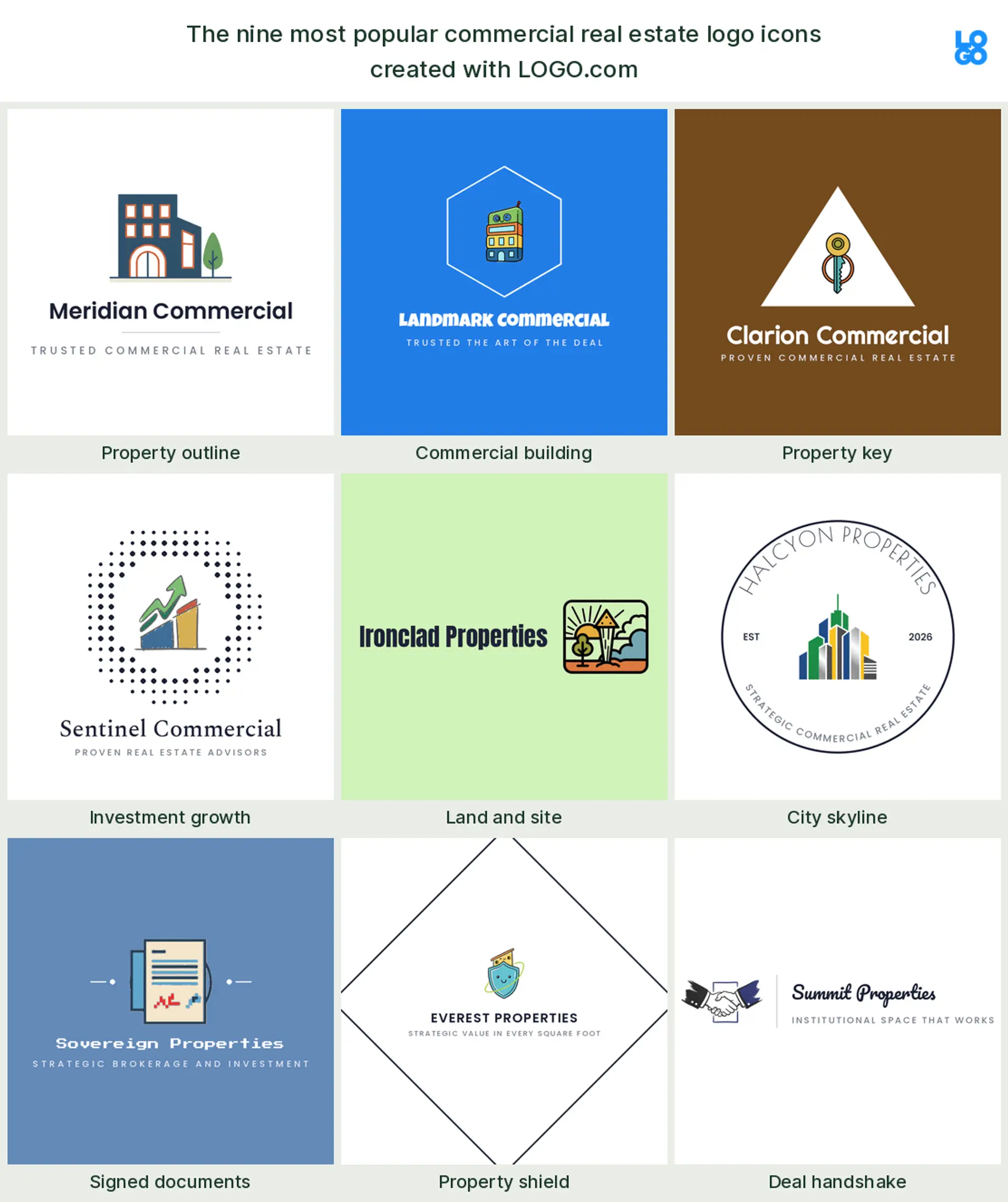
Property outline
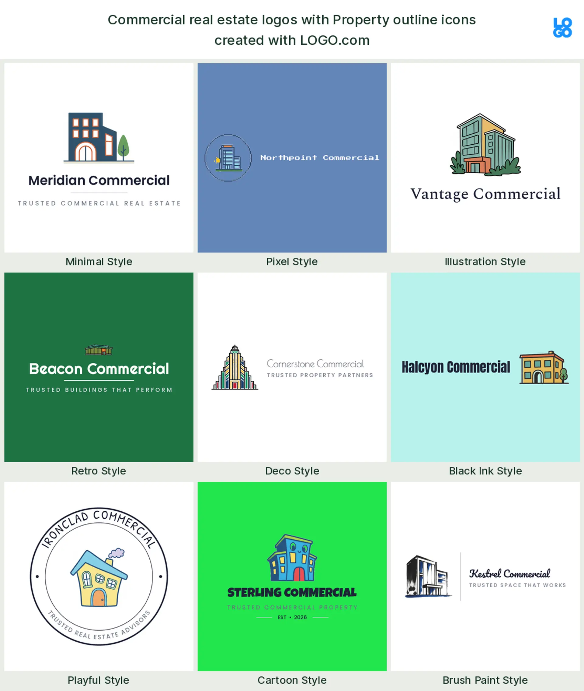
The most common element by far is the plain shape of a property, in about 63 percent of the icon descriptions we read. A clean building or roofline outline says real estate in a single glance without tying you to one asset class, which is why it is the safe default for a commercial real estate logo or a broader real estate company logo. Kept to a few confident strokes, it reads as solid rather than generic.
Commercial building
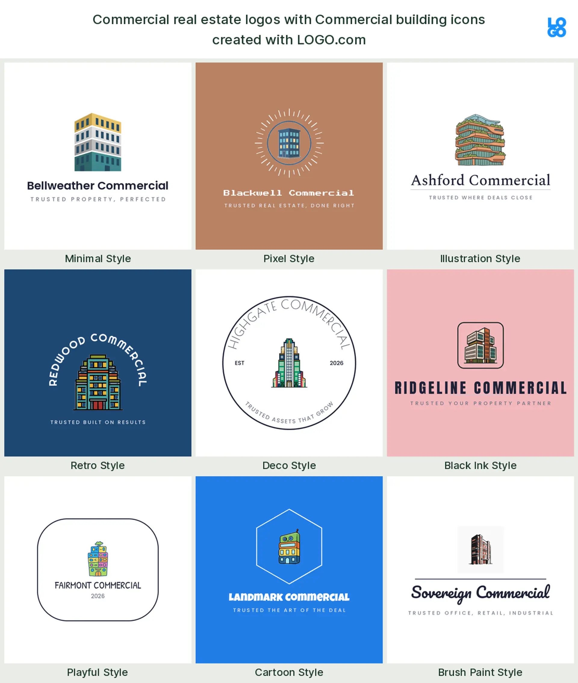
Right behind it, in roughly 28 percent of the prompts, founders describe an actual commercial building, an office block, a tower, a multi story facade. This is the mark to reach for when you want to look distinctly commercial rather than residential, so it suits an office, retail, or mixed use commercial real estate logo. A few clean floors and a strong vertical line do the whole job.
Property key
A key turns up in about 26 percent of the descriptions, usually paired with a building or a door. In commercial property the key reads as a closed deal and a handed over space, so it makes a warm, human real estate agency logo or a mark for a brokerage that wants to feel approachable. It pairs beautifully with a building outline.
Investment growth
Next, founders reach for growth: an upward arrow, a rising graph, a coin. It points straight at returns and appreciation, which is why it fits a real estate investment or a real estate development logo, or any firm that sells performance more than paint. Keep the arrow simple so it does not read like a generic finance mark.
Land and site
A little further down, designers describe land itself, a plot, a site marker, a parcel. Ground is where every commercial deal begins, so a land or site symbol suits a land brokerage, a developer, or a real estate development logo that wants to signal it builds from the dirt up. It reads calm and long term.
City skyline
The skyline is the ambitious pick, a row of towers standing together. It says scale and a portfolio across a city, which makes a confident commercial real estate logo for an investment group or a firm that works the whole downtown. A simple silhouette of three or four buildings carries more weight than a detailed cityscape.
Signed document
Founders also point at the paperwork, a signed contract, a document, a magnifier over the fine print. It leans toward the diligence side of the business, so it fits a property management logo, a title or advisory firm, or any brand that wants to signal a deal done right. Show one page and a clean signature line, nothing more.
Property shield
A shield around a building shows up when founders want to signal protection and trust. It reads as security, stewardship, and a safe pair of hands, which suits a property management logo or an insurance leaning real estate company logo. A crest can tip formal fast, so keep the inside simple.
Deal handshake
Last in the nine is the handshake, the deal itself. It is the most human symbol in the set, all relationships and repeat clients, which makes it a natural brokerage or real estate agency logo for a firm that wins on service. Pair it with a small building so nobody mistakes it for a generic consultancy.
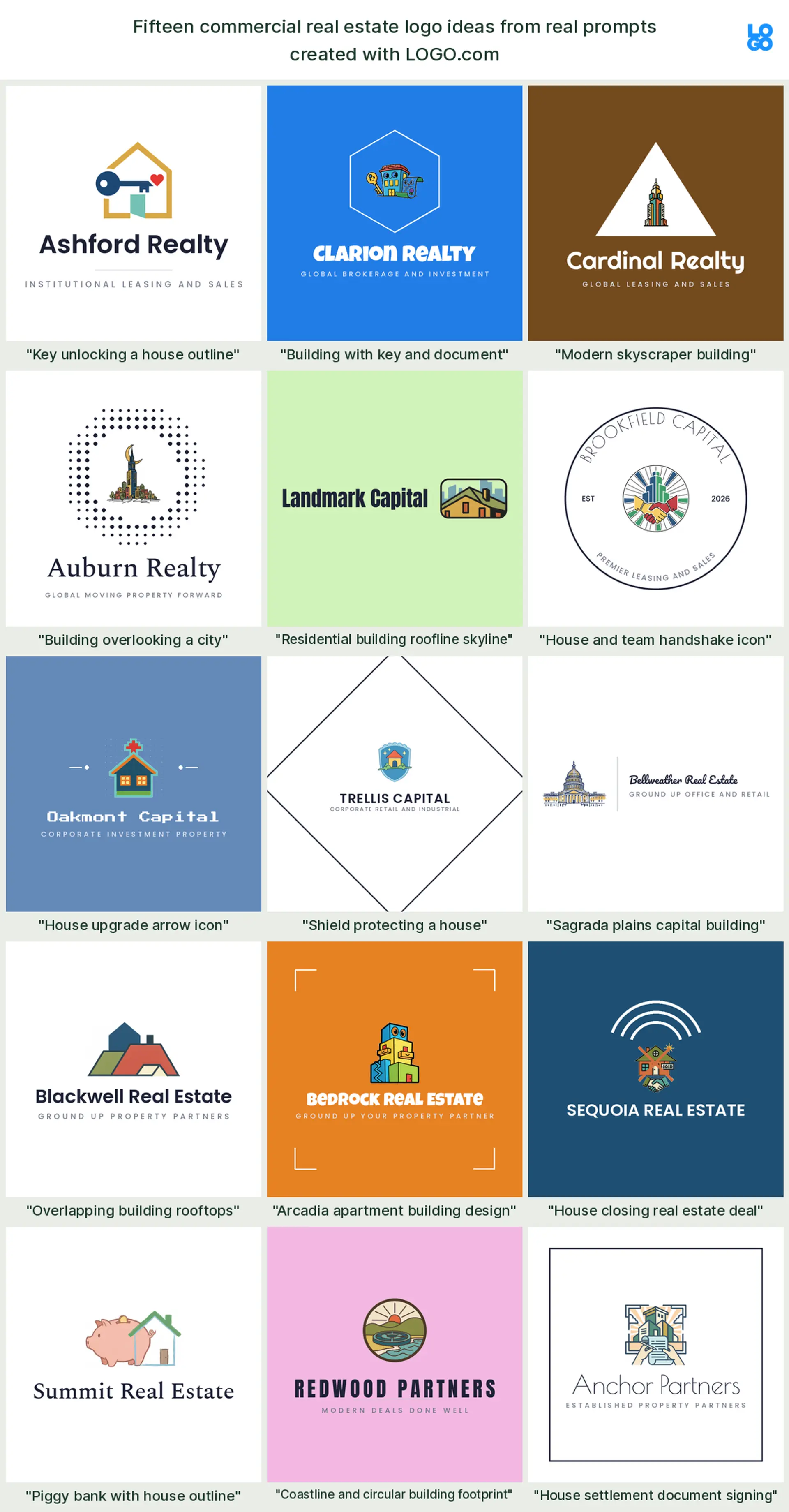
Fifteen commercial real estate logo ideas from real founder prompts
These fifteen are the exact icon descriptions real estate and property founders typed into LOGO.com, shown across the nine styles so you can watch each one move from clean and corporate to bold and modern. They build on the plain top nine but carry more of a story, and any of them can hold your firm name. Treat them as commercial real estate logo ideas to start from, then change the color, font, and wordmark until the mark fits your shop.
"Key unlocking a house outline"
A key turning inside a property outline reads as a closed deal in one clean shape, exactly as a founder pictured it. It makes a warm brokerage or real estate agency logo that leads with getting clients into space.
"Building with key and document"
One founder combined a building, a key, and a document, the three beats of a commercial transaction. It suits a full service real estate company logo or a property management logo that handles the whole lifecycle.
"Modern skyscraper building"
A single modern tower is the most direct commercial statement there is. It makes a confident office or downtown commercial real estate logo for a broker who works the tall buildings.
"Building overlooking a city"
Set one building above a low skyline and you get a firm that leads its market, just as a founder framed it. It reads as an ambitious real estate development logo or an investment group mark.
"Residential building roofline skyline"
A run of rooflines against a skyline says multifamily and mixed use in one line. It suits an apartment developer or a multifamily commercial real estate logo, a real founder prompt with range.
"House and team handshake icon"
A handshake under a roof puts the relationship front and center, exactly as a founder described. It makes a service led brokerage or real estate agency logo for a team that wins on trust.
"House upgrade arrow icon"
Add an upward arrow to a property and the mark quietly promises appreciation. It reads as a real estate investment or value add real estate development logo, a founder favourite for growth.
"Shield protecting a house"
A shield wrapped around a building signals stewardship and a safe asset. It suits a property management logo or an insurance leaning real estate company logo, just as a founder imagined it.
"Sagrada plains capital building"
A columned capital building carries gravity and permanence in a single silhouette. It makes an institutional or luxury real estate logo for a firm that wants to read established, a genuine founder prompt.
"Overlapping building rooftops"
Overlapping rooftops read as a portfolio of assets rather than a single deal. It suits an investment group or a property management logo that runs many buildings at once.
"Arcadia apartment building design"
A clean apartment block names the specialty plainly, exactly as a founder wrote it. It is a natural multifamily or apartment focused commercial real estate logo.
"House closing real estate deal"
A property marked with a closing beat celebrates the moment the deal lands, a founder prompt built for brokers. It reads as a closing focused brokerage or real estate agency logo.
"Piggy bank with house outline"
A piggy bank beside a property makes the investment angle friendly and plain, just as a founder pictured it. It suits a real estate investment fund or a small real estate development logo.
"Coastline and circular building footprint"
A coastline framing a building footprint ties a project to its location, a distinctive founder prompt. It makes a memorable resort, waterfront, or coastal commercial real estate logo.
"House settlement document signing"
A property over a signed settlement puts the paperwork, the part that actually closes a deal, at the heart of the mark. It fits a title, escrow, or property management logo, straight from a founder prompt.
Office, retail, industrial, or multifamily: match the mark to your asset class
Let the logo say which buildings you actually work with. Focus on offices and downtown towers? A tall building or a skyline reads instantly as a commercial real estate logo for the corporate world. Lease retail and mixed use? A friendlier facade with a door or an awning fits the street level feel. Live in industrial, warehouses, and logistics? Go low, wide, and structural, a long roofline or a simple geometric block. Build or own apartments? A run of rooflines makes a clear multifamily mark. And if you cover several asset classes, a plain property outline or a monogram keeps you flexible so you are not boxed into one sector. Pick the assets you are known for and build the mark around that one idea.
Brokerage, investment, or property management: what your logo should signal
Your business model changes what the mark needs to say. If you are a brokerage, you sell relationships and closed deals, so a handshake, a key, or a confident wordmark reads right for a real estate agency logo. If you invest or develop, you sell returns, so a growth arrow, a rising skyline, or a clean geometric building suits a real estate development logo or an investment mark. If you manage property, you sell reliability and care, so a shield, a steady building, or a calm monogram makes a trustworthy property management logo. Name the promise you make to clients first, then choose the symbol that says it fastest.
Will it hold up on a building sign, a leasing brochure, and an email signature?
A commercial real estate logo lives in more places than most, and the tough ones are the biggest and the smallest. It has to read at fifty feet on the crown of a building or a monument sign at the entrance, and it has to stay sharp shrunk into an email signature, a listing thumbnail, and a leasing brochure header. That is why a single bold shape beats a detailed illustration every time. Test yours the honest way: shrink it until it is the size of a favicon and hold it at arm's length. If the building, key, or arrow still reads and the firm name is legible, it will survive the leasing sign and the pitch deck alike.
Colors and fonts that read corporate, stable, and high value
Color signals what kind of firm you are before anyone reads the name. When we looked at the palettes real estate and property founders actually picked on LOGO.com, green just edged out blue at the top, with warm brass and a muted orange not far behind. That fits the business: a deep blue reads corporate and trustworthy, a forest or emerald green reads growth and money, and a brass or bronze accent adds the premium, high value feel that suits a luxury real estate logo. For type, a strong serif looks institutional and established, while a clean geometric sans reads as a modern real estate company logo. Keep it to one confident color plus a neutral, give the mark room, and let the restraint signal that you are the serious option.
What the biggest commercial real estate brands get right, and what to borrow
Look at the firms that dominate commercial real estate and a pattern jumps out. The largest brokerages and investment houses almost never use a picture at all. They run plain, confident lettermarks, three or four initials set in a strong typeface, because at their scale the name is the asset. There is a lesson in that for any new firm: a clean monogram reads more institutional than a clip art building ever will, and it survives every surface from a rooftop sign to a favicon. Borrow the restraint, not the exact letters. If you want a touch more warmth than a pure lettermark, add one small building or key beside your initials and stop there. The move that separates a credible commercial real estate logo from a generic one is knowing when to leave the picture out.
How much does a commercial real estate logo cost?
Less than you would guess, because getting started is free. Designing and previewing your logo on LOGO.com costs nothing, and you can download a high resolution PNG with full commercial use without paying, so a new brokerage or fund can brand its website, proposals, and listing profiles from day one. When you need the logo printed big and crisp, on a building sign, a monument sign, a vehicle wrap, or a leasing banner, the Brand Plan adds the vector files, unlimited edits, and a brand kit that keeps every pitch deck and offering memorandum on brand. Full commercial use comes with both the free and paid downloads, so you never pay just to put your own commercial real estate logo on a client deal.
Build your commercial real estate logo with LOGO.com
Pick the symbol that fits your assets, choose one of nine styles, and our free commercial real estate logo maker builds the rest around your firm name. Preview it free, download a high resolution PNG with full commercial use, and walk out with one confident, credible mark ready for your leasing signs, your pitch decks, and your business cards in minutes.
Methodology. These figures come from logos created on LOGO.com during the 12 months ending July 2026. There is no dedicated commercial real estate industry in our data, so we widened the lens to the roughly 1429 founders who selected a real estate or property industry, including property management, development, and investment, and grouped the 87 relevant icon descriptions they wrote by concept, keeping the commercial ones, offices, buildings, skylines, keys, and investment. A property or building outline was most common, in about 63 percent of those descriptions, followed by a commercial building in about 28 percent and a key in about 26 percent. Because many logos combine two symbols, these shares overlap and do not add up to 100. Figures are rounded to the nearest percentage point. Source: LOGO.com first party product data, July 2026.
THE #1 LOGO GENERATOR
Why LOGO.com is the best commercial real estate logo maker
1.Ranked from what real property founders choose
The symbols and styles come from the icons real estate and property founders described on LOGO.com, so you start from what works for the business, not generic clip art.
2.From firm name to finished logo in minutes
Enter your firm name, pick a symbol and a style, and you have a finished commercial real estate logo in minutes, not weeks of agency back and forth.
3.Legible on a building sign and a listing thumbnail
Your mark stays sharp at fifty feet on a monument sign and shrunk into a listing thumbnail, where thin lines and fine detail usually disappear.
4.Transparent PNG for brochures and pitch decks
Download a transparent logo that drops cleanly onto a leasing brochure, an offering memorandum, or a pitch deck with no white box around it.
5.One identity for signage, site, and email
Design it once and it carries across your building signs, your website, your listing profiles, and every email signature on the team.
6.Full color or a single ink version
Choose a full color icon or a quiet single color version that reads as a luxury real estate logo on an etched sign, a wax seal, or a stamped folder.
7.Nine styles, corporate to boutique
Match your firm, from an institutional serif monogram to a clean modern building mark, all built to read small and print big.
8.A monogram and a full firm name to match
Keep a compact monogram of your initials and the full firm name, so you have the right version for a favicon and a rooftop sign.
9.Free to design, cleared for commercial use
Preview free and download a high resolution PNG with full commercial use, then upgrade to the Brand Plan for vector files to print signage, wraps, and banners.
Commercial Real Estate Logo Maker FAQs
Need Inspiration? See example brands in your industry...
3D DesignAcademic WritingAccountantAerospace EngineeringAgricultural ConsultingAgriculture CompanyAmazonAnimal ProtectionAnimationApp DevelopmentAquacultureAromatherapyArt and DesignArtsAsian RestaurantAthleticsAudio TechnicianAuto ManufacturingAuto Repair ServicesBadgeBandBarber ShopBearBeauty and CosmeticsBeeBibleBiotechBitcoinBlogBoatBook PublisherBooks and Literature BlogBrainBuildingBusiness Consulting Logo MakerBusiness StorageCakesCampaignCandlesCarCarpentryCateringCelebrationsChemicalChildrenChoirCircleCivil EngineeringClothingCoffee Shop