Football Logo Maker
Design a football team logo that looks good on helmet decals and jerseys.
Need a different logo maker? Try our AI logo generator.
Logos created using LOGO.com
670,000,000
Helmet and mascot football logos

Crown, crest and player football logos

Gridiron action and playbook football logos

Football Logos, Ranked From Real Founder Prompts
According to LOGO.com data, the football helmet is the symbol founders ask for most, turning up in about 23% of the 463 custom football icon descriptions we counted, ahead of a football player at about 11% and a team crest at about 10%.
The nine symbols below are what those 463 people actually described, so every shape here has already passed the only test that matters, which is a stranger recognising the sport before they read the name. Under them sit fifteen football logo ideas quoted word for word from founder prompts, each drawn in all nine styles.
On this page
- Nearly a quarter of founders asked for the same thing: nine football symbols ranked
- Fifteen football logos, typed by founders and drawn nine ways
- Which way should the helmet face on your logo?
- What makes a fantasy football logo worth screenshotting
- Flag football, youth, and travel teams all want different marks
- Football or American football? What to put in the name
- Why a green logo disappears on a green field
- Make your football logo with LOGO.com
Nearly a quarter of the football icon descriptions founders type into LOGO.com ask for a helmet. Not the ball, not a shield, a helmet. We read 463 custom football icon descriptions written by real people building a football logo on LOGO.com, sorted them by the shape founders actually asked for, and turned the result into nine ranked symbols and fifteen ideas you can take straight into the editor. Whether you are naming a varsity squad, a booster club, or the fantasy league you have run since college, this is what already works.
Nearly a quarter of founders asked for the same thing: nine football symbols ranked
A football logo has an unusual amount of competition inside it. The helmet, the ball, the player, the field, and the crest are all fair game, and founders do not agree on which one wins. So we counted. Every custom icon description in the set was grouped by the symbol it asked for, and the order below is what came back. Three symbols take almost half the set between them, and the gap after that is wide.

1. Football helmet
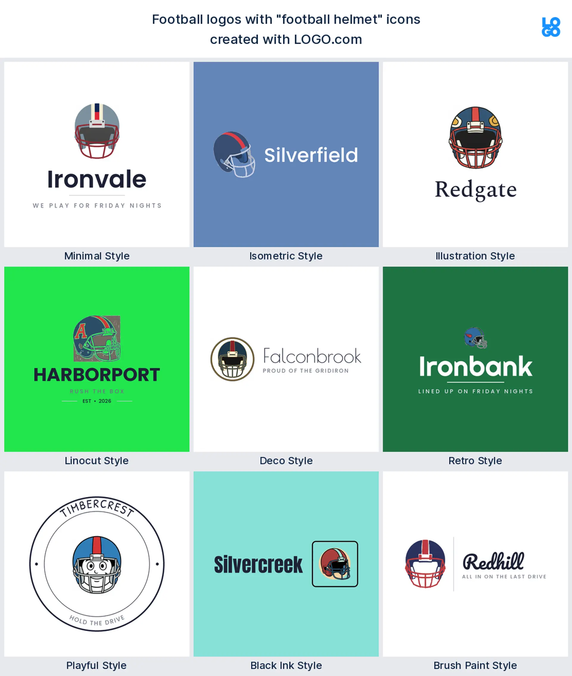
The helmet is the whole sport compressed into one silhouette, and about 23% of the 463 descriptions we counted asked for it. Founders wanted helmets with wings, helmets with animal faces, helmets with a single letter on the side. It is the only shape here that reads as football from across a parking lot, and it survives being shrunk to the size of a thumbnail. If you want one symbol to carry a football team logo, take this one and stop looking.
2. Football player
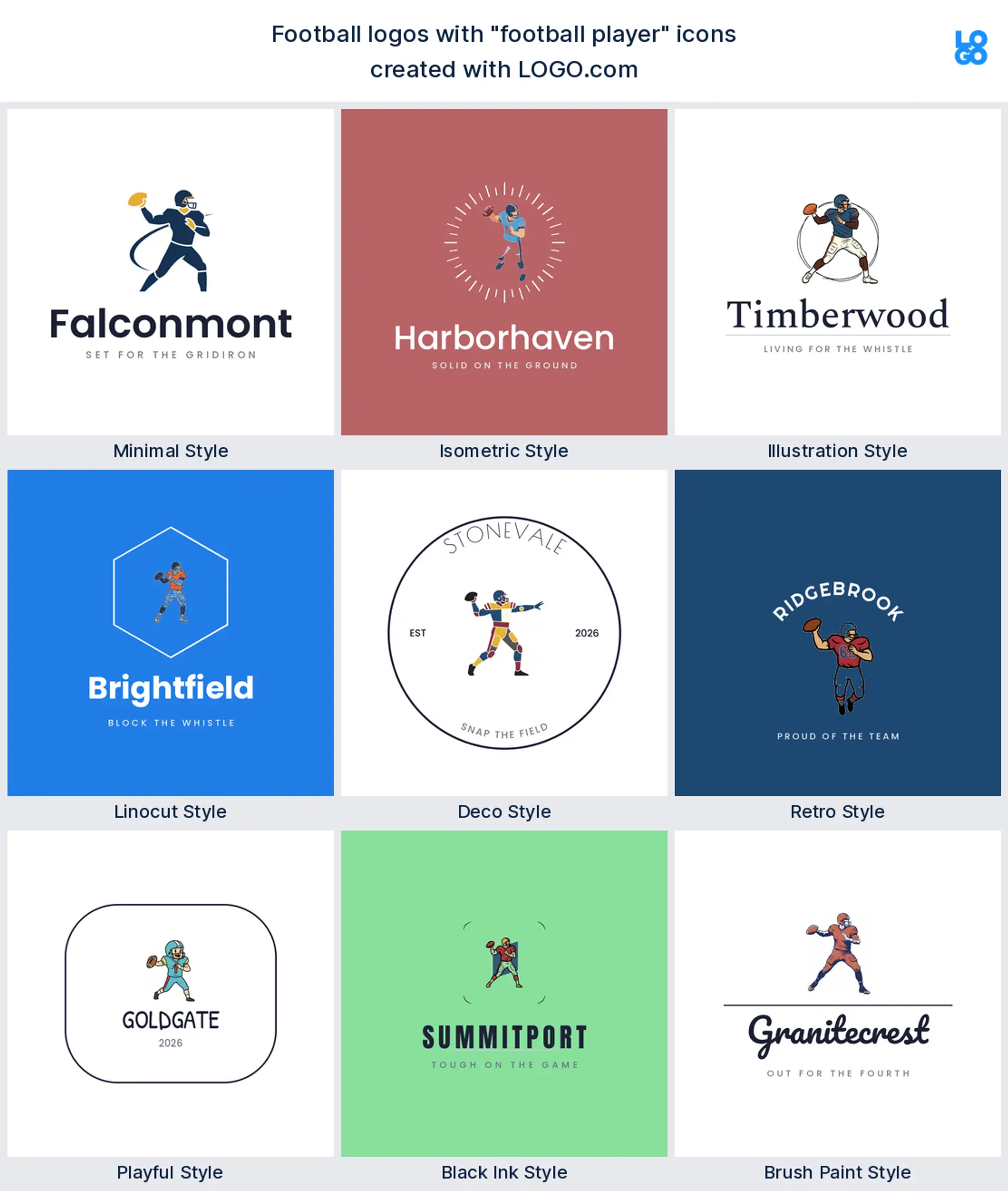
Second place went to a person rather than an object. Roughly 11% of descriptions asked for a player, usually mid throw, mid catch, or leaping over a defender. A figure gives you something a helmet cannot, which is a story, and it makes people feel like the brand belongs to someone. Reach for it when you want an energetic american football logo for a camp, a combine, or a training program.
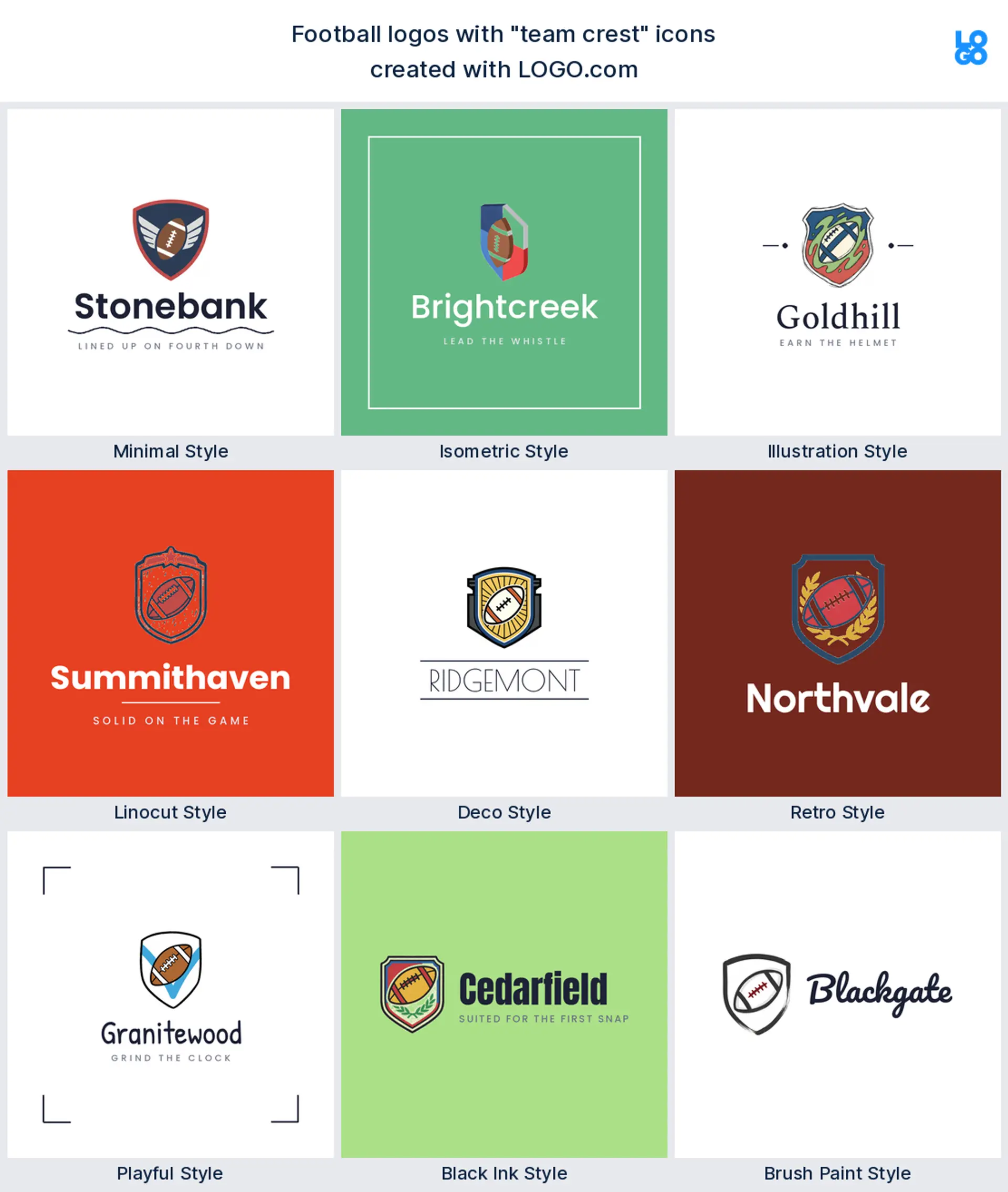
3. Team crest
About 10% of founders asked for a container instead of a picture. Shields, badges, emblem rings, and outlined frames all landed here, and every one of them exists to give the team name a proper home. A crest is what turns a symbol into an institution, so it is the natural spine for a school program, a league office, or any football logo design that wants to look older than it is.
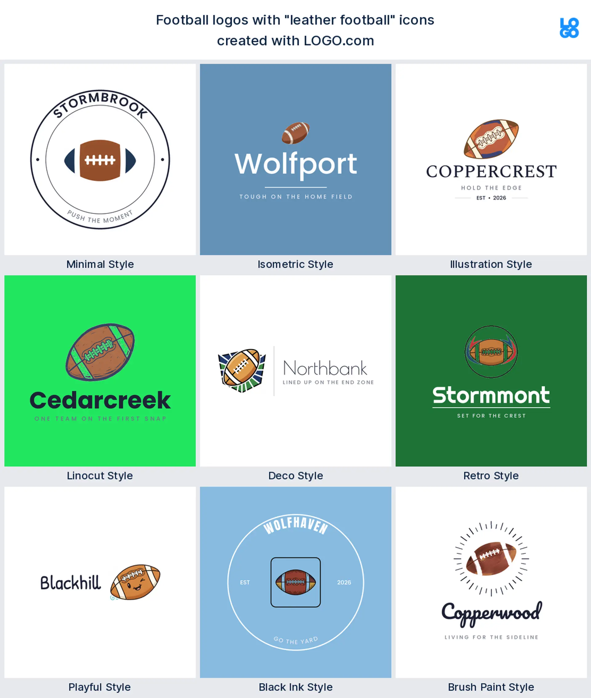
4. Leather football
The ball comes next, and founders were oddly specific about it. They did not write ball, they wrote leather, laces, stitched panels, and worn texture. That detail matters, because a plain oval reads as almost nothing while a laced leather ball reads as football instantly. It is the friendliest symbol in the set and a solid base for a fantasy football logo.
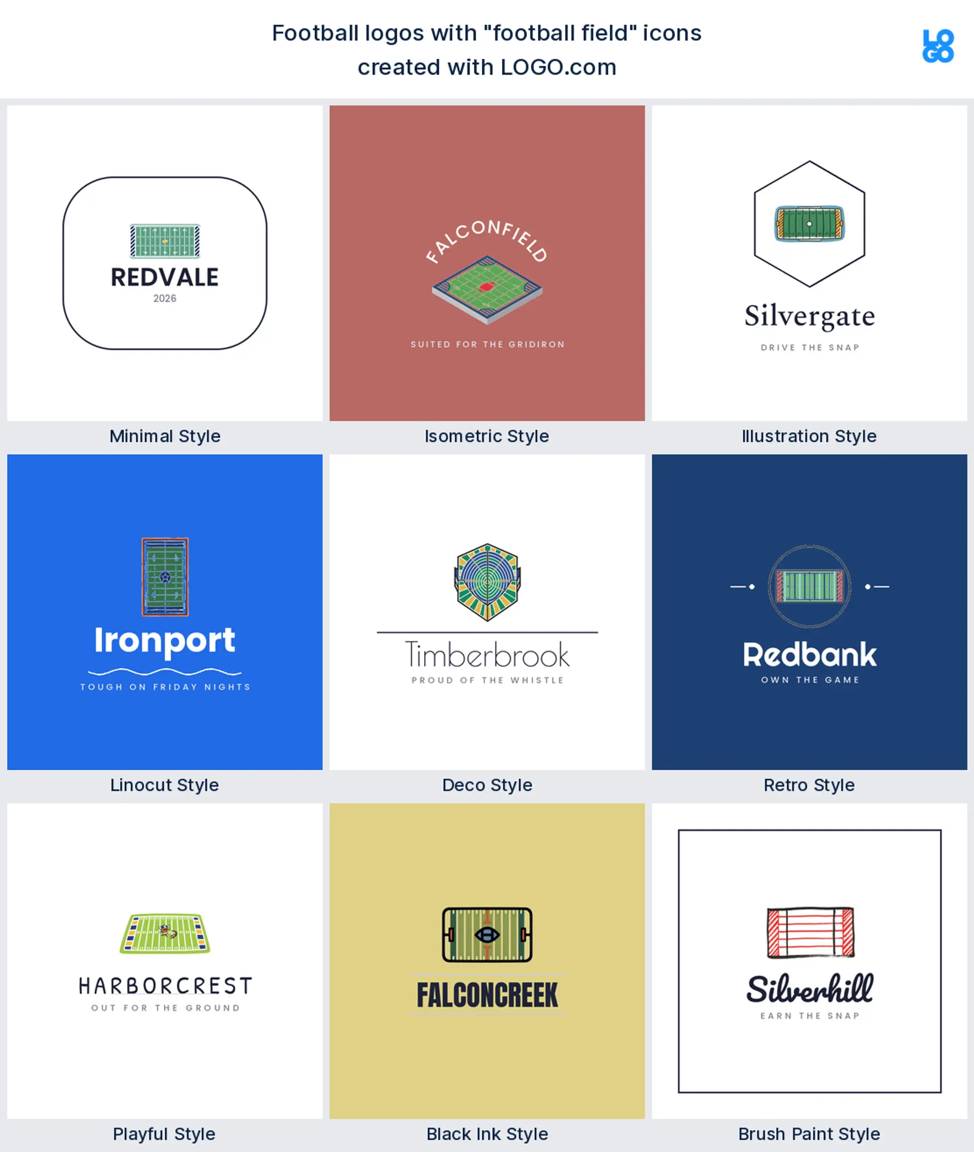
5. Football field
The ground everyone plays on comes next. Descriptions named turf, yard lines, mown grass, and the tactical diagram of a play drawn over the top of it. It says place rather than team, which is why it suits a facility, a training center, or a broadcast brand better than a squad. Good bones for a football field logo that has to look neutral.
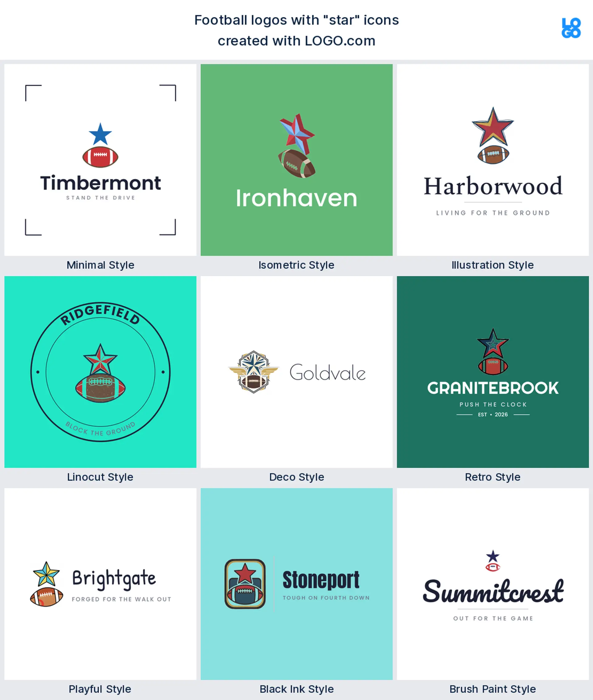
6. Star
In football a star is almost never decoration. Founders used one above a helmet to mark a title, a row of six to count them, and a constellation to spell out a state. A star also holds its shape longer than almost anything else when a mark gets small, which is why it is such a common finishing touch on a football team logo maker preview.
7. Goalpost
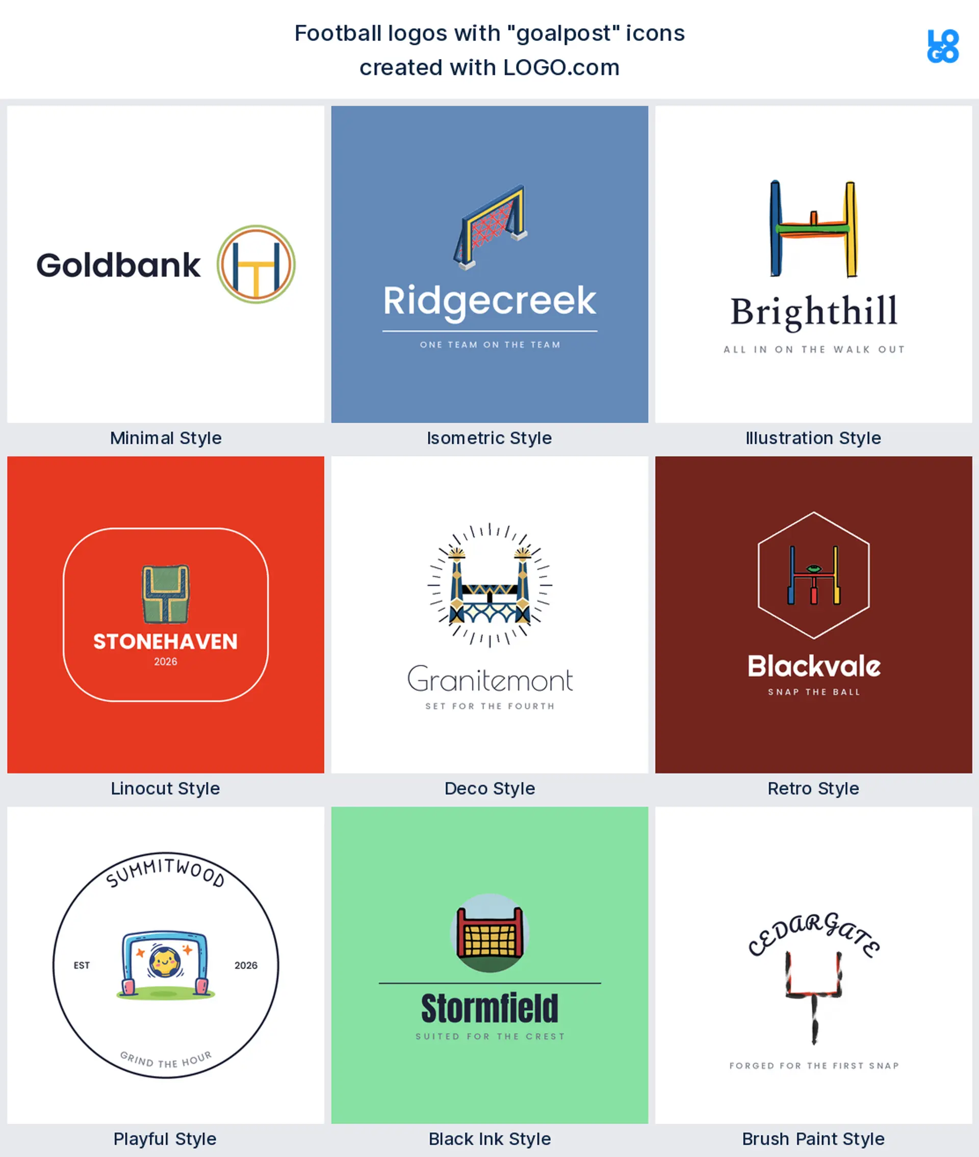
Then come the uprights. A goalpost with a ball sailing through it, a post with the end zone underneath, a set of arms rising off a base. It is the most abstract shape here and the one that survives being reduced to three lines, which makes it a quiet favorite for a kicking academy or a special teams football logo.
8. Wings
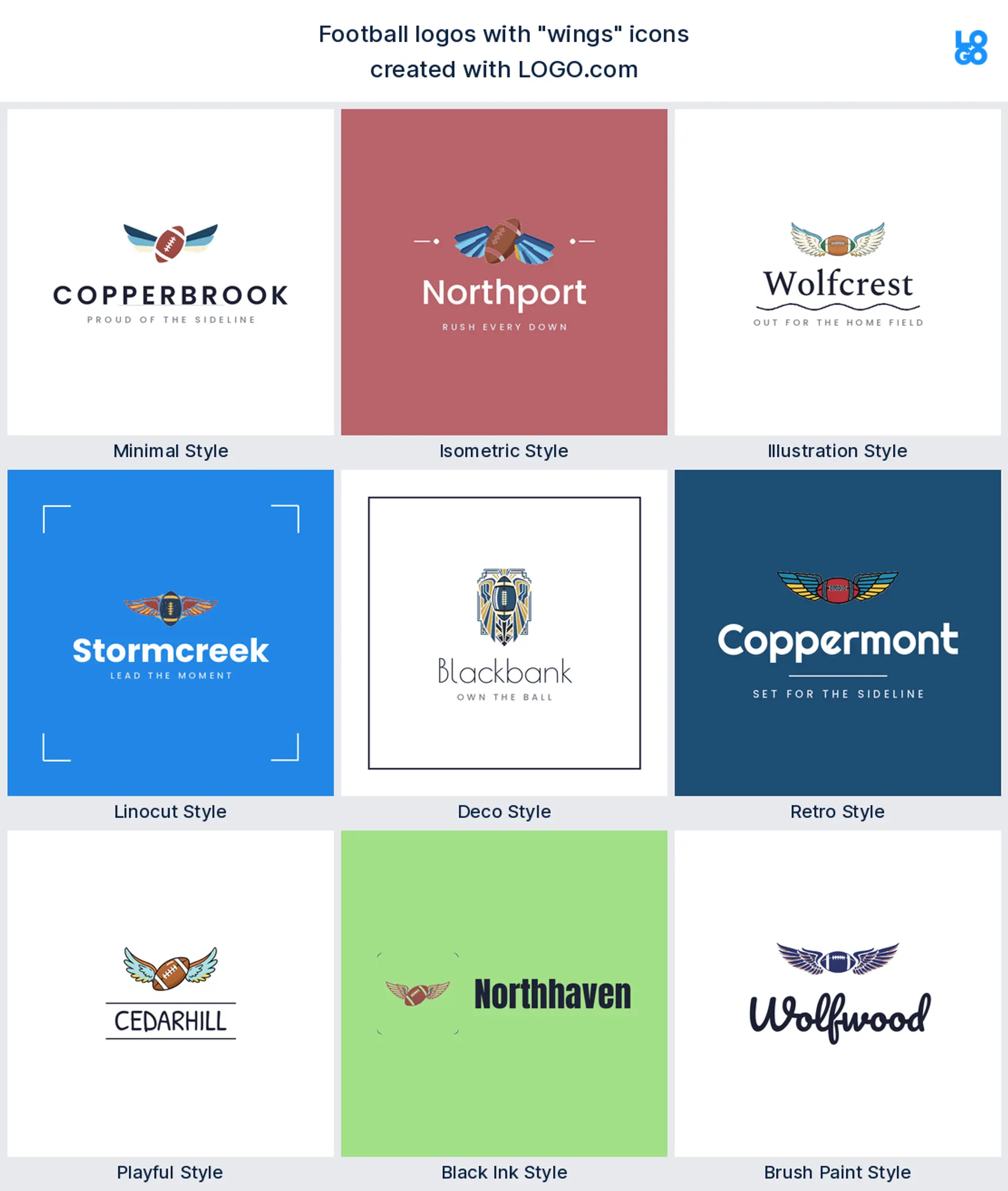
Wings take eighth and they almost never travel alone. Founders bolted them onto helmets, onto balls, and onto the sides of crests, always to say the same thing, which is that this team moves. Keep the feathers chunky and few, because thin plumes disappear the moment a logo gets stitched. A fast, obvious choice for a youth football logo.
9. Animal mascot
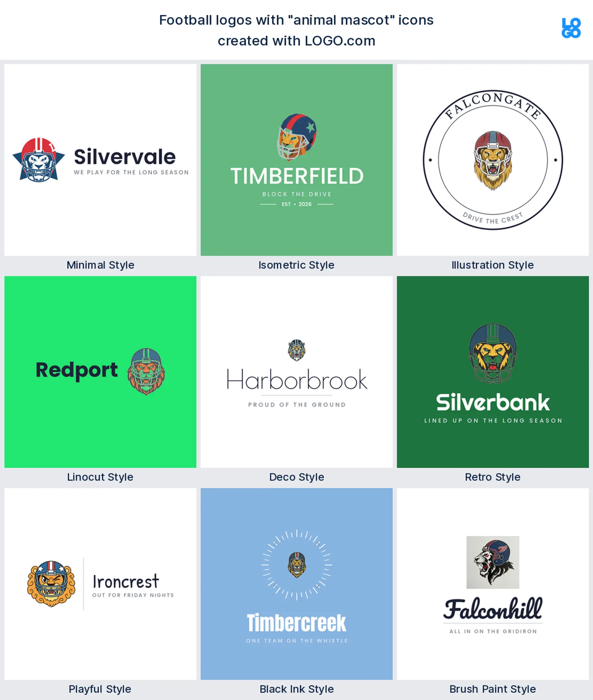
The animals close out the nine, and this group is the most fun to read. Lions, wolves, panthers, eagles, a bear reaching for a ball, and one genuinely angry frog. Mascots take the most work to draw well and give the most back, because they are the only symbol here players will happily wear on a hoodie. Worth the effort for a club that needs a mascot football logo with a personality.
Fifteen football logos, typed by founders and drawn nine ways
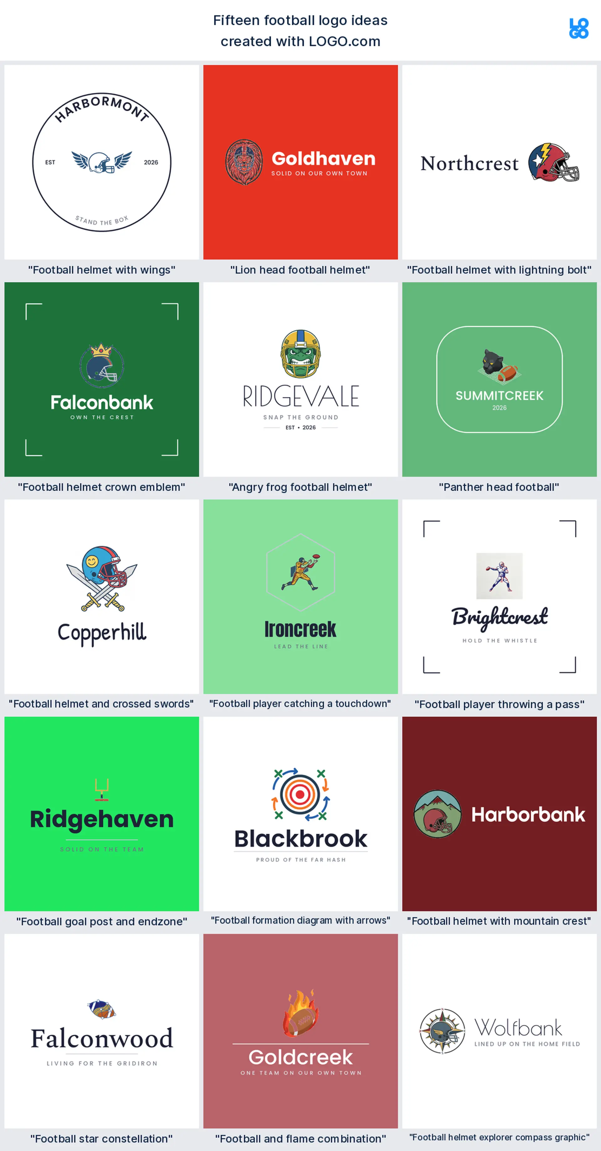
These fifteen headings were not written by us. Each one is a prompt a founder typed into the icon generator, kept word for word, then run through all nine LOGO.com styles. The point is to show how far one line of text travels: the same words come back as a stamped varsity badge, a flat modern mark, or a painted sideline wordmark. Say your team name out loud, find the line it collides with, and start swapping parts. These are the football logo ideas people are actually asking for, not a mood board.
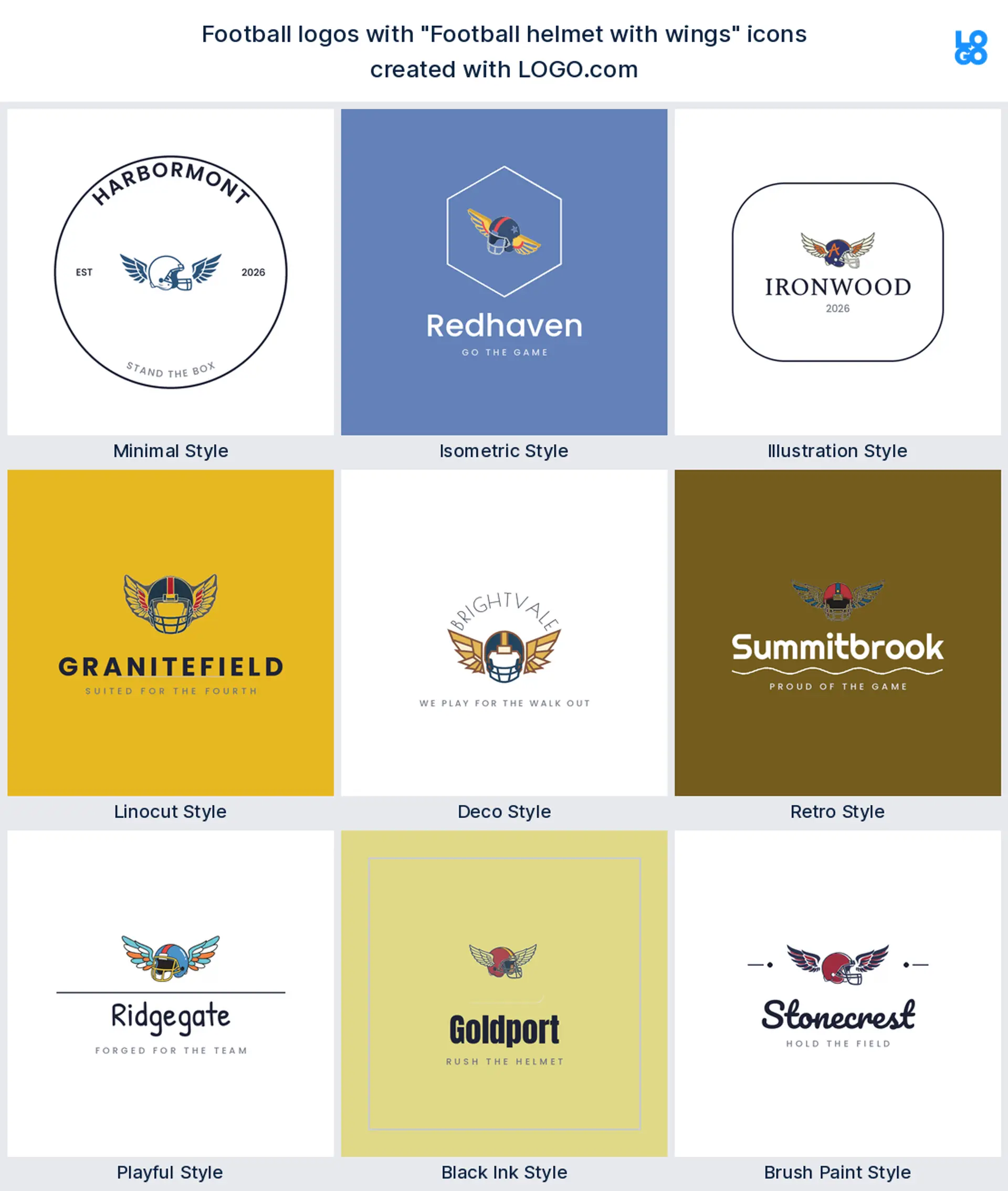
1. "Football helmet with wings"
This was the single most requested combination in the whole set, and it earns the spot. Wings turn a static helmet into something in motion without adding a face, a year, or a slogan. Keep the feathers to three or four bold shapes and it will still read once it shrinks onto a sleeve patch.
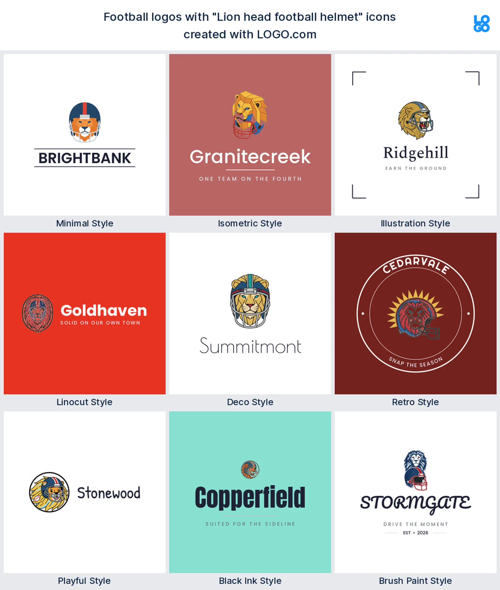
2. "Lion head football helmet"
Half mascot, half equipment, and much easier to draw than a full animal body. A lion face pushing out of the helmet shell gives you a mascot that never needs a second version for small sizes. It suits a program that wants to sound established from its very first season.
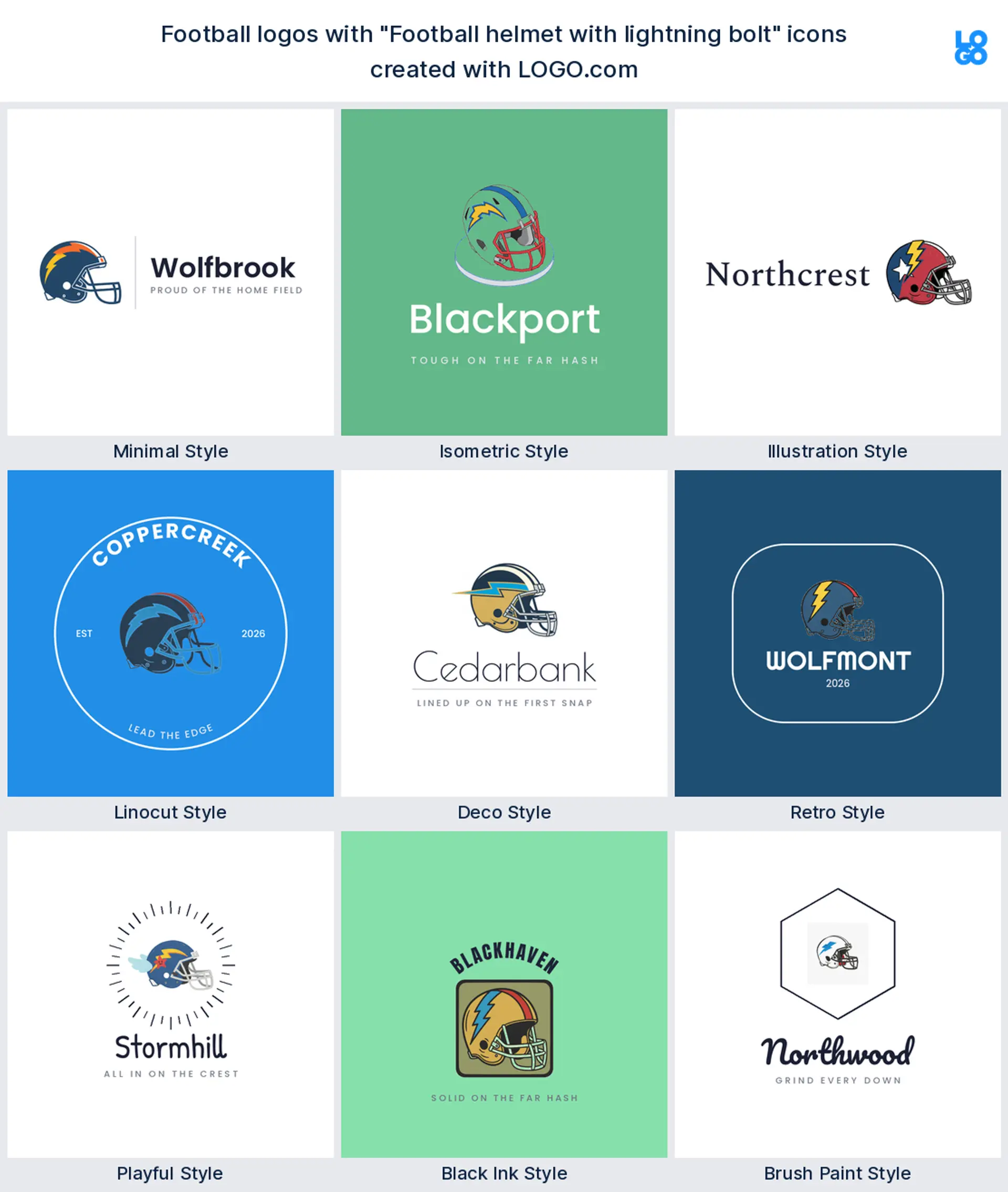
3. "Football helmet with lightning bolt"
Two shapes, one idea, no explanation required. The bolt across the helmet shell is the shortest way to say fast, and it happens to be the easiest decal in this list to reproduce in vinyl. Ideal for a speed camp or a seven on seven side.
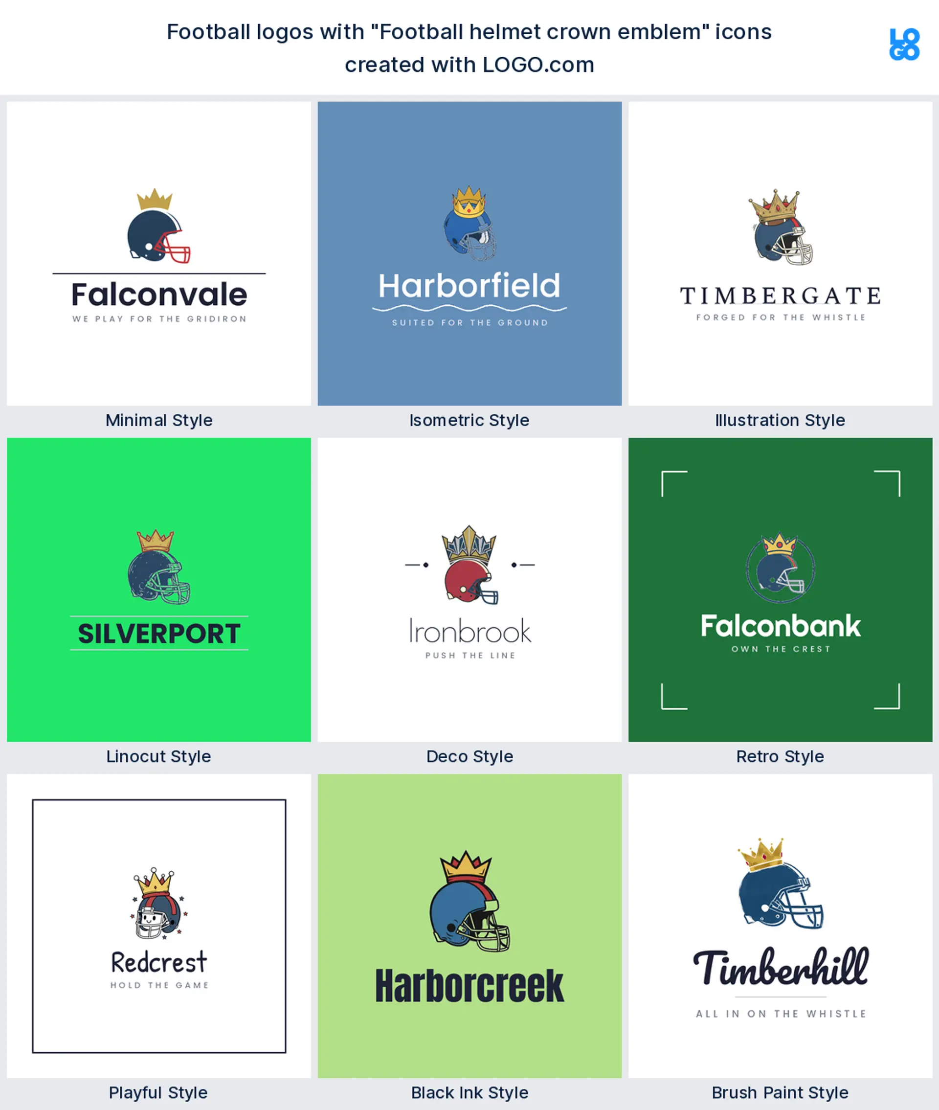
4. "Football helmet crown emblem"
A crown on a helmet is a claim, not a decoration. It only works if you have something to back it up, so save this one for a title program, a bowl game, or a league that already has banners hanging.
5. "Angry frog football helmet"
Someone really did ask for this, and it is a useful lesson. An unexpected animal in a helmet is far more memorable than a fifth wolf, and youth teams love a mascot with a sense of humor. It also happens to be exactly the register a funny fantasy football logo wants.
6. "Panther head football"
The classic predator profile, drawn straight on rather than in a helmet. A panther head next to the ball reads as serious varsity football and stays legible in one color, which is what you want when it ends up embroidered on a coach polo.
7. "Football helmet and crossed swords"
Crossed weapons behind a helmet give a badge instant symmetry, and symmetry is what makes a mark feel official. It is a good pick for a military school team, a rivalry game, or any side whose name involves knights, raiders, or blades.
8. "Football player catching a touchdown"
The most joyful shape on the page. A receiver stretched out with the ball at the fingertips freezes the exact second everyone stands up, and that emotion carries a brand further than a helmet ever will. Lovely for a highlight channel or a youth program.
9. "Football player throwing a pass"
A quarterback in the throwing motion is the most recognisable human shape in the sport. The raised arm gives the mark a natural diagonal, which stops it looking flat, and the silhouette still works when you strip out every internal line.
10. "Football goal post and endzone"
Architecture instead of anatomy. The uprights with the end zone stripe underneath give you a wide, low mark that fits beautifully across the top of a scoreboard graphic or a website header, where a tall crest would have to shrink.
11. "Football formation diagram with arrows"
Circles, crosses, and a curving route drawn like a coach would draw it. This is the most distinctive idea in the set because almost nobody uses it, and it says strategy rather than muscle. Perfect for a playbook app, a podcast, or an analytics brand.
12. "Football helmet with mountain crest"
Geography makes a logo yours in a way a generic animal cannot. A ridge line behind the helmet ties a team to a valley, a range, or a town, and it gives you a second color band to play with inside the badge.
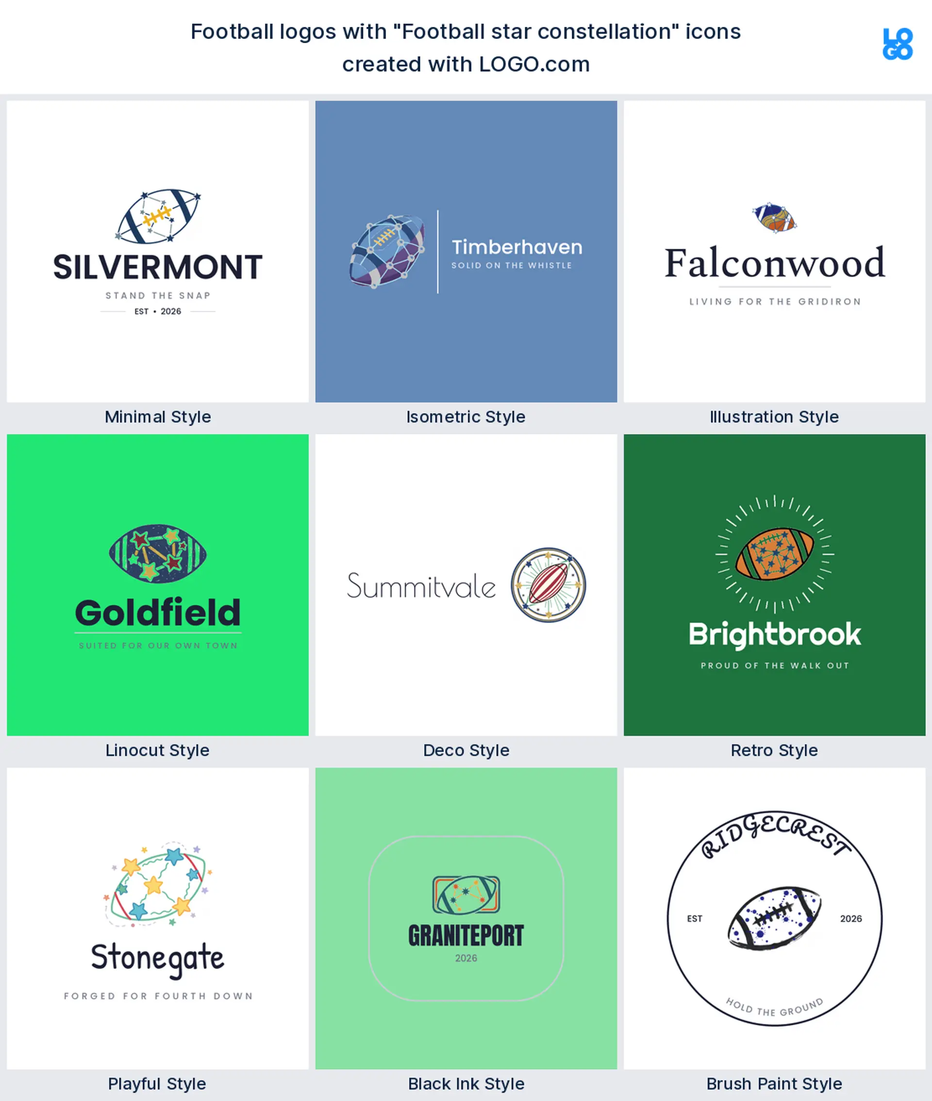
13. "Football star constellation"
Stars joined into a shape read as a state, a title count, or simply as night games. It is the quietest idea here and the most flexible, since a constellation scales down to almost nothing and still holds its pattern.
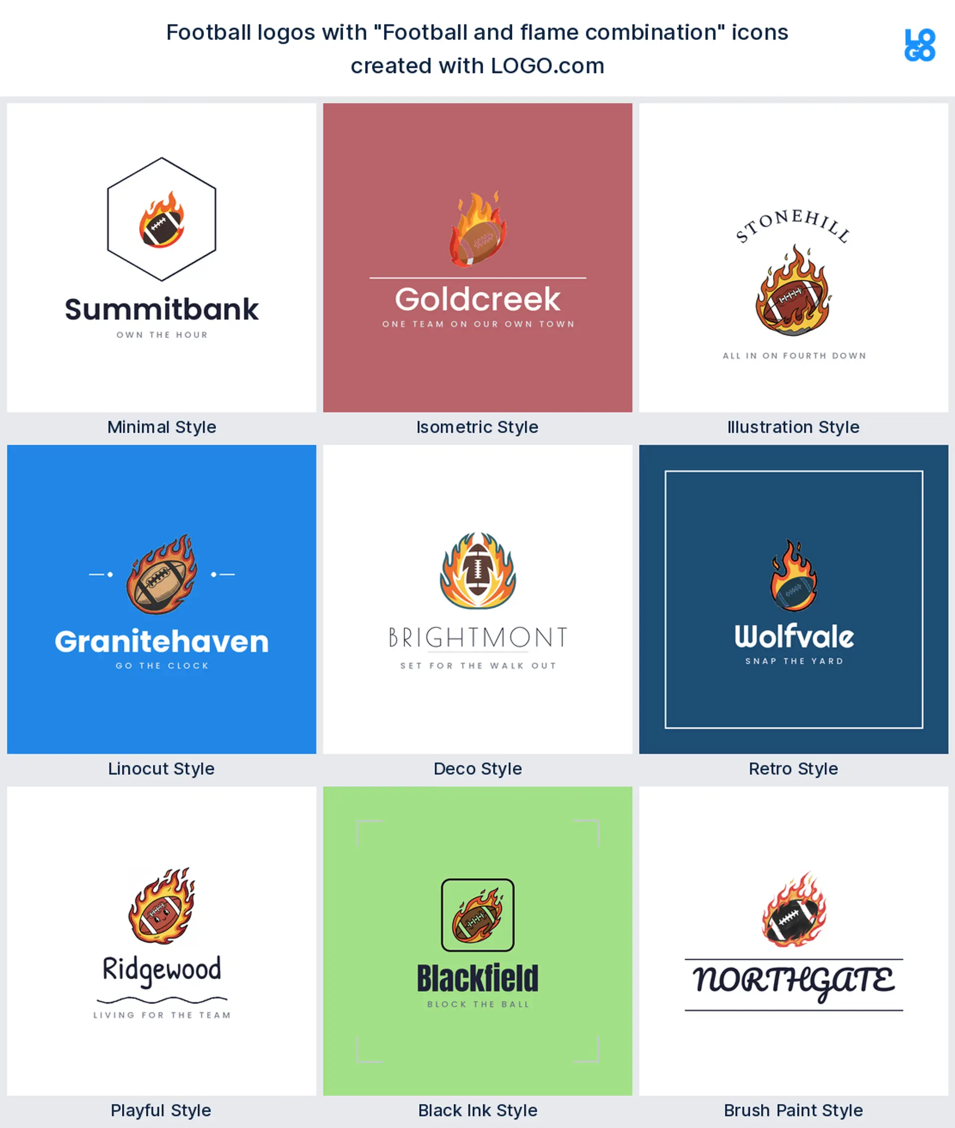
14. "Football and flame combination"
Heat is the oldest shorthand in sport and it still lands. A ball breaking through flame suits a hot streak, a rivalry week, or a fantasy football team logo for the manager who has won three in a row and wants everyone to know.
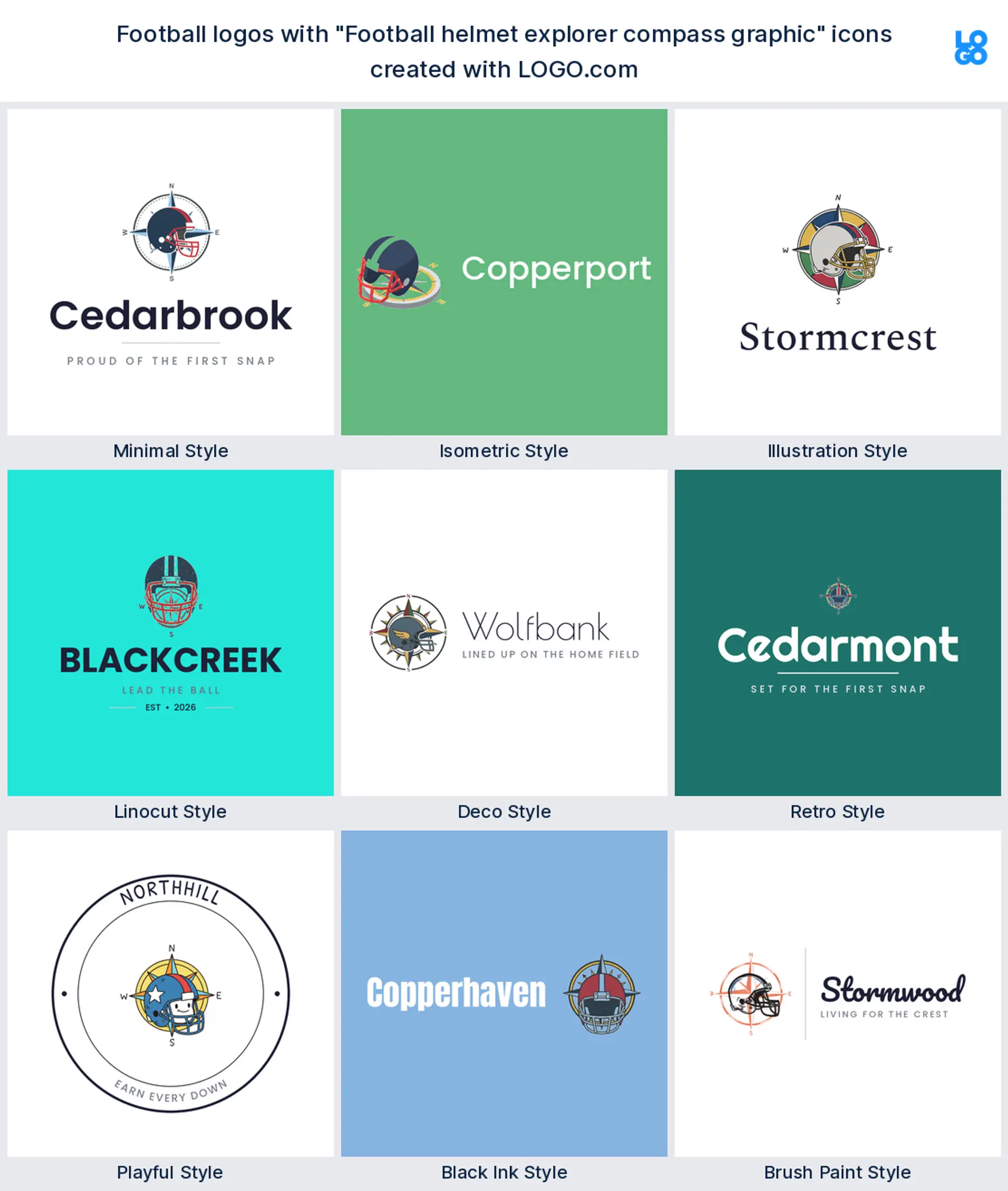
15. "Football helmet explorer compass graphic"
The strangest prompt of the fifteen and one of the best. A compass rose behind a helmet suits a travel team, a recruiting service, or a program built around going somewhere, and no other team in your league will have anything close to it.
Which way should the helmet face on your logo?
If you go with a helmet, and the data says most of you will, you have to pick a direction before anything else. A helmet facing left is the traditional broadcast angle and the one people read as a team mark without thinking. A helmet facing right feels newer and slightly aggressive, which is why so many recent rebrands use it. A helmet pointed straight at the viewer is the hardest to draw and the most striking when it works, because it turns the shell into a symmetrical shield.
There is a practical answer too. Whatever direction you choose, you will end up mirroring it, because a real helmet decal goes on both sides of the head and one of them will always face the other way. So pick a shape that survives being flipped. Avoid a letter or a number inside the mark unless you are happy running two versions, and keep any facial detail simple enough that the mirrored copy still looks like the same animal. That single check saves most football helmet logo projects from a reprint.
What makes a fantasy football logo worth screenshotting
A fantasy football logo has a completely different job to a team crest. Nobody stitches it onto anything. It lives at about forty pixels wide next to your team name in an app, it appears in a group chat every Sunday, and it has to survive being roasted by nine other people. So it needs one strong shape and a punchline, not a detailed illustration. Read your team name out loud and draw the most literal thing in it, then push the color hard.
Keep it readable at avatar size, which is smaller than you think. One symbol, two colors, no thin outlines, and no text you actually need to read. If your league name is the joke, put the joke in the icon rather than in tiny lettering underneath. That approach works for a serious fantasy football league logo and a funny fantasy football logo equally well, and you can build either one here in a couple of minutes with the same fantasy football logo maker the rest of this page uses.
Flag football, youth, and travel teams all want different marks
Running a flag football side? You have no helmets to put a decal on, so your logo lives on shirts, flags, and a league website instead. That frees you up to use a wider mark, and it is the one case where a full wordmark can beat a badge. A flag football logo built around the team name in a strong typeface will outperform a tiny mascot every single time.
Youth programs pull the other way. Kids want the mascot, parents want to recognise it on a hoodie from the far side of a field, and the volunteer printing the shirts wants two colors and no gradients. Travel and select teams sit in between, since they need something that reads on a helmet, on a bag tag, and on a tournament bracket in another state. Pick your hardest surface first and design for that, then everything easier takes care of itself.
Football or American football? What to put in the name
This page is built for the sport with helmets, downs, and end zones. If you searched for football and meant the game with a round ball and a goal net, our soccer logo maker is the right place to go instead. It is worth deciding early, because the word you choose changes both the symbol people expect and the way they find you.
In the United States, football on its own is understood, so a local club, school, or league rarely needs to spell it out. If you sell to an international audience, or you run a program abroad, the phrase american football logo is what people actually search for, and putting the full phrase in your brand name removes any doubt. The same goes for gridiron, which still reads clearly in Australia and parts of Europe. Say the version your audience says.
Why a green logo disappears on a green field
Football founders save green and blue at almost exactly the same rate, which is unusual for a sport with this many loud color schemes. Red takes a clear third, yellow trails it, and white or black sits underneath nearly all of them. Green is obvious once you picture the field, and blue is the institutional color every school program falls back on.
Most helmets end up as one shell color, one stripe, and a decal, so build the logo the same way and stop at three. Red on white is the loudest thing you can put on a shell and the easiest to pick out from the top row of a stand. Green is the trap. A green mark laid over green turf vanishes in every action photo you will ever post, so give it a white keyline or a dark base before it goes anywhere near a field. Save yellow for a stripe or a highlight.
Make your football logo with LOGO.com
Everything on this page came out of the same football logo generator you are about to open. Give it your team name, take one of the nine symbols, and it returns full color options in seconds. Push the palette to your school colors, run a wide version for the banner and a square one for the app, and keep going until the mark looks like it has been on that sideline for twenty years.
Nothing about designing, previewing, or downloading a high resolution PNG costs anything, and full commercial use comes with it. The Brand Plan is the paid step, and it is the one you want when a printer asks for vector files to put the mark on jerseys, helmets, banners, and merchandise, plus unlimited edits and the brand kit. Open the football logo creator and see what your team name looks like on a shell.
Methodology. These figures come from logos created on LOGO.com. The Football, Football Club, and Football Team industry settings together cover roughly 278 brands, but those settings on their own returned only 35 custom icon descriptions over the window, far too few to rank, so we widened the scope to every custom icon description that mentions football. That gave 463 descriptions across the 24 months to August 2026, which we grouped by the symbol founders asked for. The football helmet accounts for about 23%, a football player about 11%, and a team crest about 10%. Color shares come from saved palette selections by founders using the football industry settings. Source: LOGO.com first party product data, August 2026.
THE #1 LOGO GENERATOR
Why LOGO.com is the best football logo maker
1.Built from 463 real football icon prompts
Every symbol, color and style on this page came out of what founders actually asked for when they built a football logo here, so you start from evidence instead of a mood board.
2.Survives being cut in vinyl and stuck on a shell
Bold shapes and no hairline strokes, so your mark still works cut in vinyl and stuck on the side of a shell where the curve eats fine detail.
3.Layers over turf, twill and floodlights
A transparent PNG drops straight onto navy twill, green turf, or a night game photo without dragging a pale rectangle behind it.
4.Works as a fantasy league avatar
Build a square version at the same time and your fantasy football team logo survives being cropped to a circle beside your name in the app.
5.Full color or one color, your call
Keep the full color icon for screens and switch to a single color version for embroidery, helmet vinyl, and a stamped booster club sticker.
6.Try all nine LOGO.com icon styles at once
Carved linocut, clean minimal, isometric, deco, retro, hand painted brush and more, all from the same team name, so you can compare instead of guess.
7.Red on white beats green on green
Green and blue lead our football color data, and we pair them so a green mark never sinks into a green field or a floodlit night shot.
8.Change it when the roster does
Swap the year, the mascot, or the accent color between seasons without paying a designer to redraw the whole badge.
9.Free download, full commercial use
Download a high resolution PNG free with full commercial use included, and upgrade to the Brand Plan when you need vector files for jerseys and signage.
Football Logo Maker FAQs
Explore more logo ideas
3D DesignAcademic WritingAccountantAerospace EngineeringAgricultural ConsultingAgriculture CompanyAmazonAnimal ProtectionAnimationApp DevelopmentAquacultureAromatherapyArt and DesignArtsAsian RestaurantAthleticsAudio TechnicianAuto ManufacturingAuto Repair ServicesBadgeBandBarber ShopBearBeauty and CosmeticsBeeBibleBiotechBitcoinBlogBoatBook PublisherBooks and Literature BlogBrainBuildingBusiness Consulting Logo MakerBusiness StorageCakesCampaignCandlesCarCarpentryCateringCelebrationsChemicalChildrenChoirCircleCivil EngineeringClothingCoffee Shop