Mechanic Logo Maker
Design a mechanic or garage logo that looks right on your van and business cards.
Need a different logo maker? Try our AI logo generator.
Logos created using LOGO.com
670,000,000
Wrench led marks for hands on mechanics

Engine and tyre marks with a vintage lean
Vehicle led marks for mobile mechanics and garages
Mechanic Logos, Ranked From Real Founder Prompts
According to LOGO.com data, the symbol mechanic founders describe most often is not a car at all. Motorcycles and dirt bikes appear in about 43 percent of the custom icon descriptions in this group, ahead of the wrench at about 37 percent and the engine at about 25 percent.
The nine icons and fifteen ideas below are drawn straight from those descriptions, so you are starting from what working mechanics asked for instead of a blank canvas. Borrow the shape, then push the colour, the type, and the name until the mark belongs to your van and nobody else's.
On this page
- Nine symbols 591 mechanics kept coming back to
- Fifteen mechanic logo ideas, quoted exactly as founders typed them
- The bike beats the car, and that tells you who is starting these businesses
- Working out of a van changes what your logo has to do
- Your mark has to survive a business card before anything else
- Name first, symbol second, and what to do if you have neither
- The colours mechanics actually pick, and the one they skip
- Make your mechanic logo with LOGO.com
Ask 591 mechanics to describe the icon they want and the most common answer is not a car. It is a bike. Motorcycles and dirt bikes turn up more often than anything else in the custom icon descriptions mechanic founders wrote on LOGO.com, which tells you something useful about who is actually starting these businesses. Plenty of them are one person with a van, a toolbox, and a phone number. So this page is built from what those founders typed: the nine symbols they kept coming back to, fifteen of their real prompts drawn nine ways each, and the practical calls you will have to make about where the mark lives once it exists.
Nine symbols 591 mechanics kept coming back to
Group the descriptions by subject and 591 mechanic, vehicle repair, and automotive servicing founders on LOGO.com land on nine recurring symbols. Two wheel machines lead at about 43 percent of the icon descriptions in this set, the wrench follows at about 37 percent, and the engine takes about 25 percent. Below those three the tail runs through gears, tyres, car shapes, tool pairs, steering wheels, and pistons. Almost none of them need more than one object and a name you can read at a glance.
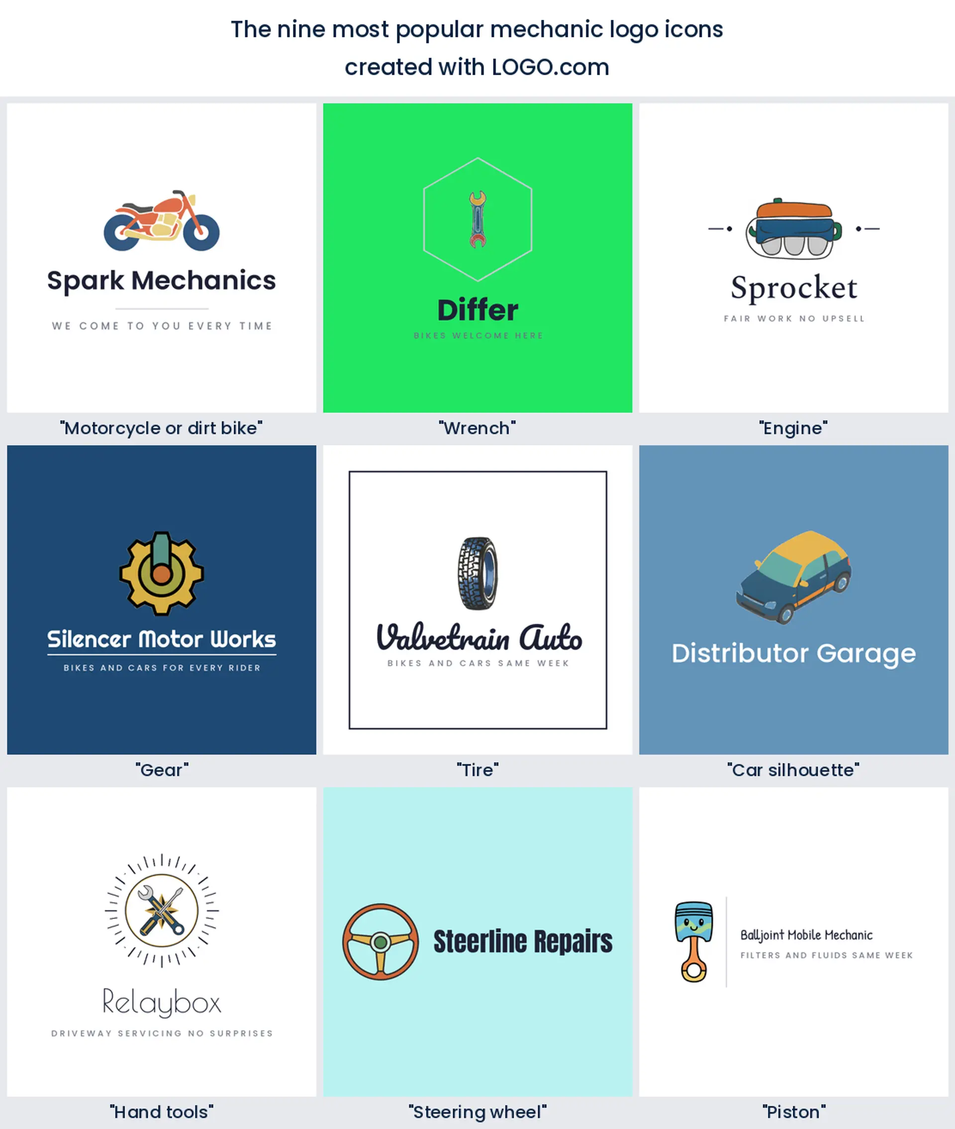
1. Motorcycle or dirt bike
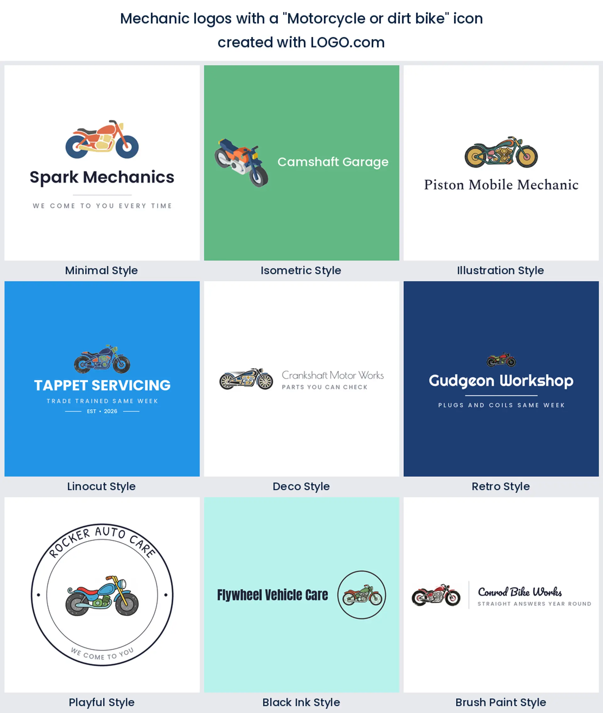
The surprise of the whole set, and the clearest signal in it. Roughly 43 percent of these descriptions name a motorcycle, a dirt bike, or a part off one, because so many independent mechanics build their name on two wheel work before they ever touch a saloon car. Draw the machine in profile with heavy wheels and skip the spokes, and you get a mechanic logo that riders recognise from the other side of a paddock.
2. Wrench
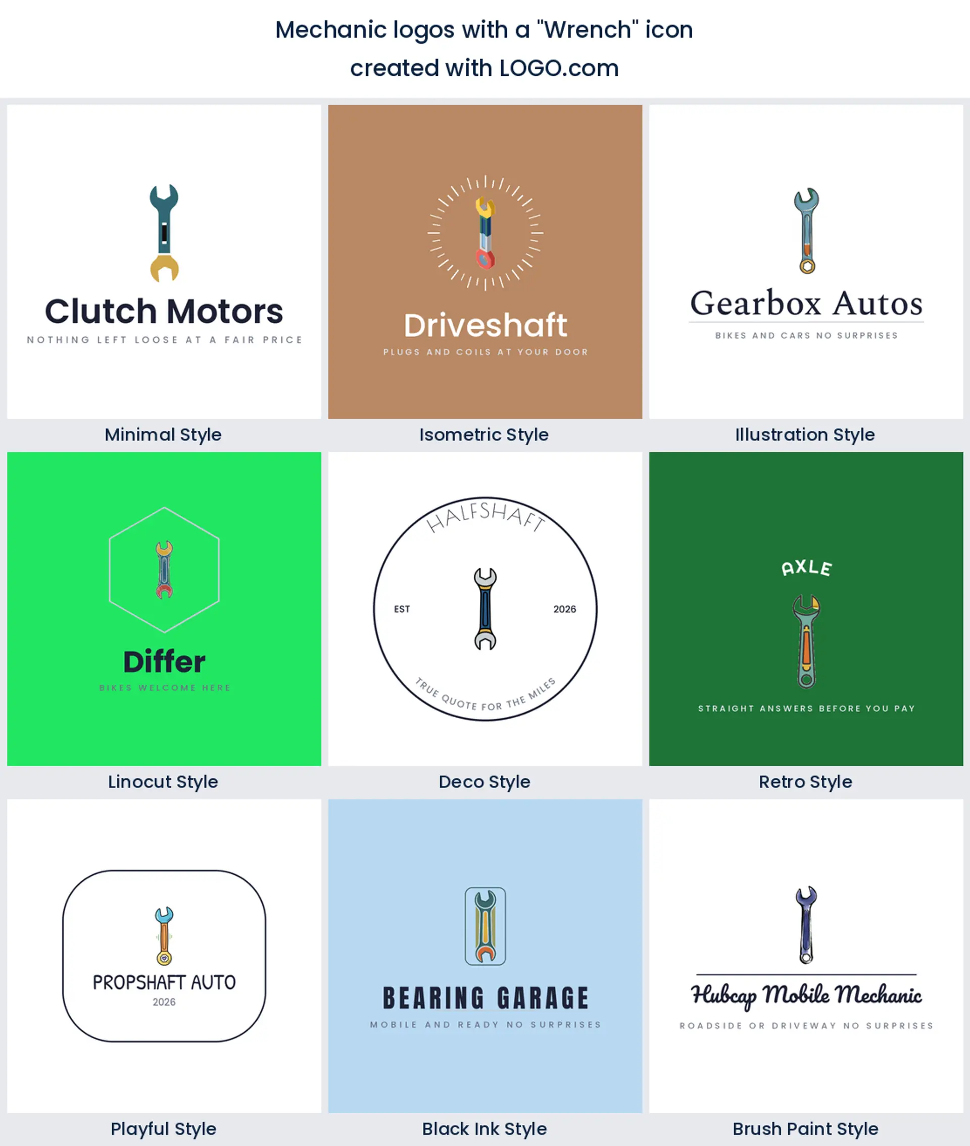
Second, at about 37 percent, and still the shape everyone decodes without thinking. A wrench says fixing rather than selling, which is exactly the distinction a customer is making when they call you instead of a dealership. Thicken the handle and keep the jaws wide open so the gap survives a shrink, and it carries a garage logo or a one person mobile mechanic logo equally well.
3. Engine
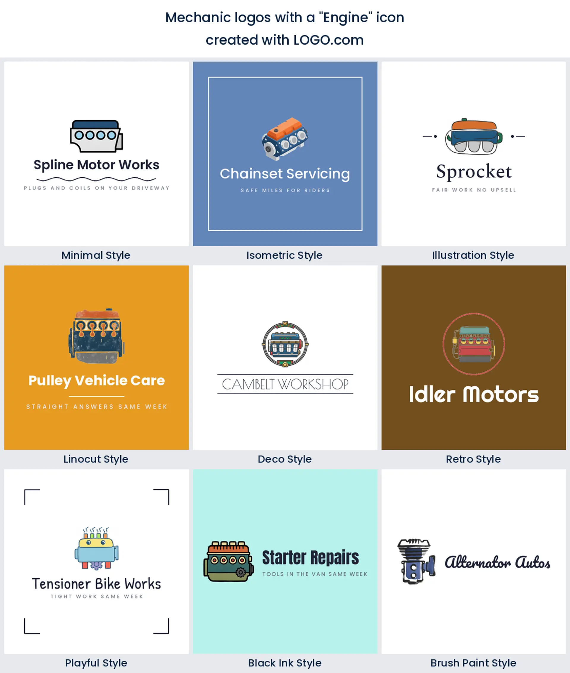
The engine block sits third at about 25 percent and it is the symbol for anyone who wants to look further into the job than fluids and filters. Founders reach for it when they rebuild, diagnose, or tune. Block in the cam cover and the cylinders as flat shapes and throw away the hoses, because that detail is what makes an auto mechanic logo look cluttered the moment it goes on a shirt.
4. Gear
Fourth, and the most obliging shape in the nine. One toothed ring reads as machinery to absolutely everybody, and it will happily hold a second symbol in its middle, which is why so many founders pair it with a wrench. Reach for it when you service more than one kind of vehicle and you want a mechanic shop logo that does not tie you to any of them.

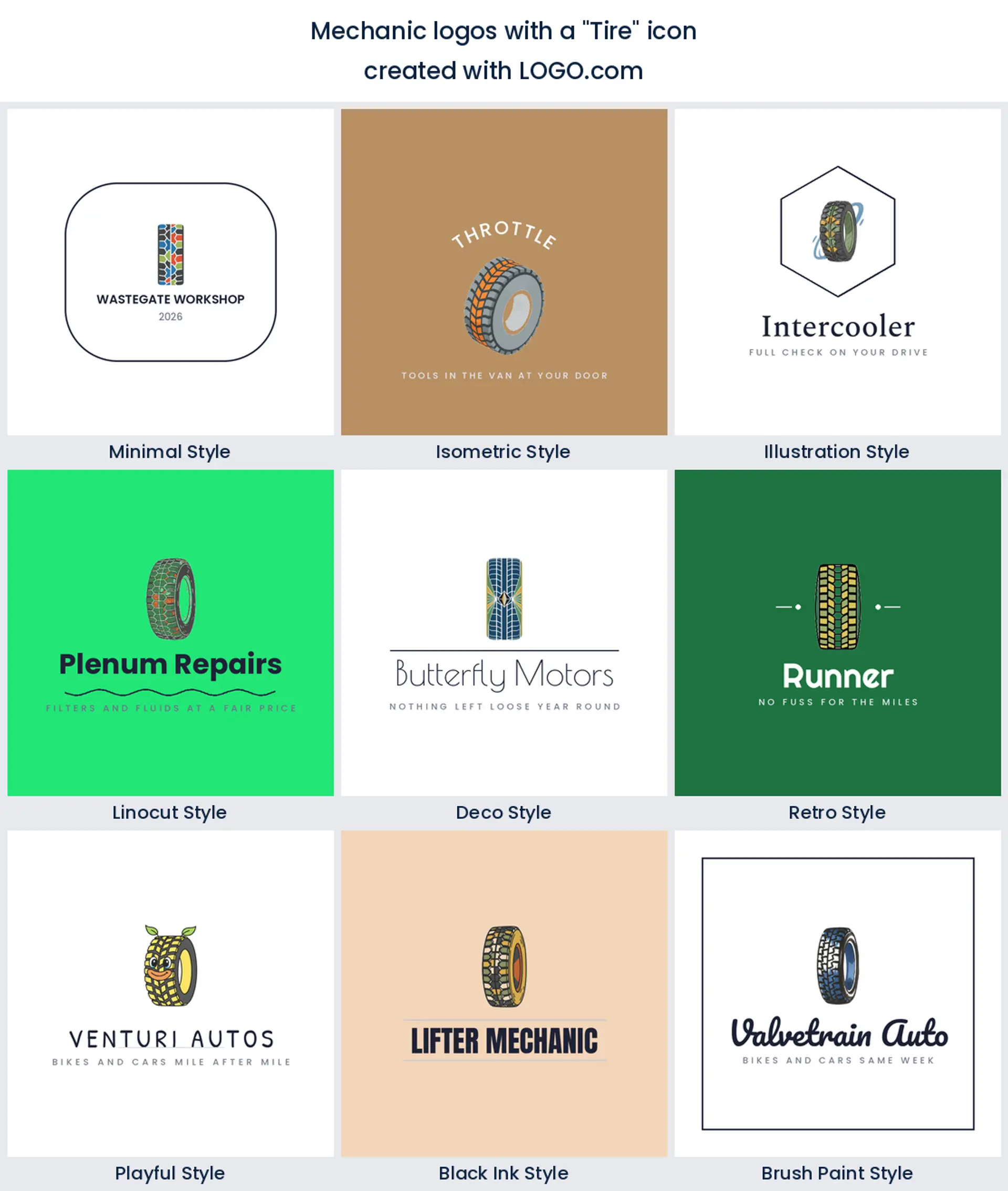
5. Tire
Tyres and tread come next, and they carry the plainest promise on the list. A wheel in profile or a slab of tread tells a driver you fit, balance, and change, so it is the natural opening for a tyre specialist. It also makes a strong texture band beneath a wordmark when you want a wide mark rather than a tall one.
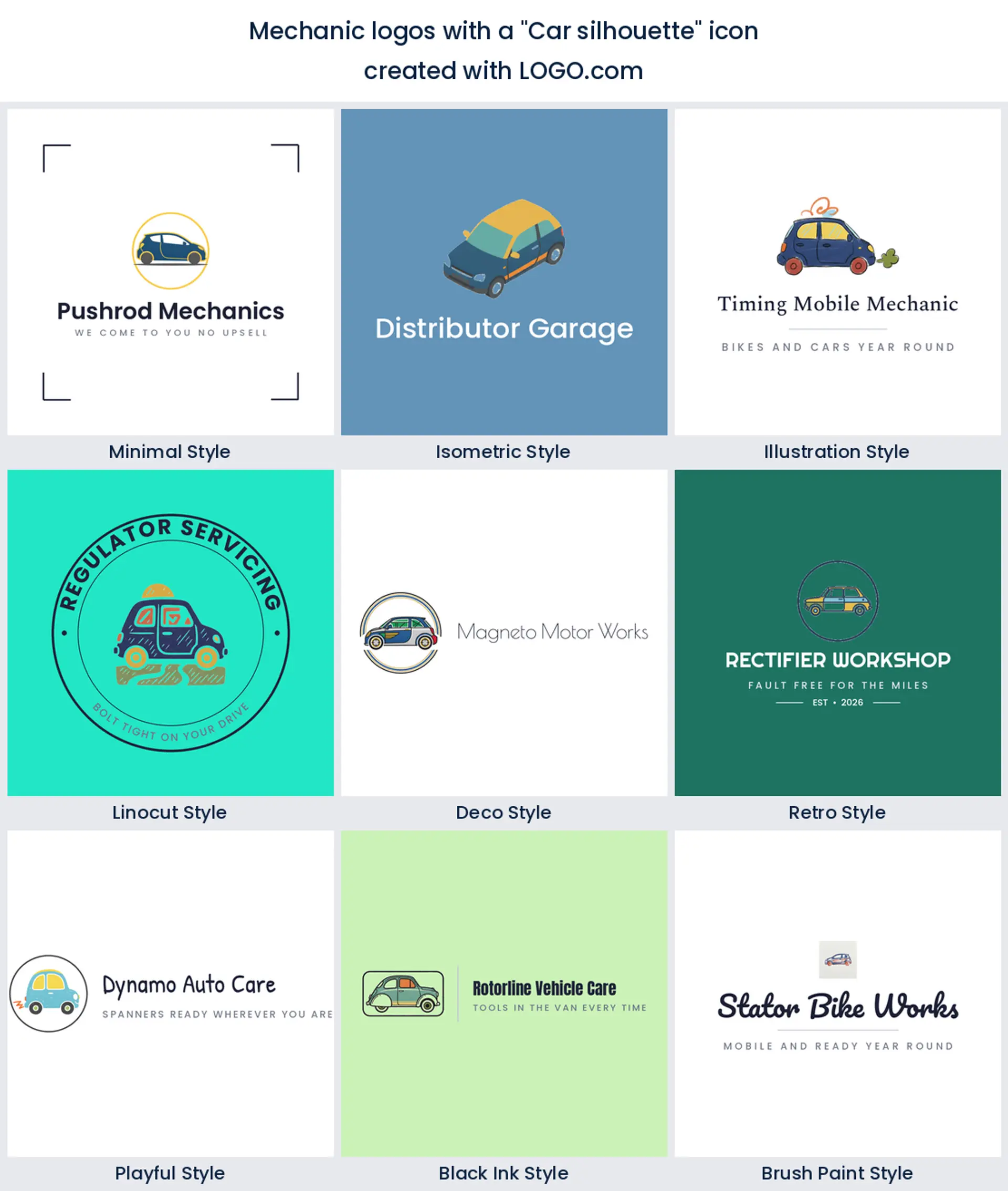
6. Car silhouette
The car itself only ranks sixth, which surprises most people. It works hardest when it is paired with something else, a wrench across the bonnet or a tool underneath, so the shape reads as repair rather than sales. Use a side profile with one strong curve, and you have the start of a car mechanic logo that nobody mistakes for a dealership.
7. Hand tools
Crossed tools sit seventh. A wrench over a screwdriver is the oldest shorthand in the trade and it survives because an X is readable at any size at all. It suits the mechanic whose own hands are the selling point, so if you are after a tools mechanic logo, cross two shapes of clearly different widths so they never blur into one.

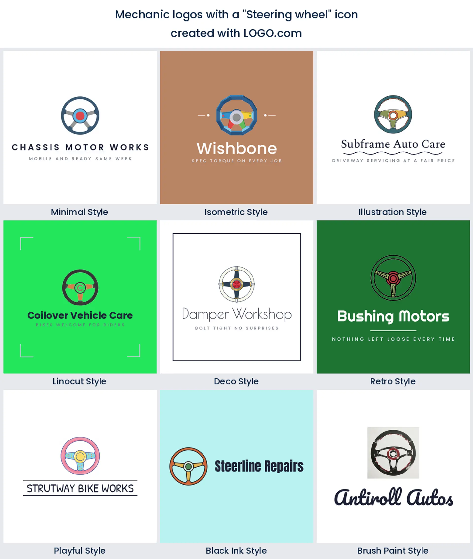
8. Steering wheel
Eighth, and the only symbol in the nine that points at the driver instead of the machine. That makes it a warmer pick for servicing, inspections, and anything built on people coming back. Three spokes and a clean rim is plenty. Put a sunrise or a road behind it and it turns into a badge with a bit of heritage in it.
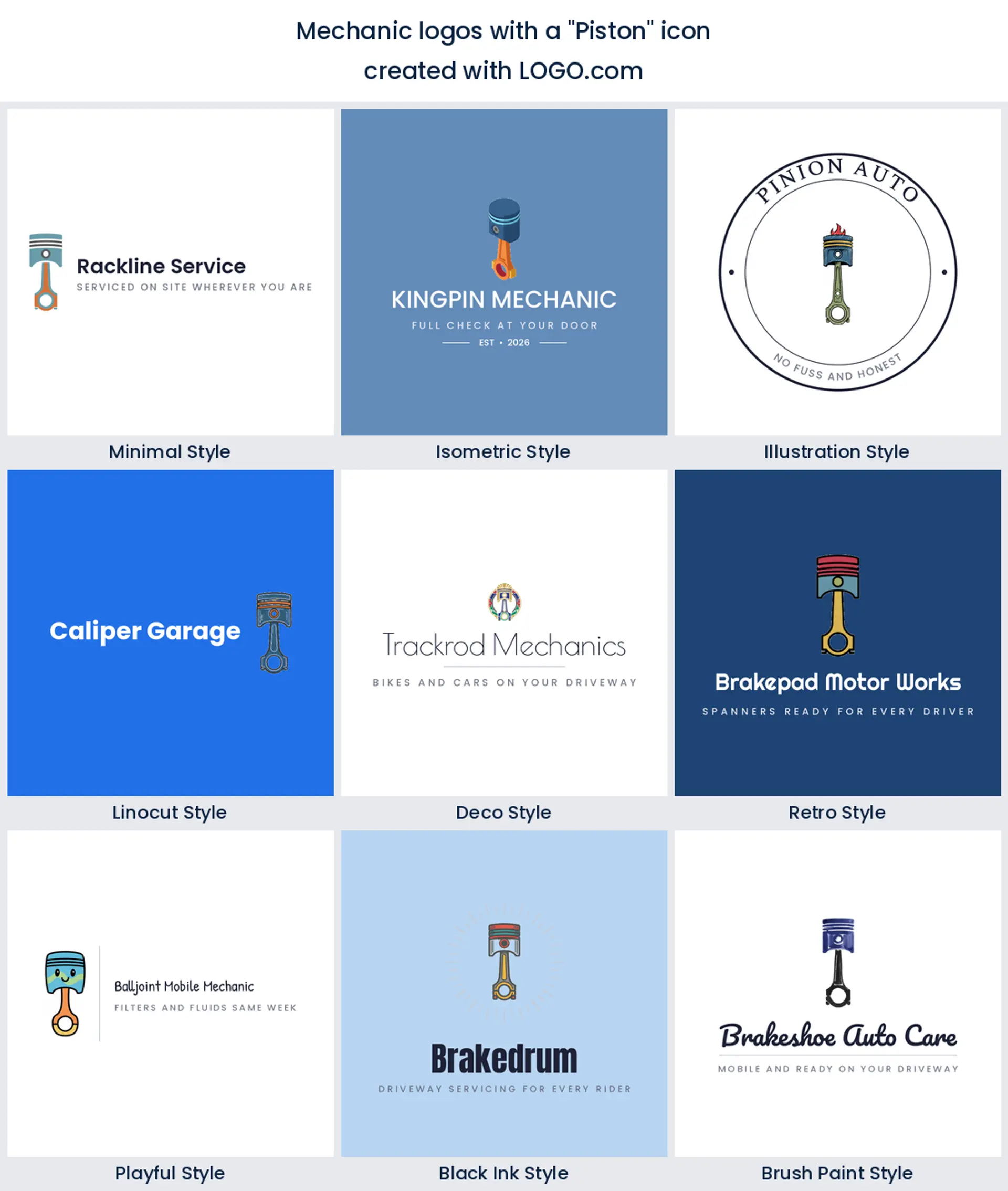
9. Piston
Last of the nine and the loudest. A crown and a rod reads performance, rebuilds, and engine building, and it shows up on motorbike and dirt bike work as often as on cars. Stand it upright, keep the outline heavy, and it holds up on a hoodie back as well as it does on a mechanic business card.
Fifteen mechanic logo ideas, quoted exactly as founders typed them
Every heading below is a description a mechanic actually typed into LOGO.com, quoted word for word. They are combinations rather than single objects, which is what gives a mark its character, and each one is rendered across all nine styles so you can see how far a single idea travels. Read them as starting points for your own mechanic logo ideas, then change the object, the colour, or the wording until it stops looking like anyone else's.
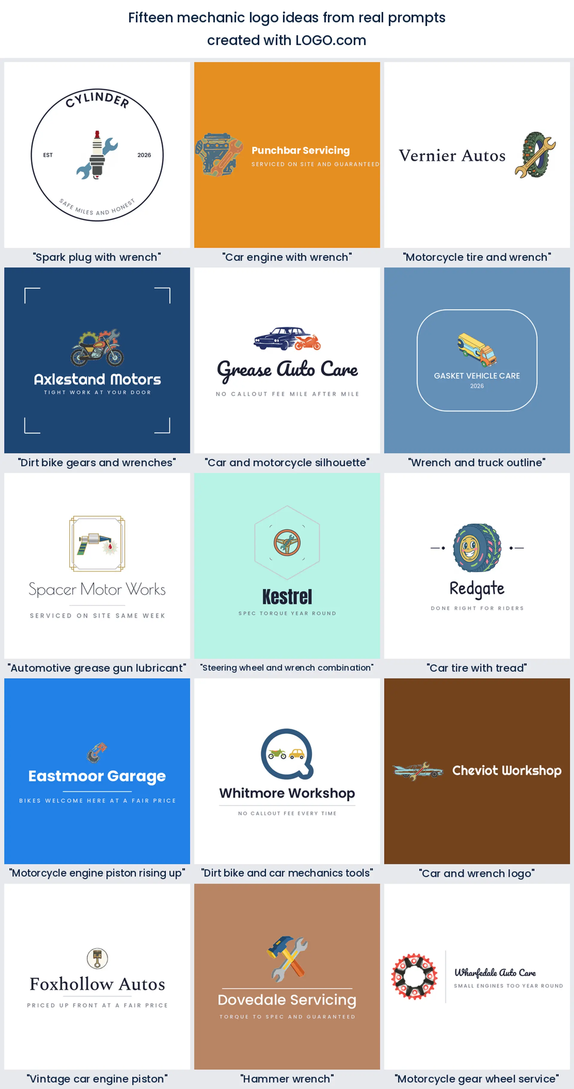
1. "Spark plug with wrench"
A spark plug is small, specific, and instantly mechanical, and putting a wrench through it turns a part into a service. It is a lovely pick for tune ups, ignition work, and anyone whose phone rings about no starts, and the vertical plug gives you a tall mark that drops neatly into a round profile picture.
2. "Car engine with wrench"
The most direct statement in the set. Engine plus tool leaves nobody guessing what you do, which matters when a driver is scrolling a map at speed. Let the wrench overlap the block rather than sit beside it so the two shapes lock together, and this becomes a solid mechanic shop logo for a workshop that does the full range.
3. "Motorcycle tire and wrench"
Written by a motocross mechanic, and it shows. A knobbly tyre carries more personality than almost any other shape in this trade, and the wrench keeps it honest about the work. Perfect for a motorcycle mechanic logo, a track side service, or anyone whose customers arrive on a trailer.
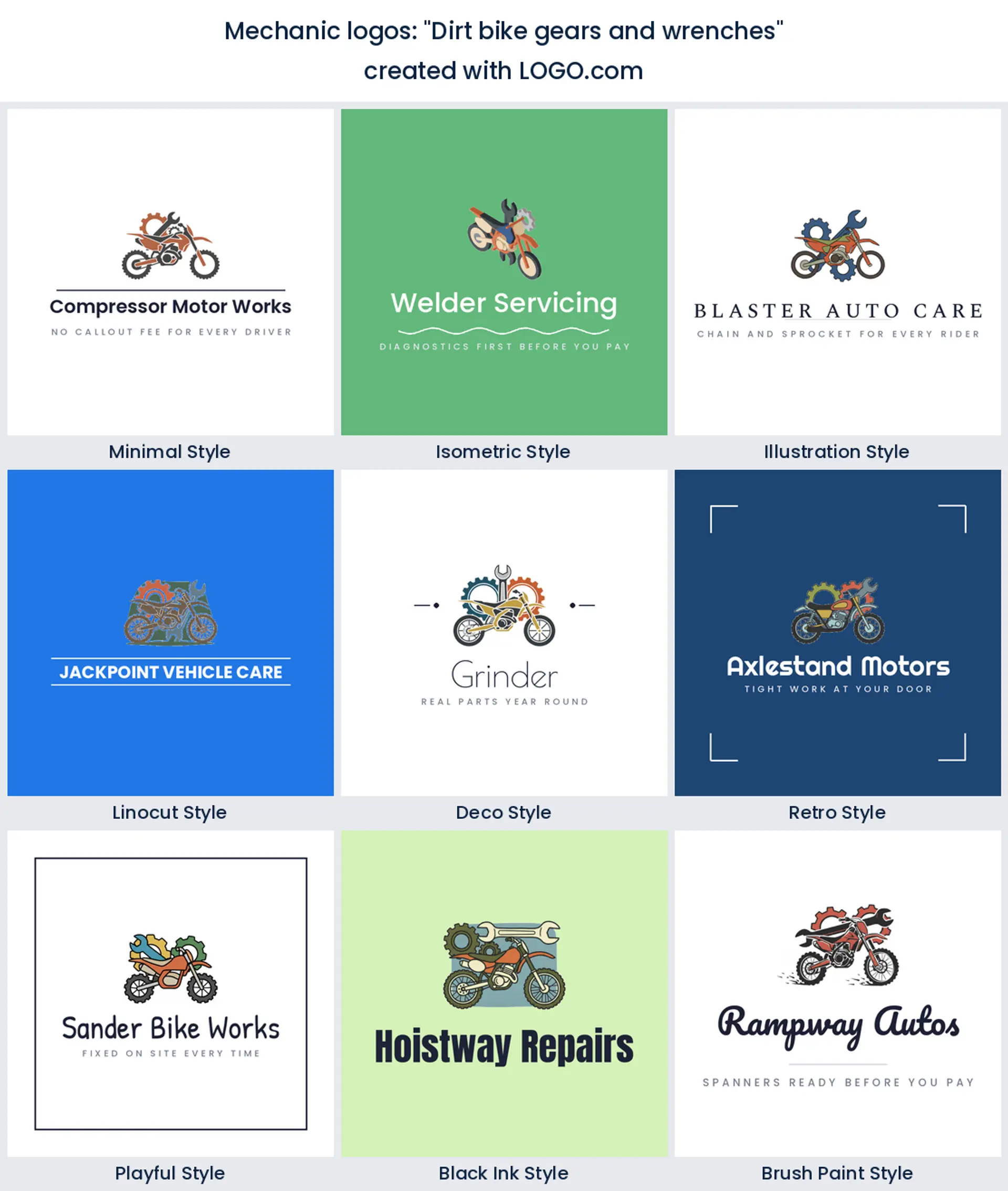
4. "Dirt bike gears and wrenches"
Three ideas in one prompt, which is usually too many, so pick two. Gears behind a bike, or wrenches behind gears, but not all three fighting for the middle. Done simply it makes a confident off road mechanic logo that reads well on a van door and on the back of a race shirt.
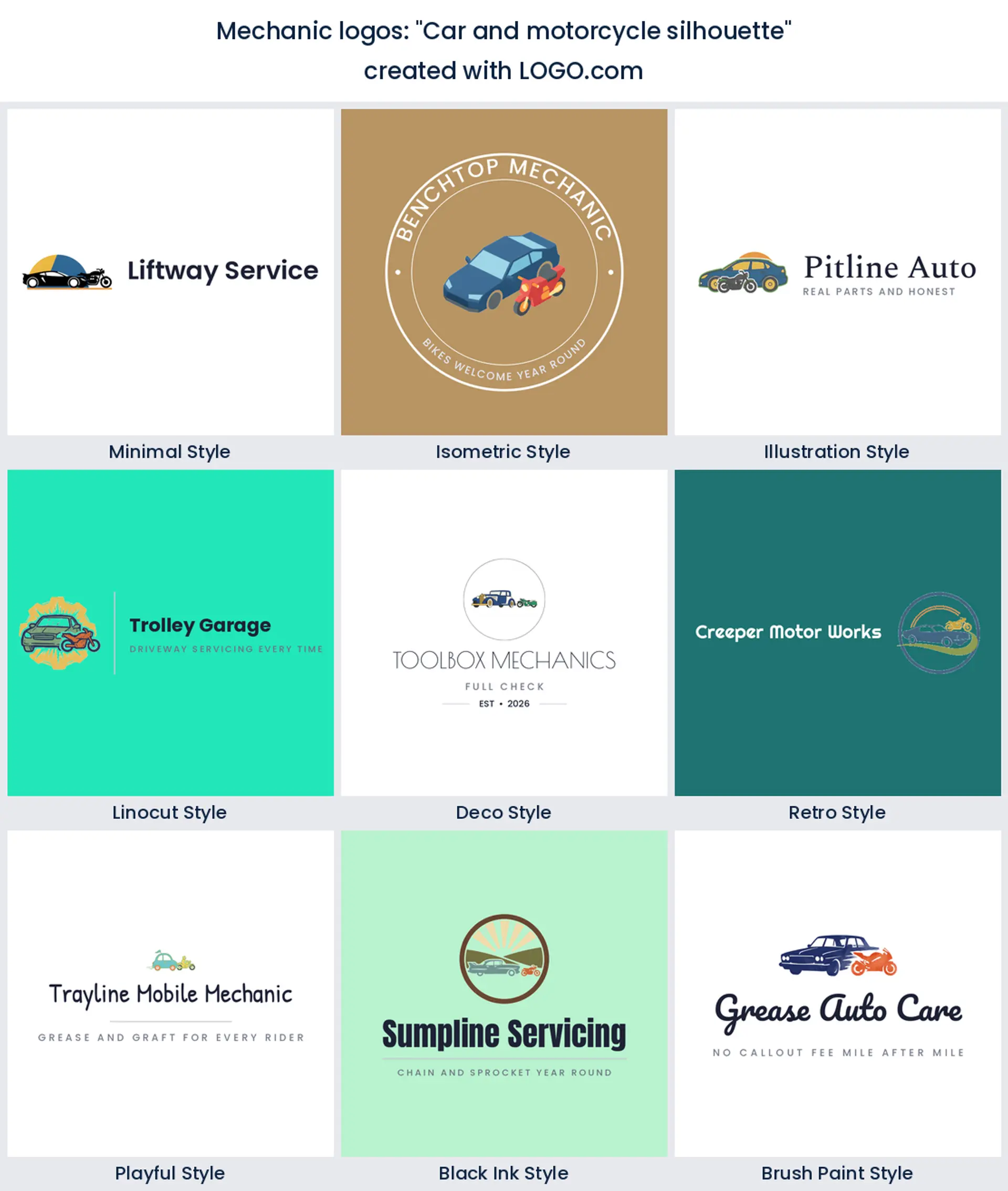
5. "Car and motorcycle silhouette"
This one solves a real problem: what do you show when you fix both. Two profiles, one small and one large, stacked or overlapping, says cars and bikes without a word of explanation. It is a practical answer for a mixed workshop and it keeps your mechanic logo design honest about the bays you actually have.
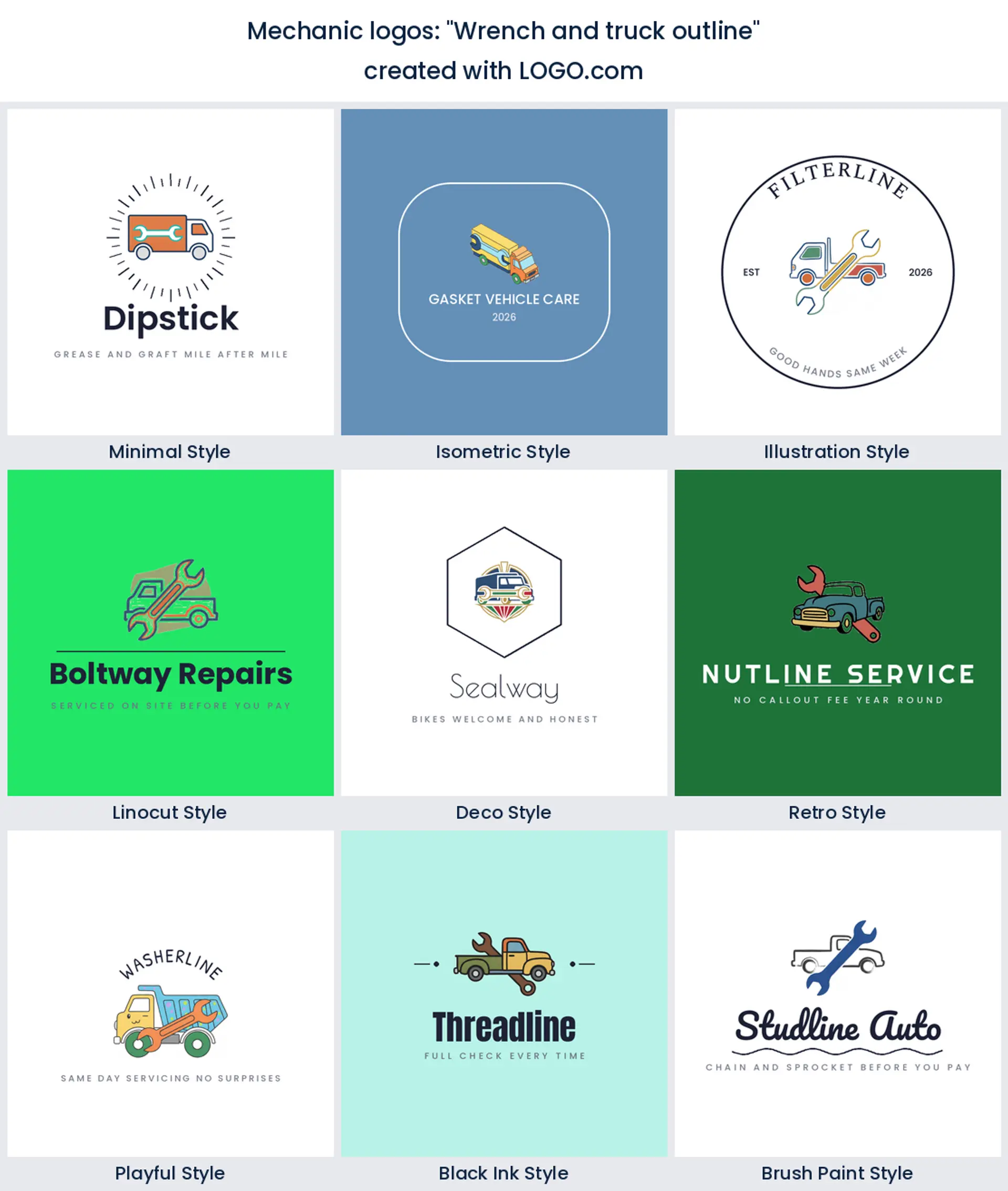
6. "Wrench and truck outline"
Swap the car for a truck and the whole tone changes. Outlines are lighter than filled shapes, so a truck drawn in line work with a wrench through it feels technical rather than heavy. Good for fleet servicing, light commercial work, and anybody chasing diesel mechanic logo ideas that do not shout.
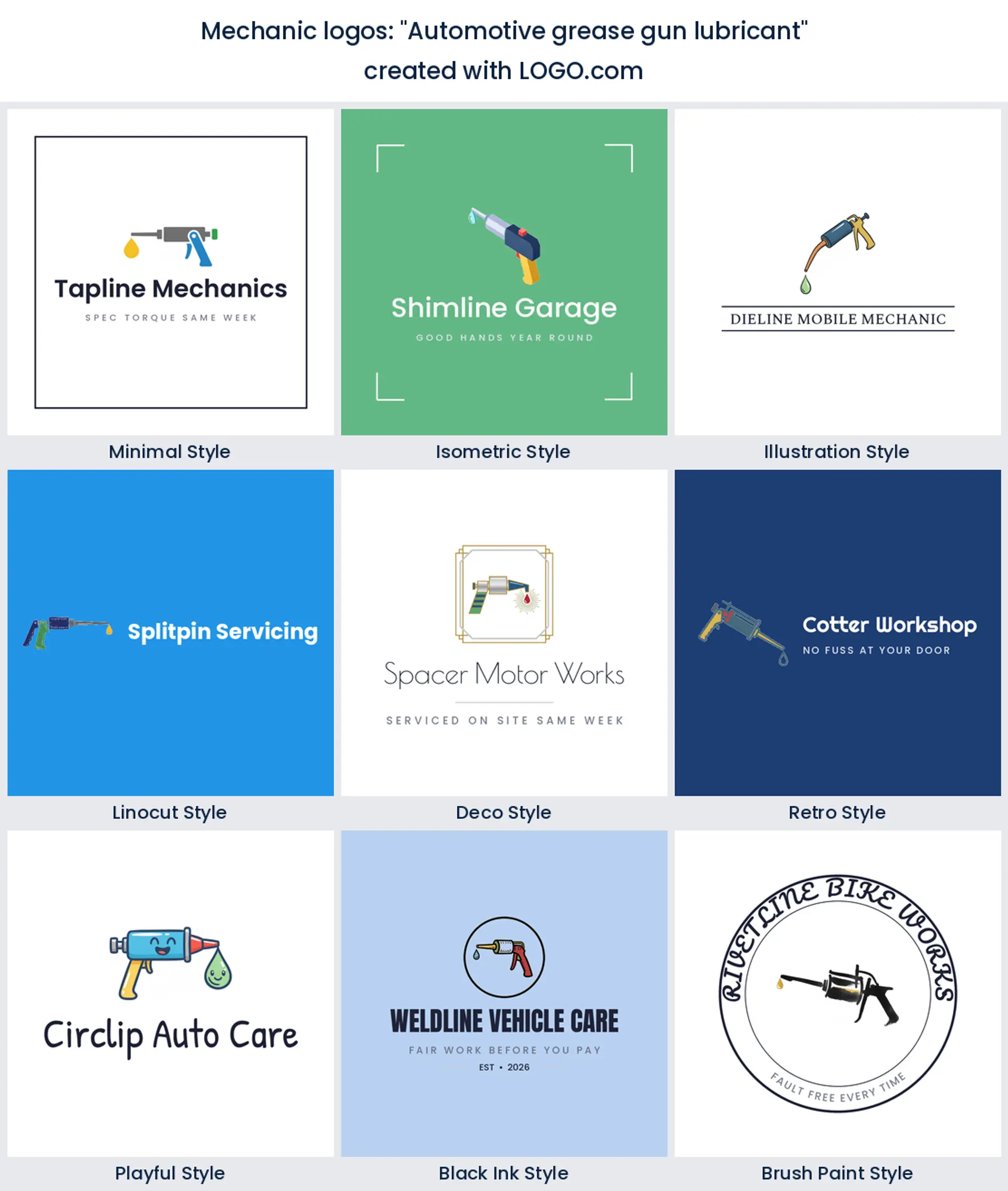
7. "Automotive grease gun lubricant"
Nobody else is using a grease gun, which is exactly the argument for it. It is an odd, specific, working tool that says lubrication, servicing, and maintenance contracts. Draw the barrel and the nozzle as two clean shapes and let a single drop do the rest, and you get a mark with no competition on your street.
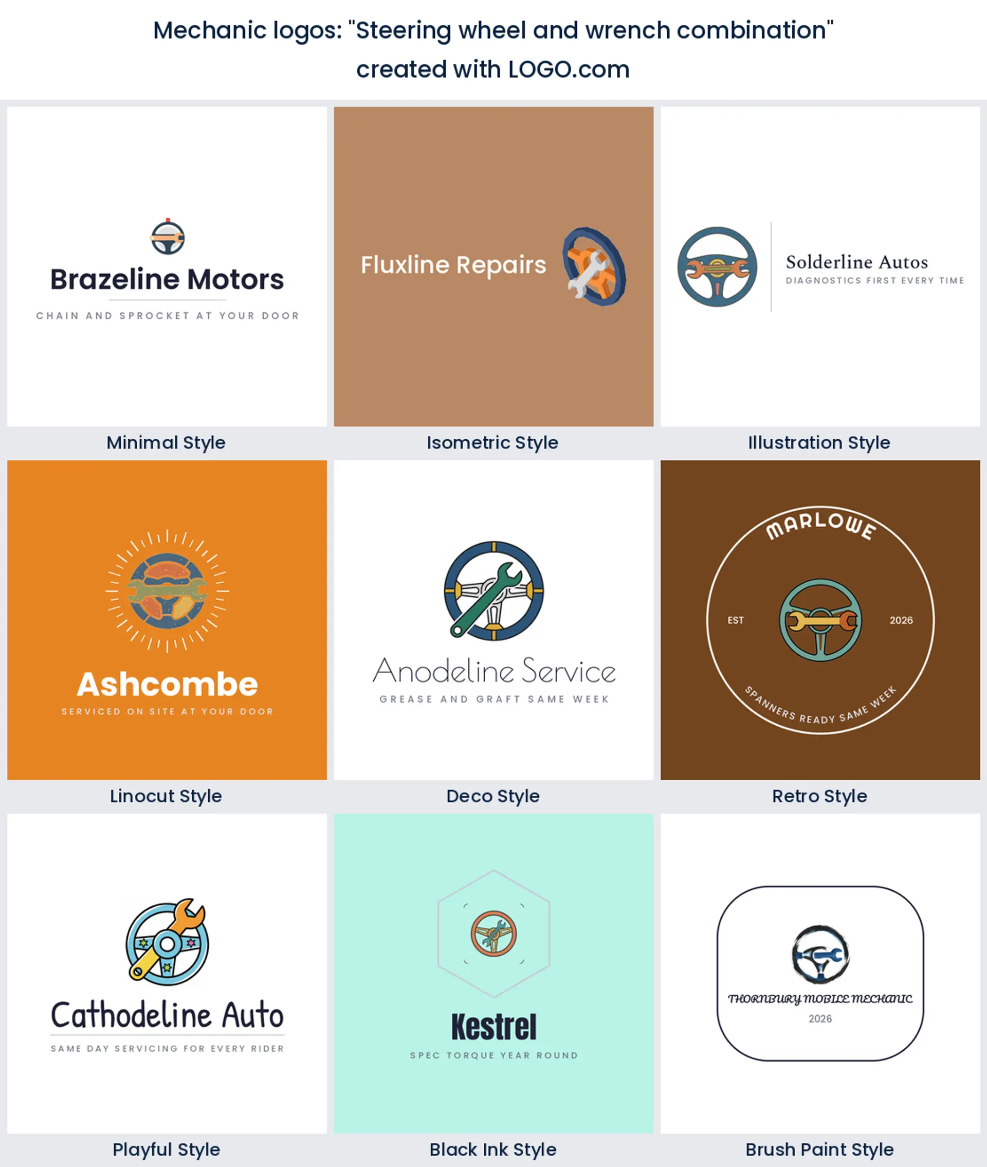
8. "Steering wheel and wrench combination"
Two founders wrote versions of this within weeks of each other, which makes it the most duplicated idea in the group. It balances the driver and the tool, so it fits servicing, inspections, and general repair. Keep the wheel as an open ring and slide the wrench through it rather than in front, or the middle goes solid.
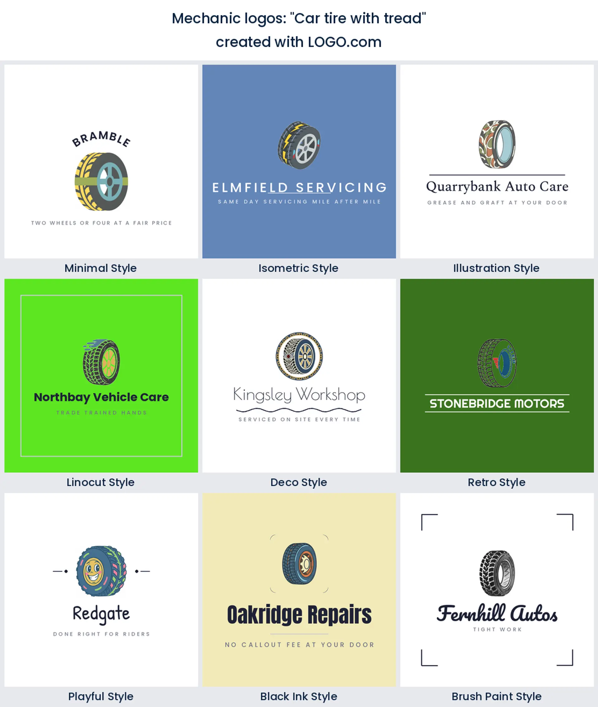
9. "Car tire with tread"
Simple, and better than it sounds. One tyre, seen slightly from the side so you get both the wall and the tread, is a shape people read in a fraction of a second. Pair it with a short name in a heavy weight and you have a tyre and wheel mechanic logo that works at the size of a map pin.
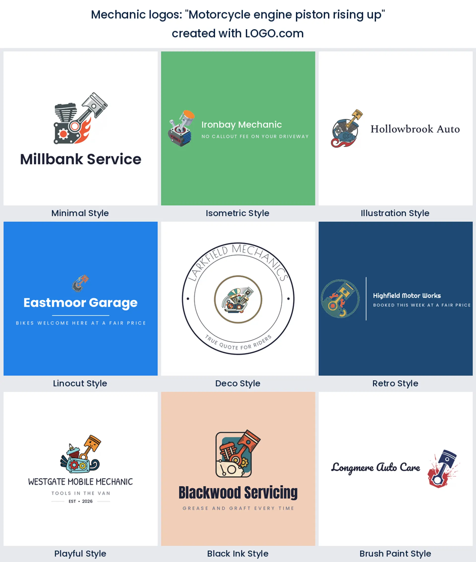
10. "Motorcycle engine piston rising up"
Movement is rare in this trade and it makes a mark feel alive. A piston lifting out of a bike engine, with the rod on a diagonal, reads as power and rebuild work rather than routine servicing. Aim it up and to the right and keep the negative space open around the crown.
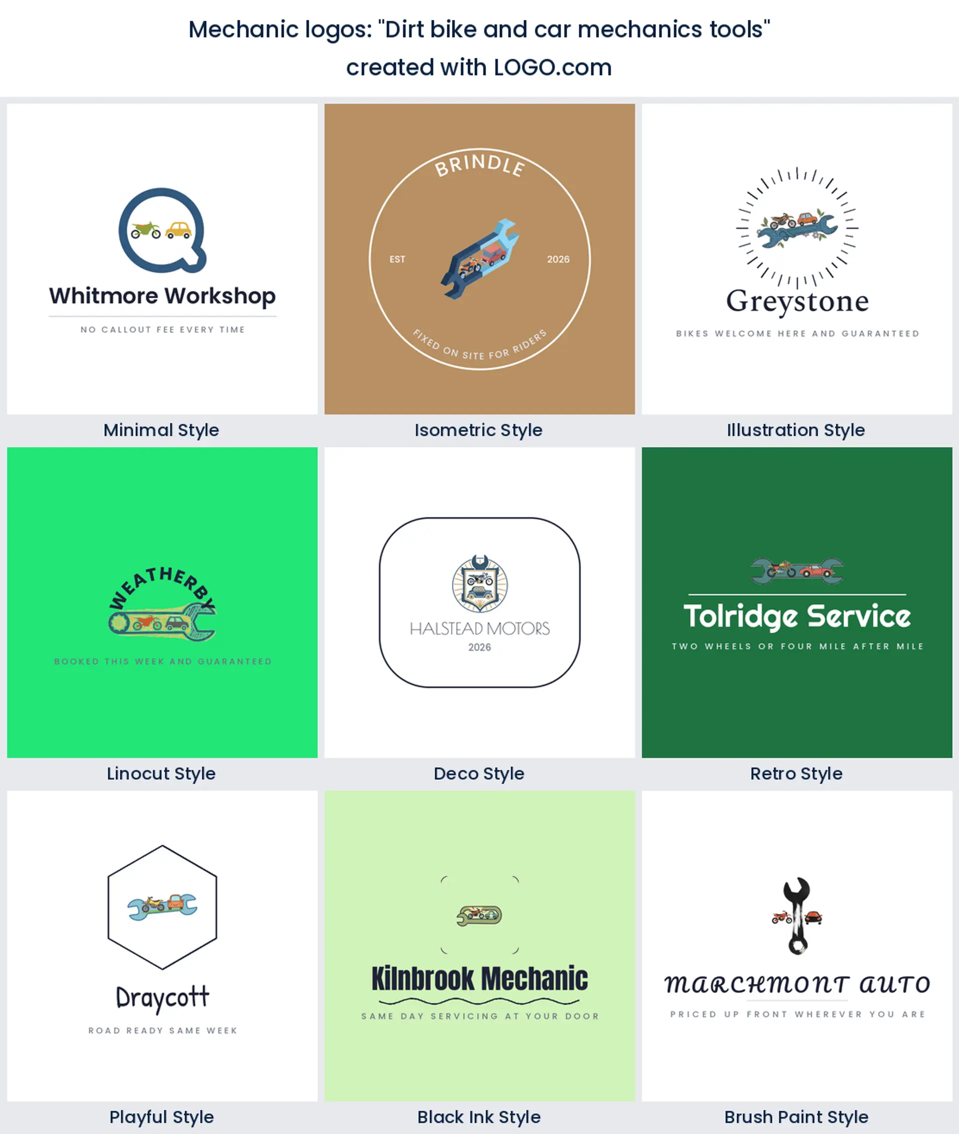
11. "Dirt bike and car mechanics tools"
The workshop that takes anything with an engine. A bike, a car, and a tool is a lot to fit, so let the tool be the frame and the vehicles be small shapes inside it. That hierarchy is what stops a busy idea turning into a busy logo, and it suits a general mechanic who does not want to turn work away.
12. "Car and wrench logo"
The plainest prompt anyone wrote, and there is nothing wrong with plain. A car body with a wrench laid across it is the trade in two shapes, and it will still be legible in ten years. Give it a strong colour and an unusual typeface, because when the icon is this familiar the type is what makes it yours.

13. "Vintage car engine piston"
Old machinery has a look, and this prompt is chasing it. A piston drawn with a little weight and wear, sitting inside a ring or a plain frame, sends you straight towards classic restoration and engine rebuilding. Keep the palette to two colours or the vintage feel turns into clutter.

14. "Hammer wrench"
Two tools, no vehicle, which quietly widens what you can take on. It suits fabrication, welding, and the repairer whose work spans more than cars, and it is a sensible base if you are hunting small engine repair logo ideas. Cross them at a shallow angle so the mark sits wide rather than square.
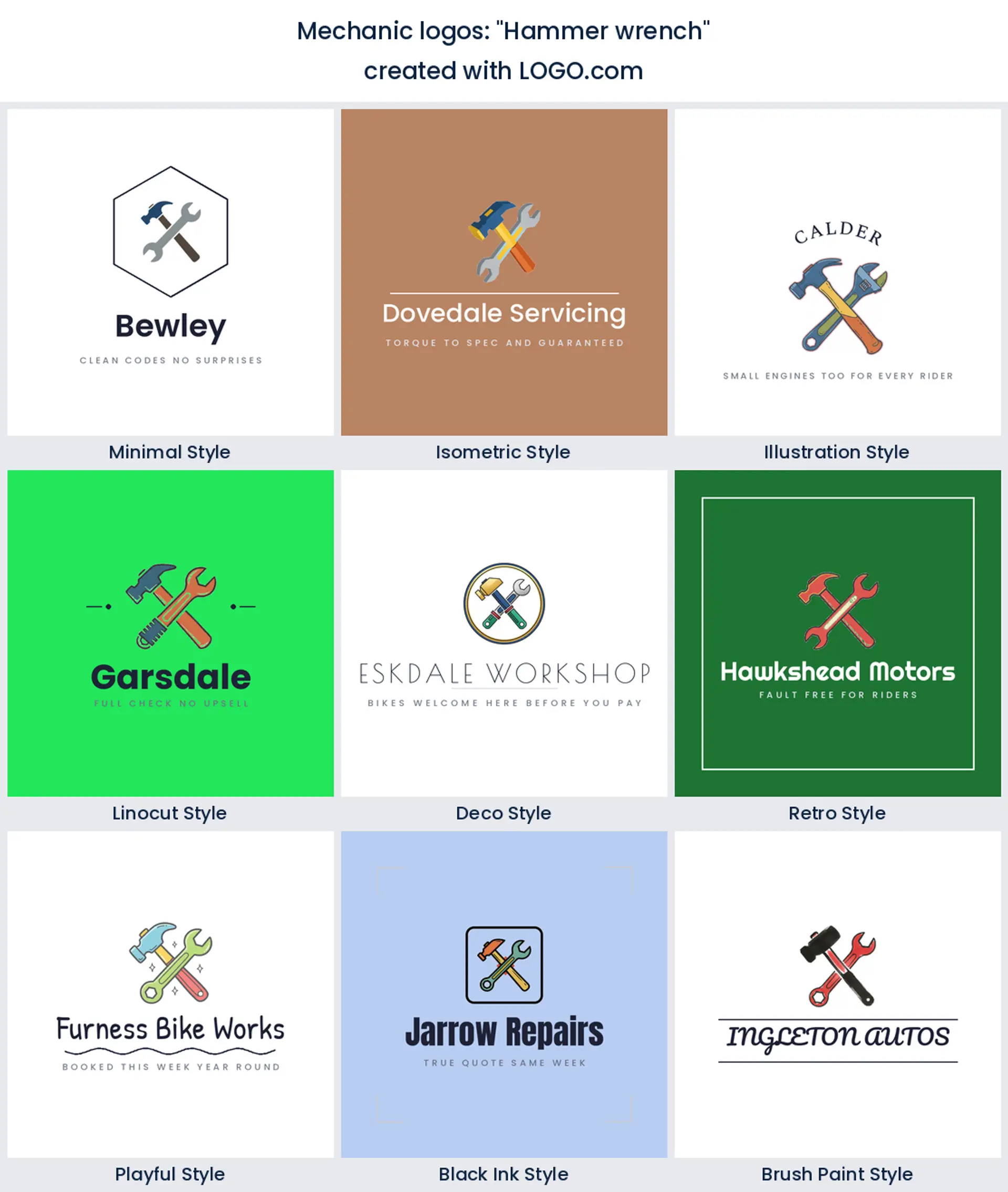
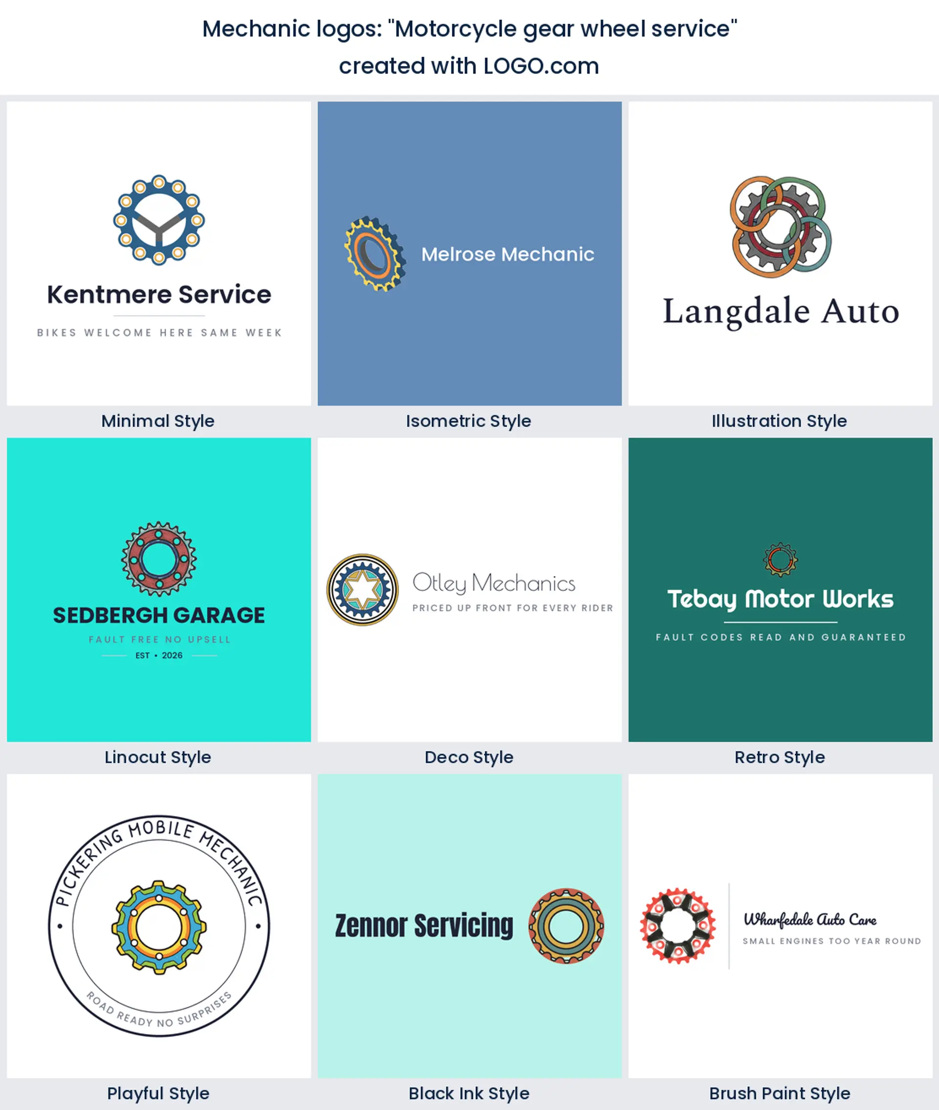
15. "motorcycle gear wheel service"
A sprocket, not a car gear, and the difference matters to the people you want calling. Ringed teeth around an open centre give you somewhere to put an initial or a small mark, and the whole thing stays circular, which is the friendliest shape for an avatar or a sticker.
The bike beats the car, and that tells you who is starting these businesses
It is worth sitting with the top of that ranking for a moment, because it goes against every stock image you have ever seen. In our numbers the bike beats the car by a wide margin. The reason is who signs up. Motorcycle, motocross, and dirt bike specialists are usually small, usually independent, and usually branding themselves rather than a building, so they come to a logo maker early. Car heavy workshops often inherit a name and a sign from whoever had the unit before them.
The lesson is not that you should draw a bike. It is that the machine you draw should be the one your best customers own. If half your week is scooters and quads, a saloon car on your van is quietly telling the wrong people to call. Pick the vehicle that matches the work you want more of, then keep it simple enough that it survives at the size of a phone icon.
Working out of a van changes what your logo has to do
If you work out of a van, your logo is your premises. There is no sign, no forecourt, and no waiting room, so the mark has to carry the trust a building normally carries. That usually means a bolder, friendlier shape and a name that includes the word mobile, because people search for it. A good mobile mechanic logo also has to survive being seen sideways at traffic lights, so wide beats tall and heavy beats delicate.
A fixed workshop has different jobs to do. Your garage logo will spend its life on a building, a ramp banner, and a reception wall, so it can afford a badge, a founding year, or a second line of type. It also sits alongside your neighbours on a trade estate, which is a real argument for an unusual colour. Whichever you are, write down the three places the mark will appear most and design for those, not for the screen you are drawing on.
Your mark has to survive a business card before anything else
Ask a mechanic where their logo does the most work and the honest answer is rarely the sign. It is the card left on a dashboard, the sticker on a service book, and the header on an invoice. That is why people search for mechanic business card ideas almost as often as they search for logos. All three of those are small, printed, and often in one colour, so test your mark at about three centimetres wide, in black on white, before you fall in love with it.
Two things break at that size. Thin strokes close up and fill in, and small lettering inside a badge turns to grey mush. Fix both by thickening every line until it is wider than the gap beside it, and by lifting your shop name out of any ring and putting it underneath the mark. If you are working up mobile mechanic business card ideas, leave the icon on its own on the back of the card and give the front to your phone number.
Name first, symbol second, and what to do if you have neither
Most of the mechanics in our data typed a symbol before they had settled a name, and that is the wrong way round. The name decides how much room the icon gets. Two short words let you stack the mark on top and keep everything tight. Four long words force the icon to sit beside the type and shrink. So if you are still weighing up mechanic shop name ideas, get that decision done first and the logo becomes much easier.
Short and specific beats clever. Your own surname works, a street or a district works, and a single mechanical word plus one plain word works best of all. Avoid anything that locks you to one service unless you are certain, because Brakes Only is a hard name to grow out of. If nothing is landing, try our business name generator, then bring the winner straight back here and put a mark on it.
The colours mechanics actually pick, and the one they skip
Our palette numbers for this group are not what the trade press would tell you. Set aside the white and black bases nearly every logo uses and blue is the clear leader among mechanic and vehicle servicing founders, with green a strong second, then orange and yellow. Red, the colour everybody assumes belongs to garages, sits well down the list. Blue reads dependable and technical, green reads honest and increasingly says hybrid and electric work, and orange and yellow do the visibility job on a roadside.
Choose one lead colour and one accent instead of three equals. Deep blue with a single warm accent is the safest pairing in this trade and it still looks sharp printed in black on a job sheet. If every workshop near you is red, that is an argument for blue or green rather than a reason to join in. And your logo does not have to be full colour everywhere. On LOGO.com you can pick a multi colour icon or a one colour version, and the one colour file is the one your sign maker and your embroiderer will ask for. Free downloads give you four high resolution PNG files with full commercial use, and the paid Brand Plan adds the vector files for large print, unlimited edits, and a brand kit.
Make your mechanic logo with LOGO.com
Type your business name, pick the machine or the tool that matches the work you want more of, and choose one of nine styles. You will be looking at real options in under a minute, and you can keep pushing the colour, the icon, and the type until it looks like your van and your bench. Preview it free, download the high resolution files, and get it onto the card, the invoice, and the door.
Methodology. These figures come from logos created on LOGO.com during the 12 months ending August 2026. We kept the founders whose selected industry named mechanic work or a workshop that repairs engine driven vehicles, including the mechanic, mobile mechanic, auto repair, motorcycle, motocross, diesel, small engine, roadside and automotive servicing values, and dropped mechanical engineering, mechanical HVAC, marine and bicycle mechanics along with body, paint, glass, towing, detailing, dealership and parts supply because those belong to other pages. That gave 591 brands. We then read the custom icon descriptions those founders wrote and scoped them to mechanic subjects, meaning hand tools, engine and drivetrain parts, wheels and tyres, and the vehicles a mechanic services, which left 65 descriptions. Grouped by concept, motorcycles and dirt bikes were most common at about 43 percent, followed by the wrench at about 37 percent and the engine at about 25 percent. Figures are a share of scoped mechanic icon descriptions, rounded to the nearest percentage point. Source: LOGO.com first party product data, August 2026.
THE #1 LOGO GENERATOR
Why LOGO.com is the best mechanic logo maker
1.591 mechanics told us what to draw
Every icon on this page comes from descriptions real mechanic founders typed on LOGO.com, so you start from evidence instead of a gallery of stock spanners.
2.Legible on a card left on a dashboard
Heavy shapes and open gaps keep your name legible on a card left on a dashboard and on the header of a one page invoice.
3.Swap between nine icon styles in one click
See a stripped back minimal mark and a carved linocut badge side by side before you commit, without redrawing anything or briefing a designer.
4.Stencils, stickers, and stitching from one file
Pick a multi colour icon or a single colour version, which is the file your vinyl cutter and your workwear embroiderer will actually ask for.
5.Free PNG downloads with full commercial use
Four high resolution PNG files cost nothing and carry full commercial use, so your quotes, socials, and Google listing are covered from day one.
6.Vector files for the van wrap and the workshop sign
The Brand Plan adds the vector files a wrap installer or a sign maker needs to print your mark two metres wide with clean edges.
7.Built for maps, listings, and local search
Start from a square lockup and the same mark drops into your Google Business profile, your Facebook page, and a windscreen sticker without a redraw.
8.Take on new work without paying for a redesign
Take on bikes, diesel, or diagnostics later and swap the icon, colour, or wording yourself rather than paying for another round of design.
9.Colours and fonts saved into a brand kit
Type your business name and you will be choosing between real options in a minute, with your colours and fonts saved in a brand kit you can hand to a printer.
Mechanic Logo Maker FAQs
Explore more logo ideas
3D DesignAcademic WritingAccountantAerospace EngineeringAgricultural ConsultingAgriculture CompanyAmazonAnimal ProtectionAnimationApp DevelopmentAquacultureAromatherapyArt and DesignArtsAsian RestaurantAthleticsAudio TechnicianAuto ManufacturingAuto Repair ServicesBadgeBandBarber ShopBearBeauty and CosmeticsBeeBibleBiotechBitcoinBlogBoatBook PublisherBooks and Literature BlogBrainBuildingBusiness Consulting Logo MakerBusiness StorageCakesCampaignCandlesCarCarpentryCateringCelebrationsChemicalChildrenChoirCircleCivil EngineeringClothingCoffee Shop