Auto Repair Logo Maker
Design an auto repair logo that works on your shop sign and your service van.
Need a different logo maker? Try our AI logo generator.
Logos created using LOGO.com
670,000,000
Clean and mechanical auto repair logos

Retro and hand drawn garage logos
Bold badges for auto body and truck repair
Auto Repair Logos, Ranked From Real Brand Data
According to LOGO.com data, the wrench is the symbol auto repair founders describe most often, turning up in about 38 percent of the custom icon descriptions in this group, ahead of the car engine at about 23 percent and the gear at about 17 percent.
The nine icons and fifteen ideas below are built from those descriptions, so you are starting from what real shop owners asked for rather than a blank page. Use them to shortcut the hard part, then push the color, the type, and the wording until the mark belongs to your bays and nobody else's.
On this page
- We read what 630 auto shops asked for. The wrench won.
- Fifteen ways to build an auto repair logo, style by style
- The wrench or the spray gun? Your busiest bay decides
- Bay doors, invoices, and the decal on a customer's back window
- Does a modern auto repair logo still need a shield?
- Why so many shops land on blue, red, and yellow
- Diesel rigs, small engines, and dirt bikes need their own symbol
- Free PNGs now, vector files when the sign goes up
- Make your auto repair logo with LOGO.com
Your logo is the first thing a driver reads on your sign, and the last thing they see on the invoice they take home. That puts an auto repair logo under more pressure than most: it has to look capable from the road, survive a vinyl cutter, and still read on a phone screen when somebody searches for a shop at 7am with a warning light on. So instead of guessing, we went to the numbers. Below are the nine symbols auto repair founders actually asked for on LOGO.com, fifteen real prompts they typed rendered nine ways each, and the practical calls you will have to make about specialty, color, and files.
We read what 630 auto shops asked for. The wrench won.
When you strip the descriptions back to their subject, 630 auto repair, mechanic, and automotive founders on LOGO.com keep returning to nine symbols. The wrench is the runaway leader at about 38 percent of the icon descriptions in this set, the car engine follows at about 23 percent, and the gear takes about 17 percent. After those three the tail spreads across tires, parts, tool pairs, steering wheels, pistons, and oil. One clear mark plus a name you can read from the kerb does almost all the work here.
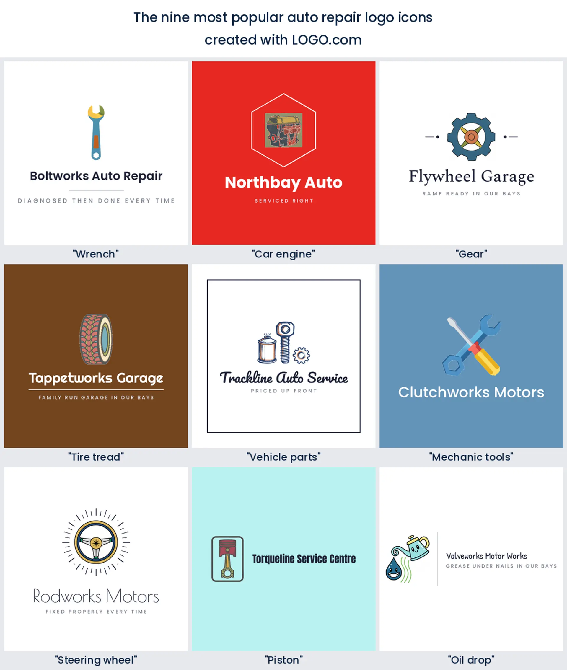
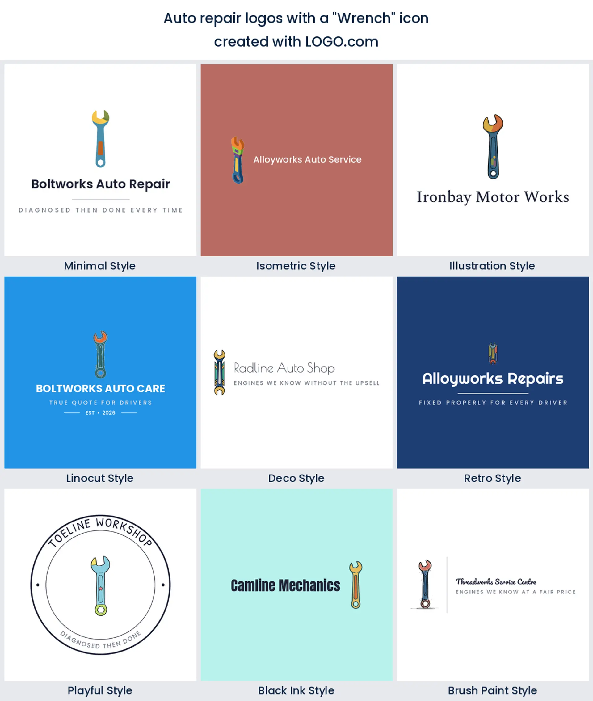
1. Wrench
Nothing else comes close. About 38 percent of the icon descriptions in this set put a wrench at the centre, which makes it the default auto repair logo mark and the one customers decode without thinking. Draw it thick and slightly angled so the jaws stay open when it shrinks onto a business card, and you have a mark that suits a general garage, a mobile mechanic, or a straightforward auto shop logo.
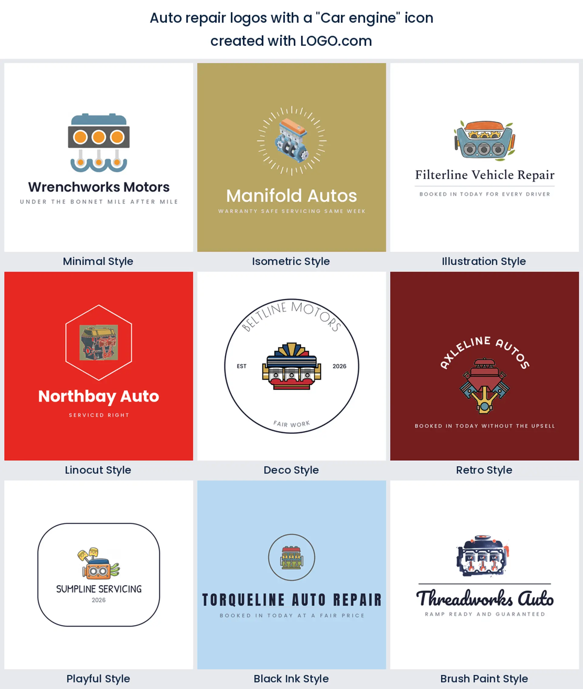
2. Car engine
Second place goes to the engine block, at roughly 23 percent. It is the symbol founders reach for when they want to say we go deeper than an oil change, so it fits rebuild specialists, diagnostics shops, and performance work. Keep the cylinder shapes chunky and drop the small hoses, because fine detail turns to mush on a shirt and it is exactly what makes a car repair logo look busy.
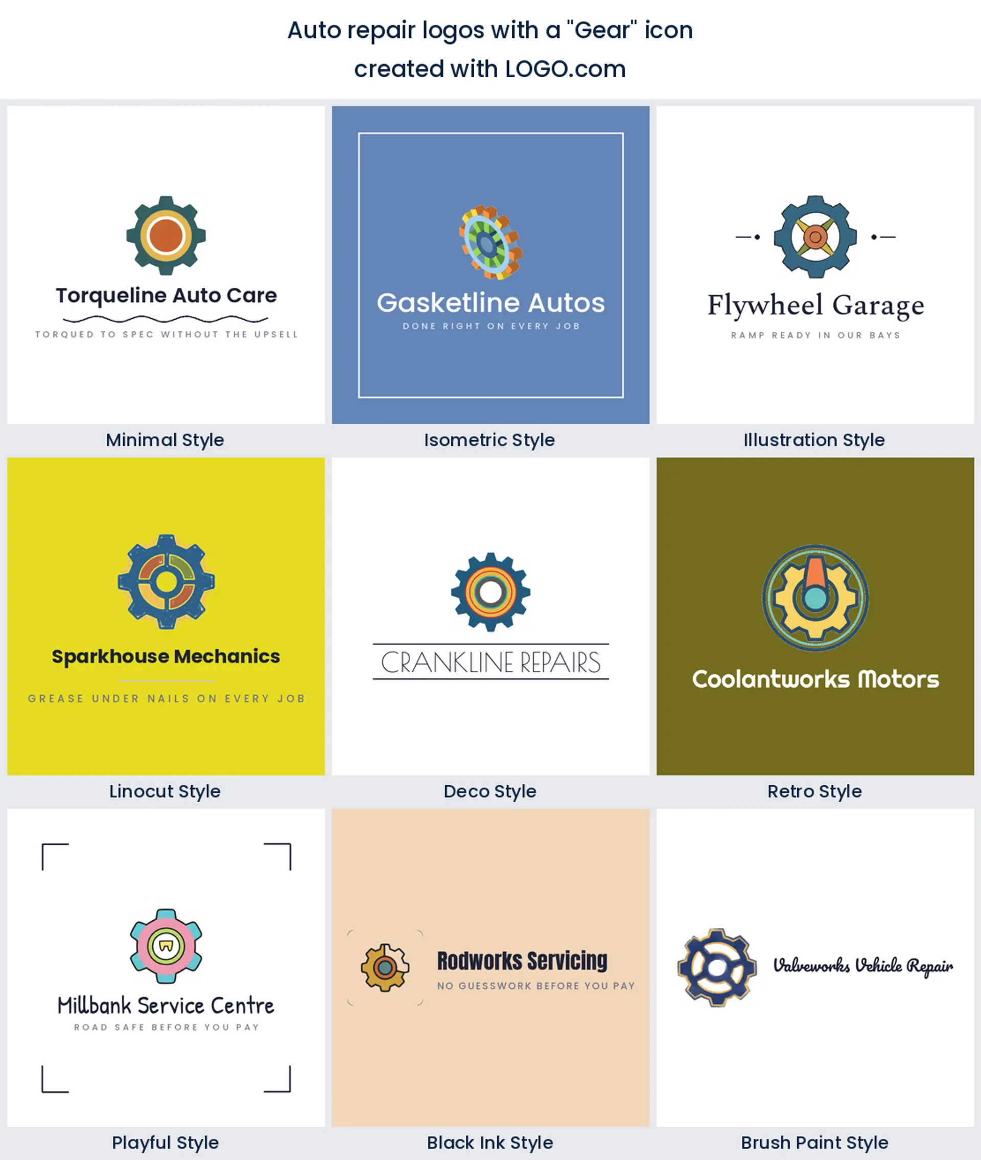
3. Gear
The gear takes about 17 percent and it is the most flexible of the top three. A single toothed ring reads as machinery to everyone, and it happily holds another symbol inside it, which is why so many founders combine it with a wrench. Use it when you want a modern auto repair logo that does not lean vintage, or when your shop covers more than one kind of vehicle.
4. Tire tread
Tread comes next in the ranking, and it is the pick with the clearest customer promise. A block of tread or a wheel in profile tells people you fit and balance, so it is the natural start for a tire shop logo or a wheel and alignment brand. Tread also makes a great texture band under a wordmark when you want the mark to feel wide rather than tall.
5. Vehicle parts
Halfway down the list founders stop drawing one hero object and start drawing a small cluster: a bolt, a spark plug, a filter. It suits shops that sell as much as they fit, and it gives an auto parts counter or a restoration garage more to say than a lone tool. Group the pieces tightly so the cluster still reads as one shape at thumbnail size.
6. Mechanic tools
Crossed tools sit sixth. A wrench over a screwdriver is the oldest shorthand in the trade and it still works, mostly because the X shape is instantly readable at any size. It is a good fit for a mobile mechanic logo or a small independent garage where the owner is the brand and the hands on story matters more than the machinery.
7. Steering wheel
The steering wheel ranks seventh, and it points at the driver rather than the machine. That makes it a warmer choice for shops built on trust and repeat customers, including servicing brands and inspection centres. Three spokes and a clean rim is enough. Add rays behind it and you get a badge that suits a classic or vintage restoration logo.
8. Piston
Pistons come in eighth and they carry more attitude than anything else in the nine. A rod and crown reads performance, tuning, and engine building, which is why it turns up on motorcycle and dirt bike work as often as on cars. Point it upward and keep the outline bold if you want a performance or engine builder logo that still prints on a hoodie.
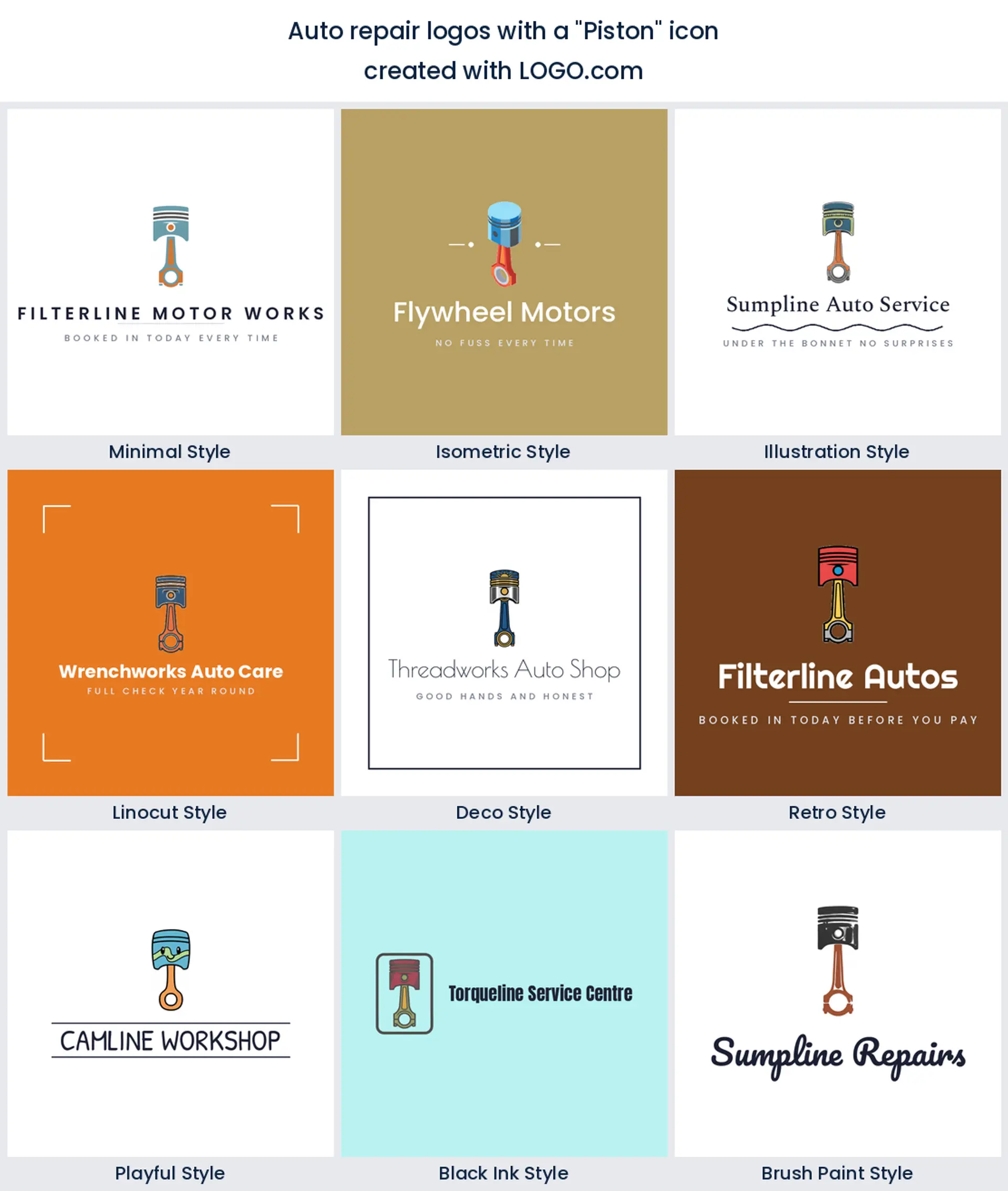
9. Oil drop
Last in the nine, and the most specific. A single drop, usually falling from a spout or a wrench, is the fastest way to say fluids and servicing, so it is the obvious start for an oil change logo or a quick lube brand. It is also the smallest shape in the set, so give it a strong outline or it disappears the moment the logo goes on a window decal.
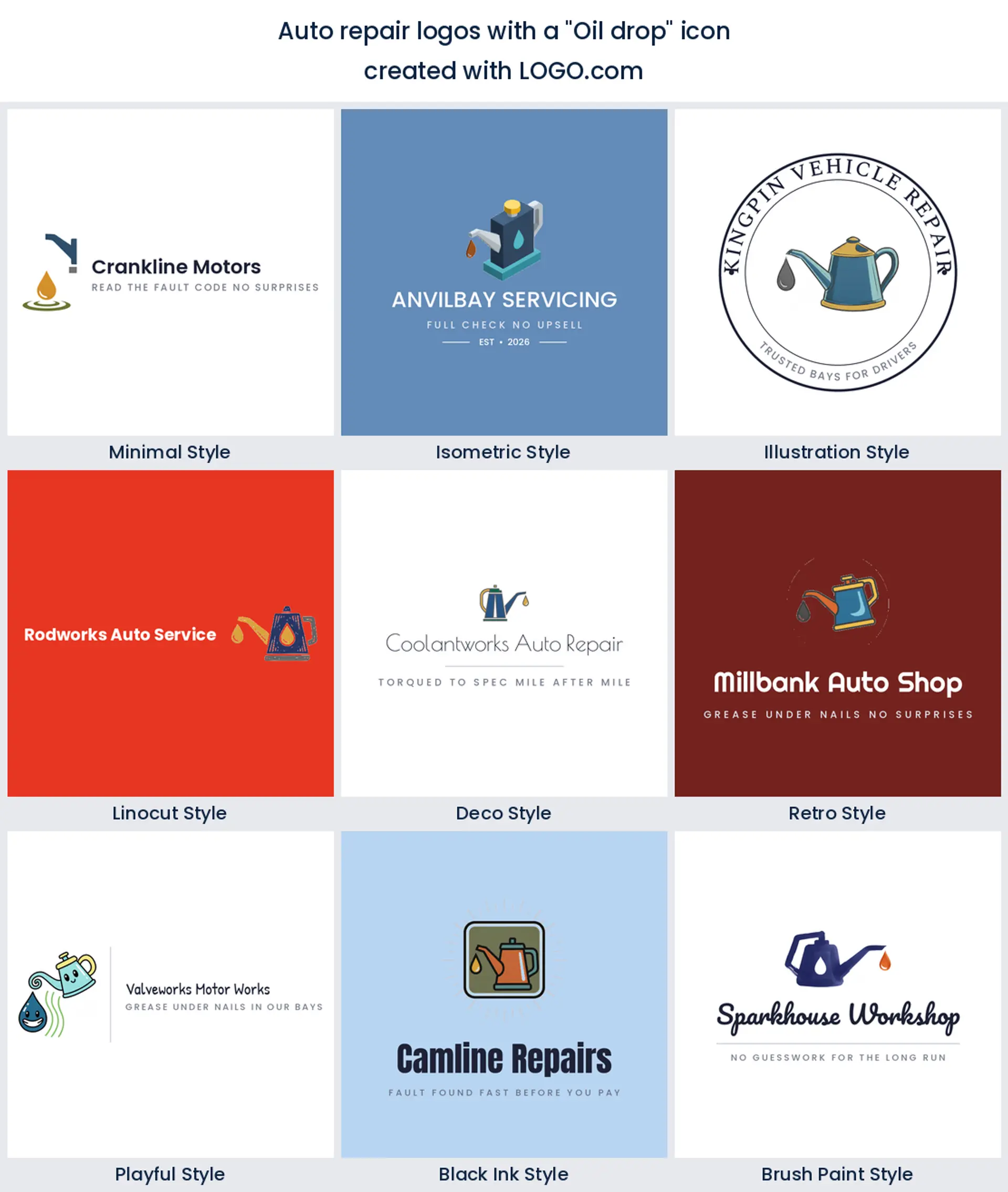
Fifteen ways to build an auto repair logo, style by style
These fifteen are not made up. Each heading is a real prompt an auto repair founder typed into LOGO.com, and each one is rendered across all nine of our styles so you can see the same idea go from a clean minimal mark to a carved linocut badge. Read them as starting points rather than finished logos. Pick the row that matches the work you actually do, then change the color, the font, and the name until none of it looks borrowed.
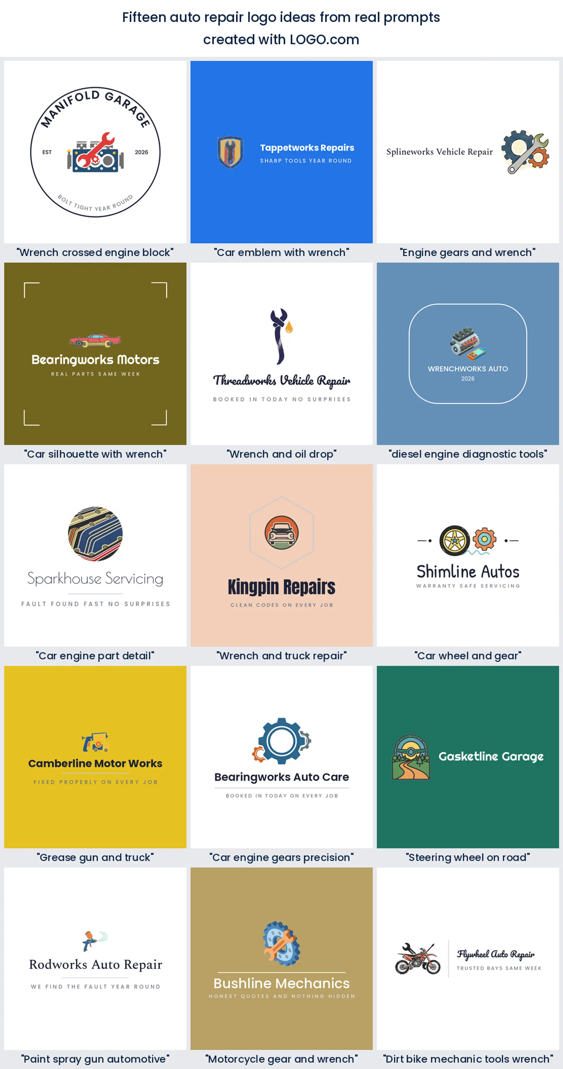
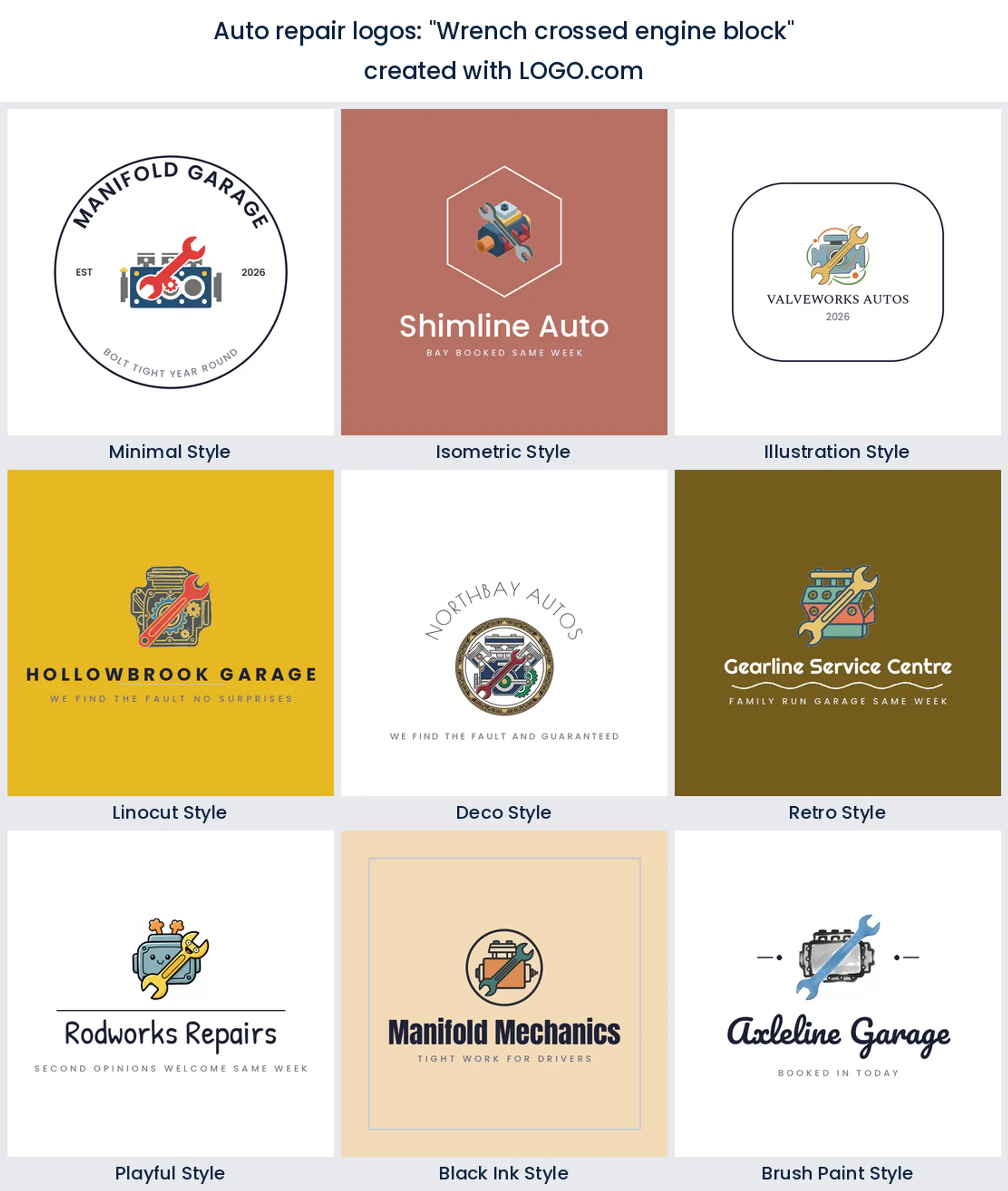
1. "Wrench crossed engine block"
A wrench laid diagonally across a squared engine block is about as direct as this gets, and it is a strong opener if you do everything from diagnostics to rebuilds. The two shapes lock into a compact square, which is exactly what you want for a profile picture and a stamped invoice header.
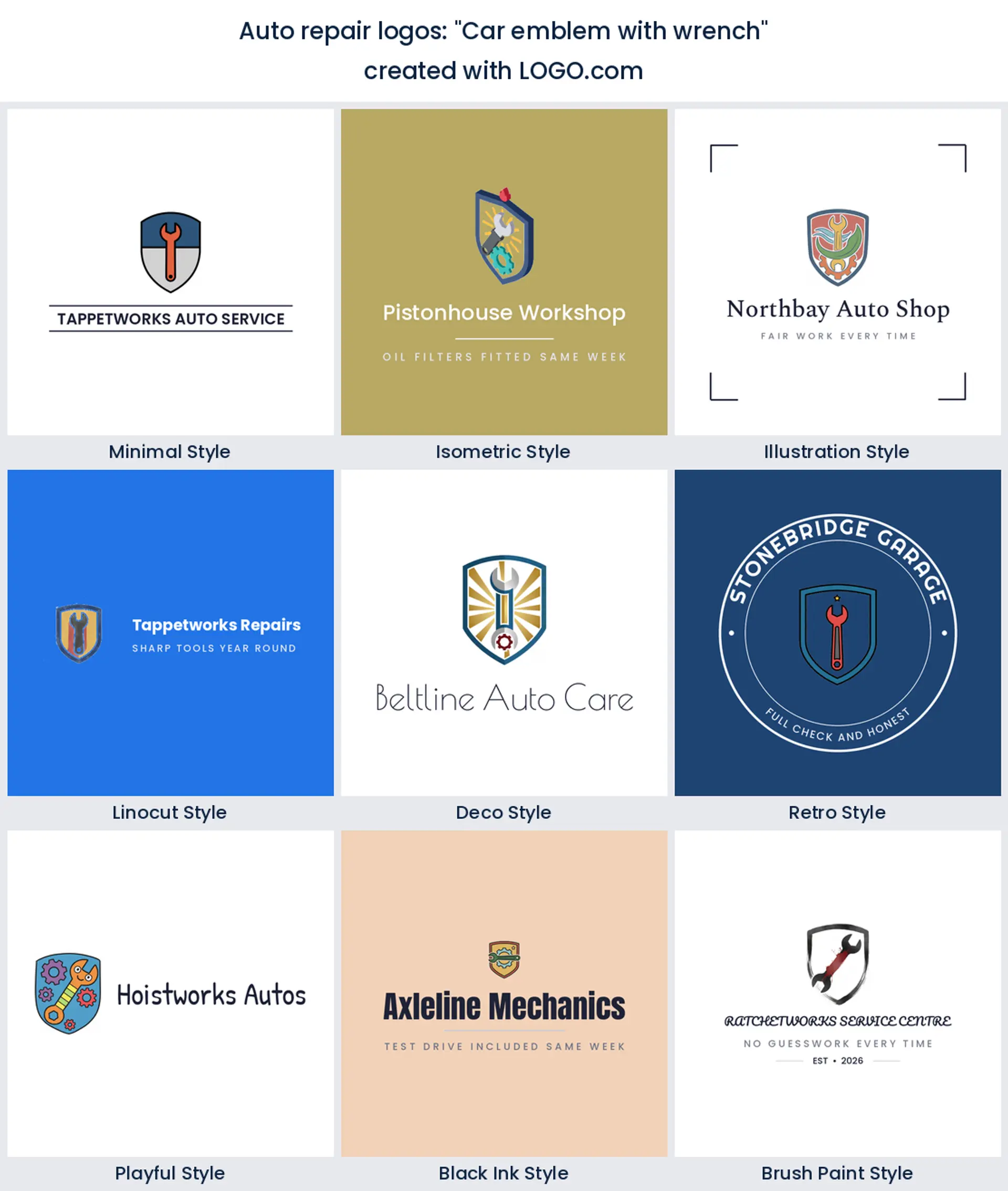
2. "Car emblem with wrench"
Put the wrench inside a shield or an oval and the whole thing turns into a badge. That extra frame is what separates a generic mark from something that looks established, so reach for it if you are opening on a street that already has three garages on it.
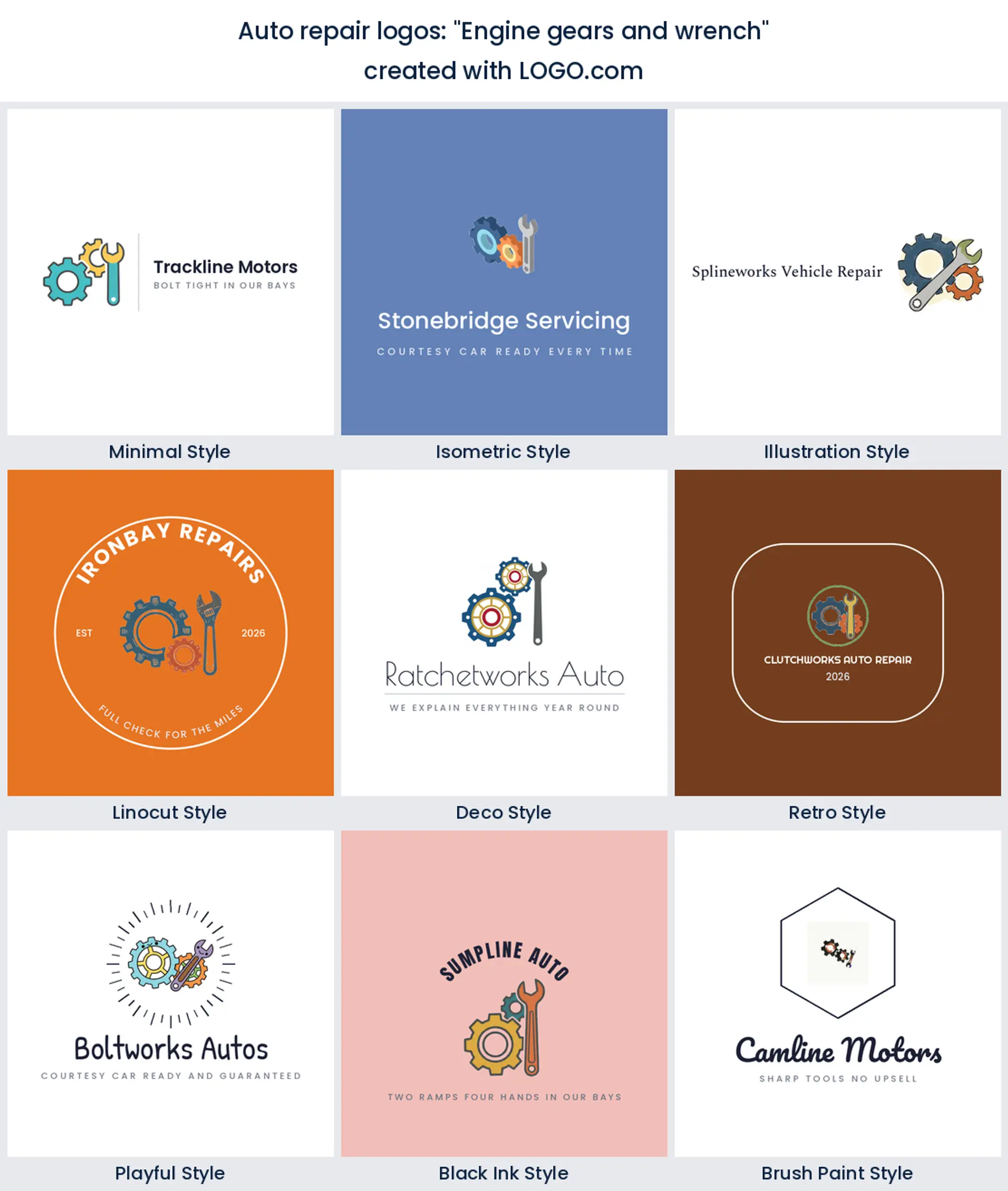
3. "Engine gears and wrench"
Interlocking gears with a wrench cutting through them reads mechanical without naming a single vehicle. Handy when you service cars, vans, and light trucks and do not want to paint yourself into a corner with a car silhouette.
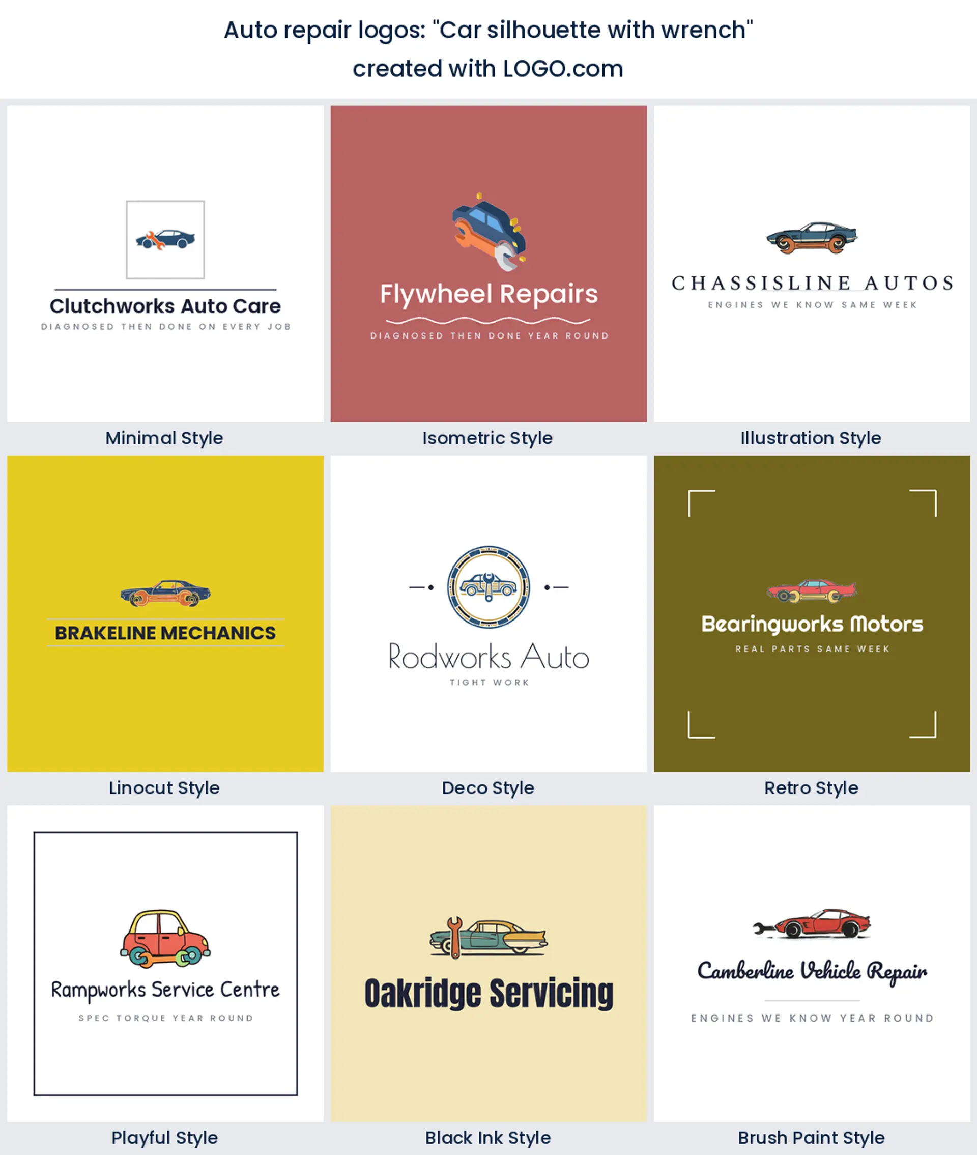
4. "Car silhouette with wrench"
A car in profile with a wrench over it is the clearest way to say we fix cars, full stop. It is the safest of the fifteen and it is the one most likely to win a customer who is scanning search results in a hurry.
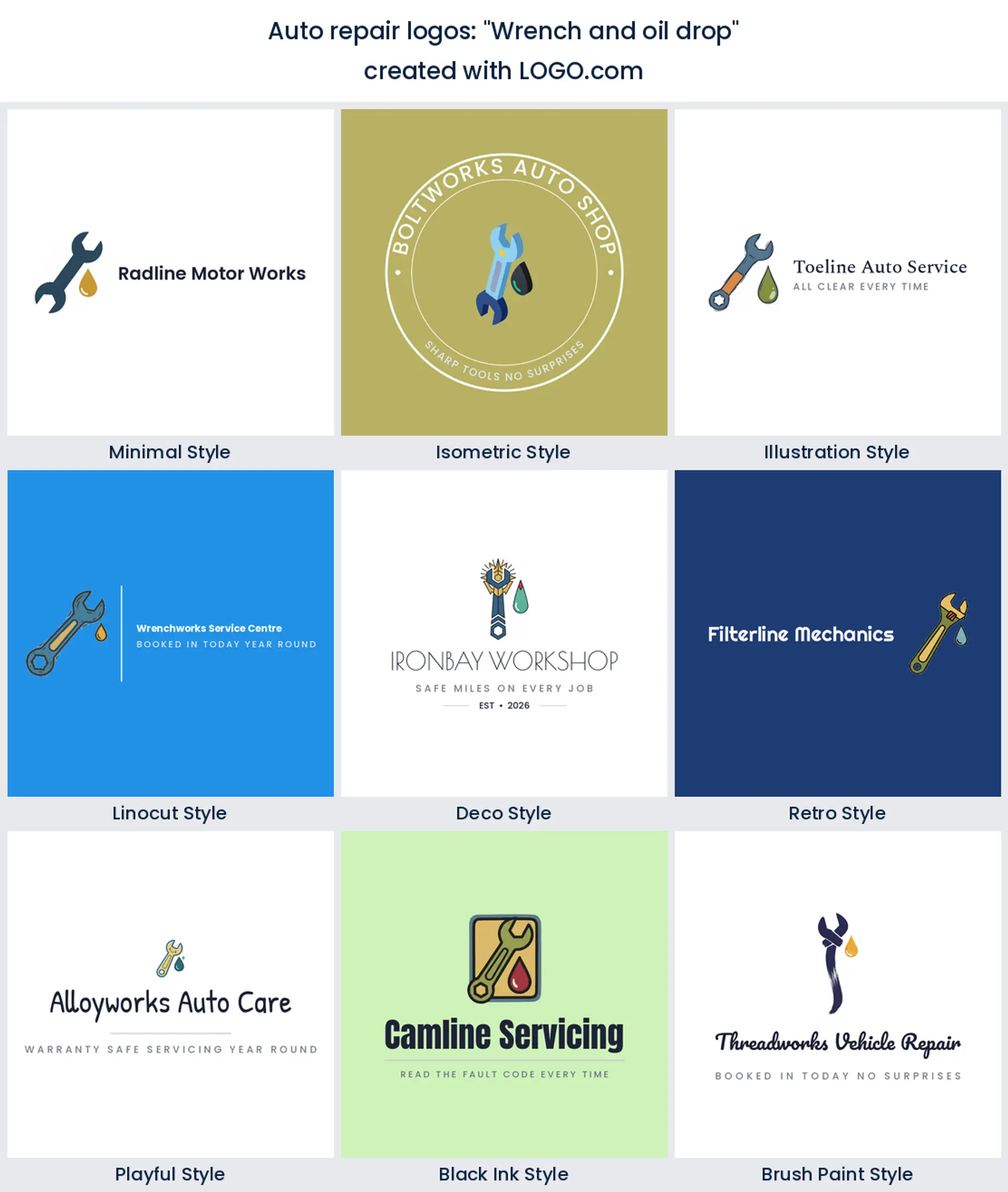
5. "Wrench and oil drop"
Drop an oil bead off the end of the wrench and the mark shifts from general repair toward servicing. If most of your revenue is scheduled maintenance, this is a better oil change logo than a lone can or funnel, because the wrench keeps the workshop credibility.
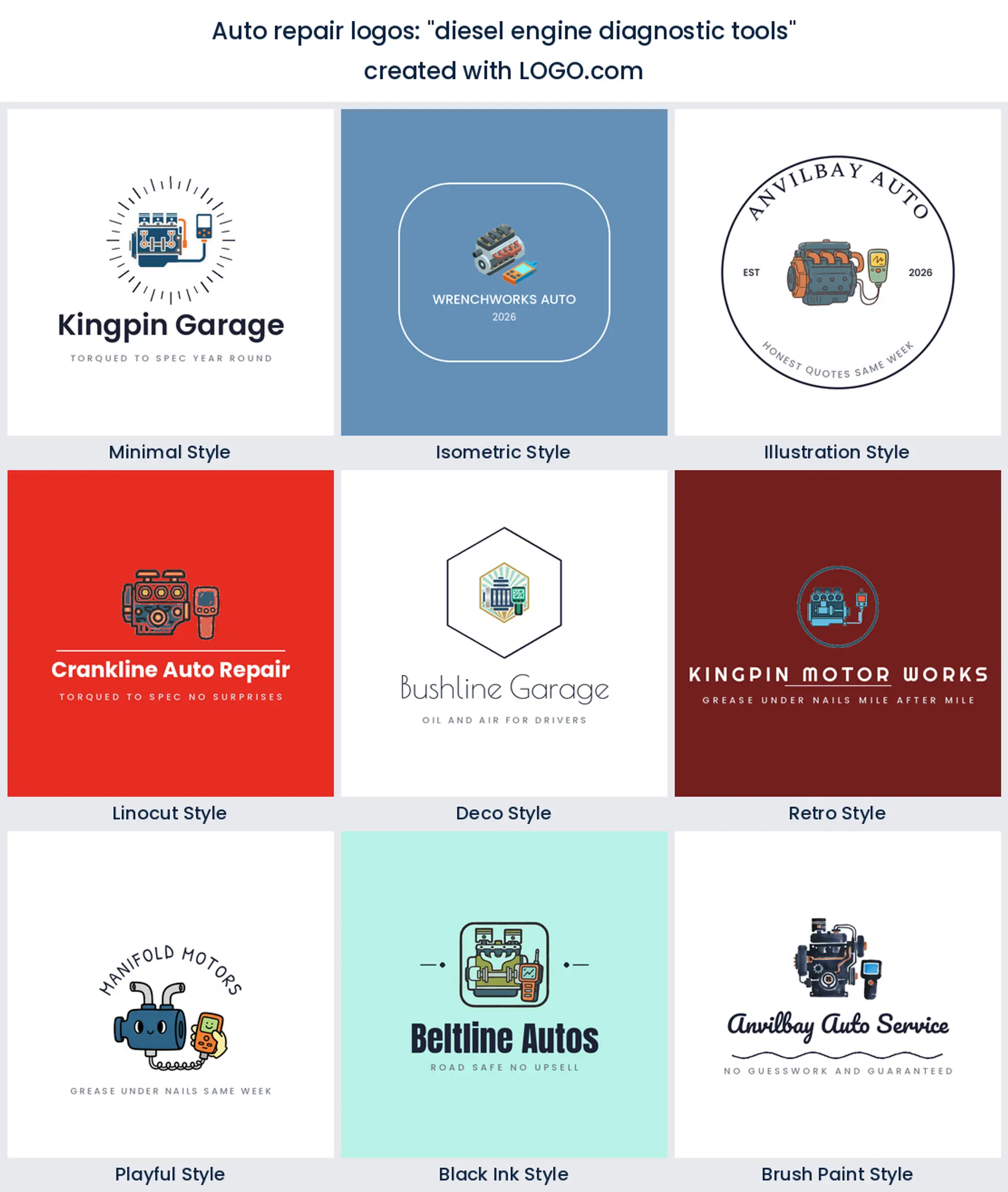
6. "diesel engine diagnostic tools"
A scanner, a probe, and a heavy engine block together say diagnostics rather than spanners. For a diesel repair logo, or any shop that leads with fault finding on trucks and commercial vehicles, this is the direction that matches what you sell.
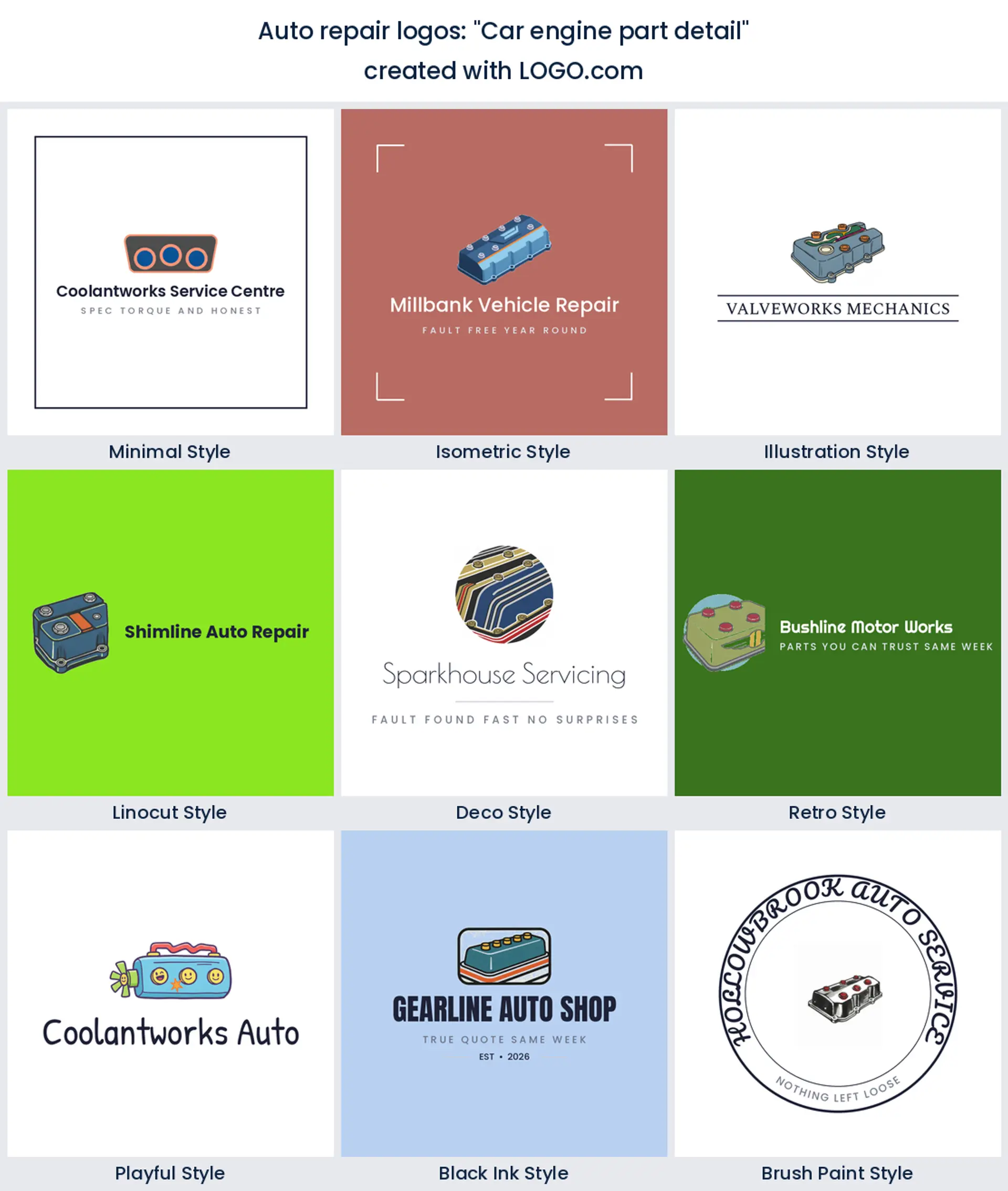
7. "Car engine part detail"
Zooming right in on one machined part, a valve cover or a head, gives you something almost nobody else has. It suits engine builders and restoration shops where the customer already knows what they are looking at and wants to see that you do too.
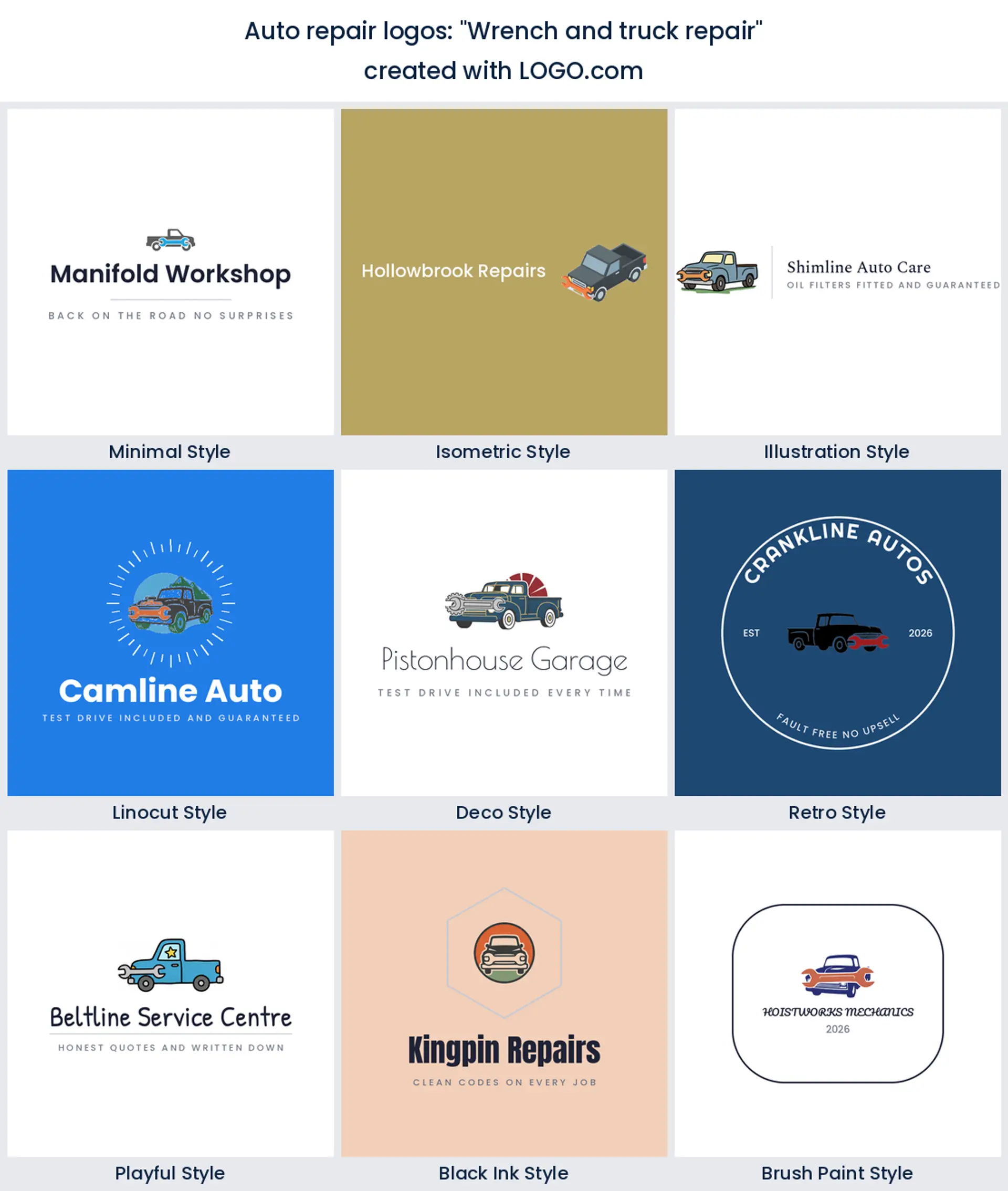
8. "Wrench and truck repair"
Pair the wrench with a truck rather than a car and the whole brand tilts commercial. Fleet work, trailers, and light haulage all respond to it, and it gives you room to say heavy duty without shouting.
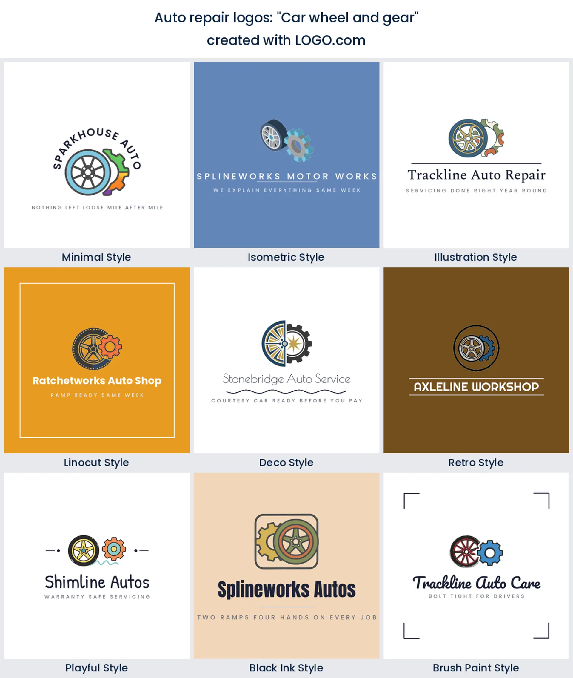
9. "Car wheel and gear"
A wheel and a gear side by side is a neat two symbol lockup for shops that split their time between tires and mechanical work. If you want a tire shop logo that still says garage, this is the compromise that does not look like a compromise.
10. "Grease gun and truck"
A grease gun aimed at a truck is unusual enough to be memorable and specific enough to be honest. It belongs to lubrication, undercarriage, and preventative maintenance brands, and it photographs well on a wall because the shape is so unlike a wrench.
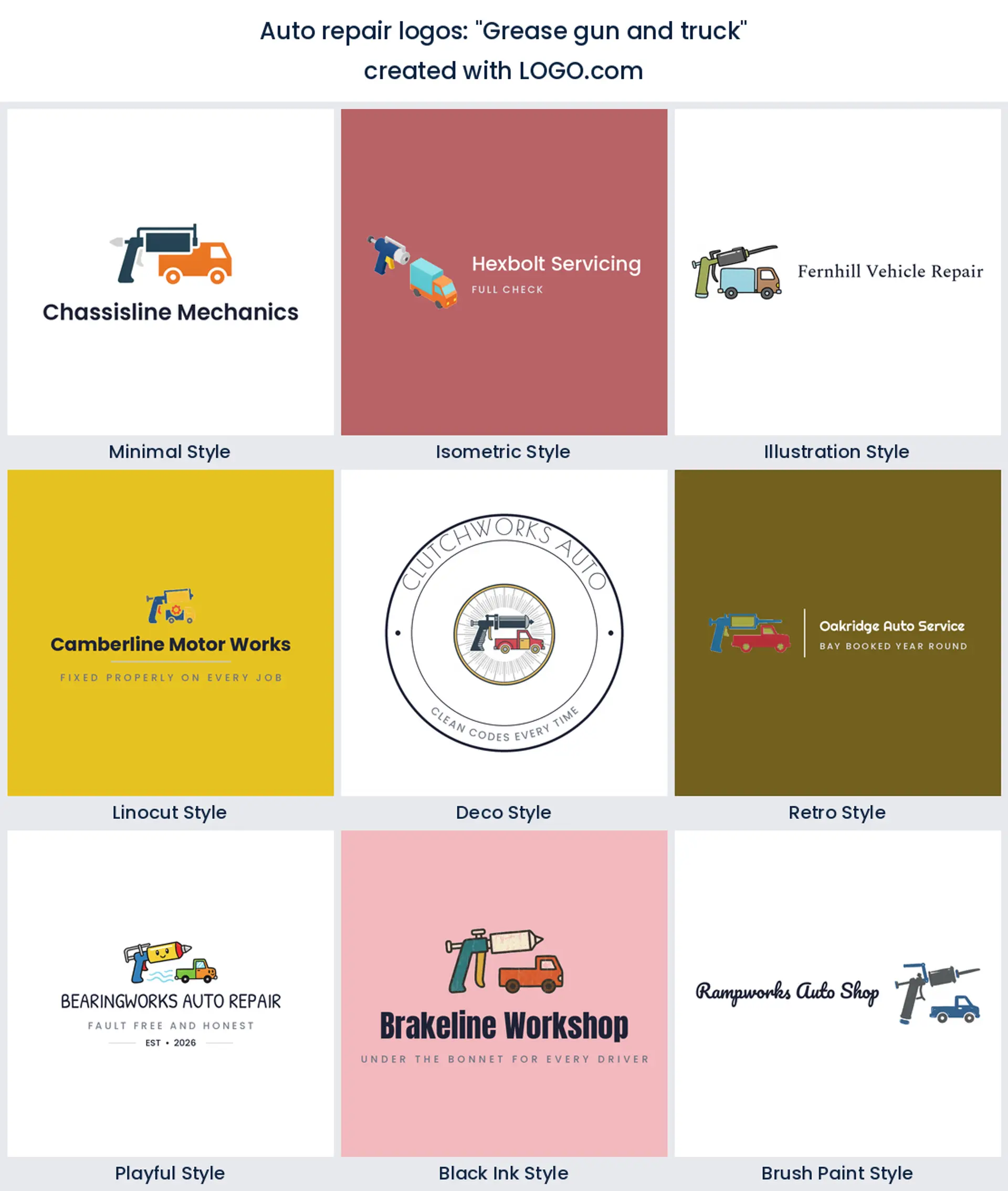
11. "Car engine gears precision"
Precision is the note here. Tight concentric gears drawn with even spacing feel measured and careful, which is exactly the mood you want if your pitch is warranty safe servicing rather than the cheapest quote in town.
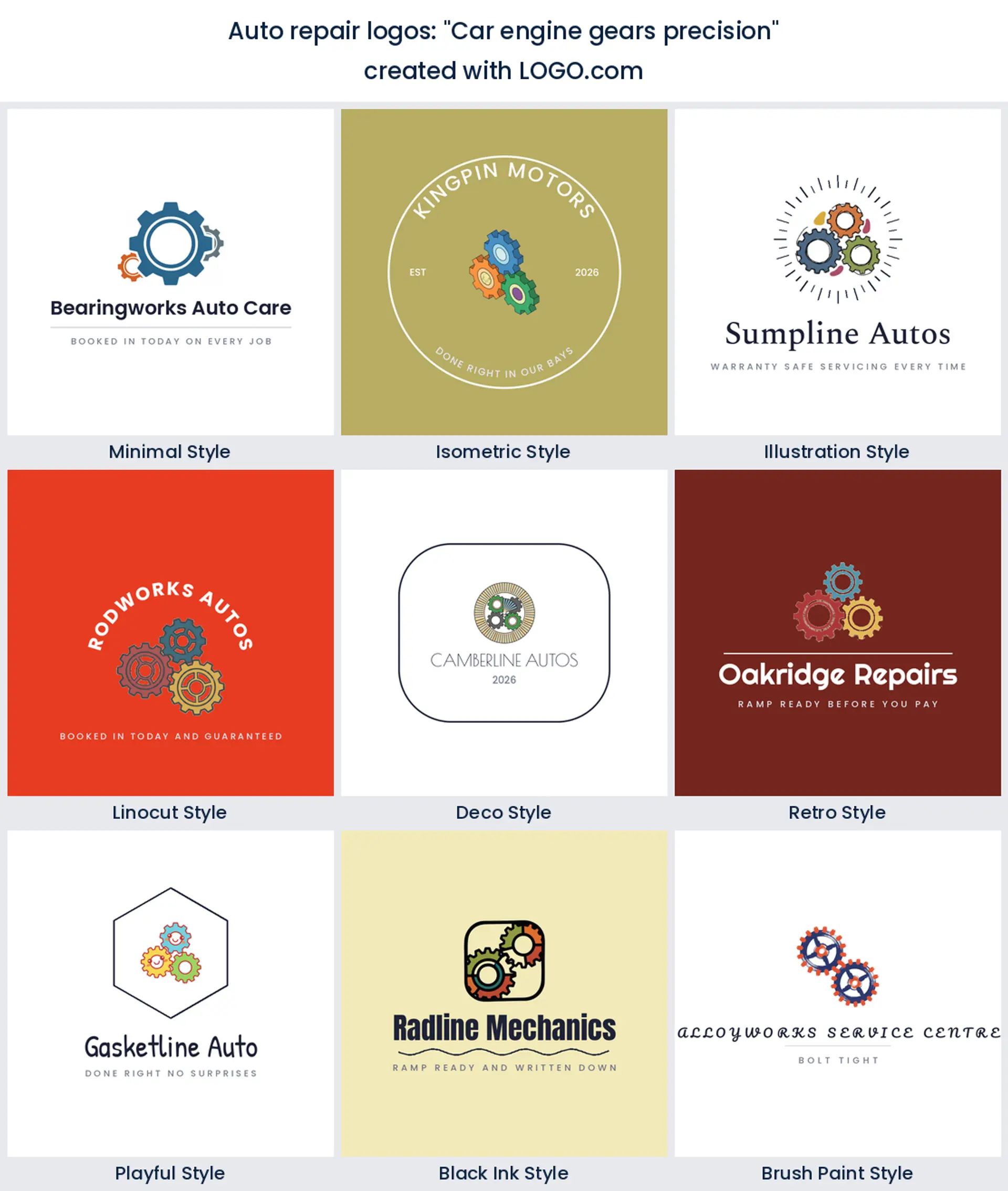
12. "Steering wheel on road"
A steering wheel sitting over a stretch of road pulls the focus onto the drive rather than the workshop. Good for inspection centres, roadworthiness testing, and mobile brands that come to the customer instead of the other way around.
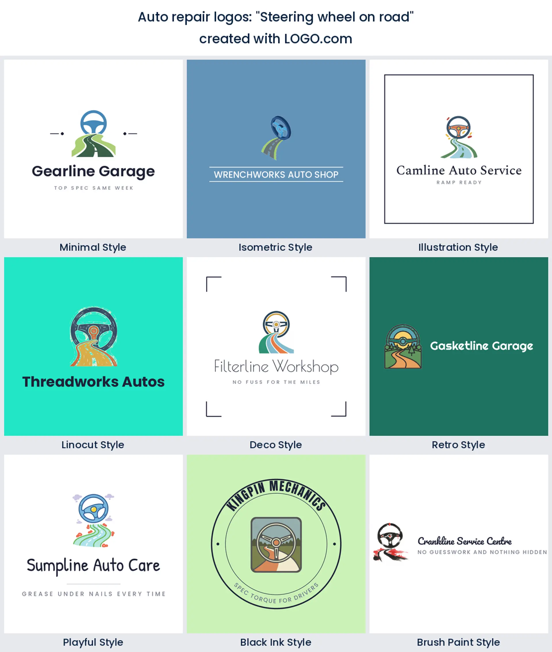
13. "Paint spray gun automotive"
A spray gun with a soft arc of paint moves the whole brand into bodywork. If you are writing a collision repair logo brief, or hunting for auto body shop logo ideas, start here rather than with a wrench, because paint is the thing your customers are actually buying.
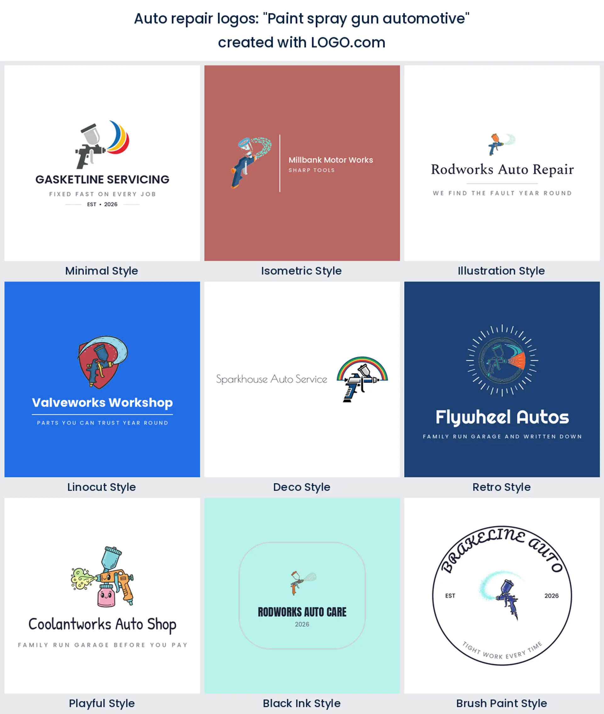
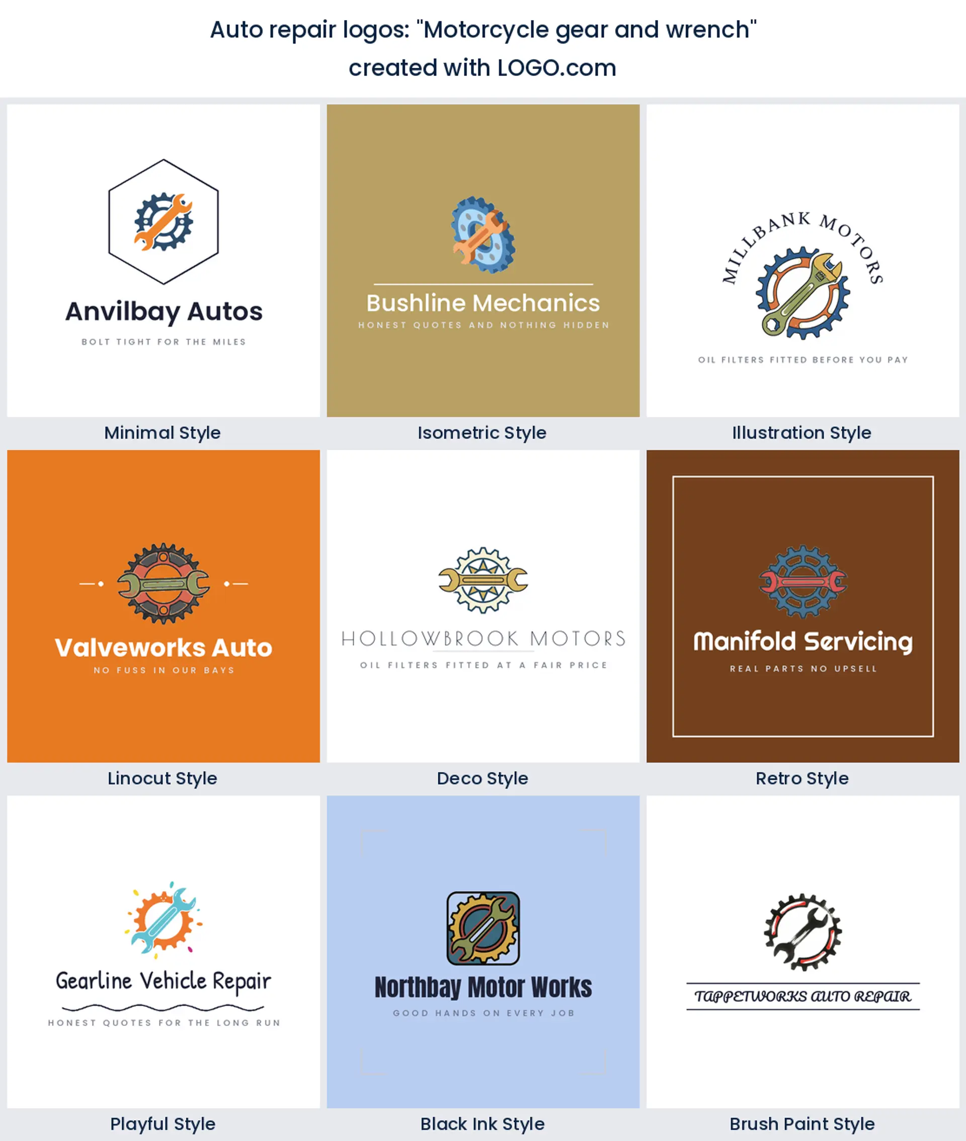
14. "Motorcycle gear and wrench"
A sprocket paired with a wrench is the motorcycle version of the top mark, and the toothed edge instantly separates you from car garages. Worth it if bikes are more than a sideline, because riders notice when a shop signals that it knows their machines.
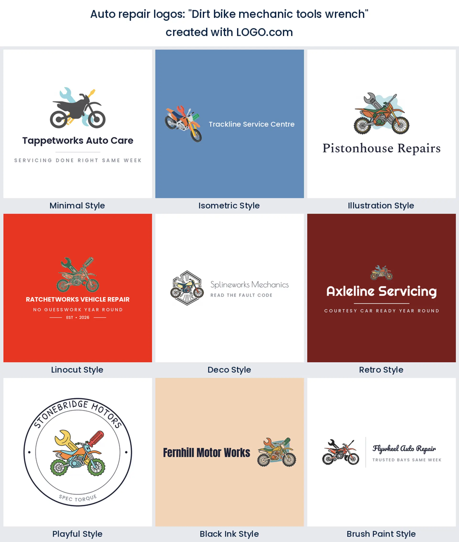
15. "Dirt bike mechanic tools wrench"
Dirt bike parts with tools around them is the loosest and most energetic of the fifteen, and it suits off road, motocross, and small engine repair logo work. Keep the layout deliberately a little rough, since polish is not what this customer is buying.
The wrench or the spray gun? Your busiest bay decides
Before you choose a symbol, decide what you want the phone to ring about. If you do general mechanical work, a wrench or a gear keeps you open to everything and that is the right call. Running a body shop? A spray gun or a panel outline will pull the right jobs, and it is why an auto body shop logo almost never leads with a spanner. Fitting rubber all day? Put the tread front and centre so people driving past on a flat know instantly that you can help. Doing quick lube and scheduled servicing? An oil drop says it in one shape.
The trap is trying to cover all of it in one mark. A logo crowded with a wrench, a car, a tire, and a drop reads as clutter, not range. Choose the service you make the most money on, build the mark around that, and let your sign copy and your website carry the rest of the list. You can always add a second lockup later for a specific line, which is what most shops searching for a custom auto body shop logo end up doing anyway.
Bay doors, invoices, and the decal on a customer's back window
An auto repair logo lives on more surfaces than most small business marks, and half of them are unforgiving. The road sign gets read at speed from an angle. The bay door version might be two metres wide and painted. The invoice version is maybe a centimetre tall in the corner of a page. And if you are lucky, a happy customer puts a decal in their back window and drives your logo around town for years.
Design for the worst of those and the rest look after themselves. Test the mark in solid black on white first, because that is what a vinyl cutter and an embroidery machine actually see. Kill any stroke thinner than the gap next to it. Keep your shop name in one clear weight rather than three. If it survives at the size of your thumbnail, it will survive on the door.
Does a modern auto repair logo still need a shield?
Not always, and it is worth thinking about rather than defaulting. Shields, banners, and circle badges carry a lot of history in this trade and they still signal established and trustworthy, which is why so many shops reach for them. The cost is that they add a heavy outer shape that eats space, so the mark inside has to shrink, and at small sizes you end up with a smudge in a frame.
If you want a modern auto repair logo, try the badge and the bare mark side by side before you commit. Younger diagnostics and EV focused shops usually look better without the frame, and a clean gear or wrench with confident type reads current instead of retro. If you do keep the badge, make it simple: one ring, one line of small text, and nothing tucked into the corners.
Why so many shops land on blue, red, and yellow
Our own palette numbers for this group are clear. Once you set aside the white and black bases that nearly every logo uses, blue is the most picked hue among auto and repair founders, with red and yellow close behind and orange next. Blue reads dependable and technical, red reads fast and urgent, and yellow does the safety and visibility job that shows up on tow trucks and roadside branding for a reason.
Pick one lead color and one accent rather than three equal partners. Navy with a single red accent is the most reliable combination in the trade and it still looks sharp on a white invoice. If your street is already full of red, blue is the easier way to stand out. And remember your logo does not have to be full color everywhere. On LOGO.com you can choose a multi color icon or a one color version, and the one color file is what you will hand to the sign shop and the shirt printer.
Diesel rigs, small engines, and dirt bikes need their own symbol
If you do not work on ordinary cars, do not use an ordinary car. A shop turning wrenches on tractors, generators, and mowers is better served by a piston or a tool pair than a sedan, and anyone hunting small engine repair logo ideas will recognise the difference straight away. Heavy diesel and truck work wants weight: thick outlines, a squared frame, a truck profile rather than a hatchback.
Bike shops are their own thing again. A sprocket, a fork, or a knobbly tire tells riders you understand their machines, and that signal matters more in motorcycle and motocross work than in almost any other niche. Whatever you service, name it in the wordmark too. Auto Repair, Diesel, Motors, Garage, and Auto Care all pull different customers, so pick the one that matches the bay you want filled.
Free PNGs now, vector files when the sign goes up
Designing and previewing your logo on LOGO.com is free, and so is the download of four high resolution PNG files, which come with full commercial use. That is enough to run your socials, your website, your invoices, and your Google listing without paying anything. Plenty of shops stop there and it is a perfectly sensible place to stop.
The paid Brand Plan, which is 72 dollars a year, is about print. It adds the vector files your sign maker, wrap shop, and embroiderer will ask for by name, plus unlimited edits, a brand kit with your colors and fonts written down, and a website builder with a domain. If your logo is going on a building, a truck, or a set of workwear, that is the point where the vector file stops being optional. So if you are shopping around for auto repair shop logo design quotes, it is worth knowing you can see the finished mark before you spend anything.
Make your auto repair logo with LOGO.com
Type your shop name, choose the symbol that matches the work you want more of, and pick one of nine styles. You will have real options in front of you in under a minute, and you can keep adjusting the color, the icon, and the type until it looks like your shop. Preview it free, download the high resolution files, and get it onto the sign, the van, and the invoice.
Methodology. These figures come from logos created on LOGO.com during the 12 months ending August 2026. We combined three groups of founders whose selected industry named vehicle repair work, keeping the automotive, auto body, mechanic, motorcycle, diesel, towing and restoration values and dropping sales, dealership, rental, parts supply and detailing, which gave 630 brands. We then read the custom icon descriptions those founders wrote and scoped them to repair and servicing subjects, leaving 64 descriptions. Grouping those by concept, the wrench was most common at about 38 percent, followed by the car engine at about 23 percent and the gear at about 17 percent. Figures are a share of scoped auto repair icon descriptions, rounded to the nearest percentage point. Source: LOGO.com first party product data, August 2026.
THE #1 LOGO GENERATOR
Why LOGO.com is the best auto repair logo maker
1.Built on what auto shops actually asked for
The icons here come from real descriptions auto repair founders typed on LOGO.com, not a stock gallery of spanners someone guessed at.
2.Readable from the road, not just the screen
Bold shapes and open counters mean your shop name still reads on a roadside sign at 40 miles an hour and on a one centimetre invoice header.
3.Nine styles, from clean minimal to carved linocut
Match a diagnostics brand or a vintage restoration garage without redrawing anything, and see every option side by side before you choose.
4.A one color version for cutters and stitchers
Choose a multi color icon or a single color version, which is what your vinyl cutter and your workwear embroiderer will actually ask for.
5.Free high resolution PNGs with full commercial use
Download four high resolution files free and use them on your invoices, your Google listing, your socials, and your quotes straight away.
6.Vector files for the sign, the wrap, and the shirts
The Brand Plan adds the vector files a sign shop or a wrap installer needs to print your mark two metres wide with no soft edges.
7.One mark that works as a profile picture too
Start from a square lockup so the same logo drops into your Google Business profile, your Facebook page, and a window decal without a redraw.
8.Change it when you add a bay or a service
Add tires, bodywork, or diesel later and swap the icon, color, or wording without starting your brand again from scratch.
9.A full brand set in minutes, not weeks
Type your shop name and you will be choosing between real options before the kettle boils, with the colors and fonts saved in a brand kit.
Auto Repair Logo Maker FAQs
Explore more logo ideas
3D DesignAcademic WritingAccountantAerospace EngineeringAgricultural ConsultingAgriculture CompanyAmazonAnimal ProtectionAnimationApp DevelopmentAquacultureAromatherapyArt and DesignArtsAsian RestaurantAthleticsAudio TechnicianAuto ManufacturingBadgeBandBarber ShopBearBeauty and CosmeticsBeeBibleBiotechBitcoinBlogBoatBook PublisherBooks and Literature BlogBrainBuildingBusiness Consulting Logo MakerBusiness StorageCakesCampaignCandlesCarCarpentryCateringCelebrationsChemicalChildrenChoirCircleCivil EngineeringClothingCoffee ShopColors