
Business Consulting Logo Maker
Design a business consulting logo that works on pitch decks and your website.
Need a different logo maker? Try our AI logo generator.
Logos created using LOGO.com
670,000,000
Growth and performance consulting logos
Strategy and advisory consulting logos
People and specialist consulting logos

Business Consulting Logos, Ranked From Real Founder Prompts
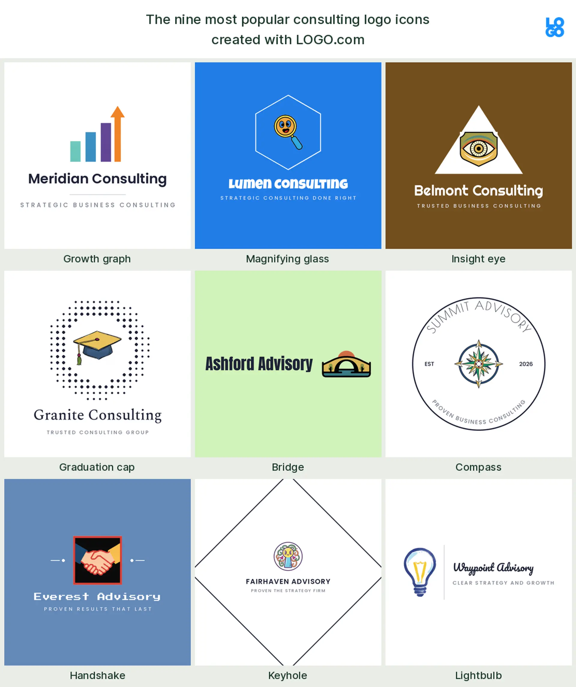
According to LOGO.com data, the symbols consultants reach for most are an upward growth graph, in about 18 percent of the icon descriptions we read, a magnifying glass in about 12 percent, and an insight eye in about 11 percent, with a graduation cap and a bridge close behind.
That mix matters because a consulting logo rarely lives on a shopfront. It shows up small on a pitch deck, a proposal cover, an email signature, and a LinkedIn banner, so the nine styles below are tuned to hold up at those sizes. Pick the symbol that matches your work and reshape it with your own name and color.
On this page
- Nine consulting symbols, ranked by how often founders pick them
- Fifteen business consulting logo ideas from real founder prompts
- Why so many consulting logos are just initials
- How to avoid looking like every other consulting firm
- One symbol reads differently for management, IT, and finance
- Is a free consulting logo good enough for client work?
- Make your business consulting logo with LOGO.com
Most consulting logos try so hard to look serious that they end up looking like every other blue square with a swoosh. Yours does not have to. The strongest marks grow from one clear idea rather than a stock symbol, and our own data hints at what that idea usually is. When we grouped the icon descriptions real consulting founders typed into LOGO.com, an upward growth graph led everything else, showing up in about 18 percent of them. This page lays out the nine symbols consultants reach for most, fifteen real prompts you can borrow, and the handful of choices that make a consulting logo look credible instead of generic.
Nine consulting symbols, ranked by how often founders pick them
Consulting is a broad tent, from a solo strategist to a global firm, and this ranking pulls from across all of it. Growth and analysis sit at the top, then vision and expertise, and the tail runs through bridges, compasses, and the odd keyhole. Whichever one fits your work, keep it to a single clean shape so it still reads when it is shrunk onto a business card or a LinkedIn avatar.
Growth graph
The single most common symbol is not a briefcase or a suit, it is a rising line. An upward growth graph appears in about 18 percent of the consulting icon descriptions we read, which makes it the natural anchor for a business consulting logo built around results. Keep the climb simple, a few bars and one clean arrow, and it reads as momentum the moment someone sees it.
Magnifying glass
Analysis is the whole job, and the magnifying glass says so, appearing in about 12 percent of the prompts. It reads as looking closely and finding what others miss, which suits a research heavy or due diligence consulting logo. Drawn as one crisp circle and handle, it stays legible even as a small profile icon.
Insight eye
Close behind sits the eye, named in around 11 percent of the descriptions. An eye signals insight and foresight, the promise that you see the whole board, so it makes a sharp mark for a strategy or advisory consulting logo. Keep it geometric rather than lifelike and it never tips into uncanny.
Graduation cap
After the top three, the graduation cap starts showing up. It leans on expertise and teaching, which fits a training led or knowledge transfer consultant logo, the kind of firm that leaves clients smarter than it found them.
Bridge
Consultants love a bridge, and for good reason. It is the tidy picture of closing a gap and getting a client from where they are to where they want to be, which makes it a fitting business consulting logo for change and transformation work.
Compass
A compass shows up next. It stands for direction and steady guidance, a good fit for an advisory or management consulting logo that promises to point the way when a decision is hard.
Handshake
Further down, founders draw hands, usually a handshake or two palms cupping a shape. It puts partnership and trust front and centre, which reads well on a relationship driven consulting firm logo. Simplify the fingers hard, because hands get messy fast at a small size.
Keyhole
The keyhole is a quieter favourite. It hints at unlocking potential and finding the one insight that opens everything, a neat metaphor for a problem solving consultant logo without spelling it out.
Lightbulb
Last in the set is the lightbulb, shorthand for the idea that changes things. Pair it with a gear or a spark and it says practical ideas, not just bright ones, which makes an approachable innovation or IT consulting logo.
Fifteen business consulting logo ideas from real founder prompts
These fifteen are the exact icon descriptions consultants, advisors, and strategists typed into LOGO.com, shown across the nine styles so you can watch each one shift from clean and minimal to bold and modern. They build on the plain top nine but carry a little more character, and any of them can hold your name. Treat them as consulting logo ideas to start from, then change the color, font, and wordmark until the mark fits your practice.
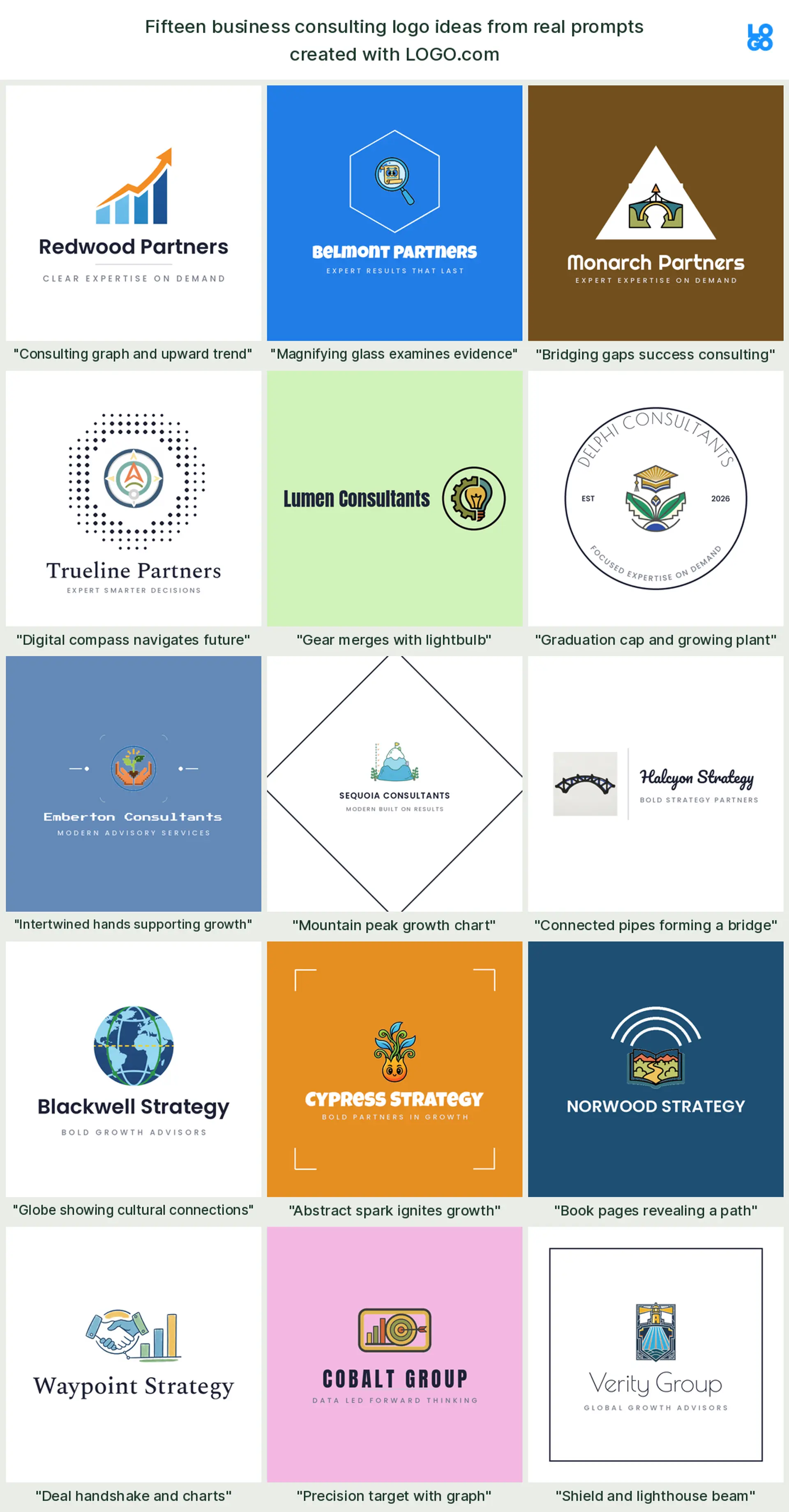
"Consulting graph and upward trend"
A founder typed this one, and it is the clearest promise in the set, a bar chart climbing toward an arrow. It makes a confident business consulting logo for anyone who sells measurable growth.
"Magnifying glass examines evidence"
Here a magnifying glass hovers over a document, exactly as a founder described it. It reads as rigor and diligence, a natural consulting logo for audit, research, or diligence work.
"Bridging gaps success consulting"
One founder pictured a bridge spanning a gap toward a rising path. It is transformation in a single mark, and it suits a change management consulting firm logo.
"Digital compass navigates future"
A compass with a digital edge, straight from a founder prompt, blends guidance with technology. It fits an IT consulting logo or a forward looking advisory.
"Gear merges with lightbulb"
A gear dissolving into a lightbulb pairs ideas with execution, just as a founder imagined. It makes a smart innovation or operations consulting logo.
"Graduation cap and growing plant"
A founder combined a graduation cap with a young plant, learning plus growth. It reads as a coaching or development focused consultant logo.
"Intertwined hands supporting growth"
Two hands lifting a rising shape, a real founder prompt, puts partnership at the heart of the mark. It suits a people first consulting logo for HR or leadership advisory.
"Mountain peak growth chart"
One founder drew a mountain peak that doubles as a growth chart. It signals ambition and the climb to the top, a strong management consulting logo.
"Connected pipes forming a bridge"
This founder prompt links segments into a bridge, structure built from parts. It makes an apt operations or systems consulting firm logo.
"Globe showing cultural connections"
A globe threaded with connecting lines, as a founder pictured, says reach and cross border work. It fits a global strategy or management consulting logo.
"Abstract spark ignites growth"
A spark setting off an upward motion, from a real prompt, is energy and momentum with no literal object. It reads as a modern consulting logo design.
"Book pages revealing a path"
One founder opened a book whose pages reveal a path forward. Knowledge leading to action makes a thoughtful advisory or research consulting logo.
"Deal handshake and charts"
A handshake beside rising charts, exactly as a founder wrote it, ties trust to results. It suits a deal advisory or financial consulting logo.
"Precision target with graph"
A founder paired a bullseye with a graph, focus meeting proof. It makes a results driven business consulting logo for performance work.
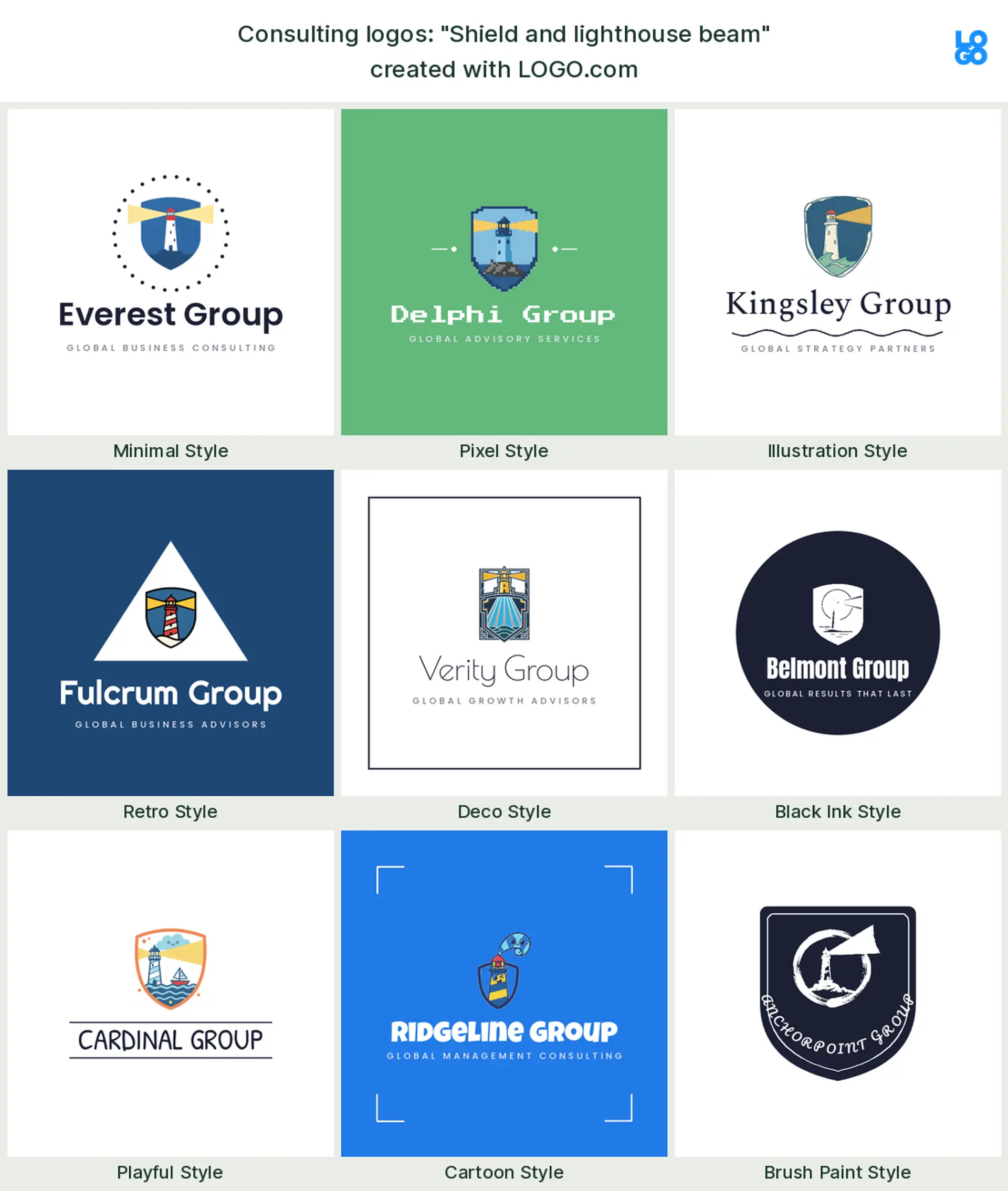
"Shield and lighthouse beam"
A shield with a lighthouse beam, a real founder prompt, blends safety with direction. It reads as a risk or security consulting logo you can trust.
Why so many consulting logos are just initials
Look at the firms at the top of the field and a pattern jumps out, most of them wear their initials. It is not laziness, it is confidence. A lettermark of two or three letters looks established, travels well from a favicon to an office sign, and lets a firm span many services without boxing itself into one picture. For a solo consultant or a new practice, initials are a quiet shortcut to looking bigger and more permanent than you are, and they never date. If your name is the asset, a clean lettermark consultant logo may be all you need, and you can add one small symbol only if the initials feel too bare on their own.
How to avoid looking like every other consulting firm
The fastest way to blend in is to reach for the same navy blue swoosh everyone else uses. You can do better with two moves. First, color, because our own numbers show consulting founders actually pick green most on LOGO.com, with blue close behind and warm neutrals filling out the rest, so a considered green or a warmer accent already sets you apart from the sea of corporate blue. Second, pick one honest symbol from the ranking above instead of a generic abstract mark, because a specific idea, a bridge, a keyhole, a rising graph, sticks in the memory where another swoosh does not. Keep the wordmark clean and evenly spaced, commit to one strong color plus a neutral, and your consulting logo design will stand out for looking intentional rather than templated.
One symbol reads differently for management, IT, and finance
The same mark can send very different signals depending on your niche, so lean into yours. A management consulting logo wants strategy and direction, so a compass, a bridge, or a rising graph lands well. An IT consulting logo reads clearest with a gear, a node network, or a lightbulb that hints at systems and problem solving. A financial consulting logo calls for restraint, a clean upward line, a shield, or a plain monogram that signals discipline and trust. People and HR advisory suit hands or a supportive shape. Choose the symbol that matches the room you work in, and let the rest of the mark stay calm around it.
Is a free consulting logo good enough for client work?
For most consultants, yes. Designing and previewing on LOGO.com is free, and you can download a high resolution PNG with full commercial use without paying, so your logo is ready for a website, a proposal, and a LinkedIn profile the same afternoon, and it is genuinely yours to use with clients. You only reach for the paid Brand Plan when you need the vector files to print the mark sharp and large on a pitch deck template, an office sign, or an event banner, plus unlimited edits and a full brand kit that keeps every deck and invoice consistent. Commercial use comes with both the free and paid downloads, so nothing about client work is locked behind the paywall.
Make your business consulting logo with LOGO.com
Pick the symbol that fits your practice, choose one of nine styles, and our free consulting logo maker builds the rest around your firm name. Preview it free, download a high resolution PNG with full commercial use, and leave with one credible, professional mark ready for your website, your pitch decks, and your proposals in minutes.
Methodology. These figures come from logos created on LOGO.com during the 12 months ending July 2026. Because business consulting spans many labels in our data, we widened the lens to the roughly 2054 founders who selected a consulting industry, from business and management consulting to IT, technology, and financial consulting, and grouped the 73 consulting focused icon descriptions they wrote by concept. An upward growth graph was most common, in about 18 percent of the descriptions, followed by a magnifying glass in about 12 percent and an insight eye in about 11 percent. Because many logos combine two symbols, these shares overlap and do not add up to 100. Figures are rounded to the nearest percentage point. Source: LOGO.com first party product data, July 2026.
THE #1 LOGO GENERATOR
Why LOGO.com is the best business consulting logo maker
1.Symbols pulled from real consulting brands
The nine symbols and fifteen ideas come straight from the icons real consulting founders described on LOGO.com, so your business consulting logo starts from proven ground, not generic clip art.
2.A boardroom ready mark in minutes
Type your firm name, choose a symbol and a style, and a finished consulting logo is ready in minutes, with no agency brief and no big invoice.
3.Crisp on a slide, sharp on a favicon
The mark stays crisp shrunk onto a pitch deck slide or a LinkedIn avatar, where thin lines and fussy detail usually break down.
4.Transparent files that sit on any slide
Export a transparent logo that drops onto any slide, proposal cover, or email signature with no white box fighting the background.
5.Consistent across every client touchpoint
Design it once and it carries across your website, decks, invoices, and LinkedIn, so the practice looks like one firm everywhere.
6.A confident single color option too
Keep a full color icon or switch to a restrained single color that reads as a serious consultant logo on a letterhead or an engraved sign.
7.Lettermark, symbol, or emblem styles
Range from a clean lettermark for a boutique strategy shop to a bolder emblem for a newer consulting firm logo, all built to read small.
8.Initials and full firm name, both ready
Save both a compact initials monogram and the full firm name, so you have the right version for a favicon and a large office sign.
9.Free to design, yours to sell with
Preview free and download a high resolution PNG with full commercial use, then upgrade to the Brand Plan for vector files to print signage and decks.
Business Consulting Logo Maker FAQs
Need Inspiration? See example brands in your industry...
3D DesignAcademic WritingAccountantAerospace EngineeringAgricultural ConsultingAgriculture CompanyAmazonAnimal ProtectionAnimationApp DevelopmentAquacultureAromatherapyArt and DesignArtsAsian RestaurantAthleticsAudio TechnicianAuto ManufacturingAuto Repair ServicesBadgeBandBarber ShopBearBeauty and CosmeticsBeeBibleBiotechBitcoinBlogBoatBook PublisherBooks and Literature BlogBrainBuildingBusiness StorageCakesCampaignCandlesCarCarpentryCateringCelebrationsChemicalChildrenChoirCircleCivil EngineeringClothingCoffee ShopColors