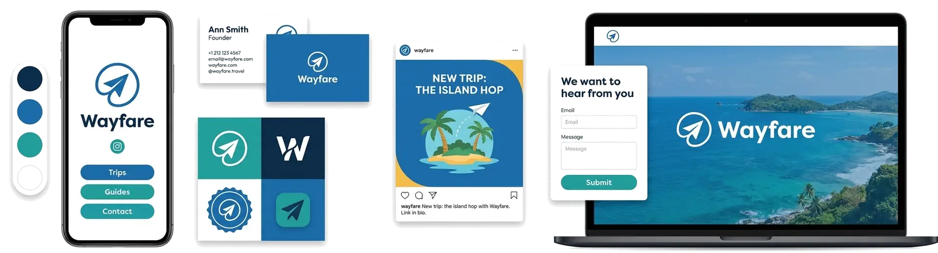
Every travel brand is selling the same promise, that the whole world is within reach, so the logos start to look alike: a globe here, a plane there. The ones that stand out pick a clear symbol and a point of view. To help you skip the guesswork, we looked at what real travel founders chose on LOGO.com, ranked the icons that show up most, and turned them into fifteen travel logo ideas you can make your own.
The icons travel brands actually put on their logo
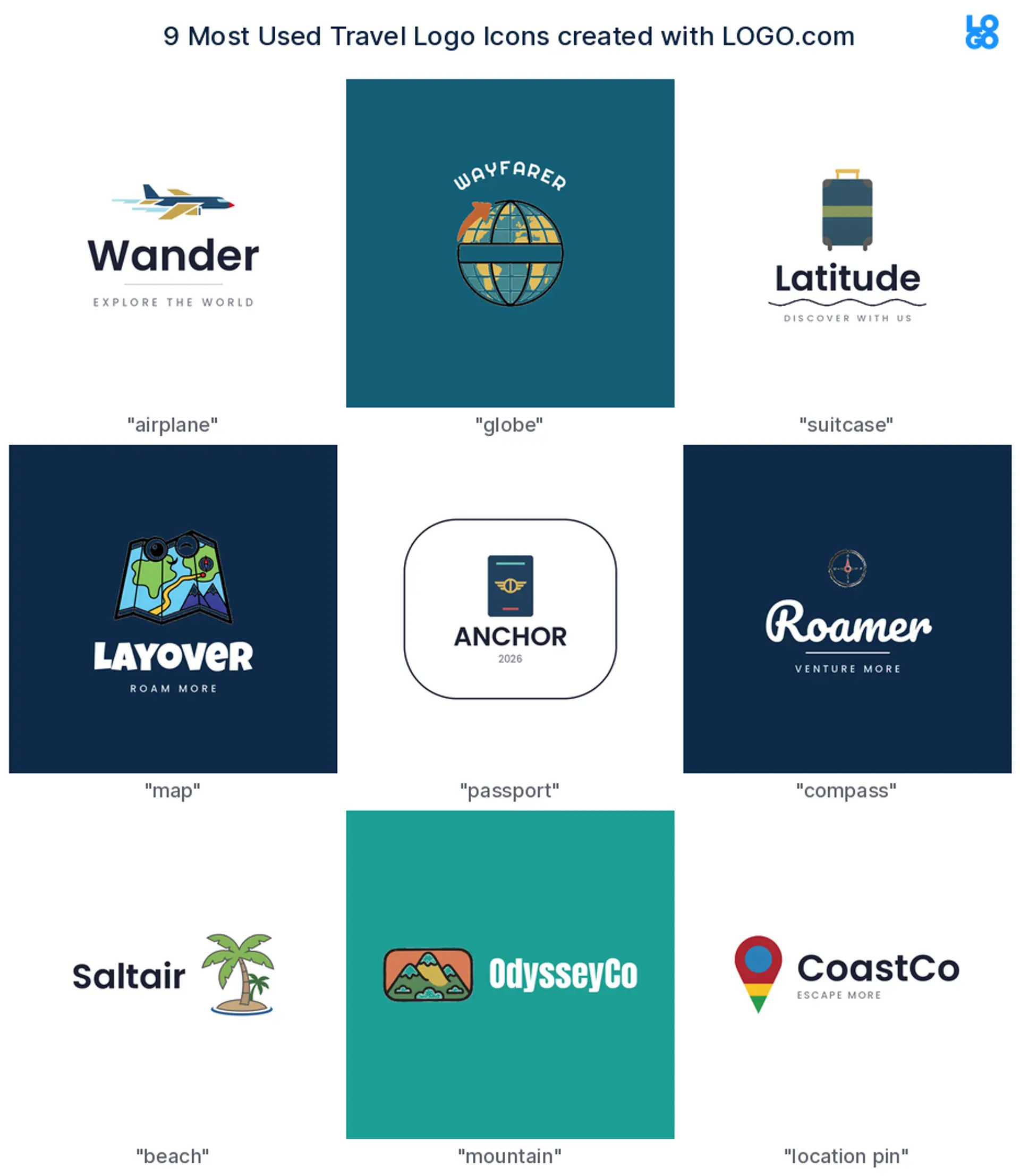
When we dug into the travel logos founders build on LOGO.com, nine symbols kept coming up: the airplane leads at about 26%, then the globe at about 23% and a suitcase at about 15%, trailed by maps, passports, compasses, beaches, mountains, and location pins. One clear symbol plus a readable name does almost all the work.
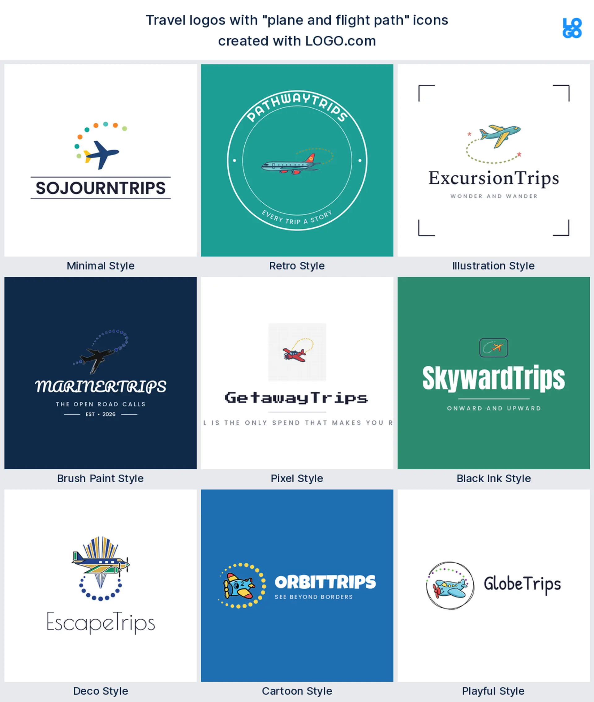
1. Airplane
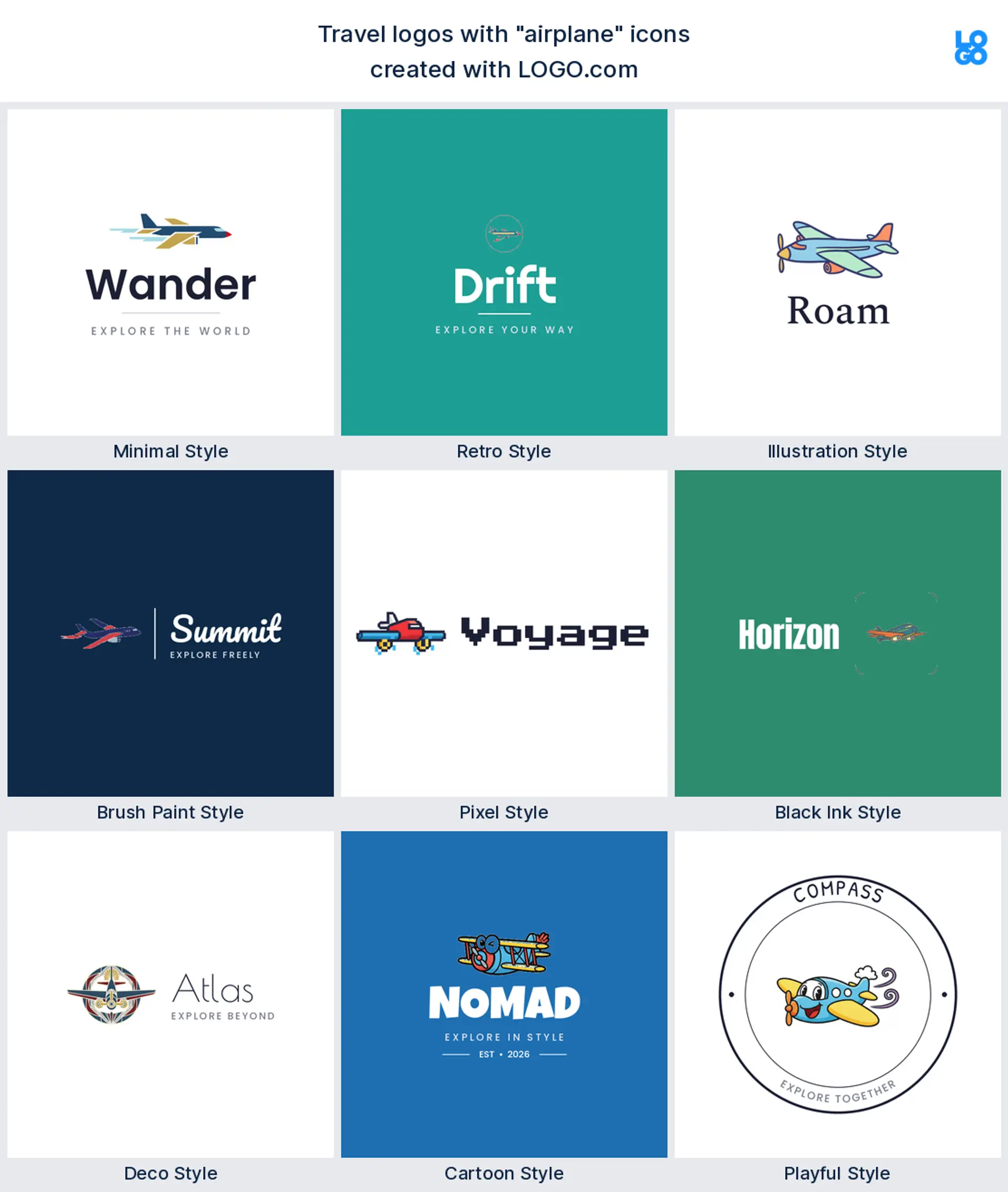
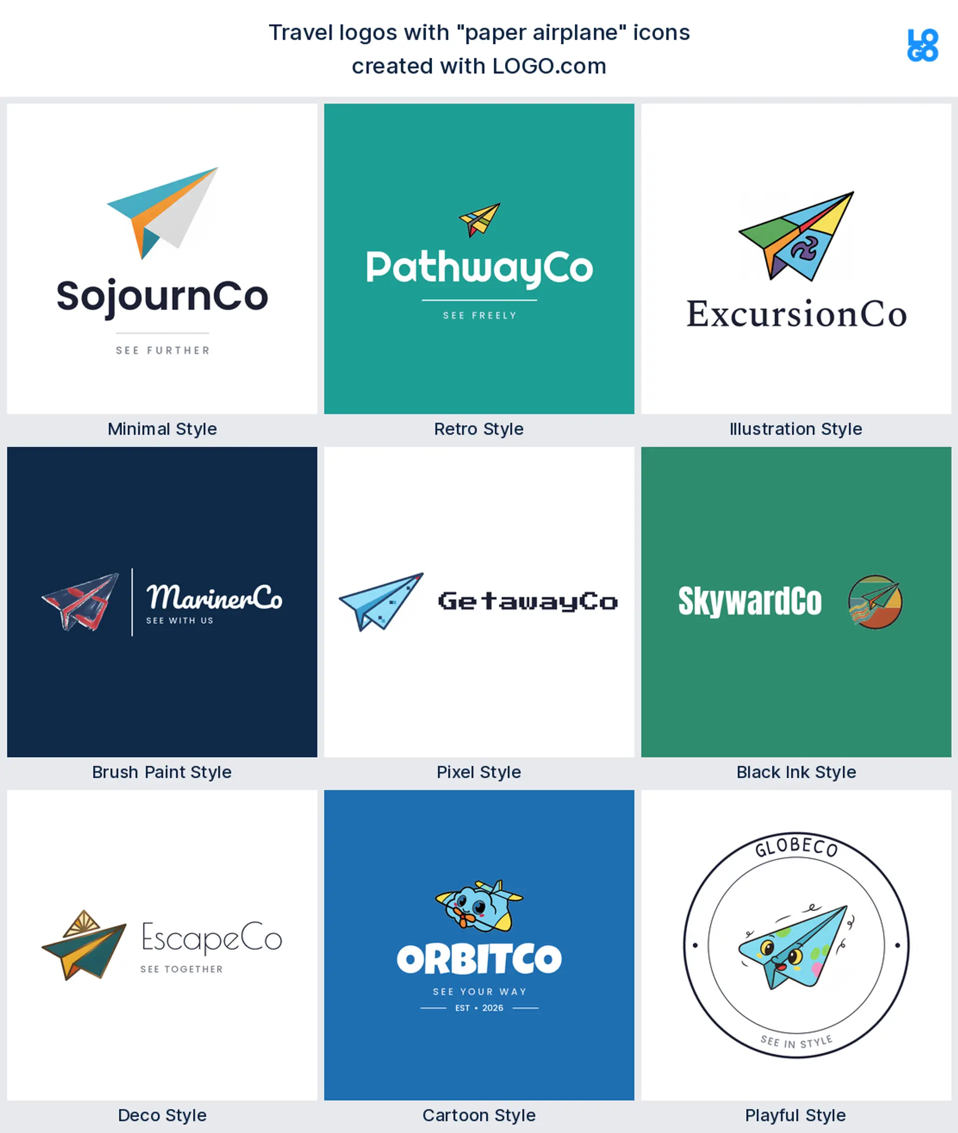
Start with the airplane and you are in good company: it shows up in about 26% of travel logos on LOGO.com, more than any other symbol. A plane mid arc says go somewhere in an instant, and it stays sharp on a website header or a tiny app icon. It is the most recognizable, all purpose travel or travel agency logo you can start with.
2. Globe
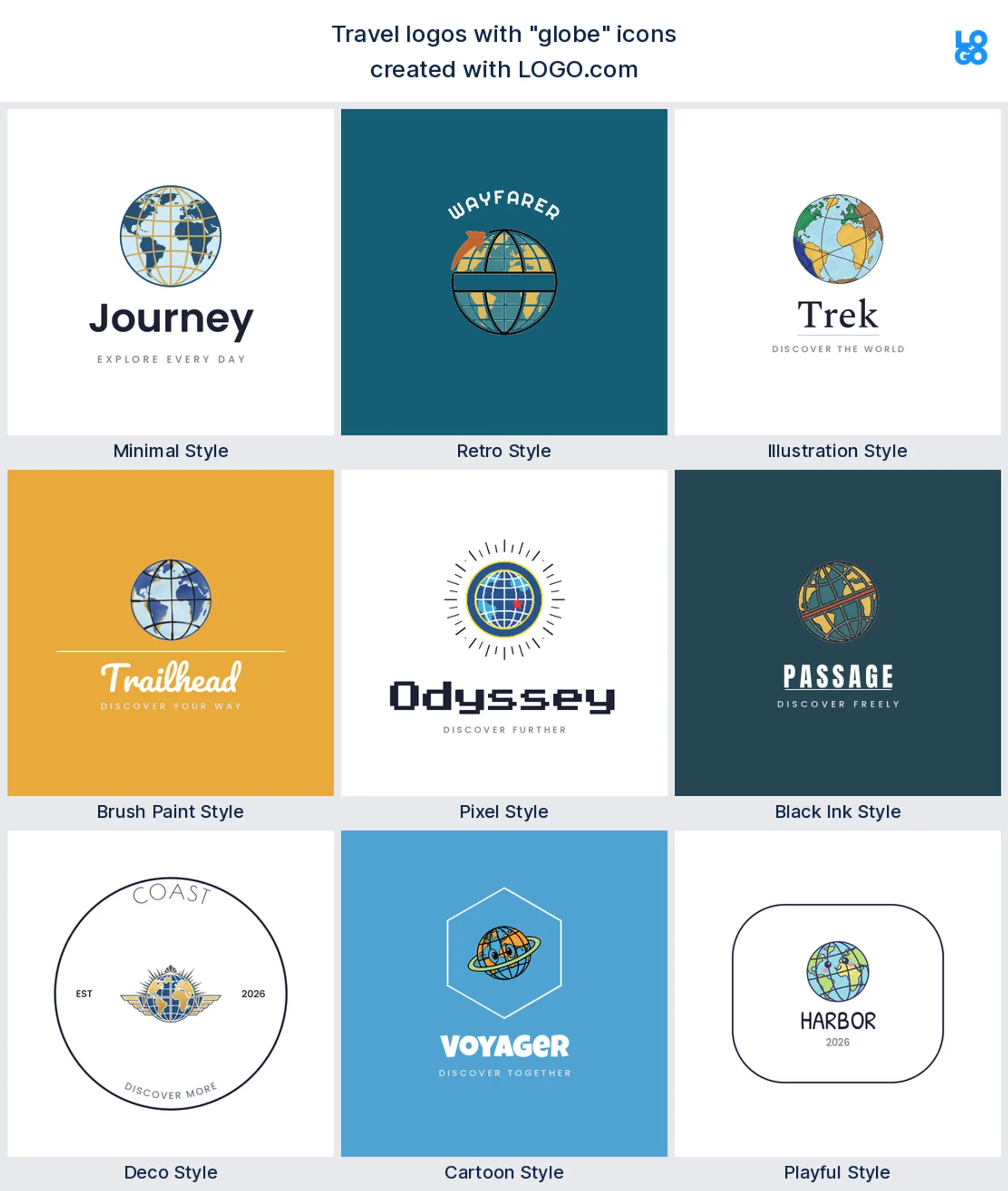
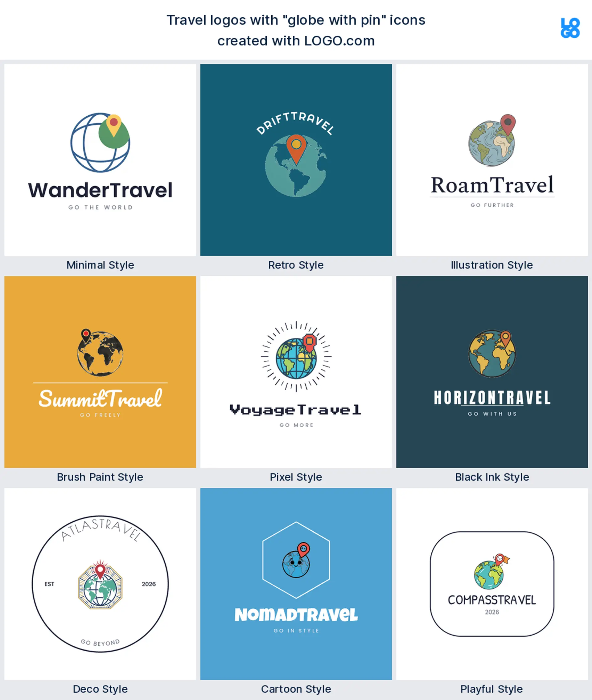
The globe is a close second, in about 23% of travel logos. A globe, a world map, or a few latitude lines promise the whole world is on the table, which makes a confident travel agency or tour operator logo. Keep the linework bold so it survives shrinking to a luggage tag or a favicon.
3. Suitcase
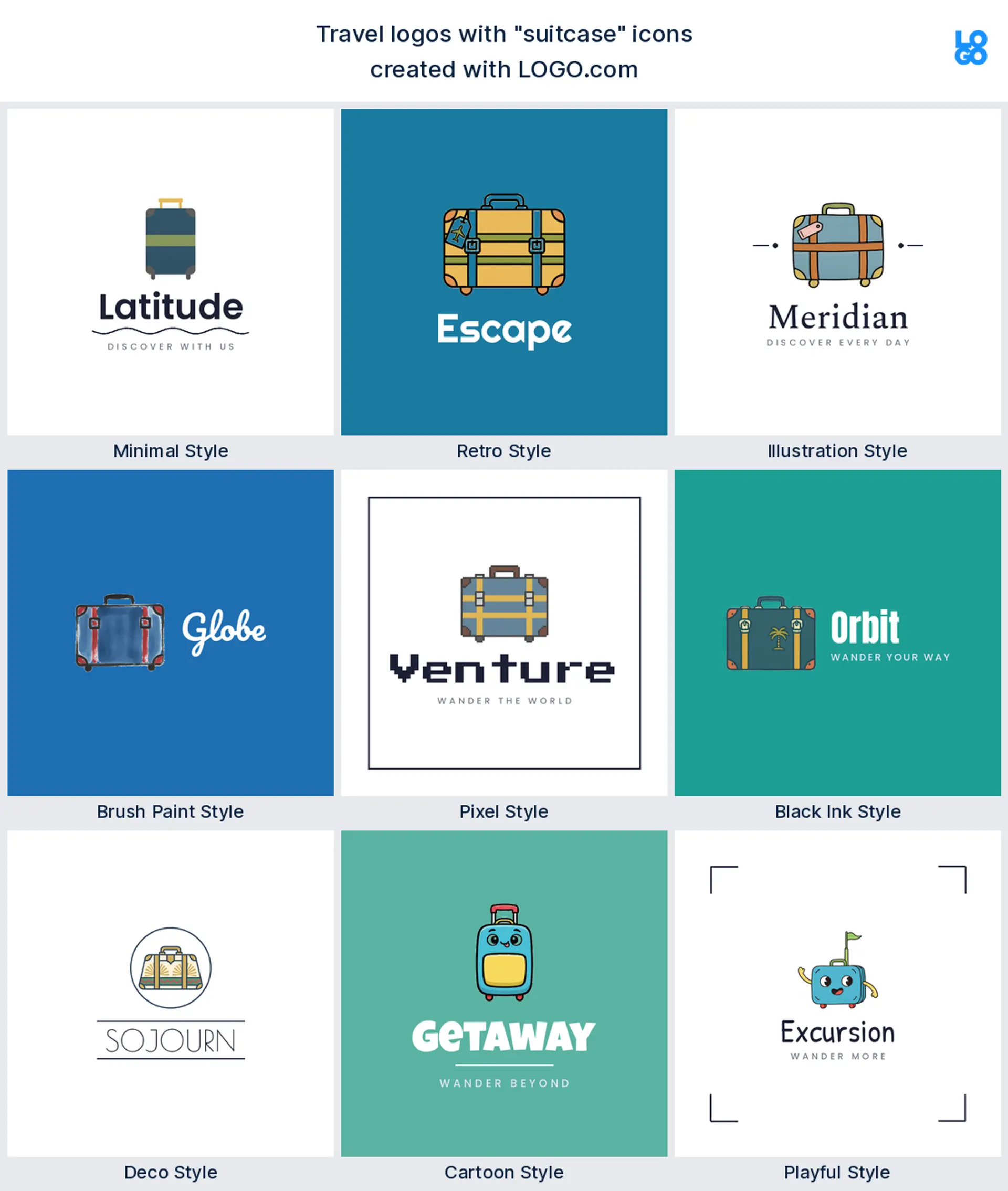
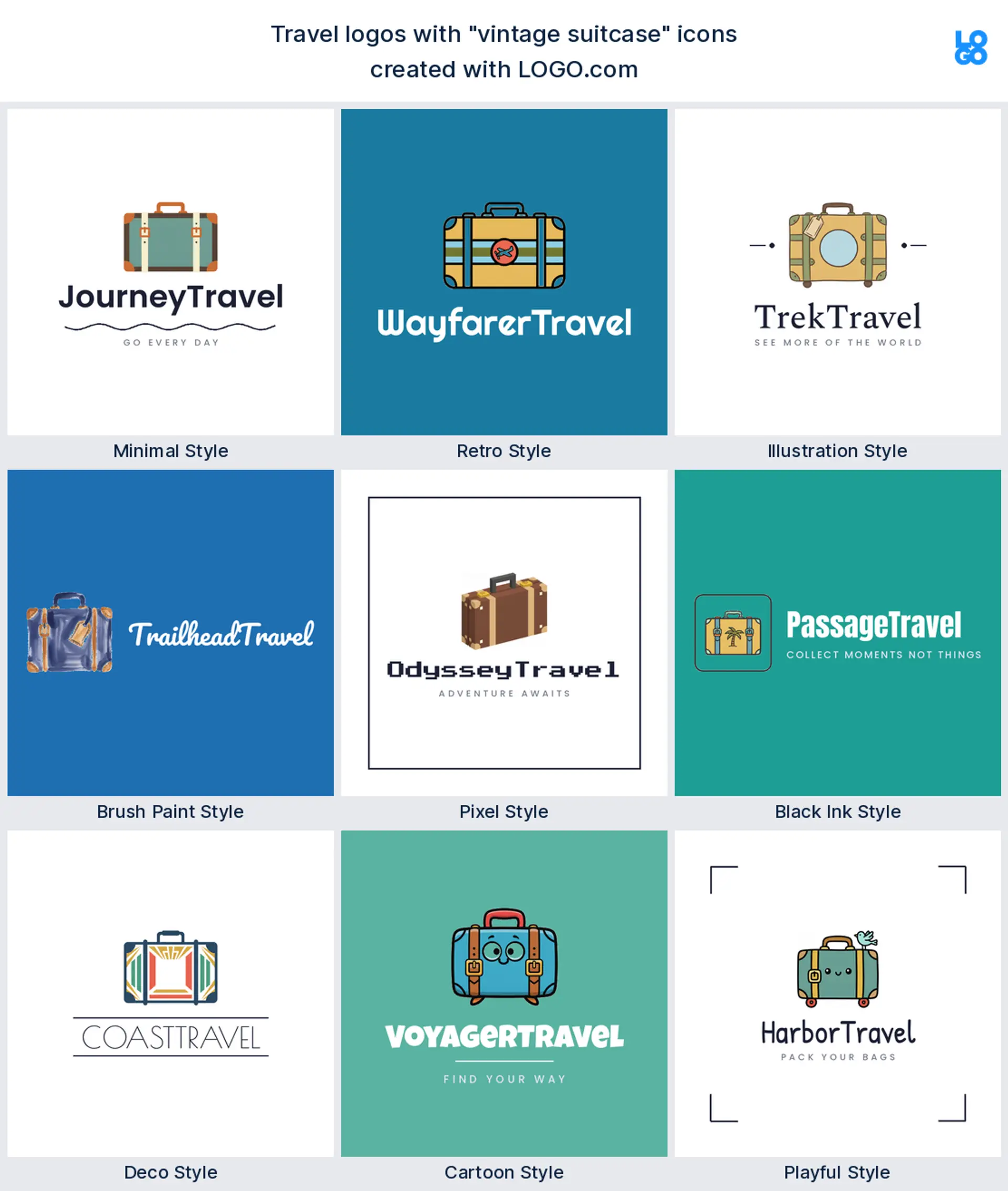
Third on the list is the suitcase, in about 15% of travel logos. Luggage is the friendly, human side of travel, the part everyone packs, which makes a warm travel or luggage brand logo for an agency, a blog, or a gear shop. A simple case with a handle stays clear even stamped small on a label.
4. Map
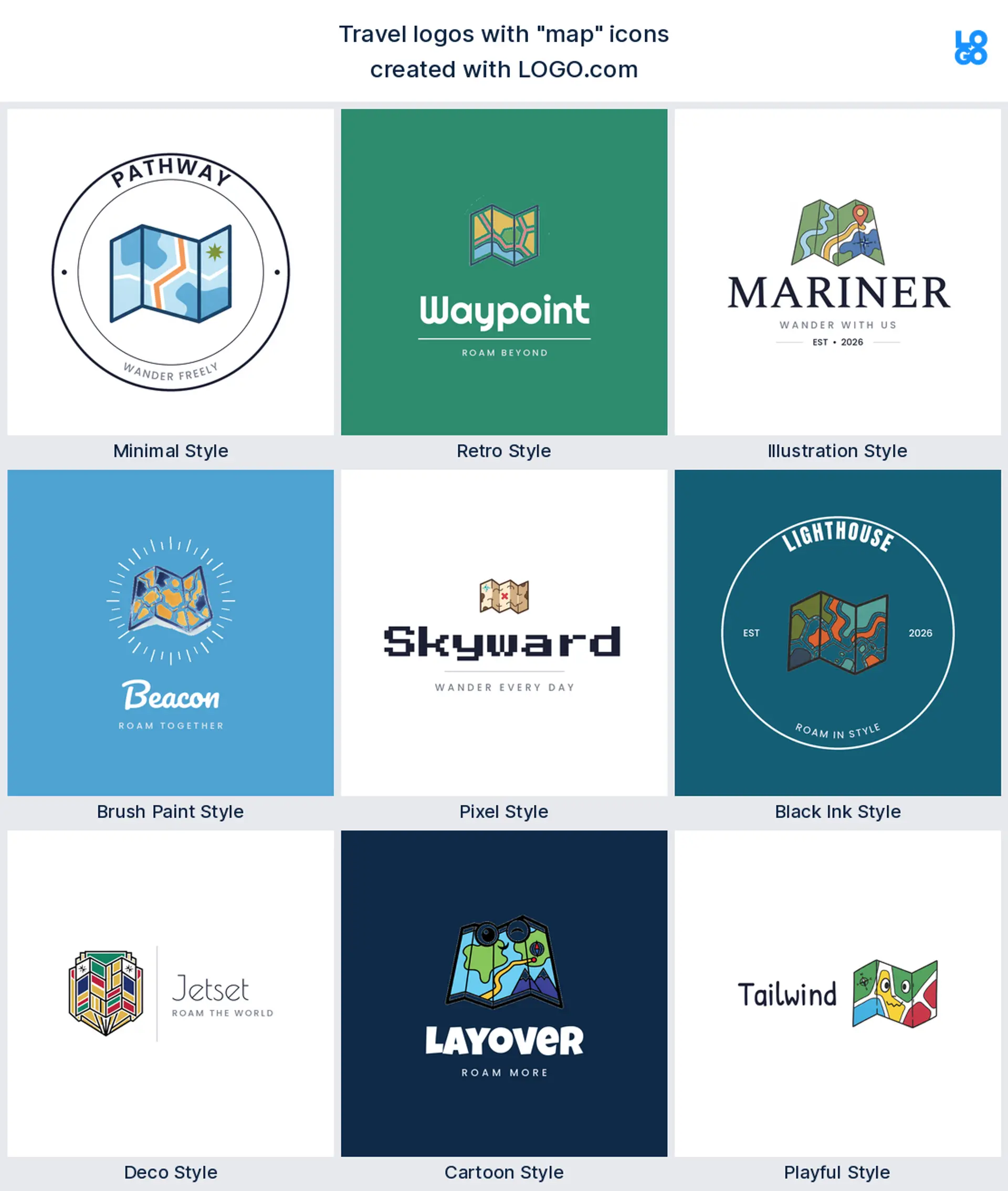
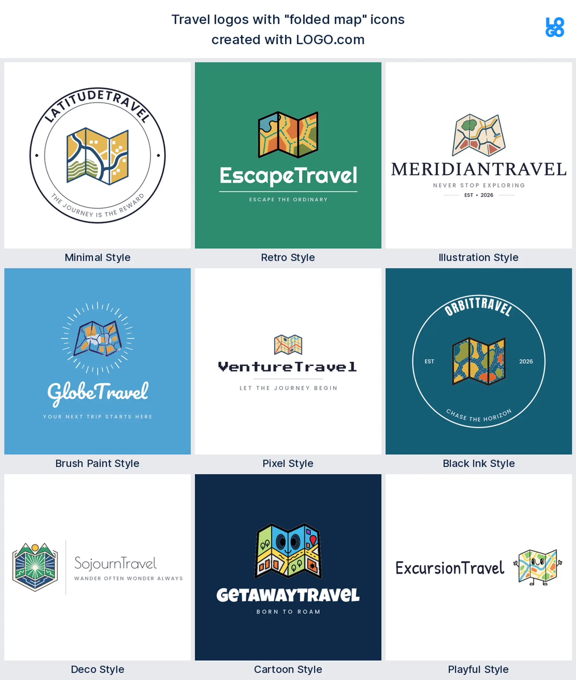
Next come maps and folded route lines. A map says planning, discovery, and the route itself, which makes a great tour operator or trip planning logo. Drawn as a few clean folds it reads instantly without turning into clutter.
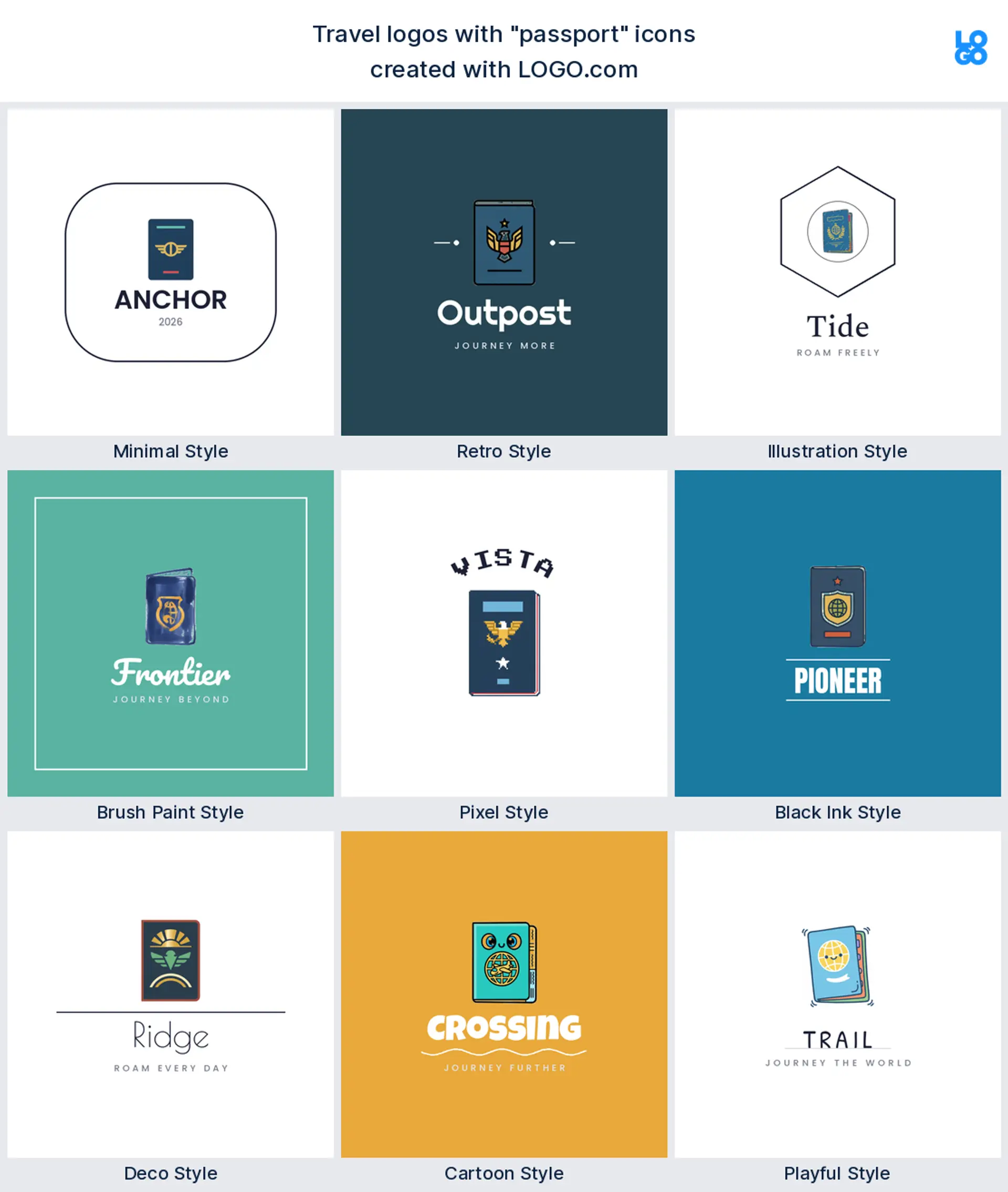
5. Passport
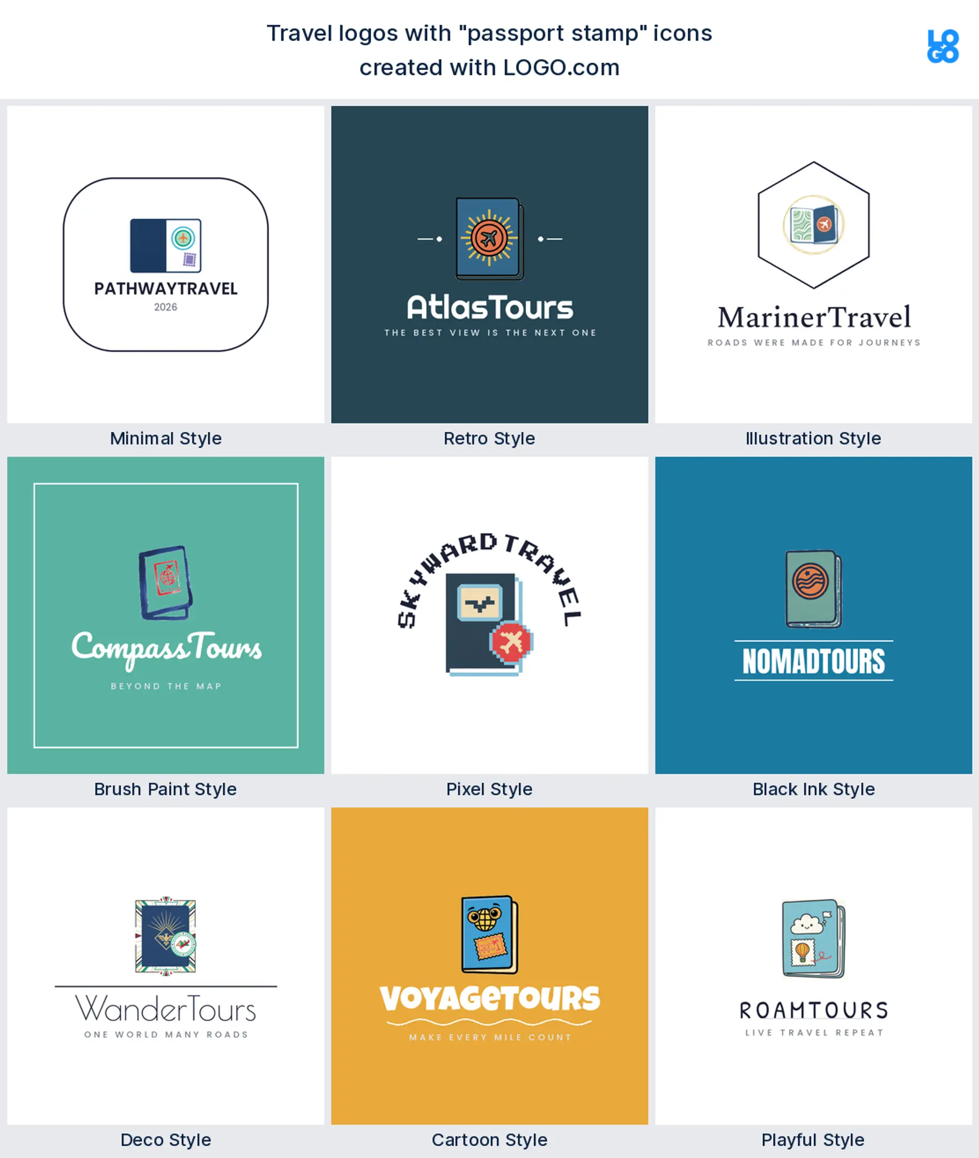
The passport is a favorite for agencies and travel agents, the document that makes a trip feel real. A booklet or a stamp signals bookings, visas, and the moment you actually go, which makes a trustworthy travel agency or travel agent logo. Keep it bold, since fine stamp detail disappears at small sizes.
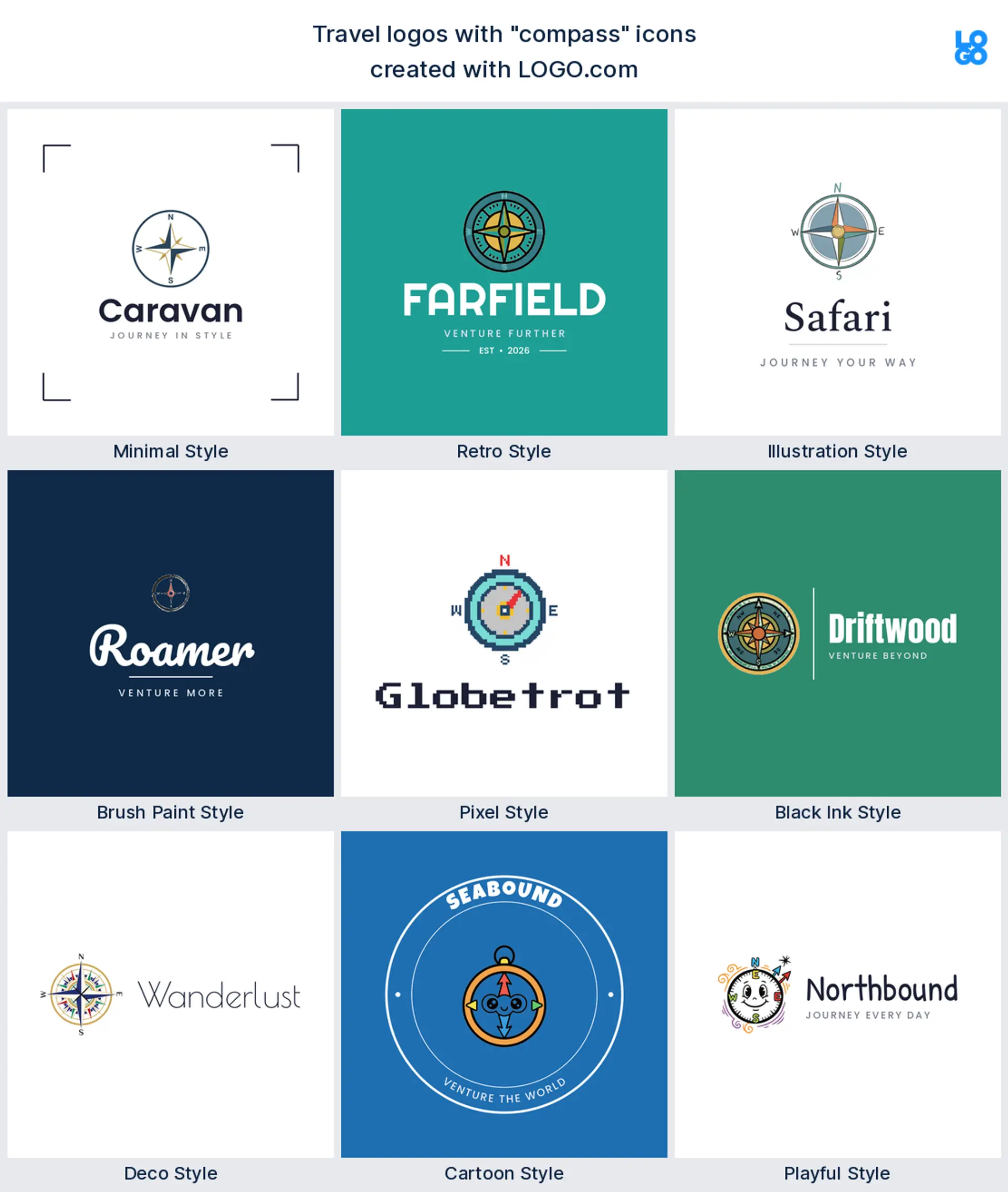
6. Compass
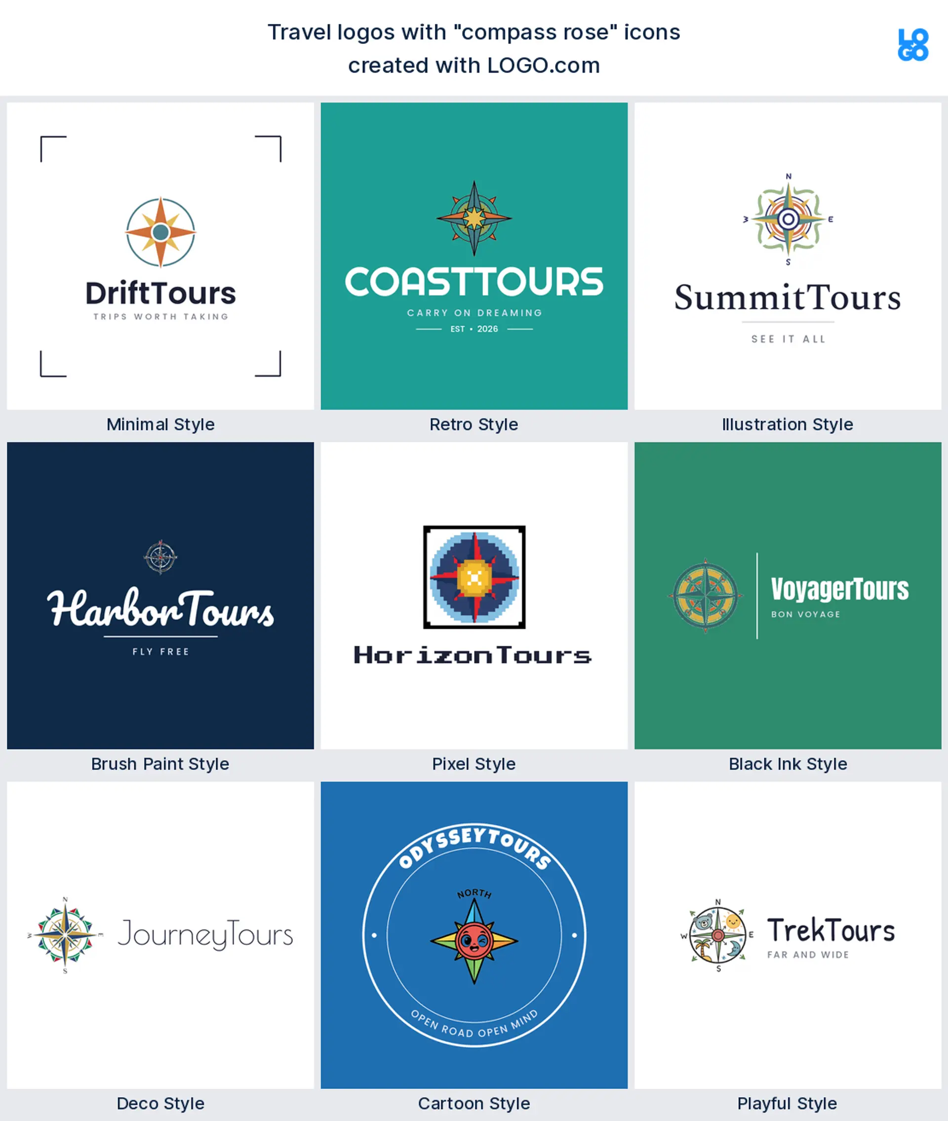
A compass points to adventure and finding your way, which makes a natural adventure or explorer logo for an outdoor travel brand. A clean compass rose looks considered on a badge and still reads as one shape when it shrinks.
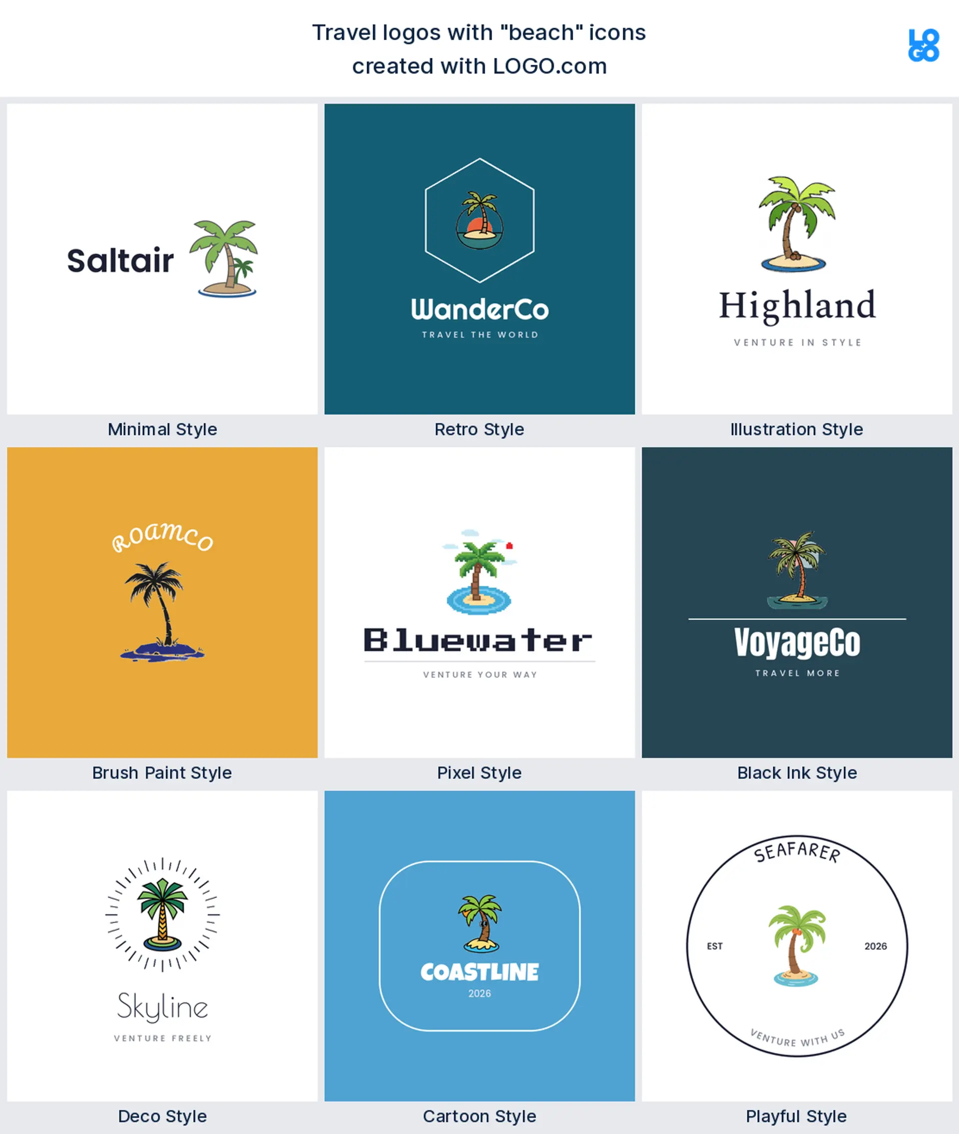
7. Beach and palm
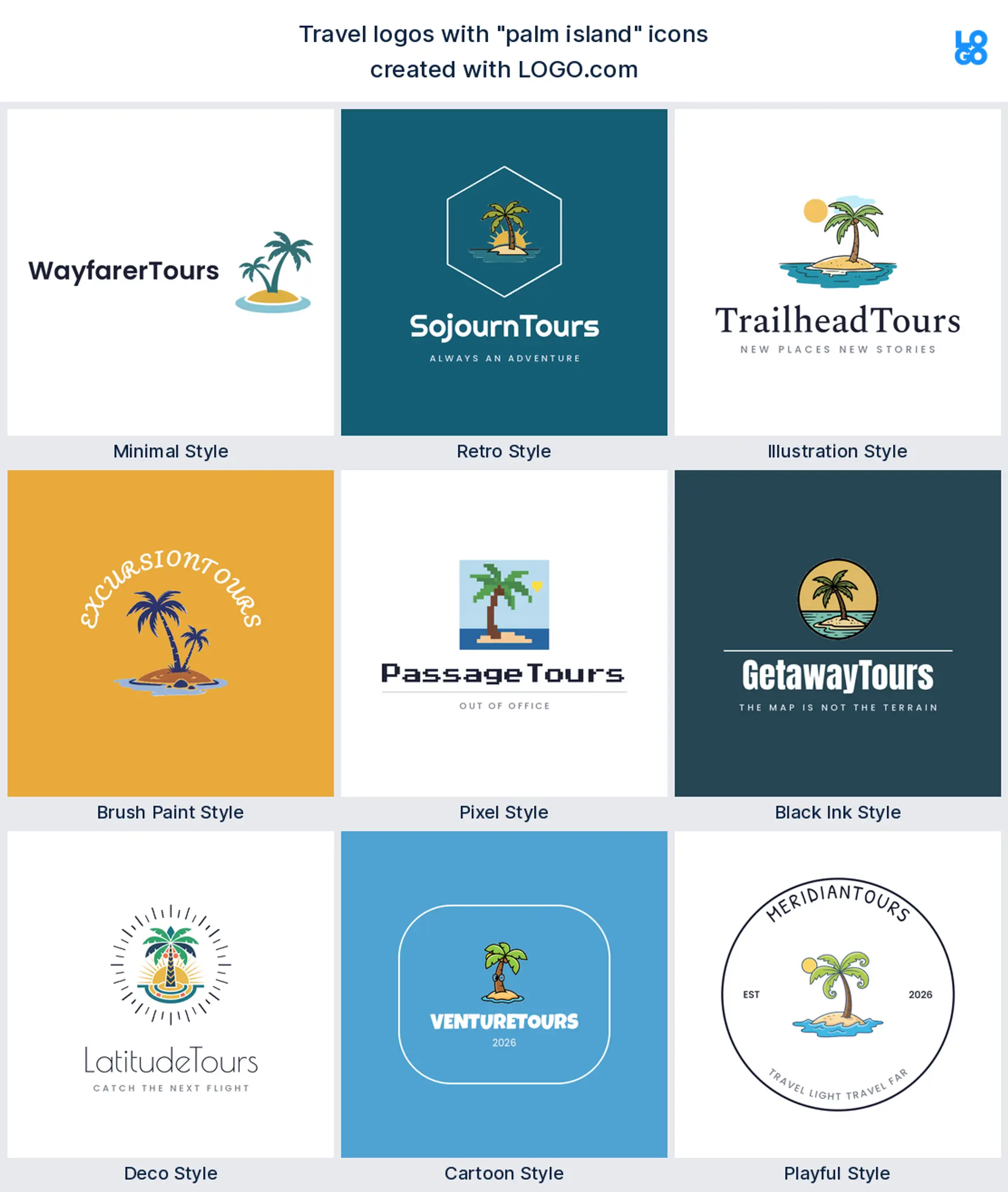
Palms, islands, and beaches carry the holiday and vacation end of travel, all sun and salt water, which makes a warm beach holiday or vacation logo. A single palm on an island reads inviting at any size, and it suits tropical tour brands too.
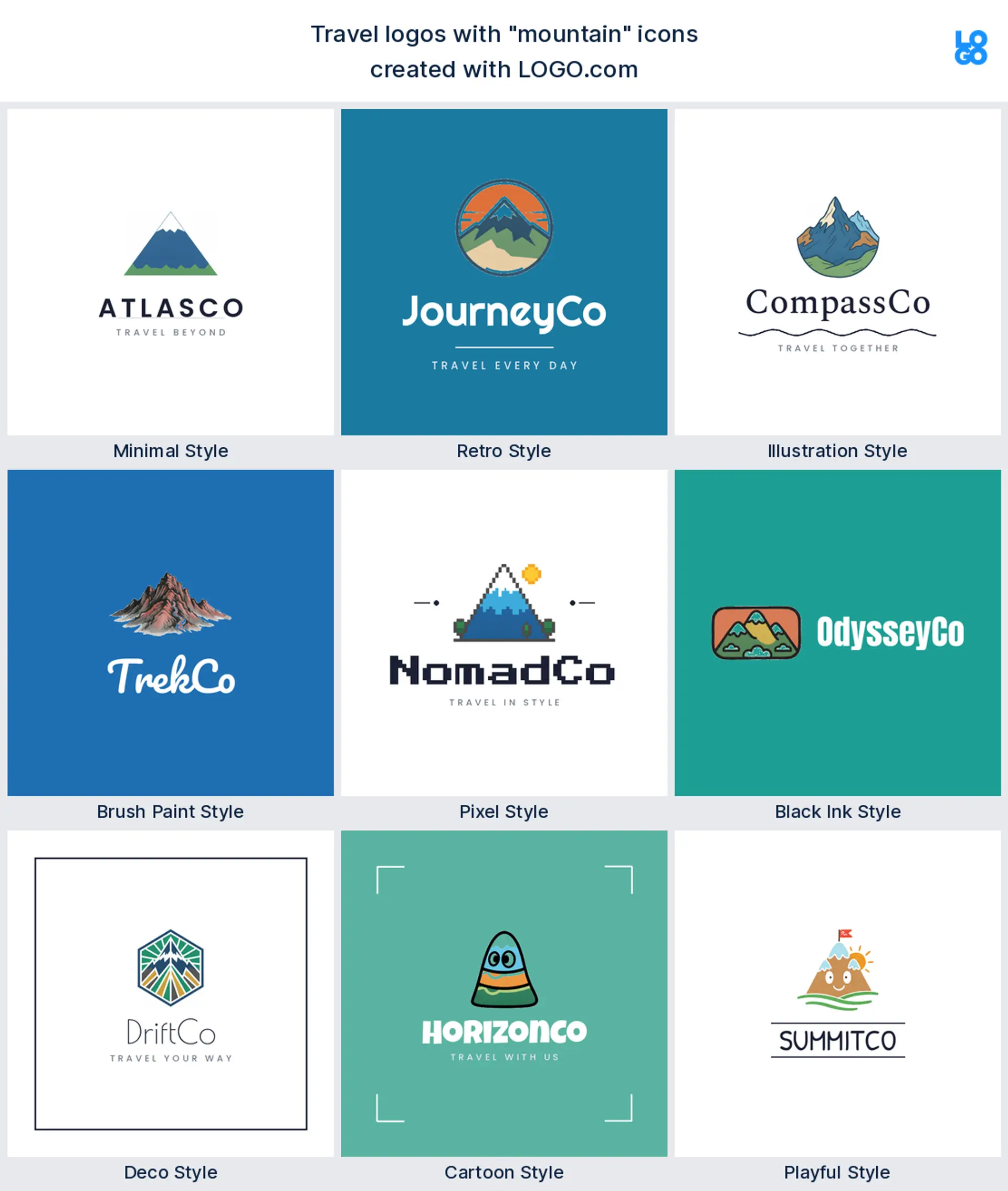
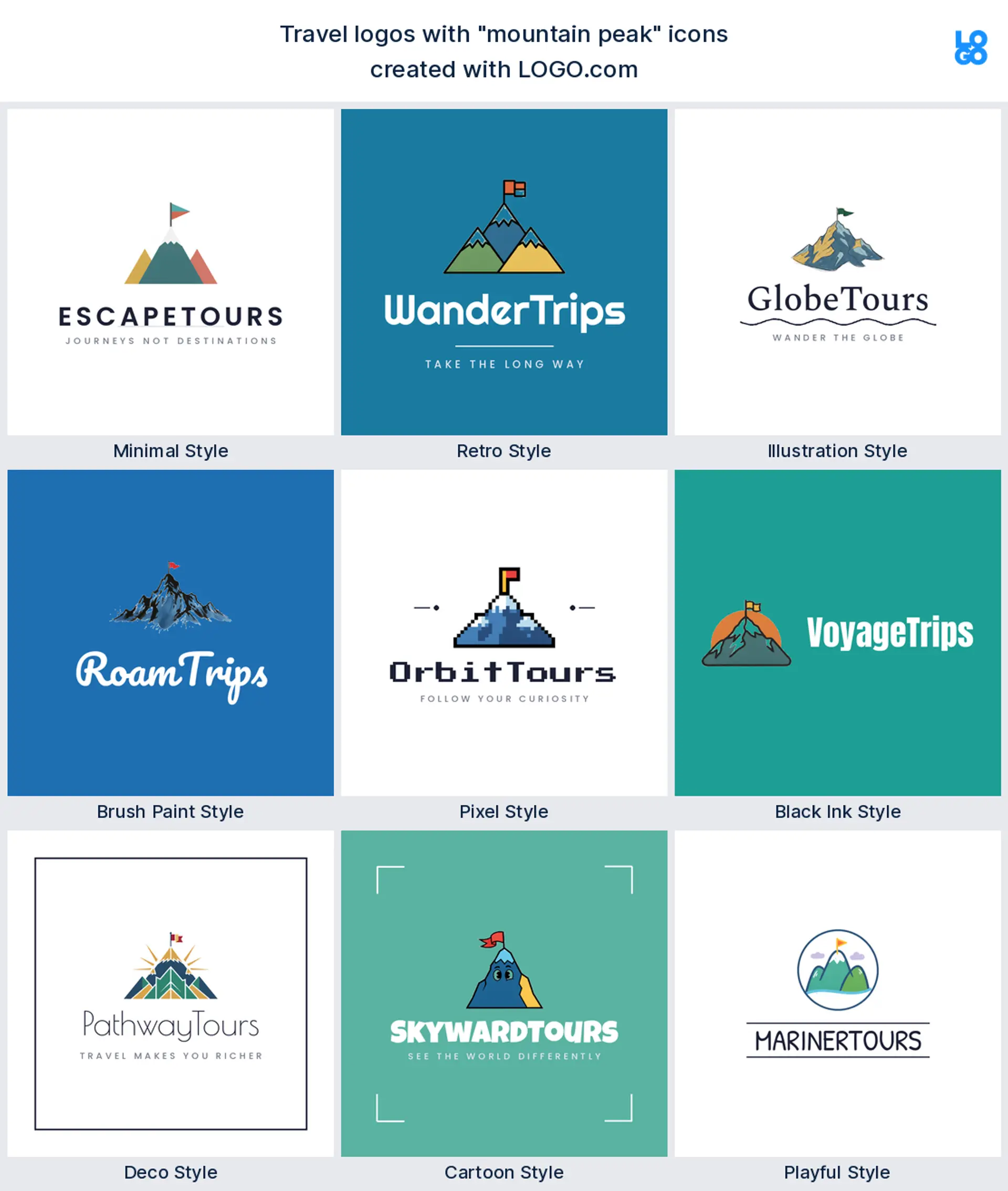
8. Mountain
Mountains stand for adventure, hiking, and the great outdoors, which makes a rugged adventure travel or expedition logo. A bold peak, maybe with a small flag, holds up in one color and looks as good on a patch as on a website.
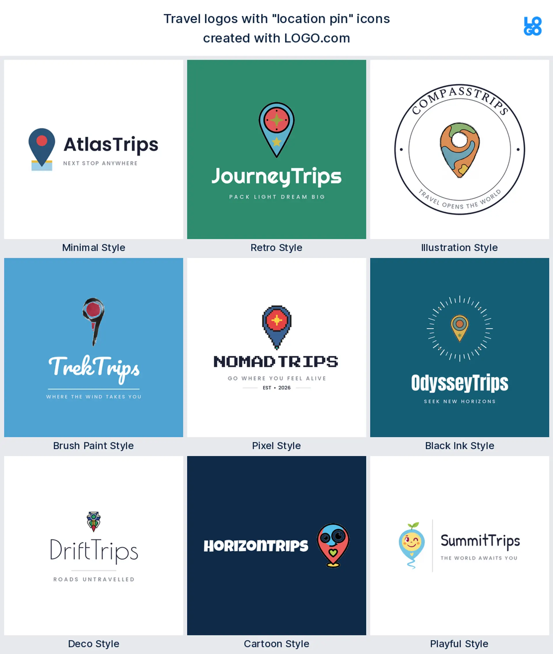
9. Location pin
The ninth is the location pin, the modern shorthand for places and maps that every phone owner knows, which makes a clean trip planning or local tour logo. A single pin reads instantly and never needs explaining.
Fifteen travel logo ideas to take further
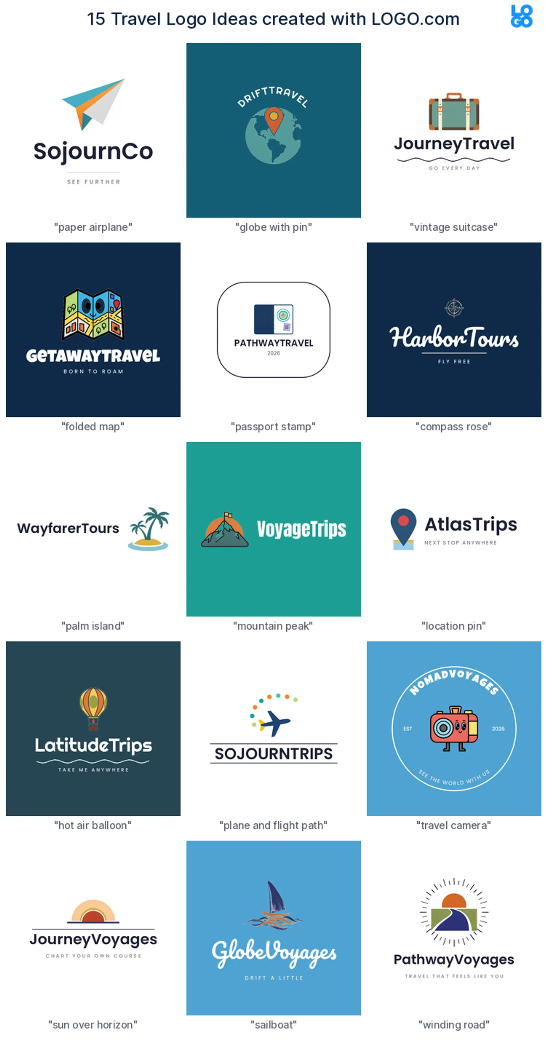
No two of these look alike. Each takes one of the popular travel symbols in a different style, so you can watch a paper plane go minimal, a suitcase go vintage, or a compass turn into a loose brush mark. Find the closest match to your brand, then make it yours from there.
1. Paper airplane, minimal
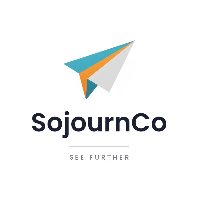
A paper airplane over a quiet wordmark feels light, optimistic, and modern, a clean travel logo for an agency or app that wants to look effortless.
2. Globe with a pin, cartoon
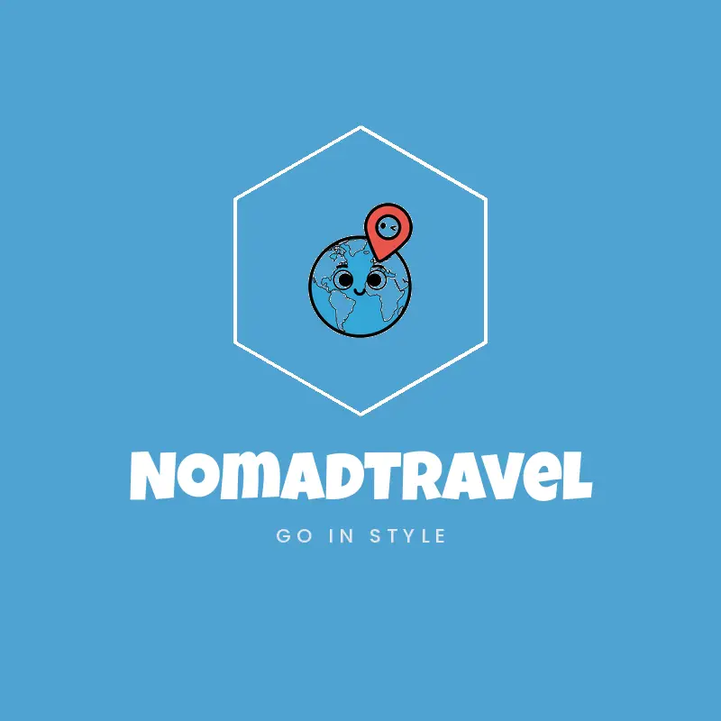
Drop a location pin onto a friendly rounded globe and you get an approachable mark that says we will get you anywhere, ideal for a booking logo.
3. Vintage suitcase, illustrated
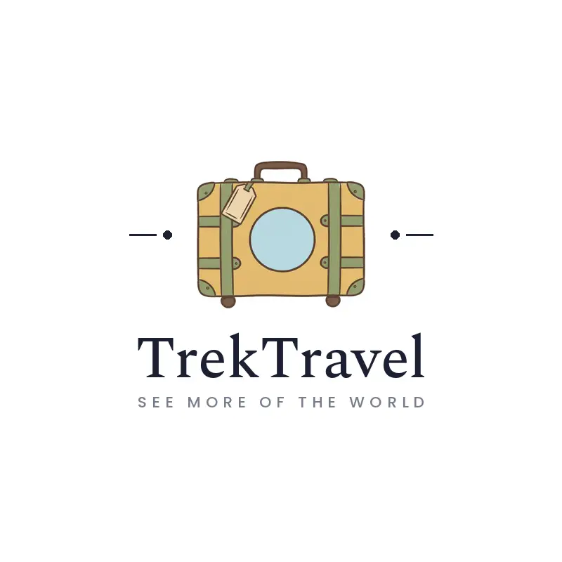
A vintage suitcase covered in stamps leans nostalgic and full of character, a lovely fit for a boutique agency or a travel blog with a story.
4. Folded map, retro
A folded map in a bold retro badge feels like a classic road trip, great for a tour operator or a regional travel logo.
5. Passport stamp, pixel
Built from crisp pixels, a passport stamp brings a playful, digital feel that stands out for a travel app or a younger travel logo.
6. Compass rose, brush paint
A compass rose in a loose brush stroke feels handcrafted and adventurous, suiting an explorer or expedition logo.
7. Palm island, deco
A palm island framed with neat deco lines reads upscale and sun soaked, right for a luxury beach holiday logo.
8. Mountain peak, black ink
A mountain peak in one bold ink color feels rugged and established, and it stitches cleanly onto a patch or prints on gear.
9. Location pin, playful
A bouncy, hand drawn location pin keeps things friendly and local, a nice fit for a city tours or trip planning logo.
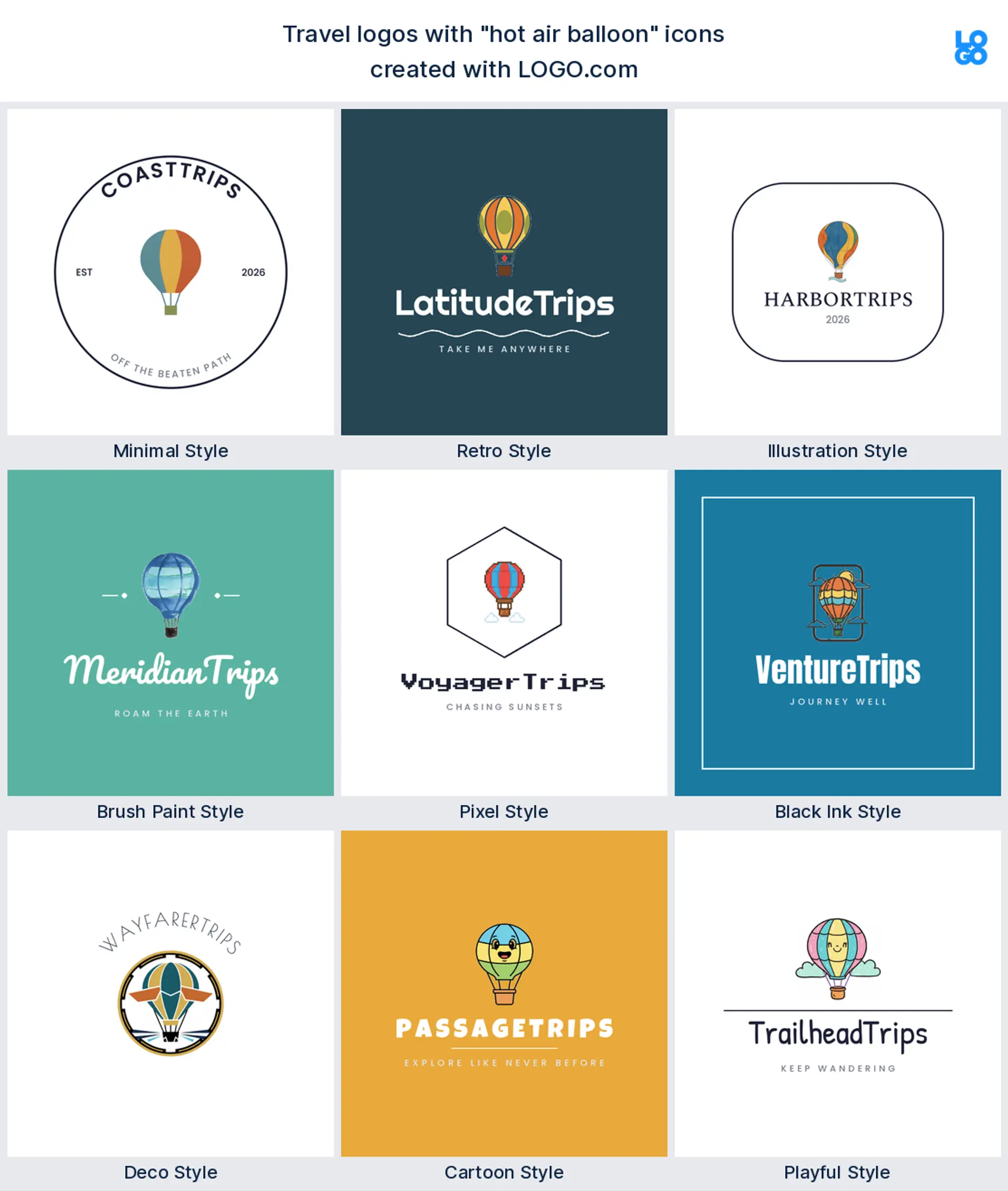
10. Hot air balloon, cartoon
A cheerful hot air balloon brings a sense of wonder and slow, scenic travel, memorable for a family or experiences logo.
11. Plane and flight path, minimal
A plane arcing around a globe with a dotted flight path says international in one clean mark, perfect for a flights or travel agency logo.
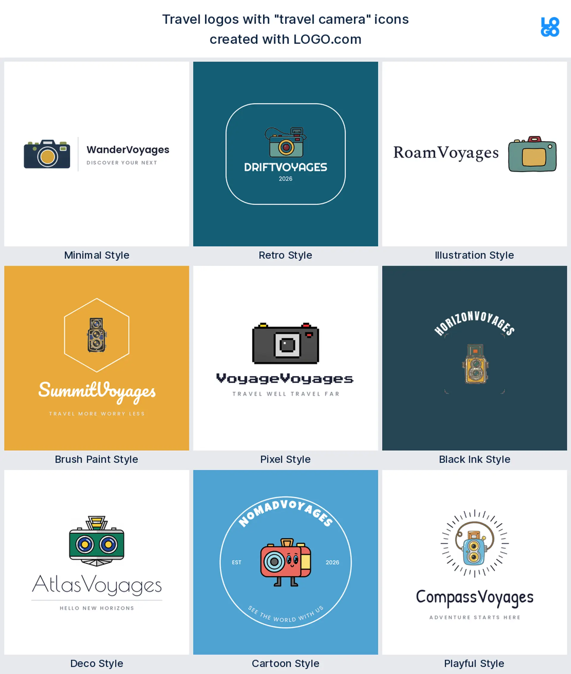
12. Travel camera, retro
A vintage camera in a retro badge speaks straight to travel bloggers and creators who document every trip.
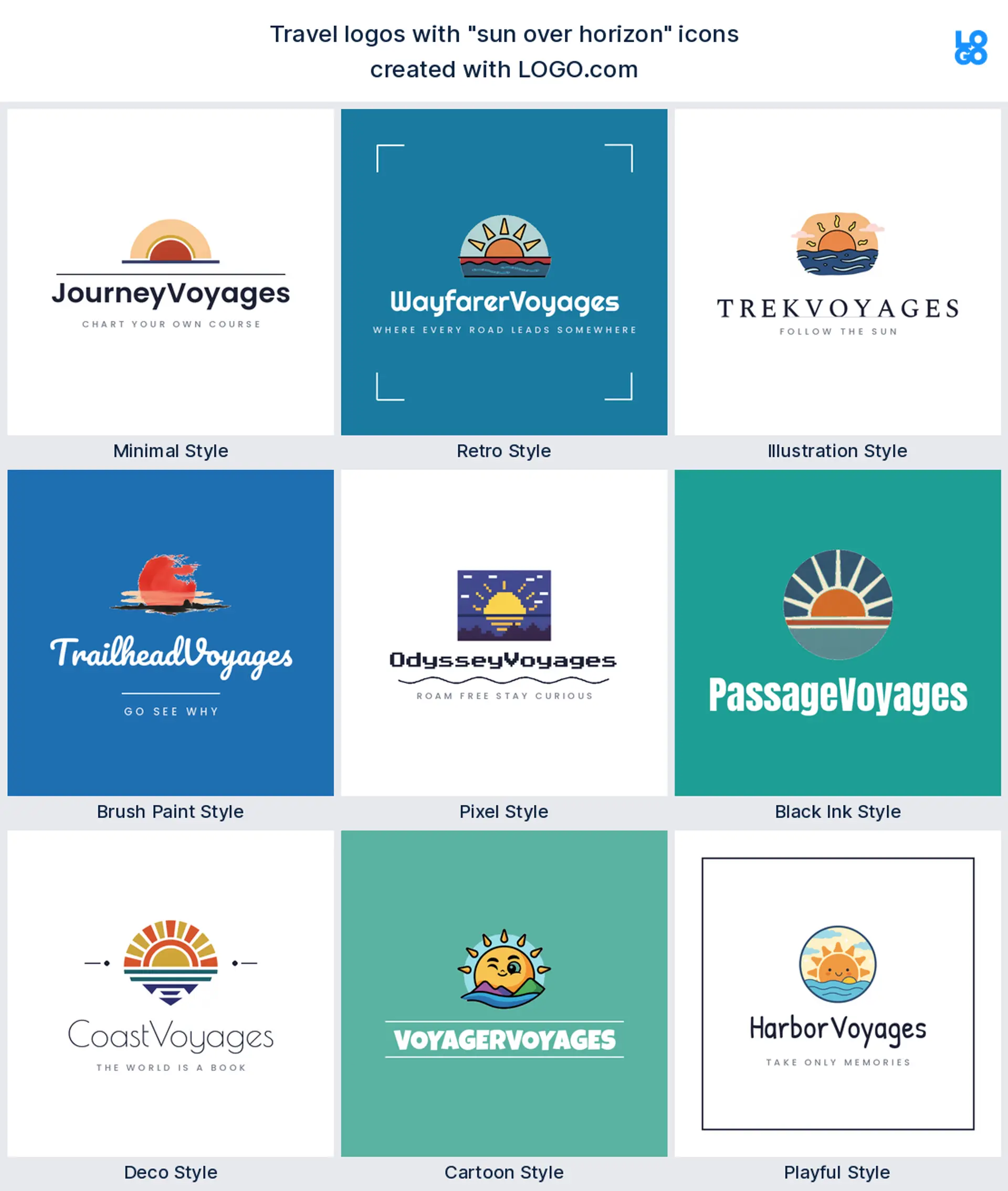
13. Sun over the horizon, illustrated
A sun rising over the horizon feels hopeful and warm, a calm, modern mark for a wellness or slow travel logo.
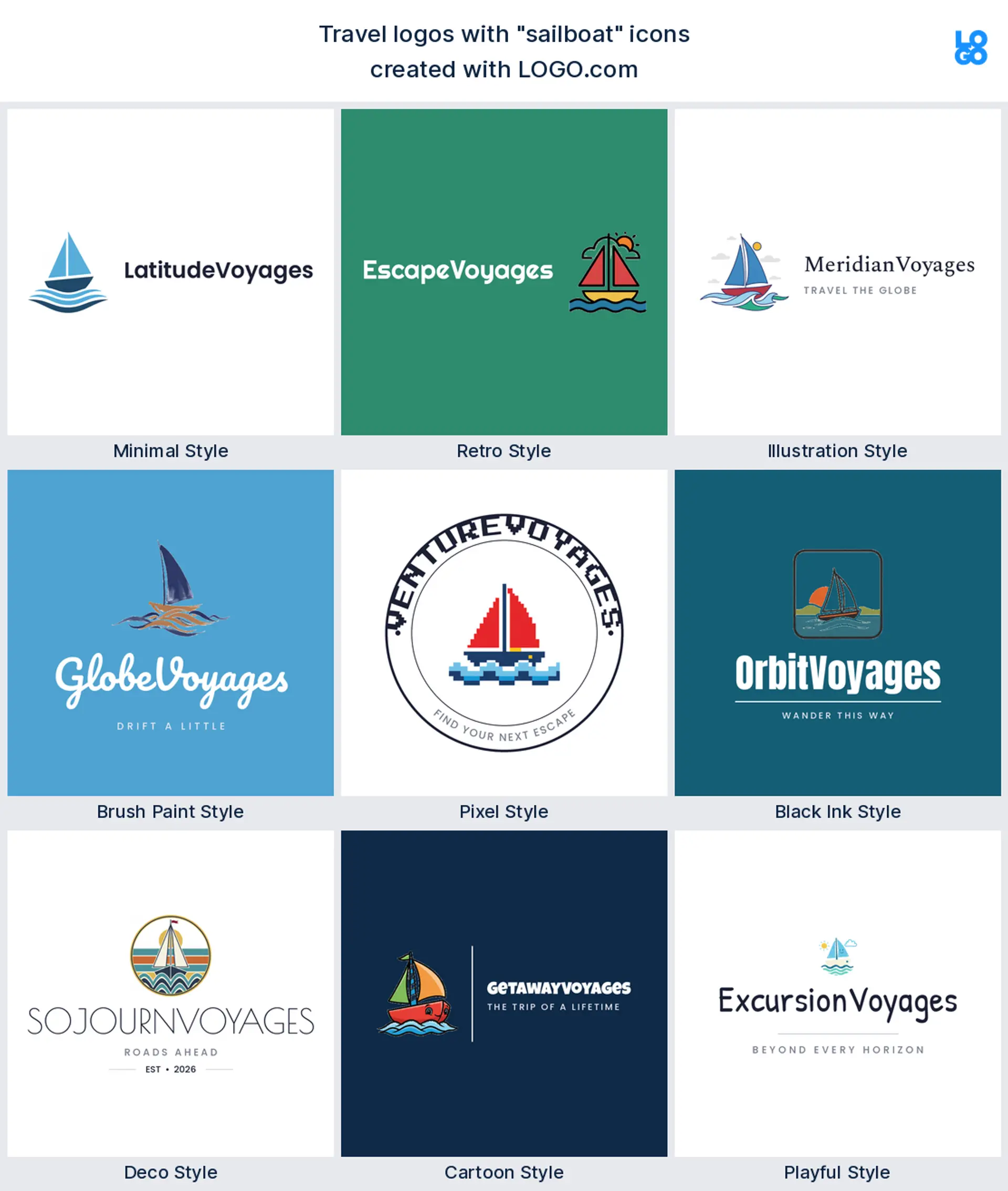
14. Sailboat, deco
A sailboat on a few clean waves carries coastal and cruise travel, easygoing and premium at once.
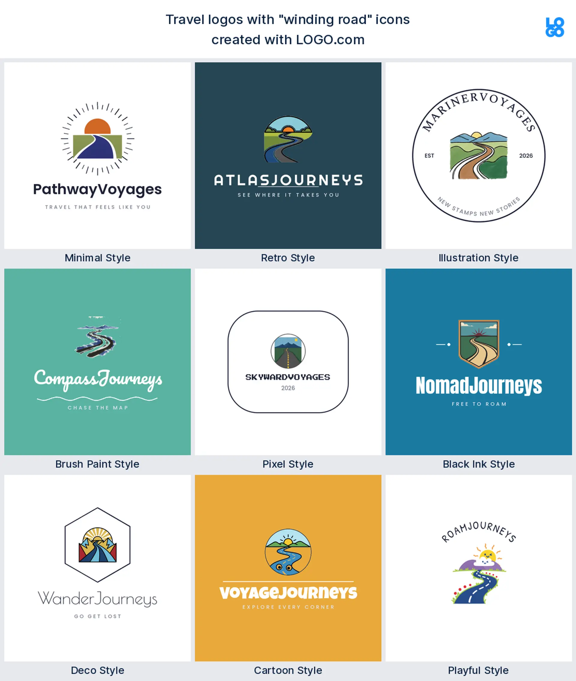
15. Winding road, retro
A winding road heading for the horizon is the road trip in one image, ideal for an RV, car hire, or overland logo.
An agency, a blog, and an adventure brand should not look alike
Start with what you actually sell, because that should shape the whole logo. If you run a travel agency, you want to look trustworthy and established, so a clean wordmark with a globe, a passport, or a compass works hard for you. Are you a tour operator? Lean into the place or the activity, a mountain, a sailboat, a winding road. And if you are a travel blogger or creator, you have more room to play, where a camera, a paper plane, or a hand drawn pin fits your voice. Pick the symbol that matches what you do, then hold it to one clear idea.
Globe and plane are everywhere, so how do you stand out?
Here is the honest tension with travel logos: the airplane and the globe are the two most popular icons by a mile, which means they are also the most crowded. You can still use them, just give yours a point of view. Combine two ideas into one, like a plane that draws a flight path or a globe built from a route line; pick a specific symbol for your niche, a compass for adventure, a palm for beach holidays, a camera for a blog; or let an unexpected color and font do the standing out. In our data travel brands already lean heavily blue and green, so a warmer or more unusual palette is an easy way to look different while still reading as travel.
Why travel brands lean blue and green
Our own numbers point one way on color: travel founders overwhelmingly choose blue, then green, over clean white and navy, the colors of sky, sea, and landscape. That is a safe, on brand place to start, and a deep navy with a bright sky blue looks instantly premium. If you want to stand out, a sunset gold or coral accent reads warm and adventurous without losing the travel feel. For type, pair one clear font with your icon, a friendly rounded sans for an approachable agency, or a confident serif for a more luxury or heritage brand. Lock the palette and font into a brand kit so your site, your social, and your printed materials all match.
Will your logo work on a website, an app, and a luggage tag?
Yes, if you keep it bold and simple. A travel logo has to stretch across a wide website header, a tiny app icon or favicon, printed itineraries and brochures, and small items like luggage tags and lanyards. Drop hairline strokes and fussy detail, since they vanish the moment the mark shrinks. Grab the transparent version in your download so the logo sits cleanly on a destination photo or a colored header with no white box around it, and check it in one solid color so you know it will hold up printed small or embroidered onto a bag.
Make your travel logo with LOGO.com
Ready to make yours? Drop in your brand name, pick the symbol that fits your niche, and our travel logo maker builds a logo around it in one of nine styles. Preview it free, then download a logo set up for your website, your app, and everything you hand a traveler.
Methodology. According to LOGO.com first party data, these figures come from logos created on LOGO.com during the 12 months ending June 2026. We isolated the roughly 650 brands whose founders selected a travel industry, such as Travel, Travel Agency, and Travel Blog, and the more than 350 custom icon descriptions those founders wrote. We grouped the descriptions by concept, for example airplane, globe, or suitcase, and ranked each by how often it appeared. The airplane was most common at about 26%, followed by the globe at about 23% and the suitcase at about 15%. Figures are a share of travel logo descriptions, rounded to the nearest percentage point. Source: LOGO.com first party product data, June 2026.