Hair Salon Logo Maker
Design a hair salon logo that looks good on your salon window and price list.
Need a different logo maker? Try our AI logo generator.
Logos created using LOGO.com
670,000,000
Sleek and modern hair salon logos
Playful and stylish salon logos
Elegant and artistic hair salon logos
Hair Salon Logos, Ranked From Real Brand Data
According to LOGO.com data, the icons hair salon owners reach for most are scissors (about 30 percent), a lock of hair (about 29 percent), and a comb (about 20 percent), pulled from the salons people actually build on LOGO.com.
Because a hair salon logo has to travel from a window decal to a mirror station to your Instagram, the nine styles below are built to stay clear at small sizes. Start from a symbol that fits your salon, then make it your own with your colors and name.
On this page
- Which icons do hair salons put on their logo most?
- Fifteen hair salon logo ideas from real founder prompts
- Scissors, flowing hair, or an abstract mark: what should a salon logo show?
- Hair salon, barber, or nail bar: match the mark to your kind of salon
- Solo stylist or full salon? Sizing the logo to your business
- Colors that suit a hair salon, straight from real brand data
- Make your hair salon logo with LOGO.com
Walk past a busy hair salon and the logo is already hard at work, etched on the window, printed on the price list, stitched into the towels. Before any of that, you need one mark that survives all of it. To see what actually holds up, we read the icons real salon owners described when they built a logo on LOGO.com, and one favourite jumped out: scissors, named in roughly 30 percent of them. This page walks through the nine symbols salons reach for, fifteen real prompts you can borrow, and the small choices that make a salon logo look polished instead of generic.
Which icons do hair salons put on their logo most?
Salons come in every shape, from a single chair by the window to a full floor of stylists, so the popular symbols come from every kind of owner who built with us. Scissors lead by a wide margin, a lock of flowing hair is almost level, and a comb sits third, with the rest of the nine spread close behind. Pick the one nearest to what you do, keep it to a single clean shape, and it will still read when it is shrunk onto a booking app or a mirror sticker.
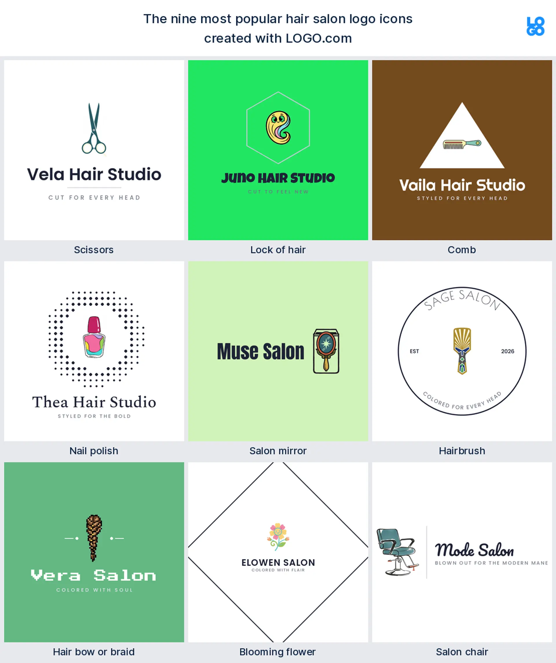
Scissors
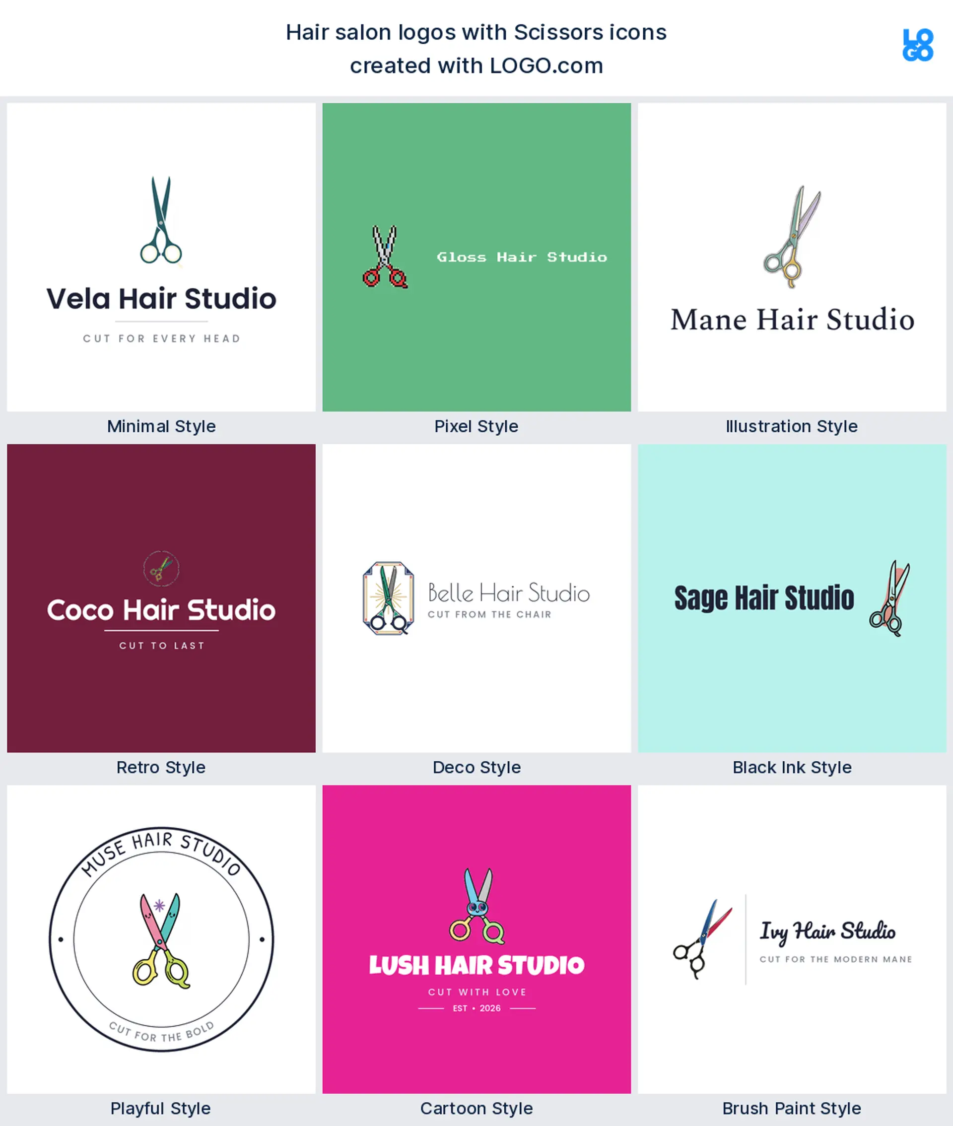
Scissors are the shape almost every salon owner types first, and the numbers back it up: they appear in about 30 percent of the icon descriptions we read. Two crossed blades say cut and style the instant someone glances at them, even shrunk onto a booking app, which makes them the obvious pick for a hair salon or hairstylist logo.
Lock of hair
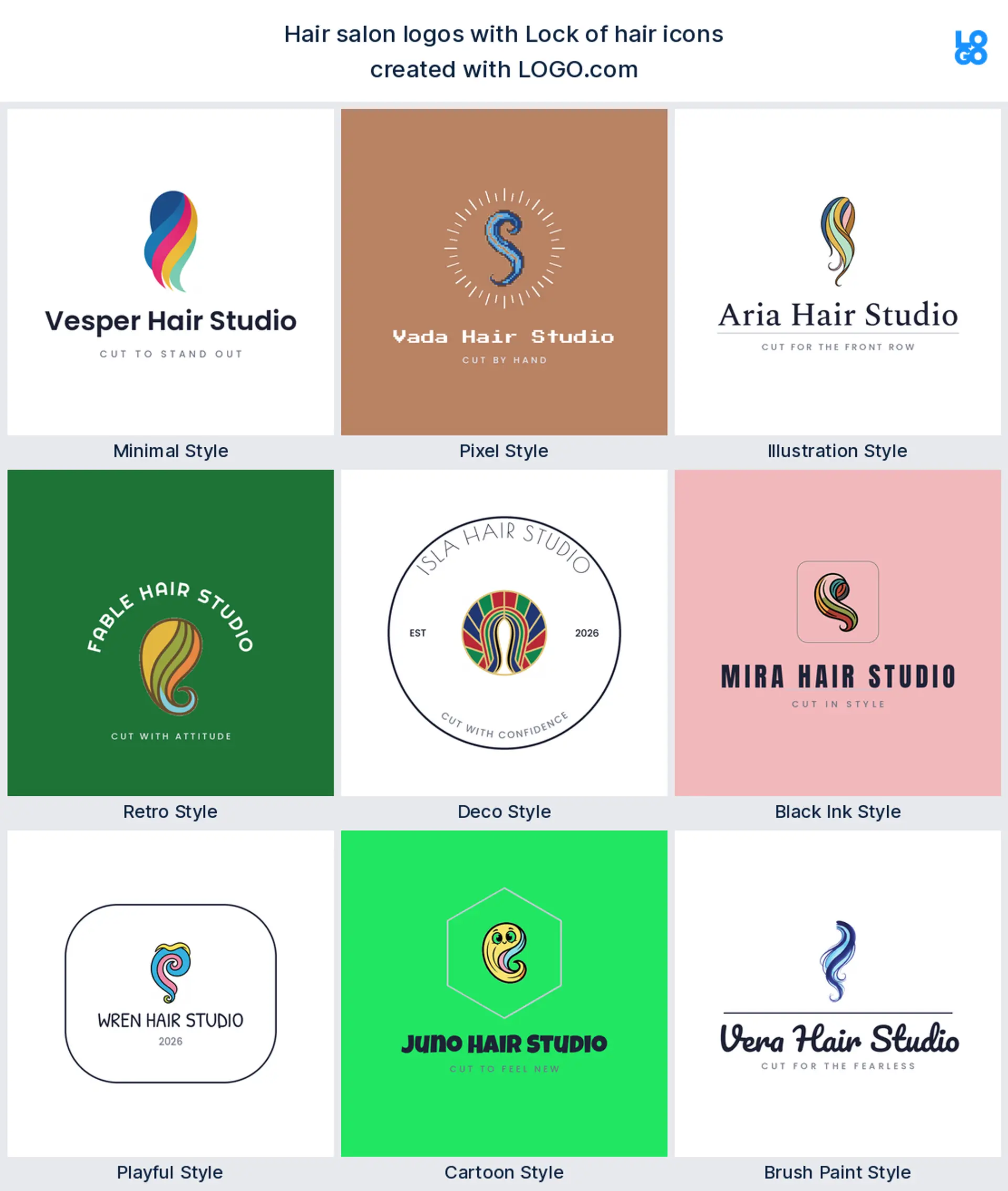
Running neck and neck with scissors, in roughly 29 percent, is a single lock or wave of hair. It sells the result instead of the tool, a soft flowing line that reads elegant and feminine, so it suits a hair salon or blow dry bar logo built around beautiful finished hair.
Comb
Add a comb and you have the classic salon pairing. On its own the comb landed in about 20 percent of descriptions, clean and quietly confident, and it sits beautifully next to a wordmark, so it makes a tidy hair stylist logo or salon logo that never looks dated.
Nail polish
Past the top three the salon world widens, and a bottle of nail polish is next up. It is the fastest way to say a place does more than hair, which is why it turns up for owners adding manicures, and it makes a natural nail salon or beauty salon logo.
Salon mirror
The salon mirror is a lovely, less obvious choice, the station mirror where the whole transformation happens. Drawn simply it feels calm and considered, a good fit for a beauty salon or styling studio logo that wants to read as an experience rather than just a chair.
Hairbrush
A hairbrush shows up steadily too, the everyday tool clients already picture in their own hands. Bold and friendly, it holds together at small sizes, so it works well as an approachable hair salon or hair care logo for a brand that feels warm rather than exclusive.
Hair bow or braid
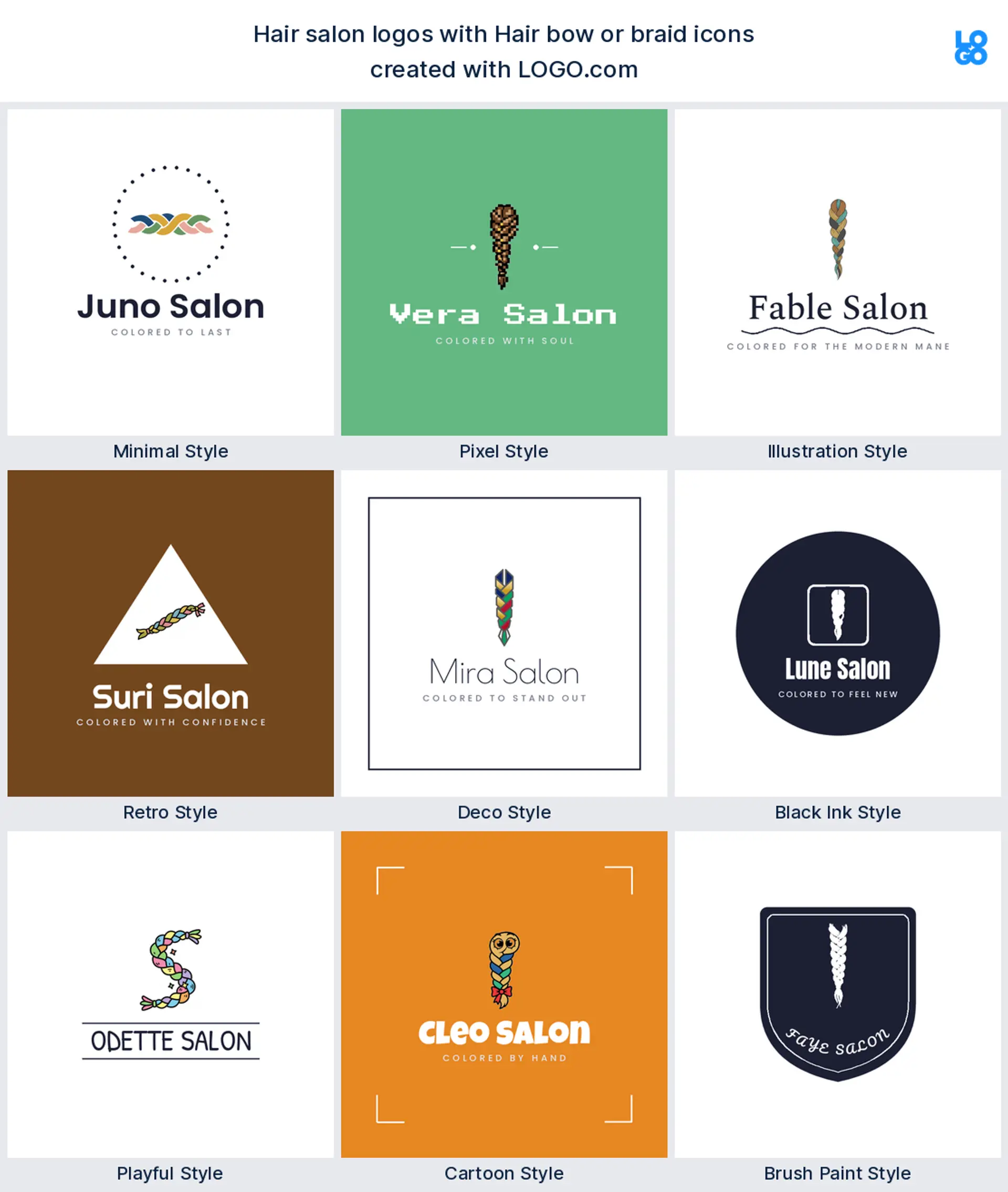
Braids and bows turn up more than you might expect, and they carry real charm. A neat plait or a tied ribbon reads playful and a little nostalgic, which makes it a sweet fit for a kids salon, a braiding specialist, or a hairstylist logo with personality.
Blooming flower
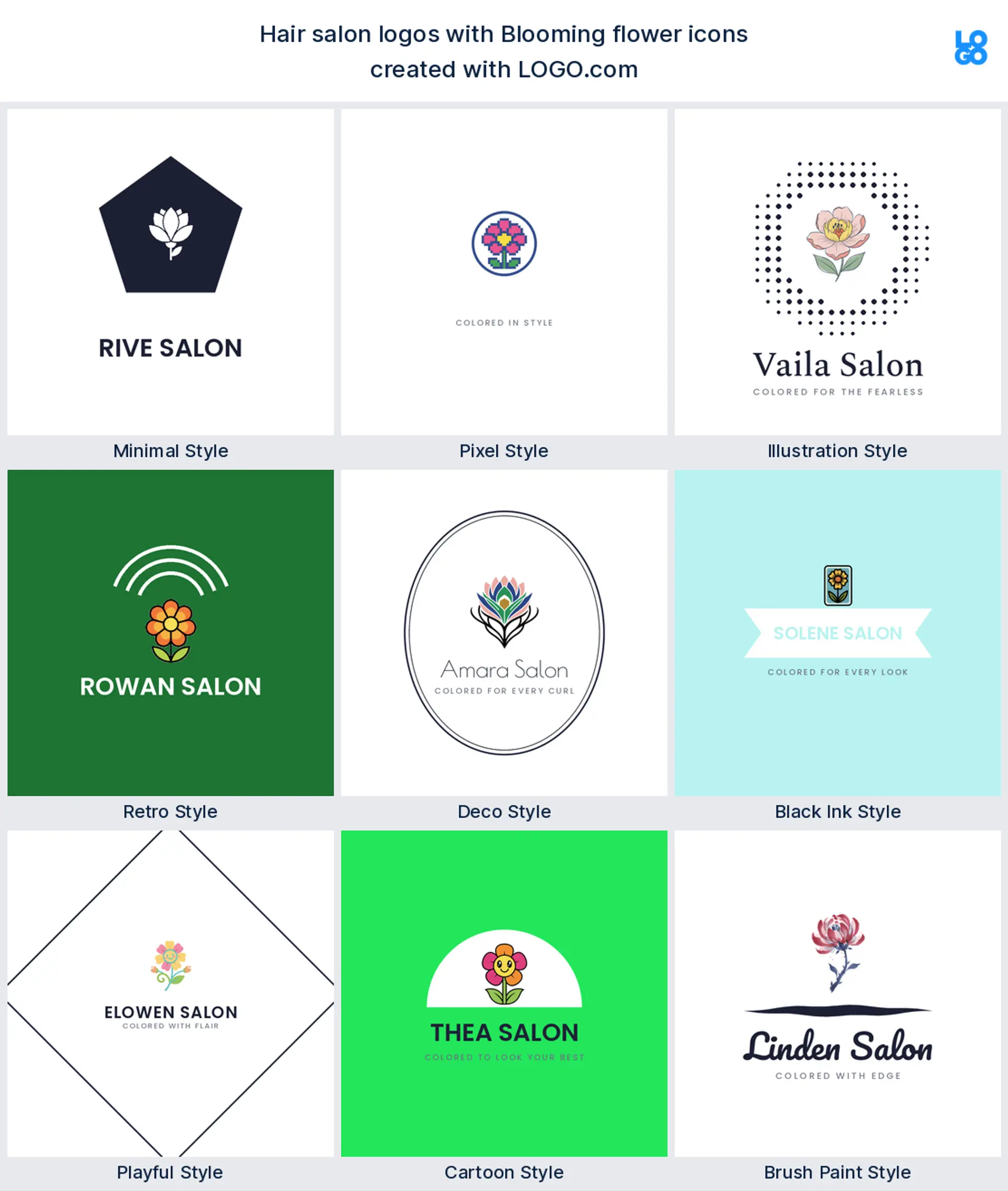
A blooming flower is the softest mark in the nine, standing in for beauty and a fresh start rather than a tool. It gives you a natural place to carry one confident color, so it suits a beauty salon or a wellness driven hair salon logo that leans pretty and calm.
Salon chair
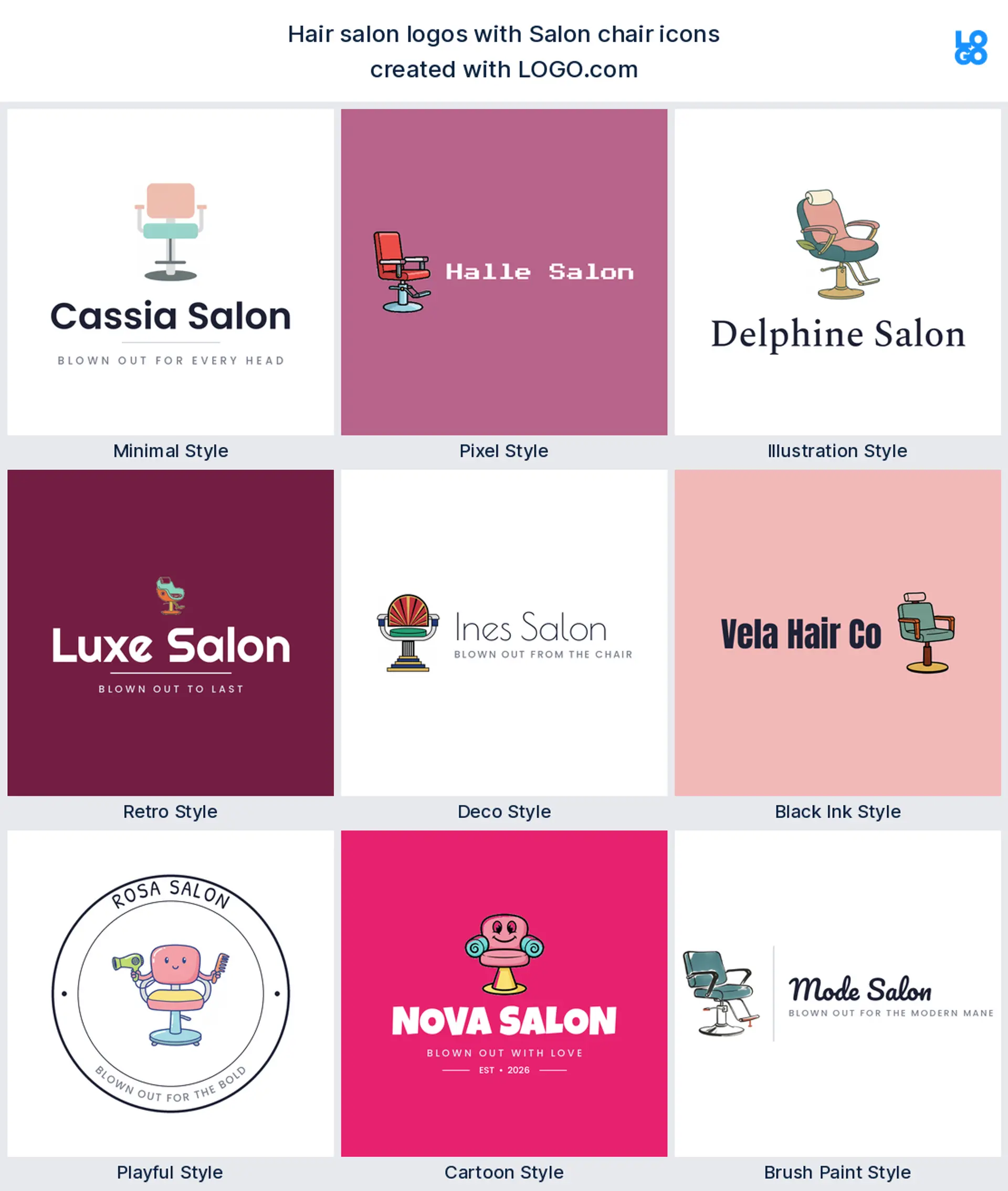
The salon chair closes out the nine, the piece of furniture that quietly says walk in and sit down. One clean chair reads established and grown up, which makes it a smart choice for a full service salon logo where the seat is the whole ritual.
Fifteen hair salon logo ideas from real founder prompts
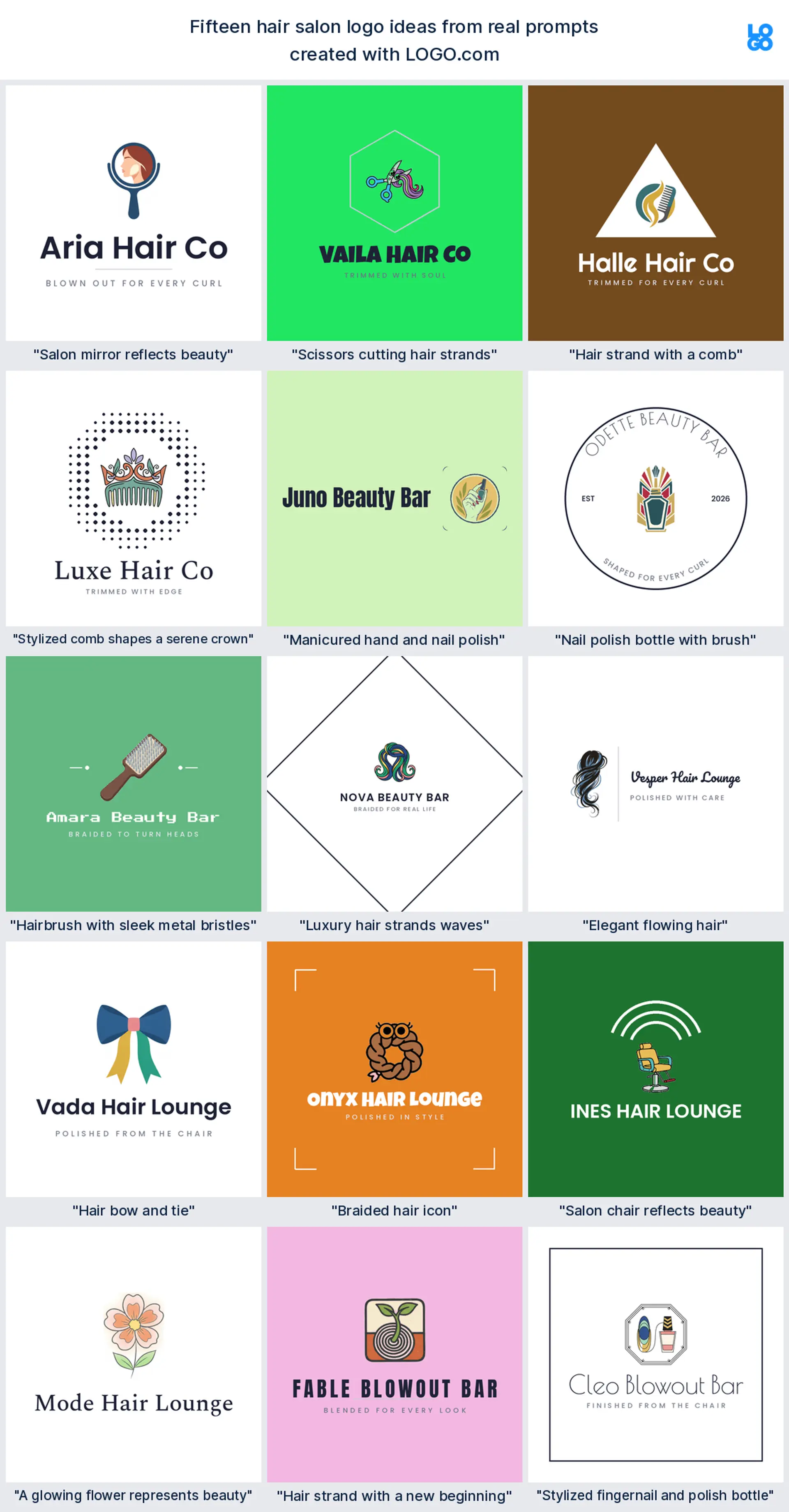
These fifteen are the exact icon descriptions salon owners typed into LOGO.com, shown across the nine styles so you can watch each one shift from clean and minimal to bold and playful. They are richer than the plain top nine, and any of them can carry your name. Treat them as salon logo ideas to borrow, then change the color, font, and wordmark until the mark feels like yours. The best hair logo design keeps one idea and lets the rest fall away.
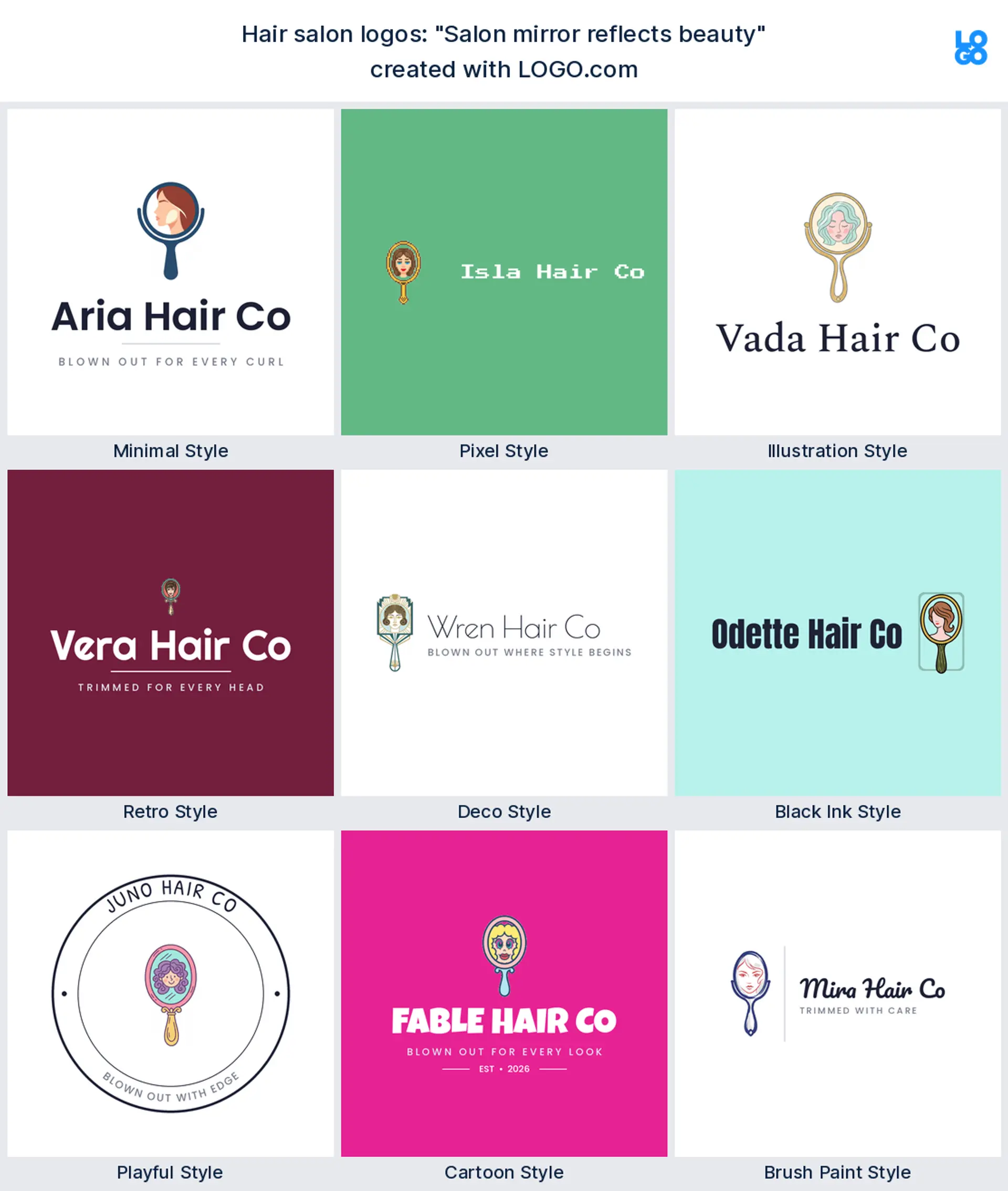
"Salon mirror reflects beauty"
A salon owner wrote this, and the mirror turns the logo into a moment rather than a tool. It reads as a calm beauty salon logo, and the reflection gives you a natural spot to carry your main color.
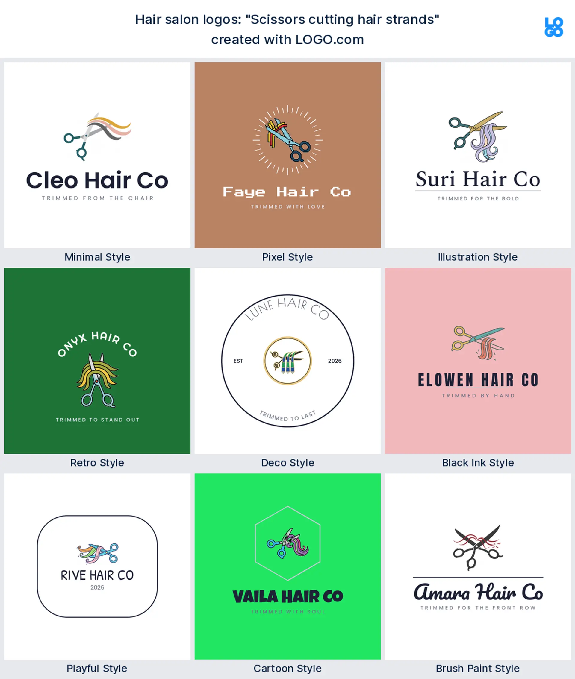
"Scissors cutting hair strands"
This came from a stylist who wanted movement in the mark, blades mid snip with hair falling away. It makes an energetic hair salon logo, and the action stops it feeling like a stock scissors icon.
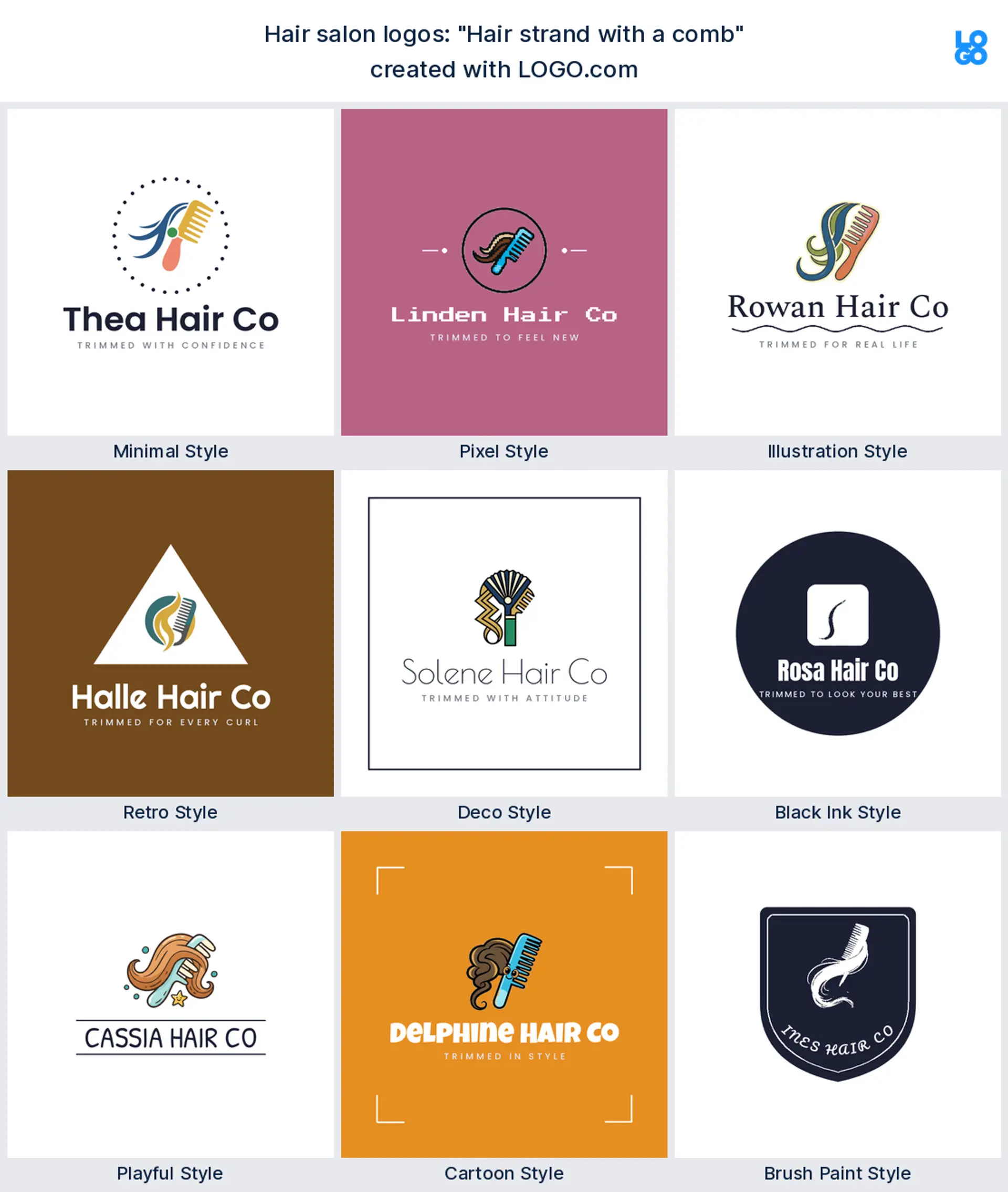
"Hair strand with a comb"
A founder typed this classic pairing, a lock of hair looped through a comb. It works as a straightforward hair stylist logo, and both shapes stay legible when the mark is dropped small.
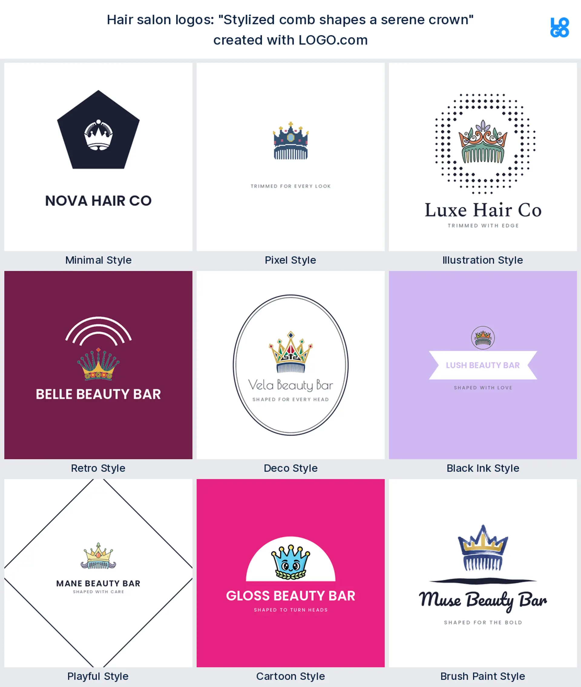
"Stylized comb shapes a serene crown"
Someone chasing a premium feel wrote this, a comb whose teeth become a crown. It reads confident and a touch luxe, a strong fit for a high end salon logo that wants clients to feel treated.
"Manicured hand and nail polish"
A salon adding manicures typed this. A polished hand beside a bottle says beauty services at a glance, which makes it a clear nail salon or beauty salon logo.
"Nail polish bottle with brush"
This came from an owner who wanted the nails side front and centre. A single polish bottle with its brush is simple and instantly readable, a neat nail salon logo for a shop window or an app icon.
"Hairbrush with sleek metal bristles"
A stylist after a modern, polished look wrote this. The sleek brush reads clean and contemporary, a good hair care or salon logo for a brand that leans sharp rather than soft.
"Luxury hair strands waves"
A founder building a glamorous brand typed this, rich waves of hair in motion. It makes an elegant hair salon logo, and the flowing lines feel expensive without any extra detail.
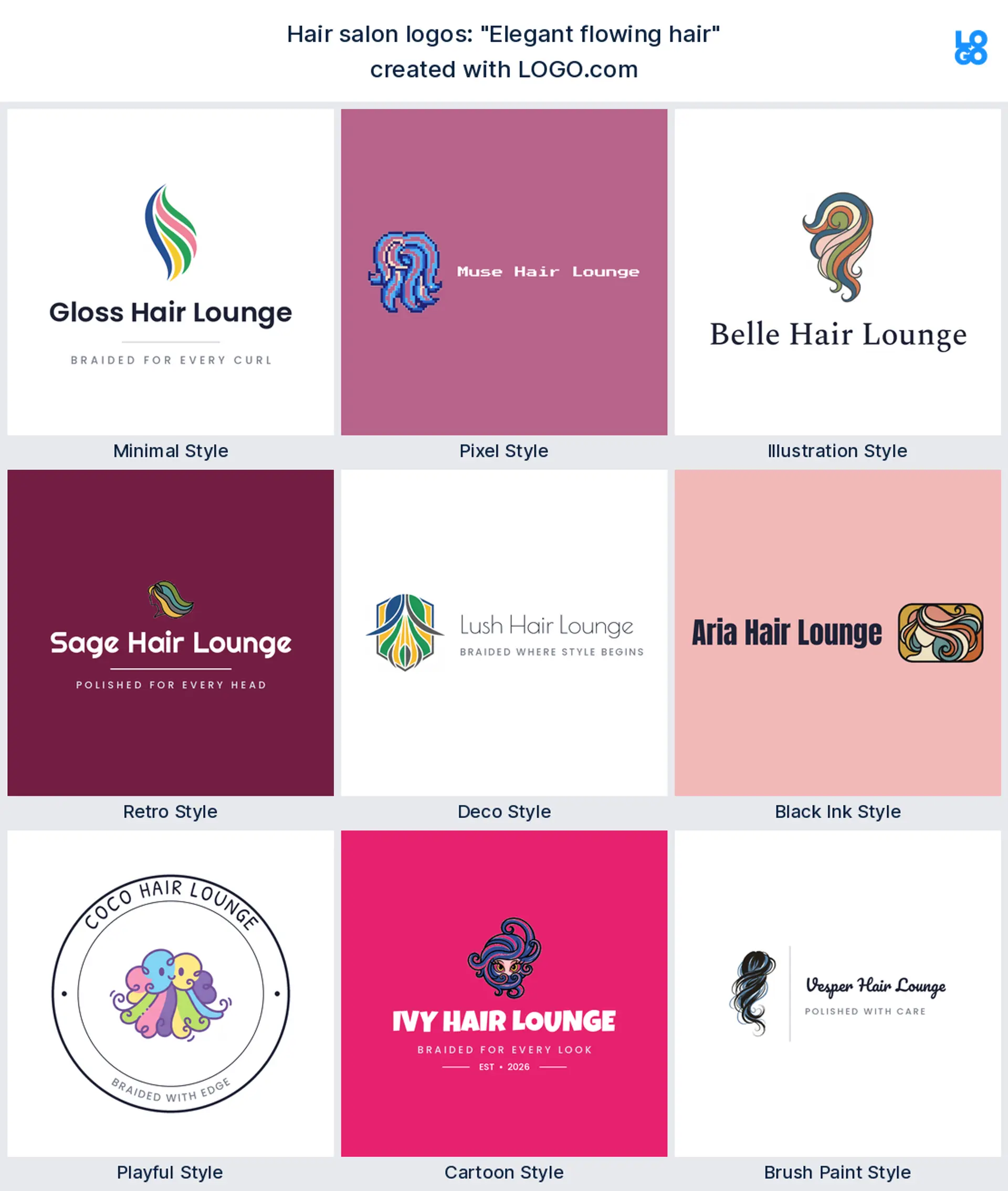
"Elegant flowing hair"
This one keeps it to a single graceful idea, hair caught mid flow. Simple and feminine, it reads instantly as a womenswear salon or blow dry bar logo that is all about the finish.
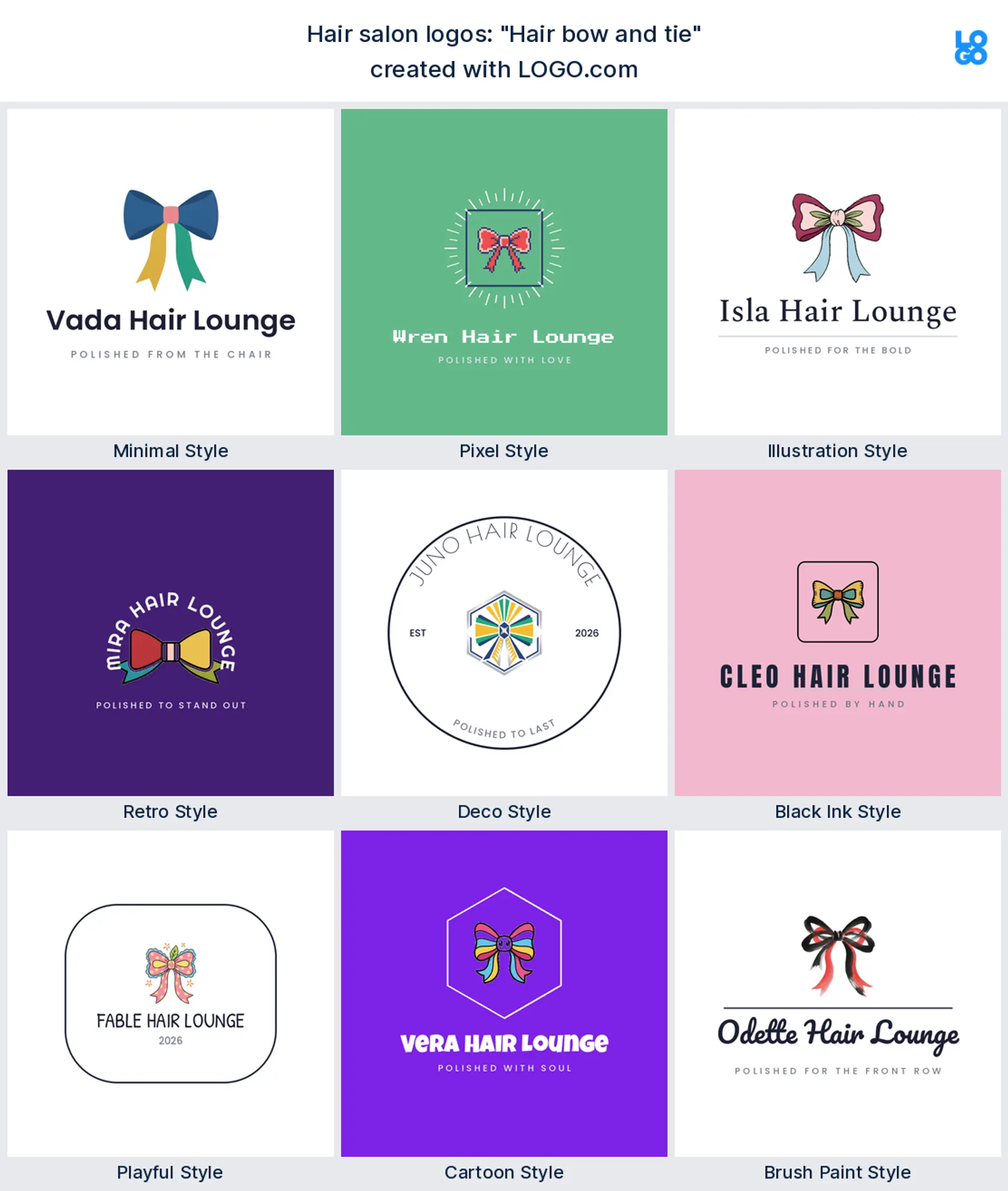
"Hair bow and tie"
A playful brand owner wrote this, a ribbon bow with a soft tie. It suits a kids salon or a braiding specialist, and it stays charming even when it is printed tiny on a loyalty card.
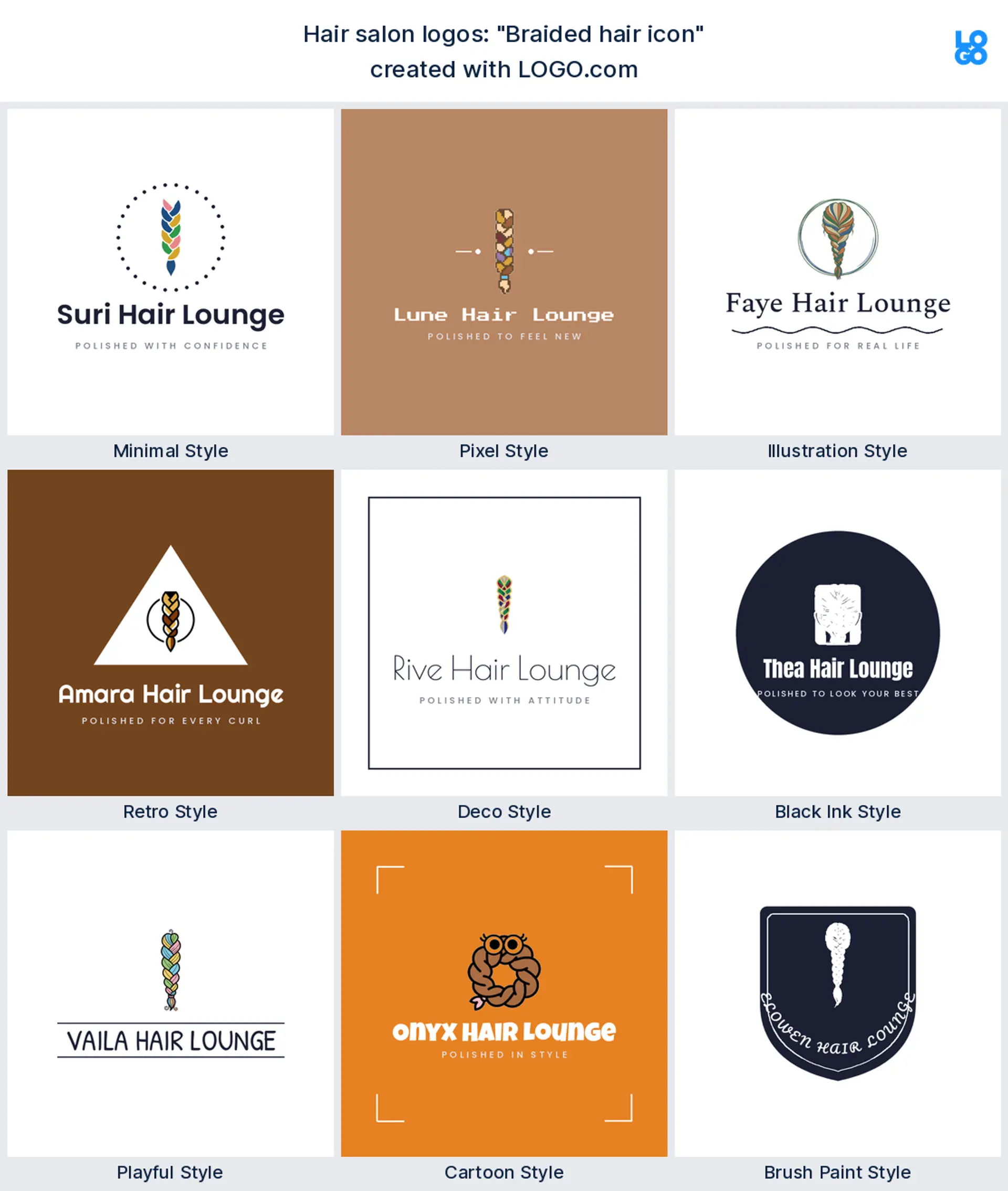
"Braided hair icon"
A braiding specialist typed this, and a clean plait says exactly what the shop does. It makes a proud, specific hairstylist logo, and the pattern reads well even in one color.
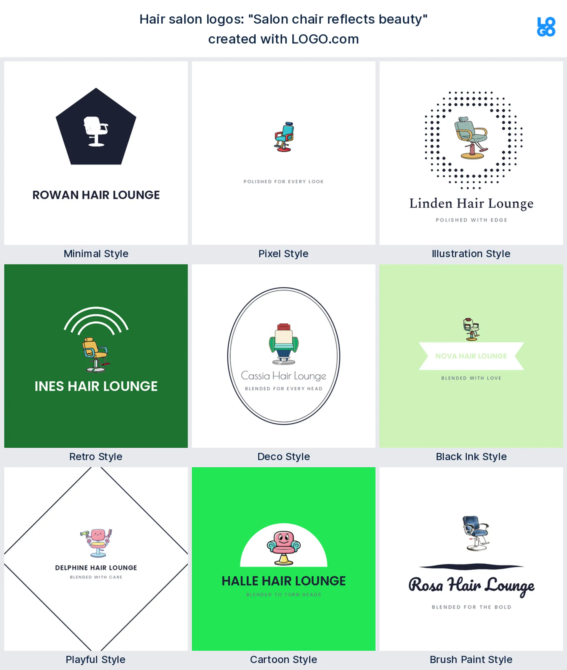
"Salon chair reflects beauty"
An owner opening a bricks and mortar space wrote this, the styling chair as the hero. It reads established and welcoming, a solid full service salon logo for a place with a real floor.
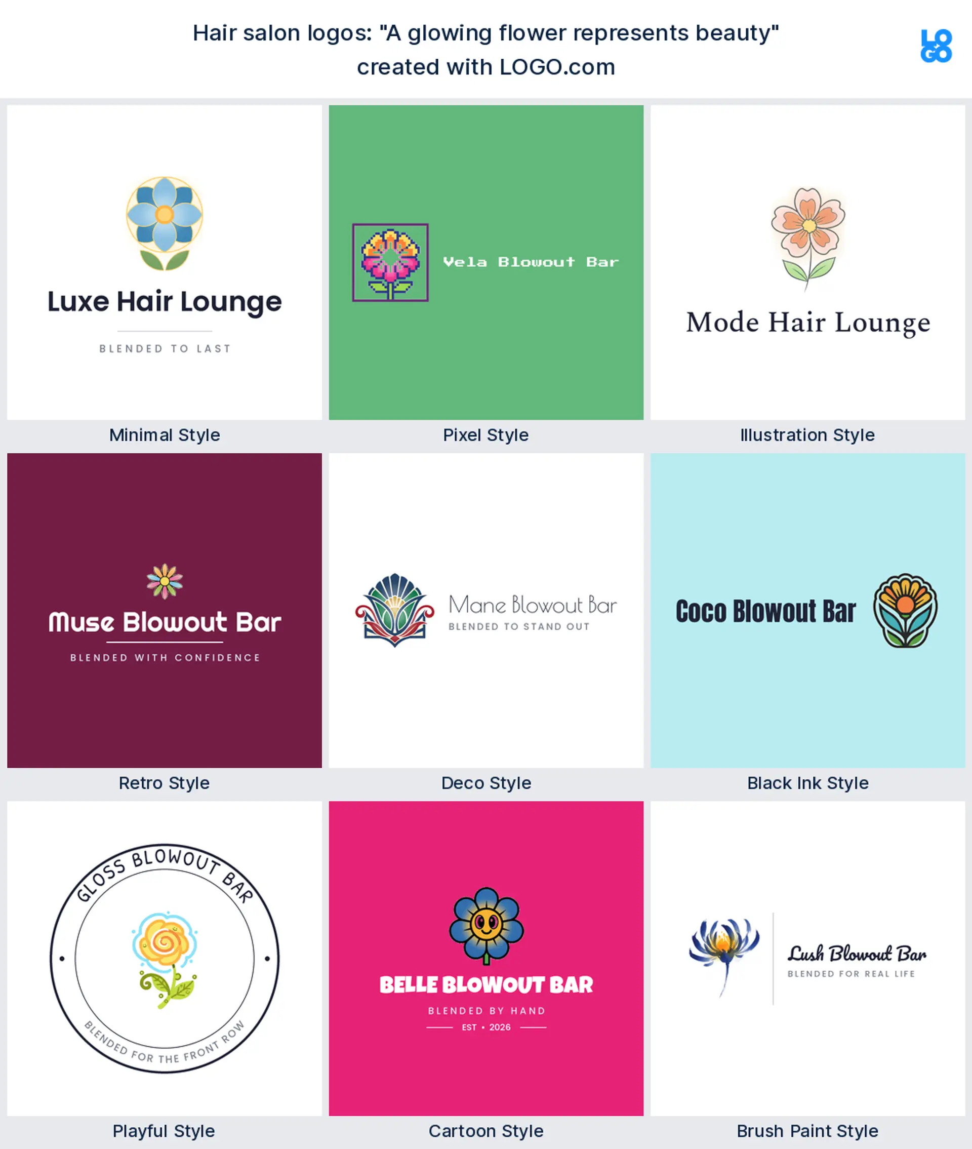
"A glowing flower represents beauty"
A founder crossing hair and wellness typed this, a soft bloom standing in for beauty. It makes a calm, pretty beauty salon logo, ideal for a brand that sells care as much as cuts.
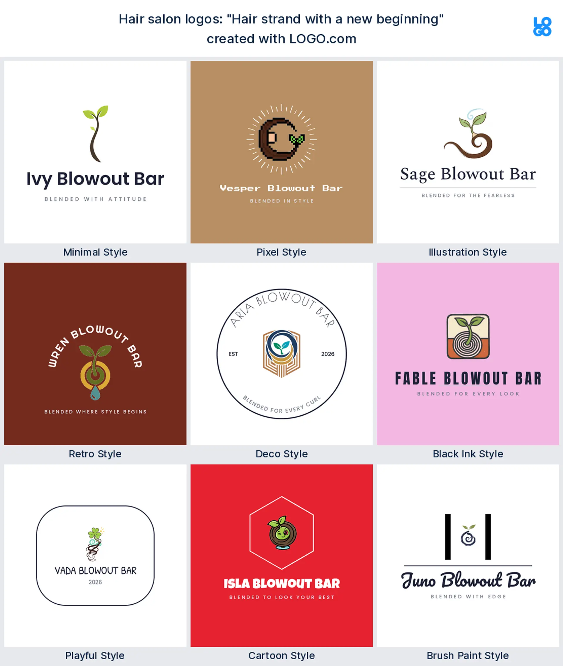
"Hair strand with a new beginning"
Someone building around fresh starts wrote this, a lock of hair curling into a new shoot. It reads hopeful and personal, a lovely hair salon logo for a stylist whose whole pitch is a reset.
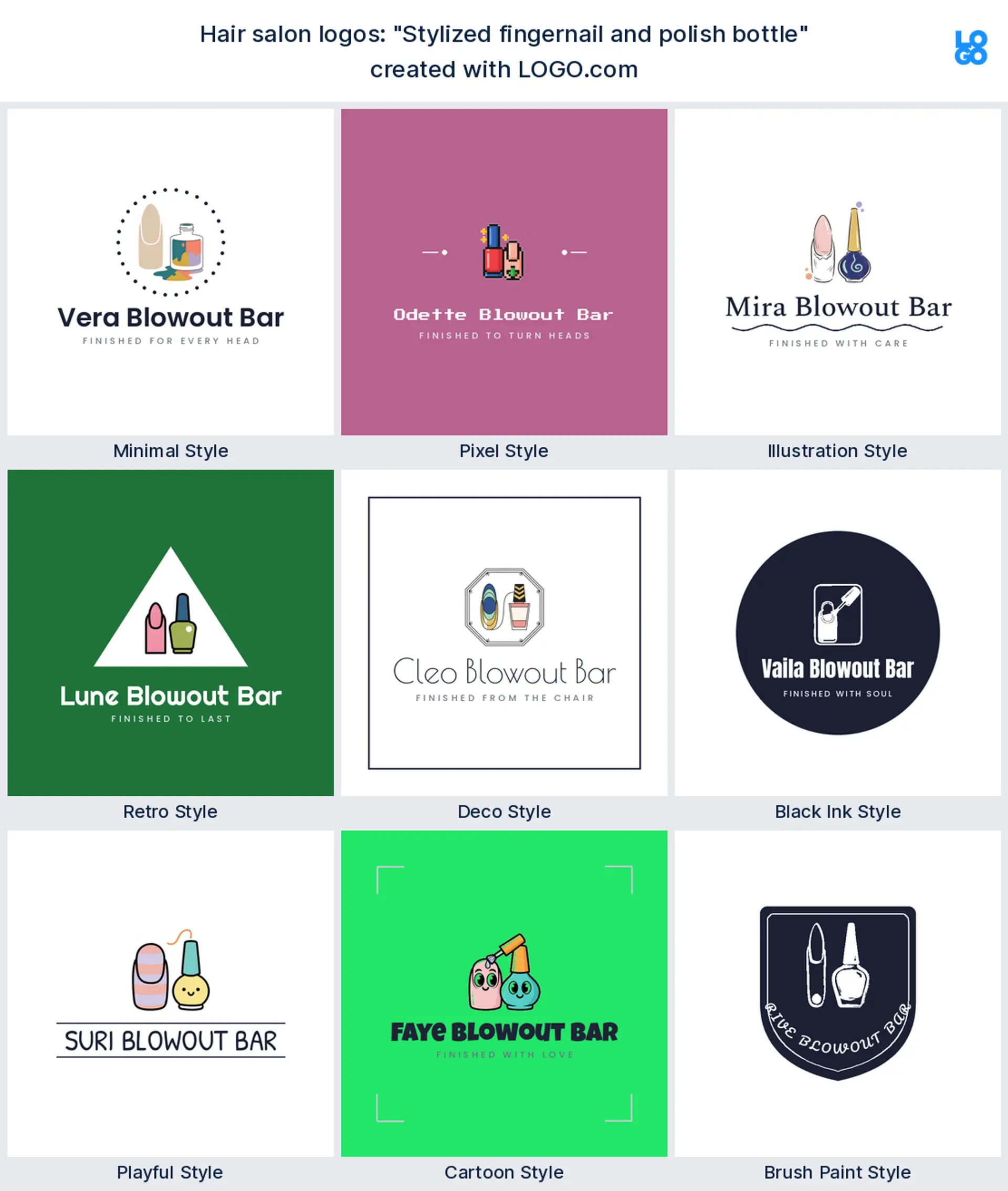
"Stylized fingernail and polish bottle"
A beauty salon owner typed this, a stylised nail paired with a polish bottle. It is a tidy way to show the nails service, and it works as a nail salon logo next to your hair mark.
Scissors, flowing hair, or an abstract mark: what should a salon logo show?
You have three honest options, and any of them can work. Show the tool and you are instantly legible: scissors, a comb, or a razor read as hair the second someone glances at your window. Show the result instead, a flowing lock or a soft wave, and the logo feels more about beauty than barbering, which suits a blow dry bar or a womenswear salon. Or go abstract, your initial or a simple shape, if you would rather your name lead. Not sure? Start with the tool, because a good hair salon logo has to be readable before it is clever. Whichever you pick, keep it to one idea so it still reads on a mirror sticker the size of a coaster.
Hair salon, barber, or nail bar: match the mark to your kind of salon
Salons are not all the same, so let the logo say which one you are. Run a classic hair salon? Lean on scissors, a comb, or flowing hair and keep it elegant. Opening a barber corner or a grooming room? Go bolder and more graphic, and a razor or a clean monogram reads sharp. Adding nails and want a nail salon logo too? A polish bottle or a manicured hand tells that story in one shape. Running a full beauty salon that does a bit of everything? Pick the service you are known for and build the mark around that, rather than cramming scissors, polish, and a flower into one busy logo. Your customers should feel what you do before they read a single word.
Solo stylist or full salon? Sizing the logo to your business
A logo for one chair is not the same as a logo for a busy floor. If you are a solo stylist, a chair renter, or working mobile, your logo lives mostly on Instagram, a booking link, and a business card, so a clean wordmark with a small mark travels best and feels personal. If you run a full salon with a window and a team, you want a mark that also holds up big, on the glass, on a sign, and on a price board across the room. Either way, ask for one version with the icon and name together and one compact version that is just the icon, so you have the right hair salon logo for a tiny profile picture and for a two metre window. Growing from one to the other later is easy when the mark is simple.
Colors that suit a hair salon, straight from real brand data
Color is where a salon shows its personality, so choose it on purpose. When we looked at the palettes salon owners actually picked on LOGO.com, pink came out on top, with green close behind and a warm brown and blue not far off, so a soft pink reads as the category more than any other shade. Want to feel warm and welcoming? A rose or blush pink is a safe, on brand choice. Chasing something calm and premium? A deep plum or a charcoal with one pink accent looks expensive. Keep it to one confident color plus a neutral, match it to a clean font, and let the space and the work be the loud part. That restraint is most of what good hair salon logo design comes down to.
Make your hair salon logo with LOGO.com
Pick the symbol that fits your salon, choose one of nine styles, and our free hair salon logo maker builds the rest around your name. Preview it free, download a high resolution PNG with full commercial use, and walk out with one clean mark ready for your window, your price list, and your Instagram in minutes.
Methodology. These figures come from logos created on LOGO.com during the 12 months ending June 2026. We read the 80 custom icon descriptions written by roughly 670 founders who chose a hair salon, salon, or beauty salon industry, grouped those descriptions by concept, for example scissors, a lock of hair, or a comb, and ranked each by how often it appeared. Scissors led at about 30 percent, a lock of hair followed close behind near 29 percent, and a comb came next at about 20 percent. Figures are a share of all icon descriptions in that set, rounded to the nearest percentage point. Source: LOGO.com first party product data, June 2026.
THE #1 LOGO GENERATOR
Why LOGO.com is the best hair salon logo maker
1.Built from real salon brand data
The icons and styles come from the logos real salon owners built on LOGO.com, so you start from what works, not generic clip art.
2.Reads on a window and a mirror station
Your mark stays sharp on a glass window decal and on a small mirror sticker, where thin lines usually disappear.
3.Transparent file for your window and socials
Download a transparent logo that sits cleanly on your window, a colored Instagram tile, or a photo of your salon with no white box.
4.One mark for the sign, the card, and Instagram
Design it once and it fits your window sign, a price list, an appointment card, and your Instagram profile picture.
5.Full color or a single color for towels
Choose a full color icon or a single color version that prints neatly on towels, robes, and a stamped loyalty card.
6.Nine styles, sleek to soft and playful
Match your vibe, from a sleek modern salon wordmark to a soft, pretty mark for a beauty salon, all built to stay legible small.
7.A wordmark and a compact mark to match
Keep the full name and a compact icon so you have the right version for a wide sign and for a tiny booking app avatar.
8.Edit it when you add nails or a chair
Swap the icon, color, or name when you add a nail bar, a second stylist, or a new location.
9.Free to design, yours to sell with
Preview free and download a high resolution PNG with full commercial use, then upgrade to the Brand Plan for vector files to print big.
Hair Salon Logo Maker FAQs
Need Inspiration? See example brands in your industry...
3D3D DesignAbstractAcademic EducationAcademic WritingAccessoriesAccommodationAccountantAdventure TourismAdvertising AgencyAerospace EngineeringAestheticsAffordableAgricultural ConsultingAgricultureAgriculture BlogAgriculture CompanyAirplaneAlternative MedicineAmazonAnimalAnimal BlogAnimal ProtectionAnimal and PetsAnimalsAnimationAnime Logo MakerApartmentApp DevelopmentApplicationAppraisal ServicesAquacultureArchitectureAriesAromatherapyArrowArtArt and DesignArtificial IntelligenceArtistArtsArts & CraftsArts EducationAsian RestaurantAssociationAstrologyAthleticsAttorney FirmAudio ServicesAudio Technician