Attorney Logo Maker
Design an attorney logo that works on your lobby sign and letterhead.
Need a different logo maker? Try our AI logo generator.
Logos created using LOGO.com
670,000,000
Attorney logos built on partners and offices

Shields books and civic law office logos
Quiet modern marks for a small legal firm
Attorney Logos, Ranked From Real Brand Data
According to LOGO.com data, scales of justice turn up in about 71 percent of the legal icon descriptions written on LOGO.com, a gavel in about 38 percent, and legal documents in about 8 percent.
What that leaves is seven quieter symbols sharing the remainder, and for a practice with more than one name on the door the useful question is which of them can carry a whole firm rather than one lawyer. Below are those nine ranked symbols and fifteen real founder prompts, each drawn across all nine LOGO.com styles, so you can watch a legal firm logo move from carved and institutional to plain and current before anyone signs off on it.
Your name goes on the door, but the mark above it has to speak for everyone behind it. That is the awkward part of an attorney logo for a firm rather than a sole practitioner. It sits over two or three surnames, a handful of associates and whatever practice groups you have grown into, and it has to look settled on all of them. It also has to survive being embossed on letterhead, cut into a lobby sign and shrunk into an email footer in the same week. We read 458 icon descriptions legal founders wrote on LOGO.com to find the nine symbols they actually reach for, and this page walks through those nine, fifteen real prompts you can borrow, and the calls that make a law office logo look like an institution rather than a first attempt.
The nine symbols attorney firms actually ask for
We took every icon description written on LOGO.com in the last two years whose wording names a law or justice symbol, 458 of them, and grouped them into nine concepts. The legal industry labels on their own are far too thin to rank anything from, so the scoping is by prompt text and we say so plainly in the methodology at the foot of this page. Two symbols run away with it. The other seven flatten out almost immediately, which is where the room to look different is hiding.
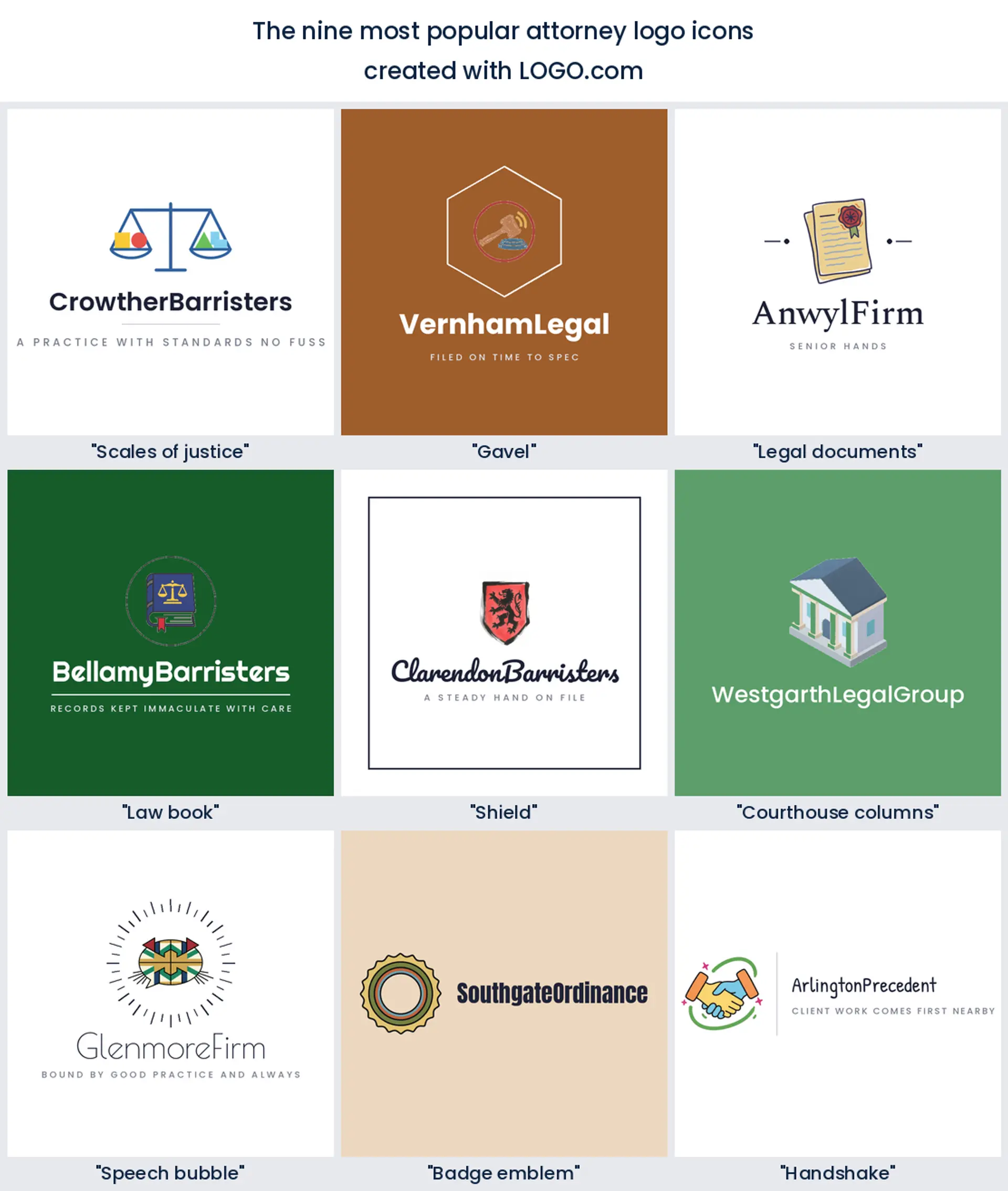
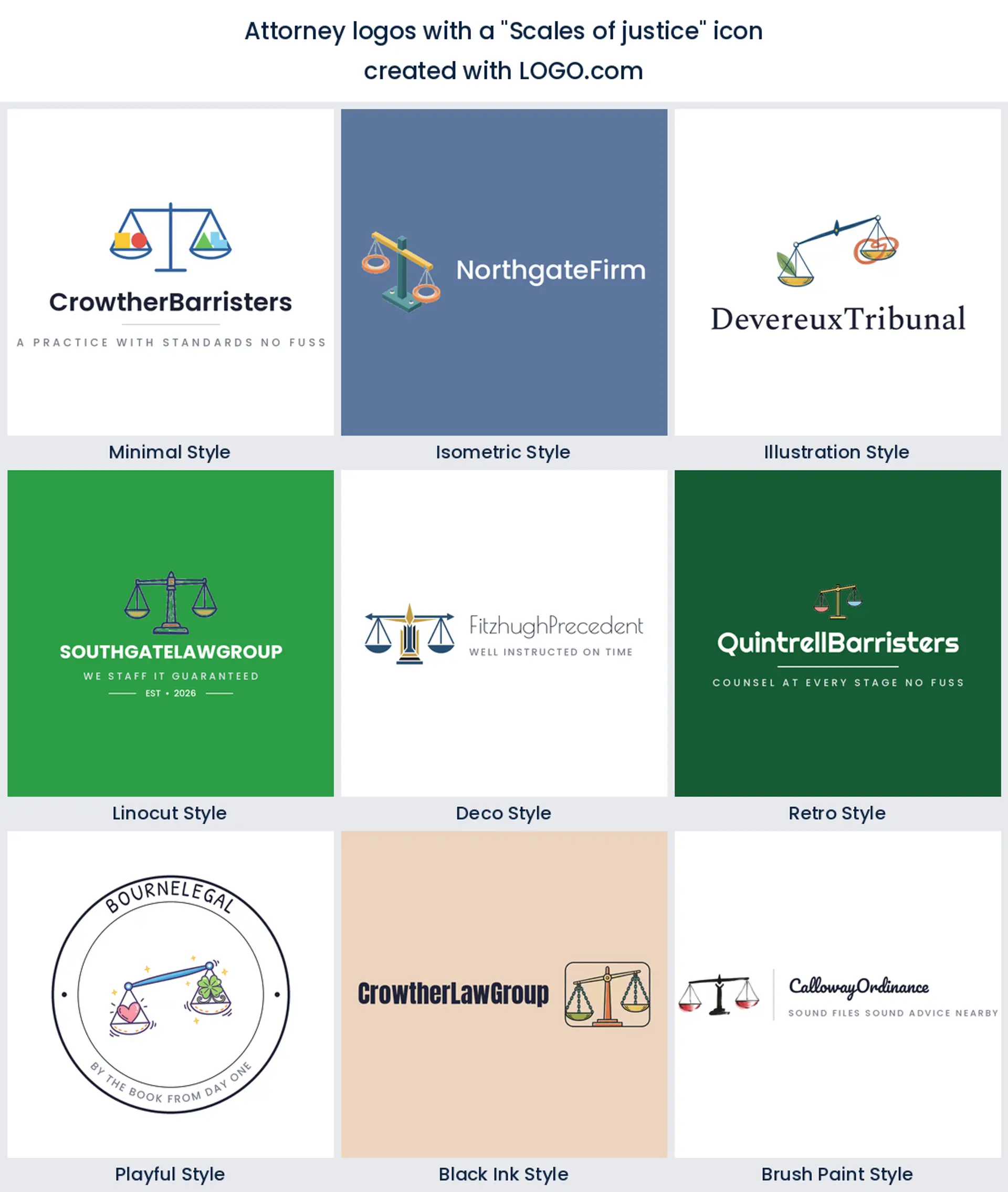
1. Scales of justice
About 71 percent of the descriptions in this corpus name a set of scales, which tells you two things at once. It is the quickest way to be read as legal by someone glancing at a lobby sign, and it is the hardest way to look unlike the firm two floors up. If you want it, take it, but do something specific with the beam or the pans so it is recognisably yours. It suits a general practice or an attorney at law logo where the work spans several areas.
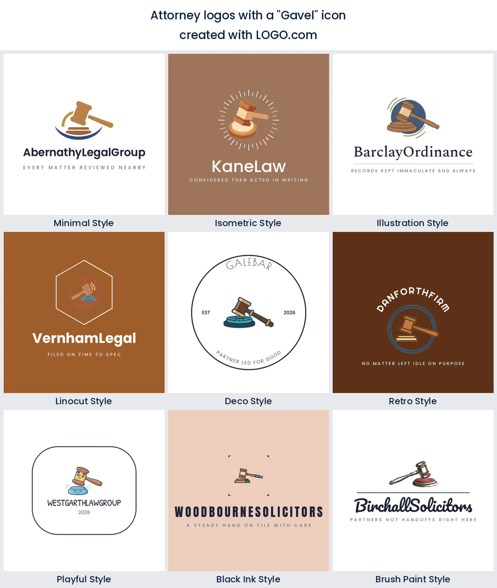
2. Gavel
Where the scales promise fairness, a gavel promises a decision, and about 38 percent of legal founders write one into their description. It reads litigation more than advice, so a firm that mostly settles matters before anyone sees a courtroom may be overpromising with it. For trial practices and criminal defence work it is a confident attorney logo and nobody has to guess what you do.
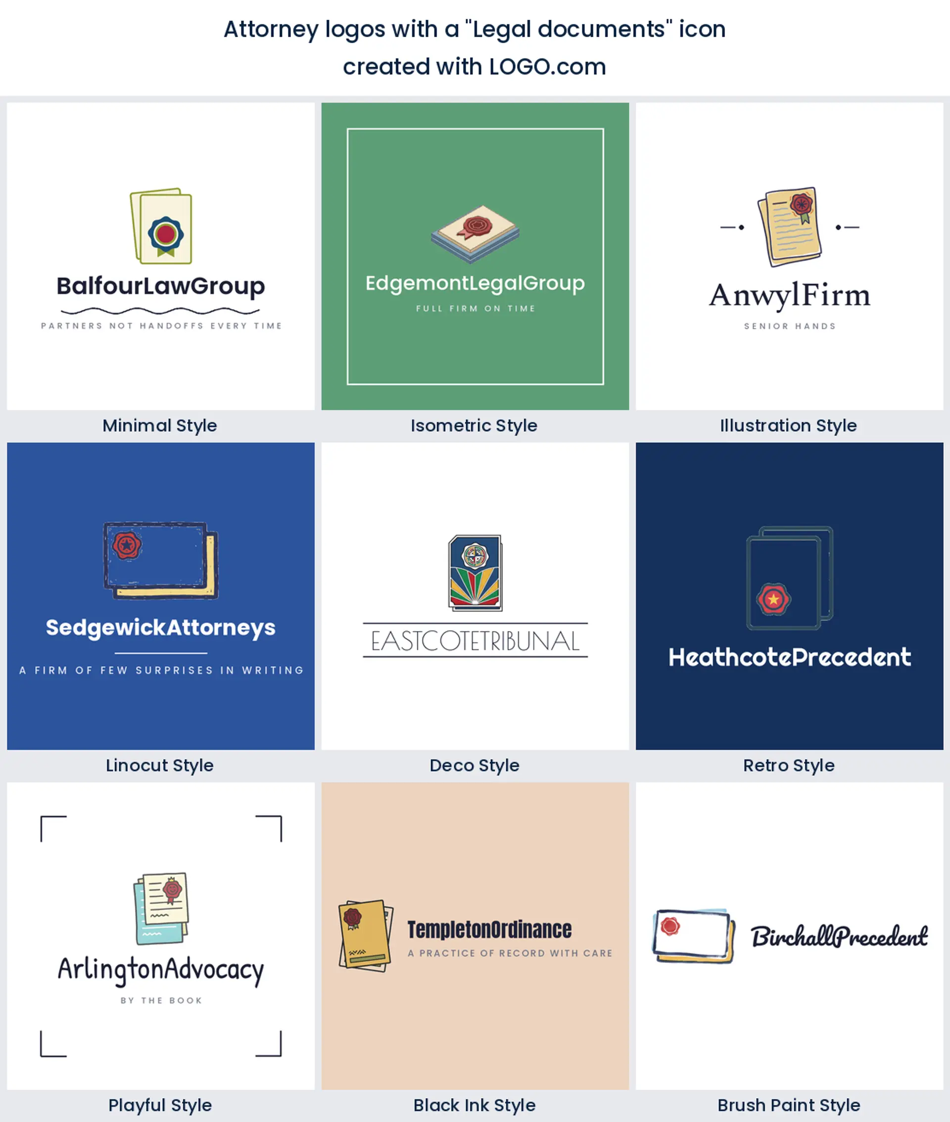
3. Legal documents
Paper comes third at about 8 percent, and it is quietly the most honest symbol for most firms. Contracts, filings, wills and closings are the actual product, and a sheet with a seal on it says that without any theatre. Transactional, estates and corporate work all sit comfortably here, and it makes a calm law office logo that never looks combative on a letter.
4. Law book
Below the top three the counts drop off a cliff, and the law book is the first symbol in that flatter middle. It leans academic, which is exactly right if your firm publishes, teaches or handles appellate work, and a little studious if you do high volume personal injury. Pair it with a modern typeface and it stops reading like a library.
5. Shield
Defence practices gravitate to the shield, fifth in the ranking, because it swaps judgment for protection. Clients who arrive frightened respond to it. It is also the shape that most easily takes a monogram, so a firm with a long name can put its initials inside and keep the whole thing legible at door plate size.
6. Courthouse columns
A facade with columns sits sixth, and it is the only symbol in the nine that describes a place rather than a tool. Founders who write it are picturing permanence, an office that was here before them and will be here after. It flatters an established firm with a real address and looks slightly wishful on a practice that started last spring.
7. Speech bubble
Consultation gets its own symbol at seventh, the plain rounded speech bubble, and it is the friendliest thing on this list. Immigration, family and employment firms use it to signal that the first conversation is easy to have. It also scales down beautifully, which matters more than it sounds when the same mark ends up as an app icon.
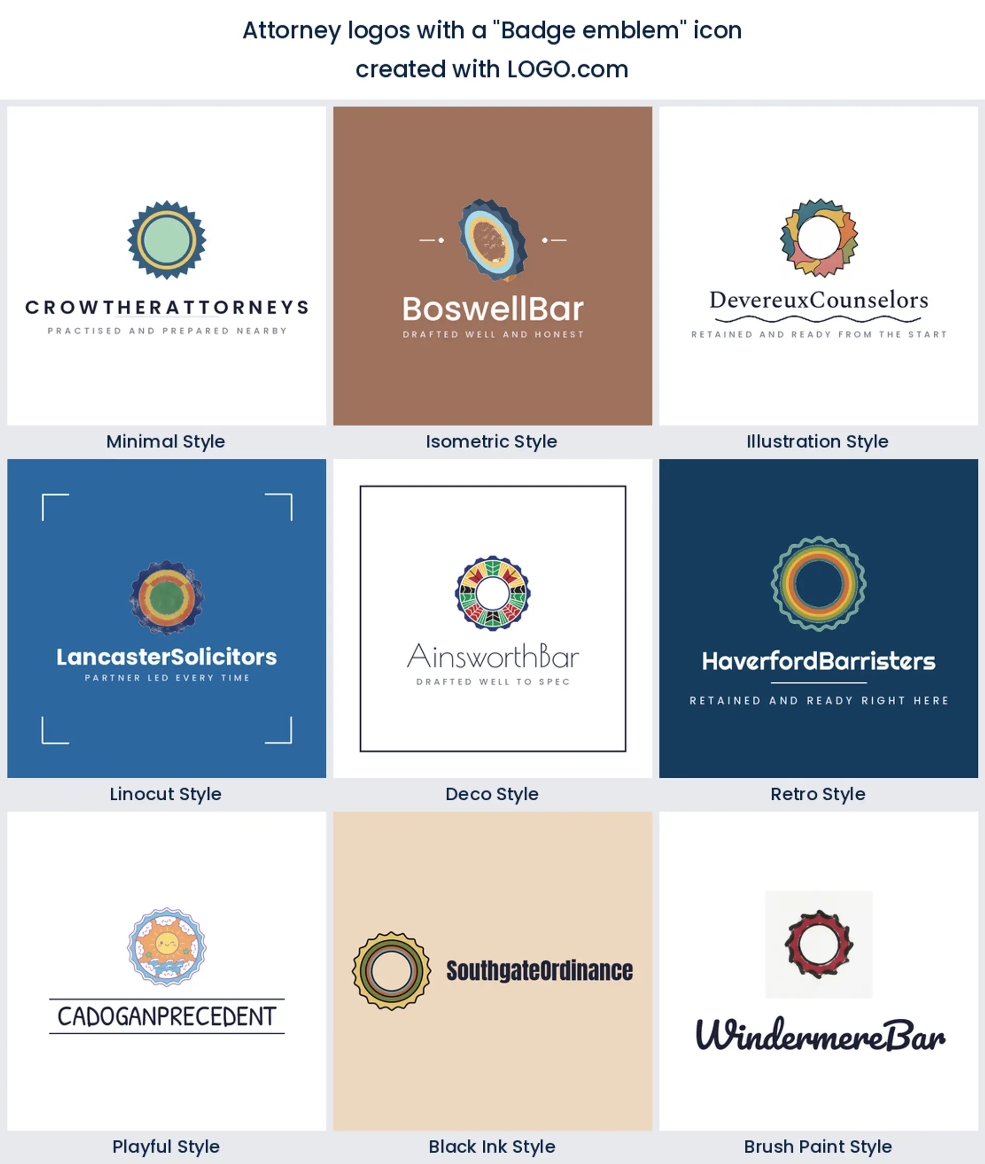
8. Badge emblem
Round badges and notched crests land eighth, and they are the most firm shaped idea in the nine. A badge has a natural ring of space for a founding year and a second line, which is why partnerships keep choosing it. Keep the inner drawing simple, because a busy badge turns to mush the moment it is embossed.
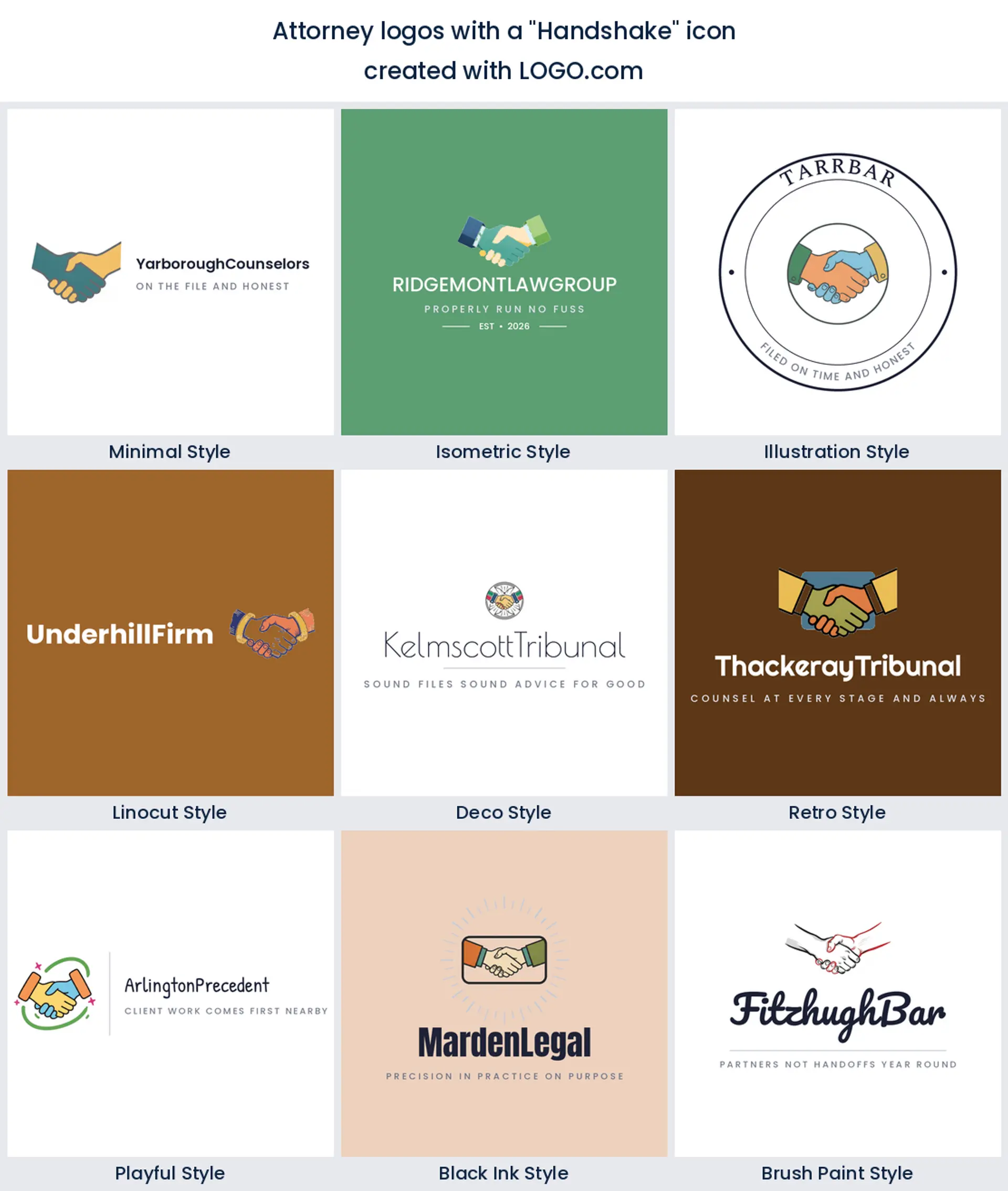
9. Handshake
Two clasped hands close out the ranking, and they say something none of the other eight manage. Not judgment, not protection, just agreement reached. Mediation practices, notaries and firms whose work ends in a signed deal get real mileage from it, and it makes a warm attorney logo design for anyone who never wants to look adversarial.
Fifteen attorney logo ideas taken straight from founder prompts
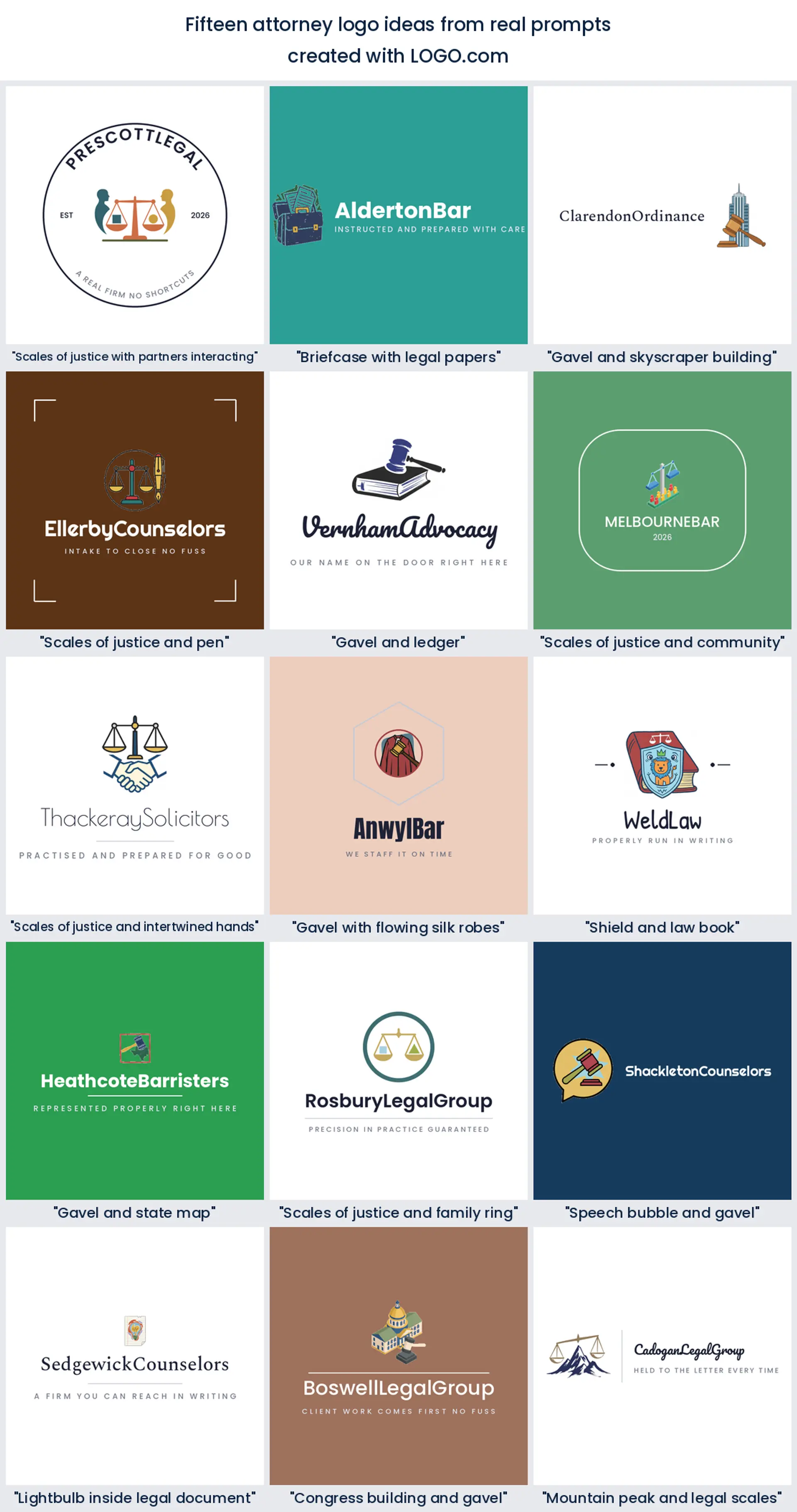
None of the fifteen below came from us. They are icon descriptions people typed into LOGO.com while building a legal brand, kept word for word, and they are richer than the plain nine because founders combine things. Each one runs across all nine styles so you can see how far a single idea travels.
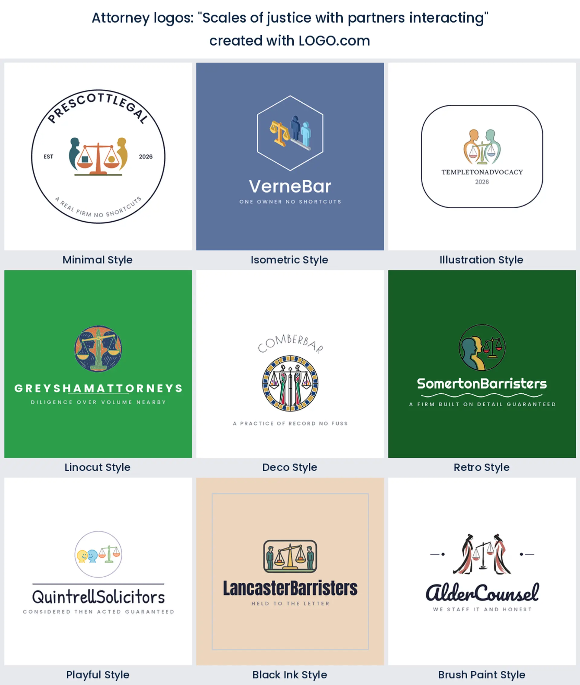
1. "Scales of justice with partners interacting"
Somebody building a two partner practice wrote this, and it is the closest thing in the whole corpus to a picture of a firm. Two figures, one beam, nobody standing above anybody. If your pitch is that clients get two heads on every matter, this is the attorney logo that says it before a word of copy does.
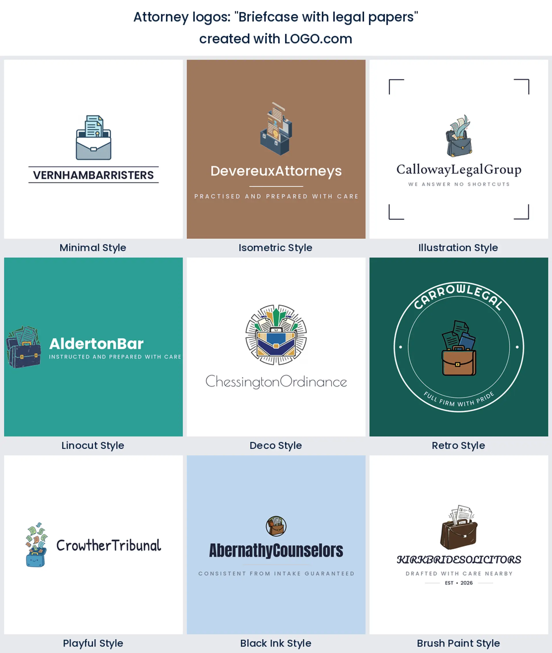
2. "Briefcase with legal papers"
Not the courtroom, the corridor outside it. An open case with paper coming out of it is the everyday image of an associate walking into a closing, and it dodges the whole judgment question. Corporate and commercial firms suit it, and it makes an unfussy law office logo that ages well.
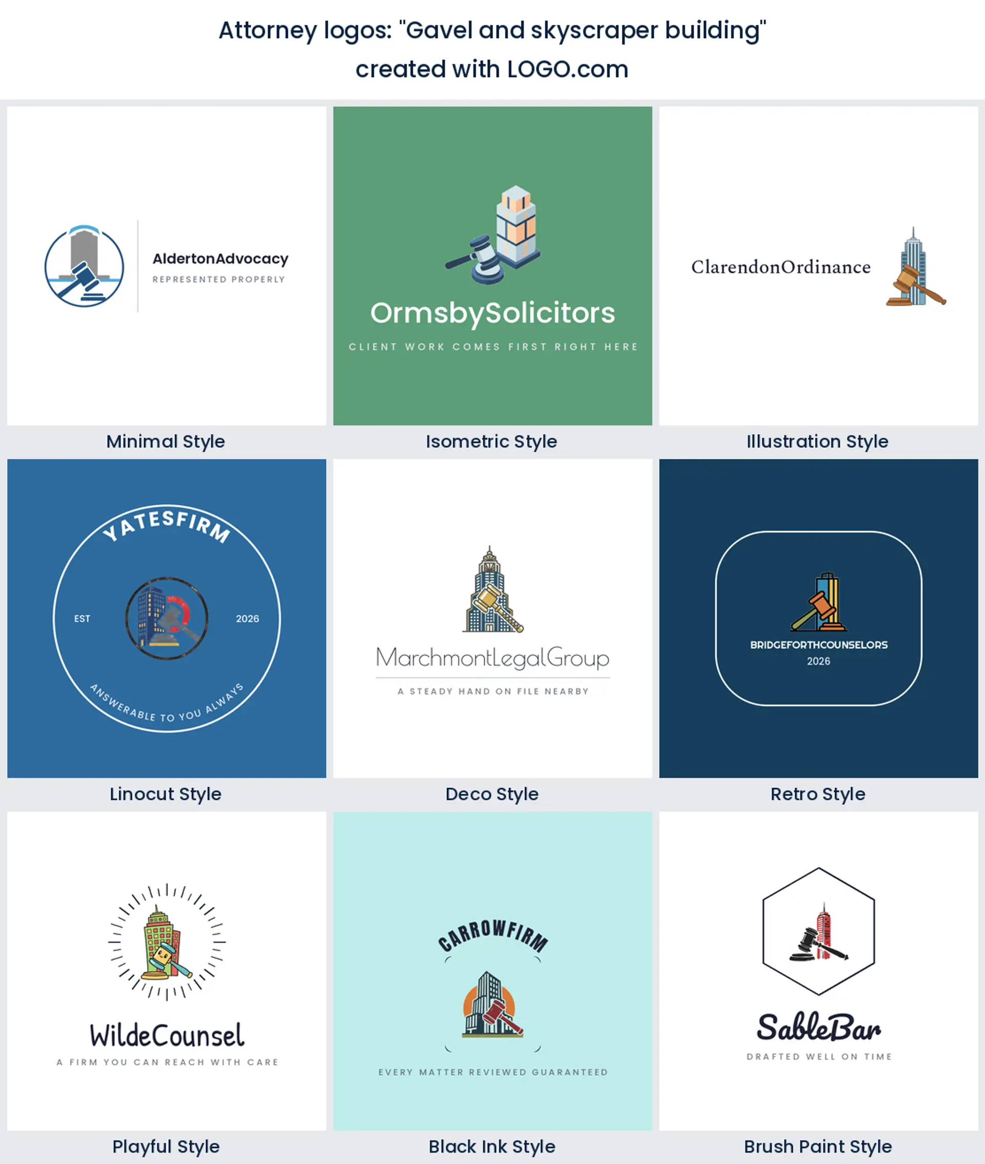
3. "Gavel and skyscraper building"
Ambition, basically. Setting the gavel against a tower says the firm plays in the city and takes on corporate work, and it is a useful signal if your competition is all crests and columns. Downtown commercial practices read well here.
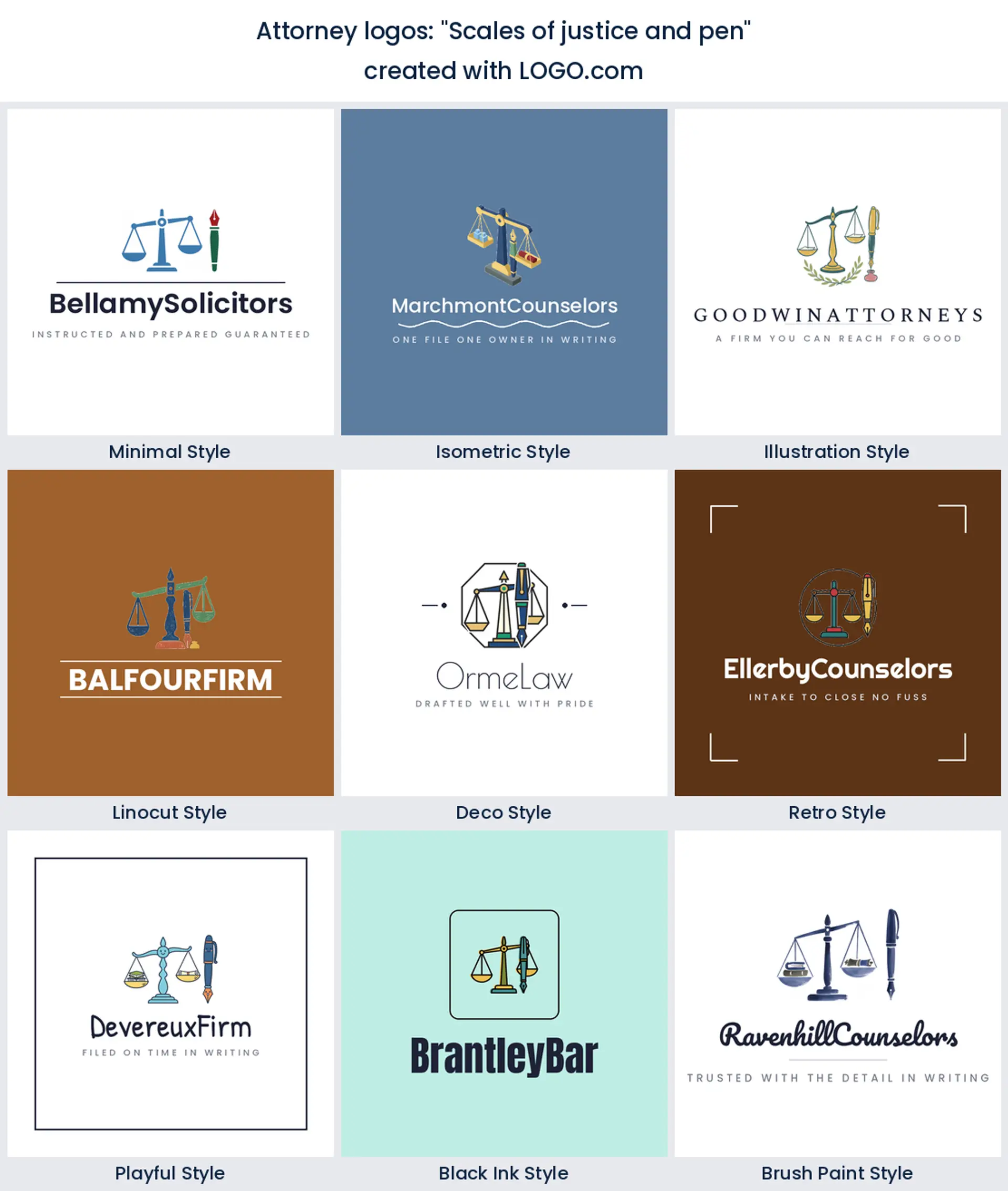
4. "Scales of justice and pen"
Here is the one that was built for stationery. A pen next to the scales points straight at signing, which is why it looks so natural at the top of a letter or across an attorney business card. Estates, conveyancing and contract heavy firms should try it first.
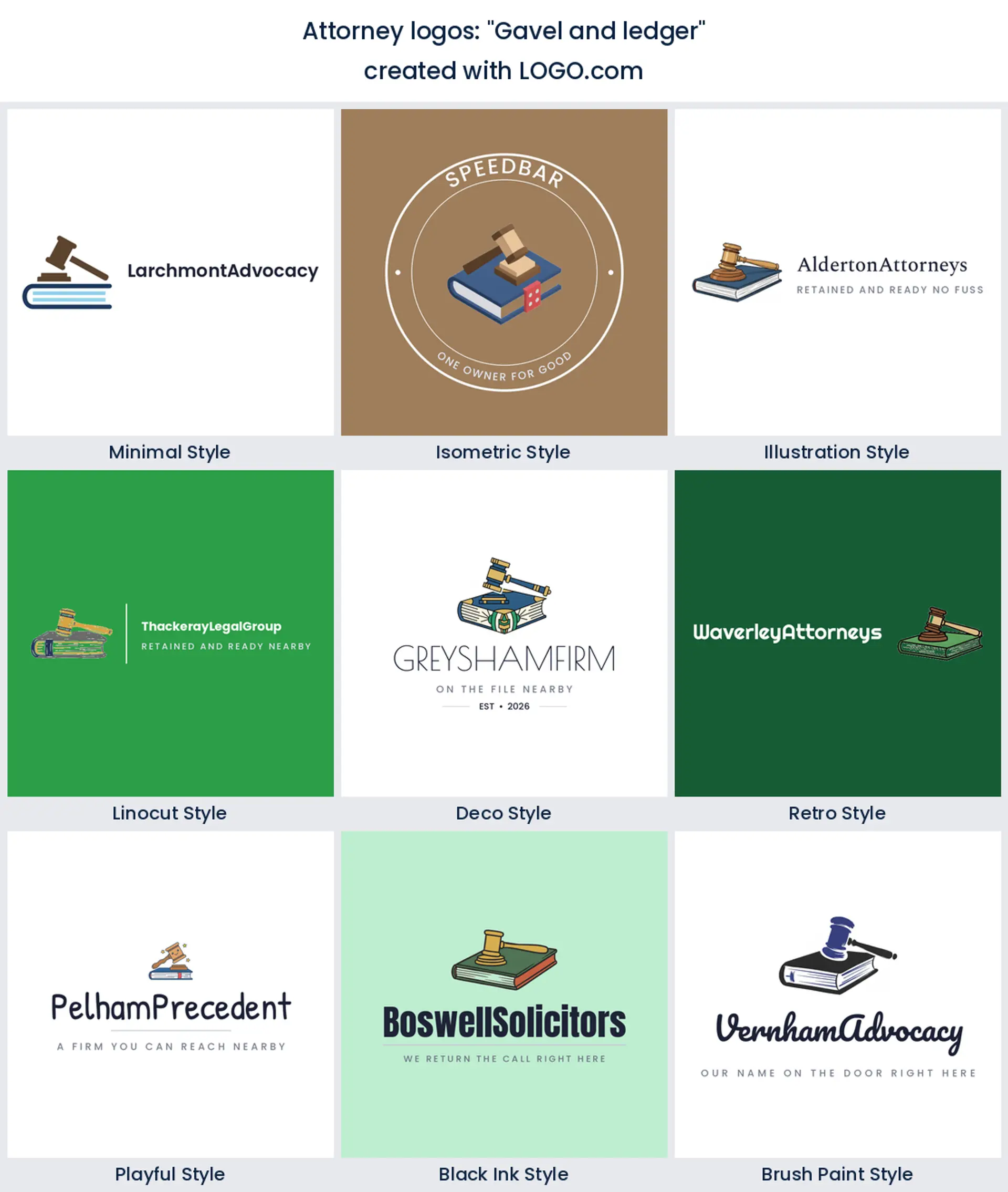
5. "Gavel and ledger"
Money and law in one mark. A ledger under the gavel suits bankruptcy, tax and insolvency work, where the client conversation is always half arithmetic. It is a specific attorney logo design rather than a general one, so use it when the practice really is narrow.
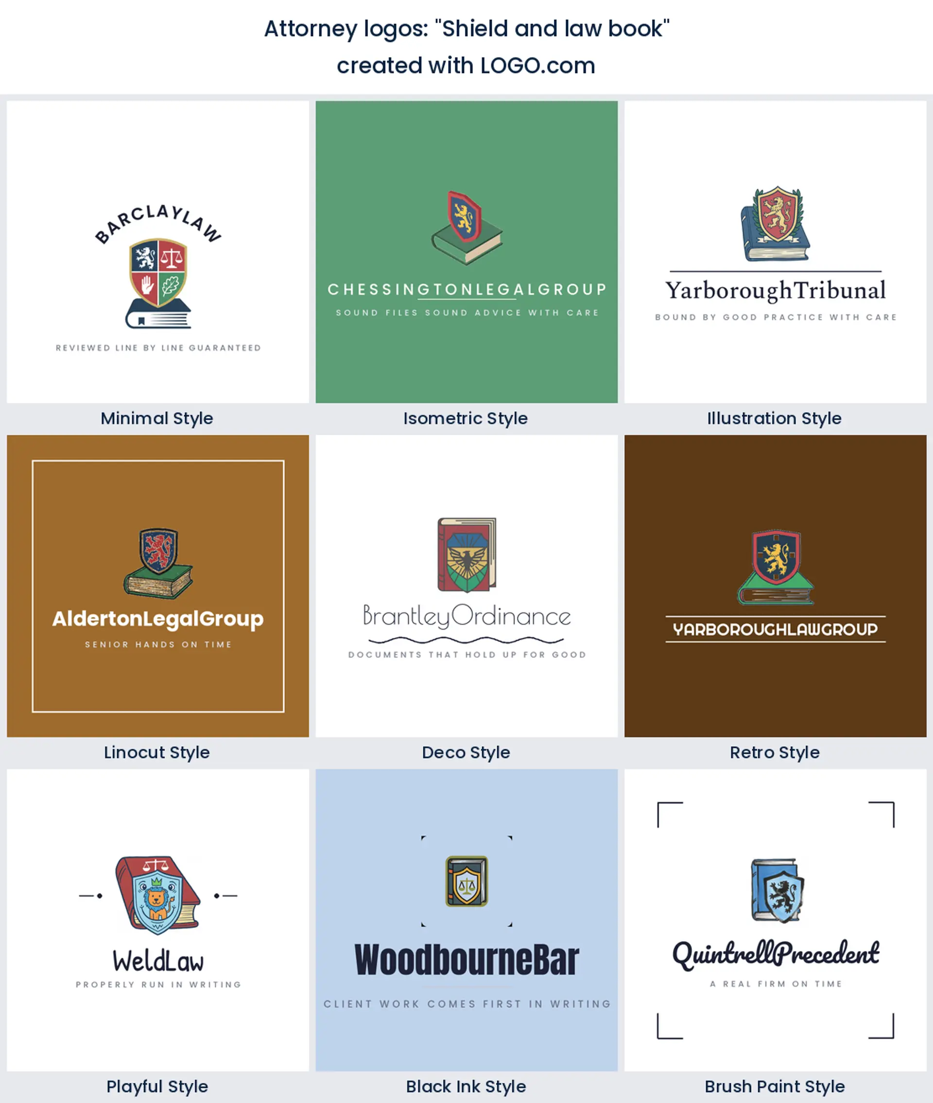
6. "Scales of justice and community"
Legal aid clinics, civil rights practices and firms doing a lot of pro bono keep writing versions of this one. A row of small figures under the beam turns the promise outward, away from the firm and toward the people it acts for. Warm, and unusual enough that nobody will confuse you.
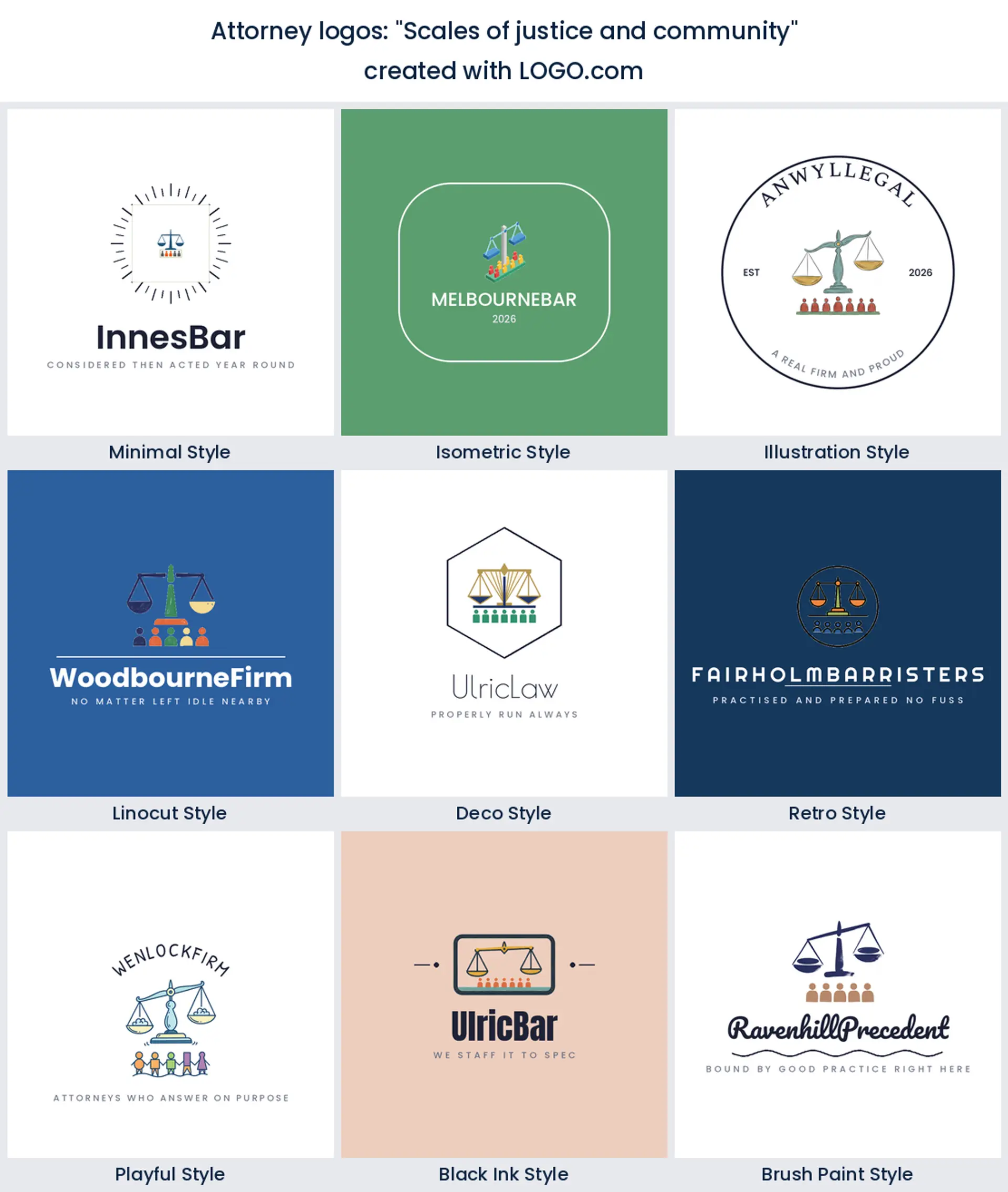
7. "Scales of justice and intertwined hands"
Softer than the plain handshake and more specific than the plain scales. Two hands holding under a balanced beam reads as being looked after, which is why family and elder law firms gravitate to it. It handles a gentle palette better than most legal marks do.
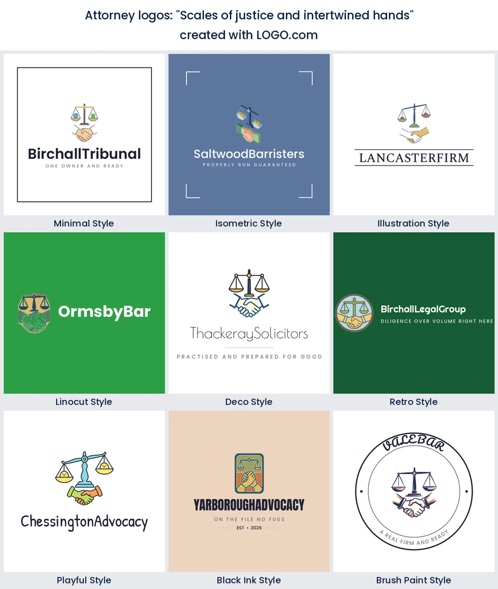
8. "Gavel with flowing silk robes"
Robes are a British and Commonwealth cue, and the founder who wrote this clearly wanted the courtroom in the picture. Chambers, barristers and advocacy practices carry it well. It is theatrical, so keep the typography quiet or the whole thing tips into costume.
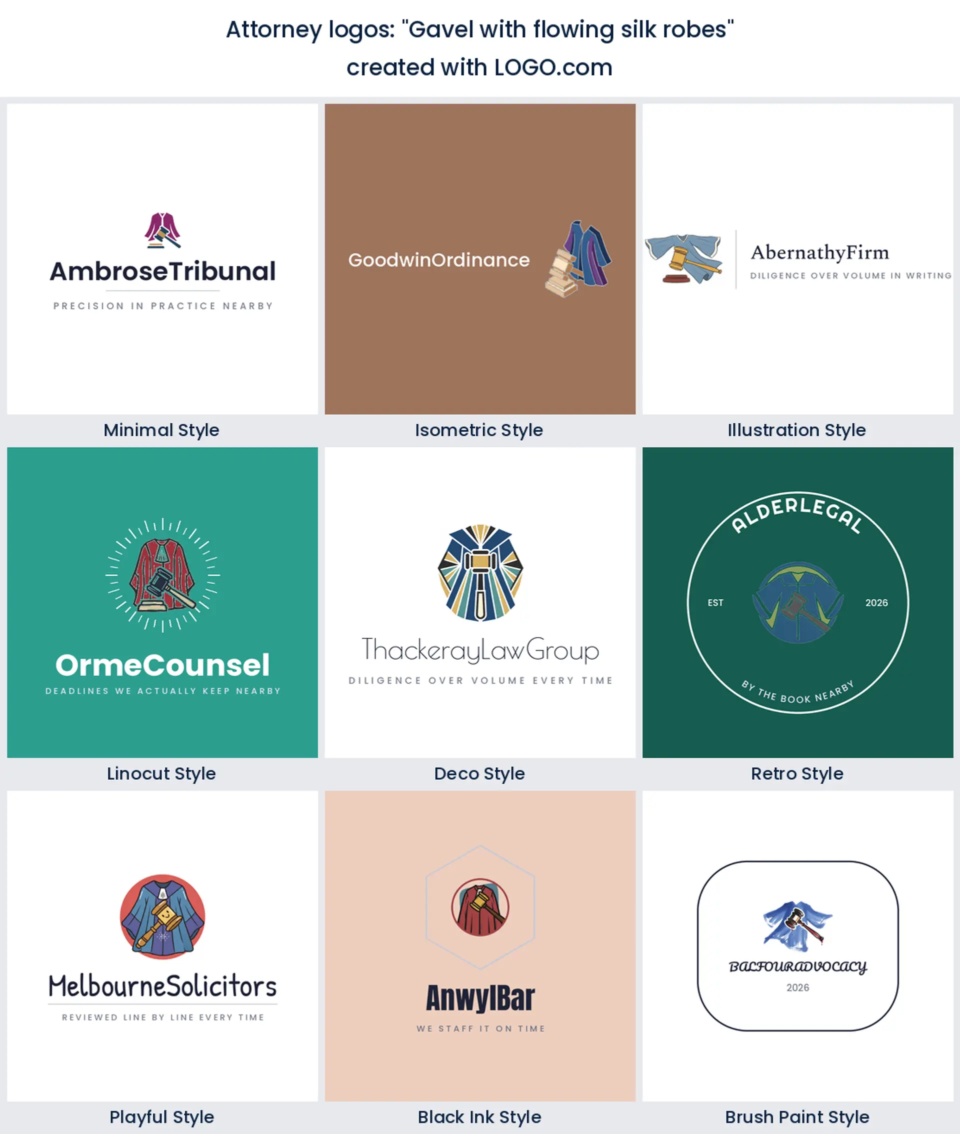
9. "Shield and law book"
Here two of the ranked symbols share a single mark and, unusually, neither one loses. Protection sitting on top of precedent is a fair description of what a defence firm sells. It fills a square nicely, which makes it one of the easier ideas here to reuse as a profile picture.
10. "Gavel and state map"
Jurisdiction as a logo. Firms that live or die on being licensed in one state write this, and it is a strong local search signal in a way an abstract mark never is. The obvious risk is that it dates the moment you open a second office.
11. "Scales of justice and family ring"
A ring around the scales does two jobs. It reads as a family and estate practice to anyone who is looking for one, and it gives the mark a hard circular edge that survives being stamped, embossed or dropped into a round avatar slot. Quietly the most practical idea on this list.
12. "Speech bubble and gavel"
Advice arriving before argument. Tucking the gavel inside a bubble tells a nervous client that the first step is a conversation, not a hearing, and firms that sell free consultations lean on it hard. It is one of the few legal marks that looks right in a bright color.
13. "Lightbulb inside legal document"
Intellectual property practices, patent attorneys and legal tech founders write this one. A bulb on the page is invention meeting paperwork, which is the whole job. It is also a rare legal mark with no weapon and no balance in it, so it stands out in a directory full of scales.
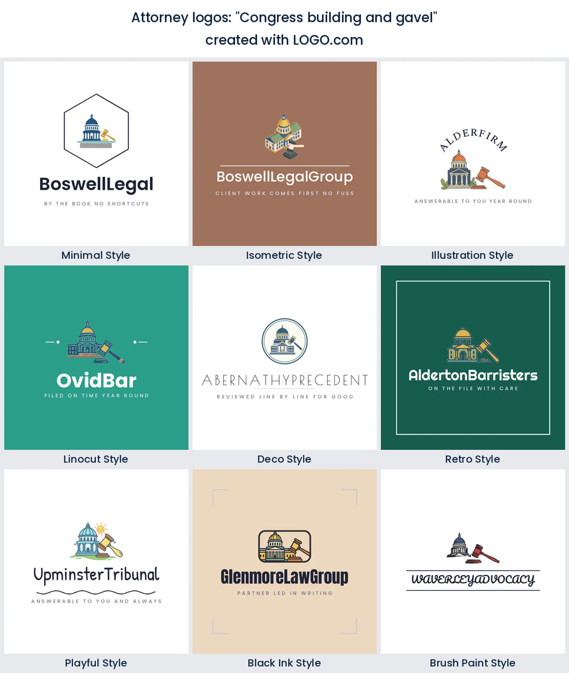
14. "Congress building and gavel"
Legislature rather than courtroom. That dome is exactly what government affairs, lobbying and regulatory firms are after, and it lifts you clear of the crowded litigation look. Draw the building simply, because domes collect detail and detail is the first thing to disappear at small sizes.
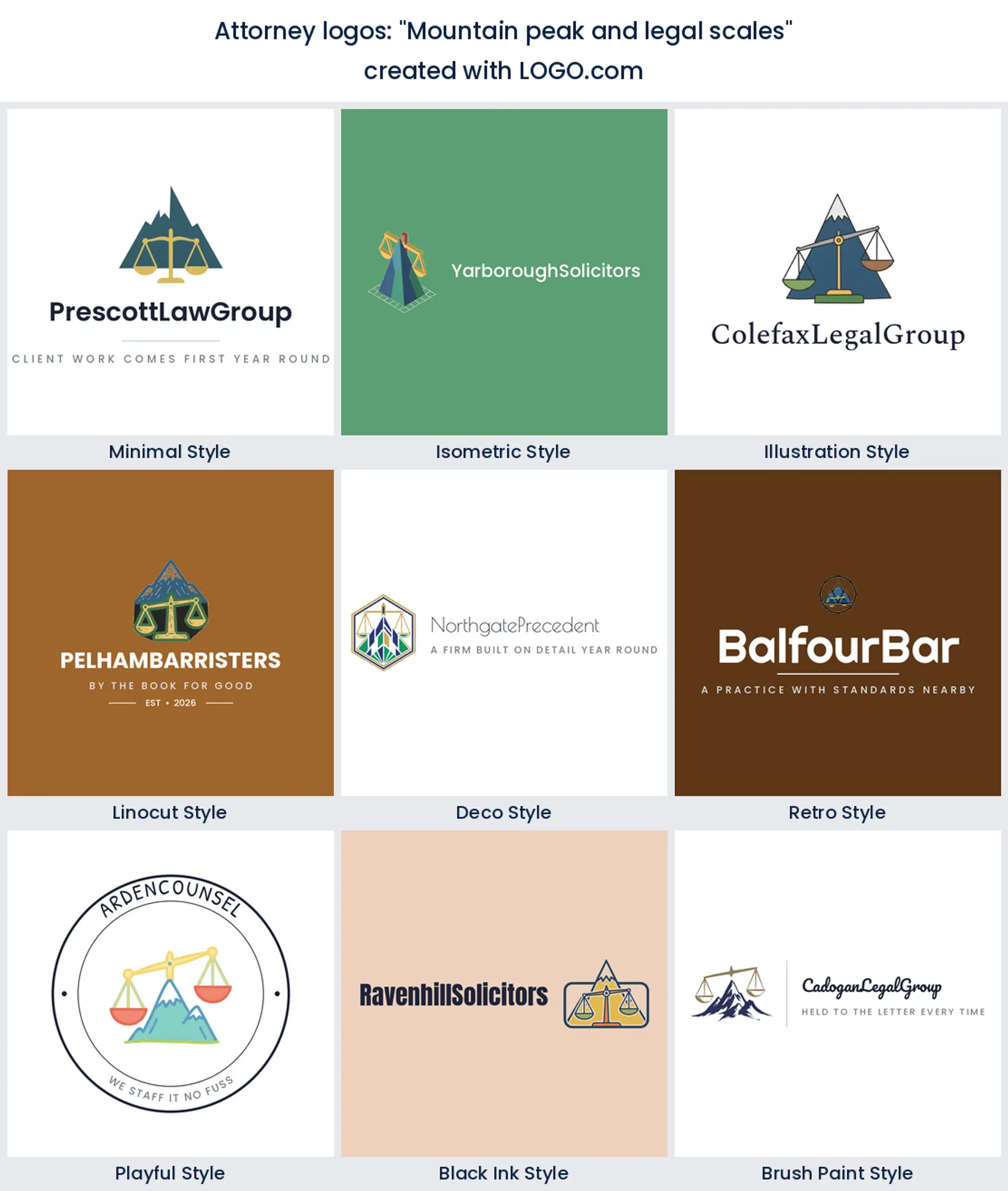
15. "Mountain peak and legal scales"
The most optimistic idea in the fifteen. A peak behind the beam turns the whole thing into a climb finished rather than a judgment handed down, and it gives a young firm somewhere to go that is not another crest. Good for immigration and appeals work, where the client already knows it is uphill.
Naming the firm before you name the logo
More people search for how to name a law firm than for how to design one, and the order matters. A mark drawn around one surname has to be rebuilt the moment a second partner joins, so decide the shape of the name first. Three patterns cover almost everything. Surnames, either one or a run of them. A place or a virtue, like a street, a river or a word such as Meridian. Or a descriptive name that says what you do, which is the easiest to find and the hardest to own.
If you are running with surnames, count the characters before you fall in love with a crest. Three names set in one line will not fit inside a ring, and a badge that has to hold nine syllables is going to lose. Take the initials into a monogram instead and let the full name sit beside it in plain type. That is also the safest route if a name partner might change, because a monogram takes an edit far better than a drawn wordmark does. Whatever you land on, check the domain and your state bar directory in the same sitting, since law office branding that cannot claim its own address online is only half finished.
One firm, several practice groups, one mark
Firms grow sideways. You start in family work, you take on a couple of employment matters, and two years later there is a small immigration team using a logo somebody made in a hurry. The fix is not a logo per group. It is one parent mark plus a rule for how the group names attach to it, so everything still reads as the same firm from across a room.
The simplest rule that works is to keep the symbol and the firm name fixed and let the group name sit underneath in the same typeface at a smaller size, on a divider line if you need one. Then give each group its own single color drawn from the same palette, so a folder from the estates team looks related to a folder from the litigation team without either shouting. Ask for the horizontal and the stacked version of your parent mark up front. You will use the horizontal one on letterhead and the stacked one everywhere square, and having both stops anyone squashing a legal firm logo to fit.
What letterhead and a lobby sign ask of the same mark
These two surfaces pull in opposite directions and most firms only test one of them. Letterhead wants the mark small, quiet and off to one side, because the page belongs to the letter. Give it a version that holds up at about 15 millimetres wide, keep any strapline off it, and make sure the whole thing still reads when the recipient photocopies your letter in black and white. The same file should drop into a fee agreement, an engagement letter and the top of an attorney at law business card without a second thought.
A law office sign is the opposite problem. It is read from across a car park, at an angle, often in the dark, and it is usually cut rather than printed. Anything thinner than the stroke of your own name will be lost in the router, so a law office lobby sign needs the heavier weight of your mark and generous space around it. Order both at the same time. The moment you have a version that works small on paper and a version that works big in vinyl, your law office logo design is genuinely finished, and everything in between takes care of itself.
Make your attorney logo with LOGO.com
Type the firm name, pick one of the nine symbols above or paste in one of the fifteen prompts, then choose a style and set the color and the type. Previewing costs nothing, you can generate as many versions as it takes to get the partners to agree, and the high resolution PNG download is free with full commercial use. The Brand Plan is there when you need the vector files for a cut sign or an embosser, plus the brand kit and unlimited edits.
Methodology. Figures come from LOGO.com first party product data for the 24 months to August 2026. The legal industry labels in our product are too thin to rank from on their own, roughly 17 icon descriptions in a year, so this ranking is scoped by prompt text instead. We took every icon description written on LOGO.com whose wording names a law or justice symbol, which gives 458 descriptions across 288 distinct prompts, and grouped them into nine concepts. Scales of justice appear in about 71 percent, a gavel in about 38 percent and legal documents in about 8 percent. The brand count of 411 is the number of accounts that chose a Law, Legal or Attorney industry in the same window. Source: LOGO.com first party product data, August 2026.
THE #1 LOGO GENERATOR
Why LOGO.com is the best attorney logo maker
1.The ranking behind every symbol on this page
Nine ranked marks and fifteen prompts, all of them pulled out of 458 icon descriptions legal founders wrote on LOGO.com. Nothing on this page came off a mood board.
2.Room for a second and third name on the door
Set the firm name as a wordmark or reduce it to a monogram, then add or swap a partner surname later without redrawing the symbol.
3.One parent mark, variants per practice group
Take the same mark into an estates version, a litigation version and an immigration version by changing only the group line and the color.
4.Sized for an attorney business card and a lobby sign
Download a horizontal lockup for letterhead and cards and a stacked one for a door plate, so nobody has to stretch anything to fit.
5.Type that survives a page of small print
The fonts here are chosen to stay legible next to nine point body copy, in a footer, and after a client has photocopied your letter twice.
6.Nine styles so the partners can actually agree
Show the same symbol as a carved crest, a clean sans wordmark and seven more, then settle it in one meeting instead of four.
7.Edit it again when the firm changes shape
Merge, rebrand or add an office and you can go back in and adjust the mark, the name and the palette rather than starting from scratch.
8.Free to design, yours to sell with
Designing and previewing is free, and the high resolution PNG download comes with full commercial use. The Brand Plan adds the vector files for signage and print plus the brand kit.
Attorney Logo Maker FAQs
Need Inspiration? See example brands in your industry...
AbstractAccessoriesAdventure TourismAestheticsAgricultureAirplaneAnimalAnimal and PetsAnime Logo MakerApplicationArchitectureArrowArtificial IntelligenceArts & CraftsAssociationAuthorAuto Parts SupplyAviationBaked Goods StoresBandsBarsBeautyBeauty and Cosmetics BlogBeerBicycleBiotechnology ResearchBlack+WhiteBlueBonfireBook StoreBoutiqueBranchBuilding Materials ManufacturerBusiness LogoButcher ShopCalligraphyCampingCandyCar ClubCartoonCatering and Buffet ServicesCharitable FoundationChibiChiropractorChurchCircusClassicClothing ManufacturingCoffee ShopsColumn