Racing Logo Maker
Design a racing or motorsports logo that works on car livery and a race suit.
Don't have a business name yet? Try our Business Name Generator.
Need a different logo maker? Try our AI logo generator.
Logos created using LOGO.com
670,000,000
Flag and finish line racing logos
Engine, tire and car marks for race teams


Helmet, kart and circuit badges
Motorsports Logos, Ranked From Real Founder Prompts
According to LOGO.com data, the most common motorsports logo icons are the racing flag (about 51%), the race car (about 28%), and the race track (about 8%).
That first number is the whole problem in one line. Half of everyone building a racing logo reaches for the same flag, so a flag on its own will not tell anyone which team you are. What separates the good ones is the second object beside it, a chassis, a tread, a needle, a helmet. Below are the nine symbols founders describe most, fifteen combinations lifted straight from what they typed, and a free racing logo maker so you can build yours now.
Stand at any paddock gate and count the logos on the transporters. You will see the same two objects again and again, a flag and a car, and our own numbers say founders do exactly the same thing when they open a logo maker. That is worth knowing before you start, because it tells you where the crowd already is. So we counted what racing founders actually asked for, kept fifteen of their descriptions word for word, and drew every single one of them out so you can see which ones still look like yours at 150 miles an hour.
Why the checkered flag turns up in half of these logos
Founders can pick a stock icon or describe their own in words. When they describe their own, you get an unusually honest read on what they want the brand to say. We took 265 of those descriptions from people building racing brands on LOGO.com, grouped them into concepts and counted them. Nine concepts came out on top, and the gap between first and second is the widest we have seen in any sport. Each one below has a nine style grid under it, because the same object drawn as cut ink and drawn as a clean line are two completely different teams. The shapes below hold whether you want an f1 racing logo feel or a club level badge.
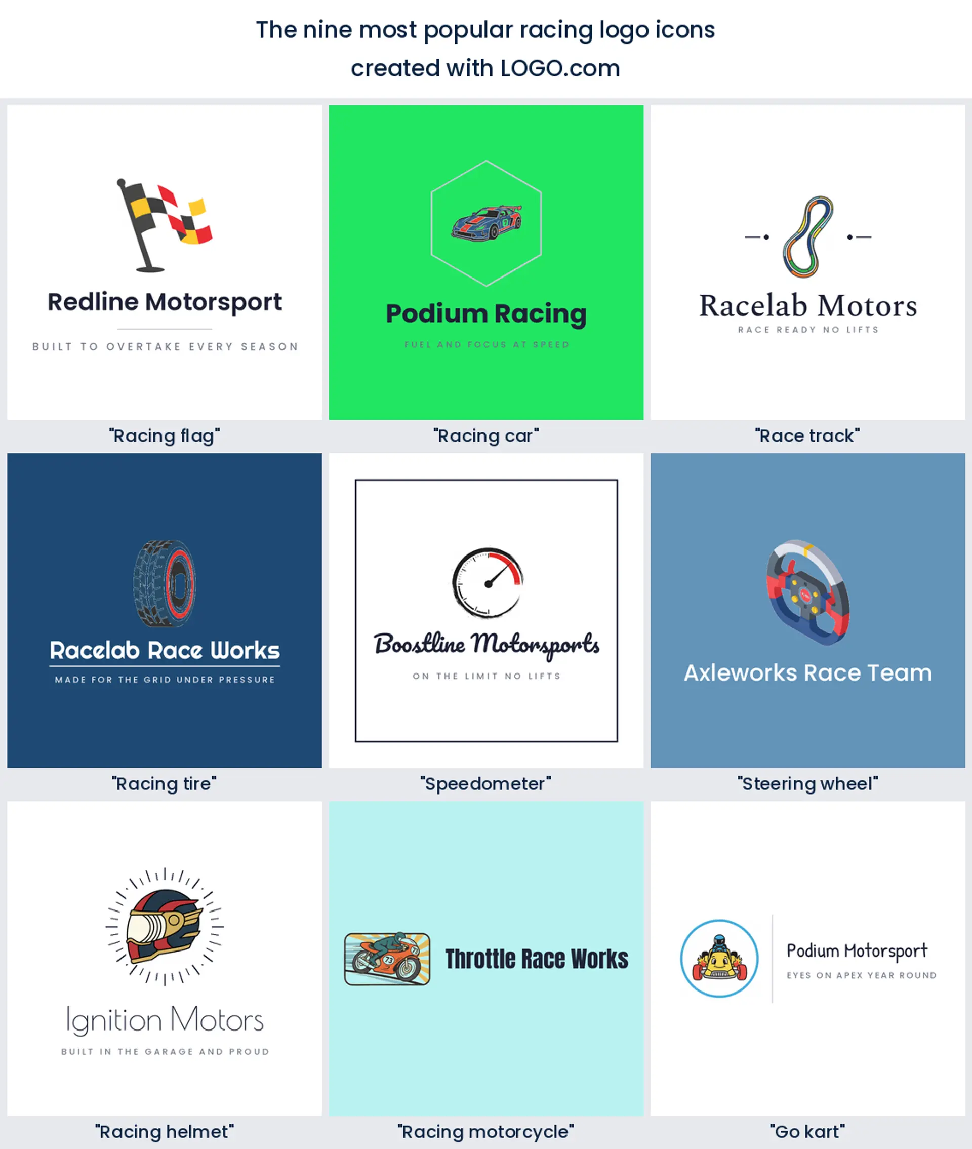
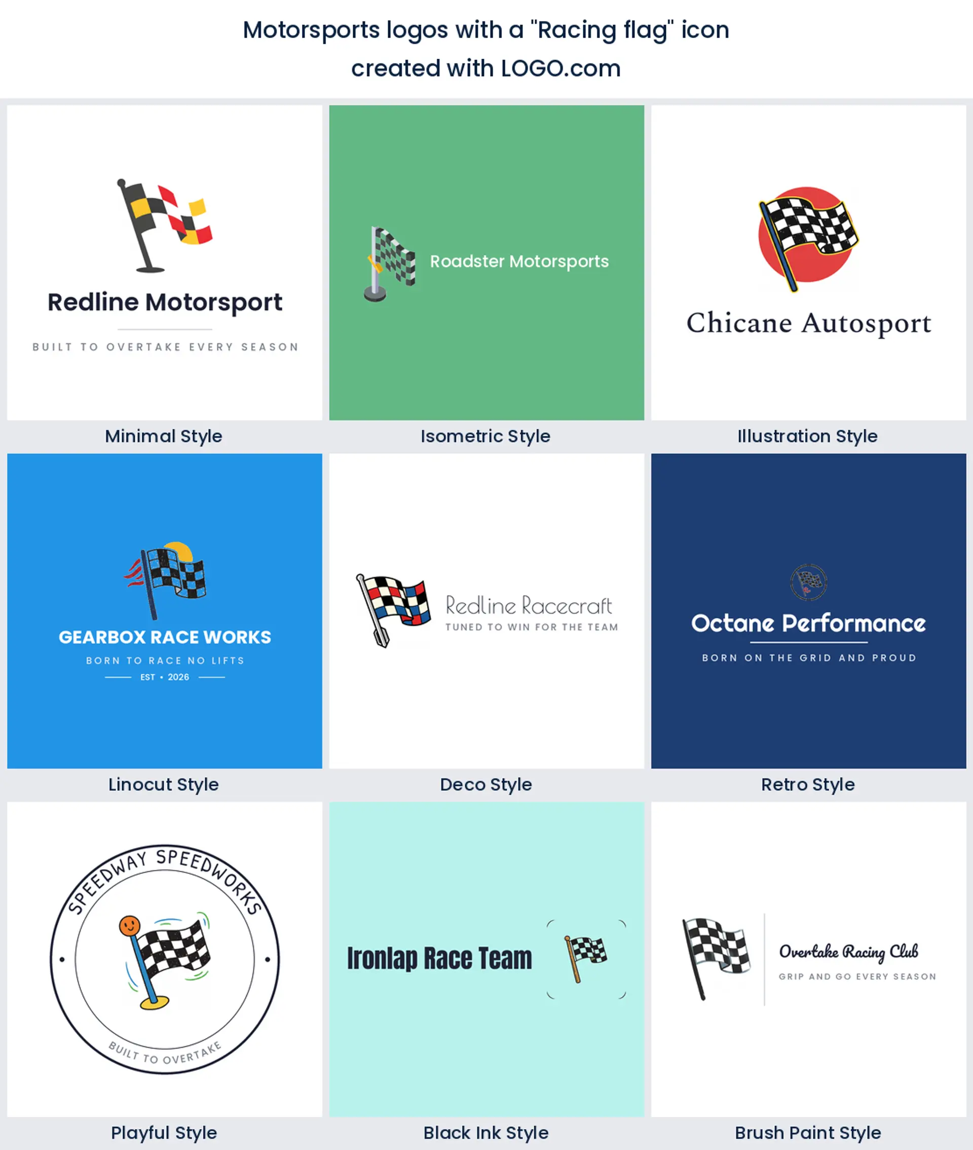
1. Racing flag
About 51% of the descriptions we counted have a flag in them, which is the highest share any single symbol has taken on one of these pages. The reason is obvious enough. A checkered pattern says motorsport with no words attached, in any country, at any size. The catch is that everybody knows it, so a bare flag makes a generic racing logo. Bend it, wrap it round something, or cut it into a shape that is yours.
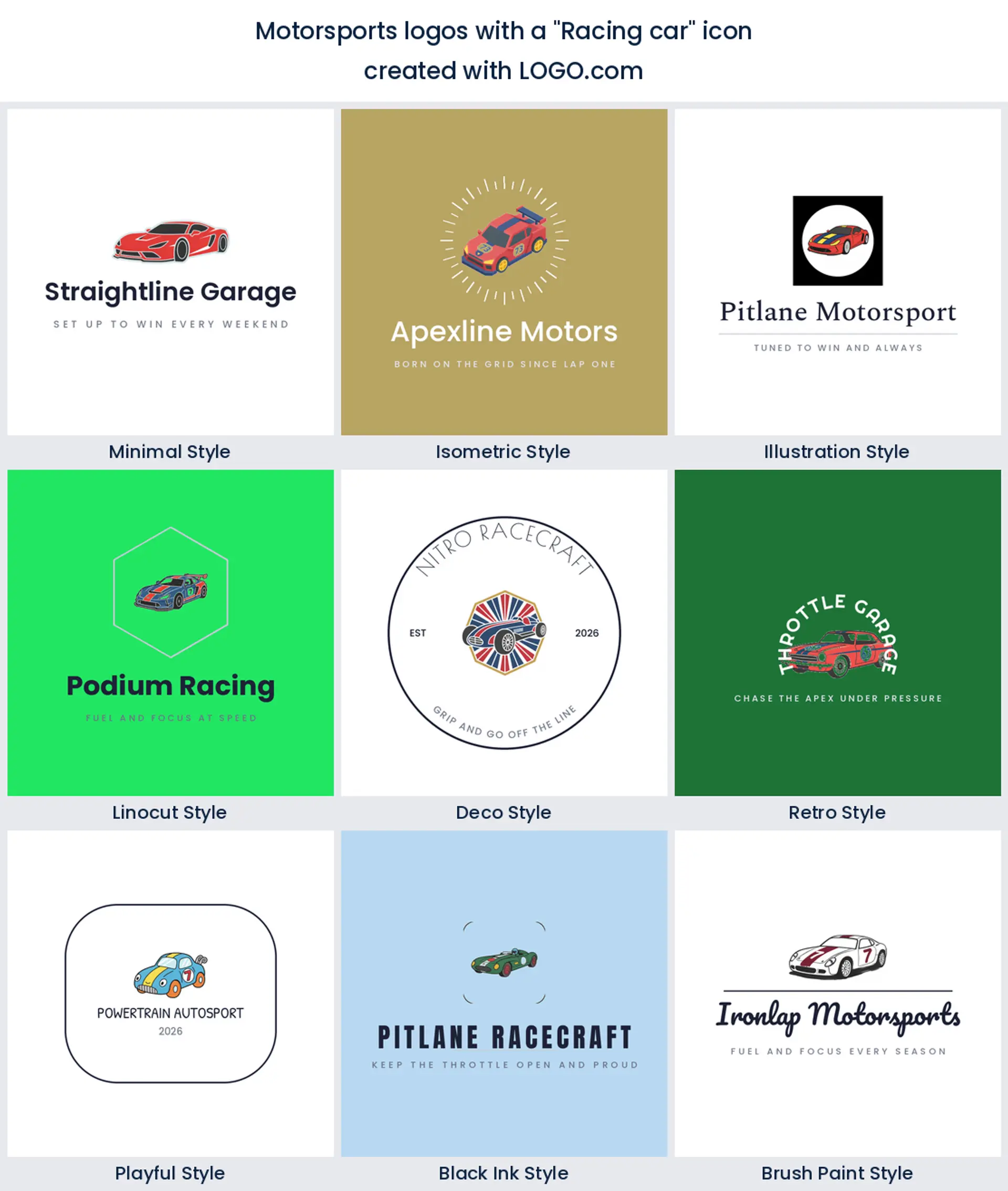
2. Racing car
Cars account for about 28% of what founders described, and almost none of them are sitting still. They describe it front on, mid corner, blurred, or seen from above. That instinct is right. A profile car reads as a dealership, an angled car reads as competition, which is what makes it the strongest race car logo when your brand is a team rather than a shop.
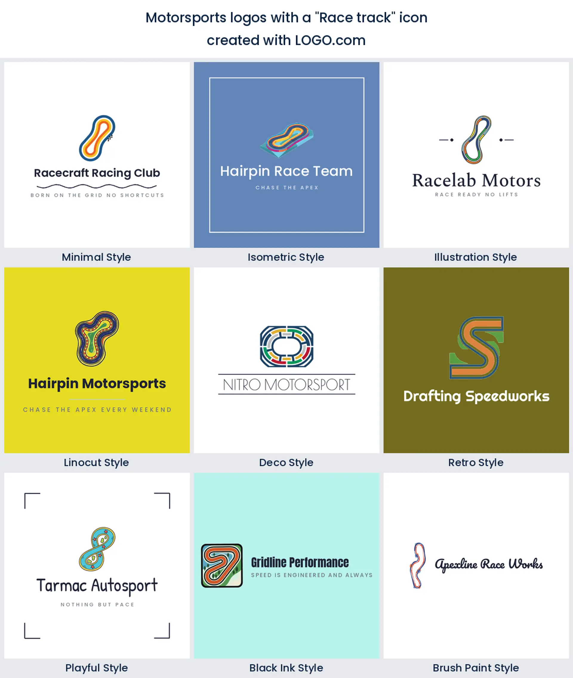
3. Race track
At about 8%, the track is the last concept here we can put a clean number on. Founders describe it as a circuit outline, a corner, or a set of starting grid lines. It is the most abstract idea in the top three and the one that ages best, because a curve of asphalt does not tie you to one car or one class. Good for a circuit, a track day operator or a racing club logo that has to cover several series.
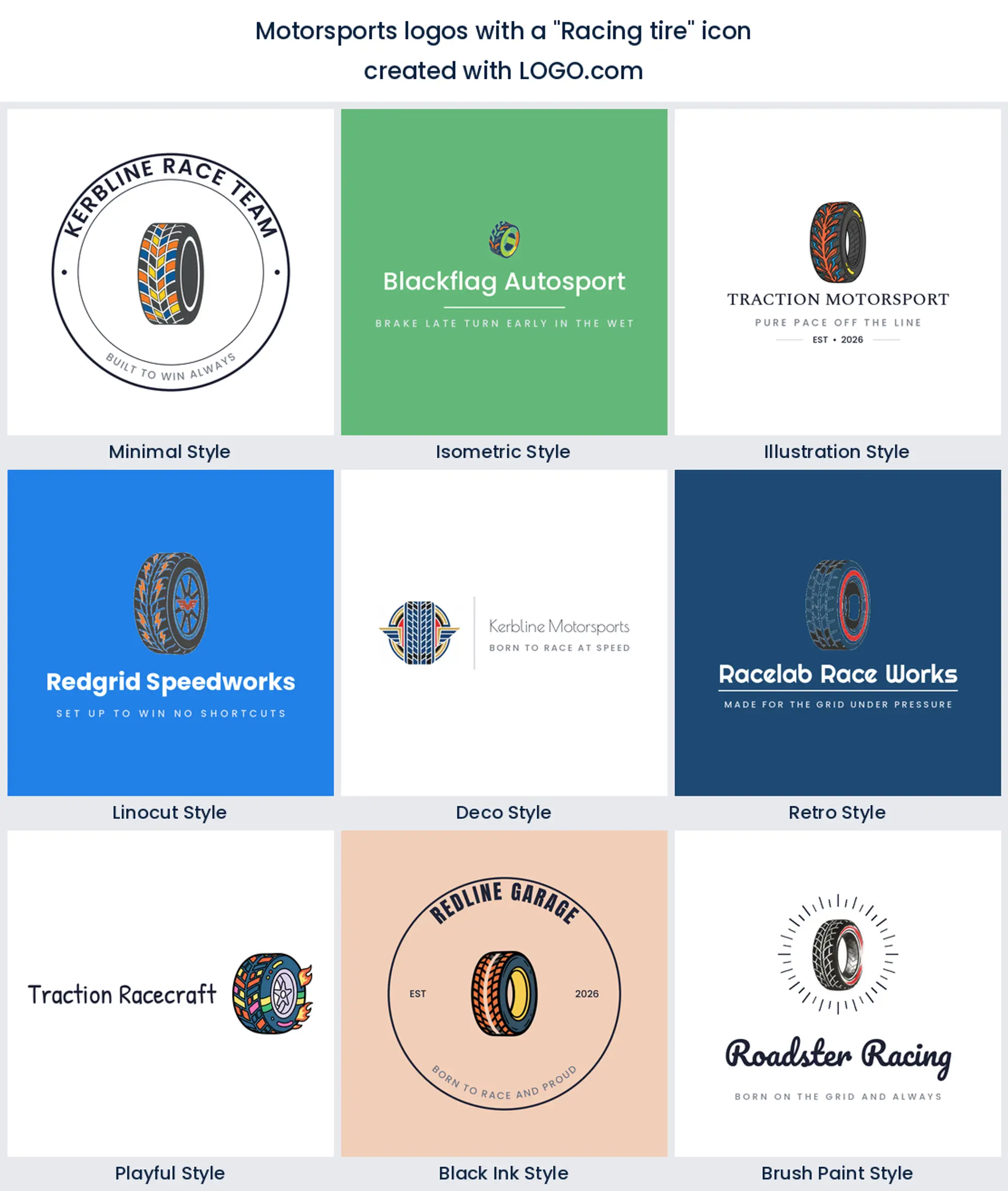
4. Racing tire
Below the top three the counts bunch up, and the tire is first of the rest, usually with a tread pattern or a smoke trail attached to it. It is a quietly clever pick. A tire is round, so it drops into a circular badge without any fighting, and the tread gives you texture that survives being printed small on a sponsor strip. Reach for it if you fit, sell or shred rubber for a living.
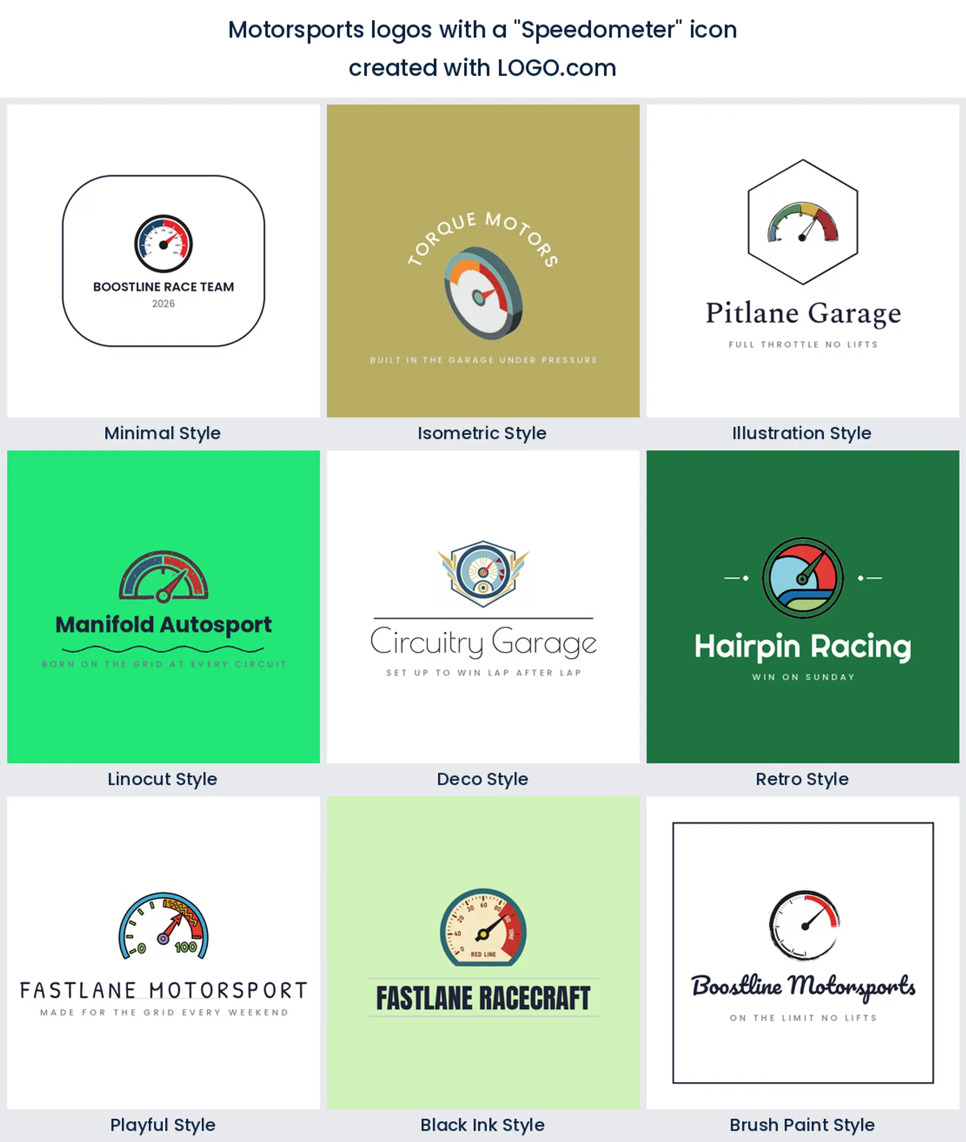
5. Speedometer
Next in the order comes the speedometer, and in our data it nearly always arrives with a needle already buried in the red. That is the appeal. A dial is the only symbol here that shows a number going up, so it carries a tuning shop, a performance parts brand or a coaching business better than any flag would.
6. Steering wheel
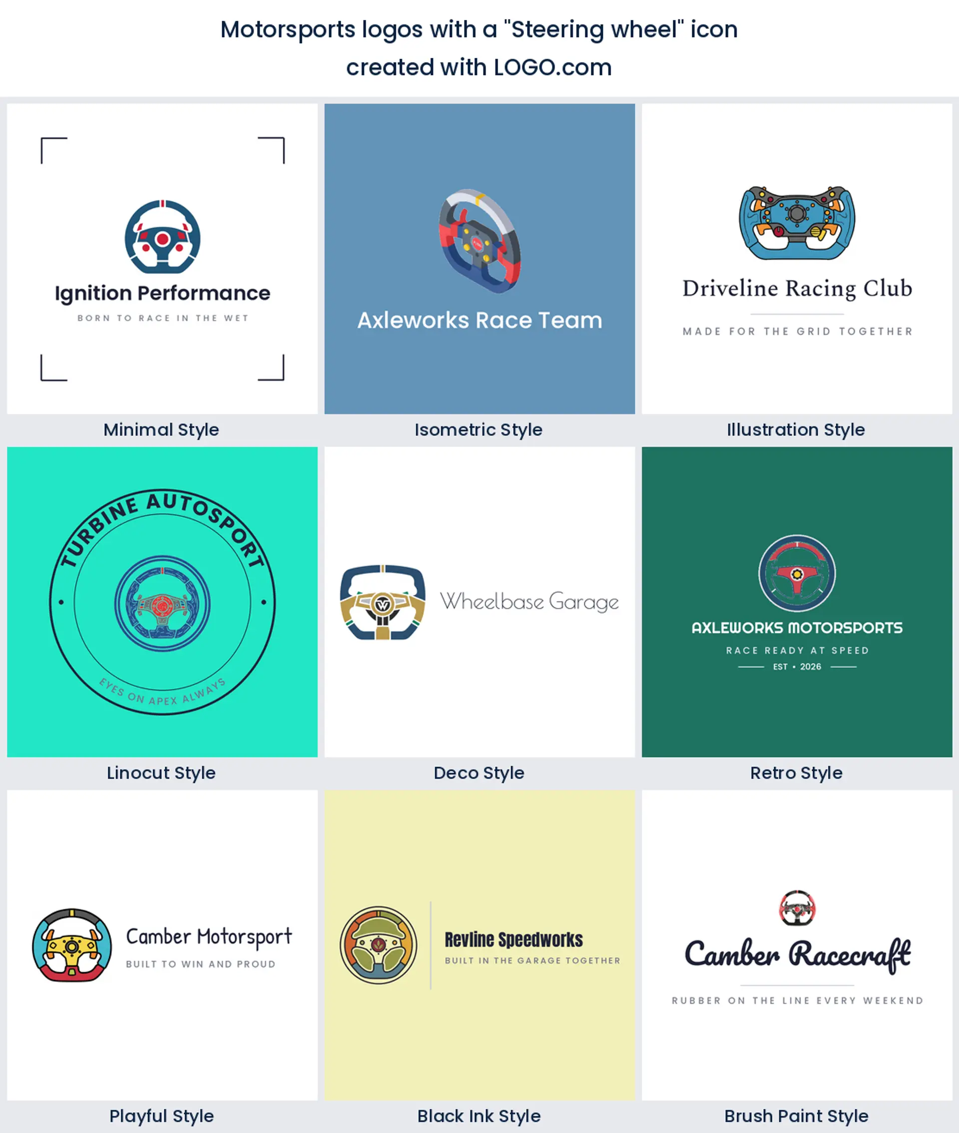
The steering wheel is the object founders pair with the flag more than any other, and it ranks sixth on its own. A modern racing wheel is a squared off shape with a flat bottom, so it reads as motorsport rather than family car the moment you draw it properly. It suits a driver academy or a sim racing logo where the wheel really is the product.
7. Racing helmet
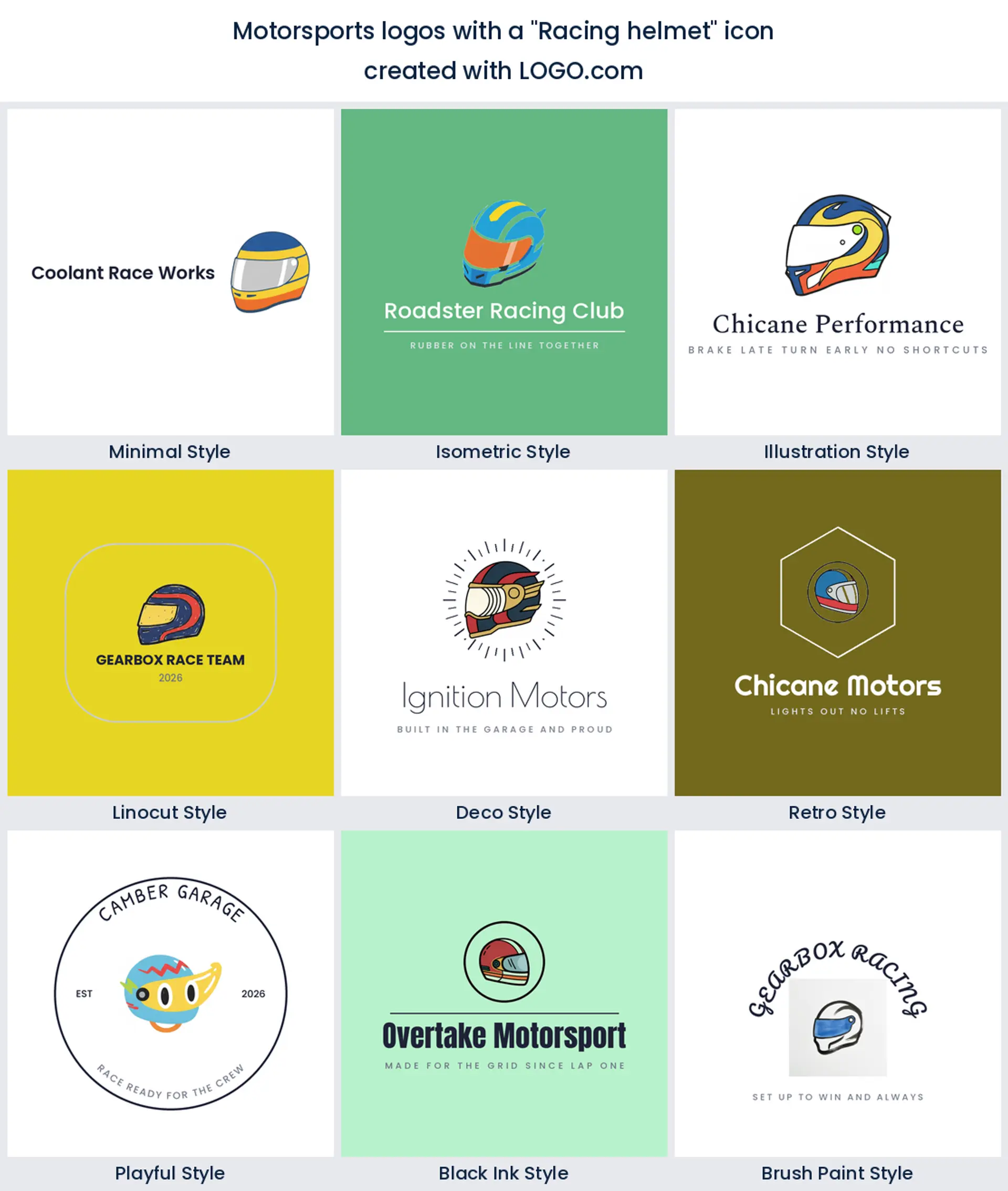
Further down the nine, the helmet is the most personal mark of the lot. A flag belongs to the sport, a helmet belongs to a driver, so this is the one to take if you are the brand. Keep the visor as one clean sweep and skip the vents, because fine slots close up the second the logo goes onto an embroidered patch.
8. Racing motorcycle
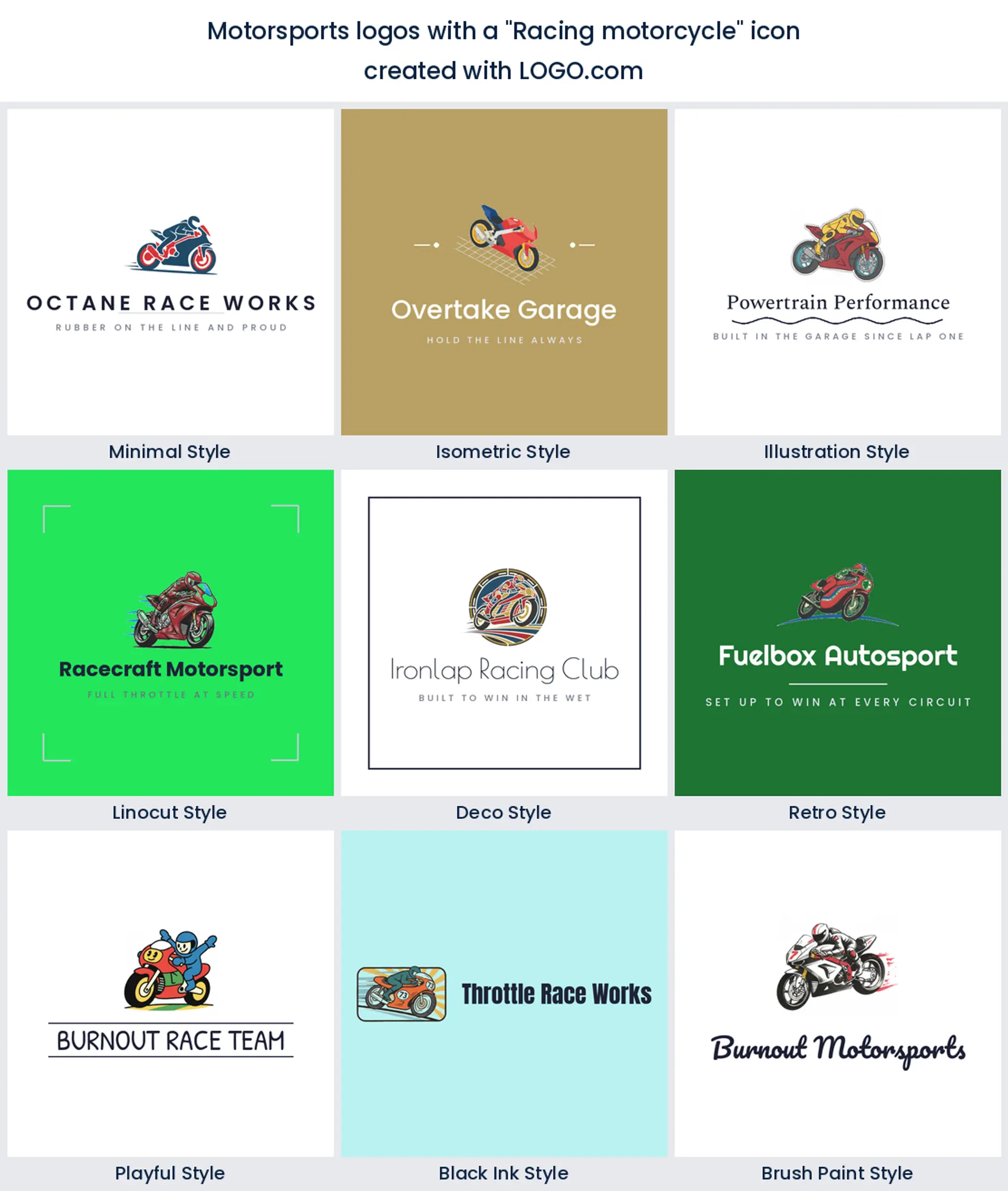
Two wheels are thinner in the data than four, and the bike arrives eighth, described leaning hard into a corner far more often than a bike standing upright. Lean angle is the whole story here, so let the machine tilt and let the wordmark stay level under it. This is your mark for a road racing team, a motocross logo or a track day school.
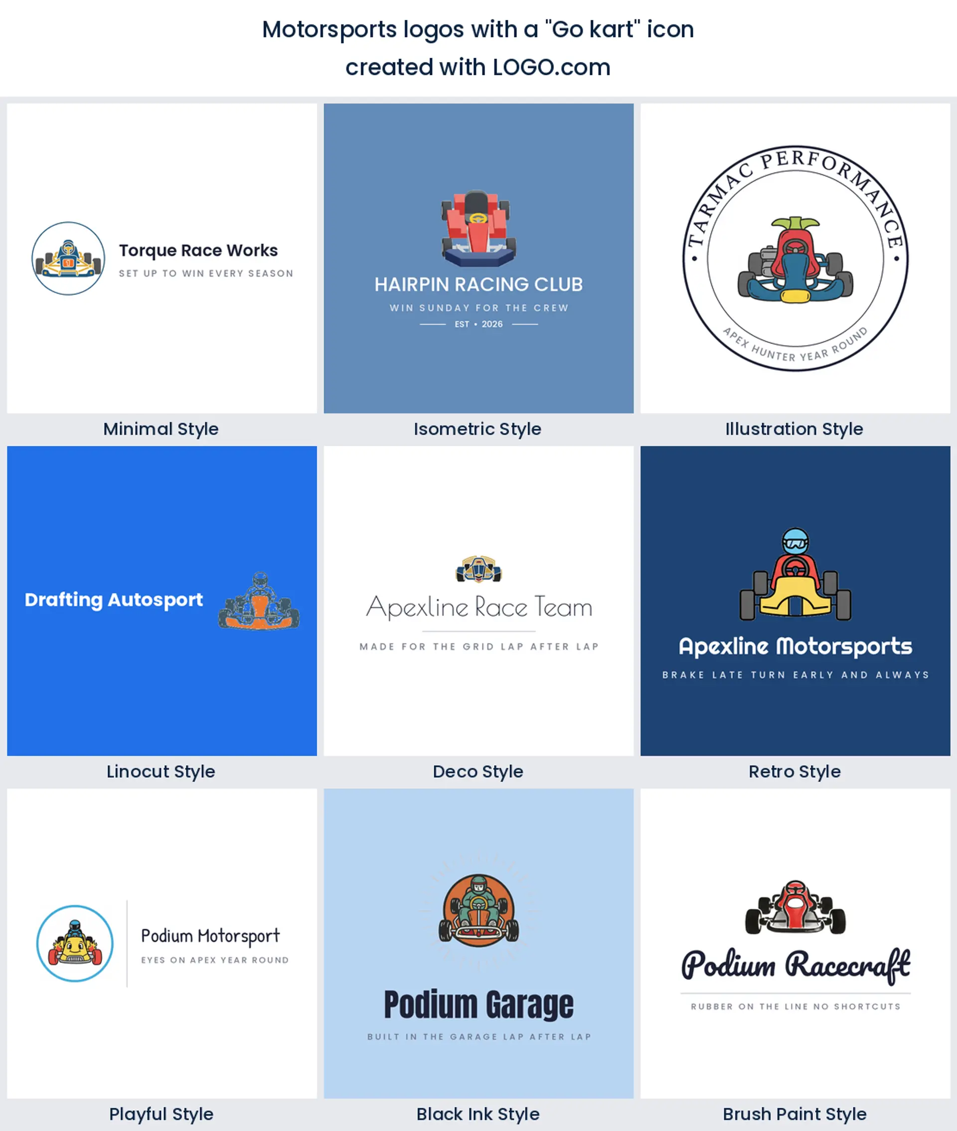
9. Go kart
The smallest concept in the nine is the kart, and the most specific. Almost every kart description we read came from someone running a track or a junior team, which fits, because nobody draws a kart by accident. Draw it low, wide and from the front, and it will never be mistaken for the race car above it.
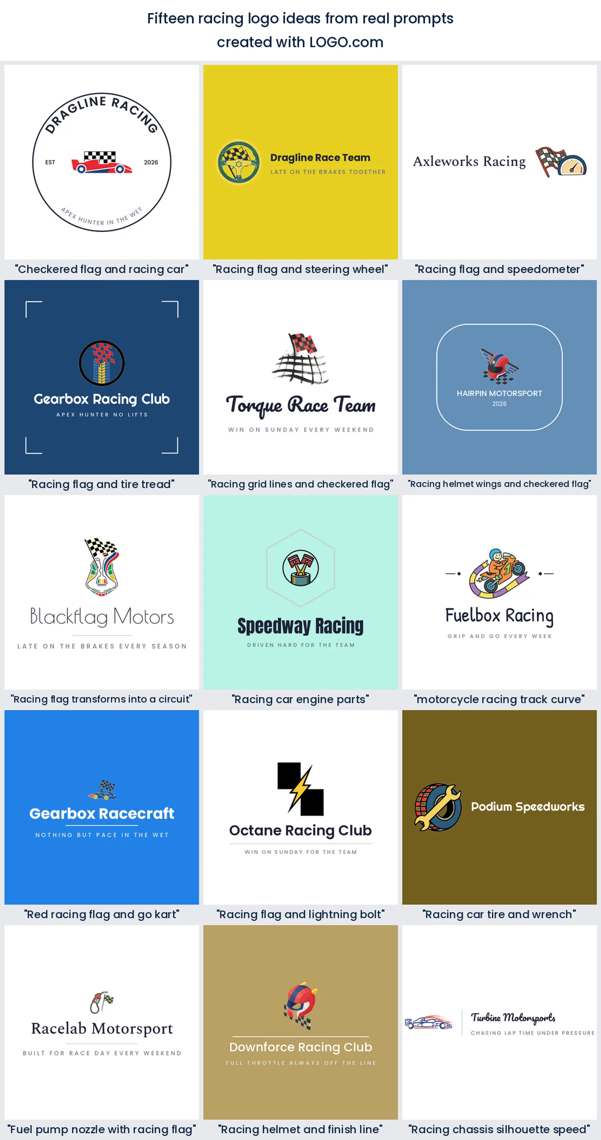
Fifteen combinations founders typed, drawn out in full
Everything below is a real description somebody wrote while building a racing brand on LOGO.com. We left them exactly as typed, quirks and all, because the pairings founders invent are better than anything a template would suggest. Each one is drawn in all nine styles, so choose the combination first and the finish second. Treat the fifteen below as racing logo ideas rather than finished answers, and change whatever does not fit your team.
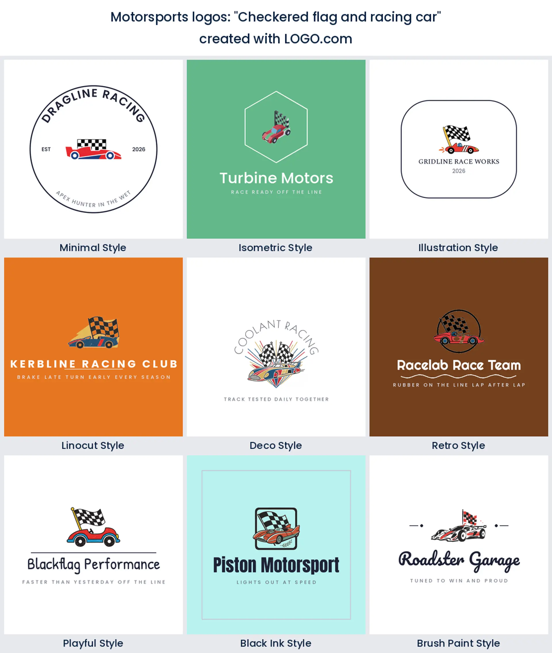
1. "Checkered flag and racing car"
The most described pairing in the whole set, and it works because the two halves do different jobs. The car says what you do, the flag says why it matters. Keep the flag behind the car rather than beside it, or the mark grows too wide to sit on a nose cone.
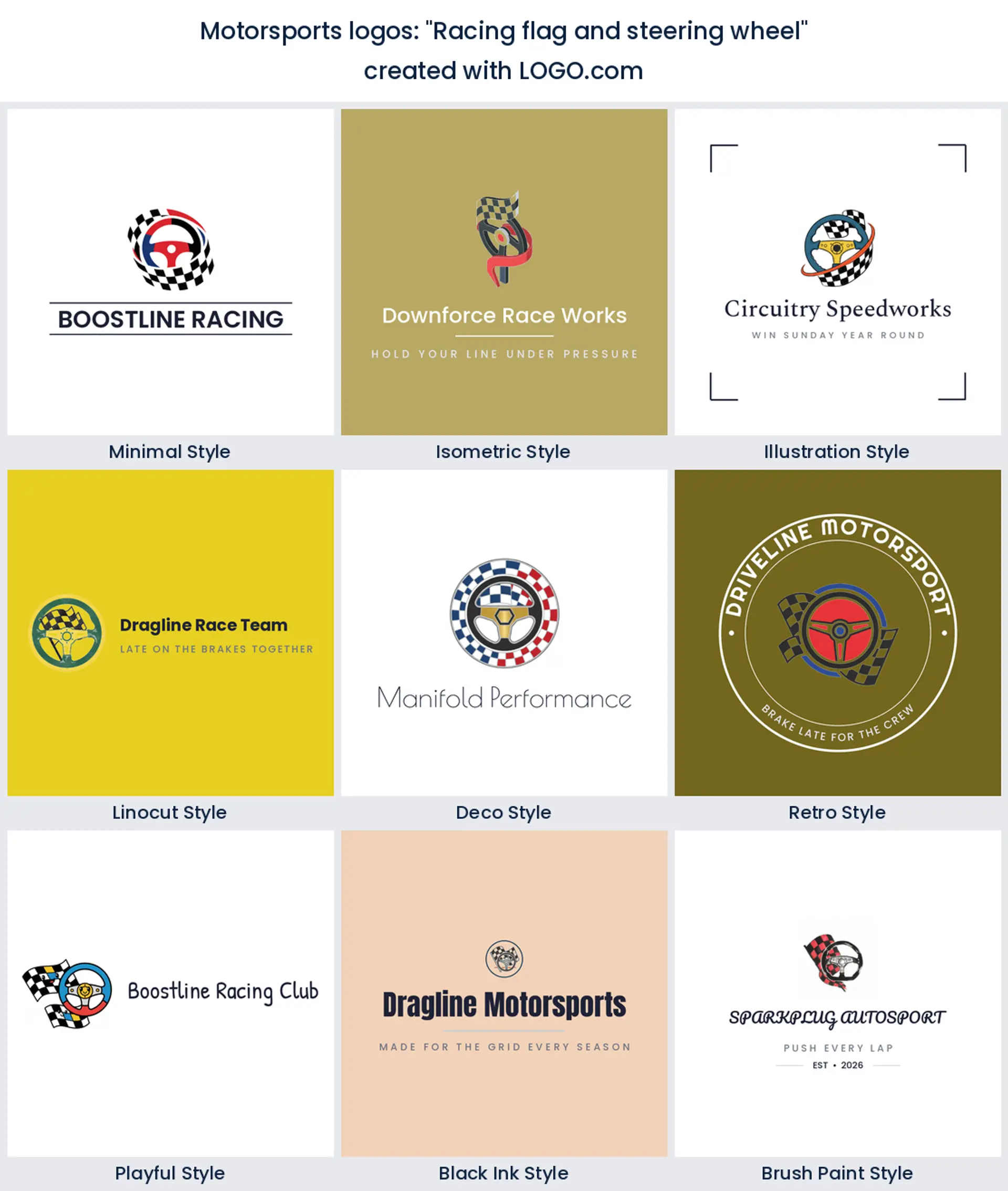
2. "Racing flag and steering wheel"
A wheel gives the flag something solid to hold onto, which stops the whole thing feeling like clip art. Because a wheel is close to a circle you get a natural badge shape for free. This is a strong pick for a driver academy or a sim racing logo that needs to look like hardware.
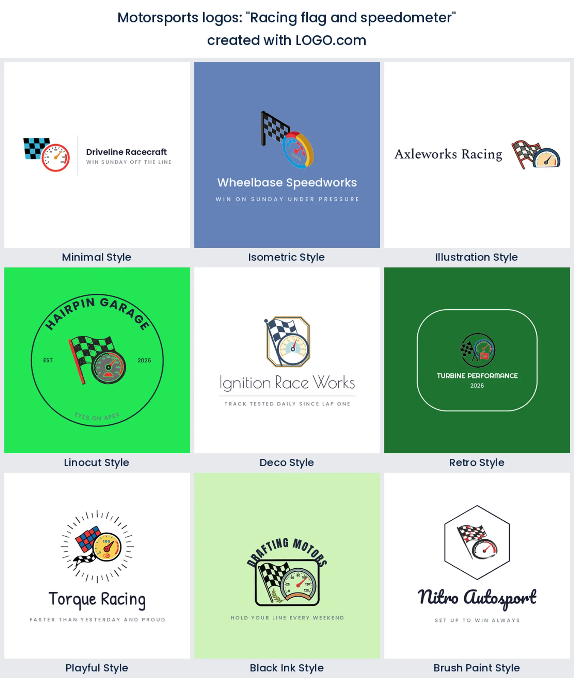
3. "Racing flag and speedometer"
Pair the flag with a dial and you swap glory for measurement, which is exactly what a tuning or data business wants to say. The needle also gives you a diagonal, and a diagonal is the cheapest way to make a static mark feel like it is moving.
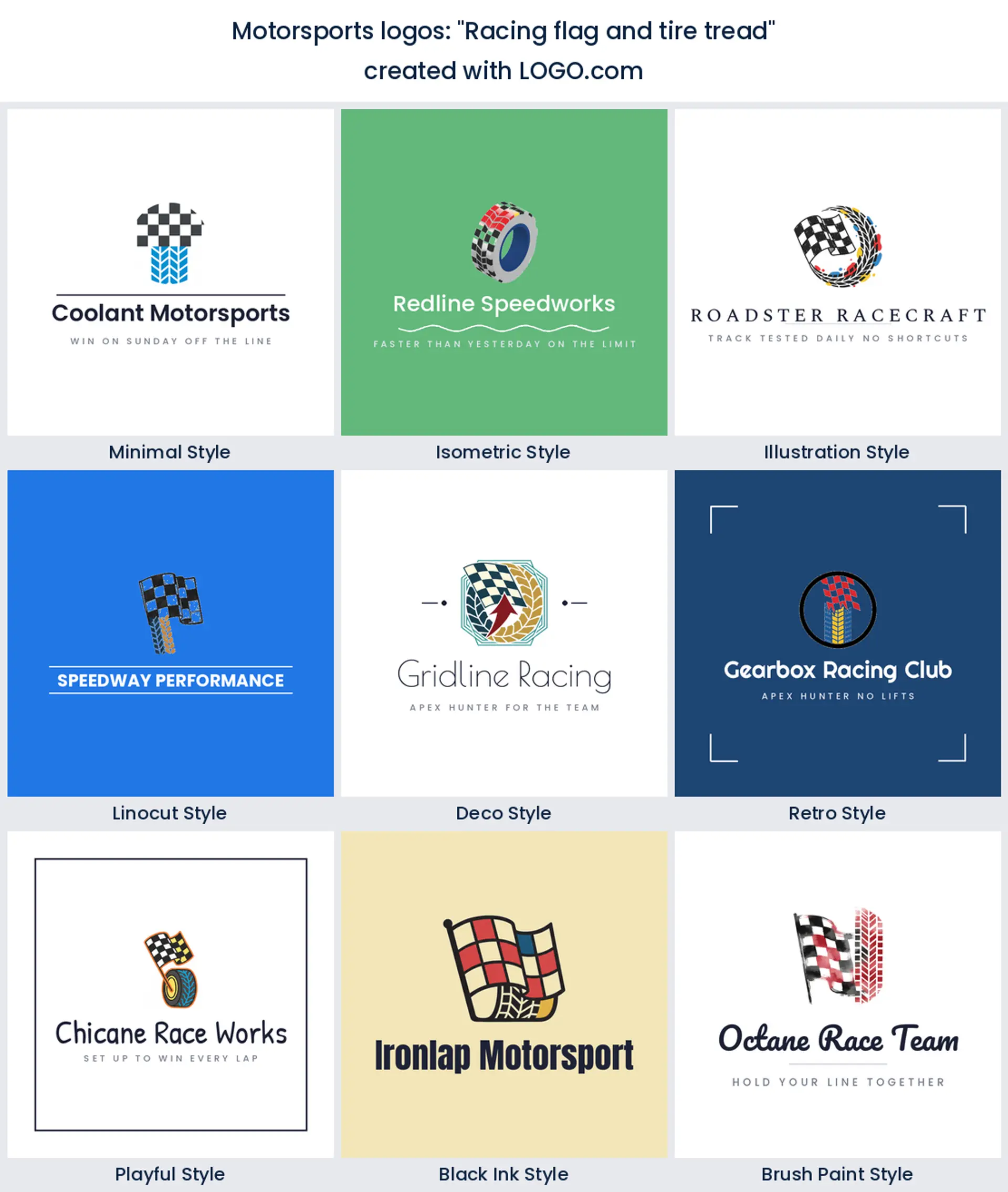
4. "Racing flag and tire tread"
Here the flag squares off into tread blocks, so one pattern becomes the other. It is the most graphic idea in the fifteen and it prints beautifully in a single color, which makes it a sensible tire shop or race preparation logo when everything ends up on a workshop banner.
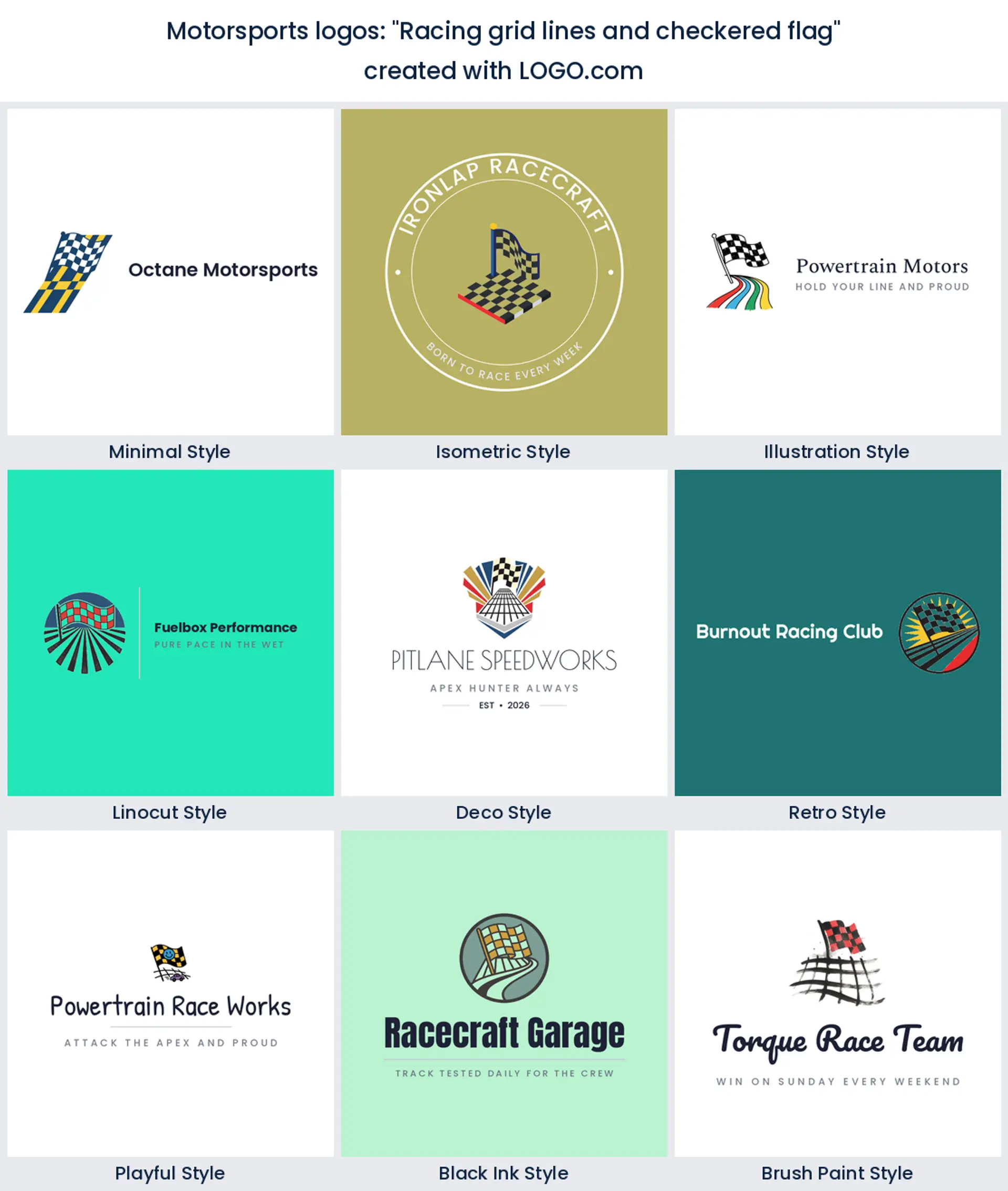
5. "Racing grid lines and checkered flag"
Grid lines are the start, the flag is the end, so together they cover the whole race in one mark. The parallel lines give you somewhere obvious to sit a team name, and the perspective reads well wide, which suits a transporter side or a pit wall.
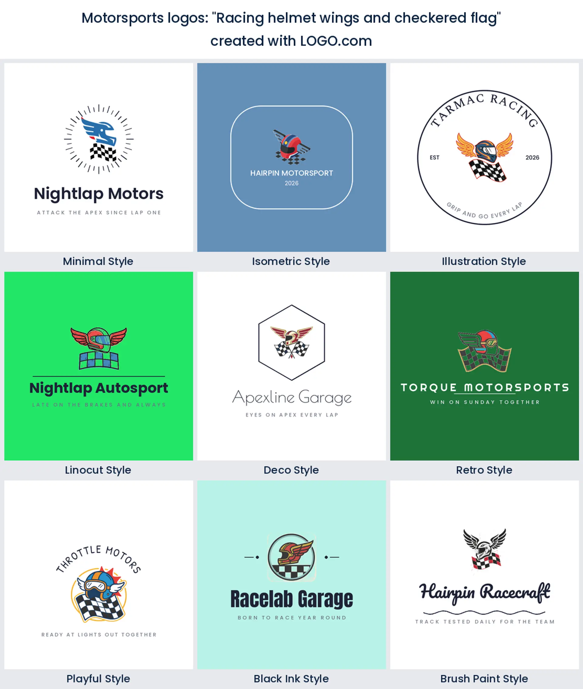
6. "Racing helmet wings and checkered flag"
Wings on a helmet is old school motorsport and it is having a moment again. The three parts stack neatly into a vertical badge, which is the shape you want on a race suit chest. Keep the feathers chunky, because thin ones vanish under stitching.
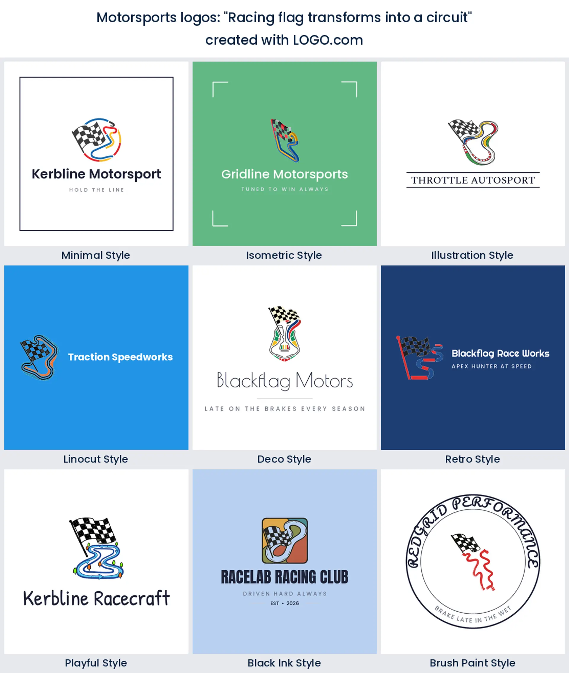
7. "Racing flag transforms into a circuit"
The smartest idea on this page did not come from us. The flag unravels into the shape of a lap, so you get motion and place in a single line. If you run one specific circuit, swap in your own layout and you have a racing logo nobody else can copy.
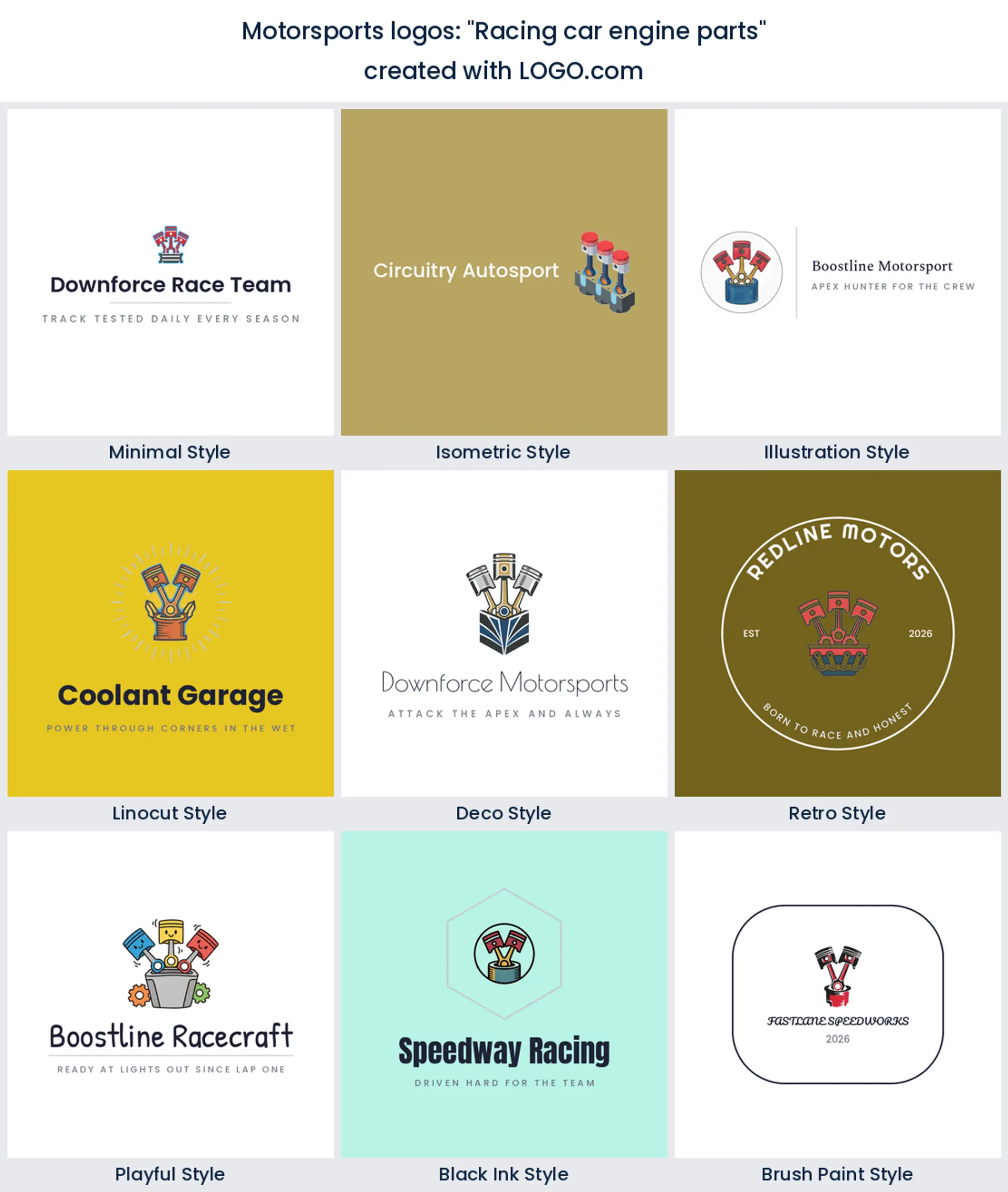
8. "Racing car engine parts"
Pistons, rods and a block are the least glamorous thing here and the most credible. Nobody puts an engine on a shirt unless they actually build them, which is precisely why it works for an engine builder, a machine shop or a parts brand rather than a team.
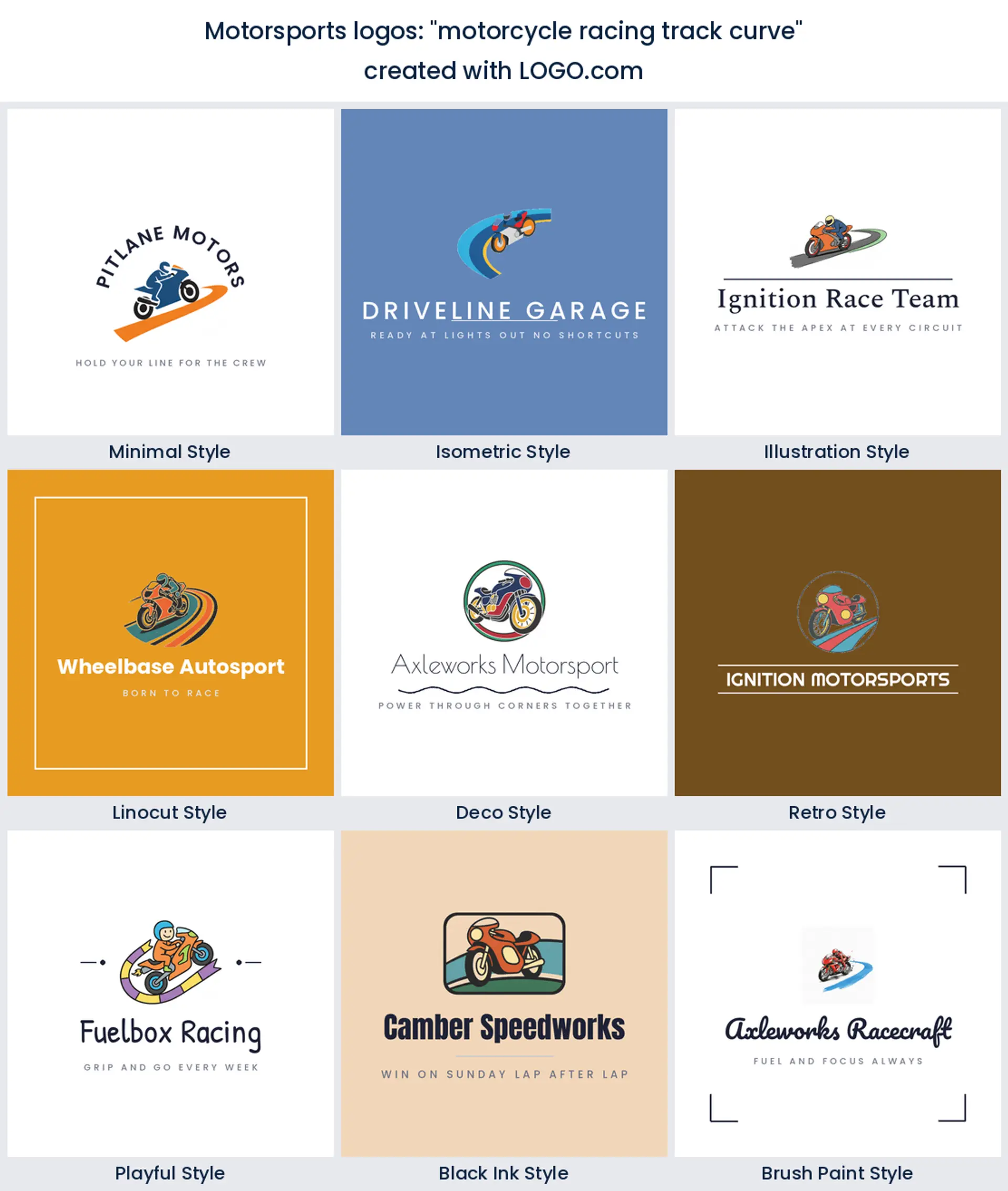
9. "motorcycle racing track curve"
A bike and the corner it is taking, drawn as one continuous shape. The curve doubles as a baseline for your name, which solves the layout problem before you start. Best kept to two colors so the lean angle stays obvious at the size of a fairing decal.
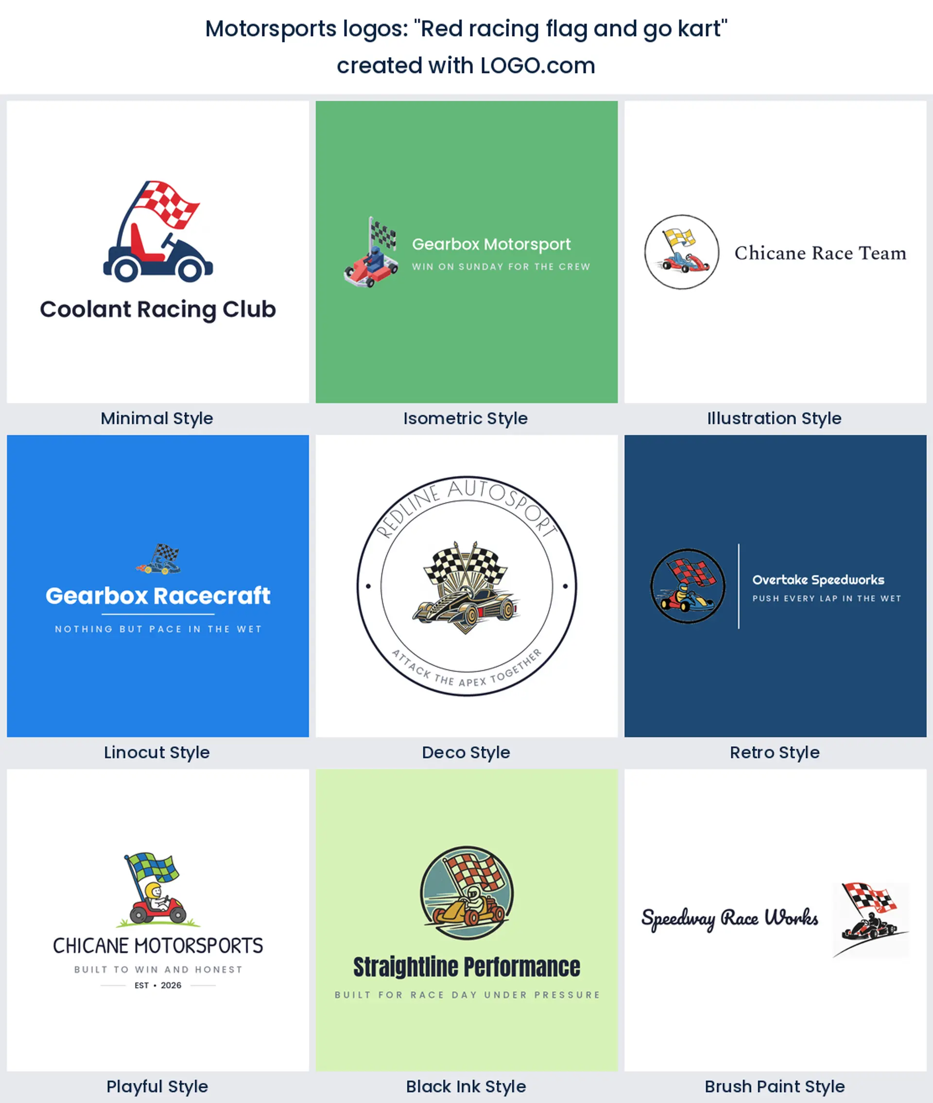
10. "Red racing flag and go kart"
Karting is where most drivers actually start, and its brands get treated as an afterthought. A low kart under a flag reads as junior competition rather than leisure, which is the difference between a birthday party venue and a karting club logo people want a sticker of.
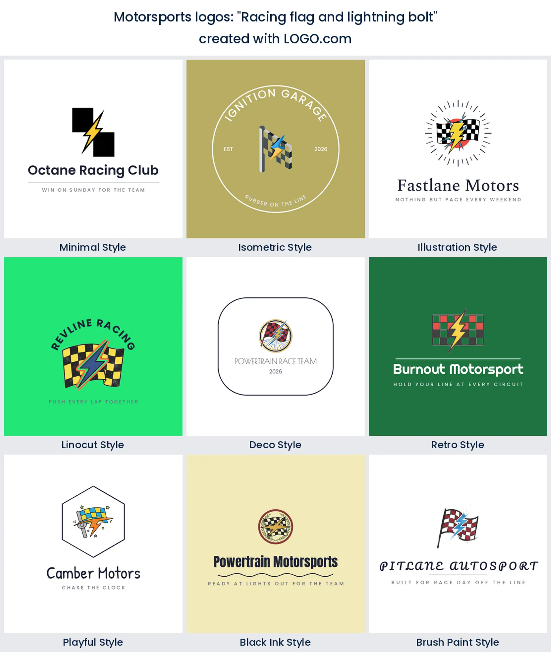
11. "Racing flag and lightning bolt"
The bolt is the shortcut to electric, and it is showing up more as founders build around EV and battery racing. It also just means fast. Use it when your brand is newer than the sport around it, and keep the bolt heavy so it does not read as a weather icon.
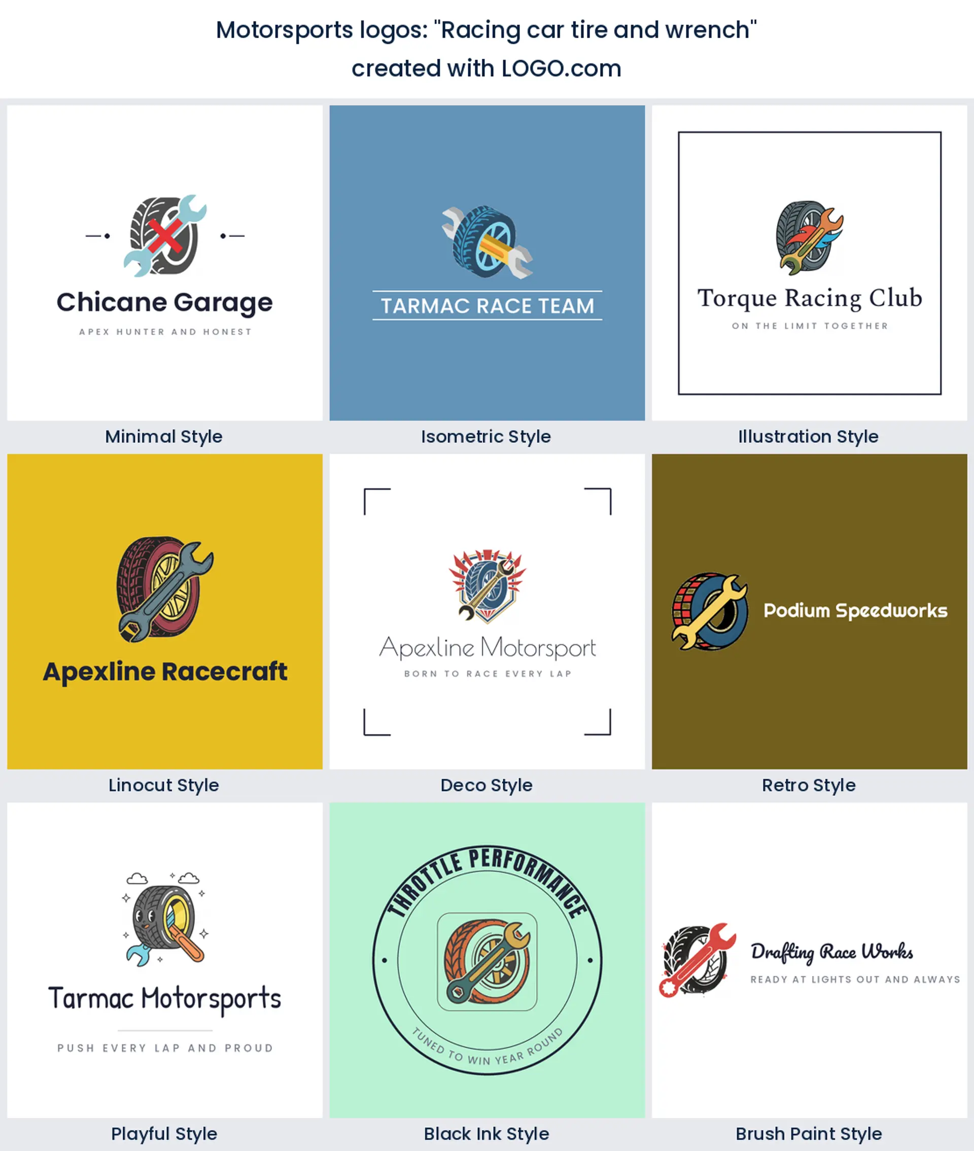
12. "Racing car tire and wrench"
Tools plus rubber is the service side of motorsport in one mark. It tells a customer you touch the car rather than drive it, which is what a race preparation shop, a mobile fitter or a pit crew business needs its logo to say straight away.
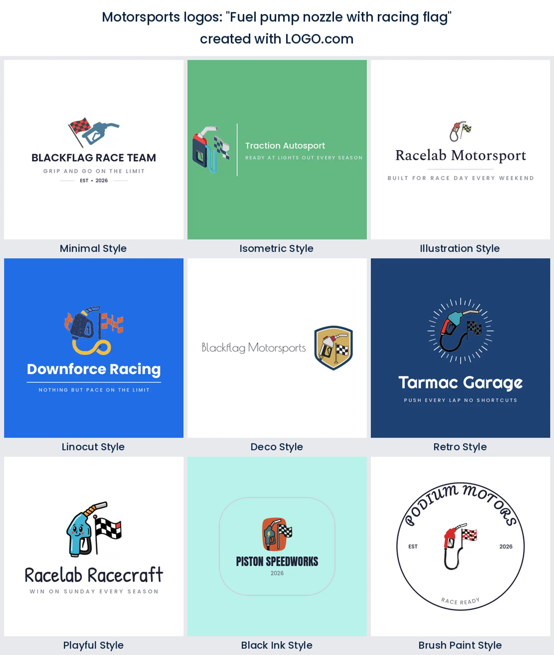
13. "Fuel pump nozzle with racing flag"
An odd one, and better than it sounds. The nozzle is an instantly readable silhouette and it puts you at the pit stop rather than on the podium. Good for a fuel brand, a lubricant line or anyone whose selling point is what goes into the car.
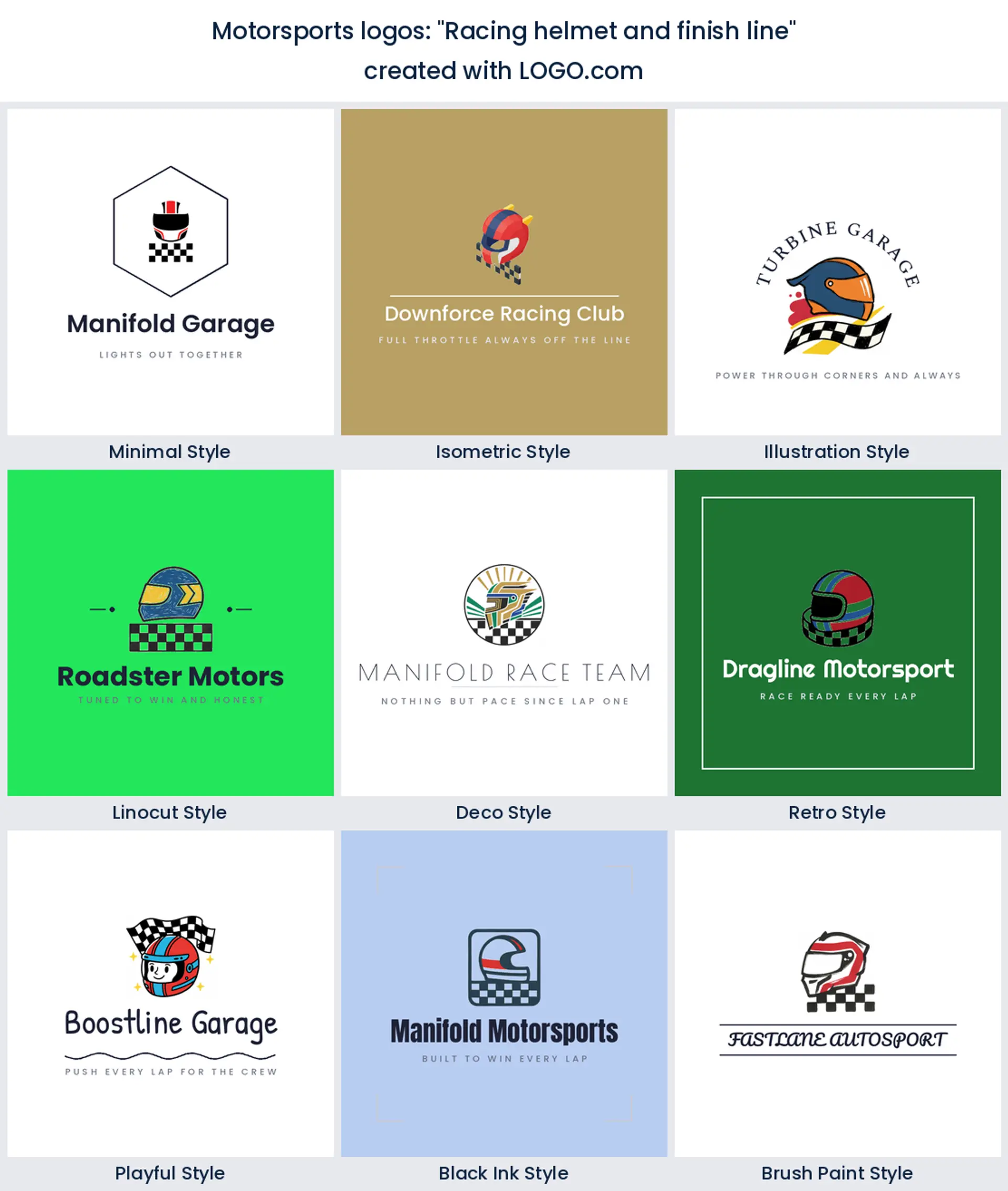
14. "Racing helmet and finish line"
A helmet with a line under it is a whole story in two shapes. It suits a driver building a personal brand for sponsorship, because the finish line adds an outcome without naming a series you might leave next season.
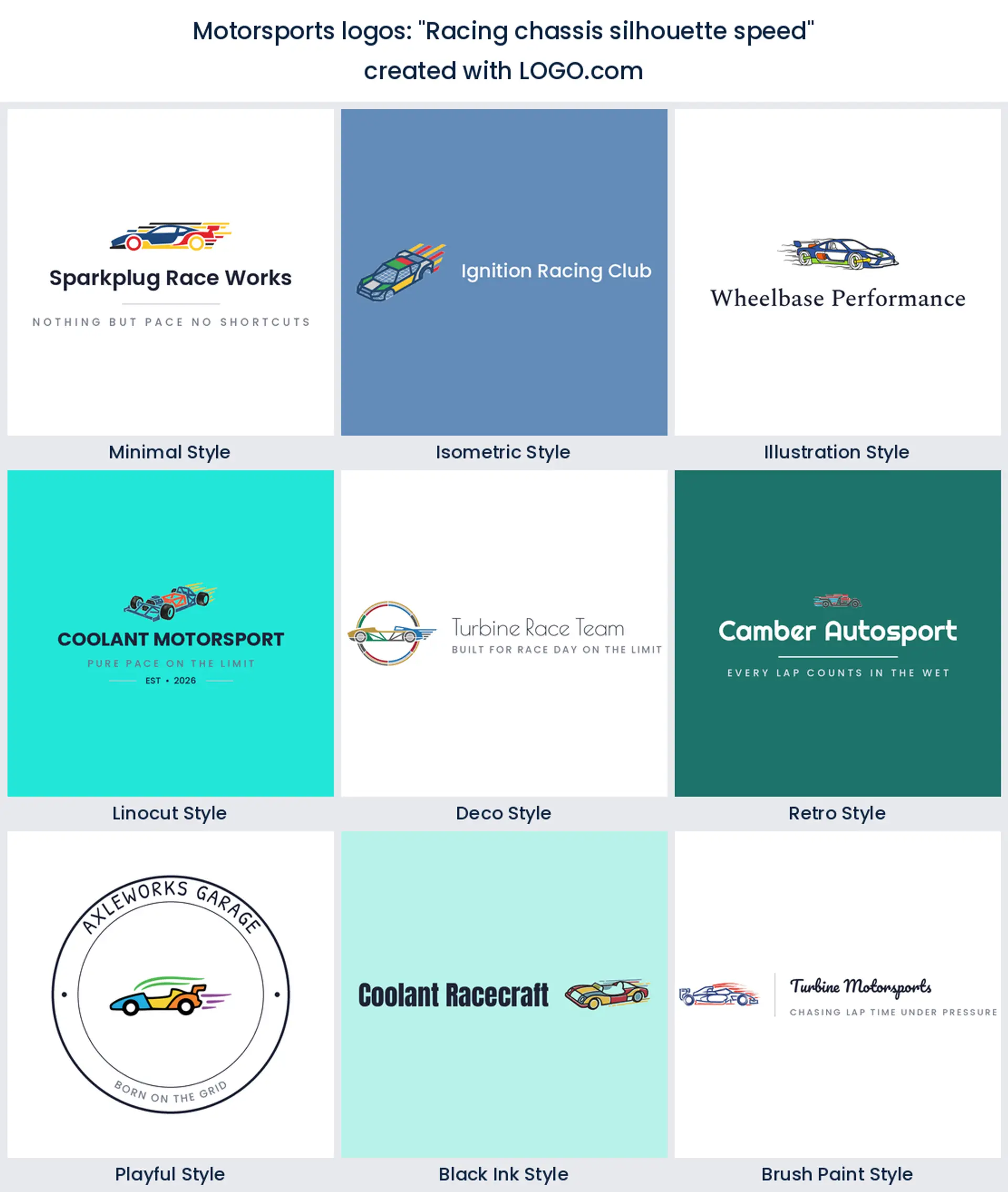
15. "Racing chassis silhouette speed"
The bare frame rather than the finished car, which is a lovely bit of restraint. A chassis outline is light enough to reverse out in white on a dark suit and specific enough that nobody mistakes it for a road car. A quietly premium motorsports logo.
Car number, team name, or both?
This is the first fork and it does not exist in any other sport. A racing brand usually has two identities, the name on the transporter and the number on the door, and founders in our data keep describing both in one breath, a car emblem with a number, a shield with a number, a flag with a digit beside it. Decide which one is doing the work. If you race a single car in one series, build the number in, because that is what commentators and timing screens use to name you. If you plan to run two cars next year, keep the number out and let it live on the livery instead, or your race car logo goes stale the moment the entry list changes.
There is a neat middle option too. Design the mark so a number can slot into a fixed panel beside it, the way a badge holds a founding year. You get the number when you want it and a clean team logo when you do not.
What a livery does to your logo that a shirt never will
A shirt is flat and it faces you. A car is neither. Your mark gets stretched over a curved door, sliced in half by a wheel arch, mirrored on the other side of the car and covered by a sponsor decal that arrives in March. Design for that and you will make three decisions differently. Keep the mark readable when it is cropped, because a wheel arch will cut it. Avoid a shape that only works facing one direction, since the left and right of the car want to point the same way as travel. And give it a version with no background panel, because a wrap shop is cutting vinyl, not printing a rectangle.
That is also where files start to matter. Designing costs nothing and four high resolution PNG files download free with full commercial use, which covers your socials, the entry form and a racing logo png for anyone who emails asking. A wrap shop or vinyl cutter will ask for vector, and that is what the Brand Plan adds at $72 a year, along with unlimited edits, your brand kit and a branded website. Get the vector before the car goes in, not while it is on the ramp.
Reading a logo at 150 miles an hour
Everything in motorsport is seen briefly, from a distance, or through a camera. That makes contrast more important than detail. When we looked at the palettes racing and automotive founders save with us, black came out ahead of every other choice, with blue the most picked color after the neutrals and green behind it. Yellow and orange appear as accents rather than as the main event. That is a different picture from the red you probably expected, and it is a useful one, because a black base is exactly what lets one bright accent carry across a grandstand.
So set your black or charcoal first, then choose one accent and commit to it. That single color becomes how people name you from the fence. Keep the line weight heavy while you are at it, since thin strokes disappear in motion blur and in a wet race. And remember you can take a multi color icon or switch to a one color version, which is the file a vinyl cutter will ask for.
Sim racing teams need a different file to the car
If you run a sim team, or a real team with a sim arm, your logo spends almost no time on bodywork and almost all of it inside a square. A Discord server icon, a stream overlay corner, a league entry list, a YouTube channel picture. None of those give you room for a wordmark, so the icon on its own has to carry the whole brand. Test it at about 40 pixels and see whether you can still tell what it is.
Shape choice follows from that. A wheel, a helmet or a chassis outline all shrink into a square cleanly. A wide flag does not, because the thing that makes a flag readable is its length. If you want the flag anyway, crop it into a circle or a square block rather than shrinking the whole thing, and keep a horizontal lockup for the places that do have width.
Make your motorsports logo with LOGO.com
Put your team, garage or driver name in the box at the top, pick one of the nine marks above, and try it in three or four styles before you settle. Good racing logo design is mostly elimination, so rule out the ones that fail on a dark car early. Most people land on something they like in a few minutes, and you can come back and change it any time before the first race of the season.
Methodology. We looked at the racing logos created on LOGO.com in the twelve months to August 2026. Because the motorsports industry label is too thinly used to rank from, we took the custom icon descriptions themselves: 265 descriptions naming a racing subject, written by 145 brands, with horse racing excluded. We grouped those descriptions into concepts and ranked them by count, which is where the racing flag (about 51%), the race car (about 28%) and the race track (about 8%) come from. Color shares come from the palettes motorsports, racing, motorcycle and automotive brands saved over the same window. Source: LOGO.com first party product data, August 2026.
THE #1 LOGO GENERATOR
Why LOGO.com is the best motorsports logo maker
1.A mark that survives a livery
Build your racing logo against black and against white in the editor, so you know now that it still reads on a dark car and on a white transporter panel rather than finding out at the wrap shop.
2.Sponsor strip test built in
Shrink your mark to the width of a rear wing sticker inside the editor and check the thin parts have not filled in, because a motorsports logo lives or dies at that size.
3.Team socials sorted before entries close
Four high resolution PNG files download free and carry full commercial use, so your racing logo png can go on the entry form, the timing screen and the team account the same afternoon.
4.The wordmark free icon for a helmet
Every build gives you the icon on its own as well as the full lockup, which is the version that ends up on a helmet side, a suit patch and a square avatar on a series entry list.
5.Vector files for vinyl and decals
The Brand Plan adds the vector files a wrap shop or vinyl cutter needs for door decals, pit banners, a transporter side and an embroidered race suit.
6.Change it when the sponsor changes
Liveries get redrawn every season, so the Brand Plan keeps your edits unlimited and your brand kit in one place when a new backer wants their color in the mark.
Motorsports Logo Maker FAQs
Explore more logo ideas
3DAcademic EducationAccommodationAdvertising AgencyAffordableAgriculture BlogAlternative MedicineAnimal BlogAnimalsApartmentAppraisal ServicesAriesArtArtistArts EducationAstrologyAudio ServicesAuto DealershipAuto Rental AgencyBBQBakeryBanking ServicesBaseball TeamBeauty SalonBed & BreakfastBettingBioinformaticsBirdBlock Letter Logo MakerBlurbBookBooks and LiteratureBoxBuilderBurgerBusiness Services and ConsultingCBDCameraCancerCannabisCardsCatCattleCharityChild CareChocolateCinemaCityClevverCloud