Restaurant Logo Maker
Design a restaurant or cafe logo that looks good on your menu and storefront sign.
Need a different logo maker? Try our AI logo generator.
Logos created using LOGO.com
670,000,000
Casual dining restaurant logos
Grill and cafe restaurant logos
Bar and fine dining restaurant logos
Restaurant Logos, Ranked From Real Brand Data
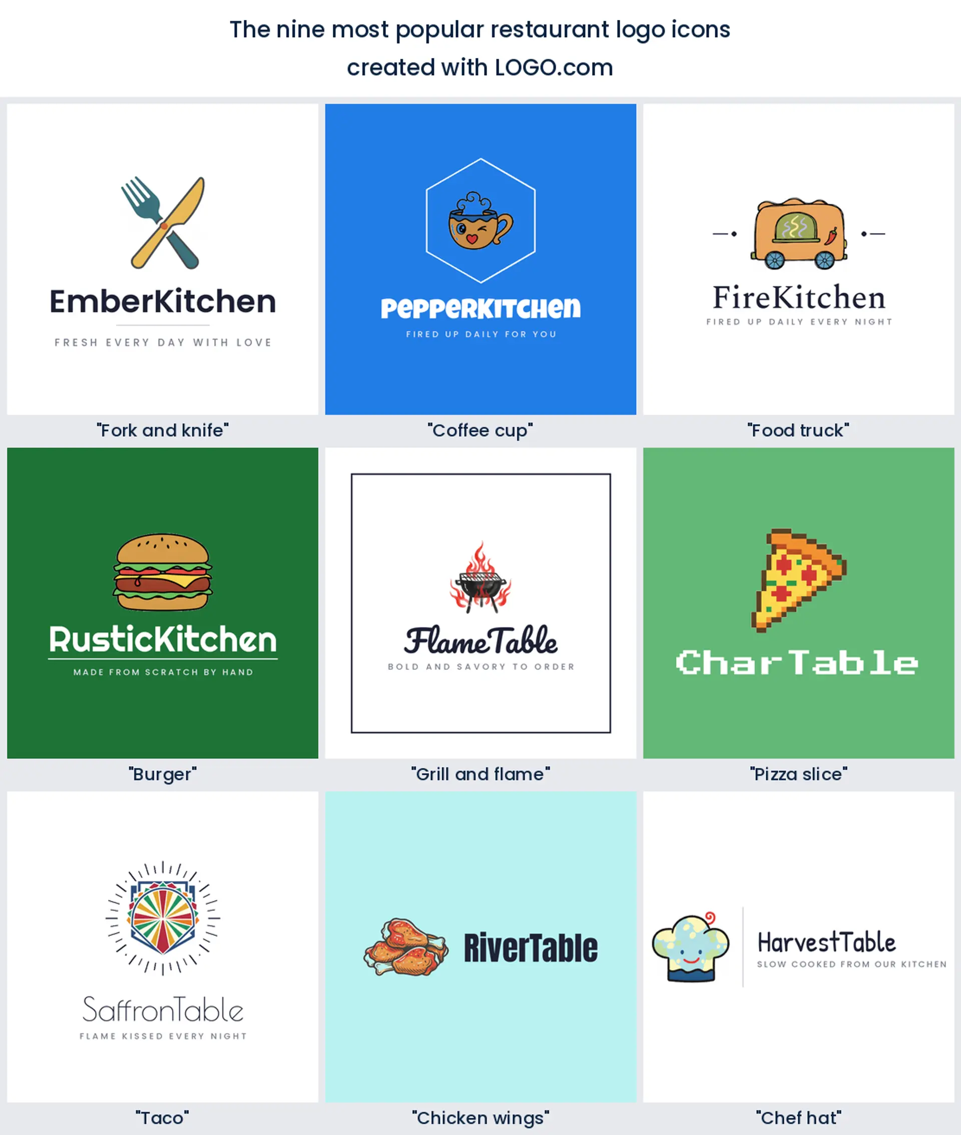
According to LOGO.com data, the most common restaurant logo icons are the fork and knife (about 19% of icon descriptions), the coffee cup (about 7%), and the food truck (about 5%). One clear symbol and a confident name carry most restaurant logos.
The nine styles below are built from those real descriptions, so you start from what diners already read as good food instead of a blank page. Pick a symbol, then make the color, font, and name your own.
On this page
- Fork, cup, or flame: the symbols that read restaurant fast
- Fifteen restaurant logo ideas from real founder prompts
- Your cuisine should be obvious before anyone reads the name
- Fast food energy or fine dining calm: what your logo says about the price
- The menu, the sign, and the delivery app all need the same mark
- Which colors make food look good enough to eat?
- What a restaurant logo costs and where you can use it
- Make your restaurant logo with LOGO.com
People decide where to eat in about the time it takes to scroll past your logo. To see which symbols actually pull that glance, we read 246 real restaurant icon descriptions that founders typed into LOGO.com, then turned the most popular into fifteen restaurant logo ideas you can recolor and make your own.
Fork, cup, or flame: the symbols that read restaurant fast
The restaurant logos founders build on LOGO.com cluster around nine symbols. The fork and knife leads by a wide margin at about 19% of the 246 icon descriptions we read, the coffee cup follows at about 7%, and the food truck sits third at about 5%. After those come the burger, the grill, the pizza slice, the taco, chicken wings, and the chef hat. Most restaurant logos need just one of these plus a clear, appetizing name.
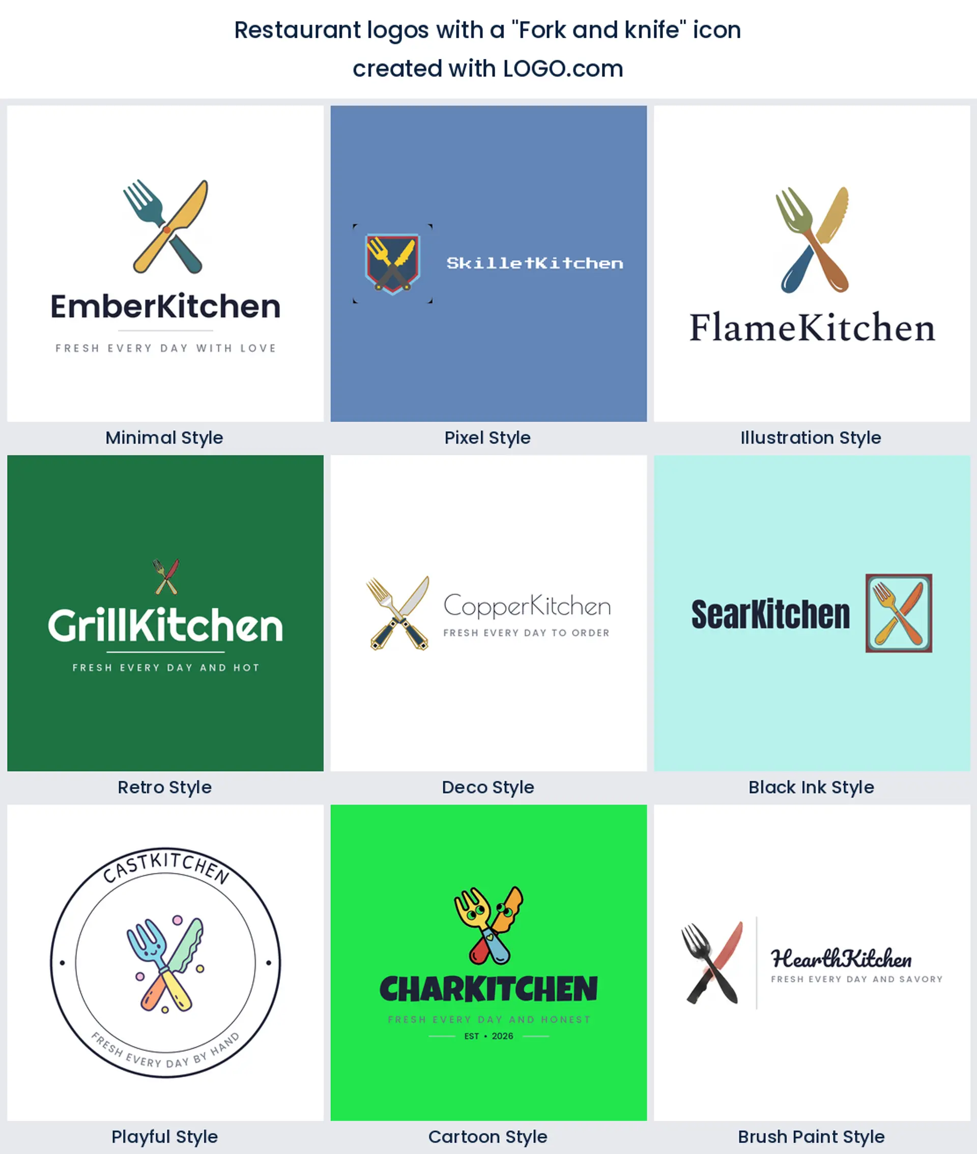
1. Fork and knife
Nothing says restaurant faster than a fork and knife, and founders know it. Crossed, stacked, or tucked into a monogram, this pair turns up in about a fifth of the icon descriptions we read. It is the safe, legible heart of almost any restaurant logo, from a family diner to a white tablecloth room.
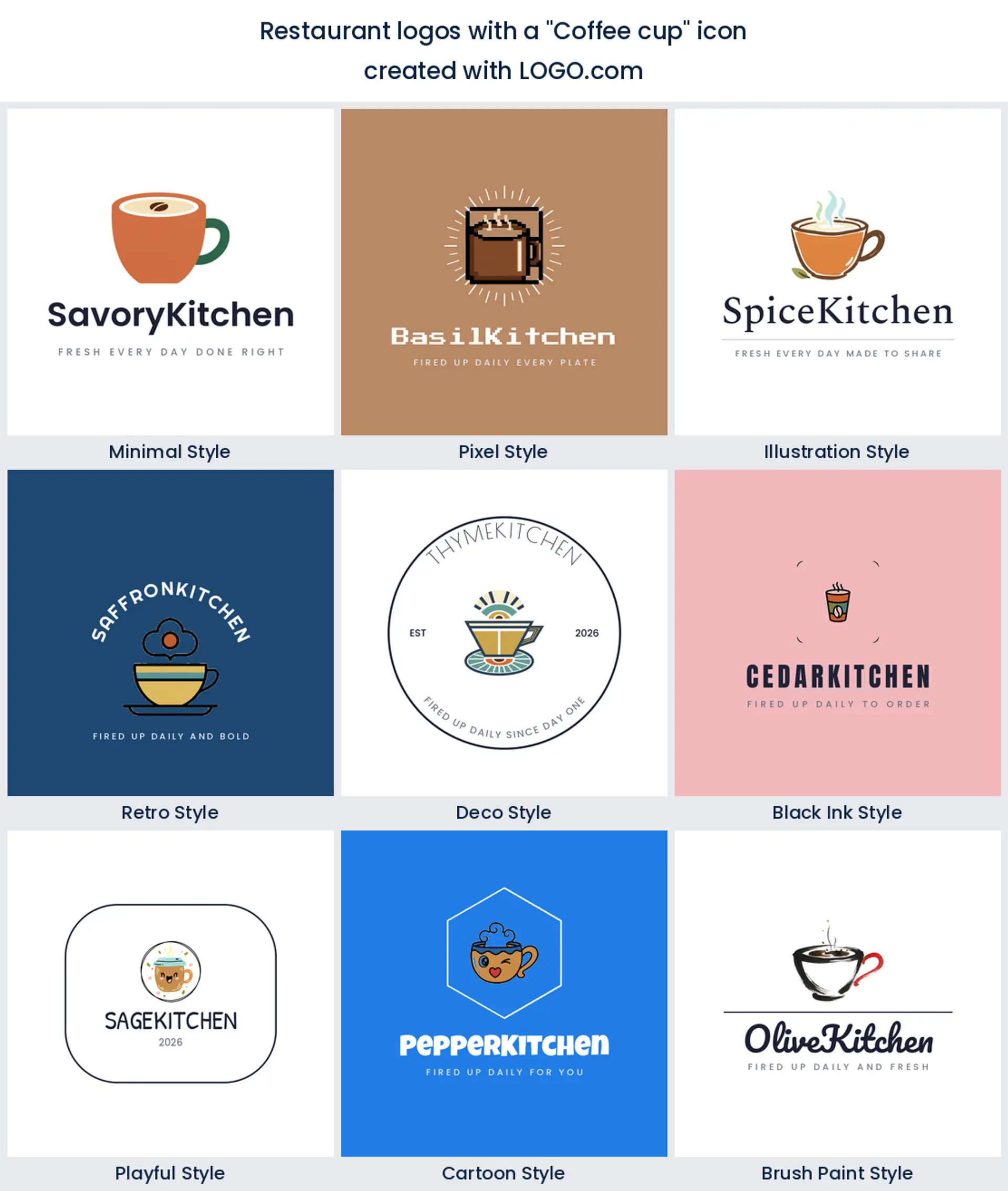
2. Coffee cup
A steaming cup is the second most drawn symbol, and it works overtime for cafes, brunch spots, and coffee led restaurants. Keep the steam simple and it still reads warm shrunk onto a loyalty stamp or an app icon, which makes it a friendly cafe logo.
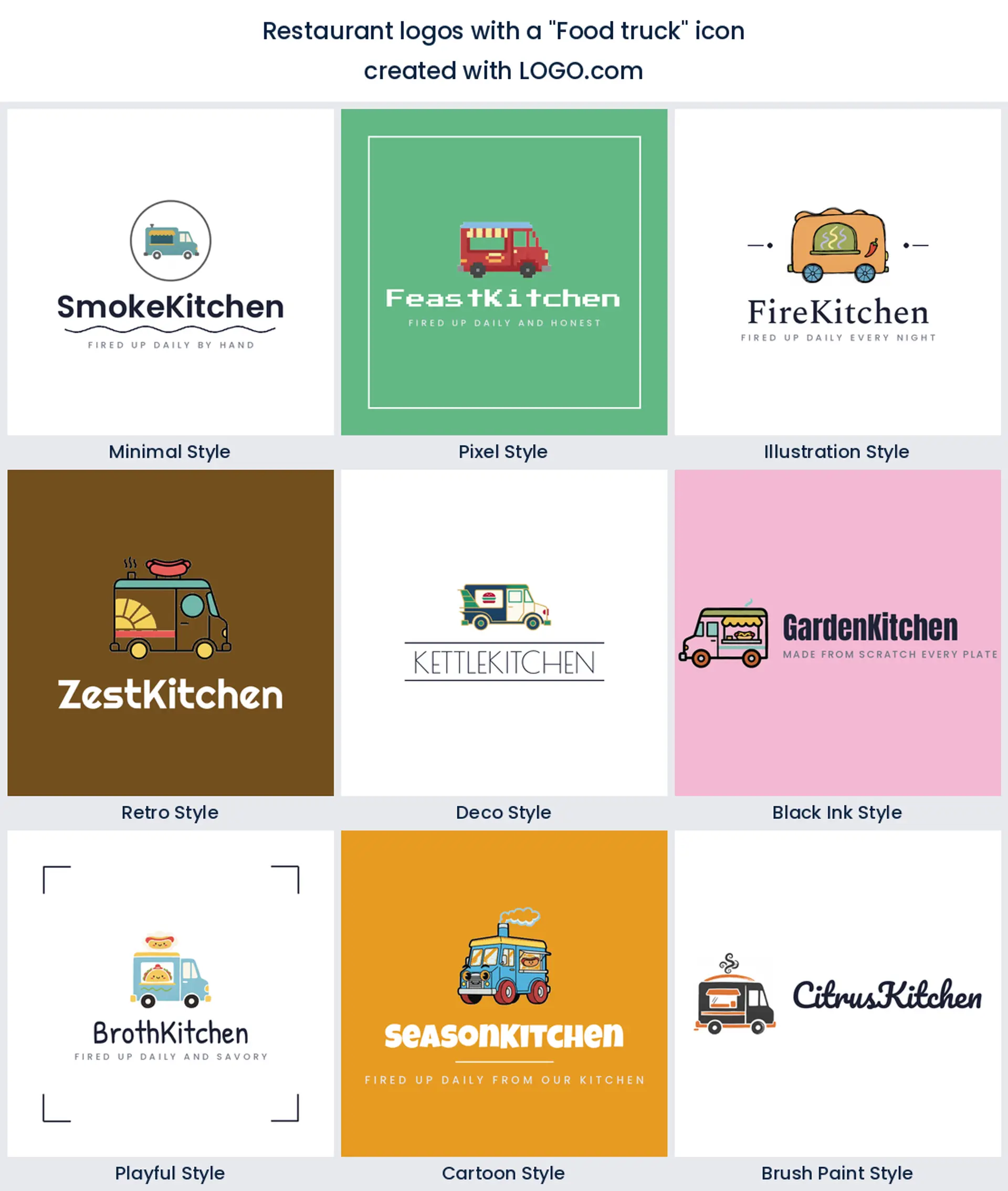
3. Food truck
Third place goes to the food truck, a sign of how many founders start on wheels before they open doors. A little trailer or a serving window instantly says street food and good value, and it doubles as a ready made food truck logo you can paint on the side of the van.
4. Burger
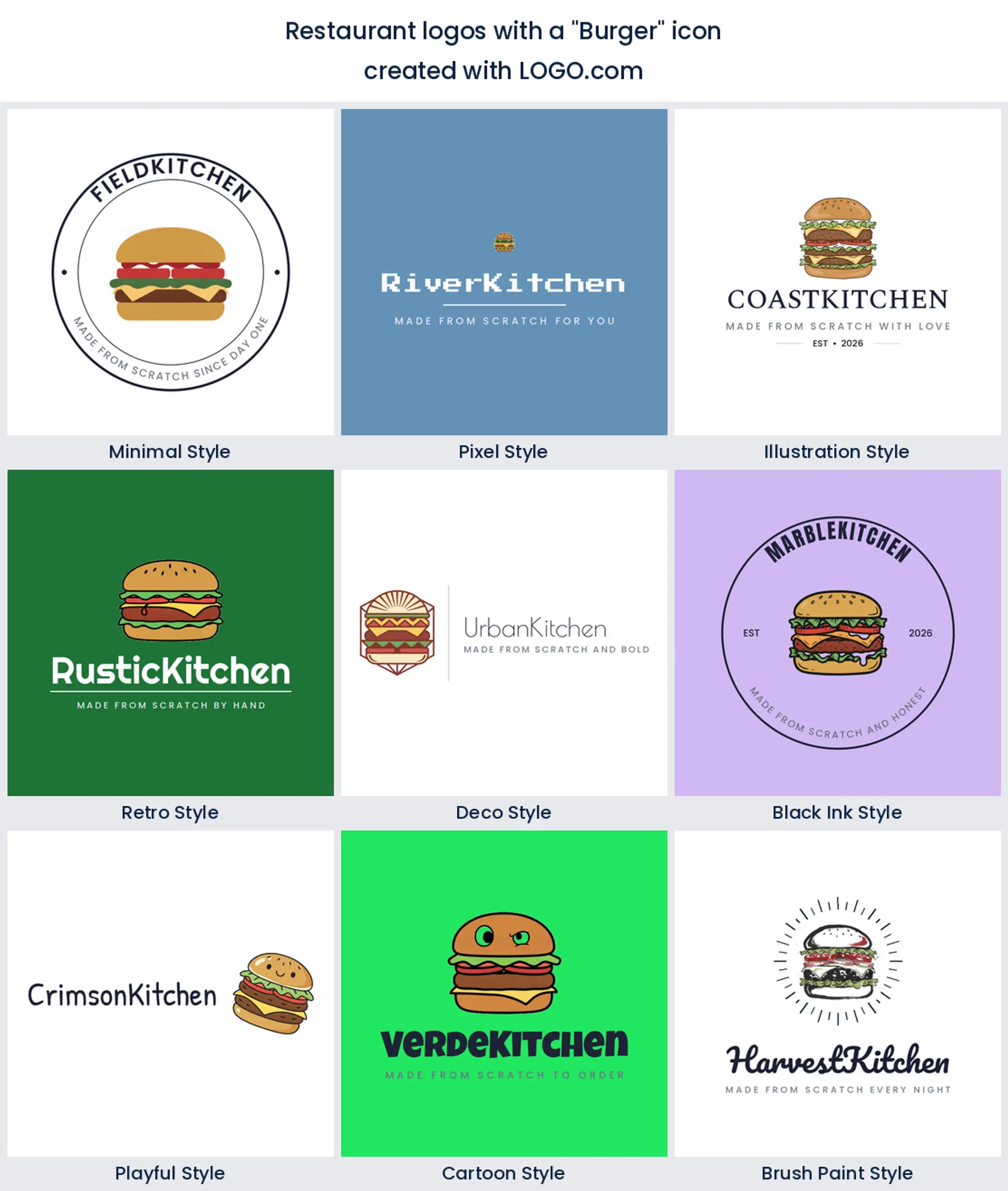
The burger is the everyman of restaurant marks. A stacked patty with a sesame bun reads casual, hungry, and fun in one glance, perfect for a burger joint, a bar and grill, or a fast food logo that wants to look appetizing at thumbnail size.
5. Grill and flame
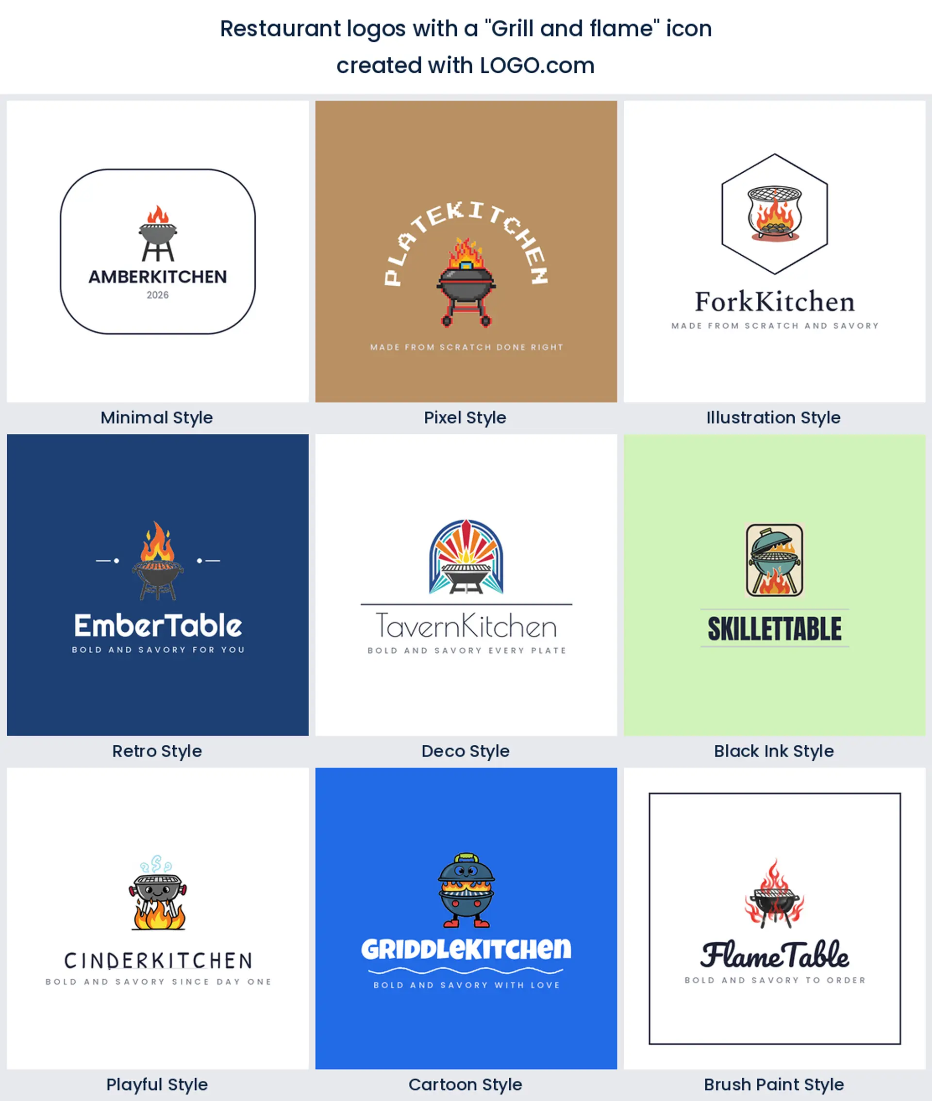
Flames, embers, and grill grates come next, the shorthand for smoke and char. Reach for a flame or a pair of tongs when you run a steakhouse, a barbecue spot, or an Argentine grill and you want the logo to promise something cooked over fire.
6. Pizza slice
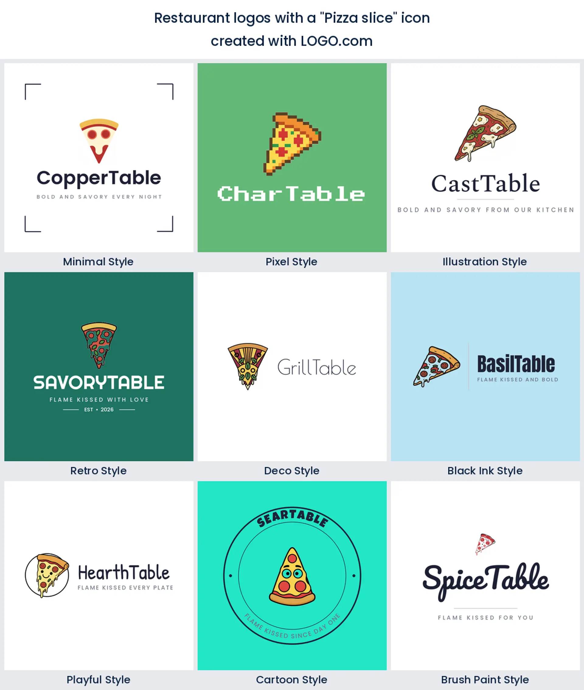
A single slice needs no translation. The triangle with a bubbling crust is one of the most recognizable food shapes there is, which is why it anchors so many pizzeria and Italian restaurant logo designs, even at the size of a delivery app tile.
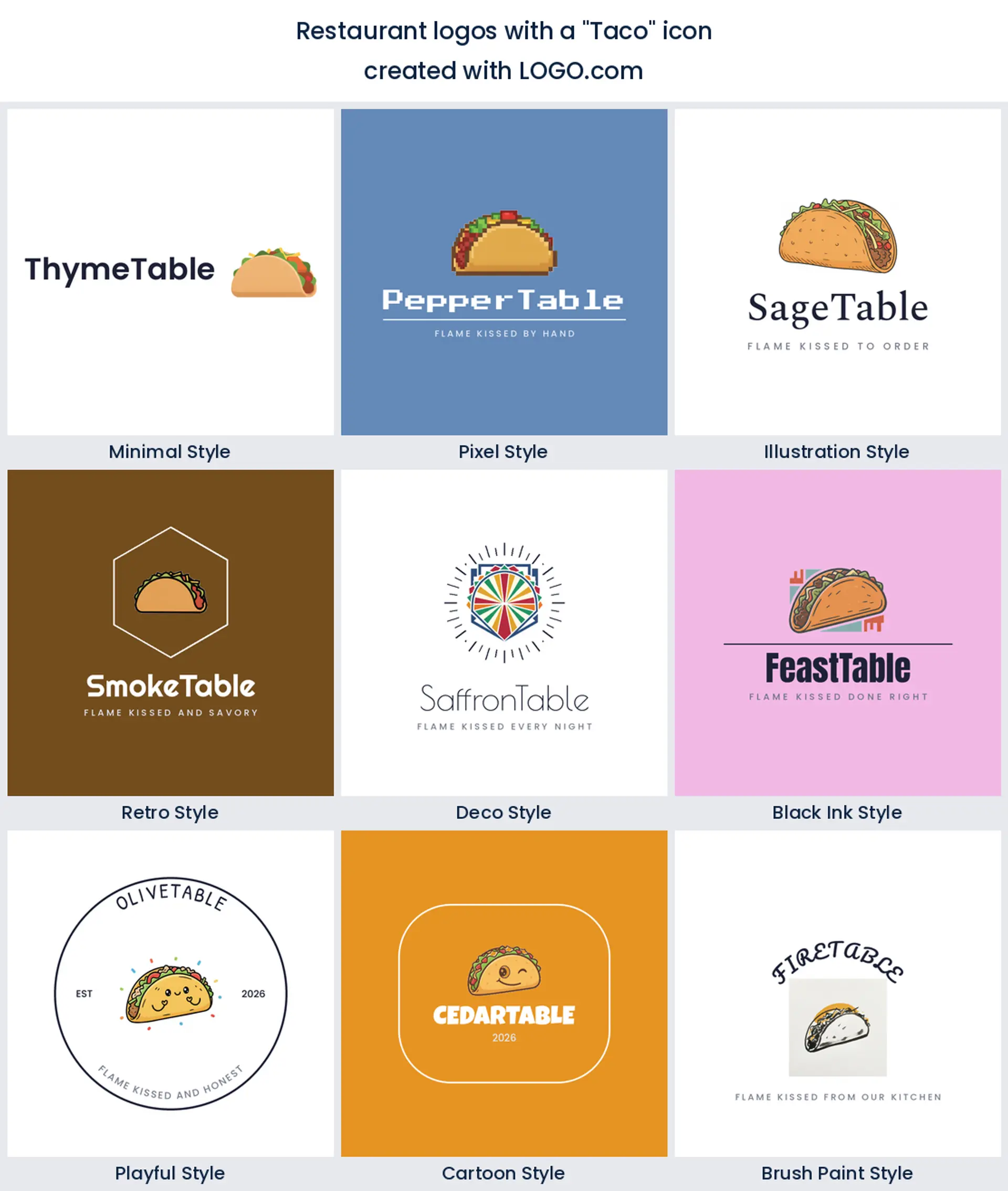
7. Taco
Tacos punch above their weight in the data. A folded shell with a few toppings is bright, playful, and unmistakably Mexican, an easy pick for a taqueria, a food stall, or a mexican restaurant logo that should look fun before you read a word.
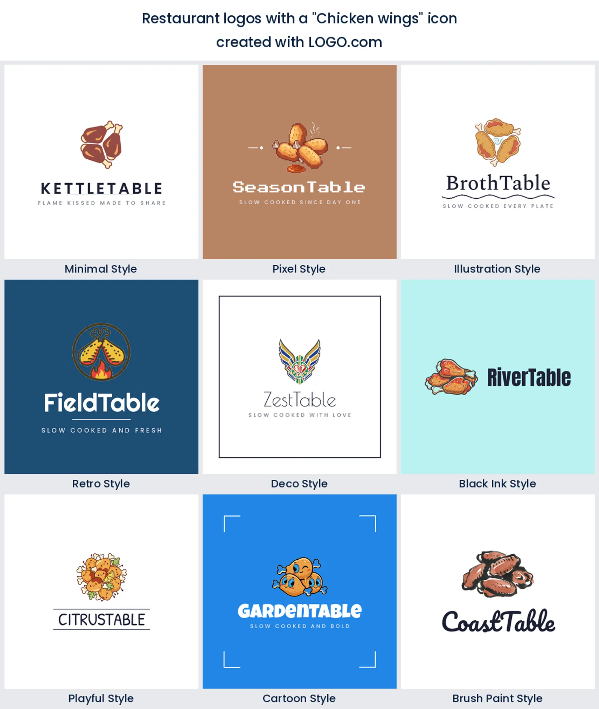
8. Chicken wings
Wings and drumsticks show up for the wing bars, fried chicken shops, and sports pub kitchens. A single drumstick or a saucy wing reads bold and casual, and it keeps its shape stamped on a takeout box or a napkin.
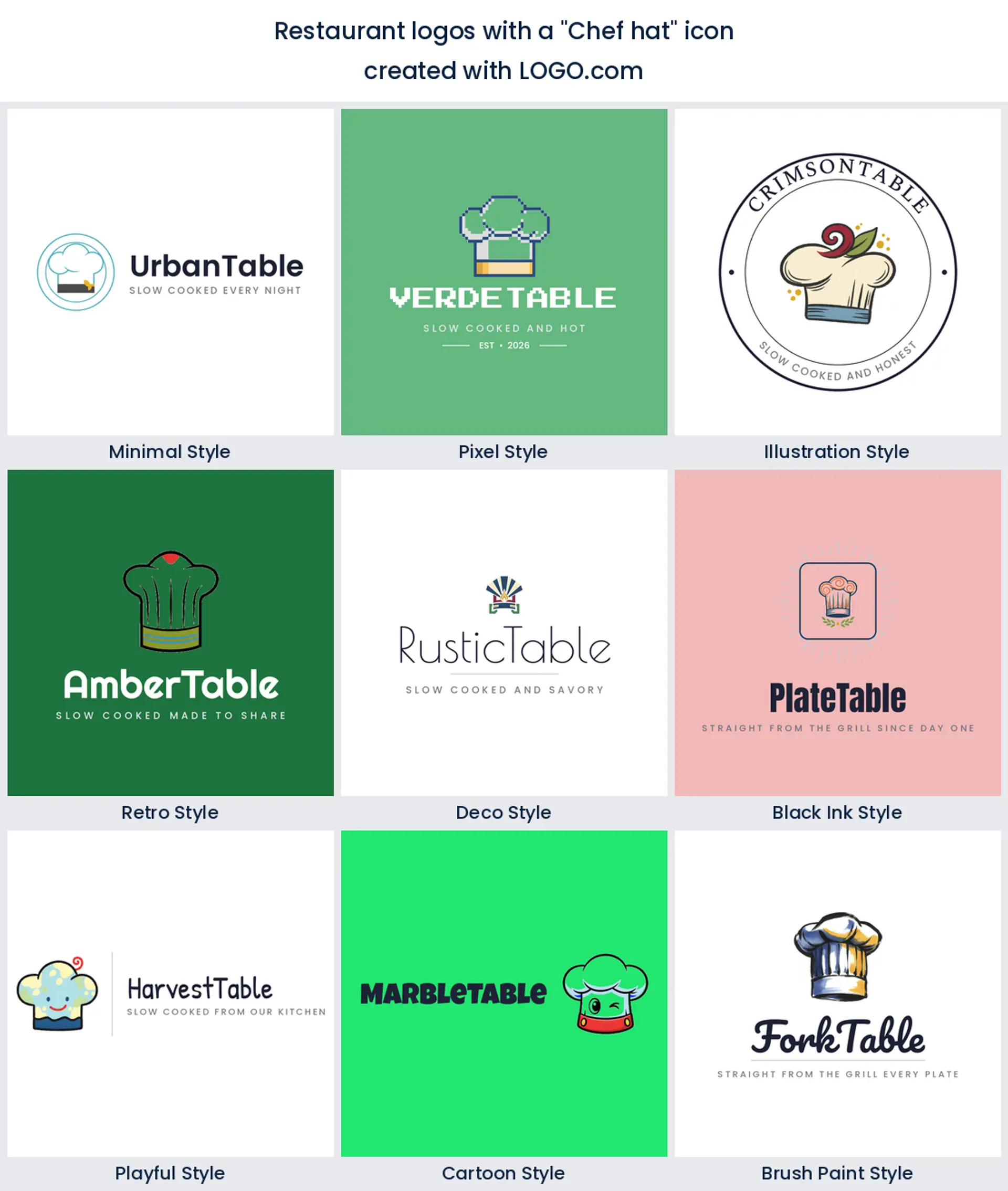
9. Chef hat
Rounding out the nine is the chef hat, the classic toque. Sit it above your name and it says a real cook is in charge with no food icon required, which makes it a flexible restaurant logo for fine dining, a catering brand, or a personal chef.
Fifteen restaurant logo ideas from real founder prompts
These are not made up. Each heading below is a real icon description a restaurant founder typed into LOGO.com, shown across the nine styles so you can watch the same idea go from a clean minimal mark to a bold retro badge. Find the one closest to your food, then change the color, font, and name until it is yours.
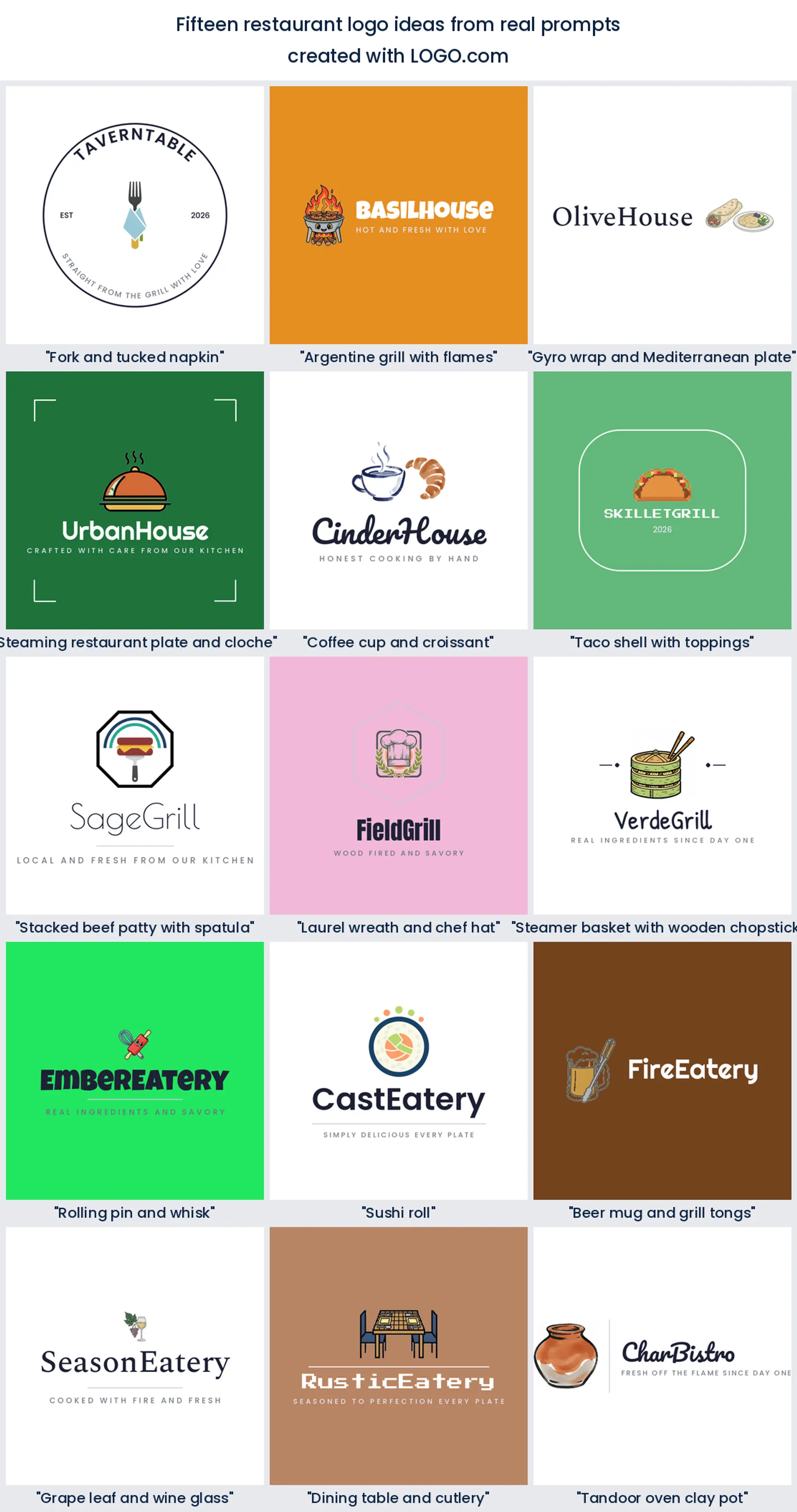
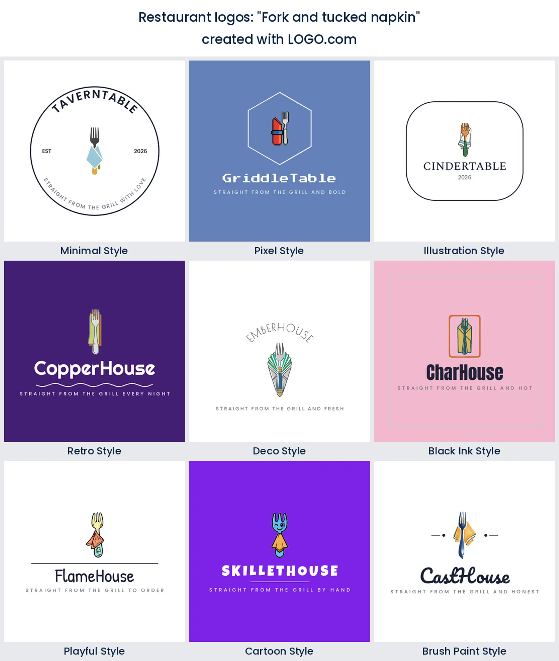
1. "Fork and tucked napkin"
A fork resting on a neatly folded napkin is quiet luxury in one mark. It suits a bistro or a fine dining room that wants its restaurant logo to feel calm and considered rather than loud.
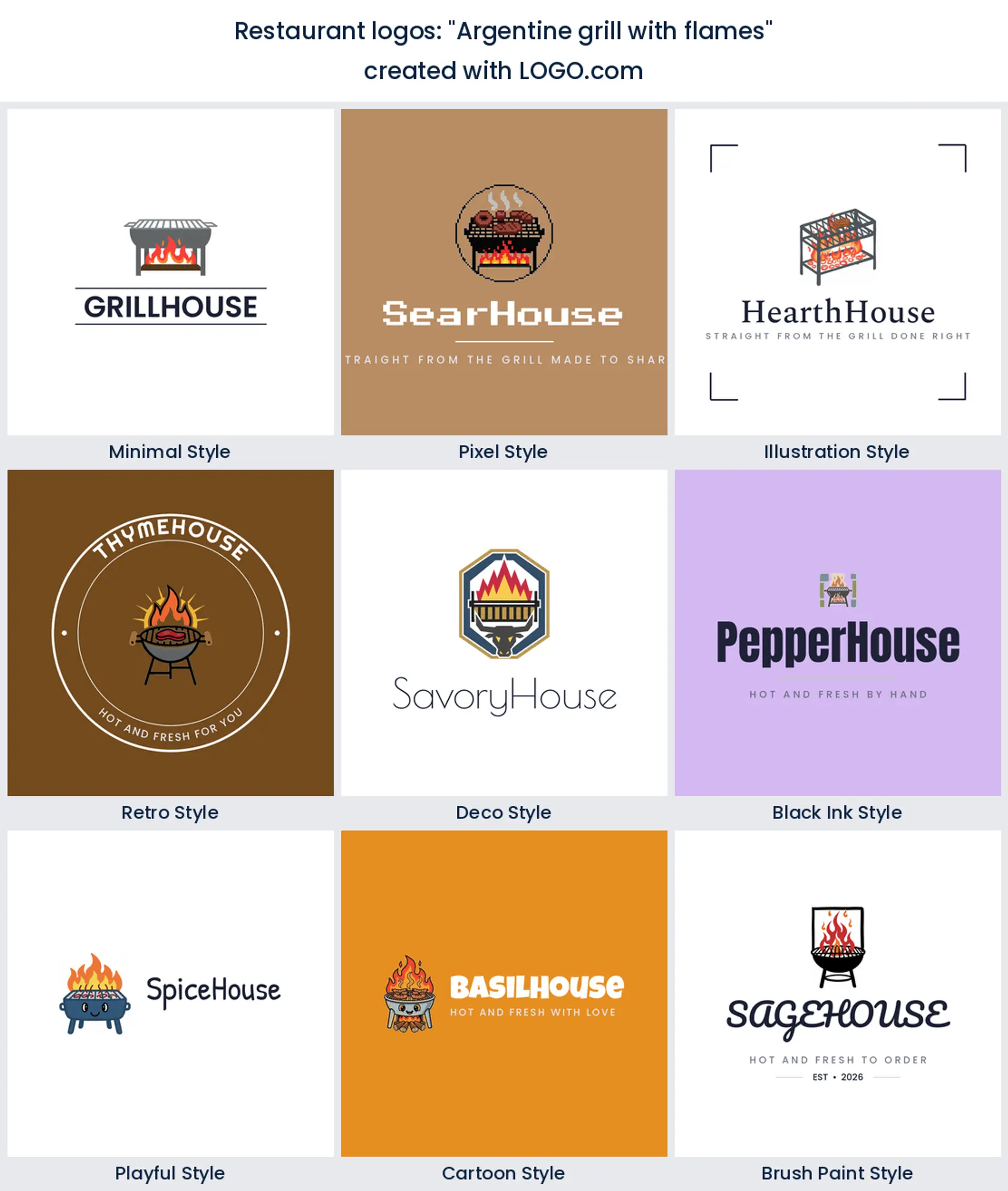
2. "Argentine grill with flames"
This one comes straight from a steakhouse founder. A grill licked by flames promises fire cooked meat, a natural fit for an asado house, a churrascaria, or any barbecue restaurant logo.
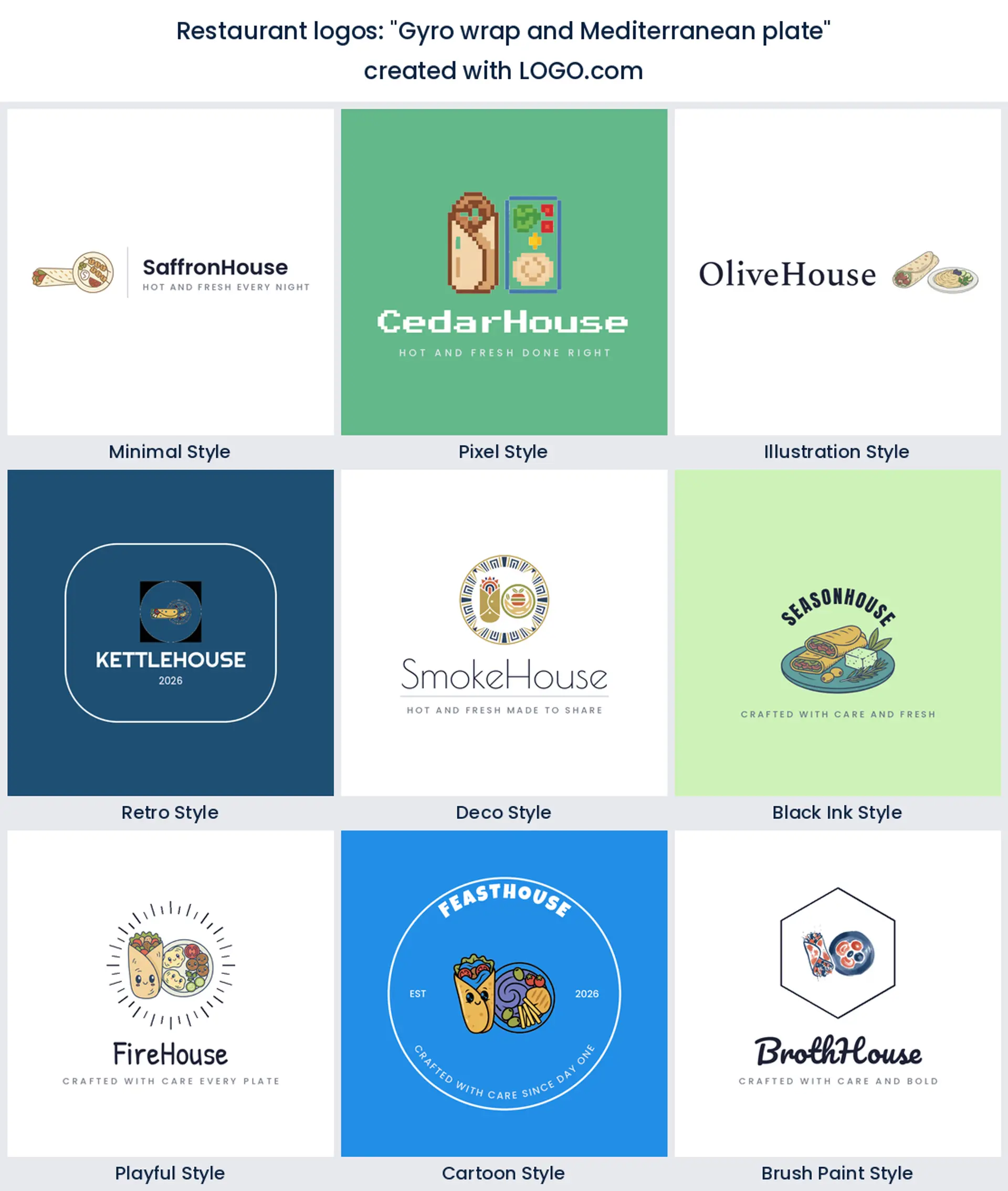
3. "Gyro wrap and Mediterranean plate"
A gyro beside a loaded plate reads fresh, herby, and Mediterranean. Use it for a Greek taverna, a shawarma counter, or a Mediterranean restaurant logo that leans on olive and lemon tones.
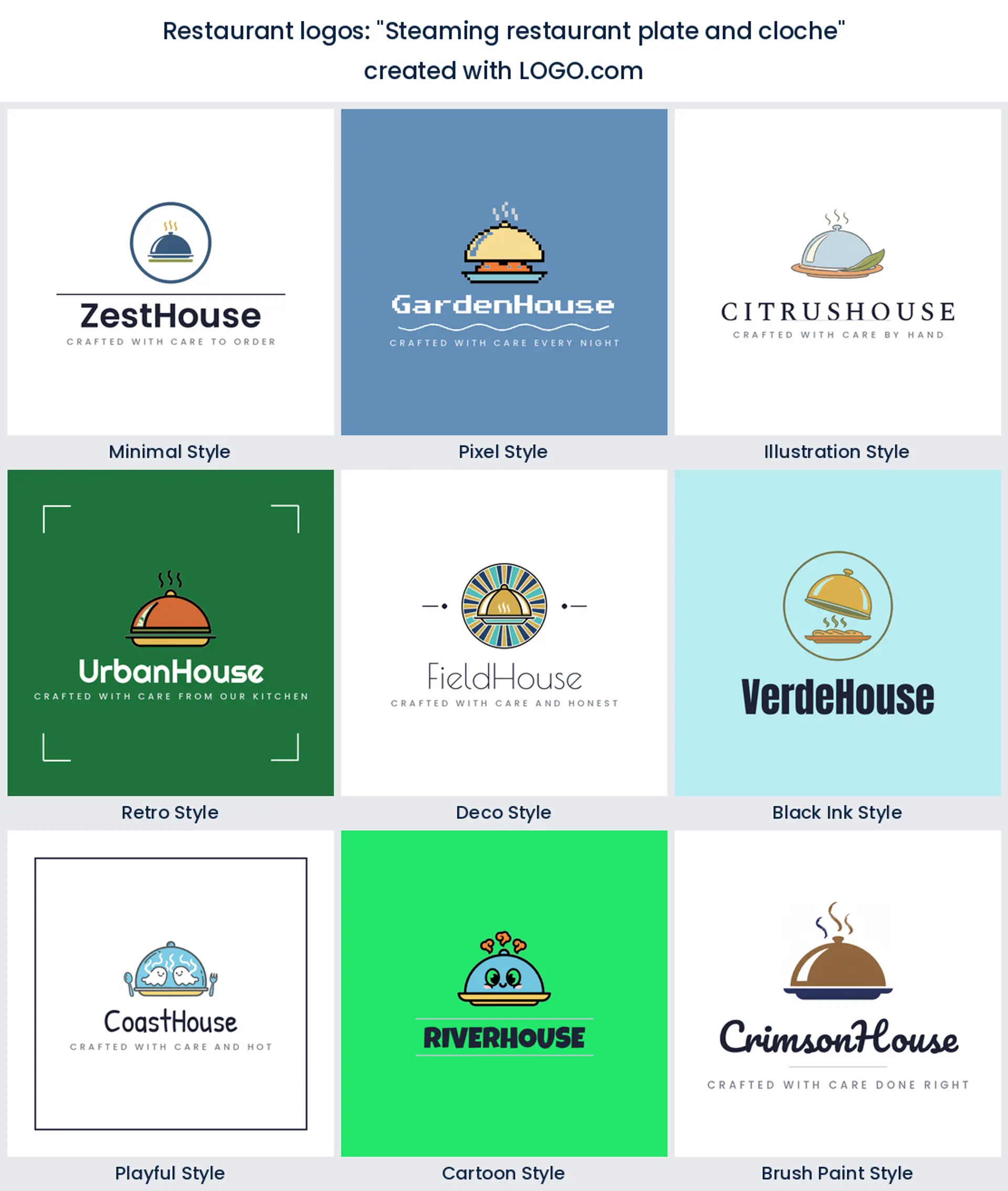
4. "Steaming restaurant plate and cloche"
Lift the cloche and steam rises off the plate. This is the mark for a place that plates with care, an upscale kitchen or a tasting menu restaurant logo where presentation is the point.
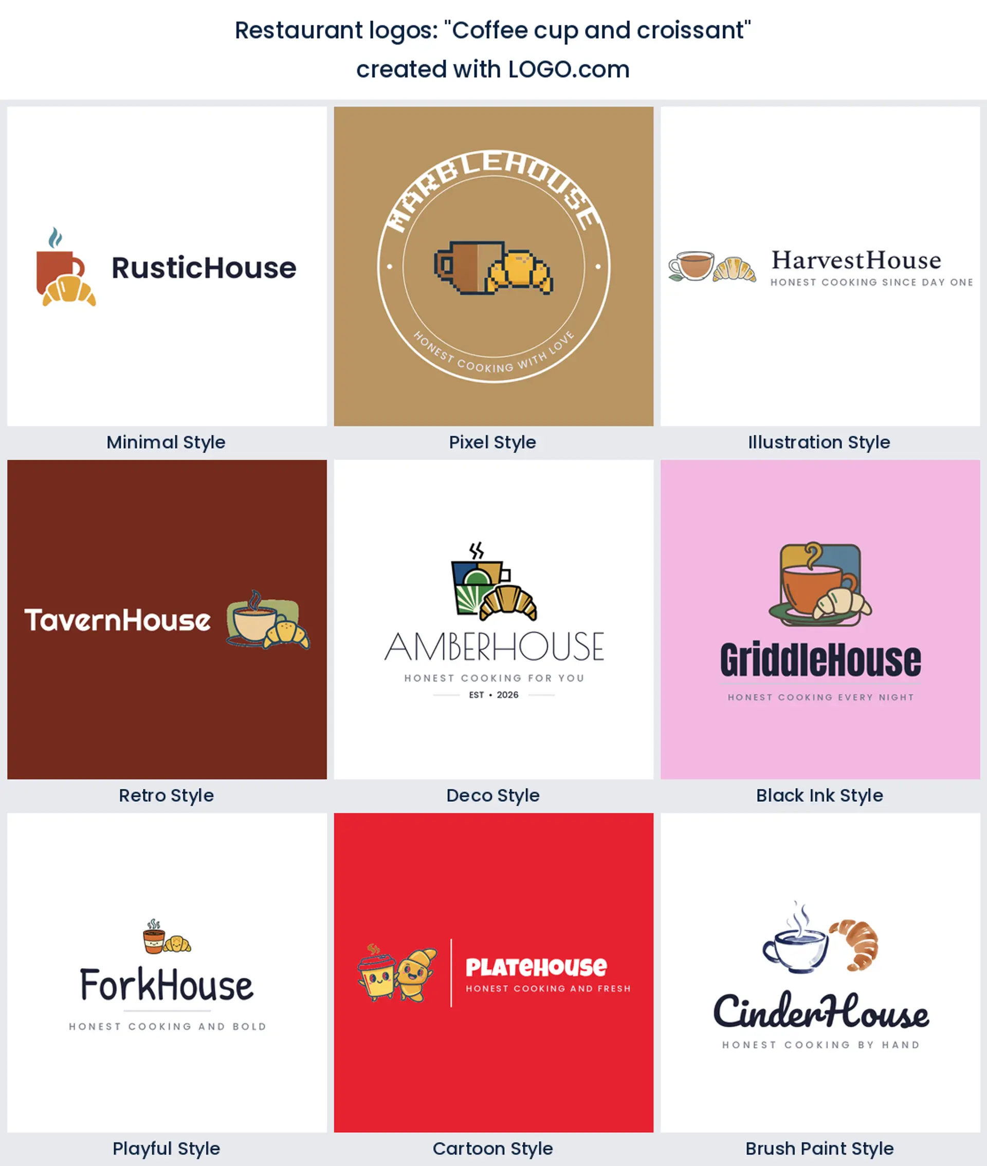
5. "Coffee cup and croissant"
A cup paired with a flaky croissant says all day brunch and good coffee. It is a lovely cafe logo for a bakery cafe, a breakfast spot, or a corner coffee bar.
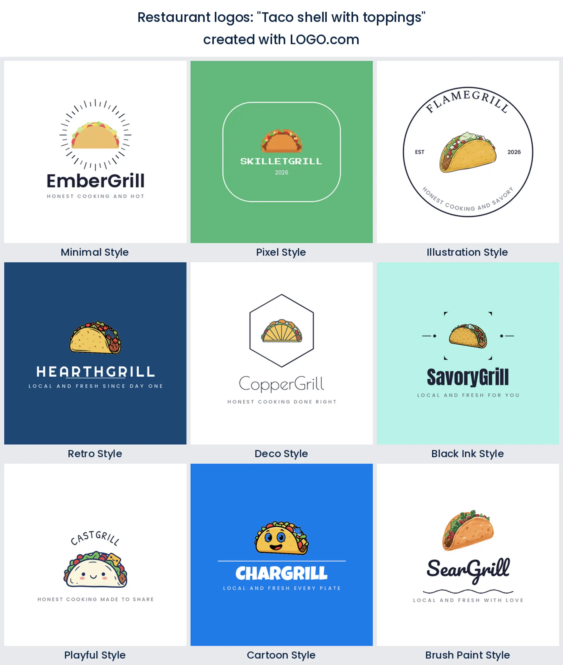
6. "Taco shell with toppings"
A single loaded taco shell is bright and appetizing on its own. Founders reach for it when they want a taqueria or a mexican restaurant logo to look fun and casual from the first glance.
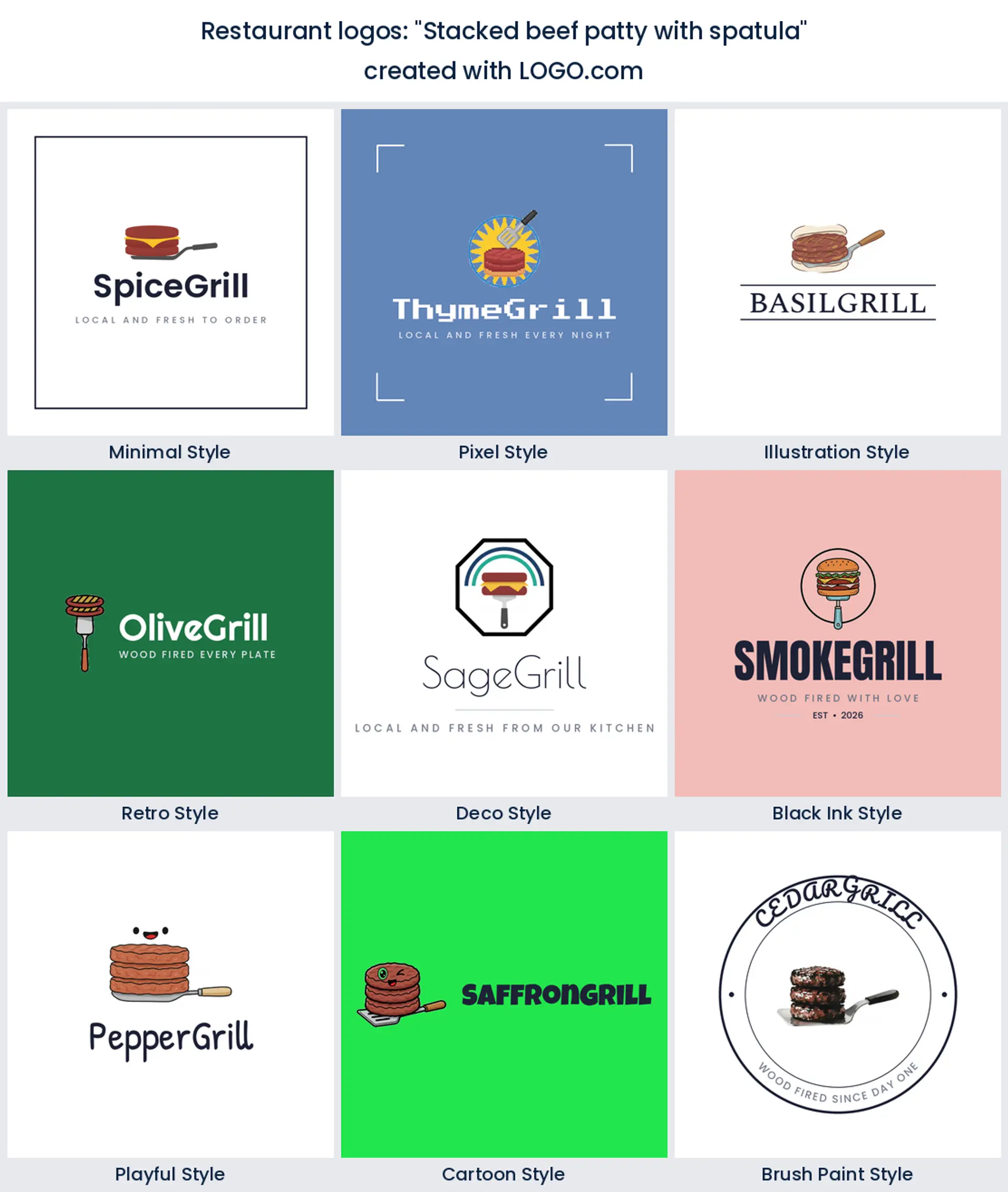
7. "Stacked beef patty with spatula"
A tall patty and a spatula put the cooking right in the logo. It is made for a smash burger stand or a bar and grill that wants its restaurant logo to look hands on and hungry.
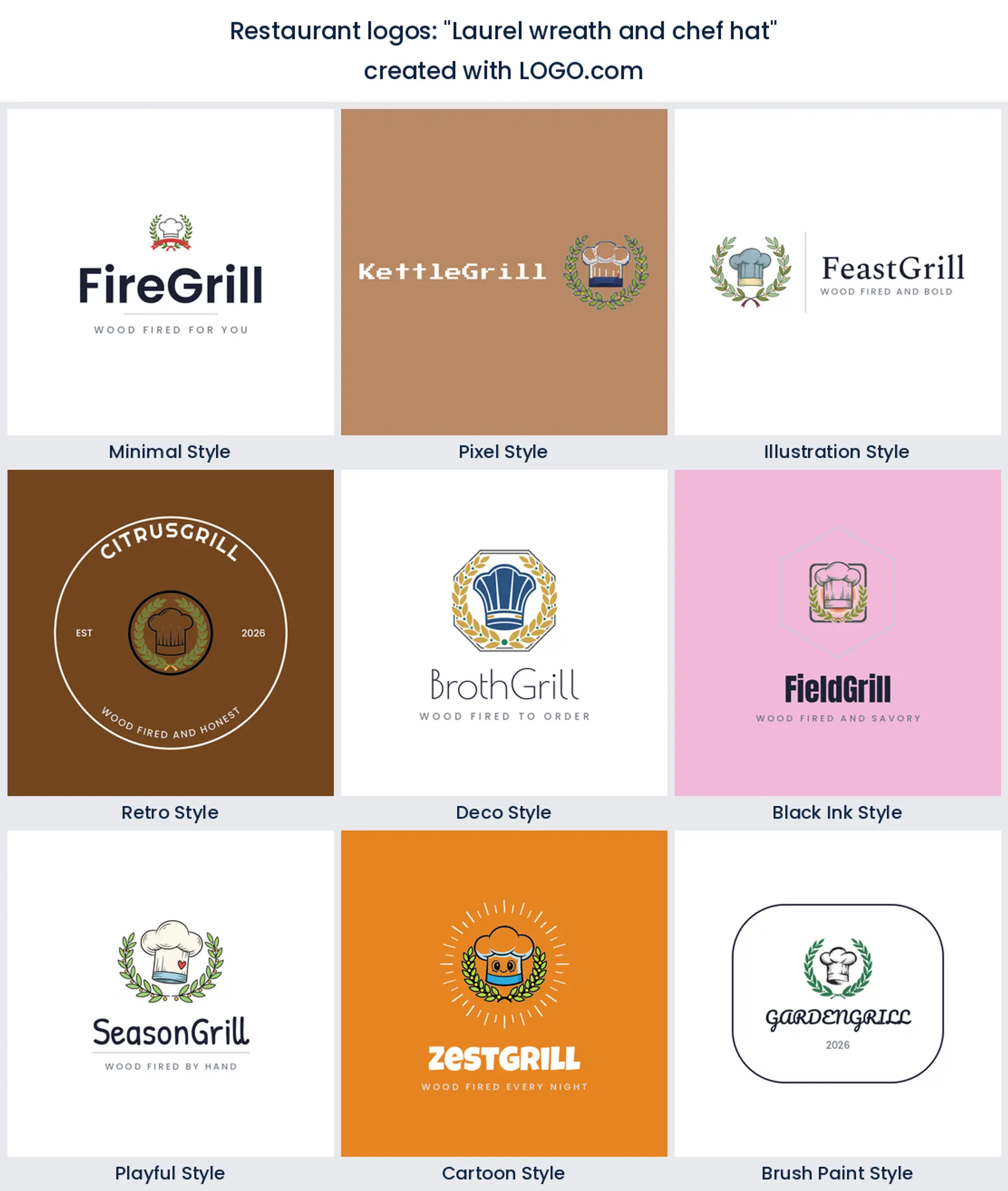
8. "Laurel wreath and chef hat"
Wrapping a chef hat in a laurel wreath borrows a little old world prestige. It works for a heritage restaurant, a catering company, or a chef led restaurant logo that wants to feel established.
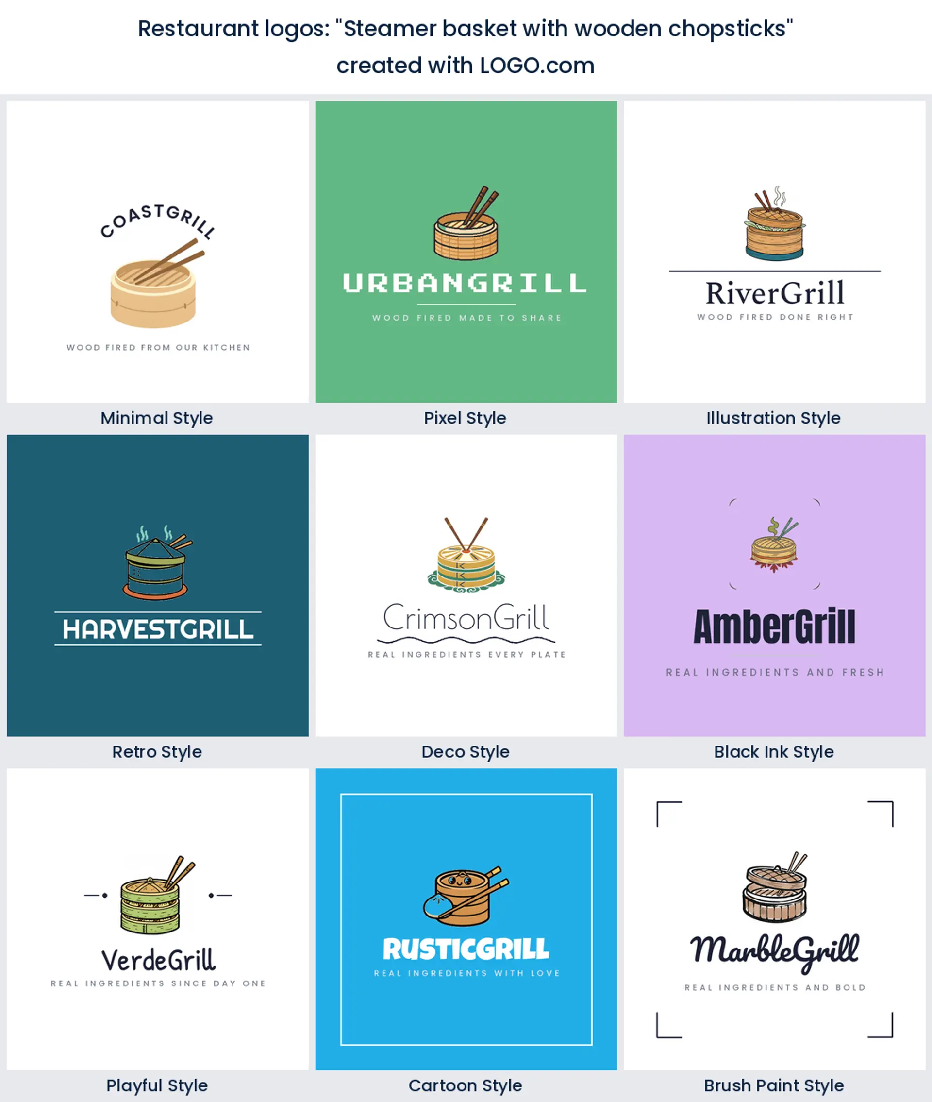
9. "Steamer basket with wooden chopsticks"
A bamboo steamer with chopsticks is unmistakably dim sum. Use it for a dumpling house, a Cantonese kitchen, or a chinese restaurant logo that should read authentic and handmade.
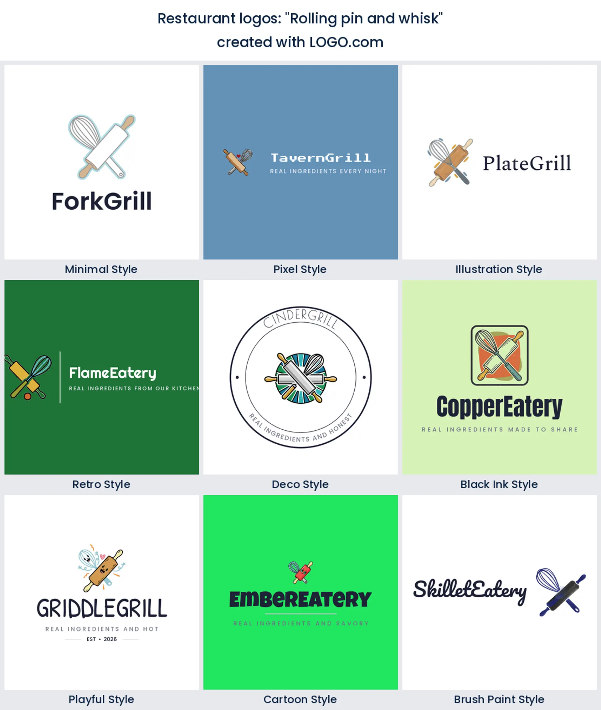
10. "Rolling pin and whisk"
Cross a rolling pin with a whisk and you get made from scratch in one emblem. It fits a pasta house, a trattoria, or an Italian restaurant logo that bakes its own bread.
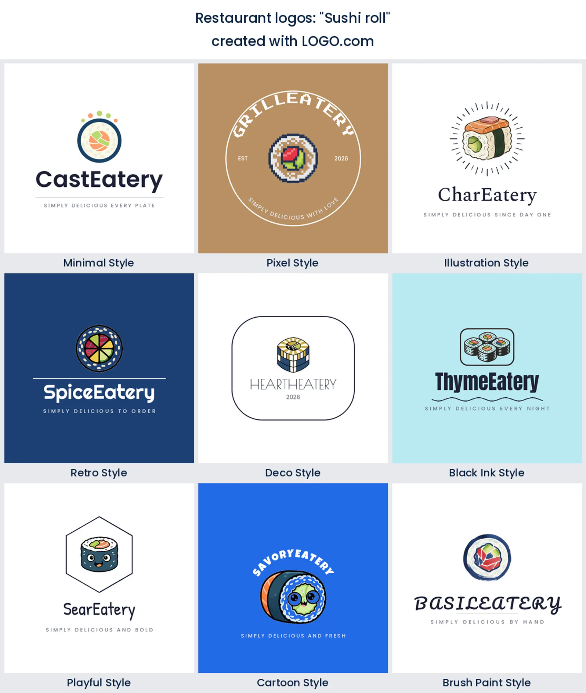
11. "Sushi roll"
A single sushi roll, viewed end on, is clean, modern, and instantly Japanese. It is the obvious centerpiece for a sushi bar or a Japanese restaurant logo that values simplicity.
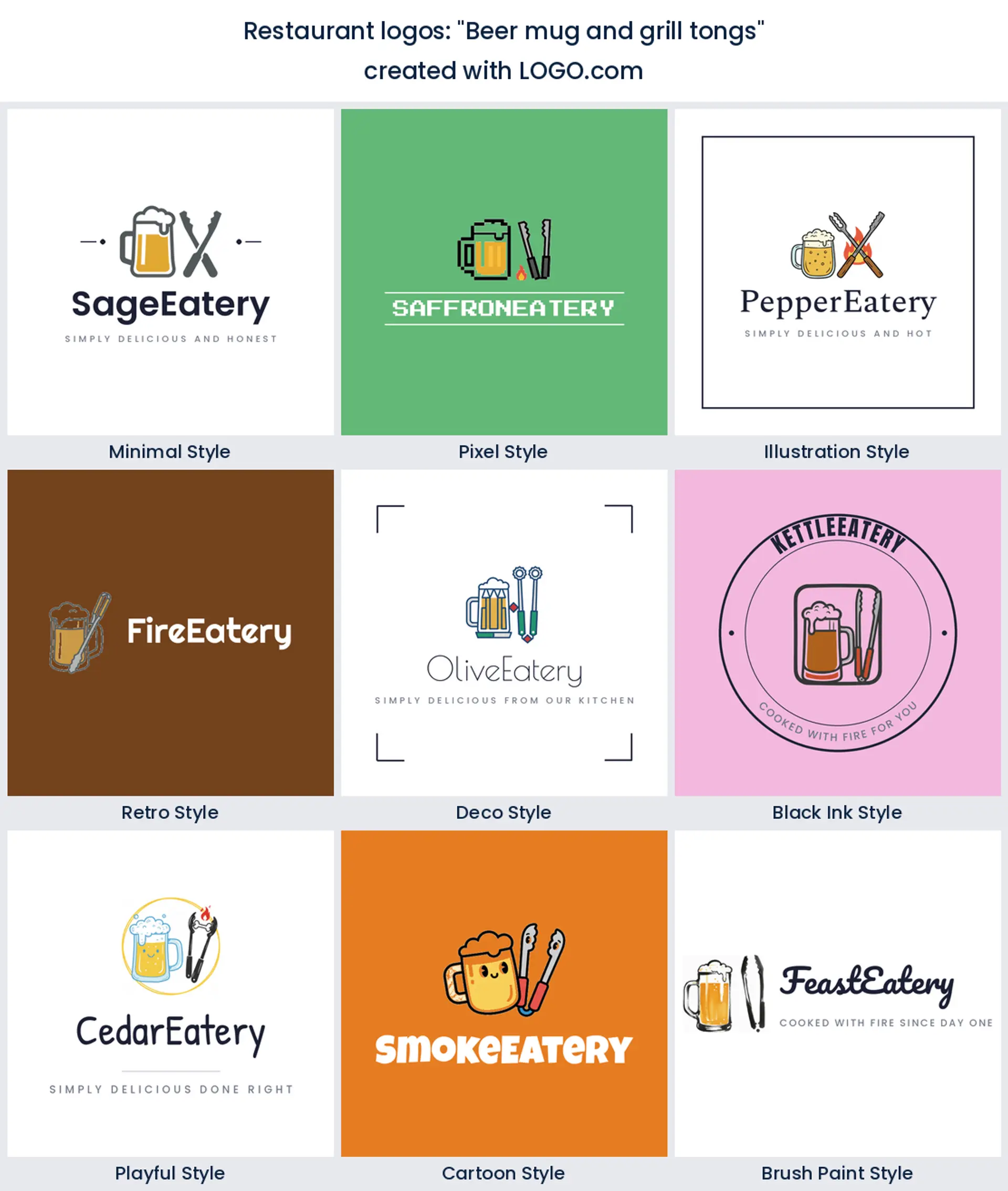
12. "Beer mug and grill tongs"
A frosty mug beside a pair of tongs says cold drinks and hot grill. This is the pub kitchen classic, a ready made bar and grill logo for a sports bar or a beer garden.
13. "Grape leaf and wine glass"
A grape leaf curling around a wine glass reads vineyard and cellar. Pour it into a wine bar, an enoteca, or an Italian restaurant logo that wants a grown up, romantic feel.
14. "Dining table and cutlery"
A laid table with cutlery is the friendliest way to say come and eat. It suits a family restaurant, a Sunday roast spot, or any restaurant logo design that wants to feel welcoming.
15. "Tandoor oven clay pot"
A tandoor with rising heat is the soul of a curry house. Choose it for an Indian restaurant, a kebab grill, or a restaurant logo that should smell of spice before you taste it.
Your cuisine should be obvious before anyone reads the name
Let the food do the talking. If you run a Mexican spot, a taco, a chili, or a bright warm palette makes a mexican restaurant logo read at a glance. Running an Italian place? A grape leaf, a tomato, or a rolling pin with a classic serif give an italian restaurant logo that old country warmth. For a Chinese or Japanese kitchen, a steamer basket, chopsticks, or a single sushi roll keep a chinese restaurant logo or a sushi bar clean and authentic. Pick the one symbol that names your cuisine fastest, and let the wordmark do the rest.
Fast food energy or fine dining calm: what your logo says about the price
Your logo sets a price expectation before anyone reads the menu. A fast food or fast casual spot wants bold, rounded, high energy shapes and bright color that promise quick and good value in the best way, which is exactly what a fast food logo is for. A fine dining room wants the opposite, thin lines, plenty of space, a restrained palette, and a quiet serif or a simple monogram that signals you are somewhere special. Decide where you sit on that scale first, because the same fork and knife can read like a busy diner or a tasting menu depending on how you draw it. Keep it to one idea either way so the restaurant logo still reads when it shrinks.
The menu, the sign, and the delivery app all need the same mark
Restaurant logos live at brutal sizes. The same mark has to look good blown up on a window or an awning and shrunk into a round avatar on a delivery app, with a printed menu and a takeout box in between. Drop hairline strokes and fussy detail that turn to mud when printed small or read from the sidewalk. One solid shape, generous spacing, and a clear name will carry you across every surface a restaurant uses.
Grab the transparent version for packaging and screens. A transparent PNG sits straight on a kraft takeout bag, a menu header, or a dark app tile with no white box around it, which matters when your logo shares space with food photography. Keep a solid background copy too for stamps and avatars that need contrast. Both come in your download from LOGO.com.
Which colors make food look good enough to eat?
When we looked at the palettes restaurant founders pick on LOGO.com, green came out on top, with blue close behind and warm oranges and browns not far off. That mix makes sense. Green reads fresh and farm to table, warm orange and brown feel cooked and comforting, and red, the classic appetite color, still shows up all over the data. Choose one main color and one accent rather than a full rainbow. For type, a clean rounded sans looks modern and fast casual, a warm serif feels sit down and established, and a bold script leans diner or bistro, so pick the one that matches how people eat with you. Lock your color and font into a brand kit so your menu, signage, and socials all match, which keeps your restaurant logo design consistent as you grow.
What a restaurant logo costs and where you can use it
Designing and previewing your restaurant logo on LOGO.com is free, and so is downloading it. The free plan gives you high resolution PNG files with full commercial use, so you can put the logo on your menu, your window, your takeout boxes, and your delivery listings and trade under it right away. A paid Brand Plan adds the vector files you need to print large and crisp on signage, awnings, and vehicle wraps, plus unlimited edits and a full brand kit for when you open a second location. Either way the logo is yours to use commercially.
Make your restaurant logo with LOGO.com
Pick the symbol that fits your food, choose one of nine styles, and our restaurant logo maker builds the rest around your name. Preview it free, then download a finished logo ready for your menu, your sign, and your delivery apps in minutes.
Methodology. These figures come from logos created on LOGO.com during the 12 months ending July 2026. We looked at roughly 2264 brands whose founders selected a restaurant industry, such as Restaurant, Fast Food, Pizza Restaurant, and Mexican Restaurant, and the 246 custom icon descriptions those founders wrote. We grouped the descriptions by concept, for example fork and knife, coffee cup, or food truck, and ranked each by how often it appeared. The fork and knife led at about 19%, the coffee cup followed at about 7%, and the food truck came third at about 5%. Figures are a share of restaurant logo descriptions, rounded to the nearest percentage point. Source: LOGO.com first party product data, July 2026.
THE #1 LOGO GENERATOR
Why LOGO.com is the best restaurant logo maker
1.Built from real restaurant brand data
Icons, colors, and layouts pulled from restaurant logos founders actually made on LOGO.com, not generic clip art.
2.Sharp on a delivery app tile
Your mark stays clear shrunk to a round avatar on a delivery app or Instagram, where most new diners first find you.
3.Transparent files for menus and boxes
Download a transparent PNG that sits cleanly on a kraft takeout bag, a menu header, or a dark app tile with no white box.
4.One logo for sign, menu, and app
Start square so the same restaurant logo works on a window decal, a printed menu, and a social profile.
5.Nine styles, diner to fine dining
Match your restaurant, from a bold retro diner badge to a refined fork and knife monogram.
6.Works in one color too
A single color version stamps onto napkins and paper bags and engraves onto a wooden sign.
7.One brand kit for the whole restaurant
Keep a single logo, palette, and font across your menu, signage, and takeout packaging.
8.Edit it as your menu changes
Swap the icon, color, or name whenever you add a location or refresh the concept.
9.Free to design, yours to sell under
Preview free and download high resolution PNGs with full commercial use, then upgrade to the Brand Plan for vector files.
Restaurant Logo Maker FAQs
Need Inspiration? See example brands in your industry...
3D DesignAcademic WritingAccountantAerospace EngineeringAgricultural ConsultingAgriculture CompanyAmazonAnimal ProtectionAnimationApp DevelopmentAquacultureAromatherapyArt and DesignArtsAsian RestaurantAthleticsAudio TechnicianAuto ManufacturingAuto Repair ServicesBadgeBandBarber ShopBearBeauty and CosmeticsBeeBibleBiotechBitcoinBlogBoatBook PublisherBooks and Literature BlogBrainBuildingBusiness Consulting Logo MakerBusiness StorageCakesCampaignCandlesCarCarpentryCateringCelebrationsChemicalChildrenChoirCircleCivil EngineeringClothingCoffee Shop