Barber Shop Logo Maker
Design a barber shop logo that works on your shop window and business cards.
Need a different logo maker? Try our AI logo generator.
Logos created using LOGO.com
670,000,000
Classic barber pole and razor logos
Scissors, comb, and fade barber logos
Crown, chair, and emblem barber logos
Barber Shop Logos, Ranked From Real Founder Prompts
According to LOGO.com data, scissors, the barber pole, and the comb are the three symbols that show up most in barber logo icon descriptions, appearing in about 49%, 31%, and 25% of them. Those three carry most barber shop logos.
The nine styles below start from those real descriptions, so you begin with marks barber customers already read as sharp and professional instead of a blank page. Pick a symbol, then make the color, font, and name your own.
On this page
- What barbers actually put on their logos, by the numbers
- Fifteen barber logo ideas from real founder prompts
- Does the barber pole belong in your logo?
- Vintage or urban, which barber logo design fits you?
- Should your logo carry your name or your shop’s?
- What makes a barber logo look sharp instead of generic?
- Colors and fonts that read barbershop, not salon
- Make your barber shop logo with LOGO.com
Nearly half of the barber logos founders describe on LOGO.com feature the same tool, a pair of scissors, with poles, combs, and straight razors close behind. That is useful to know before you design a thing, because a barber logo has to say haircut fast and stay sharp shrunk to an app icon. We read 148 real barber icon descriptions to find what actually works, then turned the most popular into fifteen barber shop logo ideas you can recolor and make your own.
What barbers actually put on their logos, by the numbers
The barber logos founders build on LOGO.com cluster around nine symbols. Scissors lead by a wide margin, showing up in nearly half of the icon descriptions we read, the barber pole is close behind at about 31%, and the comb sits third at about 25%. After those come a lock of hair, the straight razor, clippers, the fade, the barber chair, and a crown. Most barber shop logos need just one or two of these plus a strong, readable name.
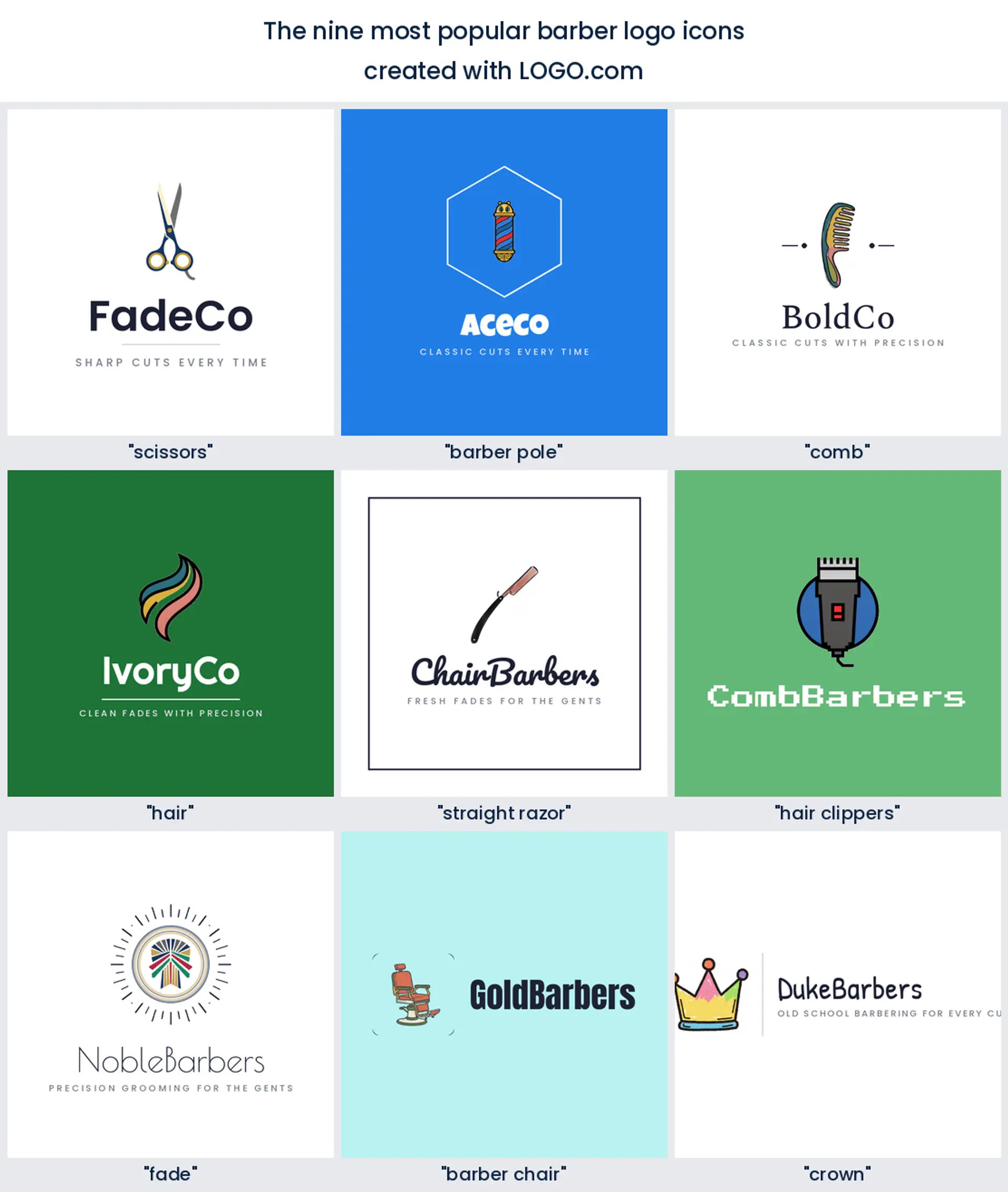
Scissors and shears
Scissors turn up in nearly half the barber descriptions founders wrote, more than any other symbol. A crossed pair of shears is the fastest way to say haircut, which makes it the safe, classic centre of almost any barber shop logo.
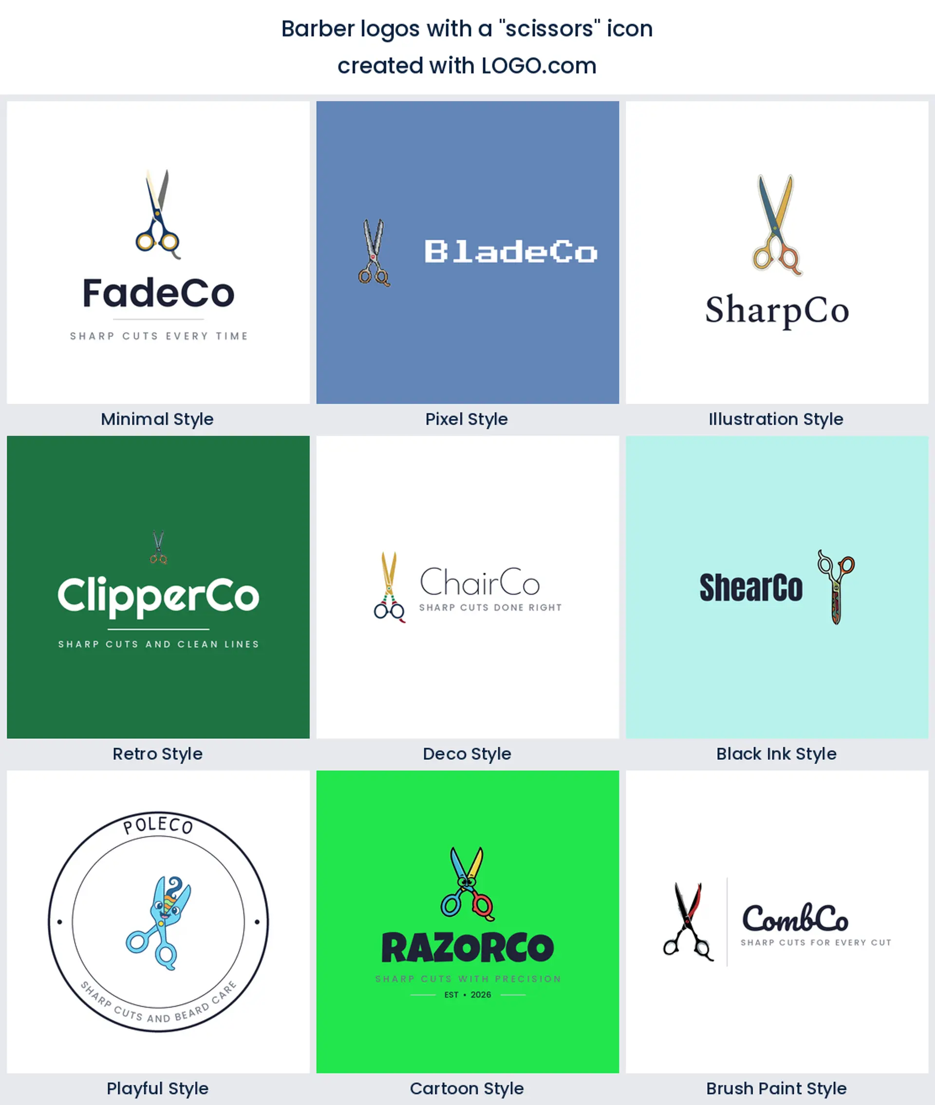
The barber pole
The barber pole is not far behind, in about 31% of the descriptions. Nothing else reads barber from across the street the way those spinning stripes do, so a pole makes a bold and instantly recognizable barber pole logo.
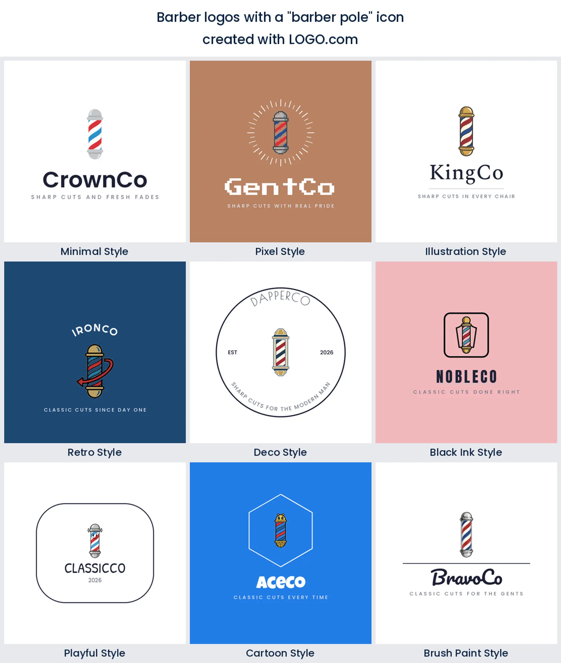
The comb
Combs appear in roughly a quarter of them, usually crossed with a pair of scissors. On its own a comb is clean and understated, a tidy choice for a modern barber logo that wants the tools without the clutter.
A lock of hair
A lock of flowing hair shows up often too. It puts the actual craft, the cut, front and centre, and works nicely as a stylish barber logo for a shop that leans fashion forward.
The straight razor
The straight razor is a barber favourite. That single open blade feels traditional and a little sharp edged, a perfect pick for a classic barber logo or a hot towel shave bar.
Hair clippers
Clippers earn their spot next. They are the tool every barber actually reaches for, so a clipper mark reads authentic and current, a natural fit for a fade focused barber shop logo.
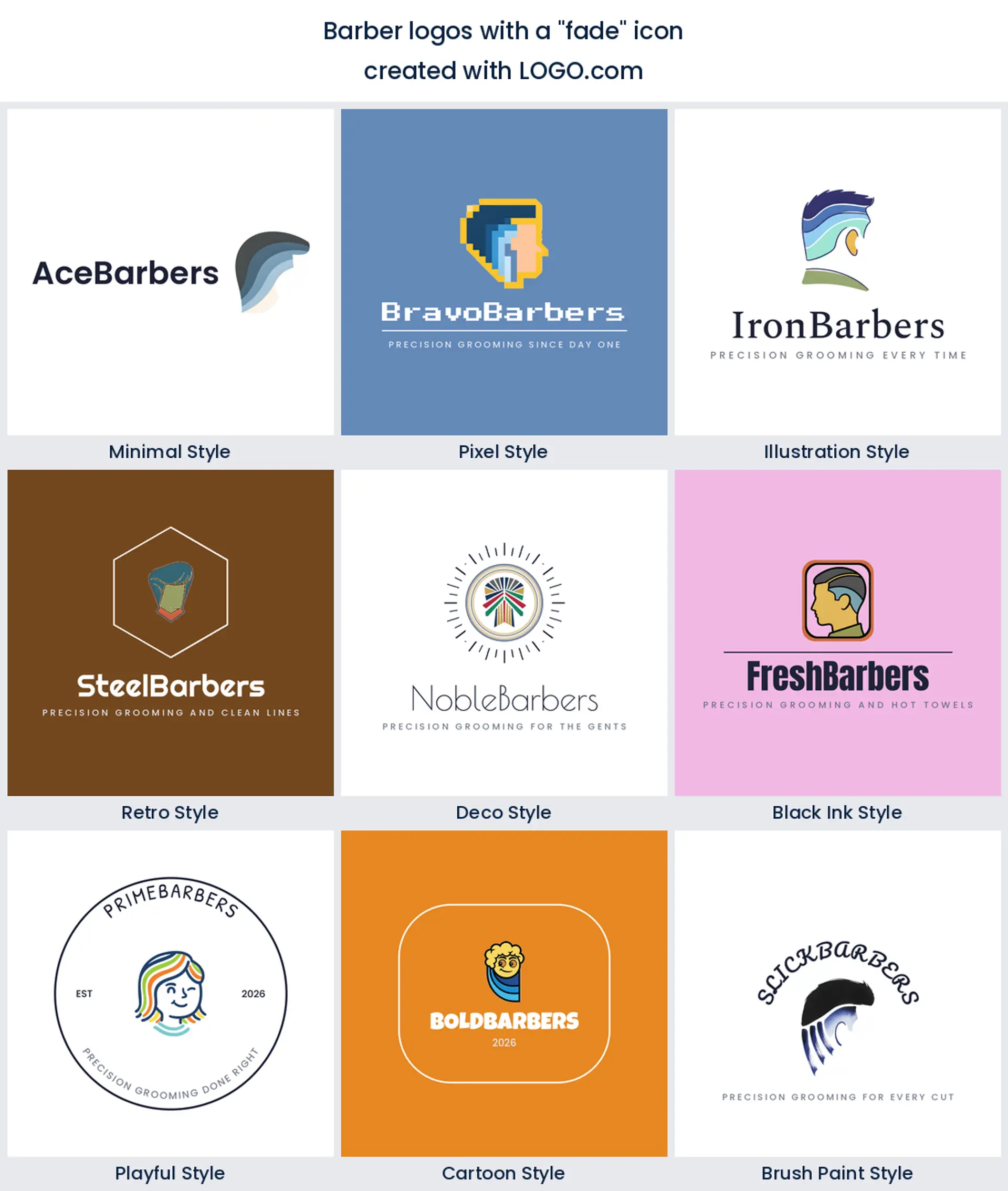
The fade
The fade itself comes up as a symbol, drawn as tapered lines. It is a clever way to signal the skill you are known for, and it makes a distinctive barber logo design for a shop built on clean fades.
The barber chair
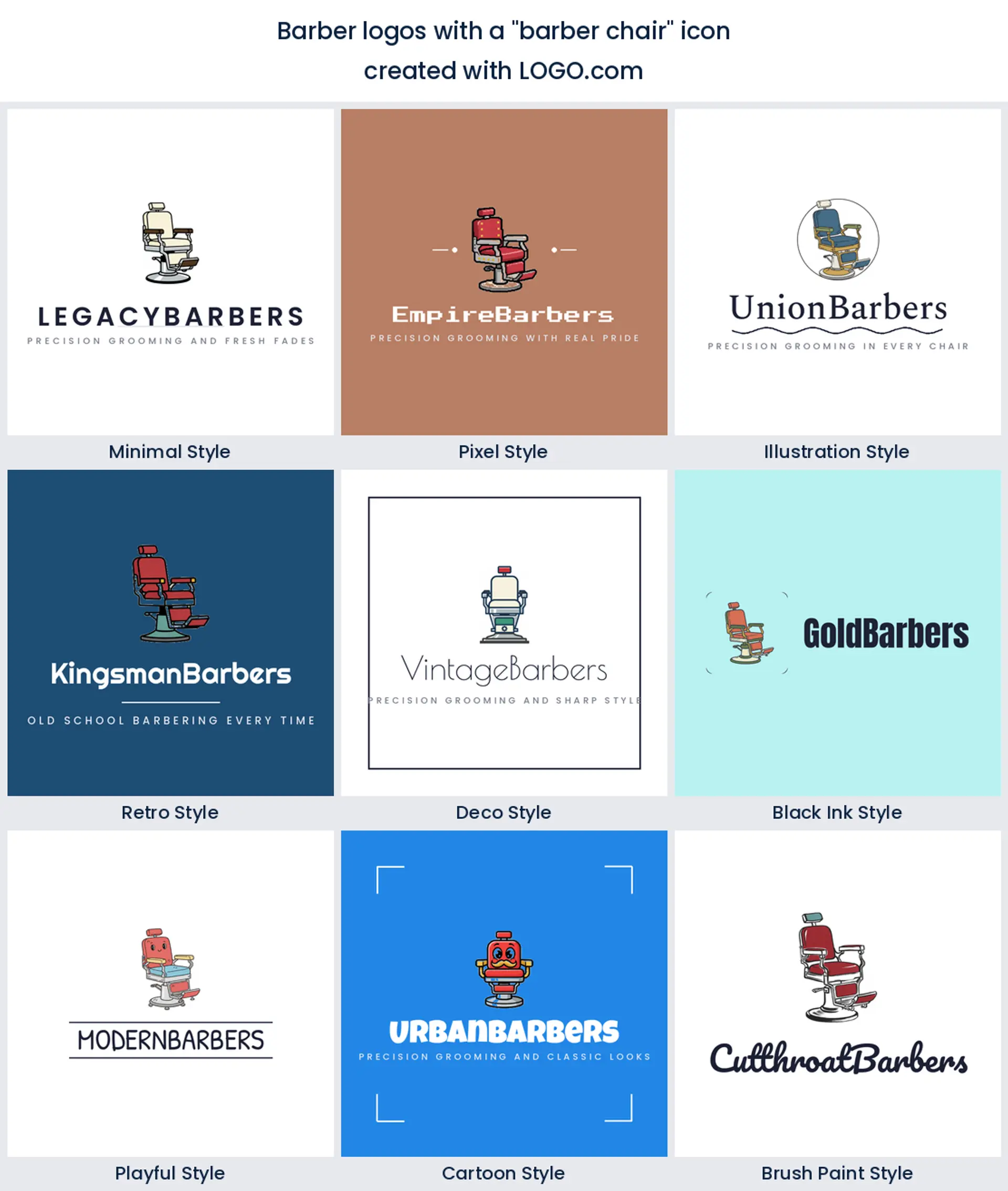
The barber chair appears less often but lands with real character. That vintage hydraulic chair says sit down and relax, a warm choice for a traditional barber shop logo.
The crown
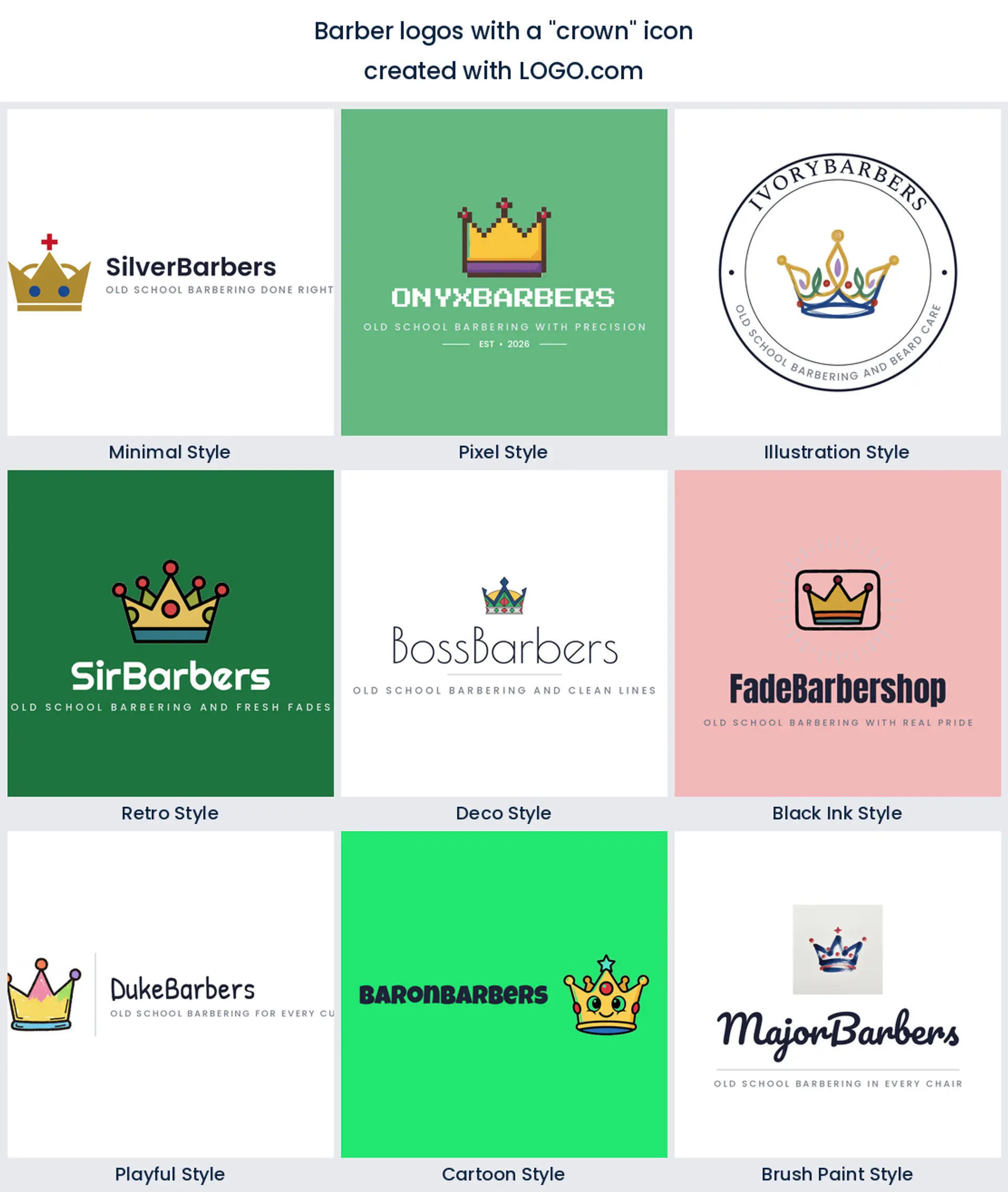
Last on the list is the crown. Barbers pair it with a pole or a pair of shears to say king of the cut, an easy way to give a barber logo a confident, premium feel.
Fifteen barber logo ideas from real founder prompts
These are not made up. Each heading below is a real icon description a barber founder typed into LOGO.com, shown across the nine styles so you can watch the same idea go from a clean minimal mark to a bold retro badge. Find the one closest to your shop, then change the color, font, and name until it is yours. It is the quickest way to turn barber logo ideas into a finished mark.
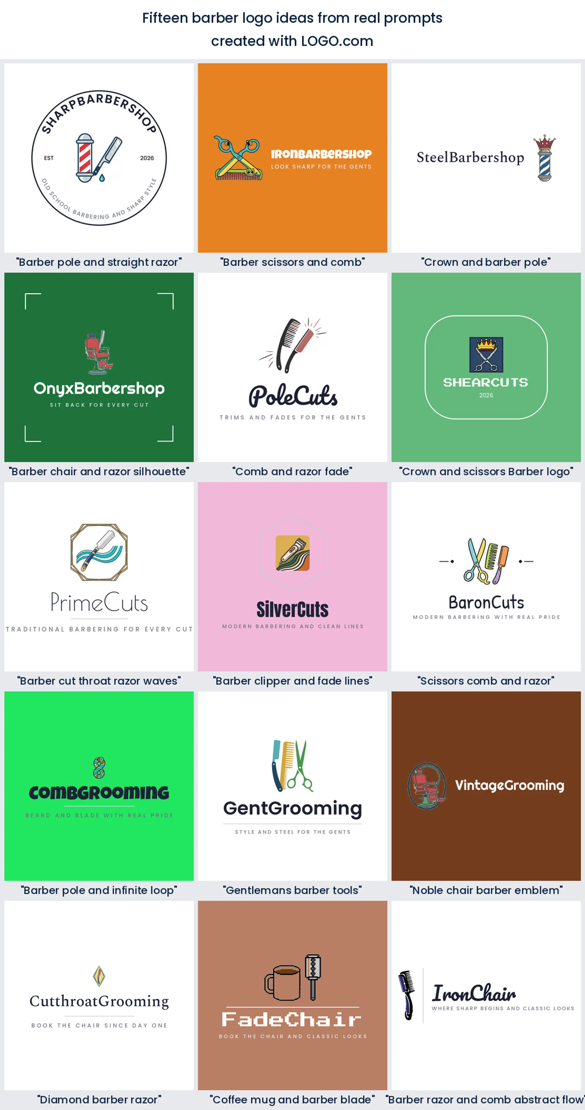
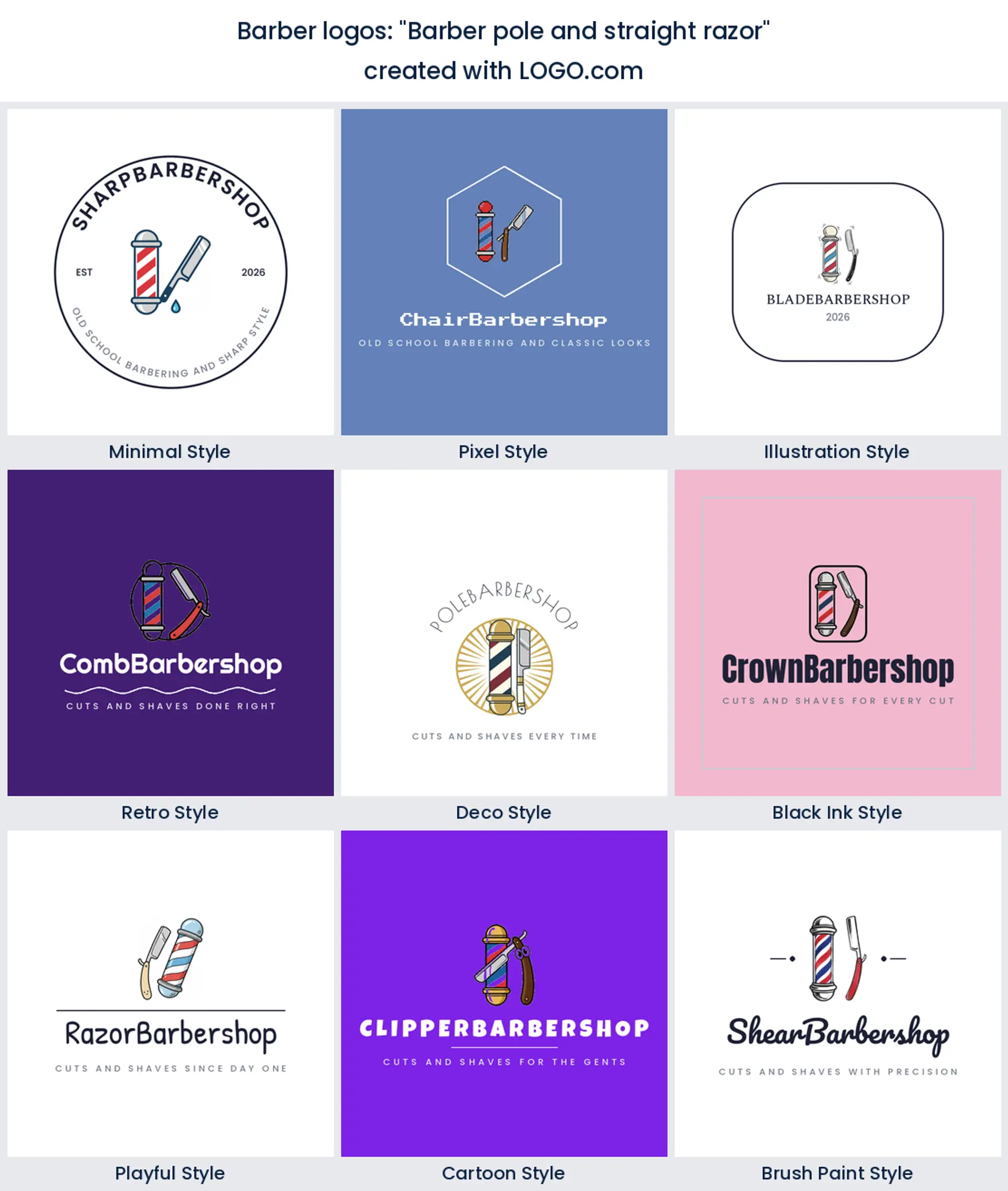
1. "Barber pole and straight razor"
The two most traditional barber tools in one emblem. A striped pole beside an open razor is heritage barber through and through, a strong barber shop logo for a shop that leans classic.
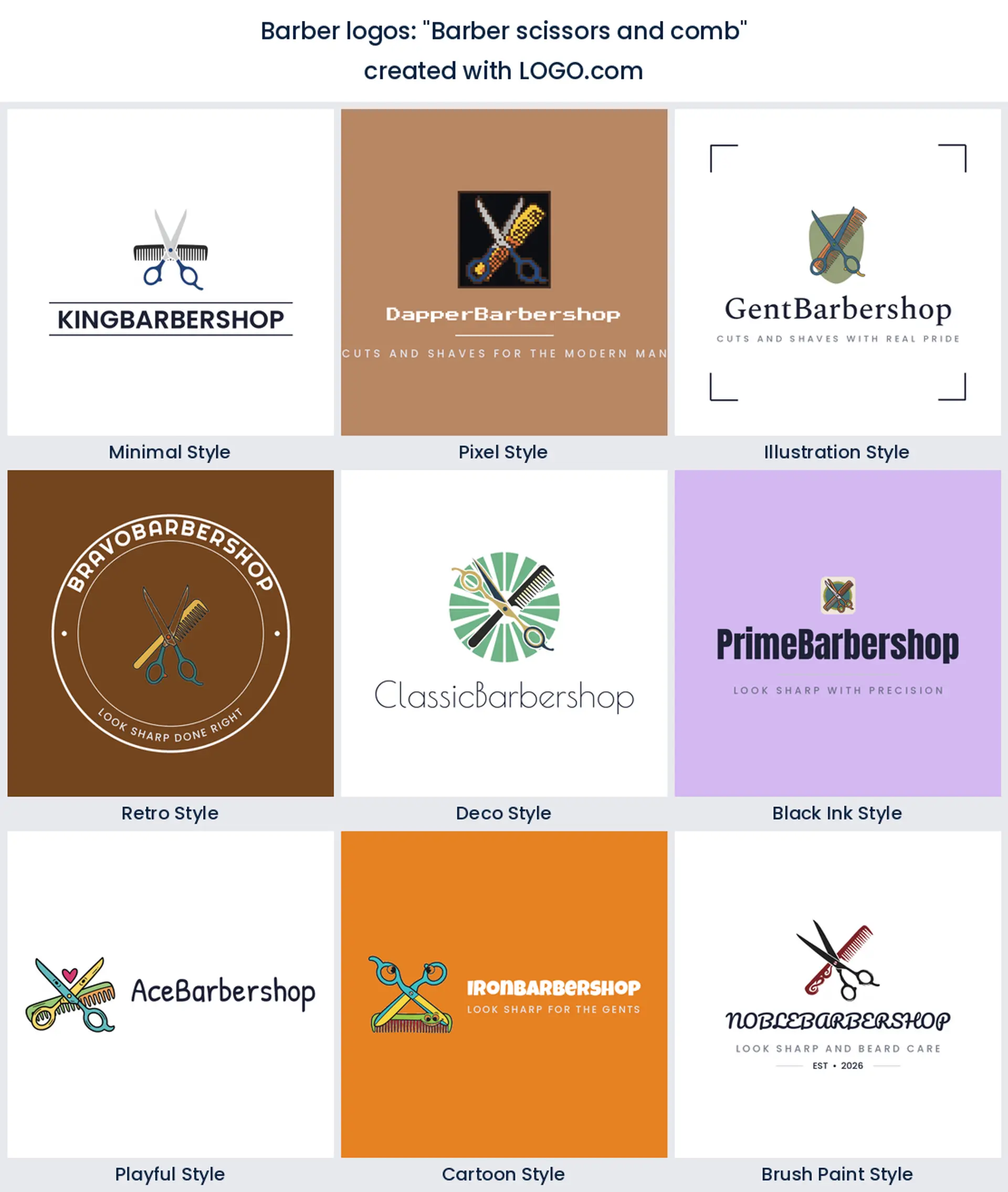
2. "Barber scissors and comb"
The pairing barbers reach for most. Shears crossed over a comb is clean, balanced, and reads haircut instantly, which is why it makes such a dependable barber logo.
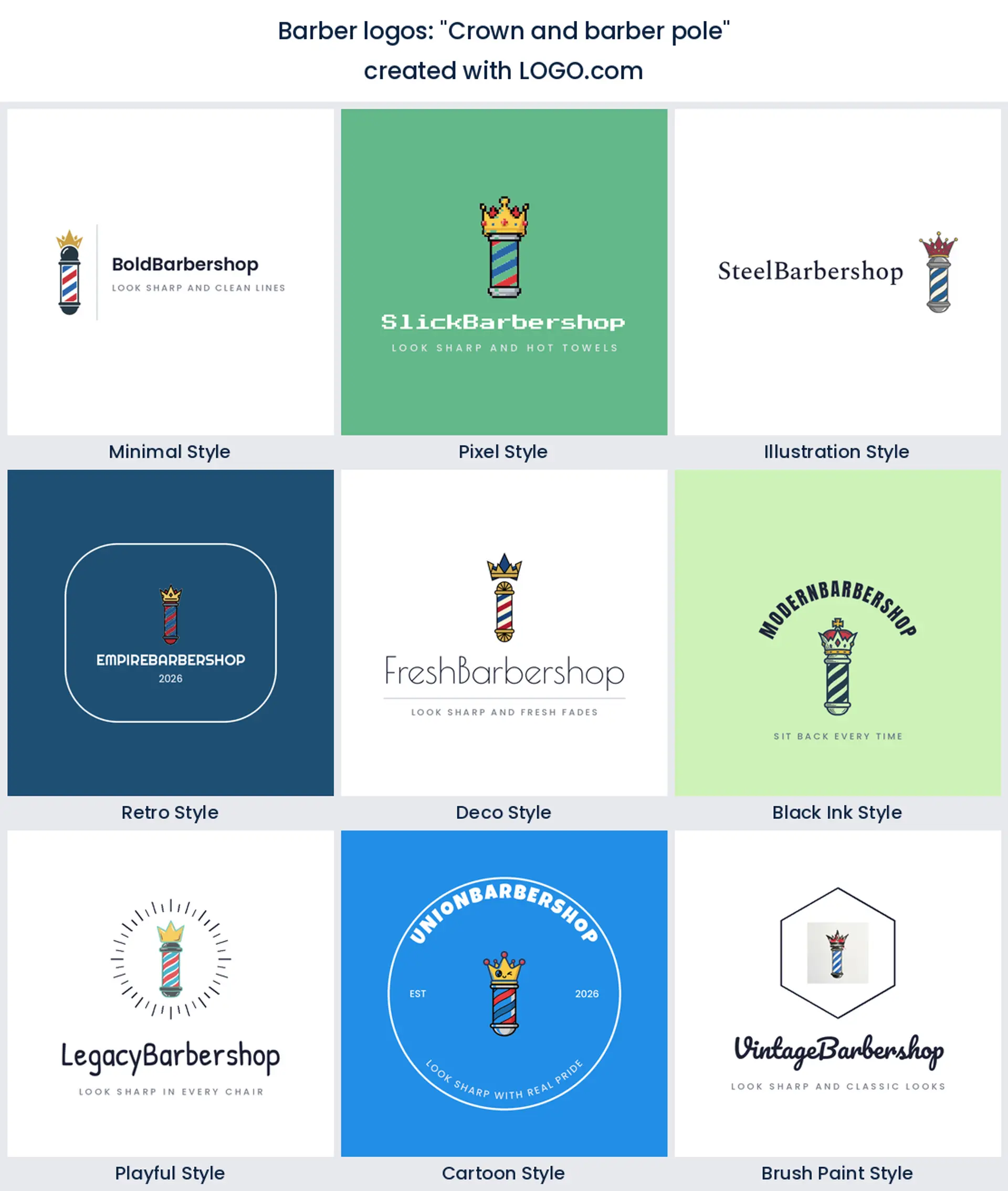
3. "Crown and barber pole"
Top a barber pole with a crown and you get king of the fade energy. It suits a shop with a bit of swagger and gives you a bold, premium barber logo design.
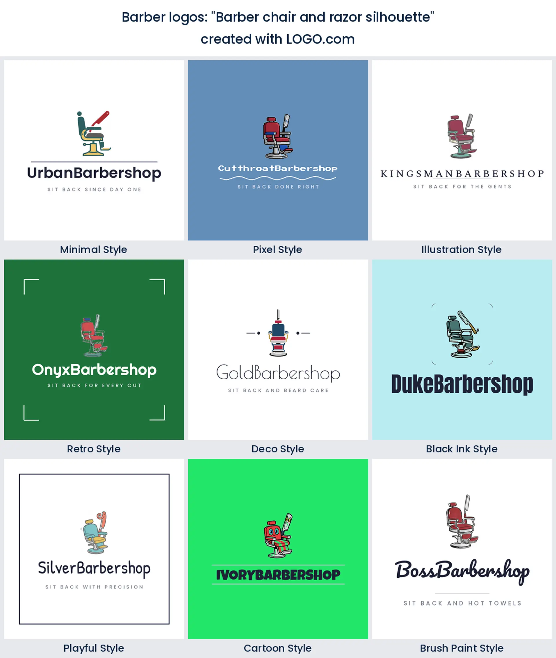
4. "Barber chair and razor silhouette"
A vintage chair with a razor behind it feels like a proper old school shop. Reach for it if hot towel shaves and a relaxed chair are your thing.
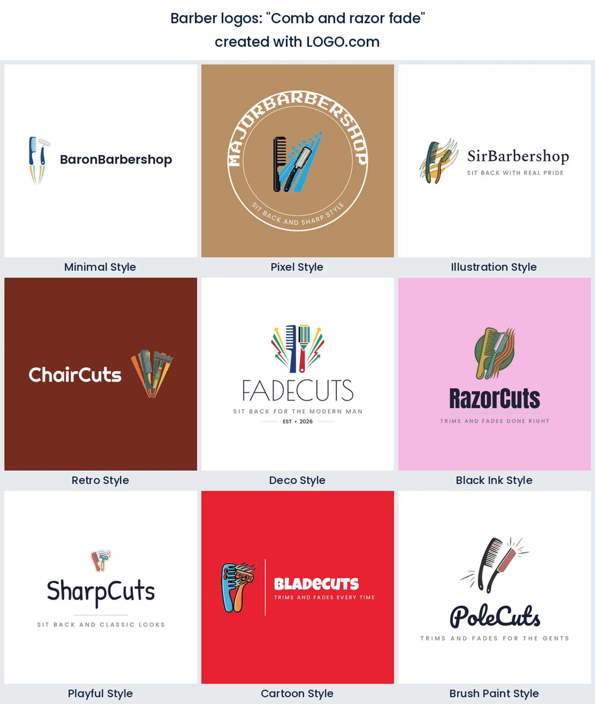
5. "Comb and razor fade"
A comb, a razor, and a hint of fade lines together tell the whole story of a cut. It is a modern, tool led barber logo for a fade specialist.
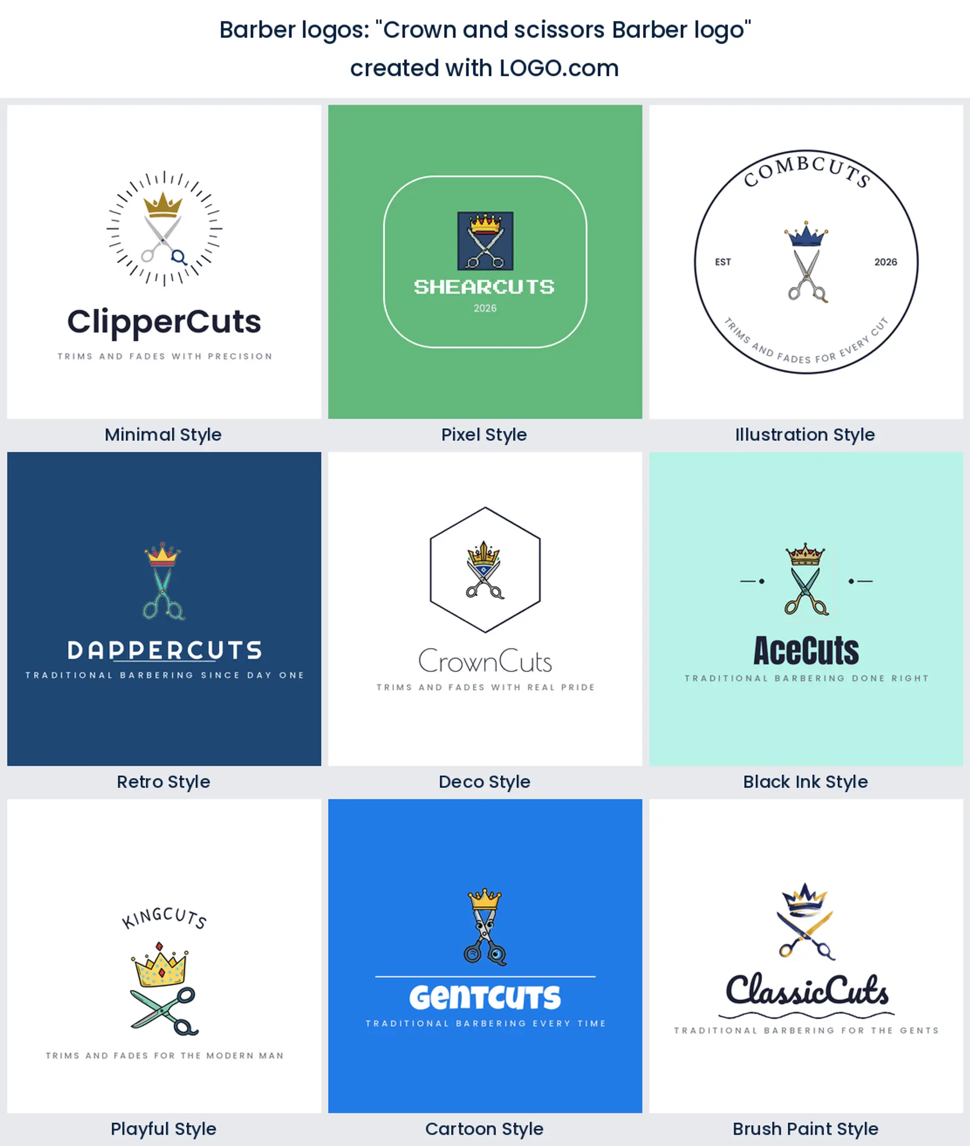
6. "Crown and scissors Barber logo"
Scissors under a crown is confident without shouting. Reach for it when you want your barber logo to feel a touch luxury, like a members only chair.
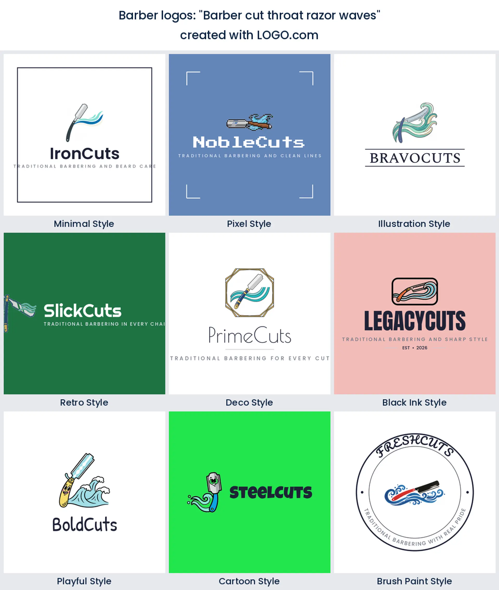
7. "Barber cut throat razor waves"
A cut throat razor trailing clean waves is sharp and stylish. It leans young and makes a great urban barber logo design for a fresh city shop.
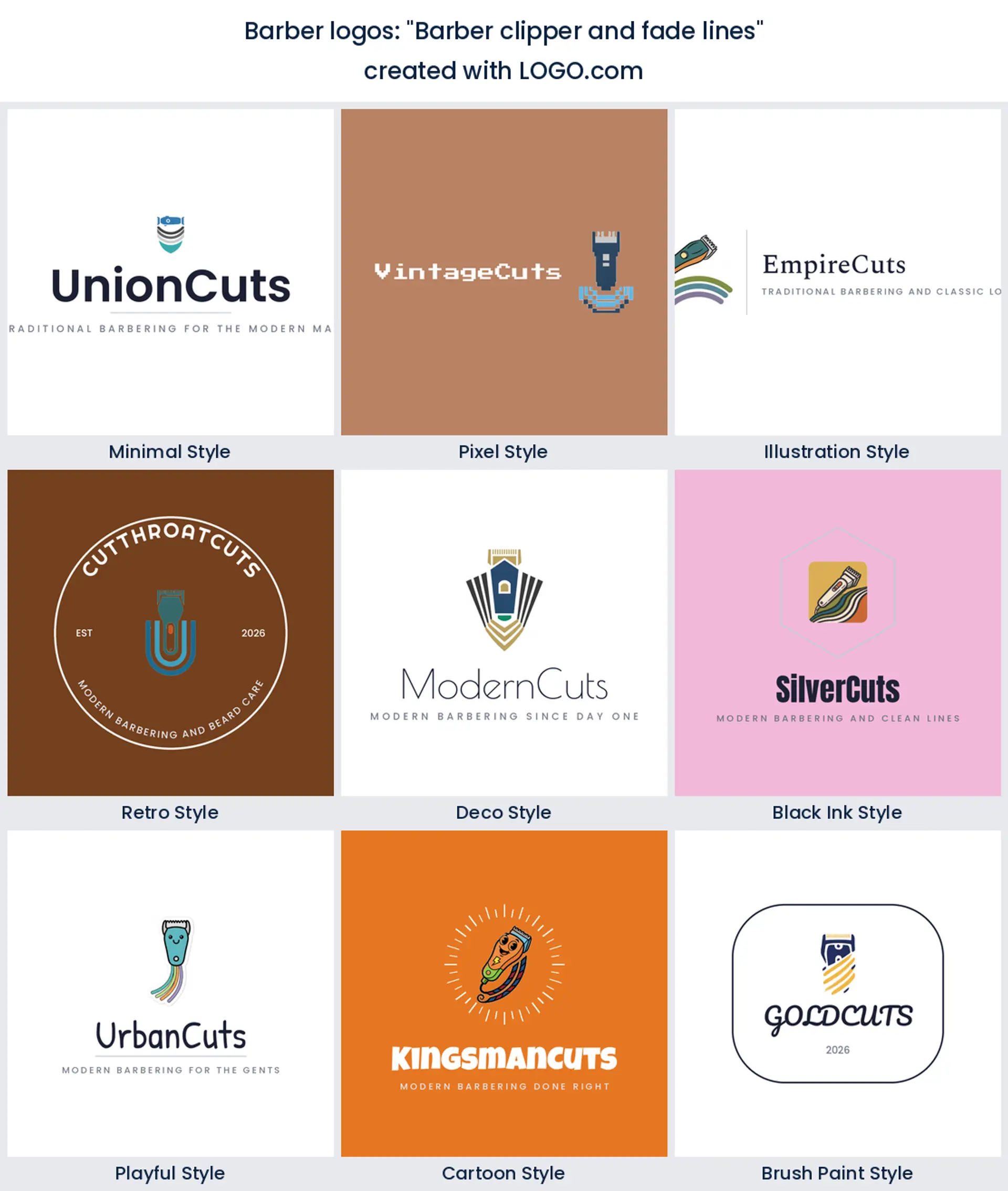
8. "Barber clipper and fade lines"
Clippers over tapered fade lines put your signature skill right on the sign. Perfect for a shop known for crisp fades and skin tapers.
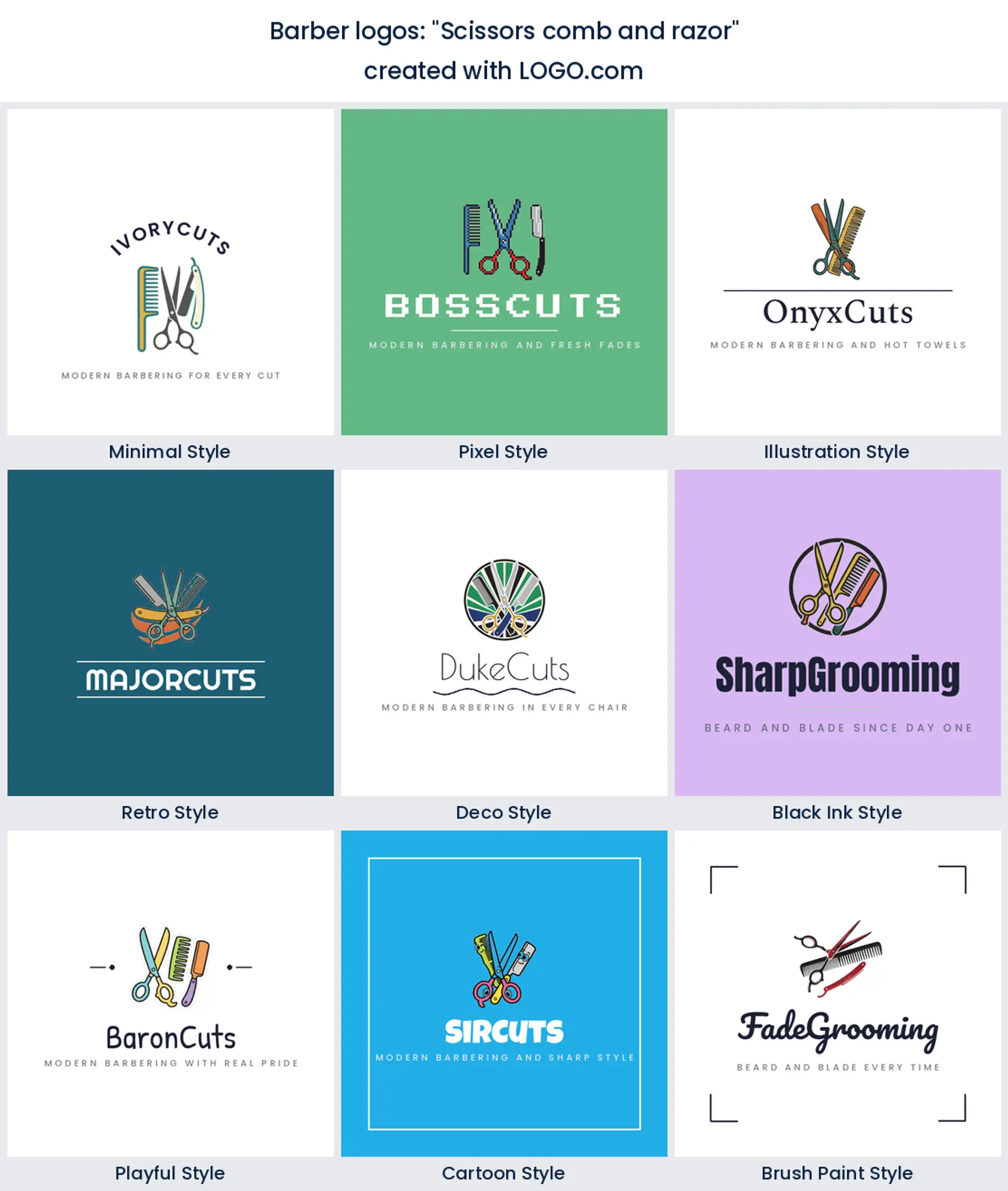
9. "Scissors comb and razor"
All three core tools in one crest reads full service. It is a versatile barber shop logo for a shop that does cuts, shaves, and lineups.
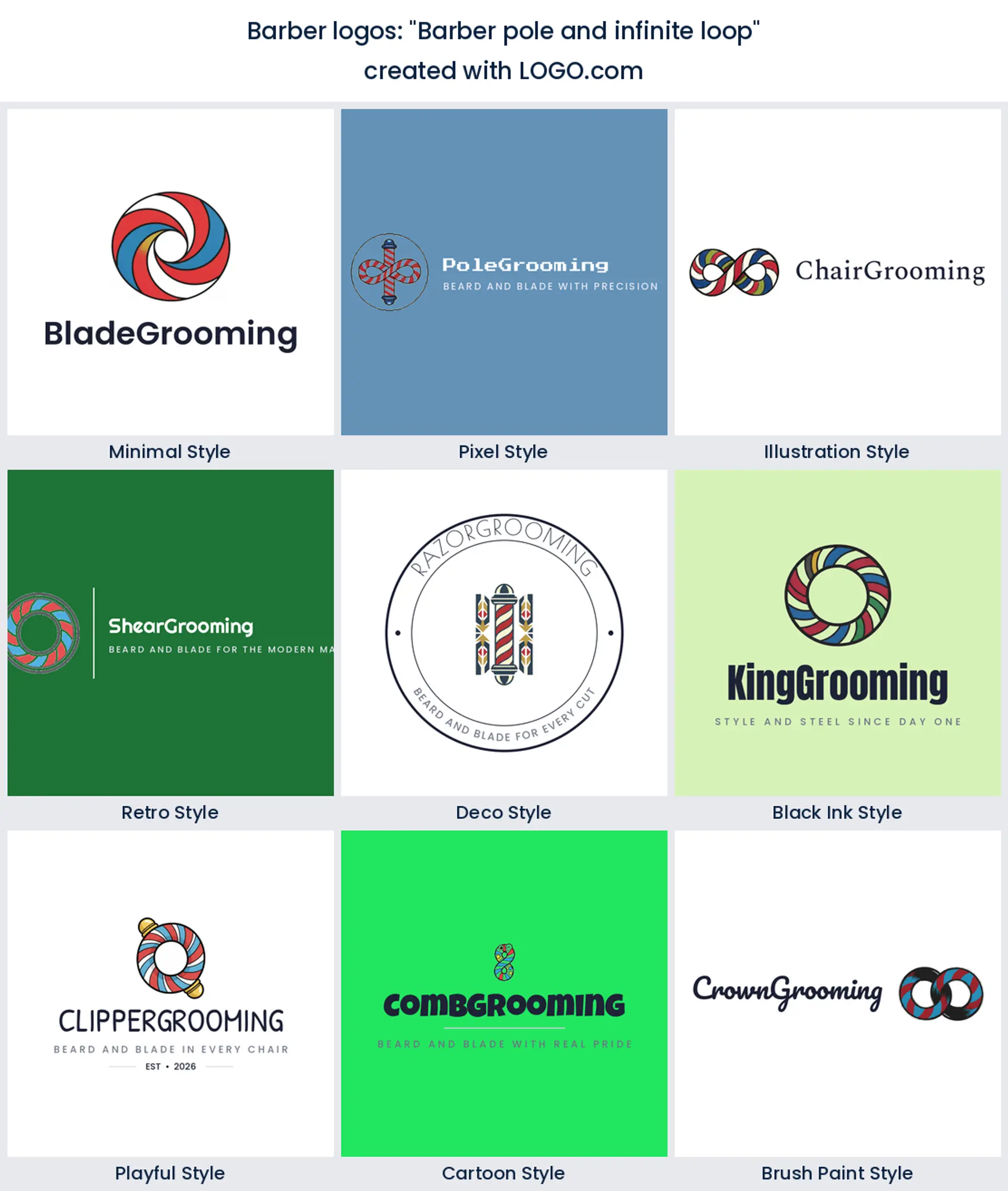
10. "Barber pole and infinite loop"
A barber pole drawn as an endless loop is a clever modern twist on the classic. Good for a forward thinking shop that still respects tradition.
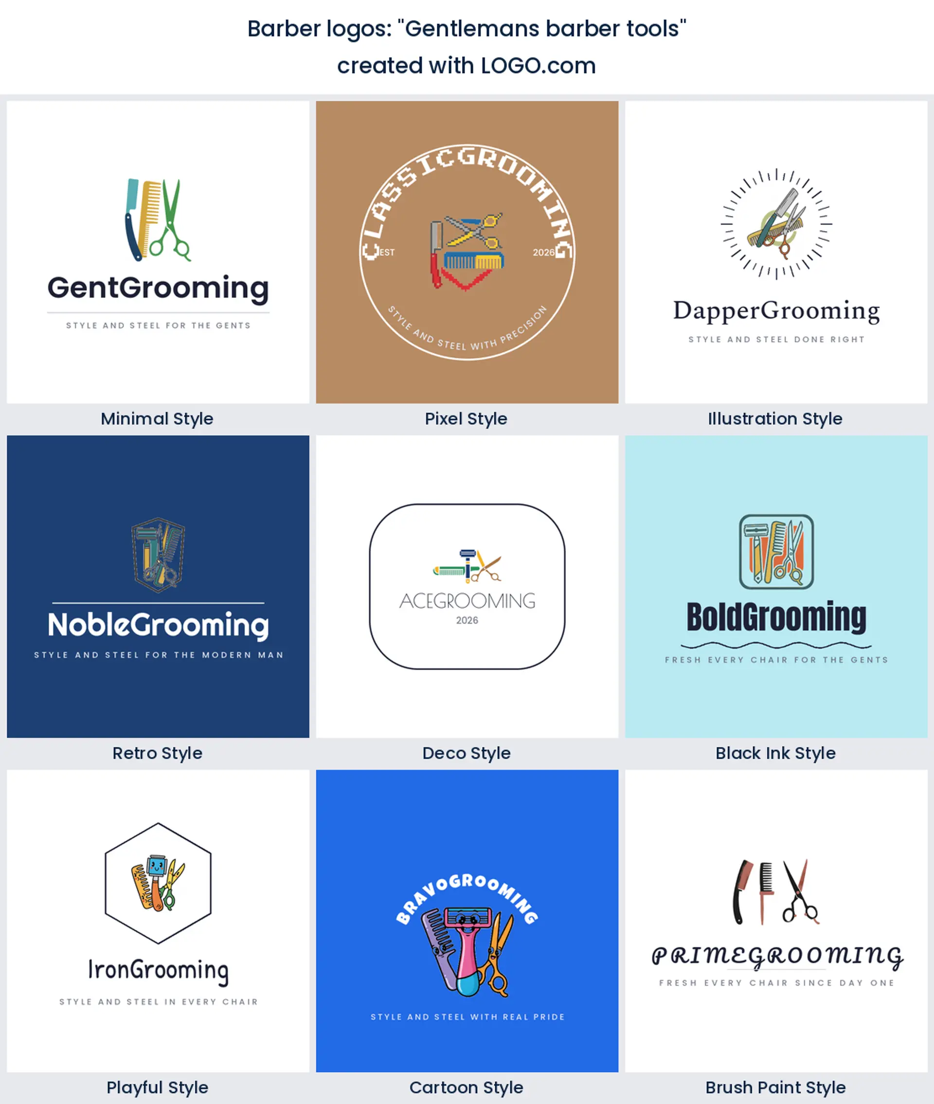
11. "Gentleman’s barber tools"
A tidy arrangement of a razor, a comb, and shears says gentleman’s grooming. It fits a refined barber logo for a shave parlour or grooming lounge.
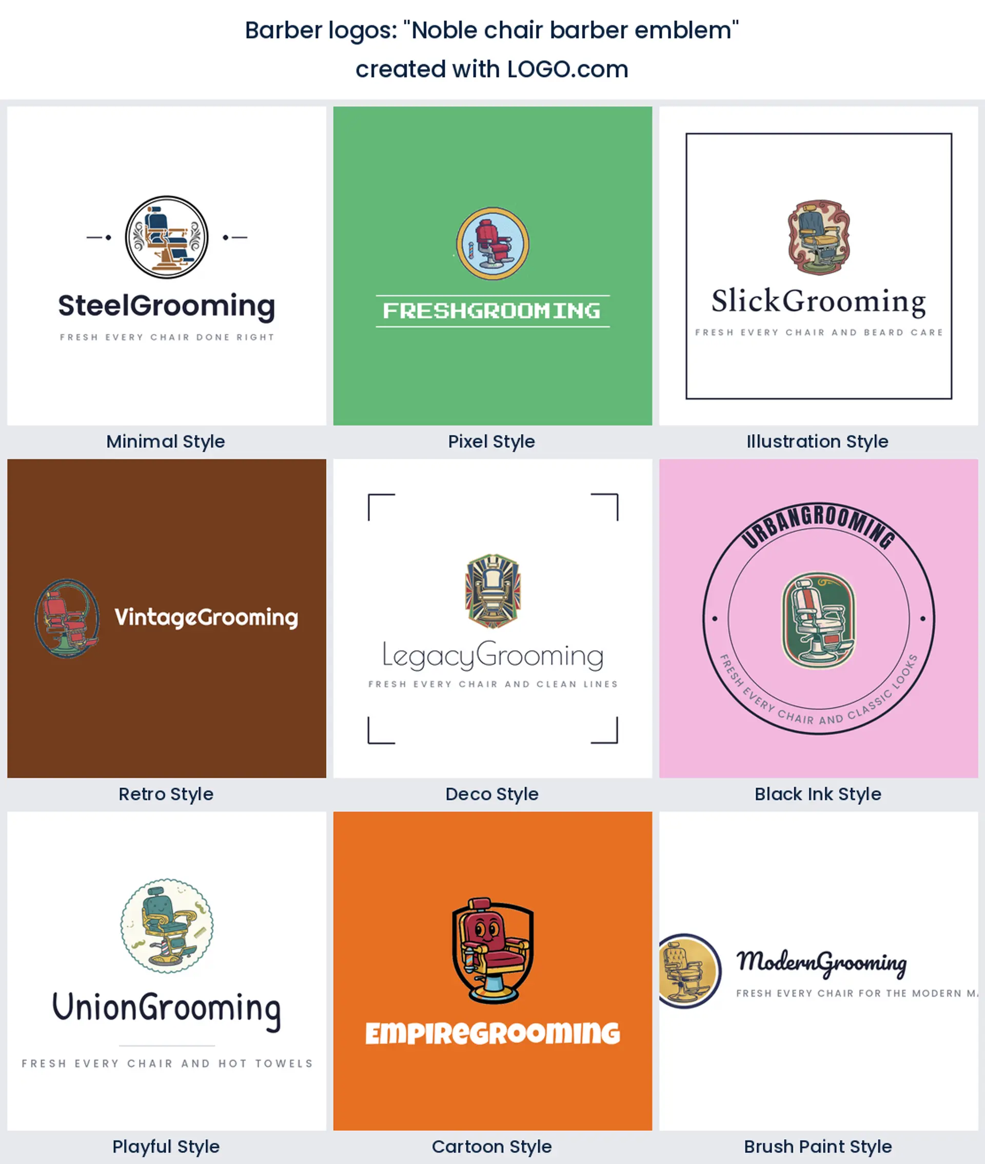
12. "Noble chair barber emblem"
A grand barber chair inside a badge feels established and proud. A great pick when you want your shop to look like it has been around for years.
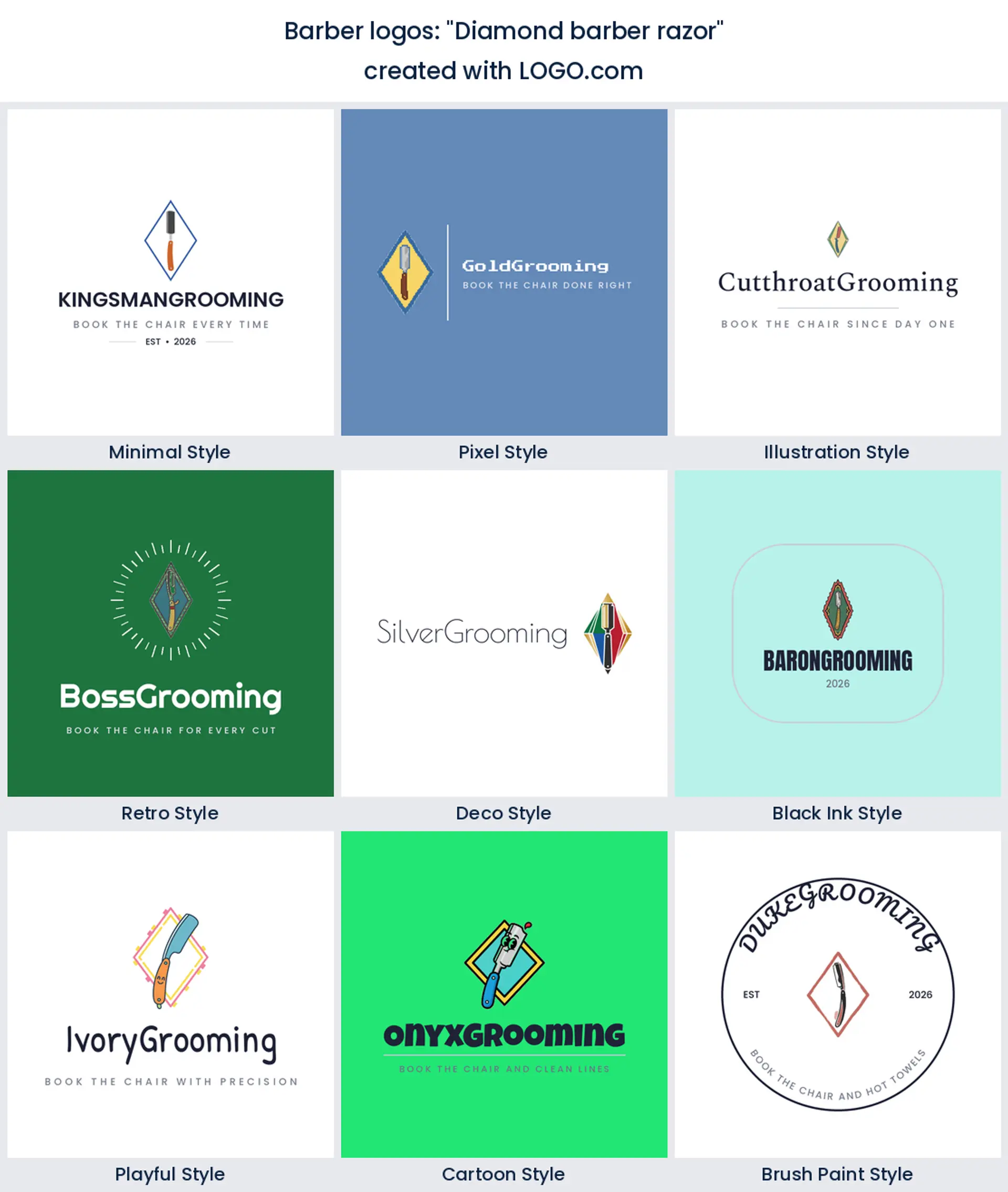
13. "Diamond barber razor"
A razor framed by a diamond adds a little shine to a simple tool. It gives a clean barber logo a premium, polished edge.
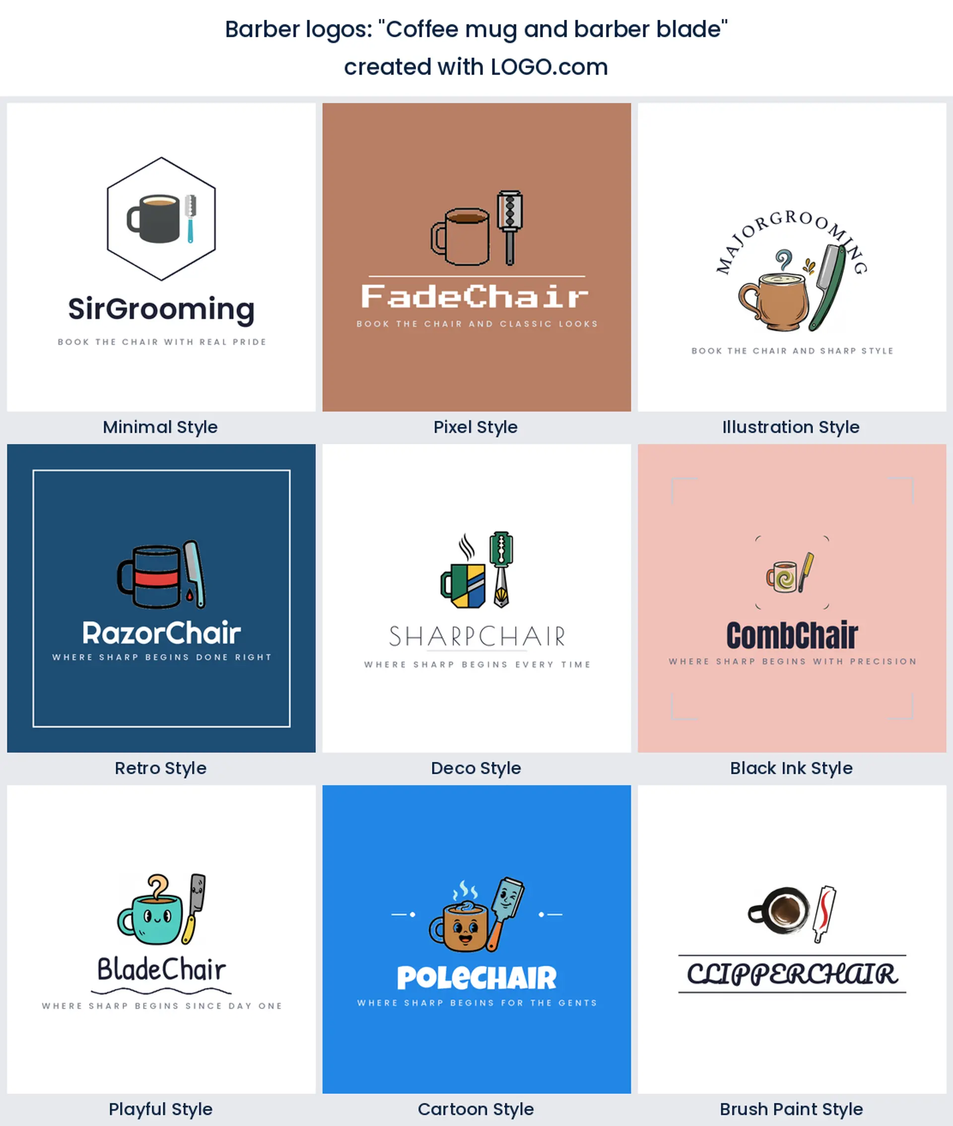
14. "Coffee mug and barber blade"
A coffee cup beside a razor is for the shop where the chat and the coffee matter as much as the cut. A friendly, characterful barber logo for a neighbourhood spot.
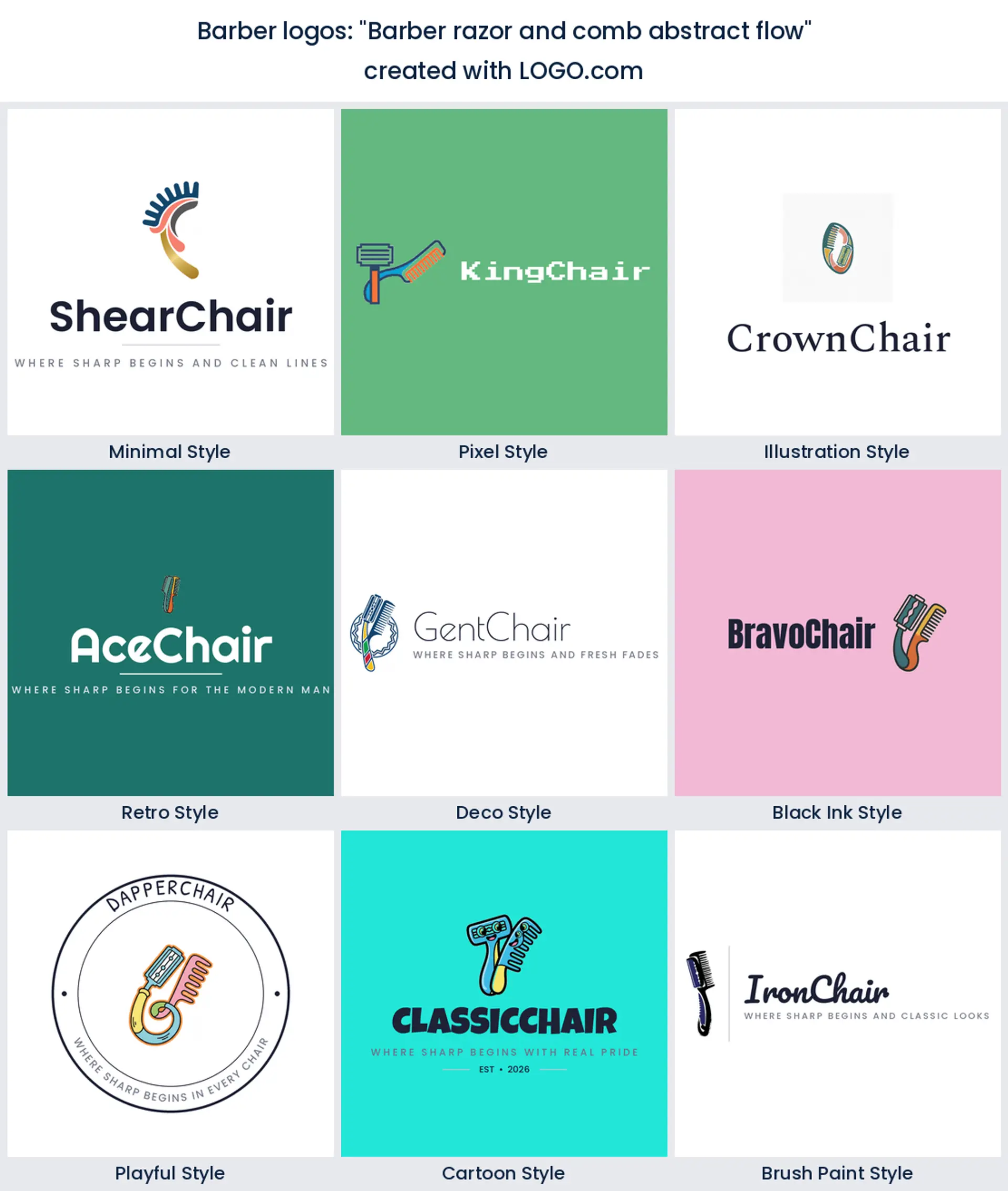
15. "Barber razor and comb abstract flow"
A razor and a comb drawn as one flowing shape looks sleek and contemporary. A smart barber logo design for a minimalist, design led shop.
Does the barber pole belong in your logo?
The barber pole is the most recognizable symbol in the trade, so a barber pole logo tells anyone at a glance exactly what you do. It is a brilliant shortcut for a new shop that needs instant recognition. The catch is that everyone knows it, so if you want to stand out, either draw it in a fresh way, as a loop or an abstract stripe, or skip it and let your scissors, razor, or name carry the mark instead. There is no wrong answer here, only which story you want your barber logo to tell.
Vintage or urban, which barber logo design fits you?
Barber logos tend to fall into two camps. The vintage look leans on badges, banners, and old world type, all crests and heritage tools, and it suits a traditional shop that trades on craft and history. The urban barber logo design is cleaner and bolder, think a single sharp icon, heavy modern type, and a lot of black, and it fits a fresh city shop chasing a younger crowd. You do not have to build a whole style from scratch. Start from one of the nine styles here, then push it vintage or urban with your color and font choices.
Should your logo carry your name or your shop’s?
A lot of the barber founders in our data name the shop after themselves, with prompts like a personal cuts wordmark wrapped around a pole or a pair of shears. If you are the draw, put your name front and centre and let a small tool icon sit beside it, which builds a personal brand clients follow chair to chair. If you are building a shop that can run without you, or you plan to hire, lead with a shop name and a strong symbol so the barber logo outlasts any one barber. Either way, keep the name short so it stays legible on a window and a booking app.
What makes a barber logo look sharp instead of generic?
Barber logos live at brutal sizes. The same mark has to look good enlarged on a shop window and shrunk to a profile picture on Instagram or a Booksy listing, with a business card and an embroidered cape in between. Drop hairline strokes and fussy detail, since they turn to mud printed small on a card or read from the street. One solid shape, confident type, and generous spacing beat a busy crest every time, and that is usually the difference between a barber logo that looks custom and one that looks like a template.
Grab the transparent version for the real world too. A transparent PNG lets your barber logo sit straight on a glass window, a black cape, or a bottle of beard oil with no white box around it, and a solid background copy handles spots that need contrast, like a stamp or a loyalty card. Both come in your download from LOGO.com.
Colors and fonts that read barbershop, not salon
When we looked at the palettes barbers actually pick on LOGO.com, black and white did most of the heavy lifting, with a deep green or a navy blue as the favourite accent, not the red you might expect. That tracks with how the trade looks now: black and white feel sharp and masculine, green and navy read premium and grown up, and a small pop of a warm tone keeps it from turning cold. Pick one main color and one accent rather than a full rainbow. For type, a strong slab or a bold condensed sans reads confident and modern, while a vintage serif or a script leans old school barber, so choose the one that matches your chair. Lock your color and font into a brand kit so your window, your cards, and your socials all match as you grow.
Make your barber shop logo with LOGO.com
Pick the symbol that fits your shop, choose one of nine styles, and our barber shop logo maker builds the rest around your name. Designing and previewing is free, and so is downloading, since the free plan gives you high resolution PNG files with full commercial use, so you can put the logo on your window and cards and take bookings under it right away. A paid Brand Plan adds vector files for large, crisp print on signage, capes, and vehicle wraps, plus unlimited edits and a full brand kit for when you open a second chair. Preview your barber logo free and download it in minutes.
Methodology. These figures come from logos created on LOGO.com during the 12 months ending July 2026. We looked at roughly 120 brands whose founders selected a barber industry, such as Barber Shop and Barber, and read 148 barber logo icon descriptions those founders wrote, including the ones whose descriptions named barber tools directly. We grouped the descriptions by symbol, for example scissors, the barber pole, or the comb, and ranked each by how often it appeared. Scissors were most common, in about 49% of the descriptions, the barber pole next at about 31%, and the comb third at about 25%. Because many descriptions name more than one tool, the shares overlap and do not add up to 100. Figures are rounded to the nearest percentage point. Source: LOGO.com first party product data, July 2026.
THE #1 LOGO GENERATOR
Why LOGO.com is the best barber shop logo maker
1.Built from real barber brand data
Symbols, colors, and layouts pulled from barber logos founders actually made on LOGO.com, not generic clip art.
2.Sharp on a Booksy avatar
Your mark stays clear shrunk to a booking app icon or an Instagram avatar, where most new clients first find your shop.
3.Transparent files for windows and capes
Download a transparent PNG that sits cleanly on a glass window, a black cape, or a bottle of beard oil with no white box.
4.One logo for window, card, and app
Start square so the same barber logo works on a shop window decal, a business card, and your booking profile.
5.Nine styles, vintage to urban
Match your chair, from a heritage pole and razor crest to a bold, minimal fade mark for a modern shop.
6.One color for capes and stamps
A single color version stamps onto a loyalty card and presses into a shop stamp for tags and beard oil bottles.
7.One brand kit for the whole shop
Keep a single logo, palette, and font across your storefront, your capes, and your price board.
8.Rebrand when you add a chair
Swap the icon, color, or name whenever you take on a barber, add a chair, or open a second shop.
9.Free to design, yours to trade with
Preview free and download high resolution PNGs with full commercial use, then upgrade to the Brand Plan for vector files.
Barber Shop Logo Maker FAQs
Need Inspiration? See example brands in your industry...
3D DesignAcademic WritingAccountantAerospace EngineeringAgricultural ConsultingAgriculture CompanyAmazonAnimal ProtectionAnimationApp DevelopmentAquacultureAromatherapyArt and DesignArtsAsian RestaurantAthleticsAudio TechnicianAuto ManufacturingAuto Repair ServicesBadgeBandBearBeauty and CosmeticsBeeBibleBiotechBitcoinBlogBoatBook PublisherBooks and Literature BlogBrainBuildingBusiness Consulting Logo MakerBusiness StorageCakesCampaignCandlesCarCarpentryCateringCelebrationsChemicalChildrenChoirCircleCivil EngineeringClothingCoffee ShopColors