Fashion Blog Logo Maker
Design a fashion blog logo for your site header, feed, and profile picture.
Need a different logo maker? Try our AI logo generator.
Logos created using LOGO.com
670,000,000
Stylish fashion blog logos
Editorial and creative blog logos

Lifestyle and influencer blog logos
Fashion Blog Logo Ideas: 9 Symbols and 15 Styles
According to LOGO.com data, the symbols bloggers and creators reach for most are a sparkling star (about 18%), an open book (about 12%), and a magic wand (about 10%), pulled from the blogs and personal brands people actually build with us.
Because a fashion blog logo has to look right in a browser tab, on a header, and as a round profile picture, the nine styles below are built to stay clear when they shrink. Start from a symbol that matches your voice, then make it your own aesthetic logo.
On this page
- Nine symbols that make a blog feel like a brand
- Fifteen fashion blog logo ideas from real founder prompts
- Turning your blog into a recognisable personal brand
- Where your logo shows up, from favicon to profile picture
- Getting the soft, editorial look that aesthetic logos are known for
- Colors and fonts that feel like a style blog
- Make your fashion blog logo with LOGO.com
You have picked the name, grabbed the handle, and now your fashion blog needs a logo that looks as good in a browser tab as it does on your Instagram grid. Good news: you do not have to guess. We looked at the logos that bloggers and personal brands actually built on LOGO.com over the past year, and a clear handful of symbols keep coming back. This page walks through the nine that show up most, fifteen real prompts you can borrow, and the small choices that turn a fashion blog logo into a real brand instead of a placeholder.
Nine symbols that make a blog feel like a brand
A fashion blog can be a lot of things, from a daily outfit diary to a slow living journal, so the popular marks come from every kind of blogger and creator who built with us. A sparkling star leads, an open book is right behind, and a magic wand follows, with a speech bubble and a teacup close behind them. None of these scream clothing label, which is the point: a blog logo is about your voice and your world, so pick the symbol that matches the feeling of your writing, keep it to one clean shape, and it will still read tiny in a browser tab or as a round profile picture.
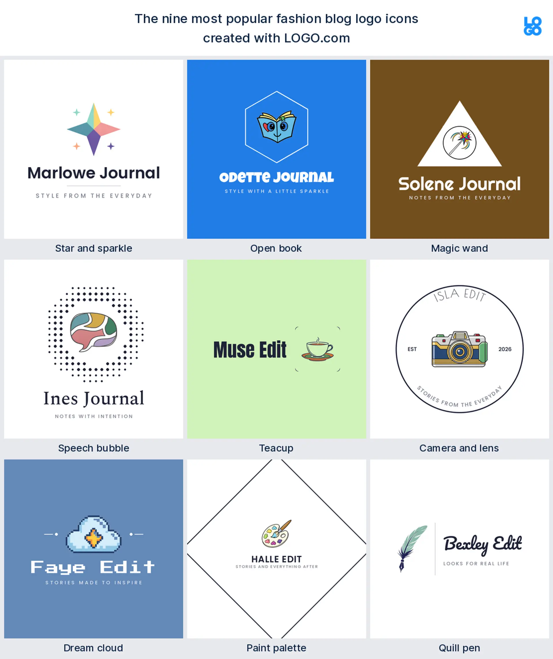
Star and sparkle
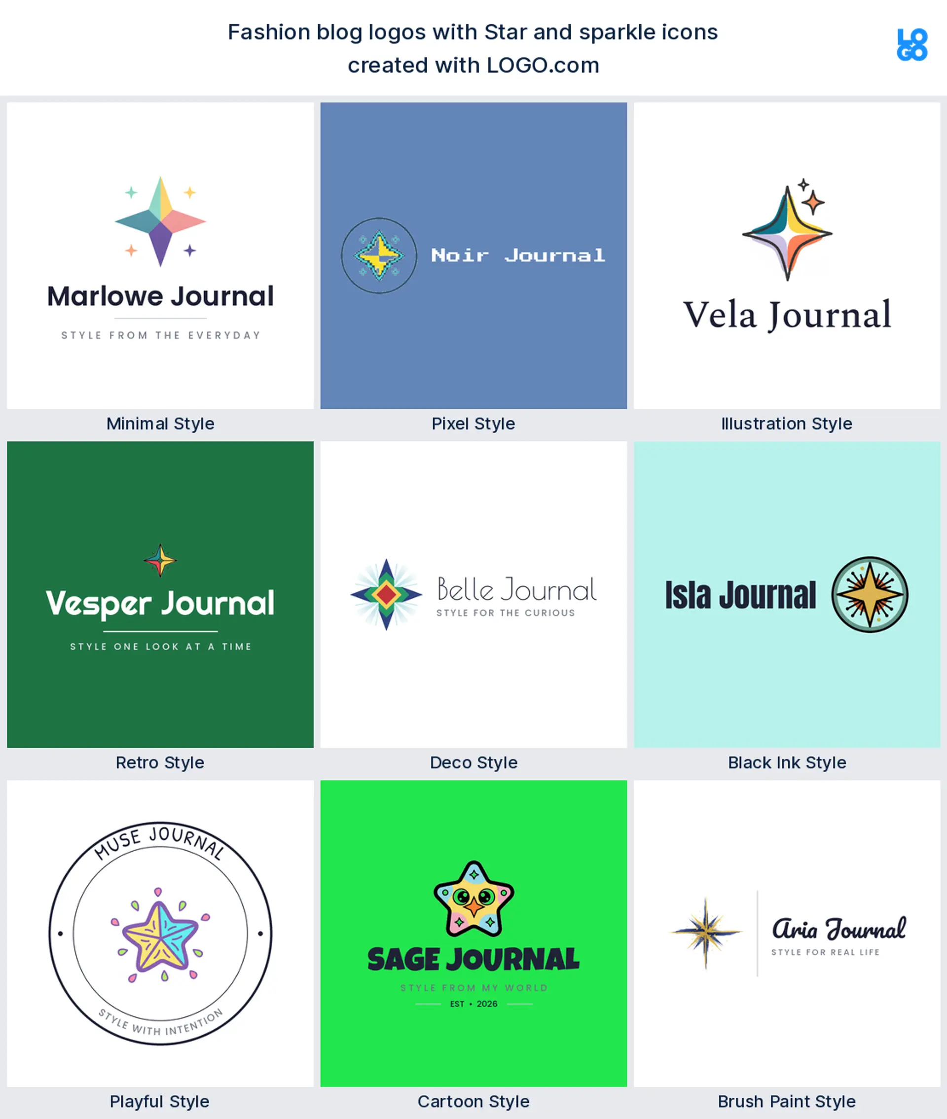
The sparkling star is the one bloggers type more than any other, showing up in roughly 18% of the descriptions we read. It reads as taste and a little magic without naming a single topic, which makes it a natural pick for an aesthetic logo or a lifestyle blog that covers a bit of everything.
Open book
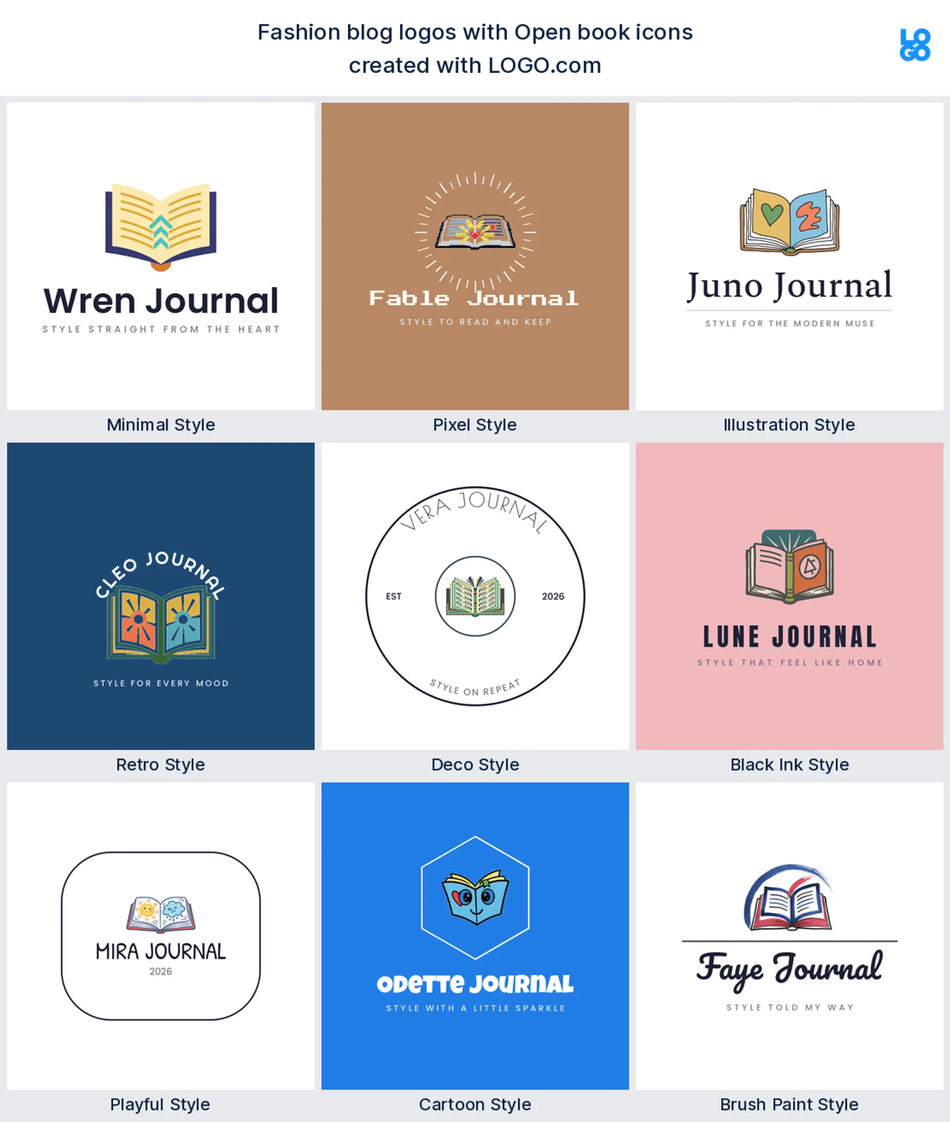
Close behind, near 12%, is the open book, the most honest way to say this is a place I write. It carries your name cleanly on a header or a favicon, so it works well as a blog logo for anyone whose words are the main event.
Magic wand
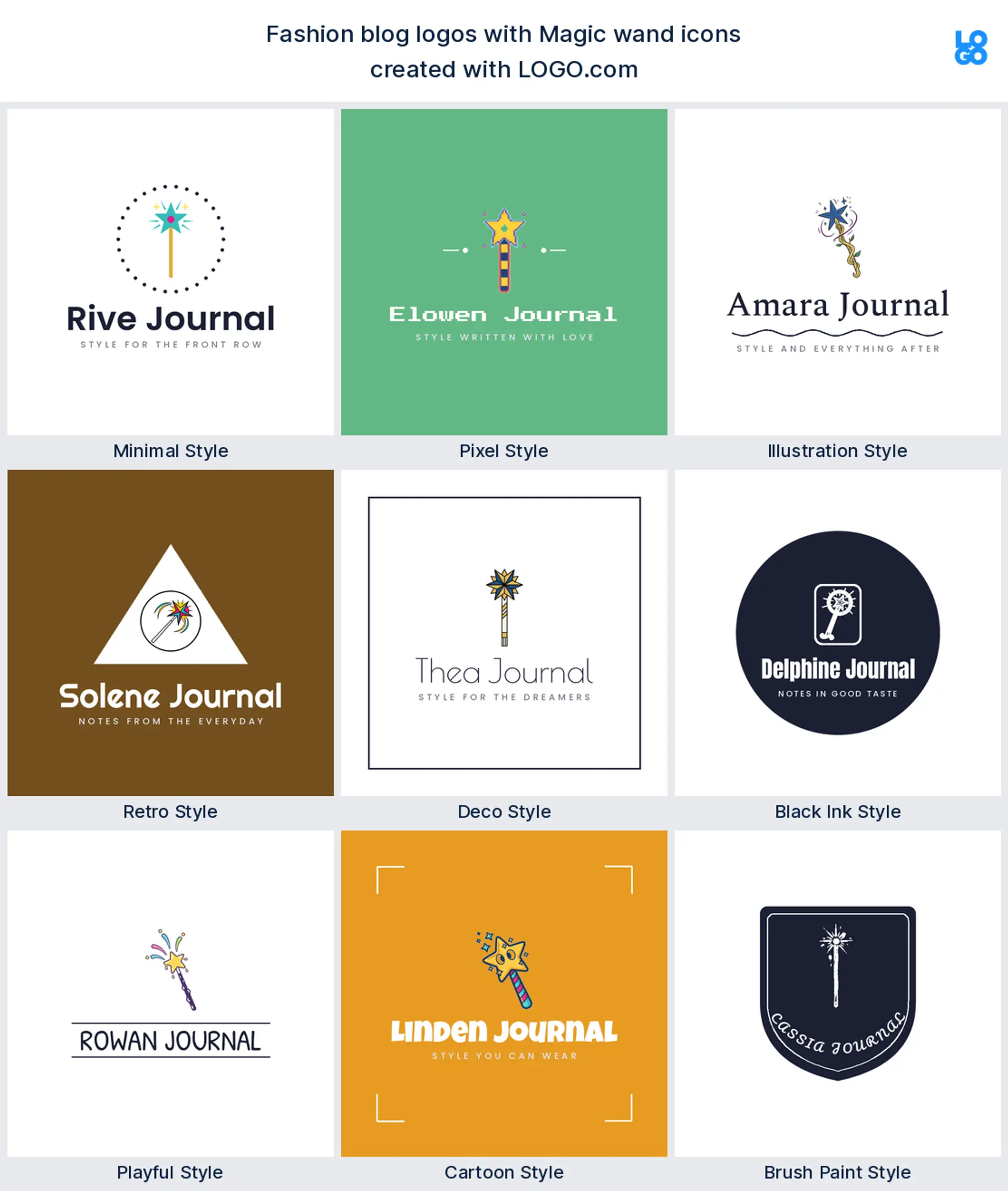
Third, at about 10%, comes the magic wand, chosen by creators who want their blog to feel like a transformation. A wand with a star tip reads playful and aspirational, a good match for a beauty, style, or personal brand logo.
Speech bubble
The speech bubble lands next, the symbol of comments, opinions, and a real point of view. Keep it simple and it holds up small, which makes it a friendly blogger logo for an outfit diary or a weekly hot takes column.
Teacup
A teacup turns up more than you might expect, because so many blogs are built around slow mornings and everyday comfort. It reads warm and unhurried, a lovely fit for a lifestyle logo or a cozy reads corner.
Camera and lens
The camera is the creator's tool, and it lands mid pack because a fashion blog usually lives on photos as much as words. Drawn boldly it survives shrinking to a profile picture, which makes it a strong content creator or photography blog logo.
Dream cloud
A soft cloud, often with a star tucked beside it, shows up for the dreamier corners of the blog world. It reads gentle and a touch whimsical, a nice choice for a mindful living or aesthetic logo.
Paint palette
The paint palette is the mark for the makers and stylists, the bloggers who treat every post like a little art project. It hints at color and craft, which suits a creative or design led lifestyle logo.
Quill pen
Last in the nine is the quill pen, the classic sign of a writer. It feels editorial and considered, so it makes an elegant blog logo for essays, reviews, or a personal brand built on words.
Fifteen fashion blog logo ideas from real founder prompts
These fifteen are the exact icon descriptions bloggers and creators typed into LOGO.com, shown across all nine styles so you can watch each one shift from clean and minimal to bold and playful. They go further than the plain nine above, and any of them can carry your blog name. Treat them as fashion blog logo ideas to borrow, then swap the color, font, and wordmark until the mark feels like yours.
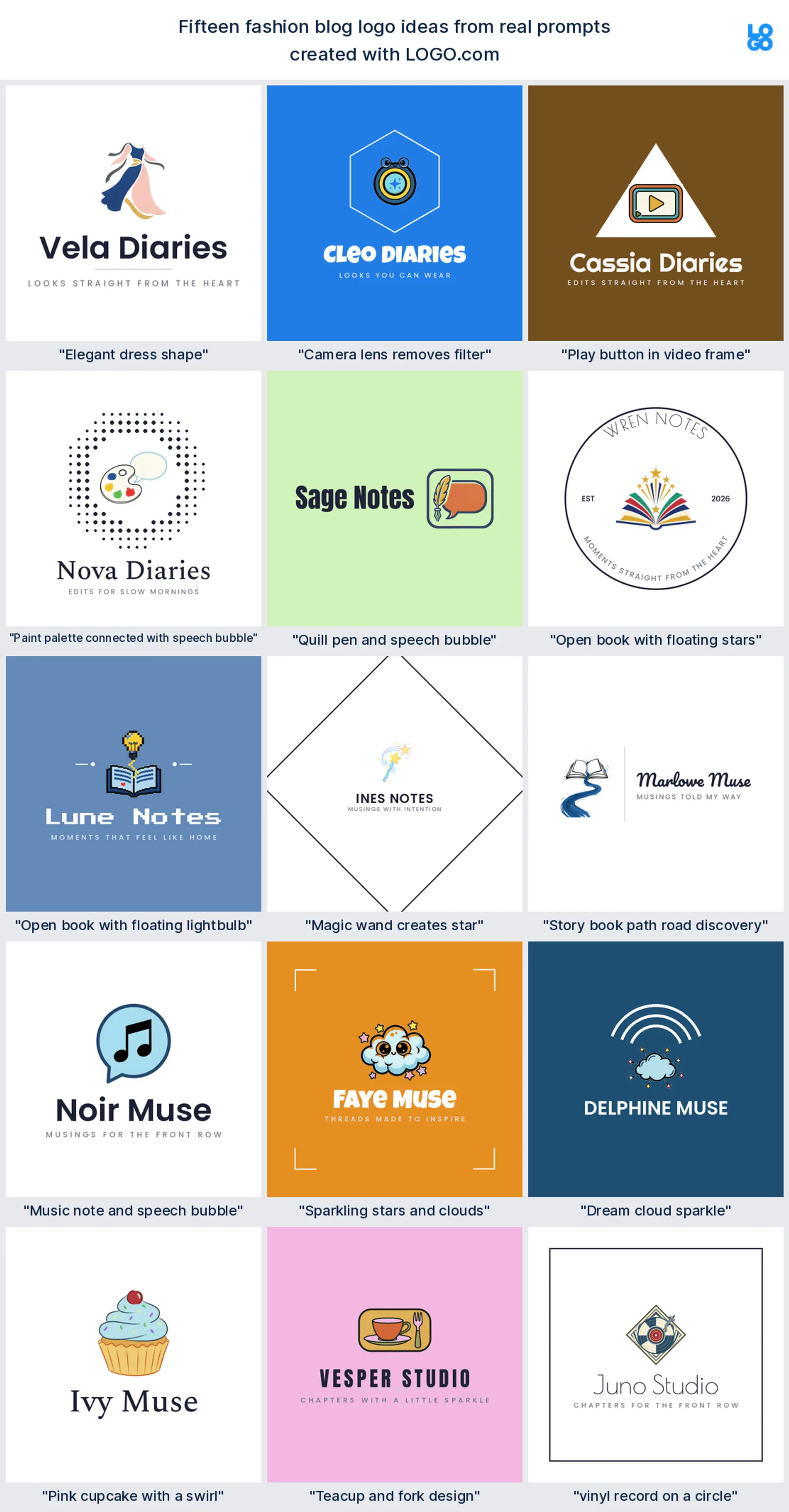
"Elegant dress shape"
One blogger wanted a single graceful silhouette, and a flowing dress does it in one stroke. It makes a chic fashion blog logo for an outfit diary or a style edit, with plenty of room to carry your main color.
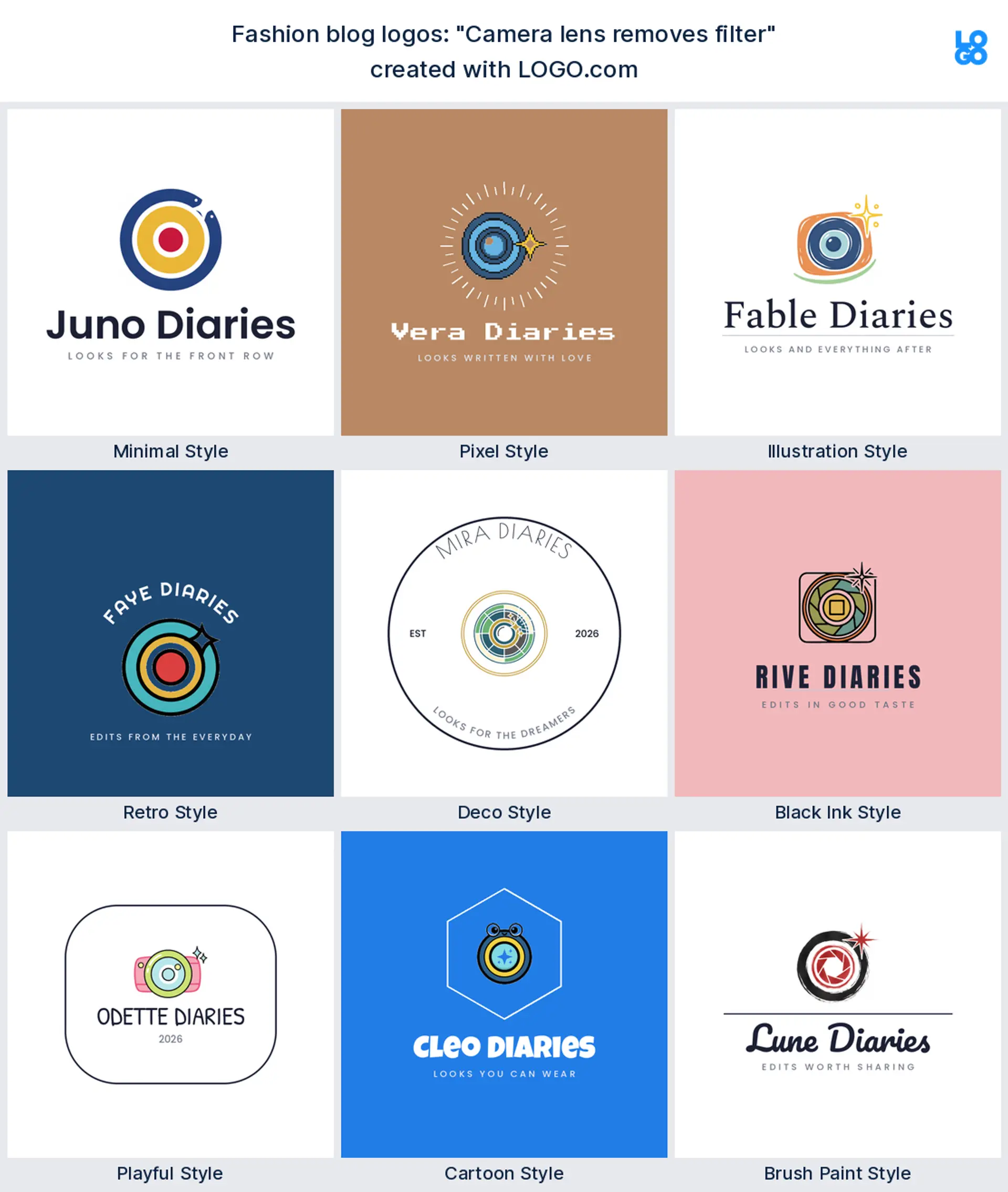
"Camera lens removes filter"
A content creator typed this, playing on the honest versus filtered idea. A lens with a spark reads modern and a little clever, a great fit for a photography or content creator logo.
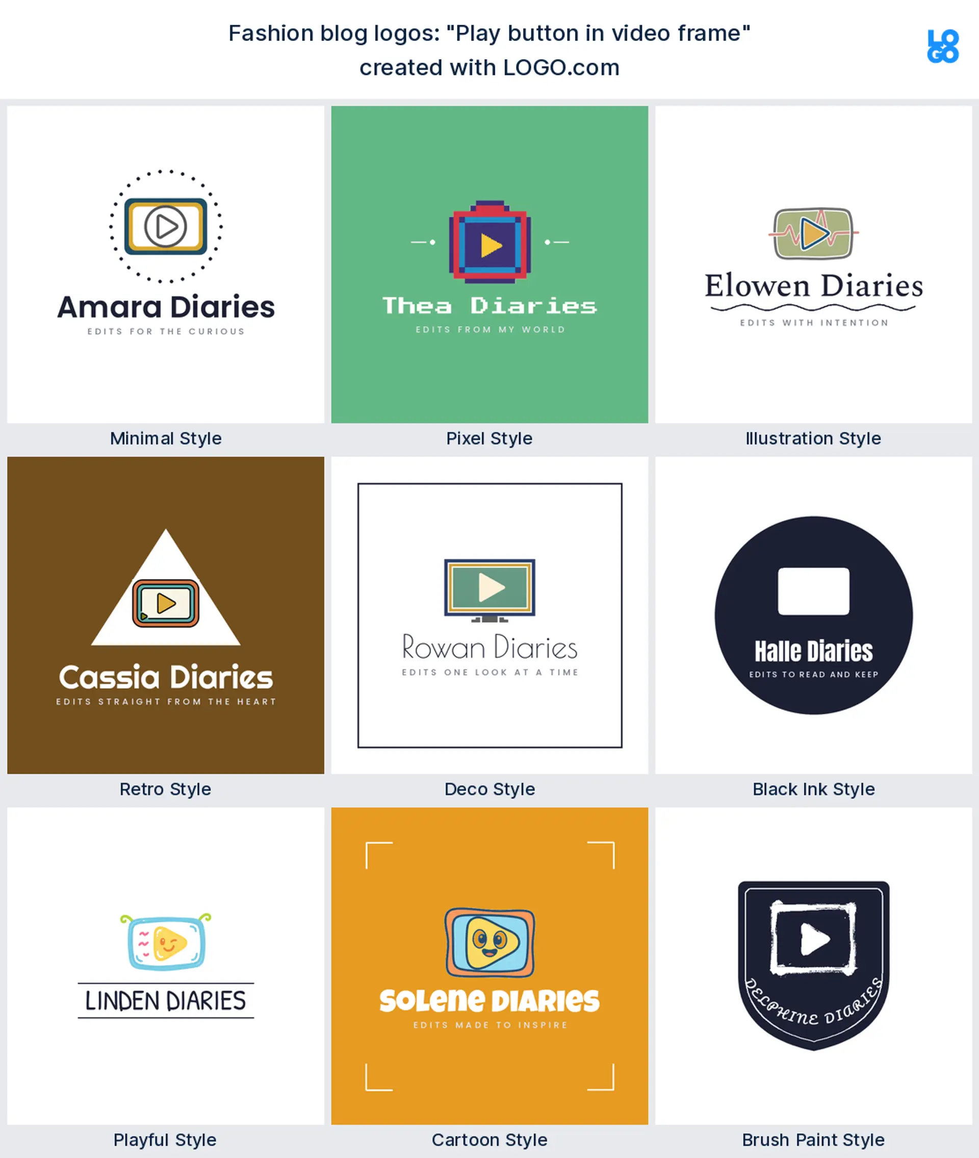
"Play button in video frame"
This came from a blogger moving into video, and it says press play at a glance. It works as an influencer logo for anyone whose blog lives on Reels and YouTube as much as the page.
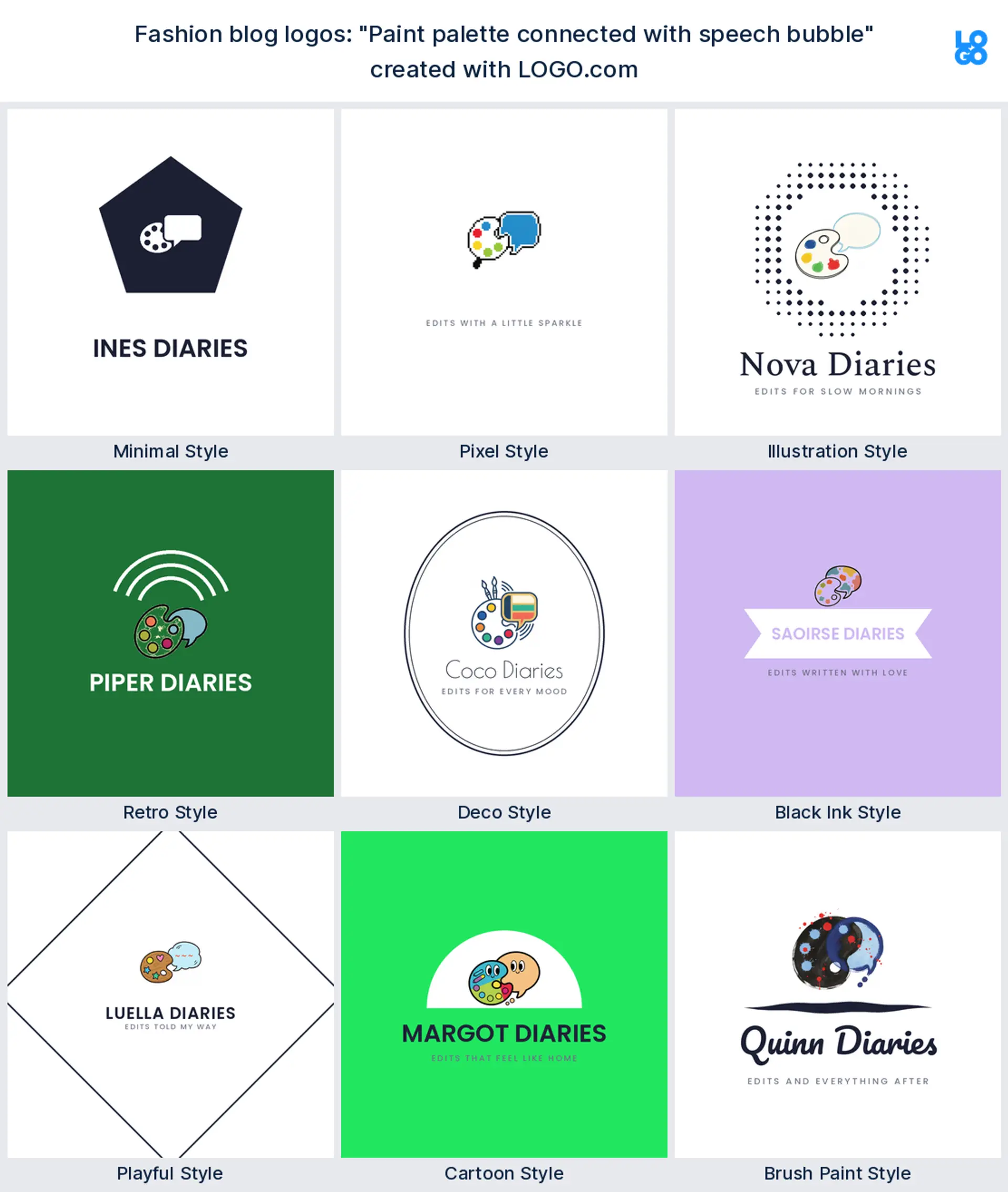
"Paint palette connected with speech bubble"
A creative writer joined a palette to a speech bubble, mixing art and opinion. It suits a design led lifestyle logo where every post is part gallery, part diary.
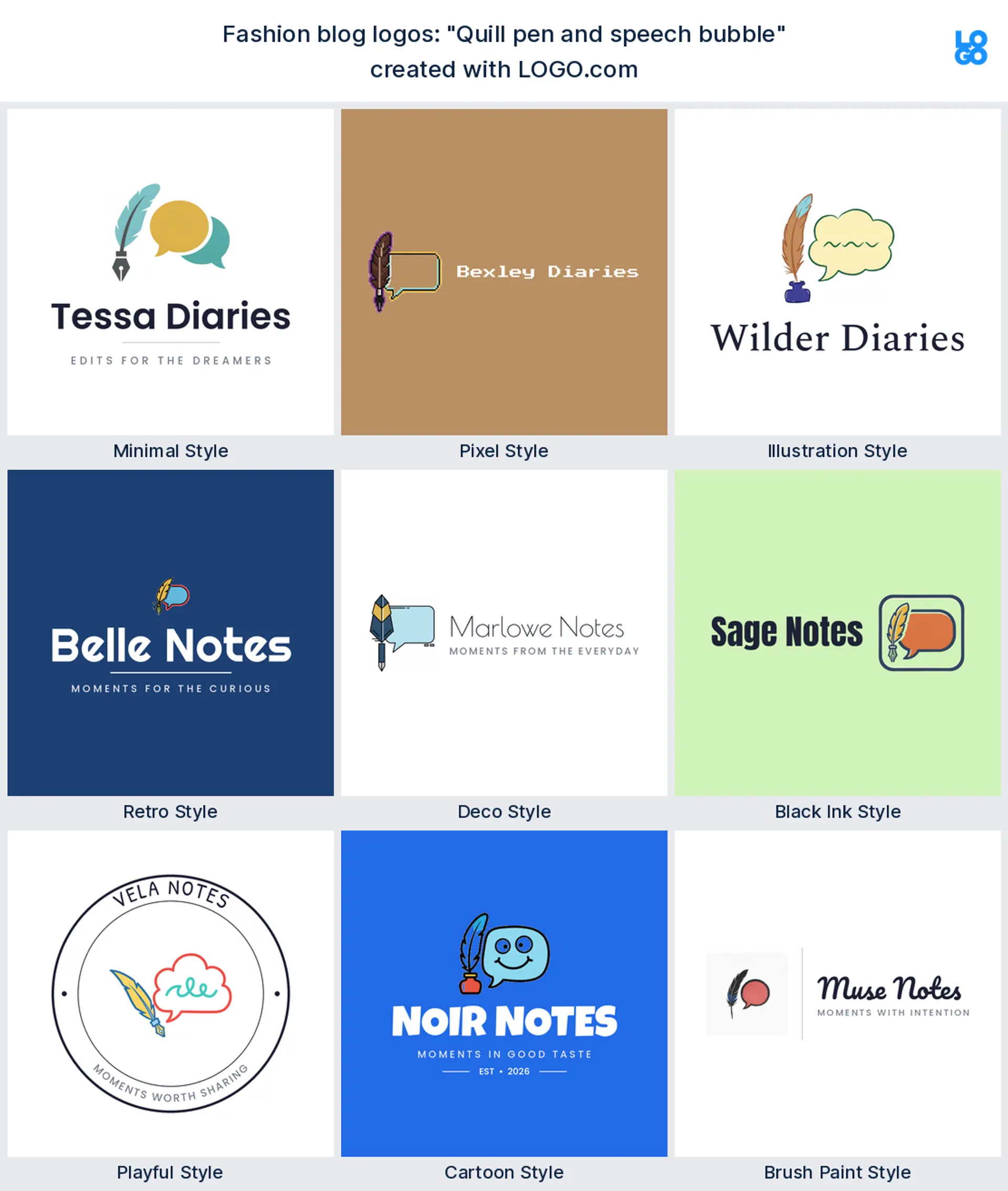
"Quill pen and speech bubble"
A founder who cares about the writing paired a quill with a speech bubble. It reads part essay, part conversation, an editorial blogger logo for reviews and long reads.
"Open book with floating stars"
This one surrounds an open book with little stars, and it feels like a story worth staying up for. It makes a dreamy blog logo for fiction, memoir, or a personal brand built on storytelling.
"Open book with floating lightbulb"
A blogger who shares tips wrote this, a book with a bright idea rising off the page. It reads helpful and smart, a natural how to or lifestyle logo.
"Magic wand creates star"
Someone building a glow up brand typed this, a wand conjuring a star. It reads fun and transformational, a playful beauty or aesthetic logo with real personality.
"Story book path road discovery"
This came from a travel and lifestyle blogger, a book that opens into a winding path. It suits a journey led blog logo about slow living, moving, or figuring things out.
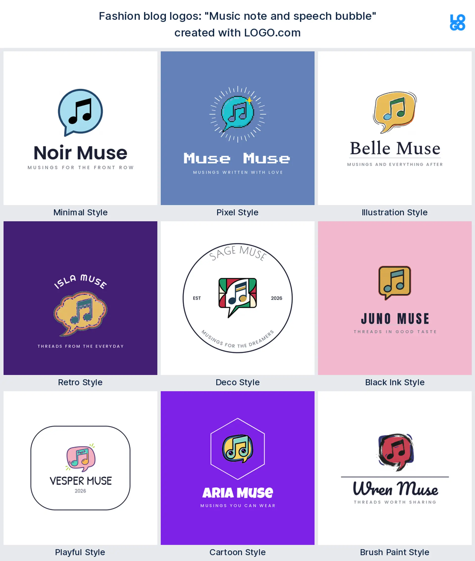
"Music note and speech bubble"
A culture writer paired a note with a speech bubble, part playlist, part commentary. It makes a lively lifestyle logo for a blog that mixes music, mood, and opinion.
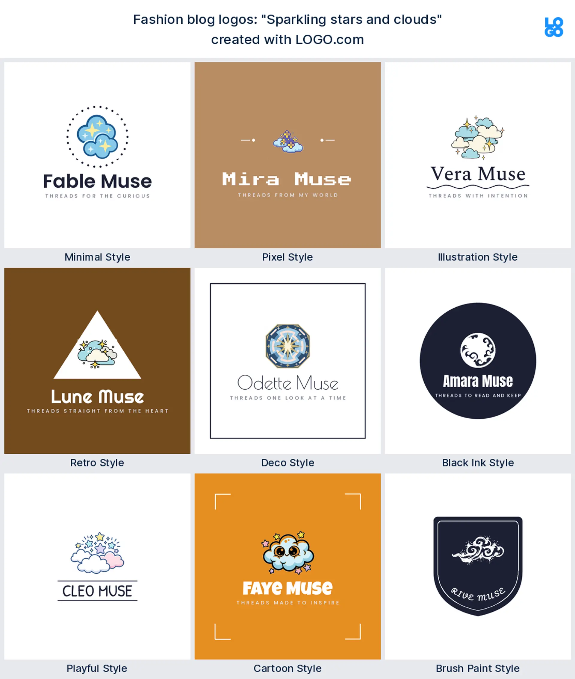
"Sparkling stars and clouds"
A founder chasing a soft, dreamy feed wrote this. Stars scattered among clouds read gentle and aspirational, a pretty aesthetic logo for a mindful or beauty blog.
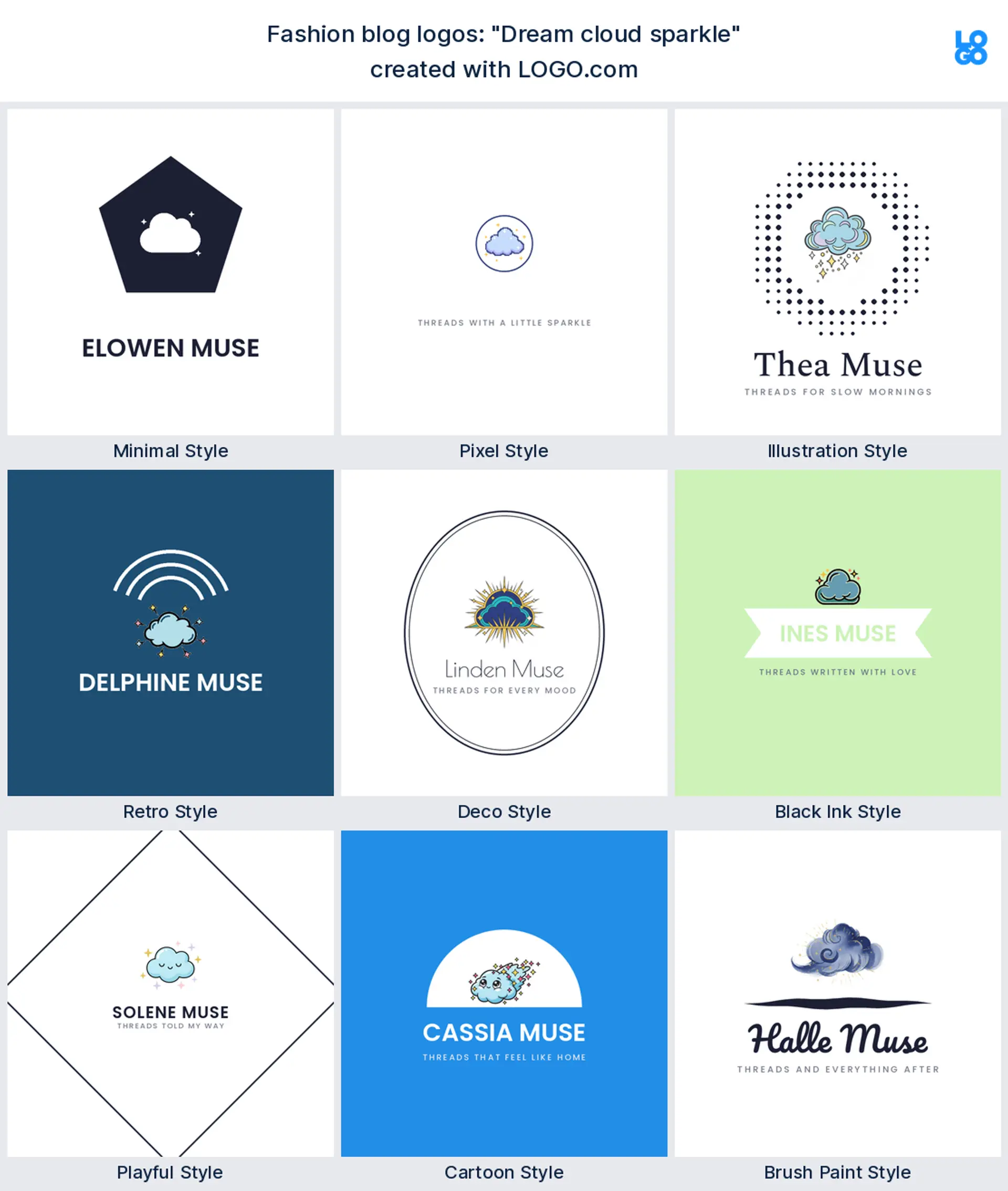
"Dream cloud sparkle"
This one keeps it simple, a single sparkling cloud. It reads calm and a little magical, a cute aesthetic logo for a slow living or self care blog.
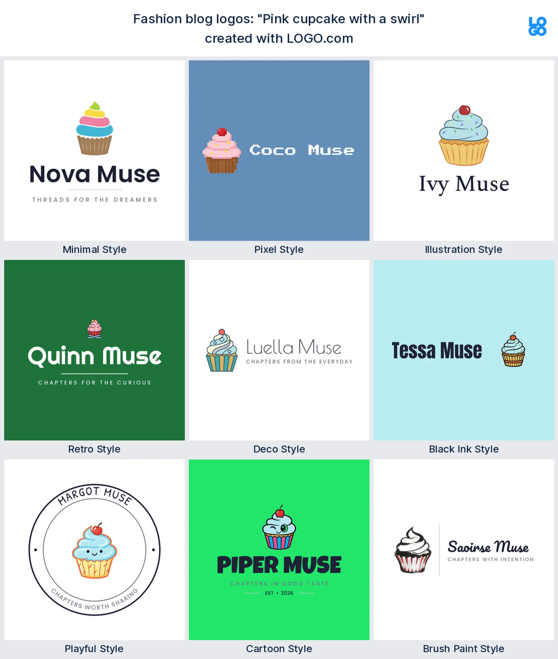
"Pink cupcake with a swirl"
A food and lifestyle blogger typed this, and a cupcake with a swirl is pure charm. It makes a sweet, approachable lifestyle logo for recipes, treats, and everyday joy.
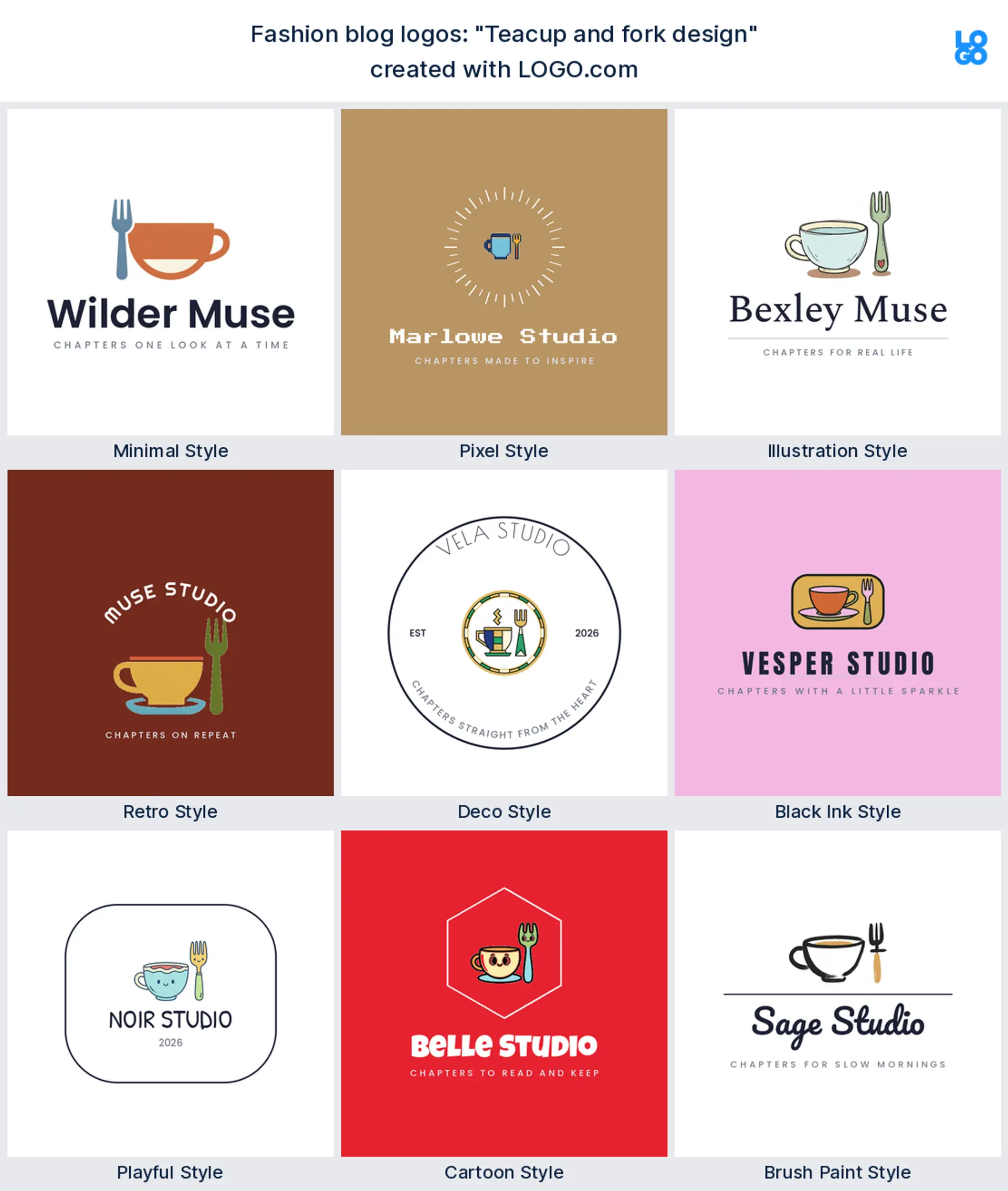
"Teacup and fork design"
A slow mornings blogger paired a teacup with a fork. It reads cozy and unhurried, a warm lifestyle logo for food, home, and quiet routines.
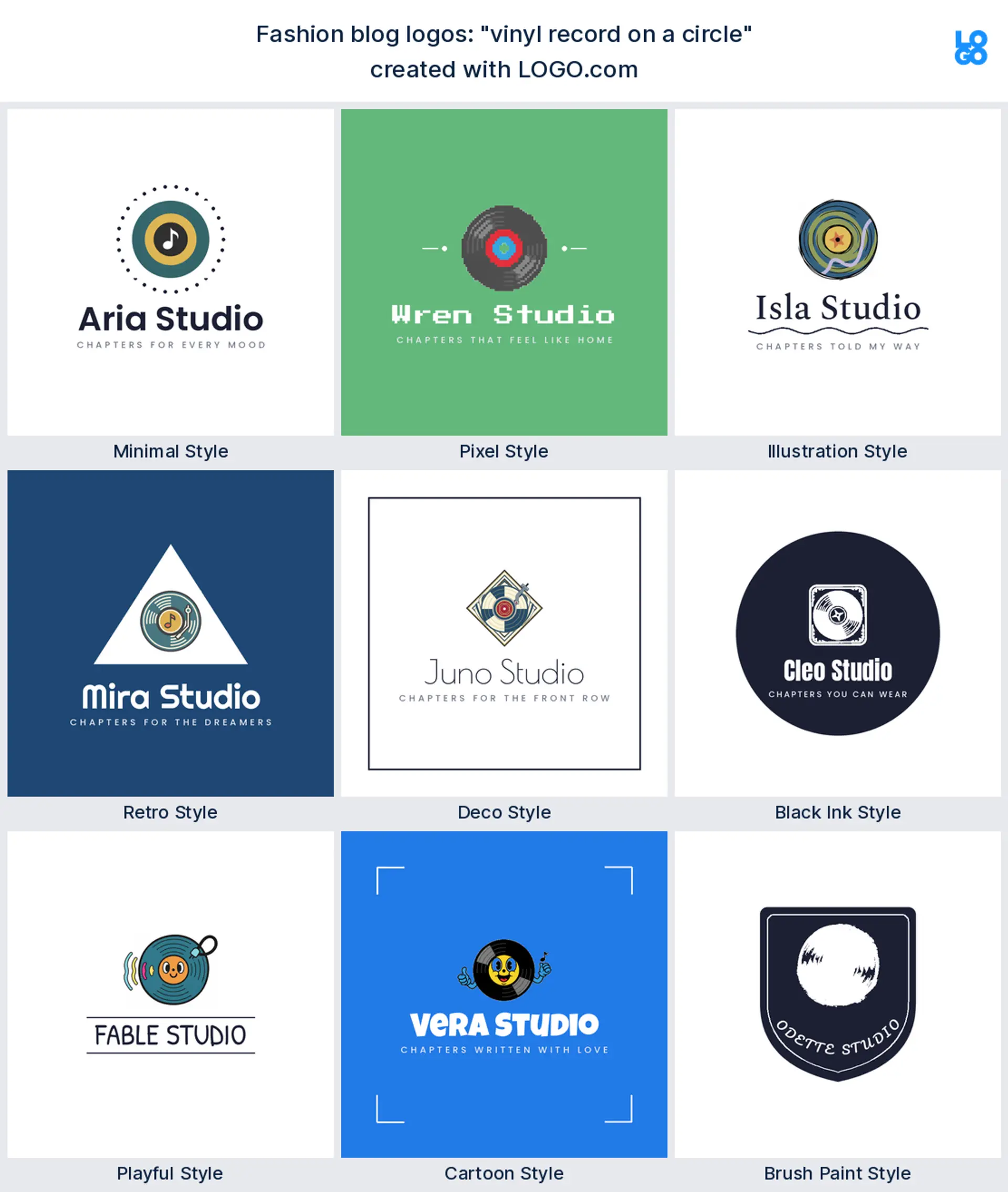
"vinyl record on a circle"
A music and style blogger wrote this, a record spinning in a clean circle. It reads retro and cool, a distinctive personal brand logo for anyone with a strong taste in sound.
Turning your blog into a recognisable personal brand
A fashion blog is really you, so the logo is doing personal brand work whether you call it that or not. The bloggers who feel established use one mark everywhere, and that consistency is the whole trick behind a strong personal brand logo. Decide what leads first: if your blog name is short and worth showing off, style it as a clean wordmark and let that be the logo, and if you want something friendlier to spot, add a small symbol or a monogram of your initials that can stand alone. Then use the same mark on your site, your Instagram, and anywhere you post, because seeing it again and again is what turns a casual reader into someone who recognises an influencer or content creator on sight. Keep the colors and the font steady too, and your blog starts to feel like a brand instead of a hobby.
Where your logo shows up, from favicon to profile picture
Your logo has more homes than a shop sign ever would, so design for the smallest one first. It sits in the browser tab as a tiny favicon, at the top of your site header, on your Instagram and TikTok profile picture, on a Pinterest pin, and maybe on a YouTube channel icon if you film. That range is exactly why the marks above are drawn simple, since a fussy logo turns to mush at 32 pixels. Export a transparent version so it drops cleanly onto a photo, a colored banner, or a story background with no white box, and keep a round, friendly version for the profile picture slots every influencer and content creator lives in.
Getting the soft, editorial look that aesthetic logos are known for
Search aesthetic logo and you will see the same recipe again and again: lots of space, one delicate mark, and type that feels calm rather than loud. It is a look bloggers reach for because it signals taste before you read a word. To get there, resist crowding the logo. Give the symbol room to breathe, choose one elegant serif or one clean sans instead of two, and keep the color soft. A muted palette and a single fine line mark will read more expensive than a busy, colorful badge every time, which is the whole trick behind a good aesthetic logo.
Colors and fonts that feel like a style blog
Color is where your blog shows its taste, so choose on purpose. In our data the blogs and personal brands that built with us lean hardest on green and blue, with a warm orange and a rich brown close behind, which points toward calm, earthy palettes rather than loud primaries. If you want a clean, modern feel, a sage green or a soft blue reads current and fresh. Chasing something cozy? A warm clay or a muted brown feels lived in and personal. Whatever you pick, hold it to one confident color plus a neutral, pair it with one serif for headings and one simple sans for the rest, and let your photos be the color story. That restraint is what separates a considered fashion blog logo from a busy one.
Make your fashion blog logo with LOGO.com
Pick the symbol that matches your voice, choose one of nine styles, and our free logo maker builds the rest around your blog name. Preview it free, download a high resolution PNG with full commercial use, and walk away with a clean mark ready for your header, your profile picture, and your feed in minutes.
Methodology. These figures come from logos created on LOGO.com during the 12 months ending July 2026. We looked at the 90 custom icon descriptions typed by founders who chose a blog industry, drawn from the 1443 blog and personal brand founders who built with us in that window, grouped those descriptions by concept, for example a sparkling star, an open book, or a magic wand, and ranked each by how often it appeared. A sparkling star led at about 18%, an open book followed near 12%, and a magic wand came next at about 10%. Figures are a share of all icon descriptions in that set, rounded to the nearest percentage point. Source: LOGO.com first party product data, July 2026.
THE #1 LOGO GENERATOR
Why LOGO.com is the best fashion blog logo maker
1.Symbols bloggers actually use
Icons and styles pulled from the logos real bloggers and creators made on LOGO.com, not generic clip art.
2.Crisp as a favicon, round as a profile picture
Your mark stays clear in a browser tab and in the little round profile slot, where fussy logos usually fall apart.
3.Drops onto any feed with no white box
Download a transparent logo that sits cleanly on a photo, a story background, or a colored banner.
4.One look across blog, Reels, and Pinterest
Design it once and it fits your site header, your Instagram, a Pinterest pin, and a YouTube channel icon.
5.The soft, aesthetic palette you want
Pick a calm, editorial palette and one elegant font, or go bold, so the logo matches the mood of your writing.
6.Free to design, yours to keep
Preview free and download a high resolution PNG with full commercial use, then upgrade to the Brand Plan for vector files and a full brand kit.
Fashion Blog Logo Maker FAQs
Need Inspiration? See example brands in your industry...
AbstractAccessoriesAdventure TourismAestheticsAgricultureAirplaneAnimalAnimal and PetsAnime Logo MakerApplicationArchitectureArrowArtificial IntelligenceArts & CraftsAssociationAttorney FirmAuthorAuto Parts SupplyAviationBaked Goods StoresBandsBarsBeautyBeauty and Cosmetics BlogBeerBicycleBiotechnology ResearchBlack+WhiteBlueBonfireBook StoreBoutiqueBranchBuilding Materials ManufacturerBusiness LogoButcher ShopCalligraphyCampingCandyCar ClubCartoonCatering and Buffet ServicesCharitable FoundationChibiChiropractorChurchCircusClassicClothing ManufacturingCoffee Shops