Stylist Logo Maker
Design a stylist logo that looks good on your booking page and client lookbooks.
Need a different logo maker? Try our AI logo generator.
Logos created using LOGO.com
670,000,000
Wardrobe and closet stylist logos
Curated rail and outfit stylist logos
Elevated and editorial stylist logos
Stylist Logos, Ranked From Real Brand Data
According to LOGO.com data, the symbols founders describe most when they brief a wardrobe or styling logo are an open closet (about 16%), a closet organizer (about 14%) and an outfit silhouette (about 14%), ahead of hangers, shelving and clothing rails.
Everything below is built from those real descriptions, so you are starting from marks clients already read as styling rather than from a blank page. Each one is drawn to survive a round profile photo, a lookbook cover and the corner of an invoice.
On this page
- Fashion stylist or hair stylist? Say it in the mark
- The nine symbols stylists describe most
- Fifteen client wardrobe briefs turned into logos
- Personal shopper, wardrobe consultant or image coach?
- Your logo on a lookbook, an invoice and a mood board
- Colors that read edited rather than boutique
- What it costs and what you can put it on
- Make your stylist logo with LOGO.com
Search for a stylist logo and you will mostly get scissors. That is the first thing to fix, because if you style wardrobes rather than hair, a pair of shears points every new client at the wrong job. So we went looking for what founders actually describe when they brief a wardrobe brand on LOGO.com, and the vocabulary turned out to be pleasingly concrete. Open closets. Hangers. Whole outfits. Below are the nine symbols that came up most, fifteen real briefs rendered nine ways each, and the decisions that separate a personal stylist logo from a shop logo.
Fashion stylist or hair stylist? Say it in the mark
The word stylist is doing two very different jobs in search, and the bigger half belongs to hair. That matters for you, because a client landing on your booking page has about a second to work out whether you are cutting hair or building a wardrobe. Scissors, combs and a salon chair all belong to the other trade, so leave them alone entirely. Wardrobe objects do the disambiguating for you. An open closet, a hanger, a rail or an outfit says fashion styling before anyone reads your tagline, which is why every symbol on this page comes from that vocabulary. If your work genuinely spans both, pick the service you want more of and let the mark commit to it. A logo that hedges reads as a logo that is unsure.
The nine symbols stylists describe most
When we read the wardrobe and styling icon descriptions written on LOGO.com, nine ideas carried nearly all of them. An open closet leads at about 16%, a closet organizer follows at about 14%, and an outfit silhouette sits level with it at about 14%. After that the list runs through hangers, shelving, rails, shirts, a lightbulb and a crown. What stands out is how physical the vocabulary is. Founders describe furniture and garments, not abstractions, which tells you a stylist logo works best when it shows the room or the thing rather than hinting at a feeling.
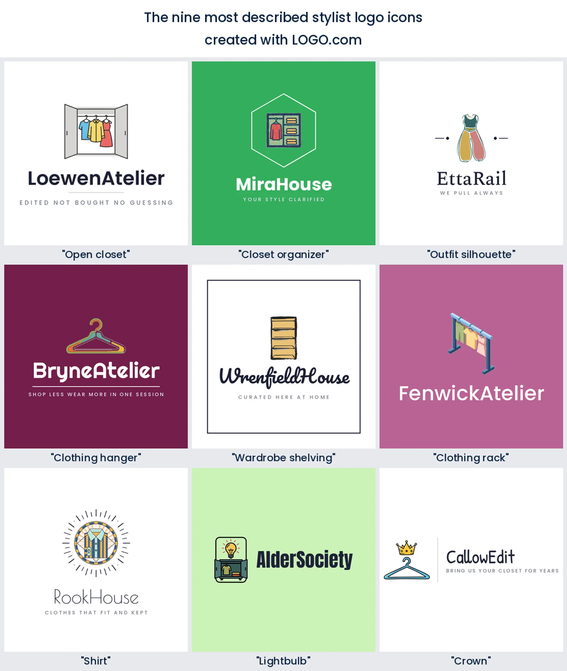
1. Open closet
Roughly 16% of the descriptions we read named an open closet, which makes it the clear favourite. It is the only symbol on this list that shows a whole world rather than a single object, which is exactly what a wardrobe session feels like from the client side. Two doors swung open with a few pieces inside reads instantly, even in a round avatar, and it makes a warm fashion stylist logo when you want to promise a full edit rather than one outfit.
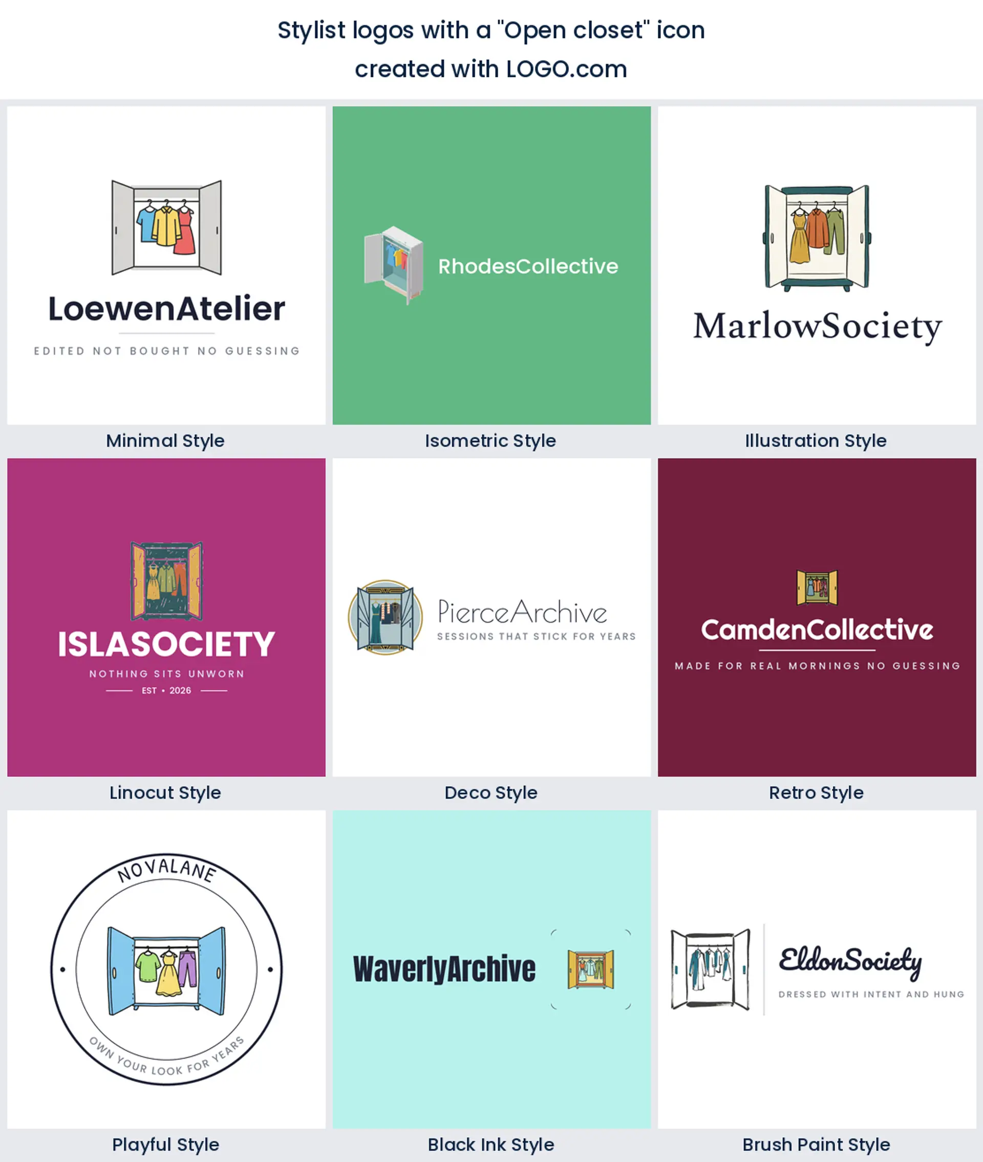
2. Closet organizer
Organisers account for about 14%, and they are the most service minded symbols on the list. Founders describe shelves, rods, boxes and systems, because what they sell is order. Draw it as a simple divided grid with one hanging piece and you get a mark that suits wardrobe audits, decluttering and the kind of stylist whose first session is always a purge. It is also a natural personal stylist logo when your clients are busy rather than fashion obsessed.
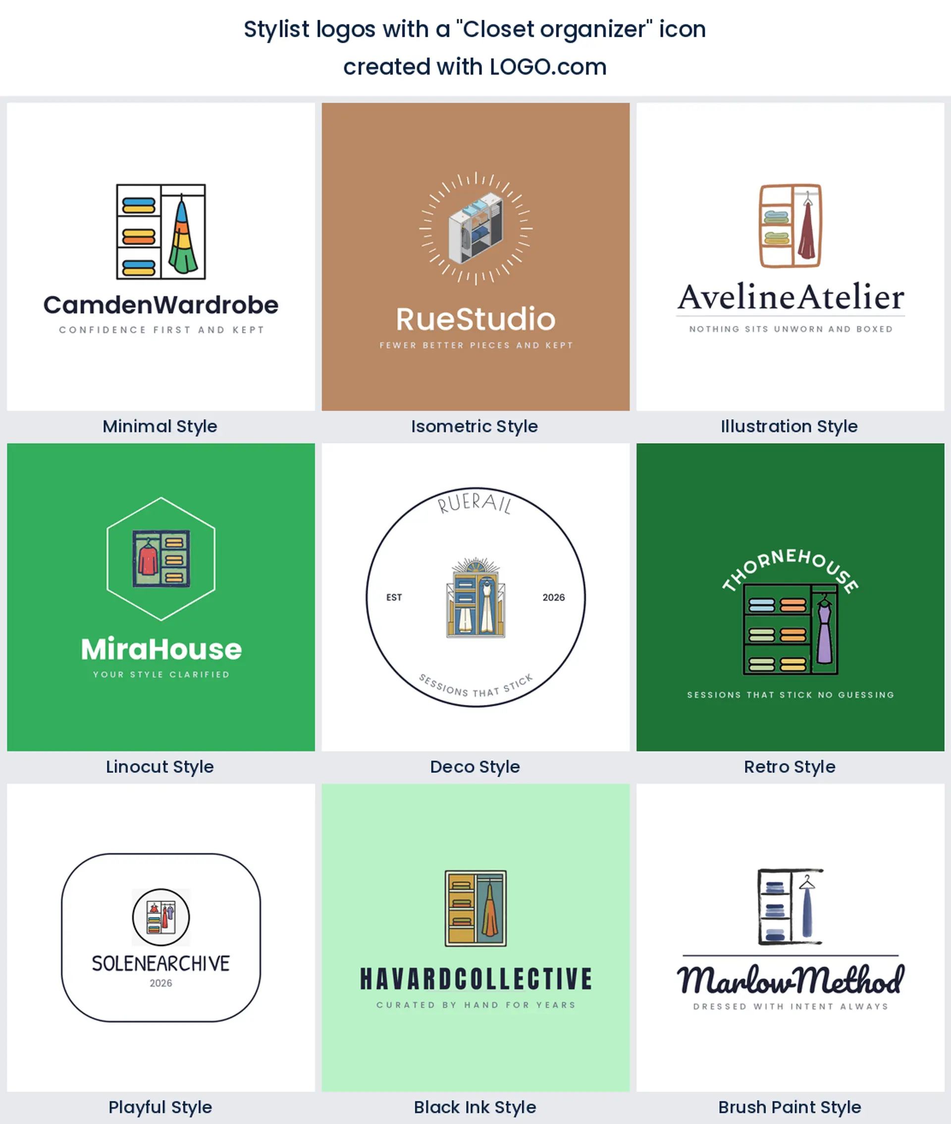
3. Outfit silhouette
Also at about 14%, and the only symbol here that puts a person in the frame rather than furniture. A top and a bottom drawn as one shape says you style humans, not rails, and it is the friendliest option if your work is confidence led. Keep the shape a little abstract so clients of every size see themselves in it, and it becomes a lovely styling logo for coaching and image work.
4. Clothing hanger
Now the ranking drops out of percentages and into shapes, and the hanger is the most economical one you will find. A hanger is three strokes and everybody reads it, which is why it holds up embossed on a card and shrunk to a favicon. It is a good pick if you want something that will not date, and it plays beautifully as a monogram when you let the hook curve into your initial. Reach for it when you want a stylist logo design that whispers.
5. Wardrobe shelving
Founders who work inside people's homes keep describing shelves, rods and open storage. It is the one symbol that pictures the space rather than the clothes, which is exactly right if your sessions happen in a client's own bedroom. Keep the shelves to three lines at most, since any more and they merge into a smudge the moment the mark goes small. Pair it with a calm serif and it reads considered rather than clinical.
6. Clothing rack
Nothing on this page feels more editorial than a rail, and founders reach for it when the work is about curation, pulling pieces, building a capsule, sending a rail to a shoot. Hang three garments and no more, keep the bar thick, and it works as a personal shopper logo where the whole promise is that you did the choosing.
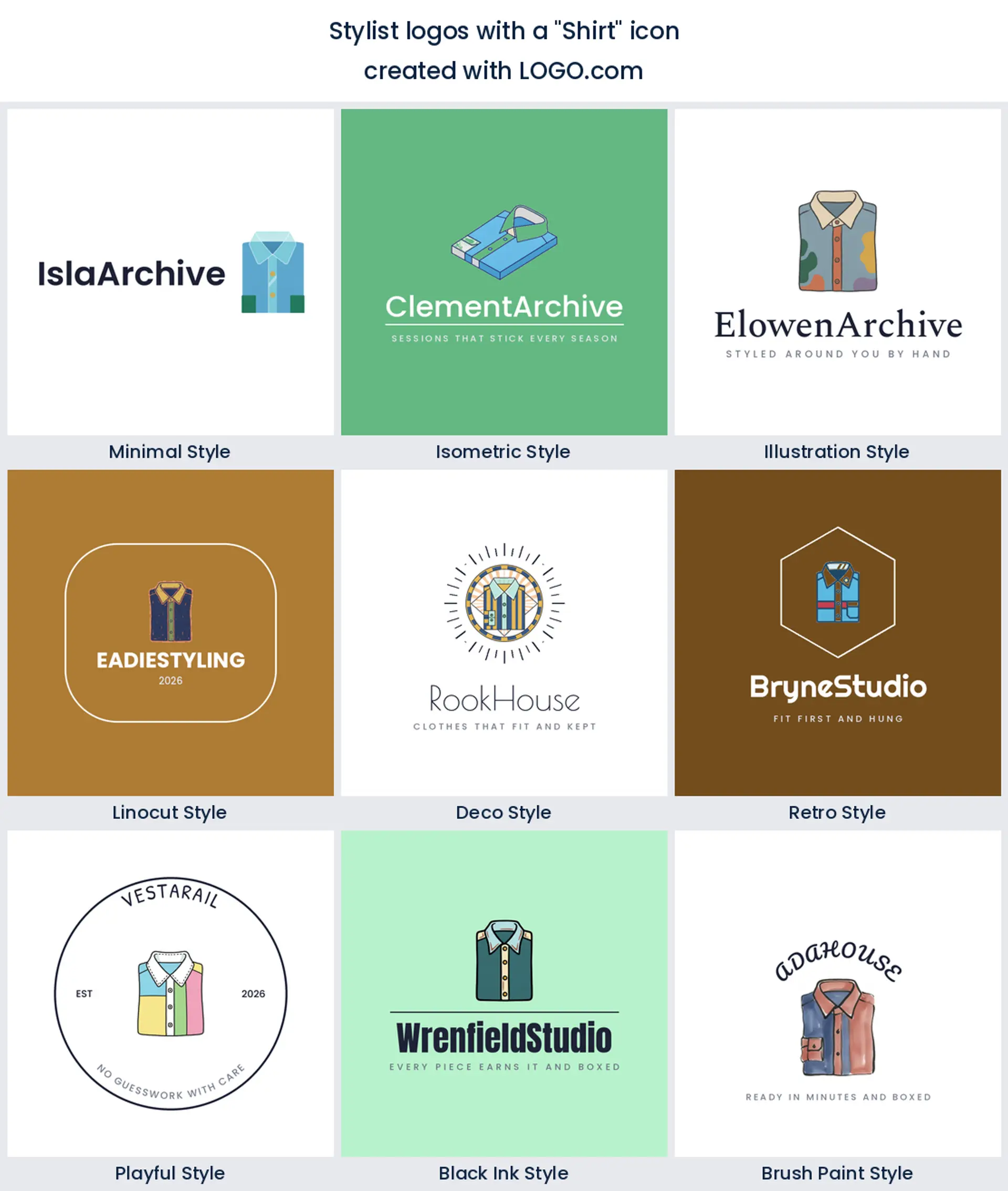
7. Shirt
Menswear and corporate work is where the plain shirt earns its ranking. It is unglamorous in the best way, and the strong collar line keeps it legible at any size. If your niche is interview wardrobes, first jobs or capsule dressing, this is the least fussy symbol you can choose.
8. Lightbulb
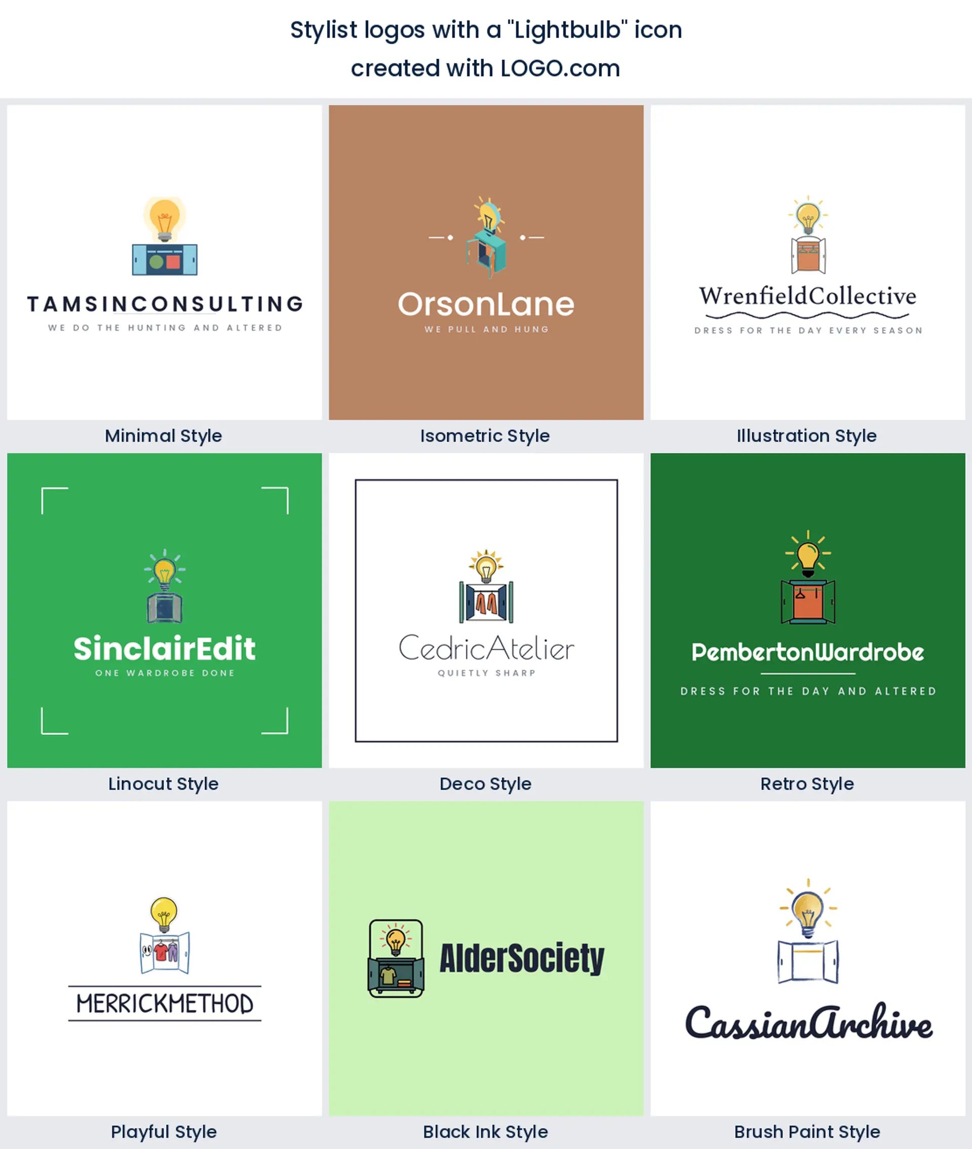
Here is the one you would never guess sitting this high. Founders keep pairing a bulb with a closet or a hanger to say the service is an idea, not a garment. It is a clever move for wardrobe consultants and image coaches, because it shifts the promise from clothes to clarity. Keep the bulb small and let the wardrobe element lead, or the mark starts looking like a tech startup.
9. Crown
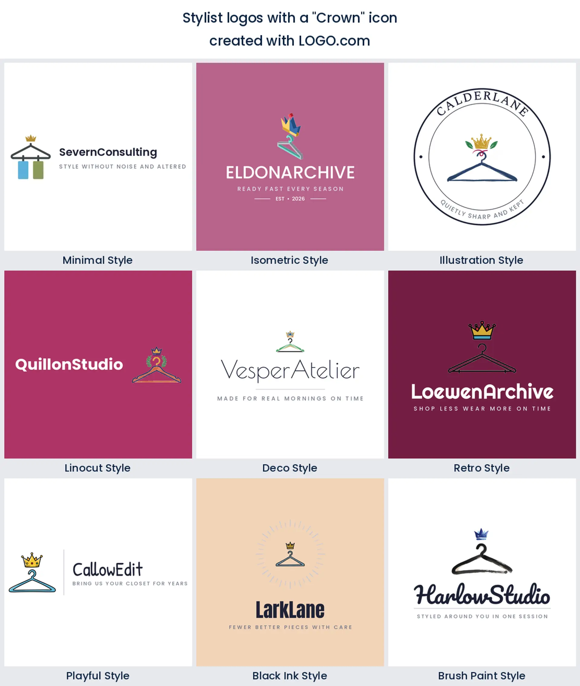
Last of the nine, and it works as an accent rather than a subject. It turns up perched above a hanger or a garment, doing exactly one job, telling people the client leaves feeling like the best version of themselves. Used lightly it is charming. Used large it tips into bridal or barbershop territory, so keep it as an accent rather than the whole mark.
Fifteen client wardrobe briefs turned into logos
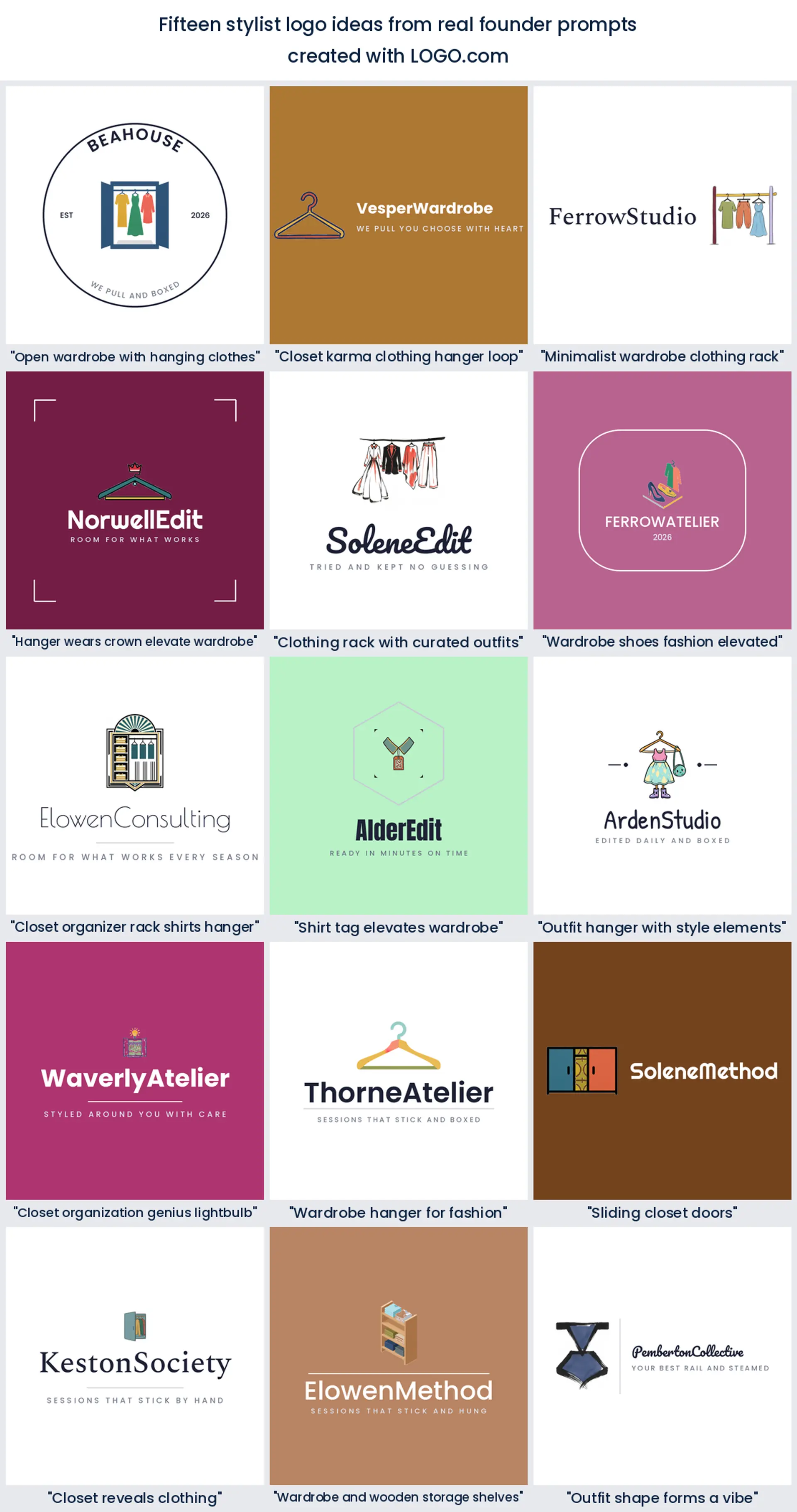
Each heading below is a real description someone typed into LOGO.com while building a wardrobe brand, quoted exactly as they wrote it. We rendered every one across all nine LOGO.com styles so you can watch the same idea travel from a quiet minimal mark to a bold linocut badge. Use them as stylist logo ideas to react against rather than a menu to pick from, then change the name, the color and the font until the thing belongs to you.
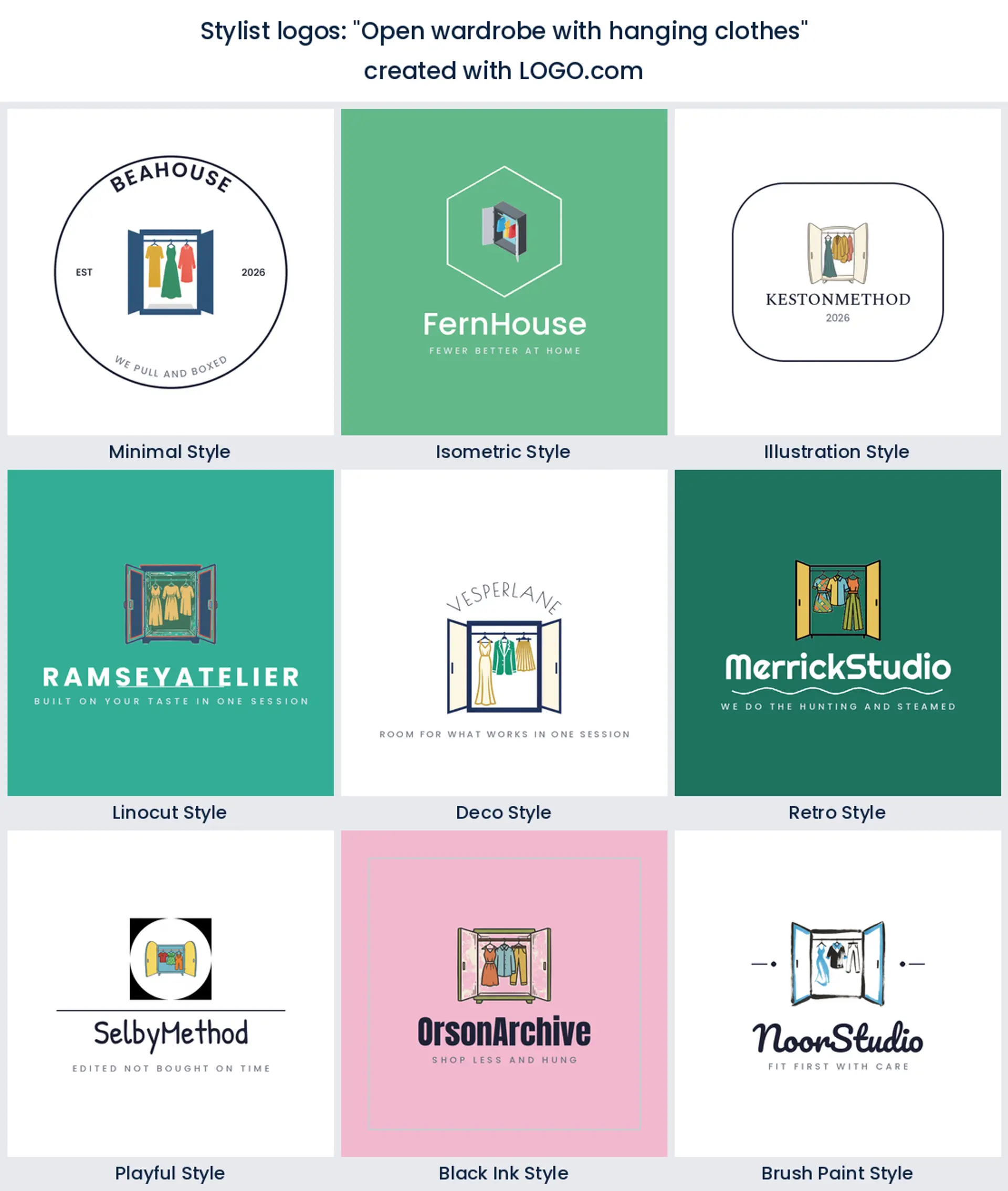
1. "Open wardrobe with hanging clothes"
Two doors swung wide with three pieces on the rod is the clearest picture of a wardrobe edit there is, and it gives clients a little hit of anticipation before they read a word. Works especially well when your sessions happen in the client's own home.
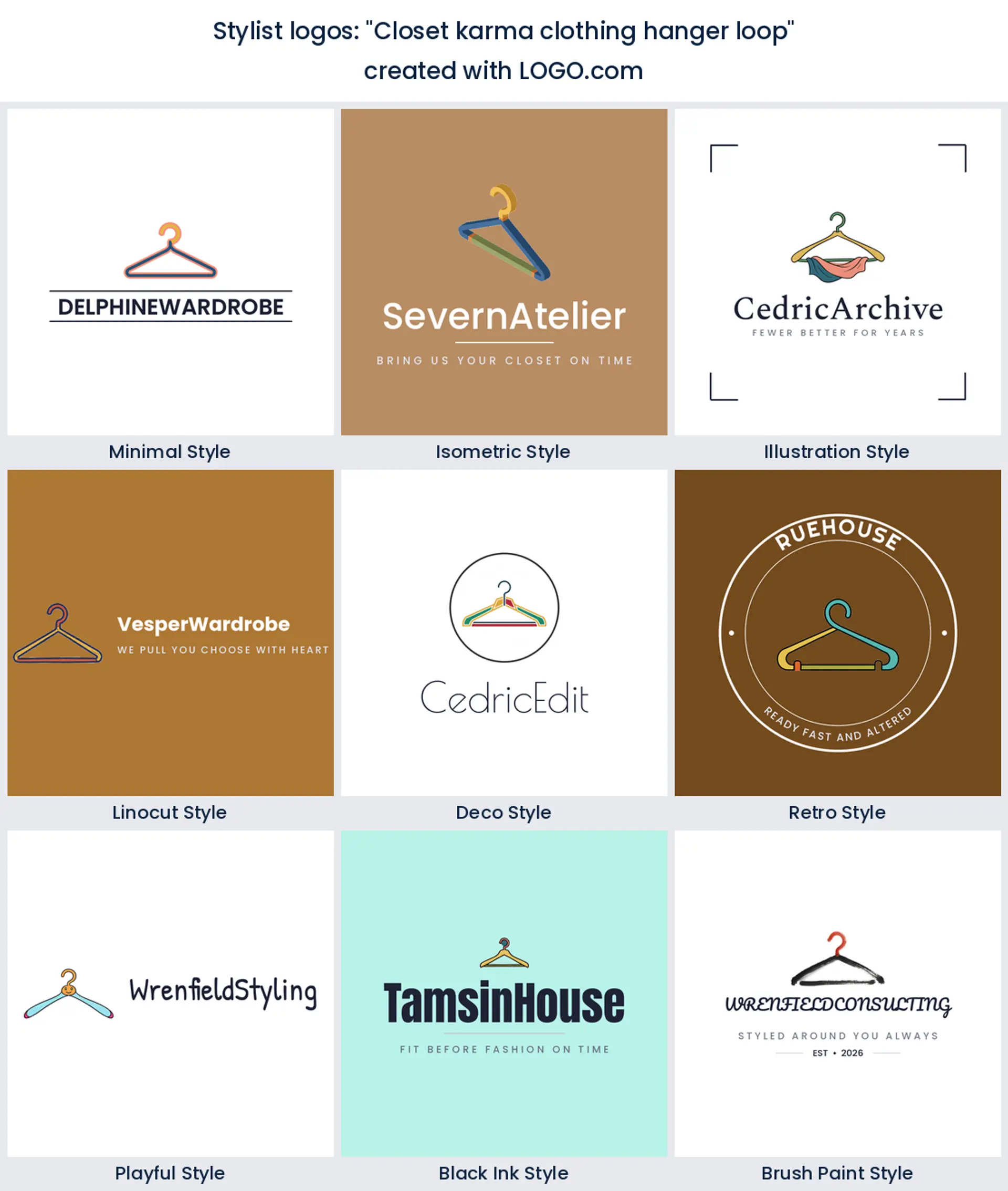
2. "Closet karma clothing hanger loop"
A hanger hook drawn as a continuous loop turns an everyday object into something that feels intentional. Choose it if your work has a sustainable or circular angle, since the unbroken line quietly says nothing here gets wasted.
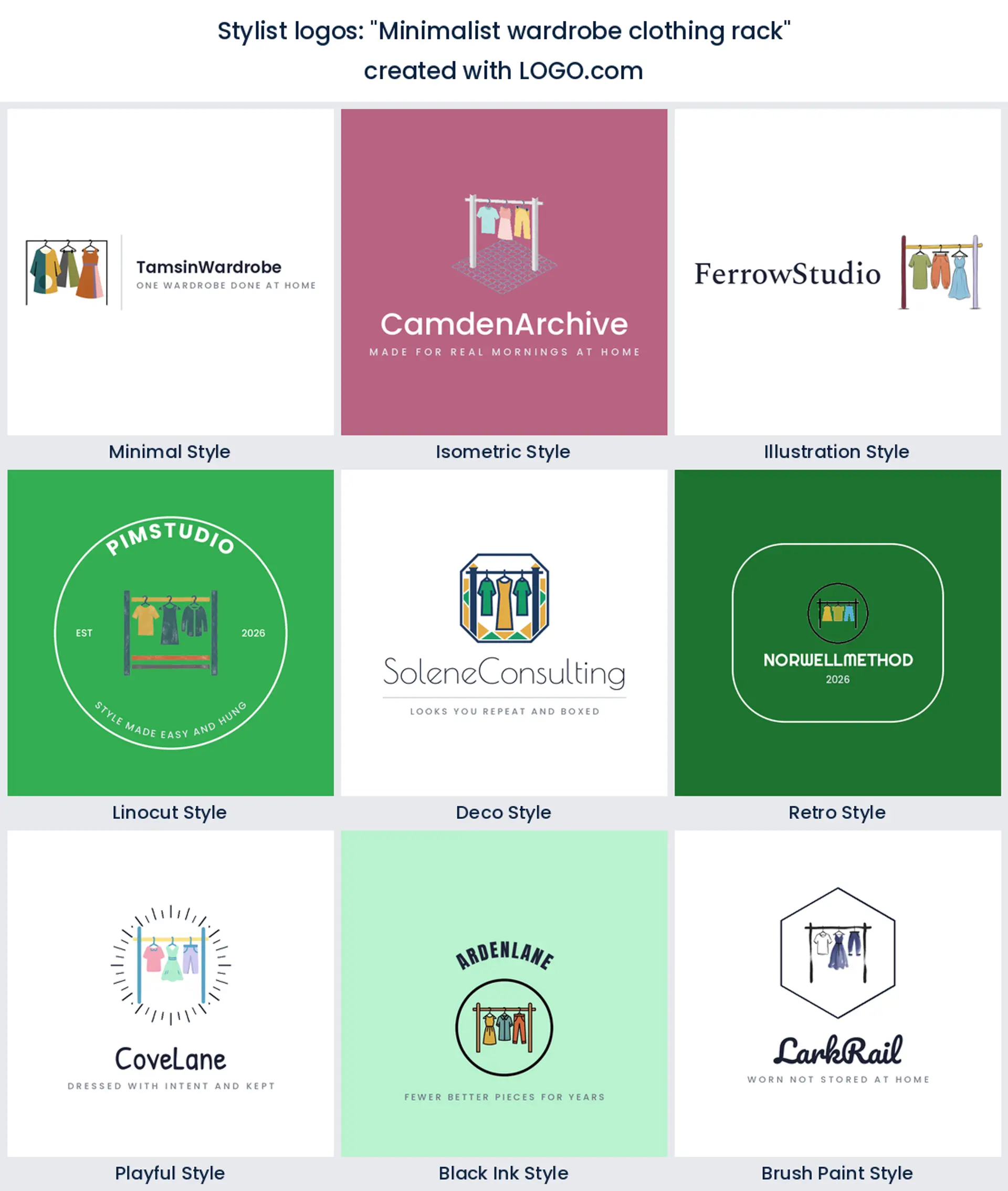
3. "Minimalist wardrobe clothing rack"
Strip a rail back to a bar, two uprights and three garments and you have a mark that will still look right in five years. This is the safest fashion stylist logo on the page and the easiest to letter next to a long name.
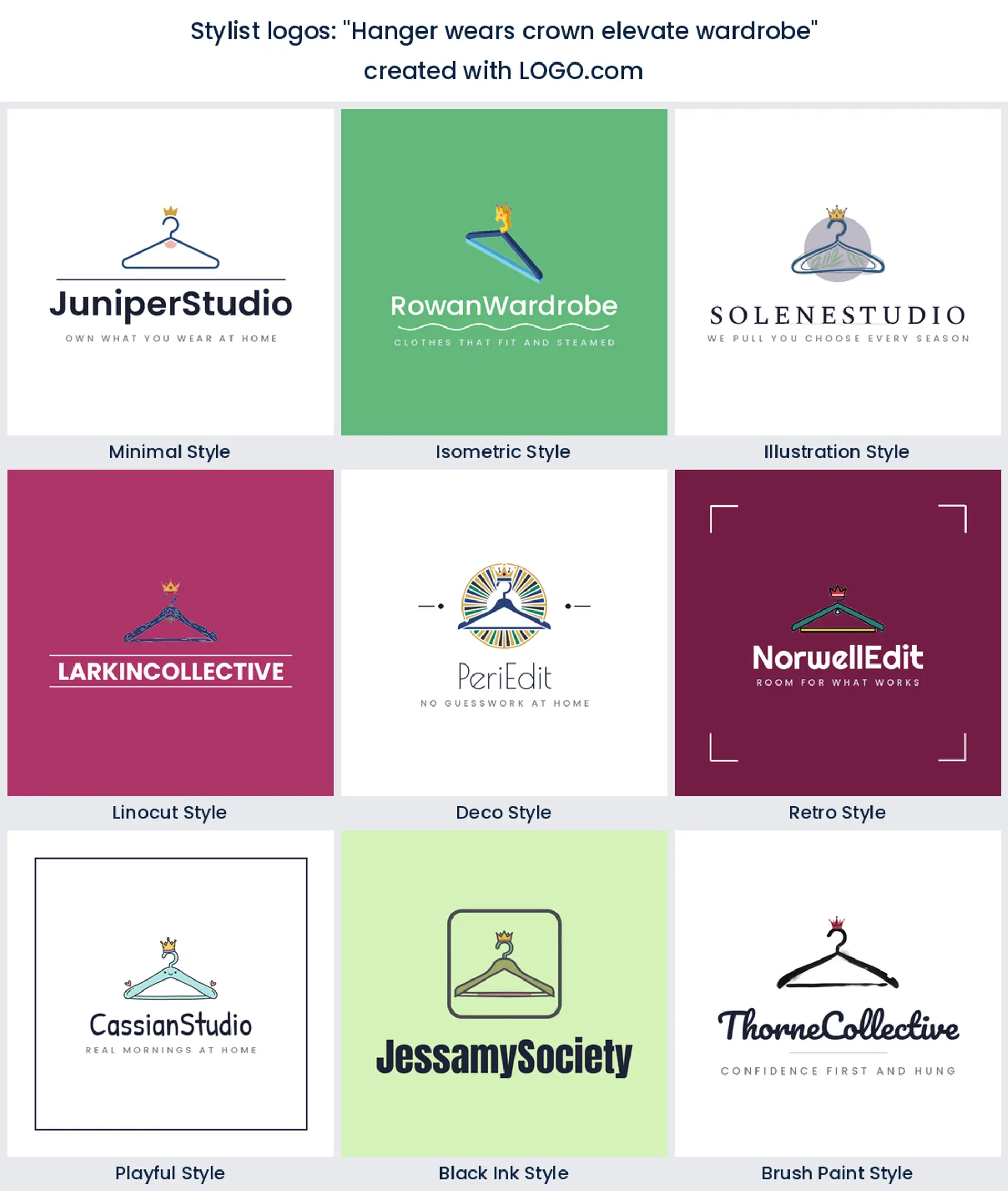
4. "Hanger wears crown elevate wardrobe"
A small crown sitting on the hook is a one gesture way of saying premium without adding a single word. Keep the crown tiny. The moment it outgrows the hanger the whole thing starts to feel like a costume.
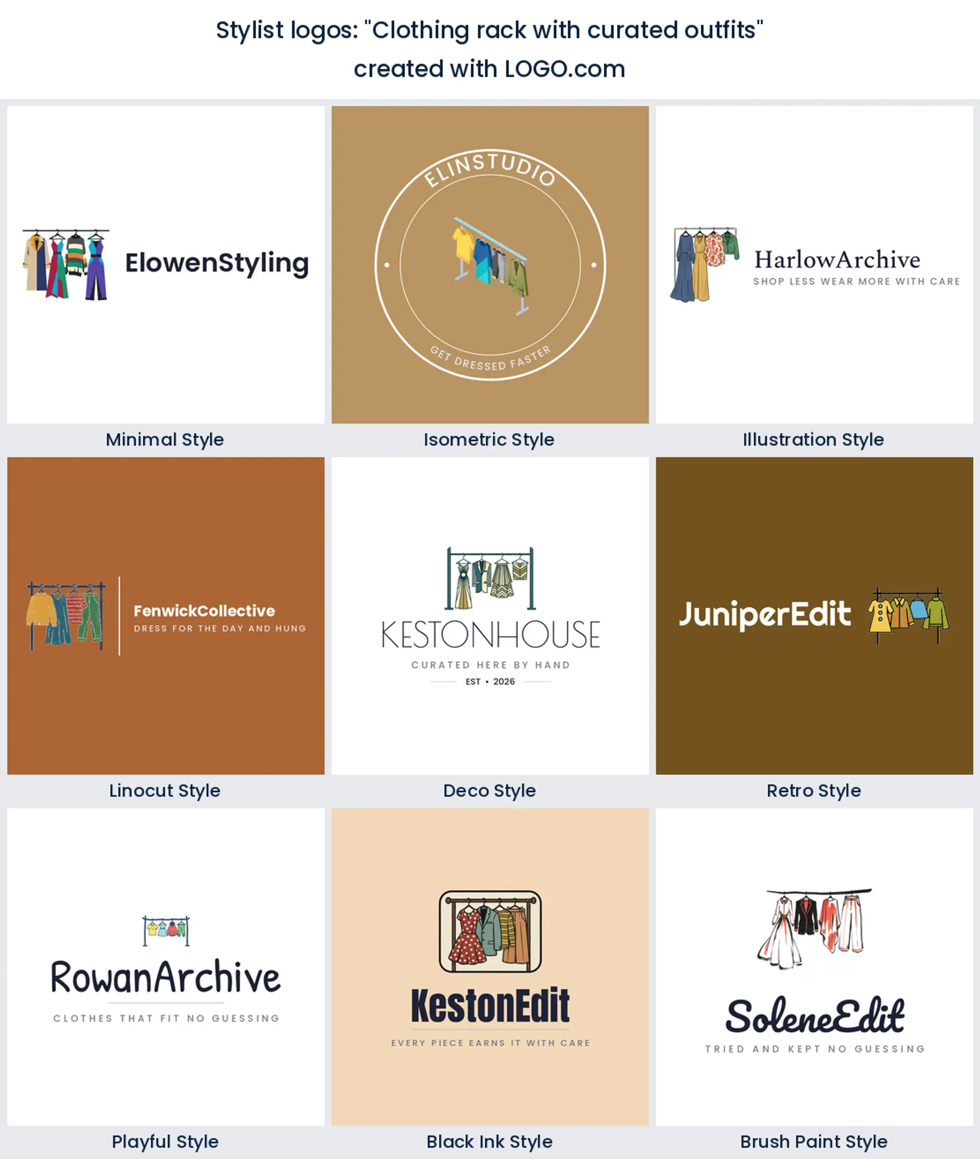
5. "Clothing rack with curated outfits"
A rail where every piece is clearly different tells people you pulled these, they did not arrive in a box. It suits stylists who shop for clients, and it is a strong personal shopper logo when the selection is the whole service.
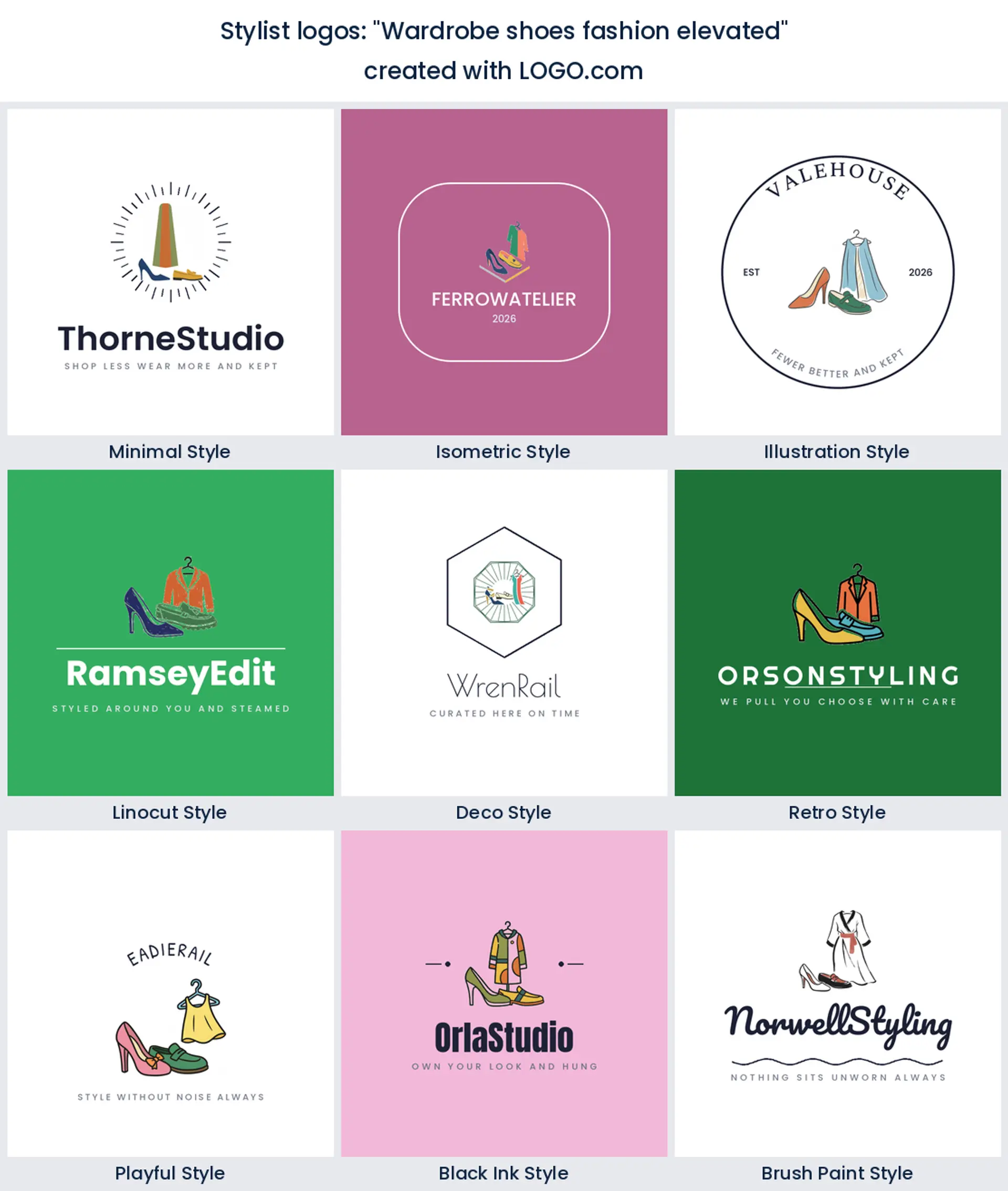
6. "Wardrobe shoes fashion elevated"
Bringing shoes into the mark widens the promise from clothes to whole looks. A single heel or loafer beside a garment is enough. Use it if accessories and footwear are where you add the most value for clients.
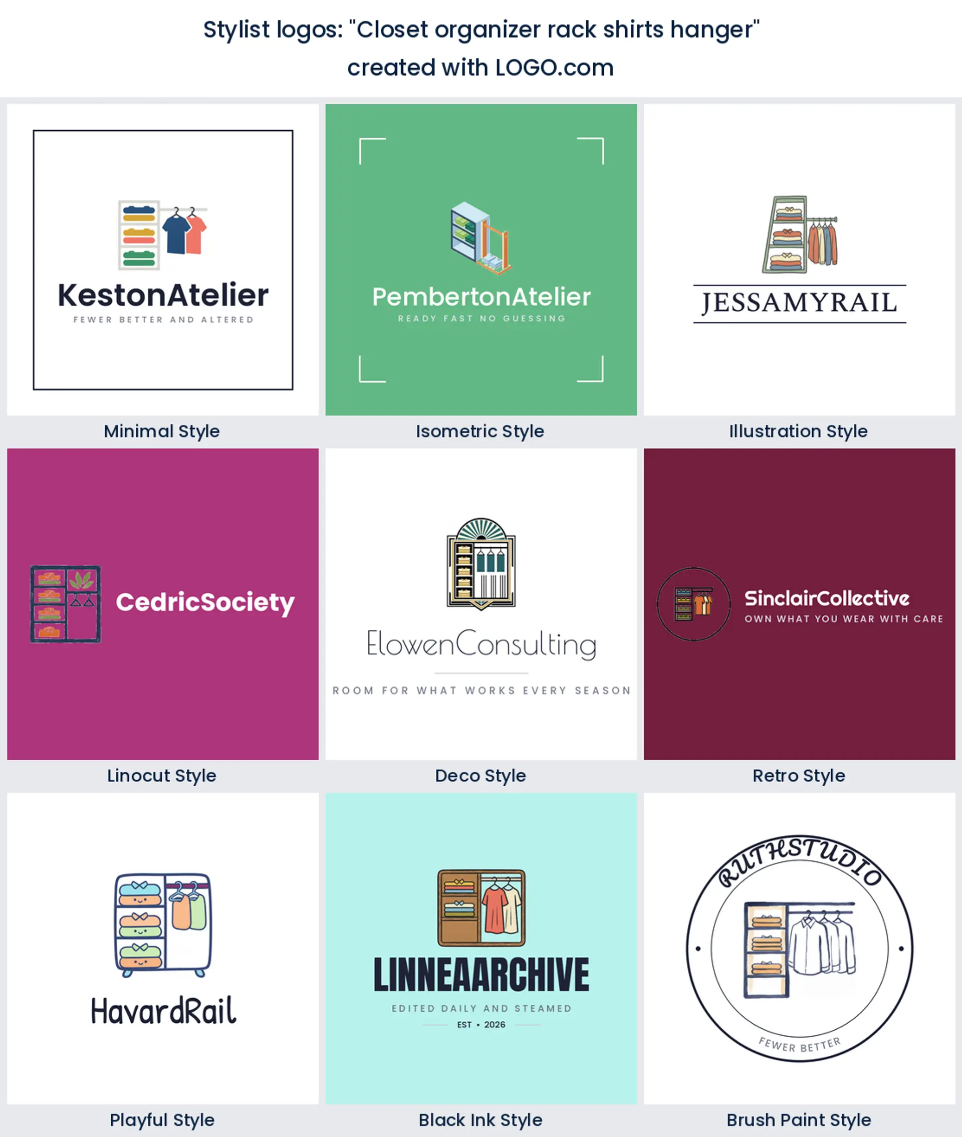
7. "Closet organizer rack shirts hanger"
Shelves, a rail and folded shirts together look like a system, which is exactly right if you sell wardrobe audits. It is busier than most marks here, so give it a generous frame and check it small before you commit.
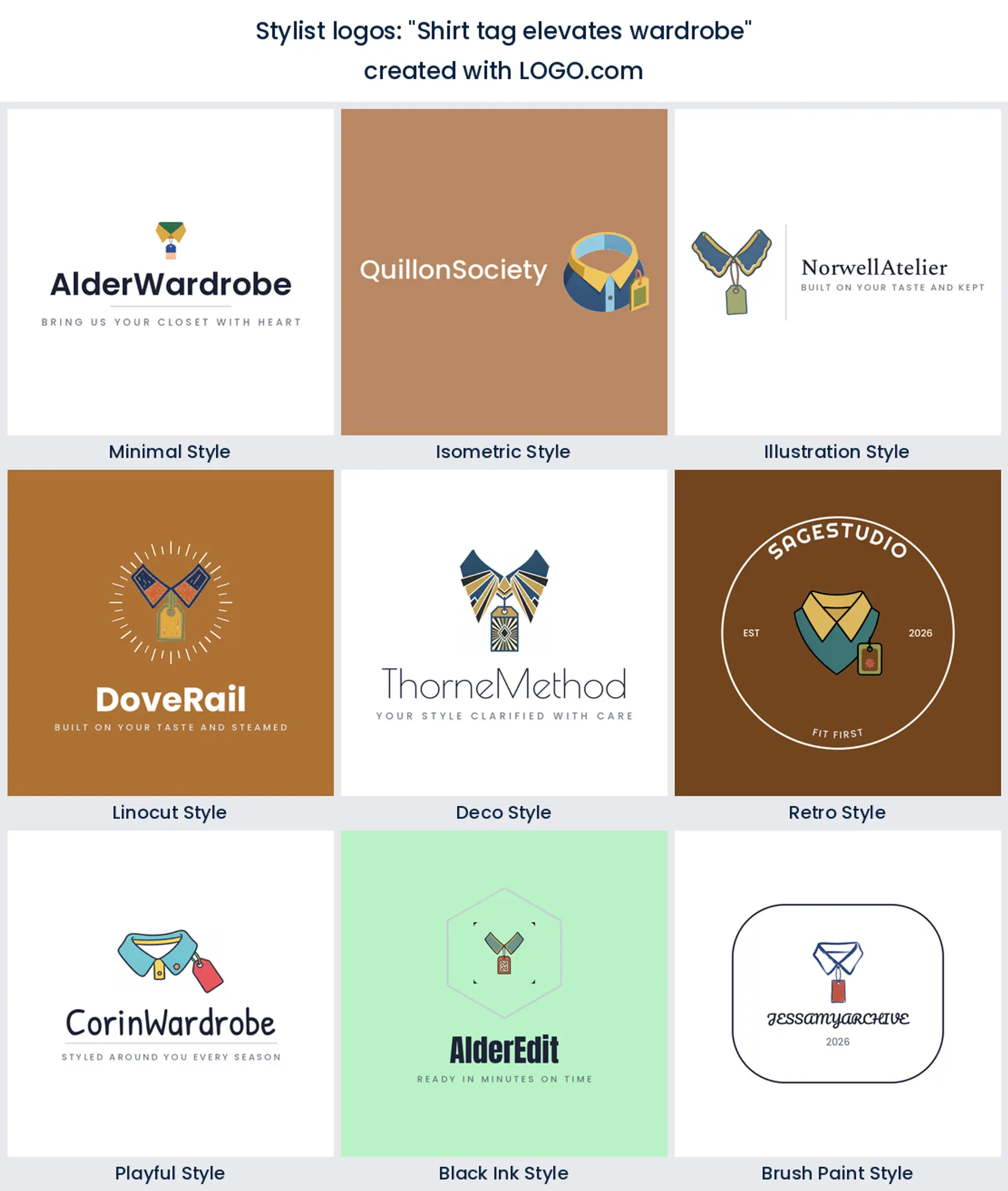
8. "Shirt tag elevates wardrobe"
A swing tag hanging off a collar puts the focus on quality rather than quantity. It is a smart pick for stylists working with tailoring, resale or investment pieces, and it prints beautifully in one color onto a card.
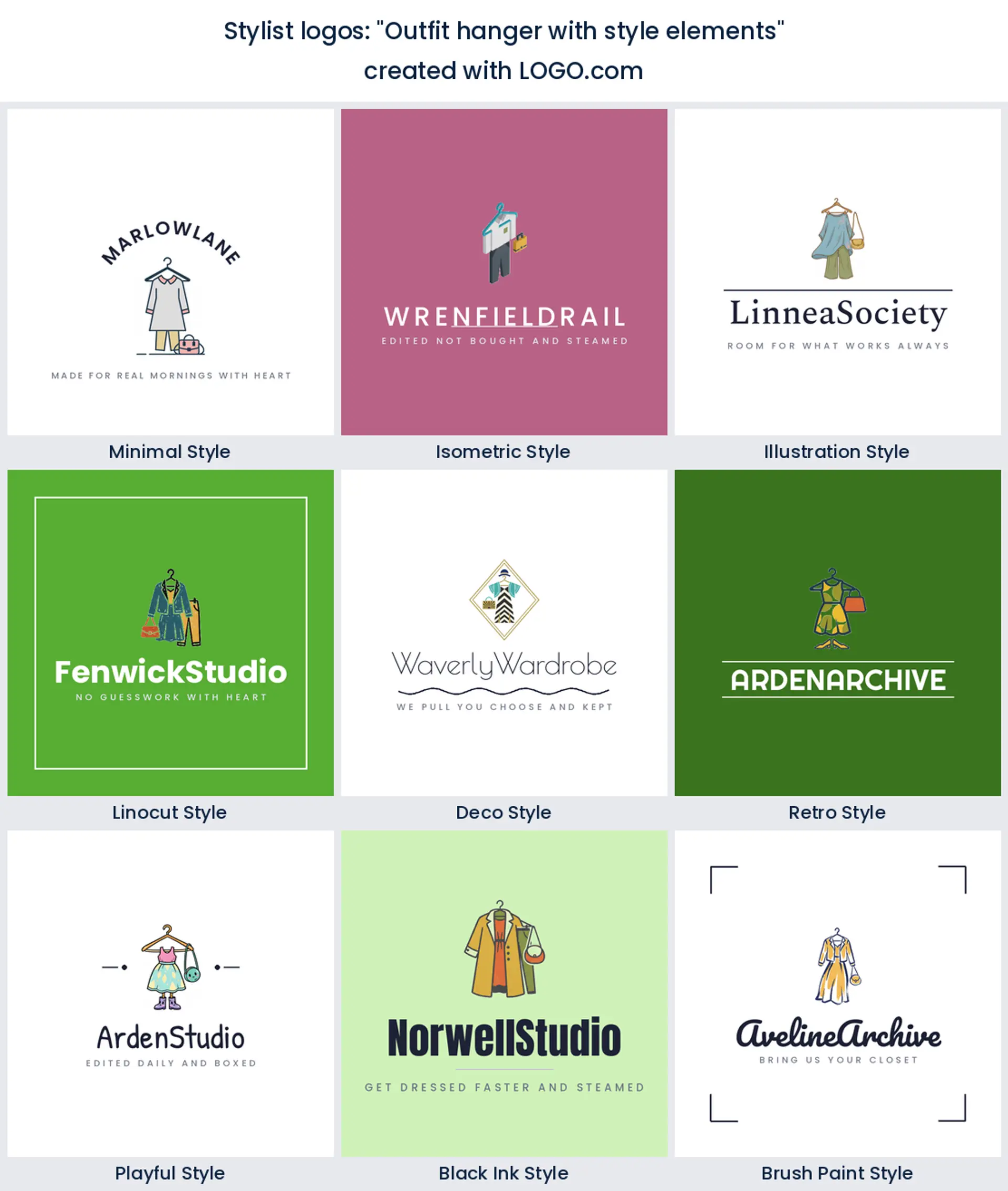
9. "Outfit hanger with style elements"
A hanger holding a whole look, with a small accessory floating beside it, reads as styling rather than storage. This is a good middle ground when you want the mark to feel fashion led but still obvious at a glance.
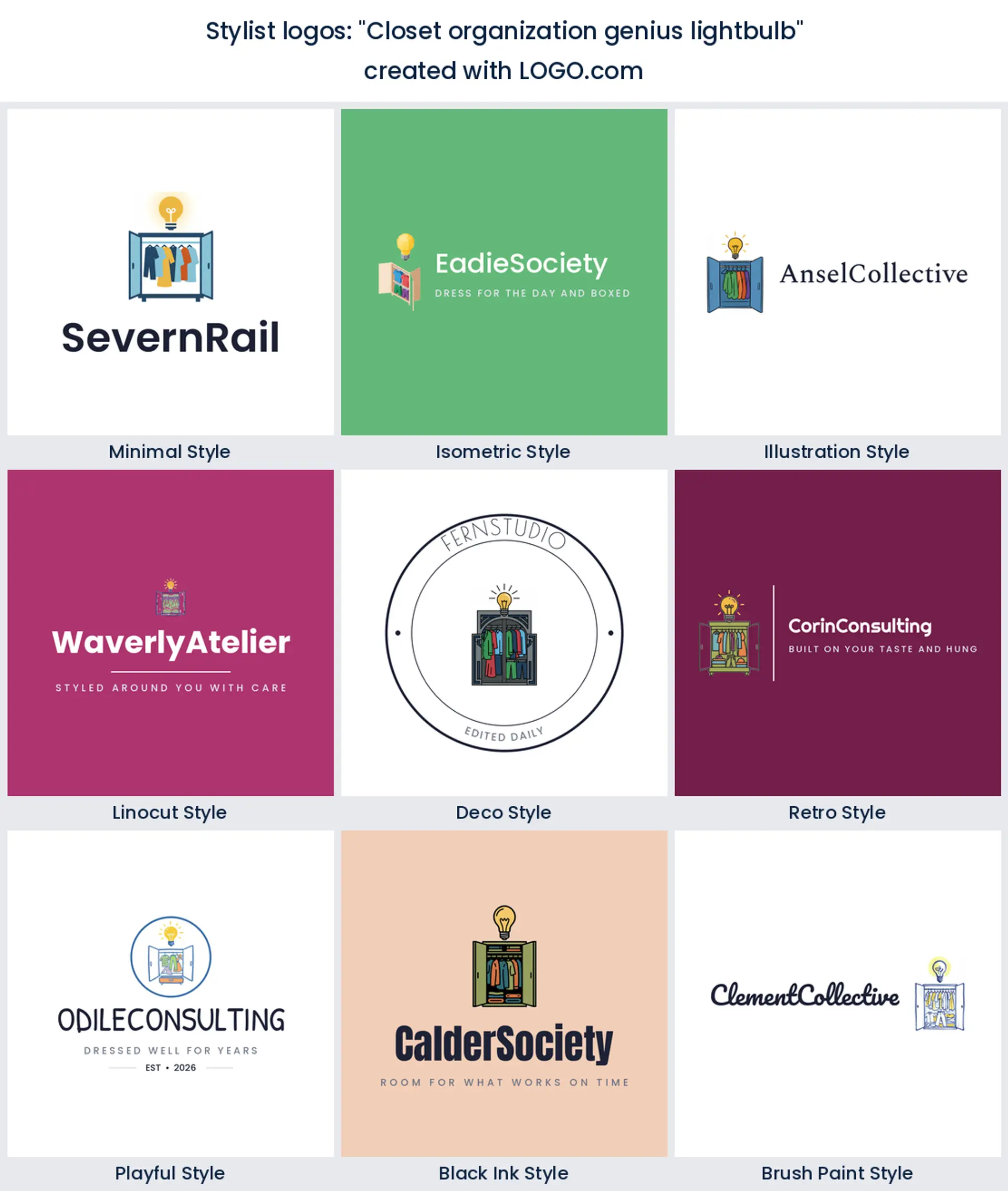
10. "Closet organization genius lightbulb"
The bulb over the closet is a promise that you bring the thinking. It suits consultants and coaches more than shoppers, and it gives you a mark that does not look like anybody else on the local search results page.
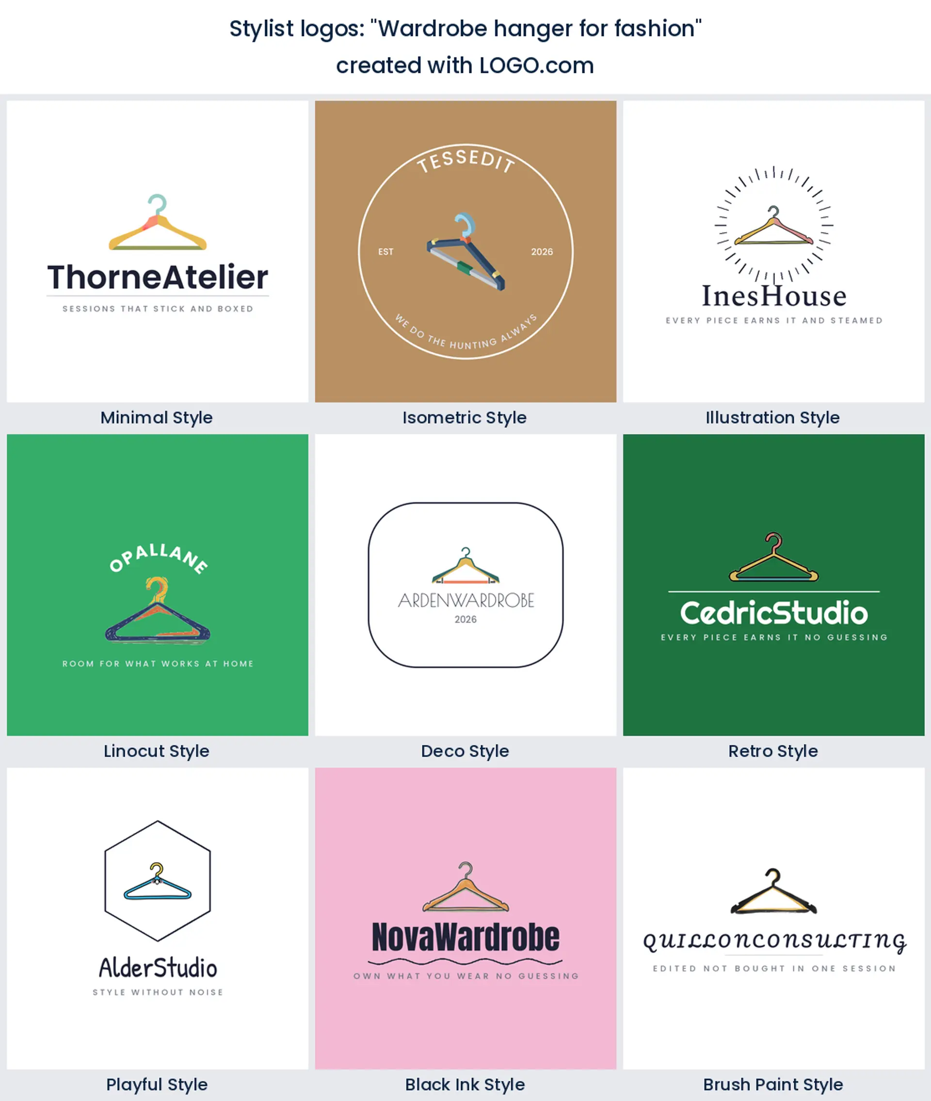
11. "Wardrobe hanger for fashion"
The plainest option here, and sometimes the right one. One hanger, one name, nothing competing. If your name is unusual or long, let it carry the personality and keep the symbol completely quiet.
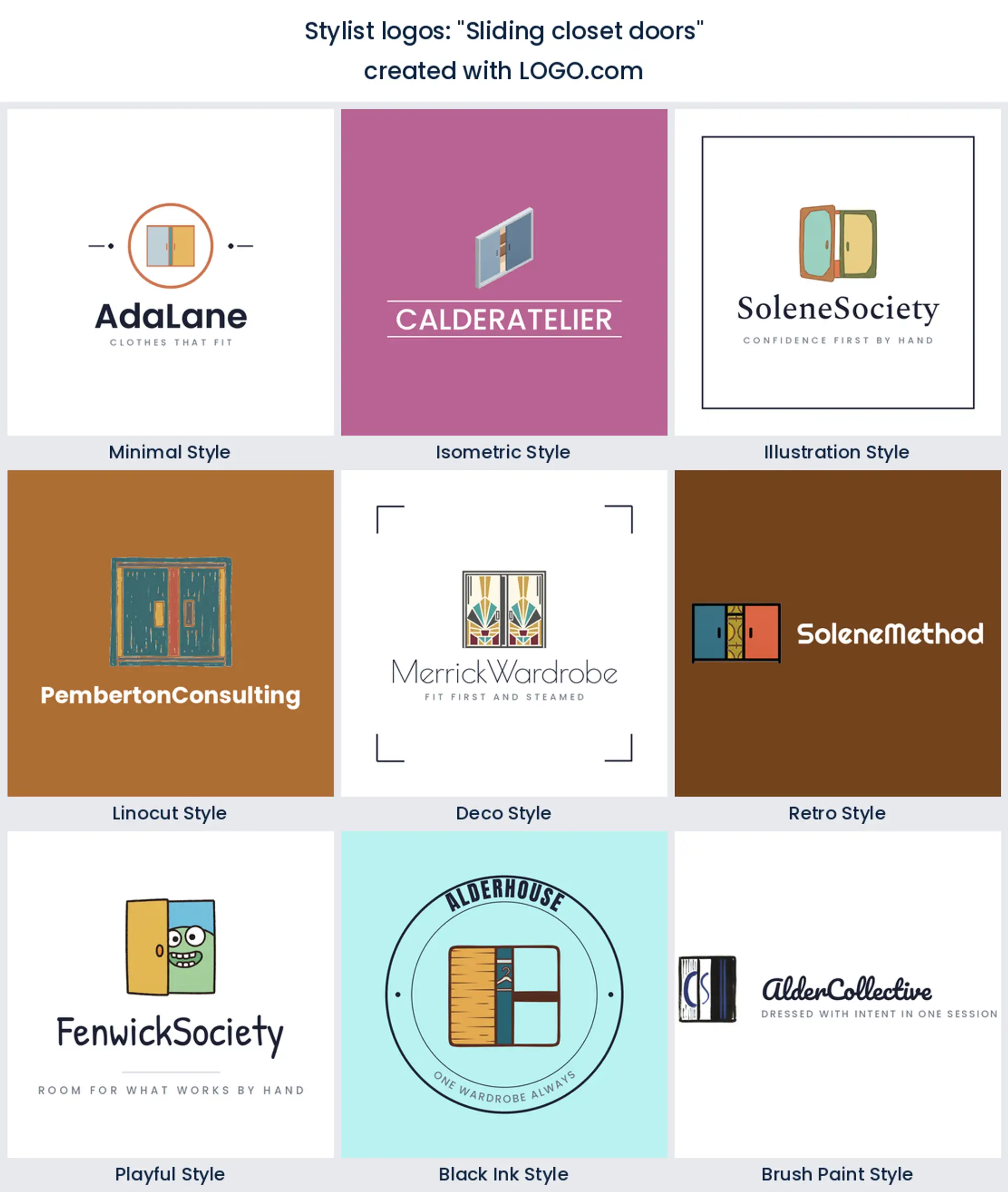
12. "Sliding closet doors"
Two panels with one slid open is an unexpectedly modern shape, all clean verticals. It suits apartment stylists and city clients, and it holds its form better than a swing door wardrobe when the mark gets small.
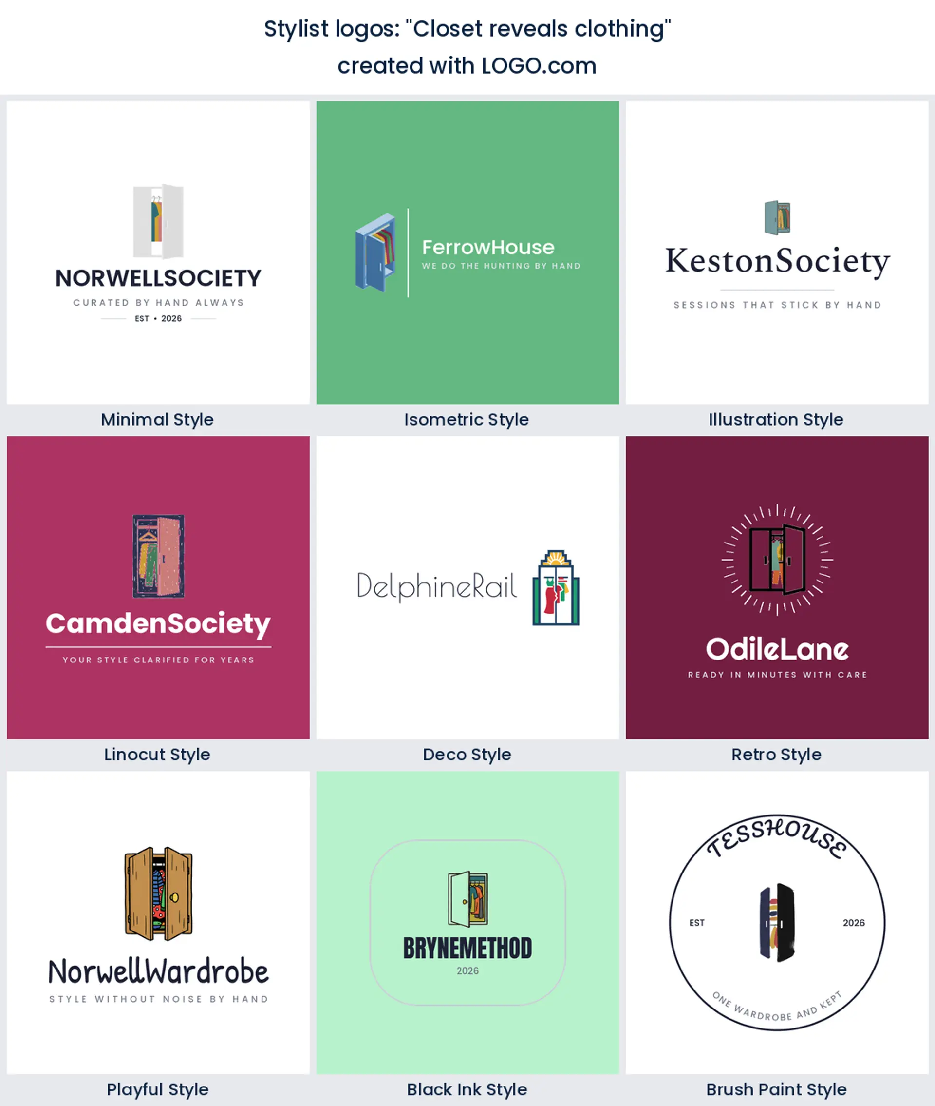
13. "Closet reveals clothing"
This one is about the moment of opening. A closet cracked just wide enough to show a sliver of color inside gives you movement in a static mark, which is lovely on a booking page hero.
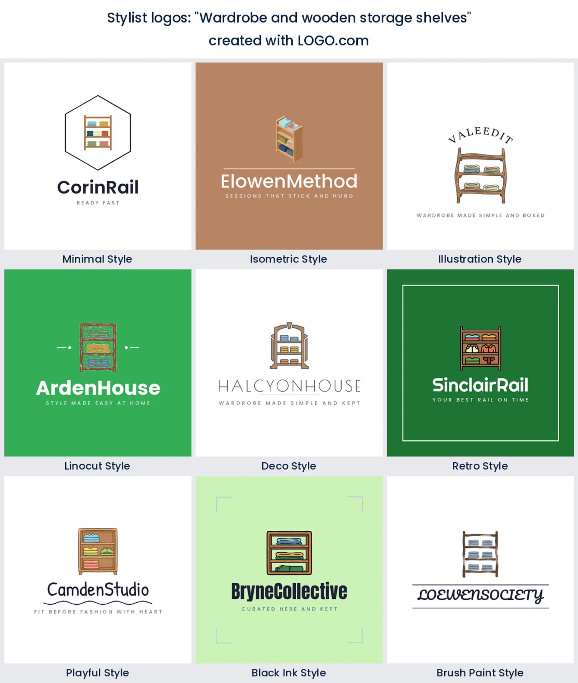
14. "Wardrobe and wooden storage shelves"
Warm shelving reads homely rather than retail, which is the point if you work in people's houses. Draw the grain as two or three short strokes, no more, and it stays friendly instead of turning into a cabinet catalogue.
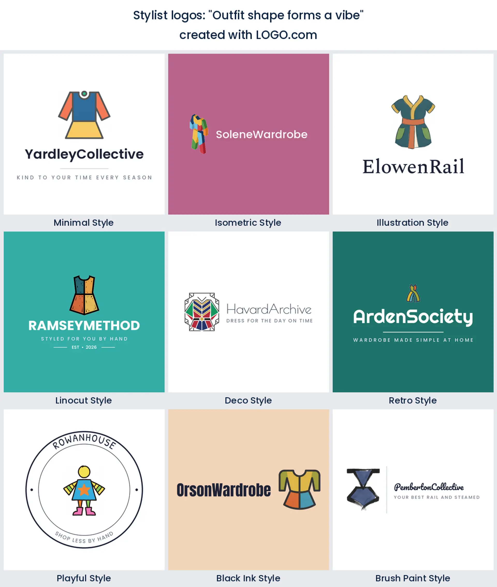
15. "Outfit shape forms a vibe"
An outfit abstracted almost to a glyph is the most ownable idea on this page. It gives you something closer to a monogram than a picture, which is why it scales down to a favicon without losing anything.
Personal shopper, wardrobe consultant or image coach?
These three sound alike and sell completely differently, so the mark should not treat them as one thing. A personal shopper logo is about selection. The promise is that somebody with taste already did the hunting, which is why a rail of clearly different pieces or a bag with one garment showing works so well. A wardrobe consultant is selling order instead, so shelving, a divided closet or a neat stack of folded shirts fits the job better than anything glamorous. Image coaching is the most personal of the three, and it is the one case where an outfit silhouette beats any piece of furniture, because the subject is the client rather than the clothes. Work out which of those a stranger should assume from your logo, then choose the symbol that says it without a subheading.
Naming works the same way. Most stylists trade under their own name, so the words are already carrying the memorable part and the symbol only has to explain the service. If you plan to grow into a team, or your surname is long and awkward to spell, build an initial mark that merges the letter into the object, a J that doubles as a hook or an O that becomes a mirror. Keep both from the start. The full lockup runs your site and your invoices, the initial version handles socials and app tiles, and no client ever sees half a surname cropped into a circle.
Your logo on a lookbook, an invoice and a mood board
Stylists have an unusual set of surfaces. There is no shop window and no swing tag. Instead your logo lives on a booking page, a round profile photo, the cover of a pdf lookbook you send after a session, an invoice, and the corner of a mood board where you sign your work. Almost every one of those is small and sits on white or on photography, which points you somewhere specific. Keep one strong silhouette with no thin interior detail, hold a solid single color version in both dark and light so it can sit over a wardrobe shot, and give it real breathing room in a corner rather than centring it over a busy garment.
There is one physical test worth doing anyway. Print the mark on a card at actual size and hand it to somebody in a fitting room. If it still looks like you at arm's length, in bad lighting, next to a mirror, it will hold up everywhere else you use it.
Colors that read edited rather than boutique
If you are wondering what a stylist palette looks like, our own numbers beat a mood board. Across the palettes stylist founders saved on LOGO.com, pink comes up most often, then green, then orange and brown, almost always over a white or black base. That is a warmer, more human set than fashion retail tends to pick, and it makes sense, because clients are choosing a person rather than a shop.
How you use them matters more than which you pick. A dusty rose against a deep ink neutral looks confident on a booking page and never tips into sweet. Sage green does a similar job while reading calmer, which suits decluttering and capsule work. Clay and warm brown are the ones to reach for when your clients lean menswear or tailoring. Whatever you choose, hold yourself to two colors plus a neutral. Every icon on LOGO.com starts in full color, so take the multi color version for your site and lookbooks and keep a one color version for a rubber stamp, embroidery on a garment bag, or anything foiled.
What it costs and what you can put it on
The download itself is free. A high resolution PNG costs nothing on LOGO.com and carries full commercial use, which covers your booking page, your Instagram, your client lookbooks, your invoices and your email signature from the day you make it. For most stylists that is the whole of year one handled. What the Brand Plan adds is the vector files anybody who makes a physical object will ask you for, plus unlimited edits and a brand kit that keeps your fonts and colors in one place. Printed cards, a branded garment bag, a stamp for your packaging or window vinyl for a studio all need those vectors. If you are still choosing between two business names, stay on the free PNG and spend the money once the name is settled.
Make your stylist logo with LOGO.com
Type your name, pick the symbol that matches how you actually work with clients, then push the color and the typeface until it looks like the wardrobes you build. You can make a few versions in the time it takes to steam a rail, sit with them overnight, and change your mind in the morning, which is exactly how a decision this visible should go.
Methodology. The stylist industry itself is small in our data, and most people who pick it are hair stylists rather than fashion stylists, so ranking by industry would have described the wrong job. Instead we read every custom icon description written on LOGO.com whose text names a closet, a wardrobe or an outfit, across the full product history to August 2026. That is 76 icon descriptions from up to 41 brands. Grouped by concept, an open closet appears in about 16% of them, a closet organizer in about 14% and an outfit silhouette in about 14%, with hangers, shelving, rails, shirts, a lightbulb and a crown making up the rest. Palette figures come separately, from saved palette choices by founders whose industry is a stylist one. Because this is a small and text scoped sample, treat the lower ranks as direction rather than precision. Source: LOGO.com first party product data, August 2026.
THE #1 LOGO GENERATOR
Why LOGO.com is the best stylist logo maker
1.Nine symbols, not one of them invented
Every mark here started as an icon description a founder wrote on LOGO.com, so you begin with an open closet, a rail or an outfit that clients already recognise instead of a stock swoosh.
2.Pink and green, because that is what stylists save
Stylist founders in our data save pink most often, then green, then orange and brown. Start there and warm or cool it until it matches the wardrobes you actually build.
3.Survives a booking page thumbnail
Your logo spends most of its life as a circle on a booking page or an Instagram profile. Every idea here is drawn with strokes thick enough to stay readable once it is cropped and shrunk.
4.Try the same closet nine different ways
See the same closet or hanger as a quiet minimal mark, a linocut badge and a retro emblem side by side, then keep the one a client would remember after a single session.
5.Built for a business that is also a person
Save a wide version with your full name for your site header and invoices, plus a symbol or monogram version for socials, so a long surname never gets cropped in half.
6.Full color online, one color on a garment bag
Take the full color icon for your website and lookbooks, and a single color version for a rubber stamp, a garment bag or anything foiled. You are never locked into one.
7.Free to download, free to use with clients
A high resolution PNG costs nothing and comes with full commercial use, so your booking page, socials and client documents can all be branded today.
8.Vectors ready for the day you print something
The Brand Plan adds the vector files a printer or signwriter asks for, plus unlimited edits and a brand kit holding your fonts and colors together as the business grows.
9.Done before your next client confirmation
Type your name, pick a symbol, adjust the color and the type. Most stylists have something worth keeping before their next client confirmation goes out.
Stylist Logo Maker FAQs
Explore more logo ideas
AbstractAccessoriesAdventure TourismAestheticsAgricultureAirplaneAnimalAnimal and PetsAnime Logo MakerApplicationArchitectureArrowArtificial IntelligenceArts & CraftsAssociationAttorney FirmAuthorAuto Parts SupplyAviationBaked Goods StoresBandsBarsBeautyBeauty and Cosmetics BlogBeerBicycleBiotechnology ResearchBlack+WhiteBlueBonfireBook StoreBoutiqueBranchBuilding Materials ManufacturerBusiness LogoButcher ShopCalligraphyCampingCandyCar ClubCartoonCatering and Buffet ServicesCharitable FoundationChibiChiropractorChurchCircusClassicClothing ManufacturingCoffee Shops