Drone Logo Maker
Design a drone logo that works on your flight case and your aerial footage.
Need a different logo maker? Try our AI logo generator.
Logos created using LOGO.com
670,000,000
Camera and survey drone logos
Inspection and infrastructure drone logos
Delivery, FPV and aviation badge drone logos
Drone Logos, Ranked From Real Founder Prompts
According to LOGO.com data, a camera lens appears in about 19% of the 98 drone and aerial icon descriptions founders wrote, ahead of an aerial landscape view at about 13% and a building inspection at about 12%.
Every one of those nine symbols, plus fifteen prompts founders typed themselves, is drawn below in all nine LOGO.com styles. Put a lens led mark beside an inspection mark beside a survey grid and the right one usually picks itself.
On this page
- What 98 drone founders asked their icon to show
- Fifteen drone logo ideas from real founder prompts
- Does a drone photography logo need a camera in it?
- Your logo has to survive a hard case, a battery, and a hi vis vest
- Where a drone logo is really seen: on the deliverable
- Proving you fly legally is part of the brand
- Your two colors should say land or airspace
- Make your drone logo with LOGO.com
Putting a drone in the logo is the easy decision, and nearly every operator makes it. What founders put beside it is the interesting part. Across 98 custom icon descriptions written by drone and aerial founders on LOGO.com, the aircraft almost never flies alone. It carries a camera lens, hovers over a roof, or sits above a survey grid, and that pairing is really the whole brief. Below you get the nine symbols that came up most, fifteen prompts founders typed word for word rendered nine ways, and the parts of a drone logo that only start to matter once you are sticking it on a flight case.
What 98 drone founders asked their icon to show
The drone industry sample on its own is tiny, so we widened the lens. Our first party data here covers the 98 custom icon descriptions written on LOGO.com that named a drone, an aerial view, a quadcopter, FPV flying, or a drone propeller, sitting alongside roughly 59 brands that picked drone as their industry. Every description was sorted by the objects inside it, then those objects were tallied. Bear one thing in mind as you read the percentages. A single description usually names an aircraft plus something else, so one share can belong to two symbols at once and the nine do not add up to 100. The ranking runs top to bottom below, with a nine style grid under each entry.
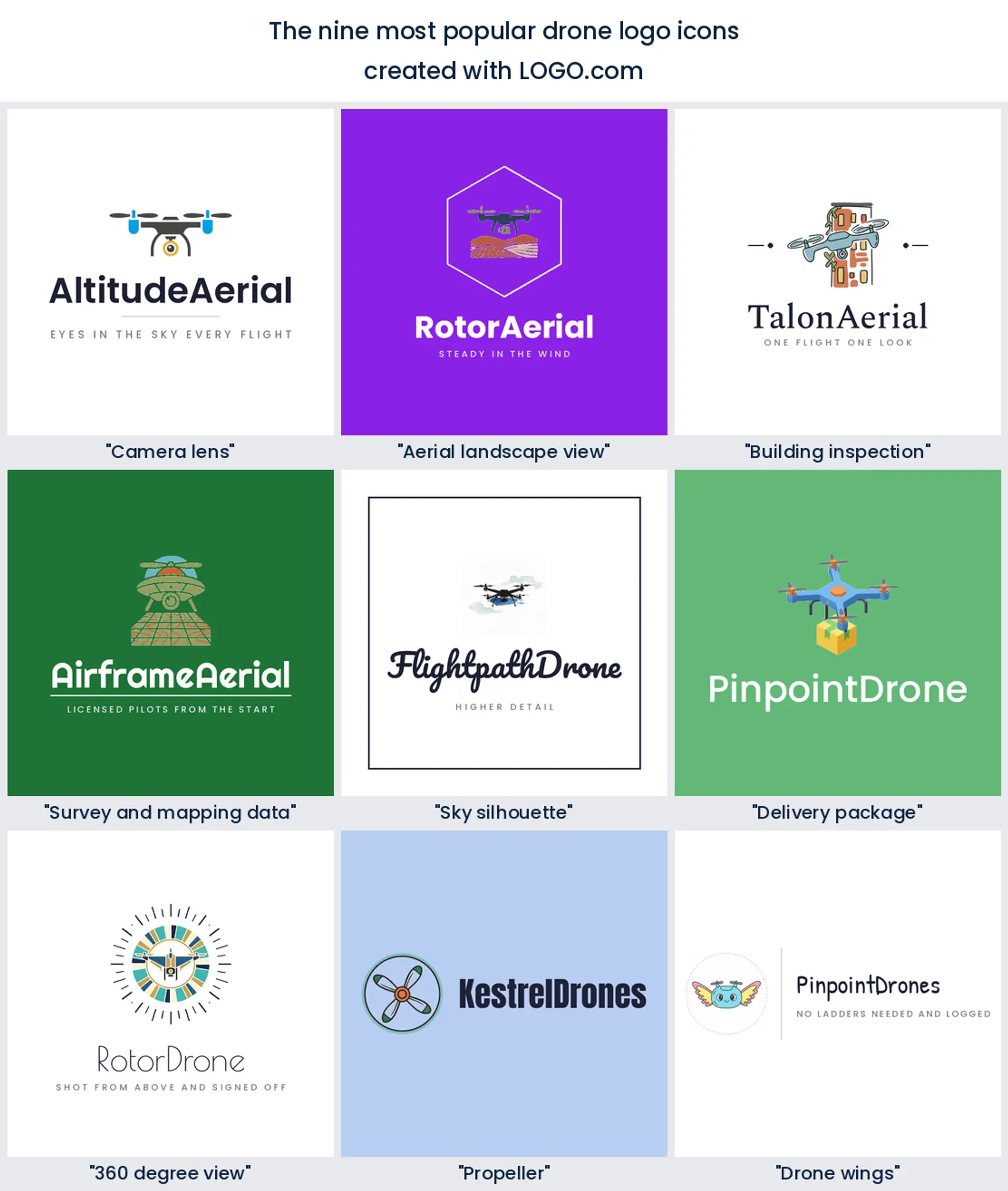
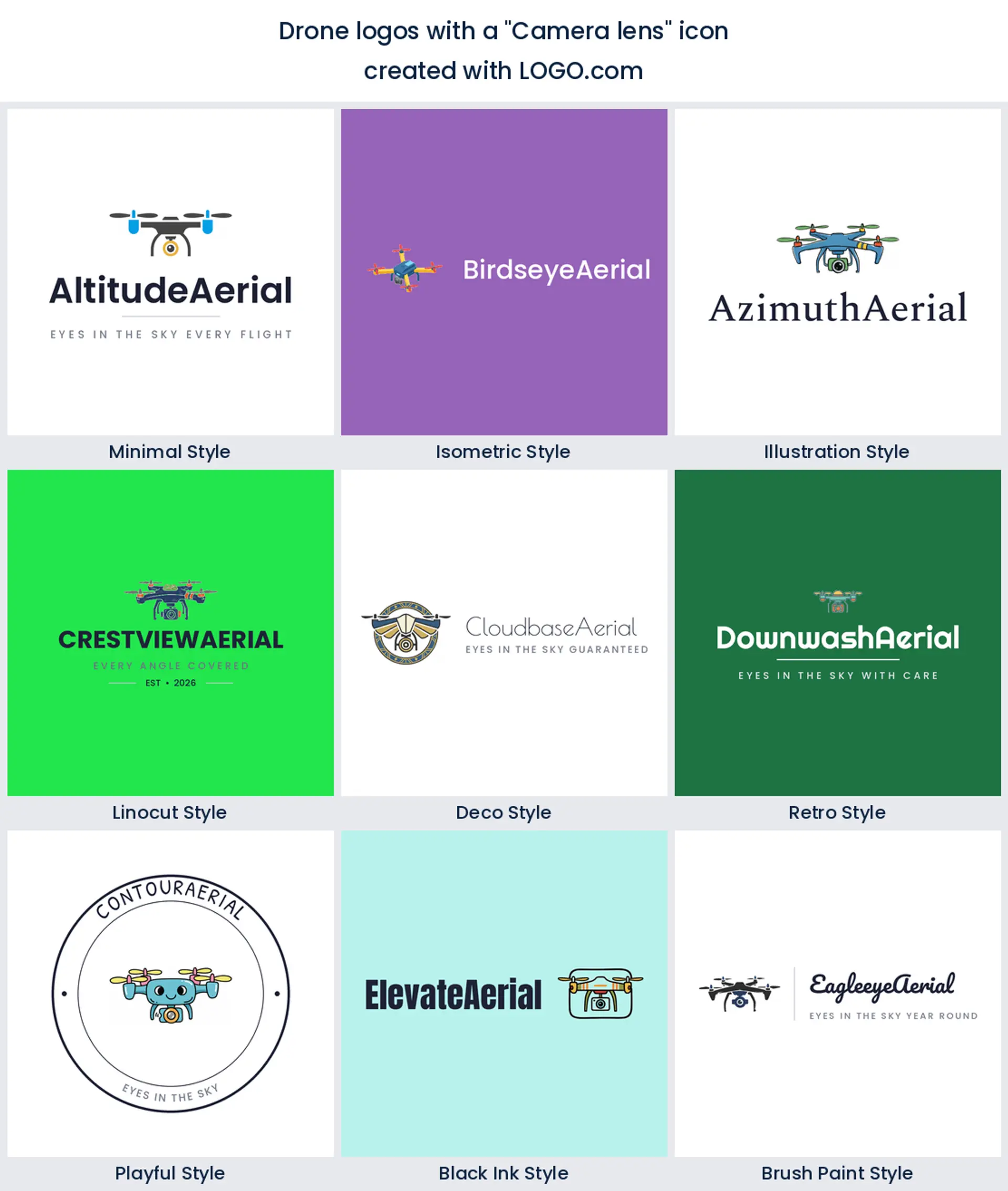
1. Camera lens
One element beats everything else here: the camera. It appears inside about 19% of the descriptions, usually slung under the aircraft rather than standing on its own. That tells you how these founders see the business. The drone is transport and the lens is the product. If you shoot property, events, or progress video, a lens under the airframe is the clearest drone photography logo you can build.
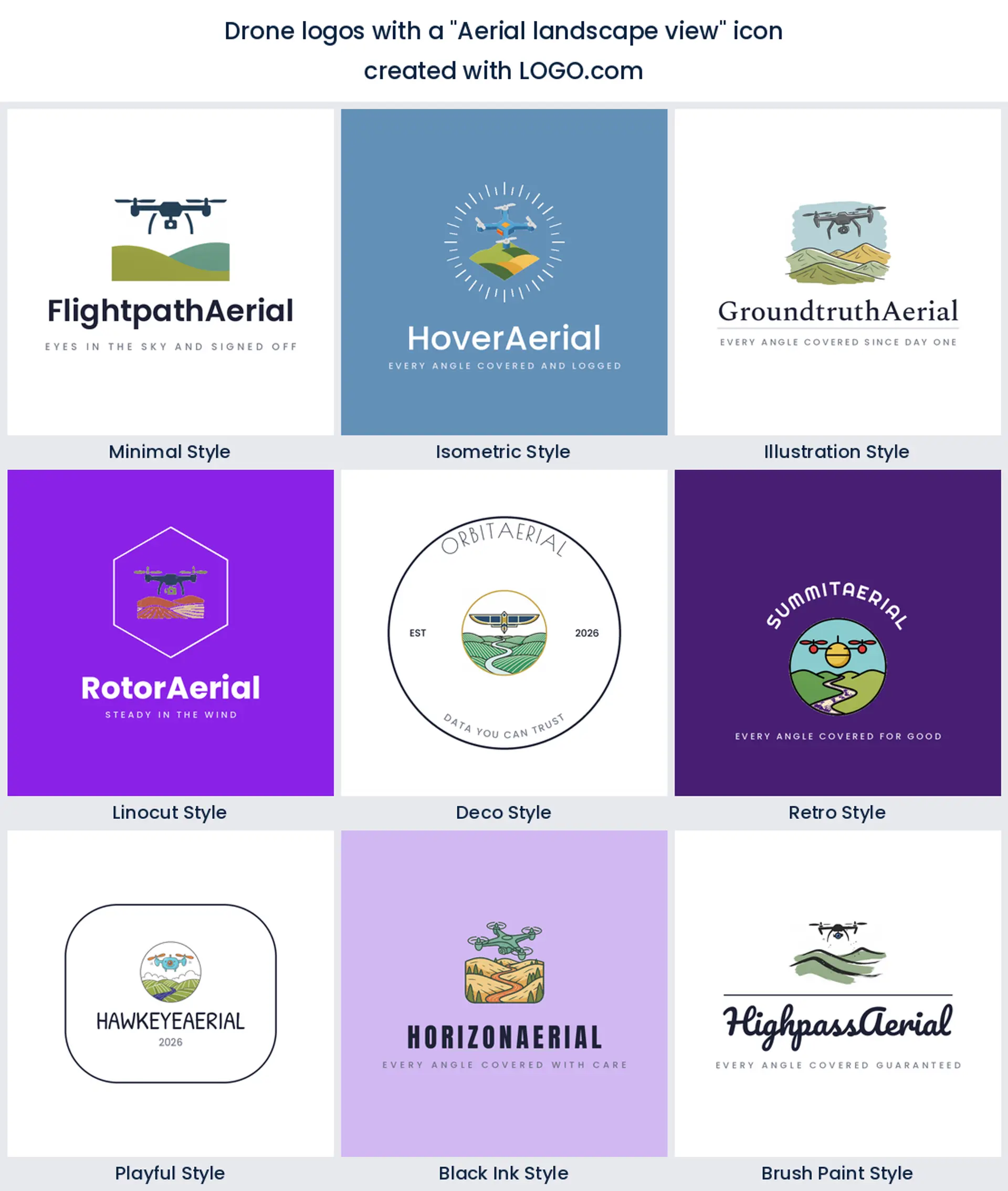
2. Aerial landscape view
Number two is not equipment at all. In roughly 13% of the descriptions the ground turns up under the aircraft, as hills, coastline, fields, and open country. It is the one symbol that shows the result instead of the equipment, and it warms the mark up, because landscape reads as scenery while a quadcopter reads as hardware. Worth a look if you sell tourism, estate, or landscape work.
3. Building inspection
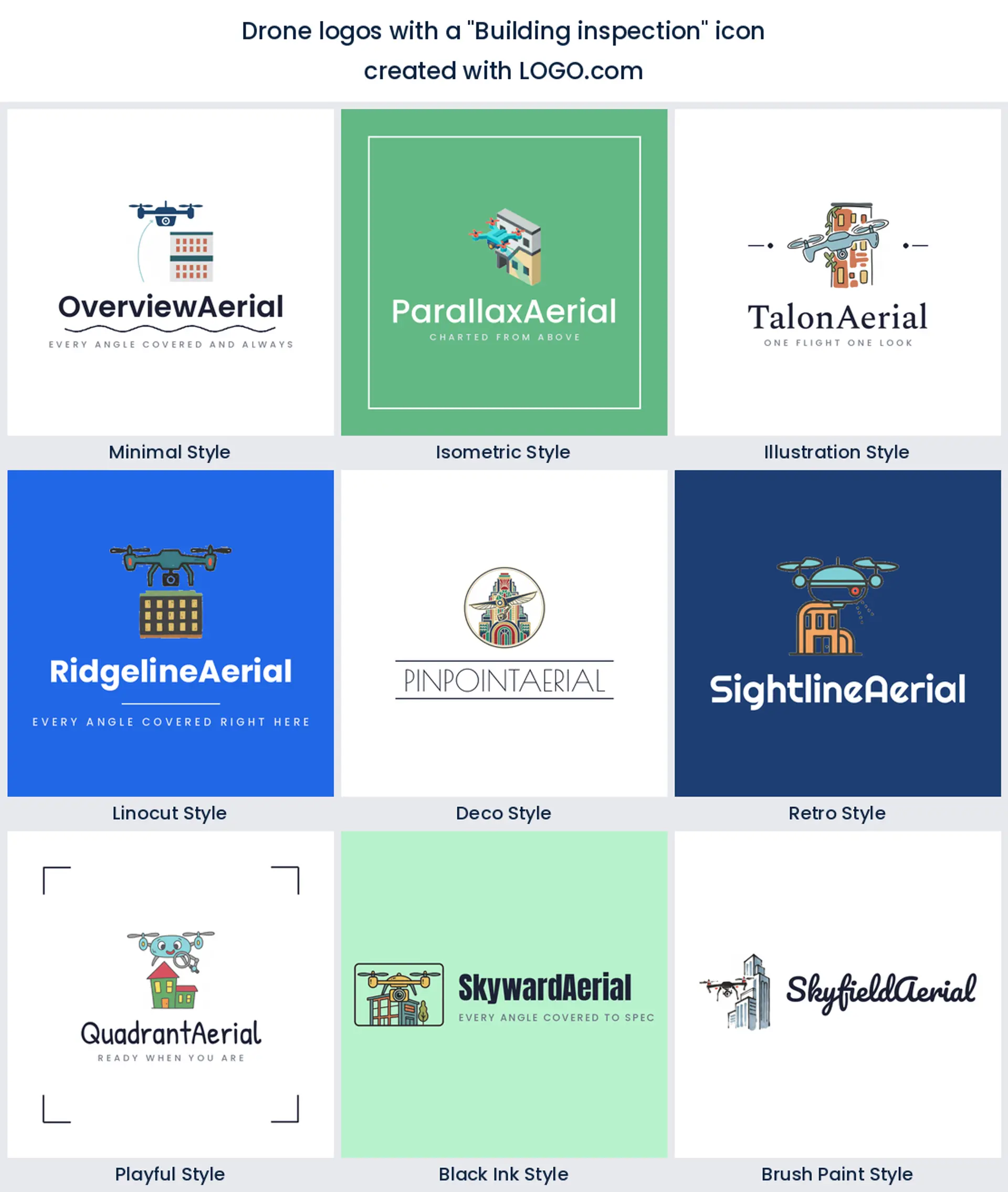
Third place, and roughly 12%, goes to a wall. Founders park the aircraft beside a building, a roof, or a structure, and plenty of them type the word inspect themselves. This is the commercial end of the trade talking. Nobody asks for a cracked roof in a mark unless roofs pay the bills, so it makes an honest drone inspection logo for surveyors, roofers, and insurance work.
4. Survey and mapping data
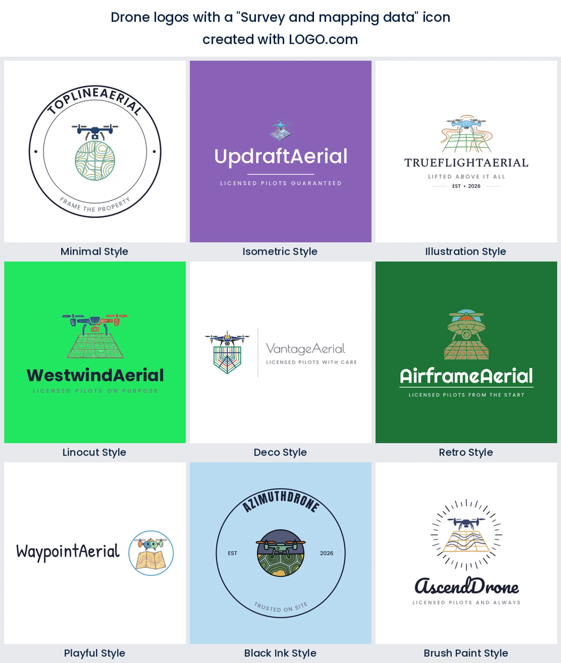
Grids, contour lines, pins, and data points come next, and they behave differently from every other entry. They are pattern rather than object, so they sit behind or beneath the aircraft and give a designer something to build a container around. Mapping and survey operators end up with a drone logo that looks like a service rather than a hobby.
5. Sky silhouette
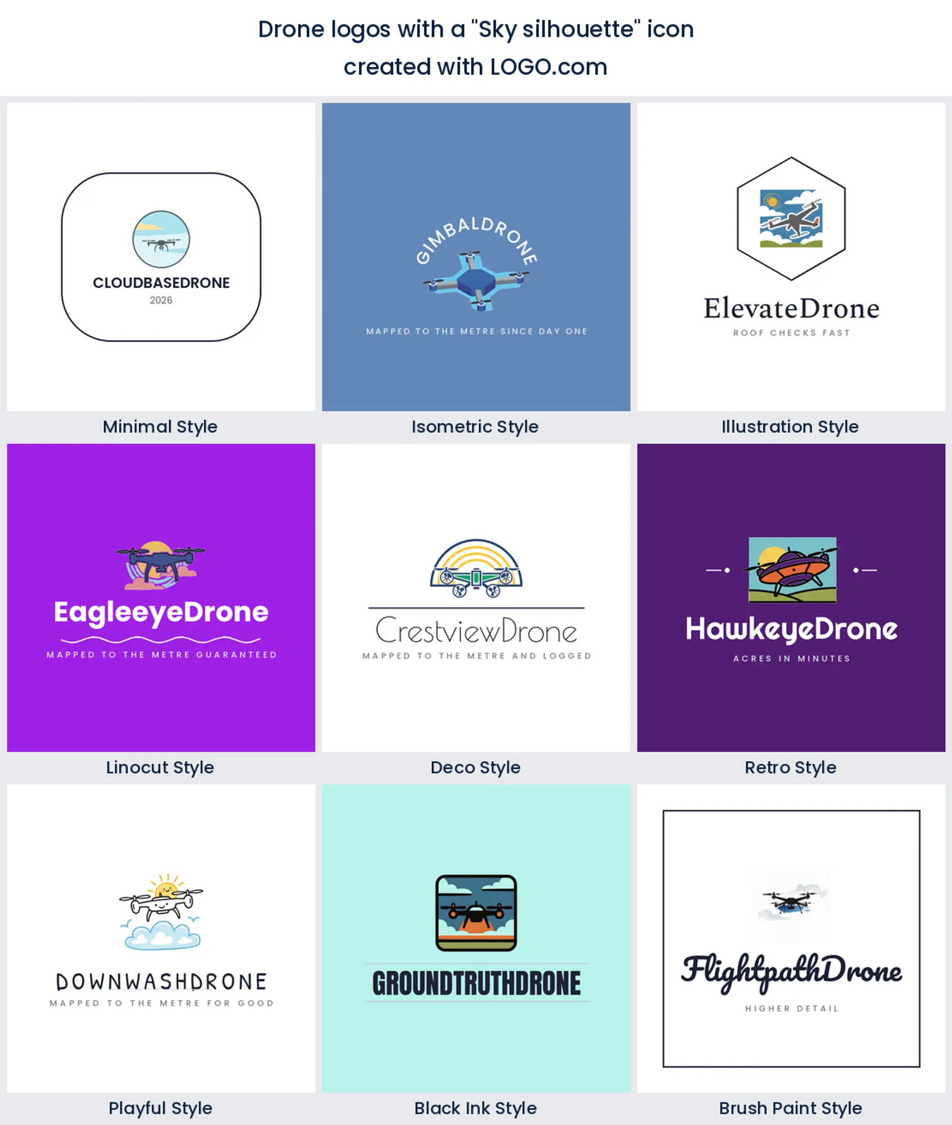
Nothing on this list is plainer than number five. Just the aircraft, small, against open sky or a single cloud. Founders reach for it when they want calm rather than technical. It also shrinks better than anything else on this page, which makes it the safest choice for a drone icon that has to live at avatar size.
6. Delivery package
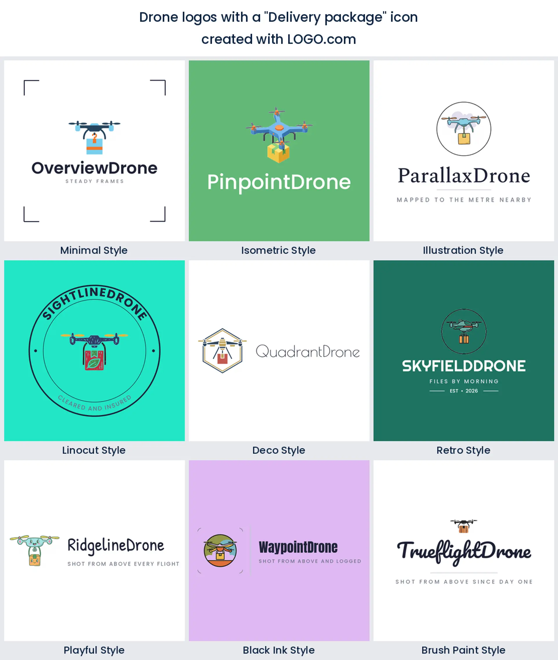
A parcel hanging under the aircraft is the one symbol here that changes the business model rather than the subject, and it settles in the middle of the ranking. Nobody confuses a delivery drone with a camera drone, which is useful. Logistics, medical transport, and last mile startups get a drone company logo that explains itself with no strapline.
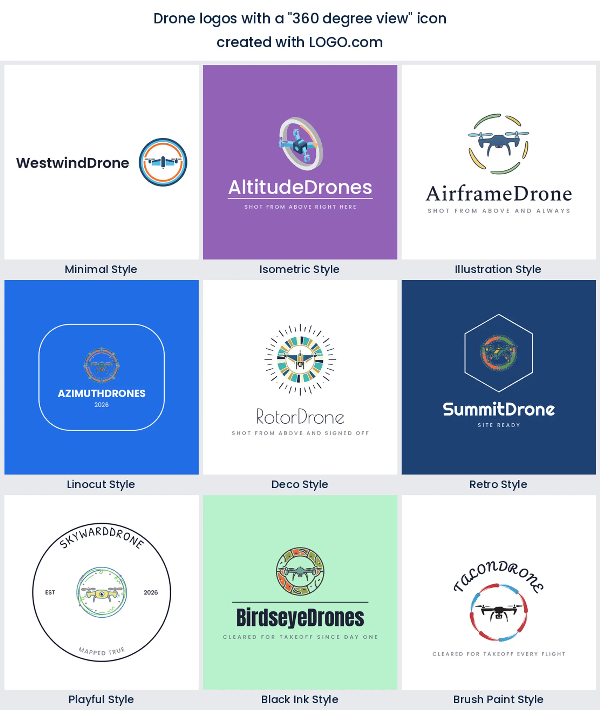
7. 360 degree view
Next comes a shape rather than an object, a ring, a sweep, or the actual numerals 360 wrapped around the aircraft. It sells coverage rather than a subject, the idea that nothing gets missed. It is also the most typographic symbol in the nine, so it suits a drone team logo where the name is doing most of the talking.
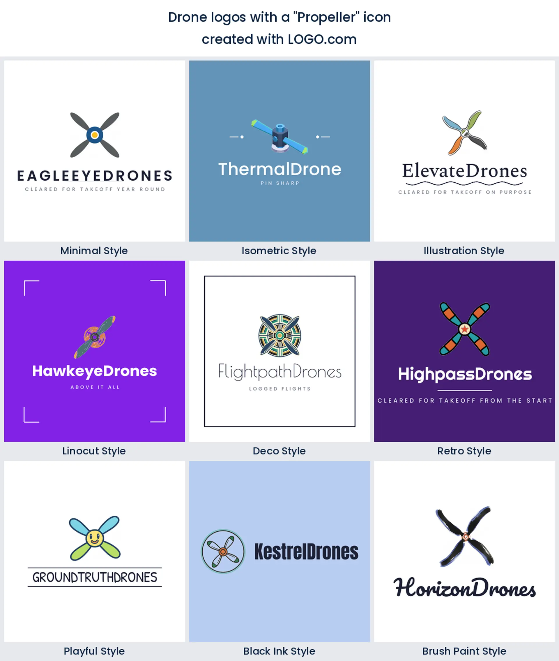
8. Propeller
Only a handful of founders zoom in on a single rotor, and that scarcity is exactly why it works. Every other operator draws the whole aircraft. A propeller cropped tight is abstract, spins nicely inside a circle, and reads as mechanical precision, which suits an FPV drone logo or a build and repair shop.
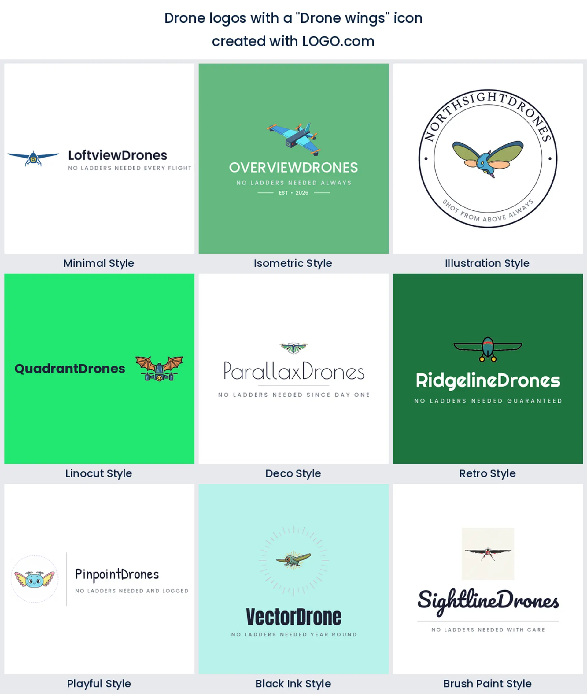
9. Drone wings
Wings are where the ranking ends, and where it stops being literal. Founders pair the aircraft with feathers or a spread pair of wings when they want the mark to feel less like a machine. It borrows a hundred years of aviation badge language, so it lands well on a pilot logo where you want the flying to feel earned.
Fifteen drone logo ideas from real founder prompts
Nothing in the list below was written for this page. Each heading is quoted exactly as a drone or aerial founder typed it into LOGO.com, then rendered across all nine styles so you can see how the same idea behaves as a clean geometric mark and as a carved linocut. Treat it as a parts bin. Use one as it stands, or borrow the object from one entry and the style treatment from another. Real drone logo ideas beat invented ones, because somebody already wanted them enough to type them.
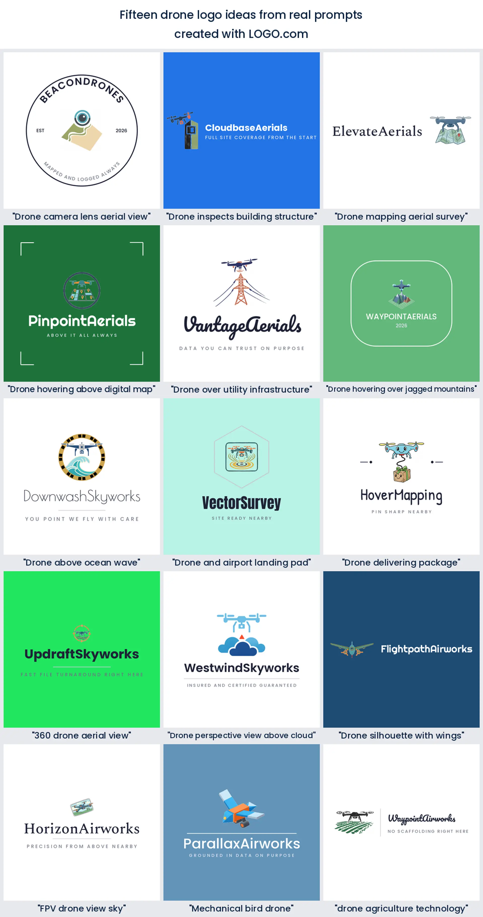
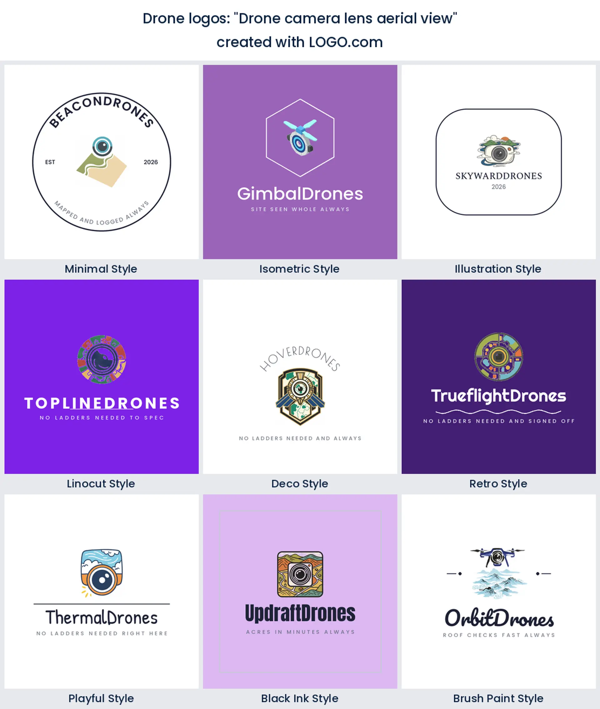
1. "Drone camera lens aerial view"
More founders typed some version of this than any other shape. The lens points down, the ground opens out below it, and a reader gets the service in one glance. Start here if you want the safest possible drone photography logo with no explaining to do.
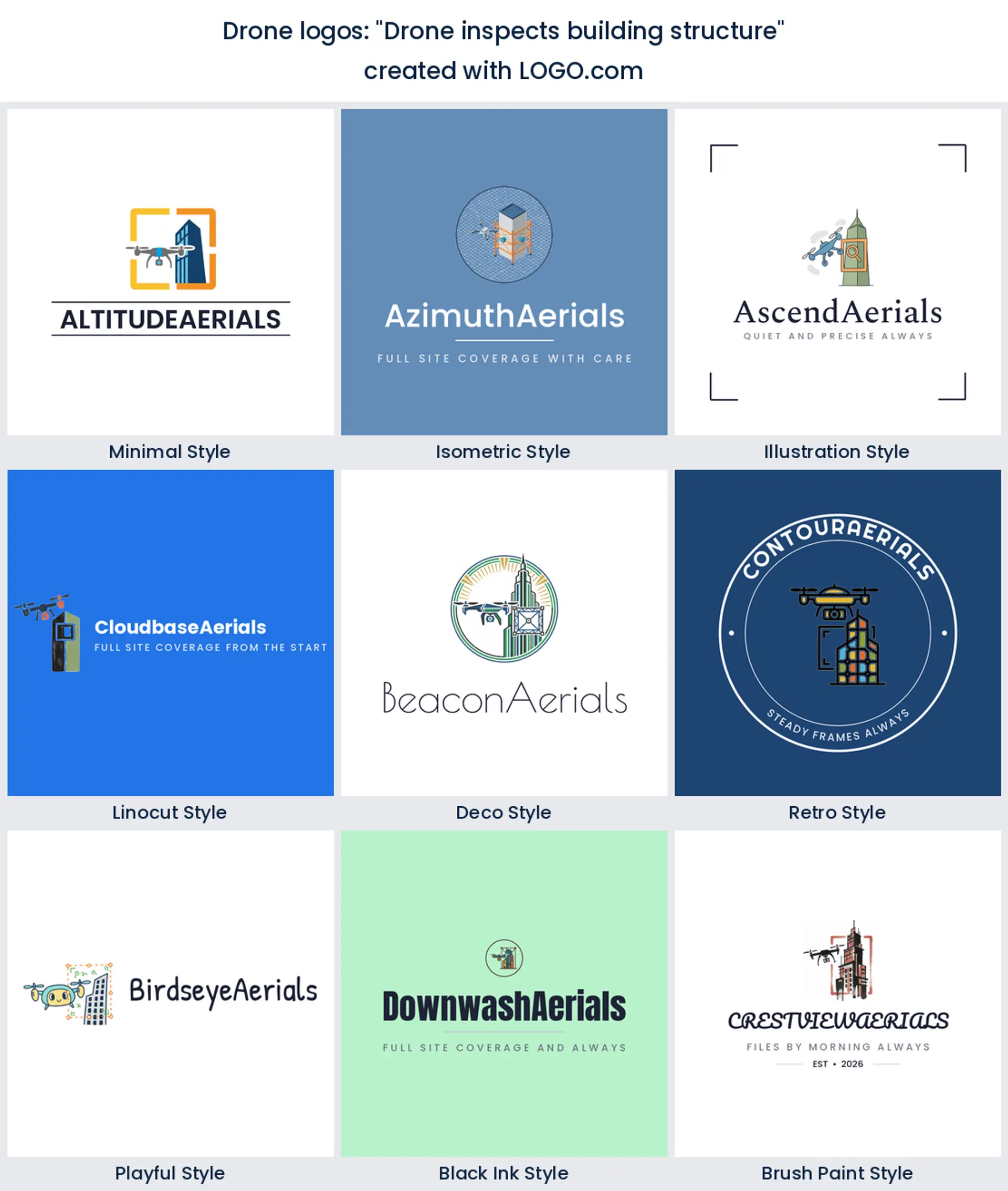
2. "Drone inspects building structure"
The aircraft sits beside a wall rather than above a field, which changes the customer entirely. A building in the frame tells a facilities manager you do reports, not wedding footage. It gives a drone inspection logo the industrial weight that a plain quadcopter never manages.
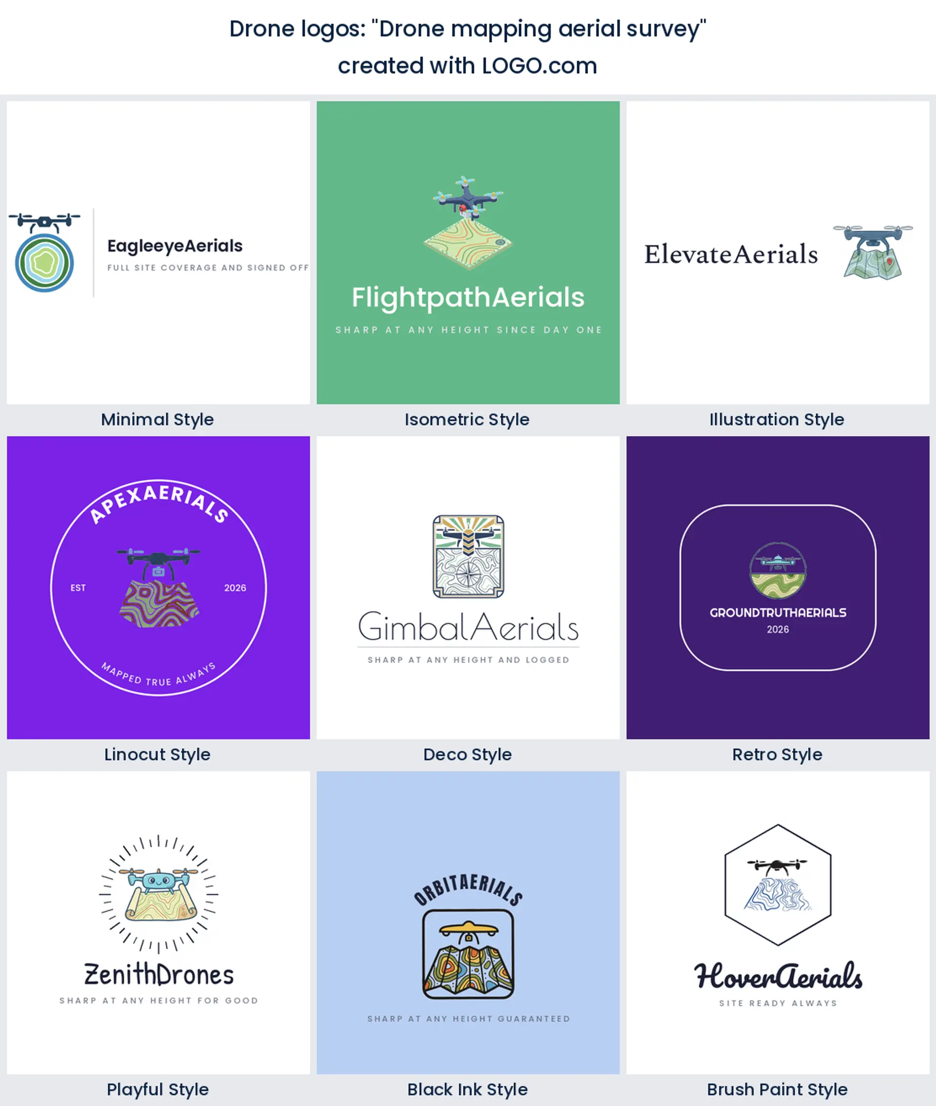
3. "Drone mapping aerial survey"
Contour lines under the aircraft do a lot of quiet work. They say measured, repeatable, and to scale, which is the promise a survey client is buying. Also handy practically, since the lines can stretch or compress to fill an awkward space beside your name.
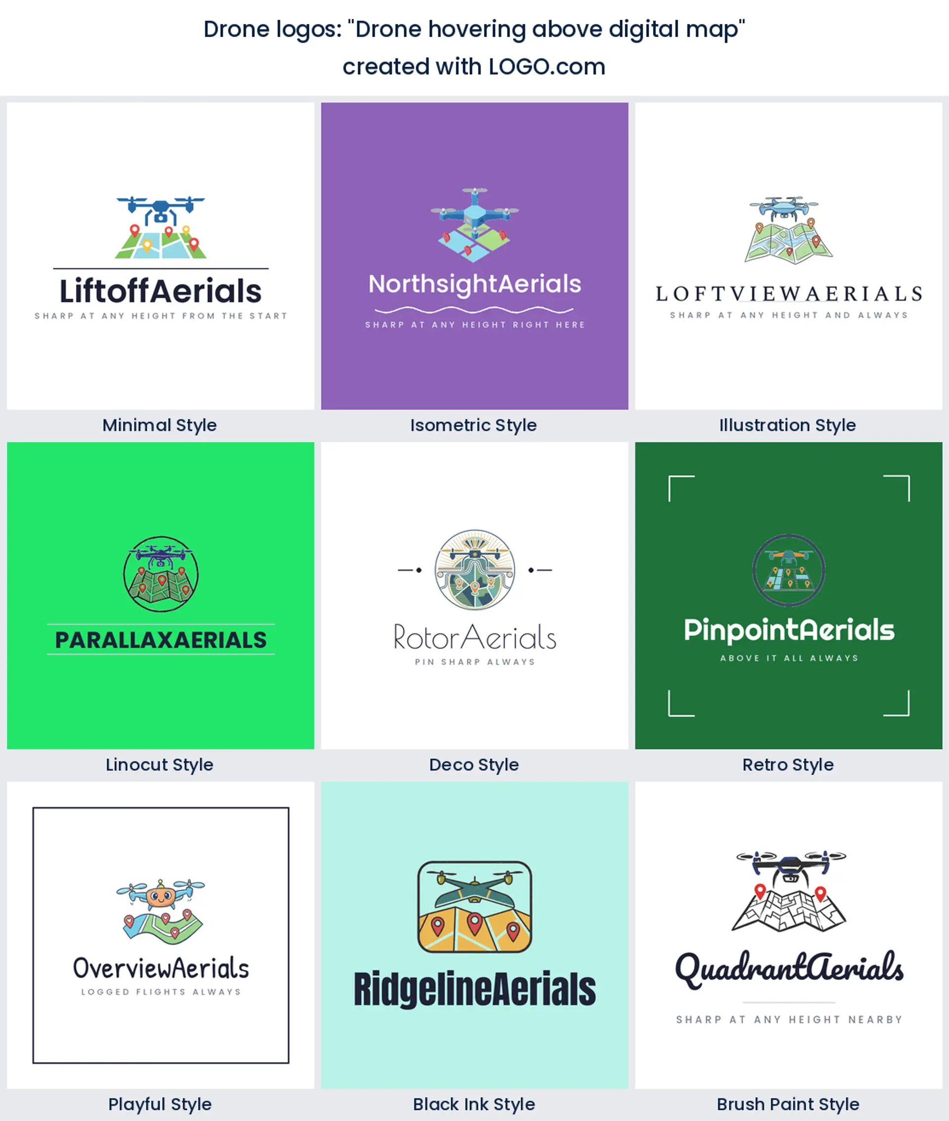
4. "Drone hovering above digital map"
A map with pins in it moves the story from flying to output. What the client gets is a file they can click, and this mark says so. It is the most software looking idea in the fifteen, so it fits an operator who sells a mapping platform as much as a flight.
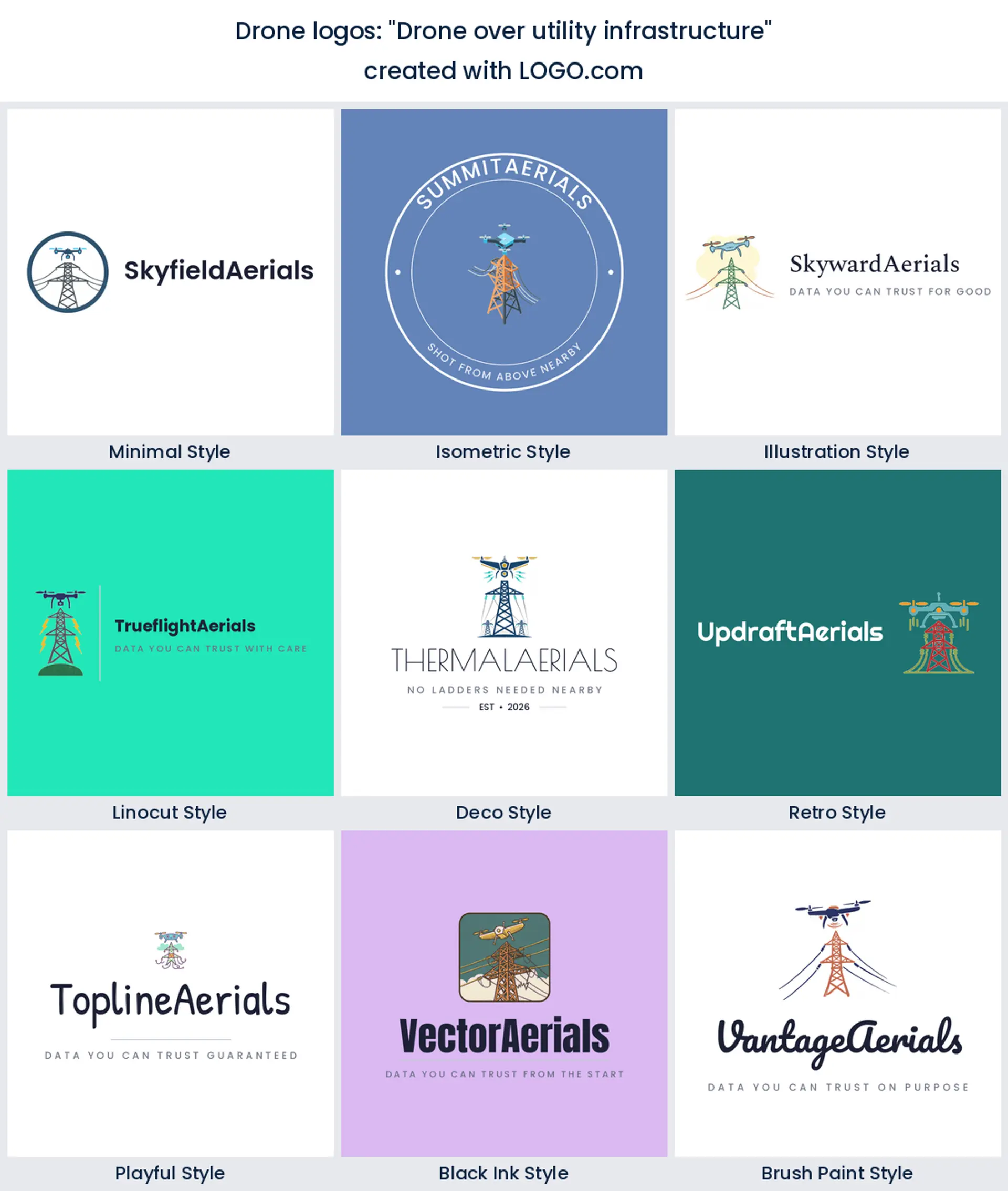
5. "Drone over utility infrastructure"
Pylons and cables are unglamorous and extremely specific, which is the point. Utility inspection is repeat work on annual contracts, and a mark that names it filters out the people asking you to film a birthday party. A confident choice for a drone services logo aimed at energy and telecoms.
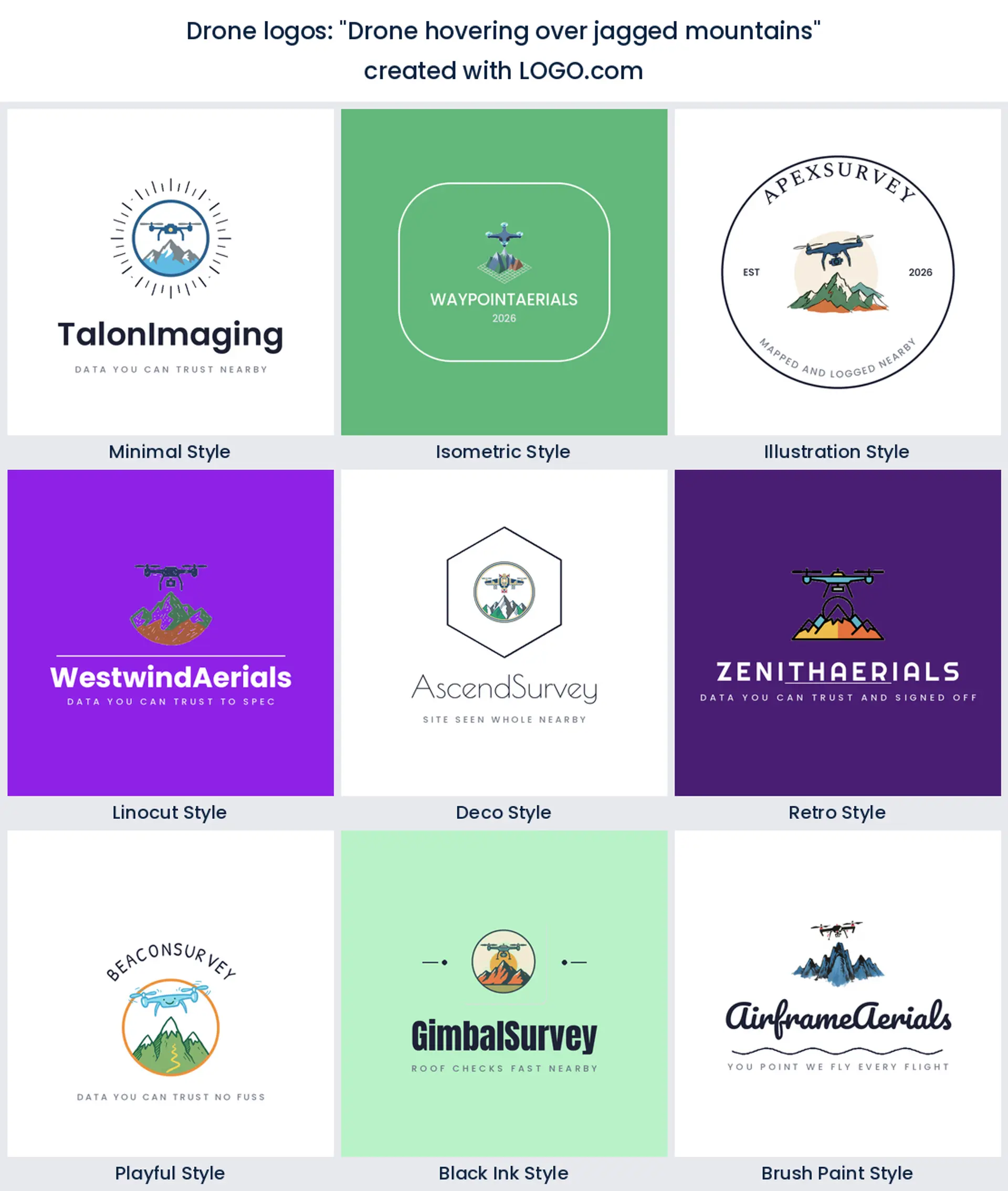
6. "Drone hovering over jagged mountains"
Peaks give you a strong silhouette and a natural triangle to hang a wordmark on. They also read adventure rather than admin, which is why alpine, tourism, and film operators keep asking for them. Pick it when the brand needs to feel a bit brave.
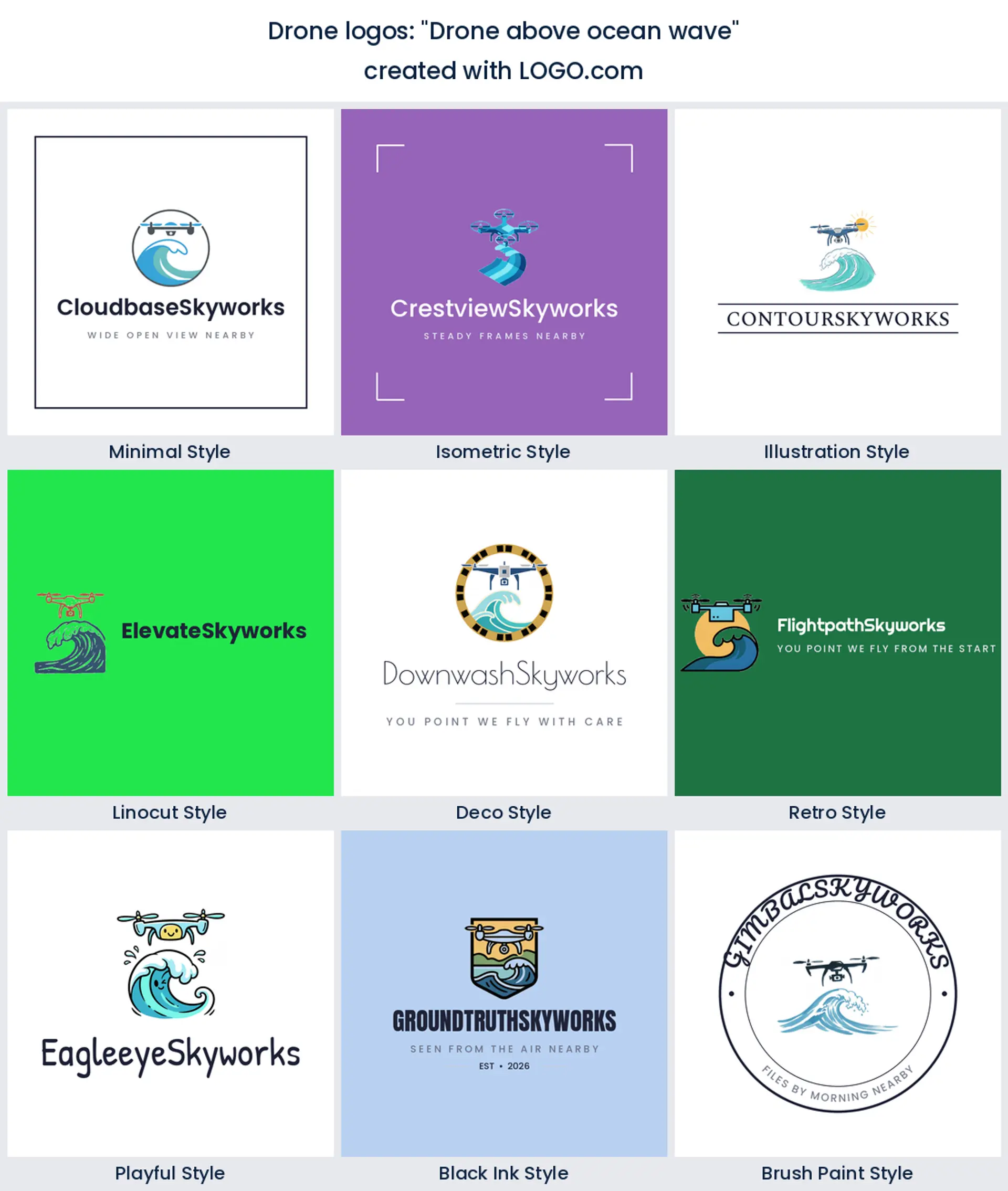
7. "Drone above ocean wave"
Water is the hardest thing on this list to draw badly, because a curling wave already looks designed. Coastal surveys, marine inspection, and surf film all live here. It also brings blue into the palette without you having to force it, which suits a calmer aerial logo.
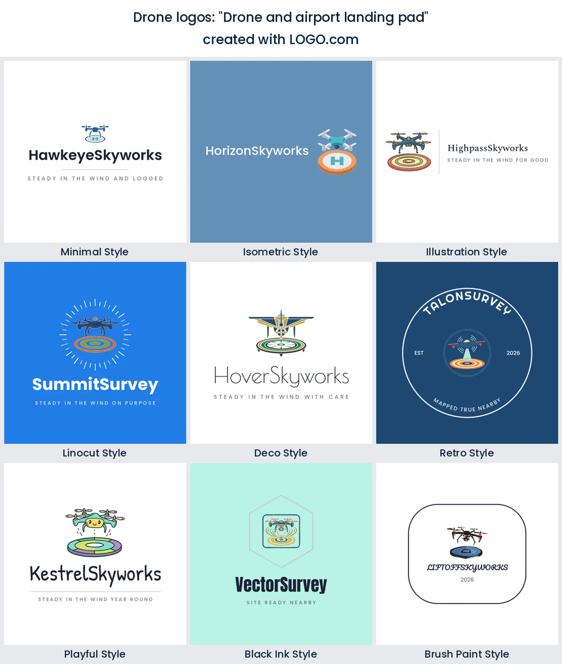
8. "Drone and airport landing pad"
The landing pad is the only element in the fifteen that talks about procedure. A circle with the aircraft descending into it says planned flights, logged flights, and a pilot who packs up properly. Reassuring on a proposal, and it makes a tidy drone pilot logo.
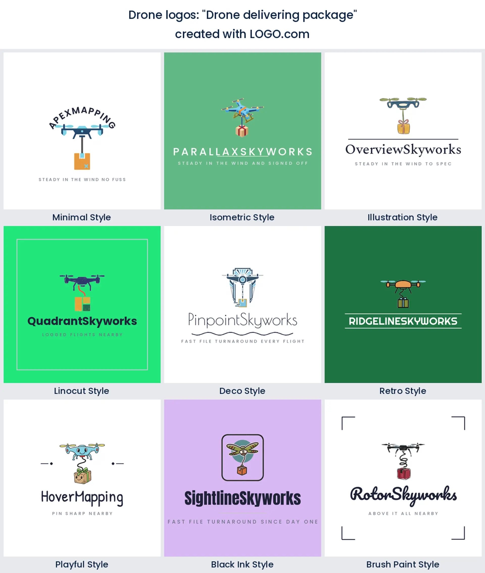
9. "Drone delivering package"
A parcel on a line under the airframe is motion frozen mid job. It has more energy than a hovering aircraft because something is clearly happening. Delivery, pharmacy runs, and site resupply operators get a drone business logo nobody will mistake for a photographer.
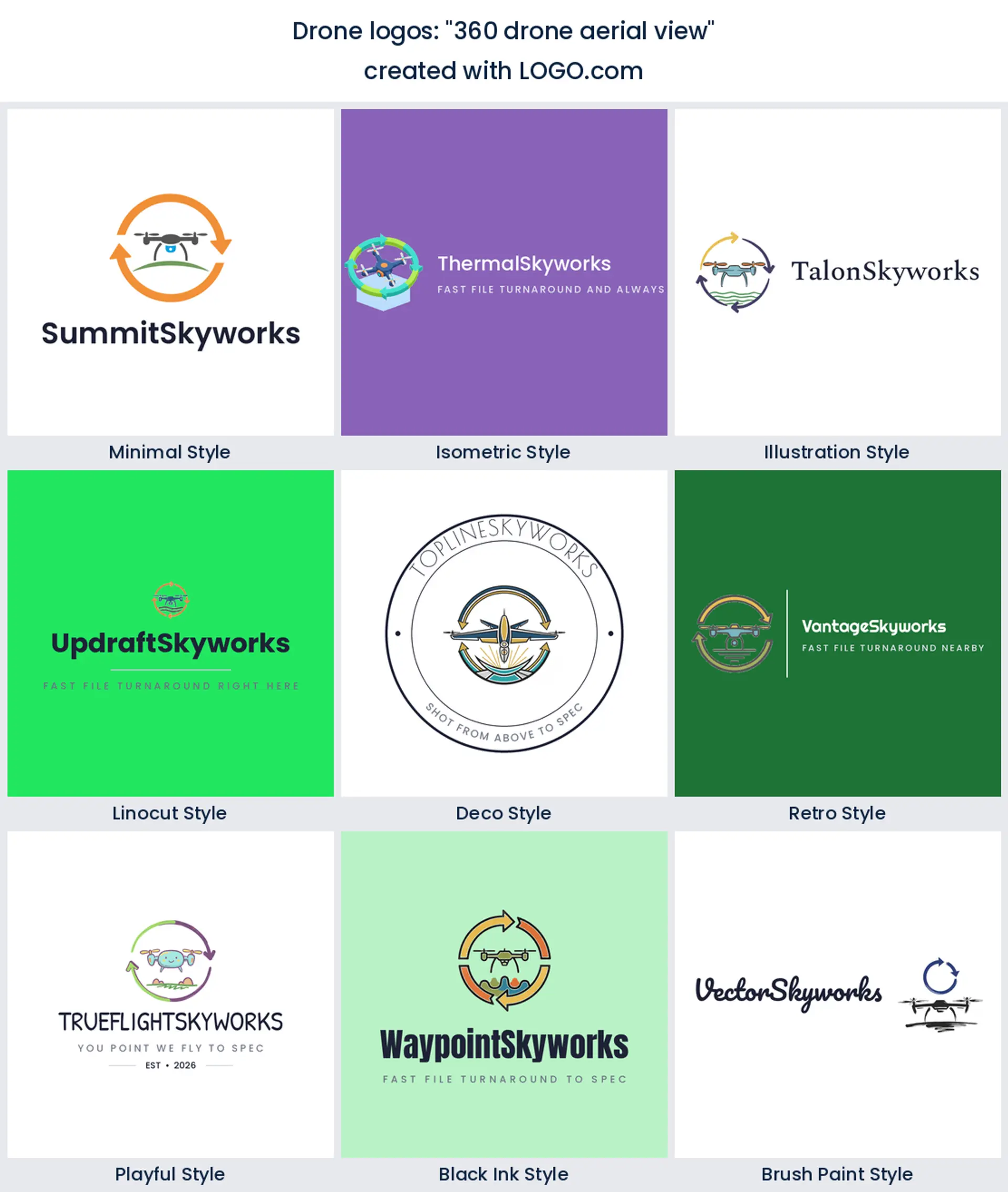
10. "360 drone aerial view"
Wrapping the aircraft in a ring of arrows turns a static object into a claim about coverage. It is also one of the few ideas here that stays perfectly legible when squeezed into a circular avatar, so it is a sensible pick if your socials matter more than your signage.
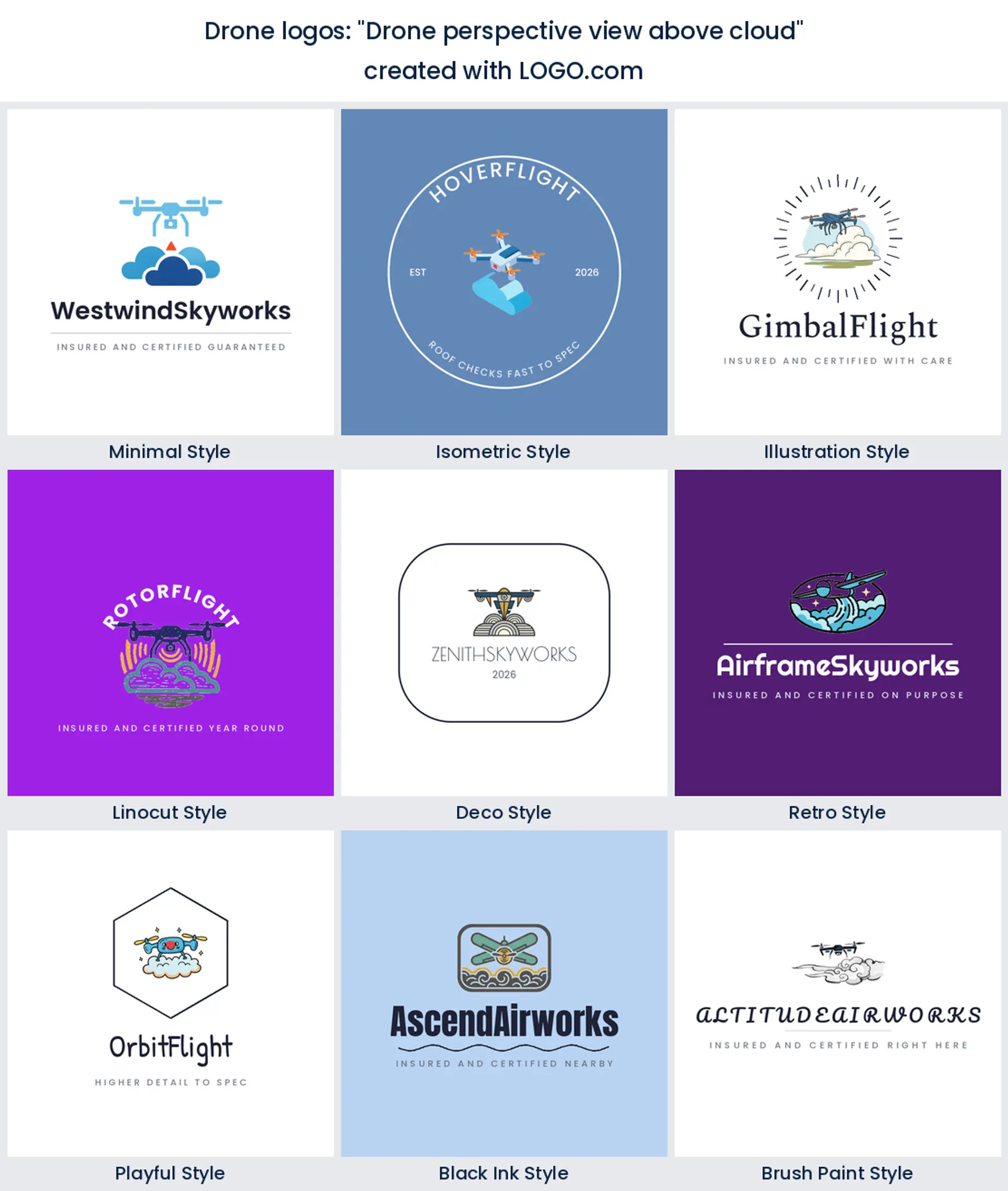
11. "Drone perspective view above cloud"
Cloud puts the aircraft higher than everything else on this page, and altitude is a mood. Soft shapes under a hard machine make a nice contrast, and the white space they create gives you somewhere to put small text. Good for an understated cool drone logo.
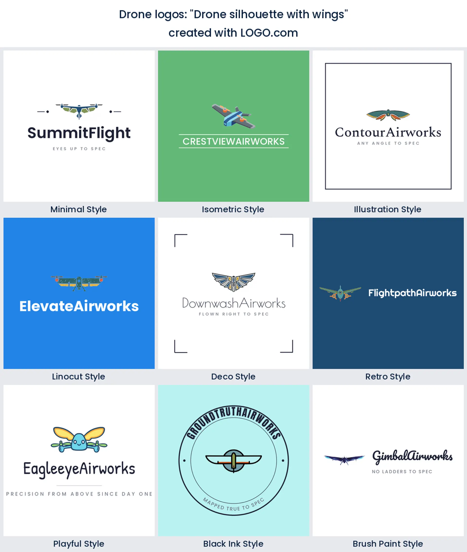
12. "Drone silhouette with wings"
This is the aviation badge route, and it is unashamedly traditional. Wings out either side of the airframe borrow every squadron crest you have ever seen, which is why it suits training schools, clubs, and a drone team logo more than it suits a startup.
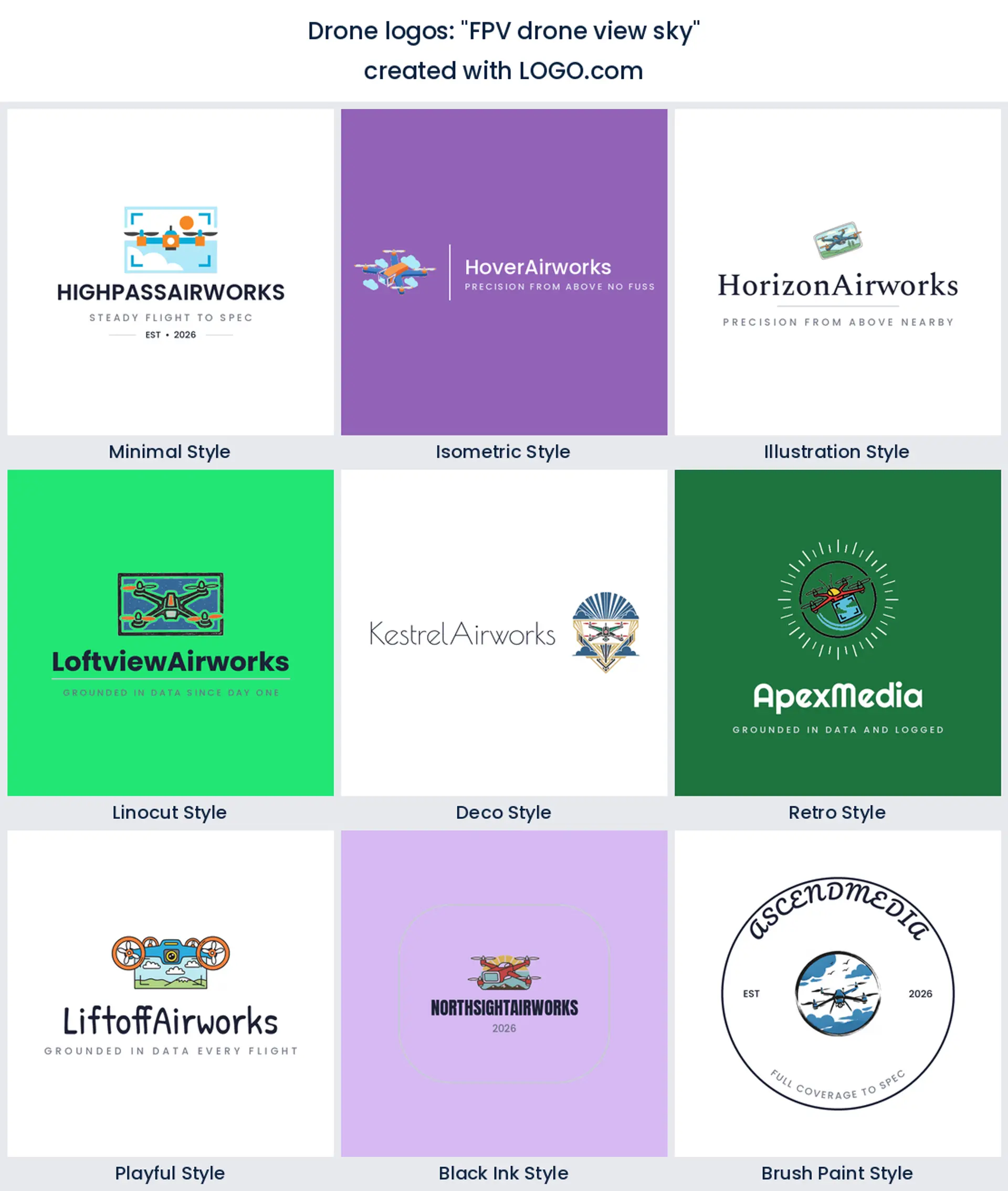
13. "FPV drone view sky"
First person racing is its own world, with its own look: a tight frame, a fast diagonal, and no polite landscape underneath. If you fly freestyle, build rigs, or cut chase footage, an FPV drone logo should feel a little aggressive, and this is the idea that gets you there.
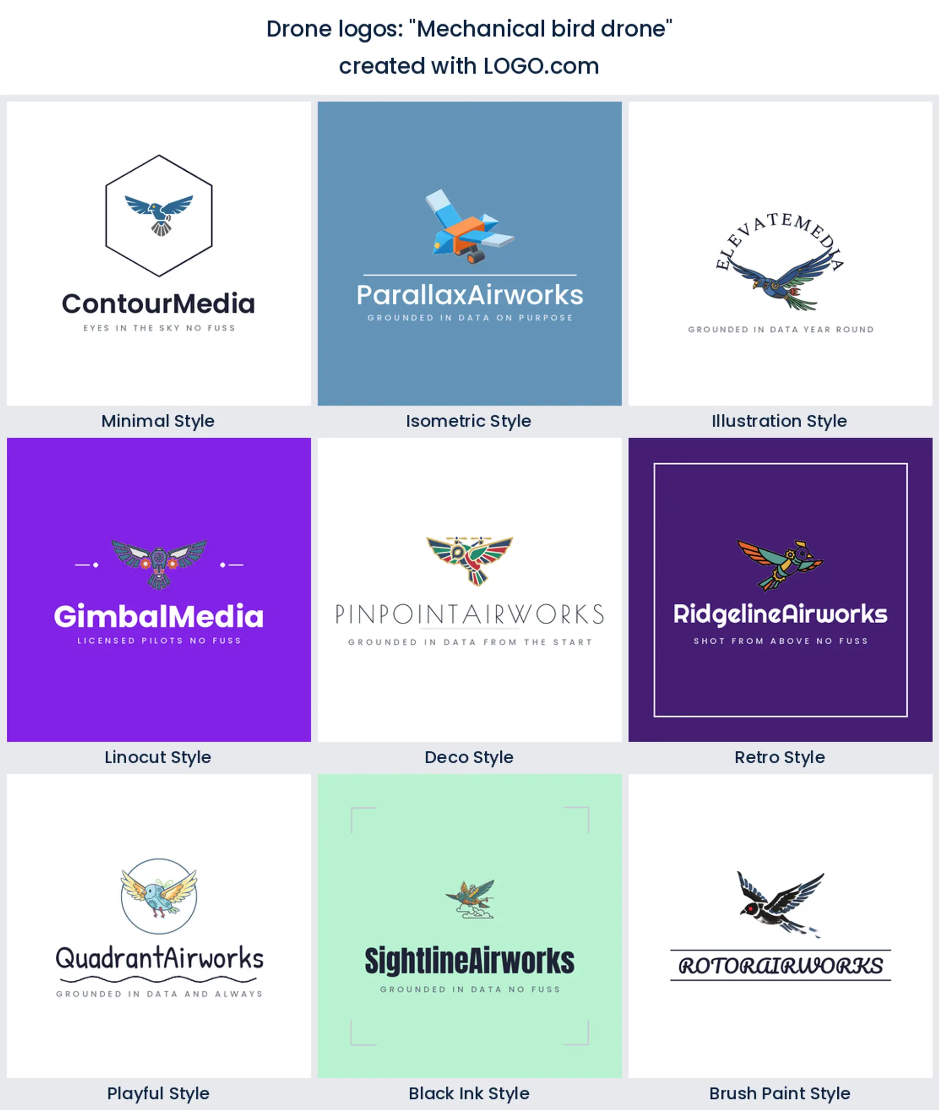
14. "Mechanical bird drone"
A few founders skip the quadcopter shape entirely and ask for a bird made of machine parts. It is the most memorable option in the fifteen because nobody else in your area will have one. Slightly harder to read at small sizes, so keep the wing shape simple and let it be a creative drone logo.
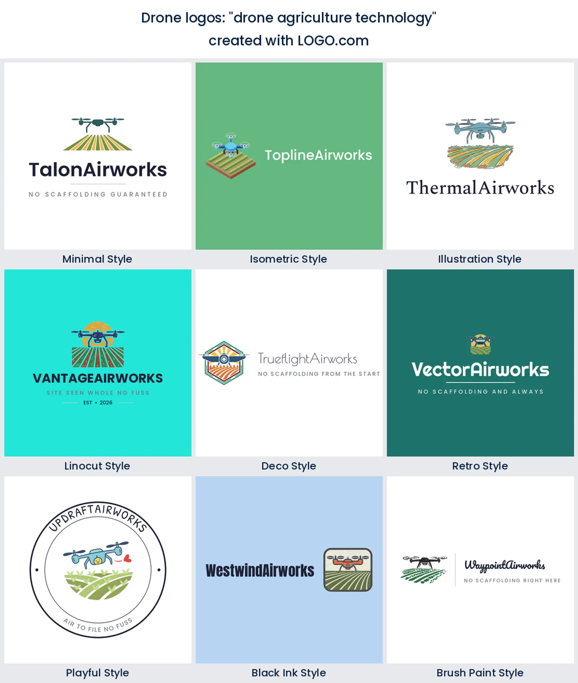
15. "drone agriculture technology"
Crop rows under the aircraft point at a completely different customer, one who cares about acres covered rather than shots delivered. Spraying, crop health, and yield mapping are growing fast, and there is very little brand competition, so a simple drone logo design here goes a long way.
Does a drone photography logo need a camera in it?
Usually yes, and the numbers say so, but it depends who is paying you. If your work is property listings, weddings, events, or promo video, put the lens in. A lens under the airframe is the fastest way to tell somebody scrolling a listing site what they are looking at, and it stops your mark reading as a hobby flyer. That is the whole case for a drone photography logo built around a camera.
Now flip it. If you inspect roofs, map sites, count stock in a yard, or spray crops, the camera is not the interesting part of the job and it makes you look like everyone else. Show the thing you measure instead. A roof, a pylon, a contour grid, or a field of crop rows narrows the audience on purpose, which is what you want when one annual contract is worth fifty small shoots. Racing and freestyle sit apart again, because an FPV drone logo is about speed and nerve, so a tilted airframe or a cropped propeller beats a tidy lens every time.
Your logo has to survive a hard case, a battery, and a hi vis vest
Drone kit lives in a case, and the case is the first branded thing a client sees when you turn up. That is a rough, matte, textured lid, usually printed as a single flat vinyl or laser cut sticker, so your mark needs to hold together in one solid color with no gradient and no hairline detail. The same goes for the smaller surfaces nobody plans for. Battery labels, controller stickers, and the little asset tag you stick on each airframe are all under two inches wide.
Then there is what you wear. A hi vis vest, a polo, or a soft shell gets embroidered rather than printed, and stitching loses thin lines first. Contour grids and feathered wings turn to mush at that size. So keep two cuts of the mark from the start: the detailed one for your website and your video end card, and a thickened single ink one for cases, stickers, and thread. Then check it the boring way. Tape the small version to a case lid, walk three metres back, and see whether you can still tell it is an aircraft. If you cannot, take a line out and go again.
Where a drone logo is really seen: on the deliverable
Most trades put their logo on a shopfront. You do not have one. Your brand travels almost entirely inside what you hand over, which changes what the mark has to be good at. A corner bug on a 4K video, a watermark on a proof photo, a badge on the cover of a roof report, a small mark on a mapping deliverable a surveyor opens six months later. Every one of those sits on top of somebody else's image or a wall of technical text.
So build for paper as much as for pixels. A roof report or a mapping deliverable is mostly dense technical text, and your mark has to hold a corner of that page without shouting over a table of readings. Keep a small wordless cut of the icon for cover badges and video end cards, because at four percent of frame width there is room for a symbol and nothing else. Then name the file properly, since the surveyor who opens your deliverable next spring will look for your brand by name before they look at the page. Get that right and your drone logo does its hardest work while you are not in the room.
Proving you fly legally is part of the brand
Commercial drone work is regulated nearly everywhere, and the rules differ by country, so check what your own aviation authority requires before you quote a job. What matters for the logo is simpler. Clients who are nervous about hiring a drone want to see that you are permitted and insured, and they look for it in the first few seconds. Founders searching for a certified pilot logo are really searching for a way to show that.
Do not try to bake it into the mark. Credentials change, and a badge with a rule reference in it ages badly and clutters the icon. Keep the logo clean and put the proof next to it. A small lockup of your logo with your operator reference, your insurance line, and your qualification, sitting in the footer of a quote or the first slide of a proposal, does the job properly. A brand kit is useful here because it keeps that lockup consistent everywhere you paste it.
Your two colors should say land or airspace
Everybody assumes this category is blue and black. Our own numbers disagree, gently. Set aside white and black, which carry the base of nearly every palette drone operators keep, and green edges ahead, purple sits a whisker behind, and blue takes third. The sample is small, so treat that as a nudge rather than a rule. It does track the work though. Green is land, crops, and survey. Purple and blue are data, software, and airspace.
Use that to pick a pair rather than a single color. Green with a deep navy reads survey and mapping and sits happily on a report cover. Blue with a light sky tint reads aerial and technical, which suits inspection. Purple with charcoal pushes you toward software and analytics. Whichever you choose, remember every logo here is a full color icon and you can also take a one color version, which is the one that ends up on the flight case and the vest.
Make your drone logo with LOGO.com
Type your operator name, describe the symbol that matches the work you actually want more of, and see it in all nine of the styles above. Your icon gets generated around the words you type rather than pulled off a shelf, so the same stock quadcopter does not end up on every operator in your area. Preview it free, download it, and come back to change the mark when you add a second aircraft or a second service.
Methodology. These figures come from logos created on LOGO.com in the 24 months ending July 2026. The drone industry sample was far too small to rank on its own, only 3 icon descriptions in the last 12 months, so we looked instead at the 98 custom icon descriptions that named a drone, an aerial view, a quadcopter, FPV flying or a drone propeller, sitting alongside the roughly 59 drone brands built on LOGO.com in the same window. False matches such as boat and aircraft propellers were excluded by hand. We grouped those descriptions by concept and ranked each concept by how often it appeared. A camera lens featured in about 19% of them, an aerial landscape view in about 13%, and a building inspection in about 12%. Founders usually name more than one element in a single description, so the shares overlap rather than summing to 100. Figures are rounded to the nearest percentage point. Source: LOGO.com first party product data, July 2026.
THE #1 LOGO GENERATOR
Why LOGO.com is the best drone logo maker
1.98 founder descriptions decided this ranking
Every symbol on the page earned its place by how often drone and aerial founders asked for it on LOGO.com, so none of it is guessed clip art.
2.Reads on a hard case lid
Check the mark in one flat color at case size, because a textured black lid is where most clients meet your brand first.
3.Small enough for a controller sticker
Battery labels, controller stickers, and airframe asset tags are all under two inches, so keep a thickened cut of the icon ready.
4.One ink version for a hi vis vest
Embroidery loses hairline contour lines and feathered wings, so a single color version keeps your vest and polo legible.
5.Sits on the corner of an aerial photo
Use the transparent file to drop a small bug onto proof photos and 4K video without a white box behind it.
6.Fits the badge on a site report cover
The same mark carries your roof report, your mapping deliverable, and the proposal you send before either of them.
7.Nine real drawing styles to compare
Minimal, illustration, isometric, deco, playful, linocut, retro, brush and black ink, all drawn properly rather than recolored.
8.Grow from one pilot to a crew with no redraw
Go from single operator to a small team and you can change the wordmark or the icon and keep everything else you have already printed.
9.Free to design, yours to invoice under
Download four high resolution PNG files free with full commercial use, then add the Brand Plan for the vector files large printing needs.
Drone Logo Maker FAQs
Need Inspiration? See example brands in your industry...
3DAcademic EducationAccommodationAdvertising AgencyAffordableAgriculture BlogAlternative MedicineAnimal BlogAnimalsApartmentAppraisal ServicesAriesArtArtistArts EducationAstrologyAudio ServicesAuto DealershipAuto Rental AgencyBBQBakeryBanking ServicesBaseball TeamBeauty SalonBed & BreakfastBettingBioinformaticsBirdBlock Letter Logo MakerBlurbBookBooks and LiteratureBoxBuilderBurgerBusiness Services and ConsultingCBDCameraCancerCannabisCardsCatCattleCharityChild CareChocolateCinemaCityClevverCloud