
Medical Logo Maker
Design a medical or dental logo that looks right on your practice sign and scrubs.
Need a different logo maker? Try our AI logo generator.
Logos created using LOGO.com
670,000,000
Trusted and clinical medical logos
Care and pharmacy medical logos
Specialist and clinic medical logos

Medical Logos, Ranked From Real Brand Data
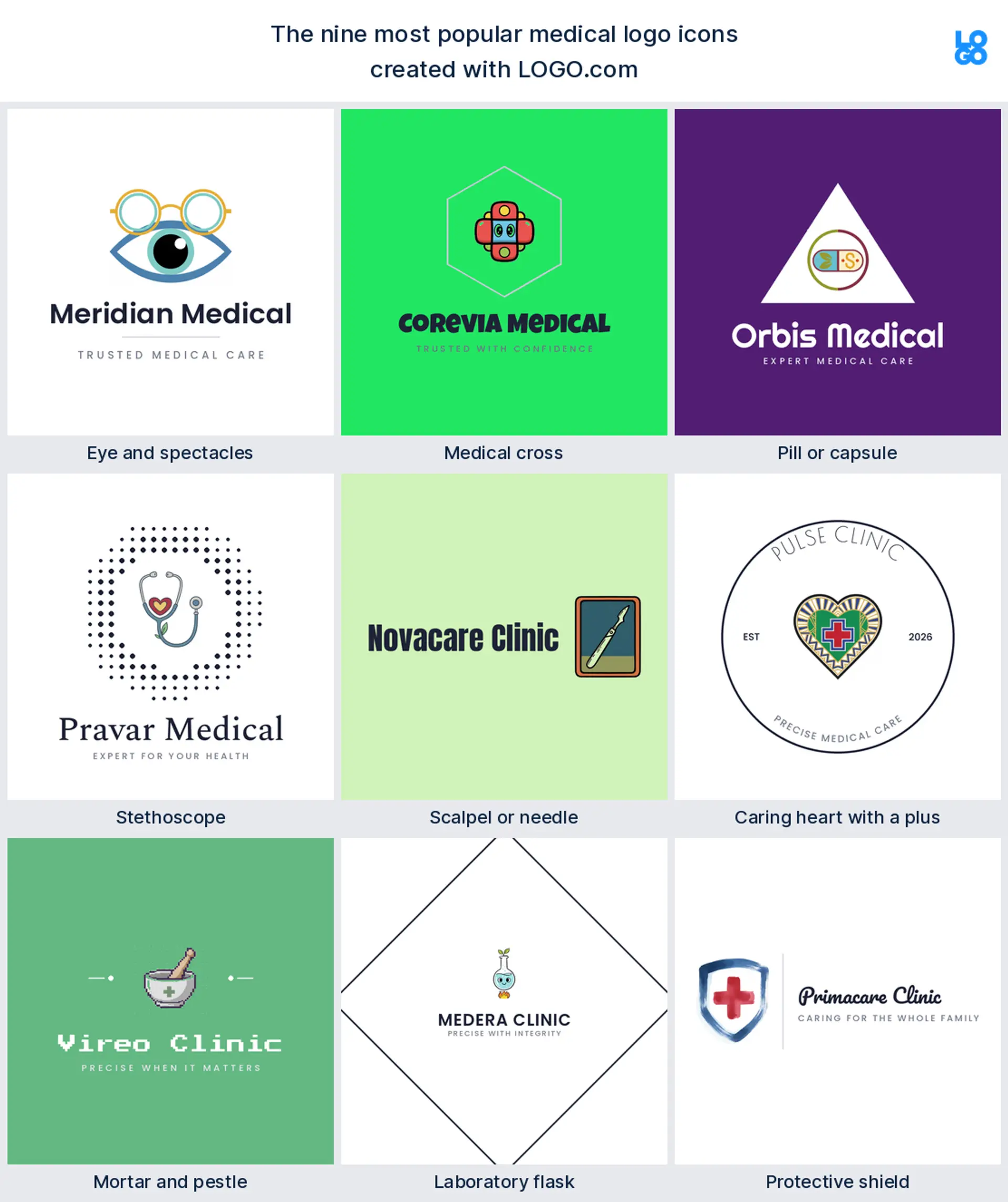
According to LOGO.com data, the icons medical founders reach for most are the eye with spectacles (about 29 percent), the medical cross (about 20 percent), and a pill or capsule (about 9 percent), drawn from the doctors, dentists, optometrists, and pharmacies who build a logo on LOGO.com.
Because a medical logo has to hold up from a practice sign to an embroidered coat to a booking app, the nine styles below are built to stay sharp at small sizes. Start from the symbol that matches your field, then make it your own with your color and name.
On this page
- Which symbols do medical founders choose most?
- Fifteen medical logo ideas from real founder prompts
- What symbol fits a doctor, a dentist, or a pharmacy?
- Caduceus, cross, or stethoscope: which medical symbol should you use?
- Where a medical logo has to hold up: scrubs, signs, and screens
- Colors that read clean and clinical, from real brand data
- What a medical logo costs and what you can use it for
- Make your medical logo with LOGO.com
Here is something our own data did not predict: the symbol medical founders describe most often is not a cross or a stethoscope, it is an eye. When we read the icons real doctors, dentists, optometrists, and pharmacists chose while building a logo on LOGO.com, the eye came out on top, in about 29 percent of them, with the medical cross close behind. This page walks through the nine symbols medical practices actually reach for, fifteen real prompts you can borrow, and the small decisions that make a medical logo look clean, capable, and easy to trust.
Which symbols do medical founders choose most?
Medicine covers a lot of ground, from a solo doctor to a dental office to a diagnostics lab, so these nine marks come from every corner of it. Eye care practices are the most active by far, which pushes the eye to the front, then the medical cross, then a pill or capsule from the pharmacy side. Pick the symbol closest to the care you give, keep it to one clean shape, and it will still read when it is shrunk onto a name badge or an app icon.
Eye and spectacles
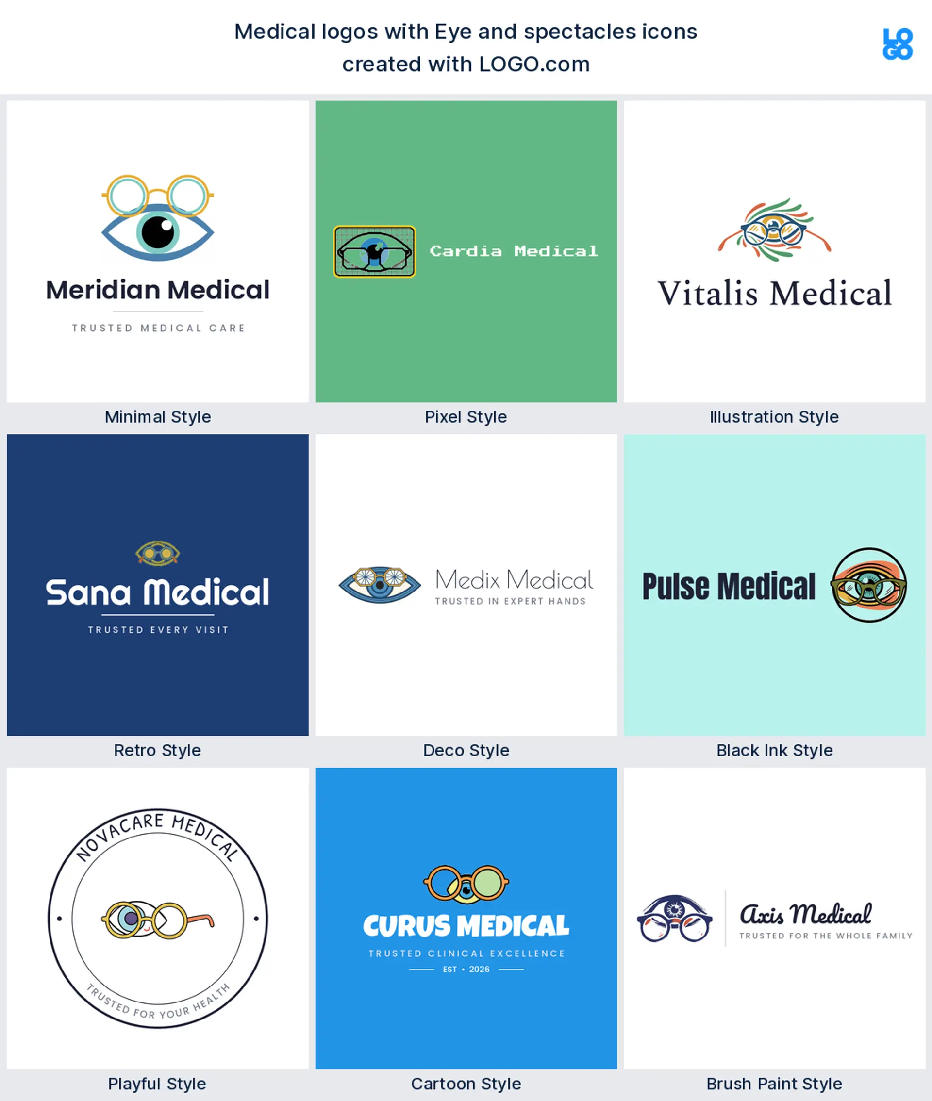
The busiest medical founders on LOGO.com turn out to be eye care practices, and it shows: an eye paired with spectacles is the single most described mark in our data, in about 29 percent of the icons. It reads as sight and careful attention in one glance, so it is the natural pick for an optometry, ophthalmology, or eye clinic logo.
Medical cross
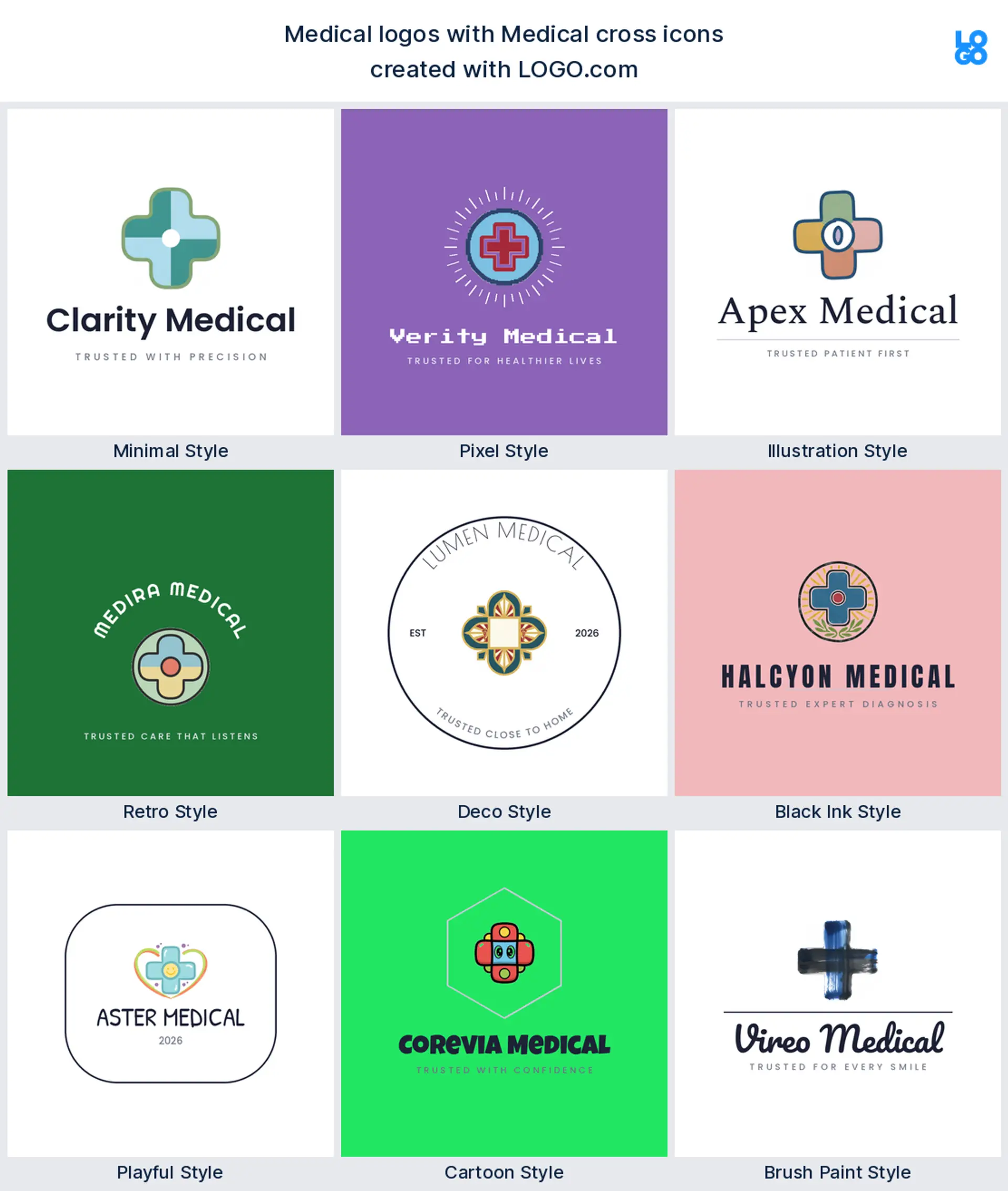
The mark everyone already recognises comes in second, the medical cross, named in roughly 20 percent of the icons. Kept rounded and modern it feels calm rather than cold, which makes it the dependable choice for a general practice, an urgent care, or a family clinic logo.
Pill or capsule
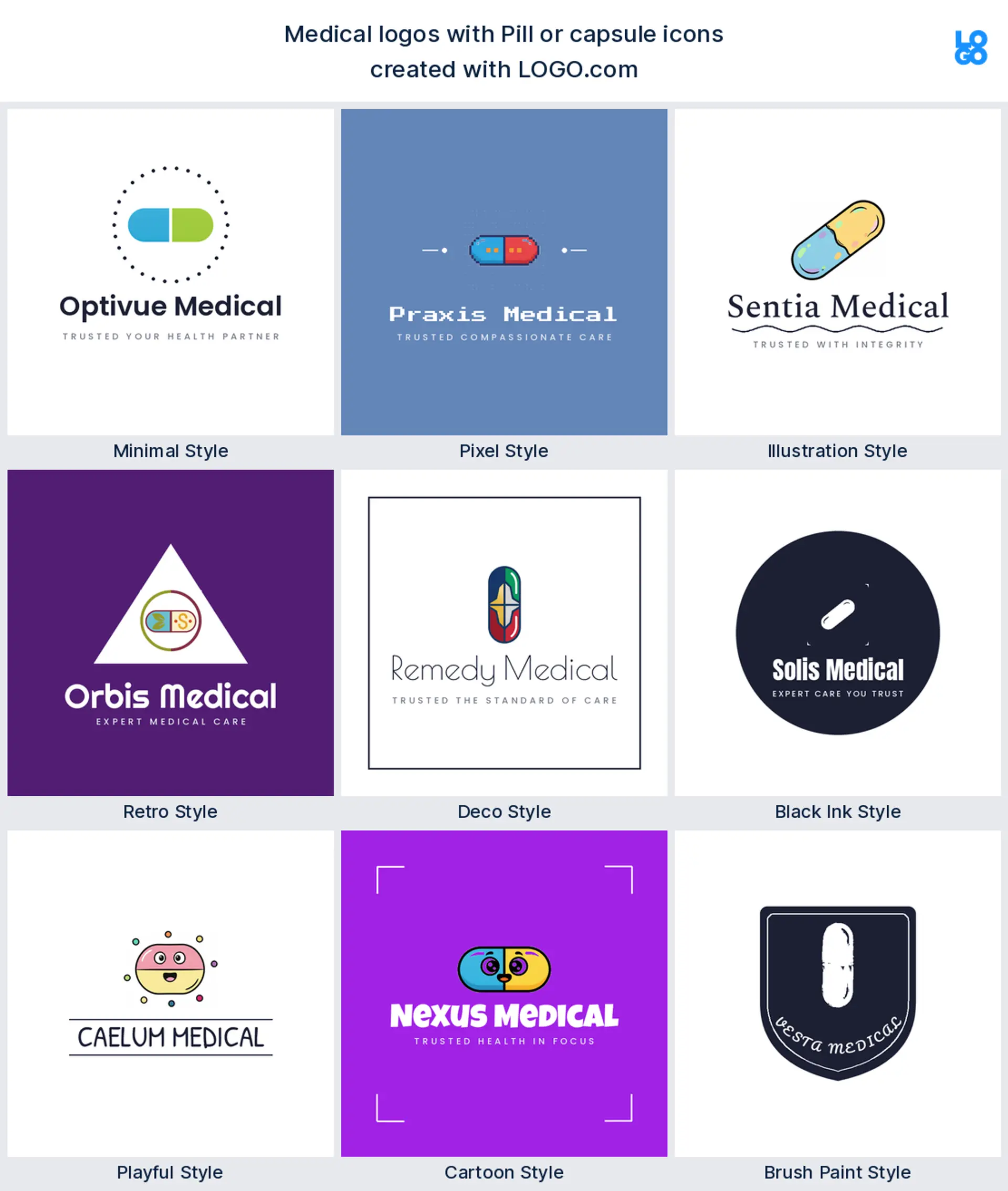
A single pill or capsule shows up in about 9 percent, and it does one job perfectly, saying remedy the instant you see it. Draw it clean and it looks modern instead of medicinal, a tidy fit for a pharmacy, a dispensary, or a medication delivery logo.
Stethoscope
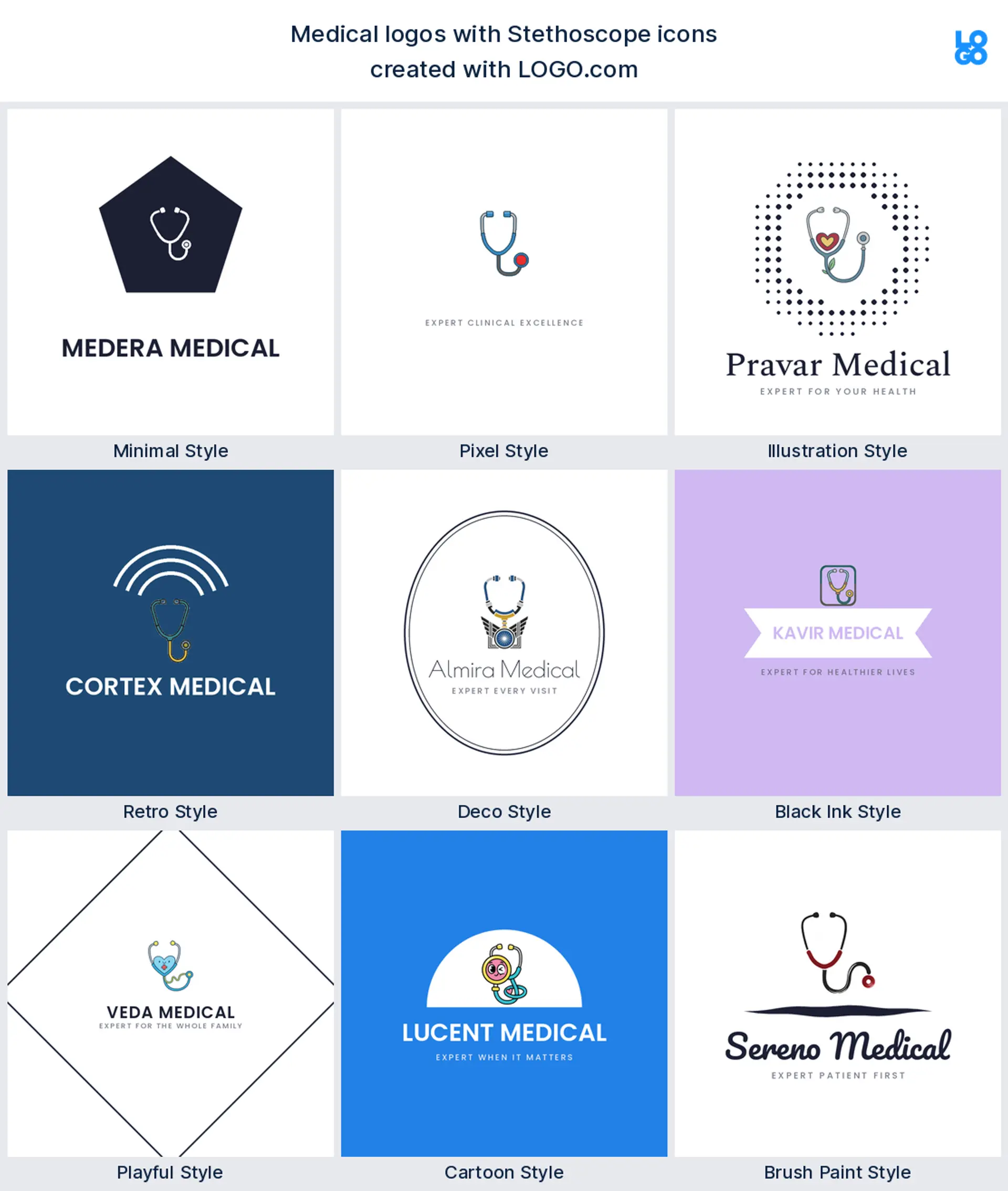
No object says doctor faster than the stethoscope, so it is little wonder founders keep reaching for it. Many loop it into a heart or hand it to a smiling child, which makes a warm pediatric clinic or family doctor logo that puts nervous patients at ease.
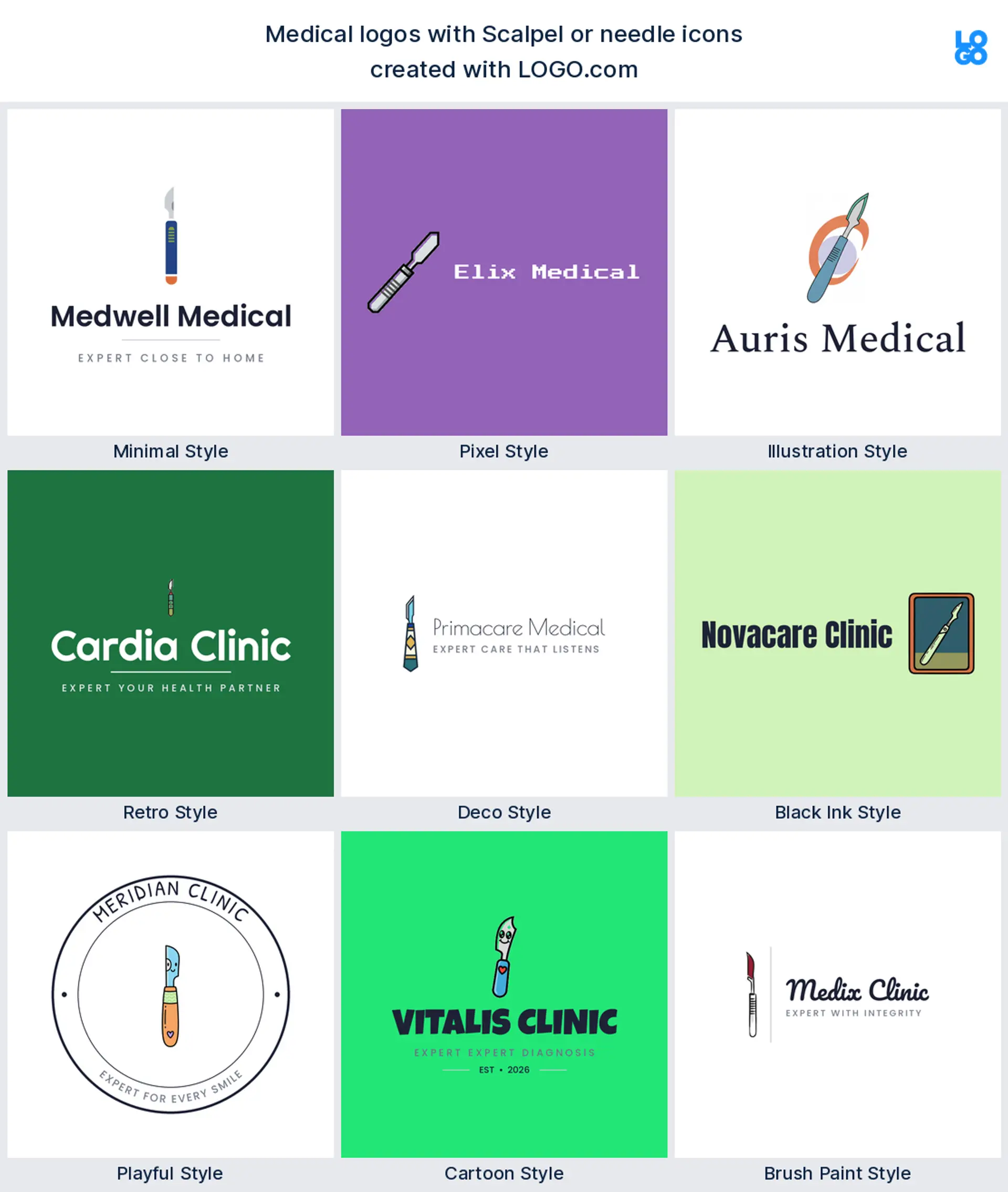
Scalpel or needle
A scalpel or a fine needle is the mark surgeons and aesthetic clinics reach for, precise and confident. Paired with a droplet it reads as skill and detail, a sharp choice for a surgical, dermatology, or aesthetic clinic logo.
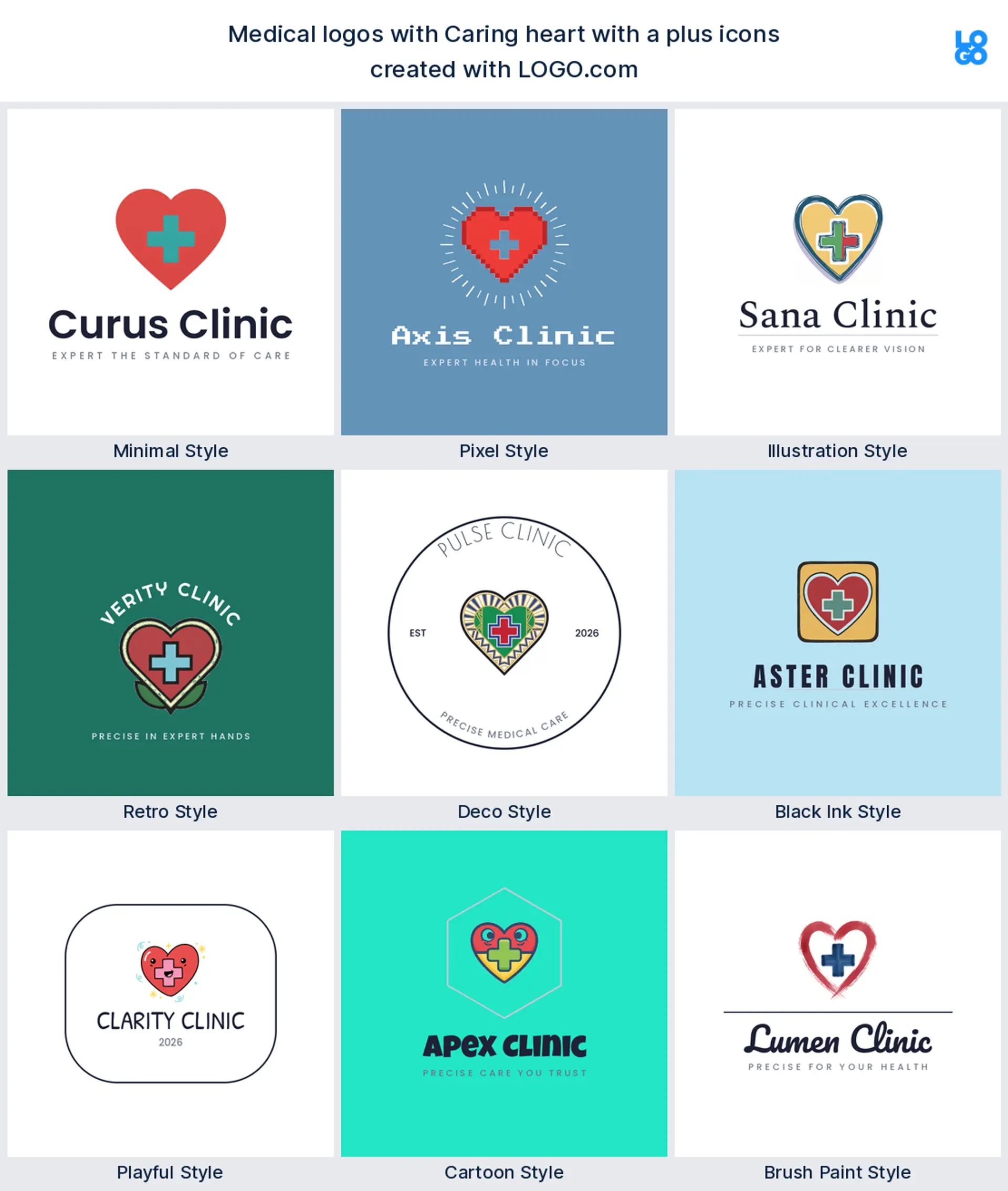
Caring heart with a plus
Plenty of founders fold a plus sign straight into a heart, which keeps the warmth of care and the signal of medicine in one shape. It suits a cardiology practice, a community clinic, or any medical logo that wants to lead with heart.
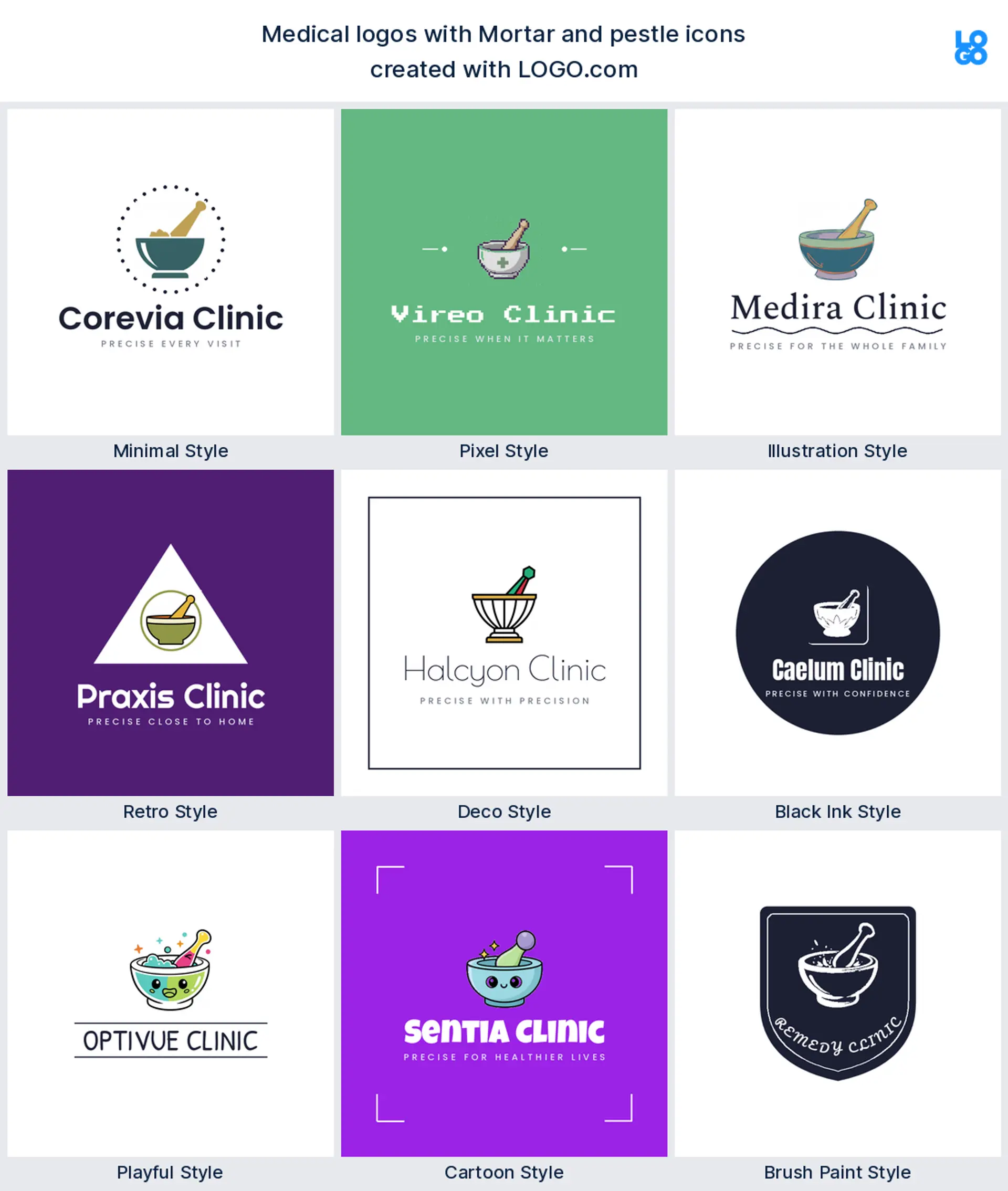
Mortar and pestle
The mortar and pestle is the quiet classic of the pharmacy world, the oldest symbol of medicine made by hand. It gives a compounding pharmacy, an apothecary, or a herbal medicine logo an instant sense of craft and trust.
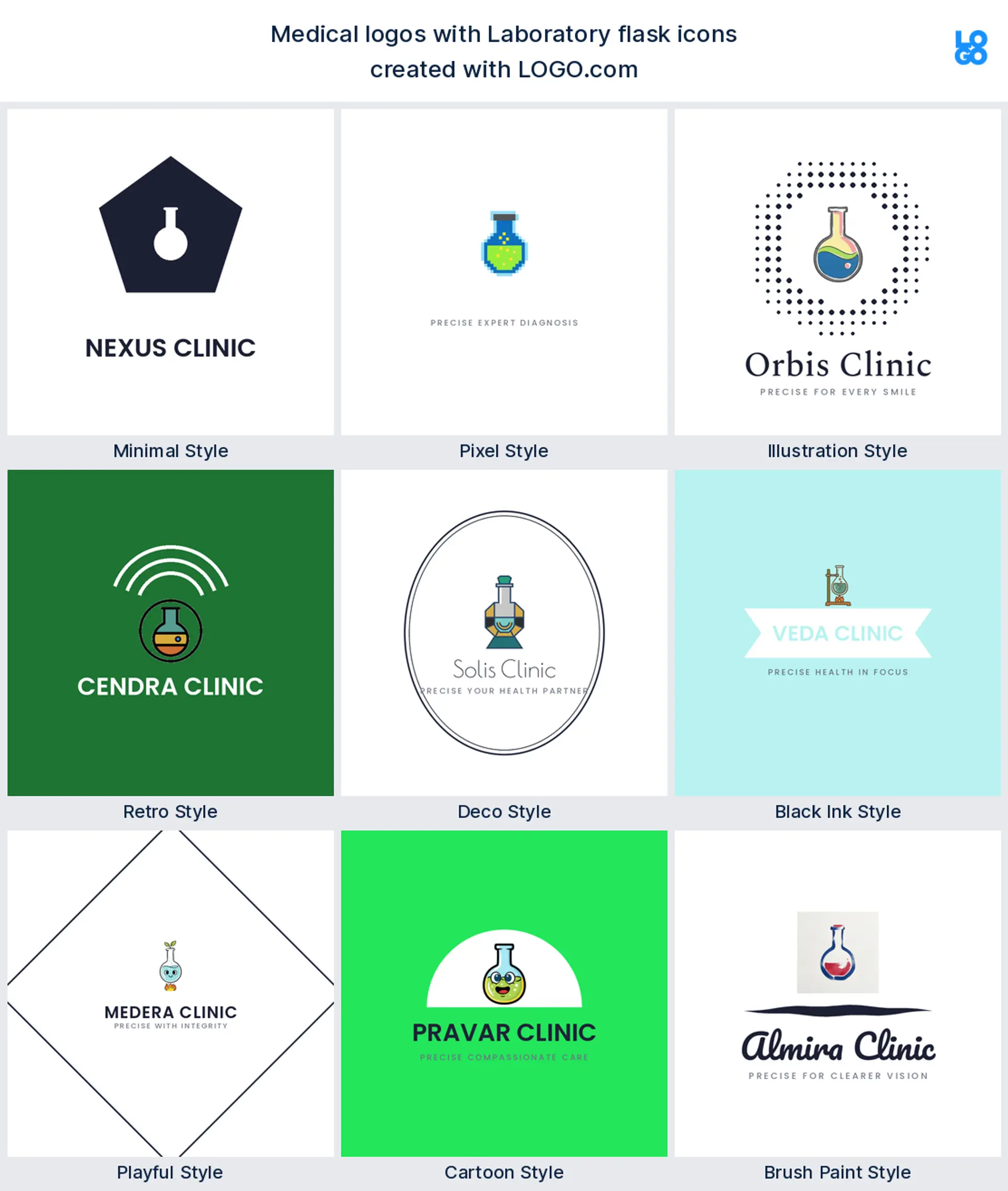
Laboratory flask
A laboratory flask turns up wherever the work is testing and proof, from diagnostics to research. It signals evidence over guesswork, so it anchors a medical lab, a diagnostics, or a biotech logo that wants to look rigorous.
Protective shield
The ninth symbol is the shield, usually carrying a plus or a burst of light inside. It stands for protection and safety, a reassuring frame for an urgent care, an immunization service, or a preventive care logo.
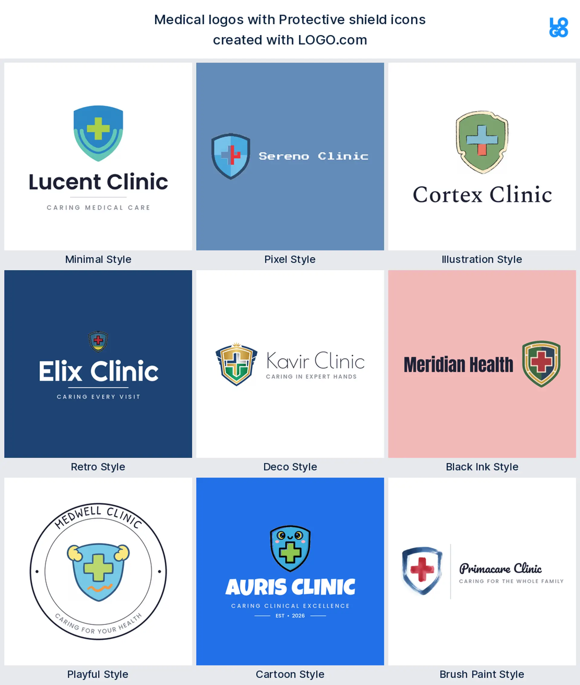
Fifteen medical logo ideas from real founder prompts
These fifteen are the exact icon descriptions doctors, dentists, pharmacists, and clinic owners typed into LOGO.com, shown across the nine styles so you can watch each one move from clean and minimal to bold and playful. They are richer than the plain top nine, and any of them can carry your name. Treat them as medical logo ideas to start from, then change the color, font, and wordmark until the mark fits your practice. The best medical logo design keeps one idea and lets everything else fall away.
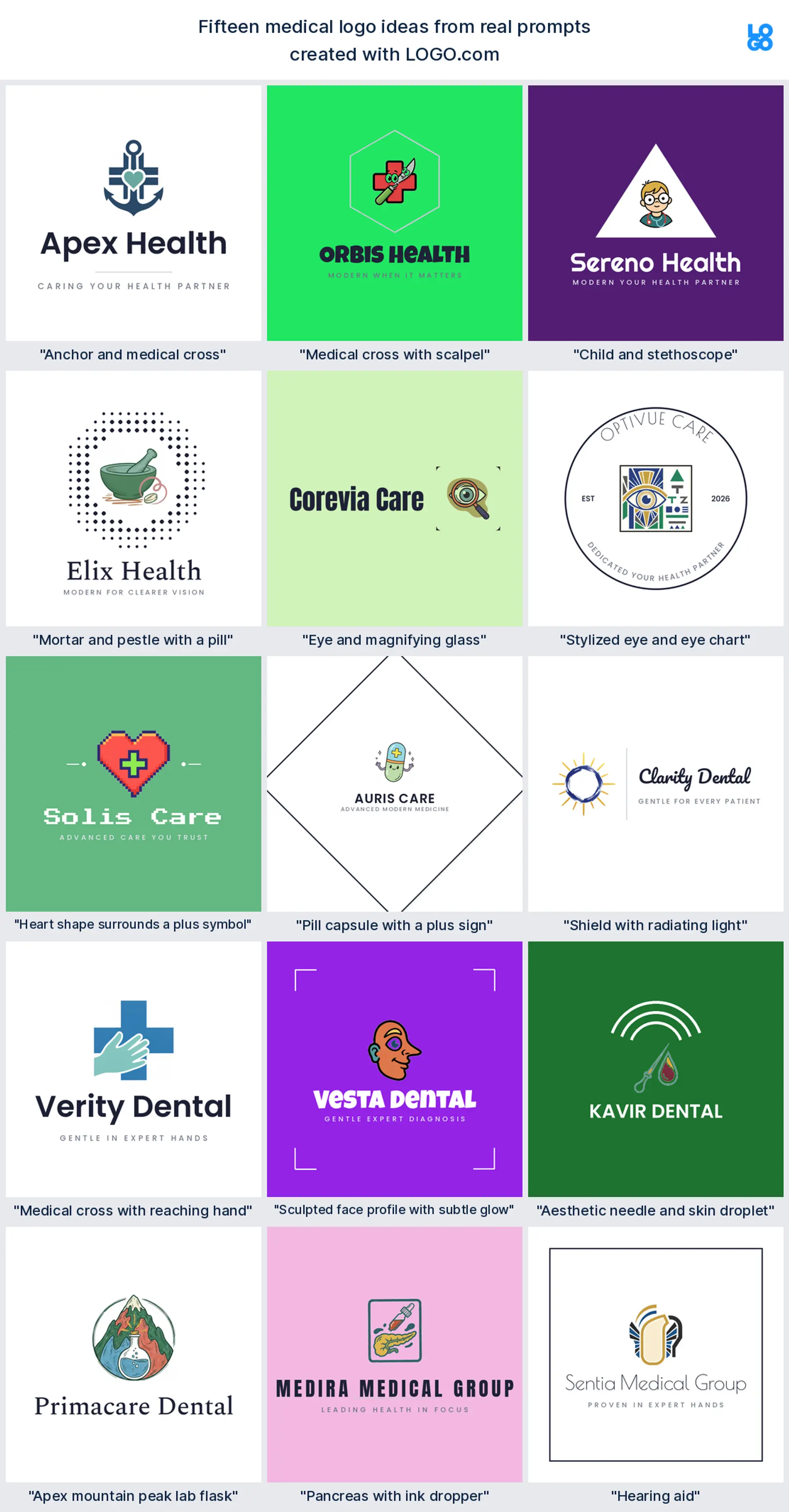
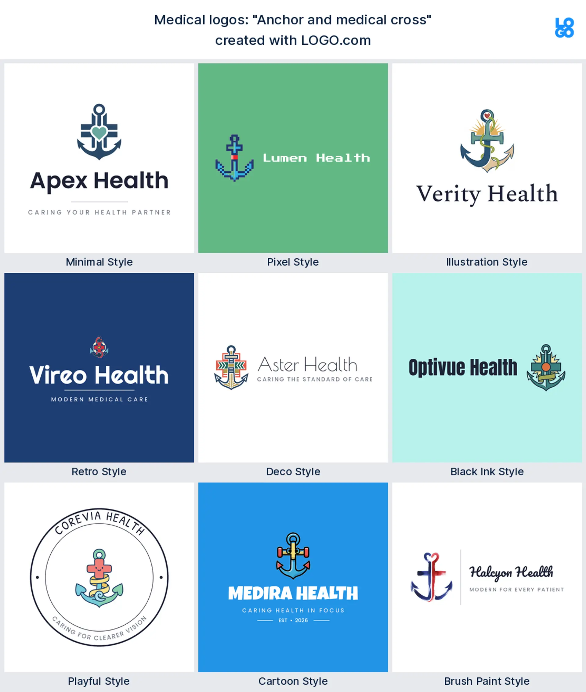
"Anchor and medical cross"
This one fuses an anchor with a medical cross, a real founder prompt that reads as steady, dependable care. It makes a distinctive medical logo for a naval, maritime, or veterans clinic.
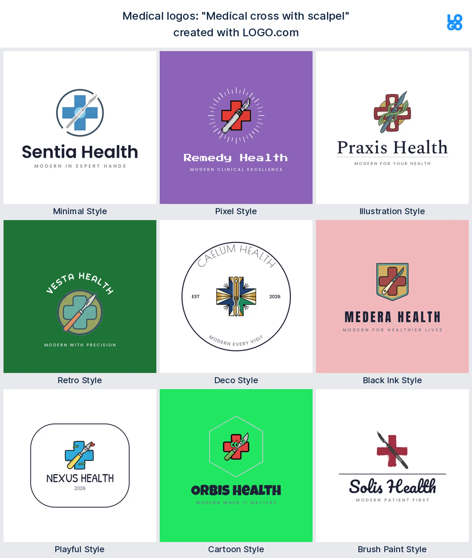
"Medical cross with scalpel"
Cross a medical plus with a scalpel and you get medicine and precision in a single mark. A surgeon typed this, and it makes a strong surgery or operating room clinic logo.
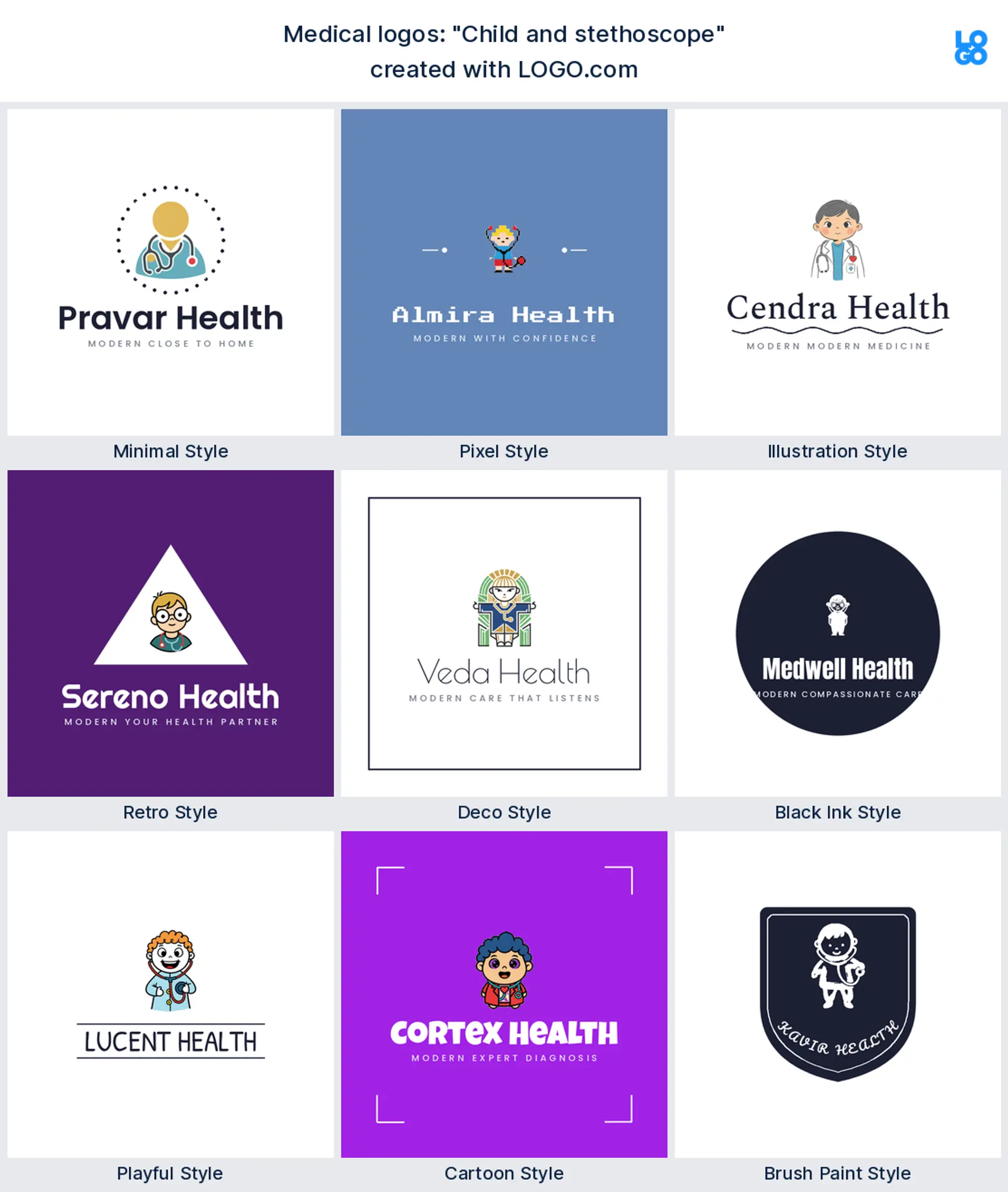
"Child and stethoscope"
Hand a stethoscope to a small child and the whole brand softens. This came straight from a pediatrician, a warm pediatric clinic logo for a childrens practice.
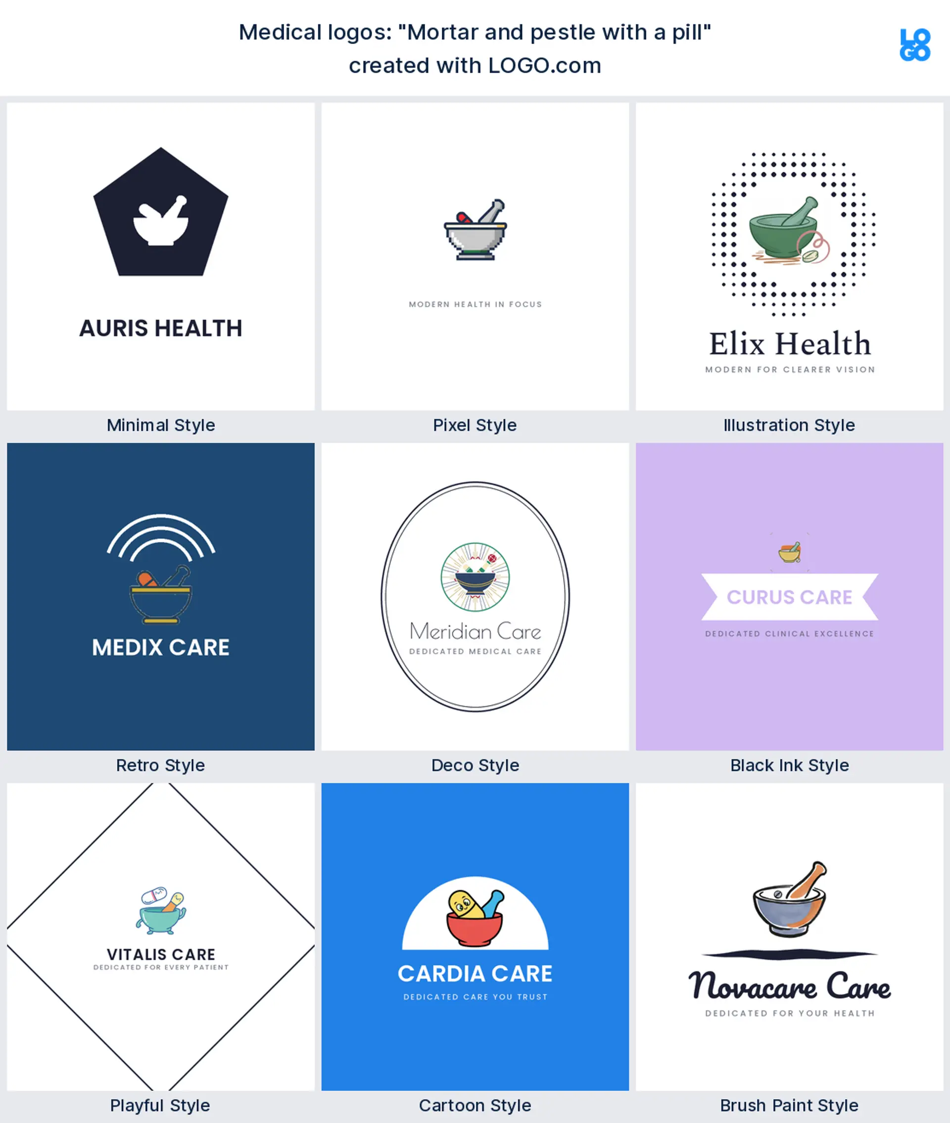
"Mortar and pestle with a pill"
A pharmacist described a mortar and pestle cradling a single pill, bridging old and new medicine. It makes a considered pharmacy or compounding logo.
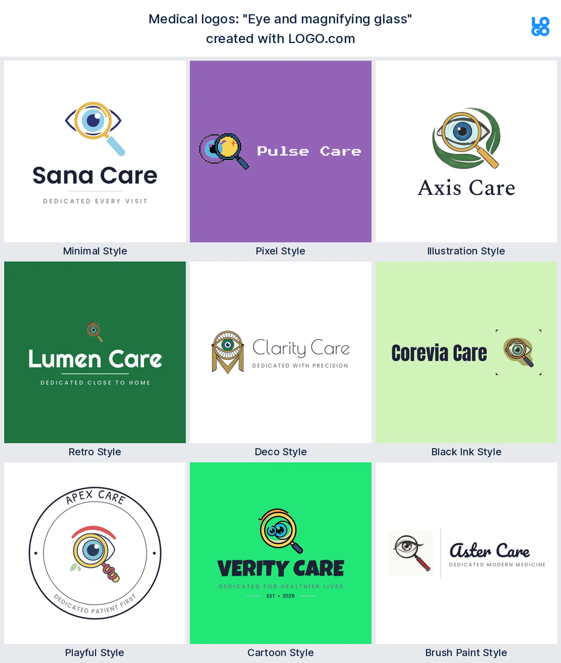
"Eye and magnifying glass"
An eye studied through a magnifying glass says sharp, careful vision at a glance. An optometrist wrote it, and it works as a clear optometry or eye exam logo.
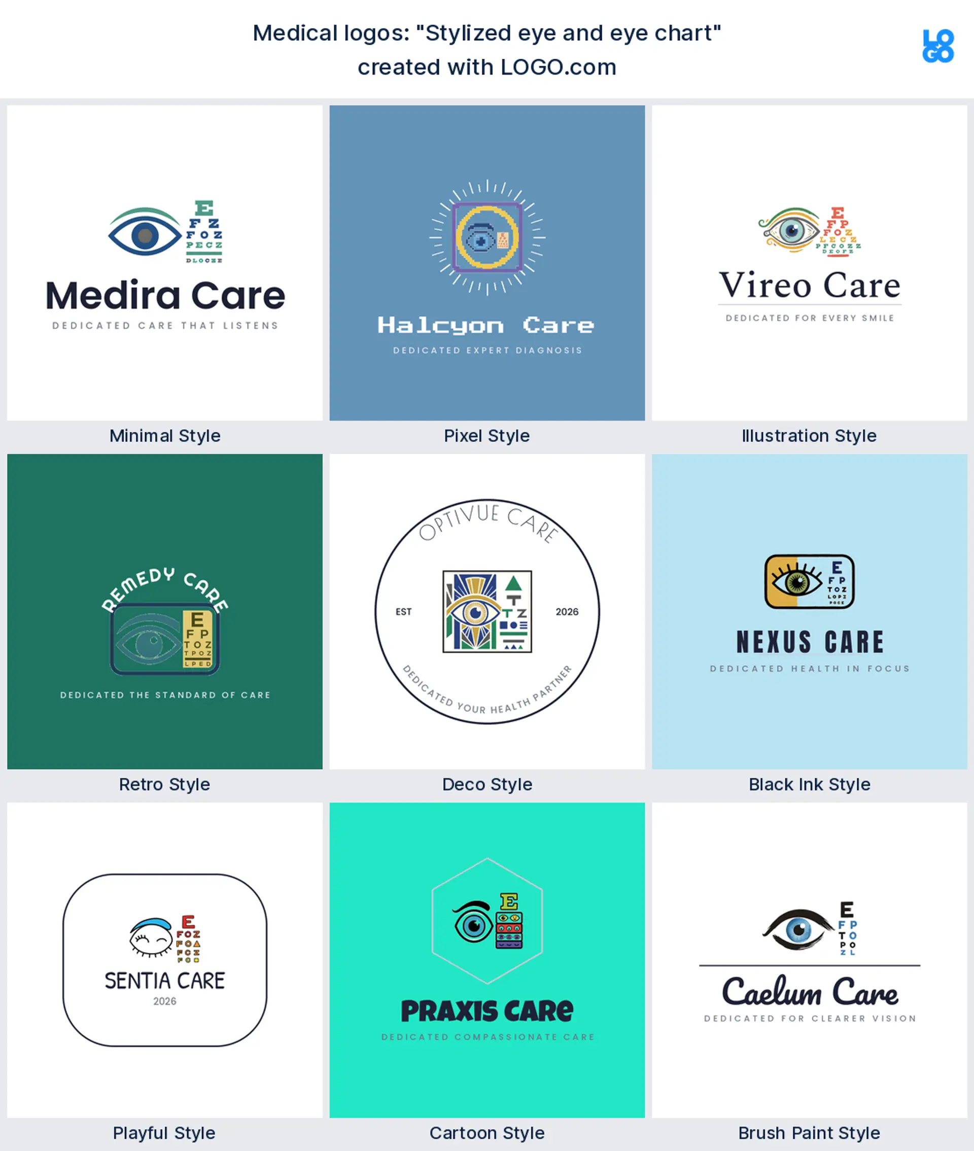
"Stylized eye and eye chart"
Put an eye next to a reading chart and the profession names itself without a word. Another eye care founder typed this, a smart optometry or vision clinic logo.
"Heart shape surrounds a plus symbol"
Wrap a plus sign inside a heart and care and medicine share one mark. A clinic owner wrote it, a welcoming family clinic or medical logo.

"Pill capsule with a plus sign"
A capsule stamped with a plus looks modern and unmistakably medical. It came from a pharmacy founder, a neat pharmacy or supplements logo.
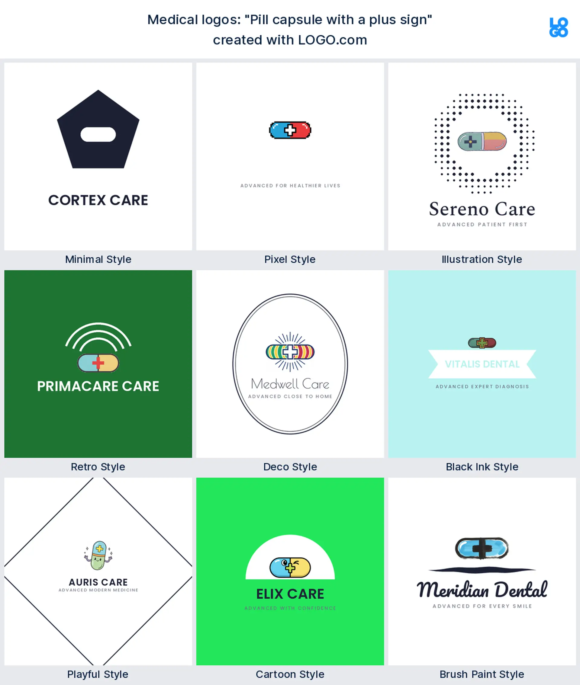
"Shield with radiating light"
Light spilling out of a shield reads as protection and trust. Someone in preventive care typed this, a reassuring urgent care or immunization logo.
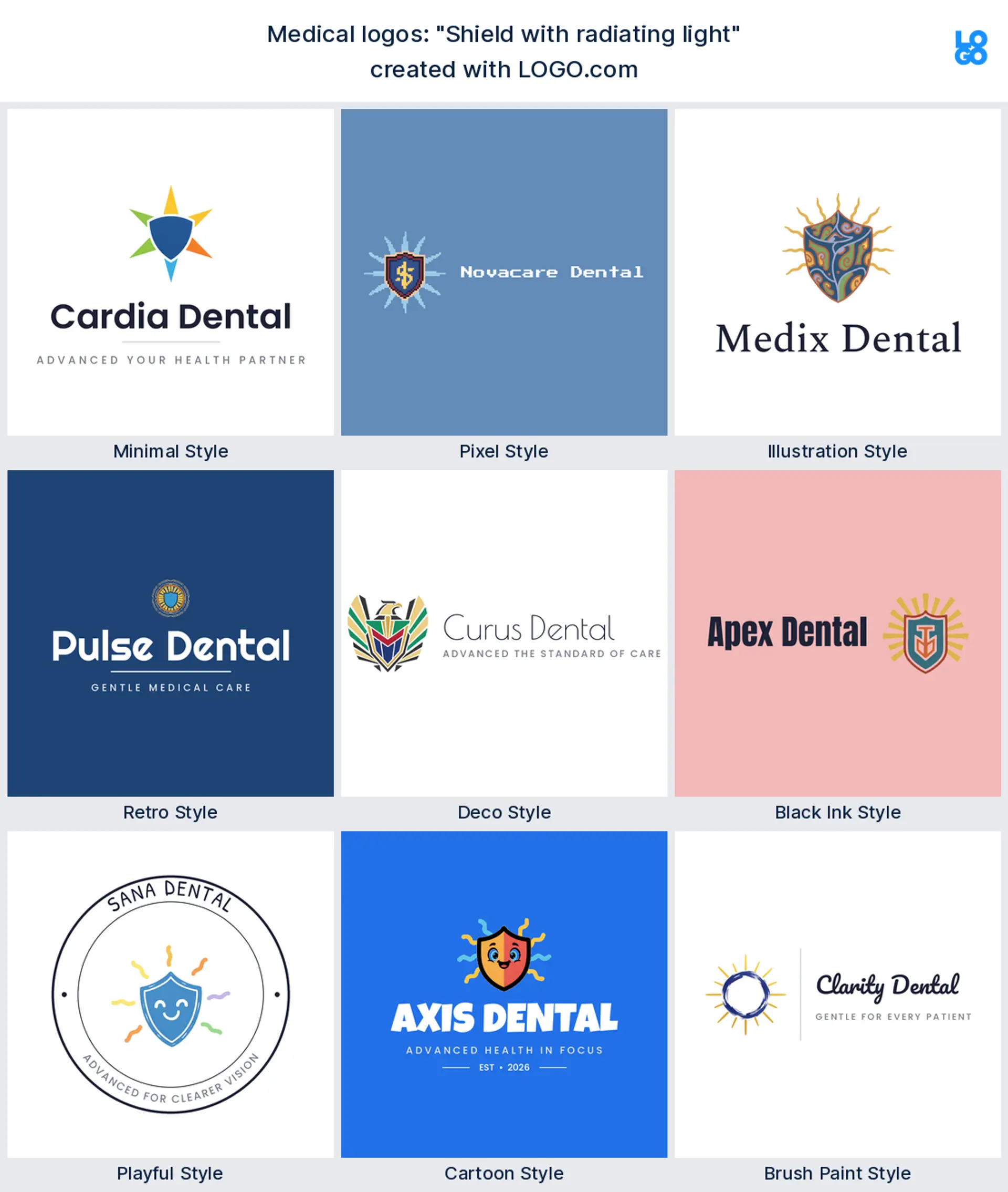
"Medical cross with reaching hand"
An open hand reaching toward a cross says help offered, not just help advertised. A founder wrote it, a caring community clinic or outreach medical logo.
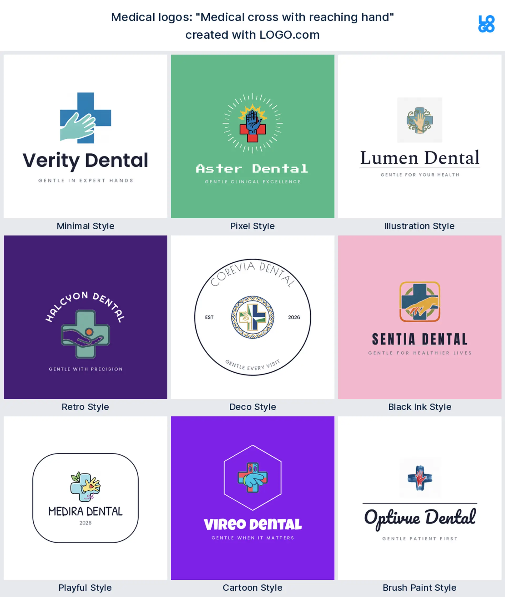
"Sculpted face profile with subtle glow"
A smooth face profile with a soft glow reads refined and skin deep. An aesthetics clinic described it, an elegant dermatology or aesthetic clinic logo.
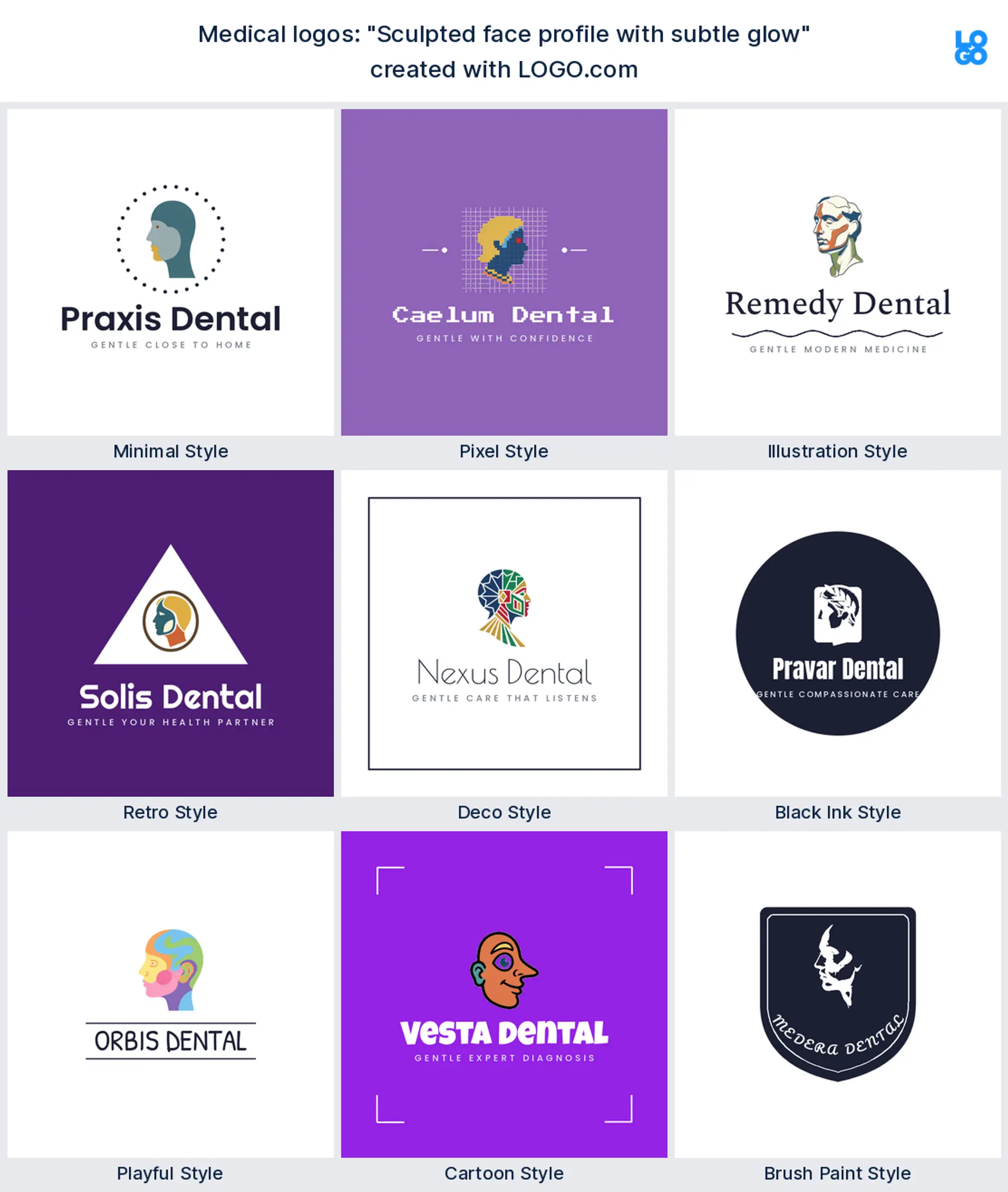
"Aesthetic needle and skin droplet"
A fine needle beside a droplet signals precision and skin care in one breath. An injectables founder typed this, a clean aesthetic or cosmetic clinic logo.
"Apex mountain peak lab flask"
A lab flask rising like a mountain peak reads as high standards and real results. A diagnostics founder wrote it, a confident medical lab or diagnostics logo.
"Pancreas with ink dropper"
A pancreas paired with a dropper is specific and knowing, exactly what a specialist wants. It makes a fitting endocrinology or specialty clinic logo.

"Hearing aid"
A single clean hearing aid names the service at a glance. An audiologist typed this, a focused audiology or hearing clinic logo.
What symbol fits a doctor, a dentist, or a pharmacy?
Medicine is not one business, so let the logo say which part of it you practice. Running a general or family clinic? A rounded medical cross or a caring heart keeps you readable at a glance, and it makes a clear doctor logo or clinic logo. Own a dental office? A clean tooth, a bright smile, or a simple cross reads instantly as a dental logo or dentist logo. Working in eye care? An eye with spectacles is the sharpest optometry logo you can pick. Filling prescriptions? A pill, a capsule, or a mortar and pestle makes an honest pharmacy logo. Seeing children all day? A stethoscope in a small hand gives you a warm pediatric logo. Choose the field you are known for and build the mark around that one idea, rather than stacking a cross, a tooth, and a pill into one crowded symbol.
Caduceus, cross, or stethoscope: which medical symbol should you use?
This is the question almost every medical founder hits, so here is the short version. The plain medical cross is the safest and most universal, read as health by everyone, everywhere. A stethoscope is more personal and human, perfect when you want to feel like a doctor people actually talk to rather than an institution. The caduceus, that winged staff with two snakes, looks impressive but is worth a second thought, because the true medical symbol is the rod of Asclepius, a single snake and no wings, and mixing the two up is a common slip. If you love the staff and snake look, use the single snake version, and if you want zero risk of confusion, a clean cross or stethoscope never misfires. Whichever you choose, keep it to one symbol so your medical logo stays calm and legible.
Where a medical logo has to hold up: scrubs, signs, and screens
A medical logo has to survive some unforgiving places, so test it in the ones that matter to you. Embroidered on scrubs or a lab coat, thin lines and gradients tend to blur, so a bold single shape wins. On a practice sign out by the road it has to read from a moving car, which again rewards one strong mark over fussy detail. Shrunk to a booking app icon or a patient portal avatar it can lose anything delicate, so check it small before you fall for it big. Download a one color version alongside the full color one and you will have a medical logo that holds up on a coat, a door, a sign, and a screen without a redraw.
Colors that read clean and clinical, from real brand data
Color does a lot of the talking before a patient reads a word, so pick it on purpose. When we looked at the palettes medical founders actually chose on LOGO.com, blue led, with a calm green close behind and a soft purple showing up for the aesthetic and dermatology crowd. Blue is the workhorse of medicine for a reason, since it reads clean, calm, and dependable, exactly what you want above a clinic door. Green leans a little more natural and reassuring, a nice fit for a pharmacy or a family practice, while a muted purple feels modern and premium for skin and cosmetic clinics. Whatever you land on, keep it to one confident color plus a neutral, pair it with a simple font, and let the white space carry the calm.
What a medical logo costs and what you can use it for
Designing and previewing your logo on LOGO.com is free, and you can download a high resolution PNG with full commercial use without paying anything, so a new practice can launch on a real budget. When you are ready to print the logo large and crisp, on a clinic sign, a vehicle wrap, or embroidered scrubs, the Brand Plan adds the vector files, unlimited edits, and a full brand kit. Commercial use comes with both the free and paid downloads, so you never pay just to use your own medical logo. It is yours to put on your door, your paperwork, and your website from the first day.
Make your medical logo with LOGO.com
Pick the symbol that fits your field, choose one of nine styles, and our free medical logo maker builds the rest around your name. Preview it free, download a high resolution PNG with full commercial use, and walk out with one clean, credible mark ready for your practice sign, your scrubs, and your booking app in minutes.
Methodology. These figures come from logos created on LOGO.com during the 12 months ending July 2026. We read the 80 custom icon descriptions written by roughly 447 founders who chose a medical, dental, clinic, pharmacy, optometry, hospital, or surgical industry, grouped those descriptions by concept, for example an eye, a medical cross, or a pill, and ranked each by how often it appeared. The eye led at about 29 percent, the medical cross followed near 20 percent, and a pill or capsule came next at about 9 percent. Figures are a share of all icon descriptions in that set, rounded to the nearest percentage point. Source: LOGO.com first party product data, July 2026.
THE #1 LOGO GENERATOR
Why LOGO.com is the best medical logo maker
1.Built from real medical brand data
The symbols and styles come from the logos real doctors, dentists, optometrists, and pharmacists built on LOGO.com, so you start from what works, not generic clip art.
2.A credible mark ready in minutes
Name your practice, pick a symbol and a style, and you have a finished medical logo in minutes, not weeks of back and forth with a designer.
3.Legible on a wayfinding sign and a name tag
Your mark stays sharp on a big wayfinding sign and on a tiny name tag, where thin strokes and fine detail usually disappear.
4.Transparent PNG for lab coats and letterheads
Download a transparent logo that drops cleanly onto a colored lab coat, a referral letterhead, or a patient photo with no white box around it.
5.One system for your sign, cards, and portal
Design it once and it carries across your entrance sign, appointment cards, referral paperwork, and your patient portal avatar.
6.Full color or a single color for embroidery
Choose a full color icon or a single color version that embroiders neatly on scrubs and stamps cleanly on a welcome card.
7.Nine styles, from clinical to approachable
Match your tone, from a crisp clinical wordmark for a surgery to a warmer mark for a pediatric or family clinic, all built to read small.
8.A full wordmark and a compact clinic mark
Keep the full practice name and a compact icon so you have the right version for a wide entrance sign and a small app avatar.
9.Free to design, yours to sell with
Preview free and download a high resolution PNG with full commercial use, then upgrade to the Brand Plan for vector files to print signs and coats.
Medical Logo Maker FAQs
Need Inspiration? See example brands in your industry...
3DAcademic EducationAccommodationAdvertising AgencyAffordableAgriculture BlogAlternative MedicineAnimal BlogAnimalsApartmentAppraisal ServicesAriesArtArtistArts EducationAstrologyAudio ServicesAuto DealershipAuto Rental AgencyBBQBakeryBanking ServicesBaseball TeamBeauty SalonBed & BreakfastBettingBioinformaticsBirdBlock Letter Logo MakerBlurbBookBooks and LiteratureBoxBuilderBurgerBusiness Services and ConsultingCBDCameraCancerCannabisCardsCatCattleCharityChild CareChocolateCinemaCityClevverCloud