Baseball Team Logo Maker
Design a baseball team or softball logo that looks good on caps and jerseys.
Need a different logo maker? Try our AI logo generator.
Logos created using LOGO.com
670,000,000
Bold mascot and crest baseball logos
Classic bat, cap and diamond logos
Vintage and collegiate ball club logos
Baseball Logos, Ranked From Real Founder Prompts
According to LOGO.com data, the bat is the symbol baseball founders reach for most, showing up in about 45% of the 281 custom icon descriptions that mention baseball, ahead of the trading card at about 14% and the glove at about 12%.
The nine styles below are built from those same descriptions, so you start from shapes players, parents, and rival coaches already read as baseball rather than from an empty page. Pick a symbol, name your club, and the baseball logo maker handles the rest.
On this page
- Nine baseball symbols, ranked by 281 founder prompts
- Fifteen baseball logo ideas worth stealing
- Embroidery is the real test for a baseball logo
- Softball, travel ball, or a card shop? Aim the mark
- Colors that look right under stadium lights
- Do you need a chest wordmark as well as a cap mark?
- What it costs and what you can put it on
- Make your baseball team logo with LOGO.com
Every ball club needs a mark that survives a cap panel, a jersey chest, and a tiny circle next to your name on a league schedule. This page starts from what founders actually built. We read 281 custom icon descriptions mentioning baseball, written by real people making a baseball logo on LOGO.com, grouped them into the nine symbols that come up most, and turned them into fifteen directions you can make your own.
Nine baseball symbols, ranked by 281 founder prompts
When we counted the custom icon descriptions written on LOGO.com that mention baseball, the same nine subjects kept coming back. The bat runs away with it, the trading card and the glove follow, and the rest split between crests, shapes, and details you can stitch. One clear symbol plus a readable team name does nearly all the work.
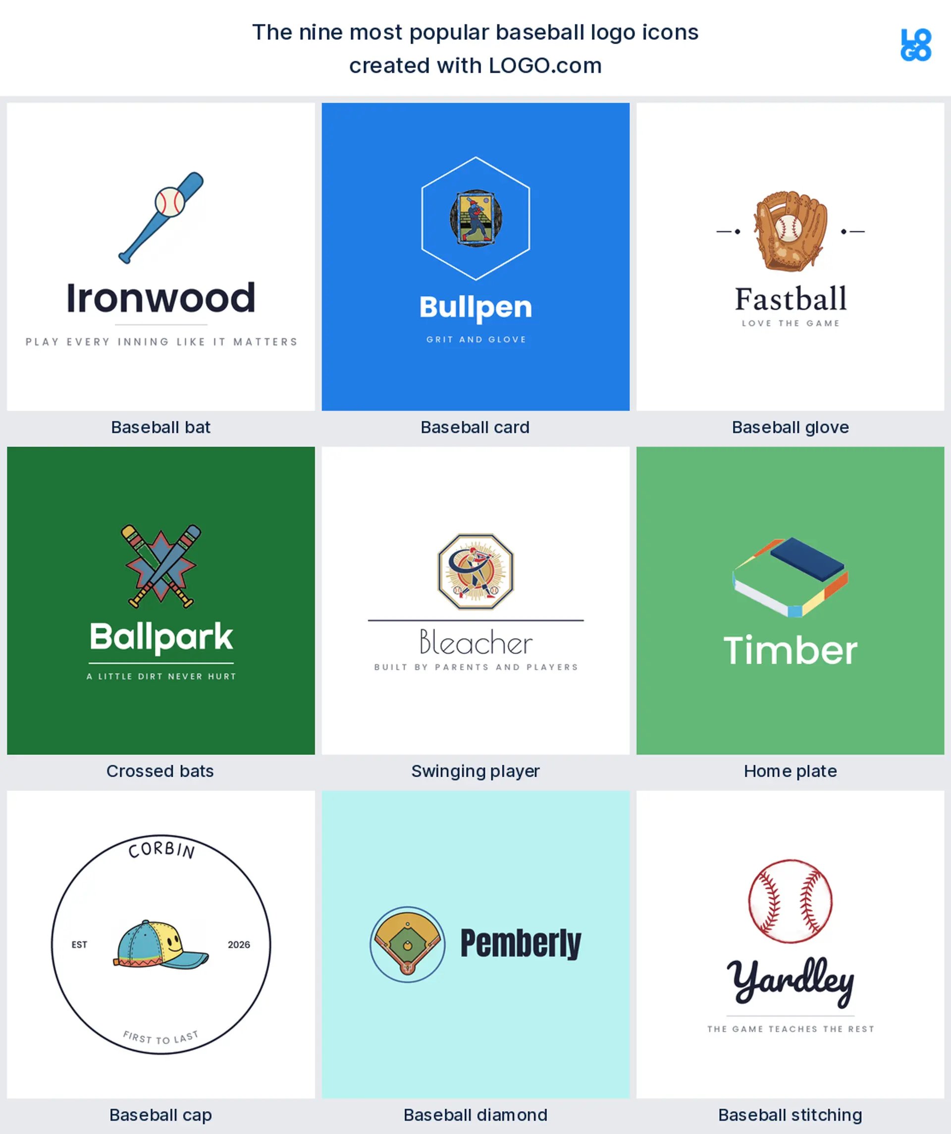
1. Baseball bat
The bat is the one nearly every founder draws first. It turned up in about 45% of the 281 baseball icon descriptions we counted, usually a single wooden bat or a bat meeting a ball at the sweet spot. It is the most literal way to say baseball without a word of explanation, and it stays readable shrunk onto a cap panel, which makes it the safest starting point for a baseball team logo.
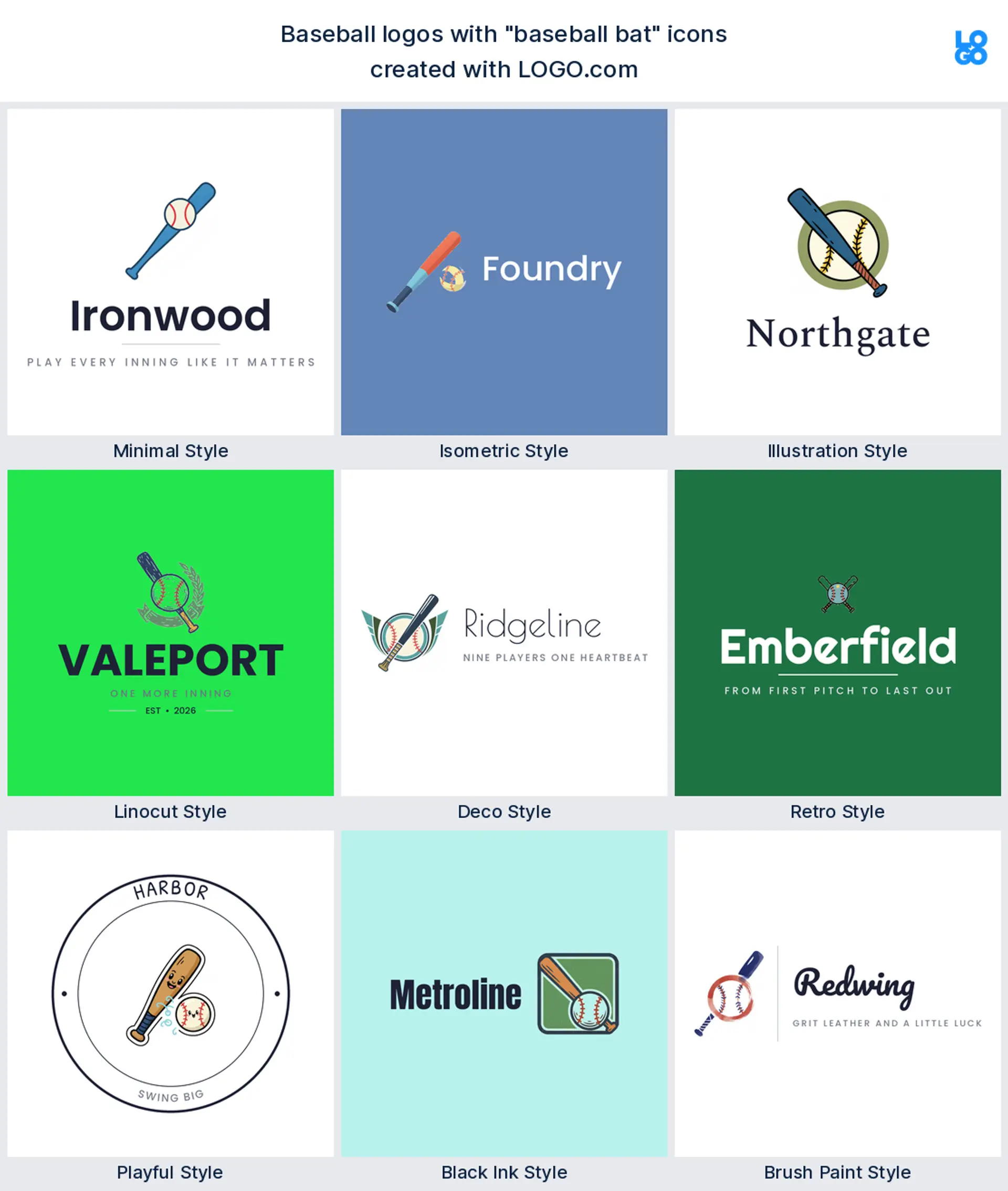
2. Baseball card
Right behind the bat sits the trading card, in about 14% of those descriptions. Most of those came from card shops, breakers, and collectors rather than clubs, and the mark is usually a card with a player portrait or a protective sleeve. If you sell, grade, or break cards, that is the sports card logo that tells a buyer exactly what you do.
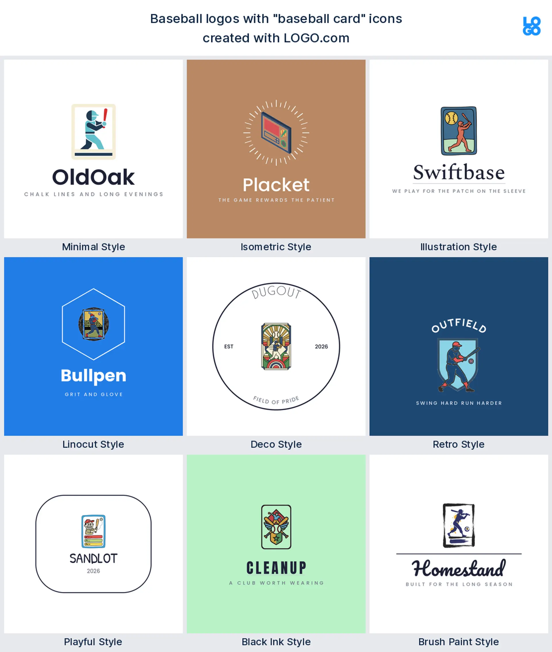
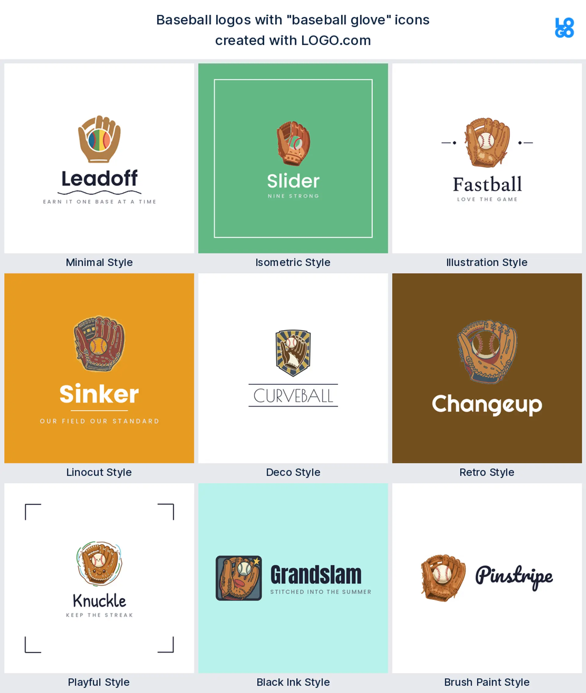
3. Baseball glove
The glove lands next at about 12%, often with a ball tucked in the pocket or a stitched web across the front. It reads warmer than a bat, which suits coaching, training, and youth programs more than a rival crest, and the leather gives an illustrator plenty to work with. A good pick for a coaching or academy logo.
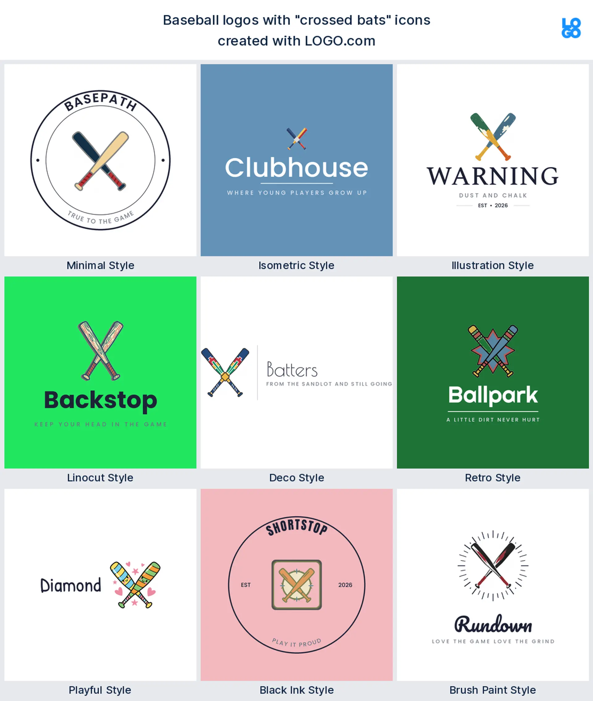
4. Crossed bats
Cross two bats and you have the oldest emblem in the sport. It came fourth in our count, usually paired with a ball, a cap, or a shield, and it carries the club feeling a single bat cannot. Crossed bats make a natural baseball team logo for a club that wants a crest rather than a character.
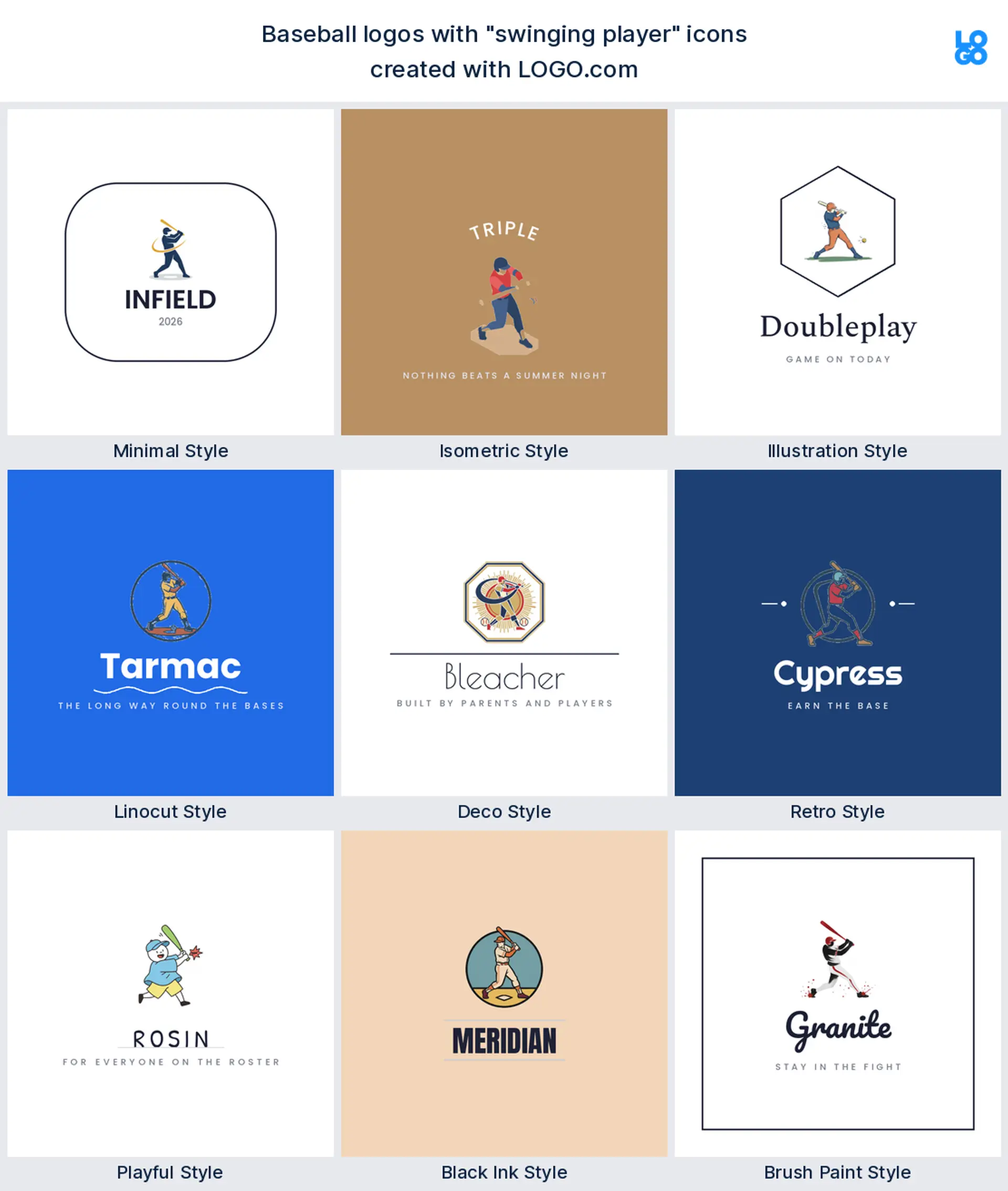
5. Swinging player
A batter mid swing is the fifth most common request, and it is the only symbol on this list with motion in it. Founders described a junior player swinging, a runner stealing a base, and a silhouette connecting with a pitch. Keep the pose bold, because detail vanishes once it is embroidered, and you get a lively youth or travel team logo.
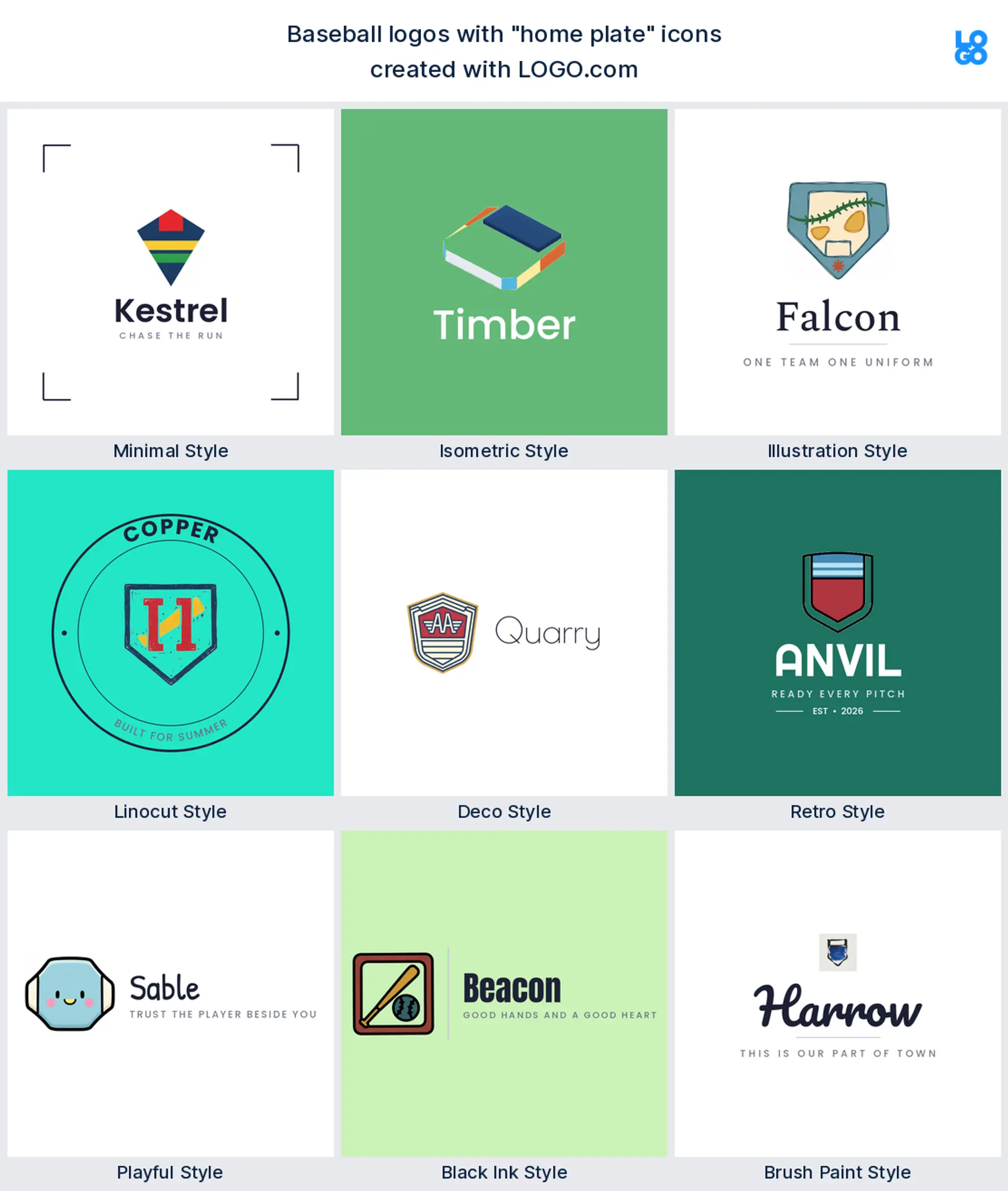
6. Home plate
Home plate is sixth, and it is quietly the most useful shape here. That five sided outline works as a frame, a badge, and a container for your team name all at once, which is why founders kept pairing it with bats and stitching. Reach for it when you want a tidy, contained club logo.
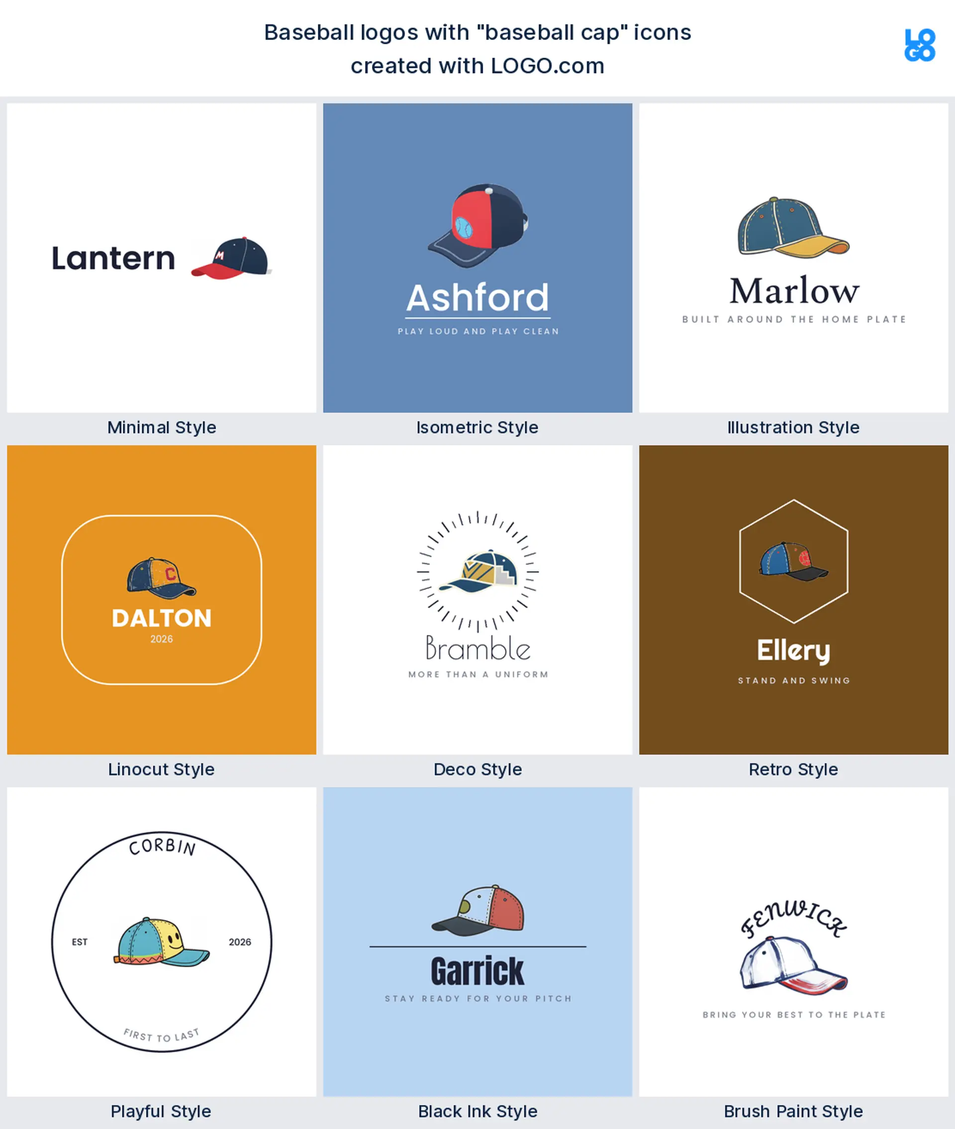
7. Baseball cap
The cap comes seventh, and it is the one symbol that doubles as the surface it prints on. Founders drew it flat and side on, sometimes with a monogram on the front panel. It is a friendly, everyday mark for a fan brand, a shop, or a podcast, and it makes an obvious baseball hat logo.
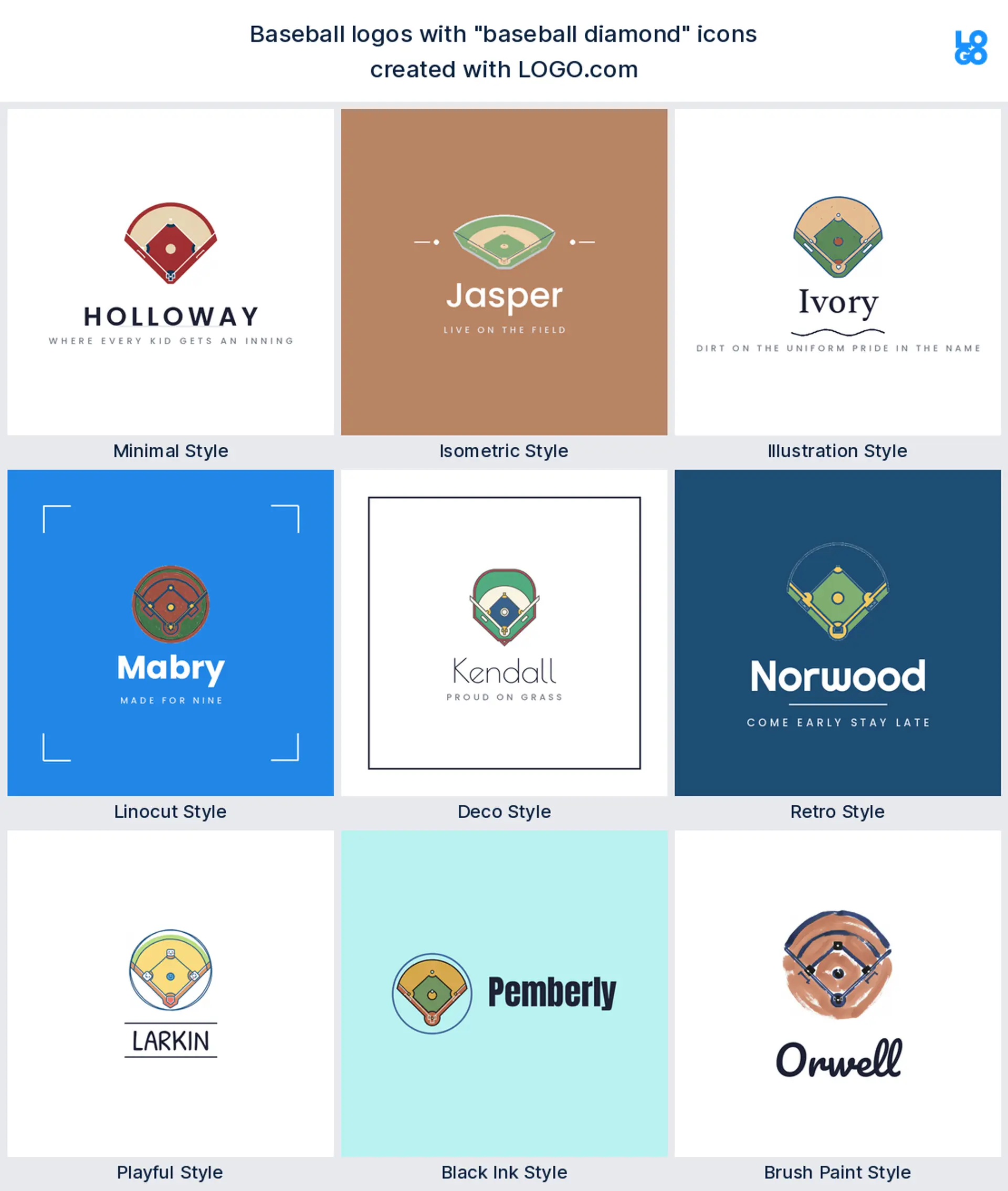
8. Baseball diamond
Eighth is the diamond, drawn as the infield seen from above or as a plain diamond with base paths running through it. It reads as the game rather than the gear, which is handy for a league, a facility, or a batting cage, and it sits nicely under a straight blocky wordmark. Good for a league or complex logo.
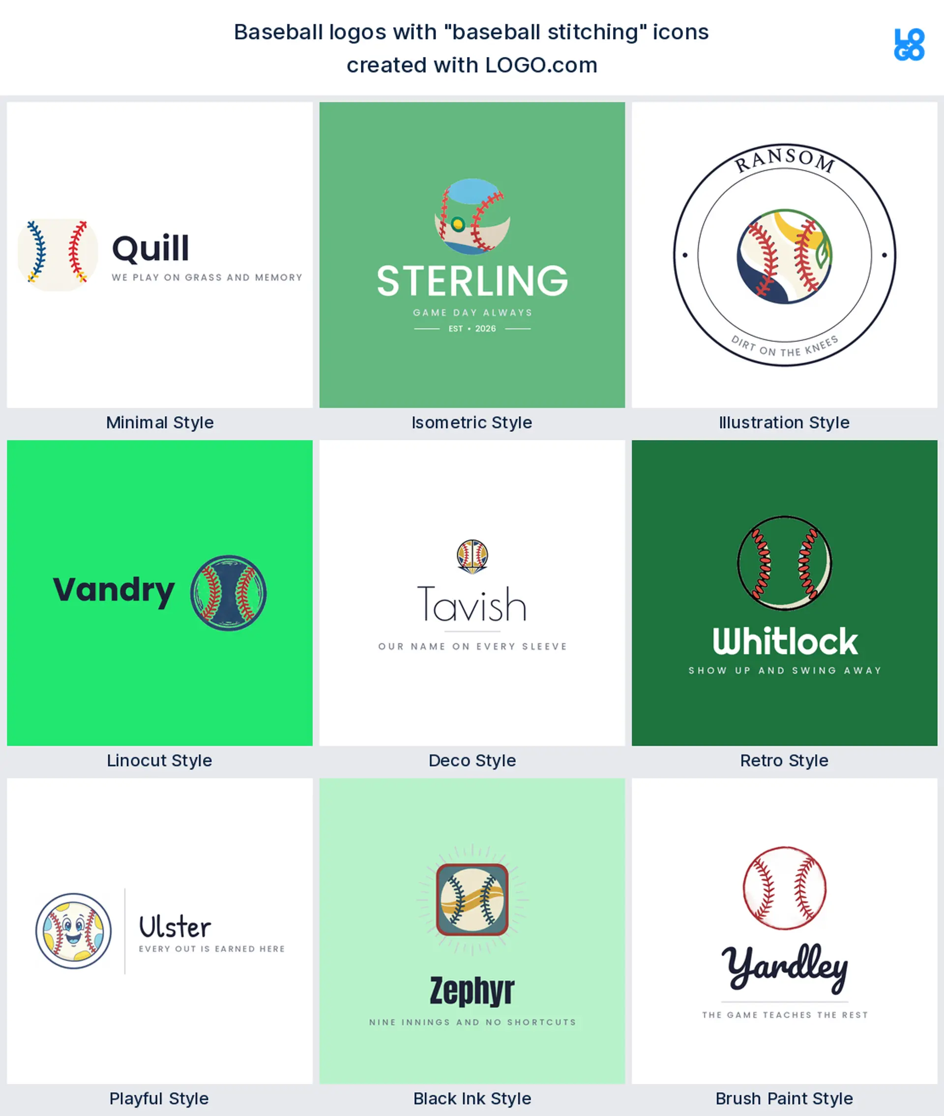
9. Baseball stitching
Last of the nine is the stitching, those two rows of seams on their own. Founders wrapped them around letters, curved them under a wordmark, and stretched them across a jersey panel. It is the subtlest option here, and the one that still says baseball when a whole ball will not fit, which makes it a smart apparel or softball logo.
Fifteen baseball logo ideas worth stealing
Every idea below is a real description a founder typed on LOGO.com, shown across all nine styles so you can watch the same thought turn from a clean minimal mark into a carved linocut crest. Find the row that sounds like your club, then change the color, the font, and the name until it belongs to you.
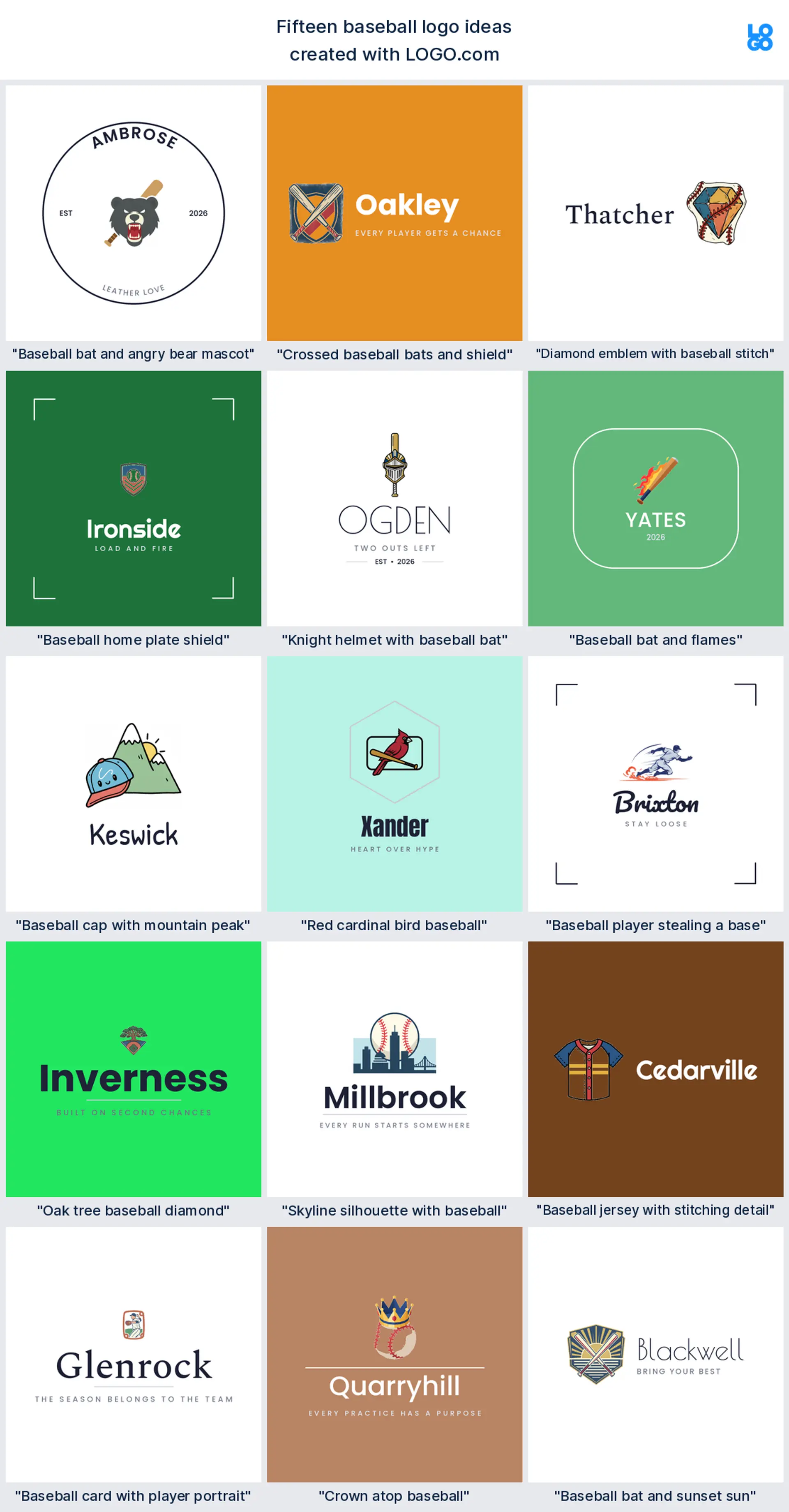
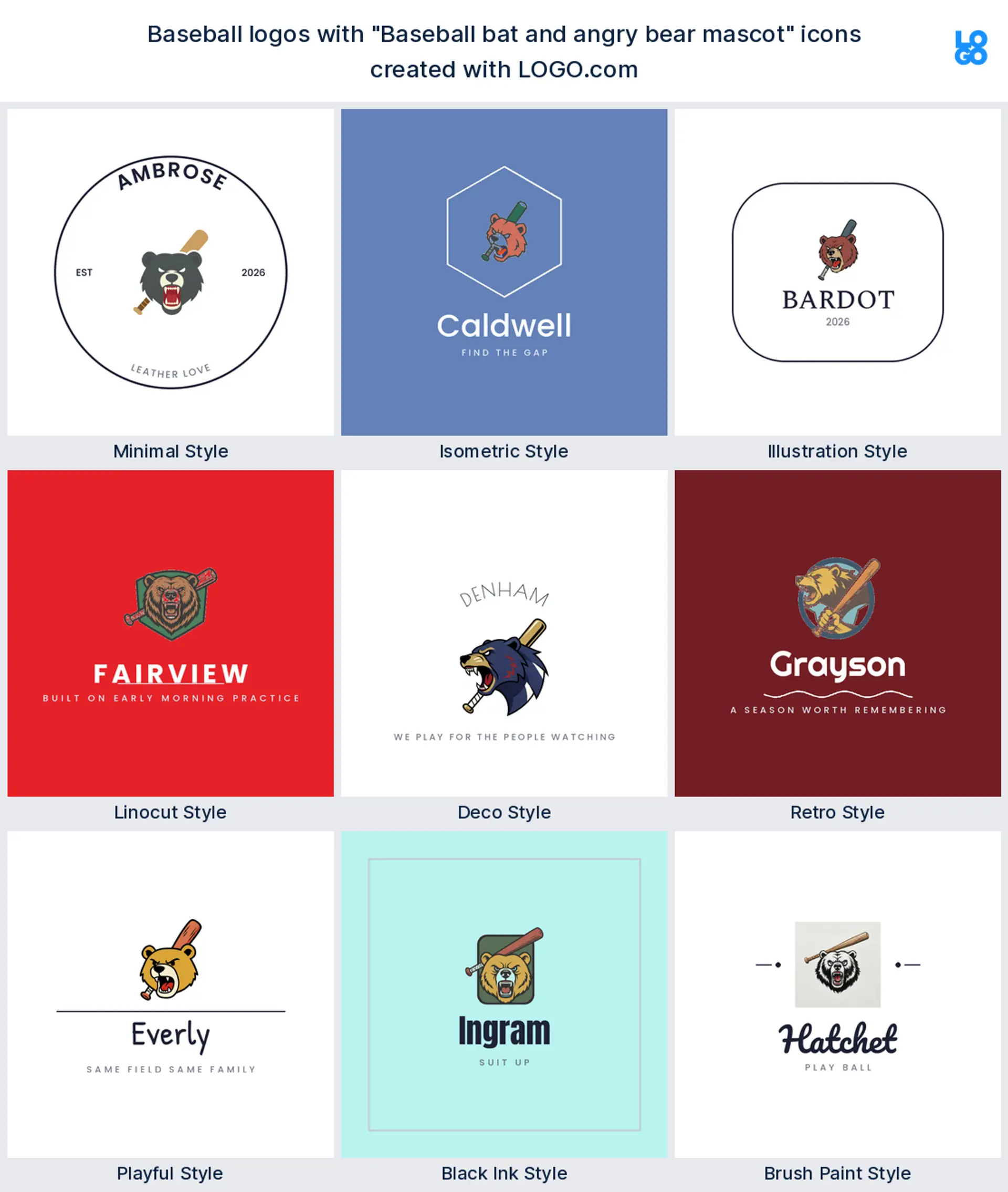
1. "Baseball bat and angry bear mascot"
Nothing says rival like an animal with an attitude. A snarling bear head behind a raised bat gives a travel or high school squad a crest that looks good painted on a dugout wall and stitched on a cap. This is the classic mascot route to a baseball team logo.
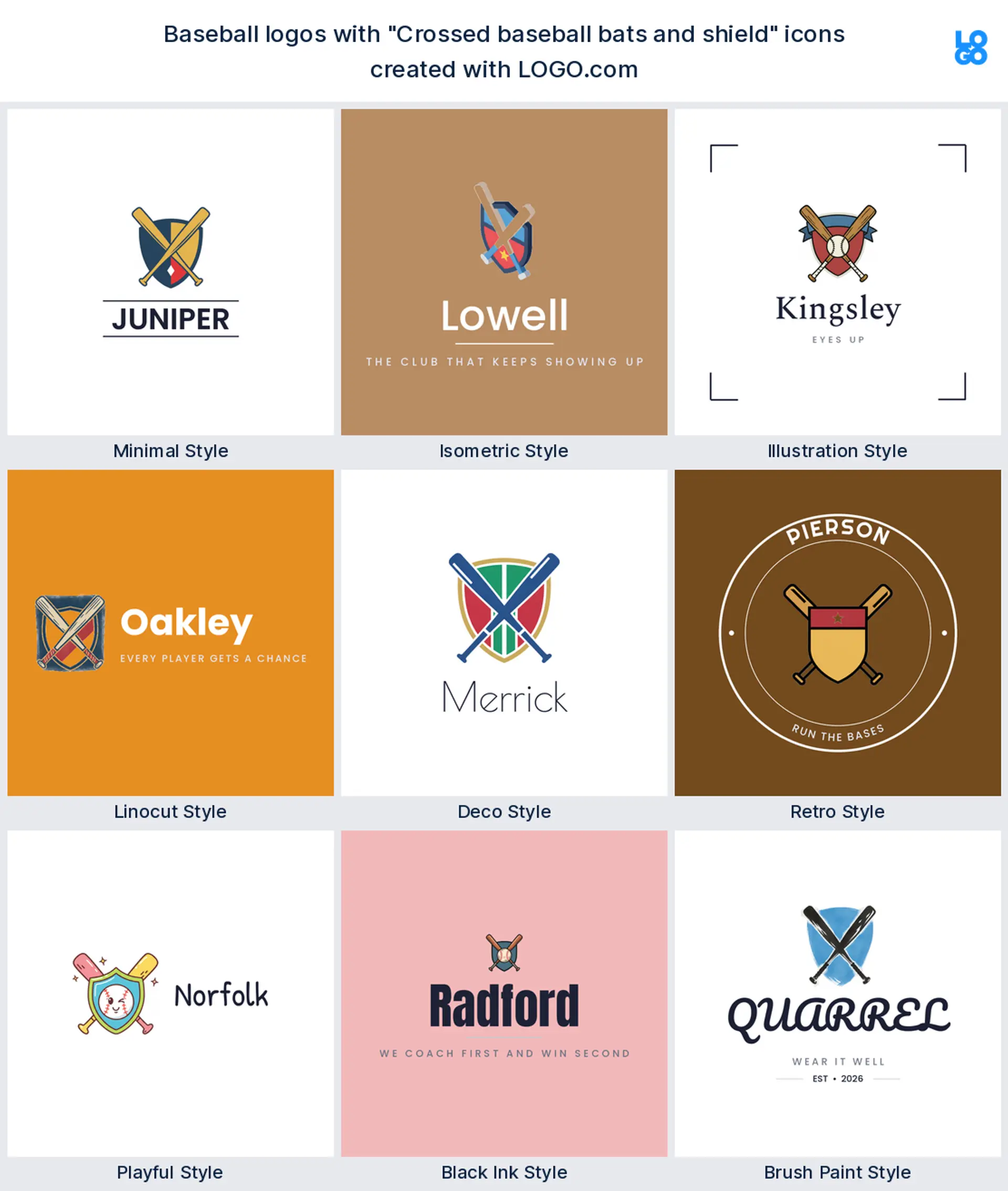
2. "Crossed baseball bats and shield"
Two bats over a shield is the safest bet on this list. It is the arrangement people already read as a ball club, so it works for a brand new team that wants to look like it has been around for fifty years. A tidy baseball logo design for when you want a crest, not a character.
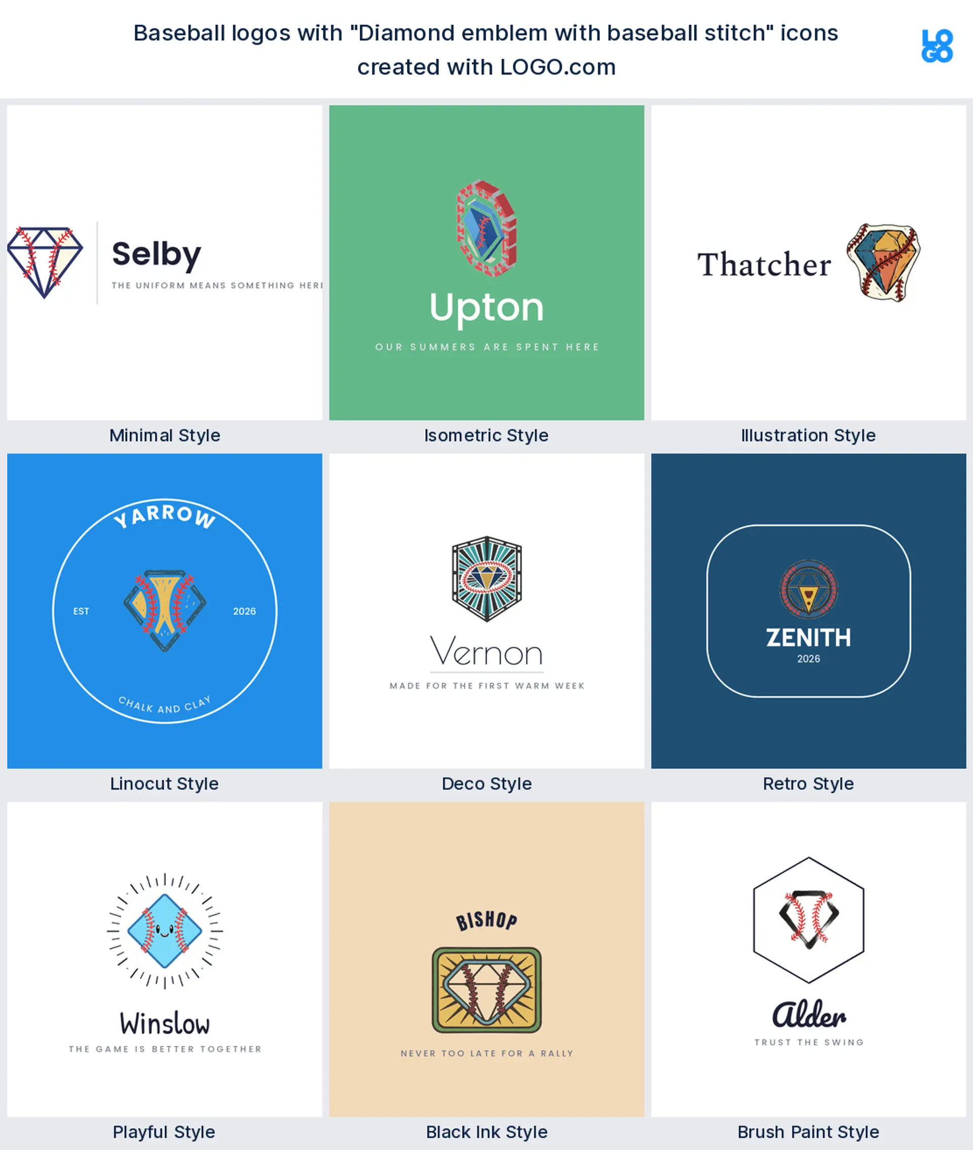
3. "Diamond emblem with baseball stitch"
Wrap seams around a diamond outline and you get something that reads as baseball from across a field. Keep the stitches chunky so they survive an embroidery machine, and the same mark works as a sleeve patch and a browser favicon.
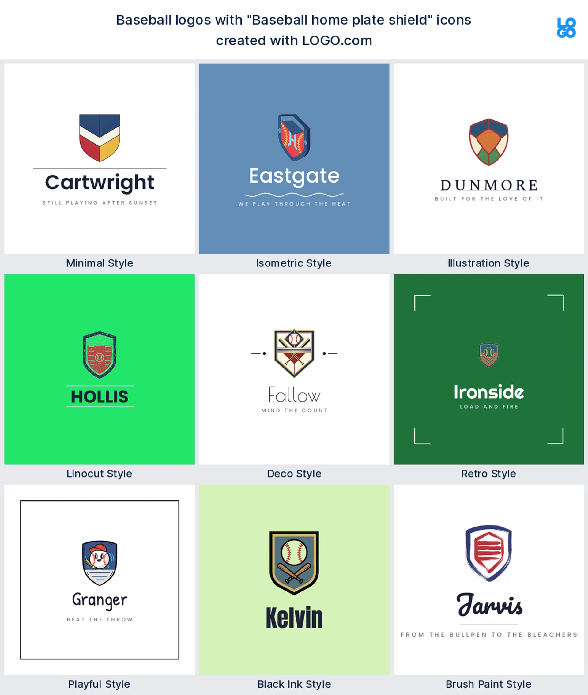
4. "Baseball home plate shield"
Home plate is already shield shaped, so you barely have to do anything to it. Drop your team name inside, add a founding year underneath, and the whole logo sits in one contained block. Ideal when a league wants every club logo to share a family shape.
5. "Knight helmet with baseball bat"
Knights, warriors, and raiders are everywhere in youth ball, and this pairing keeps it sharp instead of cartoonish. A visored helmet with a bat behind it reads fierce without a face, which ages far better across a decade of rosters.
6. "Baseball bat and flames"
Want the mark to feel fast? Flames trailing a bat are the shortest way there. It suits a hitting facility, a travel program, or a bat brand, and it makes a fun baseball bat logo that still prints in one color when it has to.
7. "Baseball cap with mountain peak"
A cap in front of a ridge line is a favorite for clubs named after a place. It ties your team to where you play, and the flat shapes hold up on a banner and a hoodie. A friendly baseball hat logo for a hometown club.
8. "Red cardinal bird baseball"
Bird names carry a century of the sport with them. A cardinal perched on a bat or a ball gives you color, character, and a crest all at once, and it still reads on a helmet decal the size of a coin.
9. "Baseball player stealing a base"
A runner sliding into the bag brings speed into an otherwise static mark. It is a rare pose in club logos, which is exactly why it stands out on a jersey back and in a list of league thumbnails.
10. "Oak tree baseball diamond"
This came from a founder describing an oak standing over a diamond, and it is a lovely fit for a community field or a foundation. The tree softens the sport and hints at something that grows, which suits a youth program logo.
11. "Skyline silhouette with baseball"
City clubs get a lot of mileage out of a skyline. Put a ball rising behind the rooftops and you have a logo that says who you play for before it says what you play, which is perfect for a city team or a fan brand.
12. "Baseball jersey with stitching detail"
Sometimes the uniform is the logo. A jersey panel with a stitched placket and a number turns your kit into the mark, which works nicely for a vintage apparel shop or a softball logo design built around what people wear.
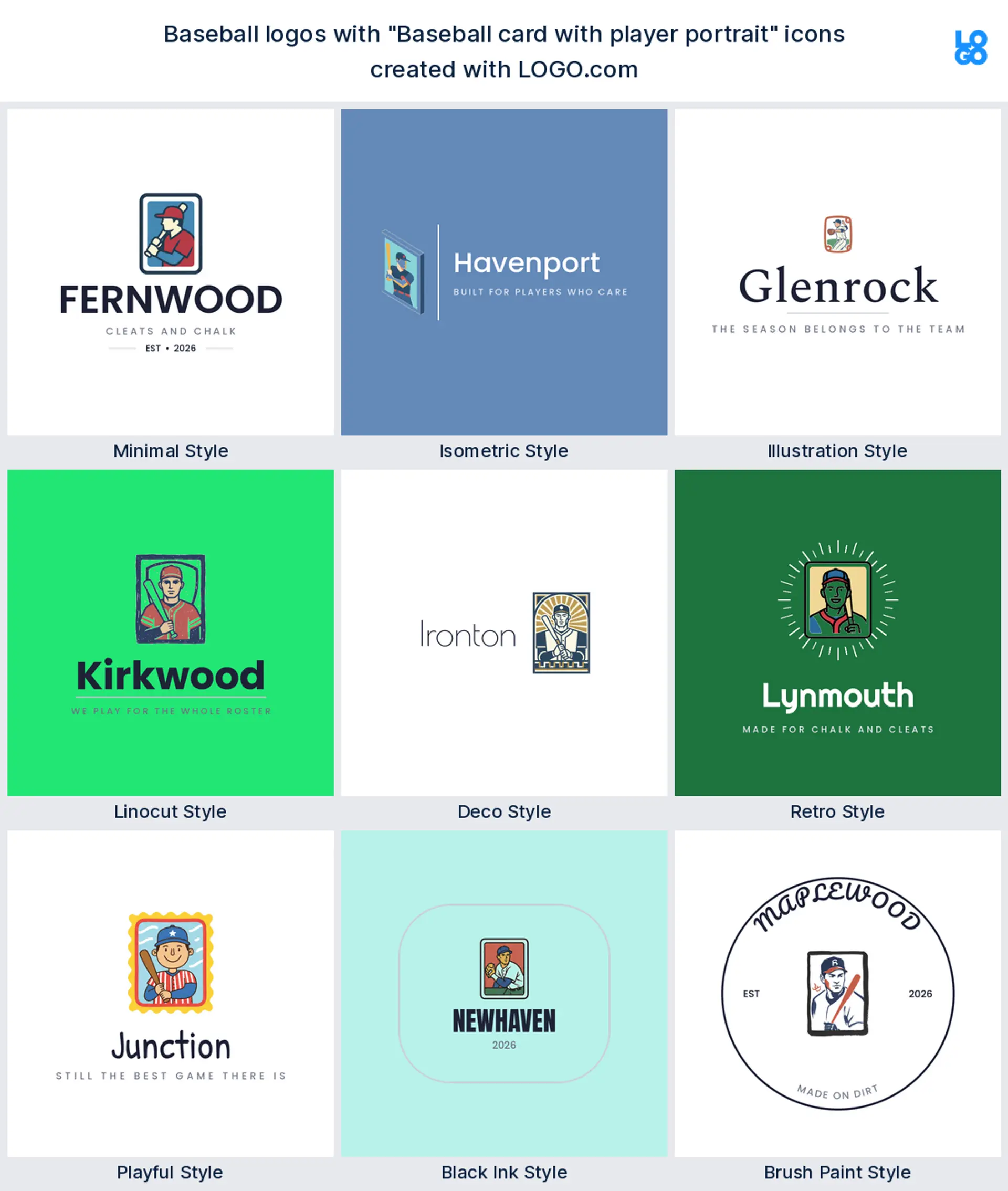
13. "Baseball card with player portrait"
For card shops and breakers, show the product. A framed card with a portrait inside stays clear at thumbnail size on a marketplace listing, and a foil accent lifts it on packaging and penny sleeves.
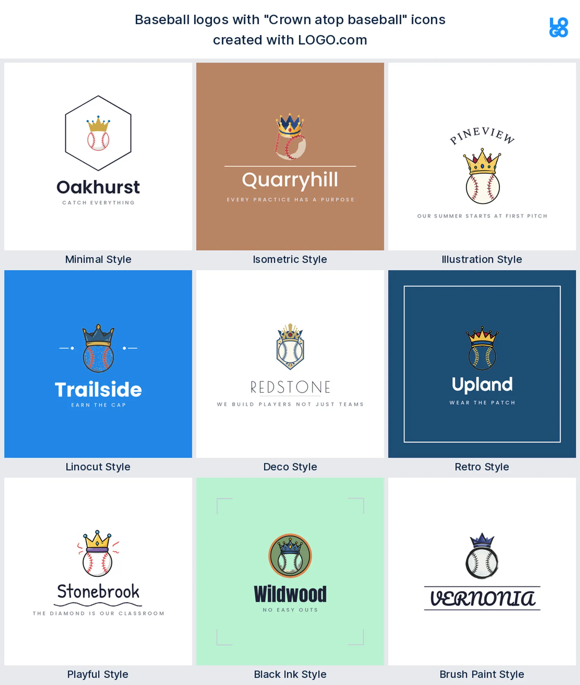
14. "Crown atop baseball"
A crown over a ball is bold and a little cocky, which is rather the point. It suits an elite program, a showcase event, or a training brand that wants to promise the top of the league before you read a word.
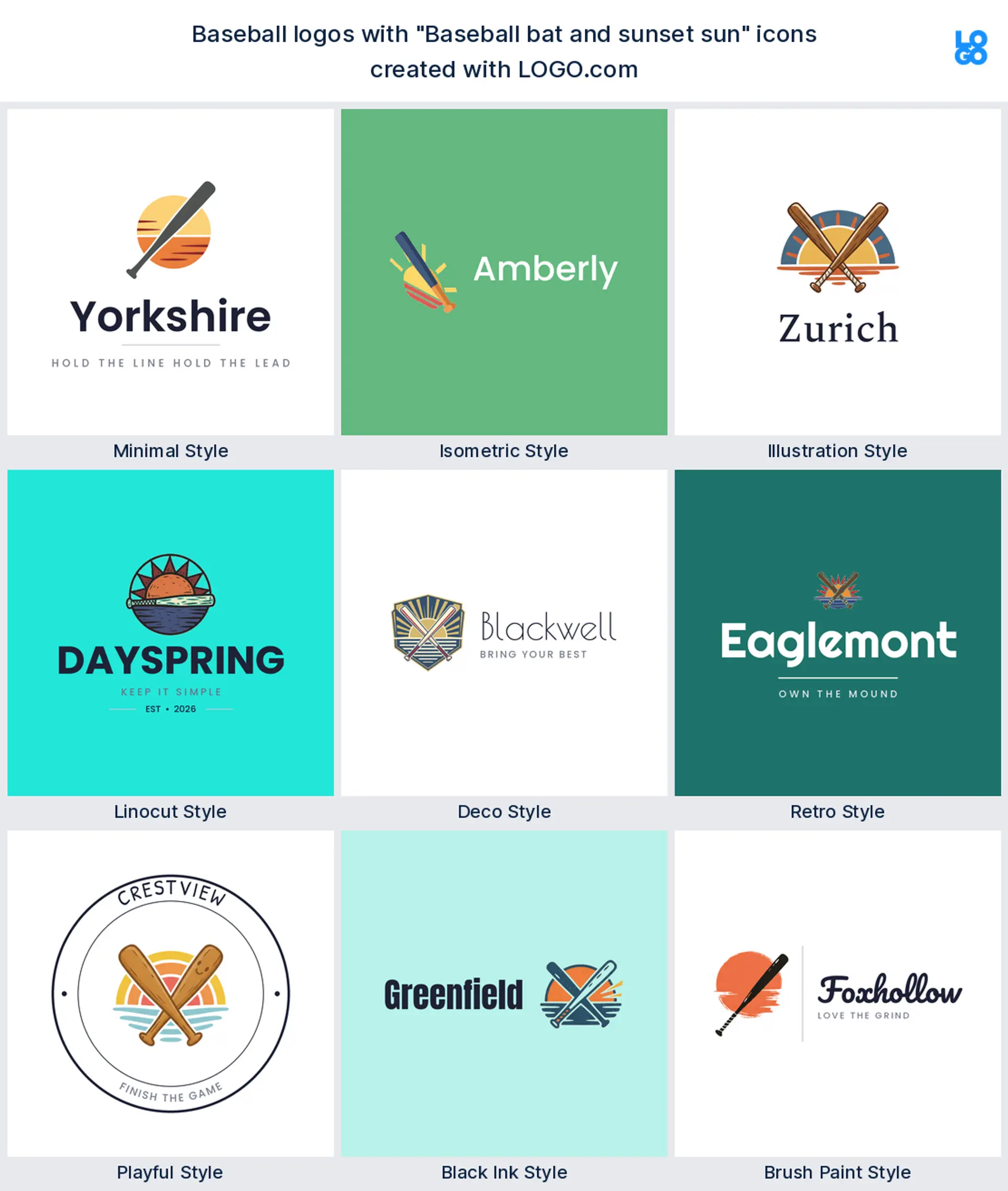
15. "Baseball bat and sunset sun"
Warm evening light is when most ball actually gets played. A bat crossing a low sun gives a relaxed, nostalgic feel that fits a beer league, a summer camp, or a podcast about the game.
Embroidery is the real test for a baseball logo
This is where most marks get found out. A baseball logo lives on stitching more than any other surface, and an embroidery machine cannot draw a hairline. Drop thin outlines, tiny text, and gradients, then look at the mark at about an inch wide, because that is roughly how much room a cap front panel gives you. If it still reads at that size in one solid color, it will hold on a cap, a sleeve, and a helmet decal.
Screens are the other extreme. Your mark has to work as a small circle beside a fixture list and as a profile picture on your team account, so build a square lockup with the icon centered and give it room to breathe. Check it once at full size and once shrunk to the size of a thumbnail before you commit.
Softball, travel ball, or a card shop? Aim the mark
If you run a travel or club team, go crest. Crossed bats, a shield, or a home plate frame carrying your city and founding year gives parents and rival coaches something that already looks established. Coaching a youth team? Lean friendly, with a mascot or a glove and a rounded font kids like wearing.
Running a softball program? The same shapes all work, but swap in the bigger ball with wider seams and pick a softball logo that stands on its own rather than looking borrowed from the boys team. And if you run a card shop, a cage, or a podcast rather than a club, say so in the mark, since a card, a batting cage, or a microphone reads far more clearly than another bat.
Colors that look right under stadium lights
Our own numbers point somewhere you might not expect. Across baseball brands built on LOGO.com, green and blue are the two most chosen non neutral hues, ahead of orange and red, and almost all of them sit on a black or white base. That tracks with the sport, since field green and a deep navy read well on grass and on grey road jerseys, while one hot accent gives you something to pop on a cap button and an outfield banner.
Pick one dominant color, one accent, and let black or white carry everything else. You can choose a full color icon or a one color version of the same mark, and the one color version is the one you want for embroidery, engraved trophies, and a single color press on a shirt. Lock both into a brand kit so your caps, your uniforms, and your schedule page never drift apart.
Do you need a chest wordmark as well as a cap mark?
Most clubs end up with two versions and it is worth planning for it early. The cap mark is small, square, and usually just an icon or a single letter, while the chest of a jersey wants your team name spelled out wide across the placket. Design the icon first, then set the same name in the same font as a horizontal wordmark, and you have a pair that clearly belong together.
Keep a stacked version too, with the icon sitting above the name, because that is the shape a banner, a sponsor board, and a team page header all want. Three lockups from one idea covers almost everywhere your club will ever need it.
What it costs and what you can put it on
Designing and previewing your logo on LOGO.com is free, and downloading a high resolution PNG is free too, with full commercial use, so you can put it on your team account, your league page, and a first run of shirts without paying anything. The Brand Plan is what you pay for, and it adds the vector files a printer or an embroiderer will ask for, unlimited edits, and a brand kit that holds your colors and fonts in one place. Vectors matter more here than in most niches, because caps, banners, and outfield signs all get made from them.
Make your baseball team logo with LOGO.com
Type in your team name, pick one of the nine symbols above, choose a style, and our baseball team logo maker builds the rest around it. Preview it free, push the color and font until it feels like your club, and download a logo ready for caps, jerseys, and your team page in minutes.
Methodology. These figures come from logos created on LOGO.com. The Baseball industry setting on its own returned too few custom icon descriptions to rank, so we widened the scope to every custom icon description written on LOGO.com in the 24 months ending August 2026 that mentions baseball. That gave 281 descriptions from 164 brands. We grouped them by concept, for example bat, card, glove, or home plate, and ranked each concept by how often it appeared. The bat led at about 45%, followed by the baseball card at about 14% and the glove at about 12%. Concepts can overlap where a founder described more than one object, so the shares do not sum to 100. Figures are rounded to the nearest percentage point. Source: LOGO.com first party product data, August 2026.
THE #1 LOGO GENERATOR
Why LOGO.com is the best baseball team logo maker
1.Ranked from 281 real baseball briefs
The symbols, colors, and styles here come from what founders actually described on LOGO.com, not a stock sports clip art pack.
2.Still readable stitched on a cap
Bold shapes and no hairlines, so your mark survives an embroidery machine on a front panel and a sleeve patch.
3.Transparent files for jerseys and banners
Drop a transparent PNG straight onto a grey road jersey, an outfield sign, or a dugout banner with no white box around it.
4.Square lockup for team accounts
Start square so the same logo works as a league page thumbnail and as your team profile picture.
5.Full color or one color, your call
Keep the full color icon for screens, then switch to a single color version for embroidery, engraved trophies, and press on shirts.
6.Nine styles from clean to carved
Match your club, from a minimal wordmark to a linocut crest or a retro badge that looks fifty years old.
7.One brand kit for the whole club
Hold your colors and fonts in one place so caps, uniforms, and your schedule page all match.
8.Edit it every season
Change the year, the color, or the mascot when the roster turns over, without starting again.
9.Free download, full commercial use
Download a high resolution PNG free with full commercial use, then add vector files on a Brand Plan when your printer asks.
Baseball Team Logo Maker FAQs
Explore more logo ideas
3DAcademic EducationAccommodationAdvertising AgencyAffordableAgriculture BlogAlternative MedicineAnimal BlogAnimalsApartmentAppraisal ServicesAriesArtArtistArts EducationAstrologyAudio ServicesAuto DealershipAuto Rental AgencyBBQBakeryBanking ServicesBeauty SalonBed & BreakfastBettingBioinformaticsBirdBlock Letter Logo MakerBlurbBookBooks and LiteratureBoxBuilderBurgerBusiness Services and ConsultingCBDCameraCancerCannabisCardsCatCattleCharityChild CareChocolateCinemaCityClevverCloudCollege