Healthcare Logo Maker
Design a healthcare logo that works on your clinic sign and staff uniforms.
Need a different logo maker? Try our AI logo generator.
Logos created using LOGO.com
670,000,000
Caring and natural healthcare logos
Mind and recovery healthcare logos
Gentle and holistic healthcare logos
Healthcare Logos, Ranked From Real Brand Data
According to LOGO.com data, the icons healthcare founders reach for most are the heart (about 23 percent), the brain (about 19 percent), and a leaf or sprout (about 19 percent), pulled from the health and wellness brands people actually build on LOGO.com.
Because a healthcare logo has to travel from a clinic sign to a name badge to a booking app, the nine styles below are built to stay clear at small sizes. Start from a symbol that fits your kind of care, then make it your own with your colors and name.
On this page
- Which icons do healthcare founders put on their logo most?
- Fifteen healthcare logo ideas from real founder prompts
- Should your healthcare logo look clinical or calming?
- Clinic, home care, mental health, or wellness: match the mark to your service
- What makes a healthcare logo feel trustworthy
- Colors that read healthy and calm, from real brand data
- Make your healthcare logo with LOGO.com
Think about where a healthcare logo has to earn trust: a clinic sign by the road, a name badge clipped to a uniform, an appointment reminder that lands on a phone. Before any of that, you need one calm, credible mark. To see what actually works, we read the icons real healthcare and wellness founders described when they built a logo on LOGO.com, and one shape led every other, the heart, named in about 23 percent of them. This page walks through the nine symbols healthcare brands reach for, fifteen real prompts you can borrow, and the small choices that make a healthcare logo feel trustworthy instead of generic.
Which icons do healthcare founders put on their logo most?
Healthcare covers a lot of ground, from a solo therapist to a busy clinic to a home care team, so these symbols come from every kind of founder who built with us. The heart leads, the brain and a leaf or sprout are almost level behind it, and the rest of the nine sit close together. Pick the one nearest to the care you give, keep it to a single clean shape, and it will still read when it is shrunk onto a name badge or an app icon.
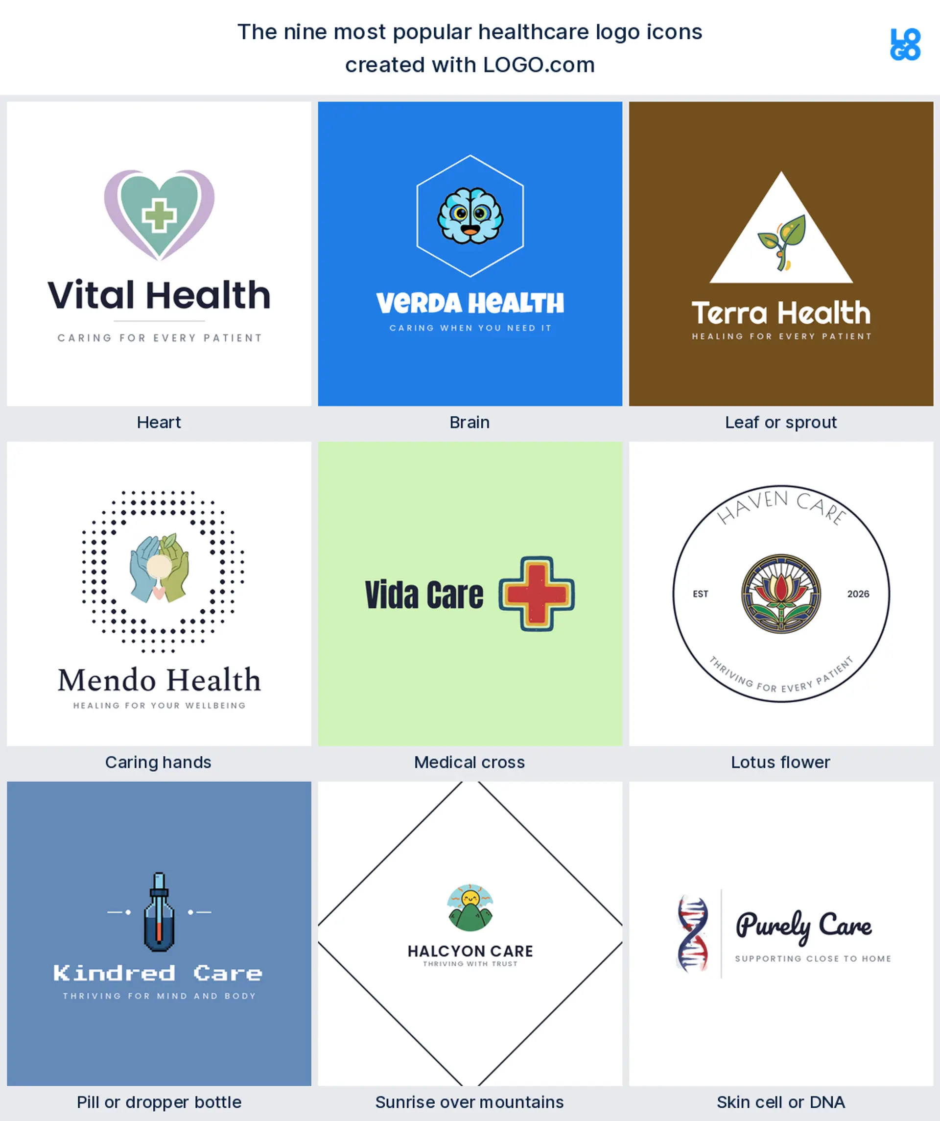
Heart
The symbol healthcare founders reach for first is the heart, and it is not close: it showed up in about 23 percent of the icons people described. A heart says care and wellbeing before anyone reads a word, which makes it the natural centre of a healthcare logo for a clinic, a practice, or a caregiver brand.
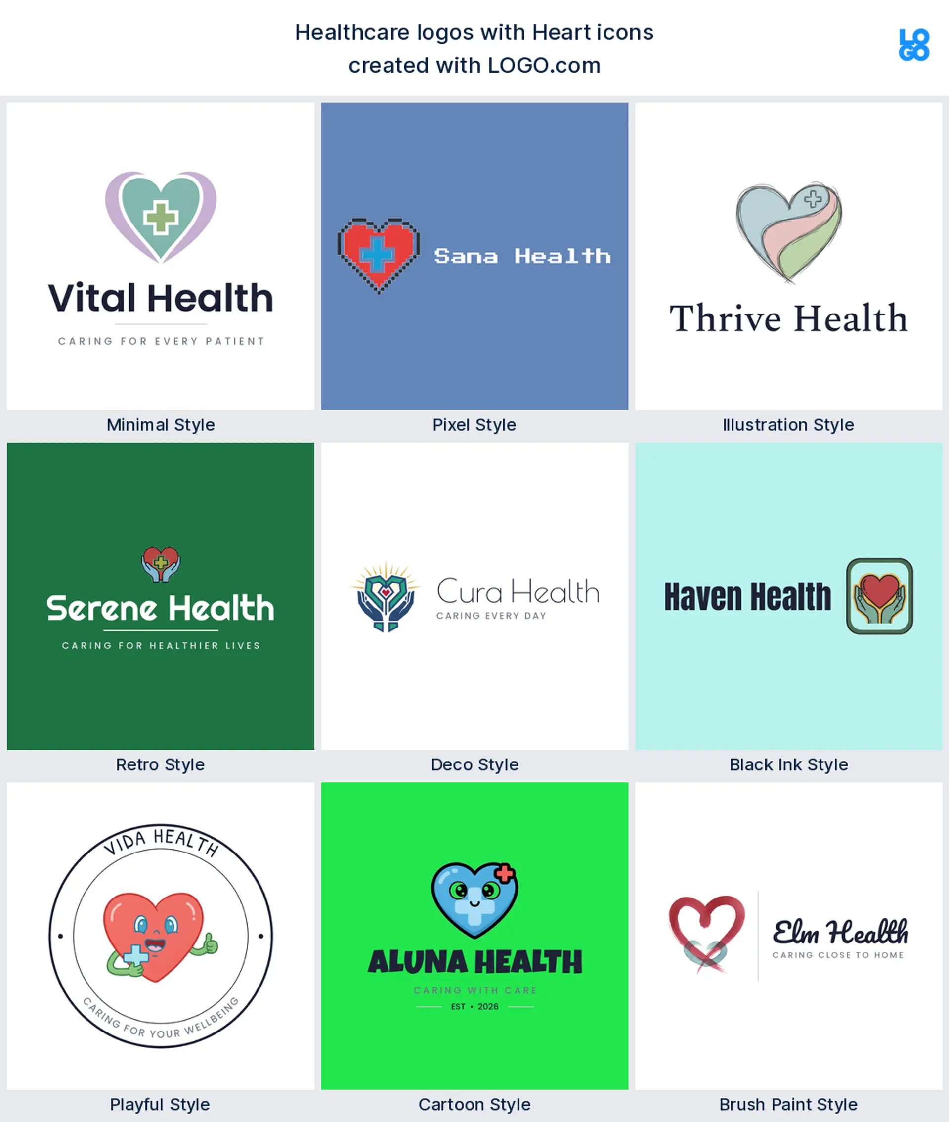
Brain
Almost level with the heart, in roughly 19 percent, is the brain, usually paired with a lightbulb or a speech bubble. It stands for the mind rather than the body, so it is the obvious choice for a mental health logo, a therapy practice, or a coaching brand that helps people think clearer.
Leaf or sprout
Tied with the brain, also close to 19 percent, is a leaf or a young sprout. It carries growth, recovery, and something natural, which is why it suits a wellness logo, a nutrition practice, or a holistic clinic that wants to feel gentle rather than clinical.
Caring hands
Just past the top three, the mark people describe most is a pair of caring hands, often cupped around a heart or a home. Hands read as support and human touch, so they make a warm home care logo or nursing logo for a team that comes to people rather than the other way around.
Medical cross
The rounded medical cross is next, the shorthand the whole world already reads as health. Kept soft and modern it looks reassuring instead of cold, a dependable pick for an urgent care logo, a family practice, or a clinic that wants to be recognised in a second.
Lotus flower
A lotus flower sits in the middle of the nine, standing in for calm and a fresh start. It gives you a graceful place to carry one soft color, so it works beautifully for a wellness logo, a mental health practice, or a spa and recovery brand built around feeling better.
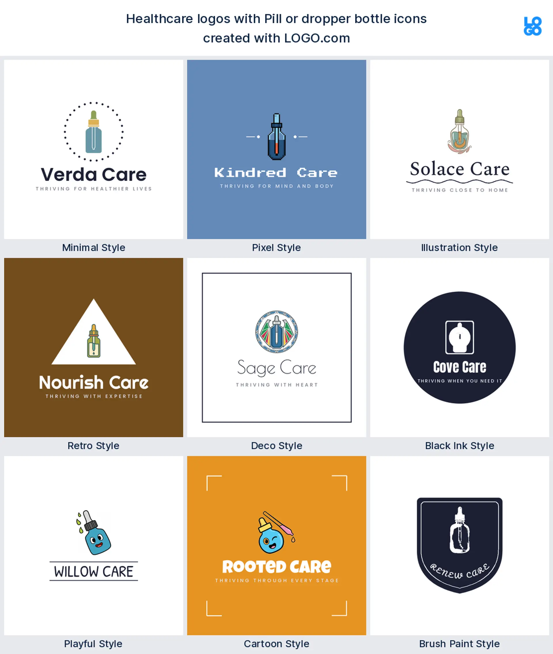
Pill or dropper bottle
Founders in the supplement and pharmacy world lean on a pill or a dropper bottle, a small object that instantly says remedy. Drawn cleanly it reads modern rather than medical, a tidy fit for a pharmacy, a supplements brand, or a nutrition and care logo.
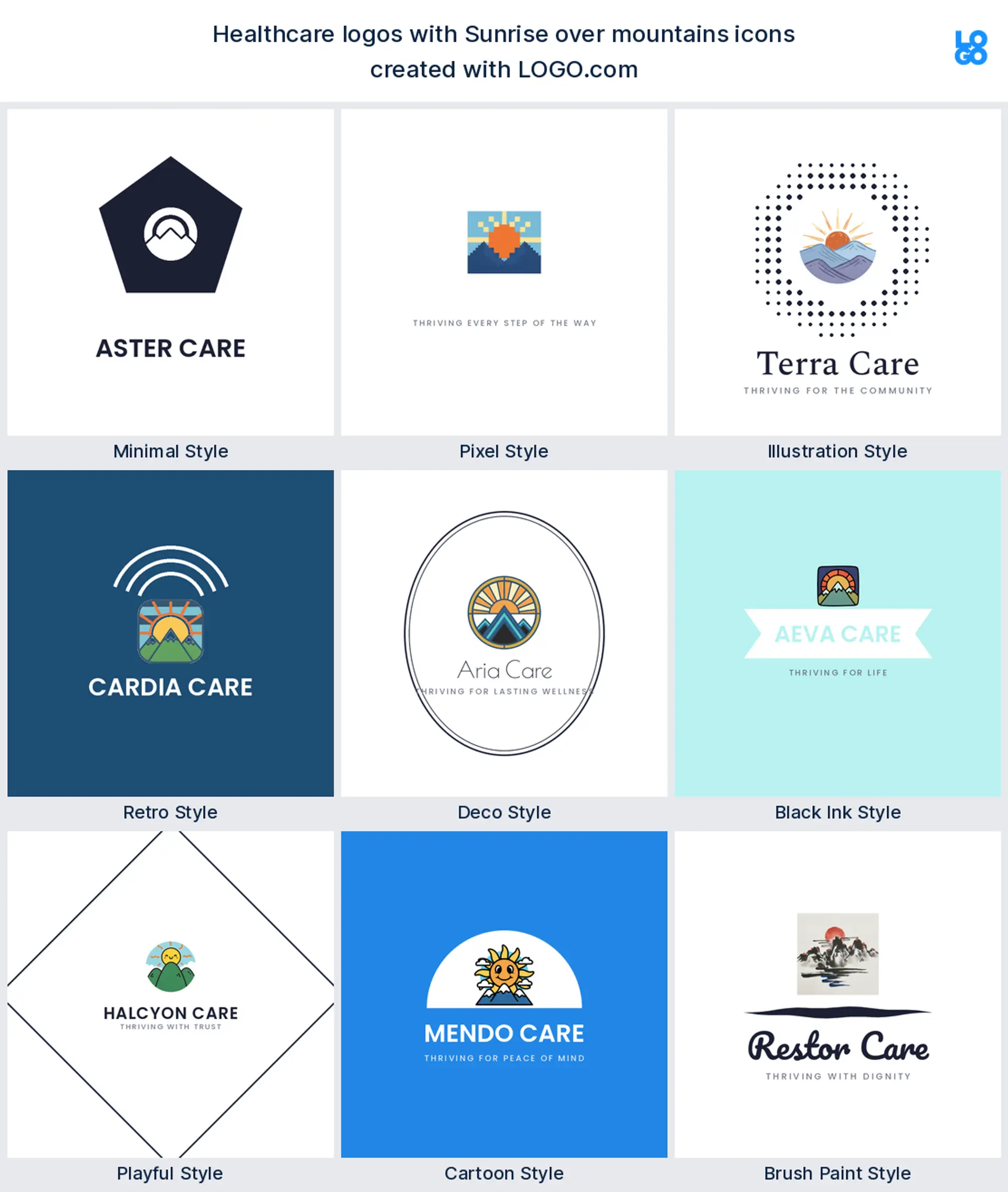
Sunrise over mountains
Near the end of the nine comes a sunrise over mountains, the quiet symbol of a new day and progress. It suits recovery and mental health brands especially, a hopeful healthcare logo for a practice whose whole promise is that things get better from here.
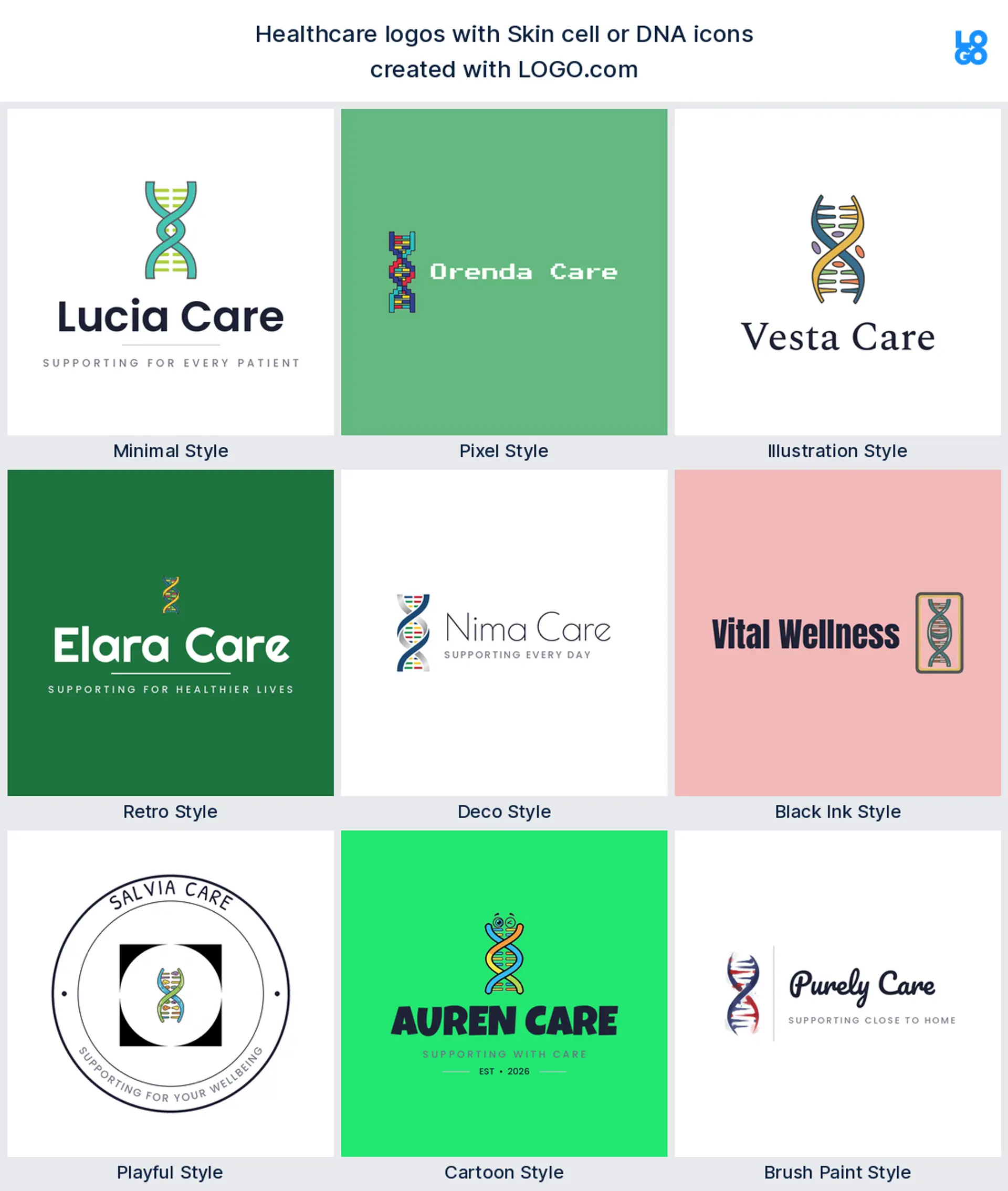
Skin cell or DNA
Closing the nine is a skin cell or a DNA helix, the most scientific mark of the set. It signals precision and evidence, which makes it a strong choice for a diagnostics lab, a dermatology clinic, or a biotech healthcare logo that wants to look advanced.
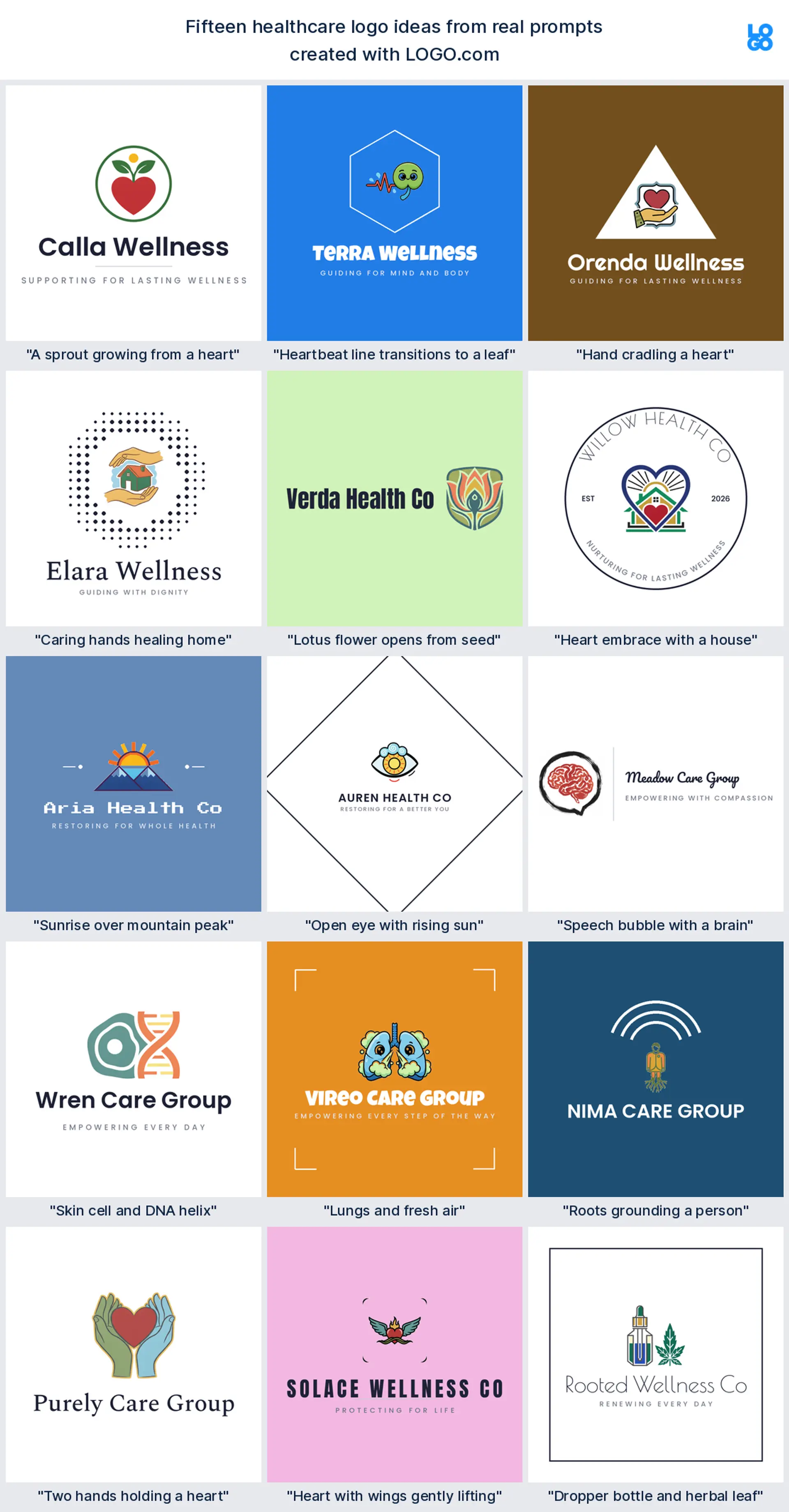
Fifteen healthcare logo ideas from real founder prompts
These fifteen are the exact icon descriptions healthcare and wellness founders typed into LOGO.com, shown across the nine styles so you can watch each one move from clean and minimal to bold and playful. They are richer than the plain top nine, and any of them can carry your name. Treat them as healthcare logo ideas to borrow, then change the color, font, and wordmark until the mark feels like your practice. The best health care logo keeps one idea and lets the rest fall away.
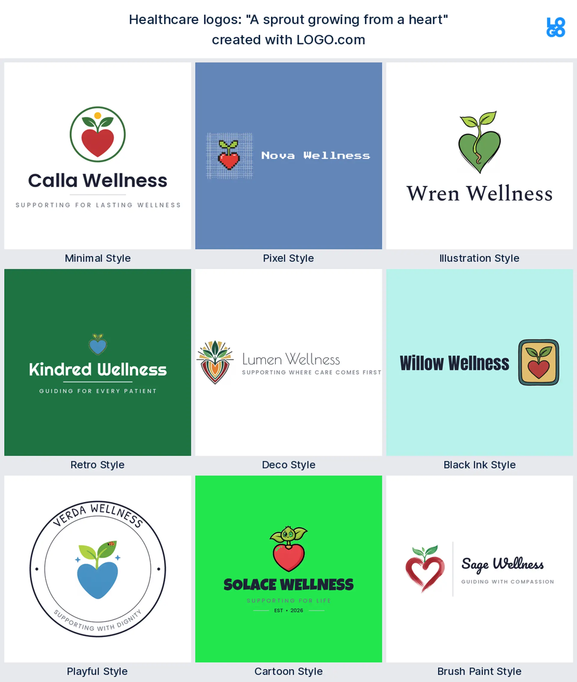
"A sprout growing from a heart"
A founder wrote this, and it folds two of the top symbols into one, a green shoot rising out of a heart. It reads as care that helps people grow, a lovely wellness logo for a practice built around recovery.
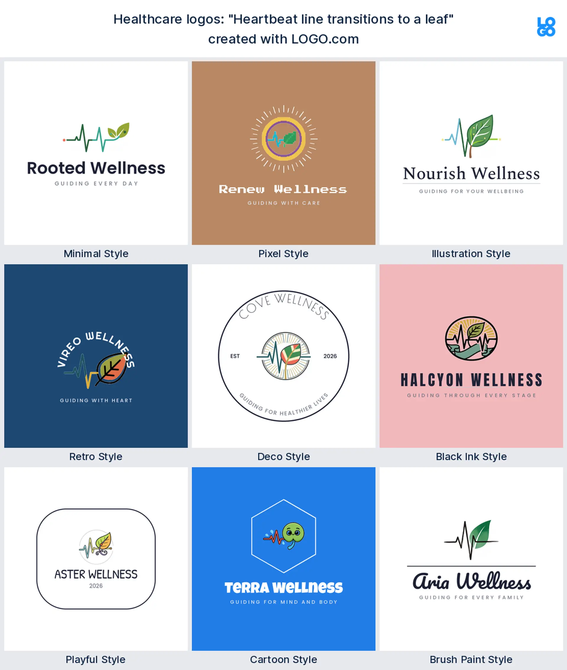
"Heartbeat line transitions to a leaf"
Someone crossing clinical and natural typed this, a pulse line that softens into a leaf. It makes a memorable healthcare logo that says both vital signs and gentle care in a single stroke.
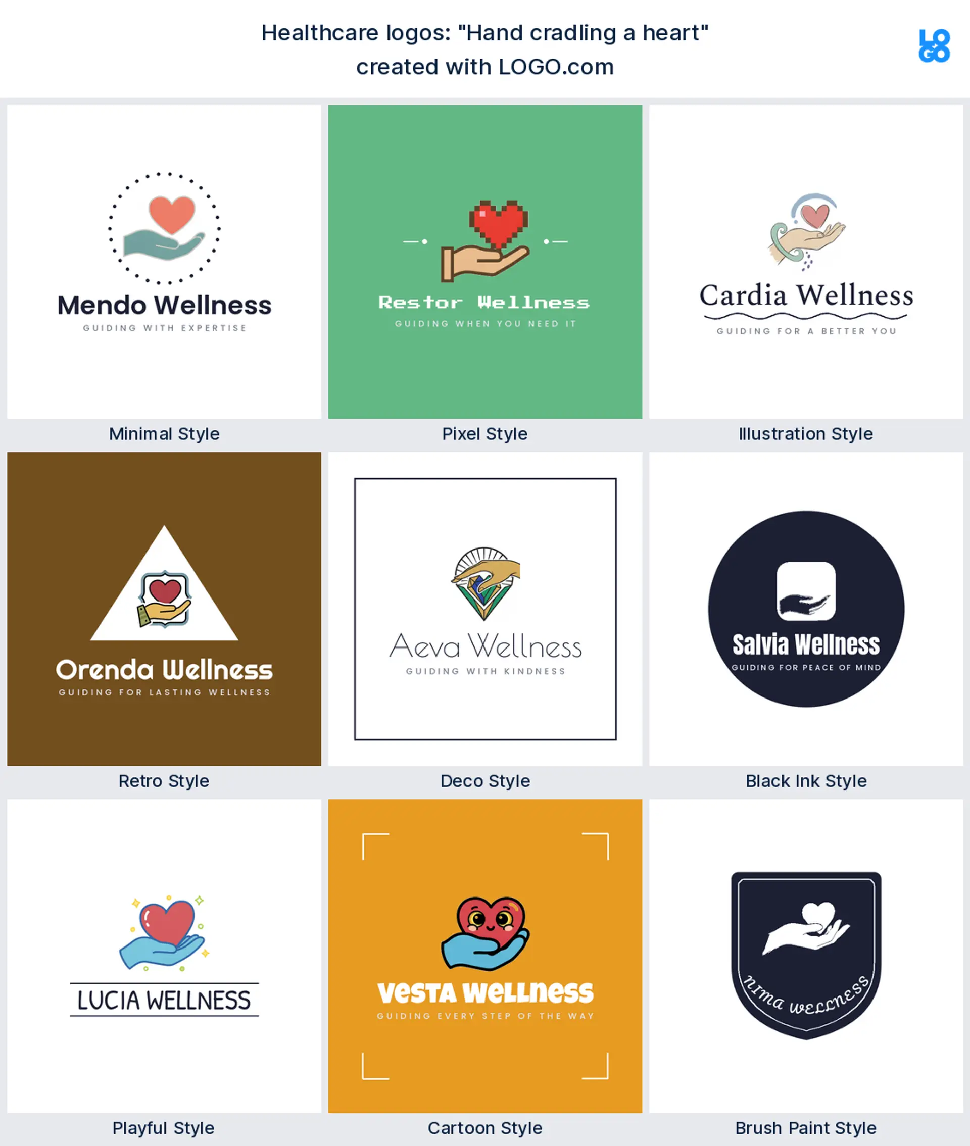
"Hand cradling a heart"
A caregiver wrote this, one open hand holding a heart. It reads as protection and warmth, a clear home care logo or nursing mark for a team whose whole job is looking after people.
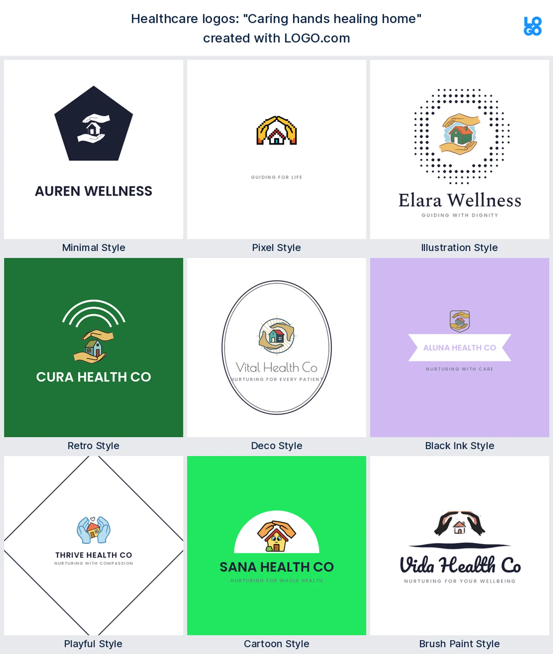
"Caring hands healing home"
A home visit founder typed this, two hands sheltering a small house. It says care delivered where people live, which makes it a natural home care logo for a mobile or in home service.
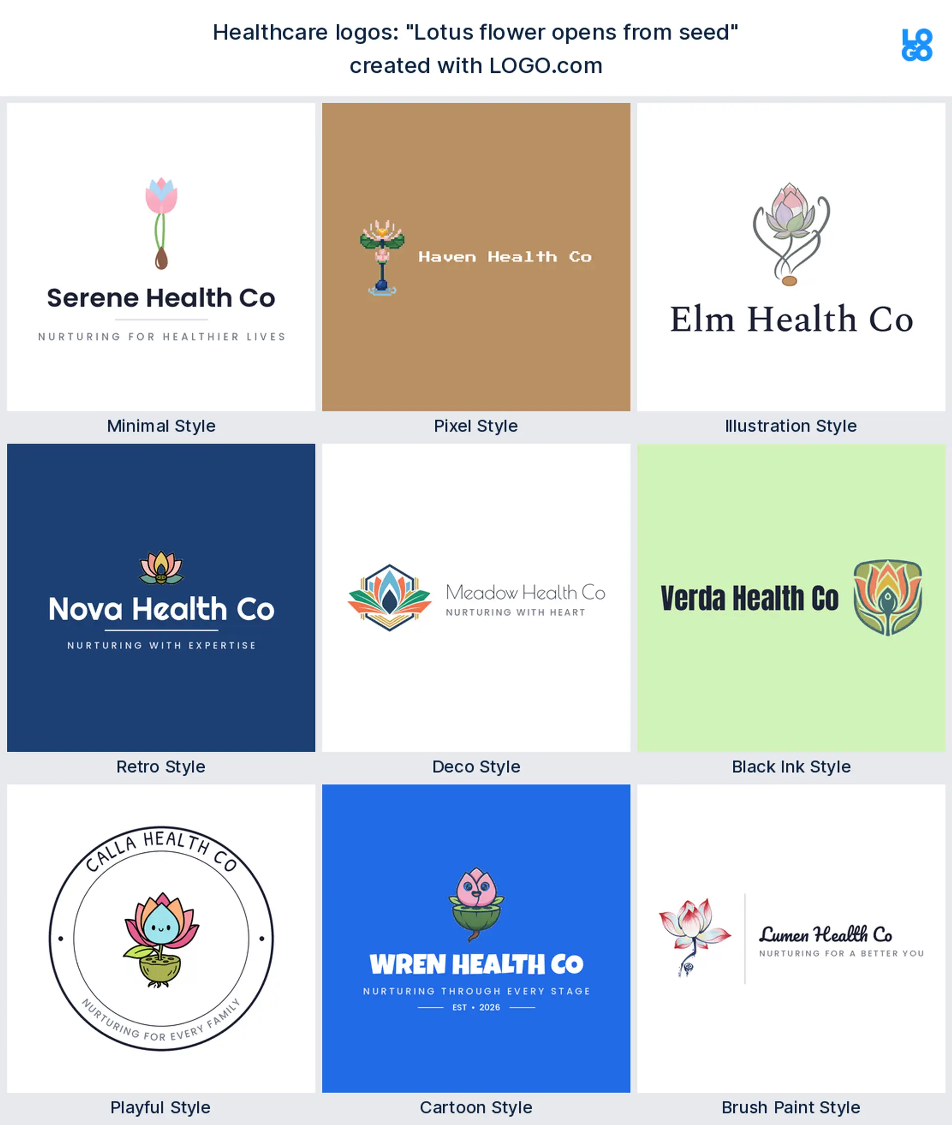
"Lotus flower opens from seed"
A wellness founder wrote this, a lotus unfolding from a single seed. It feels calm and hopeful, a graceful mental health logo or spa mark for a brand about slow, real progress.
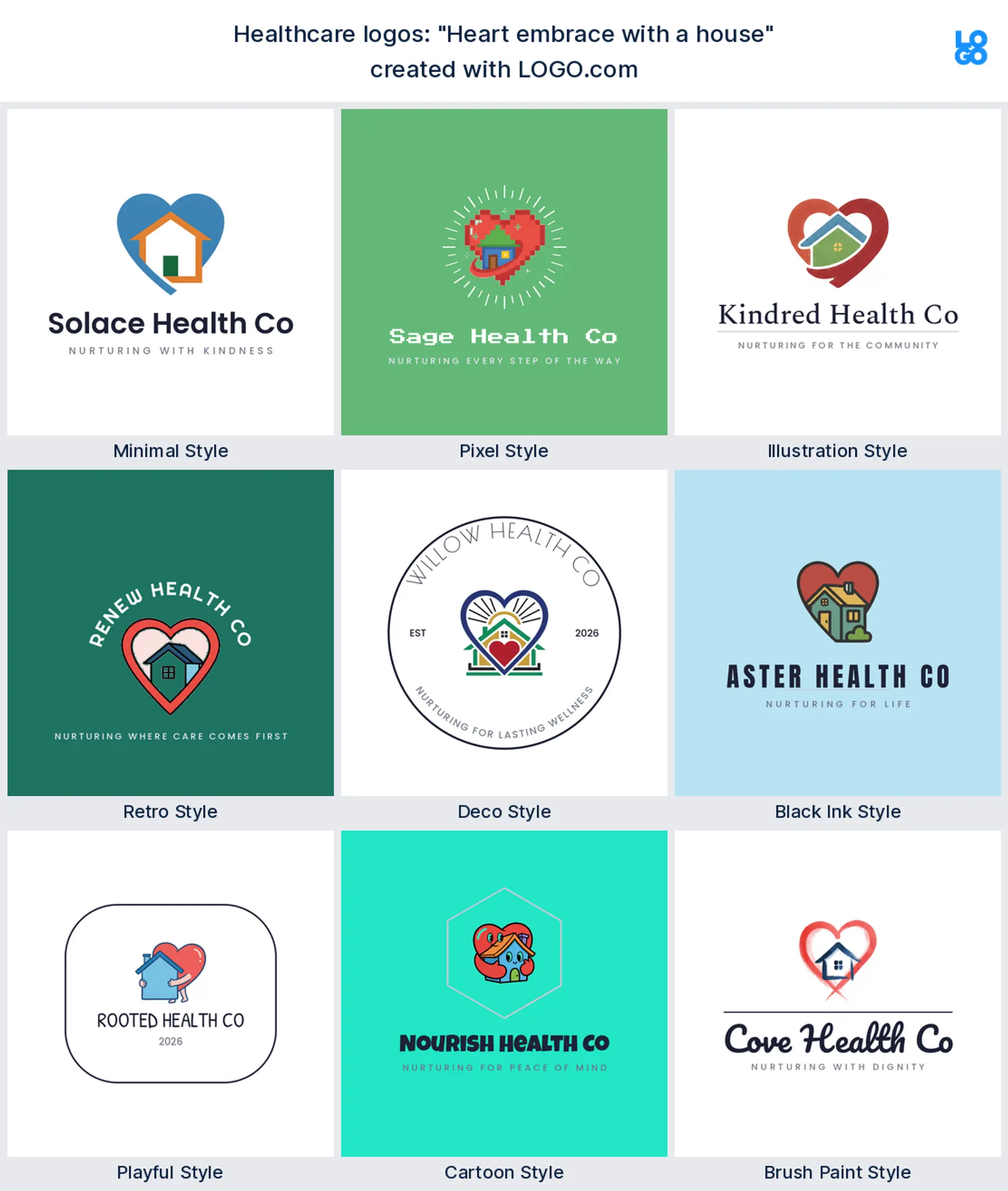
"Heart embrace with a house"
This came from a home health owner, a heart wrapped around a house. It reads as care that feels like home, a warm fit for an assisted living or home care logo.
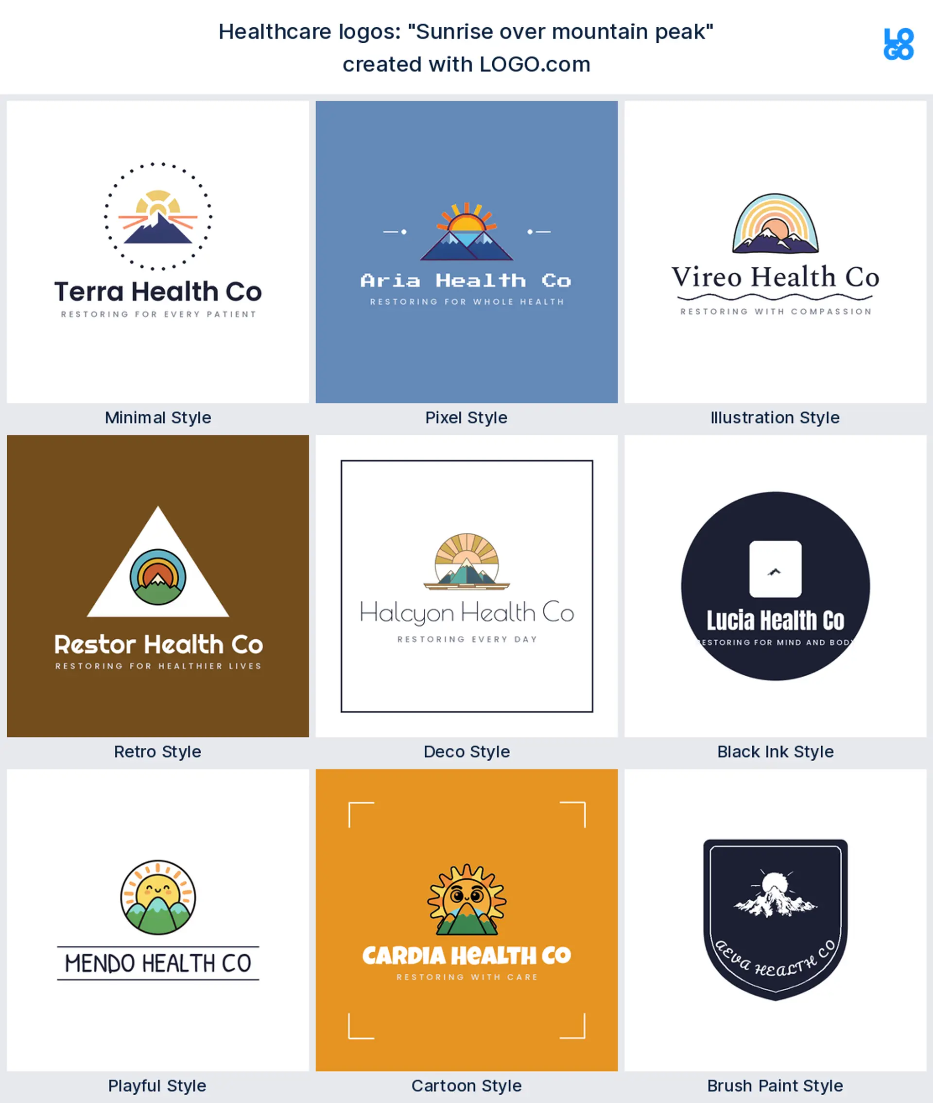
"Sunrise over mountain peak"
A recovery focused founder typed this, the sun rising over a summit. It carries a new start, an uplifting healthcare logo for a rehab, coaching, or mental health practice.
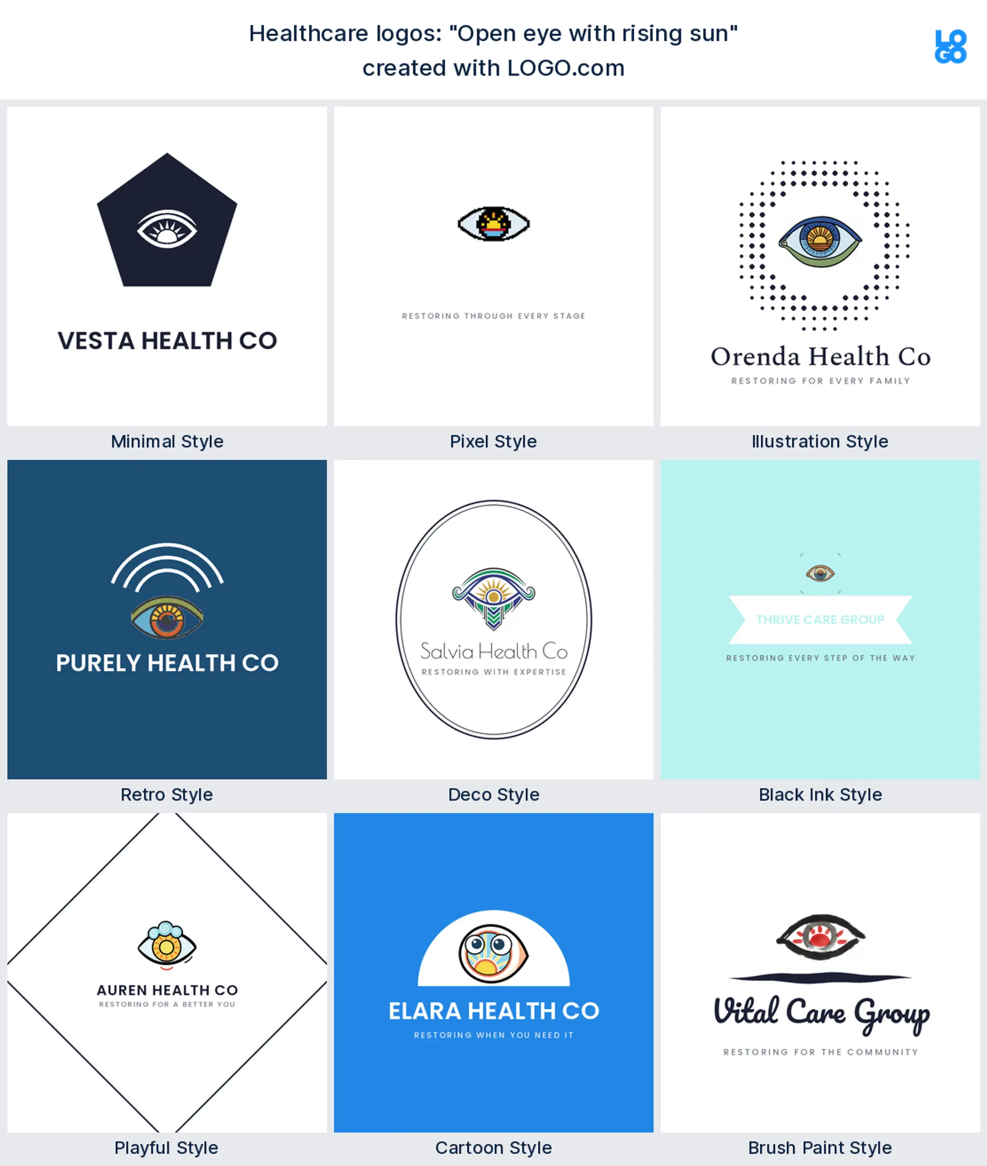
"Open eye with rising sun"
A mindfulness brand wrote this, an open eye with a sunrise inside it. It suggests clarity and awareness, a distinctive mental health logo for a meditation or therapy service.
"Speech bubble with a brain"
A therapist typed this, a brain tucked inside a speech bubble. It says talking helps, an on the nose but friendly mental health logo for counselling and talk therapy.
"Skin cell and DNA helix"
A lab founder wrote this, a skin cell beside a twist of DNA. It reads precise and scientific, a smart healthcare logo for a diagnostics, dermatology, or biotech brand.
"Lungs and fresh air"
A respiratory practice typed this, a pair of lungs breathing clean air. It is specific and instantly clear, a confident healthcare logo for a pulmonary or breathing focused clinic.
"Roots grounding a person"
A holistic founder wrote this, a standing figure with roots reaching down. It reads as being grounded and whole, a thoughtful wellness logo for a mind and body practice.
"Two hands holding a heart"
A community clinic typed this, two hands lifting a heart together. It signals shared care, a welcoming healthcare logo for a nonprofit, a charity, or a community health service.
"Heart with wings gently lifting"
A hospice and comfort care founder wrote this, a heart with soft wings. It reads as gentle and uplifting, a tender healthcare logo for palliative, comfort, or bereavement care.
"Dropper bottle and herbal leaf"
A natural remedy brand typed this, a dropper bottle beside a herbal leaf. It says plant based and considered, a clean wellness logo for a supplements or herbal medicine label.
Should your healthcare logo look clinical or calming?
This is the first real decision, and it depends on who walks through your door. If you run an urgent care, a diagnostics lab, or a family clinic, a little clinical polish builds trust, so a clean medical cross or a crisp DNA mark in a confident blue reads as safe hands. If you are a therapist, a wellness coach, or a mindfulness practice, calming wins, so a soft leaf, a lotus, or a gentle heart in muted green feels human and unhurried. Most healthcare brands live somewhere in between, so start from the feeling you want a nervous first time patient to have, then let the symbol and color follow. When in doubt, lean warmer, because a healthcare logo that feels approachable gets more people to book.
Clinic, home care, mental health, or wellness: match the mark to your service
Healthcare is not one thing, so let the logo say which part of it you do. Running a clinic or an urgent care? A soft medical cross or a heart keeps you instantly readable, and it makes a clear urgent care logo or clinic mark. Caring for people at home? Lean on cradling hands or a heart around a house for a warm home care logo or nursing logo. Working in mental health or therapy? A brain, an open eye, or a lotus reads as a calm mental health logo without a single cliche. Building a wellness, nutrition, or supplements brand? A leaf, a sprout, or a dropper bottle makes a natural wellness logo. Pick the service you are known for and build the mark around that one idea, rather than stacking a cross, a brain, and a leaf into one crowded symbol.
What makes a healthcare logo feel trustworthy
Trust is the whole job of a healthcare logo, and it comes from restraint, not decoration. Keep to one clear symbol and one confident color, because a busy mark reads as chaotic, and chaos is the last thing a patient wants from their care. Draw the shape simply enough that it survives on a tiny name badge and a wall sign alike, since a mark that breaks up when it shrinks quietly reads as careless. Choose a font that is clean and easy, skip anything spiky or novelty, and give the logo room to breathe. Do that and your health care logo will feel calm, capable, and safe, which is exactly what makes someone comfortable handing you their wellbeing.
Colors that read healthy and calm, from real brand data
Color carries more of the feeling than people expect, so choose it on purpose. When we looked at the palettes healthcare founders actually picked on LOGO.com, green came out on top, with a calm blue close behind and warmer tones well back, so green and blue read as health and care more than any other shades. Want to feel natural, growing, and reassuring? A fresh green is the safest, most on brand choice. Chasing calm, clinical trust instead? A steady blue feels clean and dependable. Either way, keep it to one confident color plus a neutral, pair it with a simple font, and let the white space do the calming. That restraint is most of what good healthcare logo design comes down to.
Make your healthcare logo with LOGO.com
Pick the symbol that fits your kind of care, choose one of nine styles, and our free healthcare logo maker builds the rest around your name. Preview it free, download a high resolution PNG with full commercial use, and walk out with one calm, credible mark ready for your clinic sign, your name badges, and your booking page in minutes.
Methodology. These figures come from logos created on LOGO.com during the 12 months ending July 2026. We read the 114 custom icon descriptions written by roughly 2482 founders who chose a healthcare, health, wellness, or mental health industry, grouped those descriptions by concept, for example a heart, a brain, or a leaf, and ranked each by how often it appeared. The heart led at about 23 percent, the brain followed near 19 percent, and a leaf or sprout was just behind, also close to 19 percent. Figures are a share of all icon descriptions in that set, rounded to the nearest percentage point. Source: LOGO.com first party product data, July 2026.
THE #1 LOGO GENERATOR
Why LOGO.com is the best healthcare logo maker
1.Built from real healthcare brand data
The icons and styles come from the logos real healthcare and wellness founders built on LOGO.com, so you start from what works, not generic clip art.
2.Reads on a clinic sign and a name badge
Your mark stays sharp on a large clinic sign and on a tiny name badge, where thin lines and fussy detail usually disappear.
3.Transparent file for scrubs, signs, and socials
Download a transparent logo that sits cleanly on a colored uniform, a clinic photo, or a social post with no white box around it.
4.One mark for the door, the badge, and the app
Design it once and it fits your clinic door, a name badge, an appointment card, and your booking app profile picture.
5.Full color or one color for scrubs and stamps
Choose a full color icon or a single color version that prints neatly on scrubs, tote bags, and a stamped patient welcome card.
6.Nine styles, clinical to calm and caring
Match your tone, from a crisp clinical wordmark to a soft, caring mark for a wellness brand, all built to stay legible small.
7.A wordmark and a compact mark to match
Keep the full name and a compact icon so you have the right version for a wide entrance sign and for a small app avatar.
8.Edit it when you add a clinic or a service
Swap the icon, color, or name when you open a second location, add a service, or grow from solo practice to a team.
9.Free to design, yours to sell with
Preview free and download a high resolution PNG with full commercial use, then upgrade to the Brand Plan for vector files to print big.
Healthcare Logo Maker FAQs
Need Inspiration? See example brands in your industry...
3D DesignAcademic WritingAccountantAerospace EngineeringAgricultural ConsultingAgriculture CompanyAmazonAnimal ProtectionAnimationApp DevelopmentAquacultureAromatherapyArt and DesignArtsAsian RestaurantAthleticsAudio TechnicianAuto ManufacturingAuto Repair ServicesBadgeBandBarber ShopBearBeauty and CosmeticsBeeBibleBiotechBitcoinBlogBoatBook PublisherBooks and Literature BlogBrainBuildingBusiness Consulting Logo MakerBusiness StorageCakesCampaignCandlesCarCarpentryCateringCelebrationsChemicalChildrenChoirCircleCivil EngineeringClothingCoffee Shop