Carpentry Logo Maker
Design a carpentry logo that works on your van door and your workshop sign.
Need a different logo maker? Try our AI logo generator.
Logos created using LOGO.com
670,000,000
Hand tool and joinery carpentry logos
Furniture maker and woodturning logos
Workshop, cabinetry and decking logos
Carpentry Logos, Ranked From Real Founder Prompts
According to LOGO.com data, a hammer appears in about 29% of the 422 carpentry and woodworking icon descriptions founders wrote, ahead of a wood plank at about 24% and wood grain at about 19%.
All nine of those symbols and fifteen real founder prompts sit below in the nine LOGO.com styles, so you can compare a cabinet maker logo, a sawmill logo, and a full carpentry logo design before you settle on one.
On this page
- Hammer, plank, or grain: what carpentry founders actually described
- Fifteen woodworking logo ideas, typed by founders and rendered nine ways
- Why rustic and modern woodworking logos are two different searches
- A joint says more about your work than a tool does
- Can you burn this logo into your own work?
- Who signs your invoices decides your icon
- Wood grain is the trap: what happens when the logo shrinks
- Make your carpentry logo with LOGO.com
Twenty nine percent. That is how often a hammer shows up when carpenters describe the icon they want, and it is the most reliable number on this page. We pulled 422 custom icon descriptions written by carpentry and woodworking founders on LOGO.com, grouped them by what was actually inside the drawing, and ranked the results. Below you get the nine symbols that came out on top, fifteen prompts founders typed word for word, and the practical things nobody mentions until a sign maker asks you for a file.
Hammer, plank, or grain: what carpentry founders actually described
Our first party data covers 422 custom icon descriptions from carpentry and woodworking founders, the ones who asked for wood, timber, lumber, a saw, a chisel or carpentry by name. We grouped every description by the object inside it and counted. Most people name two or three things at once, a hammer and a plank, a chisel and a grain texture, so the shares below overlap instead of adding up to 100. Here is the full nine in order, with a nine style grid for each one.
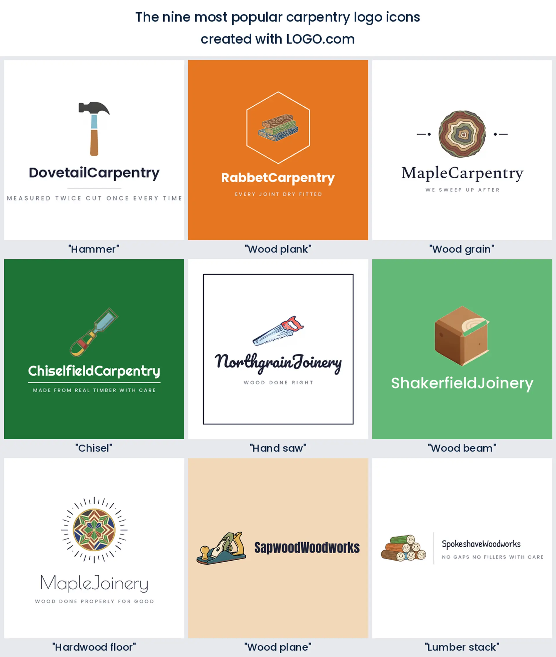
1. Hammer
The hammer is the thing founders type before anything else, sitting inside about 29% of the descriptions. Almost none of them ask for it alone. It arrives holding a plank, a beam, or a nail, which tells you what people want it to mean: not the tool, the act of building something. A claw hammer also stays legible when it shrinks to the size of a house number, so it makes the plainest, hardest working carpenter logo on the street.
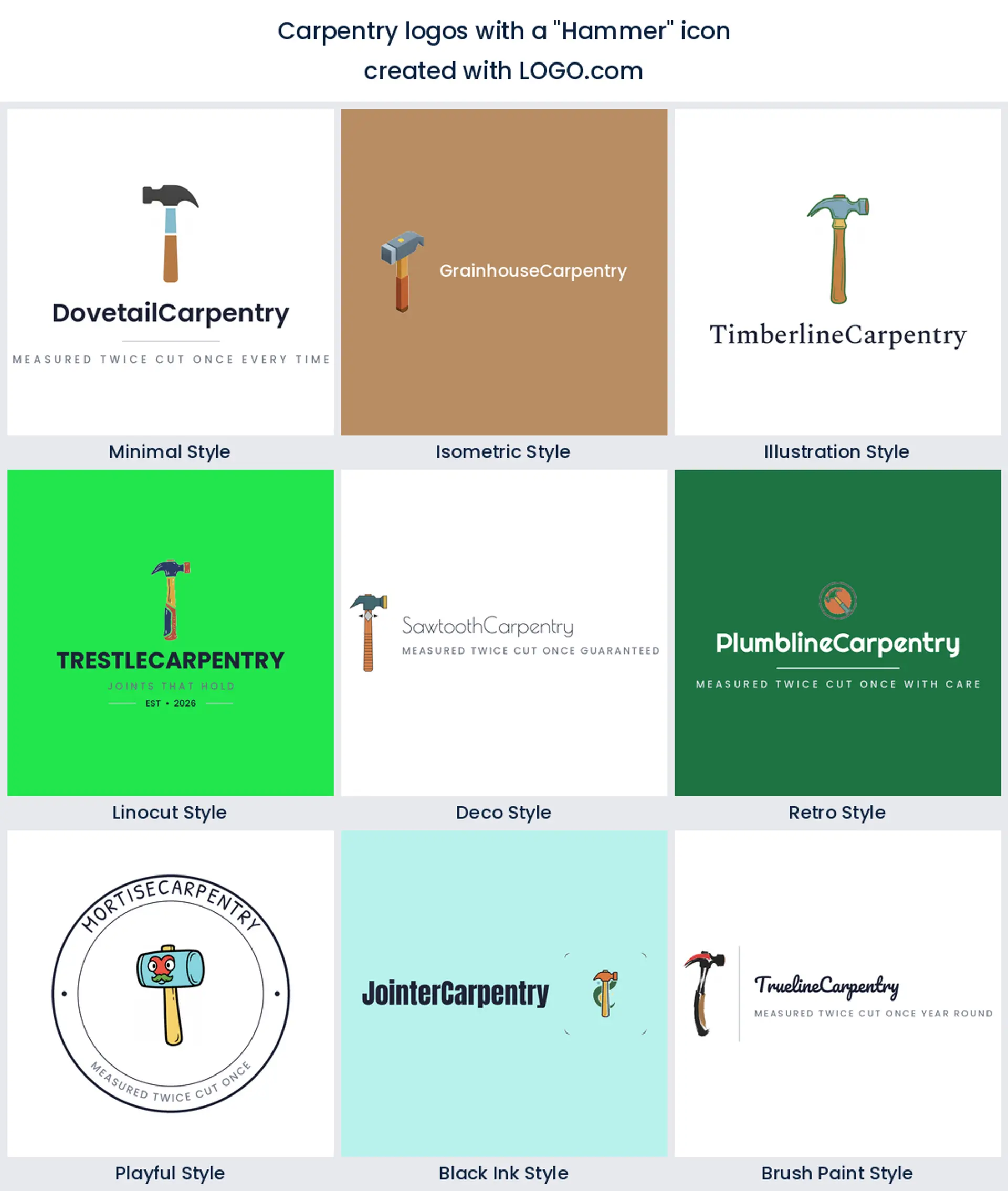
2. Wood plank
Boards do almost as much work as the hammer, landing in roughly 24% of the descriptions and usually stacked two or three deep. A stack reads as material waiting to be worked, which is a warmer idea than a tool on its own, and the straight edges give a designer something to build a container or a monogram around. Choose it when you want a woodwork logo that says supply and craft rather than repairs.
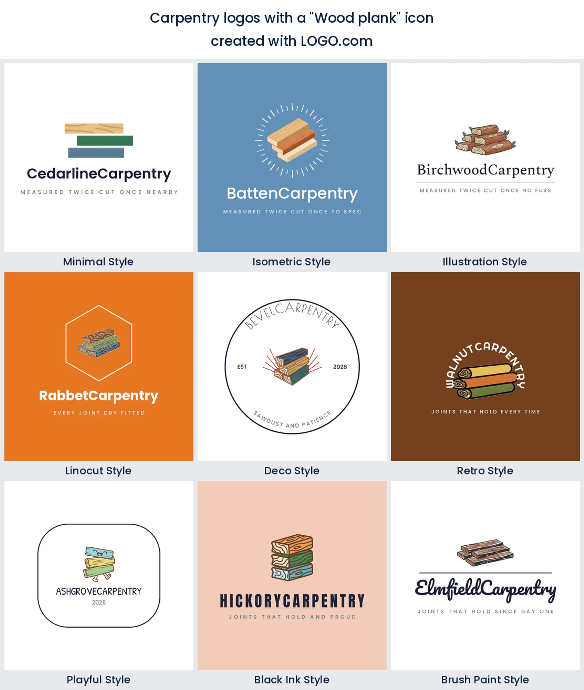
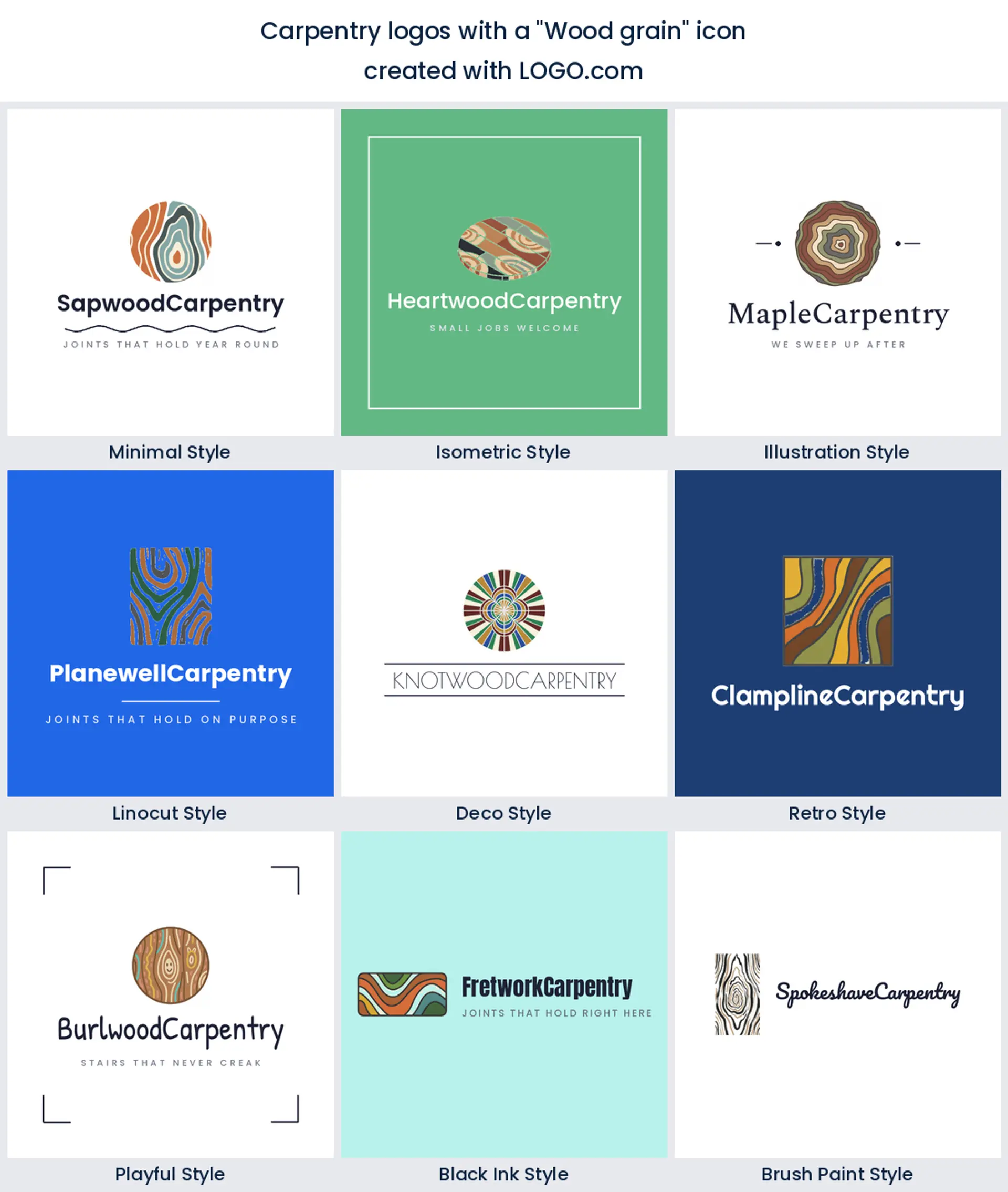
3. Wood grain
About 19% of the descriptions ask for grain, either as a texture running through another shape or as the whole mark. It is the only entry in the nine that is not an object, which is exactly why founders like it. Flowing grain lines make a wood logo feel handmade before anyone reads a word of the name, and they slot neatly inside a circle, a hexagon, or a letter.
4. Chisel
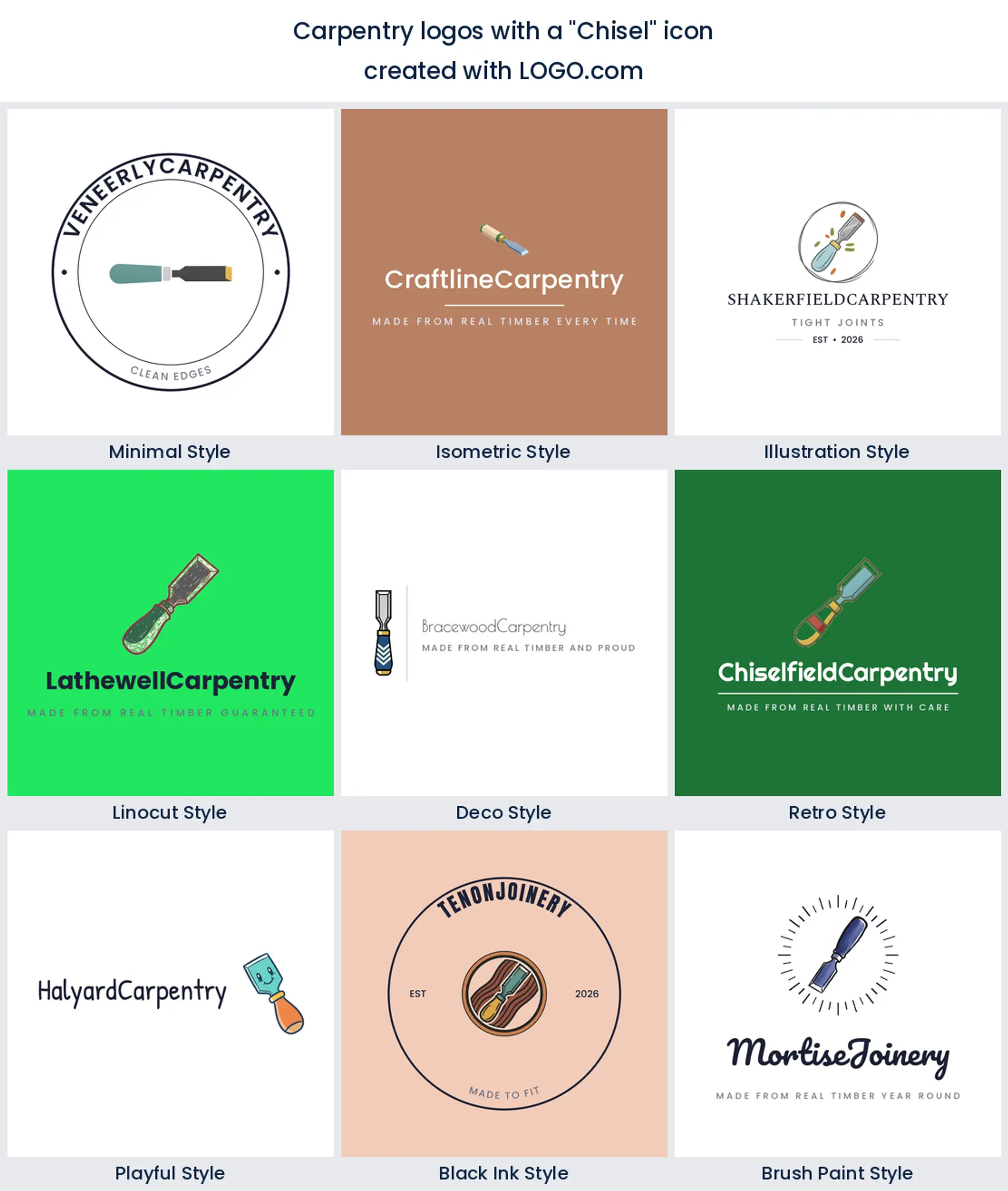
After the three obvious ones, the chisel is the tool people name most. It signals a level of work a hammer does not. Nobody chisels a fence panel, so the moment it appears in a mark the reader assumes hand cut joints and finish work. It is the sharpest starting point for a custom furniture logo or a bespoke joinery brand.
5. Hand saw
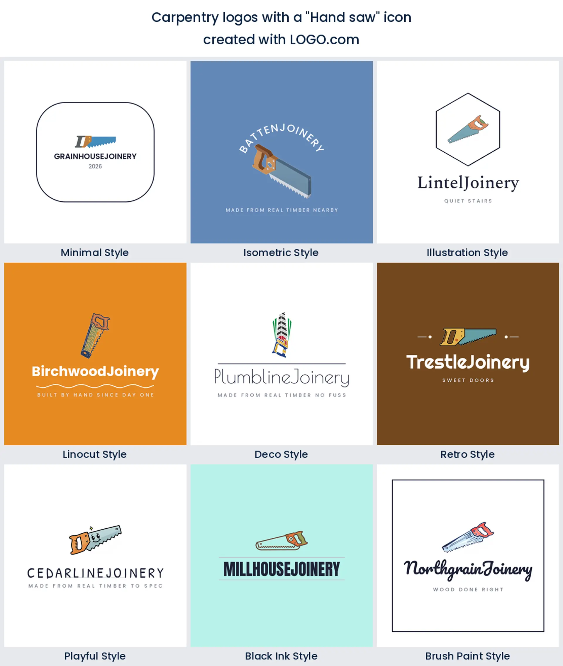
Two very different requests arrive under the same word when founders ask for a hand saw. Some want the old panel saw with a wooden handle, which reads heritage. Others want it crossed with a square or a hammer, which reads trade services. Either version gives you a carpentry logo design that people recognise instantly, even from a moving van.
6. Wood beam
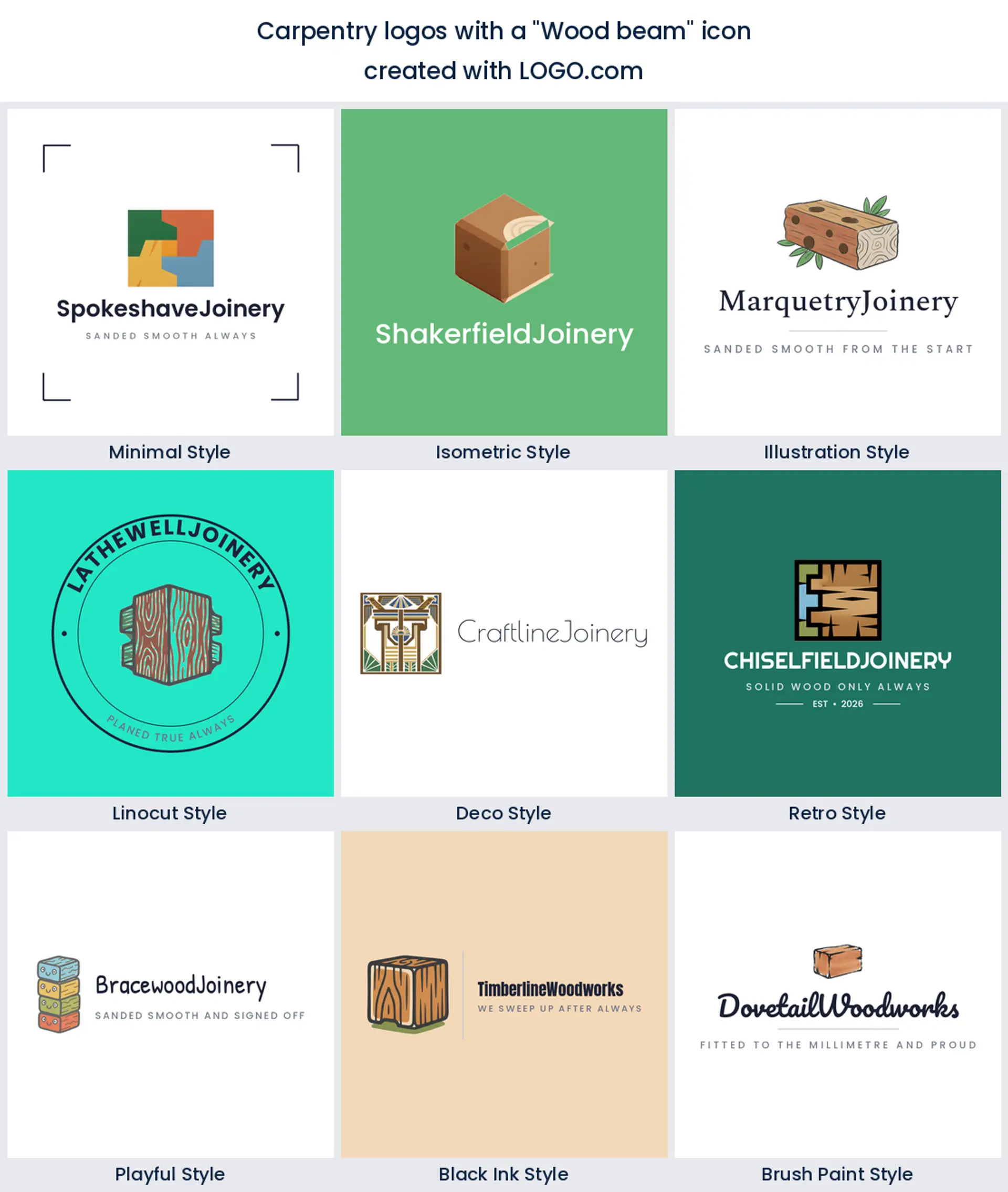
A squared beam is the sixth most described shape, and it nearly always turns up next to a house frame or a roof line. That pairing is the tell. These founders are structural carpenters and first fixers, not furniture makers, and a beam in the mark says so without a strapline. Good bones for a carpentry business logo aimed at builders and developers.
7. Hardwood floor
Only one entry in the nine hands you a repeating pattern, and it is flooring at number seven, described as planks laid in a run, a herringbone, or a parquet star. That pattern can carry across a website background or the back of a business card, which no single tool can do. Worth a look if you fit floors and want a timber logo with something running behind the mark.
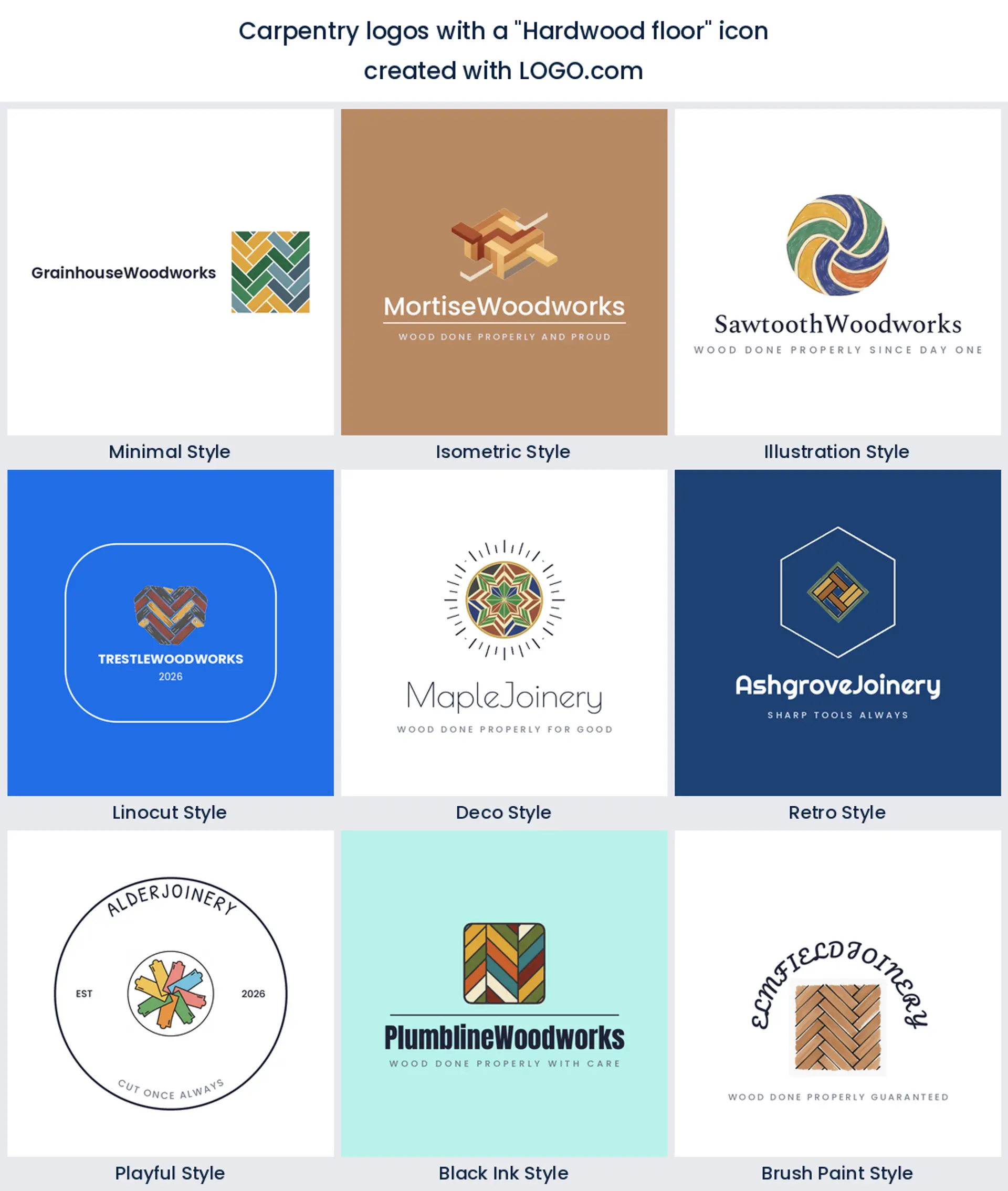
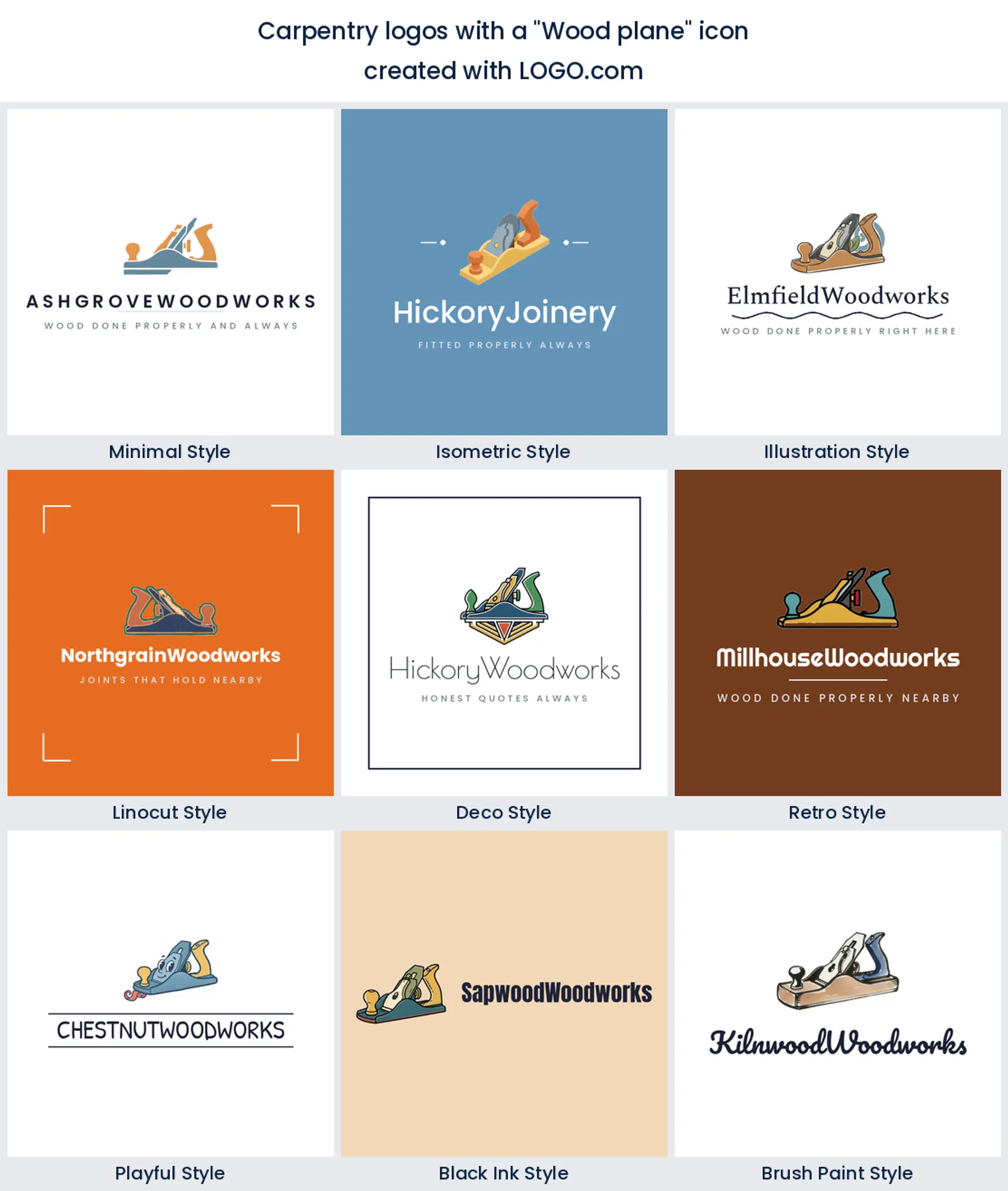
8. Wood plane
The hand plane is quieter in the data, eighth of nine, and that is part of its appeal. Every other trade owns a hammer and a saw. Nobody else owns a plane. It is the single most specific object on this page, so it carries a modern woodworking logo further than a tool everyone shares.
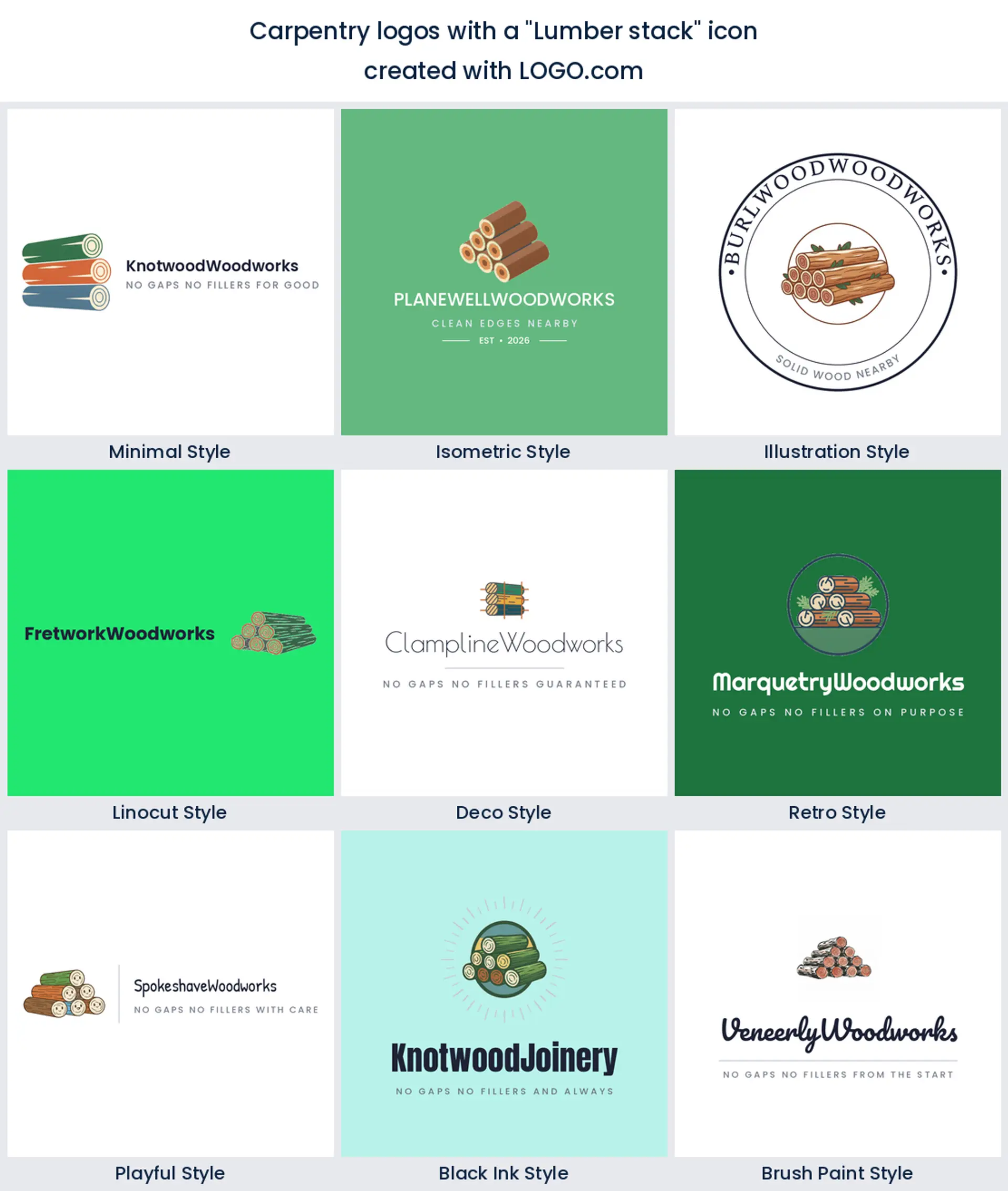
9. Lumber stack
Cut logs seen end on, rings showing, are the least common of the nine and the least angular. Those circles give you a mark with no straight lines at all, which is rare in this trade and useful if you want to look less industrial. It is the natural pick for a sawmill logo or a small timber yard.
Fifteen woodworking logo ideas, typed by founders and rendered nine ways
None of the fifteen headings below were invented for this page. Each one is quoted exactly as a carpenter or a furniture maker typed it into LOGO.com, then rendered in all nine styles. Read the list as a menu rather than a gallery. Take one whole, or lift the object from one and the treatment from another, and the result stops belonging to anybody else. Real woodworking logo ideas beat invented ones, because somebody already wanted them.
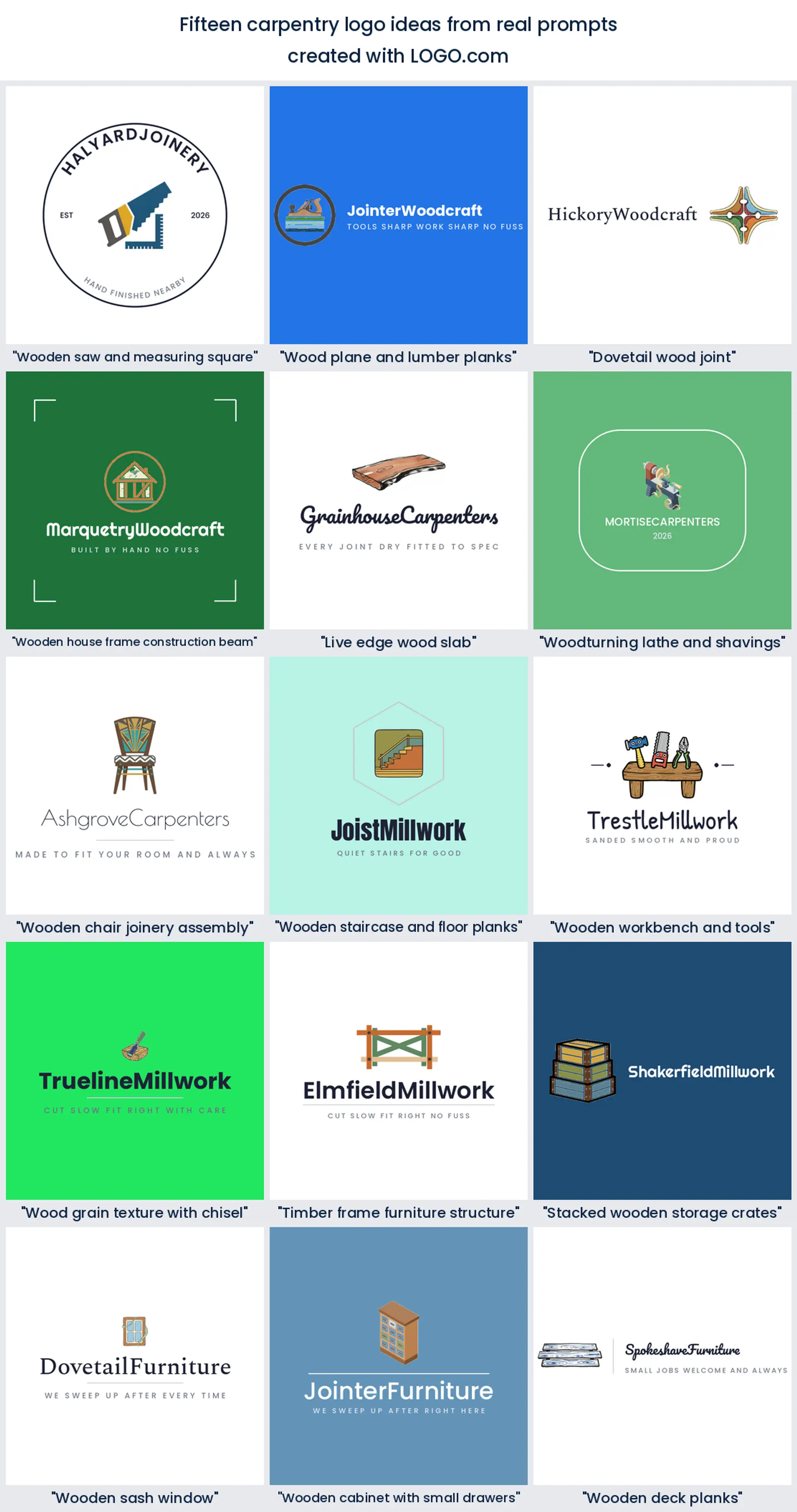
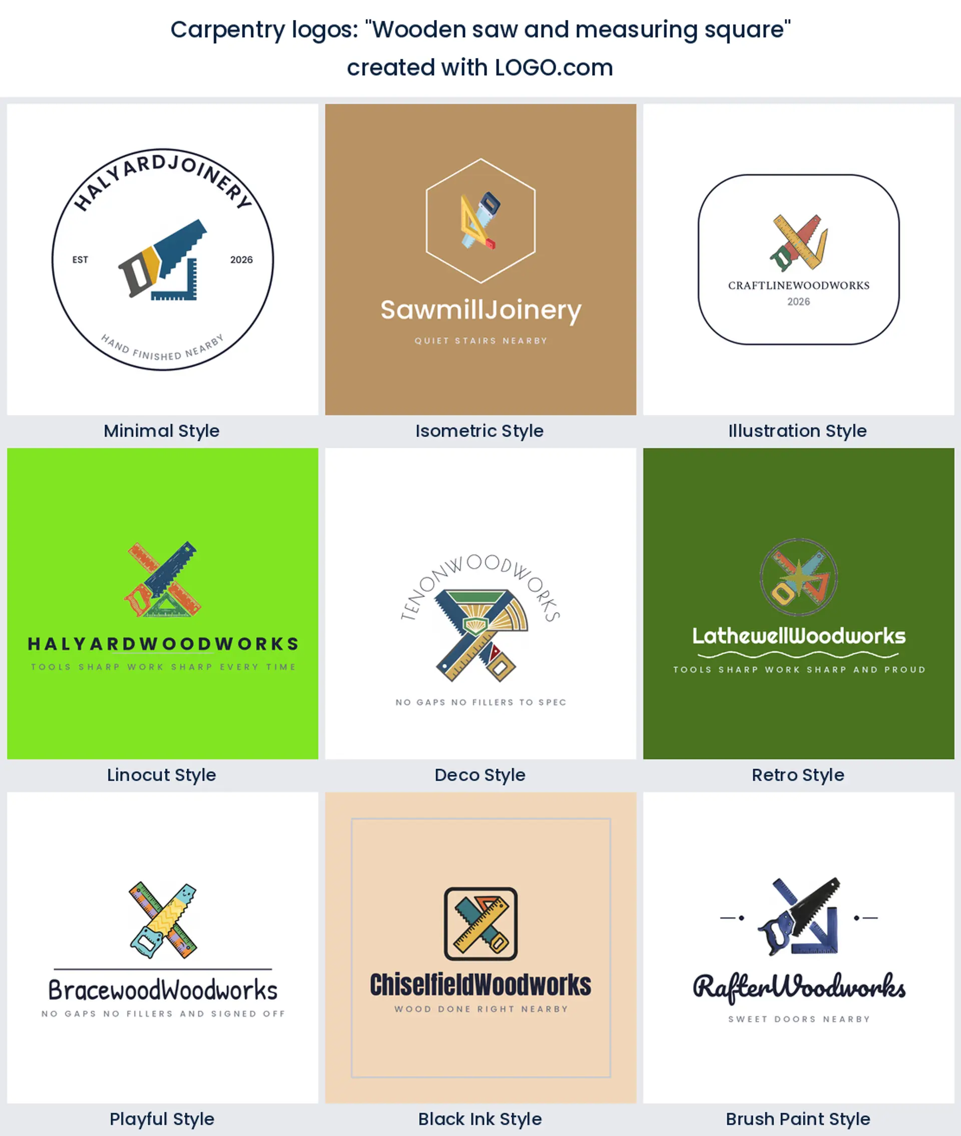
1. "Wooden saw and measuring square"
Two tools crossed is the oldest trade badge there is, and it still works because the reader gets it in half a second. The square is doing the quiet work here, since it says accurate rather than merely strong. Good bones for a carpentry business logo that wants to look established from day one.
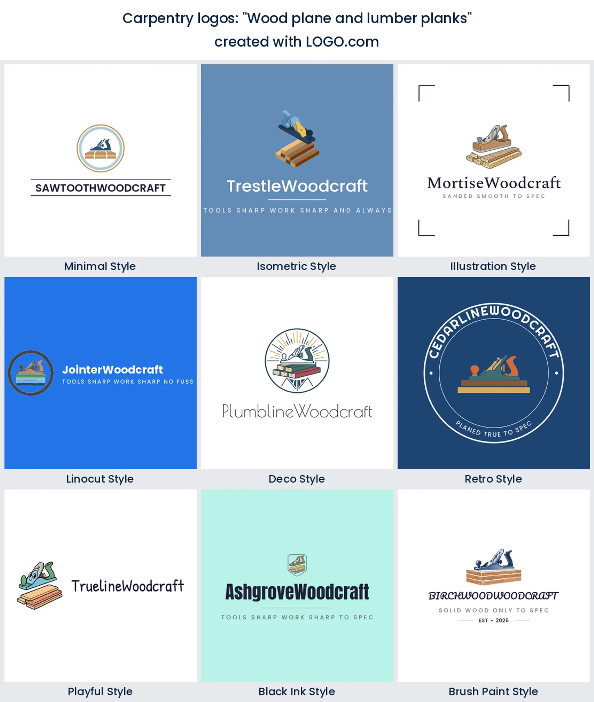
2. "Wood plane and lumber planks"
A plane resting on boards is a before and after in one picture. Rough stock on the bottom, the tool that makes it smooth on top. Nothing else in this list explains what you do quite so plainly, which is why it suits a custom woodworking logo for a maker who sells finished pieces.
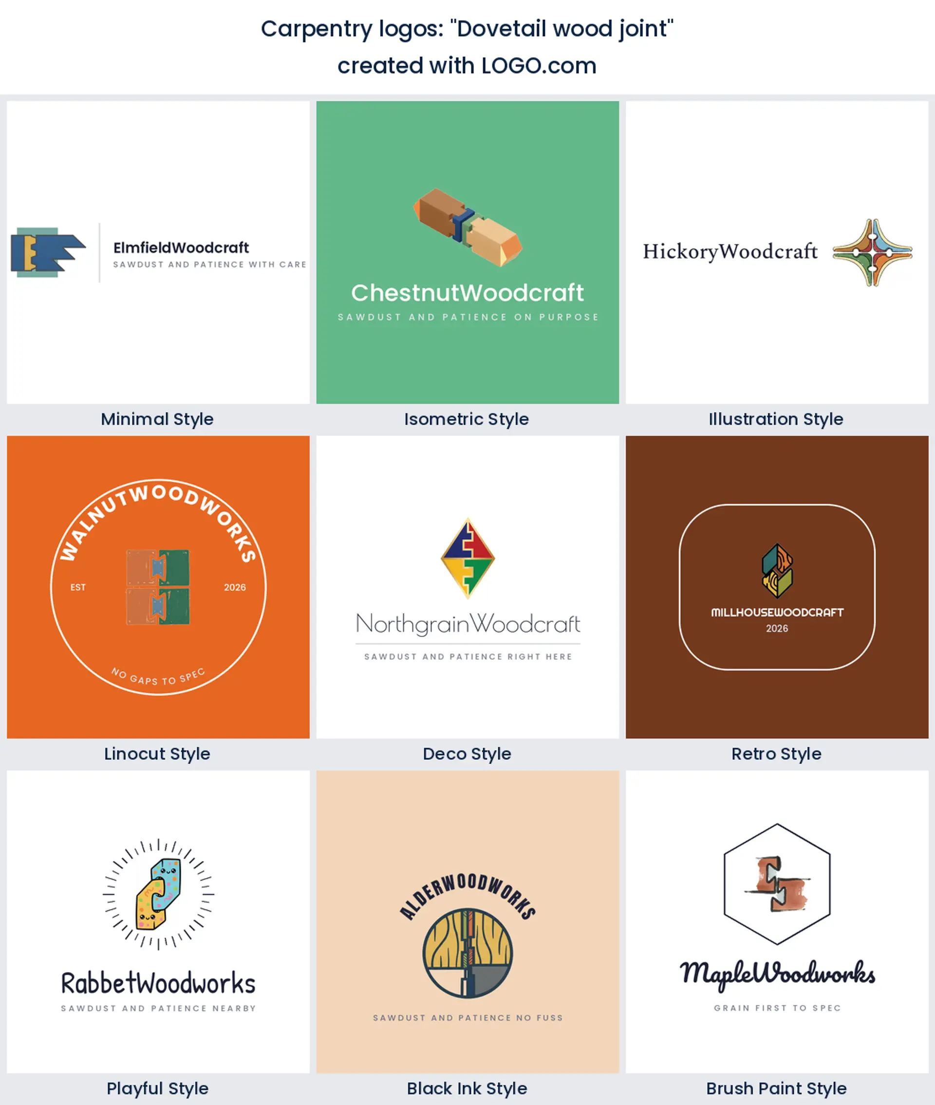
3. "Dovetail wood joint"
Only a woodworker would put a dovetail on a sign, and that is the point. It filters your audience for you. Anyone who recognises those pins and tails already knows the difference between a hand cut drawer and a stapled one, so it makes a quietly confident cabinet maker logo.
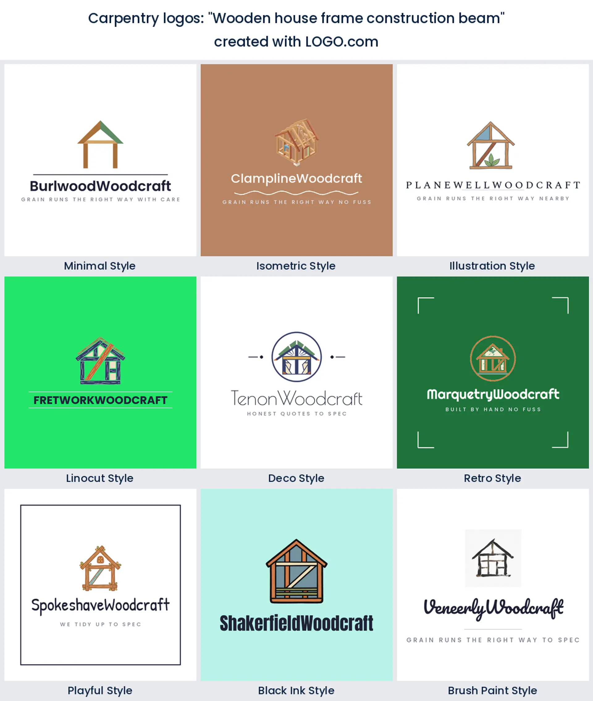
4. "Wooden house frame construction beam"
Put a frame in the mark and you are talking to builders, not homeowners. It says first fix, roof carpentry, and site work rather than kitchen islands. If most of your invoices go to contractors, this is the version of a carpentry logo they will trust.
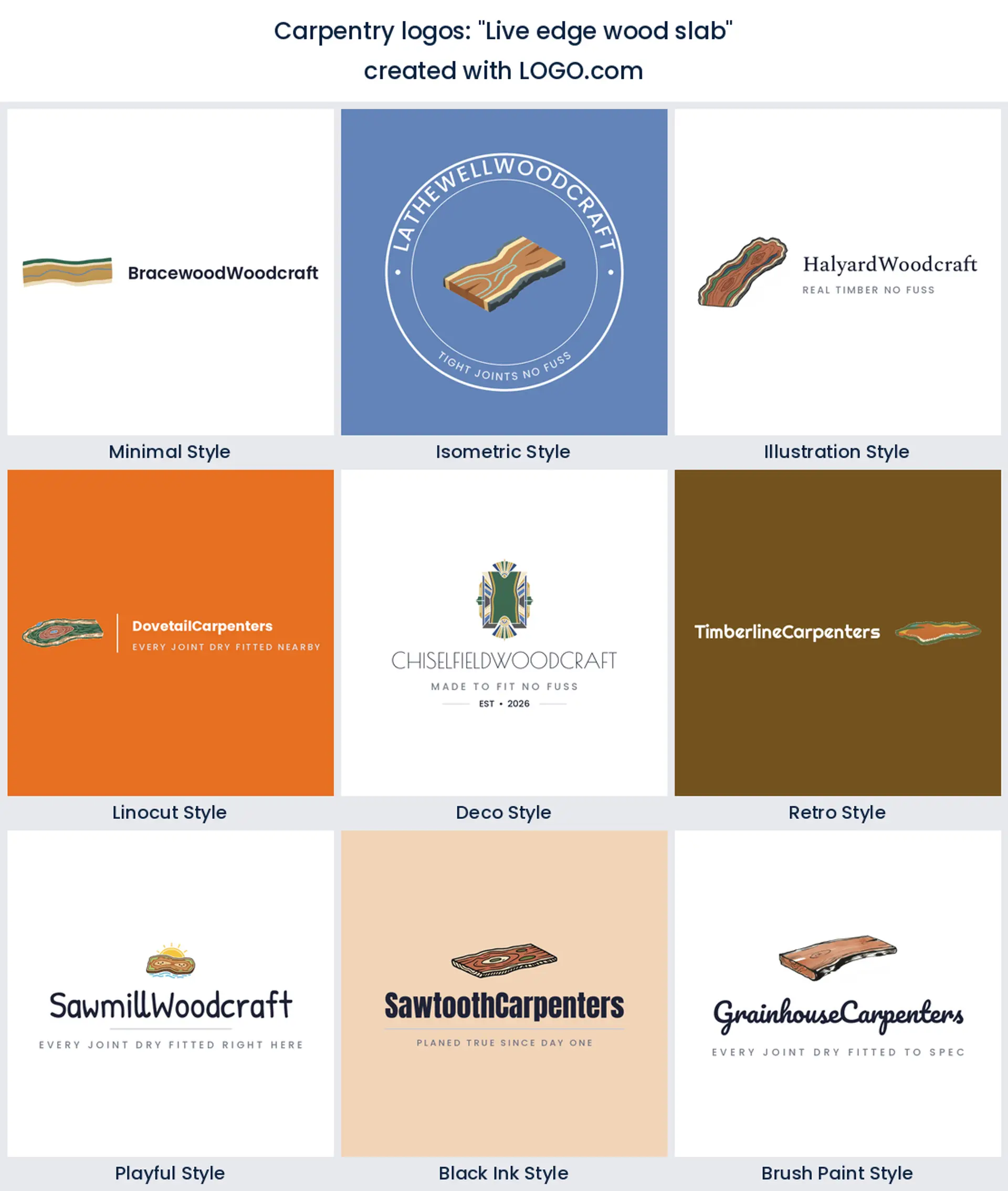
5. "Live edge wood slab"
One wavy edge does more for a brand than any tool can. A live edge slab is the shape people already associate with a slow, expensive, one off table, so it lifts your price point before you have said a number. Reach for it if you build a custom furniture logo around dining tables and counters.
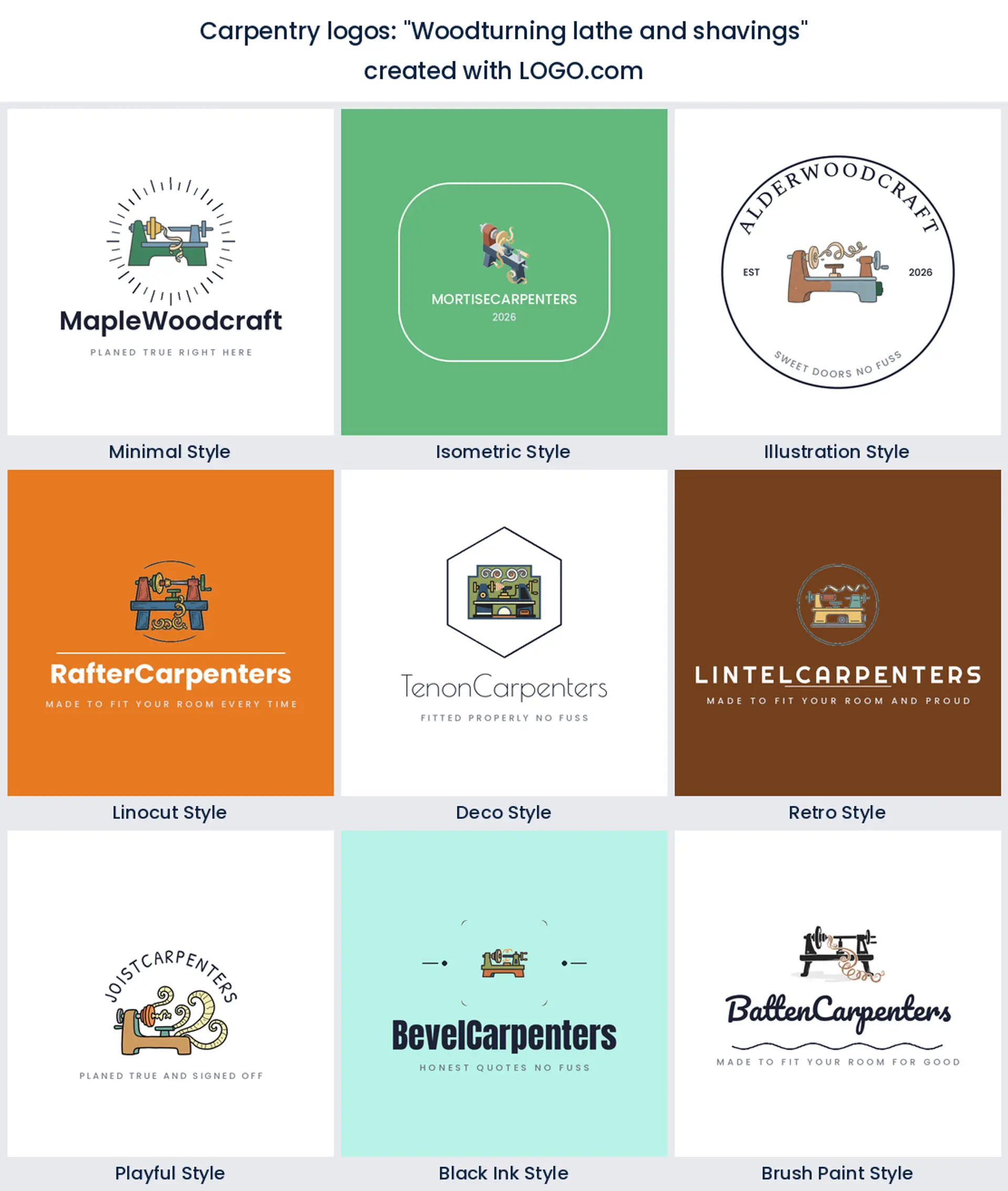
6. "Woodturning lathe and shavings"
Curls of shaving are the most joyful thing in the whole set. They add movement to a trade that mostly draws still objects, which stops the mark looking heavy. Turners, bowl makers, and spindle shops get a wood shop logo here that nobody else on the street can copy.
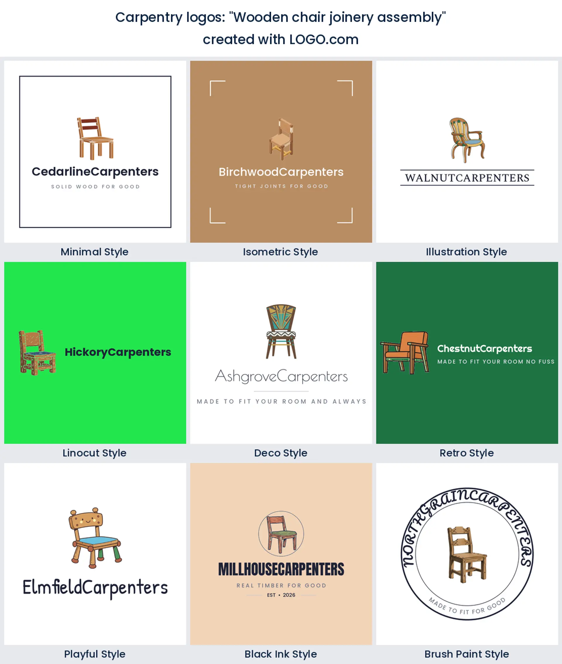
7. "Wooden chair joinery assembly"
Drawing the chair rather than the tool changes who is listening. Now the reader pictures the thing they would buy instead of the work that made it, which is what you want on an online shop. It is a friendly, domestic take on a woodworking logo design.
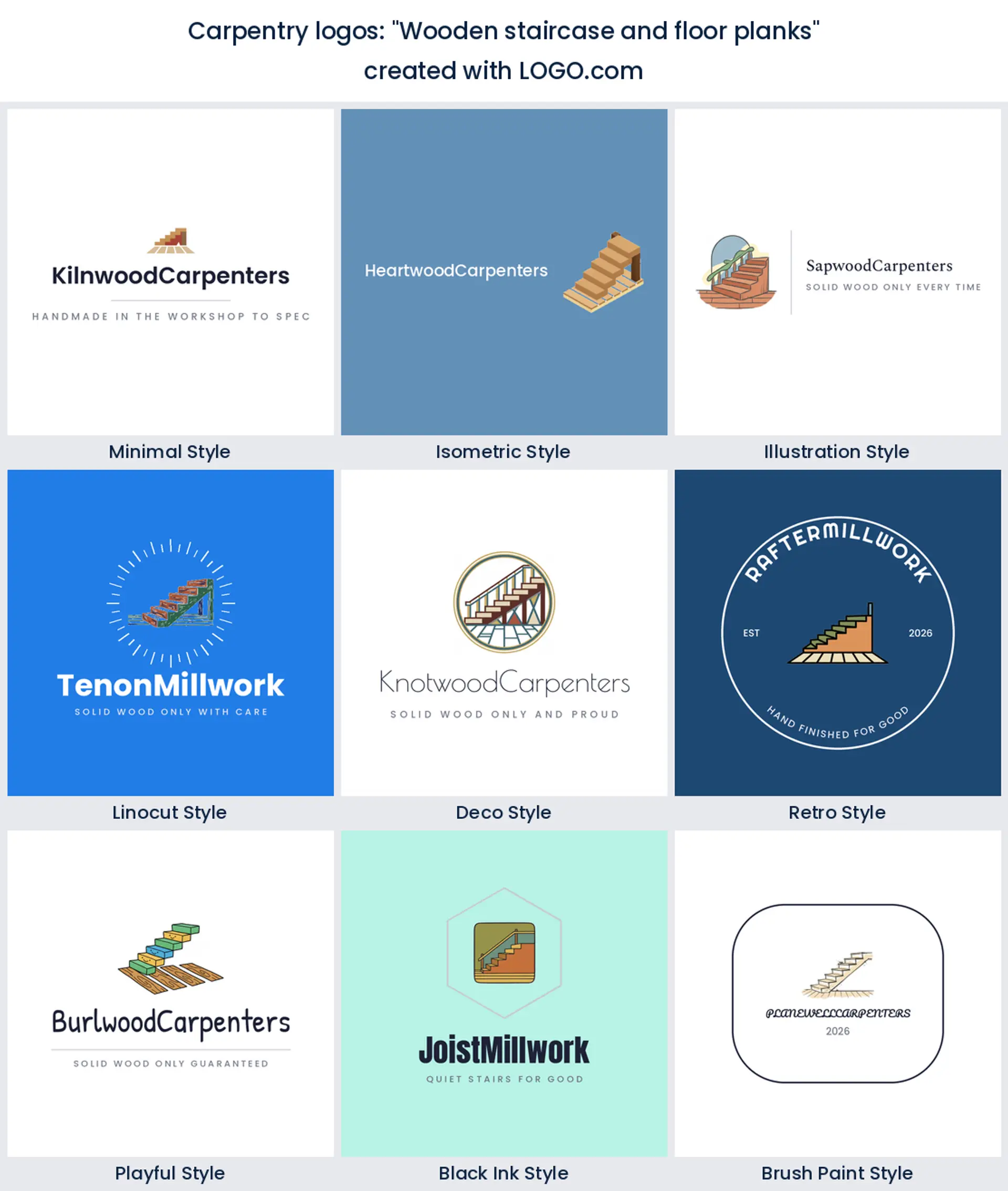
8. "Wooden staircase and floor planks"
Stairs are the single hardest thing most carpenters build, so showing them is a straight brag. The diagonal also breaks up a page full of squares and rectangles. Fitters who do stairs and floors together get a carpenter logo that covers both jobs in one shape.
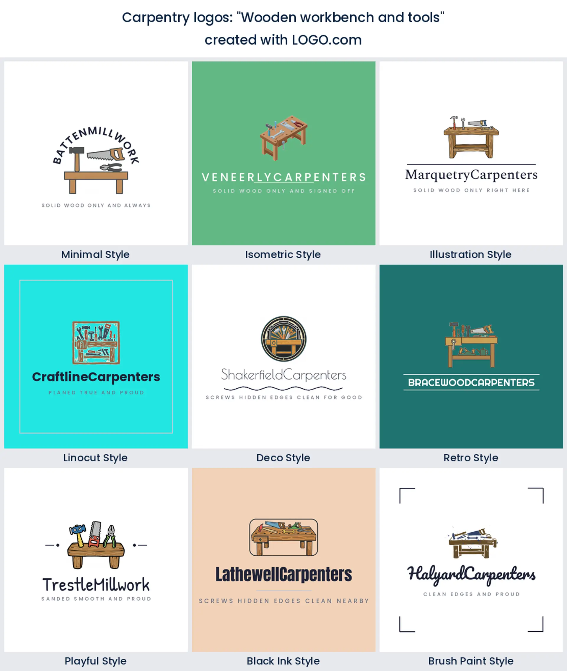
9. "Wooden workbench and tools"
The bench is the closest thing this trade has to a shopfront. Putting it in the mark, with a few tools sitting on top, tells people there is a real workshop behind the phone number and not a man with a van and a hire card. That reassurance is worth a lot to a new woodworking business logo.
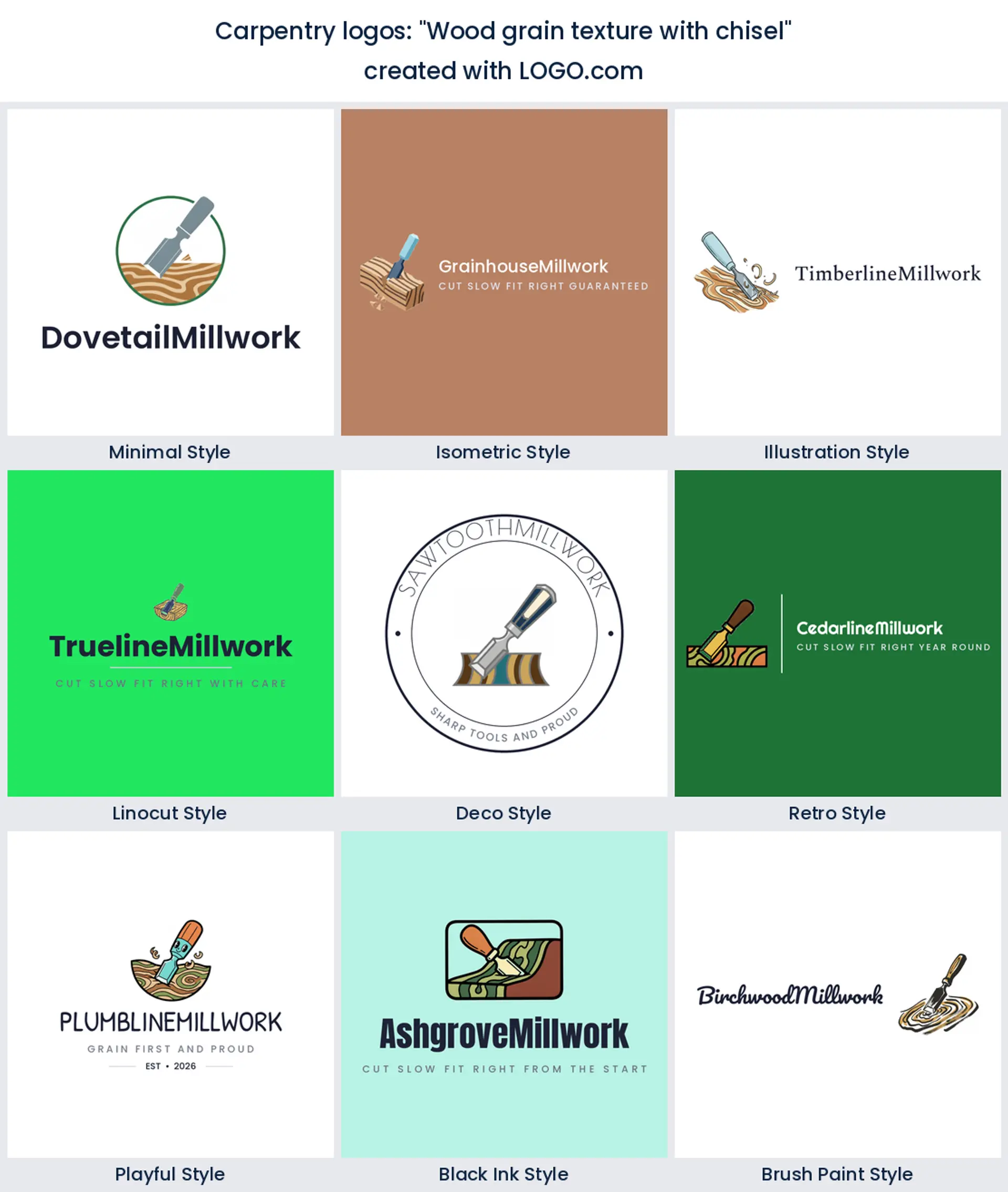
10. "Wood grain texture with chisel"
Here the texture and the tool are in the same frame, mid cut. It is the one idea on the list that shows a moment rather than an object, which gives it energy. Handy when a flat wood logo feels too static and you want something with a bit of tension in it.
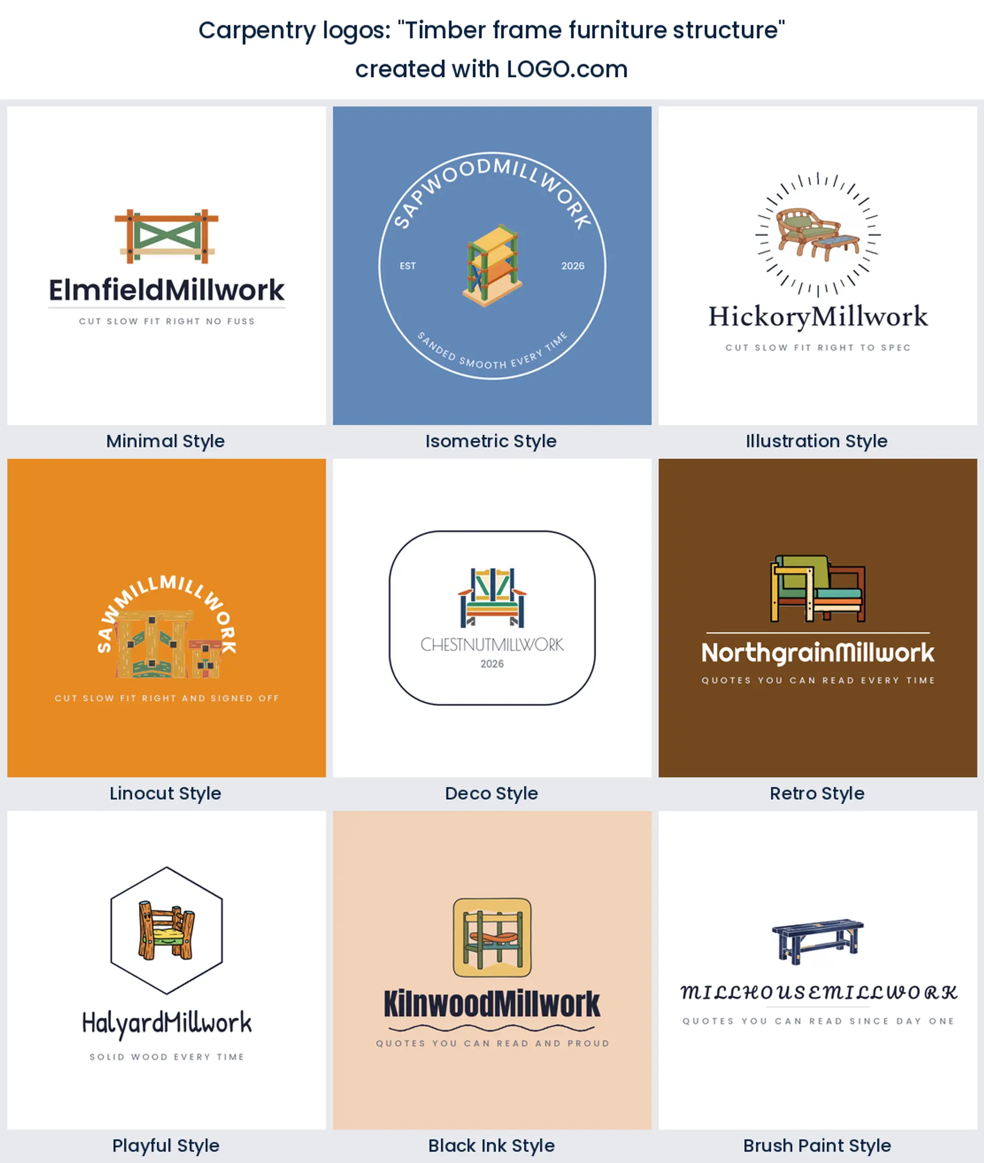
11. "Timber frame furniture structure"
Exposed joinery in a piece of furniture is the visual shorthand for solid wood, no screws, no flat pack. The open frame also leaves gaps a designer can push the wordmark into. A strong route to a modern carpentry logo that still feels handmade.
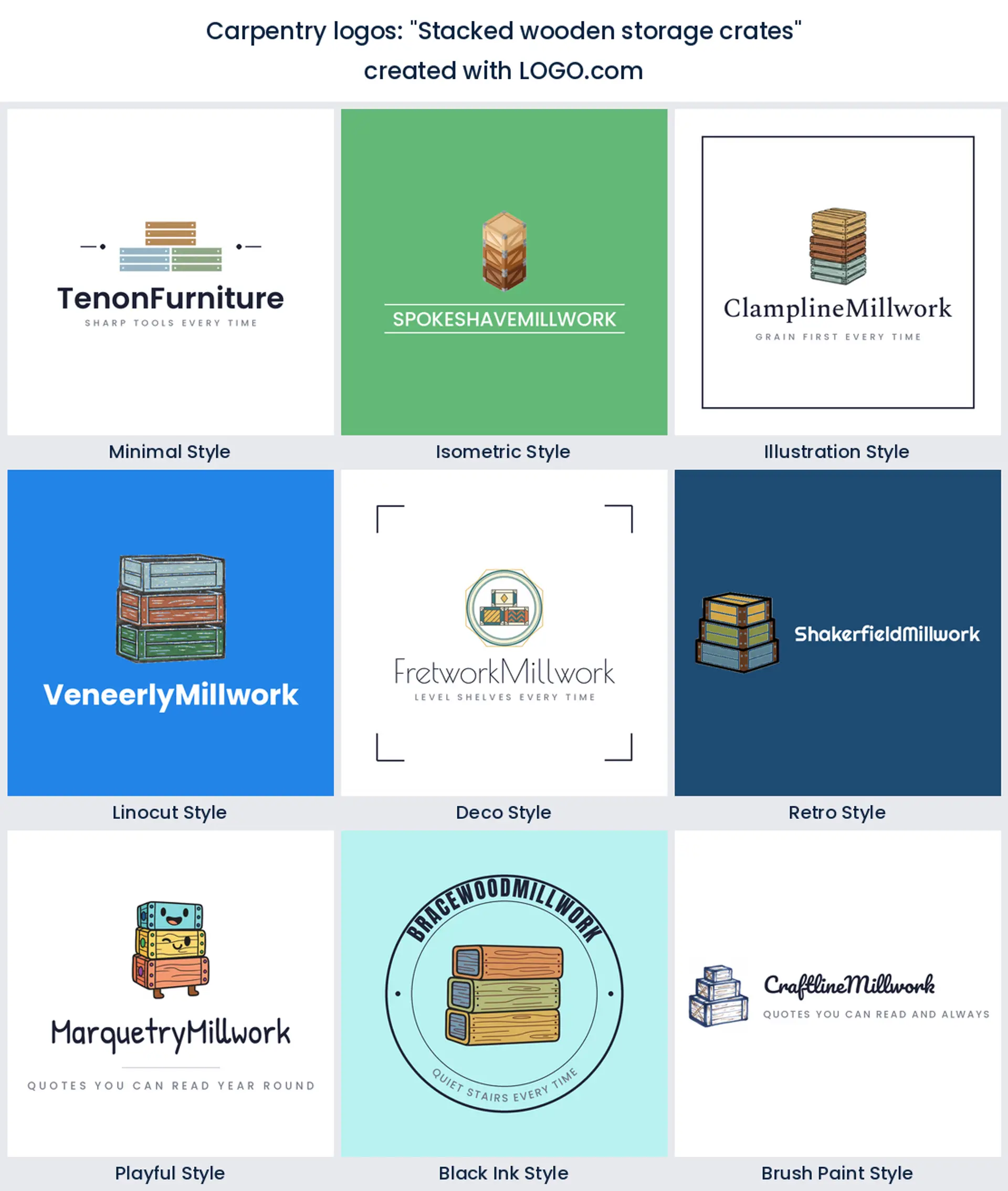
12. "Stacked wooden storage crates"
Crates are humble and a bit nostalgic, and they stack into a shape that fills a square beautifully. Makers who sell at markets, do rustic fit outs, or build storage furniture end up with a warm, approachable timber logo instead of a hard trade badge.
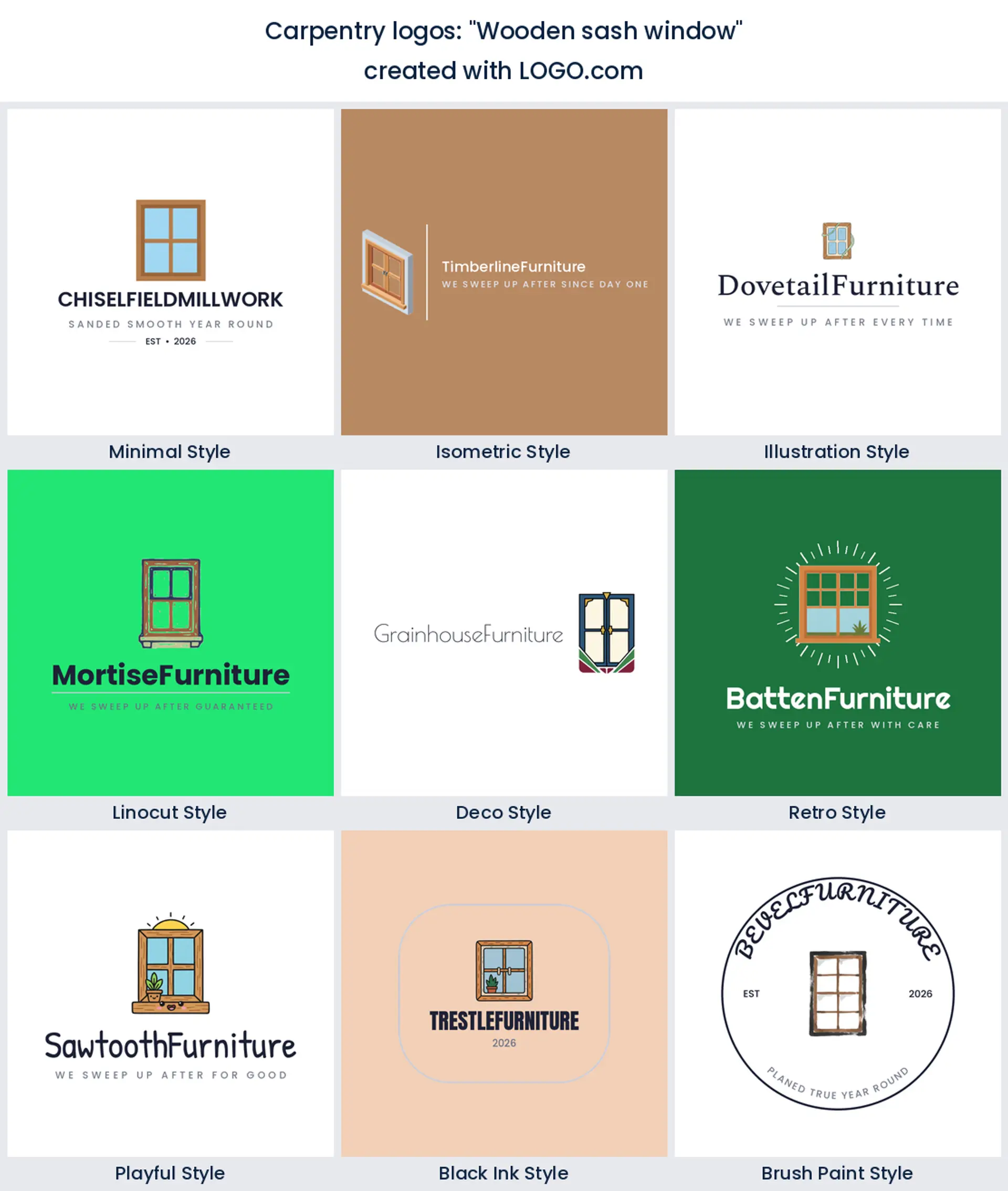
13. "Wooden sash window"
A sash window is a niche within a niche, and that is why it converts. Heritage joiners and box sash restorers compete against general builders who cannot do the work, so saying it in the mark saves you the first phone call. Ideal for a finish carpentry logo with a conservation slant.
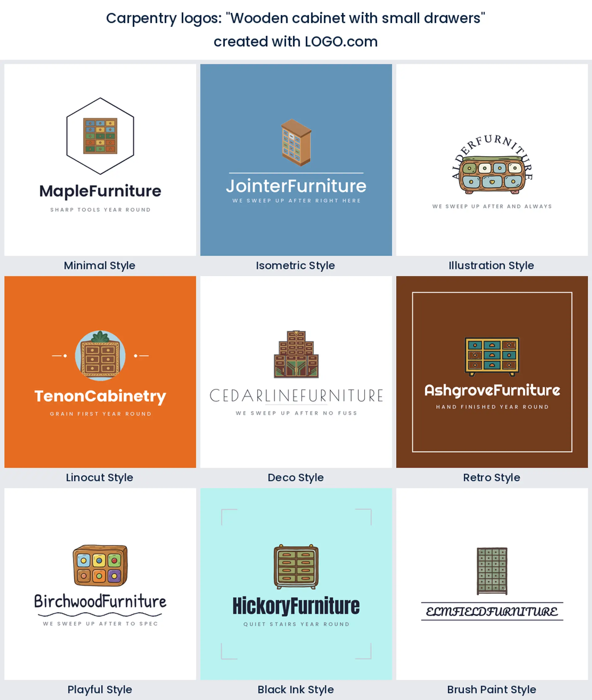
14. "Wooden cabinet with small drawers"
Rows of little drawers give you a grid, and grids read cleanly at any size, including a favicon. There is also something satisfying about the repetition that a single tool never delivers. Fitted kitchen and storage specialists get a tidy carpenter logo design out of it.
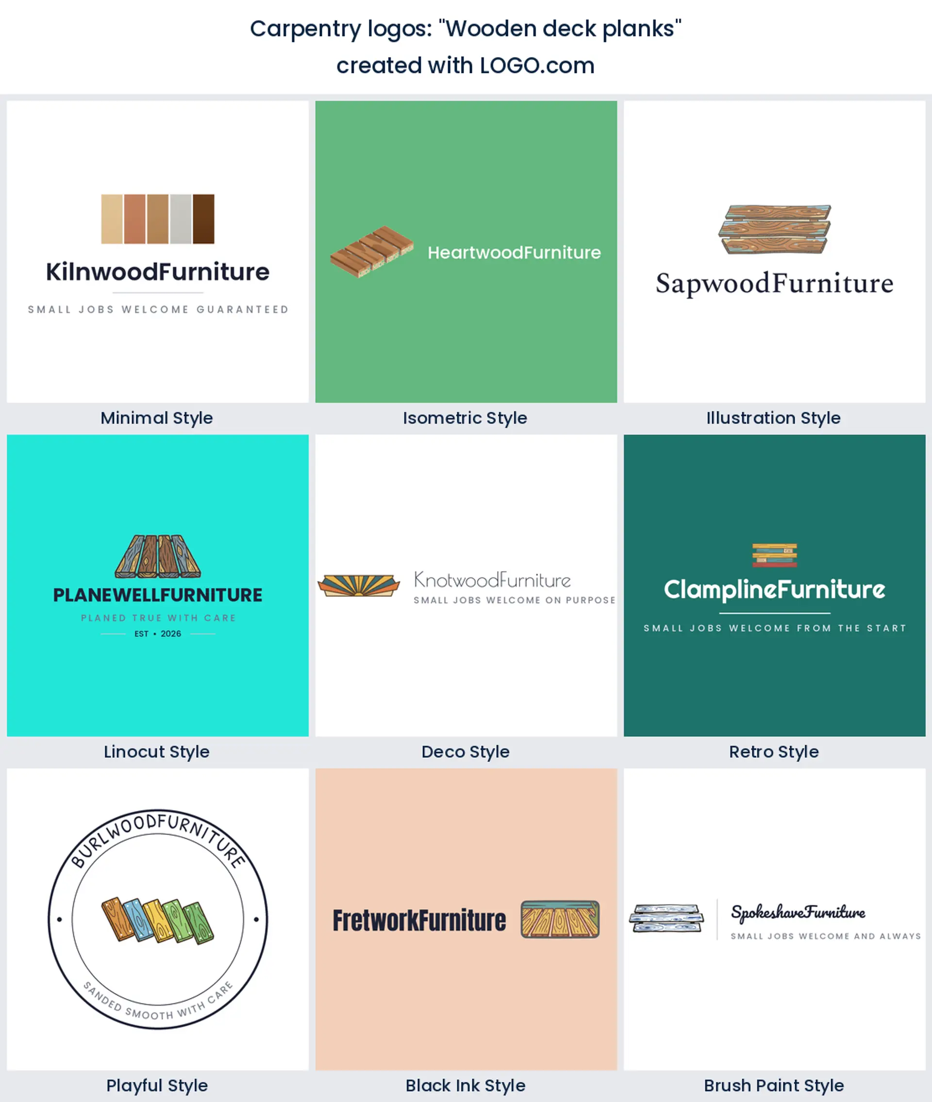
15. "Wooden deck planks"
Boards laid in perspective is the simplest idea here and one of the most useful, because decking is seasonal work that people search for by name. A few parallel lines with a shadow between them is enough to carry a whole outdoor carpentry logo design.
Why rustic and modern woodworking logos are two different searches
People do not search for a woodworking logo and leave it there. They add a word, and the word is almost always rustic or modern. Those two searches want opposite things. A rustic woodworking logo leans on a badge shape, a heavy slab serif, visible texture, and an EST date, and it sells trust in an older skill. A modern woodworking logo strips all of that out: one clean geometric mark, a light sans serif, and plenty of space around it, which reads gallery rather than workshop.
Your palette settles the argument faster than your icon does. In the color palettes carpentry and woodworking founders save on LOGO.com, the two non neutral hues out in front are green and a warm walnut brown, with blue and orange some way behind and white and black doing the base work. Brown with cream pushes you rustic straight away. The same green against charcoal reads current and professional, closer to a joinery studio than a yard. Pick the pair that matches the work you want more of, not the work you already have.
A joint says more about your work than a tool does
Here is something the data quietly shows. Tools dominate the top of the ranking, but joints keep turning up further down, in dovetails, mortises, and interlocking timbers. That is worth paying attention to, because a tool tells people what you own and a joint tells them what you can do. Anyone can buy a hammer. A dovetail in your mark is a claim, and it is a claim your customers can check the moment they open a drawer you made.
The practical catch is legibility. A dovetail drawn with six thin pins turns into a grey smudge at small sizes, so cut it back to three fat ones and let the negative space do the work. Test it as a profile picture before you commit. If the joint still reads at that size, you have a woodwork logo with a genuine story in it rather than another crossed pair of tools.
Can you burn this logo into your own work?
This is the question that separates carpentry from every other trade on our site. Nobody asks a plumber to sign their work, but a carpenter signs the underside of the table. Search volume backs it up, because a wood burning logo and how to burn a logo into wood are both real, steady searches. If you want a branding iron made, or a laser engraver to etch your mark into the end grain, the file has to be a single solid shape in one color. Gradients disappear. Thin outlines char and close up. Any text under about four millimetres will blur into the grain.
So design the stamp version at the same time as the full logo, not two years later. Take the icon on its own, thicken every stroke, drop the wordmark or set it in one heavy weight, and keep the whole thing inside a circle or a square about the size of a coin. On LOGO.com the design and preview are free, and the free download gives you four high resolution PNG files with full commercial use, which covers your socials, your invoices, and a printed site board. The paid Brand Plan adds the vector files, and a vector is exactly what an iron maker, a laser cutter, or a CNC shop will ask you for.
Who signs your invoices decides your icon
Carpentry is four or five trades wearing the same word, and a mark that tries to cover all of them says nothing. Make furniture? A slab, a chair, or a dovetail belongs in your cabinet maker logo, and your buyer is a homeowner choosing between you and a shop. Doing second fix, skirting, doors, and staircases? A plane, a square, or a run of clean mouldings suits a finish carpentry logo, and your buyer is often a builder who just wants the job done neatly.
Framing and roof work sits closer to construction, so a beam and a frame will get you taken more seriously than a chisel will. Milling and selling timber is different again, and a sawmill logo built on stacked logs and rings tells a trade buyer you supply rather than fit. Write down who signs your invoices, then pick the icon that person recognises fastest. That single decision does more for a carpentry logo design than any style choice you make afterwards.
Wood grain is the trap: what happens when the logo shrinks
Grain sits third in our ranking, and it is the element that fails most often in real life. Those flowing lines look wonderful at the top of a website and turn into a solid brown blob on a 32 pixel app tile, an embroidered chest badge, or a stamp on the back of a chair. Fine lines set close together are the first thing any reproduction process loses, whether that is a screen print, a router bit, or a phone screen.
The fix is not to drop the grain, it is to keep two versions from the start. Build the detailed mark for signage and your website, then a stripped version with three or four thick lines for anything small or physical. Print the small one at actual size, hold it at arm's length, and squint. If it still reads as wood, you are fine. If it reads as mud, remove another line and try again. A carpentry logo maker that gives you both versions saves you a redraw later.
Make your carpentry logo with LOGO.com
Type your workshop name, choose the symbol that matches the work you want more of, and pick one of the nine styles on this page. The icon is drawn from scratch around your description, so you are not picking from a shelf of the same clip art every other carpenter used. Preview the whole thing free, download it, and come back to change the color or the mark when the work changes.
Methodology. These figures come from logos created on LOGO.com in the 24 months ending July 2026. The Carpentry, Carpenter, Wood Working and Woodworker industry sample was far too small to rank on its own, so we looked instead at the 422 custom icon descriptions that named wood, timber, lumber, a saw, a chisel or carpentry, sitting alongside the roughly 249 carpentry and woodworking brands built on LOGO.com in the same window. We grouped those descriptions by concept and ranked each concept by how often it appeared. A hammer featured in about 29% of them, a wood plank in about 24%, and wood grain in about 19%. Founders usually name more than one element in a single description, so the shares overlap rather than summing to 100. Figures are rounded to the nearest percentage point. Source: LOGO.com first party product data, July 2026.
THE #1 LOGO GENERATOR
Why LOGO.com is the best carpentry logo maker
1.Built on 422 real carpentry descriptions
The nine symbols here are what founders actually asked for when they made a woodworking logo on LOGO.com, not stock clip art somebody guessed at.
2.A stamp version for the end grain
Keep a bold single color cut of your mark for a branding iron, a laser engraver, or a CNC router, so you can sign the furniture you build.
3.Still legible from the far side of a car park
Check the mark in one flat color at van door size, because that is where most people meet a carpentry business logo for the first time.
4.Survives an embroidered polo
Stitching loses hairline grain lines, so keep a thicker three line version ready for work shirts, caps, and site jackets.
5.Drops onto a photo of the finished piece
Use the transparent file to sit your mark on shots of a fitted kitchen or a live edge table with no white box behind it.
6.One mark for the van, the quote, and the shop
The same logo covers your vehicle, your written quotes, your site board, and the product photos in your online shop.
7.Files your sign maker will accept
The brand kit keeps your colors and fonts in one place so the signwriter, the printer, and the engraver all work from the same thing.
8.Change it when the work changes
Move from second fix into fitted furniture and you can swap the icon or the wordmark without starting a carpentry logo design again.
9.Free to design, yours to trade under
Download four high resolution PNG files free with full commercial use, then add the Brand Plan for the vector files large printing needs.
Carpentry Logo Maker FAQs
Need Inspiration? See example brands in your industry...
3D DesignAcademic WritingAccountantAerospace EngineeringAgricultural ConsultingAgriculture CompanyAmazonAnimal ProtectionAnimationApp DevelopmentAquacultureAromatherapyArt and DesignArtsAsian RestaurantAthleticsAudio TechnicianAuto ManufacturingAuto Repair ServicesBadgeBandBarber ShopBearBeauty and CosmeticsBeeBibleBiotechBitcoinBlogBoatBook PublisherBooks and Literature BlogBrainBuildingBusiness Consulting Logo MakerBusiness StorageCakesCampaignCandlesCarCateringCelebrationsChemicalChildrenChoirCircleCivil EngineeringClothingCoffee ShopColors