Real Estate Logo Maker
Design a real estate logo that looks sharp on your yard signs and business cards.
Need a different logo maker? Try our AI logo generator.
Logos created using LOGO.com
670,000,000
House and key real estate logos
Luxury and trust real estate logos
Friendly and residential real estate logos
Real Estate Logos, Ranked From Real Brand Data
According to LOGO.com data, the most common real estate logo icons are a house (about 58%), a key (about 22%), and a building (about 22%), followed by construction tools, a roof, and a mountain view.
The nine styles below are built from what real estate, property, and investing founders actually described on LOGO.com, so you start from marks people already read as property, not from a blank page. Every idea scales down to a yard sign, a business card, and a small social avatar.
On this page
- The nine symbols that show up most on real estate logos
- Fifteen real estate logo ideas from real founder prompts
- Solo agent, a team, or a brokerage: who is the logo really for?
- A literal house, or a mark that only hints at one?
- Yard signs, business cards, and your headshot: where it has to hold up
- Colors that read trustworthy, and the files agents actually send
- Make your real estate logo with LOGO.com
Before a buyer ever meets you, they have already seen your logo, on the sign staked in a front yard, at the top of a listing flyer, and beside your name in their inbox. That little mark shapes how trustworthy you look before the first showing even happens. We went through the icons that real estate, property, and investing founders described on LOGO.com, ranked the ones that come up most, and turned them into fifteen real estate logo ideas you can recolor and make your own. A house led by a wide margin, in about 58% of everything we read, so that is where we start.
The nine symbols that show up most on real estate logos
When we grouped the 106 custom icon descriptions real estate founders wrote on LOGO.com, one symbol towered over the rest: a house, in about 58% of them, followed by a key and a building at roughly 22% each. Behind those came construction tools, a roof, a mountain view, a growth arrow, a shield, and a gem. Most strong marks lean on one of these and let a clean, readable name do the rest.

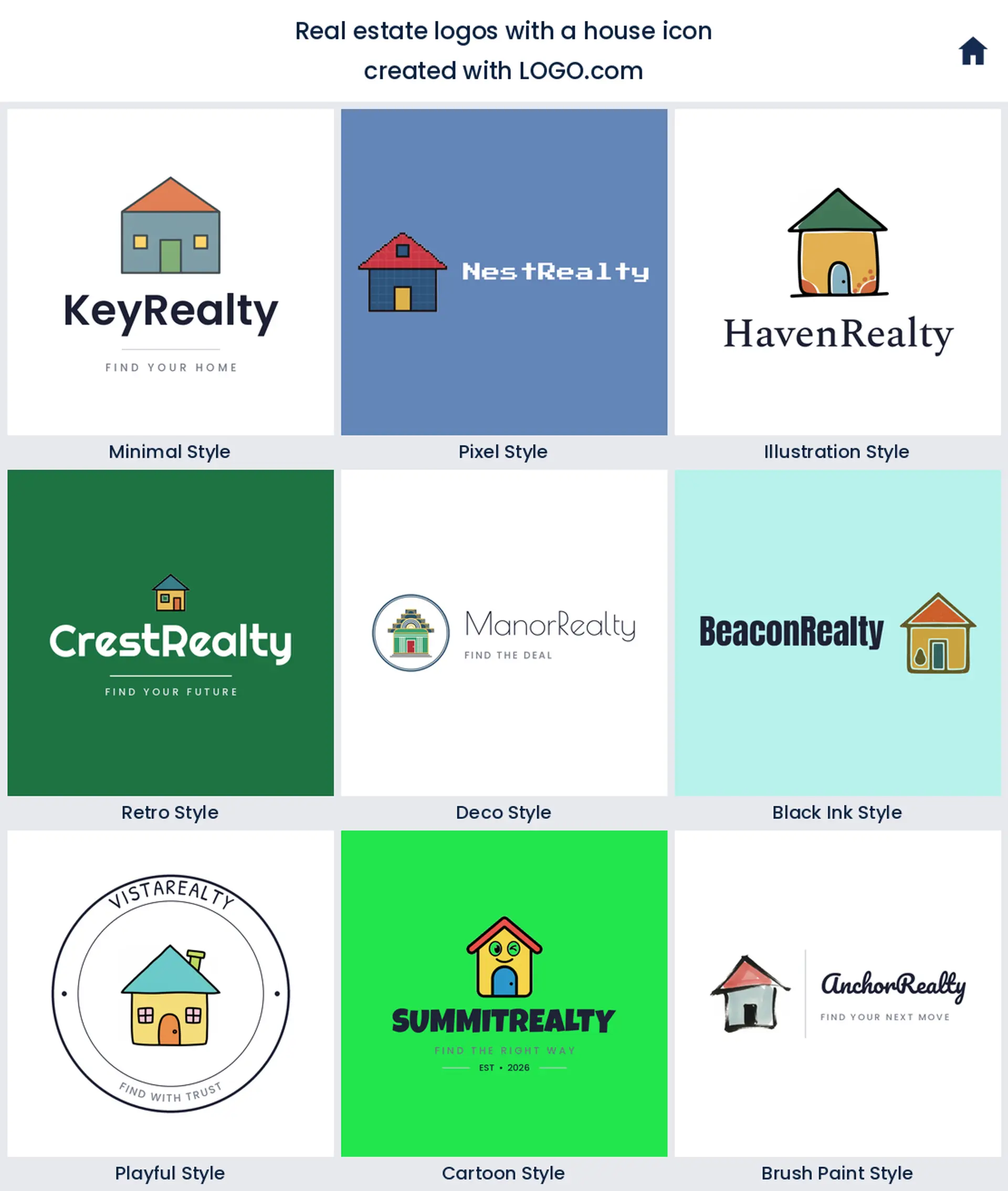
1. House
A house is the whole category in one shape, and the data makes that plain: it turned up in about 58% of the icon descriptions real estate founders wrote, more than every other symbol combined. A simple roofline or a clean home outline tells buyers what you do in an instant, which makes it the safe, obvious starting point for a real estate logo or a house logo.
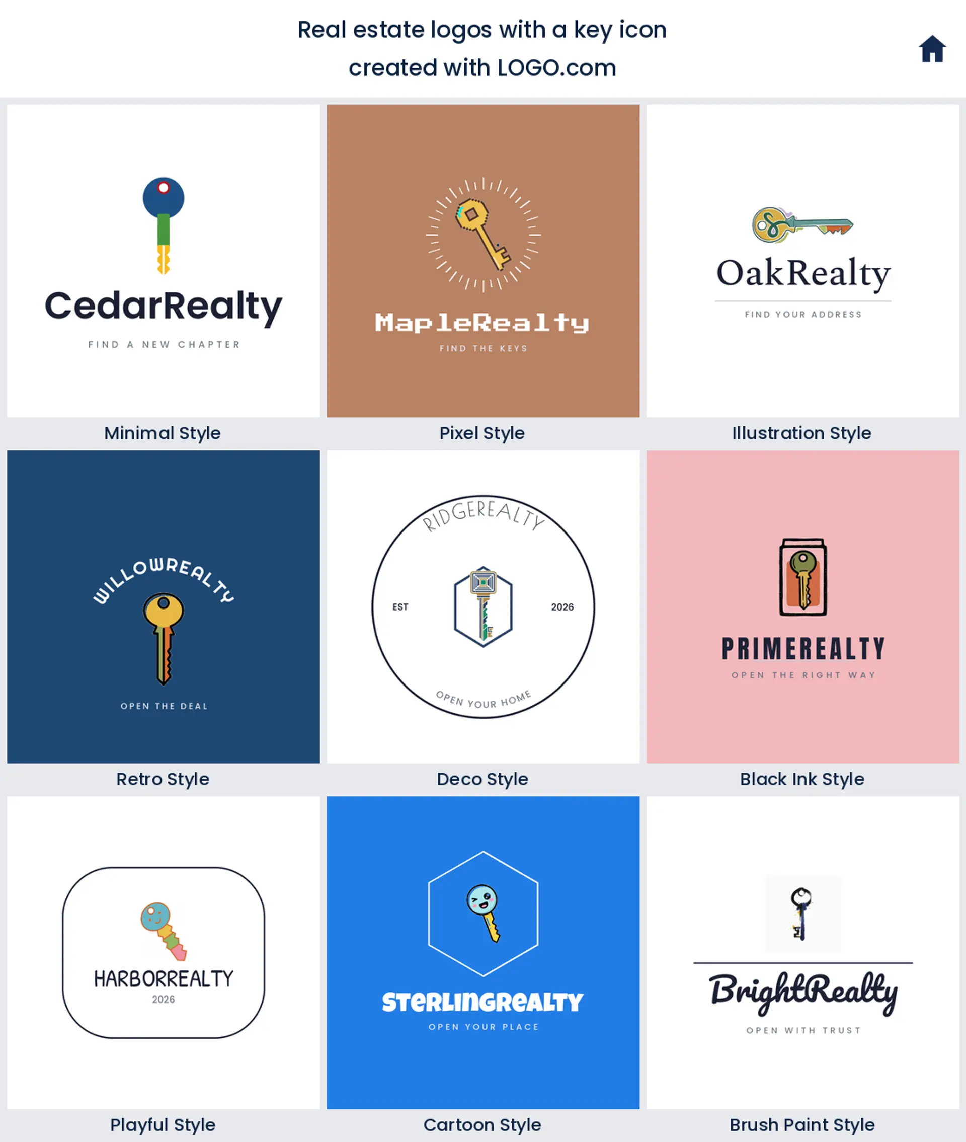
2. Key
In about 22% of the descriptions, founders reached for a key, usually turning in a lock or being handed over. It captures the closing moment of every sale in one warm, aspirational icon, and it makes a memorable realtor logo for an agent who sells the feeling of moving in.
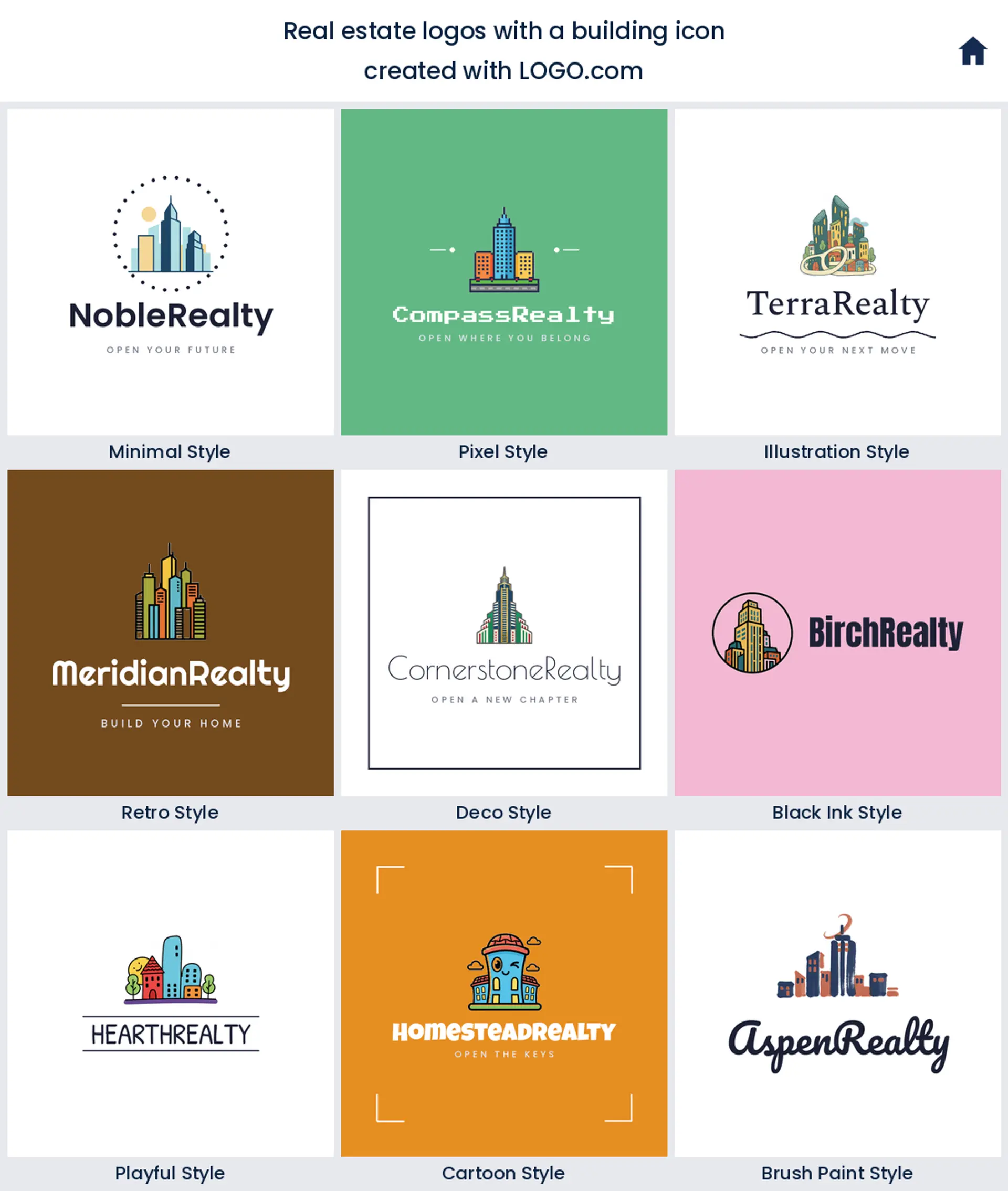
3. Building
Tied with the key at roughly 22% is a building, from a single tower to a small skyline. It reads commercial and established rather than cozy and residential, so it is the natural pick for a property management logo, a developer, or a commercial real estate company logo.
4. Hammer and tools
Just outside the top three, construction tools show up again and again, a hammer, a wrench, or a hammer over a blueprint. They point at building and renovating rather than only listing, which makes them a solid fit for a property developer, a flipper, or a construction leaning real estate logo.
5. Roof
Next comes a roofline on its own, often just the peak of a house cut down to two clean strokes. It is shelter reduced to its simplest shape, and it shines when you want a modern, abstract real estate logo that hints at a home without drawing the whole thing.
6. Mountain and view
Founders who sell location kept describing a mountain or a peak, sometimes with a horizon or a view behind it. It speaks to the setting as much as the property, so it suits vacation, luxury, and destination listings that want a real estate logo built around the view.
7. Growth arrow
An upward arrow, usually paired with a house or a rising bar, appeared for anyone selling growth. It is the mark for investors and appraisers, a clean way to say rising value, and it makes a confident real estate logo for an investing or brokerage brand.
8. Shield
A shield wrapped around a house came from founders who sell trust and protection. It reads secure and dependable, exactly the cue for property management, a home warranty service, or a real estate agent logo built on reliability.
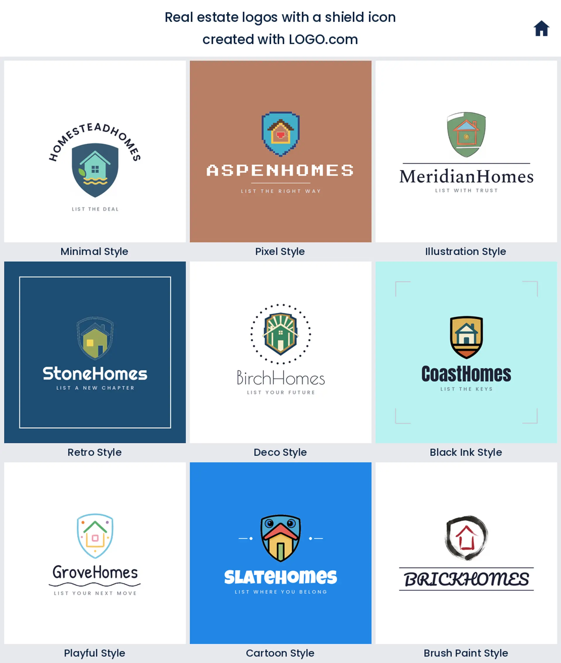
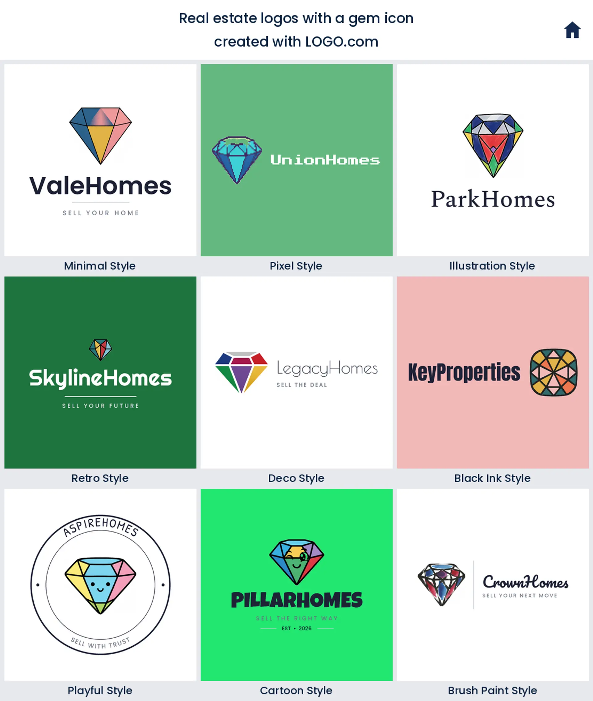
9. Gem
The ninth symbol is a gem or a diamond, the shorthand for premium. Set it beside a house or let it stand alone and you get a luxury real estate logo that signals high end listings without a single word of explanation.
Fifteen real estate logo ideas from real founder prompts
Every idea below is a real description an agent or investor typed into LOGO.com, shown across the nine styles so you can watch the same concept move from clean and minimal to bold and hand drawn. Treat them as starting points, pick the one closest to how you sell, then swap the color, font, and name until it is yours.
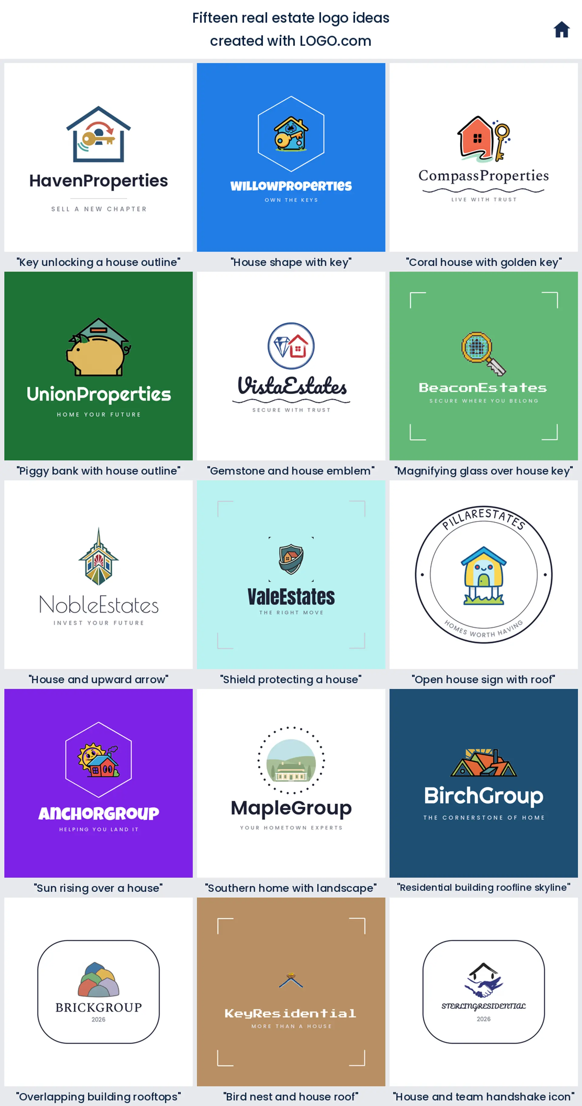
1. "Key unlocking a house outline"
This one puts the whole transaction in a single mark, a key turning in the door of a house. It is friendly and instantly readable, a great start if you want a real estate logo that feels warm rather than corporate.

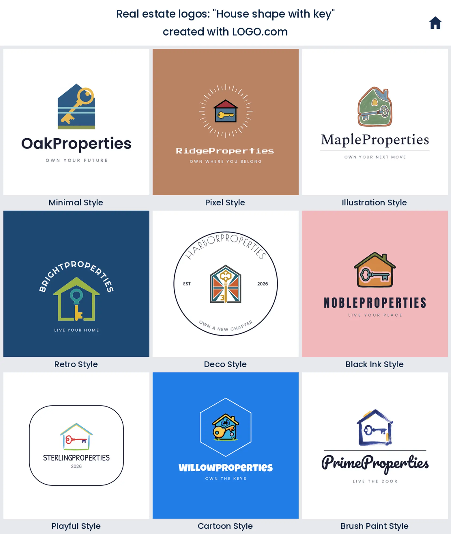
2. "House shape with key"
Here the key sits tucked inside the house itself, so two ideas become one clean shape. It scales down beautifully to an avatar, which makes it a smart house logo for an agent who lives on social media.
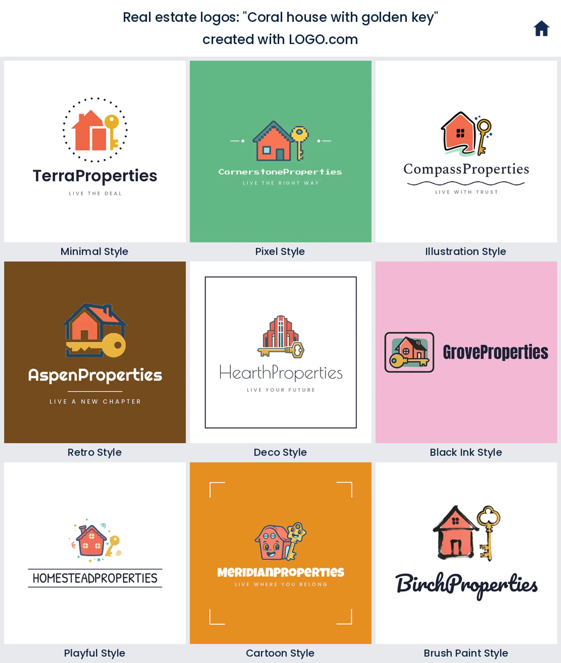
3. "Coral house with golden key"
A coral house with a golden key leans on color to feel boutique and modern. Swap the coral for your own brand shade and you have a distinctive realtor logo that stands apart from the sea of navy and gray signs.
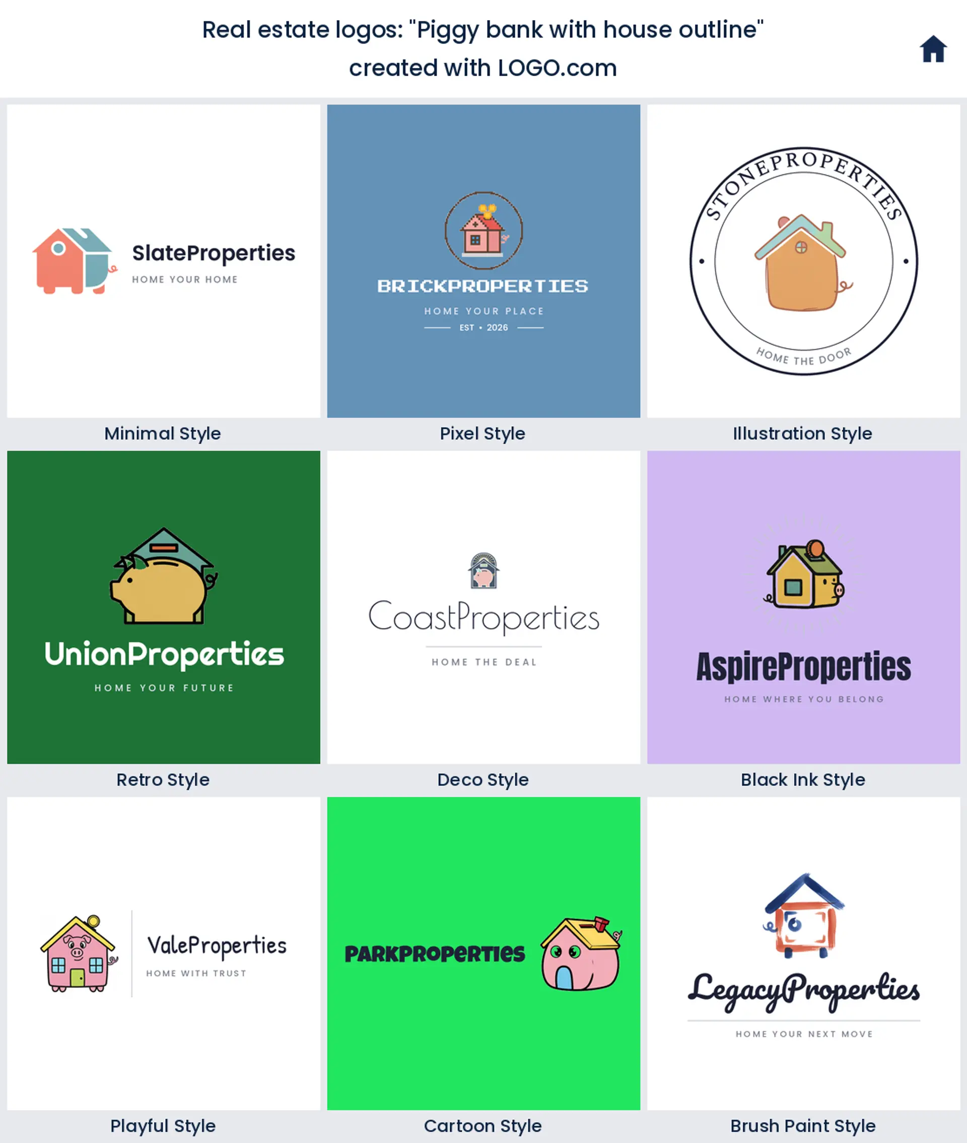
4. "Piggy bank with house outline"
A piggy bank drawn from the outline of a house says saving and investing without spelling it out. It is a playful fit for a first time buyer specialist or an investing brand that wants an approachable real estate logo.
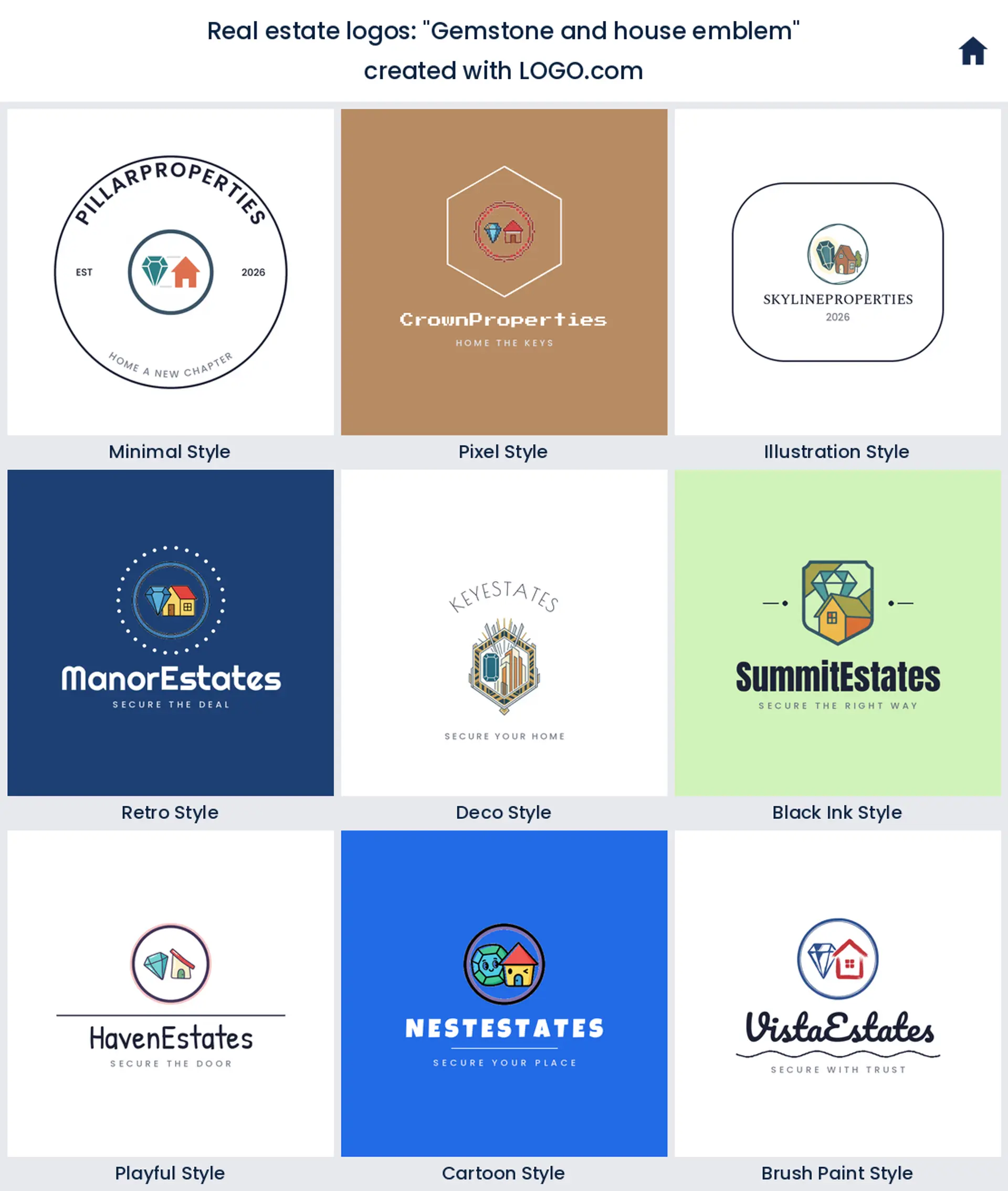
5. "Gemstone and house emblem"
Setting a gemstone beside a house frames property as something precious. It is quiet luxury, ideal for a high end agent chasing real estate logo ideas that whisper premium instead of shouting it.
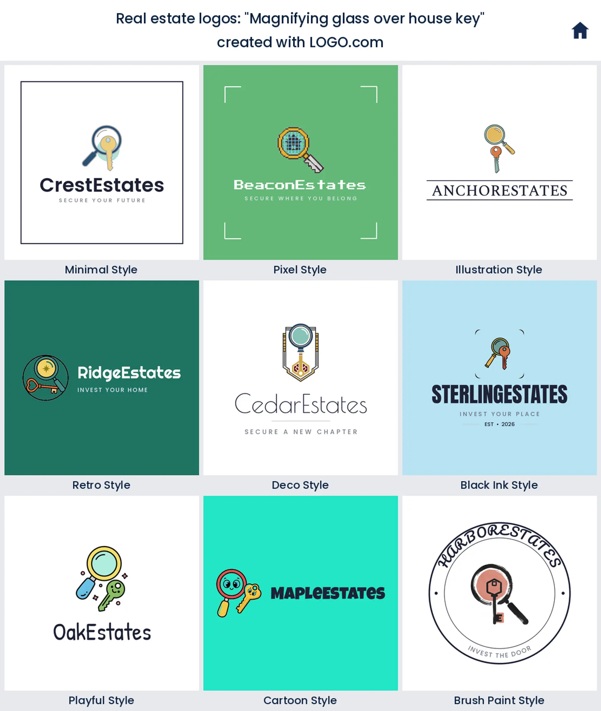
6. "Magnifying glass over house key"
A magnifying glass over a house key points straight at searching and inspecting. It suits a buyer's agent, an inspector, or an appraiser who wants a real estate logo that says we find the right one.
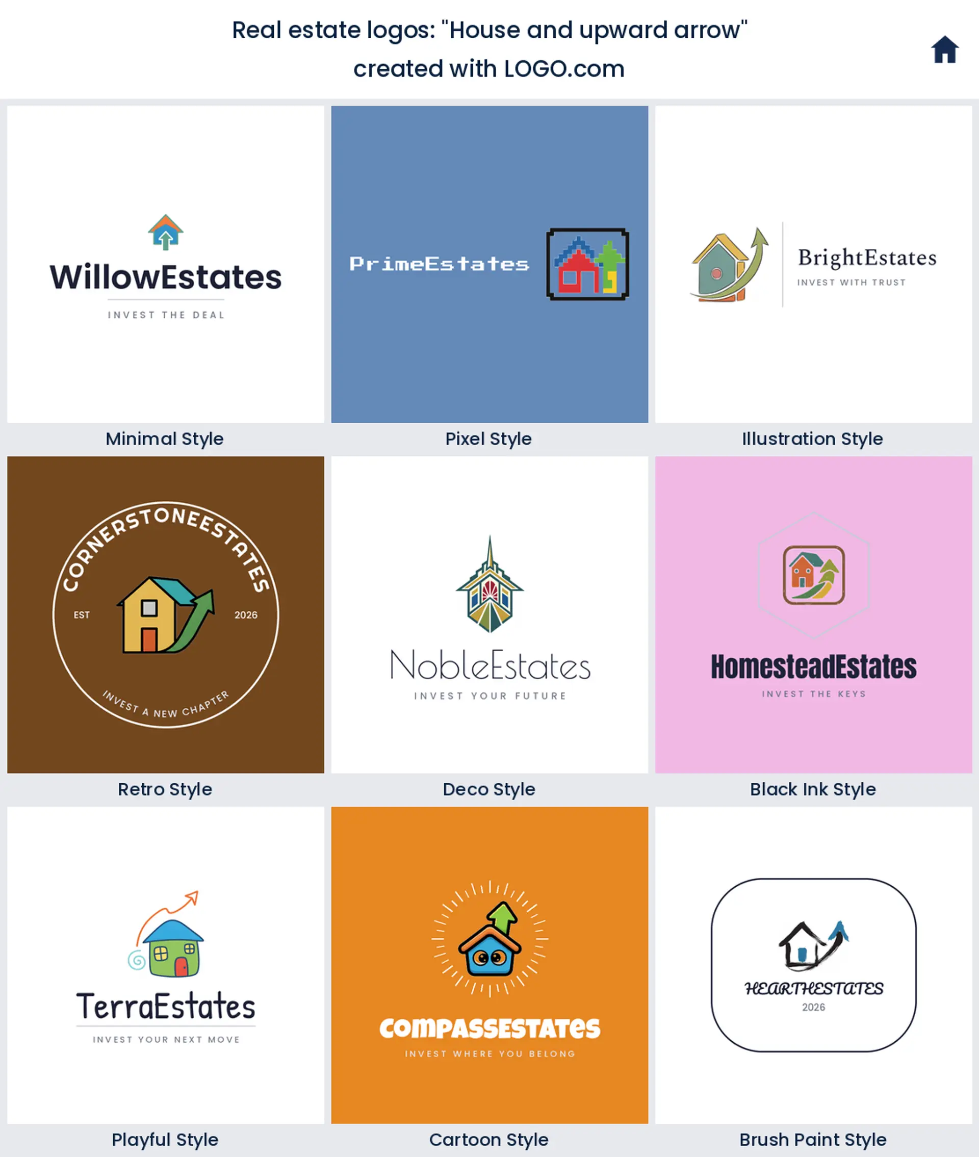
7. "House and upward arrow"
A house paired with an upward arrow is the classic growth cue. It is built for investors, appraisers, and anyone selling rising value, and it lands as a confident real estate logo for a brokerage.
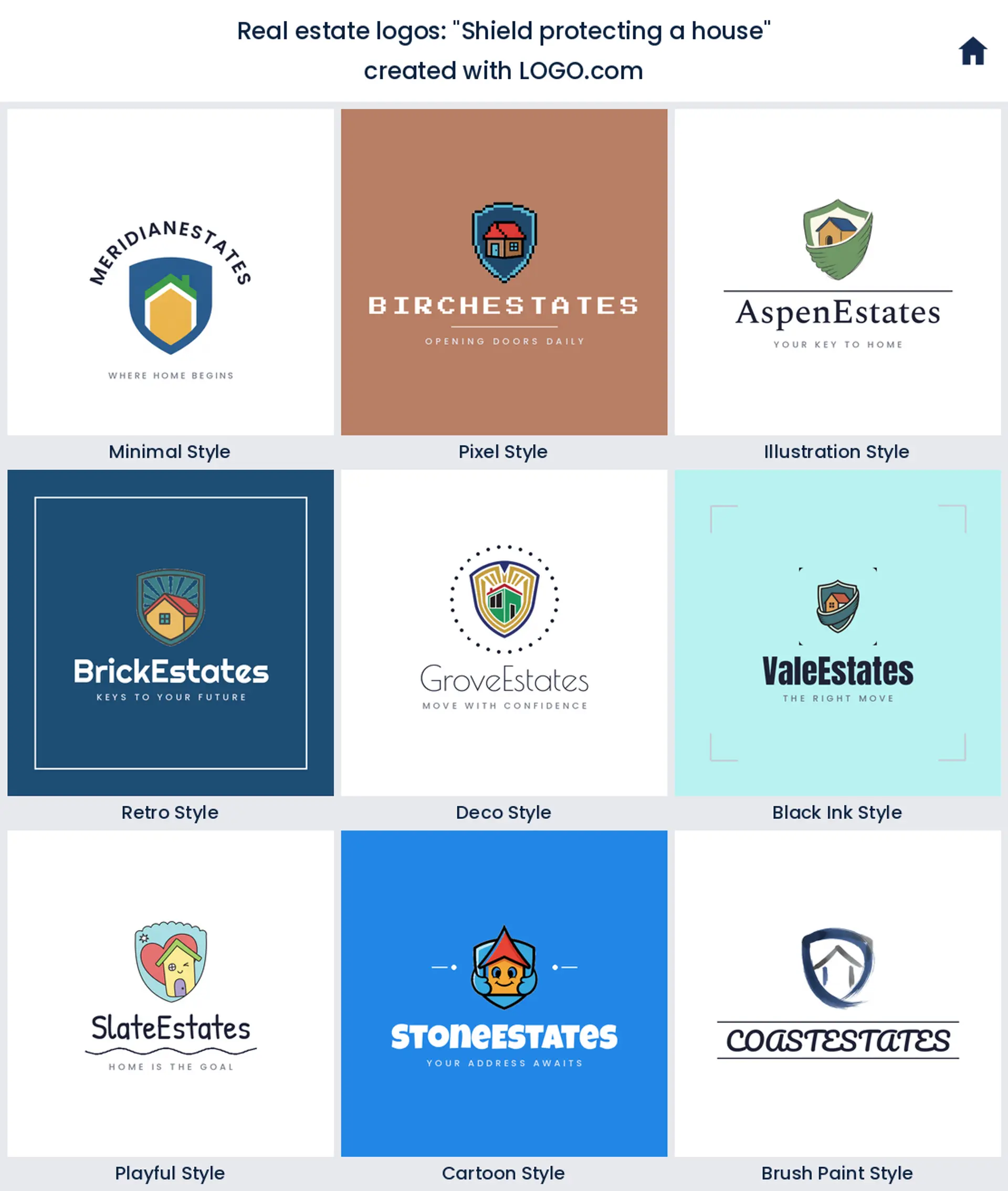
8. "Shield protecting a house"
Wrapping a shield around a house turns the mark into a promise of safety. It is a natural for property management or a home warranty brand that wants a real estate logo built on trust.
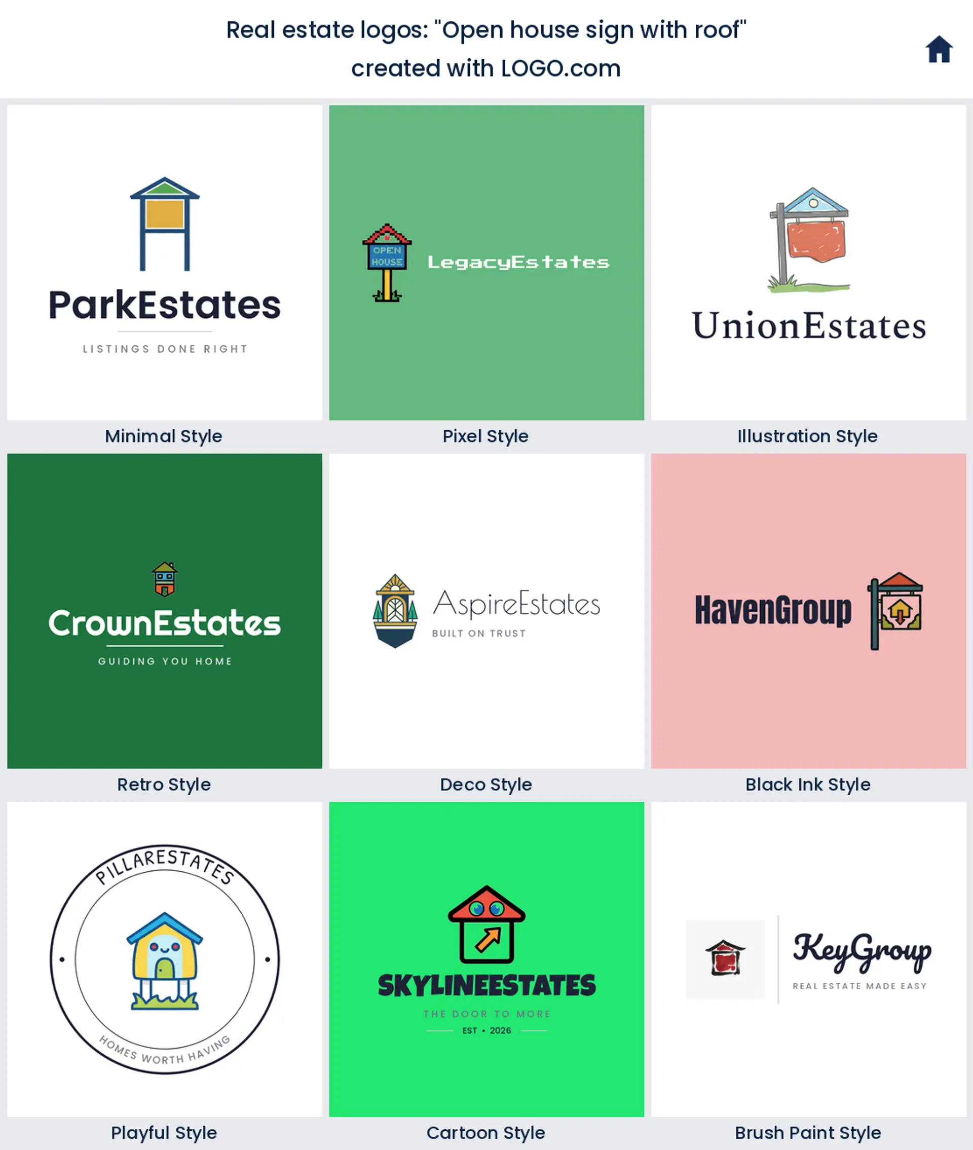
9. "Open house sign with roof"
An open house sign topped with a roof takes the most familiar object in the business and makes it the icon. It is honest and local, a warm pick for an agent who wants a real estate logo people recognize on the corner.
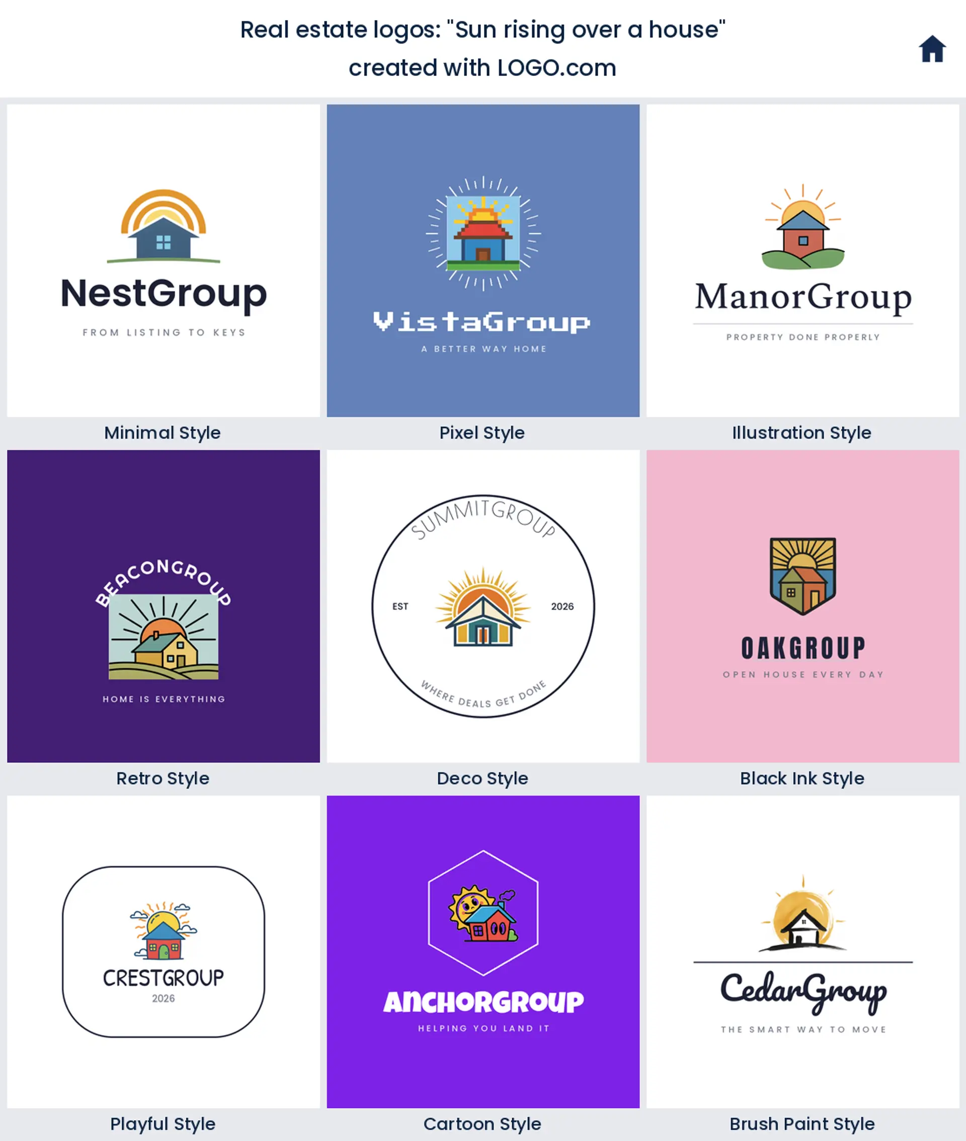
10. "Sun rising over a house"
A sun rising over a house feels like a fresh start, which is exactly what a move is. It reads optimistic and human, a lovely house logo for a family focused agent or a new development.
11. "Southern home with landscape"
A southern style home set in a soft landscape has real character. It suits a regional agent or a heritage brokerage that wants a real estate logo with a sense of place rather than a generic box.

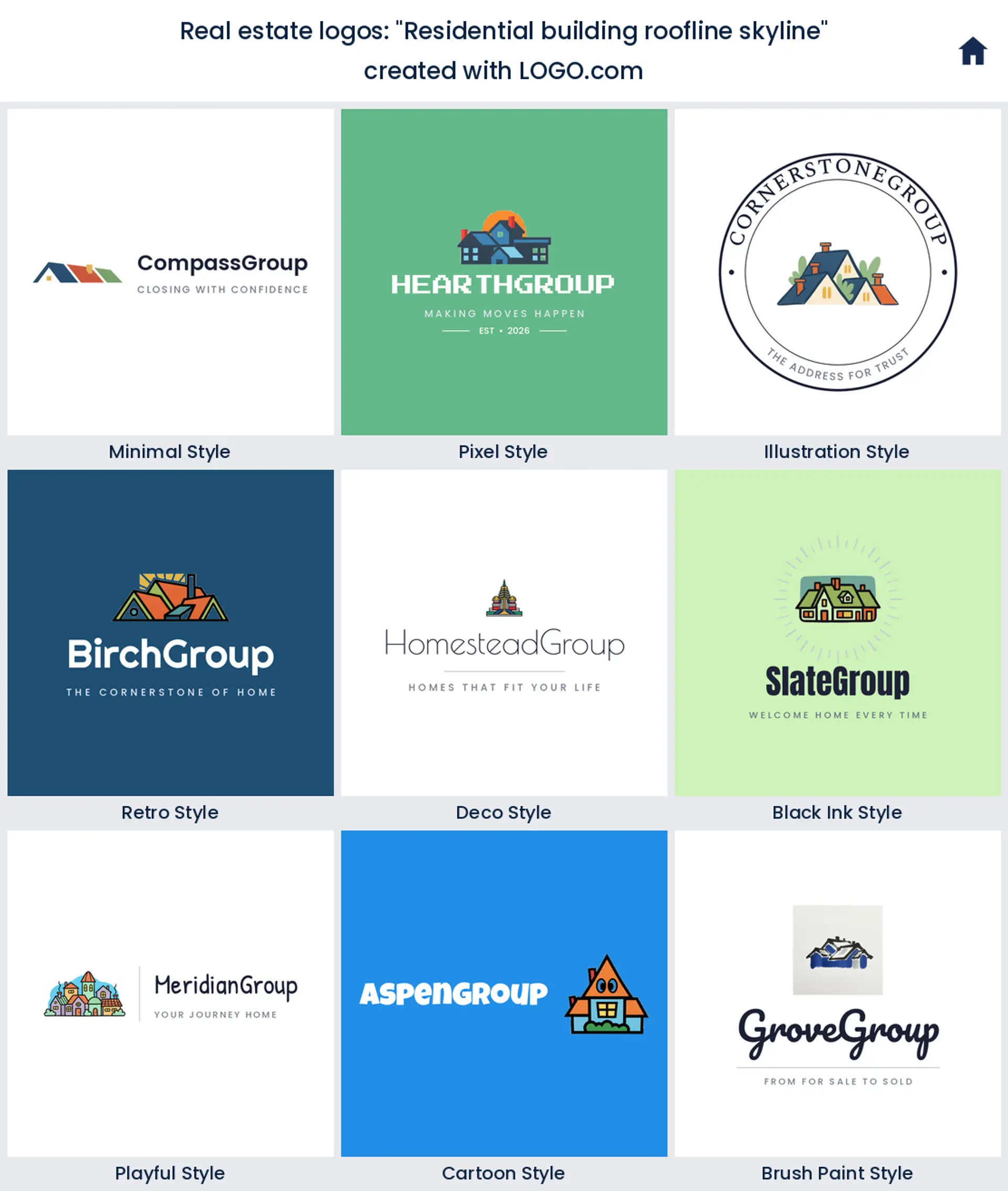
12. "Residential building roofline skyline"
A residential roofline drawn as a small skyline reads urban and modern. It is the right call for a city apartment specialist or a property management logo that needs to feel established.
13. "Overlapping building rooftops"
Overlapping rooftops stacked into one shape hint at a whole neighborhood. It works for a community focused brokerage or a multi family investor who wants a real estate logo about more than a single door.

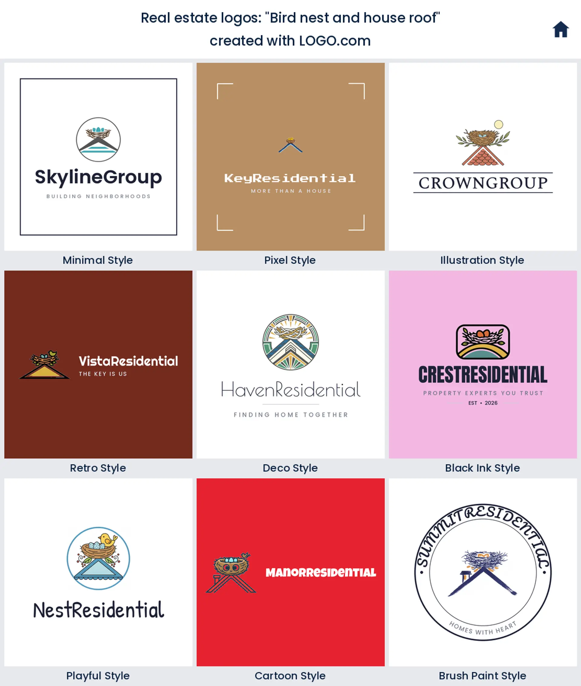
14. "Bird nest and house roof"
A bird nest resting on a roofline is an unexpected, tender take on home. It is a memorable choice for an agent who sells the idea of settling down and wants a real estate logo with a bit of heart.
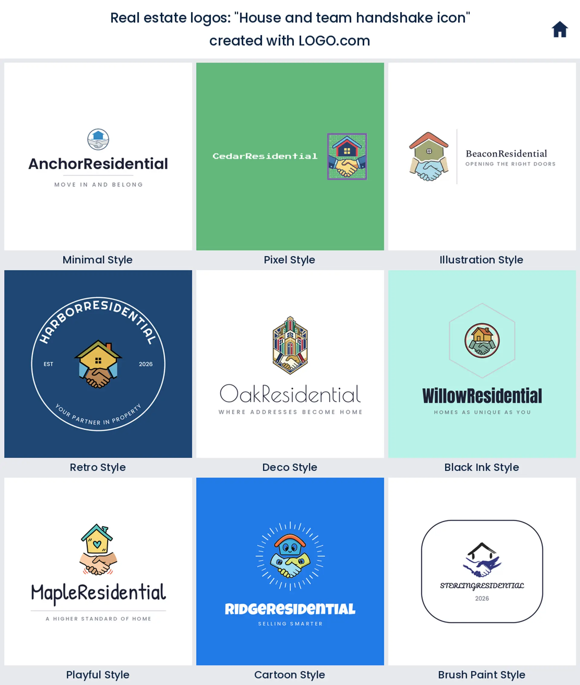
15. "House and team handshake icon"
A house above a team handshake puts the relationship front and center. It is made for a duo or a small team, a real estate agent logo that says you work with people, not just properties.
Solo agent, a team, or a brokerage: who is the logo really for?
Before you pick a symbol, get clear on whose name is on the sign. If you are a solo agent, your logo is really a personal brand, so it can lean on your initials, your headshot, and one simple house or key mark that follows you even if you switch brokerages. Running a team? You want something a little more neutral that a handful of agents can all stand behind, usually a clean emblem plus the team name. And a full brokerage needs a mark that works as the parent brand sitting above individual agents, so keep it confident and uncluttered. Decide who the logo serves first, and the right level of polish falls out of that.
A literal house, or a mark that only hints at one?
House logo searches are enormous for a reason, a literal home is the clearest possible signal of what you sell. But there is a real choice to make here. A literal house or roofline is warm, obvious, and friendly, which is perfect for residential agents and first time buyers. A more abstract mark, a monogram, an arrow, or a single roof stroke, reads modern and premium and keeps a luxury or commercial brand from looking like every other yard sign on the block. If most of your business is family homes, go literal. If you are chasing high end or commercial listings, a subtle hint of a house often does more than the whole drawing.
Yard signs, business cards, and your headshot: where it has to hold up
A real estate logo lives in a few very specific places, and they are less forgiving than they look. The yard sign is the big one, it has to read from a car rolling past at speed, so build the mark around one bold shape and a name you can catch at a glance. Your business card and listing flyers ask the same logo to shrink down cleanly next to your phone number without turning to mush. And because so much of this work is personal, your logo usually sits right beside your headshot, so keep it simple enough that it frames your face instead of fighting it. If a mark survives a yard sign, a business card, and a headshot lockup, it will handle anything else you throw at it.
Colors that read trustworthy, and the files agents actually send
Blue and green quietly run this category. When we looked at the palettes real estate founders picked on LOGO.com, green came out just ahead of blue, with warm browns and a little orange behind them, over the usual black and white bases. That tracks, blue reads professional and trustworthy while green says growth and money, which is exactly what you are selling. A deep navy with a fresh green feels modern and dependable, and a warm gold or bronze accent nudges the whole thing toward luxury. Steer clear of the loud bargain red that screams discount, and you will look more like the agent people trust with the biggest purchase of their life.
Then there are the files you actually send. A transparent real estate logo png is the one you will reach for most, it drops onto a listing flyer, an email signature, or a photo of the property with no white box wrecking the layout. Keep a solid background version too for a social profile picture where you want the fill. Designing and previewing your logo is free, and you can download a high resolution PNG with full commercial use at no cost, so it is ready for signs, cards, and listings right away. When you need to print big, the Brand Plan adds vector files for large yard signs and banners, plus unlimited edits and a full brand kit.
Make your real estate logo with LOGO.com
Pick the symbol that matches how you sell, choose one of nine styles, and our real estate logo maker builds the rest around your name. Preview it free, then download a finished logo ready for your signs, your cards, and every listing in minutes.
Methodology. These figures come from logos created on LOGO.com during the 12 months ending June 2026. We looked at roughly 1,300 brands whose founders selected a real estate, property, or investing related industry, along with the 106 custom icon descriptions those founders wrote, then grouped the descriptions by concept, for example a house, a key, or a building, and ranked each by how often it appeared. A house was by far the most common at about 58%, followed by a key and a building at about 22% each. Real estate is a broad field spanning agents, brokerages, property managers, and investors, so read the ranking as a directional guide to what founders reach for rather than a precise share. Figures are rounded to the nearest percentage point. Source: LOGO.com first party product data, June 2026.
THE #1 LOGO GENERATOR
Why LOGO.com is the best real estate logo maker
1.Icons taken from real agent prompts
Marks based on what real estate, property, and investing founders actually described on LOGO.com, so your logo starts from what buyers already read as property.
2.Reads on a sign staked across the yard
A bold icon and a clear name that hold up on a yard sign seen from a passing car, not a busy scene that blurs the moment it is planted in the grass.
3.Transparent files for flyers and listings
A transparent real estate logo png drops onto a listing flyer, an email signature, or a photo of the property with no white box breaking the layout.
4.One mark for the sign, the card, and your headshot
A single clean logo that works on a yard sign, a business card, an email signature, and right beside your headshot without redrawing anything.
5.Multi color or one color, your choice
A full color mark for your site and signs, plus a clean one color version for embossing, engraving, and a stamp on a contract.
6.Nine styles, luxe emblem to friendly house
Try the same idea as a premium monogram crest and as a warm, friendly house mark, then keep whichever fits the clients you want.
7.One brand kit across every listing
Matching colors, fonts, and marks across your signs, cards, flyers, and website so every listing looks like it comes from the same trusted name.
8.Grows from solo agent to full brokerage
Edit your logo as you add agents and offices, so a single agent and a full brokerage can share one consistent brand.
9.Free to design, yours to sell with
Download a high resolution PNG for free with full commercial use, ready for signs and cards, with vector files for large banners on the Brand Plan.
Real Estate Logo Maker FAQs
Explore more logo ideas
3DAcademic EducationAccommodationAdvertising AgencyAffordableAgriculture BlogAlternative MedicineAnimal BlogAnimalsApartmentAppraisal ServicesAriesArtArtistArts EducationAstrologyAudio ServicesAuto DealershipAuto Rental AgencyBBQBakeryBanking ServicesBaseball TeamBeauty SalonBed & BreakfastBettingBioinformaticsBirdBlock Letter Logo MakerBlurbBookBooks and LiteratureBoxBuilderBurgerBusiness Services and ConsultingCBDCameraCancerCannabisCardsCatCattleCharityChild CareChocolateCinemaCityClevverCloud