Gym Logo Maker
Design a gym logo that works on your signage and your training hoodies.
Need a different logo maker? Try our AI logo generator.
Logos created using LOGO.com
670,000,000
Garage gym and barbell club logos
Powerlifting and 24 hour gym logos
Gym apparel and mascot logos
Gym Logos, Ranked From Real Founder Prompts
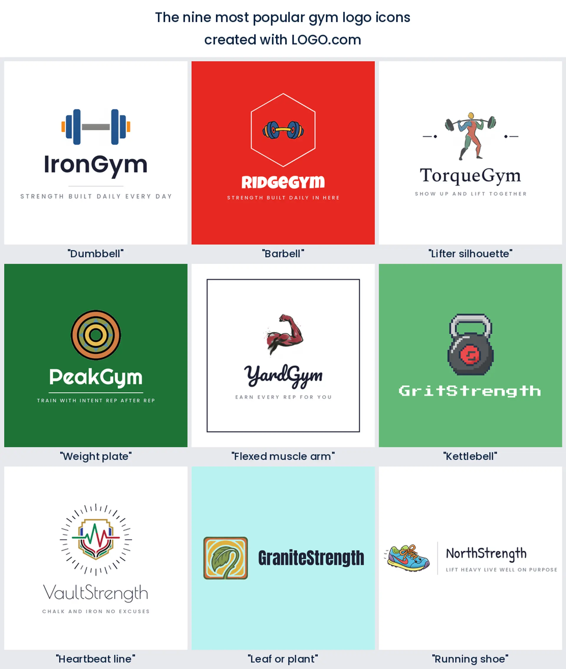
According to LOGO.com data, a dumbbell appears in about 76% of the 445 gym logo descriptions founders wrote in the past year, well ahead of a barbell at about 22% and a lifter silhouette at about 12%.
All nine of those symbols and fifteen real founder prompts are laid out below across the nine LOGO.com styles, so you can see what a barbell logo, a crossfit logo, and a full gym logo design look like before you commit to one.
On this page
- Dumbbell, barbell, or kettlebell? Here is what gym founders picked
- Steal one of these fifteen gym logo ideas
- A crossfit logo and a powerlifting logo are not the same animal
- After hours the sign is the only thing working
- Will it survive a screen print on a hoodie?
- Why so many new gyms dropped black and red
- Signage, hoodies, and when you need vector files
- Make your gym logo with LOGO.com
Walk into any gym and count the logos in the room. The one on the door, the one stencilled on the wall, the one across the back of every hoodie. Now count how many of them are built around a dumbbell. When 234 founders described the icon they wanted for a gym logo on LOGO.com, they wrote 445 descriptions between them, and roughly three in four had a dumbbell somewhere inside. The nine symbols below are ranked by how often founders reached for them, followed by fifteen prompts they typed word for word, rendered across all nine styles.
Dumbbell, barbell, or kettlebell? Here is what gym founders picked
We read the 445 icon descriptions gym founders wrote on LOGO.com over the past year, the ones where somebody asked for a dumbbell, a barbell, or a kettlebell, then counted everything else they put beside the iron. A dumbbell turns up in about 76% of them, a barbell in about 22%, and a lifting figure in about 12%. Plenty of founders name two or three things in one breath, so those shares overlap rather than adding up to 100. Here is the full nine, in order.
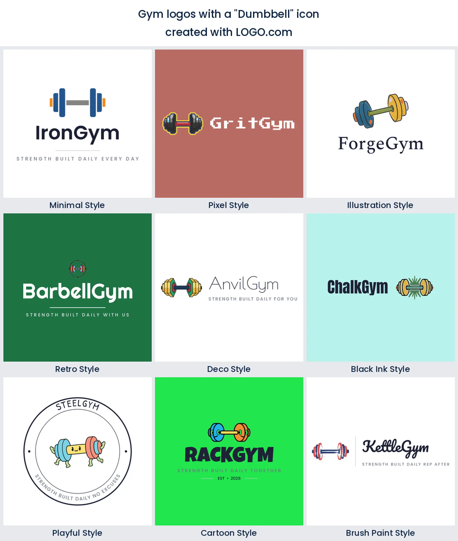
1. Dumbbell
Three in four descriptions have a dumbbell in them, which makes it the most reached for shape in the whole sample by a distance. Two bells and a bar read as training at any size, and the silhouette survives being etched into a glass door or shrunk onto a membership card. If you want the most instantly understood mark on the street, start with a dumbbell logo.
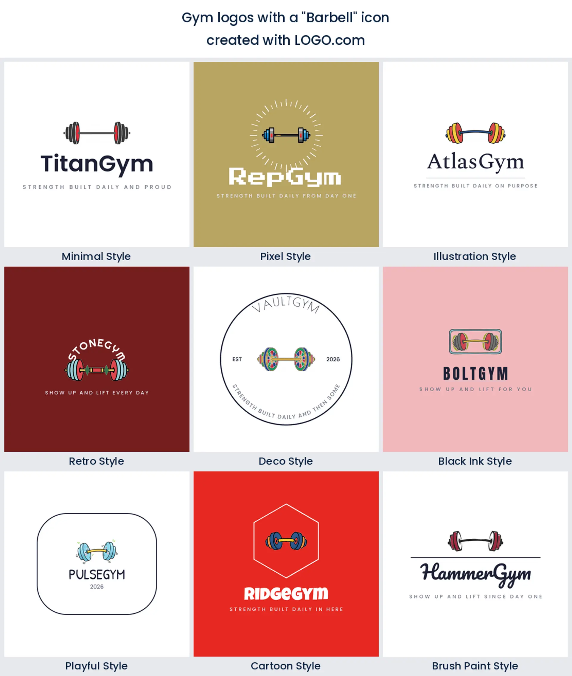
2. Barbell
The bar comes second, in roughly 22% of what founders wrote, and it carries a different message. A loaded barbell says heavy, coached, and serious, not circuit class. Reach for it when you want a barbell logo for a club built around the big lifts rather than a general floor.
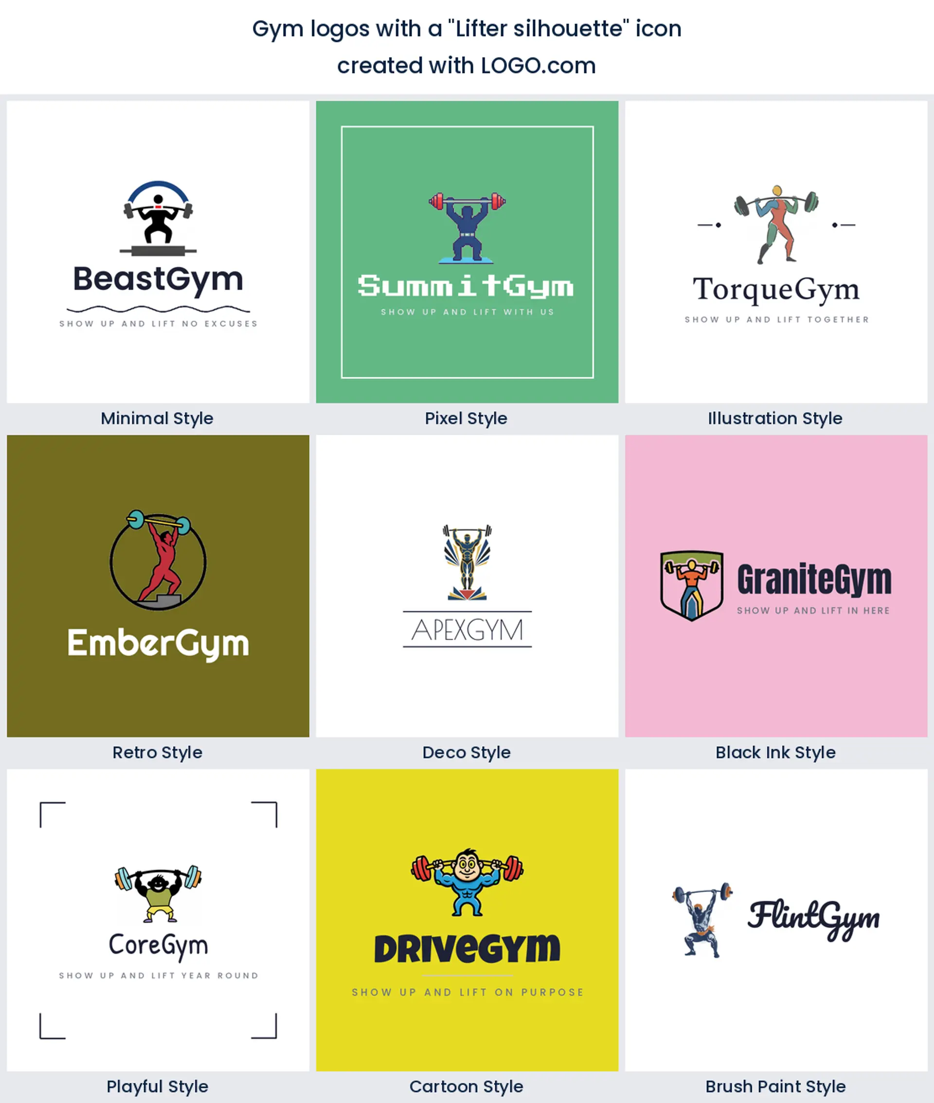
3. Lifter silhouette
In about 12% of the descriptions there is a person in the mark, caught mid pull or mid press. Putting a body in there makes the logo about the member instead of the equipment, which warms up a hard room. It is a good base for a weightlifting logo or a coaching led gym.
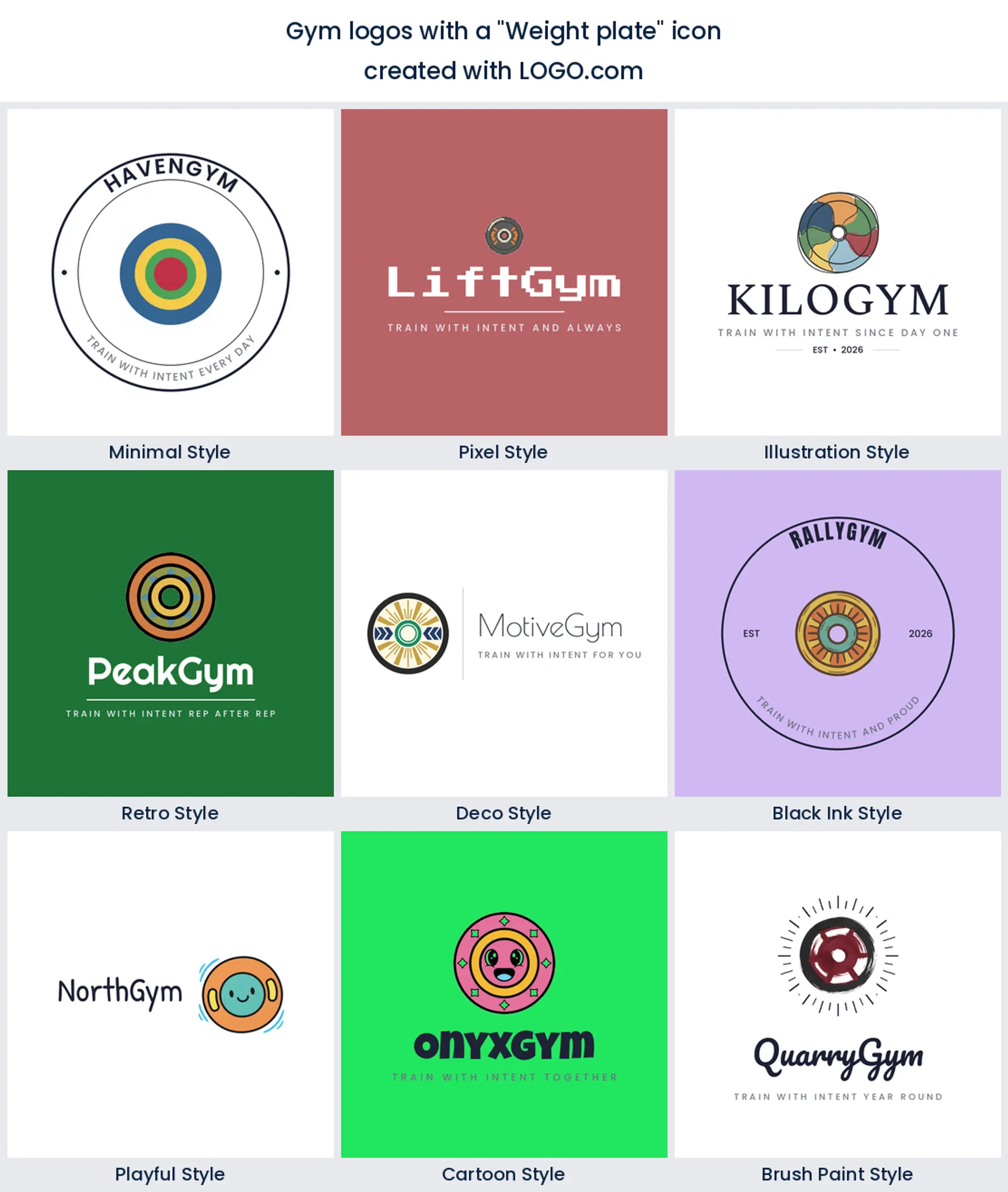
4. Weight plate
Fourth on the list is the plate on its own, no bar attached. A single disc is the most geometric thing here, so it drops into a circular badge better than anything else on the page. That makes it a tidy base for a modern gym logo design that has to hold up inside an app icon.
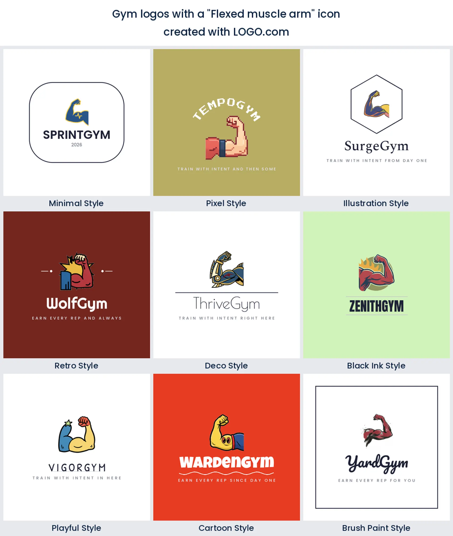
5. Flexed muscle arm
Halfway down the list the flexed arm turns up, which is lower than most people would guess given how much fitness branding leans on it. Inside a gym crowd it is almost too familiar. Use it when you want a loud, slightly retro gym logo and you are happy to lean into the classic on purpose.
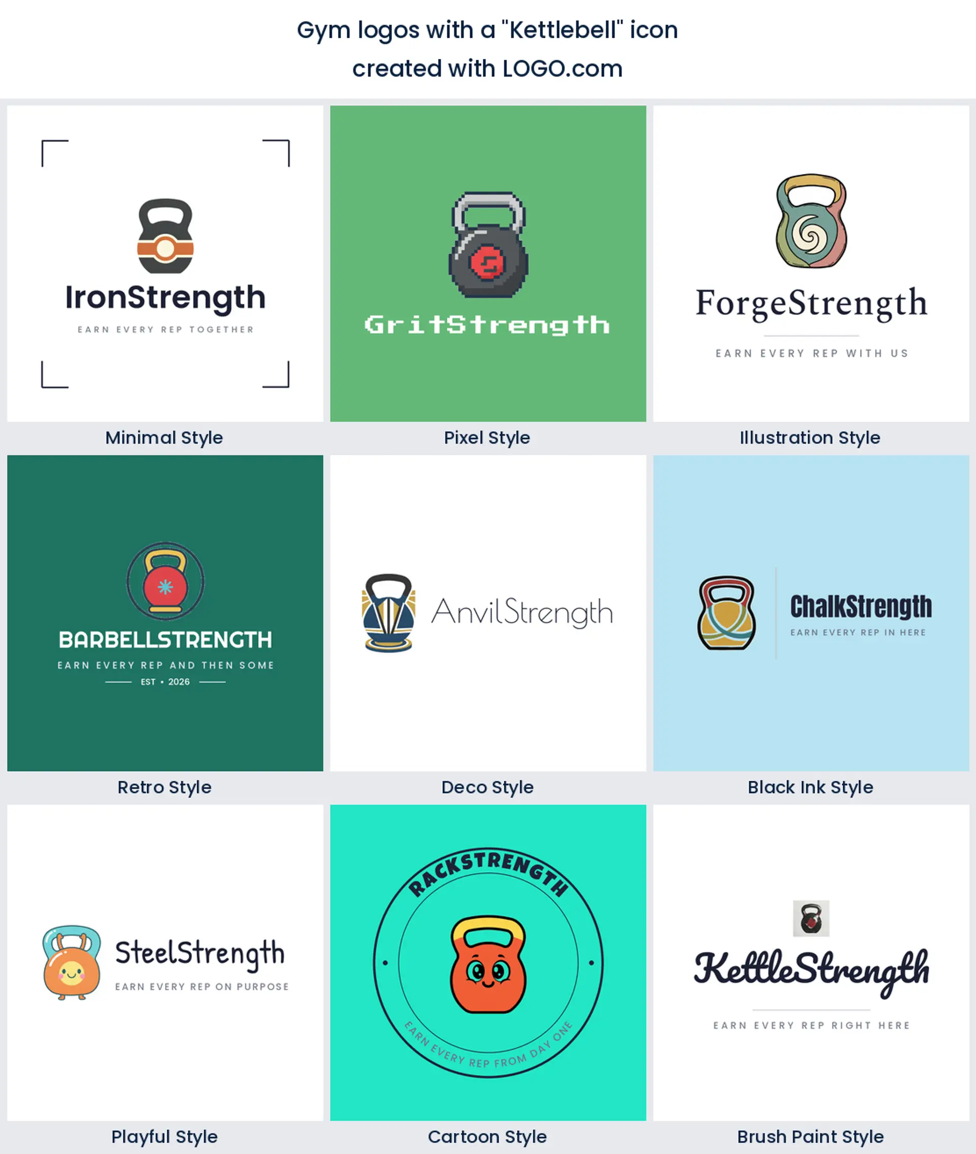
6. Kettlebell
Kettlebells are the underrated pick of this group, sixth by count. One handle and one round body give you a silhouette nobody mistakes for anything else, which is exactly what a crossfit logo or a functional training box wants on its wall.
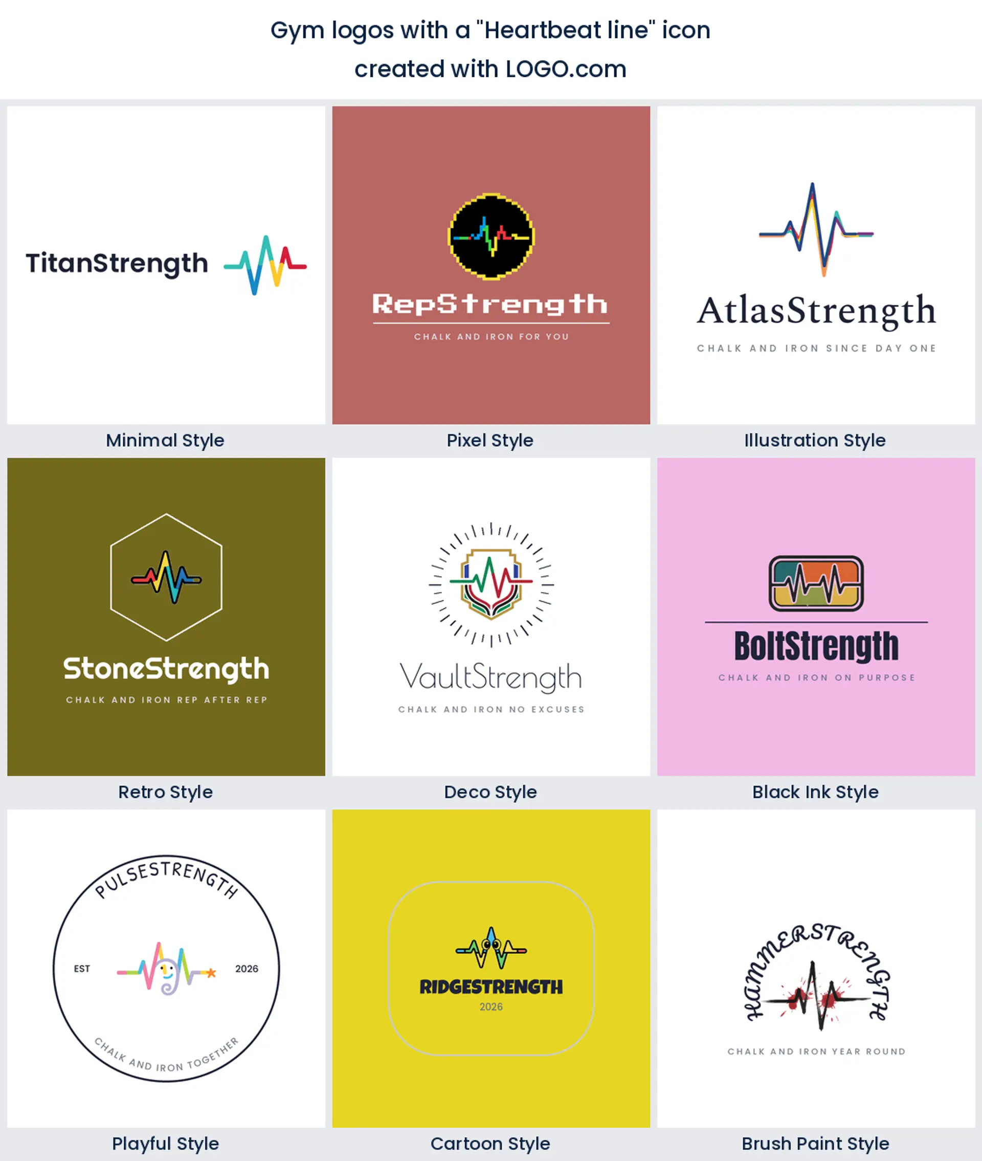
7. Heartbeat line
Seventh is the heartbeat line, threading through a bell or running under the name. It brings health into a room that usually sells strength, so it suits a gym logo for a place with recovery, classes, and a members app rather than iron alone.
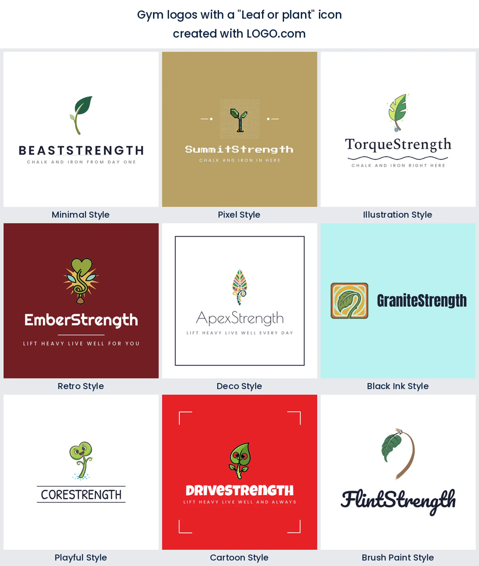
8. Leaf or plant
A leaf or a growing shoot appears more often than gym owners expect, taking eighth place. Green next to steel says recovery, daylight, and clean eating in one move. Try it if you are after a boutique gym or wellness studio logo.
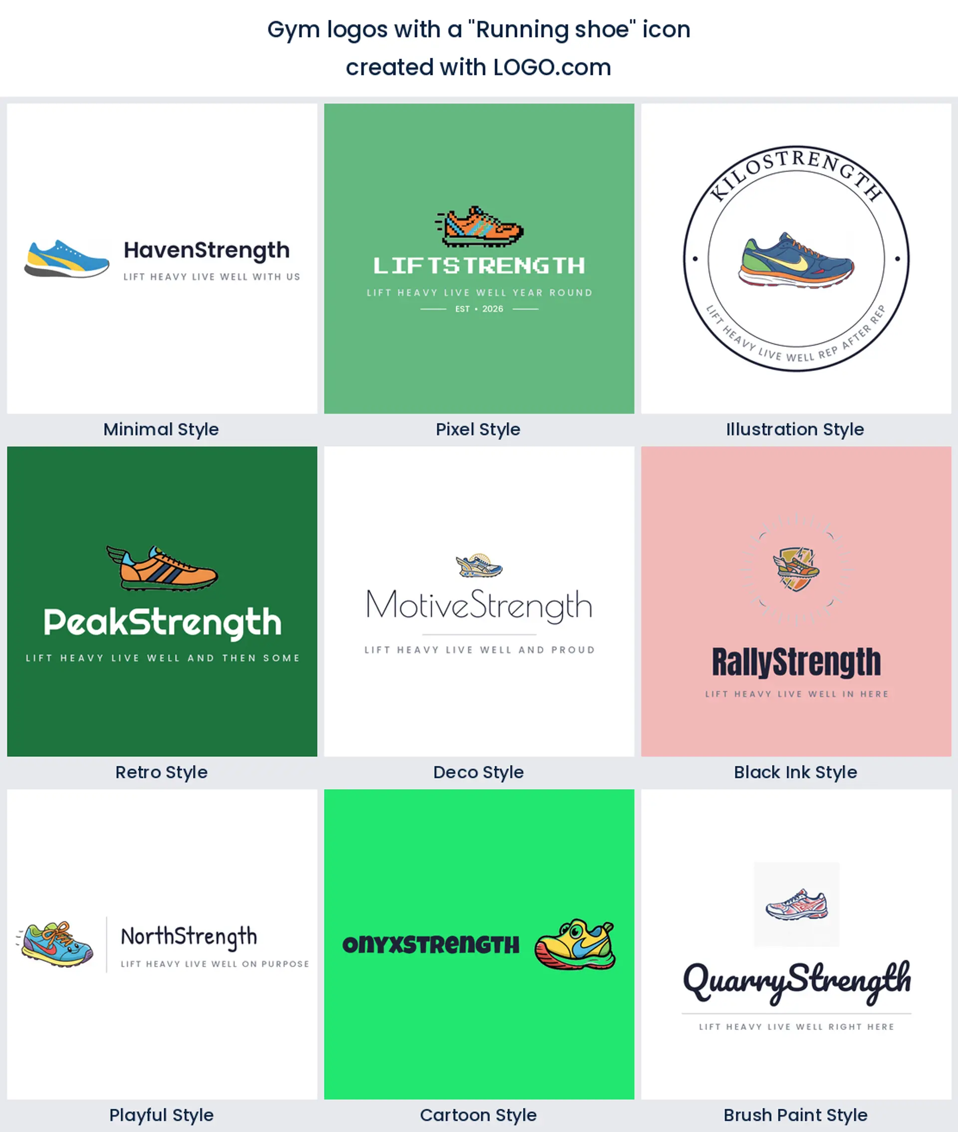
9. Running shoe
The running shoe closes the list, nearly always paired with a bell to say we do cardio too. It is the clearest way to tell people you run a full floor and not a barbell only room, so it works for a fitness gym logo that has to cover everything.
Steal one of these fifteen gym logo ideas
Every heading below is a prompt somebody actually typed into LOGO.com while building their own gym logo. We ran each one through all nine styles so you can watch a single idea travel from a clean minimal mark to a heavy retro badge. Type one in word for word, or change one element in it and it is yours.
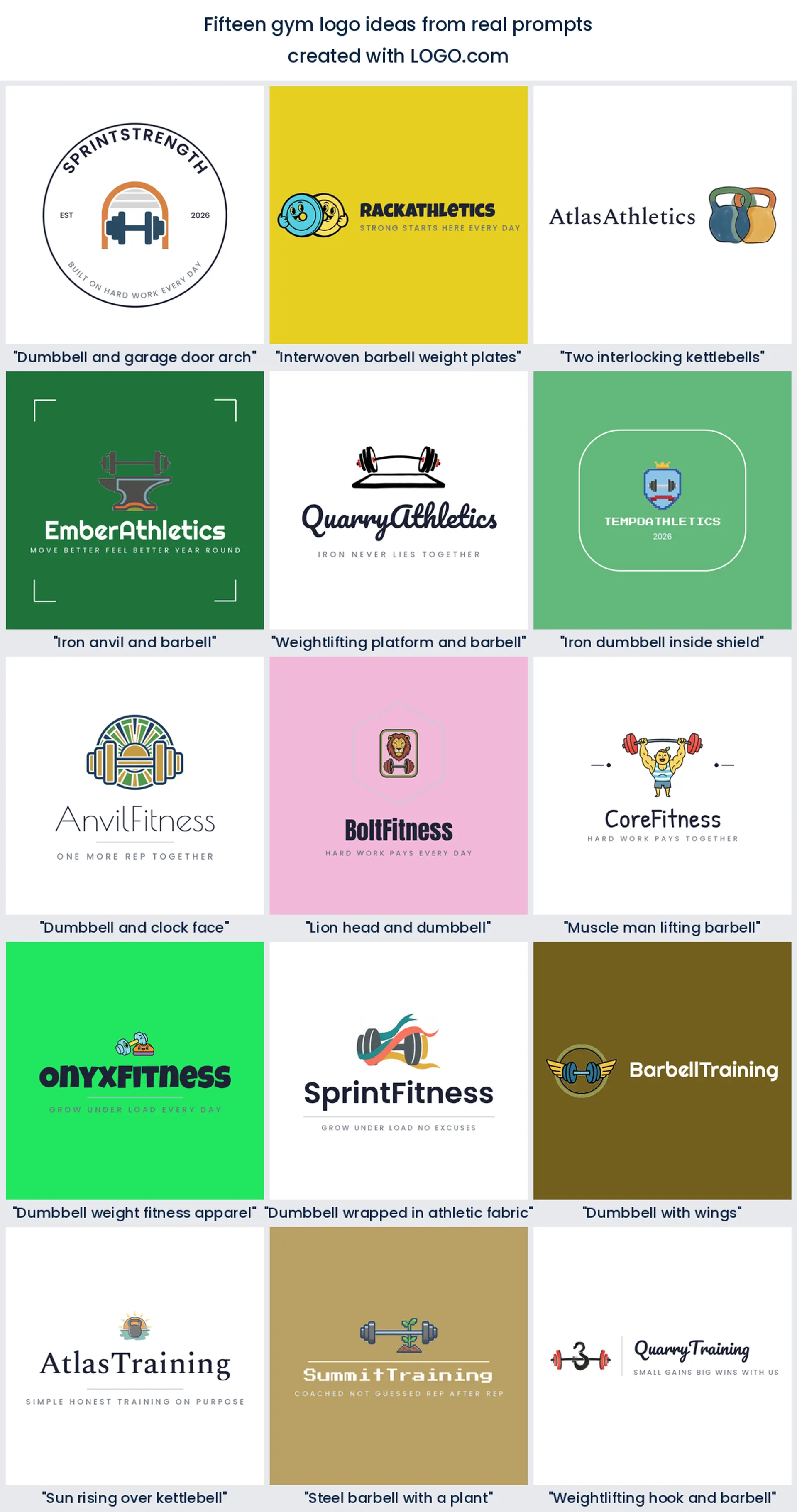
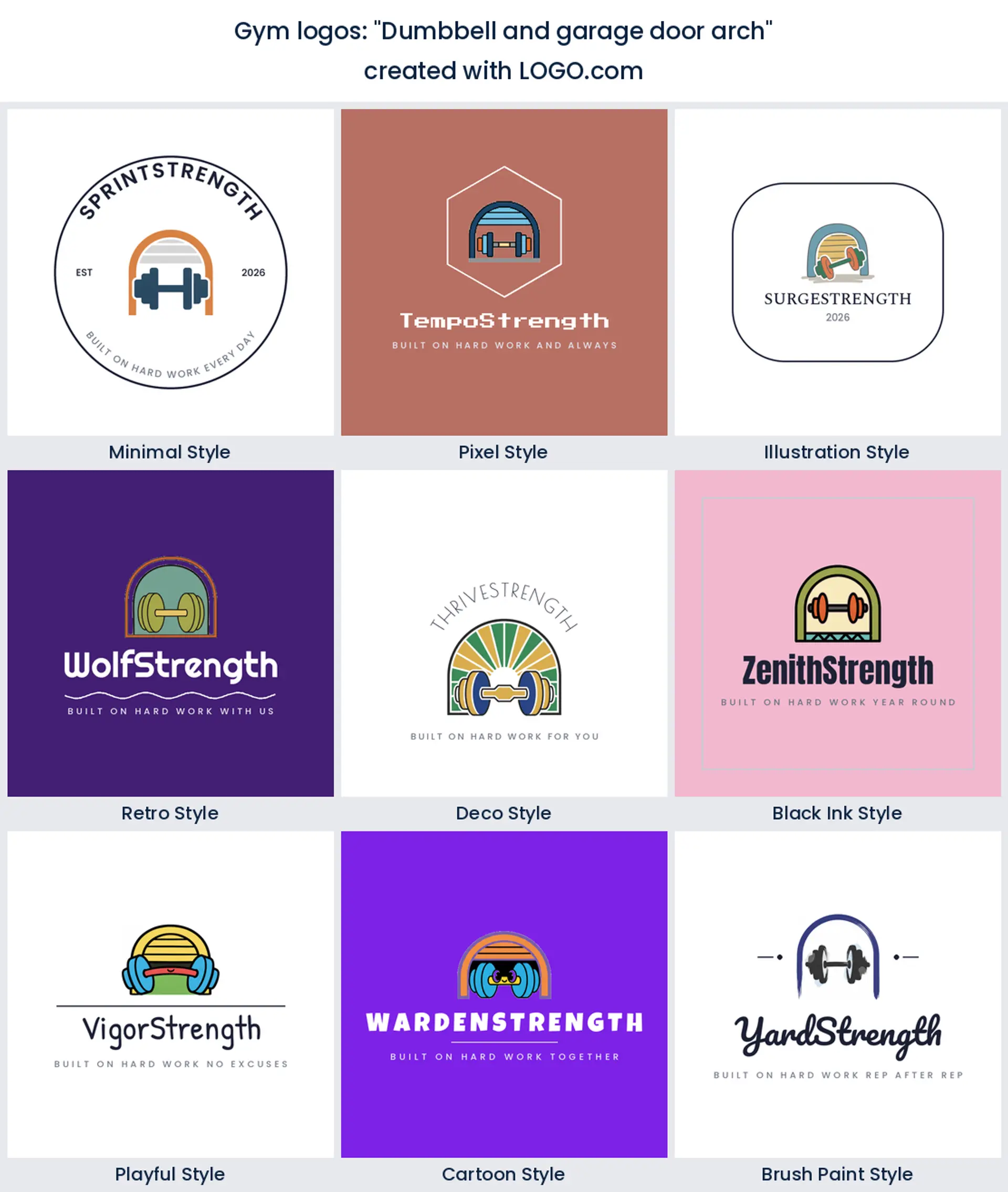
1. "Dumbbell and garage door arch"
The arch does something a bell on its own cannot, it gives you a room. Founders training clients out of a unit or a converted double garage use it to say exactly where the work happens, which makes a proud garage gym logo without a word of copy.
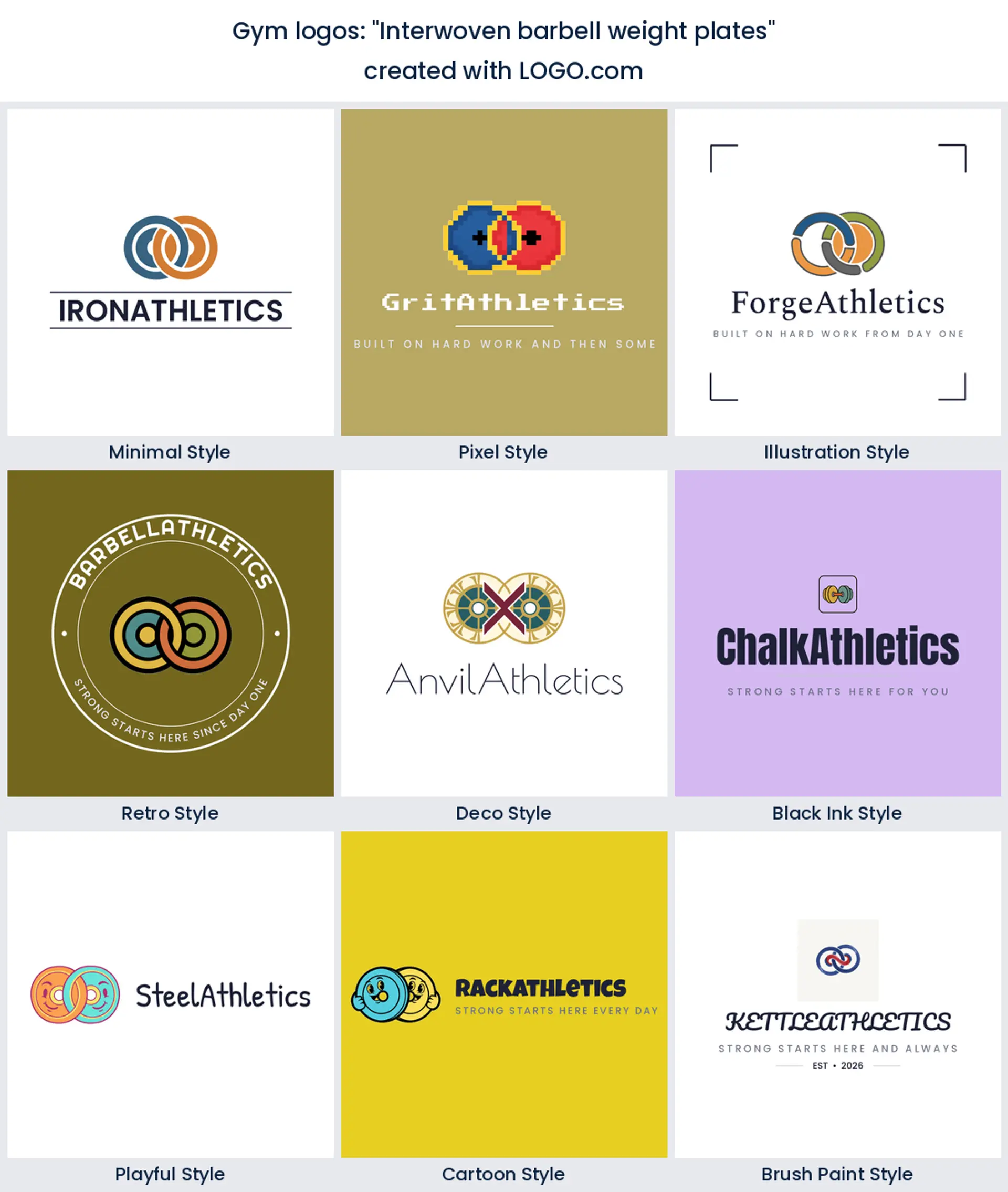
2. "Interwoven barbell weight plates"
Two plates locked through a bar turn equipment into a monogram, and monograms scale. This is one of the sharpest gym logo designs on the page for a chalk covered barbell room, because it still reads when it is punched into a floor mat.
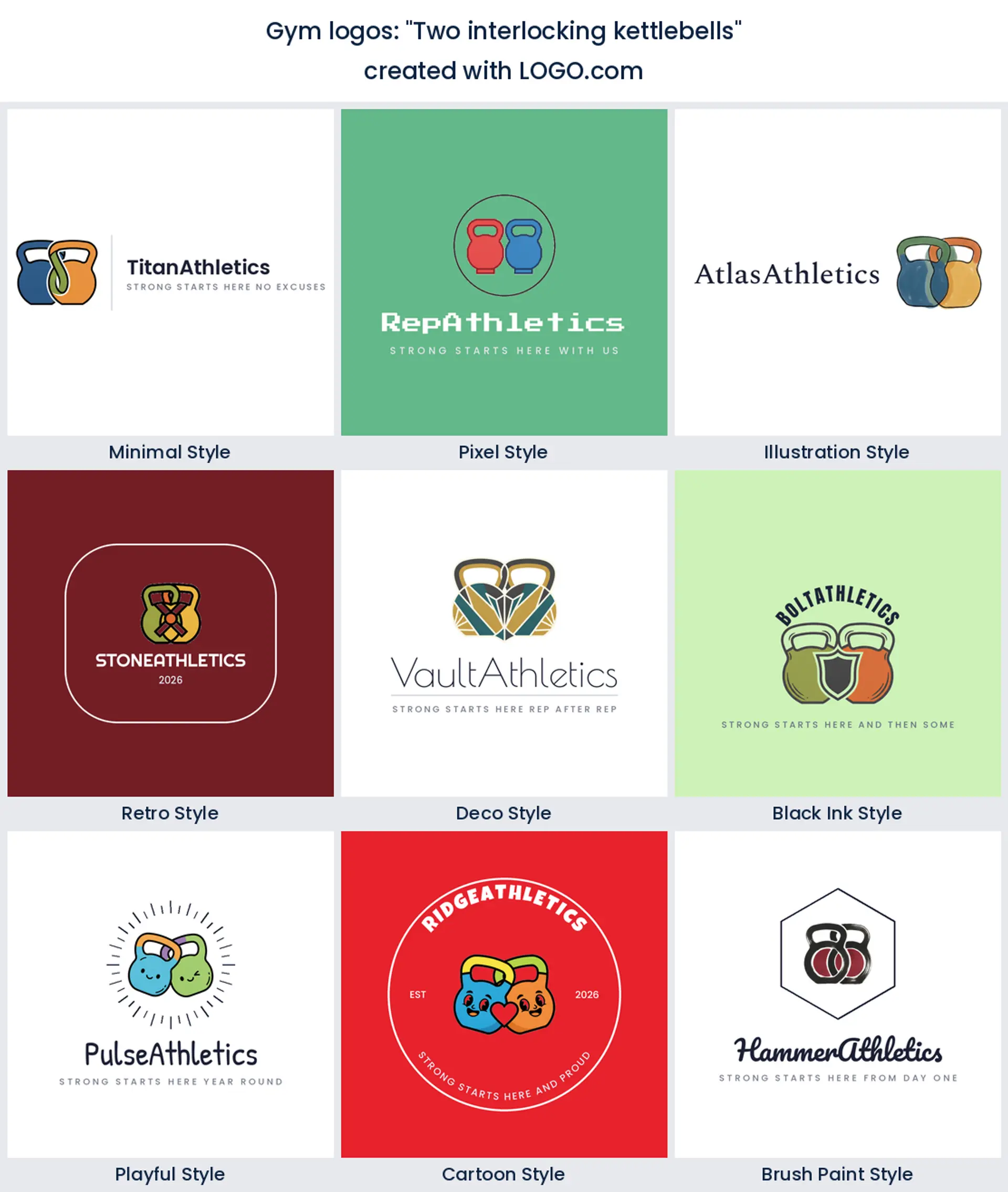
3. "Two interlocking kettlebells"
Interlocking anything suggests a pair, a partnership, a class pushing through the same round. With kettlebells it also nods at the swing itself, so it lands as a friendly crossfit logo or a small group training mark.
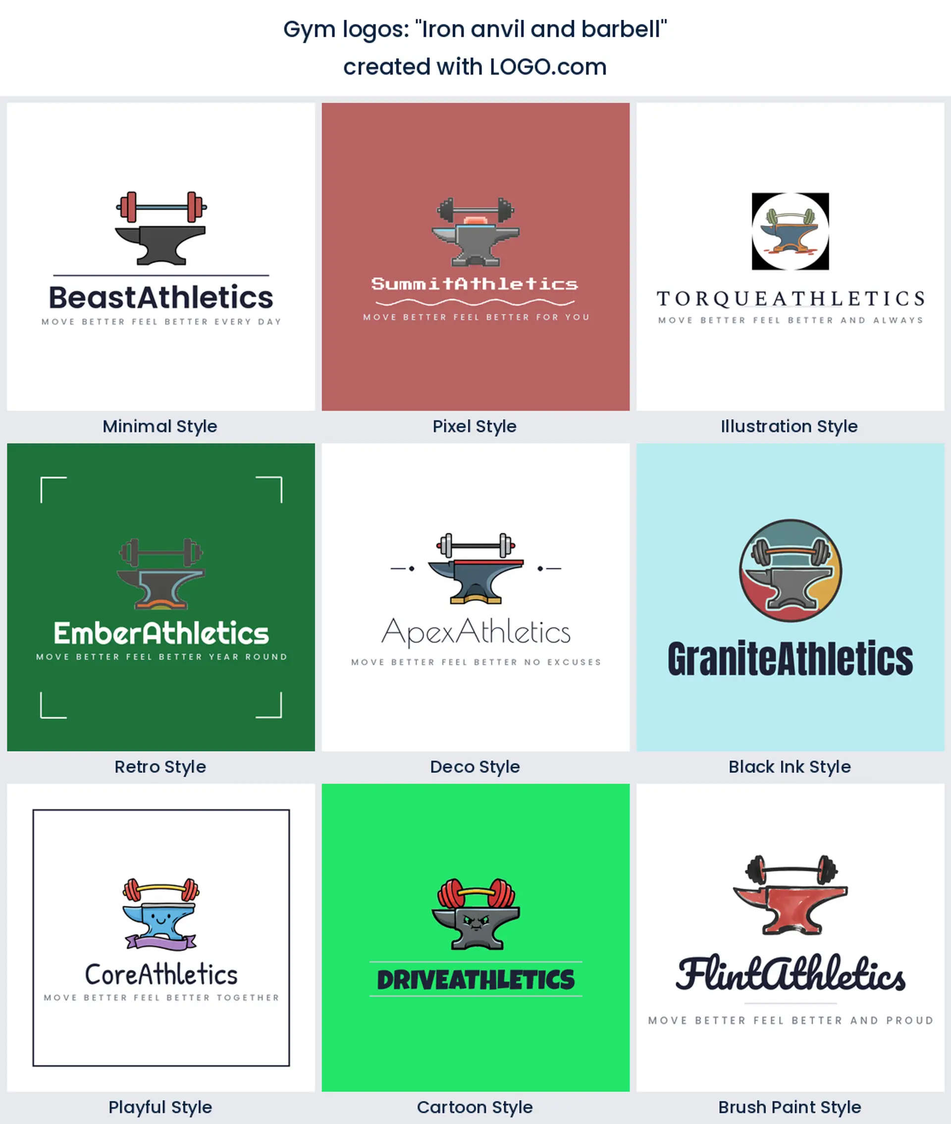
4. "Iron anvil and barbell"
An anvil is a strange thing to find in a gym and that is exactly the appeal. It borrows the forge, the hammer, the idea of something being made, and it sits beautifully under a heavy slab serif for a powerlifting logo with real attitude.
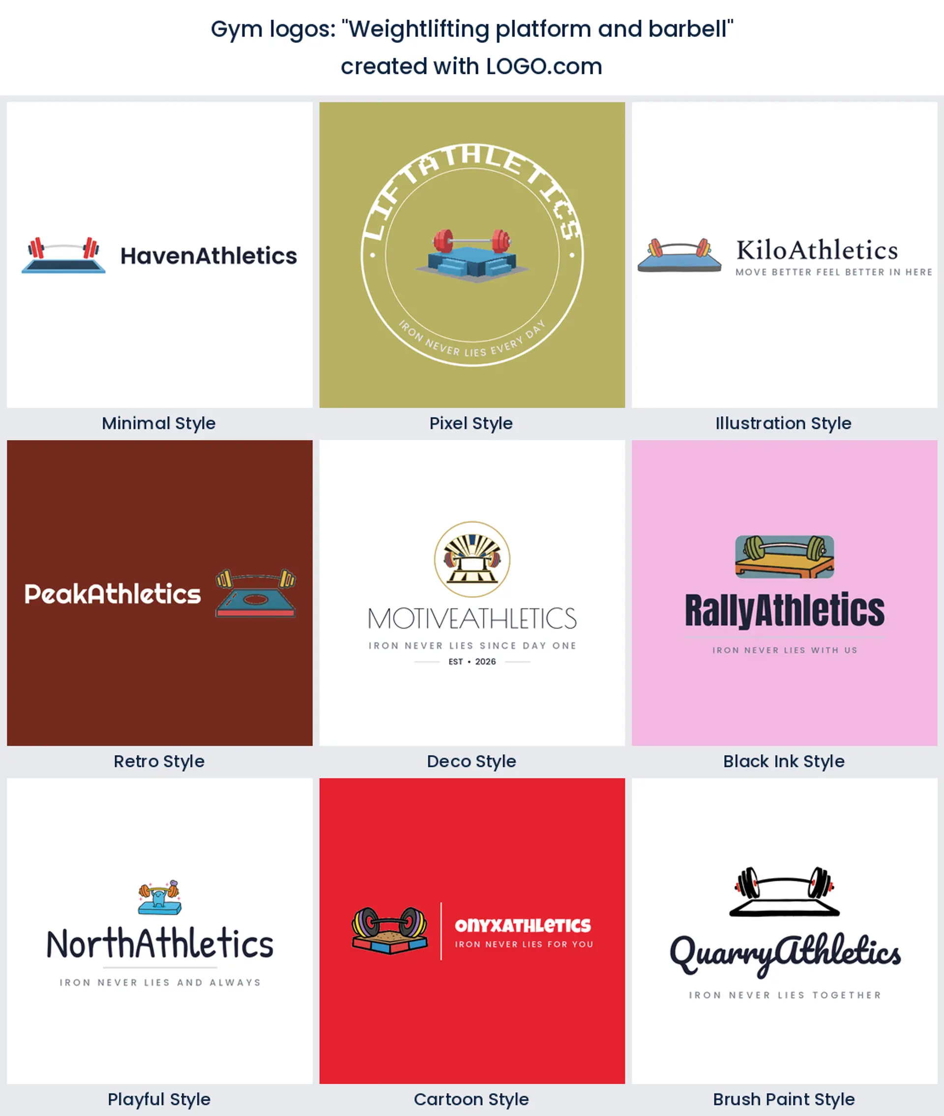
5. "Weightlifting platform and barbell"
Nobody outside the sport draws the platform, so this one reads as insider knowledge on sight. Put it on the door of an olympic lifting room and the right people will recognise it immediately, which is the whole job of a weightlifting logo.
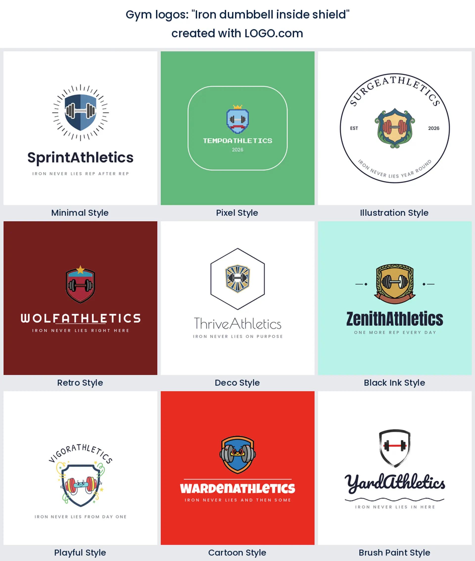
6. "Iron dumbbell inside shield"
A shield turns a bell into a crest, and crests age well on a wall. If your gym runs teams, challenges, or a leaderboard, this is the gym logo most likely to end up embroidered on a coach jacket.
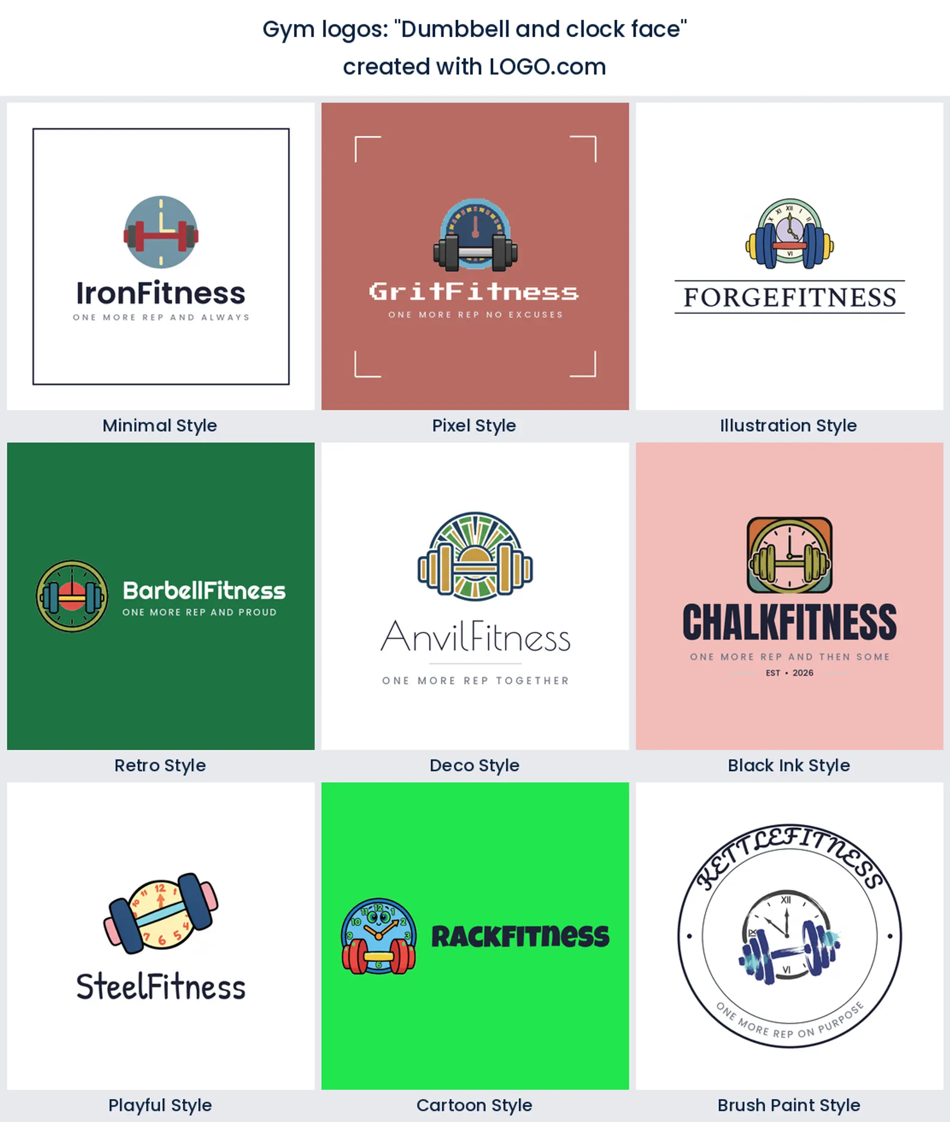
7. "Dumbbell and clock face"
Here is the one for the 24 hour crowd. A clock behind the bell says open whenever you are, no staffed hours and no waiting for a class slot, so it makes a clear and genuinely useful gym logo for a keycard access site.
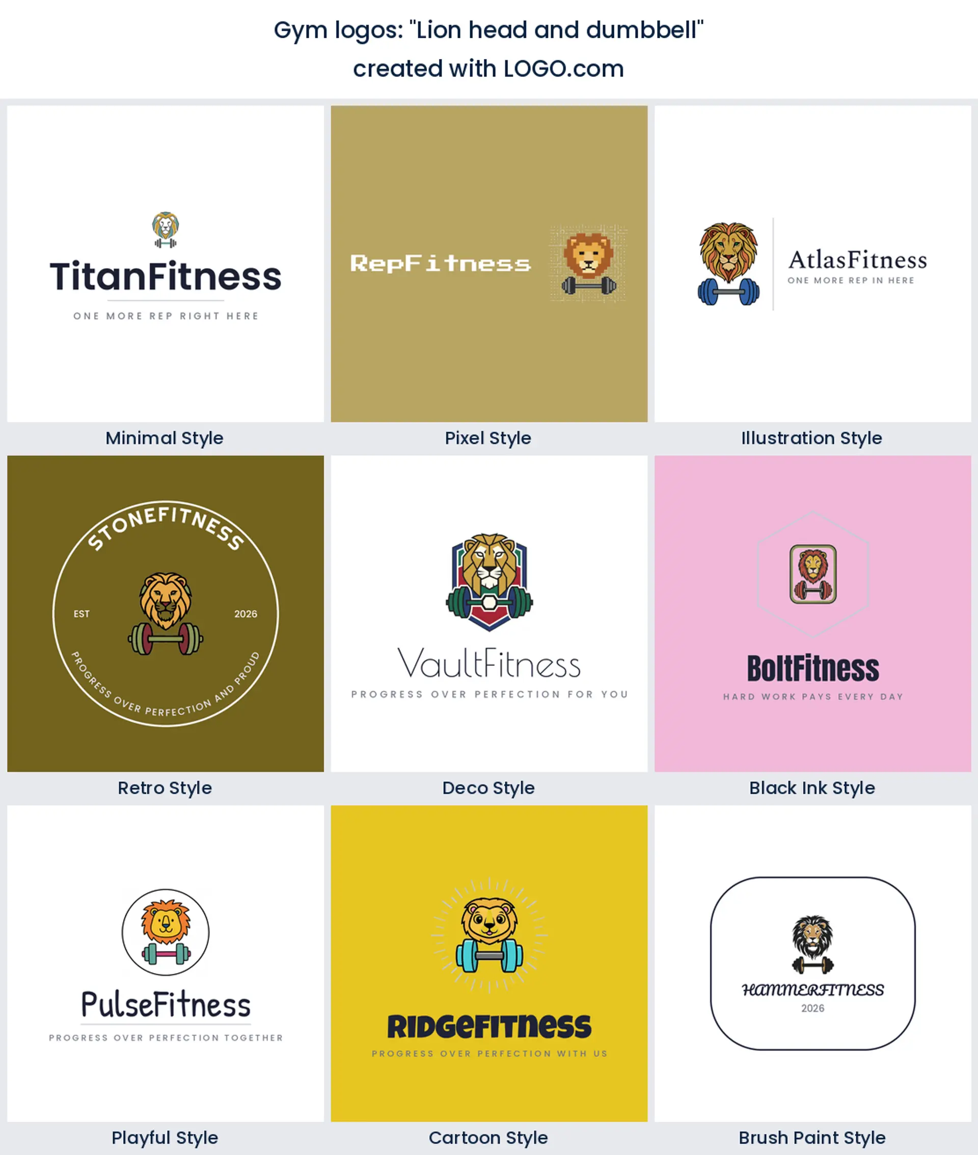
8. "Lion head and dumbbell"
Mascots divide people right up until somebody puts one on a hoodie and it sells out. A lion is the safest of them, proud rather than cartoonish, and it gives you a creative gym logo design your members will actually want to wear.
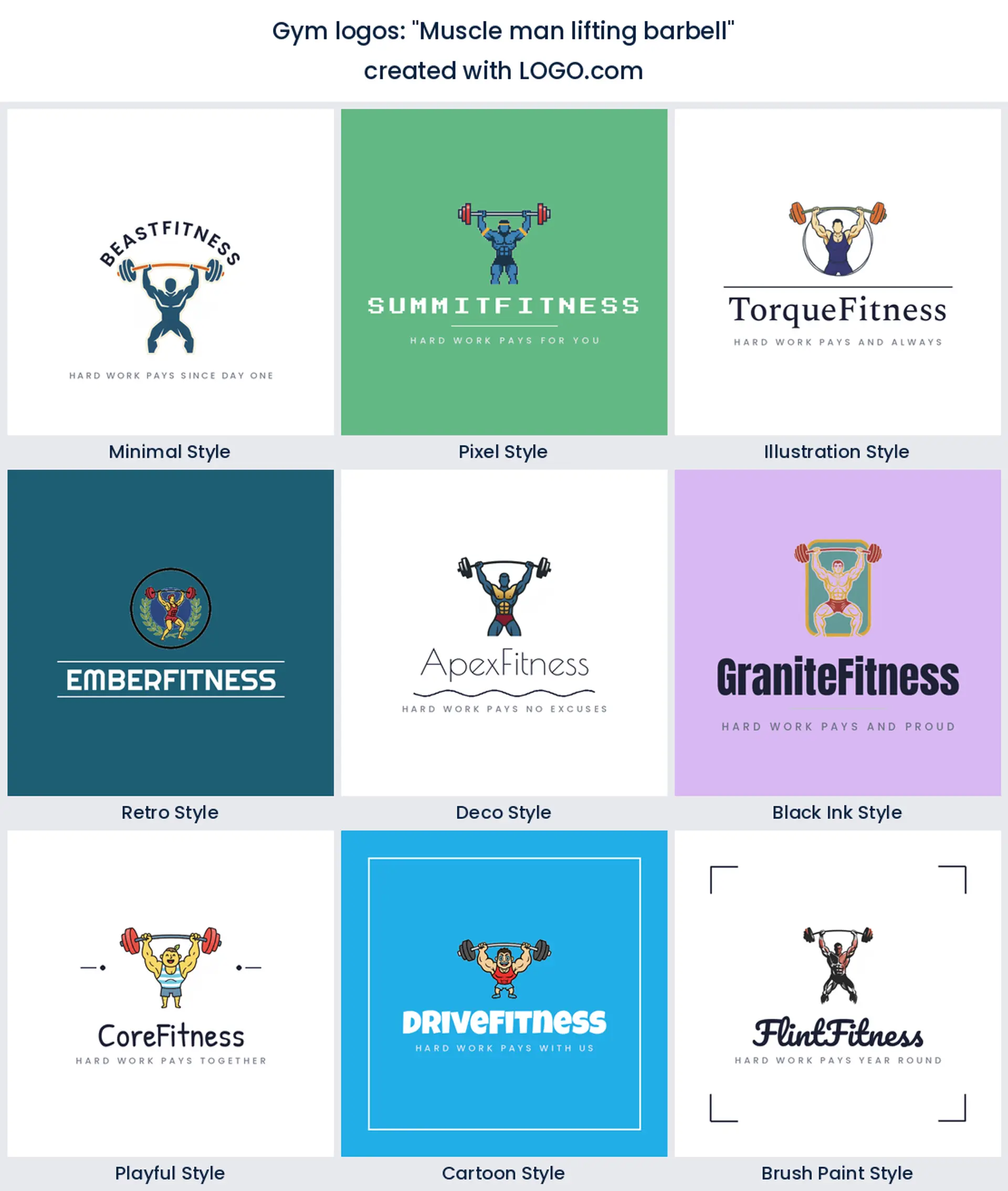
9. "Muscle man lifting barbell"
Full figure marks are the old school choice, straight off a golden era gym sign. Keep the pose simple and the outline heavy and you end up with a gym logo that looks like it has been above the door for thirty years.
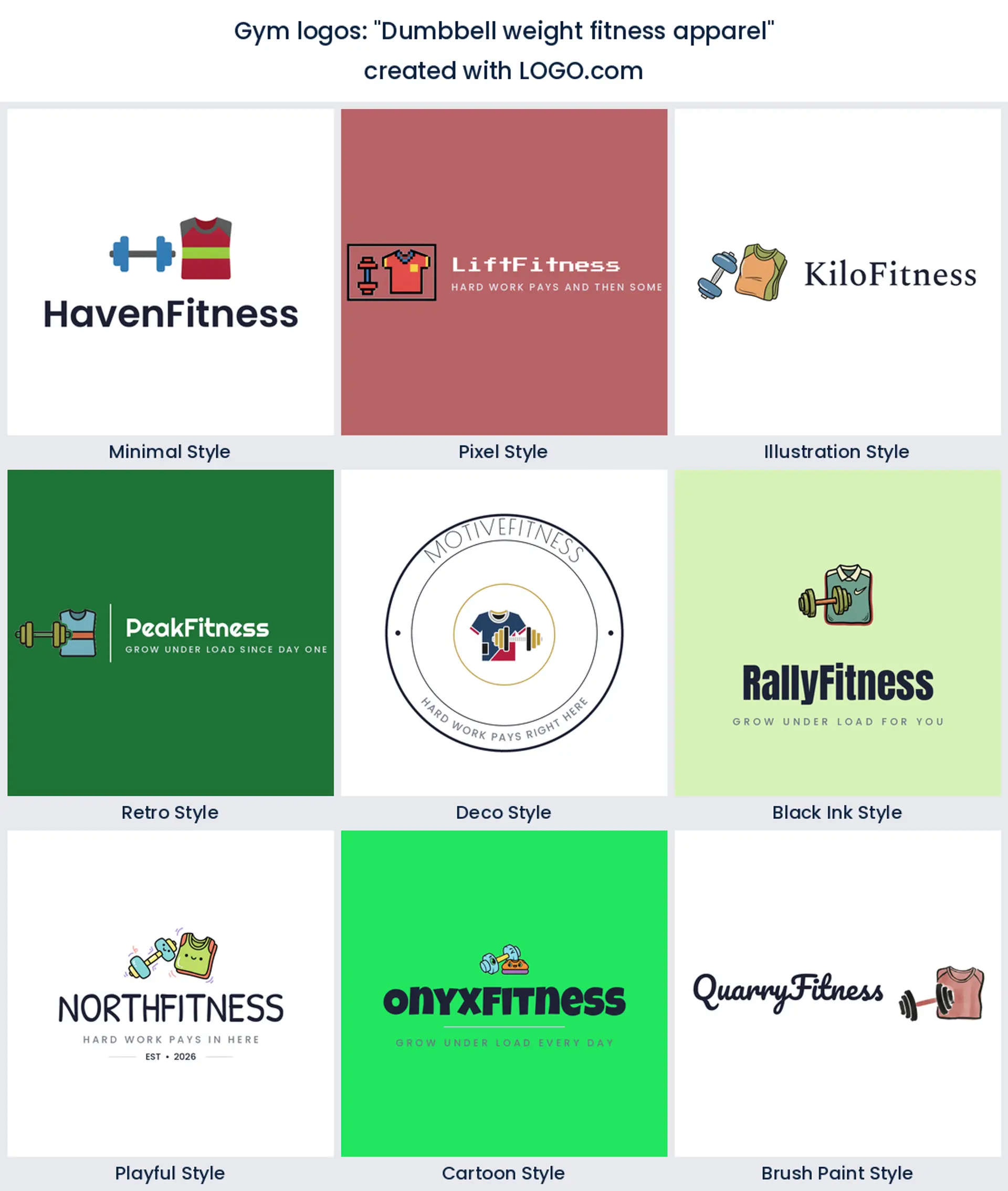
10. "Dumbbell weight fitness apparel"
This prompt asks for the mark and the merch in one go, which is how plenty of gyms actually grow. If tees and hoodies are a real line for you, a bell drawn with fabric in mind keeps your gym logo shirts and your front door looking like one brand.
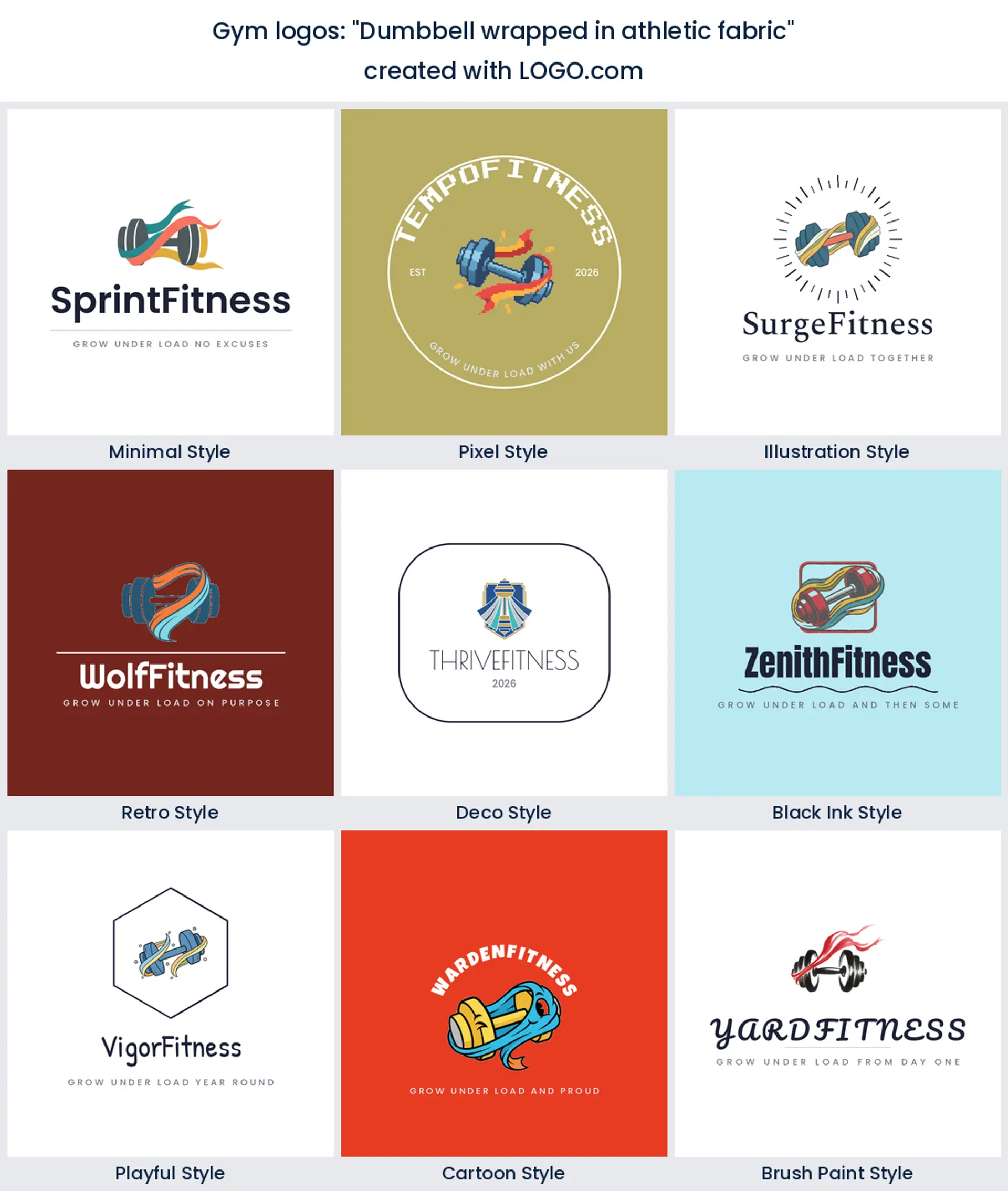
11. "Dumbbell wrapped in athletic fabric"
Fabric adds movement to a shape that is normally stiff and static. It suits an apparel led gym or an activewear label, and it prints large across the back of a training top far better than a thin outline would.
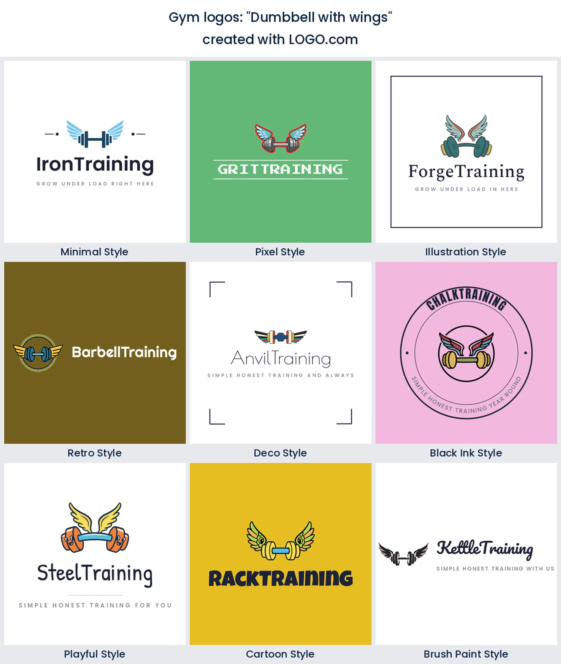
12. "Dumbbell with wings"
Wings are shorthand for lightness, and putting them on iron is a joke everybody gets straight away. Use it for a gym selling speed and conditioning rather than pure size, or for a running and lifting hybrid club.
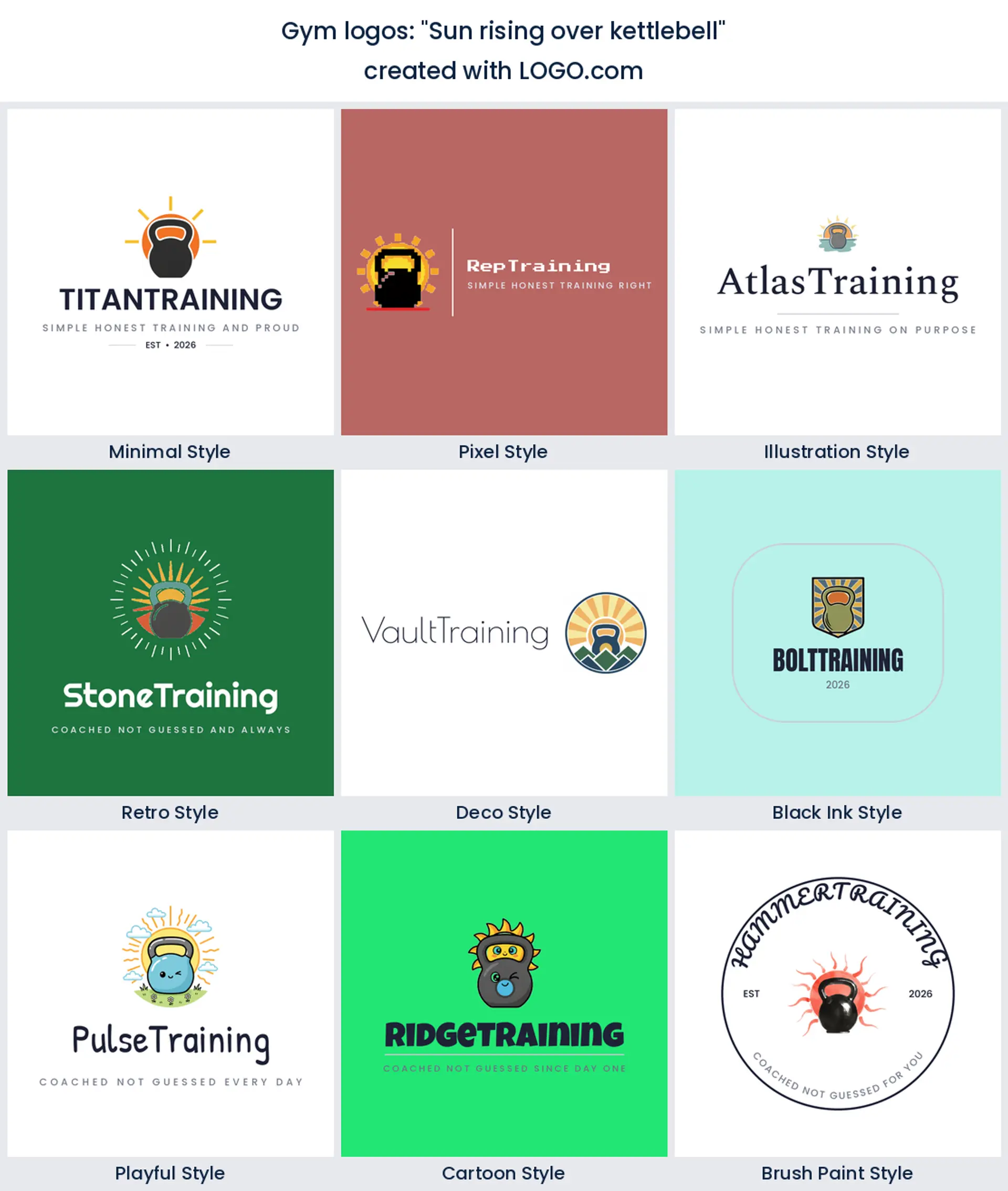
13. "Sun rising over kettlebell"
A sunrise behind the bell is the 5am class in one picture. It is the warmest mark on this page, and a natural gym logo design for a place built around people fitting training in before work.
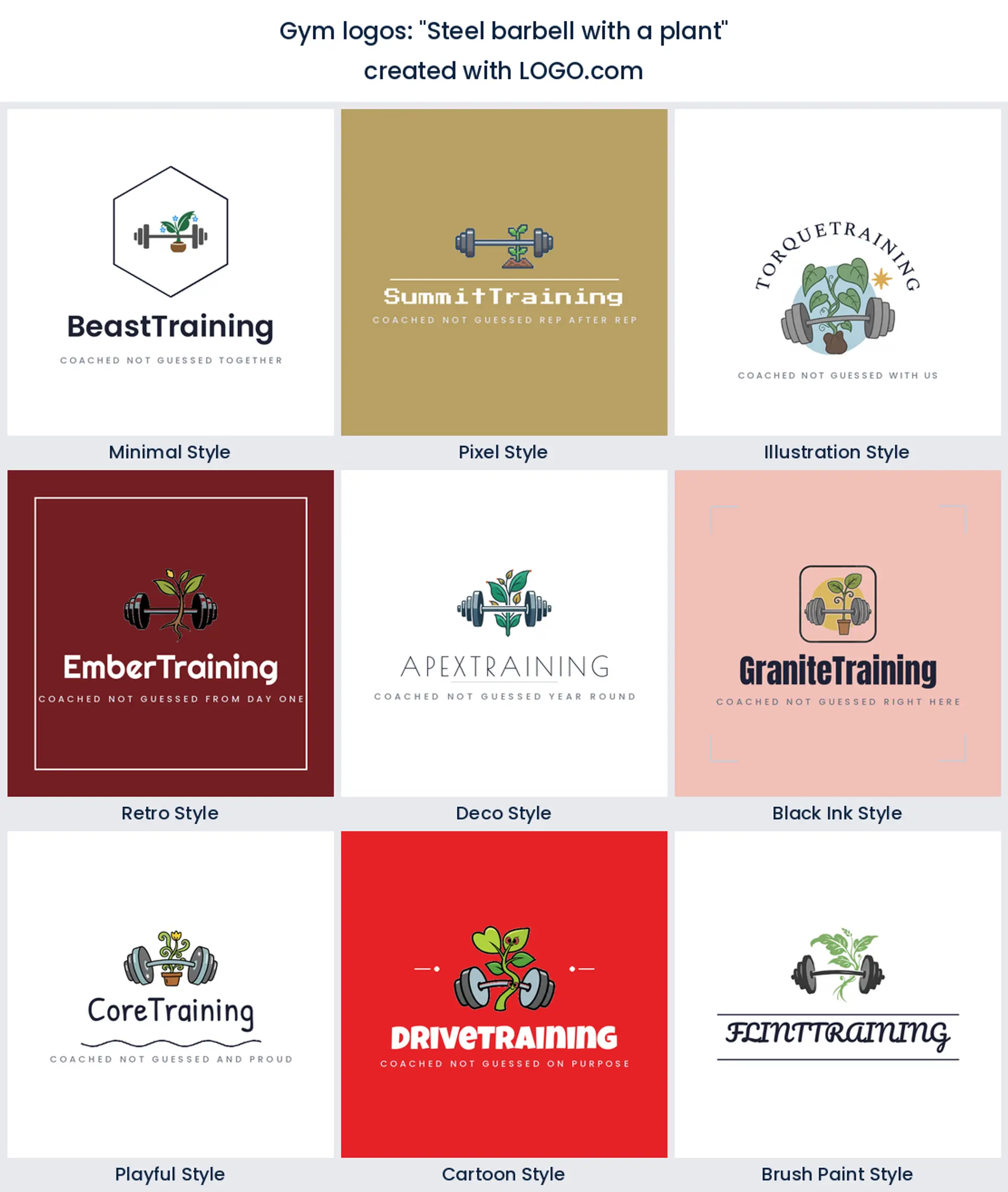
14. "Steel barbell with a plant"
Iron and greenery in the same lockup is the boutique move and it works. It tells people you have mobility, recovery, and a smoothie bar as well as a rack, so it makes a calm gym logo for a mixed floor.
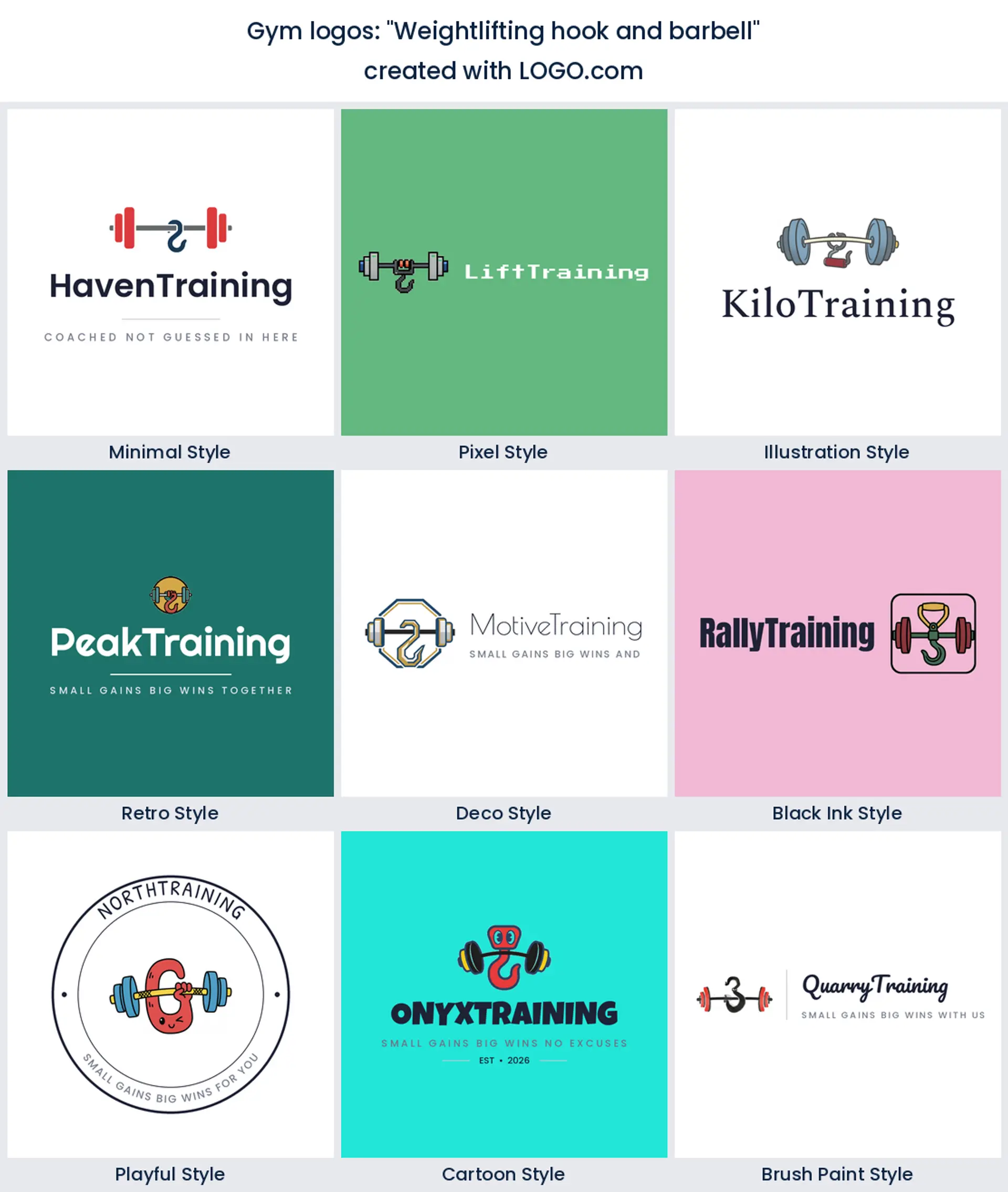
15. "Weightlifting hook and barbell"
Straps and hooks are the detail only lifters notice, which is precisely why this one earns its place. It makes a quietly technical mark for a strength coach, a barbell club, or a supply brand selling to serious lifters.
A crossfit logo and a powerlifting logo are not the same animal
These two get lumped together and they should not be. A crossfit logo sells the class, the whiteboard, and the people beside you, so circles, kettlebells, and interlocking shapes do the work, and the mark has to survive being stencilled on a wall or slapped on a whiteboard sticker. A powerlifting logo sells the total on the bar, so it goes narrower and heavier, all plates and slab type and nothing decorative. A boxing gym logo has its own vocabulary again, gloves and a ring bell, so lean into that rather than borrowing a barbell you do not use. Running a big floor with cardio, machines, and classes? Keep the symbol neutral enough that it does not promise one thing and deliver another. And if you coach out of your own unit, say so in the mark. An arch or a roller door sticks in the memory far longer than a generic bell.
After hours the sign is the only thing working
A staffed gym gets seen in daylight. A keycard gym gets seen at eleven at night, through glass, lit from behind, next to a bright vending machine. That changes what a good mark looks like. Check yours in one solid color on a dark background before you sign anything off, because thin outlines disappear the moment the room lights drop and only the sign is lit. There is a reason so many owners go looking for a gym logo black version, and it is worth building both. Keep a light one for your paperwork and quotes, and a knocked out white one for the window, the door decal, and the after hours photos.
Will it survive a screen print on a hoodie?
Gym merch is not an afterthought, it is walking advertising, so test the mark on fabric early. Screen printing hates hairline strokes and gradients, embroidery hates fine detail even more, and both of them reward a shape that reads in one flat color. Hold your logo at chest size, then shrink it to sleeve badge size, and see which parts fall apart first. If you plan to sell gym logo shirts alongside memberships, keep a single color version on hand and give your printer a vector file. Your hoodies will then match the sign outside rather than look like a photocopy of it.
Why so many new gyms dropped black and red
Black and red used to be the default and it is quietly on the way out. In the color palettes gym founders save on LOGO.com, white and black still do most of the heavy lifting, but the non neutral hue that comes out on top is green, just ahead of red. Green reads recovery, daylight, and clean living, which is why newer rooms keep pairing it with charcoal instead. Red still works if your floor is loud and competitive, and yellow makes a strong single accent on signage because it holds up under bad lighting. Whichever way you go, look at the mark against a gray wall and a dark hoodie, because those are the two backgrounds it will live on most.
Signage, hoodies, and when you need vector files
Here is the practical split. Designing and previewing on LOGO.com is free, and the free download gives you four high resolution PNG files with full commercial use, so the mark can go on your door, your socials, and your first batch of tees straight away. The paid Brand Plan is what you want once you print big. It adds the vector files a sign maker or an embroiderer asks for when they are cutting a wall graphic, wrapping a van, or stitching a hoodie, plus unlimited edits and a brand kit that keeps your colors and fonts in one place.
Make your gym logo with LOGO.com
Type your gym name, pick the symbol that matches the room you run, and choose one of the nine styles you have seen on this page. Our gym logo maker builds the rest around your name, you preview the whole thing free, and you can come back to change the icon or the color when you open a second site.
Methodology. These figures come from logos created on LOGO.com in the 12 months ending July 2026. The Gym, Boxing Gym, Gym Clothing, and Crossfit industry sample was too small to rank on its own, so we looked instead at the 445 custom icon descriptions written by the 234 founders who described a dumbbell, a barbell, or a kettlebell, grouped those descriptions by concept, and ranked each concept by how often it appeared. A dumbbell featured in about 76% of them, a barbell in about 22%, and a lifting figure in about 12%. Founders often name more than one element in a single description, so the shares overlap rather than summing to 100. Figures are rounded to the nearest percentage point. Source: LOGO.com first party product data, July 2026.
THE #1 LOGO GENERATOR
Why LOGO.com is the best gym logo maker
1.Ranked from what 234 gym founders described
The symbols here are the ones founders actually asked for when they built a gym logo on LOGO.com, not clip art somebody guessed at.
2.Still reads through the window at night
Check the mark in one solid color on a dark background so it holds up on a lit sign and a keycard door after hours.
3.Sits straight onto a chalk covered wall
Take a transparent file and drop the logo onto photos of the rack, the turf, and the class in progress with no white box behind it.
4.The door decal and the members app match
One mark covers the frontage, the class timetable, the app icon, and every hoodie that leaves the building.
5.From a bright studio floor to a chalk room
Nine styles cover a clean boutique studio and a heavy strength room, so you never start the design over from nothing.
6.Stitches onto a polo without losing detail
Choose a full color icon or a single color version that embroiders cleanly on staff kit and cuts as window vinyl.
7.A brand kit your sign maker can work from
The brand kit keeps your colors and fonts in one place, so the printer, the sign shop, and your coach all use the same files.
8.Add a second site without a redraw
Swap the wordmark, the color, or the icon whenever you open another location or launch a new class brand.
9.Free to design, yours to sell under
Download four high resolution PNG files free with full commercial use, then upgrade to the Brand Plan for vector files when you print large.
Gym Logo Maker FAQs
Need Inspiration? See example brands in your industry...
3D DesignAcademic WritingAccountantAerospace EngineeringAgricultural ConsultingAgriculture CompanyAmazonAnimal ProtectionAnimationApp DevelopmentAquacultureAromatherapyArt and DesignArtsAsian RestaurantAthleticsAudio TechnicianAuto ManufacturingAuto Repair ServicesBadgeBandBarber ShopBearBeauty and CosmeticsBeeBibleBiotechBitcoinBlogBoatBook PublisherBooks and Literature BlogBrainBuildingBusiness Consulting Logo MakerBusiness StorageCakesCampaignCandlesCarCarpentryCateringCelebrationsChemicalChildrenChoirCircleCivil EngineeringClothingCoffee Shop