Pizza Logo Maker
Design a pizza or pizzeria logo that looks good on your boxes and shopfront sign.
Need a different logo maker? Try our AI logo generator.
Logos created using LOGO.com
670,000,000
Classic Italian and wood fired pizza logos

Playful slice and topping pizza logos
Bold emblem and badge pizza logos
Pizza Logos, Ranked From Real Brand Data
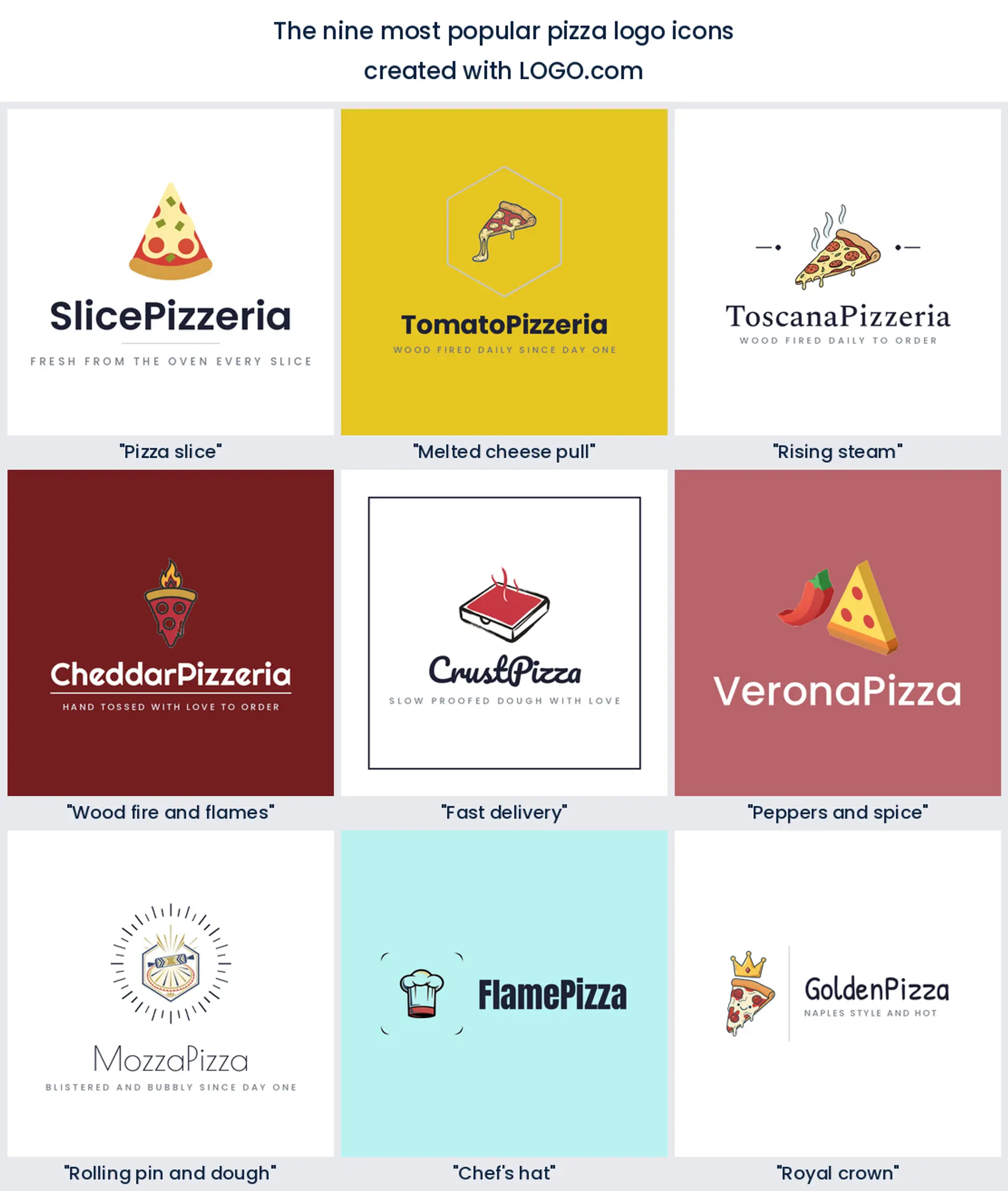
According to LOGO.com data, the most common pizza logo icons are a plain pizza slice (in about 87% of icon descriptions), a melted cheese pull (about 8%), and rising steam (about 6%). One clear symbol and a warm name carry most pizza logos.
The nine styles below are built from those real descriptions, so you start from what hungry people already read as good pizza instead of a blank page. Pick a symbol, then make the color, font, and name your own.
On this page
- What 254 real pizza icon descriptions show
- Fifteen pizza logo ideas, one for every kind of pizzeria
- Neapolitan, New York, or Detroit: match the logo to your pizza style
- Pizzeria, slice shop, delivery, or Italian kitchen: pick your lane
- From a hot box lid to a delivery app tile
- How to stand out when almost every pizza logo is a slice
- Does a pizza logo cost anything, and what can you put it on?
- Make your pizza logo with LOGO.com
Every new pizza logo seems to reach for the same triangle, and the data says most really do. Of the 254 pizza icon descriptions founders typed into LOGO.com, about 87 in 100 drew a slice. That is your starting line, not your finish. Below are the nine symbols pizza founders reach for most, plus fifteen real founder prompts you can recolor into a pizza logo that is yours.
What 254 real pizza icon descriptions show
The pizza logos founders build on LOGO.com lean on nine symbols, and one runs away with it. A plain slice shows up in about 87% of the 254 icon descriptions we read, a melted cheese pull follows at about 8%, and rising steam sits third at about 6%. After those come the wood fired flame, fast delivery cues, chili peppers, a rolling pin, a chef hat, and a crown. Most pizza logos need just one of these plus a warm, appetizing name.
1. Pizza slice
Almost every pizza logo starts here. When we read the icon descriptions founders typed on LOGO.com, a plain slice turned up in roughly 87 out of every 100, which makes the triangle with a bubbling crust the single most recognizable food shape you can put on a sign. If you want a pizza logo people read in half a second, one clean slice and a confident name is the whole recipe.
2. Melted cheese pull
A slice with a gooey cheese pull is the next most drawn mark, in about 8% of descriptions. That stretchy string of mozzarella is pure appetite, and it tells hungry people your pie is fresh out of the oven. It makes a mouthwatering pizza logo for a cheesy, indulgent brand that wants to look irresistible on a delivery app.
3. Rising steam
Curls of steam above a slice come third, in about 6% of the icons founders described. Steam is shorthand for hot and just baked, and a few simple wisps keep that fresh from the oven feeling even when the mark shrinks. Reach for it when you want a pizza logo that looks piping hot on a menu.
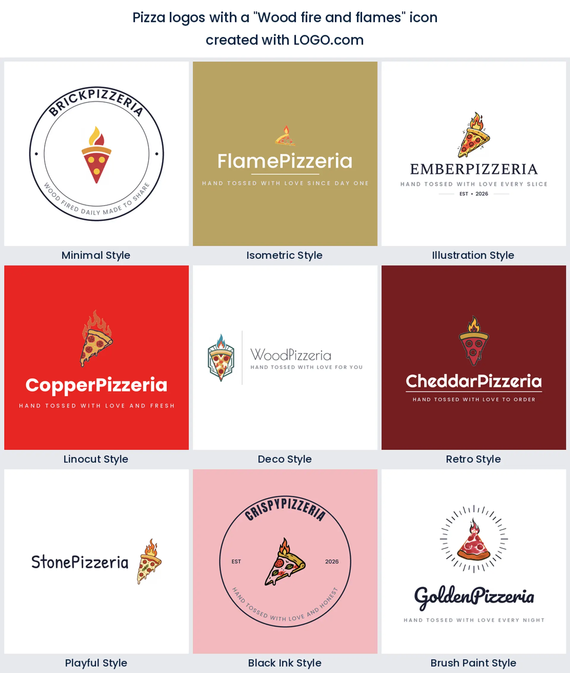
4. Wood fire and flames
Flames and embers come next, the signal for a wood fired pie. A small flame licking the crust promises blistered, charred edges and a proper oven, so it suits a Neapolitan or wood fired pizzeria logo that leans on craft.
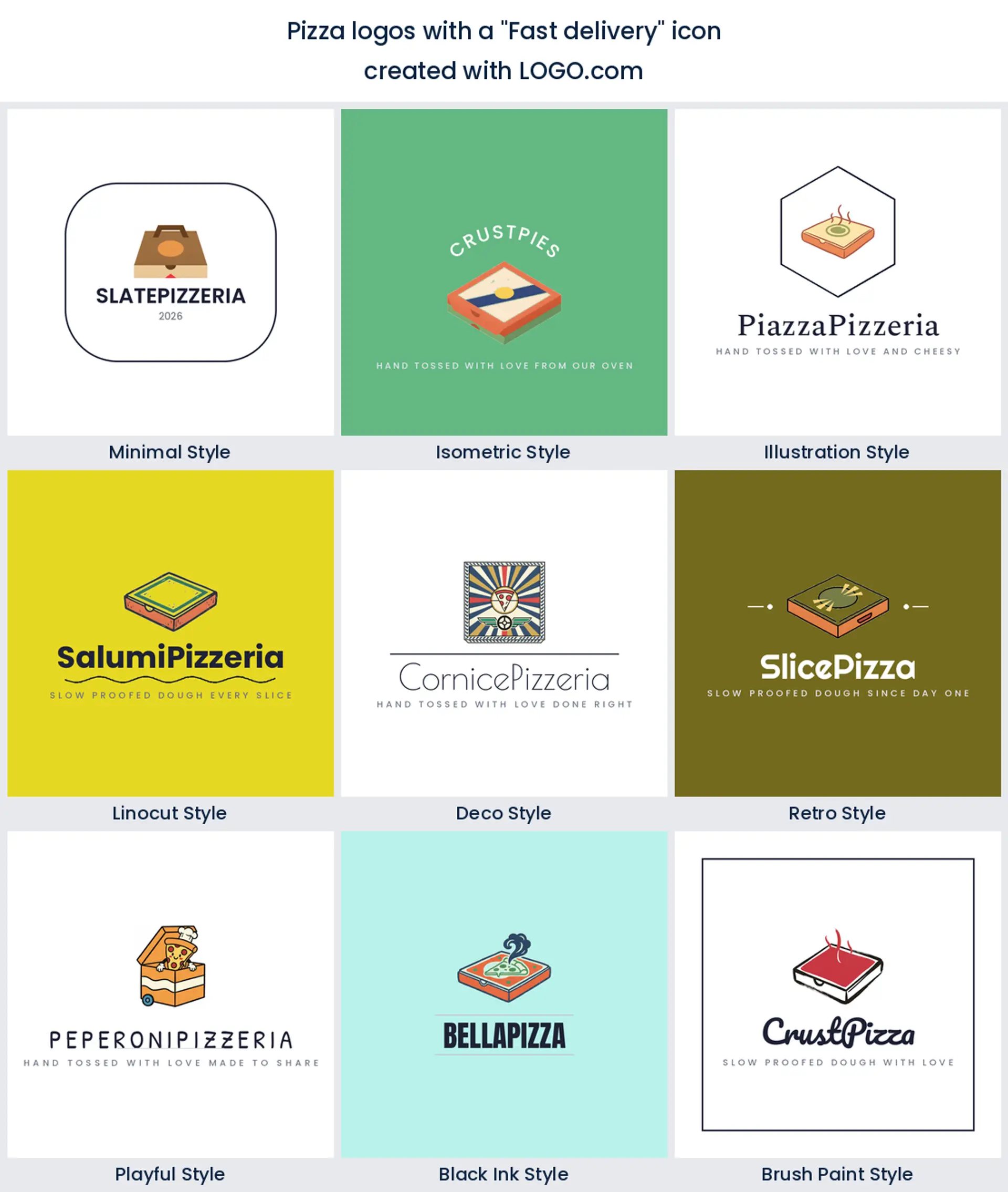
5. Fast delivery
Delivery cues turn up a lot, whether a box, a scooter, or a little truck. Founders who build around speed drop the delivery box right into the mark, which reads value and convenience at a glance. It is the natural choice for a pizza delivery logo or a slice shop that lives on the apps.
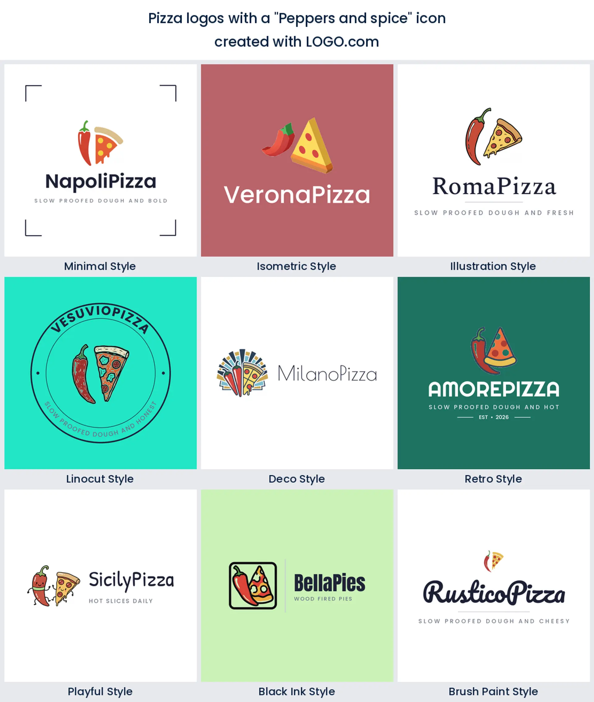
6. Peppers and spice
Chili peppers and pepper flakes show up whenever a place wants heat on the menu. A single red chili beside a slice says spicy, bold, and full of flavor, an easy pick for a pizzeria logo that is proud of its kick.
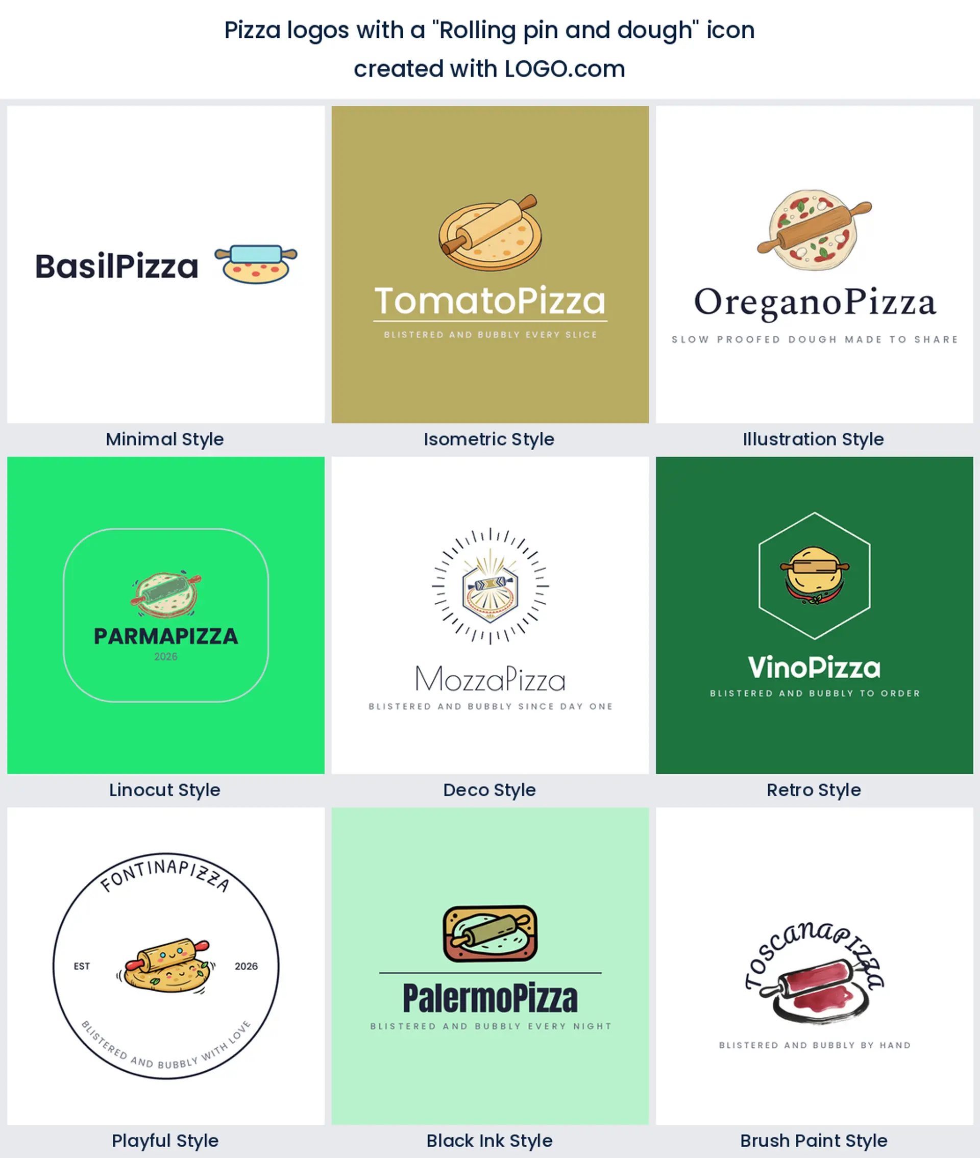
7. Rolling pin and dough
A rolling pin over a ball of dough puts the craft front and center. Founders reach for it to say we make it from scratch, which makes it a lovely pizza logo for an artisan or handmade pizza brand that proofs its own dough.
8. Chef's hat
The chef's toque still earns its spot. Sit a hat above your name and it says a real pizzaiolo runs the kitchen with no food icon needed, a flexible pizza logo for a chef led pizzeria or a family recipe brand.
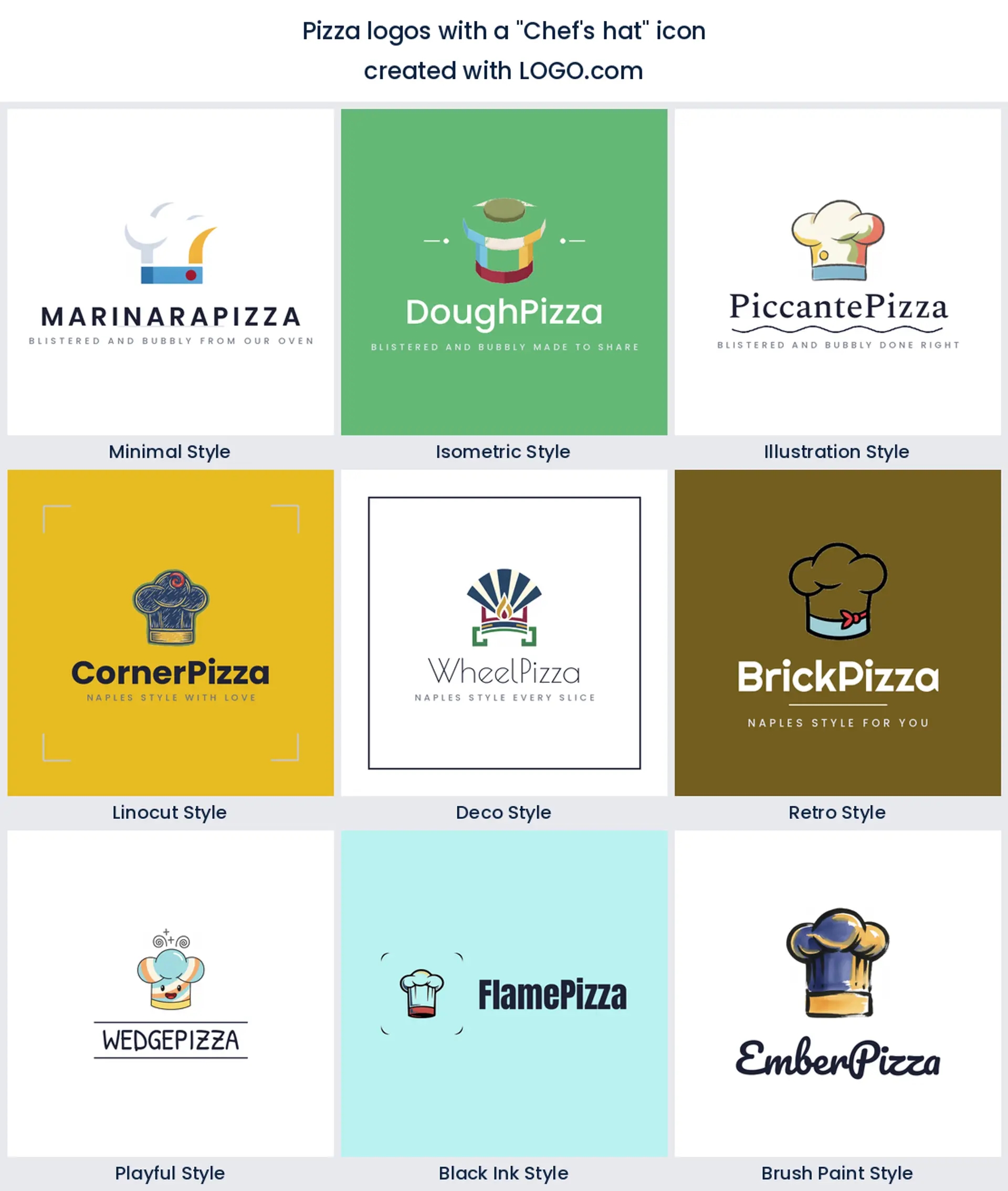
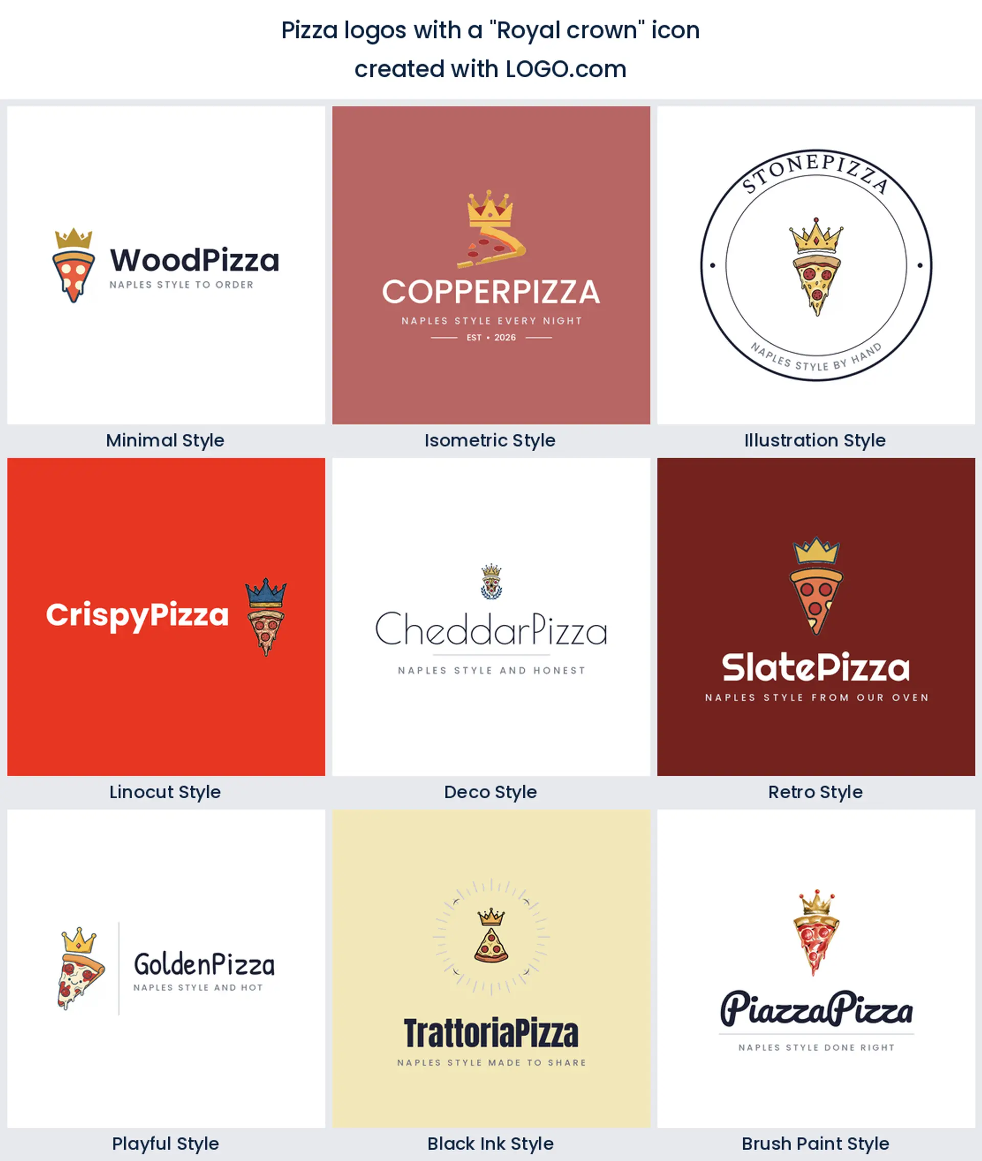
9. Royal crown
Last of the nine is the crown, the cheeky claim to be king of pizza. A little crown over a slice is confident and fun, perfect for a pizzeria logo that wants to own its corner and promise the best slice in town.
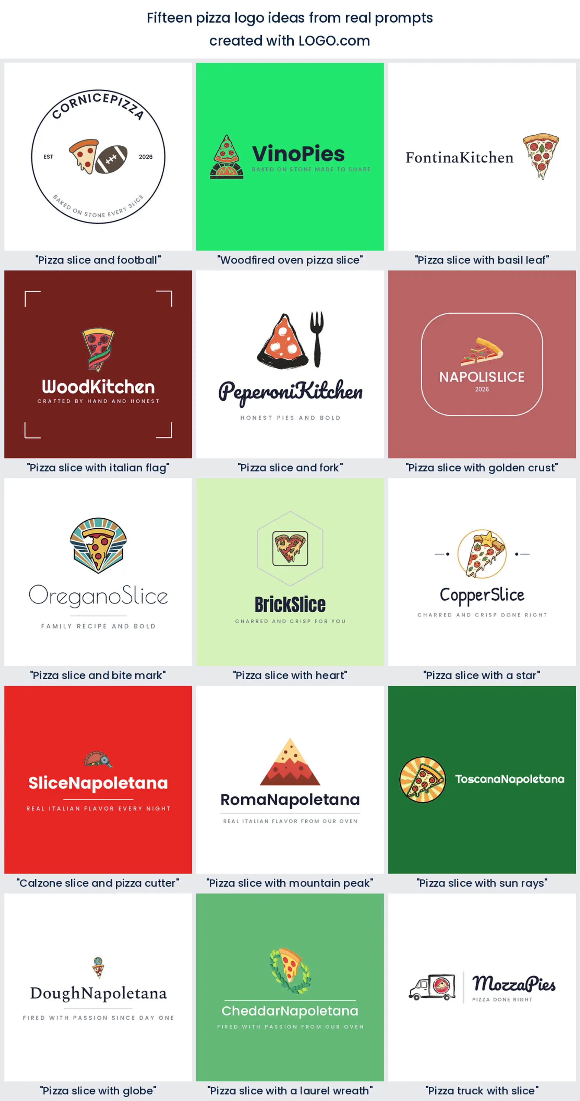
Fifteen pizza logo ideas, one for every kind of pizzeria
These pizza logo ideas are not made up. Each heading below is a real icon description a pizza founder typed into LOGO.com, shown across the nine styles so you can watch the same idea go from a clean minimal mark to a bold retro badge. Find the one closest to your pie, then change the color, font, and name until it is yours.
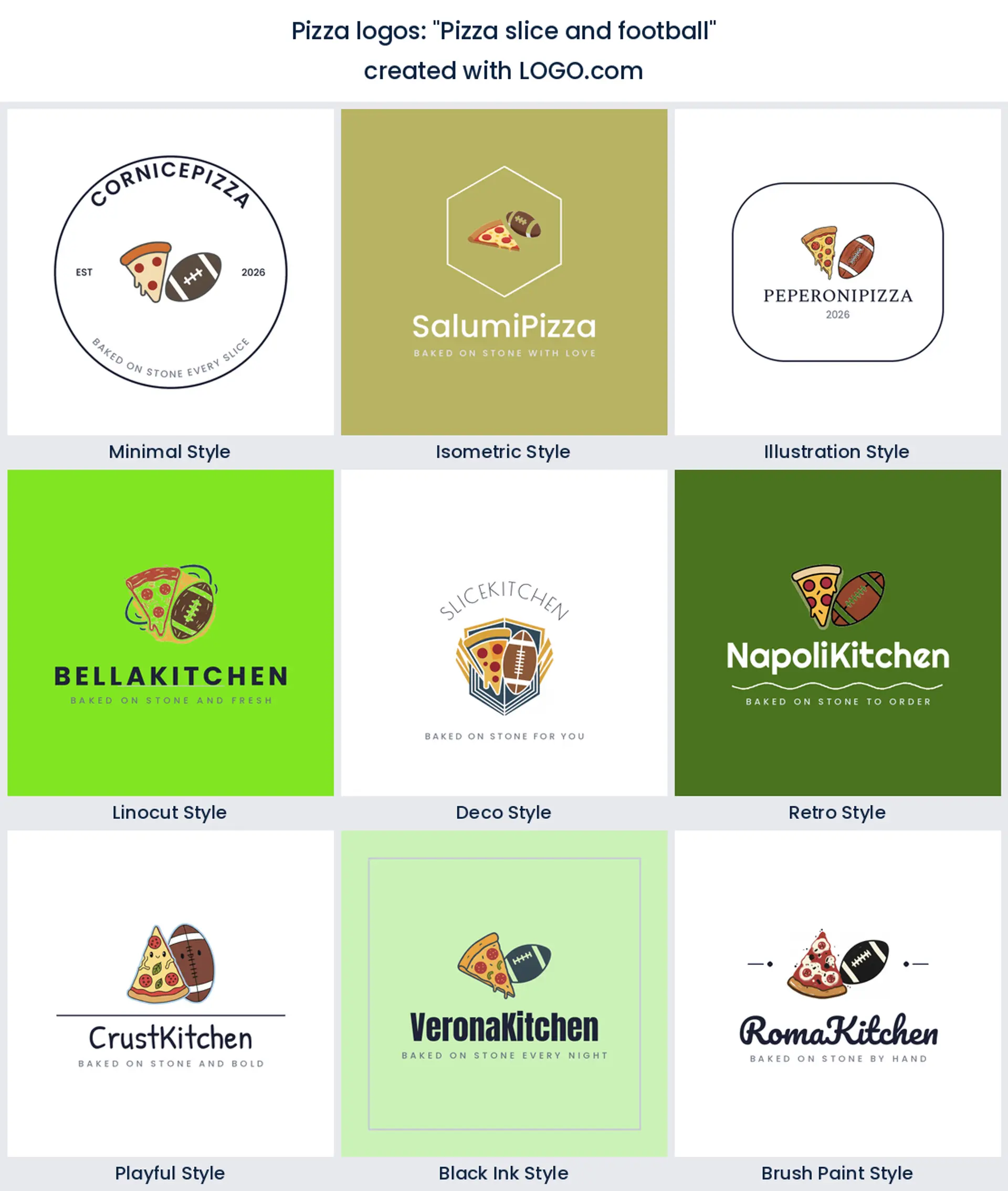
1. "Pizza slice and football"
A founder pairing a slice with a football knew exactly who eats pizza on game day. This one is made for a sports bar pizzeria, a stadium slice window, or a pizza delivery logo built around the big match.
2. "Woodfired oven pizza slice"
Straight from a Neapolitan founder, a slice framed by a wood fired oven promises blistered crust and real char. Use it for an artisan pizzeria logo that wants craft in the mark.
3. "Pizza slice with basil leaf"
One green basil leaf on a slice tells the whole Margherita story in a single mark. It suits a fresh, garden to table pizza logo or an Italian kitchen that keeps things classic.
4. "Pizza slice with italian flag"
A ribbon of green, white, and red wrapped around a slice waves the Italian flag without a word. Reach for it when you want an italian restaurant logo that reads authentic from across the street.
5. "Pizza slice and fork"
A slice beside a fork turns takeout into a sit down invitation. It makes a warm pizzeria logo for a dine in trattoria or a family pizza place that wants people to stay a while.
6. "Pizza slice with golden crust"
This founder called out the crust, and it shows. A slice with a glowing golden edge sells that first crunchy bite, a tasty pizza logo for a brand proud of its dough.
7. "Pizza slice and bite mark"
A slice with a bite already taken is playful and a little cheeky. It works for a fun, fast casual pizza logo that does not take itself too seriously.
8. "Pizza slice with heart"
Bend a slice into a heart and you get pizza with love in one shape. It is a sweet pizza logo for a neighborhood spot or a family pizzeria that runs on regulars.
9. "Pizza slice with a star"
A star tucked into a slice quietly promises top quality. Use it for a pizzeria logo that wants to look like the best rated slice in the neighborhood.
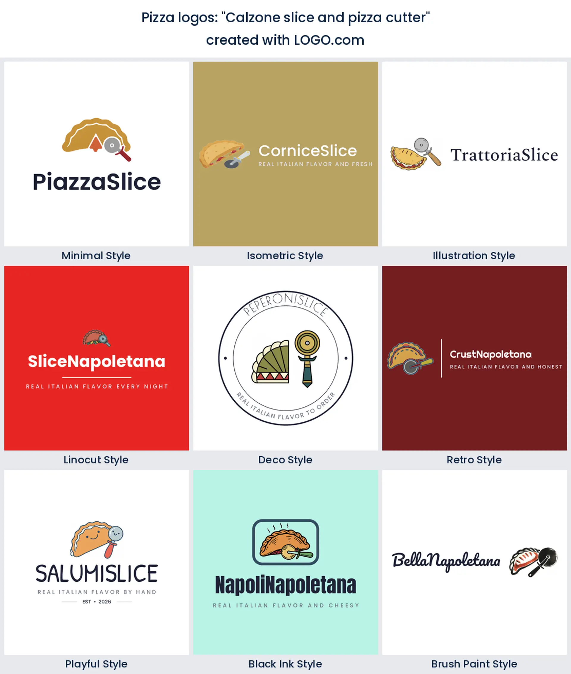
10. "Calzone slice and pizza cutter"
A calzone next to a rolling cutter shows there is more than pizza on the menu. It suits an Italian kitchen or a pizzeria logo that also slings calzones and strombolis.
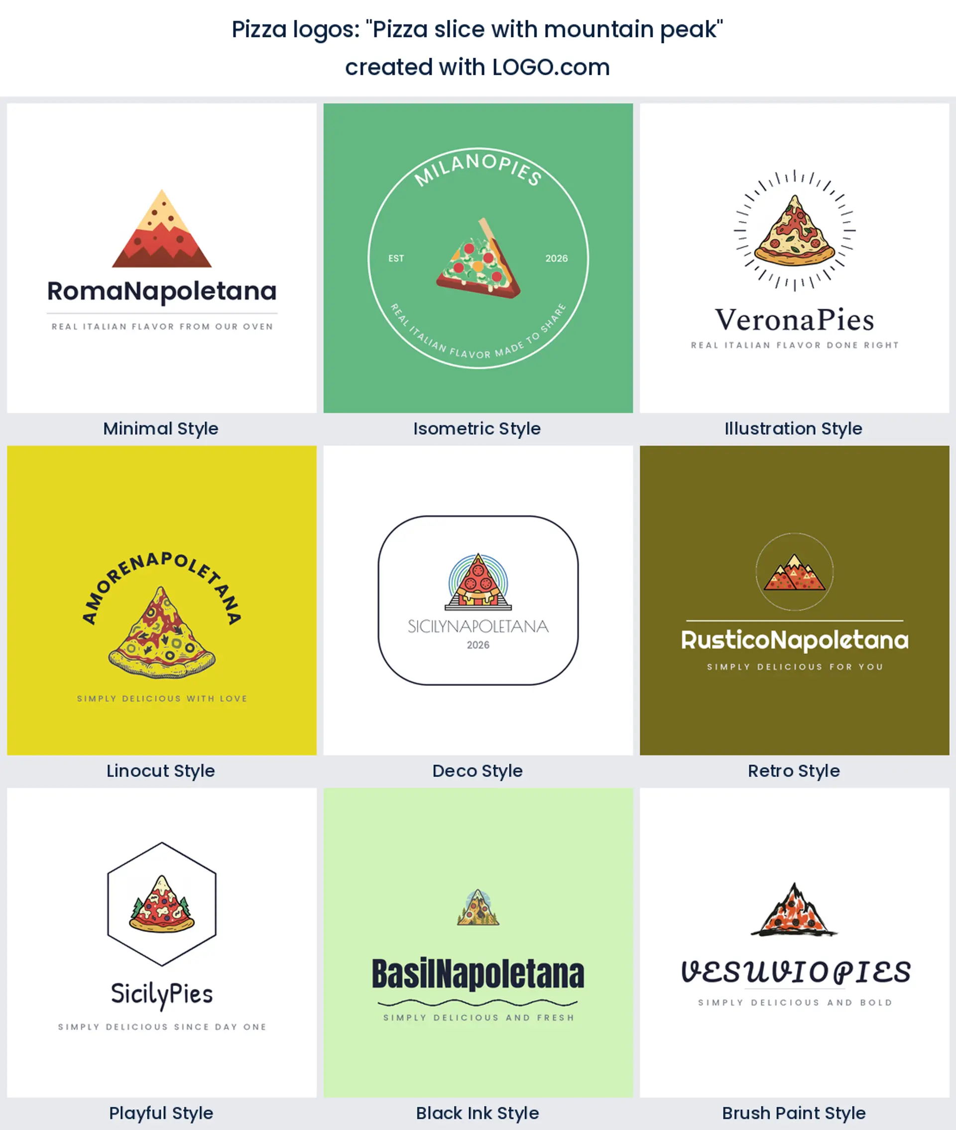
11. "Pizza slice with mountain peak"
Shaping a slice into a mountain peak is a bold, outdoorsy twist. It fits a pizza logo for a ski town slice shop or an adventurous brand with a sense of place.
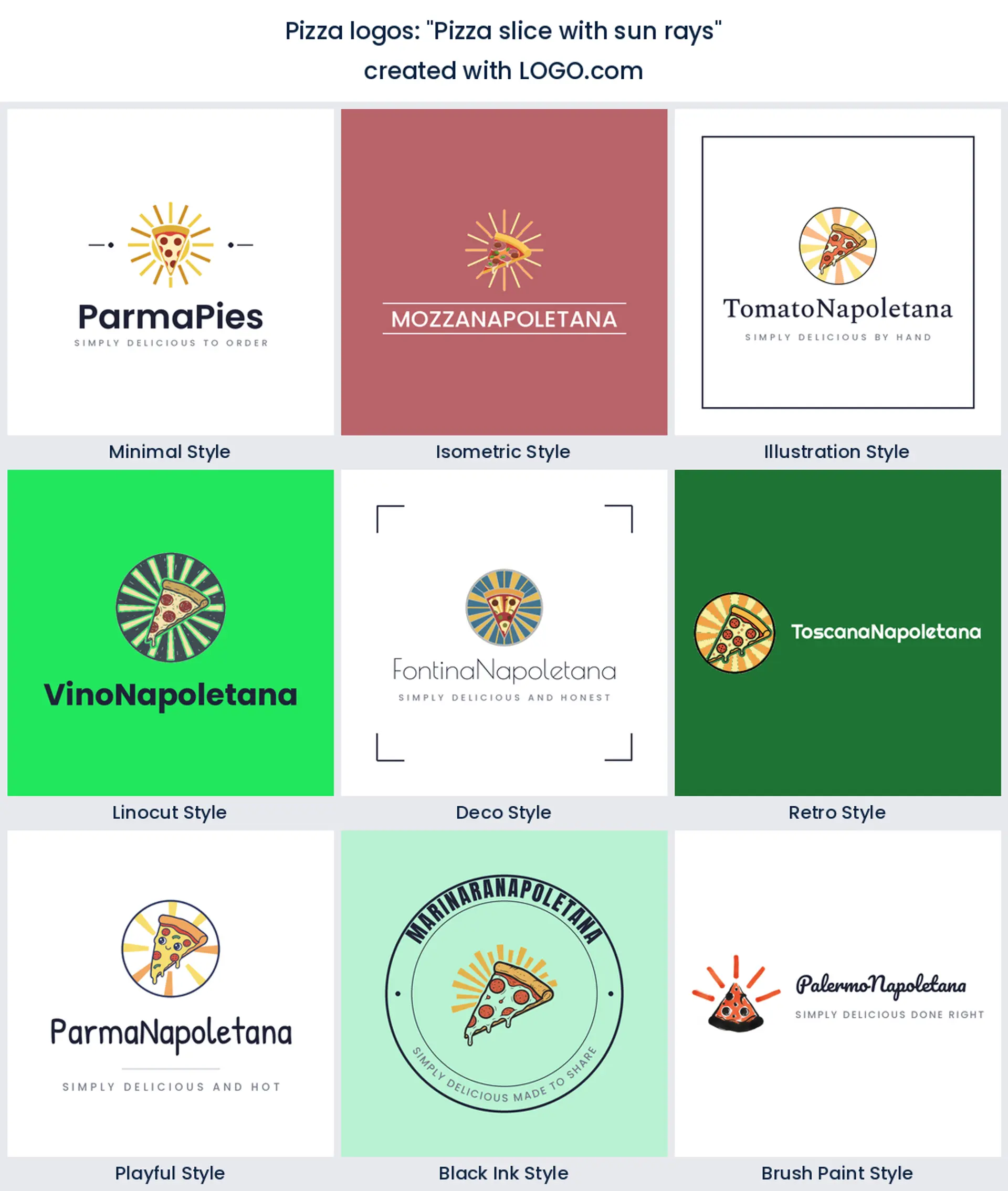
12. "Pizza slice with sun rays"
Sun rays fanning out behind a slice feel bright, sunny, and Mediterranean. Reach for it for a coastal pizzeria logo or a summery, feel good pizza brand.
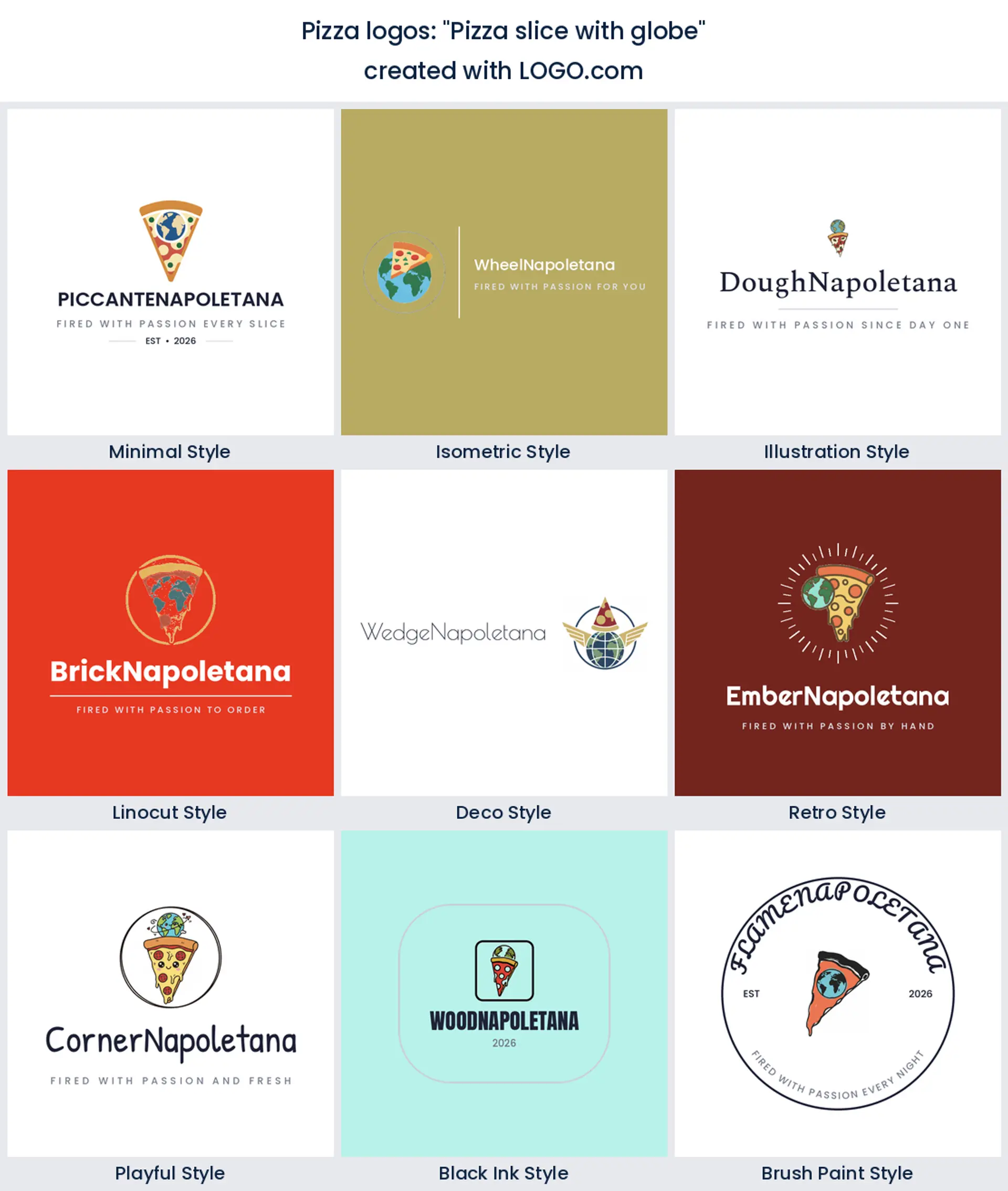
13. "Pizza slice with globe"
A slice paired with a globe says pizza for everyone, everywhere. It is a smart pizza logo for a growing chain or a delivery brand with big plans.
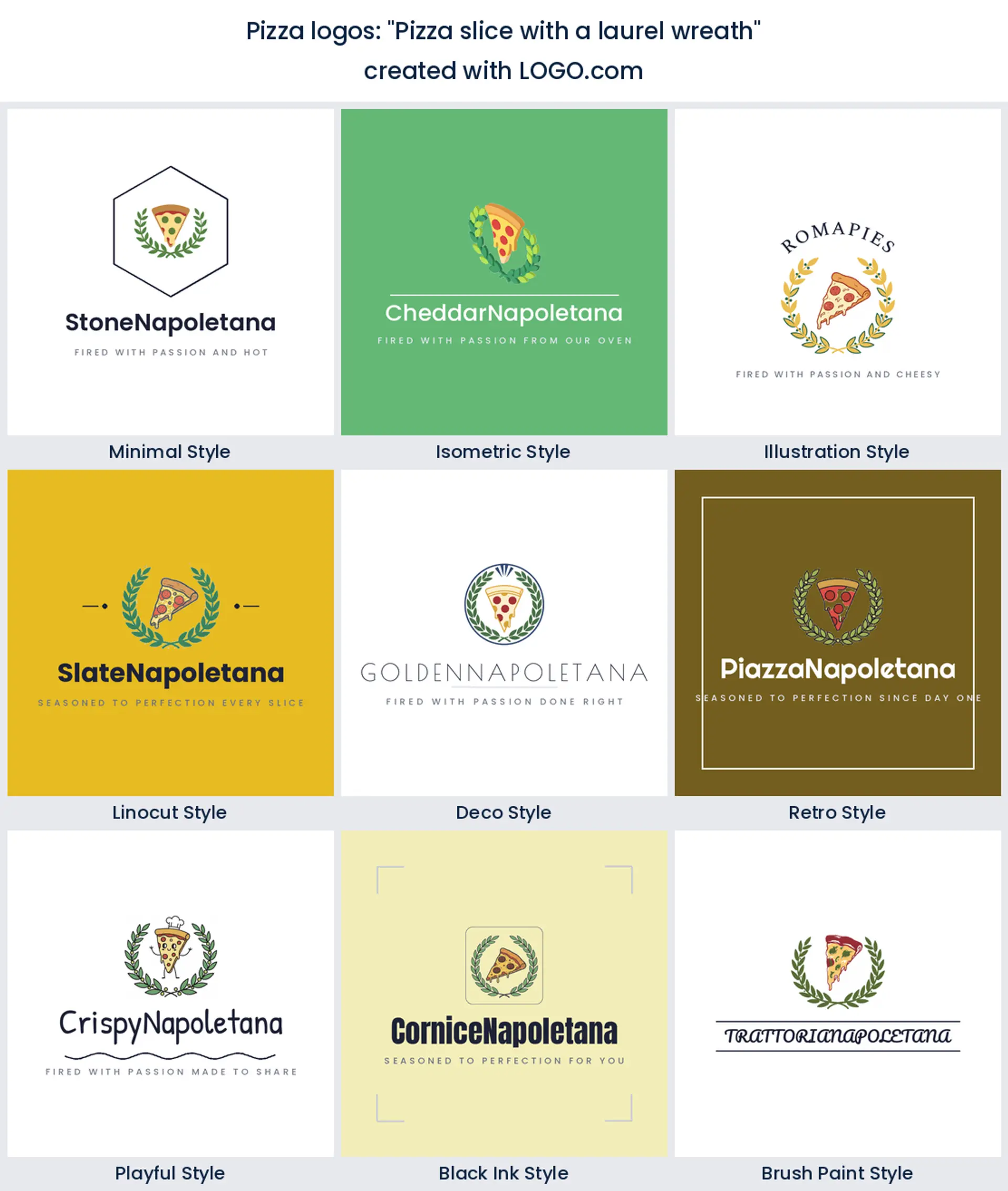
14. "Pizza slice with a laurel wreath"
Framing a slice in a laurel wreath borrows a little old world prestige. Choose it for a heritage pizzeria logo or a family recipe brand that wants to feel established.
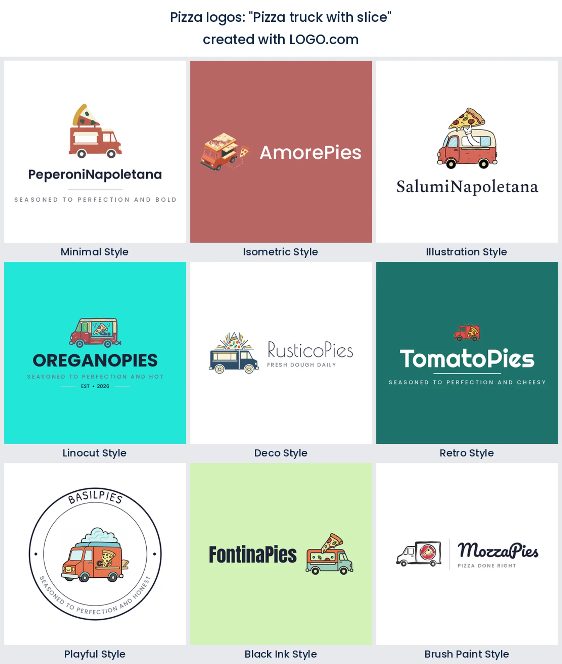
15. "Pizza truck with slice"
A little pizza truck with a slice on the side is street food in one mark. It is a ready made food truck pizza logo for a mobile oven or a pop up slice window.
Neapolitan, New York, or Detroit: match the logo to your pizza style
The kind of pizza you make can steer the whole look. A Neapolitan or wood fired spot leans artisan, so a hand drawn slice, a flame, or a simple serif feels right. A New York slice joint wants something bold and classic that reads from down the block, while a Detroit or deep dish place can go chunkier and more retro. Match the mark and the font to the pizza on your peel, and your pizza logo design will feel true before anyone tastes a bite.
Pizzeria, slice shop, delivery, or Italian kitchen: pick your lane
Say what you are and the right mark follows. If you run a full pizzeria, a classic slice with a warm serif gives a pizzeria logo that feels established. A grab and go counter wants something bold and bright, so a punchy pizza shop logo reads fast on the street. If most orders come through the apps, a simple shape that survives a round avatar matters more than fine detail, which is where a clean pizza delivery logo wins. And when pizza sits inside a wider menu, a grape leaf, a tomato, or a classic serif turn it into an italian restaurant logo. Choose your lane first, because it decides the symbol, the font, and the feel.
From a hot box lid to a delivery app tile
Pizza logos live at rough sizes. The same mark has to look good stamped on a kraft pizza box, printed on a menu board read from across the room, and shrunk into a round avatar on a delivery app. Drop hairline strokes and busy detail that turn to mud printed small or seen from the sidewalk. One solid shape, generous spacing, and a clear name will carry your pizza logo across every surface a pizzeria touches, which is exactly what makes a strong pizza box logo.
Grab the transparent version for boxes and screens. A transparent pizza logo png sits straight on a brown pizza box, a menu header, or a dark delivery tile with no white box around it, which matters when your logo shares space with photos of the food. Keep a solid background copy too for avatars that need contrast. Both come in your download from LOGO.com.
How to stand out when almost every pizza logo is a slice
Here is the honest challenge. In our data a plain slice shows up in about 87% of pizza logos, so leaning on the slice alone can leave you looking like the shop next door. There are two easy ways to stand apart. First, pair the slice with one detail that is yours, a cheese pull, a flame, a chili, or a crown, the way real founders do. Second, own a color, since warm reds, golden yellows, and herb greens are the classic Italian mix, so pick one main color and one accent and use them everywhere. A small twist and a confident palette turn a generic slice into a pizza logo people remember.
Does a pizza logo cost anything, and what can you put it on?
Designing and previewing your pizza logo on LOGO.com is free, and so is downloading it. The free plan gives you high resolution PNG files with full commercial use, so you can put the logo on your boxes, your menu, your shopfront, and your delivery listings and trade under it right away. A paid Brand Plan adds the vector files you need to print big and crisp on signage, awnings, and a delivery van wrap, plus unlimited edits and a full brand kit for when you open your second location. Either way the mark is yours to use commercially.
Make your pizza logo with LOGO.com
Pick the symbol that fits your pie, choose one of nine styles, and our pizza logo maker builds the rest around your name. Preview it free, then download a finished pizza logo ready for your boxes, your sign, and your delivery apps in minutes.
Methodology. These figures come from logos created on LOGO.com during the 12 months ending July 2026. We read the 254 custom pizza icon descriptions that founders typed while designing a logo, written by roughly 135 brands, and grouped them by concept, for example a pizza slice, a melted cheese pull, or rising steam, ranking each by how often it appeared. The plain slice led at about 87%, the cheese pull followed at about 8%, and rising steam came third at about 6%. Figures are a share of pizza logo descriptions, rounded to the nearest percentage point. Source: LOGO.com first party product data, July 2026.
THE #1 LOGO GENERATOR
Why LOGO.com is the best pizza logo maker
1.Ranked from real pizza prompts
Every icon here comes from pizza logos founders actually described on LOGO.com, so you start from what sells a slice, not generic clip art.
2.Reads at avatar size on the apps
Most new orders start on a delivery app, so your mark stays clear shrunk into a round DoorDash or Uber Eats avatar.
3.Sits clean on a kraft box
Download a transparent PNG that drops onto a brown pizza box or a dark menu photo with no ugly white box behind it.
4.One slice from box to banner
Start square so the same pizza logo works on a box, a neon shopfront sign, and a social avatar.
5.Slice shop or trattoria, nine styles fit
Match your concept, from a bold retro slice badge to a refined chef hat monogram for a sit down room.
6.Prints in one color on a box
A single color version stamps cleanly onto brown boxes and napkins and cuts into a neon sign without losing the slice.
7.A brand kit for boxes and vans
Keep one logo, palette, and font across your boxes, menu, delivery listings, and a van wrap as you grow.
8.Add a location without a redraw
Swap the color, name, or icon any time you open a second pizzeria or refresh the menu.
9.Design it free, sell pizza under it
Preview free and download high resolution PNGs with full commercial use, then upgrade to the Brand Plan for vector print files.
Pizza Logo Maker FAQs
Need Inspiration? See example brands in your industry...
3DAcademic EducationAccommodationAdvertising AgencyAffordableAgriculture BlogAlternative MedicineAnimal BlogAnimalsApartmentAppraisal ServicesAriesArtArtistArts EducationAstrologyAudio ServicesAuto DealershipAuto Rental AgencyBBQBakeryBanking ServicesBaseball TeamBeauty SalonBed & BreakfastBettingBioinformaticsBirdBlock Letter Logo MakerBlurbBookBooks and LiteratureBoxBuilderBurgerBusiness Services and ConsultingCBDCameraCancerCannabisCardsCatCattleCharityChild CareChocolateCinemaCityClevverCloud