Tech Logo Maker
Design a tech or software logo that works on your app icon and website.
Need a different logo maker? Try our AI logo generator.
Logos created using LOGO.com
670,000,000
Clean and abstract tech logos
Bold and modern software logos

Playful and geometric tech logos

Tech Logos, Ranked From Real Brand Data
According to LOGO.com data, the most common tech logo icons are the circuit board (about 22% of icon descriptions), the network (about 8%), and the gear (about 6%). One clean symbol plus your company name does most of the work on a tech logo.
Every style below is drawn from those founder descriptions rather than a stock library, so you are choosing between marks that already read as technology to the people you are selling to. Change the symbol, the color, and the type until it stops looking like the category and starts looking like your company.
On this page
- What 4,855 tech brands put in their logos
- Fifteen ideas straight from the prompt box
- Two ways around the circuit board trap
- Where your logo lives once someone is inside the product
- Blue leads every tech palette, so how do you stand apart?
- The files your engineers ask for on day one
- Should an open source project look different from an enterprise platform?
- Make your tech logo with LOGO.com
Of the 365 icon descriptions technology and software founders typed into LOGO.com over the past year, about 22% asked for some version of a circuit board. Design on instinct and you land exactly where everyone else landed. So this page starts with the nine symbols that really came up, adds fifteen tech logo ideas taken from what founders actually wrote, and shows you how to build on them without disappearing into your own category.
What 4,855 tech brands put in their logos
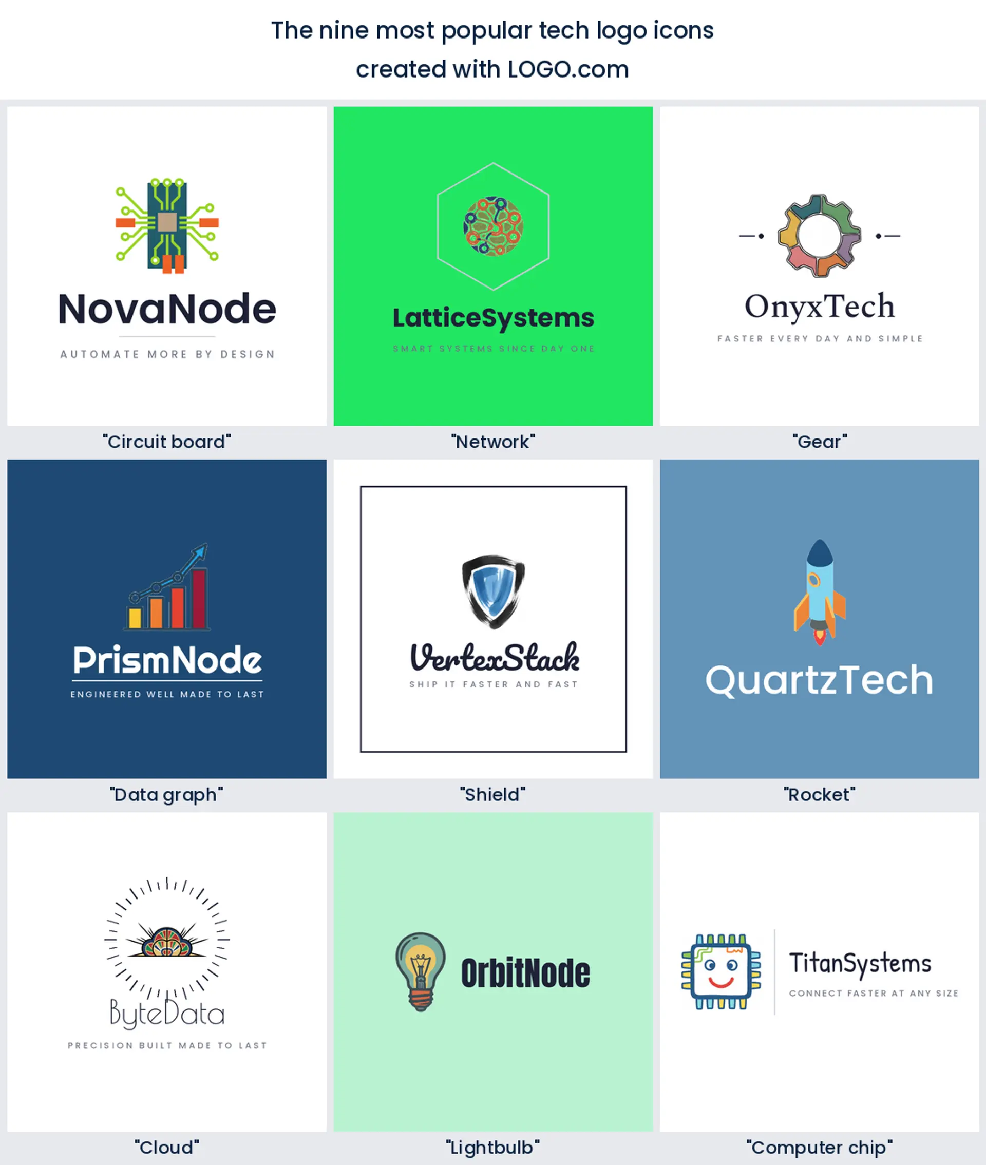
The tech logos founders build on LOGO.com cluster around nine symbols. The circuit board leads by a wide margin, in about 22% of the 365 icon descriptions we read, the network comes second at about 8%, and the gear sits third at about 6%. After those come data graphs, the shield, the rocket, the cloud, the lightbulb, and the computer chip. Most technology logos need just one of these plus a clear company name.
1. Circuit board (22%)
Circuit traces and chip outlines carried about 22% of the descriptions we read, more than double the next symbol on the list. They say technology without a word, which is exactly why they became the default for a software company or an information technology logo.
2. Network (8%)
About 8% of founders drew a network, connected nodes joined by thin lines. It is the natural pick for anything built on connection, so it suits a SaaS platform, a data company, or a cloud services logo.
3. Gear (6%)
Roughly 6% of descriptions came back to a cog. One gear reads as engineering and as systems that simply work, a solid choice for a developer tool, an automation product, or an IT services logo.
4. Data graph
Below the measured top three, data itself does well: bar graphs, rising lines, and streams of numbers. Founders choose it when the product turns information into decisions, so it fits an analytics platform or a fintech logo.
5. Shield
Wrap a shield around a lock or a circuit and the meaning arrives before the name does. It is shorthand for keeping things safe, which makes it the obvious mark for a cybersecurity or a VPN logo.
6. Rocket
The rocket shows up plenty, taking off through clouds or trailing circuits. It signals speed and momentum, a natural fit for a developer tool or a fast growing software logo.
7. Cloud
Pair a cloud with storage or a network and you have told people where your product lives. It reads instantly as a cloud software or hosting logo, which is why founders keep coming back to it.
8. Lightbulb
Whenever the story is about ideas, this is the mark that appears. Combined with a gear or a circuit it says invention and problem solving, a warm choice for an innovation lab or a technology consulting logo.
9. Computer chip
Last of the nine, and the most literal. A pixel grid or a processor square feels precise and hardware minded, the right symbol for a semiconductor, a device maker, or a deep tech logo.
Fifteen ideas straight from the prompt box
These are not made up. Each heading below is a real icon description a technology or software founder typed into LOGO.com, shown across the nine styles so you can watch the same idea move from a clean minimal mark to a bold retro badge. Find the one closest to what you build, then change the color, font, and name until it is yours. Treat them as tech logo ideas to remix rather than copy.
1. "Gear with a circuit board"
Engineering plus electronics in one shape. Use it when you want a modern tech logo that looks built rather than bought, which suits a hardware startup or a developer tool.
2. "Digital cloud network connection"
If your product moves things between places, this one does the explaining for you. It reads as a cloud platform or a networking software logo before anyone gets to the name.
3. "Shield protecting digital circuit board"
Security first, and it says so in half a second. Cybersecurity teams and information technology logos lean on this pairing because the promise stays legible at thumbnail size.
4. "Rocket ship and circuits"
Momentum is the whole point here. Reach for it when a launch tool or a growth product needs a software logo with some heat in it.
5. "Digital brain network"
Ask what smart looks like and most founders draw this. It fits a machine learning product or an AI flavored technology logo, though it is popular enough that your color choice has to work harder.
6. "Lightbulb gear cog innovation"
Ideas on one side, engineering on the other. That combination flatters an R and D team or a technology consulting logo without feeling stiff.
7. "Globe with upward arrow"
Reach and growth, stated plainly. Global SaaS brands and scaling tech company logos use it because it survives being shrunk to a favicon.
8. "Cloud storage and data protection"
Backups and privacy, drawn as one object. Storage products and data security logos get a reassuring mark out of it, especially in a cooler blue.
9. "Blockchain technology and digital currency"
Nothing subtle about it, and that is fine. A crypto wallet, an exchange, or a fintech tech logo can afford to name the category outright.
10. "Connected gears representing systems integration"
The parts work together and the mark shows it. Integration platforms and IT services logos get a dependable emblem, so keep the gear count to two or three or it clogs up at small sizes.
11. "Digital shield over server rack"
Infrastructure security compressed into one image. Hosting, backup, and enterprise software logos all fit here, and it reads well knocked out in white.
12. "Upward arrow and growth chart"
This is the language of dashboards, which is exactly why an analytics tool or a fintech technology logo can use it and be understood instantly.
13. "Synchronized arrows in a cycle"
Sync and automation, in one loop. Backup tools, workflow apps, and automation software logos suit it, and the circular shape crops beautifully into an app icon.
14. "Brain and gears combination"
Thinking and mechanics, meshed. Robotics teams and AI tech company logos take a confident direction from it, though it needs simplifying before it goes small.
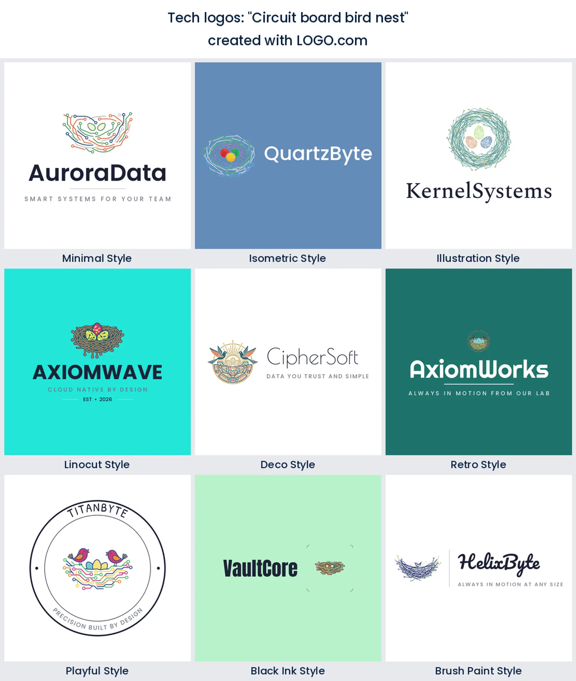
15. "Circuit board bird nest"
Founders really do type this one, and it works. A bird tucked into a circuit board gives a developer community or a friendly modern tech logo something people remember.
Two ways around the circuit board trap
It is the most popular symbol in our data by a wide margin, and that cuts both ways. A circuit trace or a chip outline is instantly readable, so nobody has to work out what you do, which is worth a lot when you get two seconds in an app store list. The cost is that you look like the other nine circuit boards on the same screen. There are two ways out. Pair the obvious symbol with something only you would use, the way founders in our data put a circuit board inside a bird nest or built one into a brain, so the mark carries a second idea. Or drop the object entirely and let a short, distinctive name carry the weight as a wordmark, with one small abstract shape beside it for the app icon. Either route beats a technology logo that could belong to any company on the shelf.
Where your logo lives once someone is inside the product
Most logo advice stops at the website header, but a software brand spends most of its life inside the interface. Your mark sits in the corner of a nav rail at about 24 pixels, spins in a loading state, fills the empty state of a screen nobody has used yet, and shrinks into an in app avatar next to a comment. Detail that looked crisp on a landing page turns to mud in every one of those slots, so drop hairline strokes, keep the shape to one clear idea, and build it square from the start. Test the tech company logo at 24 pixels on a real screen before you commit, because that is the size your daily users actually see.
Two files do most of the work in there. A transparent PNG drops the mark onto a colored dashboard, a screenshot, or a slide with no white box around it, and a one color version knocks out in white when the interface flips to dark. Keep both alongside your full color file and the logo sits cleanly on a light marketing page and a dark product screen without anyone reworking it.
Blue leads every tech palette, so how do you stand apart?
Blue came out on top of the palettes tech founders pick on LOGO.com, with green close behind, then purple and orange. That is a comfortable place to sit and a crowded one. Blue reads trustworthy and technical, which is why so much software branding lives there, so if you use it, earn your difference somewhere else: an unexpected accent, a distinctive shape, or type with real character. Green is the honest alternative for anything about growth, efficiency, or sustainability, and a purple or orange accent is the quickest way to make a modern tech logo feel like a product rather than a department. Choose one main color and one accent, never a full spectrum. A geometric sans reads precise and current, a rounded sans feels friendlier for a consumer app, and locking both into a brand kit keeps your product, your website, and your deck in step.
The files your engineers ask for on day one
Expect four requests in your first month. A square icon for the app store or your repo avatar, a transparent file for the website header, a one color version for a dark dashboard, and something crisp enough for a conference banner. Designing and previewing on LOGO.com is free, and so is the download: the free plan gives you high resolution PNG files with full commercial use, which covers your app, your website, your repo, and your deck from day one. The Brand Plan adds vector files that print large and stay crisp on signage and swag, plus unlimited edits and a full brand kit for the day you add a second product or rebrand. Either way the logo is yours to use commercially.
Should an open source project look different from an enterprise platform?
They are answering different questions. An open source project is judged by developers scrolling a repository list, so the mark has to survive as a tiny avatar and feel like it belongs to a community rather than a sales team, which is why playful and hand drawn marks do well there. An enterprise platform is judged in a procurement deck and a security review, so weight, symmetry, and a restrained palette do more for you than personality. The nine symbols hold up either way. What changes is the treatment: soften the shape and warm the color for the community project, tighten the geometry and cool the palette for the enterprise software logo.
Make your tech logo with LOGO.com
You have the data, the nine symbols, and fifteen ideas that came from real founders. Type your company name, choose a symbol and a style, and watch the lockup build itself around it. Preview as many directions as you like for free, then take the finished files to your app store listing, your repo, and your website the same day.
Methodology. These figures come from logos created on LOGO.com during the 12 months ending July 2026. We looked at roughly 4,855 brands whose founders selected a technology or software industry, such as Technology, Software, Information Technology, IT Consulting, Fintech, and Biotech, and the 365 custom icon descriptions those founders wrote. We grouped the descriptions by concept, for example circuit board, network, or gear, and ranked each by how often it appeared. The circuit board was most common at about 22%, the network next at about 8%, and the gear third at about 6%. Figures are a share of tech logo descriptions, rounded to the nearest percentage point. Source: LOGO.com first party product data, July 2026.
THE #1 LOGO GENERATOR
Why LOGO.com is the best tech logo maker
1.Ranked from 365 founder prompts
The symbols, colors, and layouts here come from icon descriptions that technology and software founders actually typed into LOGO.com.
2.Reads in an app store thumbnail
Your symbol keeps its shape where people first meet it, in a store listing, a browser tab, and a home screen.
3.One color cut for dark screens
Knock the mark out in white on a dark product interface, then switch back to full color for the marketing page.
4.A square crop for your repo avatar
The same mark drops straight into a code repository, a package profile, and a social account without losing the icon.
5.Nine styles the product really makes
From a clean geometric software mark to an isometric build or a bold linocut badge, every style shown here is one you can generate.
6.From repo avatar to conference banner
Start square and the same tech logo carries an app icon, a website header, a sticker, and a printed banner.
7.Hex values your engineers can paste
Your palette and font ship with the brand kit, so the colors inside the product match the website and the pitch deck exactly.
8.Survives the v2 rename
Keep the symbol, rebuild the wordmark around a new product name in minutes, and download every file again.
9.Free to design, yours to sell with
Preview free and download high resolution PNGs with full commercial use, then upgrade to the Brand Plan for vector files.
Tech Logo Maker FAQs
Need Inspiration? See example brands in your industry...
3D DesignAcademic WritingAccountantAerospace EngineeringAgricultural ConsultingAgriculture CompanyAmazonAnimal ProtectionAnimationApp DevelopmentAquacultureAromatherapyArt and DesignArtsAsian RestaurantAthleticsAudio TechnicianAuto ManufacturingAuto Repair ServicesBadgeBandBarber ShopBearBeauty and CosmeticsBeeBibleBiotechBitcoinBlogBoatBook PublisherBooks and Literature BlogBrainBuildingBusiness Consulting Logo MakerBusiness StorageCakesCampaignCandlesCarCarpentryCateringCelebrationsChemicalChildrenChoirCircleCivil EngineeringClothingCoffee Shop