

Logo Design Considerations for a Turkey Business
According to LOGO.com data, the five most popular colors in logos with turkey in their names created on LOGO.com over the past 12 months were black at 18%, white at 17%, red at 15%, green at 10%, and blue at 9%. Black and white lead with a crisp, confident contrast, while red, green, and blue can add warmth, freshness, or a vivid accent. For a turkey logo that feels memorable on packaging, signs, and social profiles, start with a black or white base and let one bright accent bring the character forward.
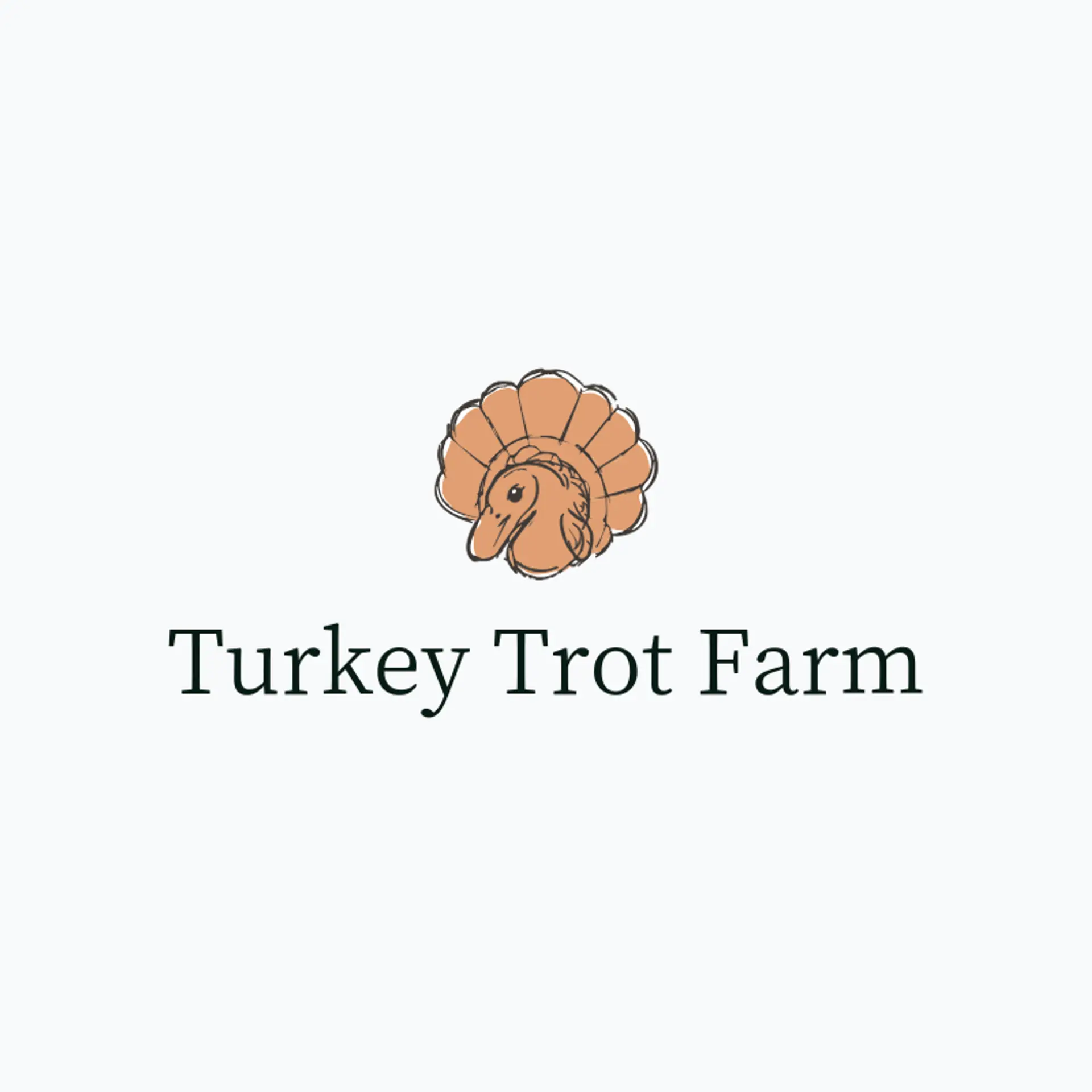
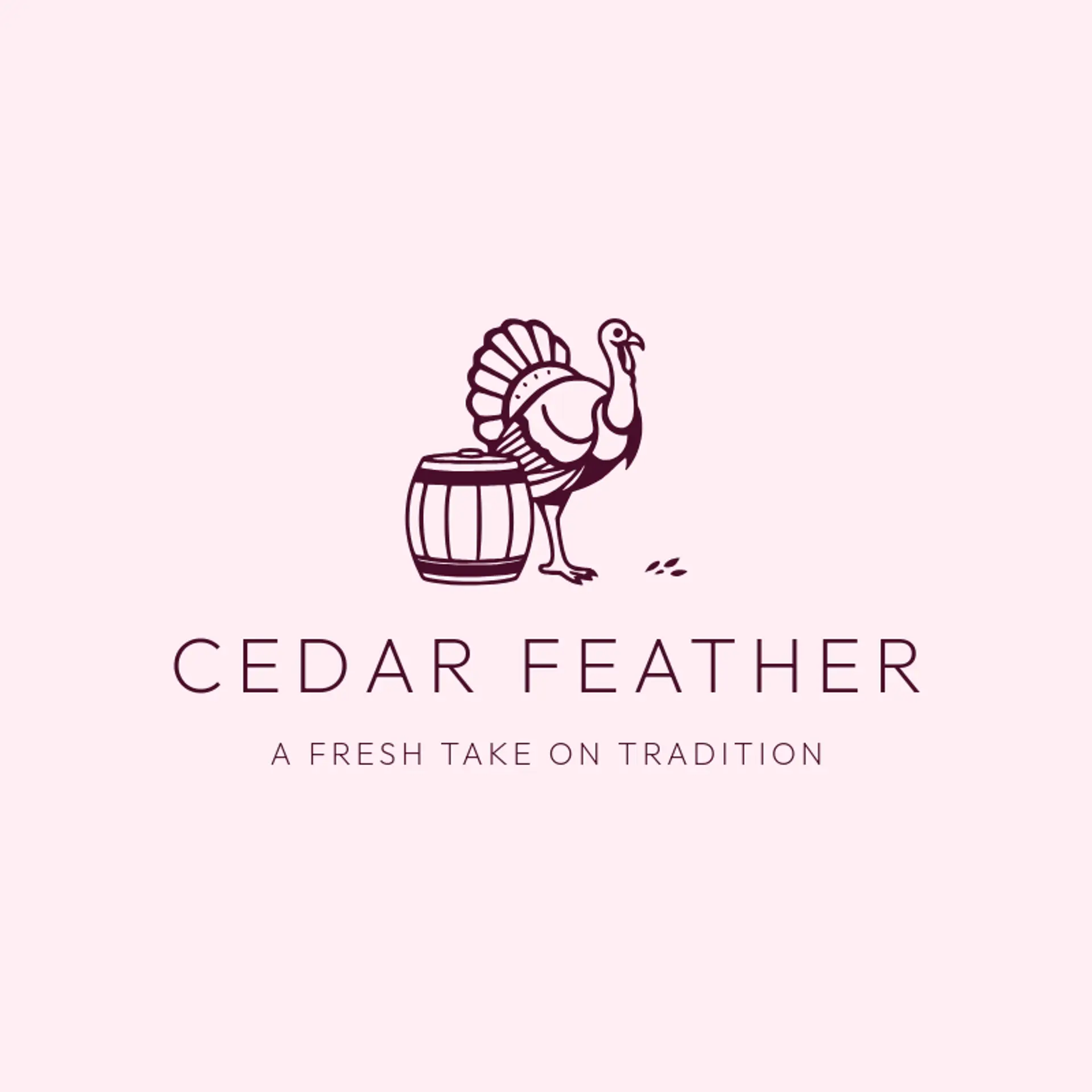
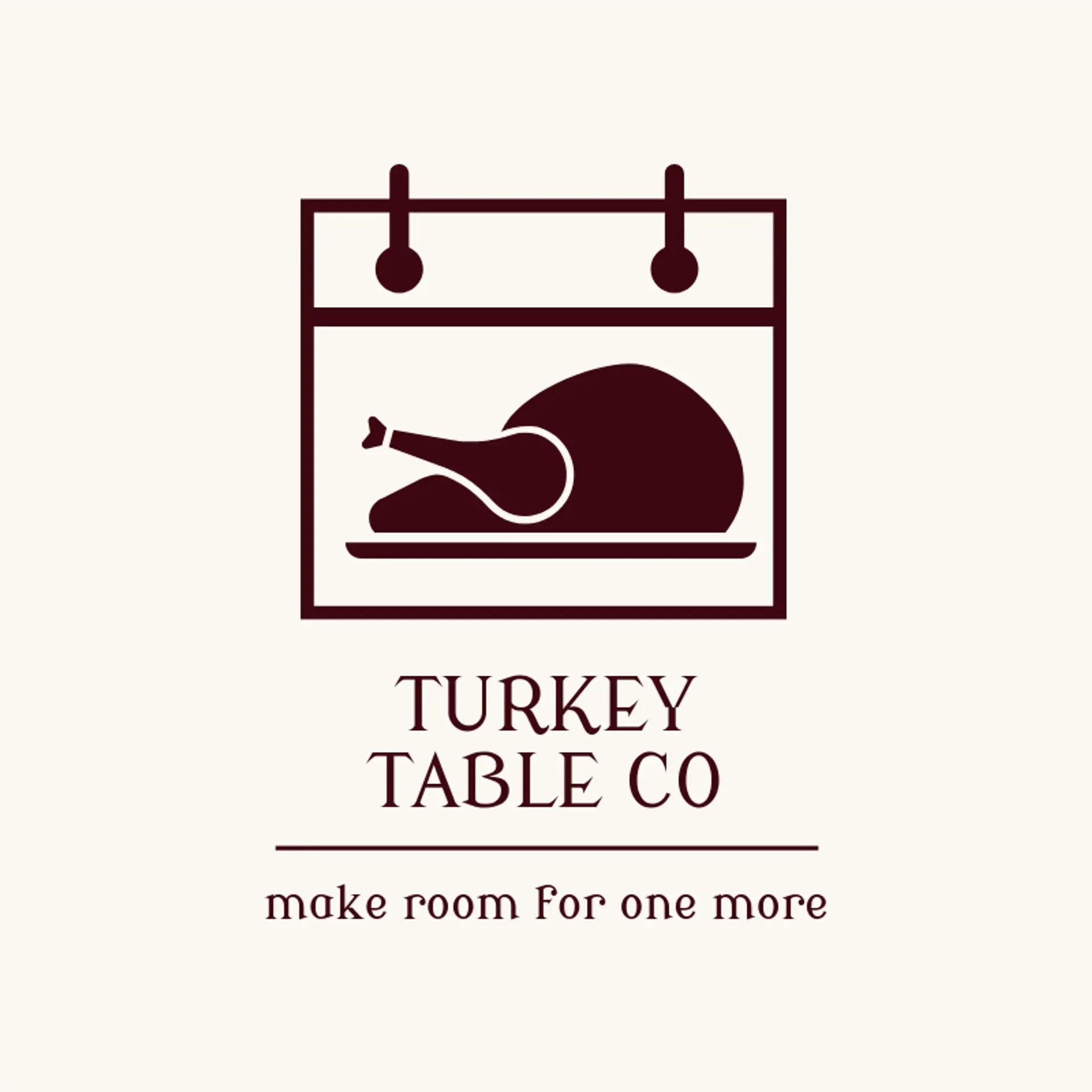
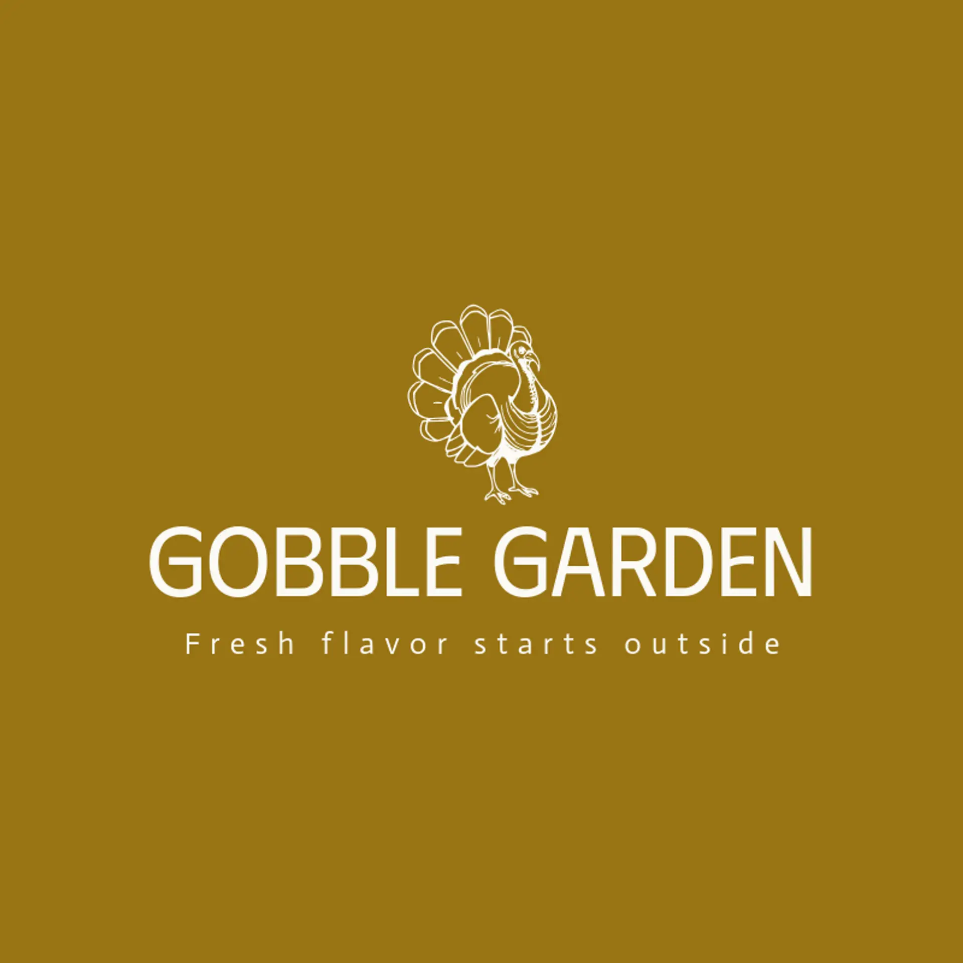
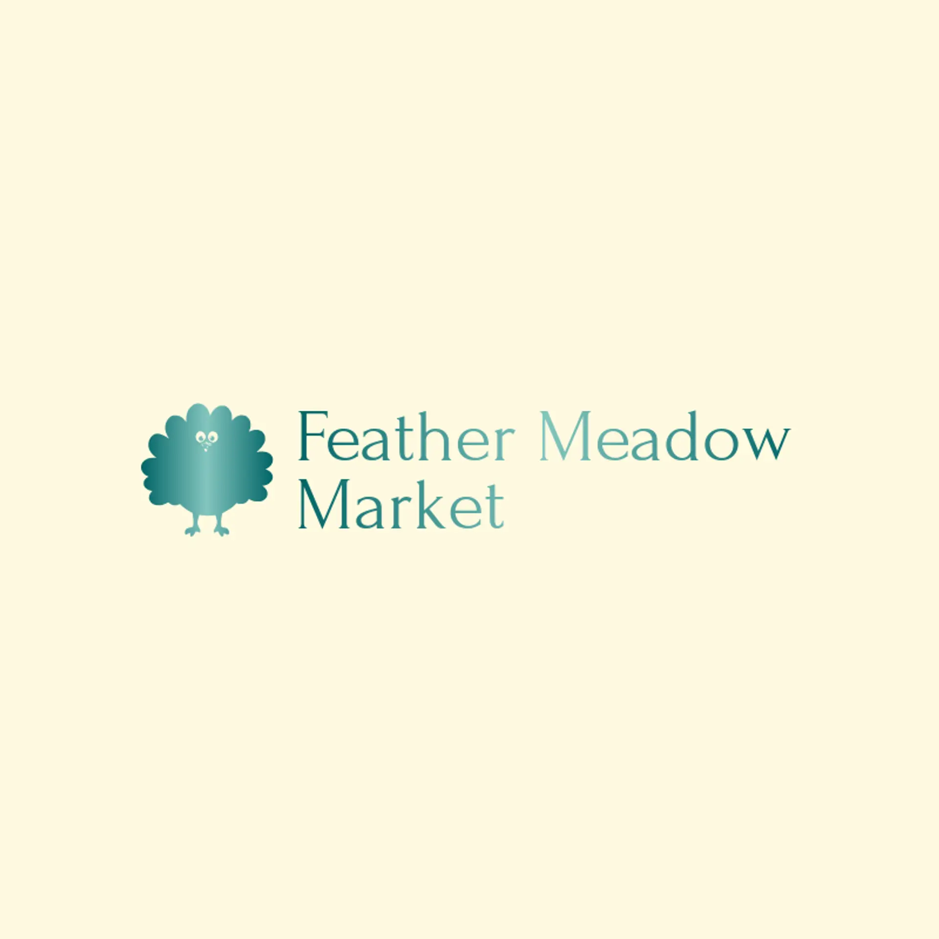
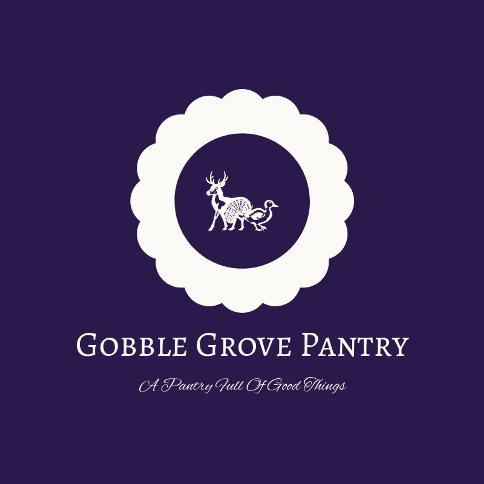
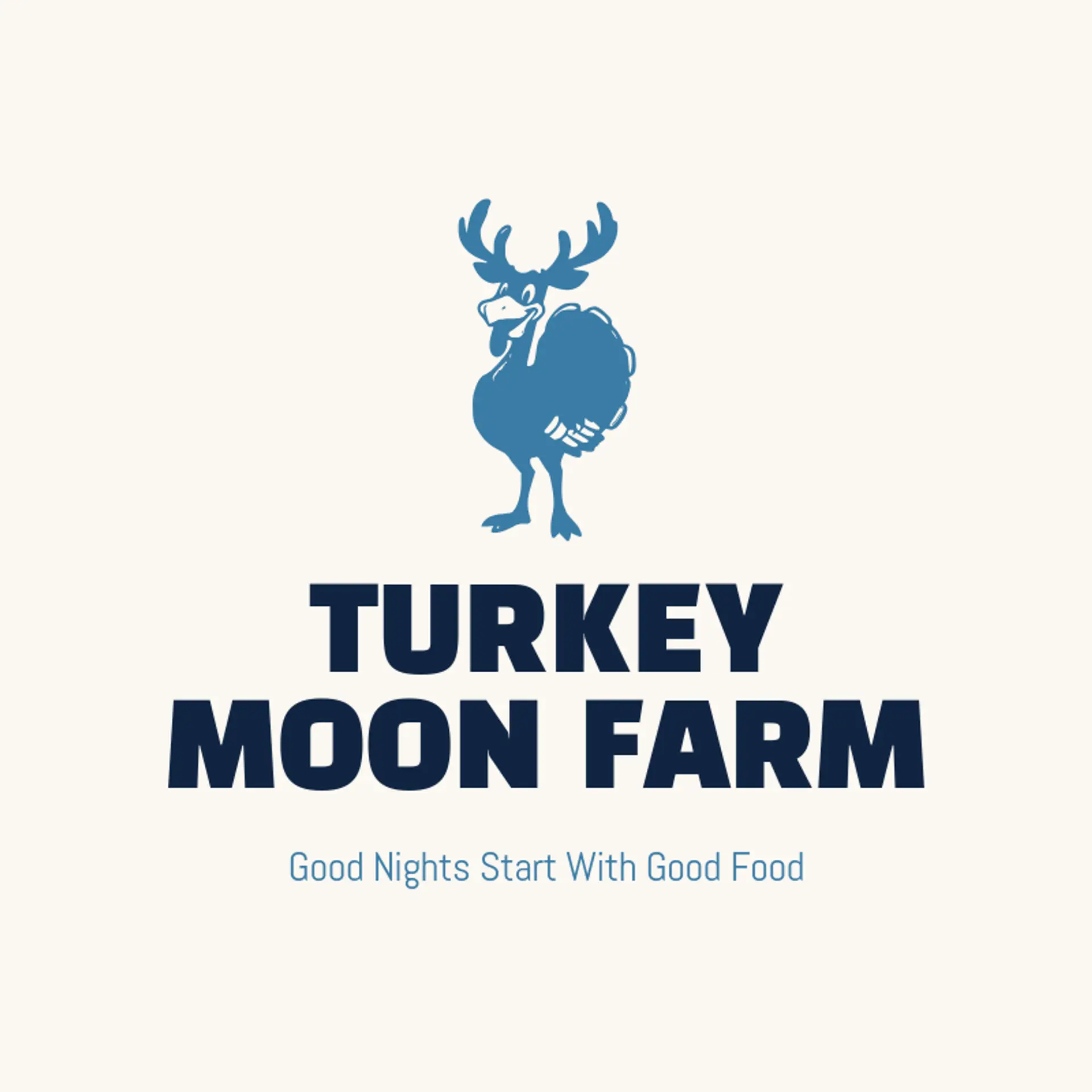
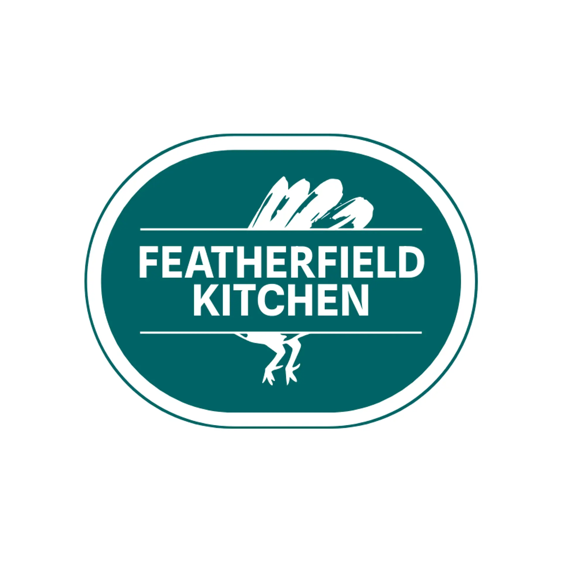
A turkey silhouette is an instantly recognizable place to begin, and a fan of tail feathers can create a strong shape even when reduced to a simple mark. A single feather can stand beside the bird as a clean emblem, or its lines can suggest movement without crowding the wordmark. For a lively food brand, consider a confident strut or a few simple feather strokes; for a farm or outdoor identity, try a quiet profile with a branch or field detail beside it. Before settling on a direction, connect the icon to the story behind the name, whether that means a family farm, a local market, or a playful seasonal product.
Icons To Make Your Turkey Logo Stand Out
That clear black and white foundation also gives turkey lettering room to stand out. According to LOGO.com data, sans serif typefaces made up 69% of font choices in logos with turkey in their names over the past 12 months, followed by serif at 14%, display at 9%, and handwriting at 6%. The most popular individual fonts included Albert Sans at 16%, Open Sans at 14%, Beau Rivage at 5%, Asar at 5%, and Alata at 5%. Pair a sturdy, easy to read typeface with the dark base and a lively accent so the name stays clear across everything from a market label to a small profile image.
Turkey Logo Ideas FAQs
Browse Related Logo Ideas
Alligator logosBeast logosBeaver logosBison logosBuffalo logosBull logosBulldog logosBunny logosButterfly logosCardinal logosCat pet care logosCow logosCoyote logosCrocodile logosDinosaur logosDog daycare and training logosDolphin logosFrog logosGamefowl logosGiraffe logosGoat logosGorilla logosHornet logosHummingbird logosLion logosMonarch logosOctopus logosPanda logosPanther logosPeacock logosPenguin logosPet care logosPet grooming logosPet logosPet sitting logosPhoenix logosRabbit logosScorpion logosShark logosSnake logosSpider logosTiger logosWildcat logosWolf logosCrow logosDuck logosElephant logosHawk logosHusky logosMonkey logos