






Logo Design Considerations for a Raccoon Business
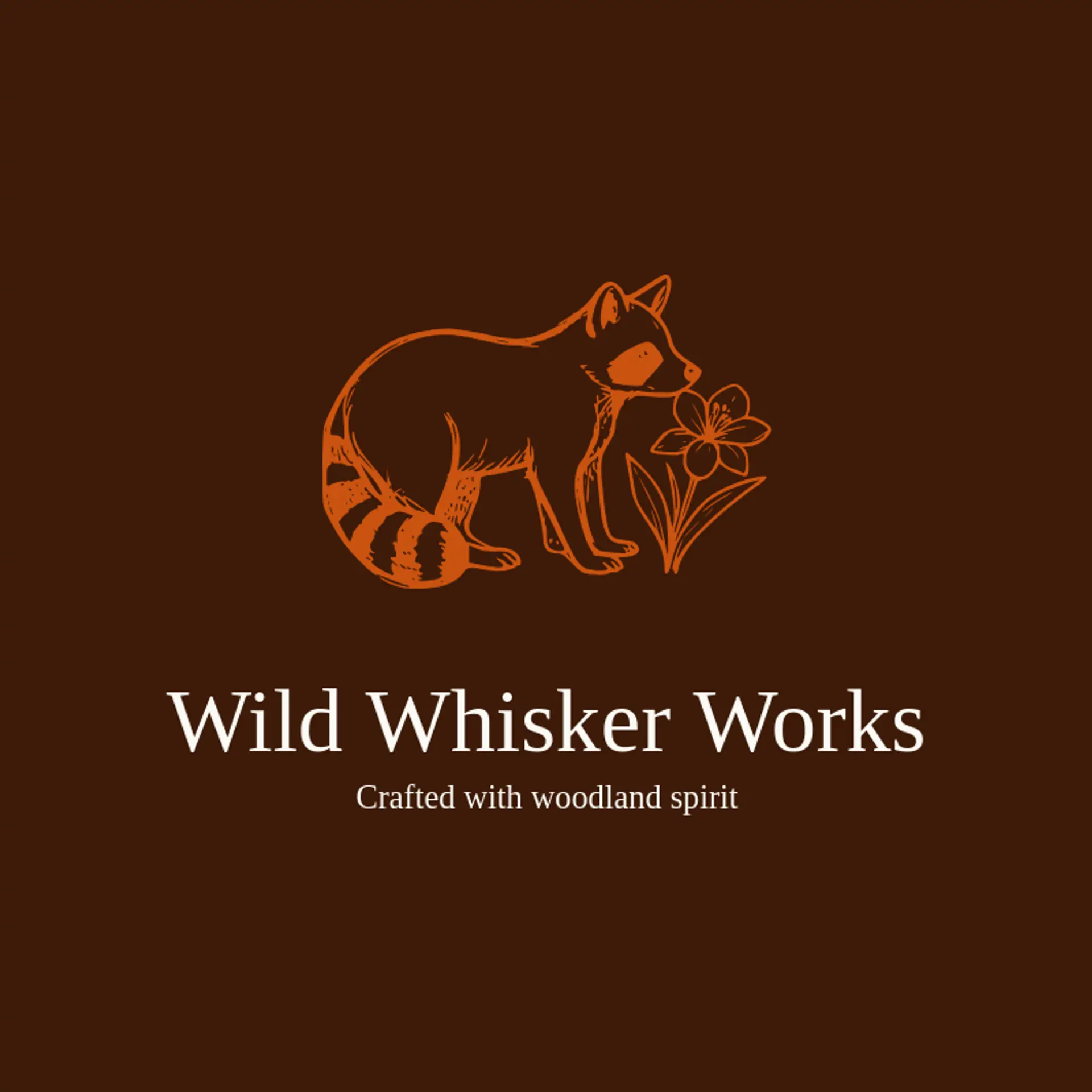
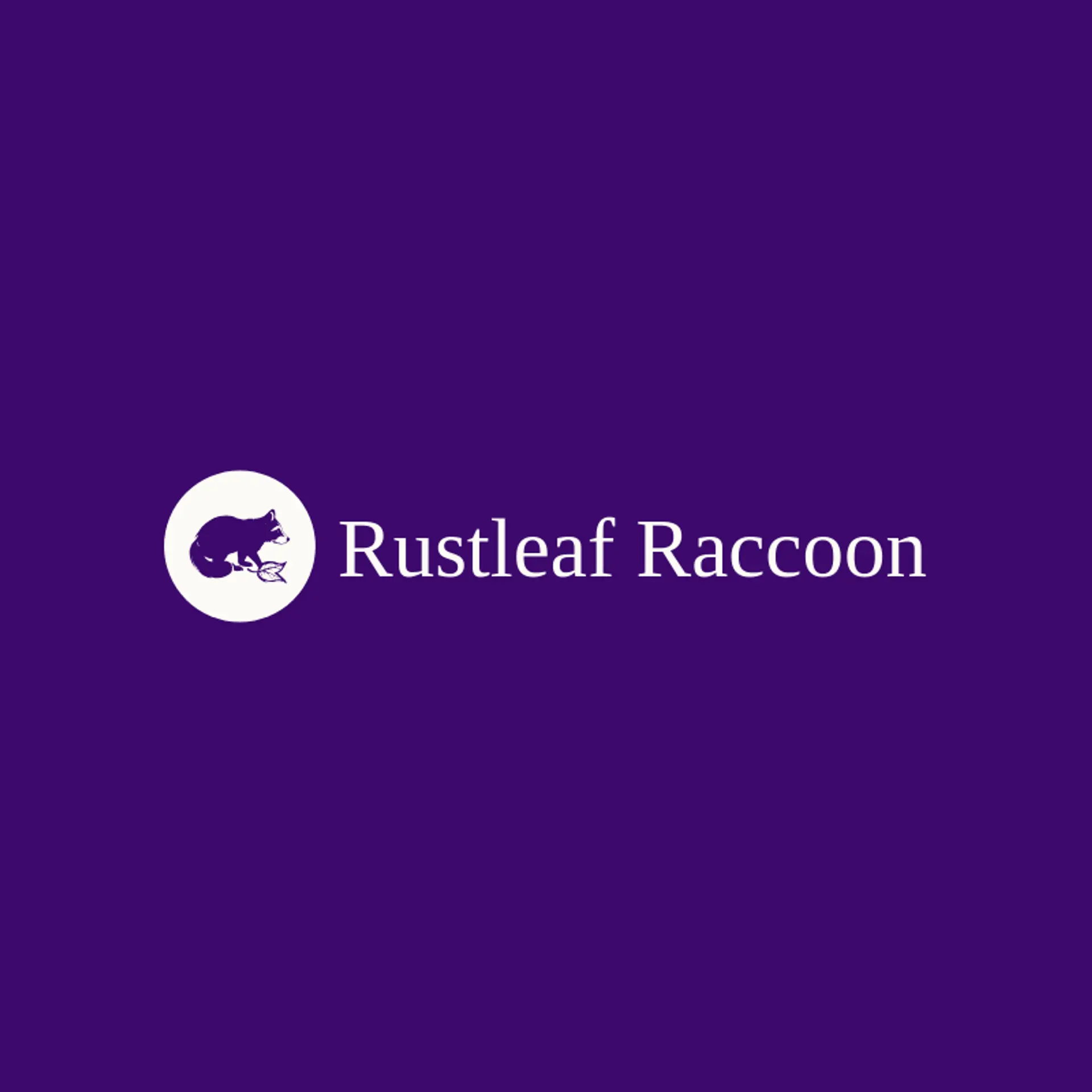
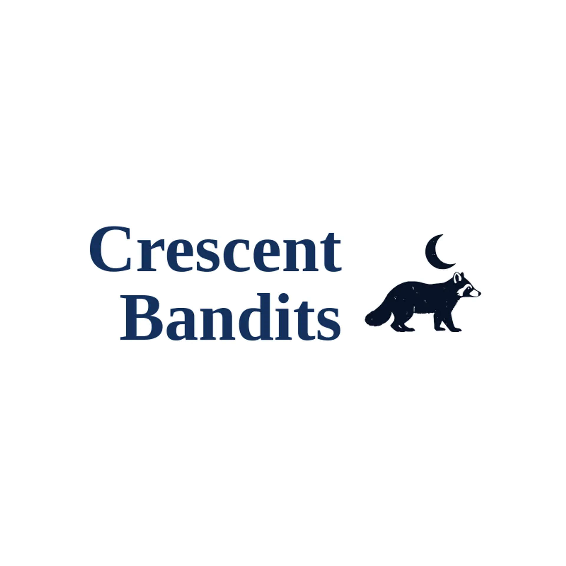
Raccoon logos benefit from earthy contrast and one lively accent that stays recognizable on signs, packaging, and social profiles. Deep forest green or charcoal can suggest woodland character, while warm cream creates breathing room and amber, rust, or soft red adds a playful spark. Choose a simple combination that keeps the mask and tail readable at a distance and reproduces consistently across print, embroidery, and digital uses.
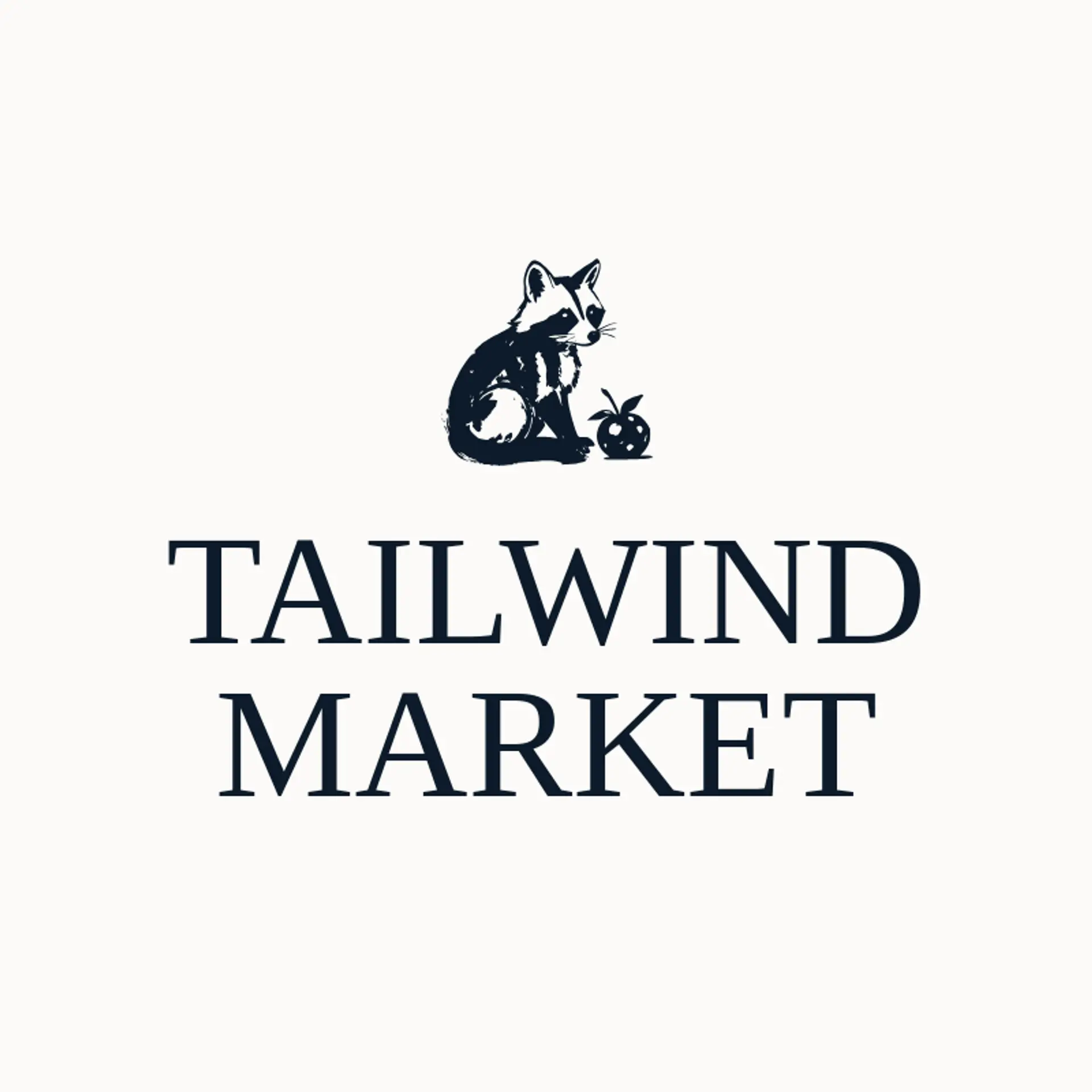
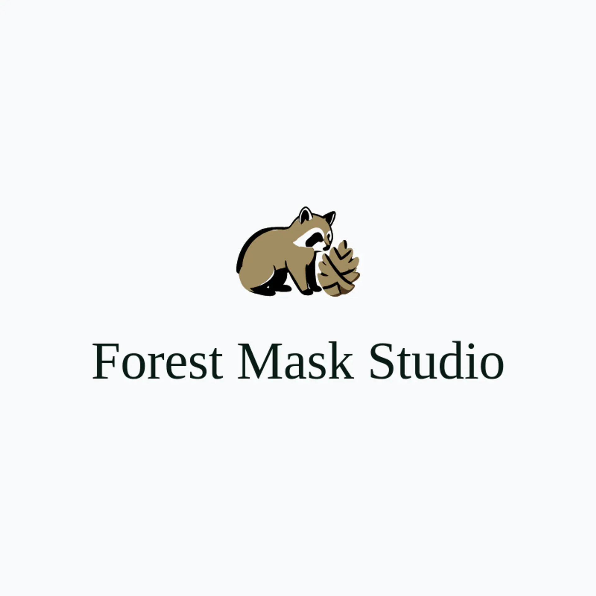
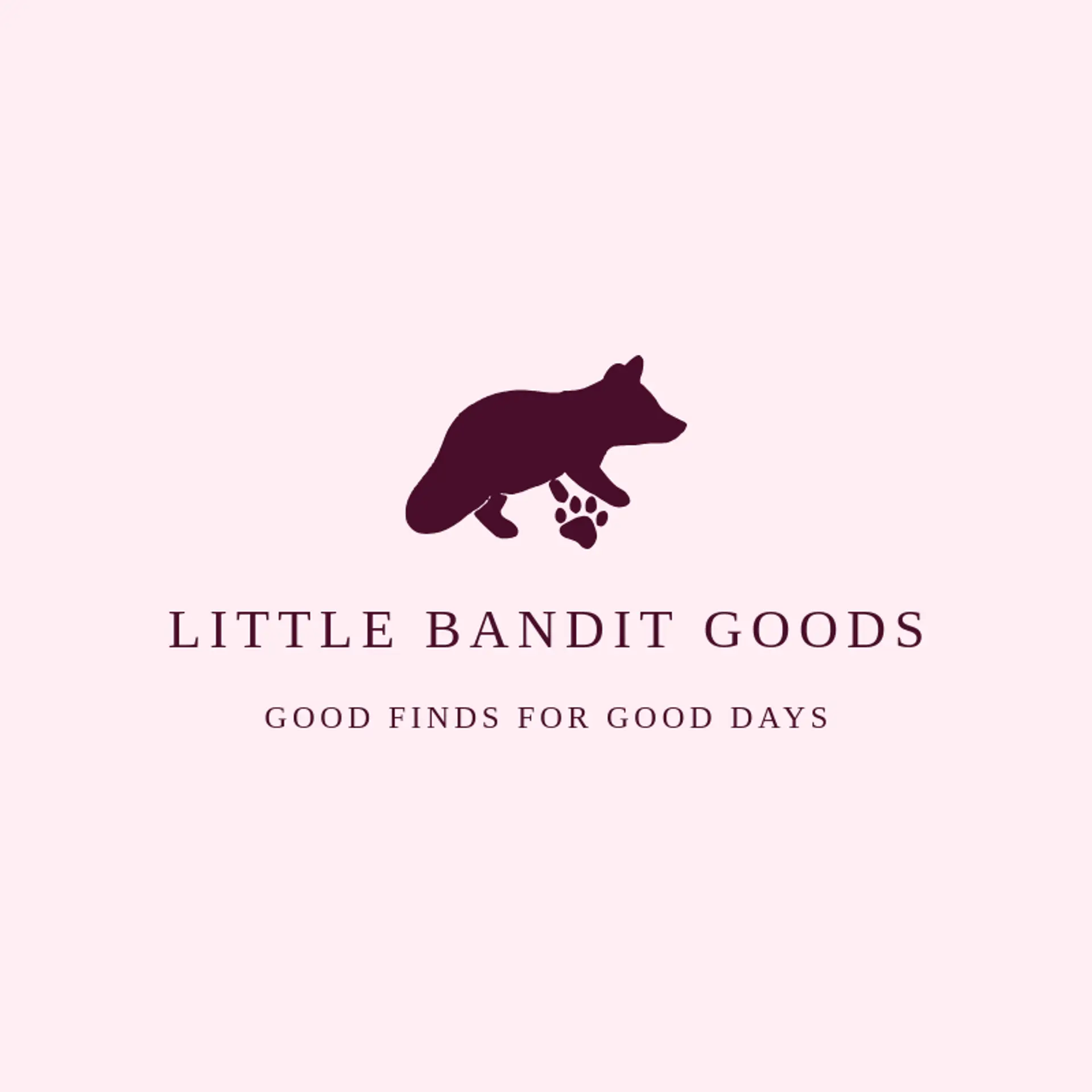
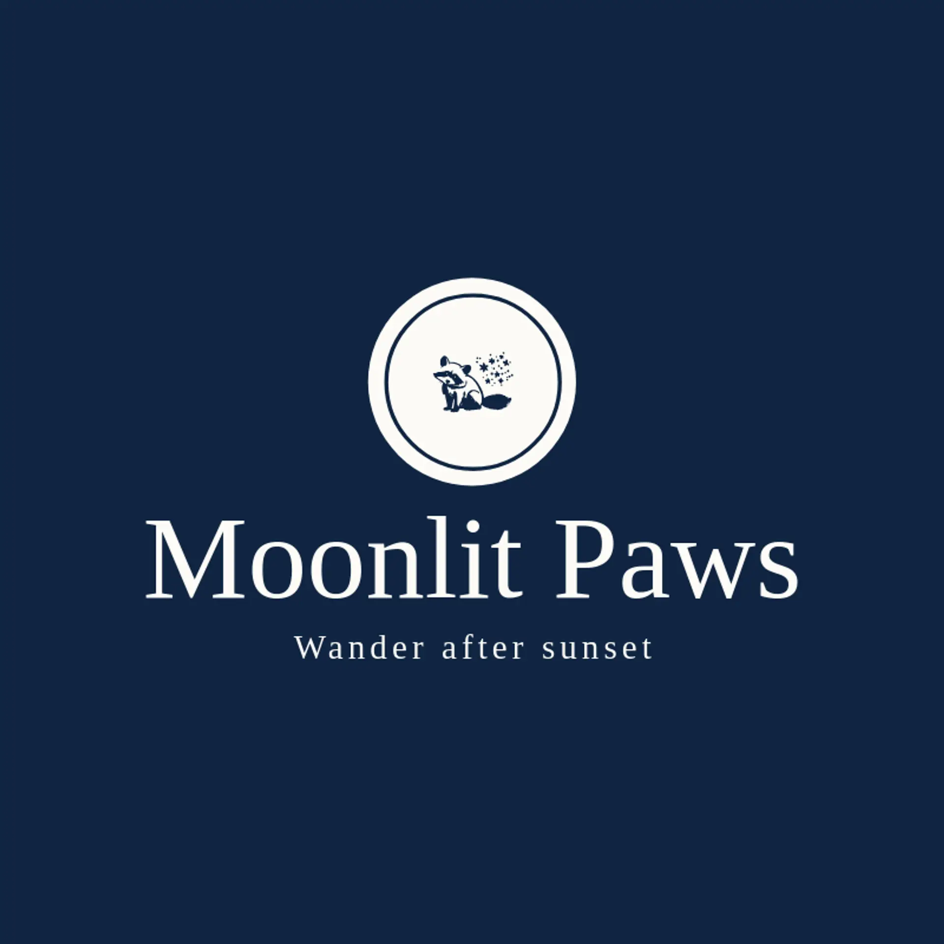
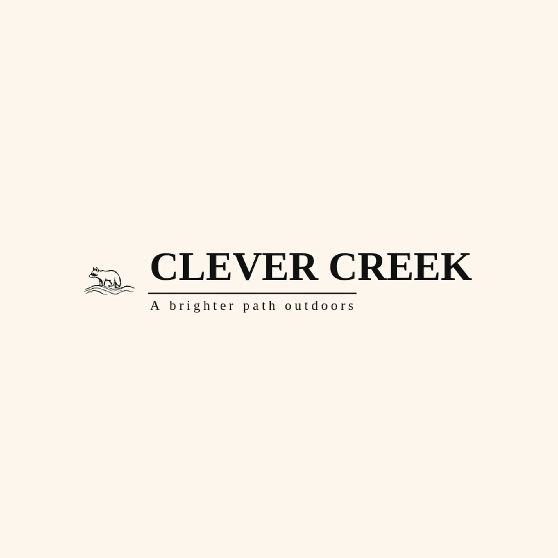
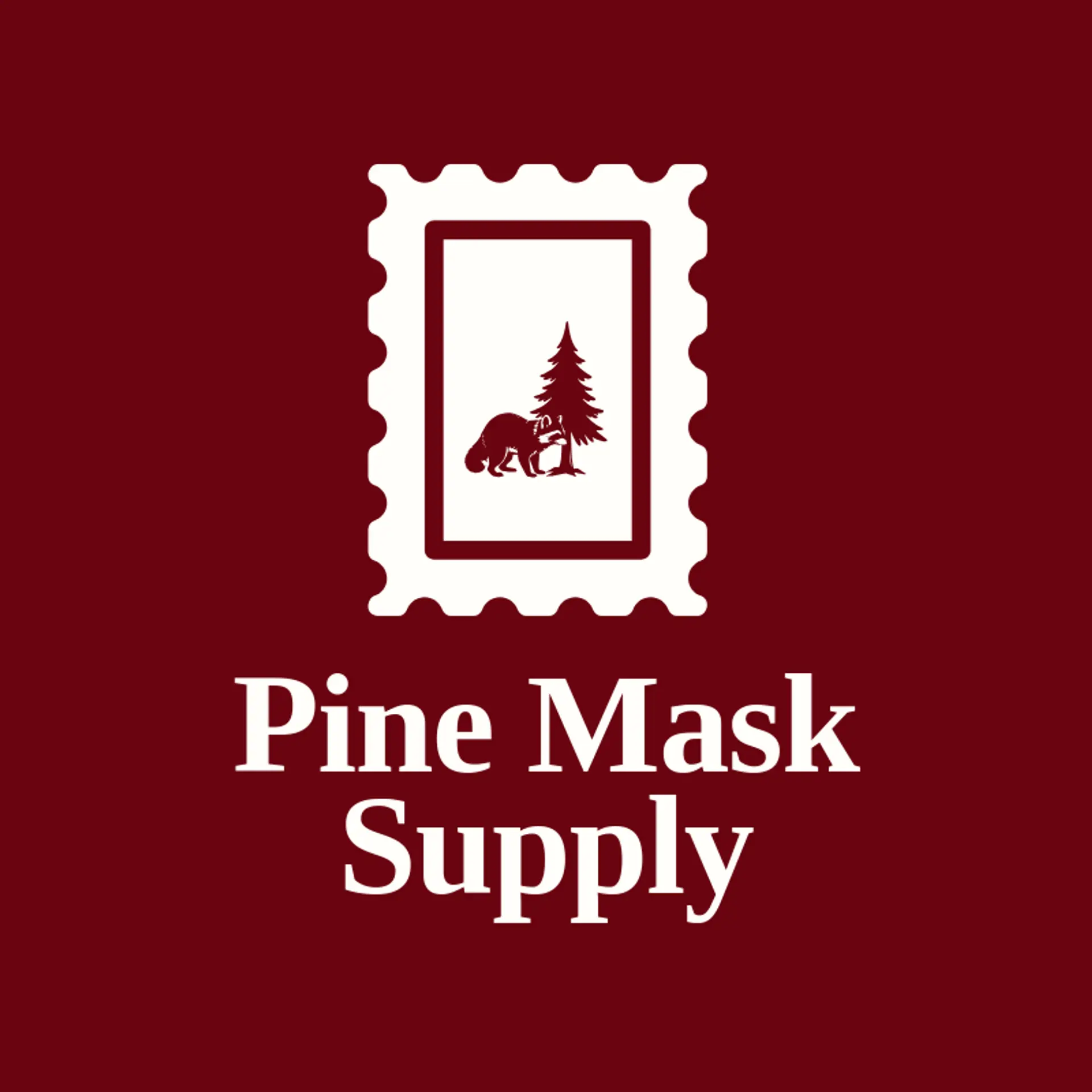
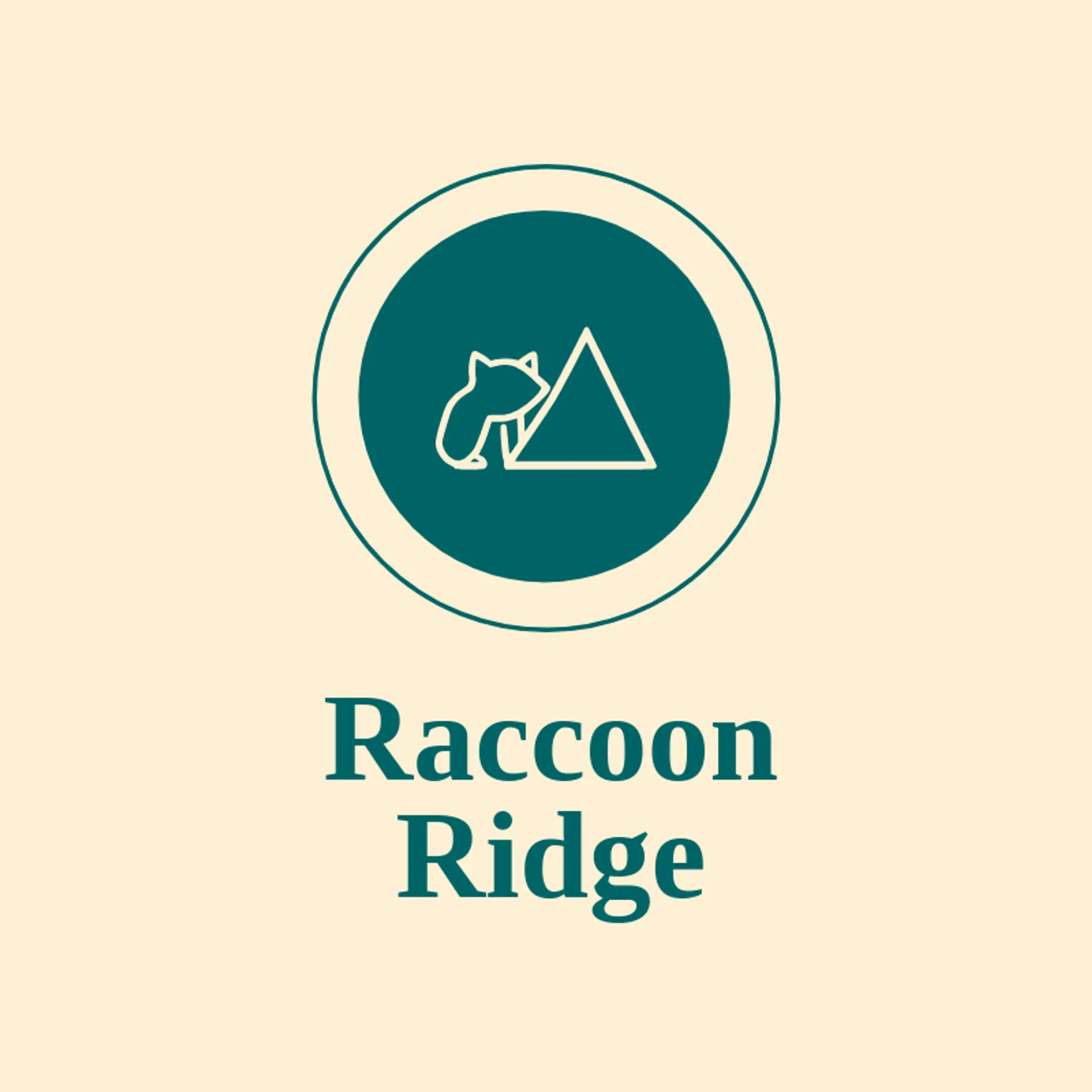
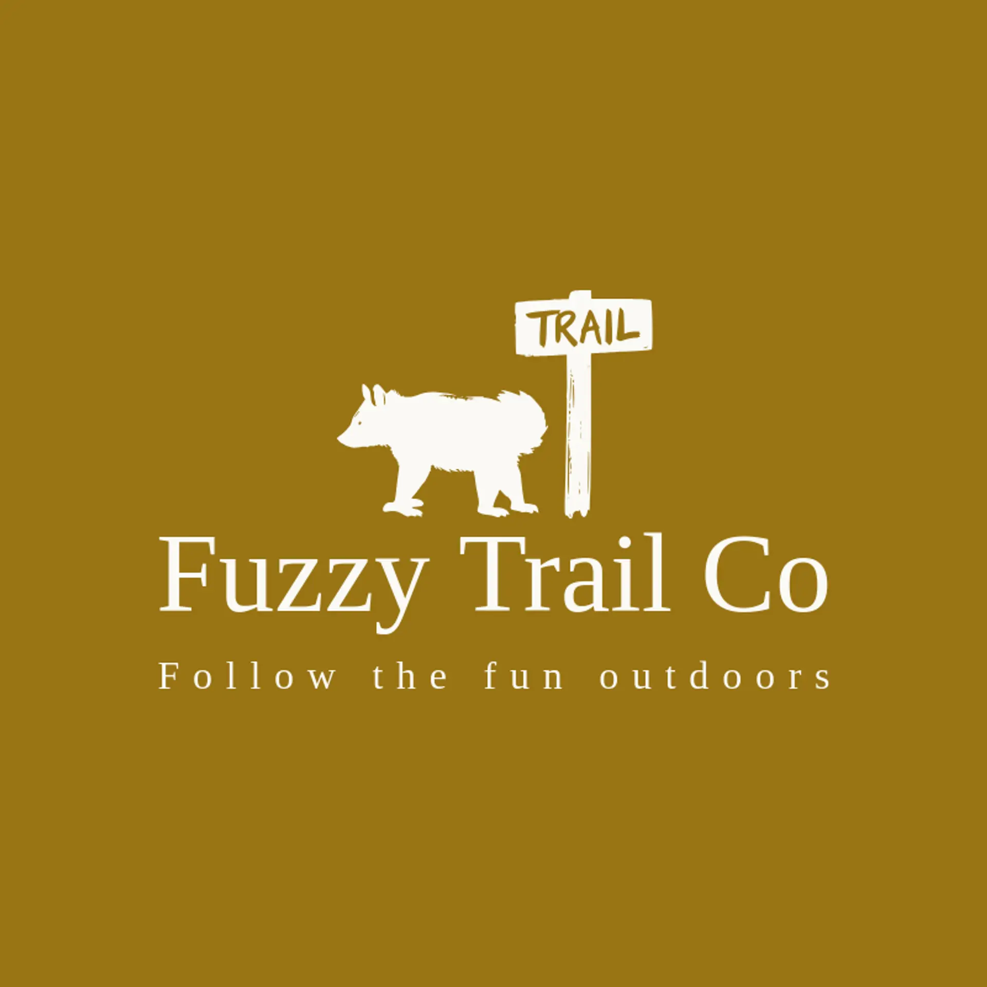
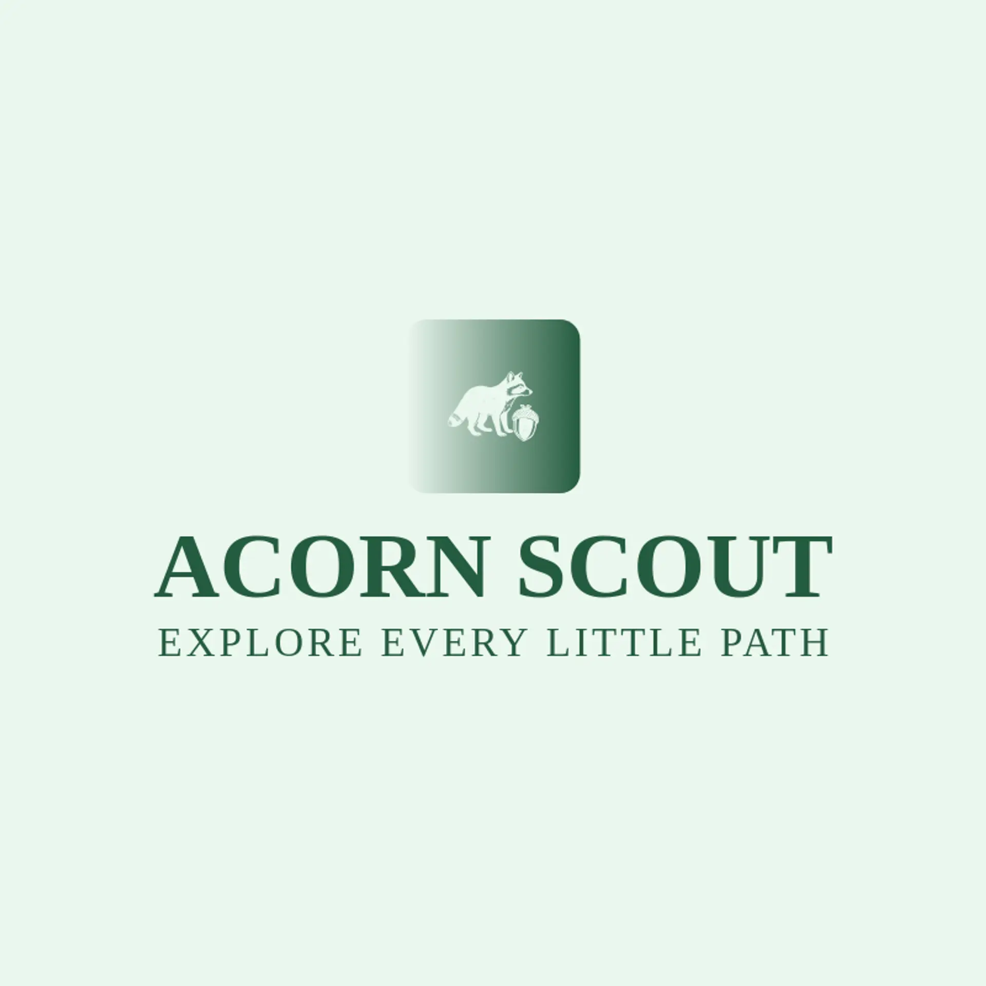
When it comes to the icon, the raccoon silhouette is the obvious starting point, and its striped tail and mask remain recognizable even when simplified to a few shapes. Acorns and leaves offer natural twists that can sit beside the raccoon for a woodland shop, while a crescent moon adds a quiet nighttime personality. Action ideas include a raccoon reaching toward a berry, balancing on a branch, or carrying a pine cone, with each pose kept clear at thumbnail size. For a friendly identity, pair the raccoon with a paw print, woodland flower, or star cluster, and for an outdoor brand consider a mountain peak, river wave, or rising sun. Before you settle, brainstorm around the story behind the business: a forest trail can inspire trees and ferns, a city service can use a skyline, and a wildlife group can pair the raccoon with a protective leaf.
Icons To Make Your Raccoon Logo Stand Out
That same balance of woodland warmth and clear contrast should guide the lettering. A sturdy sans serif can give a raccoon brand a friendly modern voice, while a rounded display style can add curiosity for a nature shop or family attraction. Look for open letter shapes, confident weight, and spacing that stays clear on small labels and social images. Pair expressive lettering with the strongest contrast from the first paragraph so the name feels memorable without competing with the raccoon mark.
Raccoon Logo Ideas FAQs
Browse Related Logo Ideas
Alligator logosBeast logosBeaver logosBison logosBuffalo logosBull logosBulldog logosBunny logosButterfly logosCardinal logosCat pet care logosCow logosCoyote logosCrocodile logosDinosaur logosDog daycare and training logosDolphin logosFrog logosGamefowl logosGiraffe logosGoat logosGorilla logosHornet logosHummingbird logosLion logosMonarch logosOctopus logosPanda logosPanther logosPeacock logosPenguin logosPet care logosPet grooming logosPet logosPet sitting logosPhoenix logosRabbit logosScorpion logosShark logosSnake logosSpider logosTiger logosWildcat logosWolf logosCrow logosDuck logosElephant logosHawk logosHusky logosMonkey logos