






Logo Design Considerations for a Hornet Business
Hornet logos benefit from a strong base color and one bright accent that keeps the mark easy to recognize on uniforms, storefronts, and social profiles. Deep navy or charcoal can give the identity a focused, confident feel, while warm yellow and golden orange bring the quick energy associated with a hornet. Choose a crisp contrast that keeps the wings, body, and wordmark readable at every size and stays consistent across print, embroidery, and digital uses.
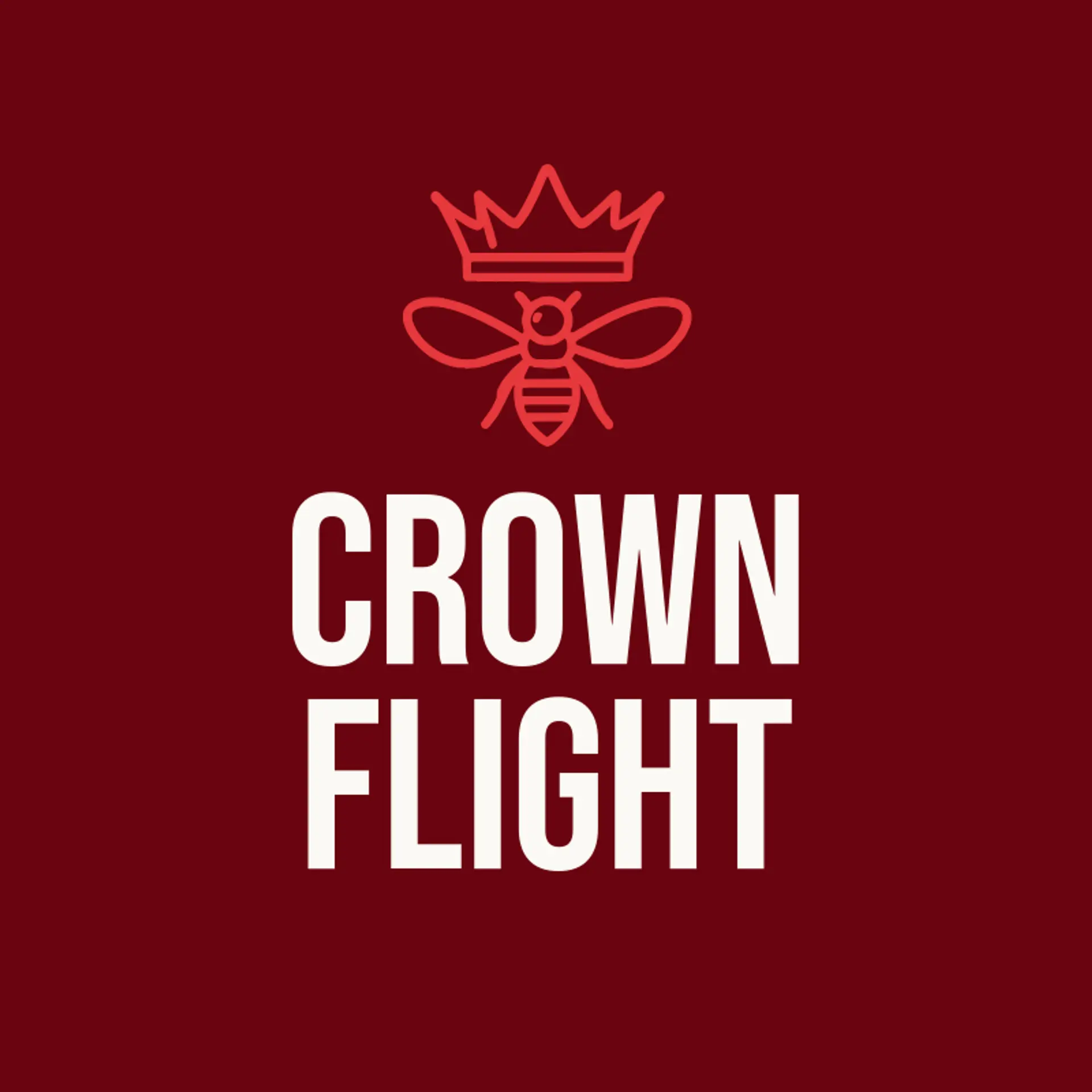
When it comes to the icon, the hornet itself is the obvious starting point, with pointed wings and a tapered body that can read clearly as a compact silhouette. Honeycomb is a useful supporting symbol, since its hexagonal rhythm can sit beside the insect or form a clean repeating pattern without crowding the wordmark. Try a single wing, a curved stinger, or a nectar drop with a hornet nearby for a mark that feels quick and focused. Botanical directions can pair the hornet with a wildflower, a leaf, or a flowering branch to suggest pollination and natural energy. For a bolder team identity, use a crown, lightning bolt, or rising sun beside the insect rather than adding detail inside it. Before you settle, brainstorm around the brand story: a garden service can lean into flowers and leaves, a school team can use a crown and bold wings, and a local club can build a memorable mark from the hornet and a simple honeycomb pattern.
Icons To Make Your Hornet Logo Stand Out
That same focus on clear contrast should guide the lettering. A sturdy sans serif can make a hornet brand feel fast and modern, while a compact serif can add authority to a club, school, or established team. Look for open letter shapes, confident weight, and spacing that stays legible beside a sharp icon. Pair restrained lettering with the strongest color contrast from the first paragraph so the name remains memorable in a quick glance.
Hornet Logo Ideas FAQs
Browse Related Logo Ideas
Alligator logosBeast logosBeaver logosBison logosBuffalo logosBull logosBulldog logosBunny logosButterfly logosCardinal logosCat pet care logosCow logosCoyote logosCrocodile logosDinosaur logosDog daycare and training logosDolphin logosFrog logosGamefowl logosGiraffe logosGoat logosGorilla logosHornet logosHummingbird logosLion logosMonarch logosOctopus logosPanda logosPanther logosPeacock logosPenguin logosPet care logosPet grooming logosPet logosPet sitting logosPhoenix logosRabbit logosScorpion logosShark logosSnake logosSpider logosTiger logosWildcat logosWolf logosCrow logosDuck logosElephant logosHawk logosHusky logosMonkey logos