
Logo Design Considerations for a Birdhouse Business
According to LOGO.com data, the five most popular colors in logos with garden in their names created on LOGO.com over the past 12 months were white at 25%, green at 23%, black at 13%, yellow at 9%, and grey at 9%. White and green lead the palette, pairing a clear backdrop with the fresh color of leaves and lawns. For a birdhouse logo, use white to keep the mark open and let green bring a natural feel to a shop sign, garden marker, or small profile image.
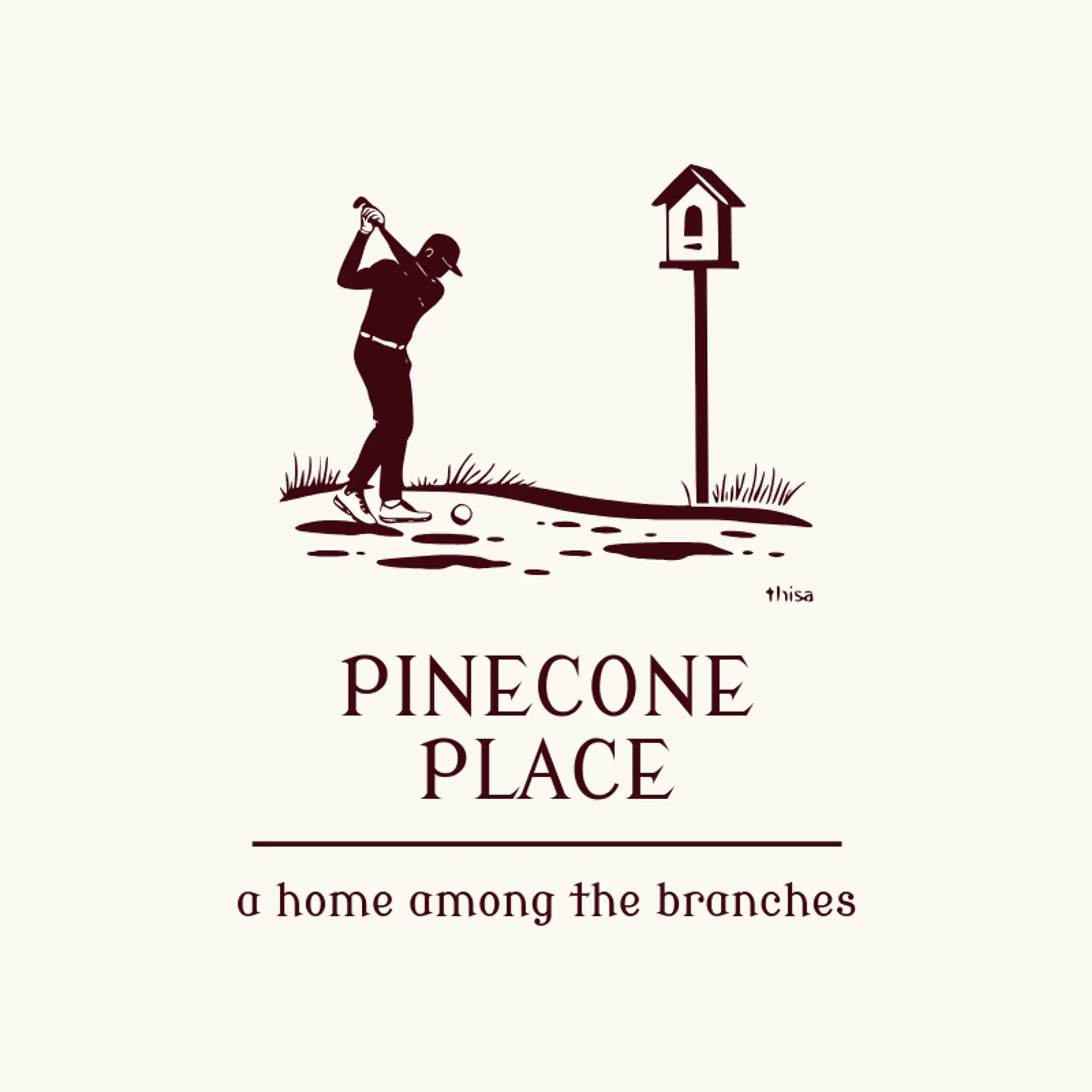
A birdhouse silhouette is the clearest starting point, since its roof, perch, and round entrance read quickly even at small sizes; pair the shape with a bird perched on a nearby branch for a friendly mark. A leaf beside the roof or a simple branch behind the silhouette can add a garden cue while keeping the house shape clean. For motion, show a bird landing at the perch or a parent bird carrying twigs nearby, with only a few lines so the mark stays easy to recognize. Shops and garden clubs can frame the silhouette with a wreath, simple crest, or sunburst, while a small seedling beside the post suggests a cared for backyard. Before you settle on an icon, connect it to the place and people around the birdhouse: a coastal shop might use a gull on the roofline, a woodland maker could pair a wren with a pine sprig, and a neighborhood nursery might set the house against a broadleaf branch.
Icons To Make Your Birdhouse Logo Stand Out
That white base and fresh green accent make simple lettering especially useful. According to LOGO.com data, sans serif typefaces made up 64% of the font choices in logos with garden in their names over the past 12 months, with serif at 18%, display at 13%, and handwriting at 5%. The favorite individual fonts were Geologica at 15%, Afacad at 8%, Schibsted Grotesk at 5%, Afacad Flux at 4%, and Aboreto at 3%. For a birdhouse logo, try clear lettering such as Geologica or Afacad so a shop name stays readable on a small wooden sign, then use a serif style when you want a more handcrafted feel.
Birdhouse Logo Ideas FAQs
Browse Related Logo Ideas
Alligator logosBeast logosBeaver logosBison logosBuffalo logosBull logosBulldog logosBunny logosButterfly logosCardinal logosCat pet care logosCow logosCoyote logosCrocodile logosDinosaur logosDog daycare and training logosDolphin logosFrog logosGamefowl logosGiraffe logosGoat logosGorilla logosHornet logosHummingbird logosLion logosMonarch logosOctopus logosPanda logosPanther logosPeacock logosPenguin logosPet care logosPet grooming logosPet logosPet sitting logosPhoenix logosRabbit logosScorpion logosShark logosSnake logosSpider logosTiger logosWildcat logosWolf logosCrow logosDuck logosElephant logosHawk logosHusky logosMonkey logos