
Logo Design Considerations for a Bunny Business
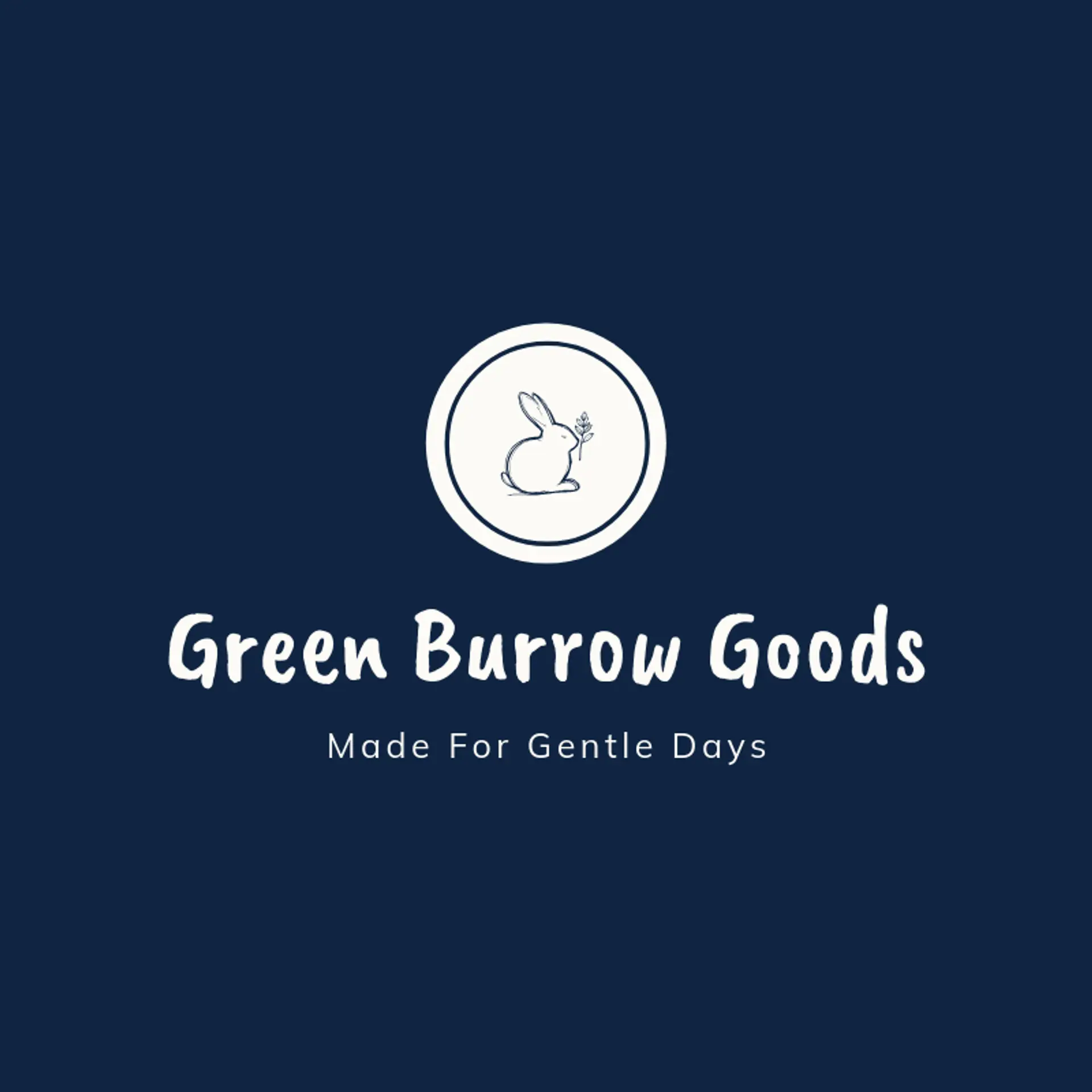
According to LOGO.com data, the five most popular colors in bunny logos created on LOGO.com over the past 12 months were white at 27%, black at 15%, grey at 12%, blue at 9%, and green at 7%. White and black create the clean contrast that makes a bunny mark feel friendly and easy to recognize, while grey, blue, and green bring softness, freshness, and a touch of outdoor charm. For a bunny logo that works across packaging, social profiles, and signs, start with a clear white or black base and let one gentle accent color shape the personality.
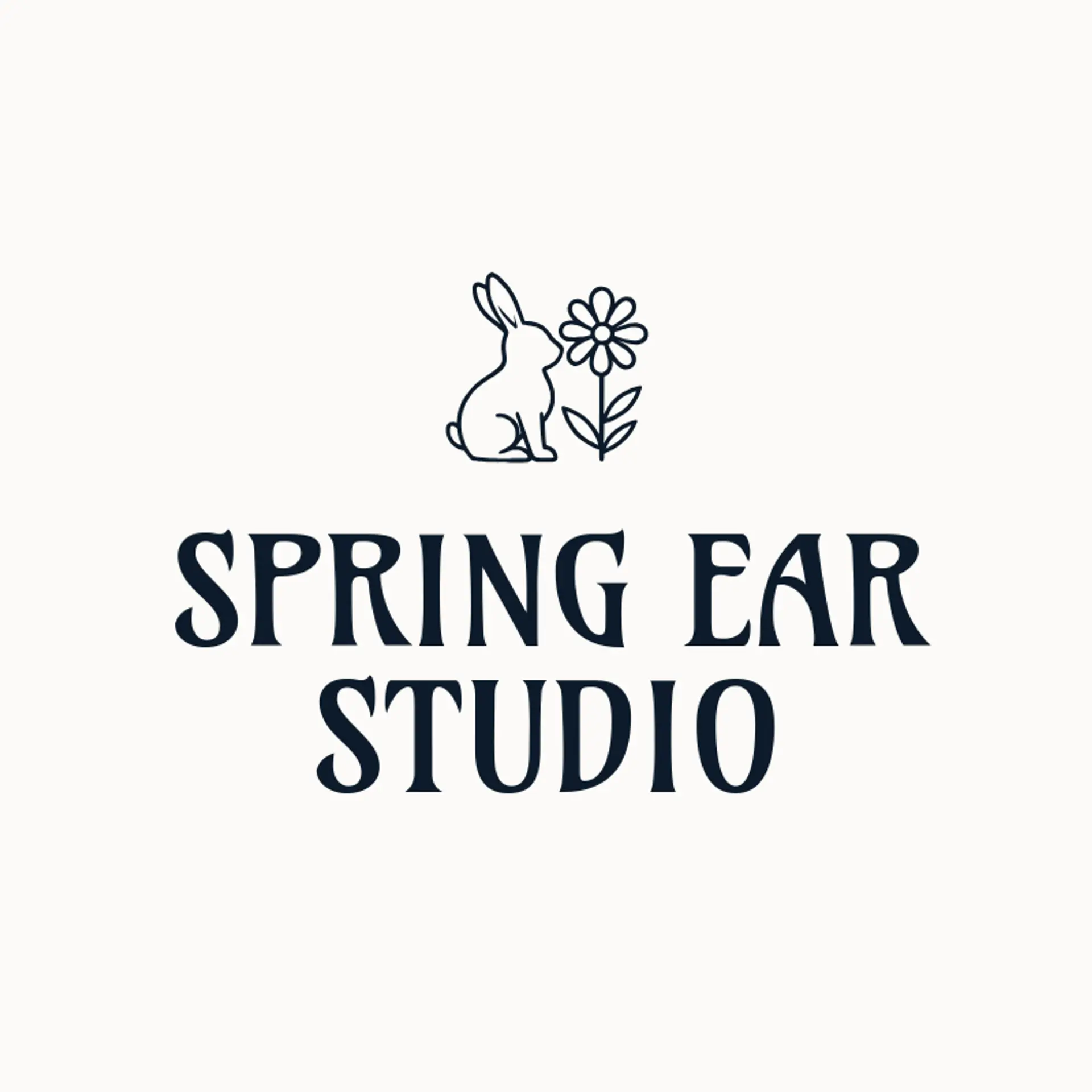
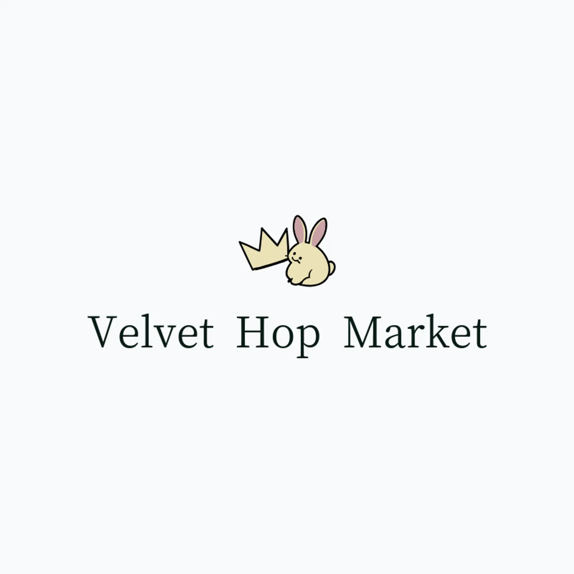
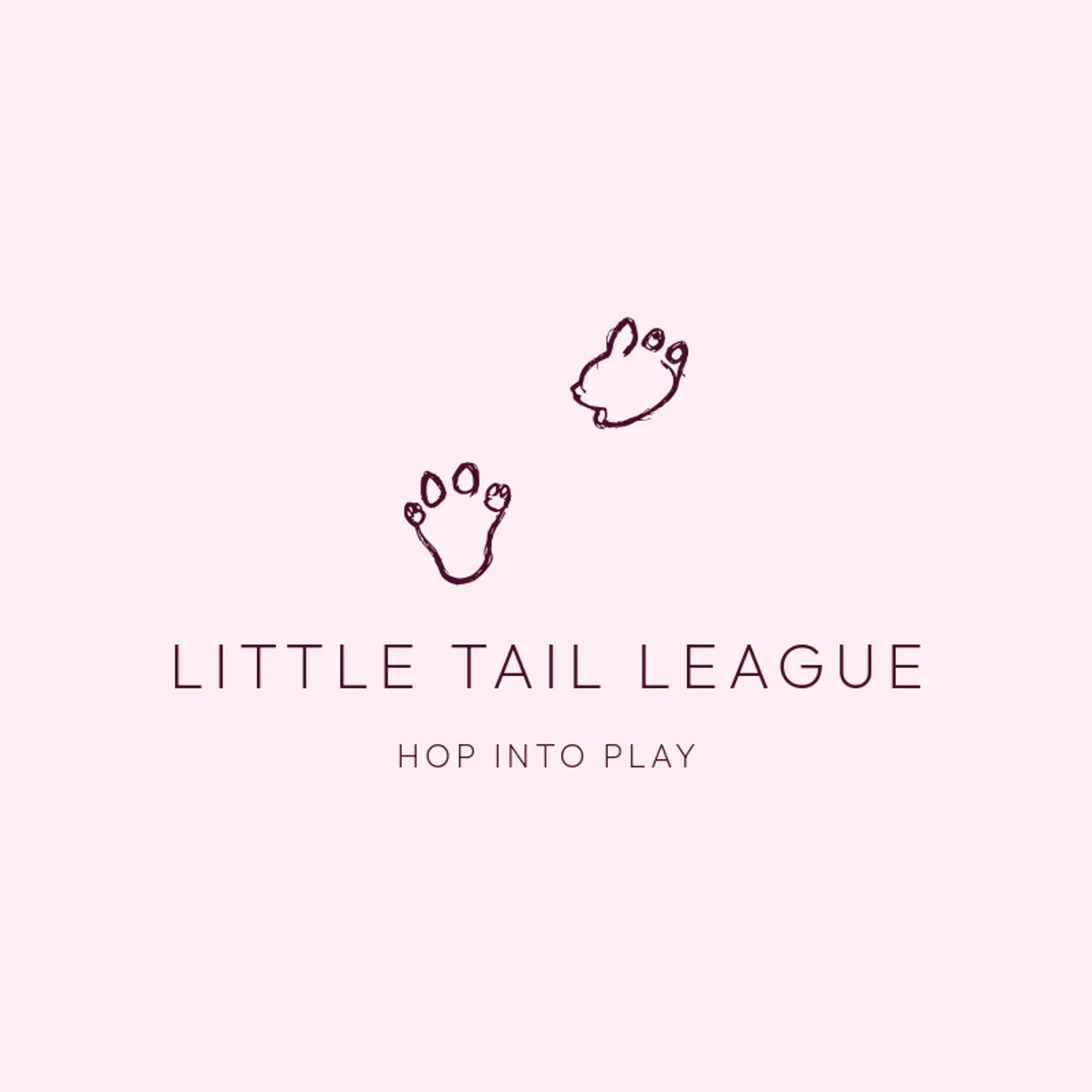
When it comes to the icon, the rabbit silhouette is the natural starting point, and it stays recognizable through long ears, a rounded body, and a lifted pose even at a small size. A carrot with leaves beside it adds an instantly playful twist, while a clover or sprouting leaf can bring a fresh garden feeling without making the mark feel busy. For a softer direction, try a rabbit with a small flower beside it, a moon behind the ears, or a pair of footprints leading toward the wordmark. A fluffy tail, spring meadow, or simple hop arc can suggest movement, while a crown or ribbon beside the rabbit can give a club, shop, or family brand its own character. Let the story guide the final choice: a farm brand can lean into leaves and carrots, a children’s label can use a moon and stars, and a wellness brand can pair the rabbit with a calm botanical sprig.
Icons To Make Your Bunny Logo Stand Out
That balance of softness and contrast carries into the lettering. According to LOGO.com data, sans serif typefaces made up 69% of the font choices in those same bunny logos over the past 12 months, with display styles at 17% and serif styles at 11%. The leading individual choices were Geologica at 16%, Afacad at 7%, Schibsted Grotesk at 7%, Afacad Flux at 5%, and Onest at 5%, giving the wordmark a clear modern voice. Set in open, approachable letterforms against a white or black base with a soft blue or green accent, a bunny logo can feel playful while staying readable on labels, websites, and small social images.
Bunny Logo Ideas FAQs
Browse Related Logo Ideas
Alligator logosBeast logosBeaver logosBison logosBuffalo logosBull logosBulldog logosBunny logosButterfly logosCardinal logosCat pet care logosCow logosCoyote logosCrocodile logosDinosaur logosDog daycare and training logosDolphin logosFrog logosGamefowl logosGiraffe logosGoat logosGorilla logosHornet logosHummingbird logosLion logosMonarch logosOctopus logosPanda logosPanther logosPeacock logosPenguin logosPet care logosPet grooming logosPet logosPet sitting logosPhoenix logosRabbit logosScorpion logosShark logosSnake logosSpider logosTiger logosWildcat logosWolf logosCrow logosDuck logosElephant logosHawk logosHusky logosMonkey logos