










Logo Design Considerations for a Wildcat Business
According to LOGO.com data, the five most popular colors in wildcat logos created on LOGO.com over the past 12 months were white at 22%, black at 17%, grey at 17%, blue at 13%, and green at 9%. White and black create the sharp contrast that suits a powerful wildcat presence, while grey adds control and blue or green can bring a fresh team spirit to the mark. For a wildcat logo that feels strong on uniforms, signs, and social profiles, begin with a clean white or black base and let one vivid accent color carry the character.
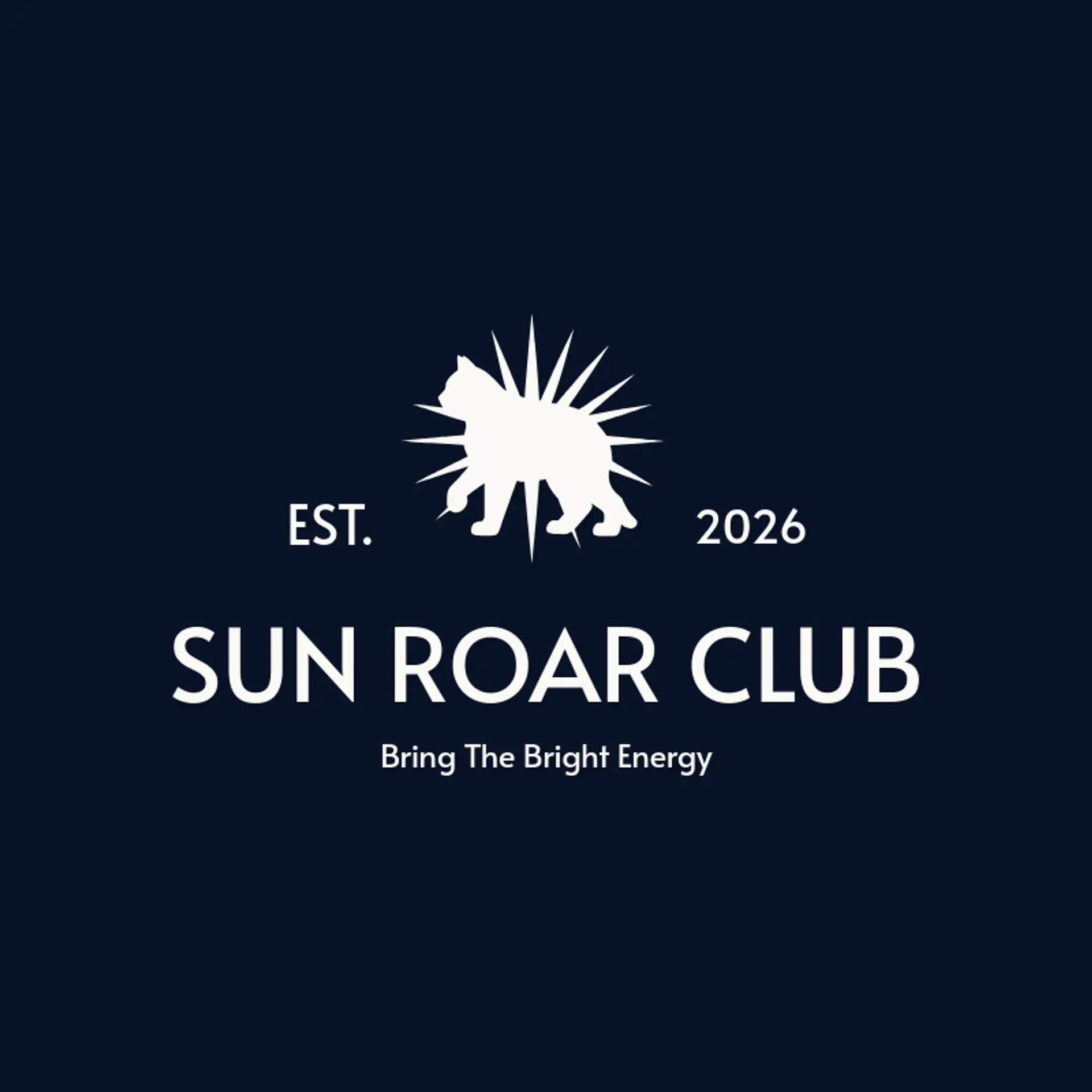
When it comes to the icon, the wildcat head is the obvious starting point, and its pointed ears, focused eyes, and angular muzzle can remain recognizable even when reduced to a bold silhouette. Claws are an underused symbol for adding motion, whether they sit beside a wordmark, cut across a stripe, or become three sharp marks beneath the name. Full body action can bring energy to the identity, so explore a wildcat crouching, leaping, or sprinting with a sweeping tail that reads clearly at a distance. For team identities, pair the animal with a shield, crown, mountain peak, or rising sun, while a wildlife brand can use paw prints, leaves, or a forest line. Before you settle, brainstorm around the story behind the name: a school can emphasize pride, a sports club can show speed, and an outdoor brand can place the wildcat beside the landscape it calls home.
Icons To Make Your Wildcat Logo Stand Out
That same focus on strong contrast should guide the lettering. A sturdy sans serif can give a wildcat club a modern, forceful voice, while a compact serif can add tradition for an established team or academy. Look for open letter shapes, confident weight, and spacing that stays clear on jerseys, merchandise, and small social images. Pair restrained lettering with the strongest color contrast from the first paragraph so the name remains easy to recognize wherever the wildcat identity appears.
Wildcat Logo Ideas FAQs
Browse Related Logo Ideas
Alligator logosBeast logosBeaver logosBison logosBuffalo logosBull logosBulldog logosBunny logosButterfly logosCardinal logosCat pet care logosCow logosCoyote logosCrocodile logosDinosaur logosDog daycare and training logosDolphin logosFrog logosGamefowl logosGiraffe logosGoat logosGorilla logosHornet logosHummingbird logosLion logosMonarch logosOctopus logosPanda logosPanther logosPeacock logosPenguin logosPet care logosPet grooming logosPet logosPet sitting logosPhoenix logosRabbit logosScorpion logosShark logosSnake logosSpider logosTiger logosWildcat logosWolf logosCrow logosDuck logosElephant logosHawk logosHusky logosMonkey logos