
Logo Design Considerations for a Giraffe Business
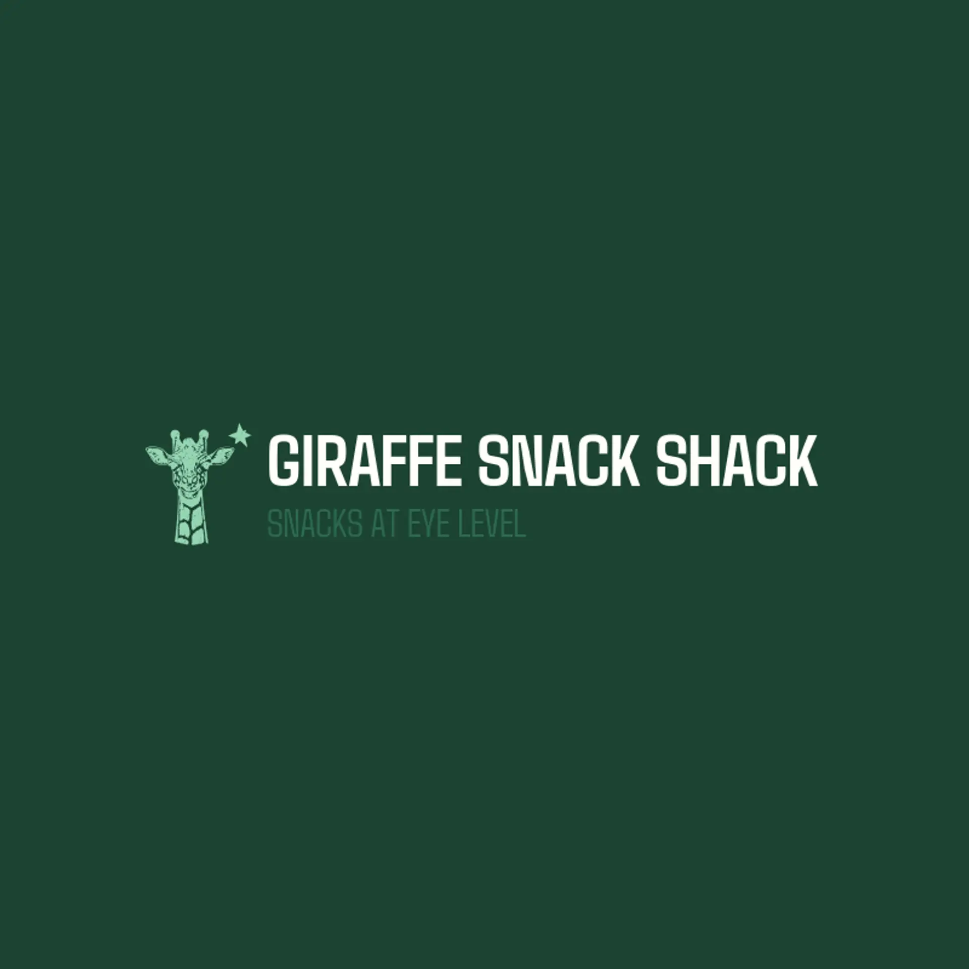
Giraffe logos feel at home in the warm tones of the savanna, where golden yellows, soft tans, and rich browns echo the animal's coat without ever looking cartoonish. A deep forest green or warm cream can give the mark a premium safari feel, while a bright amber or orange accent adds the friendly energy that makes kids and families smile. Choose a combination that keeps the silhouette readable at small sizes and reproduces cleanly across signage, clothing, and social profiles.
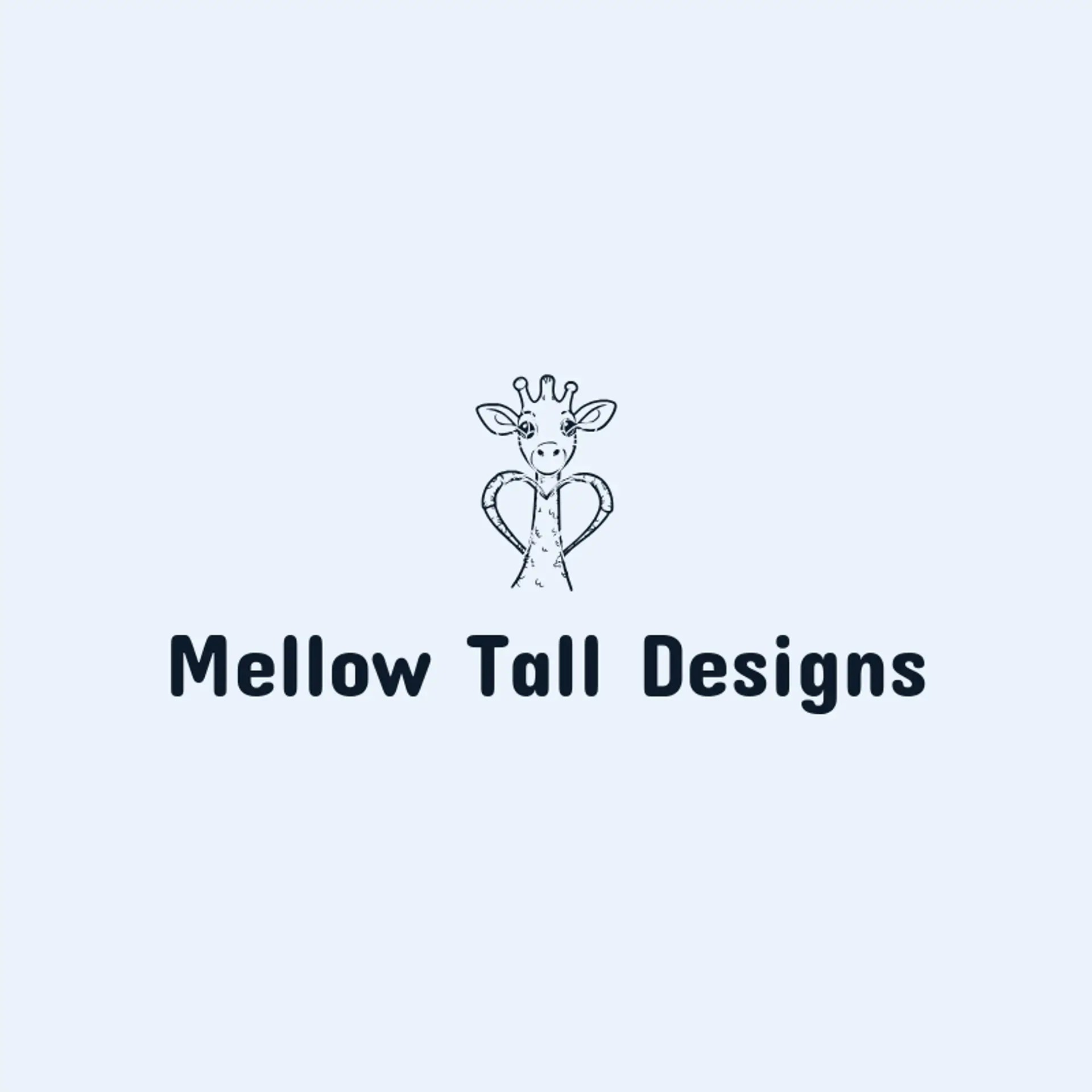
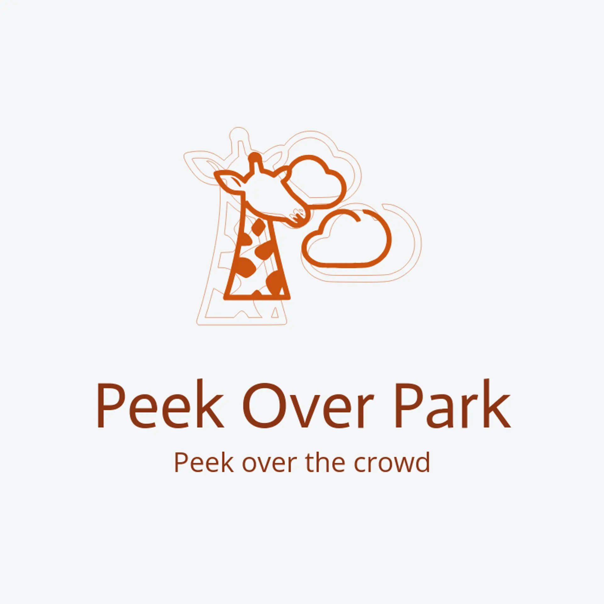
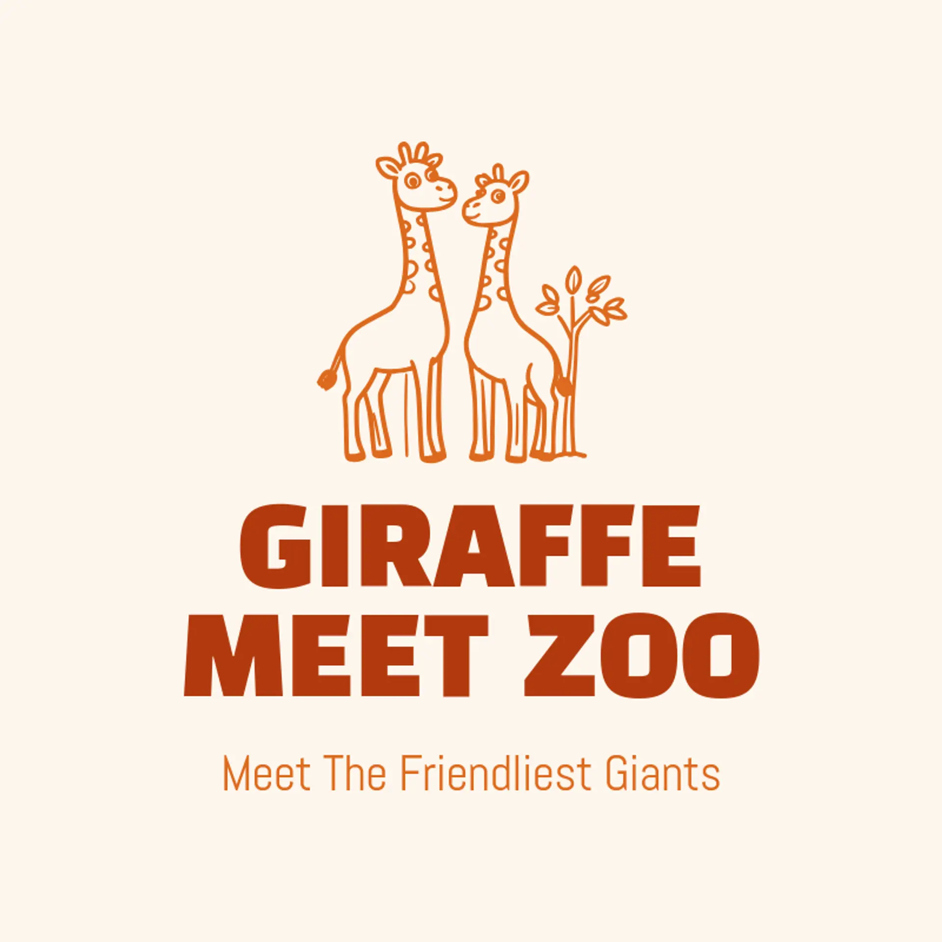
Giraffes offer one of the most unmistakable silhouettes in nature, since the long neck and gently sloping head read instantly even when cropped or reduced to simple lines, which makes the head and neck alone a perfect icon for a safari park, a nursery, or a school mascot. The spotted coat is the most underused element of the animal, because a patchwork of rounded spots can sit behind a wordmark, frame a monogram, or become a repeating pattern for packaging and signage. Action imagery brings warmth that a static head cannot, so sketch a giraffe stretching up to nibble leaves from a tree, a mother guiding her calf, or the long neck curving into the negative space of a letter. For playful family brands, pair the giraffe with a soft rounded silhouette and a friendly expression, while a crest or emblem with a giraffe head gives a lodge or a club a more established feel. Before you settle, brainstorm around the owner's own story: a zoo can perch the giraffe beside its favorite acacia tree, a kids clothing brand can let the neck rise out of a letter, and a travel company can set the silhouette against a simple sun and savanna line.
Icons To Make Your Giraffe Logo Stand Out
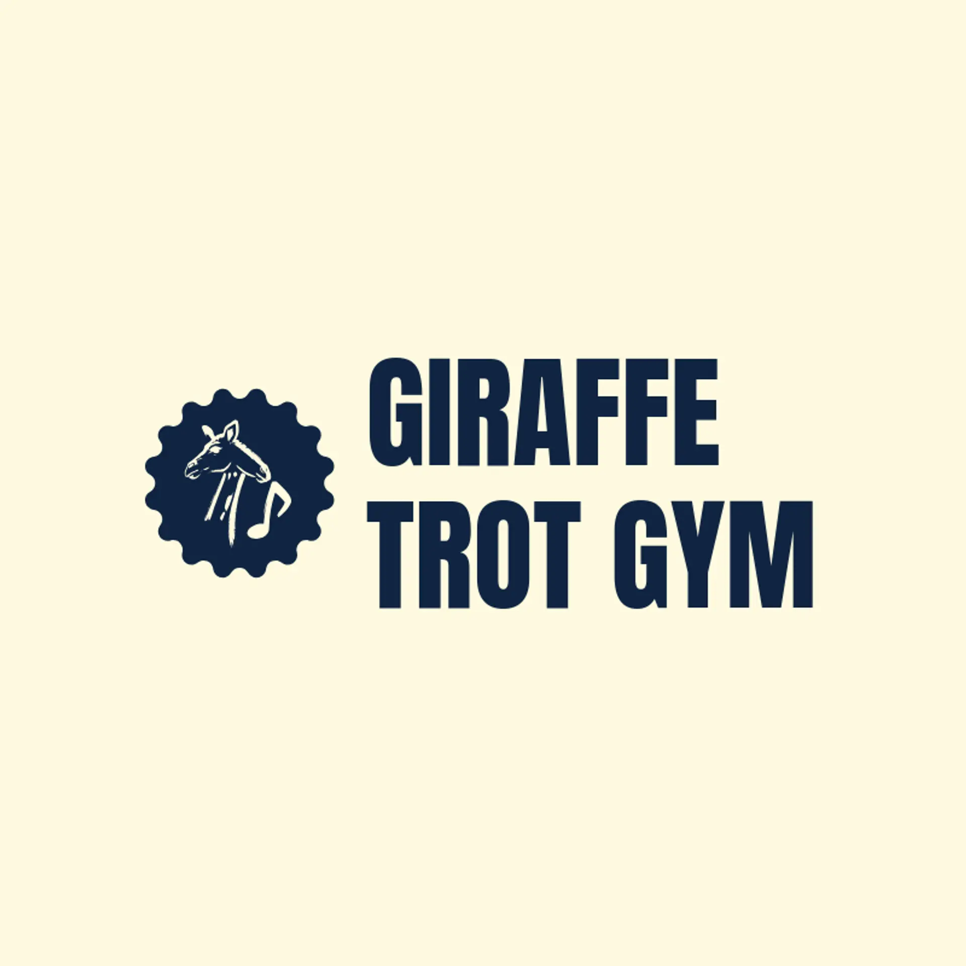
That same warm and friendly feeling should guide the lettering. A rounded sans serif with generous open letter shapes can give a giraffe brand a playful modern voice that suits toy stores, nurseries, and family attractions, while a sturdy condensed serif or a hand drawn display style can add character for a safari lodge or a nature center. Look for letterforms that stay clear and legible when the mark is scaled down to an app icon or a small label, and pair the type with the warm palette from the first paragraph so the name and the icon read as one friendly identity.
Giraffe Logo Ideas FAQs
Browse Related Logo Ideas
Alligator logosBeast logosBeaver logosBison logosBuffalo logosBull logosBulldog logosBunny logosButterfly logosCardinal logosCat pet care logosCow logosCoyote logosCrocodile logosDinosaur logosDog daycare and training logosDolphin logosFrog logosGamefowl logosGiraffe logosGoat logosGorilla logosHornet logosHummingbird logosLion logosMonarch logosOctopus logosPanda logosPanther logosPeacock logosPenguin logosPet care logosPet grooming logosPet logosPet sitting logosPhoenix logosRabbit logosScorpion logosShark logosSnake logosSpider logosTiger logosWildcat logosWolf logosCrow logosDuck logosElephant logosHawk logosHusky logosMonkey logos