







Logo Design Considerations for a Toro Business
According to LOGO.com data, the five most popular colors among logos with toro in their names created on LOGO.com over the past 12 months were white at 22%, black at 20%, green at 15%, blue at 12%, and grey at 9%. White and black together form a clean high contrast base, while green, blue, and grey bring the Toro wordmark toward a fresh, capable, and outdoorsy feel. For a Toro logo that looks strong on equipment, storefronts, and small social icons, start with white or black and use green or blue as a focused accent.
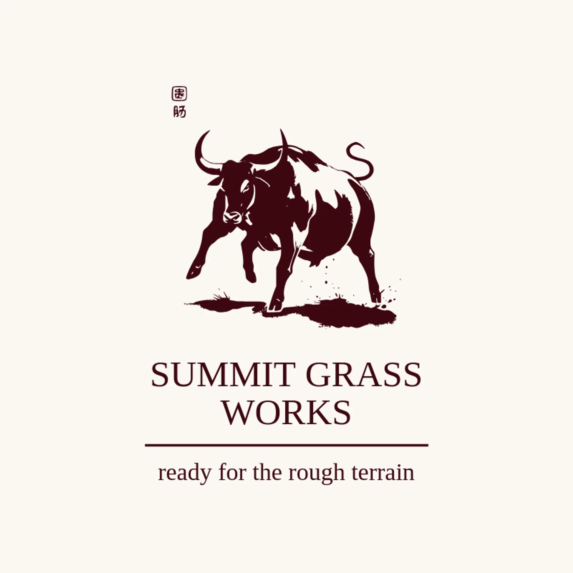
A strong bull silhouette is a natural starting point for a Toro logo: use a clean horn line, a forward stance, or a curled tail beside the name. For lawn care or outdoor equipment, pair that mark with a mower blade, a grass line, or a sun rising over a field to give the identity a clear sense of use. A shield or simple circular emblem can add a rugged feel, while a compact horn shape can turn into a distinctive letter detail. Keep the bull readable at small sizes, and choose one image that reflects whether your Toro brand should feel powerful, practical, or close to the land.
Icons To Make Your Toro Logo Stand Out
That clean contrast carries through to the lettering. According to LOGO.com data, sans serif typefaces made up 62% of font choices among logos with toro in their names over the past 12 months, followed by serif at 19% and display at 16%. Geologica led individual font choices at 12%, followed by Schibsted Grotesk at 9%, Afacad at 6%, and Prata and Open Sans at 5% each. Use bold readable lettering over a white or black base with one green or blue accent, so a Toro wordmark stays easy to recognize on equipment, dealer signs, and mobile screens.
Toro Logo Ideas FAQs
Browse Related Logo Ideas
Alligator logosBeast logosBeaver logosBison logosBuffalo logosBull logosBulldog logosBunny logosButterfly logosCardinal logosCat pet care logosCow logosCoyote logosCrocodile logosDinosaur logosDog daycare and training logosDolphin logosFrog logosGamefowl logosGiraffe logosGoat logosGorilla logosHornet logosHummingbird logosLion logosMonarch logosOctopus logosPanda logosPanther logosPeacock logosPenguin logosPet care logosPet grooming logosPet logosPet sitting logosPhoenix logosRabbit logosScorpion logosShark logosSnake logosSpider logosTiger logosWildcat logosWolf logosCrow logosDuck logosElephant logosHawk logosHusky logosMonkey logos