



Logo Design Considerations for a Mammoth Business
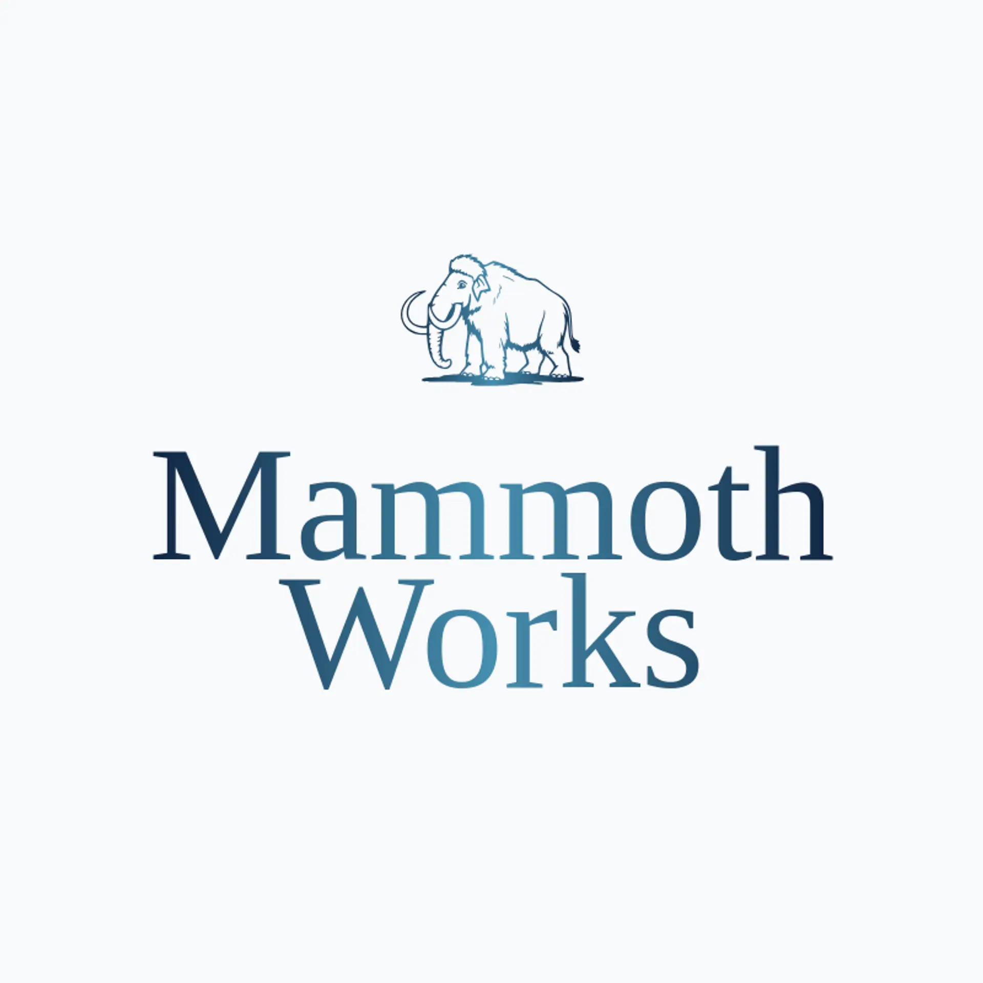
According to LOGO.com data, the five most popular colors in logos with animal in their names over the past 12 months were white at 25%, black at 15%, blue at 13%, grey at 11%, and green at 10%. White and black create a strong base for a mammoth mark, while blue, grey, and green bring to mind ice, stone, and the landscapes these giants once roamed. Try a crisp neutral foundation with one cool or natural accent to help a mammoth logo feel sturdy and easy to recognize.
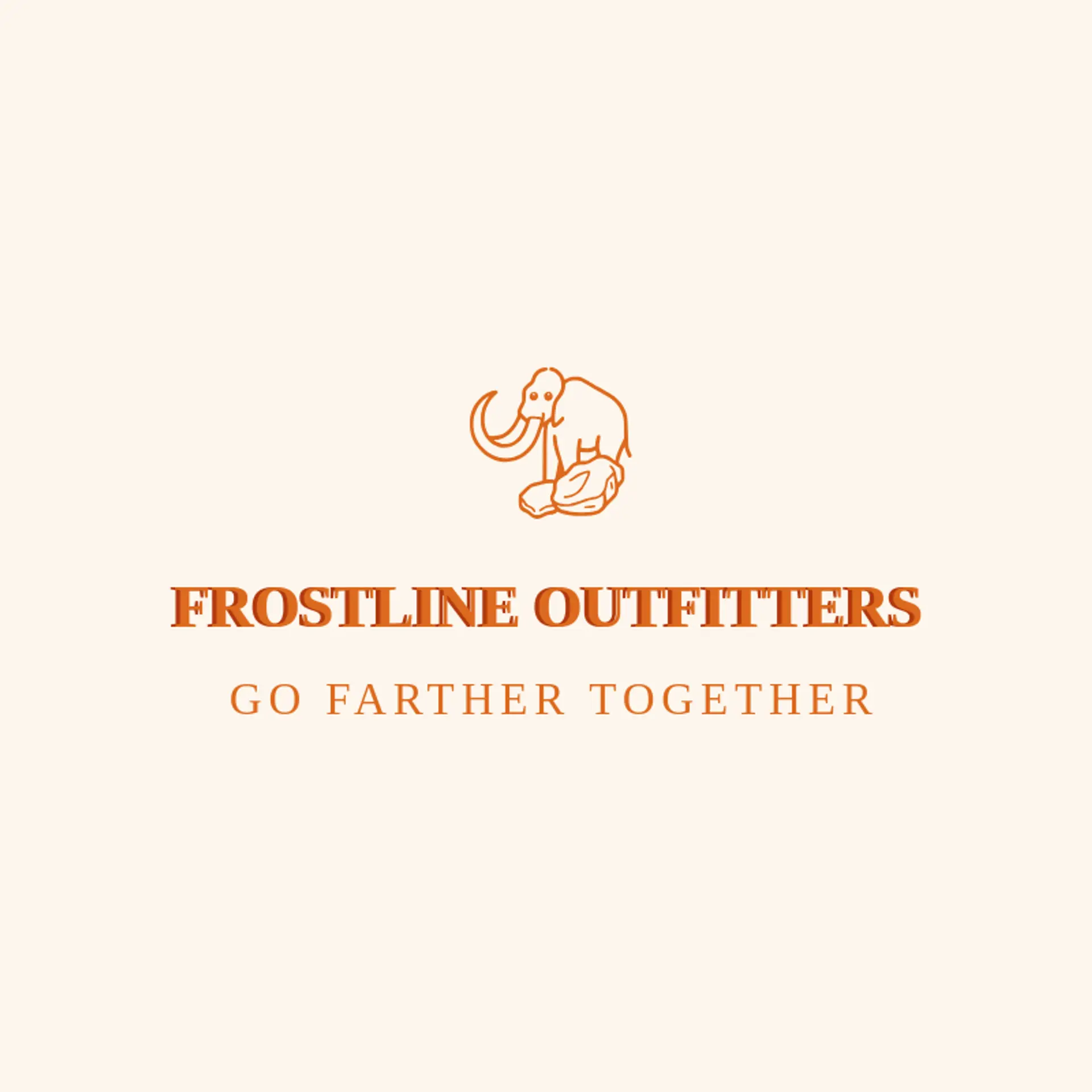
A mammoth silhouette is an unmistakable starting point, and its sweeping trunk and curved tusks can turn into a simple mark that still reads at a small size. Try the animal beside a mountain peak, a glacier line, or a northern star to give the logo a clear sense of place without crowding the wordmark. Tracks, fossils, and evergreen sprigs offer quieter directions for outdoor shops and nature groups, while a trail pennant or campfire can make the identity feel welcoming and active. For a team or club, use a bold mammoth head with a single ridge or star accent; for a heritage brand, choose a calm side profile and let the tusks carry the shape. Build from your own setting too: a mountain town might pair the mammoth with a summit, while a cold weather outfitter could use a drifting snowflake.
Icons To Make Your Mammoth Logo Stand Out
That contrast between a clear base and a distinctive accent carries into the lettering. According to LOGO.com data, sans serif styles made up 69% of font choices in logos with animal in their names over the past 12 months, with display at 15% and serif at 13%. The five favorite typefaces were Geologica at 18%, Afacad at 7%, Schibsted Grotesk at 6%, Afacad Flux at 5%, and Alata at 4%. Pair a confident sans serif wordmark with white or black and a cool accent for a mammoth identity that stays readable on gear, signs, and small screens.
Mammoth Logo Ideas FAQs
Browse Related Logo Ideas
Alligator logosBeast logosBeaver logosBison logosBuffalo logosBull logosBulldog logosBunny logosButterfly logosCardinal logosCat pet care logosCow logosCoyote logosCrocodile logosDinosaur logosDog daycare and training logosDolphin logosFrog logosGamefowl logosGiraffe logosGoat logosGorilla logosHornet logosHummingbird logosLion logosMonarch logosOctopus logosPanda logosPanther logosPeacock logosPenguin logosPet care logosPet grooming logosPet logosPet sitting logosPhoenix logosRabbit logosScorpion logosShark logosSnake logosSpider logosTiger logosWildcat logosWolf logosCrow logosDuck logosElephant logosHawk logosHusky logosMonkey logos