


Logo Design Considerations for a Alligator Business
According to LOGO.com data, the five most popular colors in alligator logos created on LOGO.com over the past 12 months were green at 26%, white at 26%, black at 17%, grey at 9%, and blue at 4%. Green and white echo swamp foliage, sharp teeth, and bright reflections on still water, while black, grey, and blue add a bold edge or a cooler outdoor mood. For an alligator logo that works on outdoor gear, wildlife education, or a memorable local brand, start with a strong green or white base and use one darker accent for clear definition.
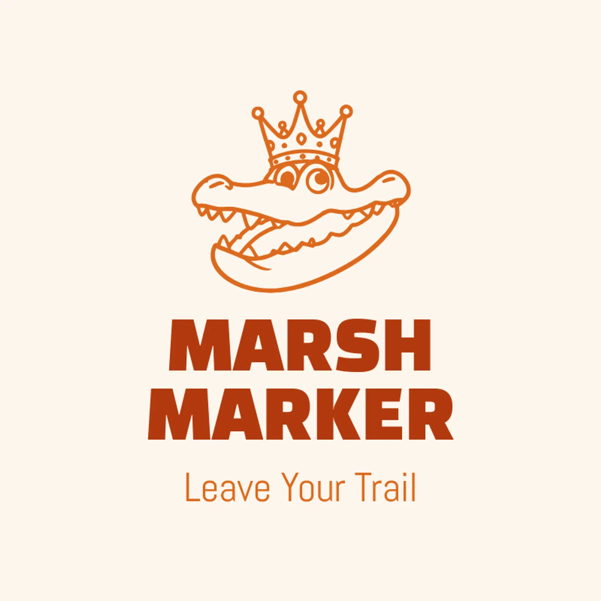
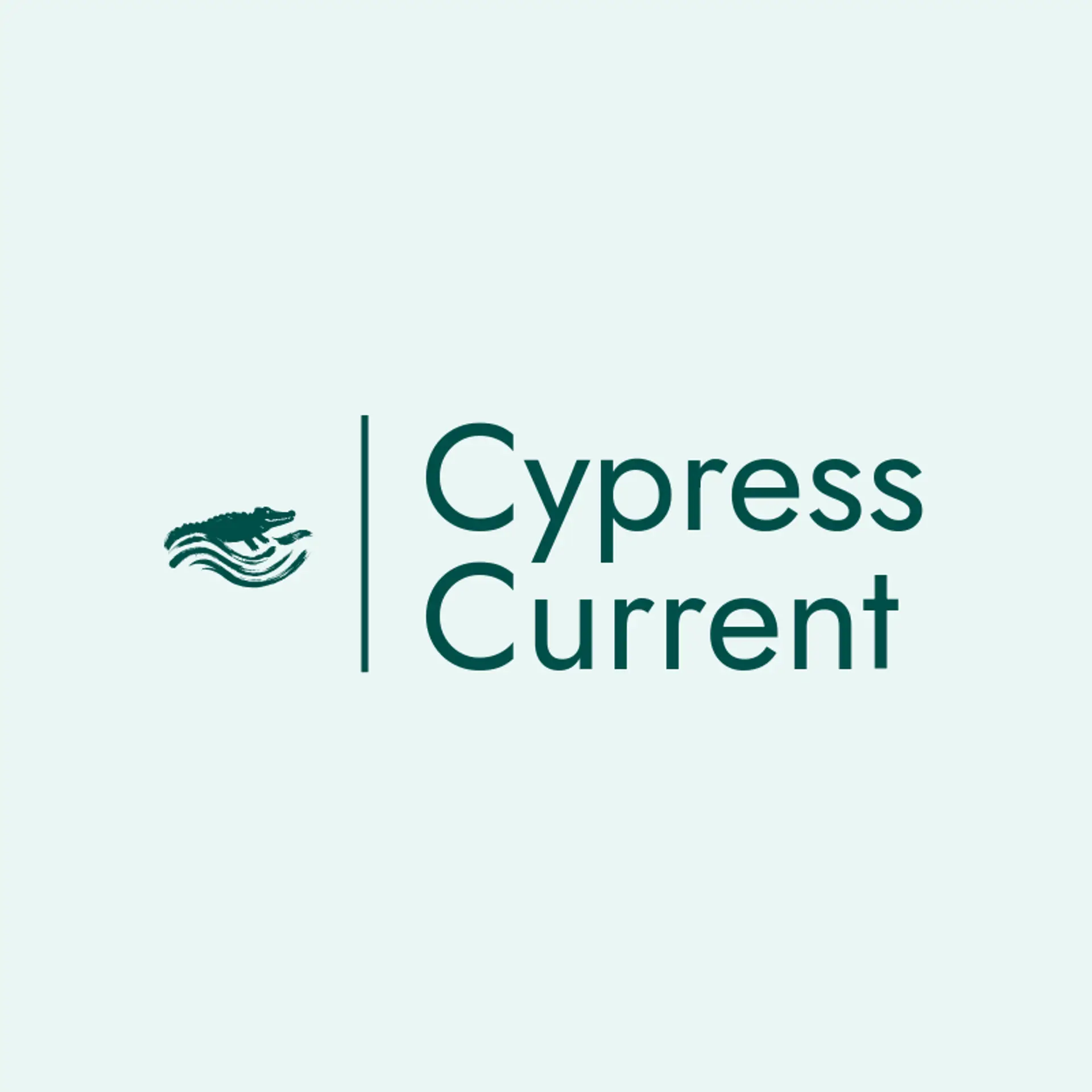
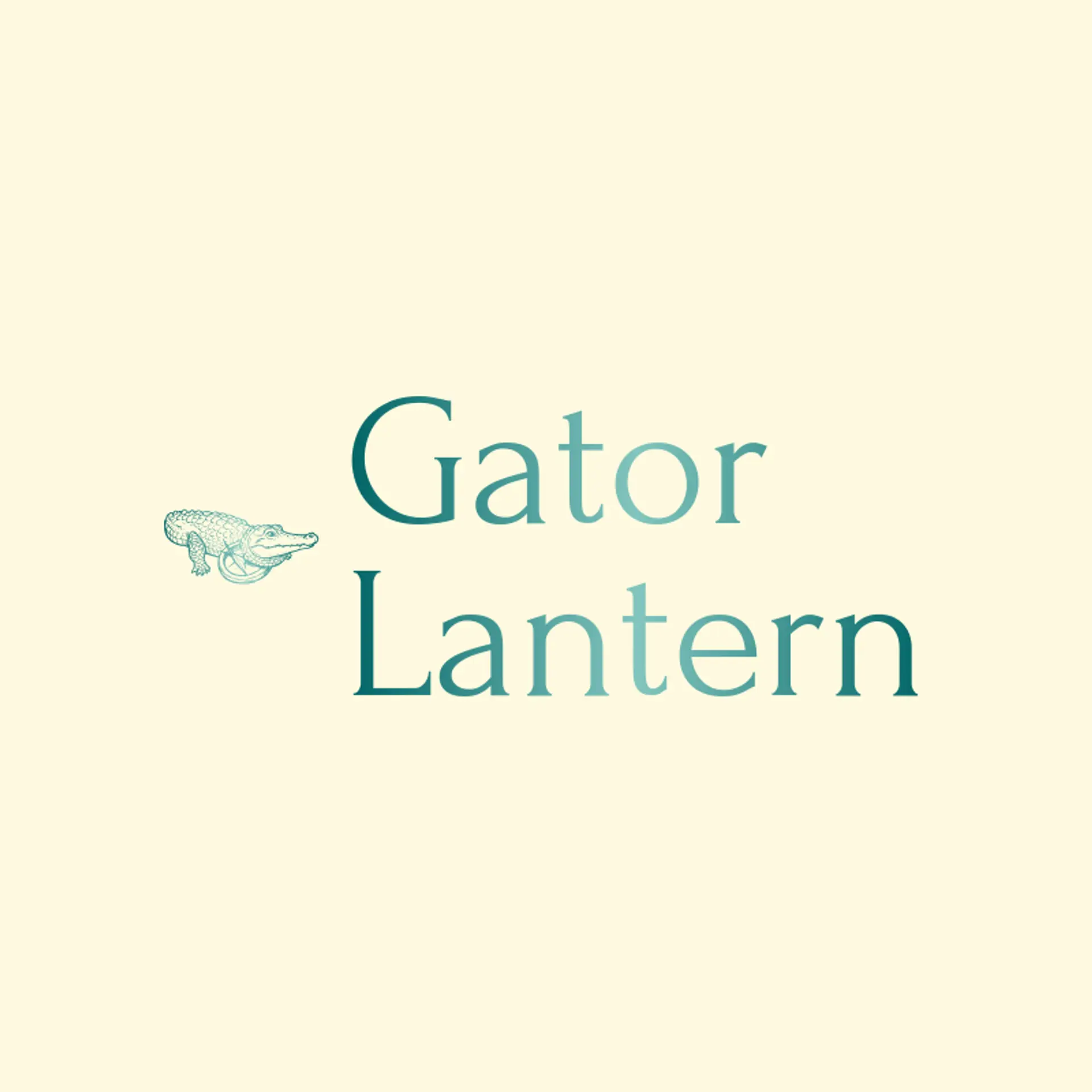
When it comes to the icon, the alligator is the obvious starting point, and a long low silhouette with a ridged back can remain recognizable even when reduced to a few geometric shapes. Water ripples, reeds, lily pads, and a rising sun can place the alligator in a clear wetland setting without crowding the mark. A toothy jaw, curled tail, or watchful eye can add character while keeping the shape bold enough for a patch or social avatar. For a stronger emblem direction, pair the alligator with a shield, a crown, a compass, or a river wave, keeping the twist beside or behind the animal. Before you settle, brainstorm around the owner's story: a marsh guide can use reeds and water, a coastal shop can lean on waves and sun, and a conservation group can bring in leaves and a clean horizon.
Icons To Make Your Alligator Logo Stand Out
That balance of natural color and strong definition should guide the lettering. A sturdy sans serif can give an alligator brand a modern outdoors voice, while a compact serif can add heritage for a wildlife center, conservation group, or established outfitter. Look for open letter shapes, confident weight, and spacing that stays clear on signs, apparel, and small social images. Pair restrained lettering with the strongest contrast from the first paragraph so the name remains easy to recognize beside a bold alligator mark.
Alligator Logo Ideas FAQs
Browse Related Logo Ideas
Alligator logosBeast logosBeaver logosBison logosBuffalo logosBull logosBulldog logosBunny logosButterfly logosCardinal logosCat pet care logosCow logosCoyote logosCrocodile logosDinosaur logosDog daycare and training logosDolphin logosFrog logosGamefowl logosGiraffe logosGoat logosGorilla logosHornet logosHummingbird logosLion logosMonarch logosOctopus logosPanda logosPanther logosPeacock logosPenguin logosPet care logosPet grooming logosPet logosPet sitting logosPhoenix logosRabbit logosScorpion logosShark logosSnake logosSpider logosTiger logosWildcat logosWolf logosCrow logosDuck logosElephant logosHawk logosHusky logosMonkey logos