



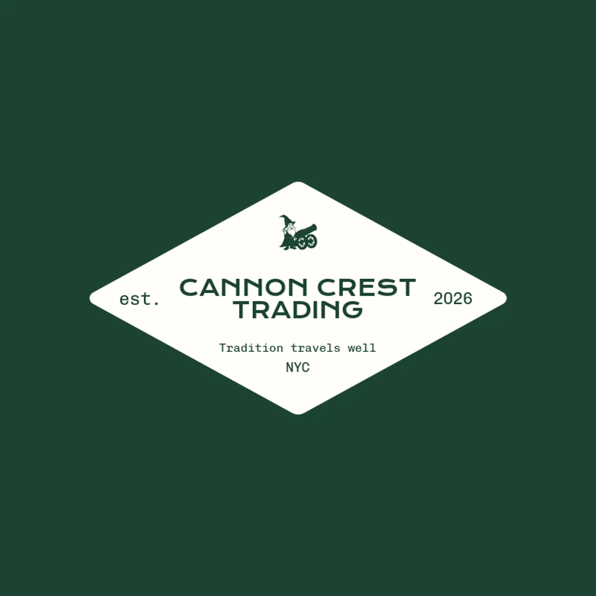
Logo Design Considerations for a Cannon Business
According to LOGO.com data, the five most popular colors in logos with cannon in their names created on LOGO.com over the past 12 months were white at 30%, black at 27%, blue at 17%, green at 10%, and yellow at 7%. White and black together make a crisp, high contrast base that suits a bold cannon wordmark, while blue, green, and yellow bring energy to the palette. For a cannon logo that feels ready for a shop, club, or heritage brand, start with white or black and let one brighter accent give the design its character.
For the icon, a cannon barrel gives the mark an unmistakable starting point, and its long profile can become a clean line that points toward the wordmark or suggests forward motion. A cannonball beside the barrel adds a simple second shape, while a small burst of smoke can bring movement without crowding the design. Historic cannon wheels, a naval carriage, or a fortress silhouette can give a heritage club or local attraction a sense of place. For a modern shop, reduce the barrel and wheel to two bold forms or let the cannonball become a small star beside the name. Before settling on a direction, build from the story behind the brand: a harbor business might pair a cannon with a wave, while a history group could use a carriage and a restrained crest.
Icons To Make Your Cannon Logo Stand Out
That same balance of strength and clarity carries into the lettering. According to LOGO.com data, serif with sans serif pairings, two sans serif styles, and standalone sans serif styles each accounted for 15% of the font categories in logos with cannon in their names over the past 12 months; sans serif with handwriting also made up 15%, sans serif with display led at 23%, and display with sans serif and entries with no category recorded each made up 8%. Open Sans, Chau Philomene One, and Damion each appeared at 9%, followed by Alike and Inter Tight at 4% each. Set sturdy, readable lettering against the white or black base and use a single vivid accent to give a cannon wordmark a clear silhouette at every size.
Cannon Logo Ideas FAQs
Browse Related Logo Ideas
Alien logosAnime character logosBattle logosCharacter logosClan logosCowboy hat logosCowboy logosCrest logosDanger logosDevil logosFamily crest logosFantasy logosGame logosGamer logosGhost logosGuild logosKing logosNinja logosPhantom logosPirate logosPrince logosQueen logosRoyal logosSamurai logosSkull logosSuperhero logosSword logosTournament logosViking logosWarrior logosZombie logosHorror logosKnight logosMermaid logosNerd logosOutlaw logosPegasus logosPoison logosReaper logosSpear logosToxic logosTrident logosZeus logosAstronaut logosPrincess logosCastle logosDice logosGothic logosGriffin logosMystery logos