


Logo Design Considerations for a Demon Business
According to LOGO.com data, the five most popular colors in logos with demon in their names created on LOGO.com over the past 12 months were black at 26%, white at 19%, green at 14%, red at 9%, and grey at 9%. Black and white together account for 45% of the color choices, giving demon themed marks a strong contrast that suits a bold, unmistakable presence. For a demon logo that works on a team shirt, shop sign, or social profile, start with a dark base and use one bright accent to make the name stand out.
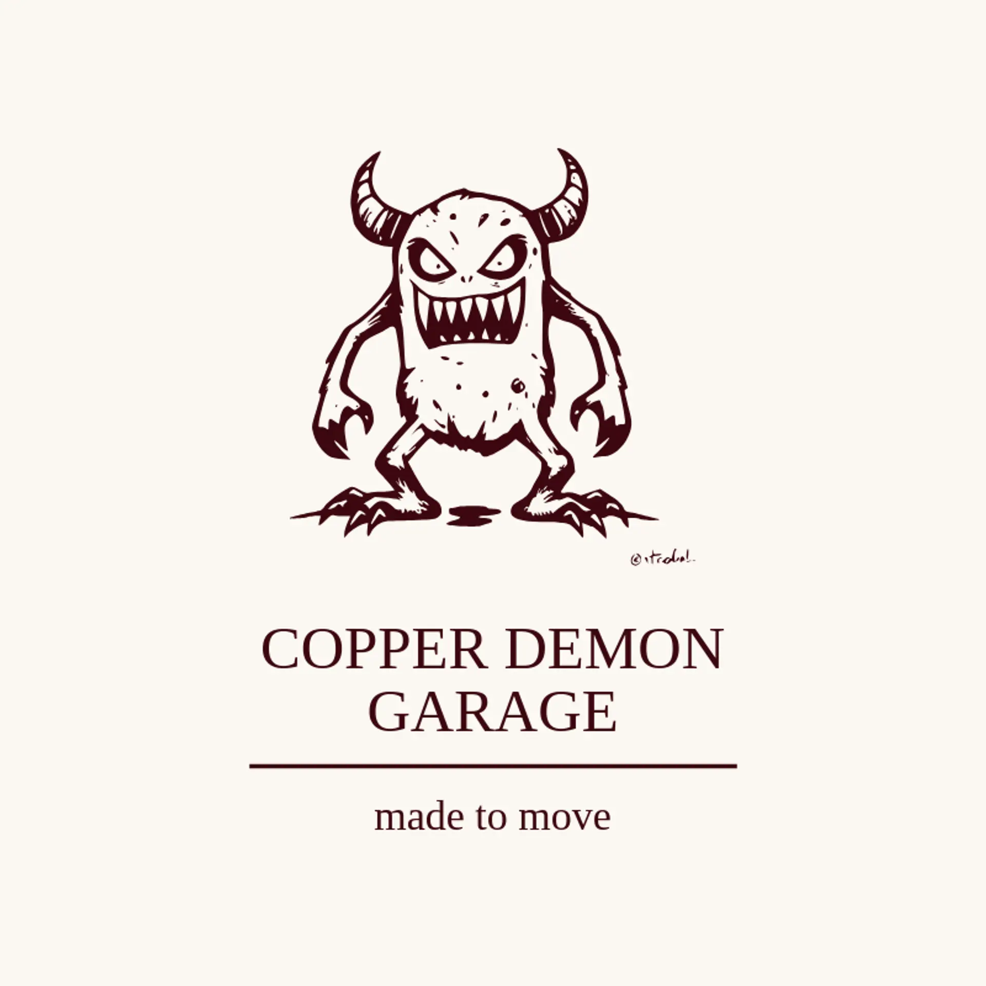
For the icon, a horned demon face is an instantly recognizable starting point, and its silhouette can stay clear with just a few strong curves and a focused expression. Flames beside the horns, a crescent moon, or a sharp lightning streak can add movement without crowding the face. For a team or gaming identity, try a running demon, a claw mark, or a compact mascot pose that still reads at small sizes. A fantasy shop could pair the character with a crystal or rune, while a music brand could set it beside a sound wave. Shape the details around the owner's story, whether that means a bold club mascot, a mischievous imp, or a polished symbol for a creative studio.
Icons To Make Your Demon Logo Stand Out
That strong contrast between black and white carries into the lettering. According to LOGO.com data, sans serif styles made up 62% of font category choices in those same logos over the past 12 months, followed by serif at 21%, display at 12%, and handwriting at 6%. The most used individual fonts were Open Sans at 13%, Schibsted Grotesk at 9%, Alata at 7%, Afacad at 7%, and Geologica at 7%. Pair sturdy, clear lettering with a dark base and a vivid accent so a demon logo stays readable on apparel, signs, and small digital graphics.
Demon Logo Ideas FAQs
Browse Related Logo Ideas
Alien logosAnime character logosBattle logosCharacter logosClan logosCowboy hat logosCowboy logosCrest logosDanger logosDevil logosFamily crest logosFantasy logosGame logosGamer logosGhost logosGuild logosKing logosNinja logosPhantom logosPirate logosPrince logosQueen logosRoyal logosSamurai logosSkull logosSuperhero logosSword logosTournament logosViking logosWarrior logosZombie logosHorror logosKnight logosMermaid logosNerd logosOutlaw logosPegasus logosPoison logosReaper logosSpear logosToxic logosTrident logosZeus logosAstronaut logosPrincess logosCastle logosDice logosGothic logosGriffin logosMystery logos