


Logo Design Considerations for a Superhero Business
Superhero logos benefit from a strong base color and one vivid accent that remains recognizable on costumes, comic covers, merchandise, and social profiles. Deep navy or black can give a hero mark authority, while white creates breathing room and red, blue, or gold accents add courage and action. Choose a combination with clear contrast so the emblem stays powerful at full size and easy to recognize when reduced.
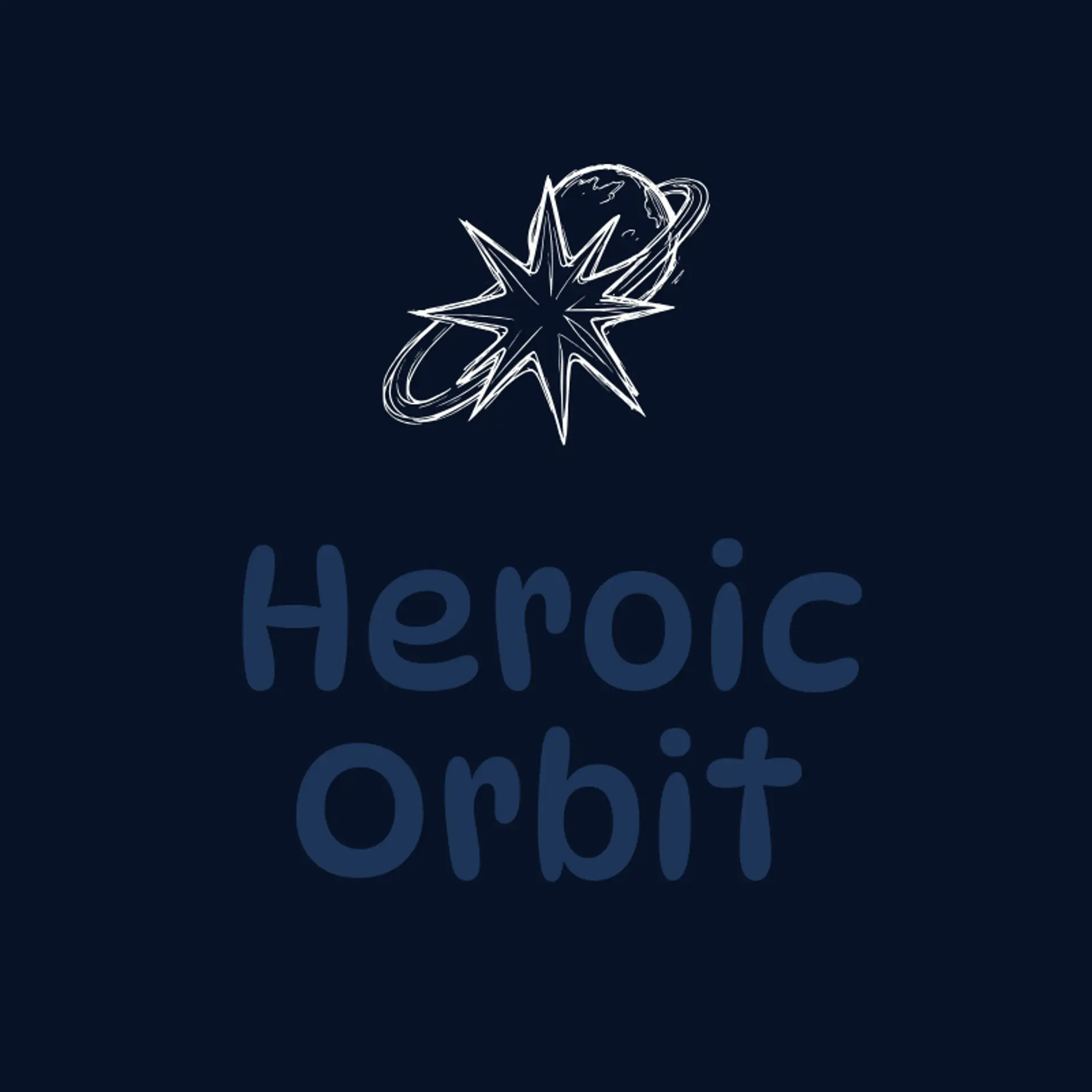
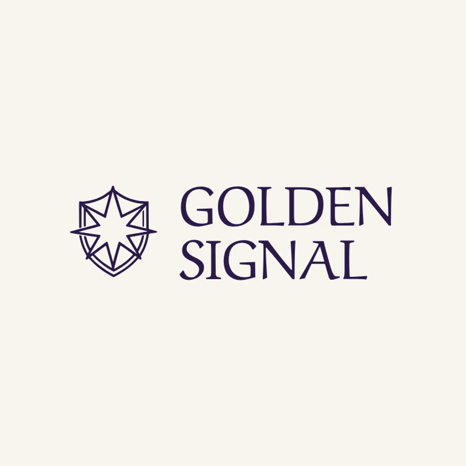
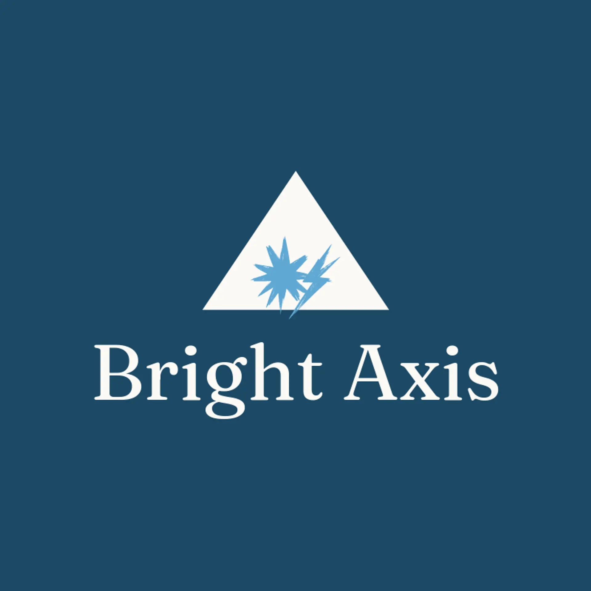
When it comes to the icon, a shield is an obvious starting point because its silhouette signals protection and reads clearly at small sizes, while a lightning bolt beside it can add speed without making the mark feel crowded. A starburst can suggest a dramatic arrival, a cape can create a flowing sense of motion, and a raised fist can bring determination to a team or character identity. For a cosmic hero, try a planet with a ring beside it or a comet with a bright tail, while a mask silhouette can hint at mystery without showing a face. A rocket, eagle, or mountain peak can give the emblem a distinct mission and setting, and a crown can suit a legendary champion or royal guardian. Before you settle, connect the symbol to the hero story: a city protector can use a skyline beside a shield, an explorer can pair a compass with a star, and a young team can turn a simple badge into a bright signal of courage.
Icons To Make Your Superhero Logo Stand Out
That same focus on bold contrast should guide the lettering. A sturdy sans serif can give a superhero brand a modern heroic voice, while a compact serif can suggest an established comic legacy or secret society. Look for strong weight, open letter shapes, and spacing that stays clear on costume badges and small social images. Pair confident lettering with the strongest color contrast from the first paragraph so the name feels memorable beside a shield, lightning bolt, or star.
Superhero Logo Ideas FAQs
Browse Related Logo Ideas
Alien logosAnime character logosBattle logosCharacter logosClan logosCowboy hat logosCowboy logosCrest logosDanger logosDevil logosFamily crest logosFantasy logosGame logosGamer logosGhost logosGuild logosKing logosNinja logosPhantom logosPirate logosPrince logosQueen logosRoyal logosSamurai logosSkull logosSuperhero logosSword logosTournament logosViking logosWarrior logosZombie logosHorror logosKnight logosMermaid logosNerd logosOutlaw logosPegasus logosPoison logosReaper logosSpear logosToxic logosTrident logosZeus logosAstronaut logosPrincess logosCastle logosDice logosGothic logosGriffin logosMystery logos