





Logo Design Considerations for a Pegasus Business
According to LOGO.com data, the five most popular colors in Pegasus logos created on LOGO.com over the past 12 months were white at 24%, blue at 21%, yellow at 18%, green at 12%, and black at 6%. White and blue create a bright skyward foundation that suits the mythical horse, while yellow and green bring sunlight, freedom, and natural energy to the identity. For a Pegasus logo that feels memorable on apparel, signage, and social profiles, start with a clean white or blue base and let one vivid accent suggest motion and flight.
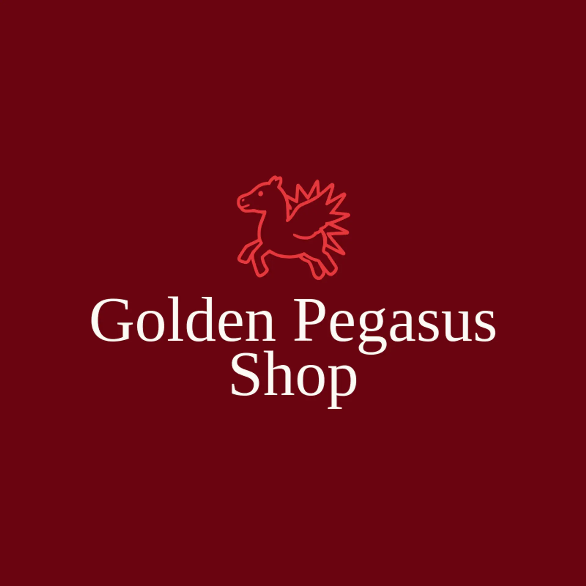
When it comes to the icon, the winged horse is the obvious starting point, with a raised wing or flowing mane that creates a strong silhouette at thumbnail size. A single feather can suggest the Pegasus story in a lighter way, especially when it sweeps beside the wordmark or points upward like a trail of flight. Stars and clouds offer supporting symbols that can sit behind the horse without making the mark feel crowded, while a horseshoe gives an equestrian brand a grounded detail. For a more adventurous identity, explore a mountain peak, a crescent moon, or a sunburst beside the Pegasus, then choose the direction that best fits the brand story and its sense of wonder.
Icons To Make Your Pegasus Logo Stand Out
According to LOGO.com data, no dependable font percentage (%) is available for this segment, so this paragraph stays editorial rather than statistical. That same sense of open air and contrast should guide the lettering. A sturdy sans serif can give a Pegasus brand a modern athletic voice, while a refined serif can add mythic tradition for an equestrian club, fantasy shop, or established academy. Look for graceful curves, confident weight, and spacing that keeps the name clear at small sizes without losing its sense of lift. Pair restrained lettering with the strongest white or blue contrast from the first paragraph so the name stays readable while the icon carries the magic.
Pegasus Logo Ideas FAQs
Browse Related Logo Ideas
Alien logosAnime character logosBattle logosCharacter logosClan logosCowboy hat logosCowboy logosCrest logosDanger logosDevil logosFamily crest logosFantasy logosGame logosGamer logosGhost logosGuild logosKing logosNinja logosPhantom logosPirate logosPrince logosQueen logosRoyal logosSamurai logosSkull logosSuperhero logosSword logosTournament logosViking logosWarrior logosZombie logosHorror logosKnight logosMermaid logosNerd logosOutlaw logosPegasus logosPoison logosReaper logosSpear logosToxic logosTrident logosZeus logosAstronaut logosPrincess logosCastle logosDice logosGothic logosGriffin logosMystery logos