








Logo Design Considerations for a Pirate Business
According to LOGO.com data, the five most popular colors in pirate logos created on LOGO.com over the past 12 months were white at 23%, black at 22%, blue at 10%, grey at 10%, and green at 9%. White and black lead with the stark contrast of sails, flags, and weathered deck markings, while blue, grey, and green bring in ocean depth, steel, and coastal adventure. If you want a pirate logo that feels ready for a crew flag, a dockside shop, or a digital profile, start with a clean white or black base and let one nautical accent color carry the character.
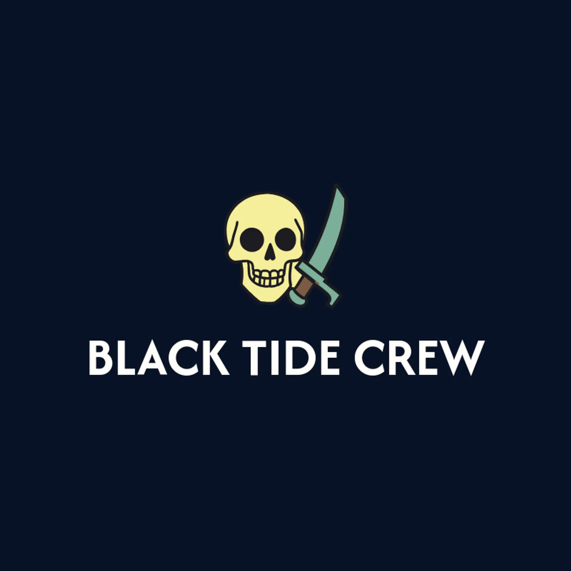
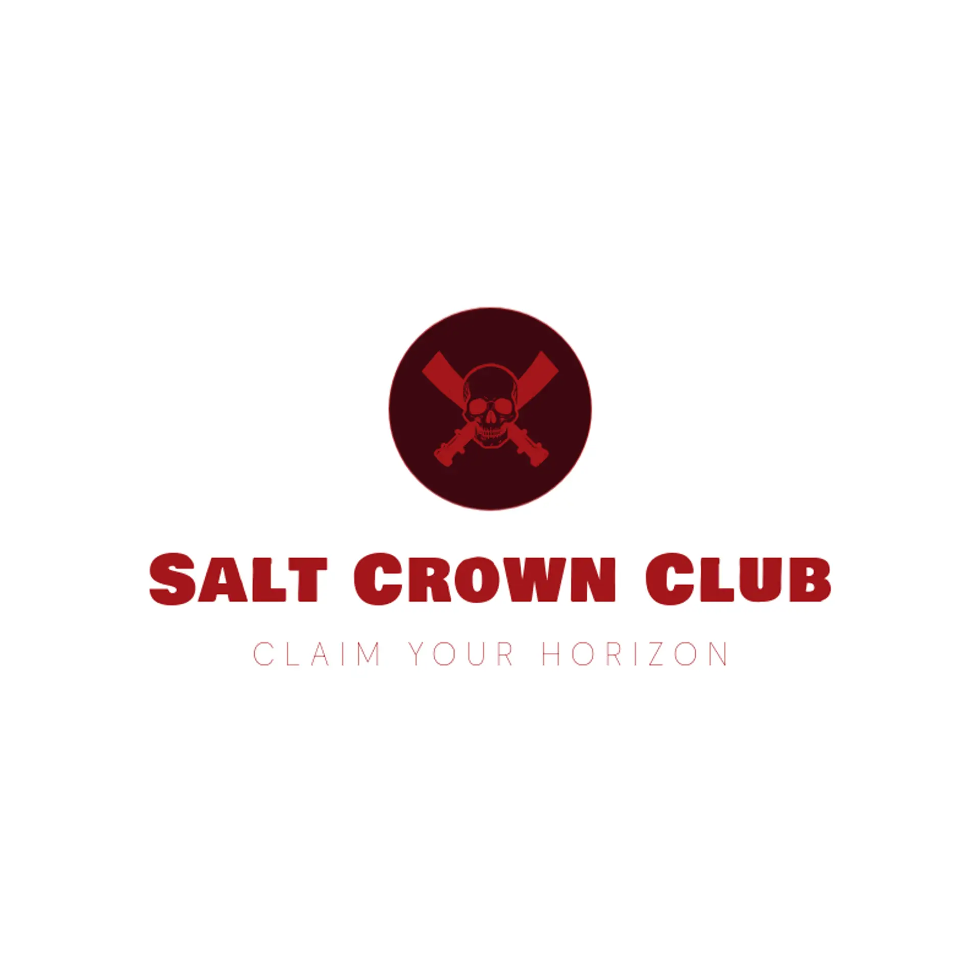
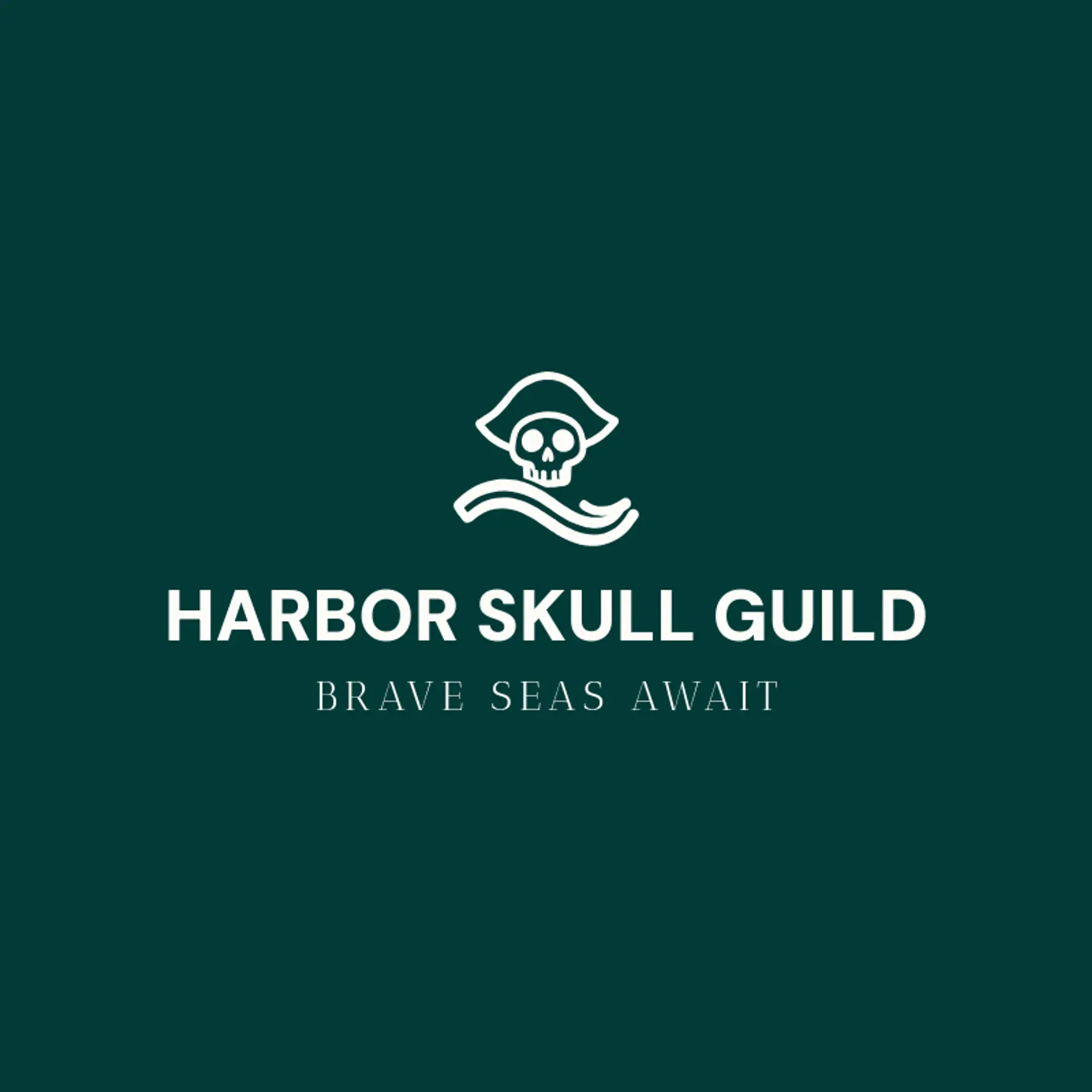
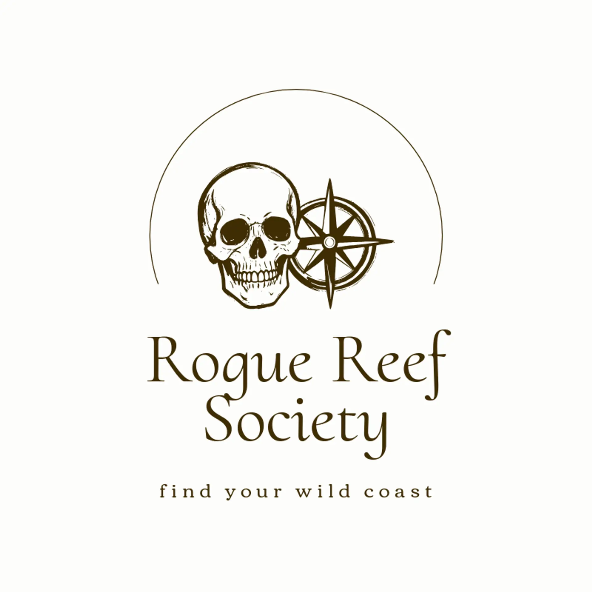
When it comes to a pirate icon, a skull is the obvious starting point, but a simple silhouette can make it feel fresh: pair a pirate skull with a cutlass beside it, or let a crossed cutlass form a strong mark for a crew or adventure brand. An anchor gives the identity a dependable harbor feeling, while a ship wheel, compass rose, or curling wave can suggest navigation without filling the icon with detail. For a livelier direction, use a pirate parrot silhouette, a kraken tentacle, or a seabird above a clean horizon, keeping every shape bold enough for a flag and a tiny avatar. A treasure map can inspire a folded path, a spyglass can become a compact vertical symbol, and a lantern can add a warm night watch mood. Before you settle, look to the brand story: a coastal shop can pair an anchor with a wave, a youth crew can use a compass and cutlass, and an event brand can turn a flag into a memorable signal.
Icons To Make Your Pirate Logo Stand Out
The same instinct for bold contrast carries into the lettering. According to LOGO.com data, sans serif typefaces made up 67% of the font choices in those same pirate logos over the past 12 months, with display styles at 15%, serif styles at 12%, and handwriting styles at 6%. The favorite fonts were Geologica at 18%, Spline Sans at 8%, Host Grotesk at 5%, Open Sans at 5%, and Schibsted Grotesk at 5%, giving the wordmark a clear modern edge. Set in sturdy letterforms against the white or black base from the first paragraph with one ocean or forest accent, a pirate logo can feel bold on a flag, readable on a storefront, and sharp at small social sizes.
Pirate Logo Ideas FAQs
Browse Related Logo Ideas
Alien logosAnime character logosBattle logosCharacter logosClan logosCowboy hat logosCowboy logosCrest logosDanger logosDevil logosFamily crest logosFantasy logosGame logosGamer logosGhost logosGuild logosKing logosNinja logosPhantom logosPirate logosPrince logosQueen logosRoyal logosSamurai logosSkull logosSuperhero logosSword logosTournament logosViking logosWarrior logosZombie logosHorror logosKnight logosMermaid logosNerd logosOutlaw logosPegasus logosPoison logosReaper logosSpear logosToxic logosTrident logosZeus logosAstronaut logosPrincess logosCastle logosDice logosGothic logosGriffin logosMystery logos