
Grim Reaper Logo Ideas
Browse popular Grim Reaper logo ideas and create a free editable logo, powered by AI. Select any Grim Reaper logo design to customize the text, font, colors and icons!


Logo Design Considerations for a Grim Reaper Business
According to LOGO.com data, the five most popular colors in logos with entertainment in their names over the past 12 months were white at 22%, black at 19%, green at 13%, yellow at 10%, and blue at 9%. White and black lead this broader entertainment sample, while green, yellow, and blue bring brighter accents that can keep a grim reaper identity from feeling flat. For a grim reaper logo, start with a deep base and let one of these lighter colors define the scythe, moon, or wordmark so the design remains clear on posters, apparel, and social profiles.
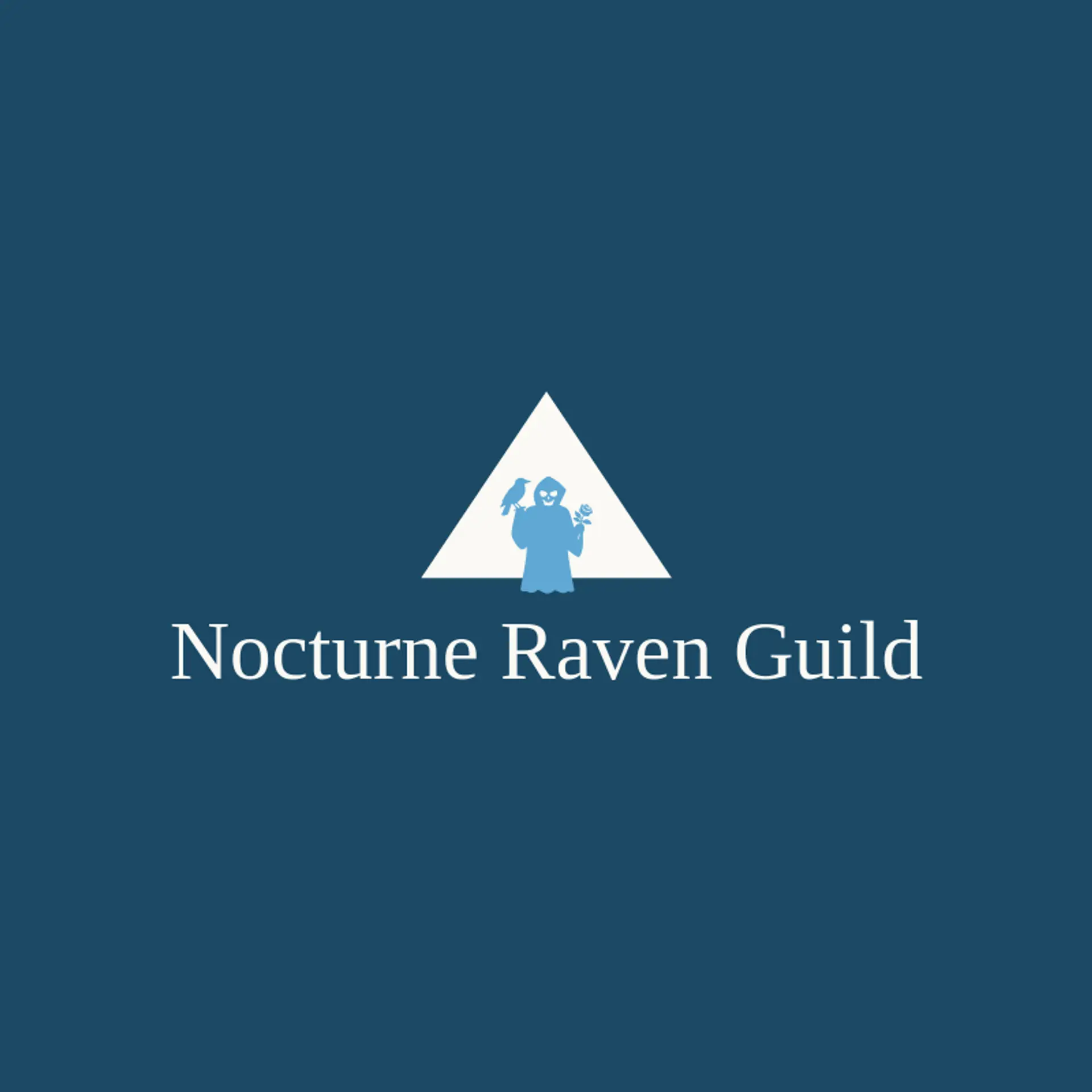
When it comes to the icon, the scythe is the obvious starting point, and its curved blade can create a memorable silhouette beside a bold wordmark or rising moon. A skull offers an instantly recognizable symbol that can be reduced to clean planes, while a raven adds a watchful natural companion for a darker identity. An hourglass can suggest mortality and time, and a candle can bring a small point of light against the shadowed subject. A wilted rose introduces a mournful romantic note, while a crescent moon gives the mark a quiet night setting. For a more direct symbol, a skeletal hand can reach toward a letterform or hold a small accent shape without making the icon crowded. Before you settle, brainstorm around the brand story: a theatrical concept can favor the scythe and moon, a gothic apparel label can pair the skull with the rose, and a mysterious entertainment brand can combine the raven with the hourglass.
Icons To Make Your Grim Reaper Logo Stand Out
The same contrast between a dark base and a bright accent can guide the lettering. According to LOGO.com data, sans serif typefaces made up 58% of font category selections in logos with entertainment in their names over the past 12 months, followed by display at 19%, serif at 18%, and handwriting at 5%. The favorite individual fonts in that same sample were Geologica at 11%, Schibsted Grotesk at 7%, Open Sans at 6%, Bayon at 4%, and GFS Didot at 4%. Use a readable sans serif for the main name or a restrained display style for a gothic feel, then pair it with the strongest light and dark contrast from the first paragraph so the name stays easy to recognize.
Grim Reaper Logo Ideas FAQs
Browse Related Logo Ideas
Alien logosAnime character logosBattle logosCharacter logosClan logosCowboy hat logosCowboy logosCrest logosDanger logosDevil logosFamily crest logosFantasy logosGame logosGamer logosGhost logosGuild logosKing logosNinja logosPhantom logosPirate logosPrince logosQueen logosRoyal logosSamurai logosSkull logosSuperhero logosSword logosTournament logosViking logosWarrior logosZombie logosHorror logosKnight logosMermaid logosNerd logosOutlaw logosPegasus logosPoison logosReaper logosSpear logosToxic logosTrident logosZeus logosAstronaut logosPrincess logosCastle logosDice logosGothic logosGriffin logosMystery logos