












Logo Design Considerations for a Royal Business
According to LOGO.com data, the five most popular colors in royal logos created on LOGO.com over the past 12 months were white at 21%, black at 18%, green at 14%, yellow at 13%, and grey at 9%. White and black lead with a stately contrast that suits regal names and formal brands, while green and yellow add jewel toned richness and grey brings a refined modern balance. If you want a royal logo that feels confident on invitations, packaging, websites, and social profiles, begin with a clear white or black base and let one rich accent carry the sense of ceremony.
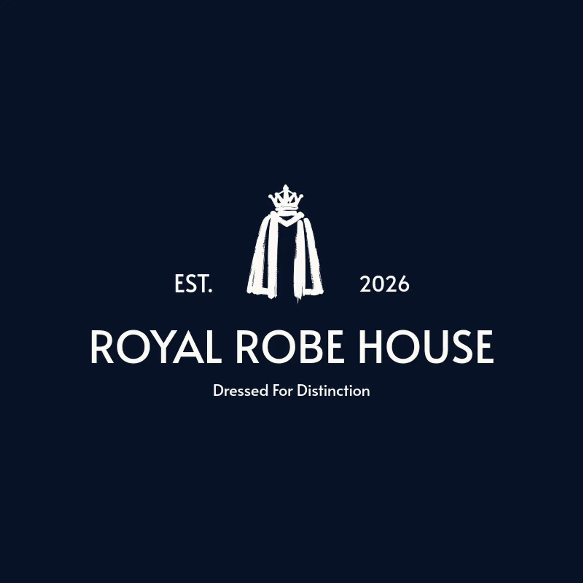
When it comes to the icon, a crown is the clearest starting point, and its points remain recognizable when simplified into a bold silhouette or paired with a small star beside it. A scepter adds ceremony through a long vertical shape, while a jewel can provide a compact focal mark with a faceted outline and a sparkle beside it. Regal animals bring a stronger sense of character, so explore a lion profile, a falcon, or a stag with clean horns, each reduced to a few confident shapes. For a heritage direction, try laurel leaves, a fleur de lis, or a royal robe, and for a more contemporary identity use a starburst or a single gemstone. Let the story of the brand guide the final choice: a family name may suit a crest inspired by its history, a luxury shop may favor a jewel, and a modern club may pair a crown with an athletic animal silhouette.
Icons To Make Your Royal Logo Stand Out
That same refined contrast should guide the lettering. According to LOGO.com data, sans serif typefaces made up 53% of the font choices in those same royal logos over the past 12 months, followed by serif at 23%, display at 17%, and handwriting at 7%. The favorite individual fonts were Geologica at 10%, Schibsted Grotesk at 7%, Afacad at 6%, Open Sans at 6%, and GFS Didot at 4%, giving the palette both clean authority and classic elegance. Set confident letterforms against the white or black base with a measured green or yellow accent, and a royal logo can stay legible from a formal invitation to a small social profile.
Royal Logo Ideas FAQs
Browse Related Logo Ideas
Alien logosAnime character logosBattle logosCharacter logosClan logosCowboy hat logosCowboy logosCrest logosDanger logosDevil logosFamily crest logosFantasy logosGame logosGamer logosGhost logosGuild logosKing logosNinja logosPhantom logosPirate logosPrince logosQueen logosRoyal logosSamurai logosSkull logosSuperhero logosSword logosTournament logosViking logosWarrior logosZombie logosHorror logosKnight logosMermaid logosNerd logosOutlaw logosPegasus logosPoison logosReaper logosSpear logosToxic logosTrident logosZeus logosAstronaut logosPrincess logosCastle logosDice logosGothic logosGriffin logosMystery logos