










Logo Design Considerations for a Nerd Business
According to LOGO.com data, the five most popular colors in nerd logos created on LOGO.com over the past 12 months were white at 30%, black at 16%, blue at 16%, orange at 8%, and green at 7%. White and black create the crisp contrast that suits clever, curious brands, while blue adds trust and orange or green brings a spark of playful discovery. For a nerd logo that works on websites, stickers, apparel, and social profiles, start with a clean white or black base and use one bright accent to make the idea feel alive.
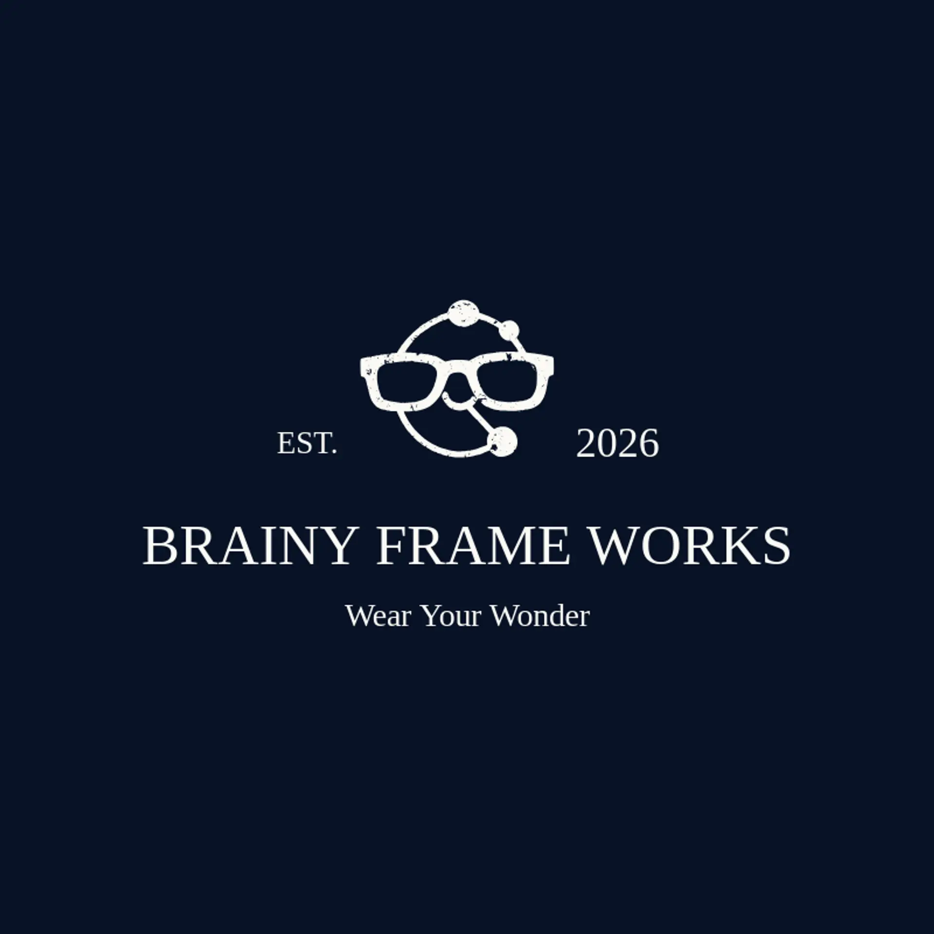
When it comes to the icon, glasses are an obvious starting point, and their strong silhouette can turn a familiar idea into a memorable mark with a lightning bolt beside the frames or a star rising above them. A light bulb suggests curiosity and invention, while an atom gives science brands a precise symbol that can be simplified into three orbiting arcs. For a playful identity, explore a beaker with a small sparkle beside it, a calculator with the buttons reduced to clean squares, a rocket with a trail of dots, or a pixel star beside a cursor arrow. Book pages, a chess knight, and a telescope can add learning, strategy, or discovery without making the mark feel too literal. Before you settle, connect the icon to the owner's story: a coding club might pair a circuit line with a star, a science shop could use an atom and a flame, and a study brand might turn a pencil into a bright idea.
Icons To Make Your Nerd Logo Stand Out
That balance of crisp contrast and playful color carries into the lettering. According to LOGO.com data, sans serif typefaces made up 75% of the font choices in those same nerd logos over the past 12 months, with display styles at 10% and serif styles at 9%. The favorite fonts were Geologica at 18%, Outfit at 7%, Afacad at 6%, Open Sans at 6%, and Bricolage Grotesque at 3%, giving the wordmark a smart, modern presence. Set clear letterforms against the white or black base with a blue, orange, or green accent so the name stays readable on a product page, club shirt, or tiny avatar.
Nerd Logo Ideas FAQs
Browse Related Logo Ideas
Alien logosAnime character logosBattle logosCharacter logosClan logosCowboy hat logosCowboy logosCrest logosDanger logosDevil logosFamily crest logosFantasy logosGame logosGamer logosGhost logosGuild logosKing logosNinja logosPhantom logosPirate logosPrince logosQueen logosRoyal logosSamurai logosSkull logosSuperhero logosSword logosTournament logosViking logosWarrior logosZombie logosHorror logosKnight logosMermaid logosNerd logosOutlaw logosPegasus logosPoison logosReaper logosSpear logosToxic logosTrident logosZeus logosAstronaut logosPrincess logosCastle logosDice logosGothic logosGriffin logosMystery logos